Week Seven
Lecture Notes
Lecture Reflection:
I think this particular lecture is what we have all been learning for our whole academic lives. The differences with research but also philosophy. I often refer to the above lecture when I would be writing a dissertation or some extreme academic writing. But its comes to my attention that I need to be doing this method a lot more when researching generally - making sure that the questions i’m asking as the right ones.
One other thing that really stood out for me within this lecture was the CRAAP test which Id never really thought about before but I will be using this method a lot more for my research as I think its a really helpful method.
Resource Notes
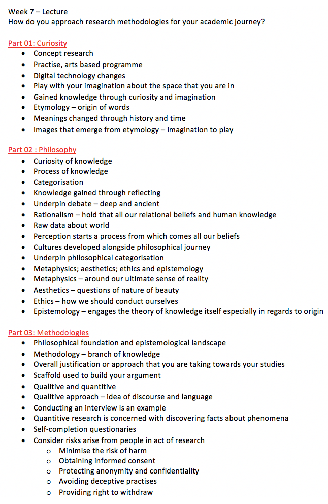
Resource One
Resource Two
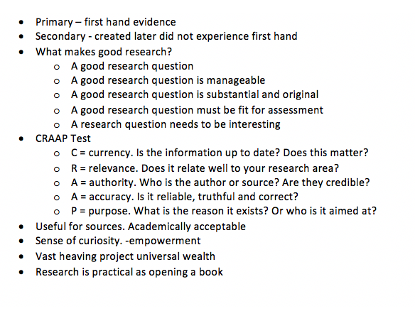
Resource Three
Resource Reflection
Resource One
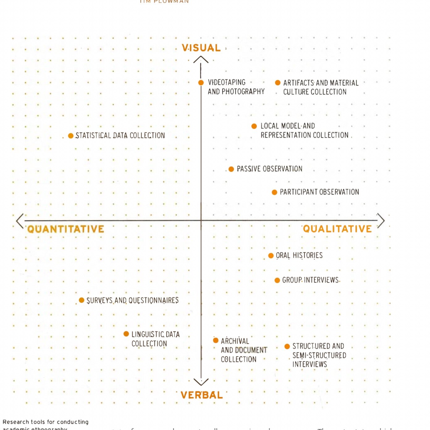
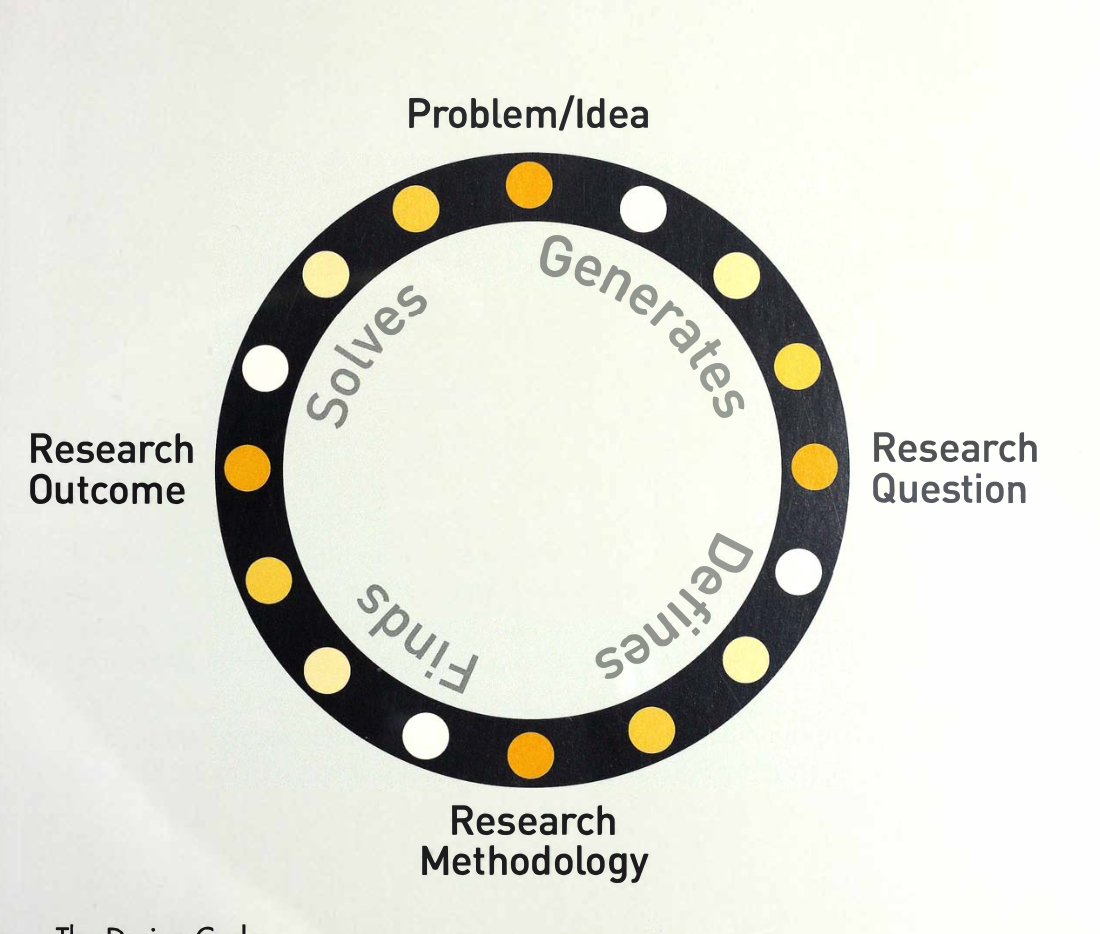
I thought the beginning of this resource was actually very helpful in terms of the history of each of the quantitative and qualitative research methods and going through each one. I also thought the diagrams that are shown above were very visually clear for me to understand the processes but also where each research method goes on a grid.
Resource Two
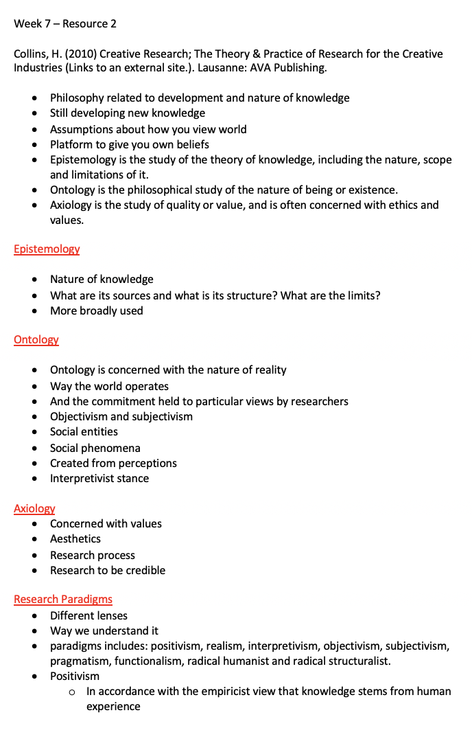
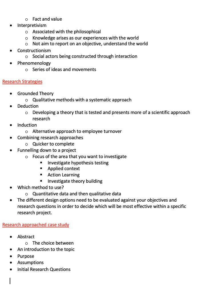
This research was very informative about how to go about different research methods and philosophies. I know understand that there are many different areas and types depending on the area that you want to research and go into. I think this is a very confusing topic as a lot of them are the same with only a slight variation.
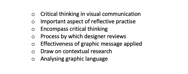
Resource Three
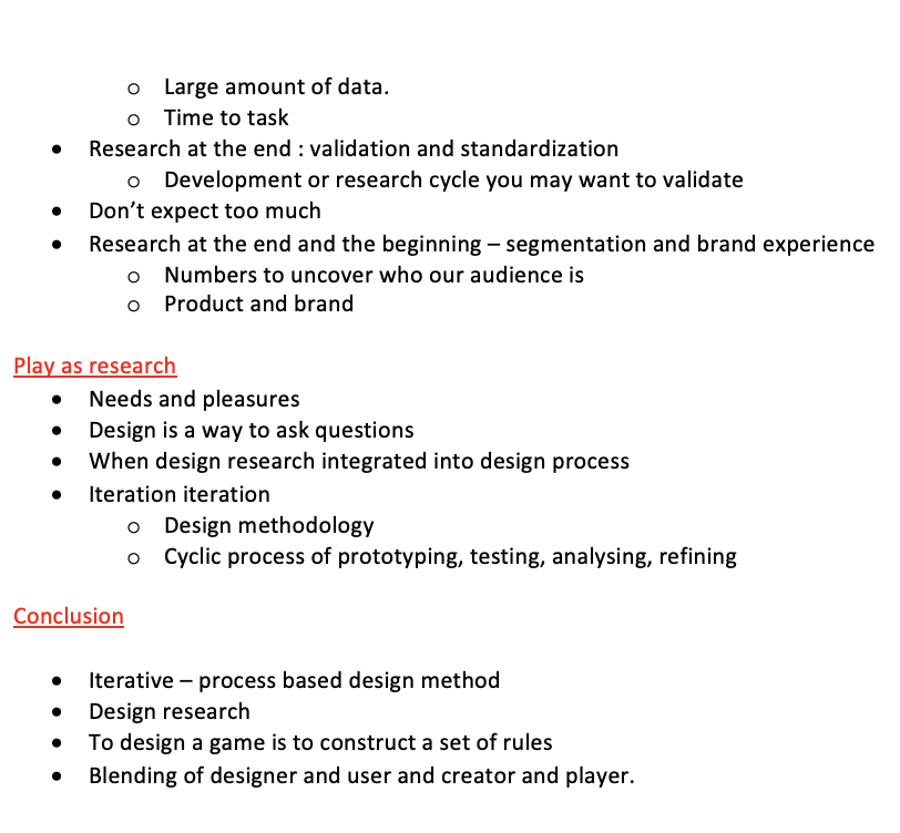
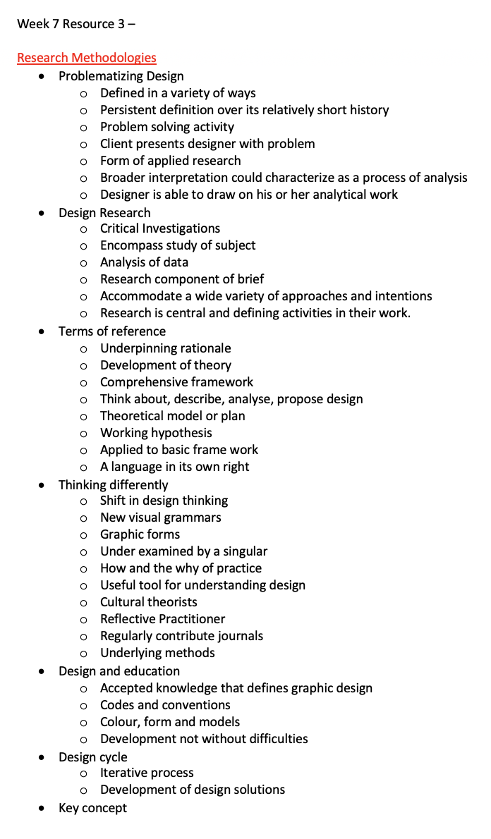
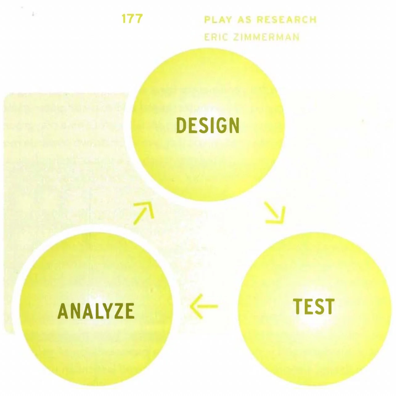
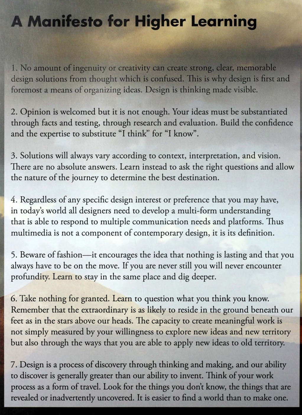
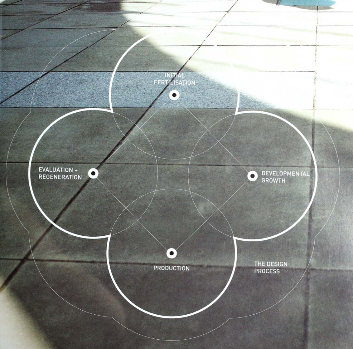
I thought this resource was very straight forward and easy to understand. I also found it particularly useful as all the research methods were to do with graphic design where as the other two resources didn’t relate to designing what’s so ever other than how you research. The things that really helped me gauge this resource were the little understandings that sat at the bottom of the page shown below but also the diagrams that showed different research and design processes. The design circle is very clearly popular one for designers as its very easy to use and to understand but also helps produce an effective result for the client.

Research
I decided to research more into relative research methods for graphic design as this is the one that’ll be more helpful for me in the longterm. I found this PDF online which I thought would be useful called: VISUAL RESEARCH by IAN NOBLE/RUSSELL BESTLEY.
Within the PDF it has similar information about Cooke, spoken about in resource three. However, in resource three they failed to mention that these designs shown below were created for the each outputs.
I really like how he’s made these almost about safety signs and the colours are really effective with the white text on the top.

“Cooke chose to illustrate his research methodology with a series of illustrations reflecting the themes of useful design and social responsibility. Set
on single pages throughout the handbook, the diagrammatic illustrations (above) convey a sense of purpose and take the polemical visual form of a manifesto for design.”

It also had this interesting research process which I thought was also really nice to look at graphically - with the white text amongst the black background.

I found the above really helpful to have a memory off - I remember doing a lot of these research in A levels but its always useful to have it written down to remember as a lot of people forget that taking images from the internet does not make it your own work.
Within the resource it also talks about Alison Barnes and her urban mapping her work is shown below:

Barnes has charted the graffiti that can be found on the map with the details of the graffiti - I think this is so clever and really interesting way of noting down research that is done around a particular subject.

She has also recorded the information on pie and bar charts which can be shown above. These could be interpreted colours for how many graffiti in which area and how many steps were taken along the road. The right hand side of the image shows all the words of the graffiti in massive lists, with a title of wha they are associated with.

The above image is how the picture looked before the words of the graffiti were put on-top and how the points of colour relate to other areas within. Overall a really interesting project and shows that research can be done in a very visual way.
The resource goes on to talk about audience and message which then shows this Artist Brazilian graphic designer Paola Faoro - the graphic score. It is a system to score and annotate wholly vocal music compositions. An alternative music design that could be read by fellow musicians and the audience alike. It can be seem in the image below. The picture utilise colour and shape but also the correlation and relationship to other notes.


It then dives into the work of ‘Paul McNeil’s structured series’ and his investigations into typography writing and language using the context definition methodology which was shown earlier on in the resource. Allowing McNeil to explore small scale experiments, he was able to explore and research about symmetry and asymmetry within roman alphabet in order to uncover hidden forms. The image shown below was created by putting mirror on the alphabet and creating using photography.

He continued his experiments, this time moving onto the English language which can be shown below:
‘When any word is keyed in this typeface, its frequency pattern spontaneously becomes visible, each word forming a non- sequential chart of its own character frequency and thus realising patterns in the language. This image develops this idea further by mapping the frequency register (in white) over infrequency (in black).’

“Following the research conducted into individual letterforms and their frequency of use in the English language, McNeil extended his range of experiments to look at the internal typographic structure of letterforms and their use within an alphabetic system of differences.
Shown here is a series of visual propositions further extending notions of character frequency occurrence. The objective of these developments was to divert conventions of written form to serve as direct visual metaphors for both frequency and tonality, by replacing glyphs with blocks in synthesised tones of grey, in the form of line screens. After producing a number of initial designs McNeil developed the examples above. Here character widths, heights and internal structures are intended to represent duration, pitch and tone respectively.
These forms can subsequently be reconverted to sounds, whose 'legibility' can only be imagined.Shown below: “


“To playfully examine the significance of internal glyph skeletons in conveying meaning, McNeil constructed a typeface that is capable of generating words and sentences, but which disallows the appearance of individual letterforms . Internal character shapes are forced to merge, leaving only the exoskeletons of wordforms, though traditional typographic patterns are retained so that, at first glance, texts look 'correct'.
This unicase alphabet attempts to reduce the inherent ambiguity and redundancy of the Roman alphabet by amalgamating variant upper case and lower case glyphs from a total of 42 to 26 – the higher number being accountable to the graphic differences between characters such as E/e, A/a, R/r. The intention was to increase legibility by maximising key differences between glyphs.
To understand the hierarchy of stroke types in the alphabet McNeil classified it into separate components and then reconstructed every combination of stroke type. Characters were categorised by the lines used: curvilinear, elliptical and circular strokes, vertical strokes, horizontal strokes and diagonal strokes.”
Overall I thought this was a really interesting resource taking a lot of the information that was previously given and putting it into visual research outputs that designers use regularly.
Workshop Challenge
This weeks task is to chose an object that you feel has a story to tell.
Mind-map of different objects:

Ive decided to pick a:
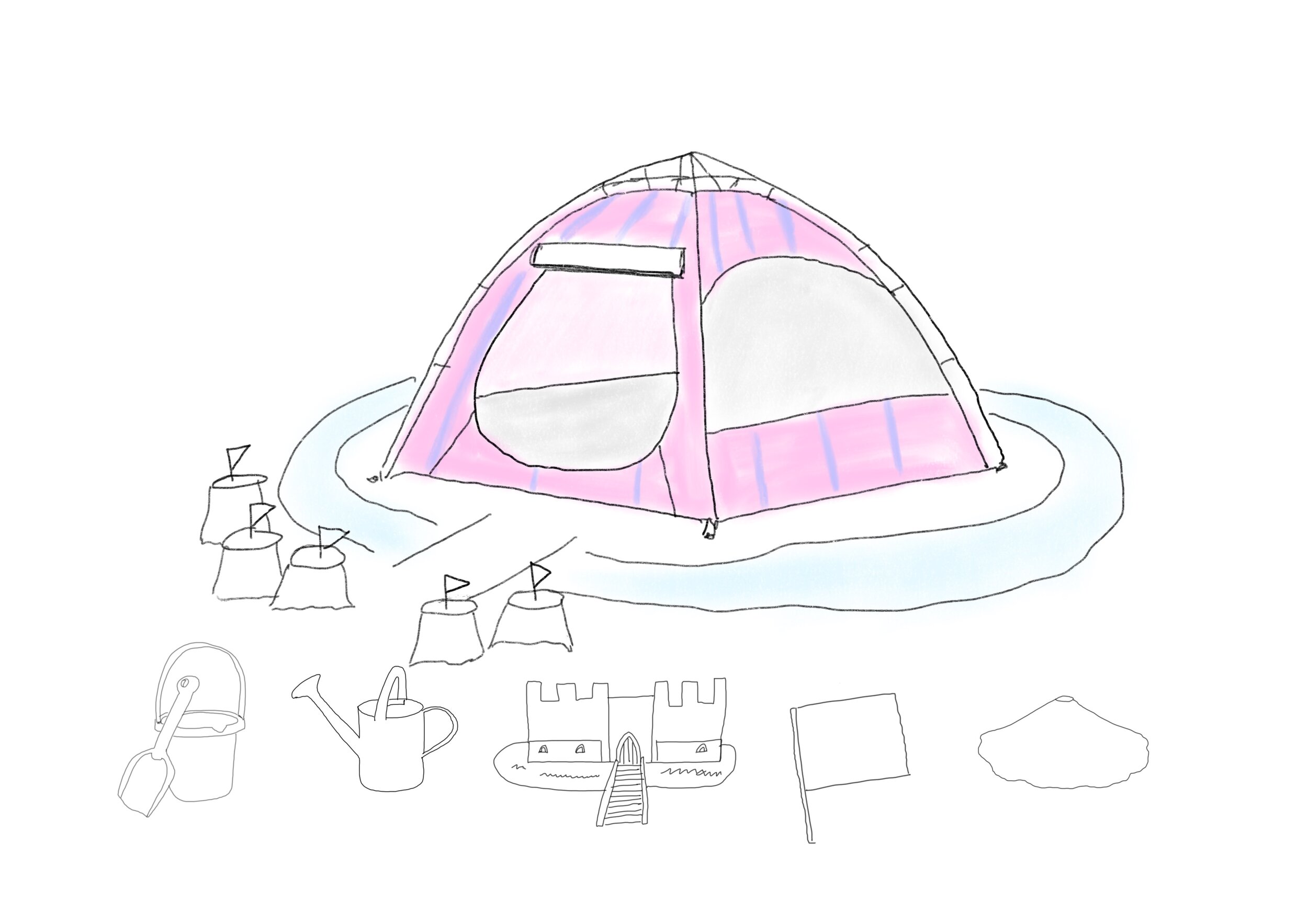
‘Pop up Beach Tent’
Etymology

Beach:

Tent:

Research:
I was researching how I could portray my story about the beach tent in a fun way and found this kids instructions on how to build a den in lockdown.
I really liked this its almost like a kids Ikea flat pack and really appealed to me.

I decided to use this as the basis of my design around the beach tent and how many ways a beach tent could be used. I feel there are many ways that children use their imagination to create their own spaces but also use toys and objects in many different ways.
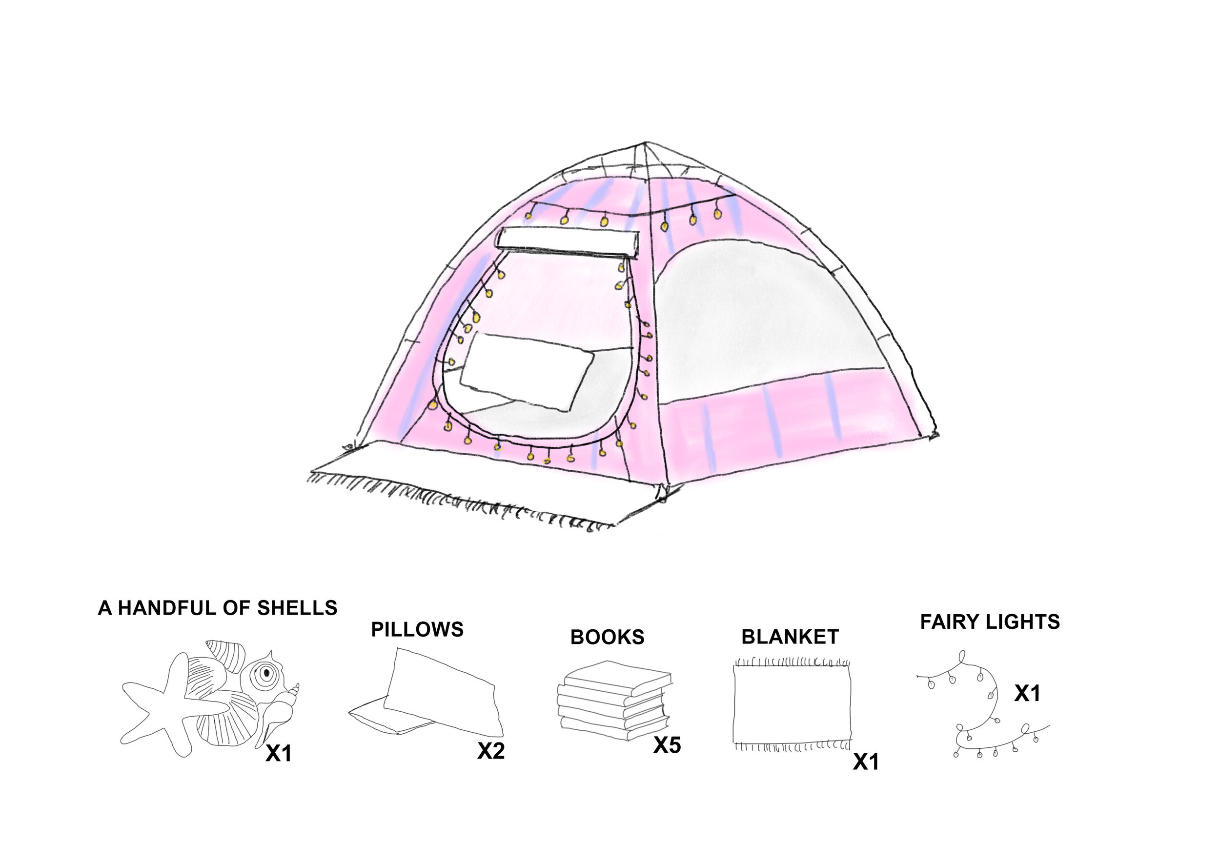
I started sketching on my iPad correlation images that go with my 300 word story on the object which can be seen below, along with a video to show the process:
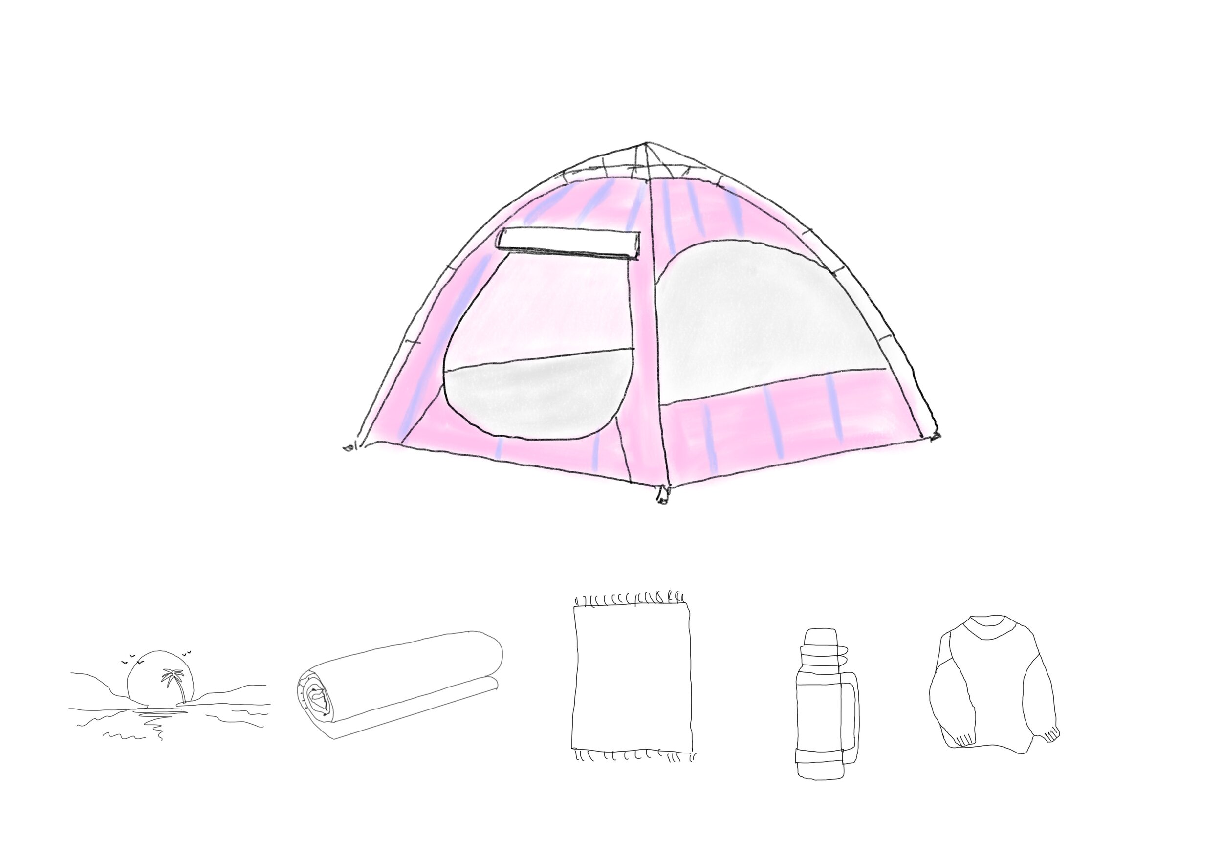
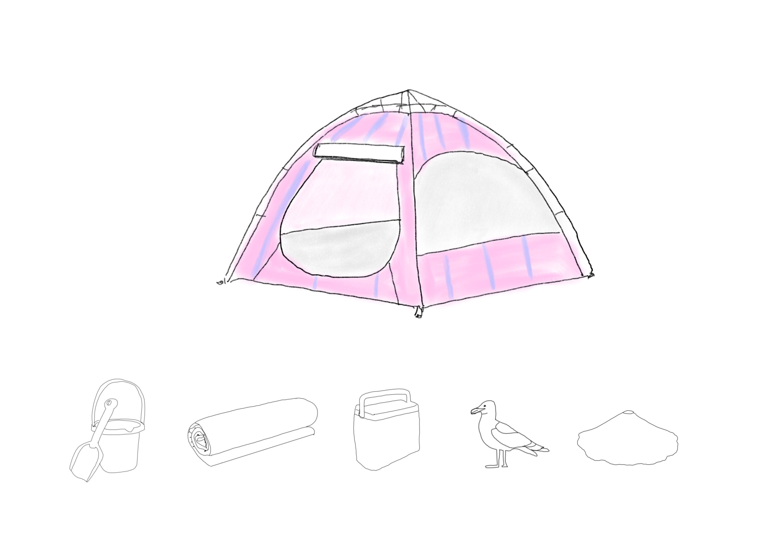
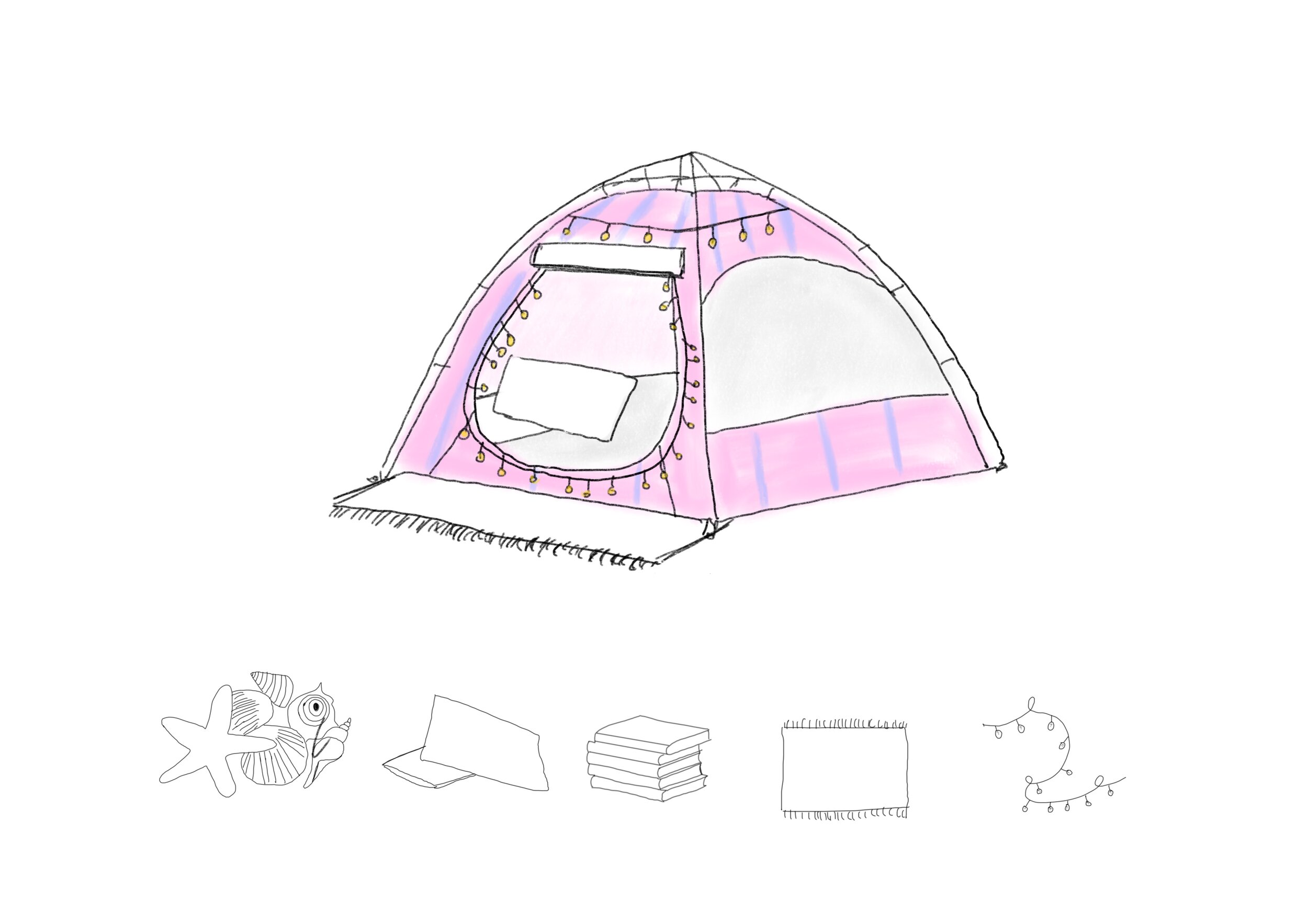
I then took those drawings into photoshop and added some text around. Adding the number and name of the item as needed in a flat pack for example so the child would know what was needed in order to create the image.
I then put it into indesign to add the final words and put all the images together.
The final story
It arrived in a bag from our local beach shop, this lightweight self-assembling tent equipped with a handy carry strap. When I was first given the beach tent, I was so excited for the shelter it would provide for me from the weather but also for the adventures I would have.
Our first holiday together, was to Cornwall a much loved holiday spot for myself and the family. It was Mr Beach Tent’s first time on the beach, there were many other beach tents that surrounded us with people playing and sheltering and napping.
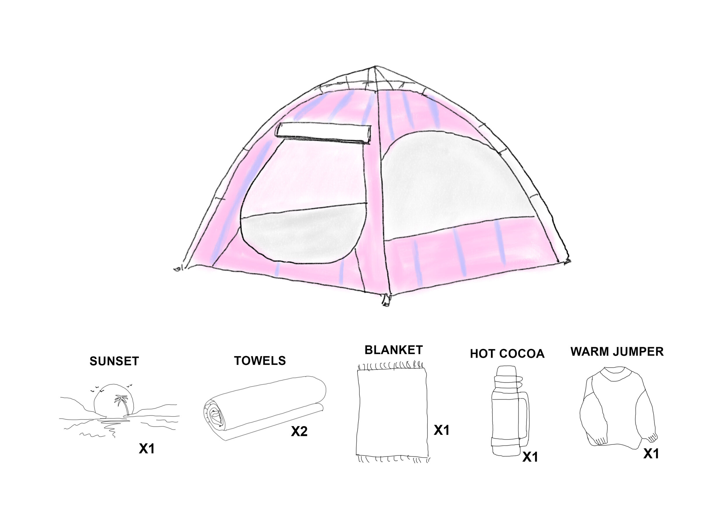
But my beach tent was the superior as my breathable polyester fabric beach tent was pink with blue strips and a yellow zip but also provided UV protection from the suns rays. Once on the beach I ripped opening the packaging of the tent, I undid the safety strap, unfolded the fibre glass rods and the tent popped open like an umbrella.
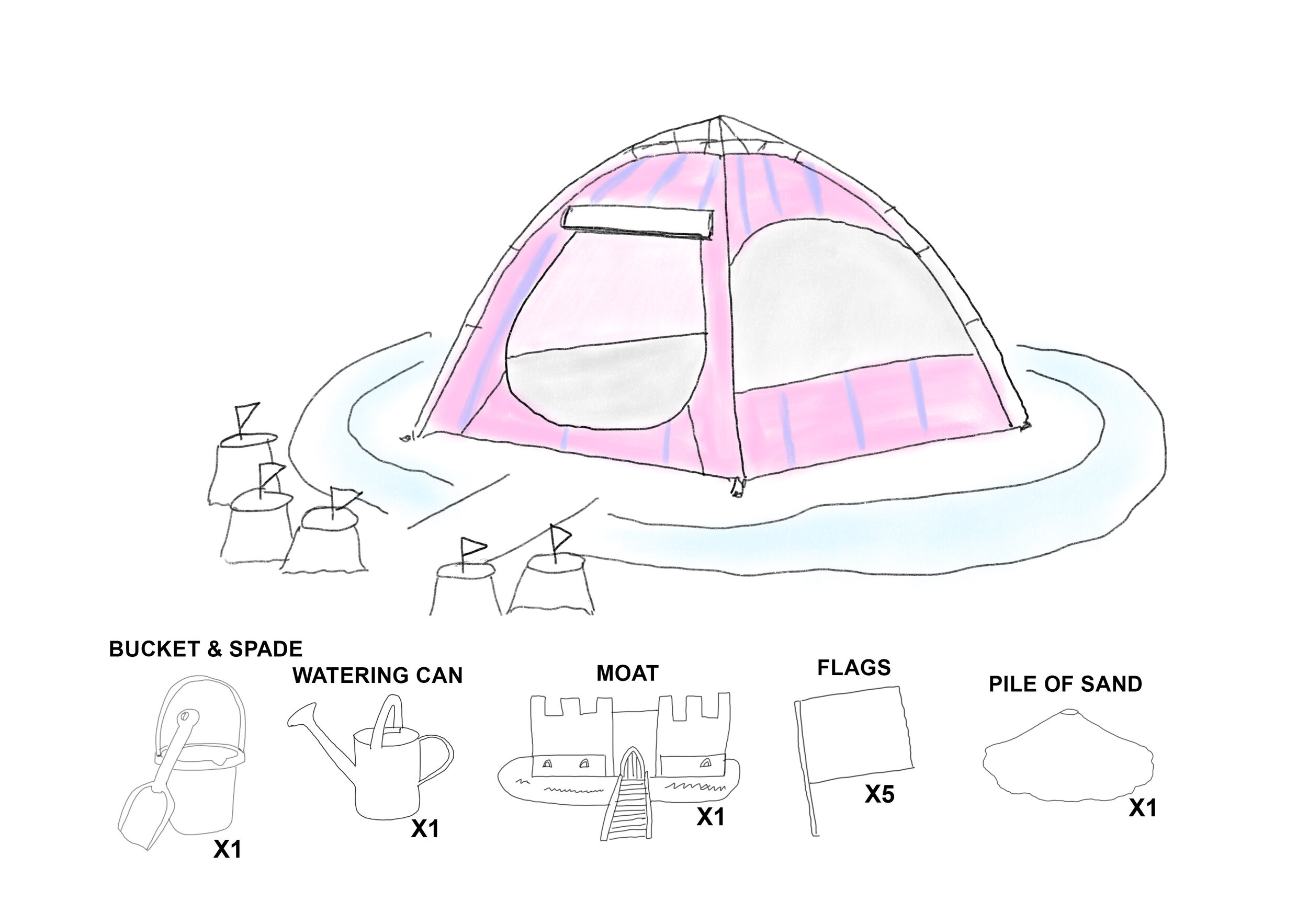
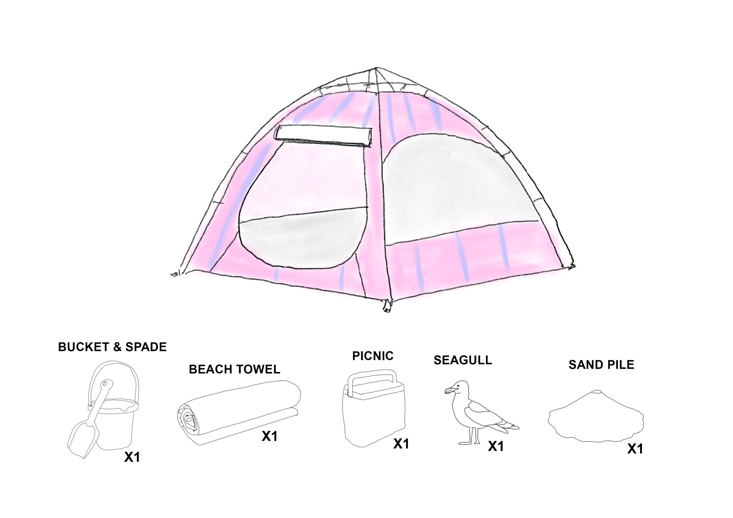
It had pockets on the sides that I could fill with sand and stones to stop it from blowing away from me. The windows of the tent had mesh coverings to provide fresh air and to keep the nasty creepy crawlies out.
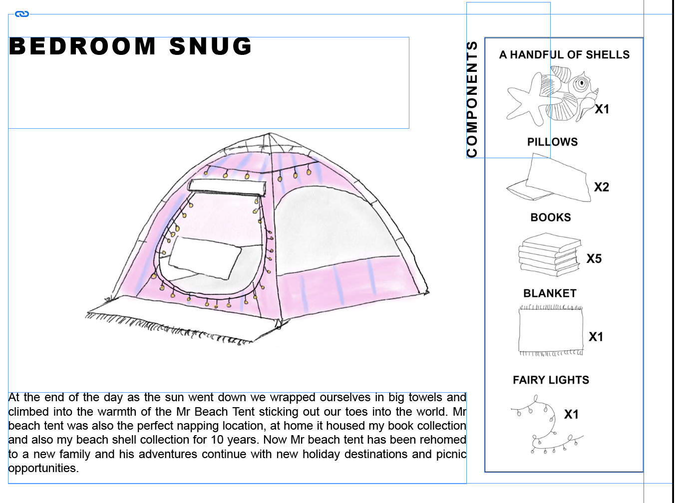
Later that day, my brother and I built a moat around the castle - Mr Tent. We warned off all the predators i.e. the seagulls from stealing our sandwiches and invading our territory. At the end of the day as the sun went down we wrapped ourselves in big towels and climbed into the warmth of the Mr Beach Tent sticking out our toes into the world.
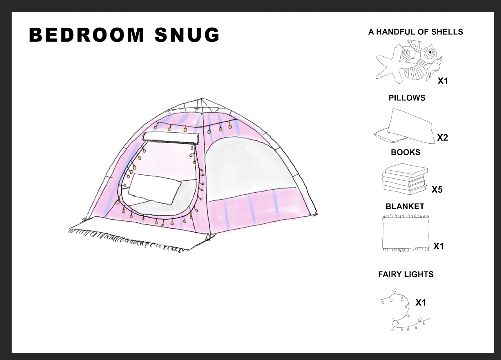
Mr beach tent was also the perfect napping location, at home it housed my book collection and also my beach shell collection for 10 years. Now Mr beach tent has been rehomed to a new family and his adventures continue with new holiday destinations and picnic opportunities.

On reflection of these images im not sure it works as a long line. So I think i’m going to experiment again with having the components at the side of the tent image.
Below is the tester to see if I would like the text to the right hand side of the image:
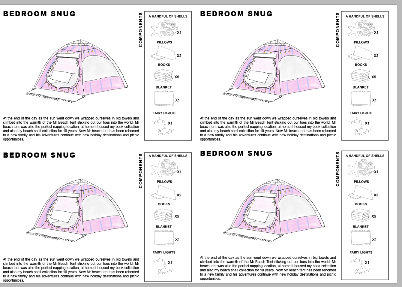
Overall I preferred the look at the story sat very nicely on the page. So I continued to change the rest of them.

Which led me to the final result above. I am really happy with the result and I think its really clear. I tried to use descriptive language throughout so you could really visualise the image along side for the child to understand. I also think that the 4 way layout is really clear.
Overall I think that the workshop task was really fun and engaging especially thinking about the graphic on the top which I think doesn’t need to be the bog standard object.
Weekly Summary
Overall I found this week interesting in various ways - I think it was the fact that methodologies are very lengthy wordy processes and when I come across things like this I tend to just switch off. I understand that there are different methods for each design and every designer comes up with their ideas in different ways, whether that is from primary, secondary or tertiary research methodologies.
Sometimes these ways are from etymology or philosophy, but also a designer can come up with designs in other ways without researching and from the everyday. I believe that not every design needs a lengthy word process behind the image - an image can speak a thousand words.
But I do also understand that these methodologies aren’t always viewed as lengthy word / circular processes and they do eventually come naturally to you over practise of the process. I found the workshop task interesting and fun especially stepping out of my comfort zone and creating a story for an object instead of a living thing or an event. I chose a beach tent purely due to the memories that I had as a child. I often have sat and observed how they are used and utilised by families across the beach. I think my concept for the beach tent could be taken further. If I had the time, I would explore how this would be taken into a book.