Week Eleven
Lecture Notes:
Lecture Summary:
“Design is what links creativity and innovation. It shapes ideas to become practical and attractive propositions for users or customers. Design may be described as creativity deployed to a specific end.” — The Cox Review of Creativity in Business, 2005.
A really interesting lecture this week from two people that are clearly have the background experience in community design. I thought the double diamond approach was really interesting part of the lecture, talking through how designers use it in different ways but also how to translate ideas into reality. There was also this whole notion of digging deeper than we have before, the continuous of asking why? Why are we doing that why is that happening? Why? There is also ideas around co-design and collaborative design.
Patti Moore, once said "Design can able us, or can disable us"
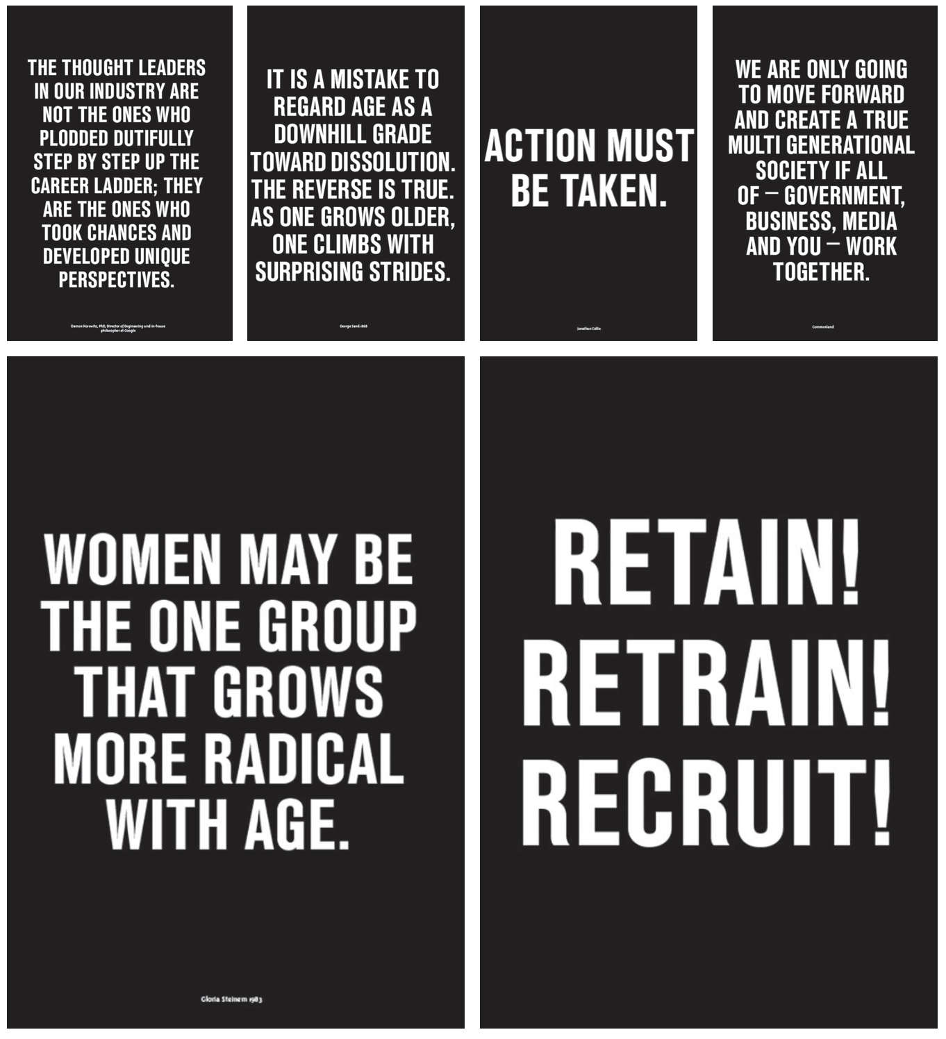
I would be really interested in looking into their project the common room in more detail and also looking a the agism in society.
“The Design Council has developed the ‘Double Diamond’ model to illustrate this. Divided into four distinct phases: Discover, Define, Develop and Deliver, it maps how the design process passes from stages where thinking and possibilities are deliberately as broad as possible to situations where they are narrowed down and channelled into focused distinct objectives.”

Resource Notes:
R1
R2
Resource Summary:
R1
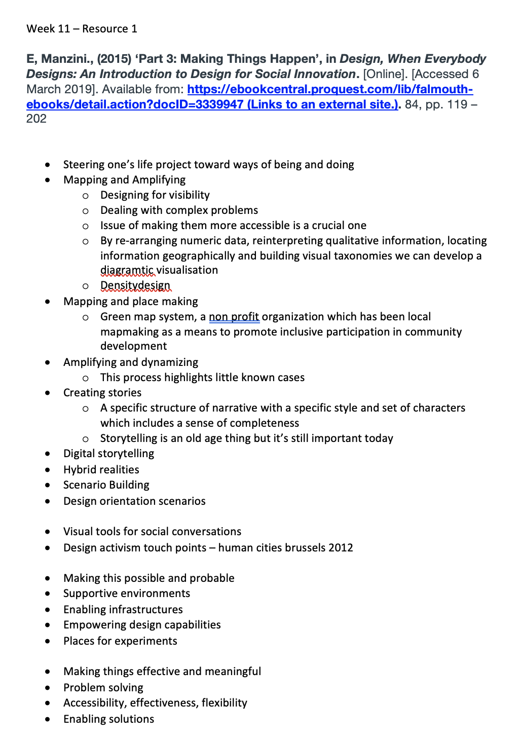
This resource was more about the problem solving, I thought the mapping part was really interesting, I hope to do more research on these:
· Mapping and Amplifying
o Designing for visibility
o Dealing with complex problems
o Issue of making them more accessible is a crucial one
o By re-arranging numeric data, reinterpreting qualitative information, locating information geographically and building visual taxonomies we can develop a diagramtic visualisation
o Density design
· Mapping and place making
o Green map system, a non profit organization which has been local mapmaking as a means to promote inclusive participation in community development
R2
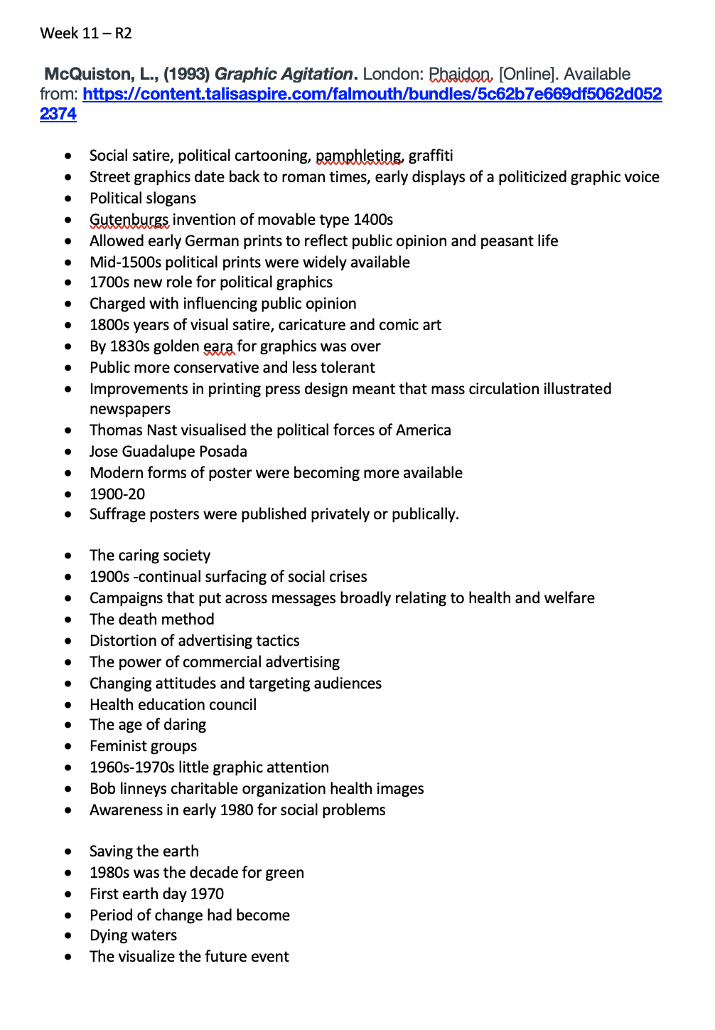
Another interesting resource looking at the graphically use within the political slogans and the advances over the years and the certain campaigns that have gone on throughout the years. There are a lot of terminology and campaigns that I hadn’t heard of before. for example; the age of daring, suffrage posters, the death method and others like the dying water. A lot of them are clearly outlining the social issues in todays world but they seem to be very dark. I am interested in finding out about earth day campaigns as I didn’t realise that this was a thing of the past 50 years. I want to see how this has changed over time.

Research:
Design and Develop
The Common Room
Political Posters
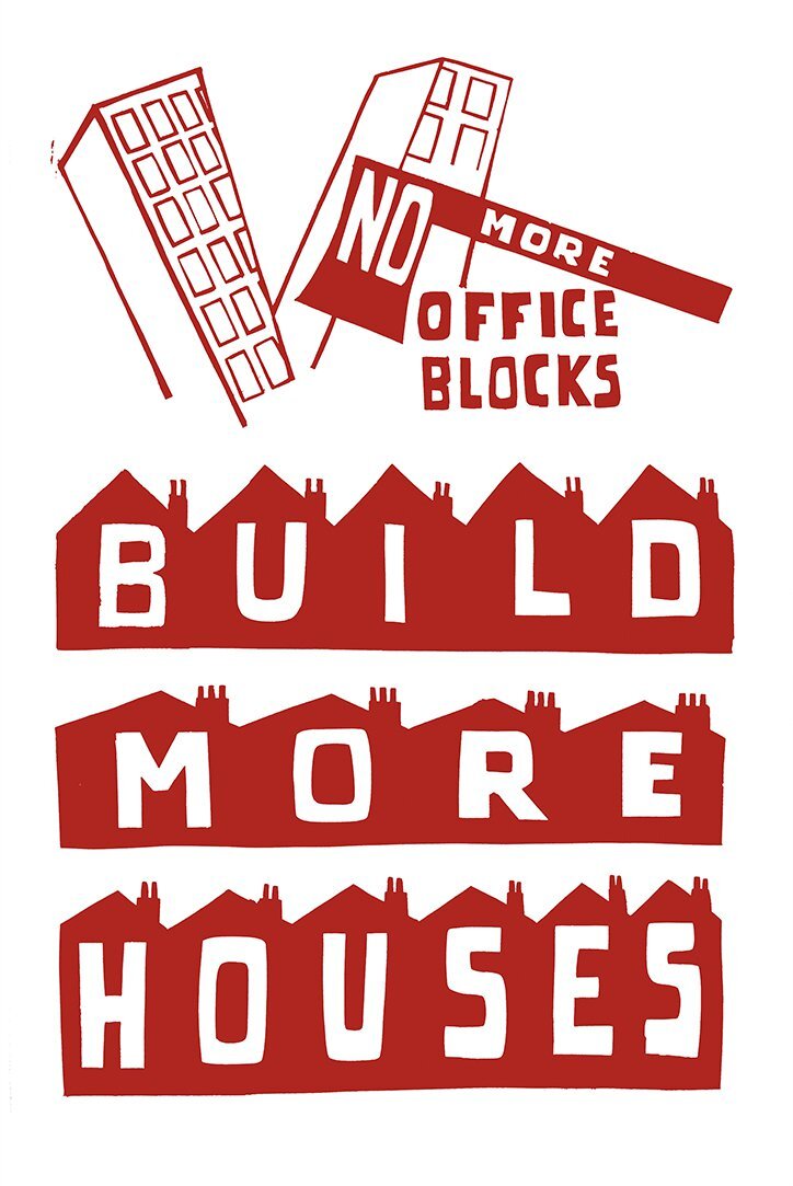
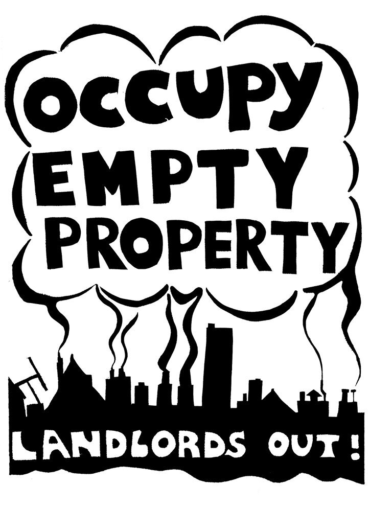
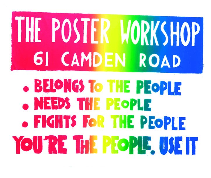
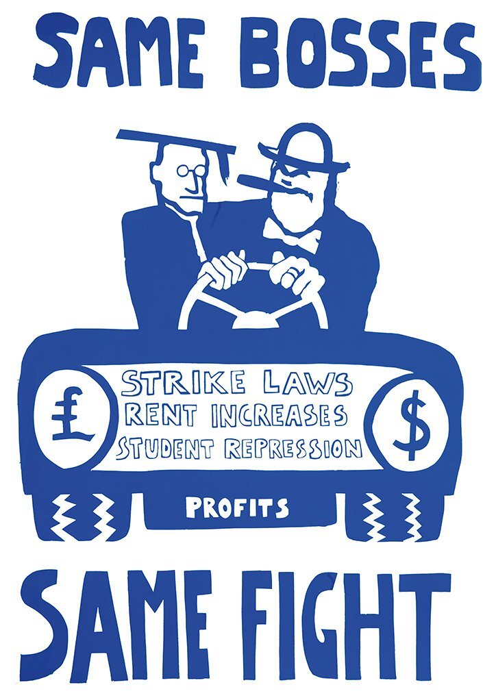
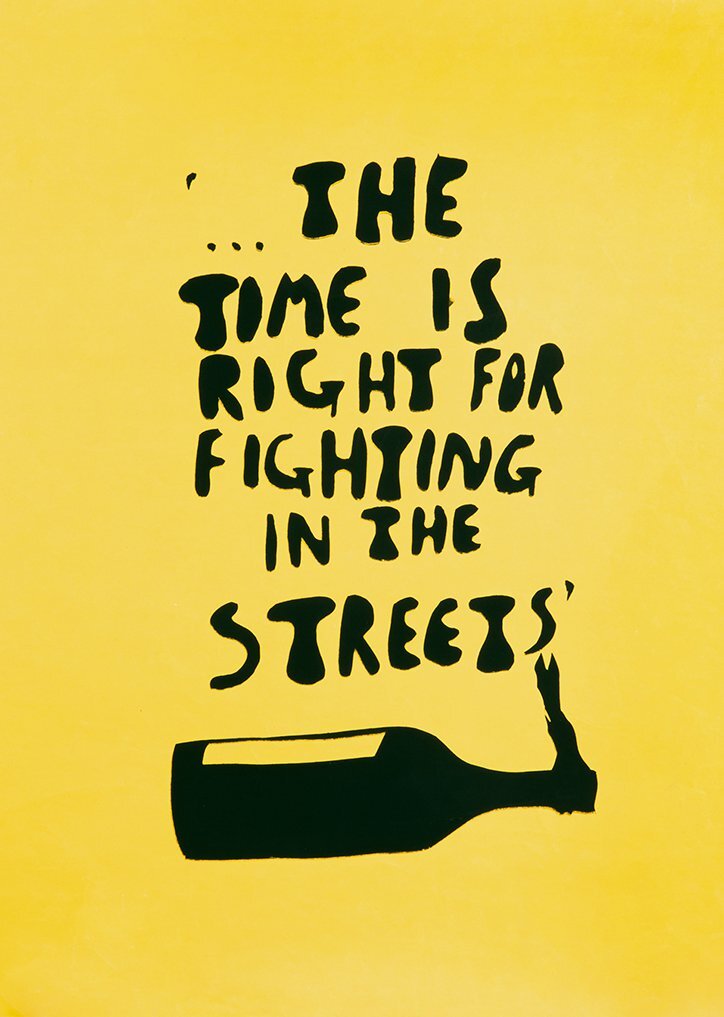
From resource 2, I was really drawn to this caring era within graphics, after doing some research I found an article on Itsnice that, where they have found some of the posters that were created in a poster making workshop in 1968-1971, called Excitement, change and hope. They have edited some of the images to clear them up but these are the result which I was really interested to see. https://www.itsnicethat.com/articles/poster-workshop-1968-1971-four-corners-books-publication-230518 www.fourcornersbooks.co.uk
I love the outcome of these and the simple graphics that were used to create really interesting poster designs.
Researching further into this caring era,
Earth Day
I think everyone knew this day existed, but I never knew it was such a huge thing across the world. I wanted to do more research about the founder of earth day and the history of what it’s become.
The History of earth day:
Earth Day 1970 gave a voice to an emerging public consciousness about the state of our planet
1990 - “This time, Earth Day went global, mobilizing 200 million people in 141 countries and lifting environmental issues onto the world stage. Earth Day 1990 gave a huge boost to recycling efforts worldwide and helped pave the way for the 1992 United Nations Earth Summit in Rio de Janeiro.”
“Earth Day 2010 came at a time of great challenge for the environmental community to combat the cynicism of climate change deniers, well-funded oil lobbyists, reticent politicians, a disinterested public, and a divided environmental community with the collective power of global environmental activism. In the face of these challenges, Earth Day prevailed and EARTHDAY.ORG reestablished Earth Day as a major moment for global action for the environment.
Over the decades, EARTHDAY.ORG has brought hundreds of millions of people into the environmental movement, creating opportunities for civic engagement and volunteerism in 193 countries. Earth Day engages more than 1 billion people every year and has become a major stepping stone along the pathway of engagement around the protection of the planet. “
“Today, Earth Day is widely recognized as the largest secular observance in the world, marked by more than a billion people every year as a day of action to change human behavior and create global, national and local policy changes.
Now, the fight for a clean environment continues with increasing urgency, as the ravages of climate change become more and more apparent every day.
As the awareness of our climate crisis grows, so does civil society mobilization, which is reaching a fever pitch across the globe today. Disillusioned by the low level of ambition following the adoption of the Paris Agreement in 2015 and frustrated with international environmental lethargy, citizens of the world are rising up to demand far greater action for our planet and its people. “
The below film, is about the founder of earth day with some really moving imagery as to why we are should take part in earth day, not just for the day but for the rest of the 365 days that follow.
Since earth day has grown each year, every year there are new political posters and movements that come with the biggest environmental campaign in the world. Last year earth day, there was an article on creative boom which really stood out for me in terms of poster graphics showing the climate change issues. The following are some of the ones that really stood out to me; https://www.creativeboom.com/inspiration/mate-act-now-designers-from-all-over-the-world-join-in-a-climate-change-poster-protest/

Tina Touli

Josie Young

Christopher Doyle
Density Design
D&AD ‘creativity for good’
After watching this weeks workshop video on the shared space, I went on to D&AD to research some of their creativity for good campaigns. These are a couple that I thought I could relate to the topic of my project.
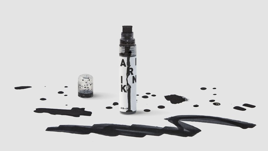
Air Ink
https://www.dandad.org/awards/professional/2017/creativity-for-good/25712/air-ink/
“Air pollution is a global problem. In Asia, it impacts Tiger Beer every day. In fact, 62% of Tiger sales come from exposed street venues. As a proud supporter of street culture and sustainability, Tiger had a bold idea: use the problem to fight the problem. Introducing Air-Ink, the first ink made from air pollution. Devices were developed to capture soot from vehicle exhausts. This was turned into safe, high-quality ink. Air-Ink pens and markers were sent to street artists around the world. To date, 770L of Air-Ink has been made, preventing over 20,000hrs of CO2 entering the air.”

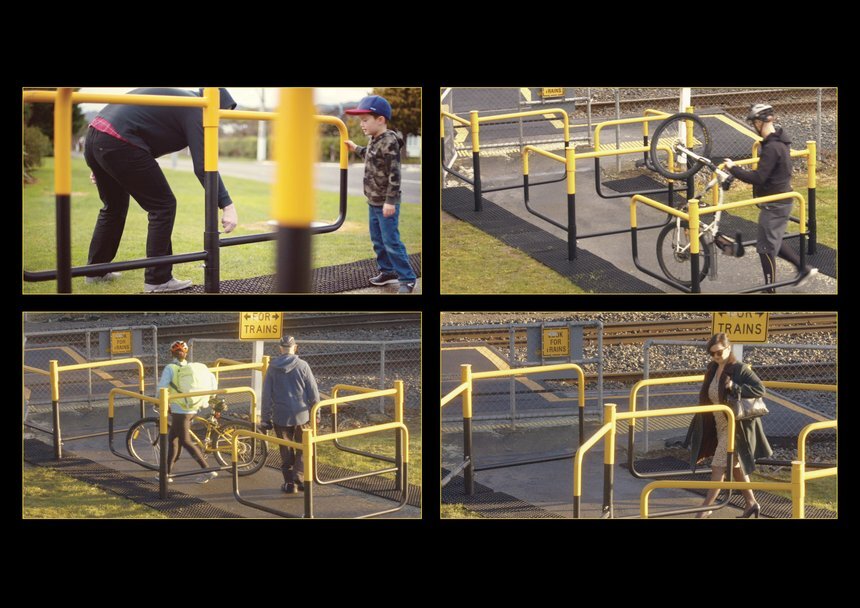
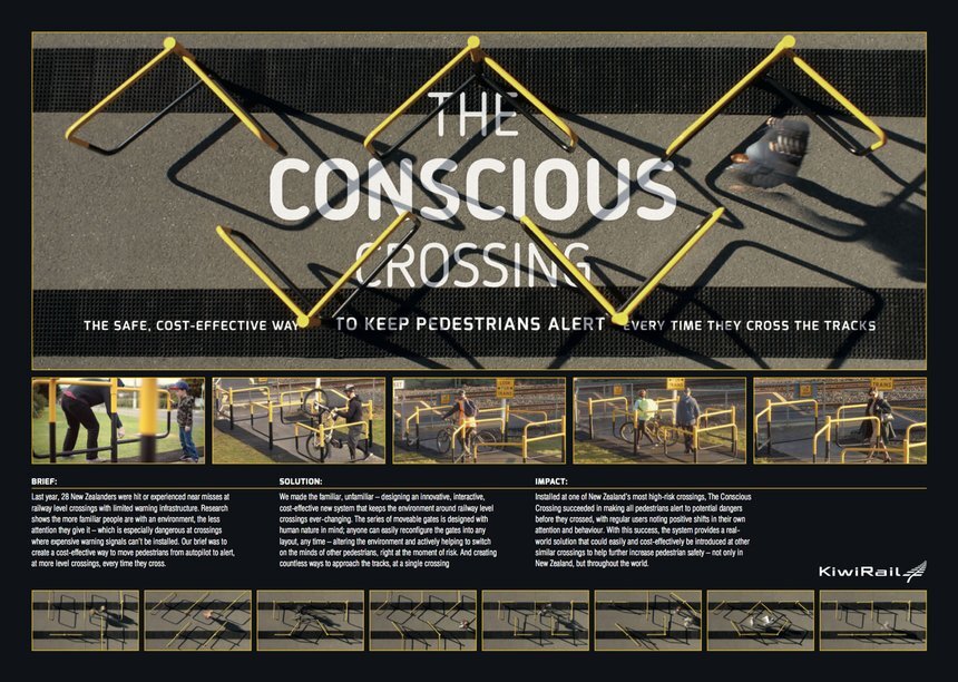
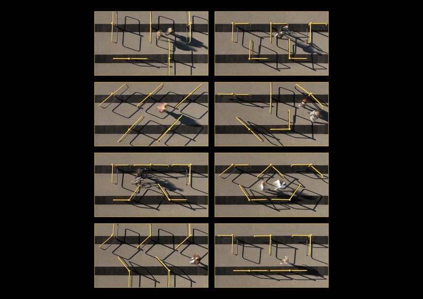
Conscious Crossing
https://www.dandad.org/awards/professional/2017/creativity-for-good/25788/the-conscious-crossing/
“The more often pedestrians use the same rail crossing, the more likely they are to become complacent and walk onto the tracks without checking, particularly at crossings where expensive warning systems can’t be installed. The Conscious Crossing interrupts this over-familiarity by continually changing the crossing environment. The cost-effective set of gates can be reconfigured an infinite number of times, forcing pedestrians into the moment every time they cross. Designed with human nature in mind, anyone can change it into any layout, any time, actively helping to keep others safe.”
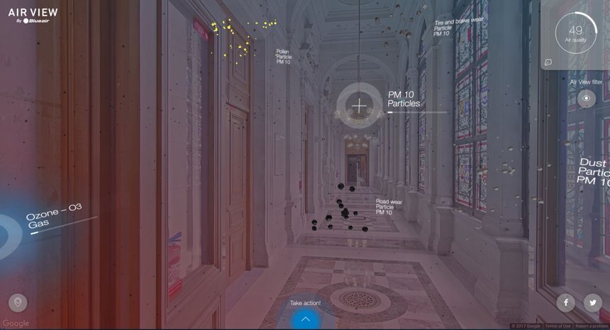
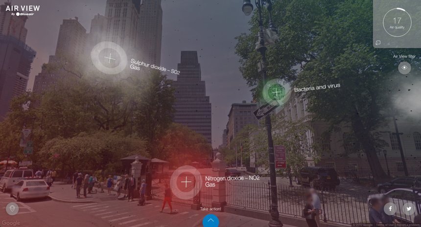
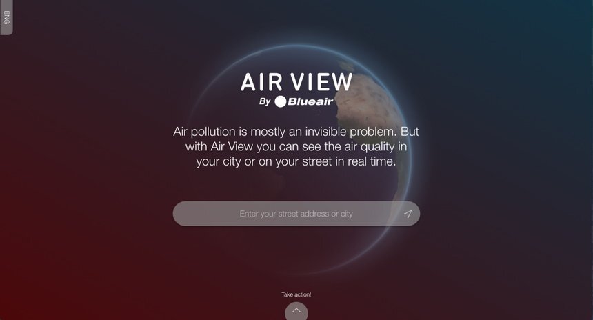
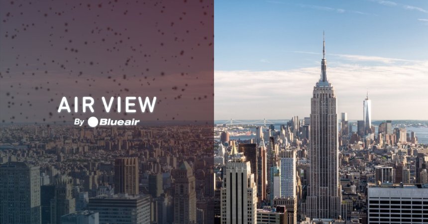
Air View
https://www.dandad.org/awards/professional/2017/creativity-for-good/25715/air-view/
“Nine out of 10 people breathe polluted air. Yet few know that air pollution is the single biggest environmental threat to human health, according to the World Health Organisation. Air pollution is also mostly an invisible threat. Blueair asked us to help raise global awareness of this invisible problem which causes millions of premature deaths every year. We wanted the project to be accessible, engaging and free of charge, in order to reach as many people as possible.
Solution & Cultural Context:
We created the free digital service ‘Air View’ to increase knowledge about the hazardous particles in the air we breathe. Developed with digital agency Rodolfo, Air View connects global air quality data to Google Street View, allowing users to ‘see’ the particles in the air they are breathing, wherever they are, in real time. Based on our quantitative and qualitative research, Air View is factual and non-emotional in design and content to respect cultural differences and avoid scare-mongering.
Impact:
Today, real time air pollution data is accessible to everyone in the world, for free. 100,000 people used Air View in the first month, with the average user spending more than two minutes on the site and searching for more than one address. Key opinion leaders, including the Swedish Environmental Protection Agency, are now promoting Air View for its informative content. Already, Air View has been translated into French, German, Chinese, and Swedish, so expanding the global clean air movement.”
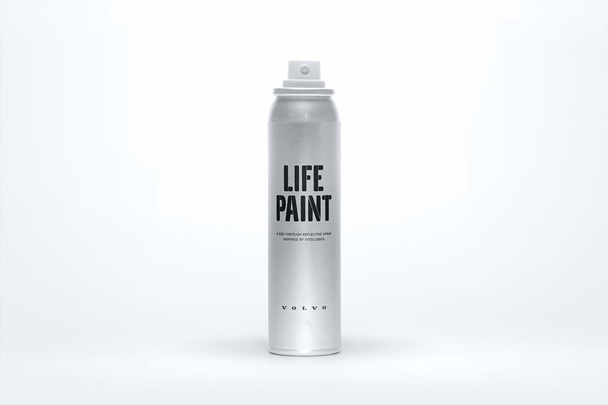
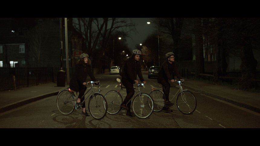
Life Paint
https://www.dandad.org/awards/professional/2016/creativity-for-good-white-pencil/25057/lifepaint/
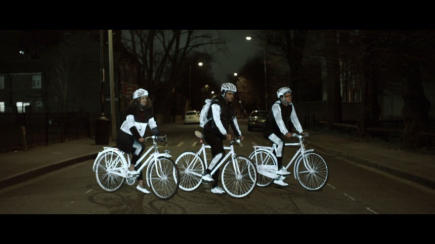
“Every year +19,000 cyclists are seriously injured on UK roads. Cycle safety is an issue that the media and consumers care deeply about. We launched Volvo LifePaint - a unique spray paint turning ordinary objects into high visibility safety gear - invisible in daylight but which stands out in headlights at night. Six launches at London’s most influential cycling stores saw the first 2000 free cans gone in hours. We achieved 130m+ impressions on Twitter within 20 days, with 188m+ in total across 156 countries. LifePaint now has its own Volvo parts number and is available in dealerships worldwide”
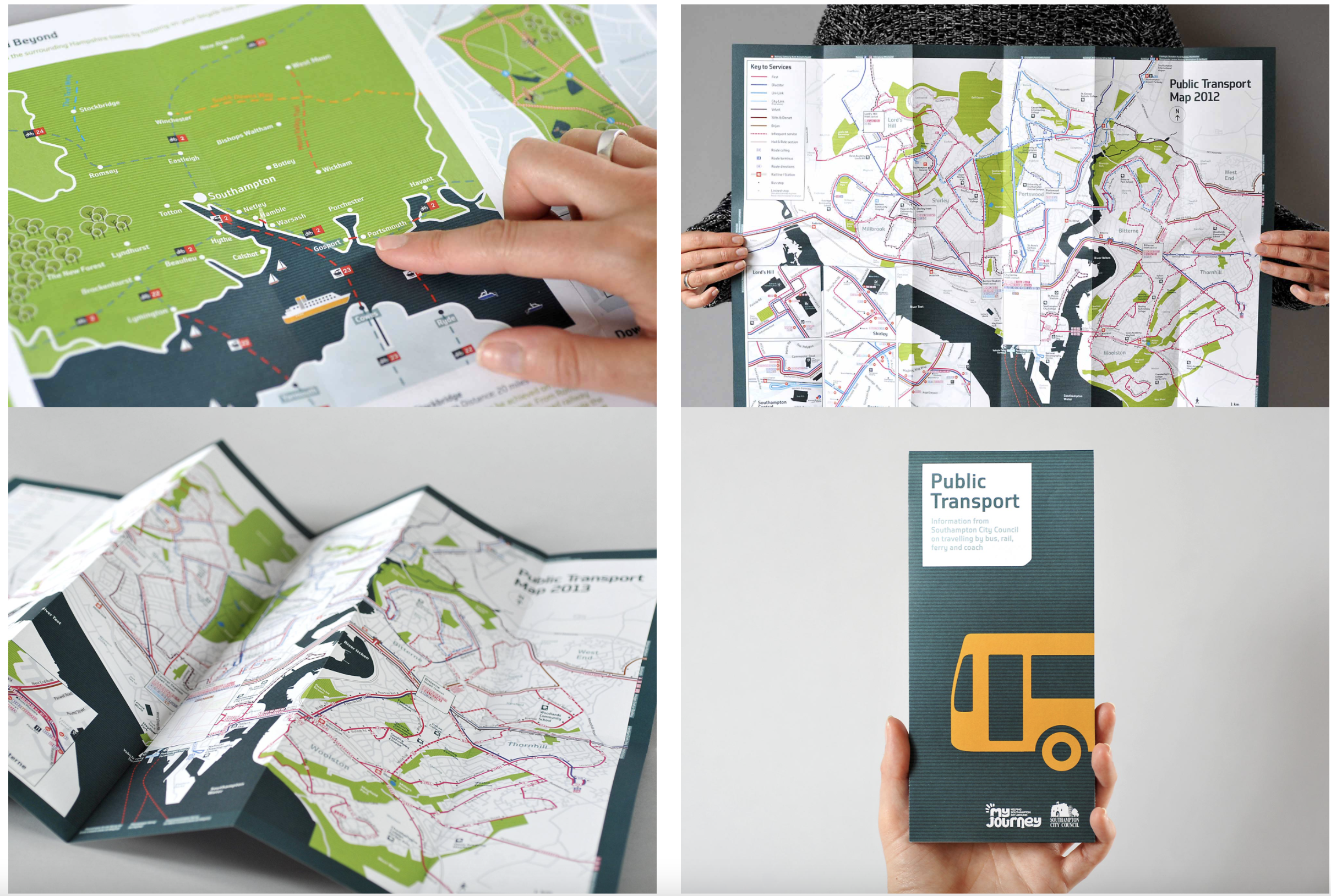
WalkRide
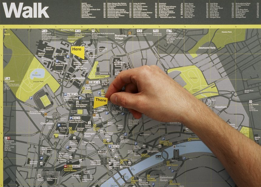
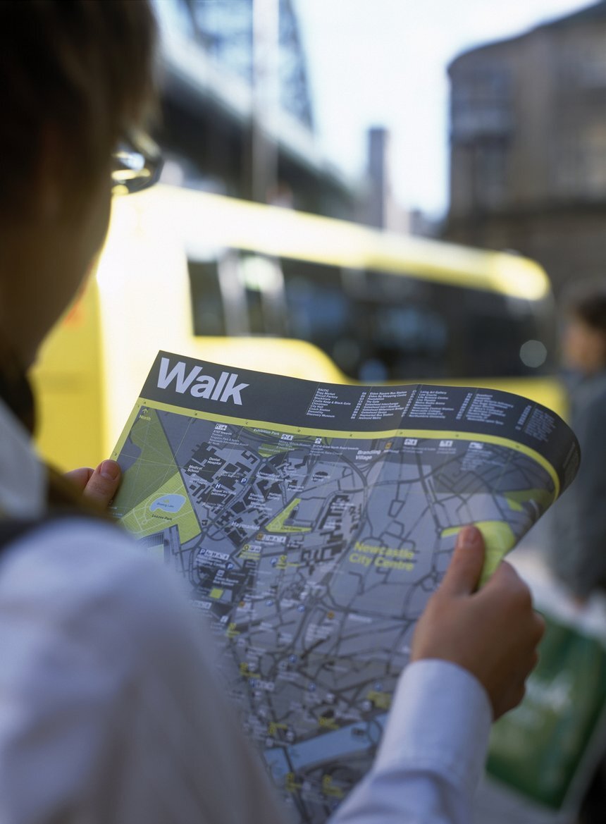
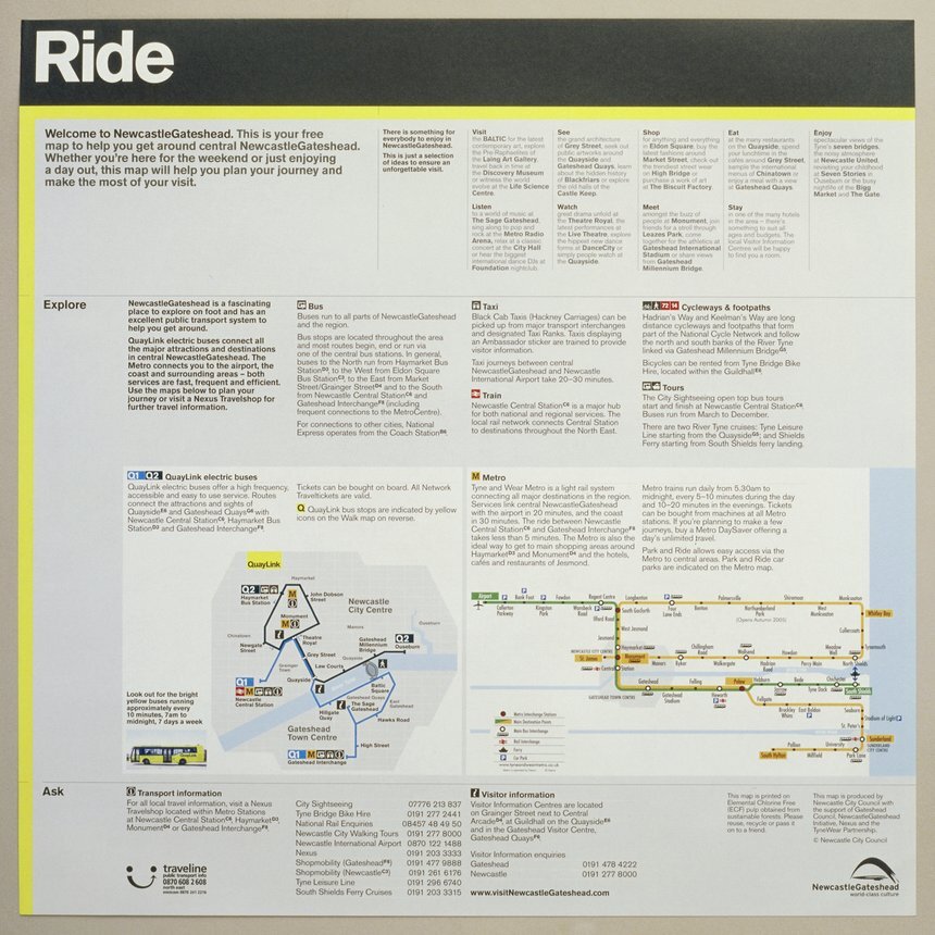
“‘WalkRide’ is an information and movement identity for Newcastle/Gateshead that seamlessly combines information for both pedestrians and public transport users in the city. The first phase of the project has just been completed. It includes the livery and all related information for a new city centre electric bus system - QuayLink - and a new WalkRide city centre map for pedestrians. Cartlidge Levene were commissioned to develop a new map for the city to be distributed by the local Visitor Information Centres. For the pedestrian 'Walk' map, careful editing of information and a simple typographic hierarchy provides a balance between richness and legibility that help make it approachable and friendly. Illustrated landmarks are used as engaging elements to draw the user in. On the reverse 'Ride' side of the map, transport information is presented in a clear, simple manner to make the information as useful and digestible as possible. 'Here' and 'There' stickers were produced as a tool for use by the Visitor Information Centre staff to point out destinations and routes to visitors.’
Wayfinding Projects
Since deciding that my outcome this week was going to be a way finding outcome, I wanted to research into how other countries had tackled way finding within their city and in other places. These are a couple examples which really stood out for me, graphically.
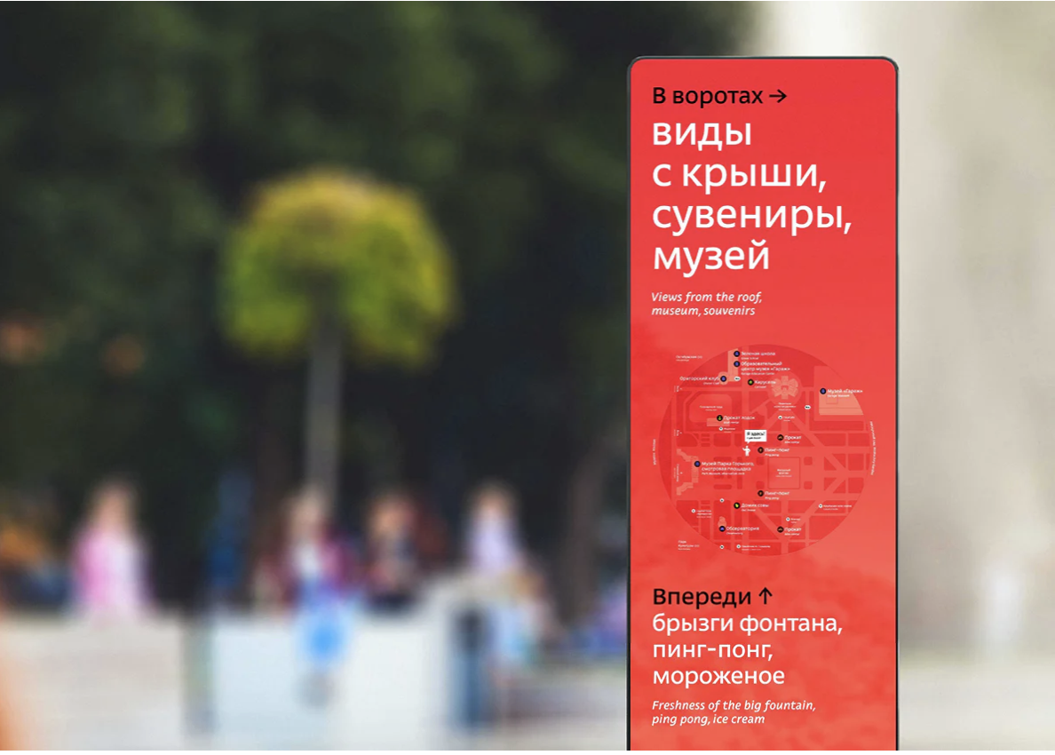
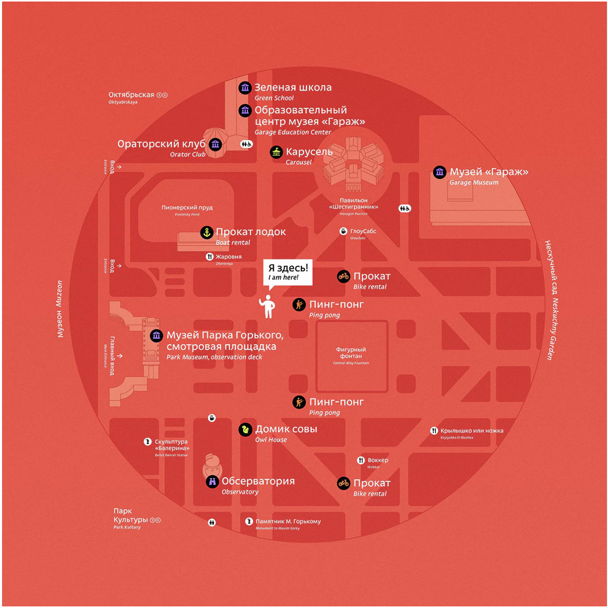
Moscow
https://www.creativereview.co.uk/wayfinding-moscow-gorky-park/
“Although wayfinding systems must be practical first and foremost, there is no reason why navigation can’t be both fun and functional. This principle is well executed in the new wayfinding at Gorky Park, which sits useful information like directions and public transport connections alongside more human touches like showing the “emotional zones” of the park, where the symbols indicating various attractions have a more playful feel than the rigid form of many traditional pictograms.”
BeeLine
https://www.creativereview.co.uk/design-museum-designs-of-the-year-2016-nominees/
“Three of this year’s four transport projects are cycling related. BeeLine is a GPS navigation tool for cyclists that points readers towards their destination, rather than offering turn by turn instructions:”

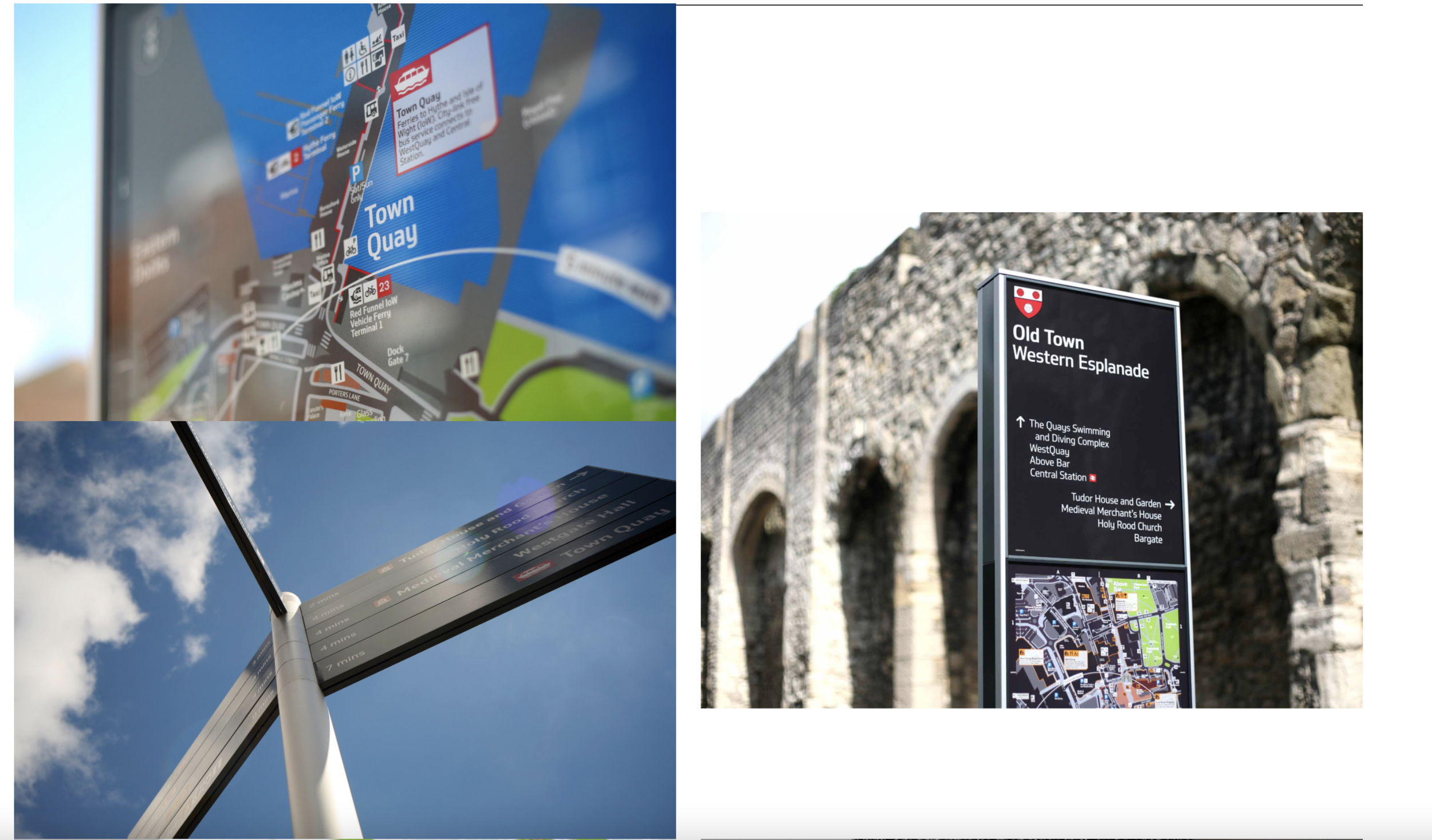
Southampton Legible City
https://www.maynard-design.com/project/southampton-legible-city/
“We integrated our product and graphic design capabilities and combined these with our strong supplier relationships. This allowed us to take a holistic approach to the design of the signage components. We created a visually coherent graphic system, unifying the various transport providers under one identity. We delivered a comprehensive guideline document for the application of the graphic strategy to bus stop infrastructure, marketing material (leaflets, posters, website, mobile app), and bus liveries.”
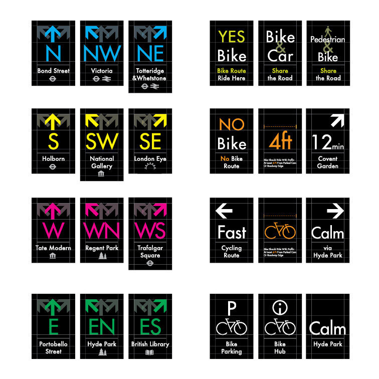
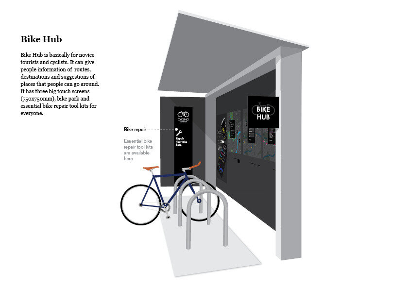
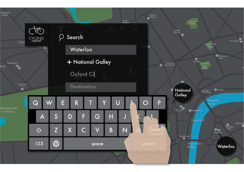
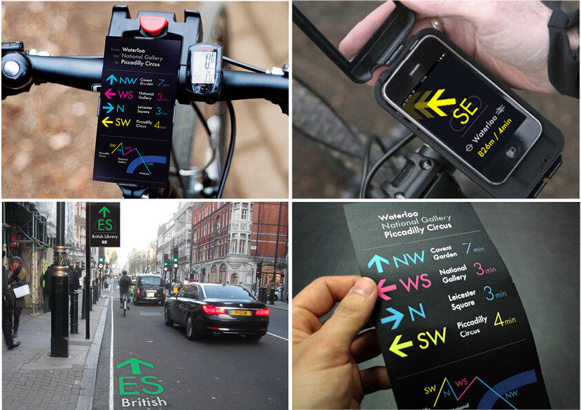
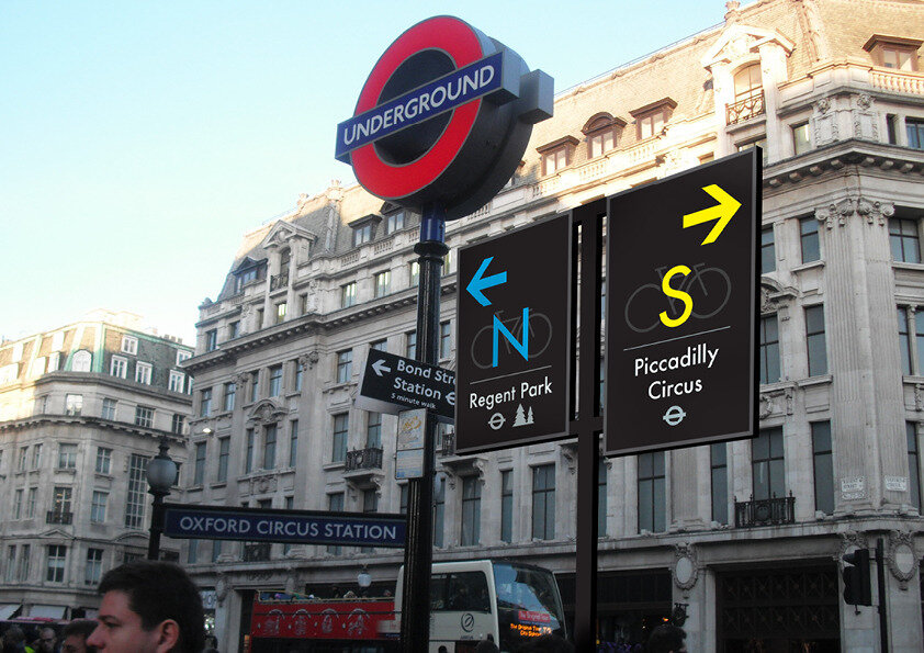
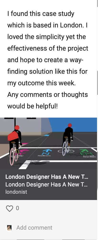
London Cycle Wayfinding
https://londonist.com/2012/01/london-designer-has-a-new-take-on-cycle-wayfinding
“Jun Kwon, a Graphic Design Student at Ravebsborne College, decided to tackle this problem for his submission to the International Society of Typographic Designers 2011 awards. His creation, Cycling Cities, is an attempt at a clean-slate approach for cycling signage — and we love it. Catering to our simple minds, Jun proposes to use a combination of landmarks, tube stations and compass direction to keep people on track.
Jun, who's from Korea, said "I am... still not very good at wayfinding in London. Even worse thing was, rather many times, I fall myself into some very dangerous moments as I was cycling, so as a graphic designer I really wanted to solve this problem in a new way that can be interpreted by international people."
His research found that people build a mental map as they cycle, and his solution builds on this natural 'waypoint' technique of navigation. He combined this with the 12 direction codes from the compass to create a flexible standard.”
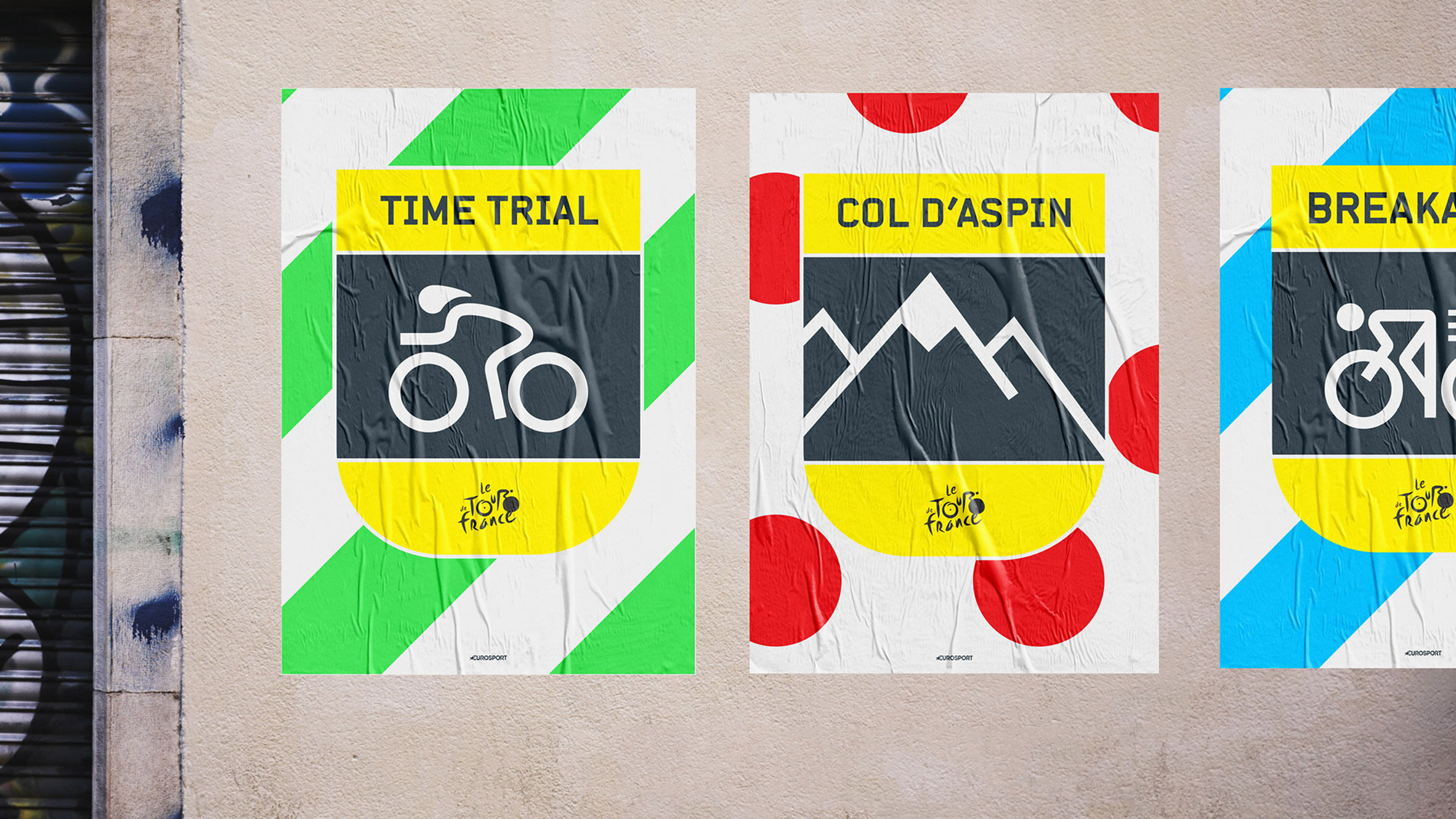
Fw.d Design
Dixon Baxi
“Road markings, race jerseys and crests informed the new visual identityfor Eurosport's cycling coverage, designed by creative agency DixonBaxi.The Home of Cycling branding will be used across Eurosport's digital and television platforms for all cycling events, including the three Grand Tours: Tour de France, Giro d'Italia and Vuelta a España. It covers 2,500 hours of live cycling across 200 days.”
City Of Adelaide
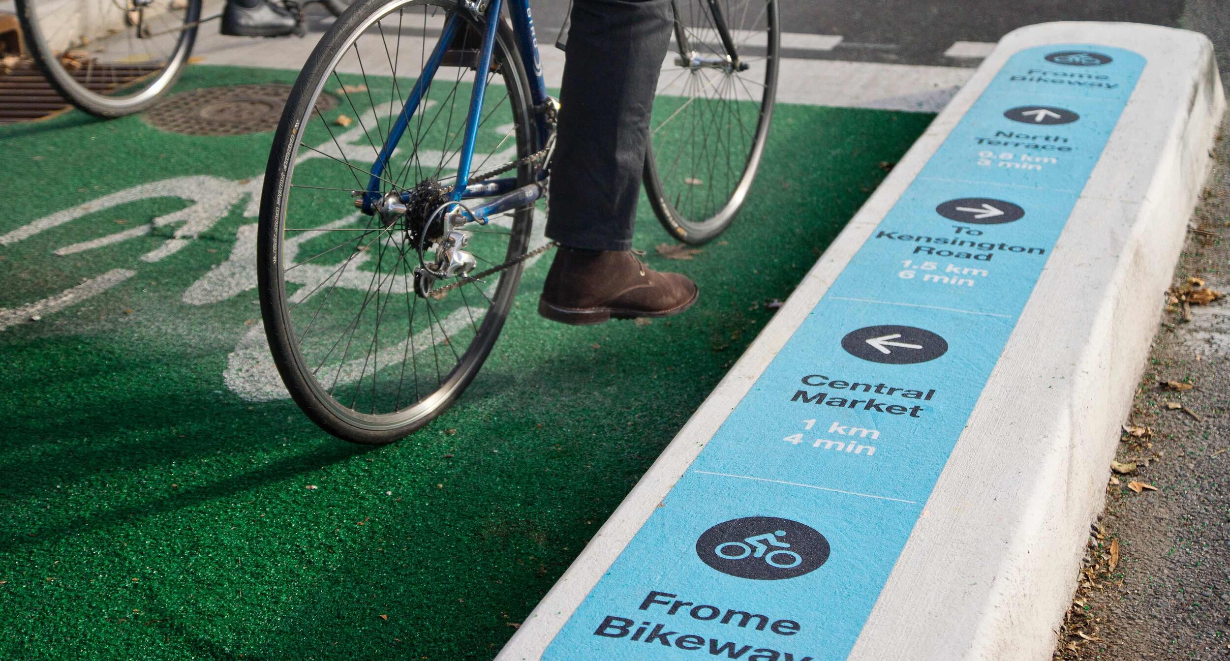
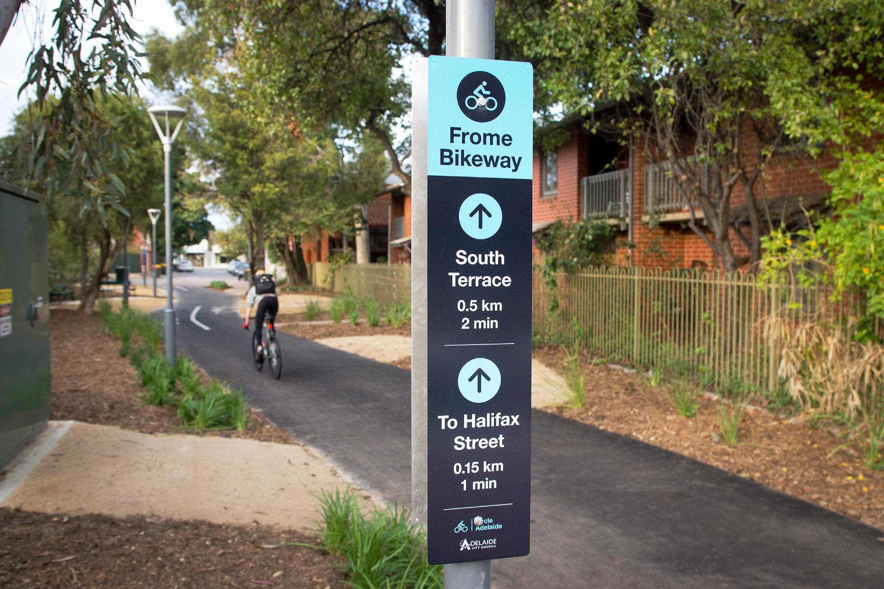
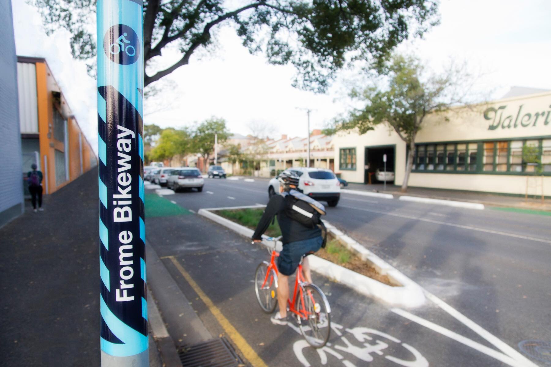
https://www.studiobinocular.com/projects/adelaide-city-cycle-wayfinding/
“As an extension of the pedestrian and cycling wayfinding strategy, Studio Binocular through A to B Wayfinding were engaged to develop a ‘Ride Adelaide’ pilot program. This system was specifically designed for cyclists on Adelaide City’s new bike priority route – the Frome Street Bikeway. The Bikeway is part of Council’s aim to increase the number of people riding a bike by improving the quality and safety of bike infrastructure across the City. It is aligned with one of the City of Adelaide’s goal to double the number of people riding a bike in the City by 2022.’
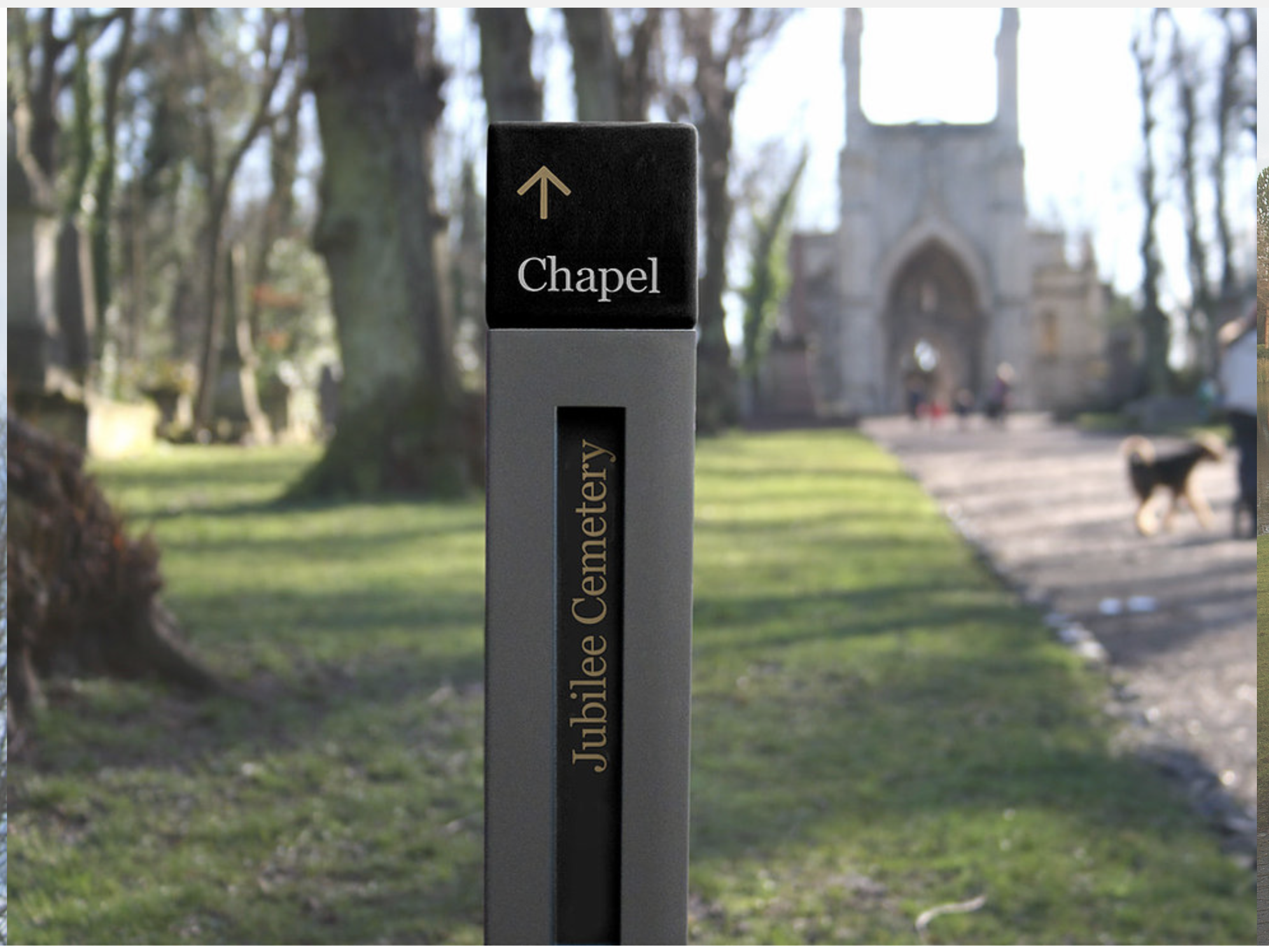
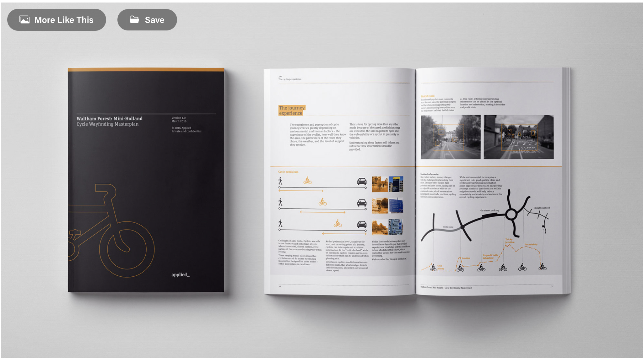
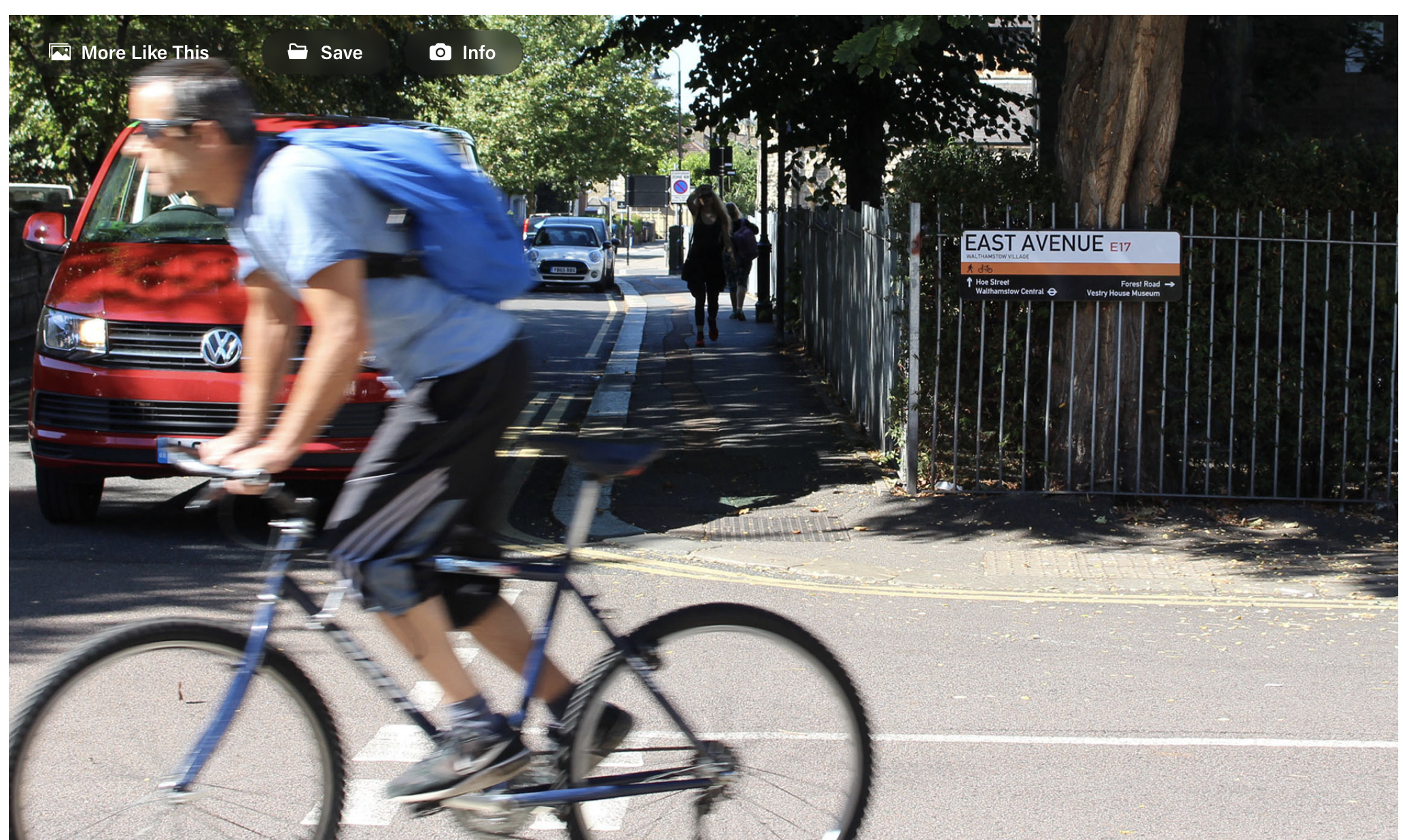
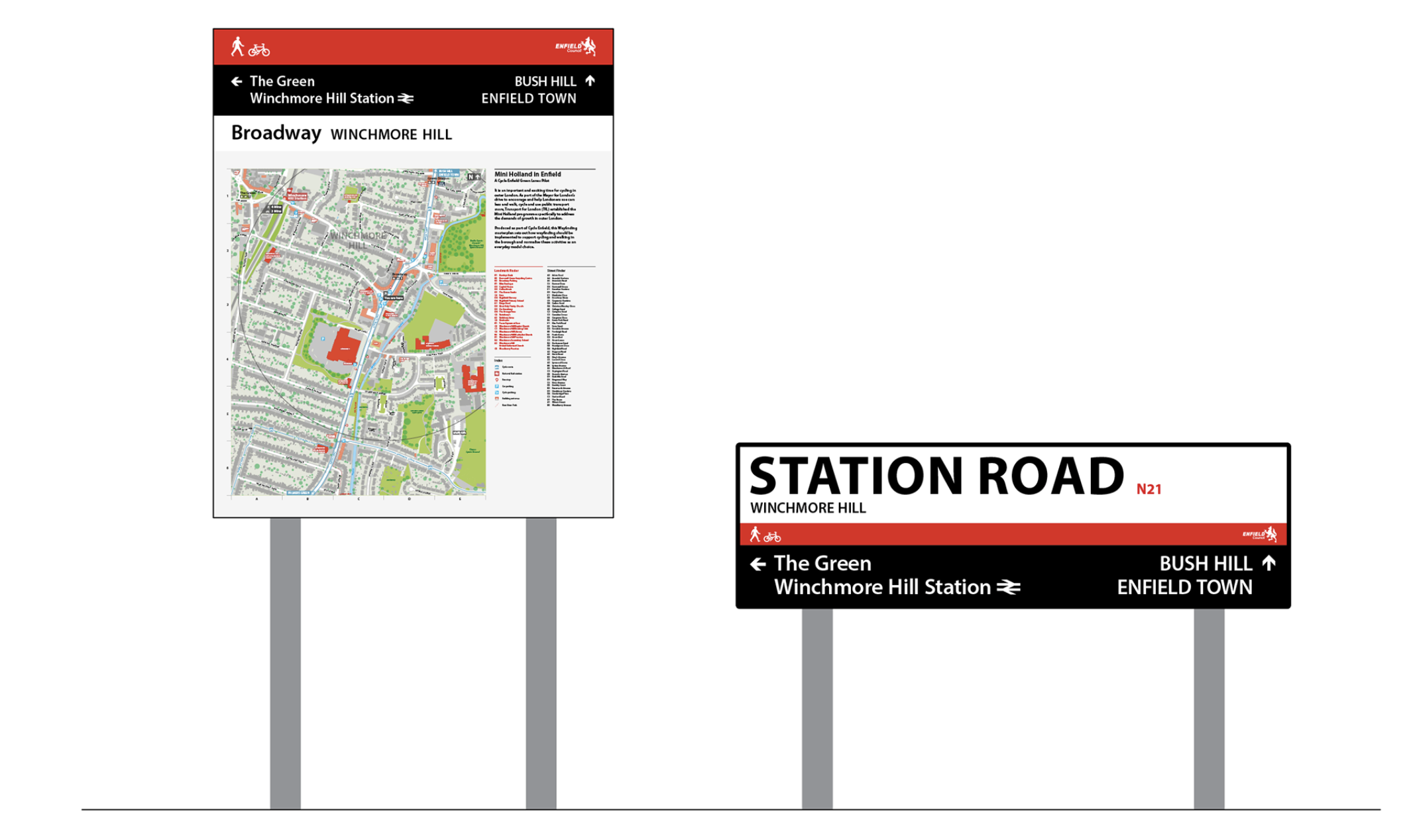
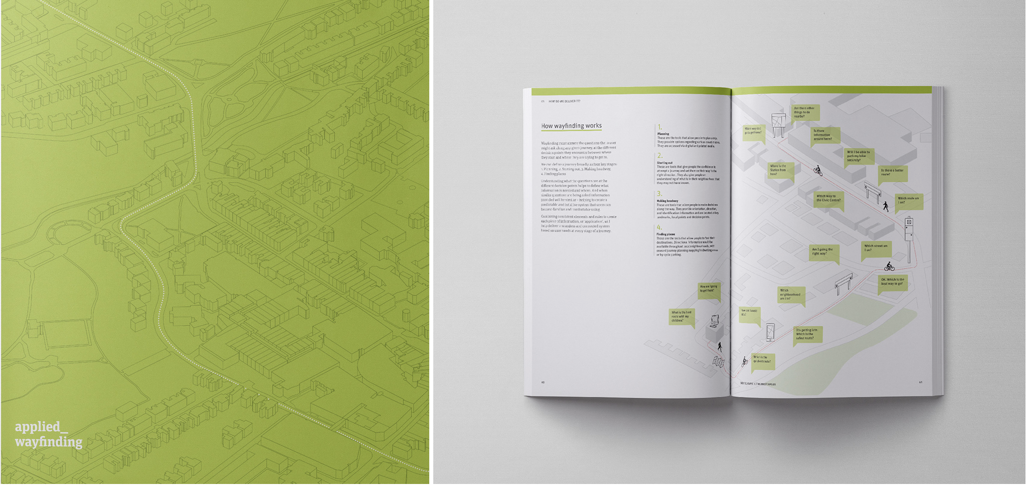
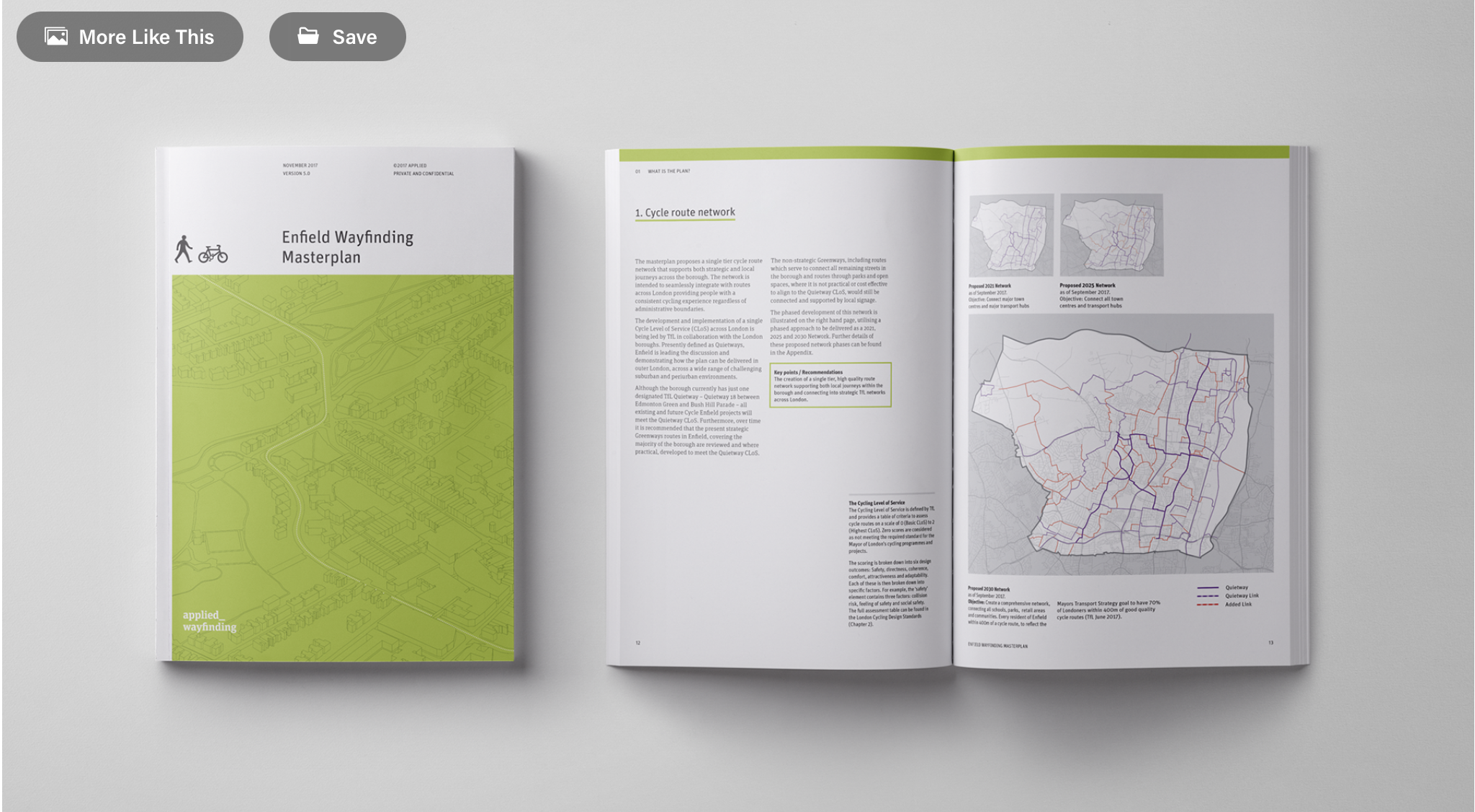
Cycle Wayfinding Plan
https://www.behance.net/gallery/70896087/London-Cycle-Wayfinding
“As part of Transport for London's Mini-Holland projects we were approached to work with two London boroughs – Waltham Forest and Enfield – to help develop their cycle networks, wayfinding and create a more positive experience for cyclists and pedestrians in London's outer boroughs.
We tried to think about the cycling experience throughout the city and what interventions can be introduced to support more enjoyable, seamless journeys.
I was involved from the start of both projects, doing on the ground research, interviews and presenting our findings. I created concept designs for signage and mapping and folded these into editorial designs for the Masterplan documents along with diagrams and illustrations to explain our findings.”
Workshop:
How can intercultural insists and differences contribute to the design development of a project?
Option 2: Conclude your own service design project, which you outlined over the last two weeks.
Changing my question:
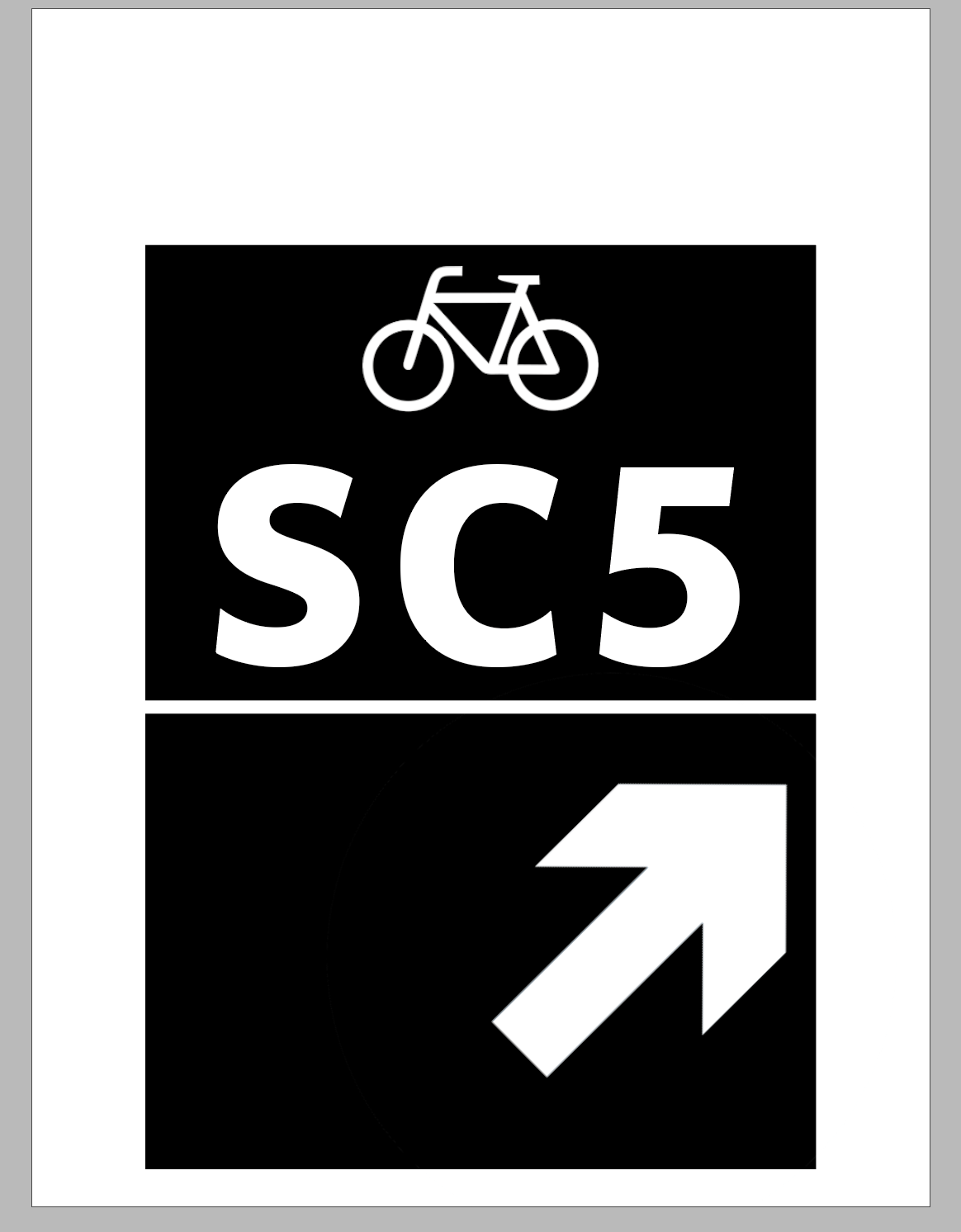
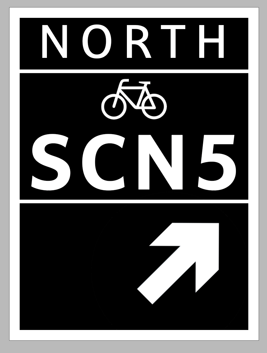
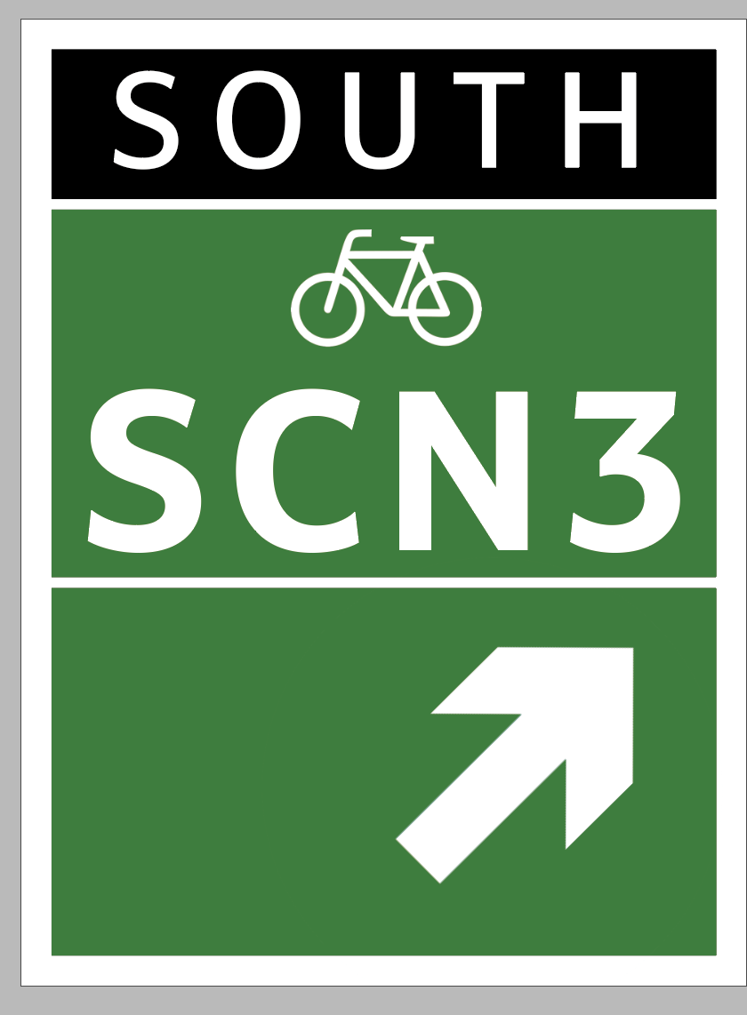
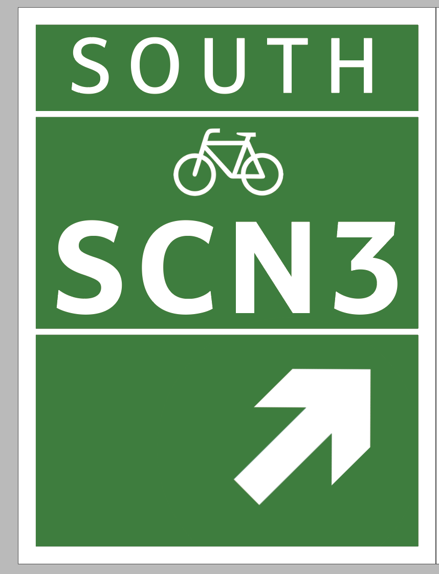
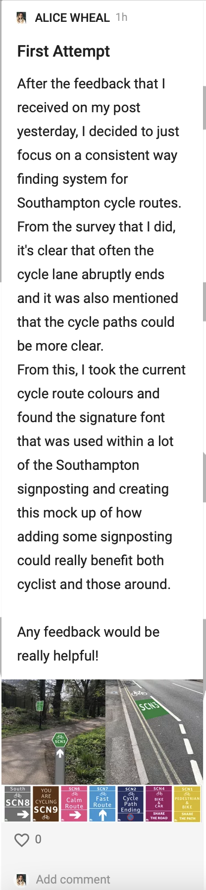
How can a design system improve cycling routes in Southampton?
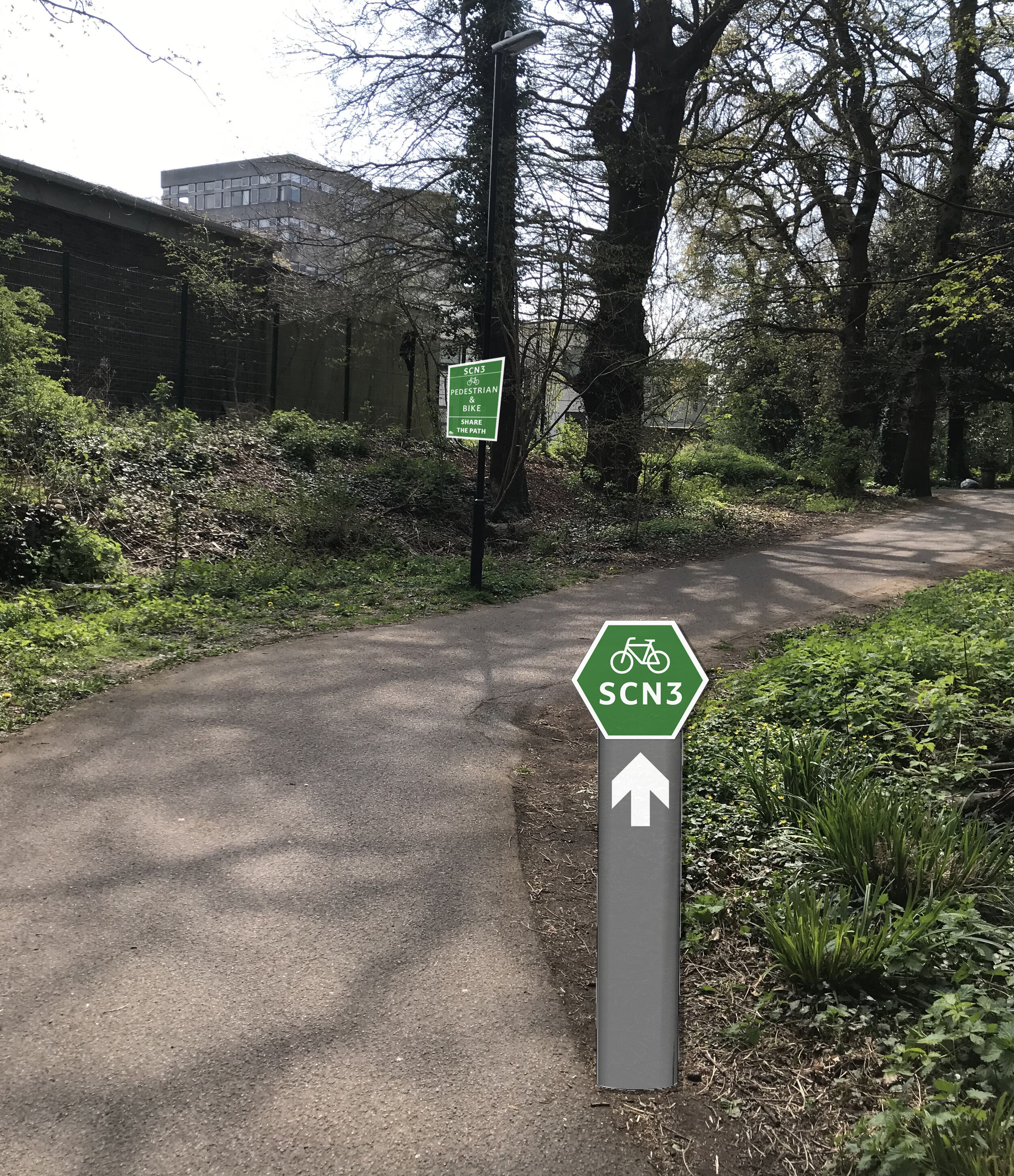
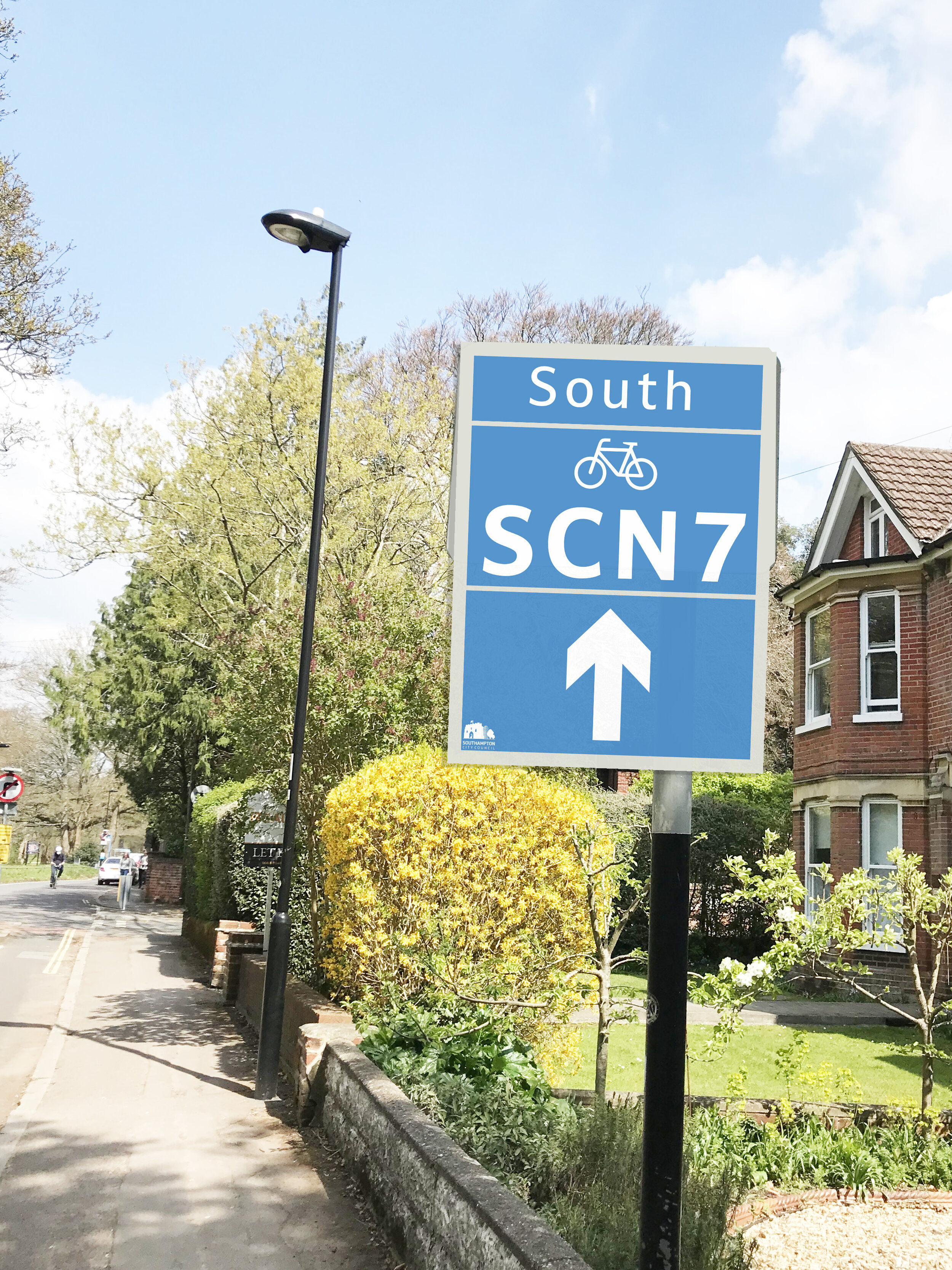
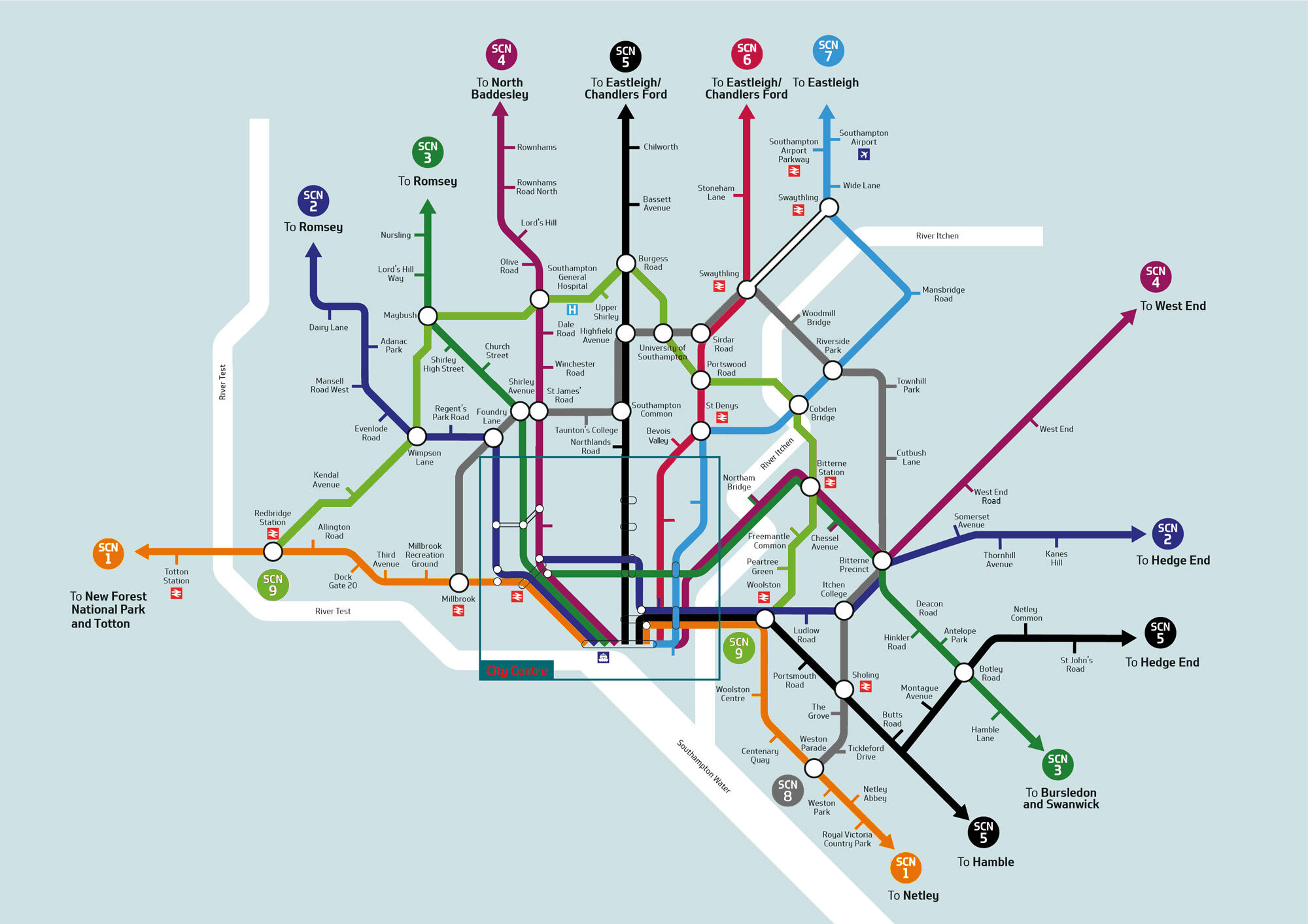
The first challenge for this week was talking imagery of the existing way finding within Southampton if there was any at all. I did this by walking SCN5 cycle route backwards. There is some map systems in place within the centre of Southampton but still no clear routes identified.

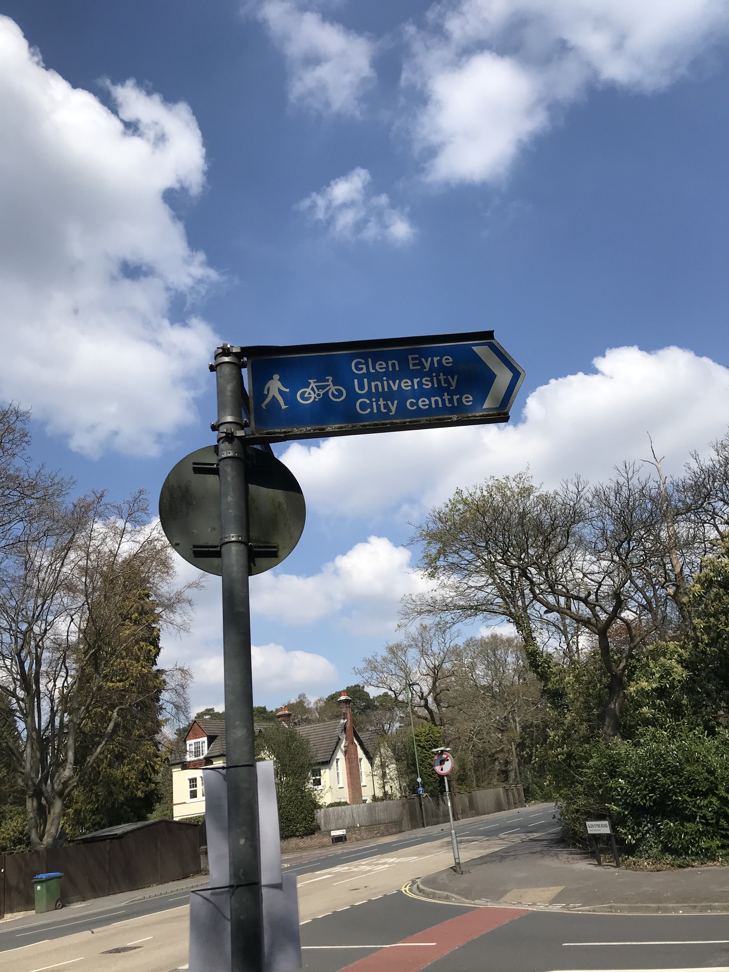
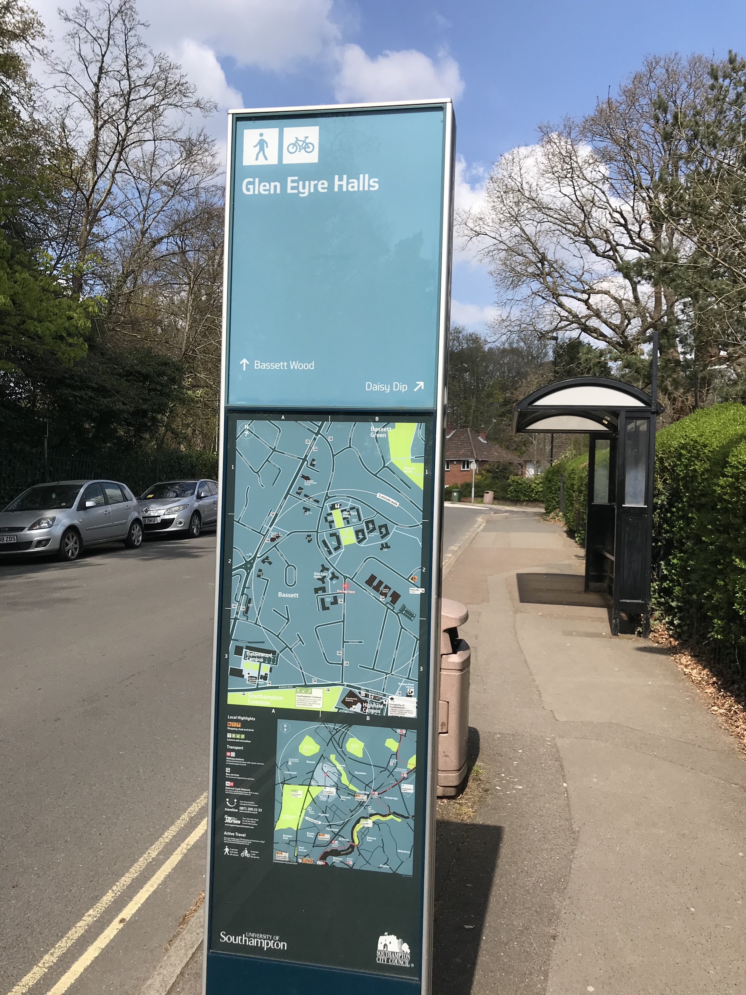
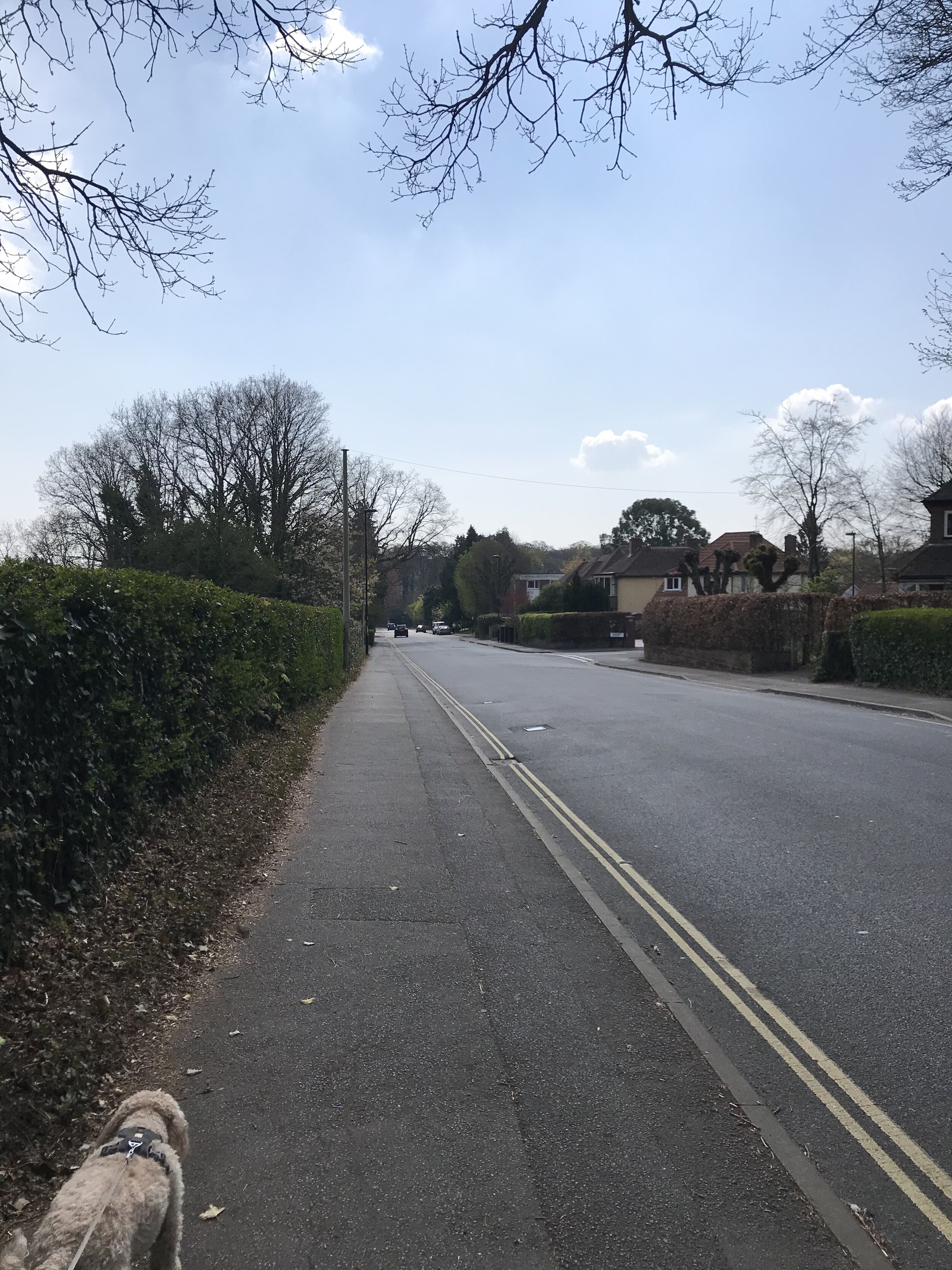
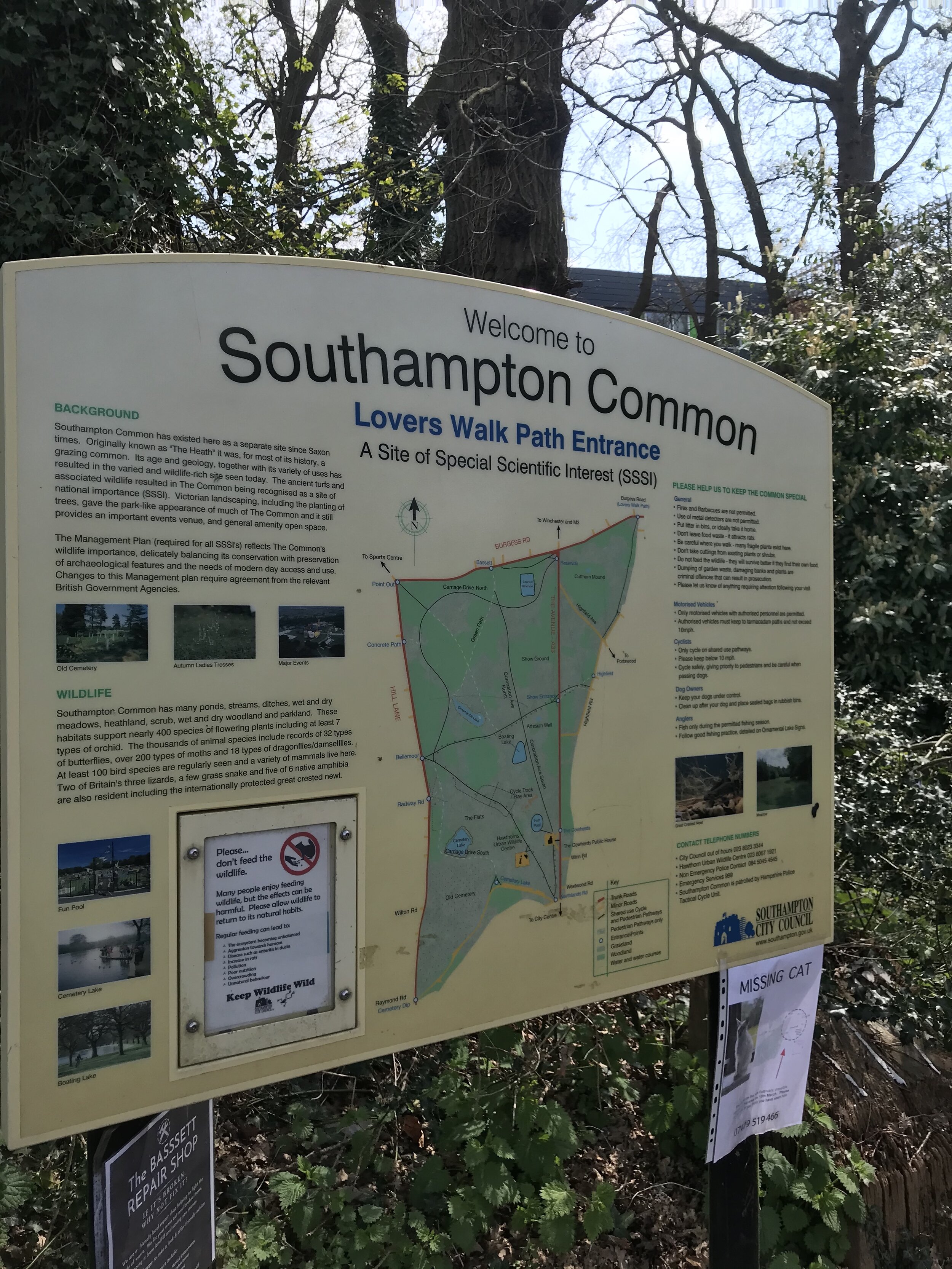
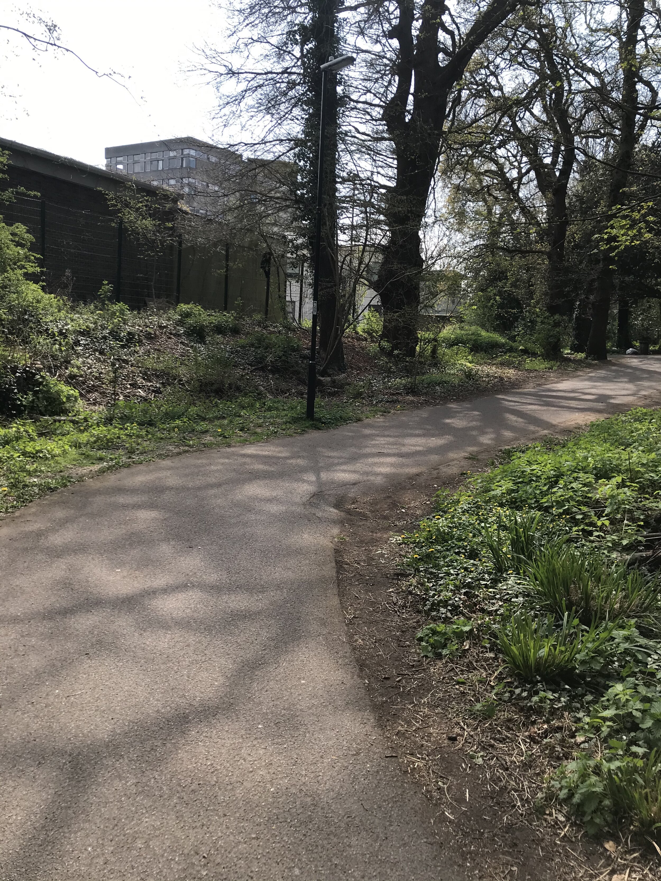
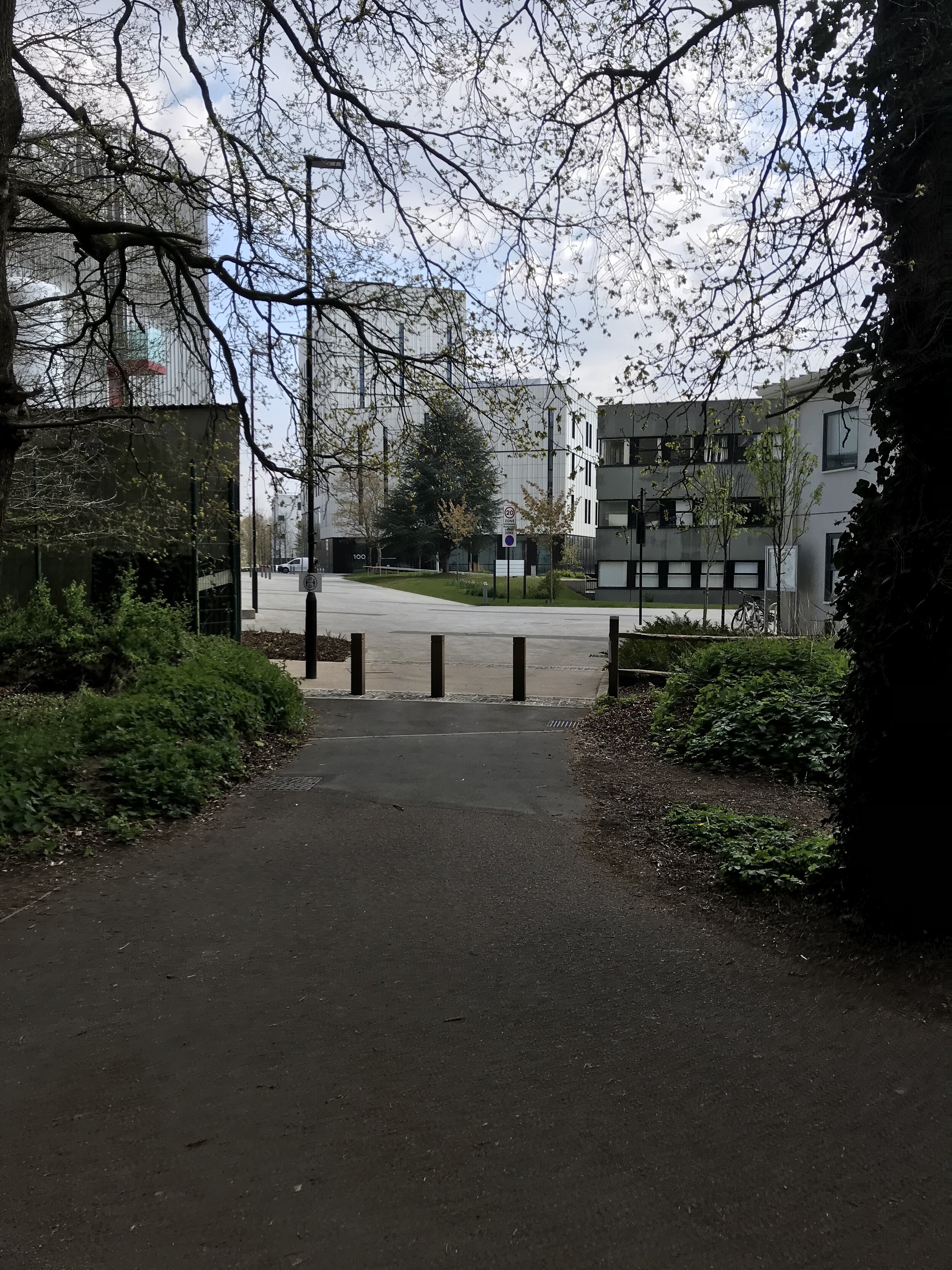
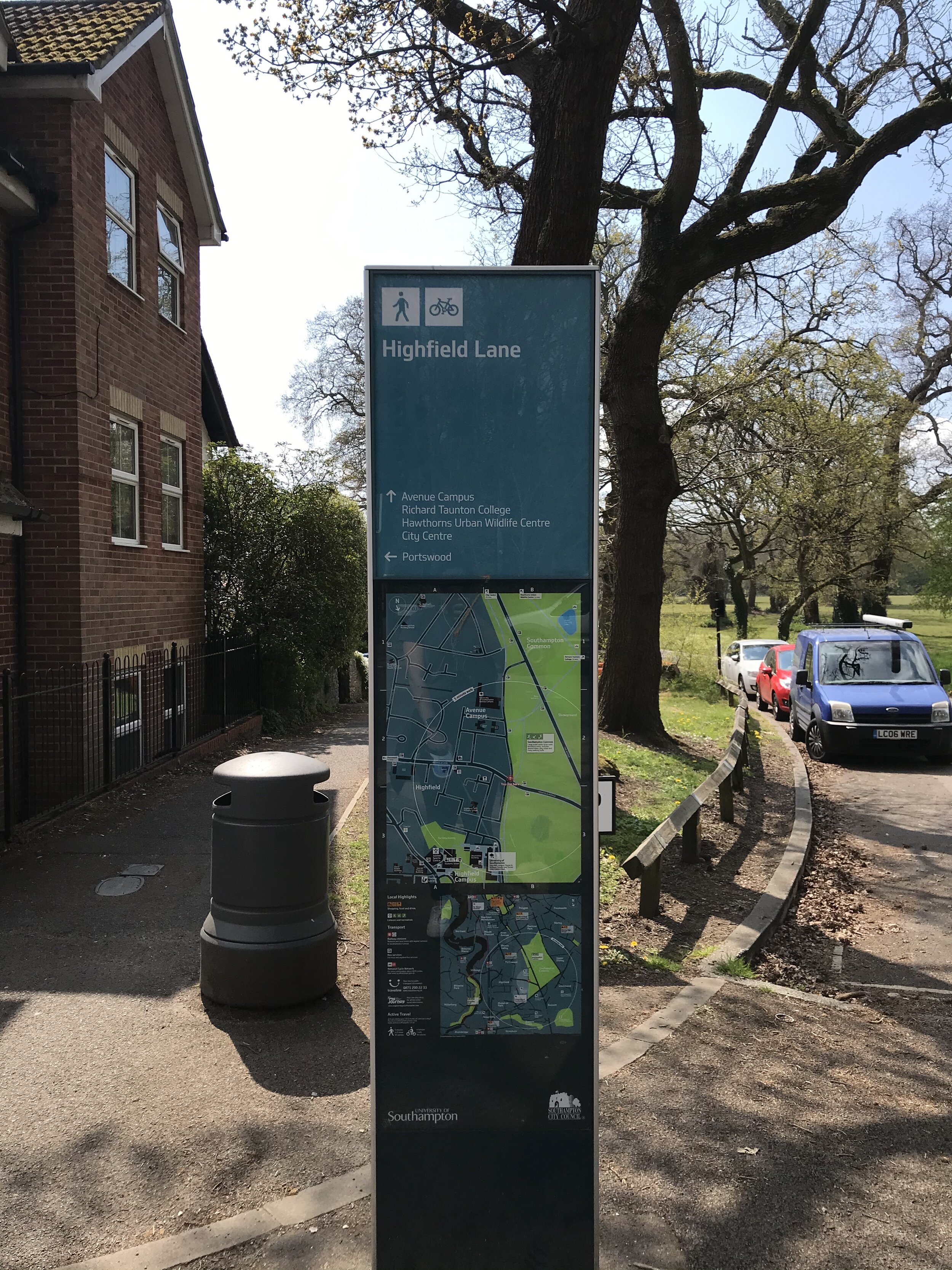
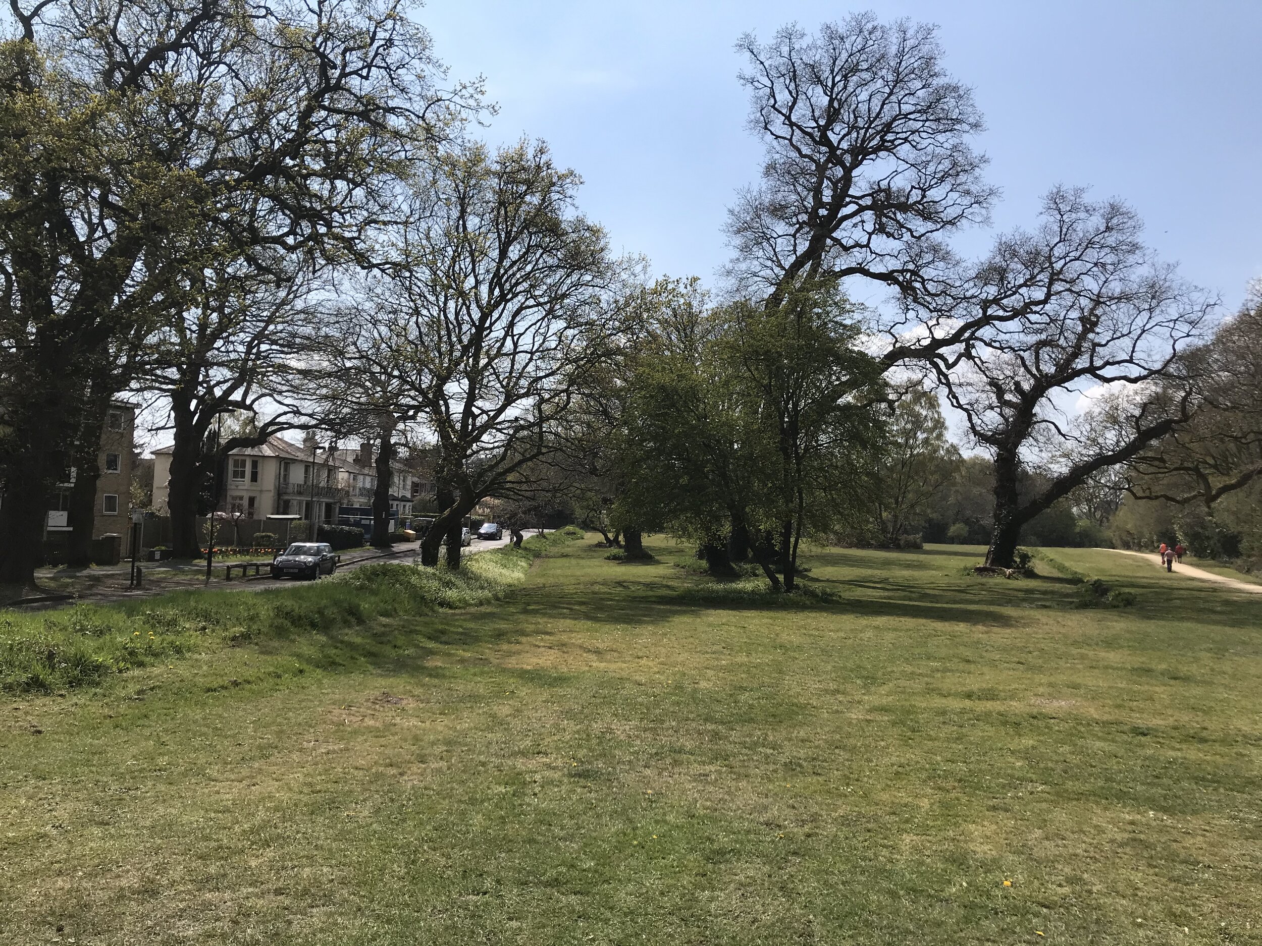
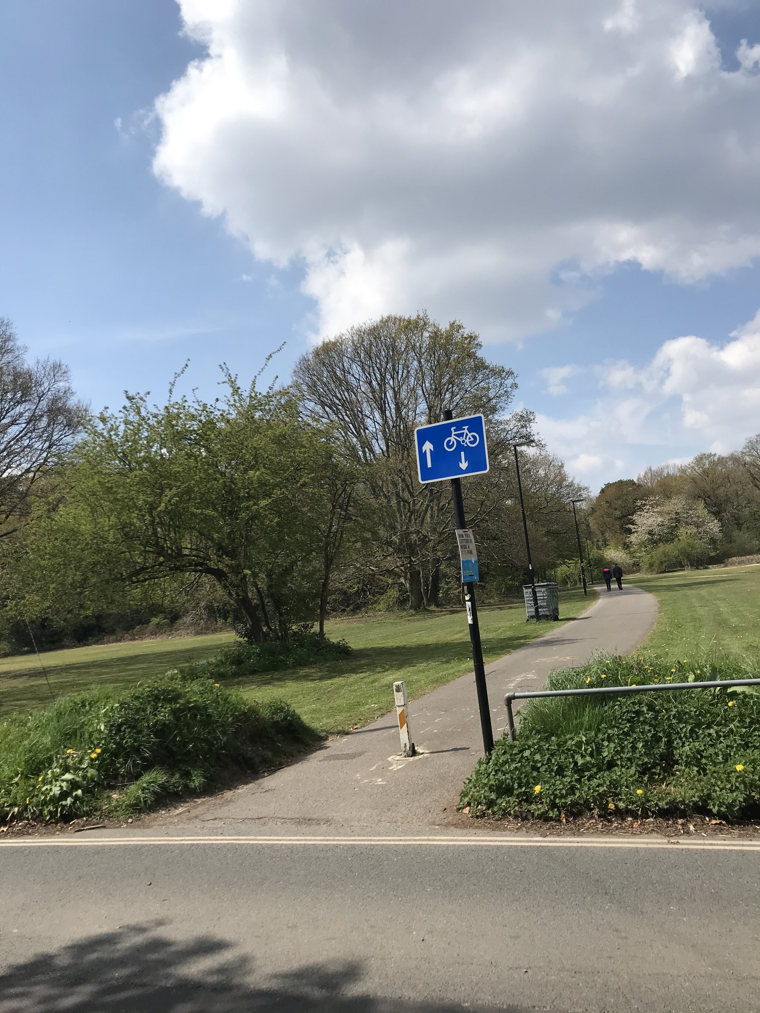
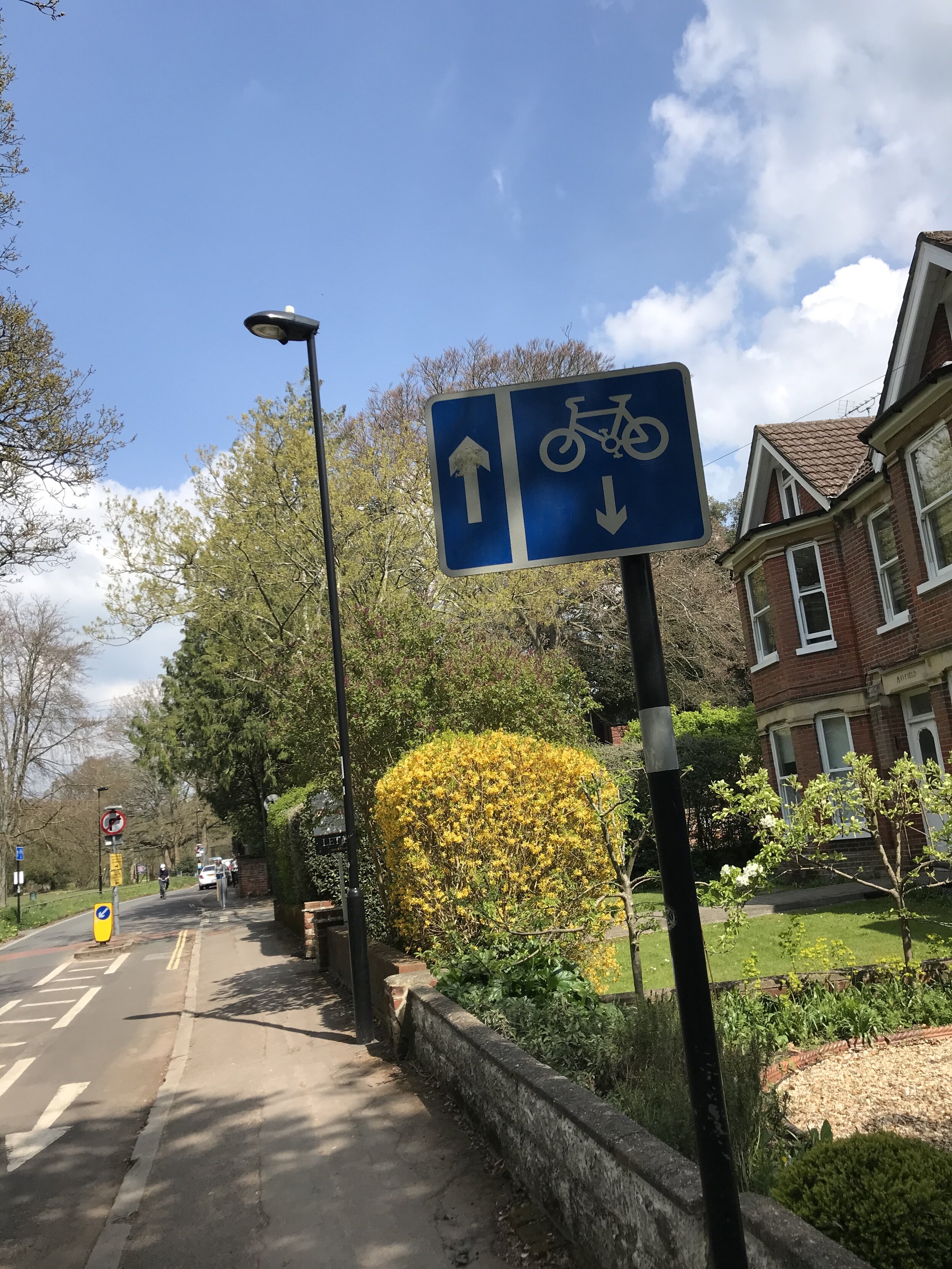
The above is a walking map - we only got to highfeild so just pass the University campus walking. We walked 1.5 miles and I saw 26 bikes total with 23 of those being no the path with no cars. So I think there is a trend with the students cycling and not wanting to be on the main road next to the cars. These were the only posts that I saw the whole time I was walking, there was nothing to say the route or direction other than walking map signage.
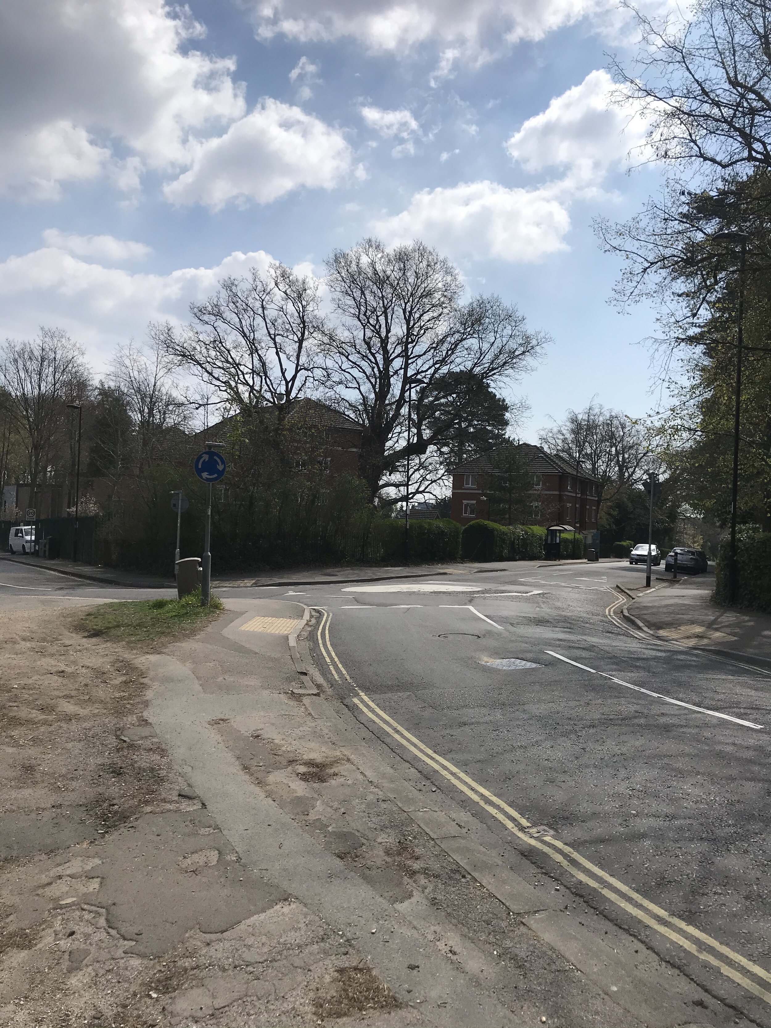
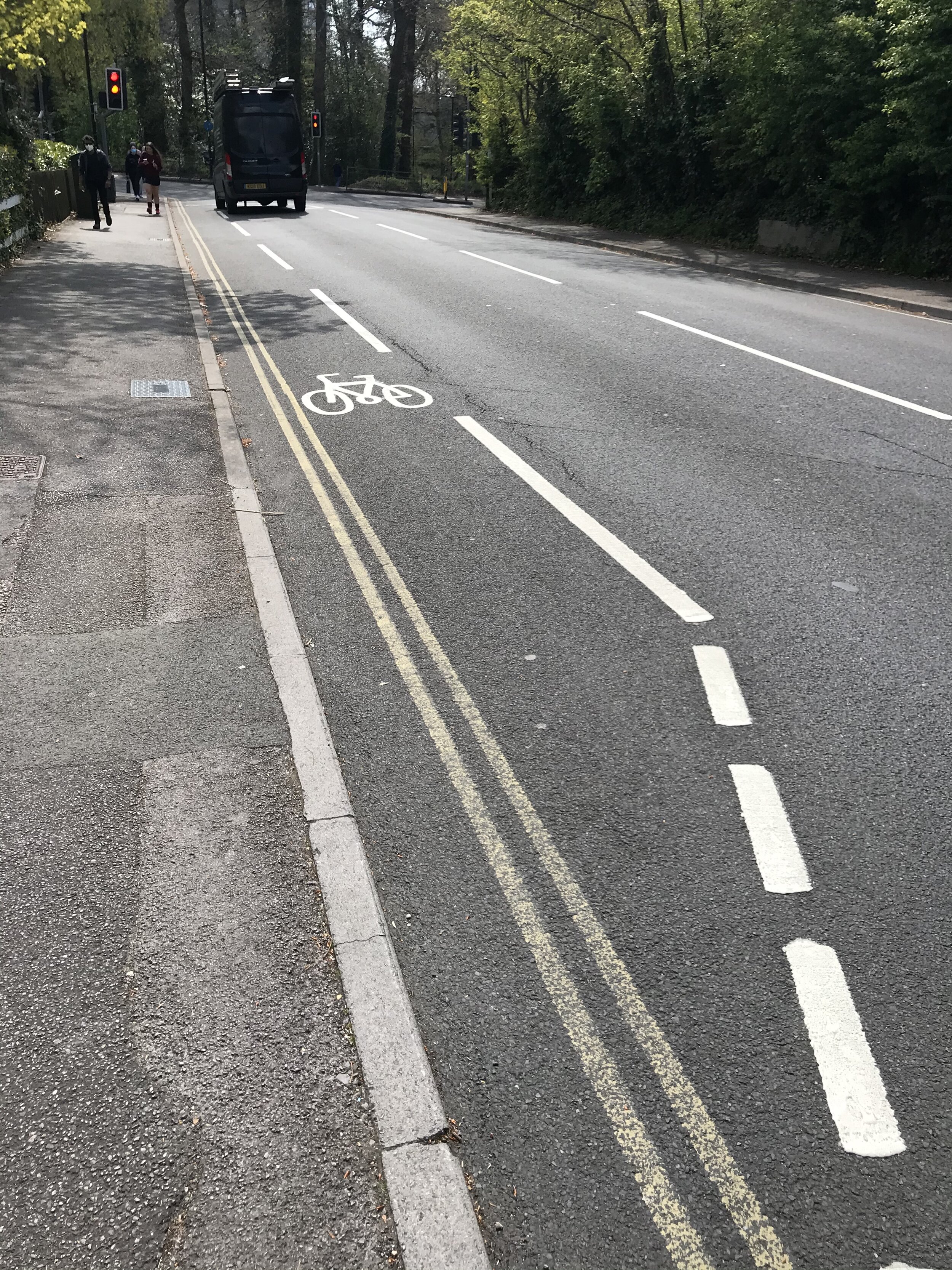
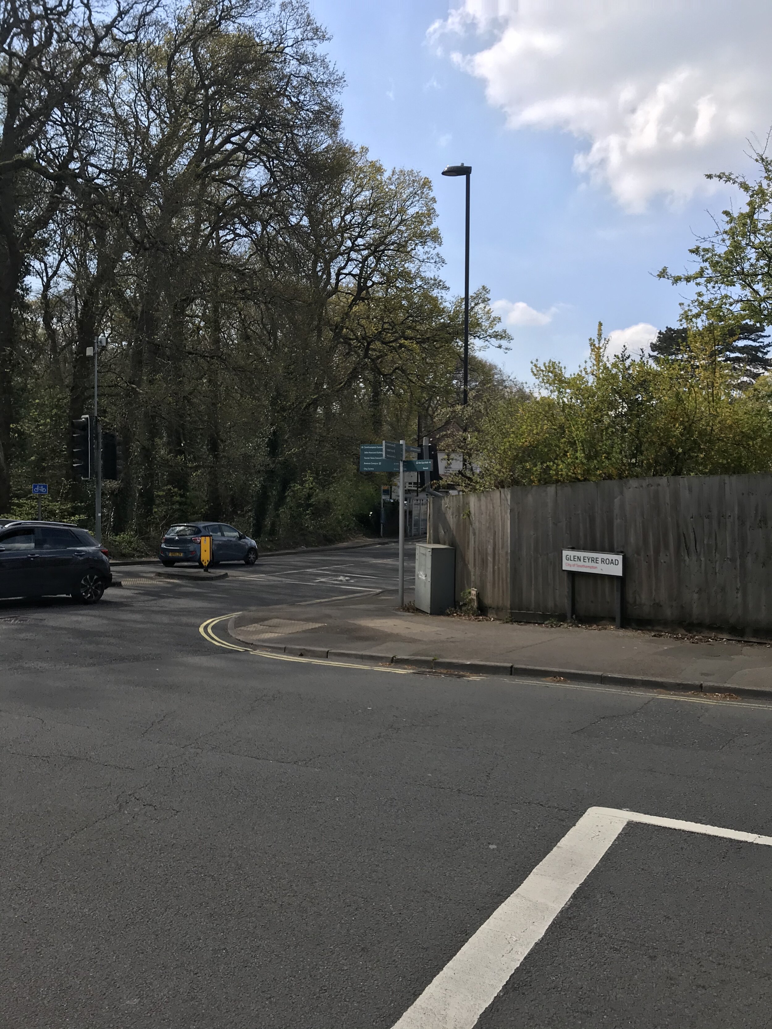
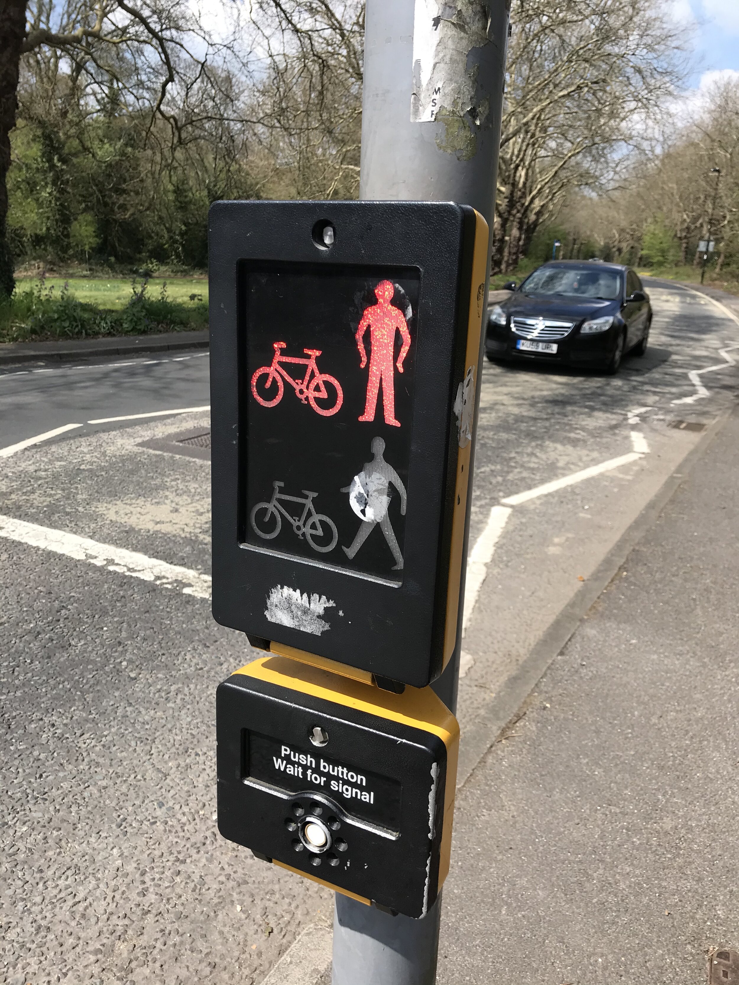
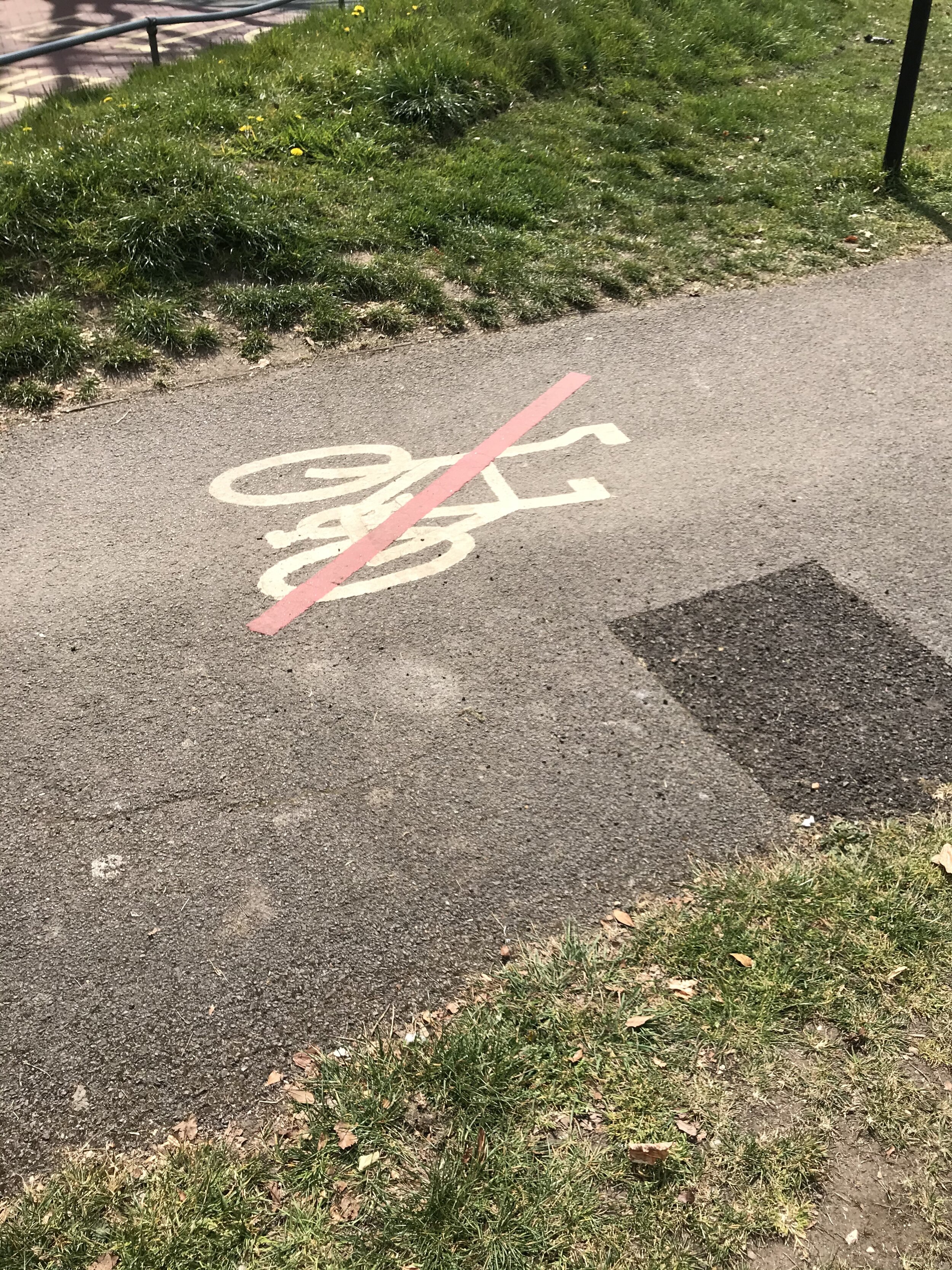
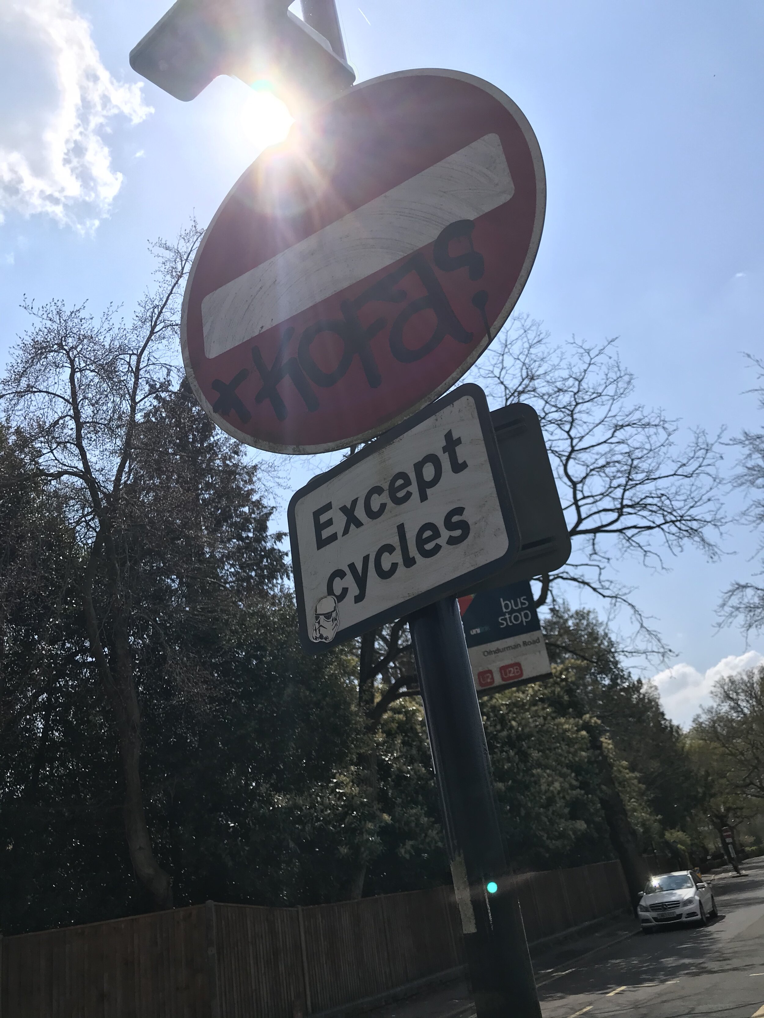
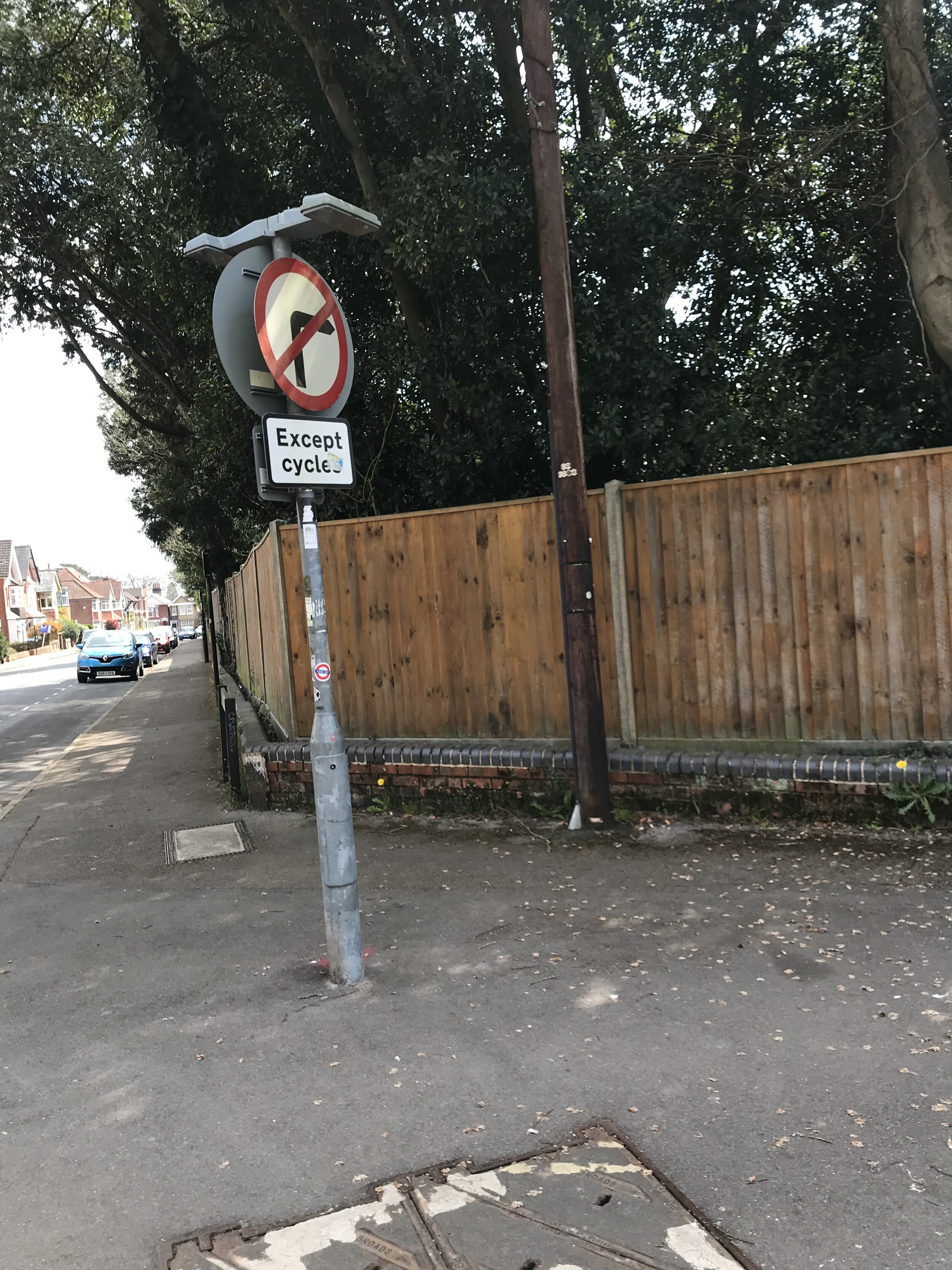
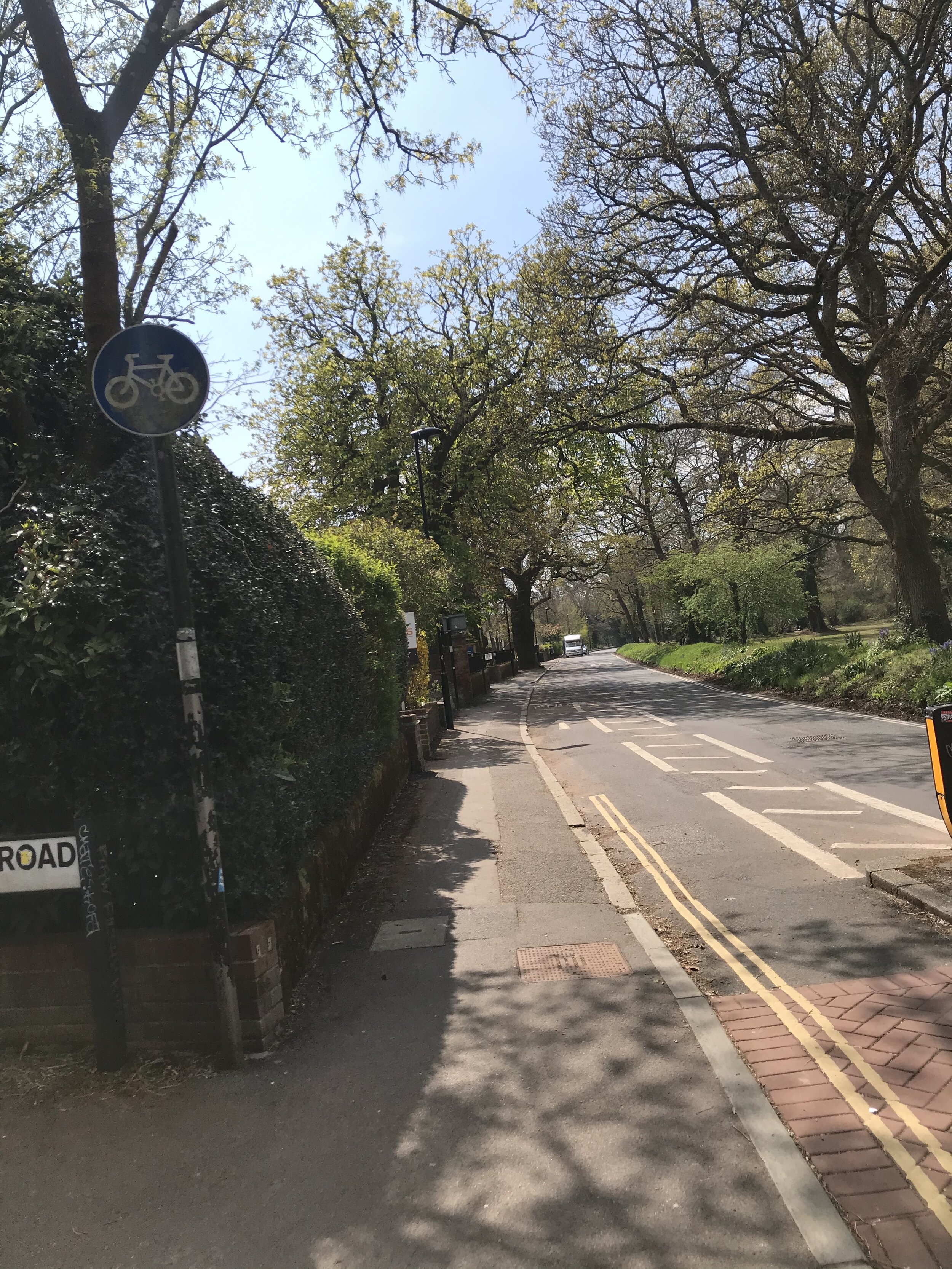
I then decided to get more into town to see if any more signs closer to the centre of Southampton. I took these images from google maps as when I went I was driving. Along this time I saw 3 cyclists using the road paths.
As you can see within the images below, there were sign postings for the cycle route that I was on but it wasn’t very often and still wasn’t clear. Also why does this get lost when you aren’t in the centre but still in Southampton?
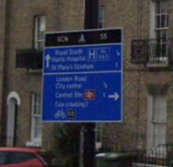
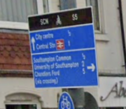
After finding out the above and being on the cycle paths for myself, I think it is clear that there does need to be more way-finding as you are just expected to know the way. Having a clear map or system in place so you know you are on the right path would be really useful, then if the path changes having the options about the routes you can take.

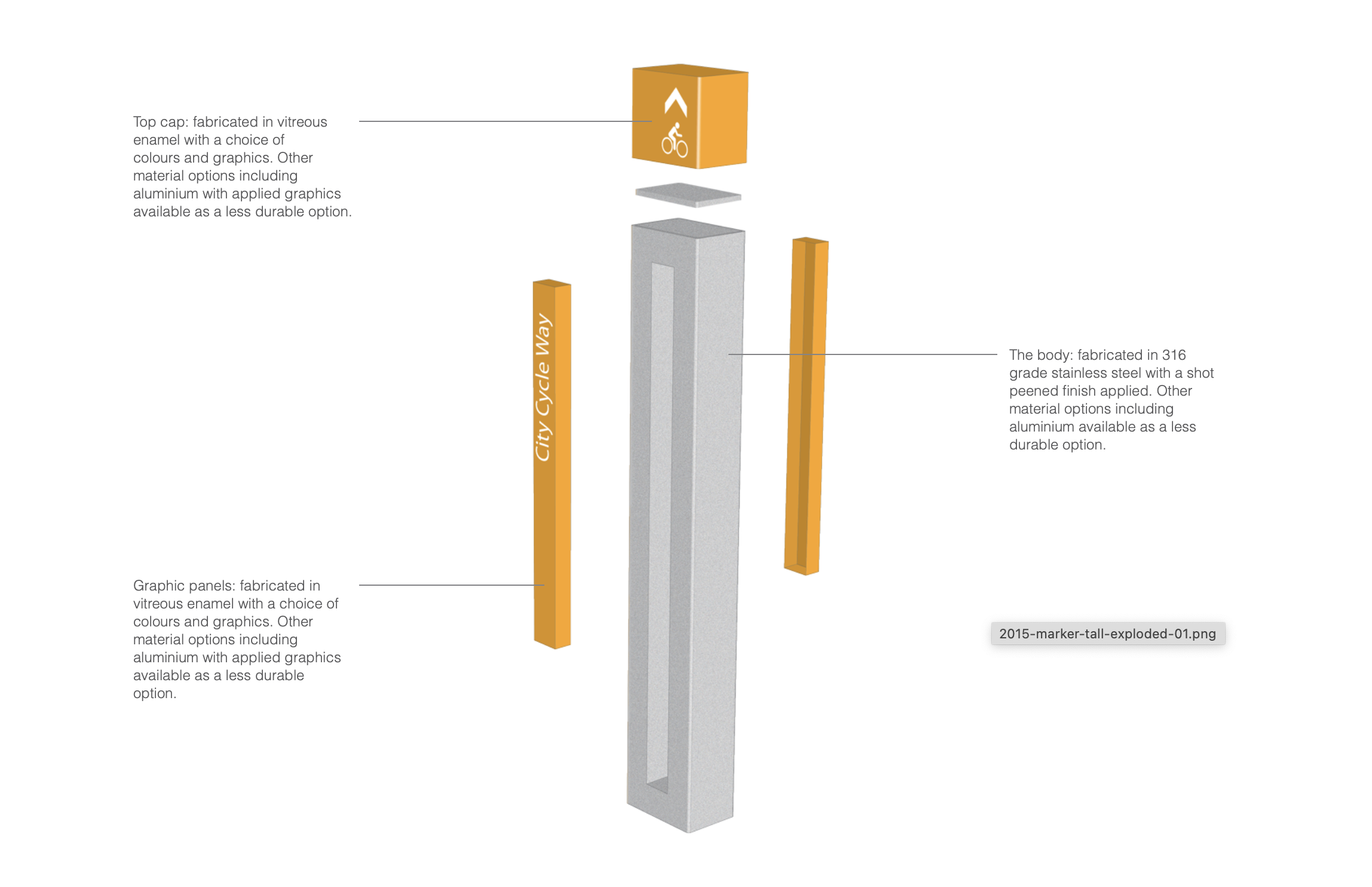
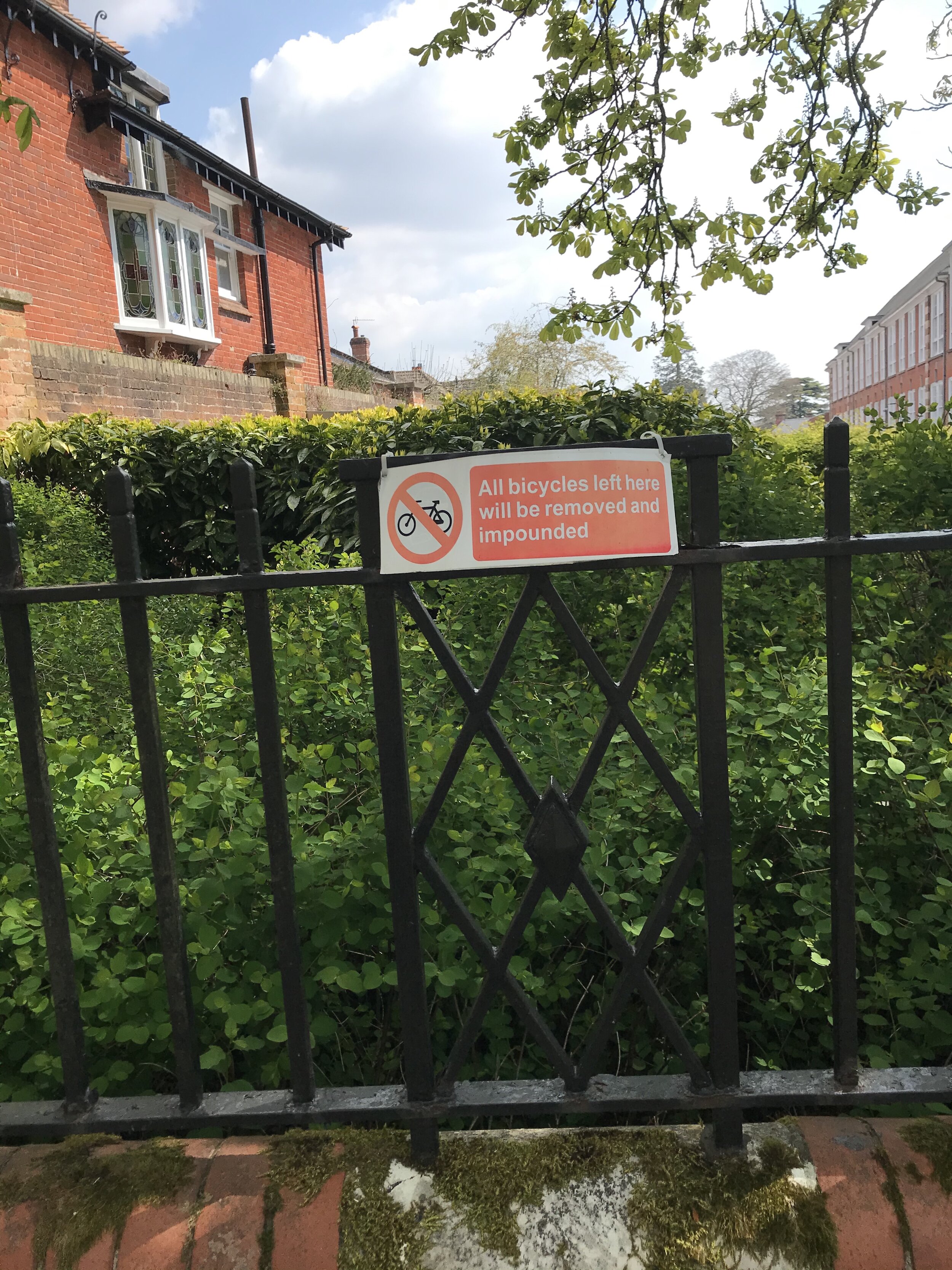
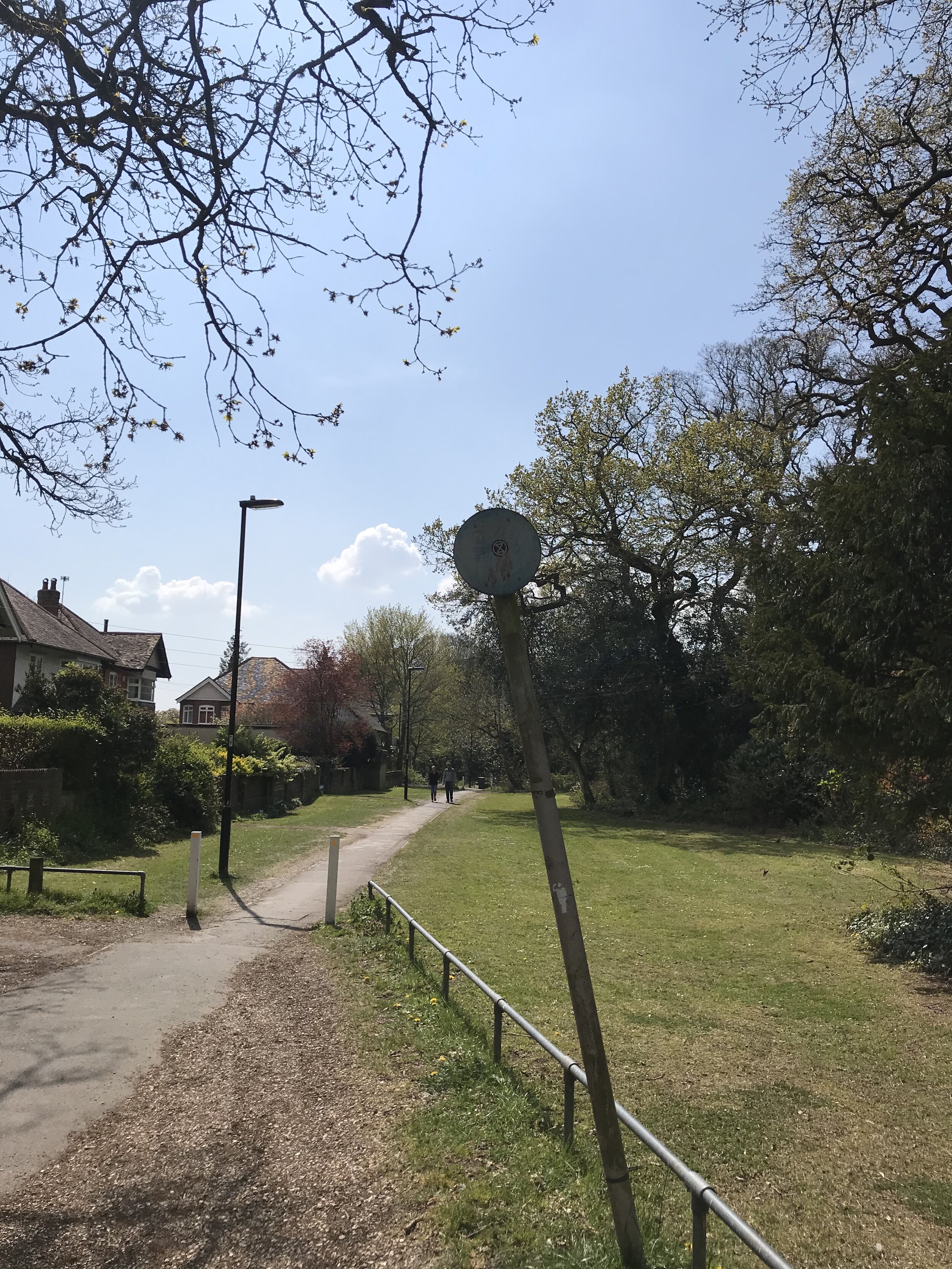
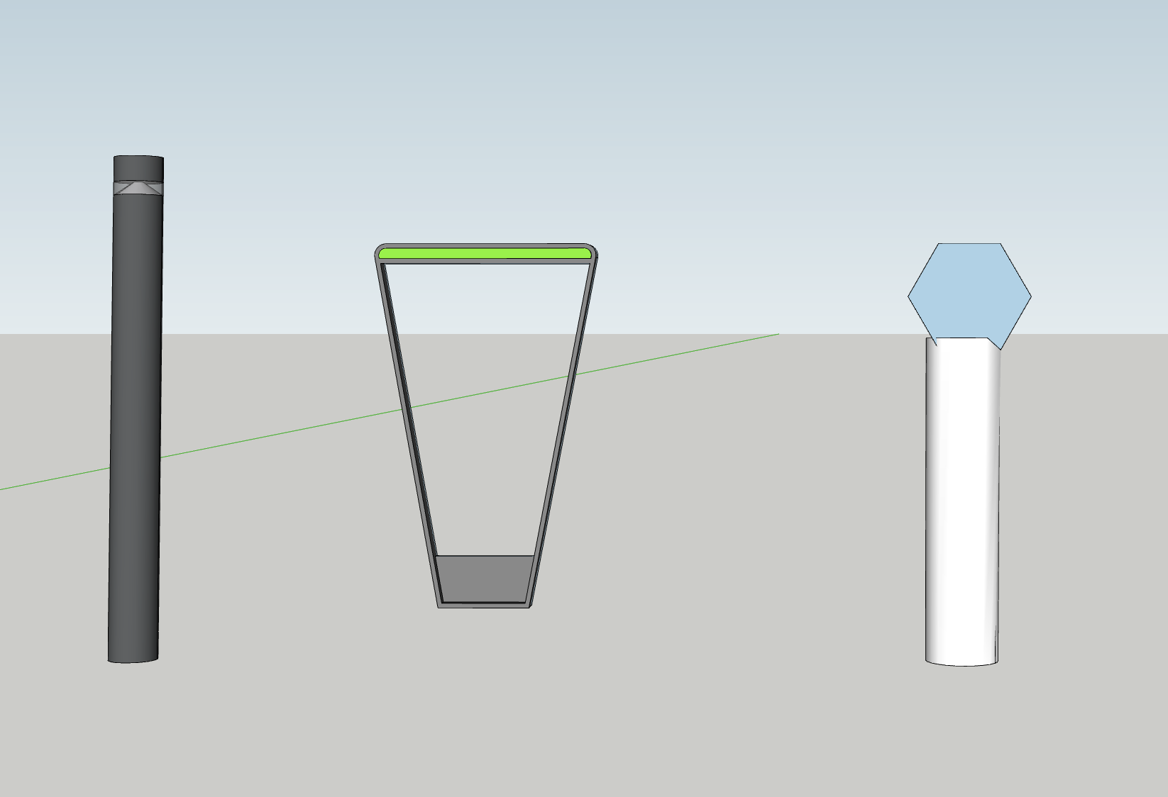
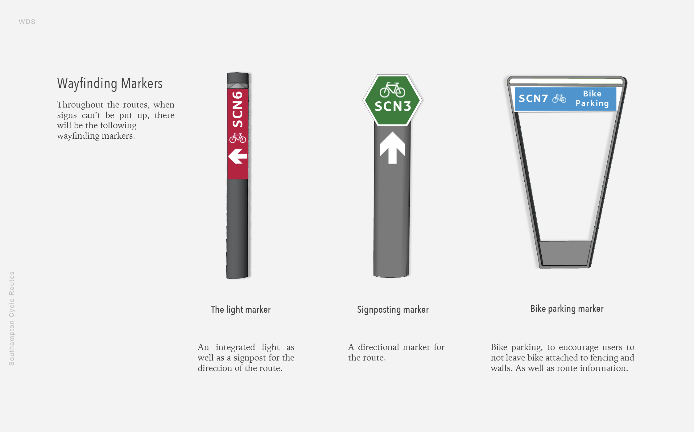
I then also saw that there were these posts dividing the pedestrian walkway and the cyclists and wondered if this shape or design would work with way-finding for cyclist.
After this, I also decided to do a survey - I wanted to collect information from the cyclists themselves:
Cycling Questions:
How would you describe Southampton’s cycle routes?
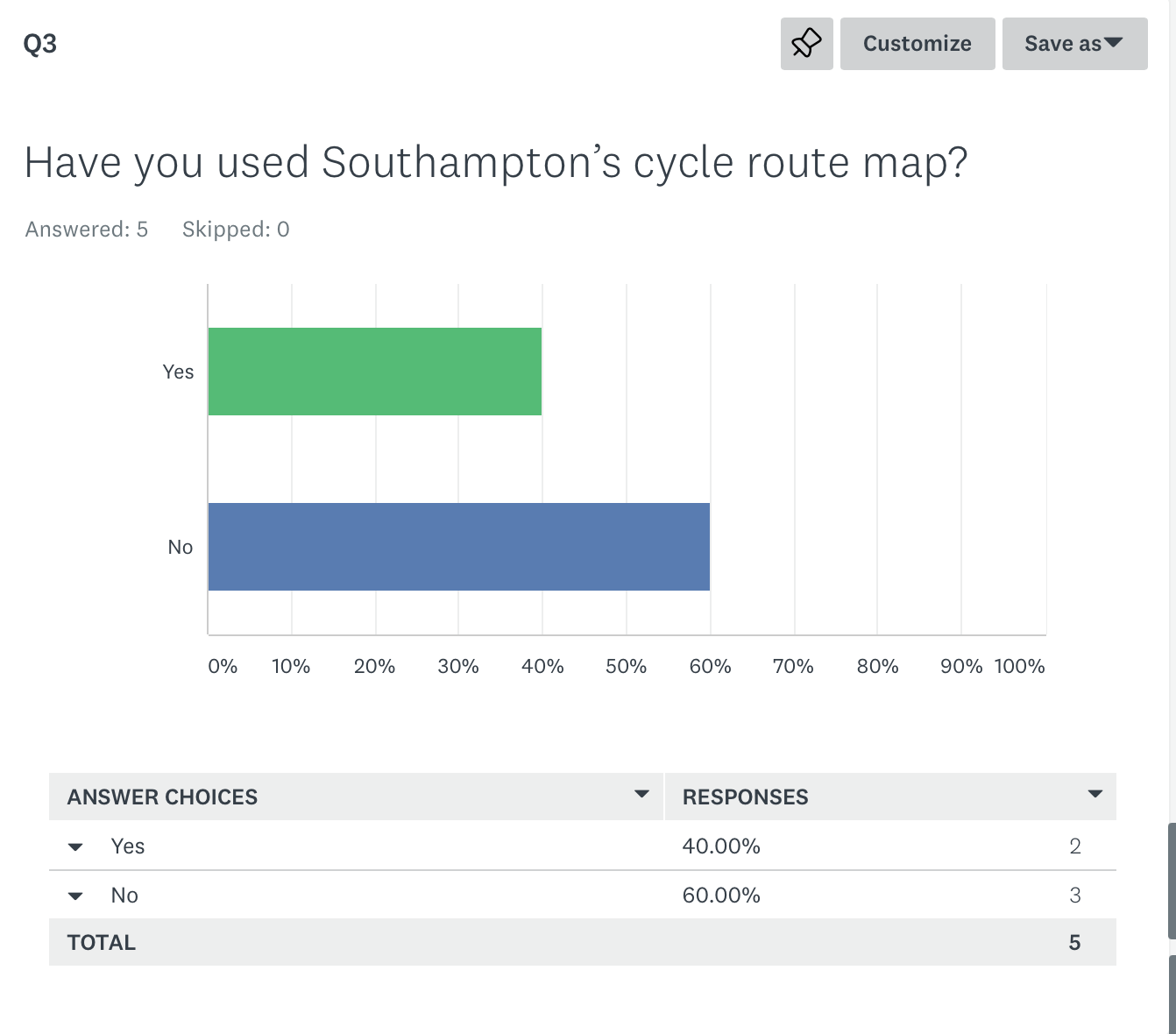
Have you used Southampton’s cycle route map?
If not then please see below:
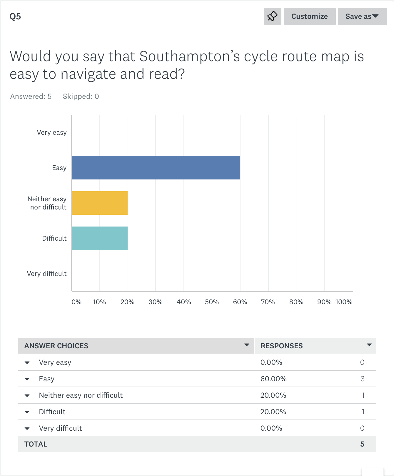
Would you say that Southampton’s cycle route map is easy to navigate and read?
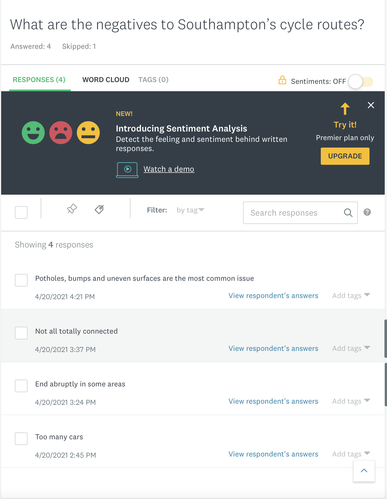
What are the negatives to Southampton’s cycle routes?
How easy do you find it to navigate around Southampton on cycle friendly routes?
Do you think that if Southampton implemented a wayfinding system this would improve ease of wayfinding?
Do you have any design suggestions for this?
Do you feel if there were more clear maps and wayfinding solutions around Southampton routes this would encourage more people to cycle?
Only 5 people responded to the survey but thats better than nothing:
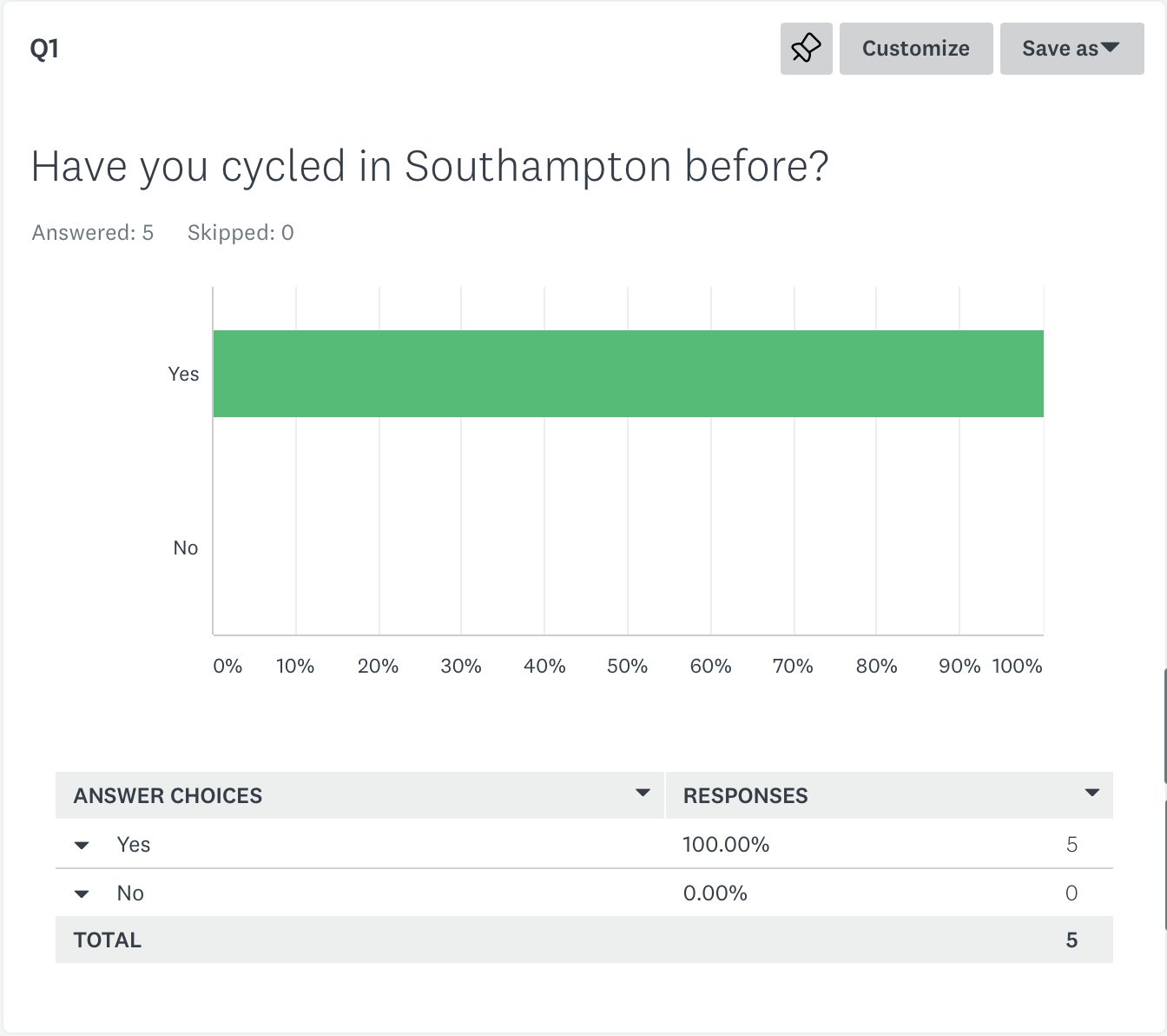
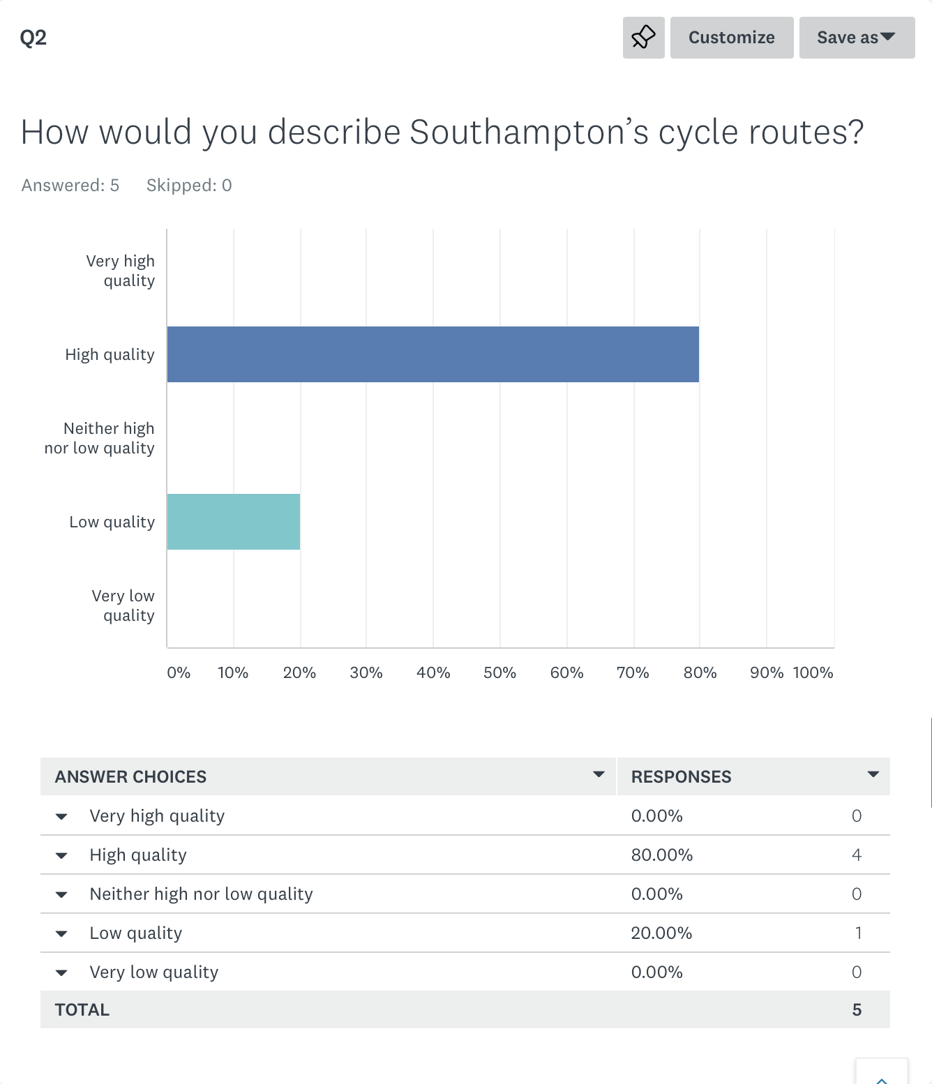
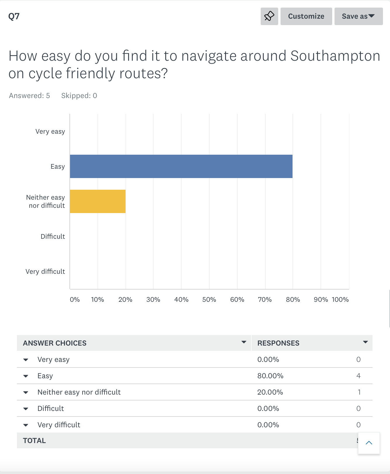
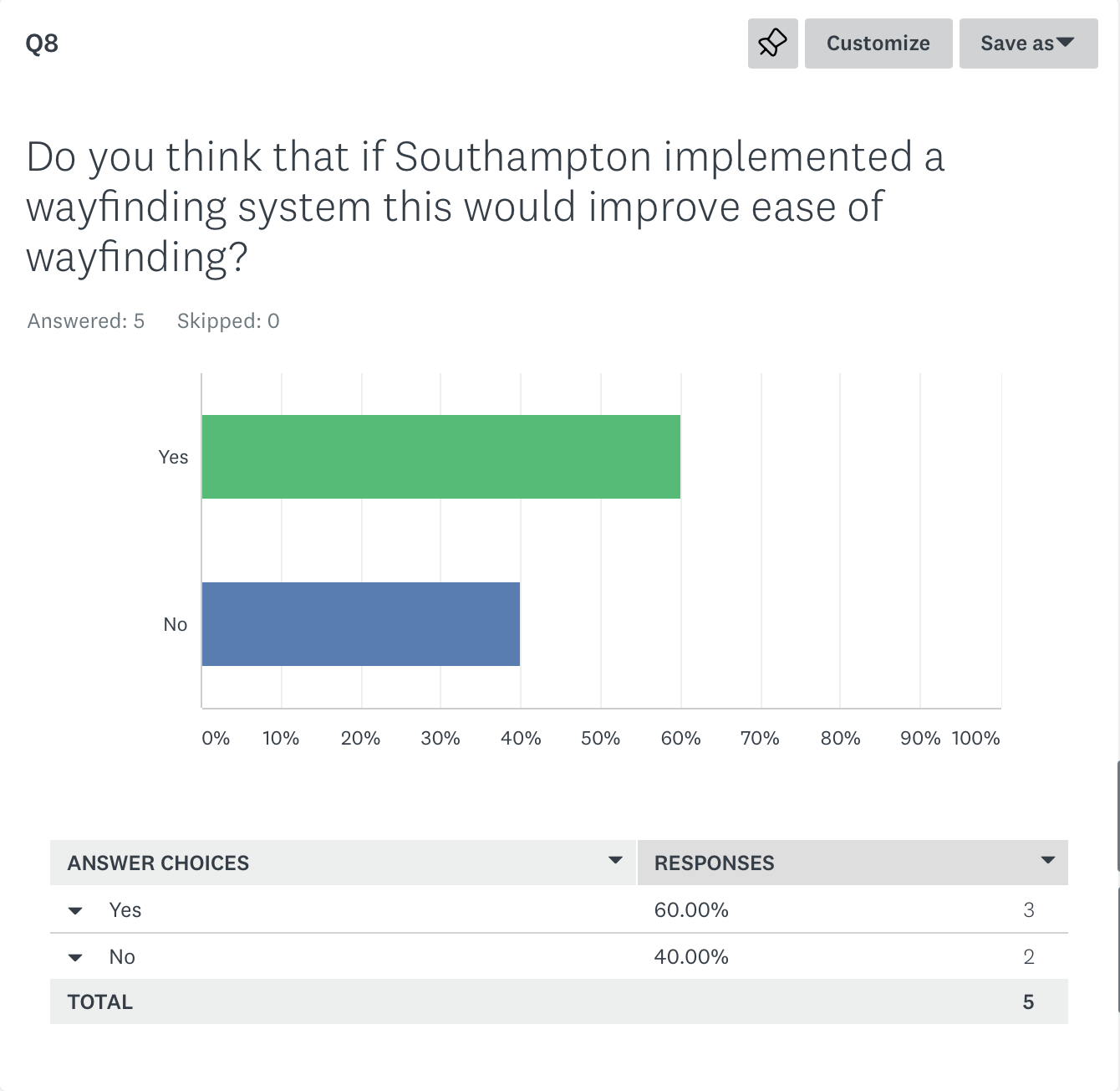
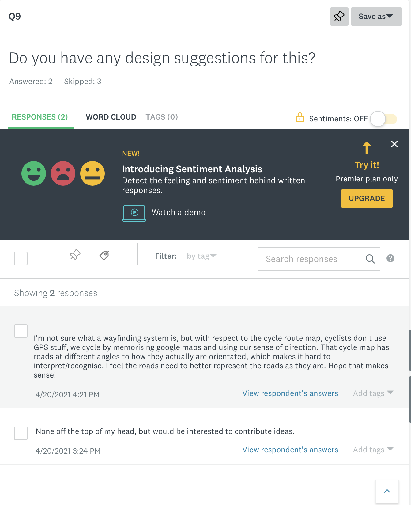
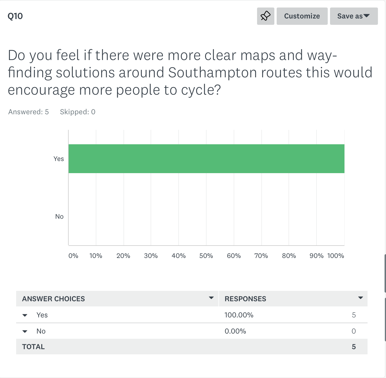
From this research, I have established there there is a need for way finding, although as it notes - some cyclists look at google maps and memorise this for the route but also I guess once you cycle a route once then you know the route.
Also the negatives to the routes, ‘end abruptly’ ‘not totally connected’, I feel that this could be improved with way finding / signage. I also thought it was interesting to not that a lot of people hadn’t seen the designed council city cycle map.
I think some of the people said no about the ease of way finding as they already find the route relatively easy to navigate - but as a walker myself there’s not enough signage on the road for me to visually see.
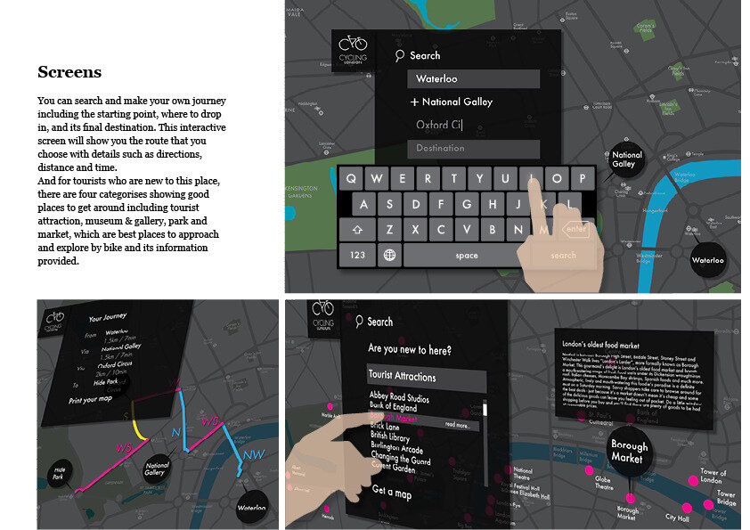
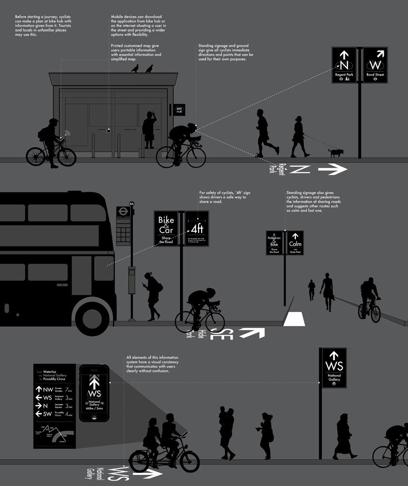
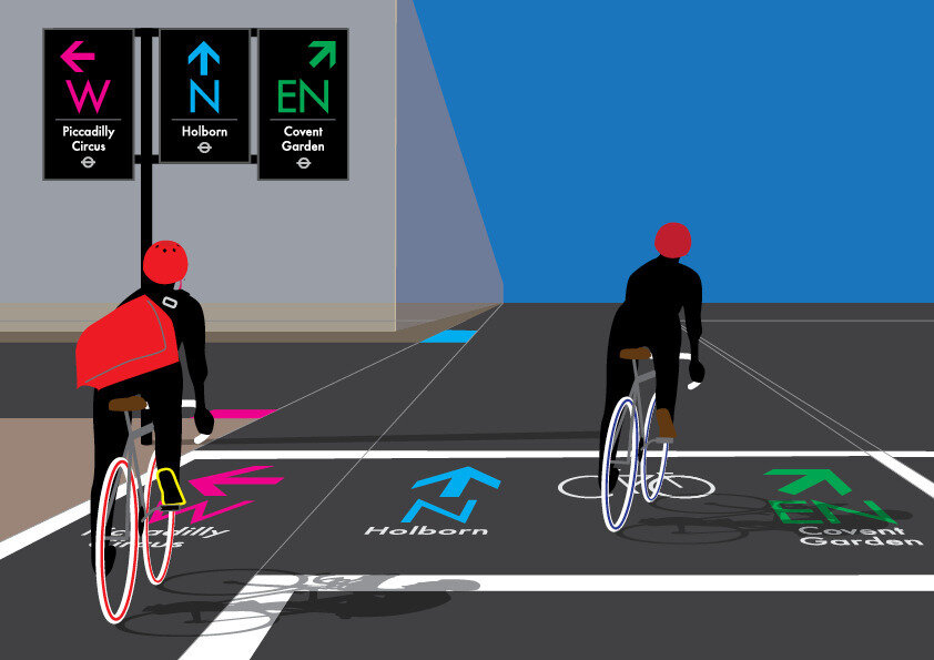
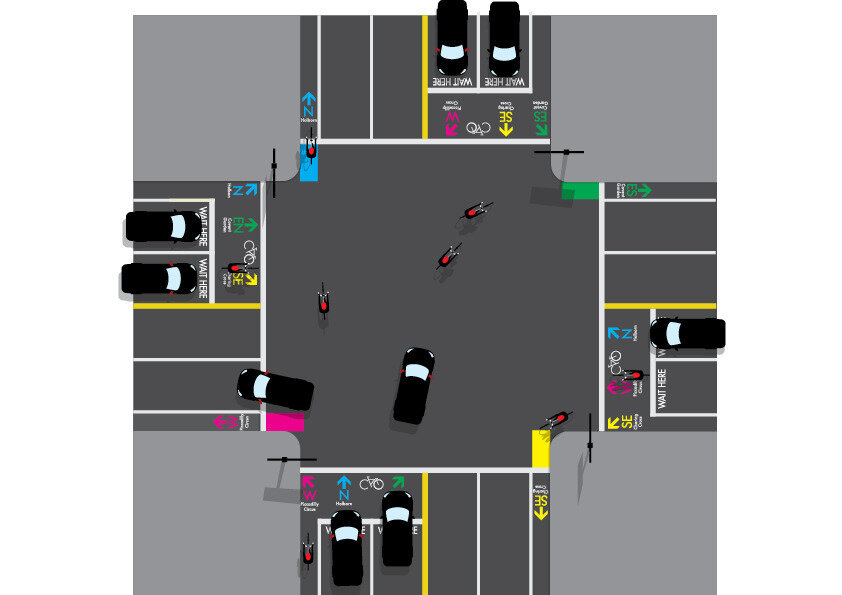
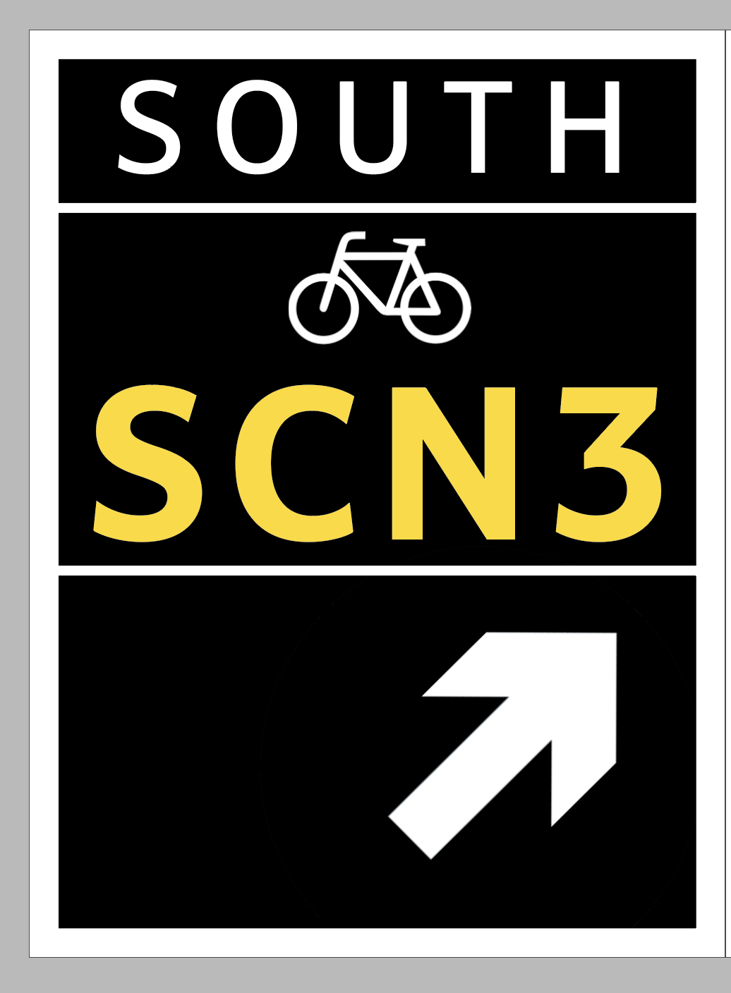
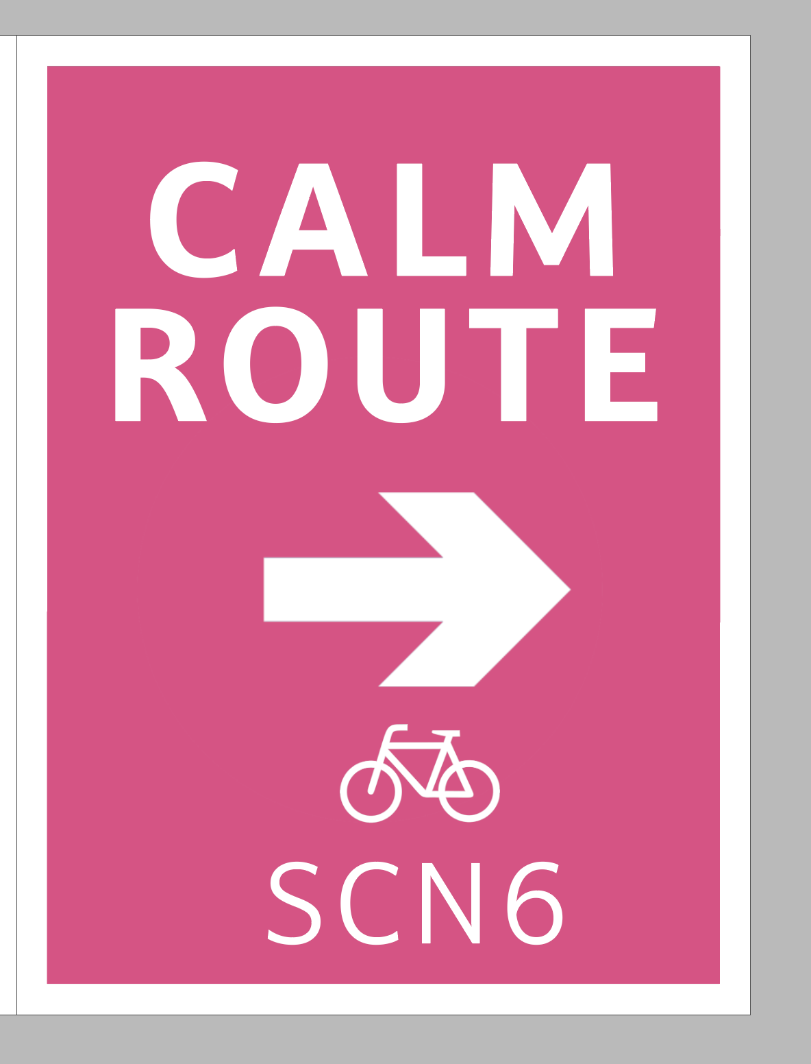
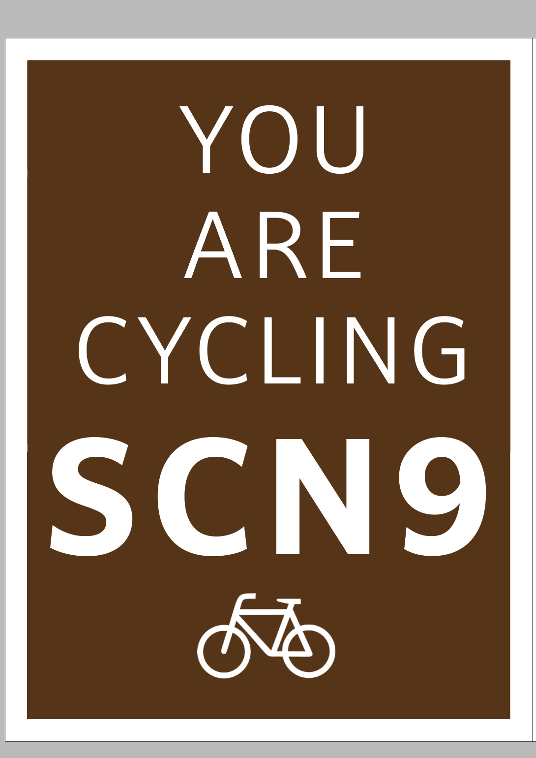
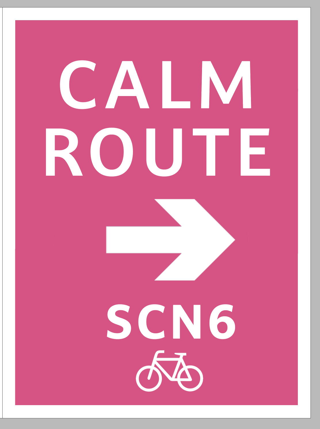
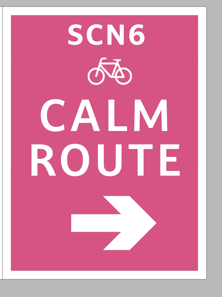
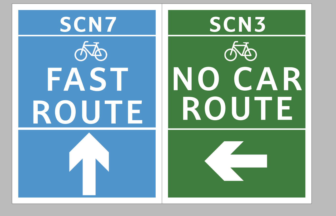
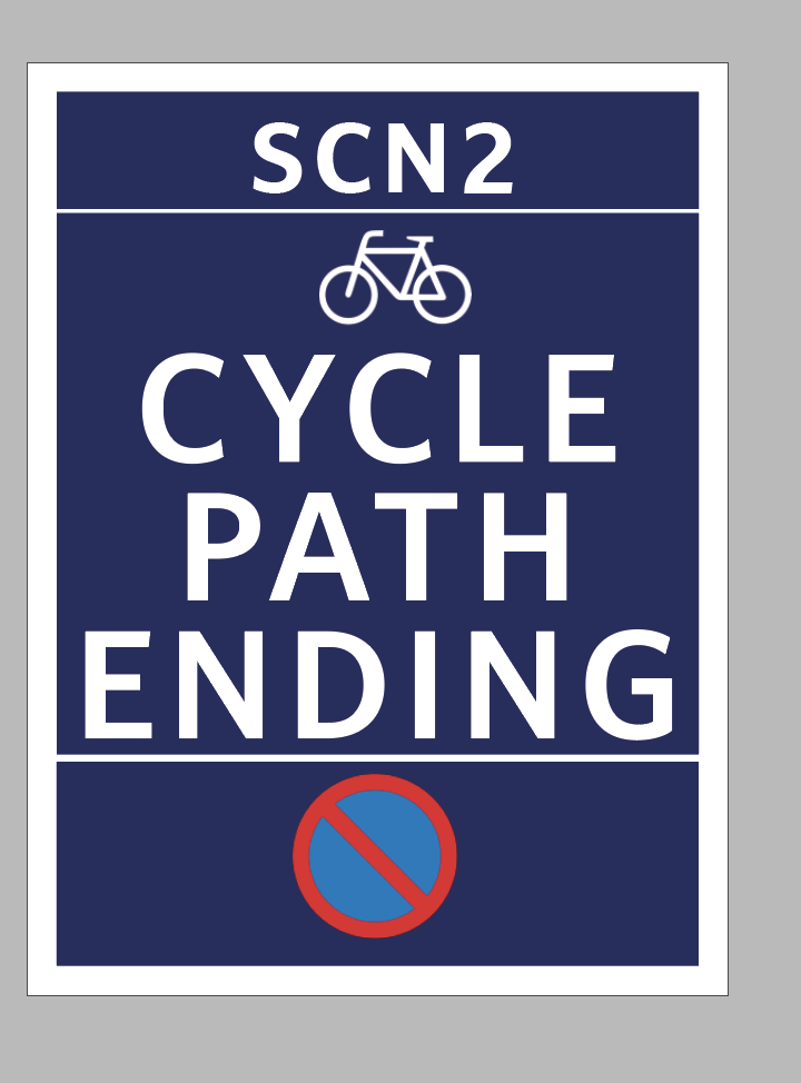
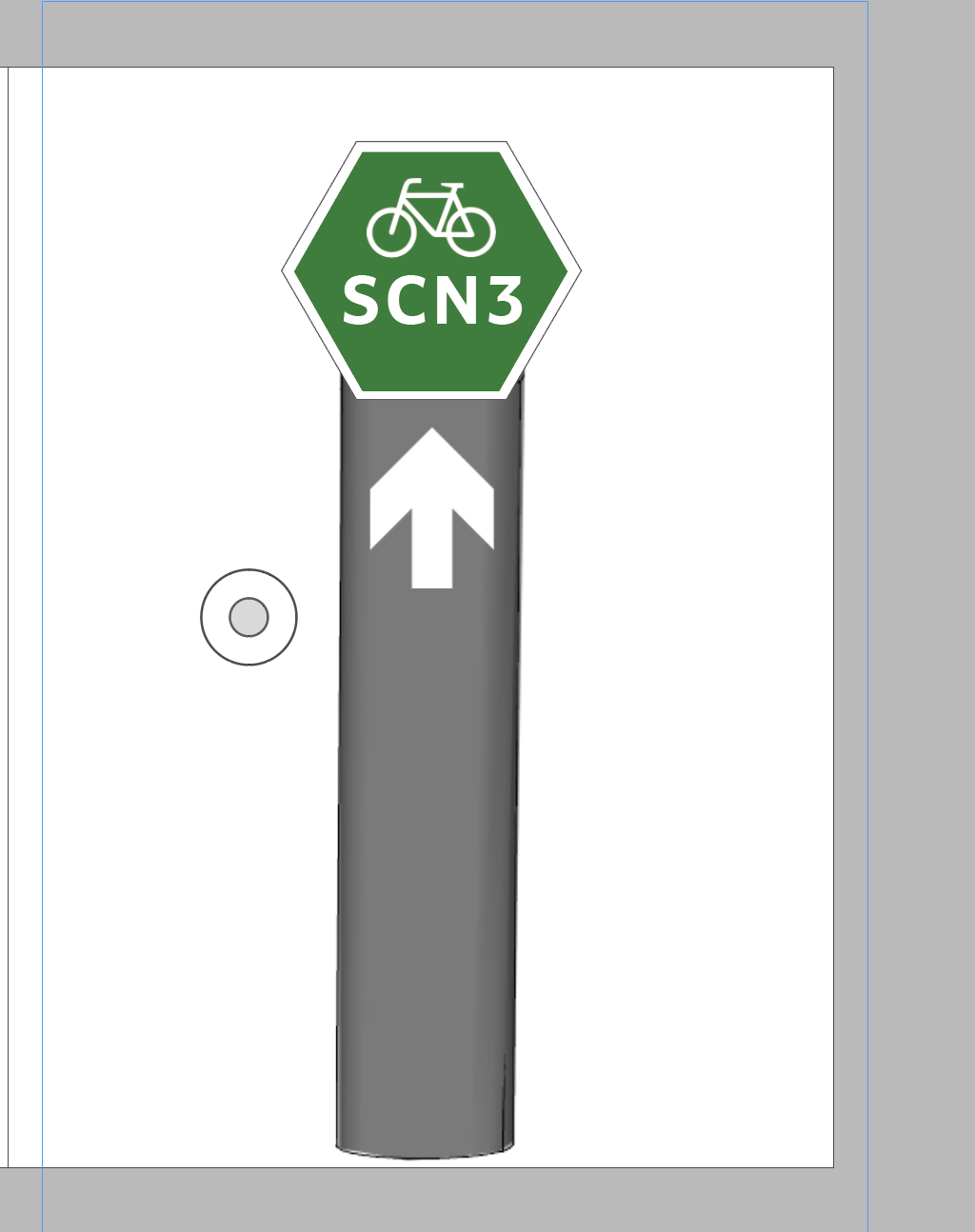
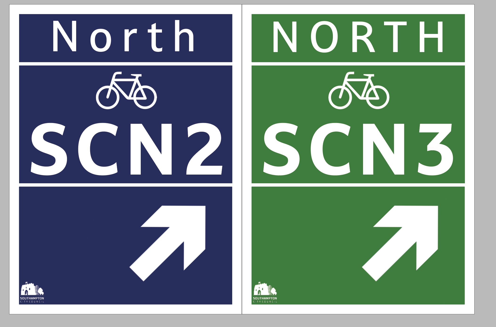
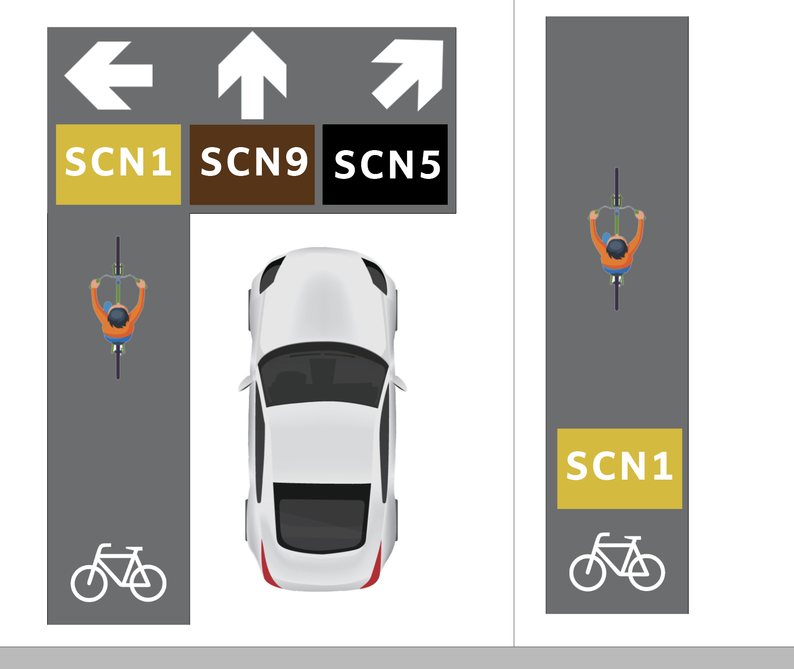
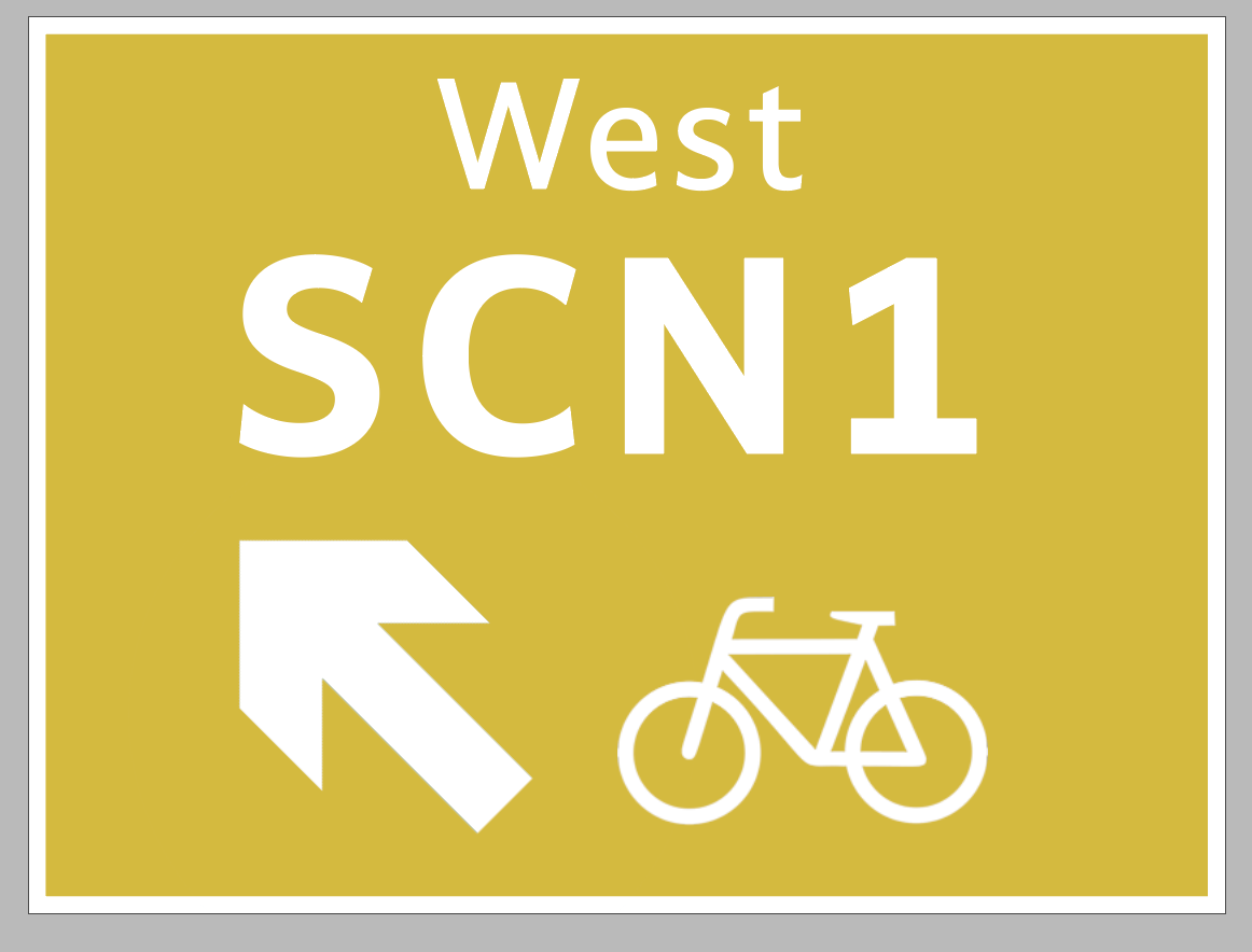
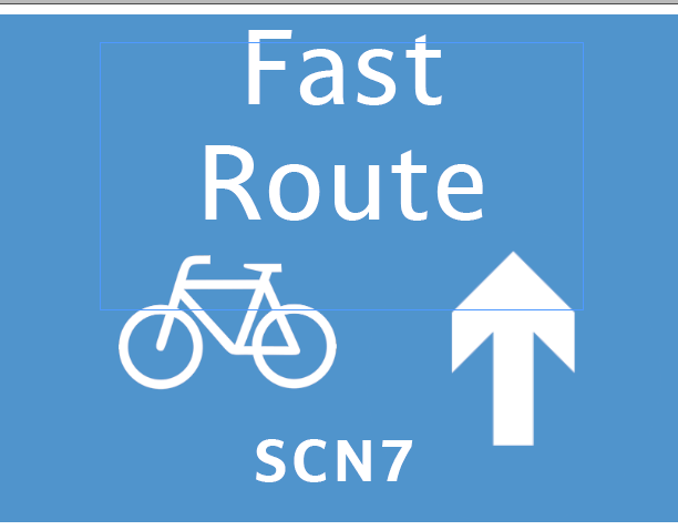
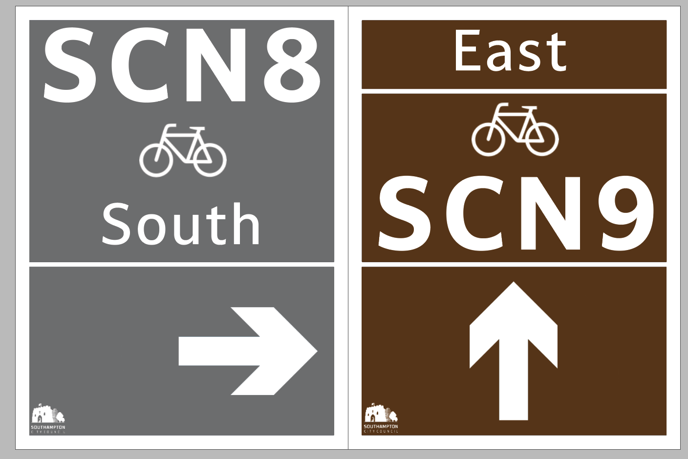
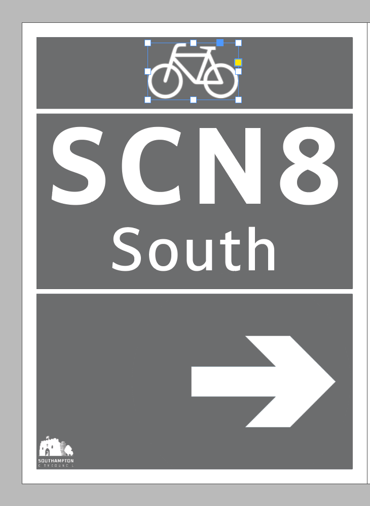
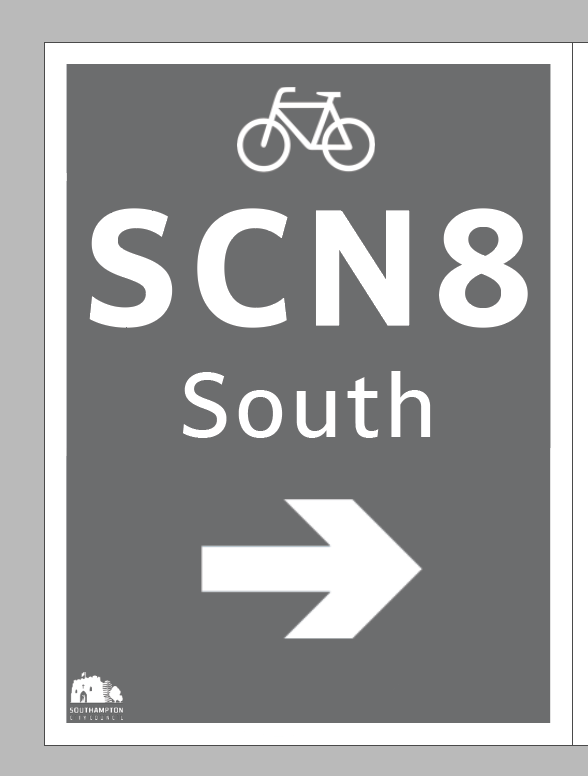
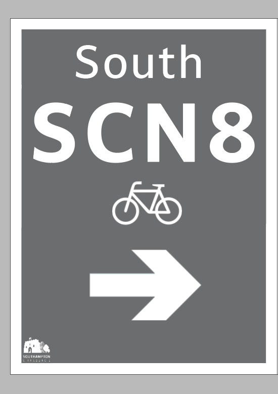
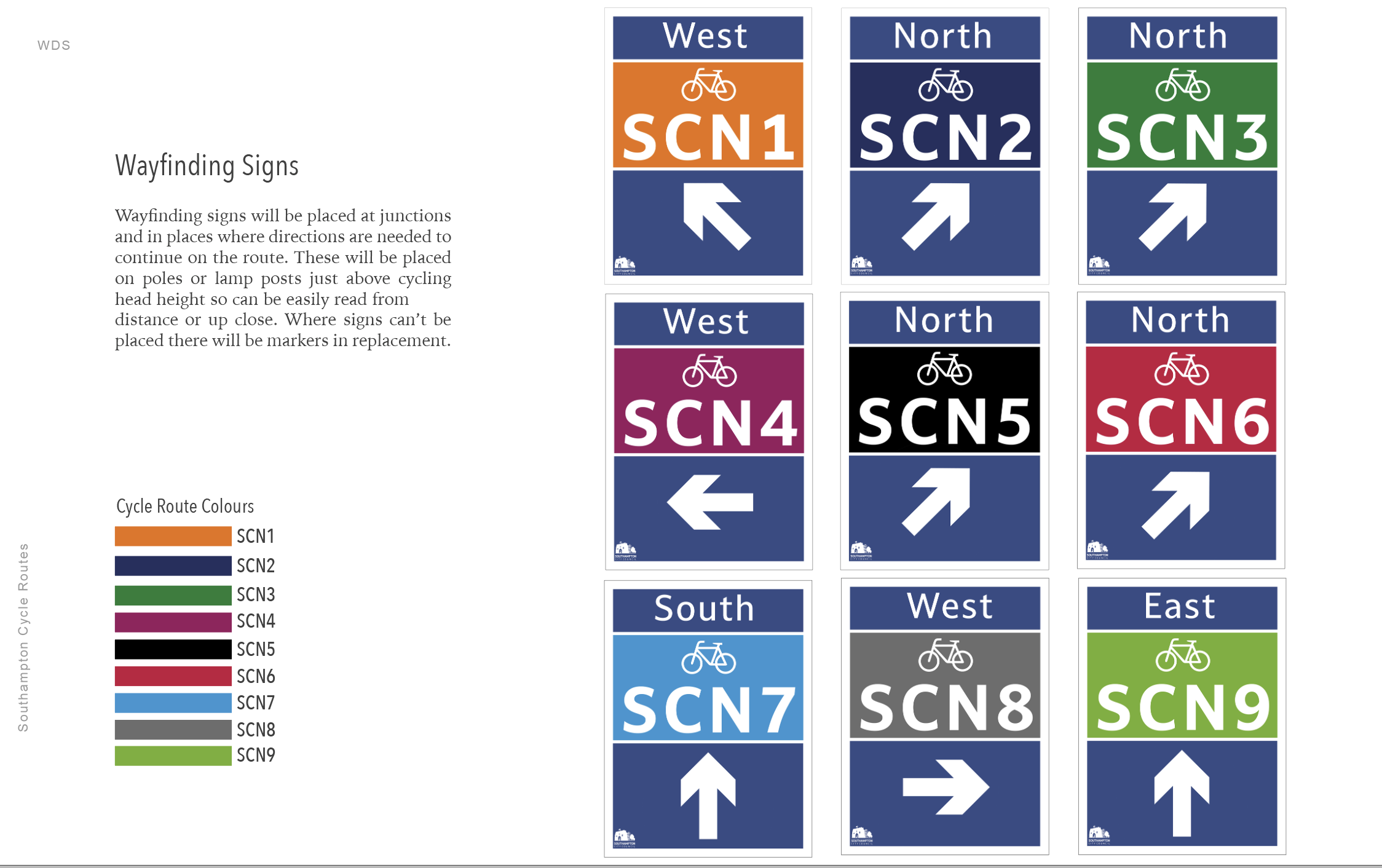
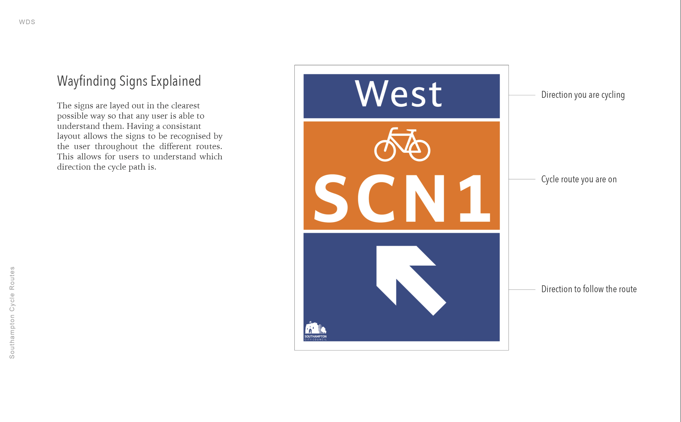
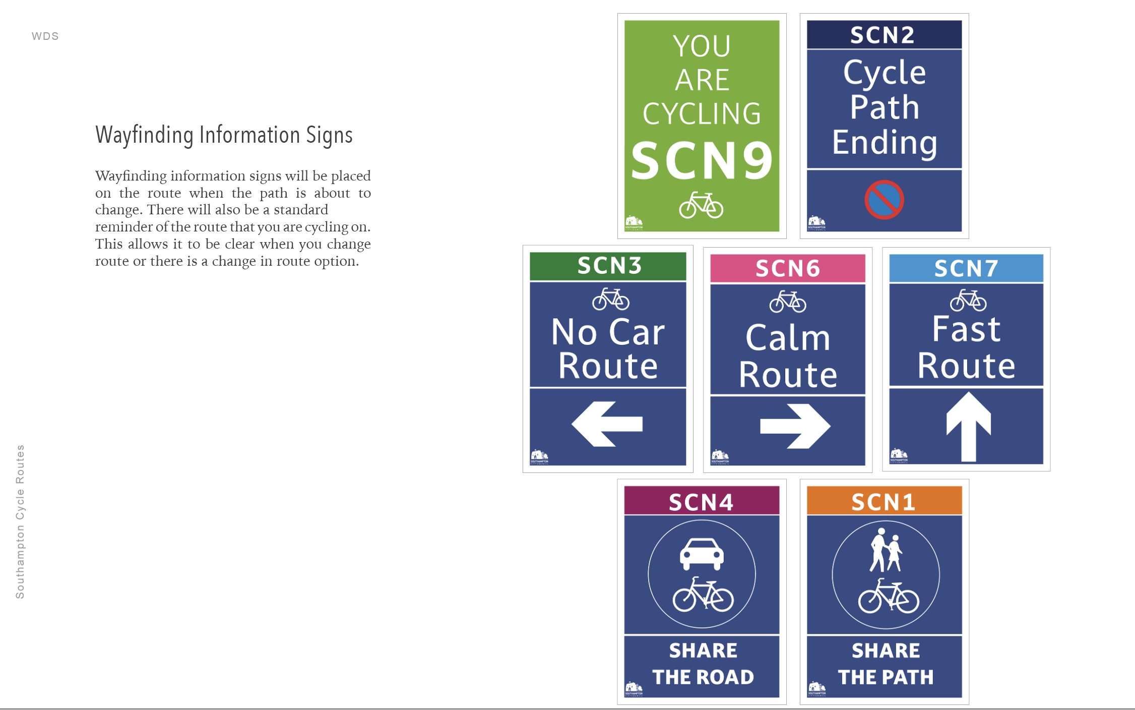
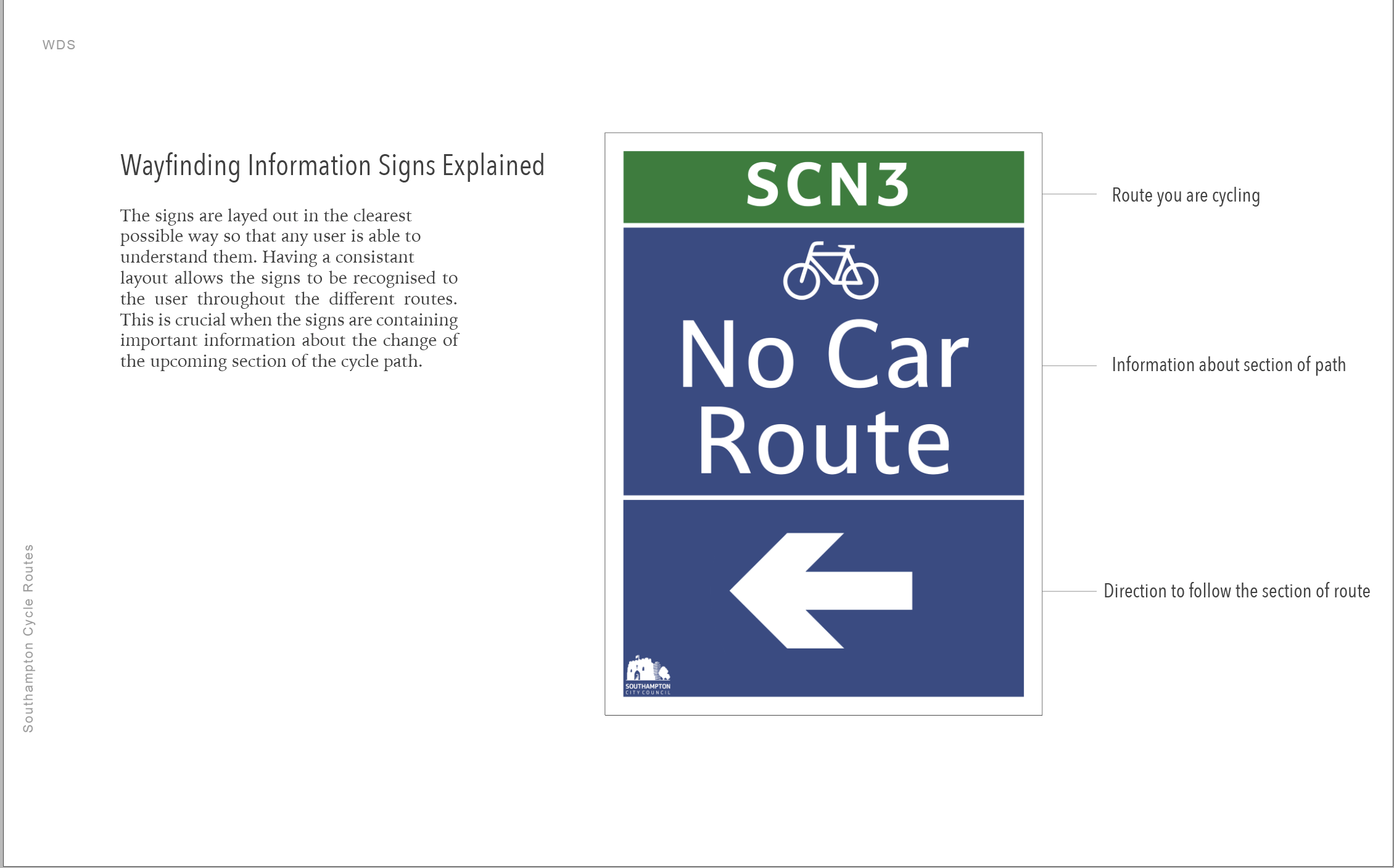
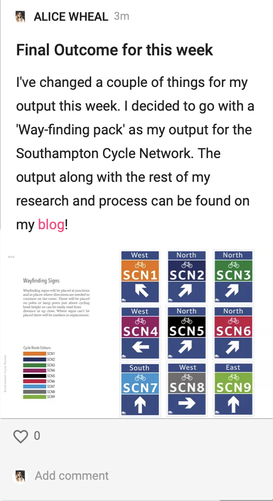
From this I am going to create a series of way finding solutions that are part of a package:
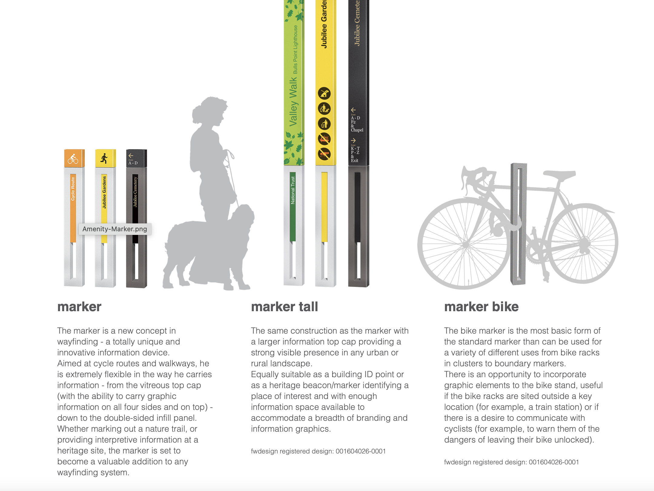
Signage
Way finding poles
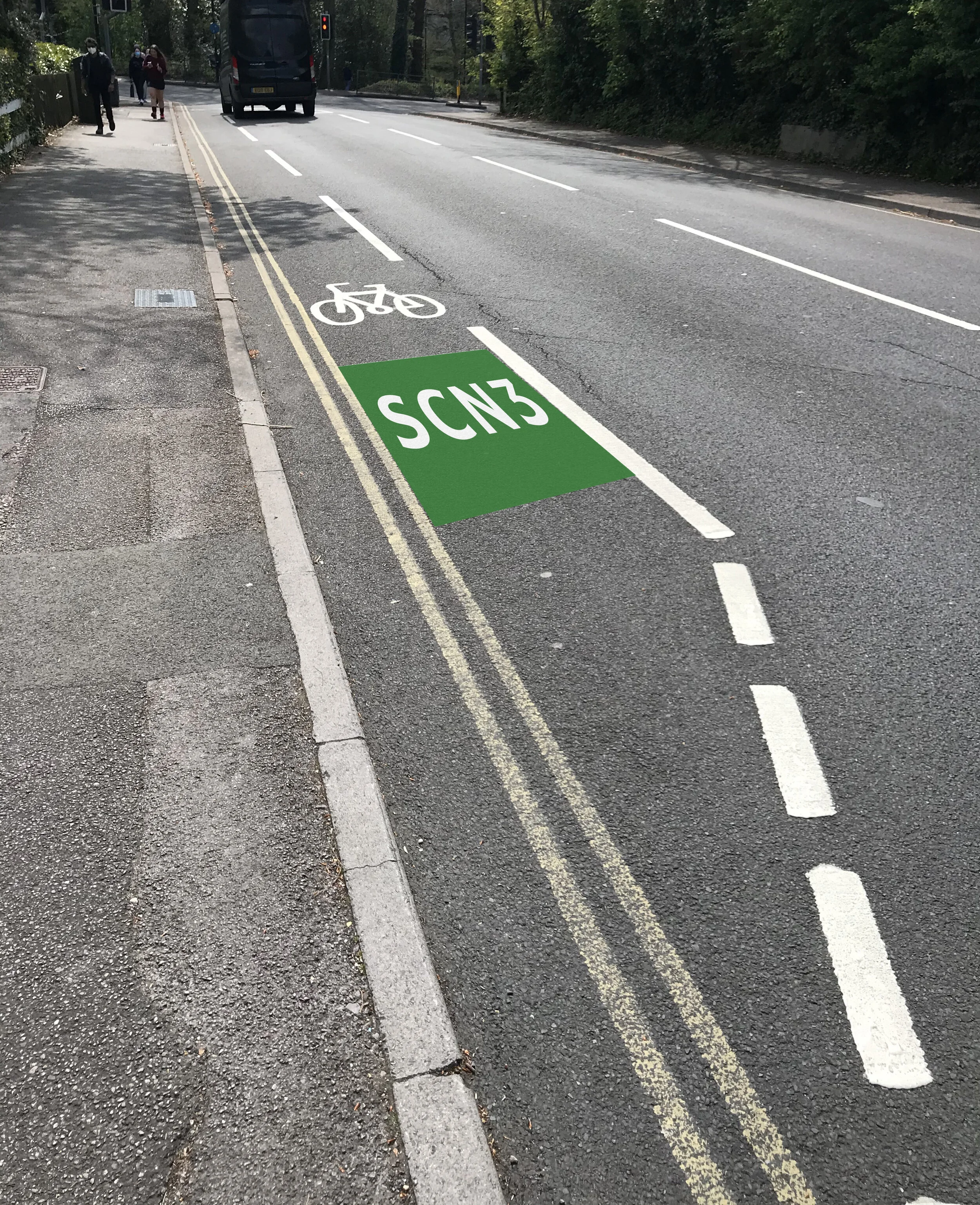
Floor Graphics
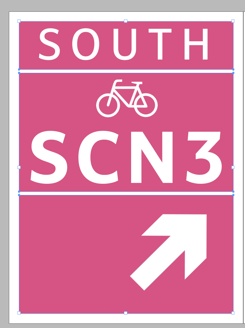
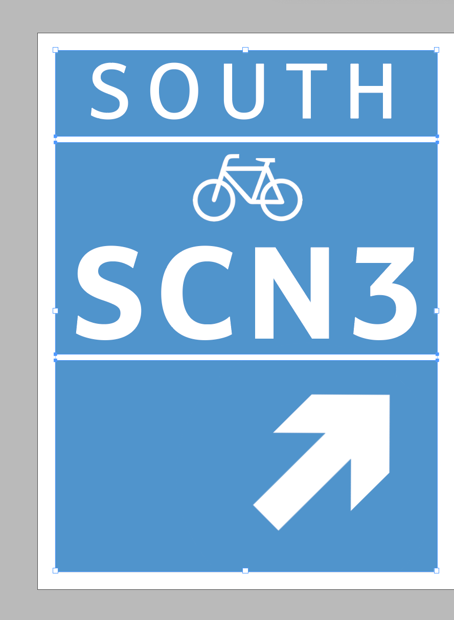
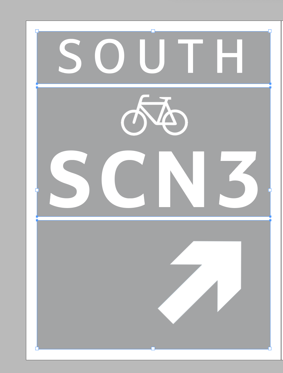
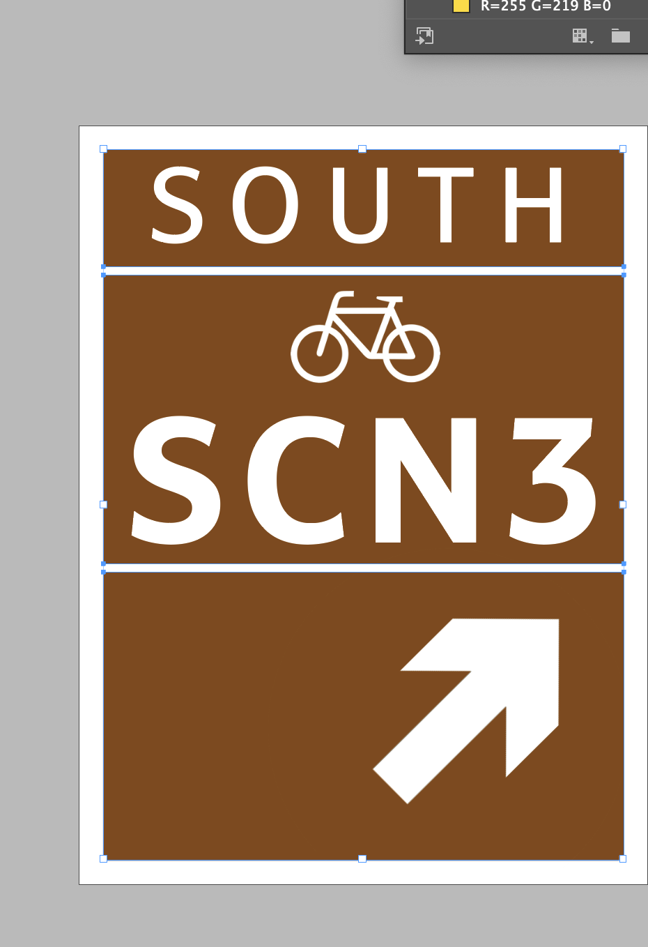
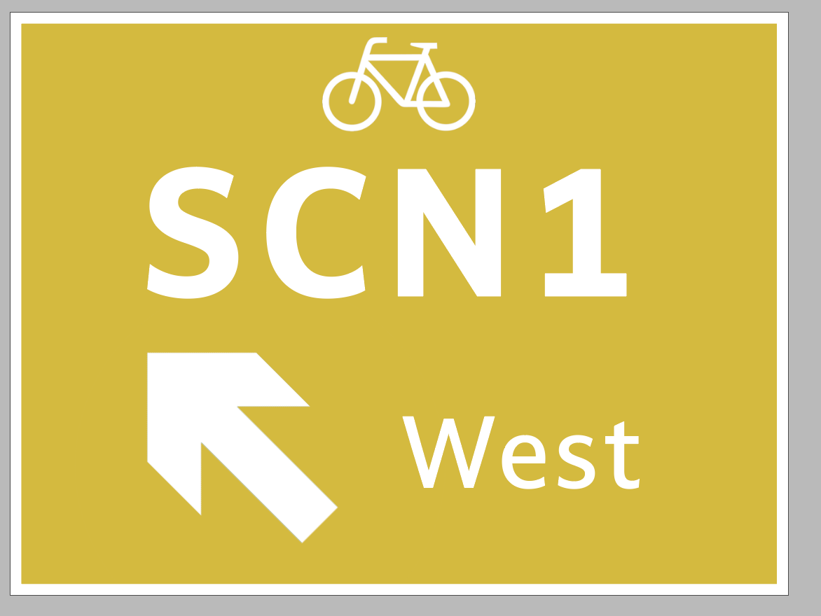
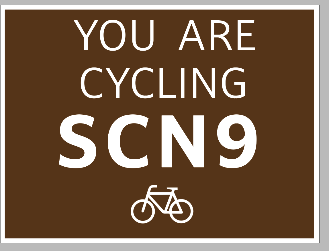
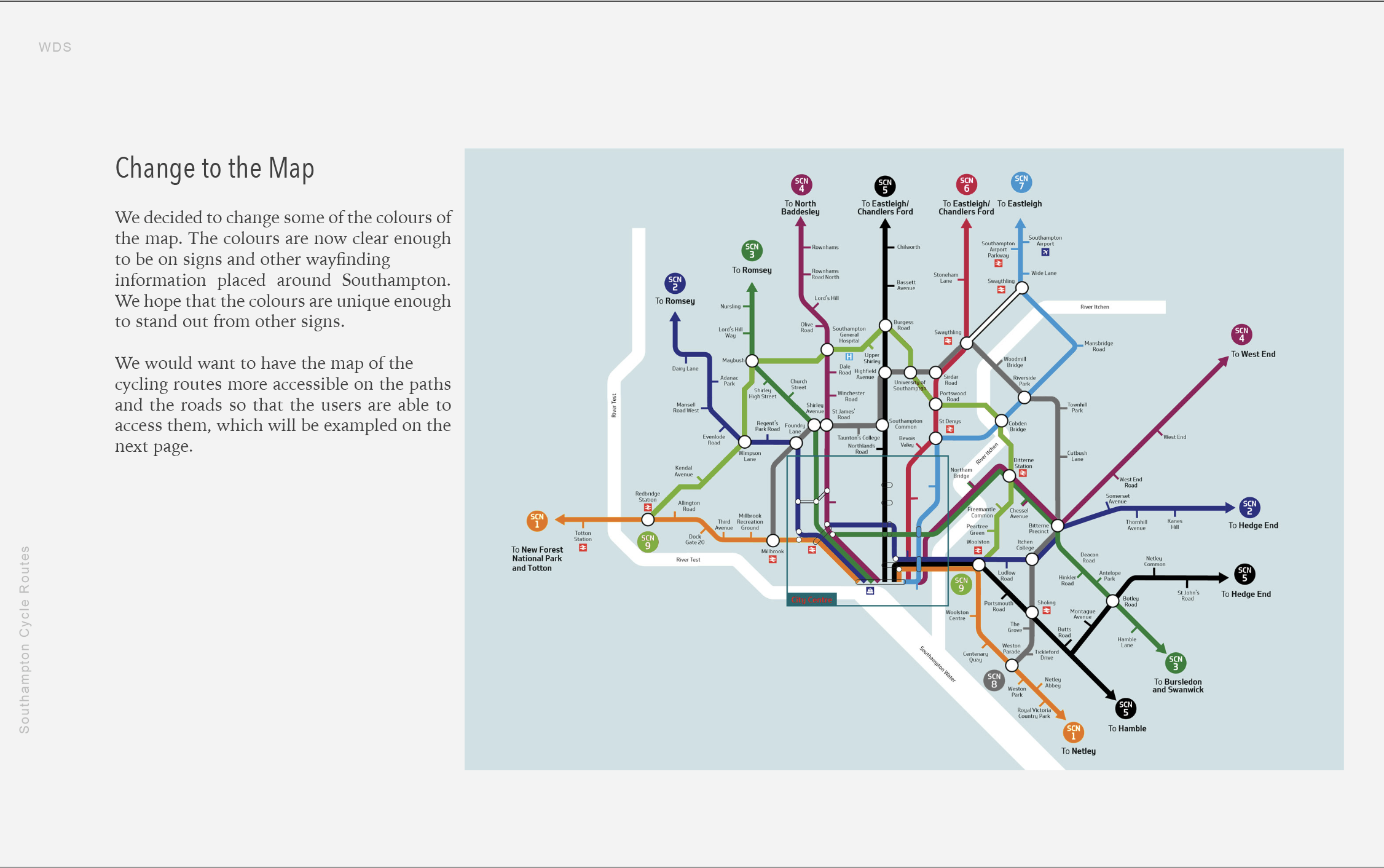
These will all be colour coordinated to the Southampton Council Route Map and have the same font as a lot of the other signage or not. I am not sure currently whether I want them to fit in or stand out.

I began by doing a quick little sketch out of how I thought the design would look.

I then went on to do some research about the font that was used within the other typography signs within Southampton.

The original font was designed by Dalton Maag but I couldn’t find the download for it, so I ended up using this one which I think is pretty similar.
A bit of development:
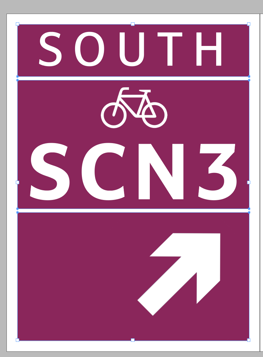
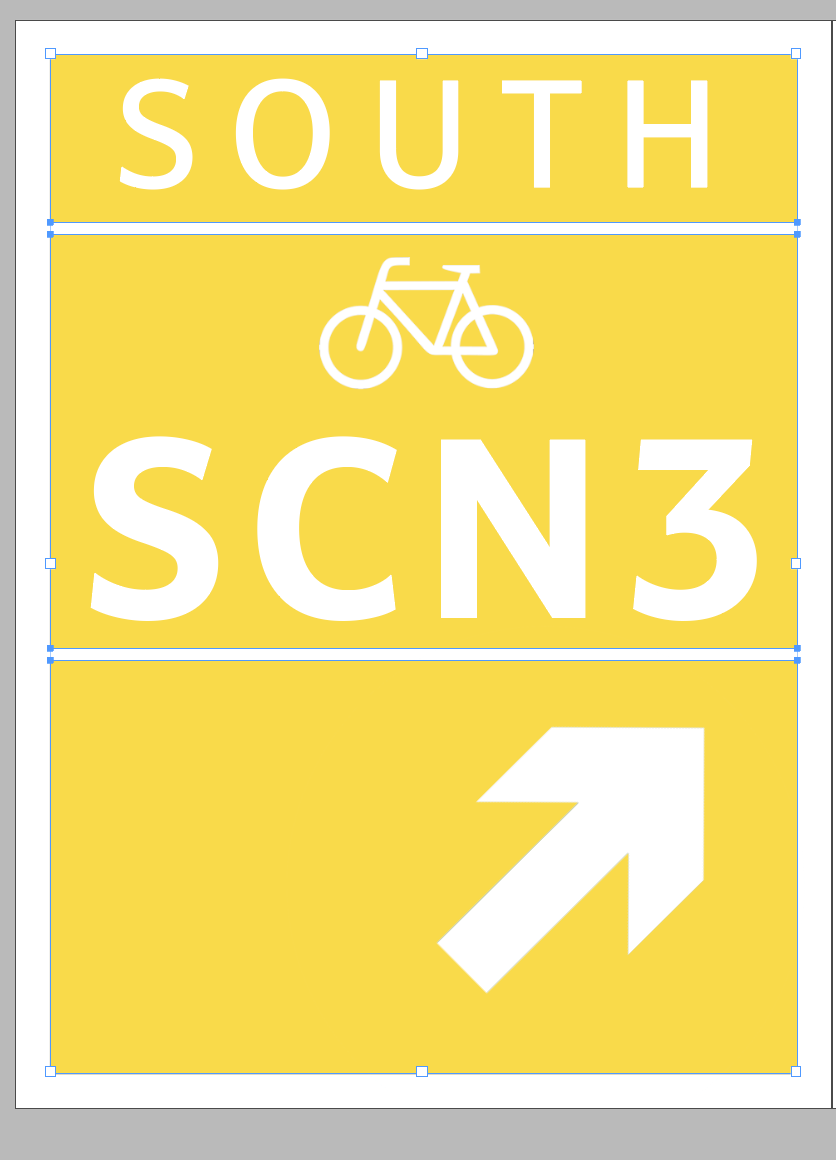
After getting to a certain point - I wanted to photoshop some of the ideas together to see if they worked:
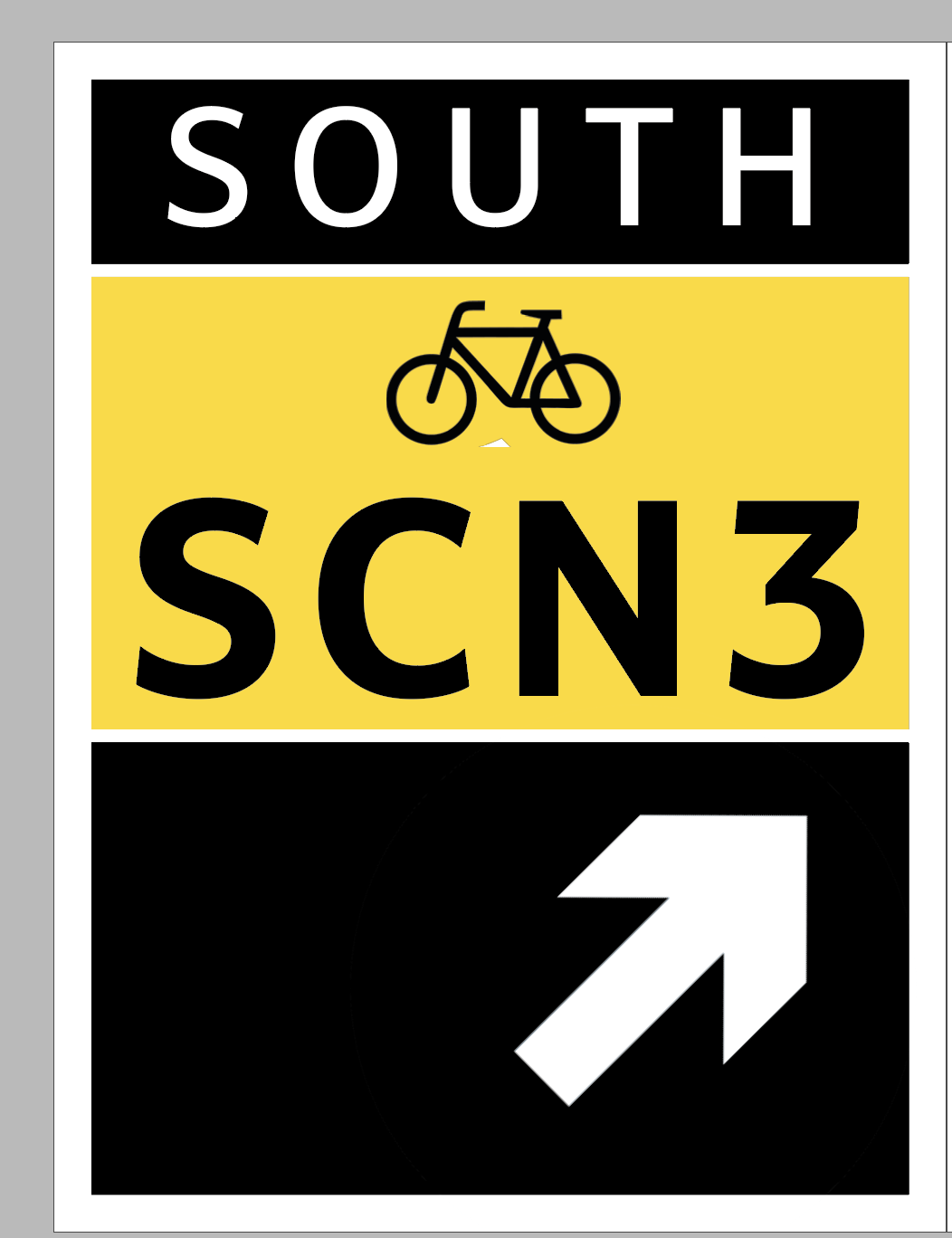
I then felt like I was at a point where I wasn’t really sure where to go and whether my design was just too simple. I posted my designs on the ideas wall and asked for feedback:


From this helpful feedback from Cat. I have revised some of the lettering within the signs.


This was the rest of the feedback that I received.
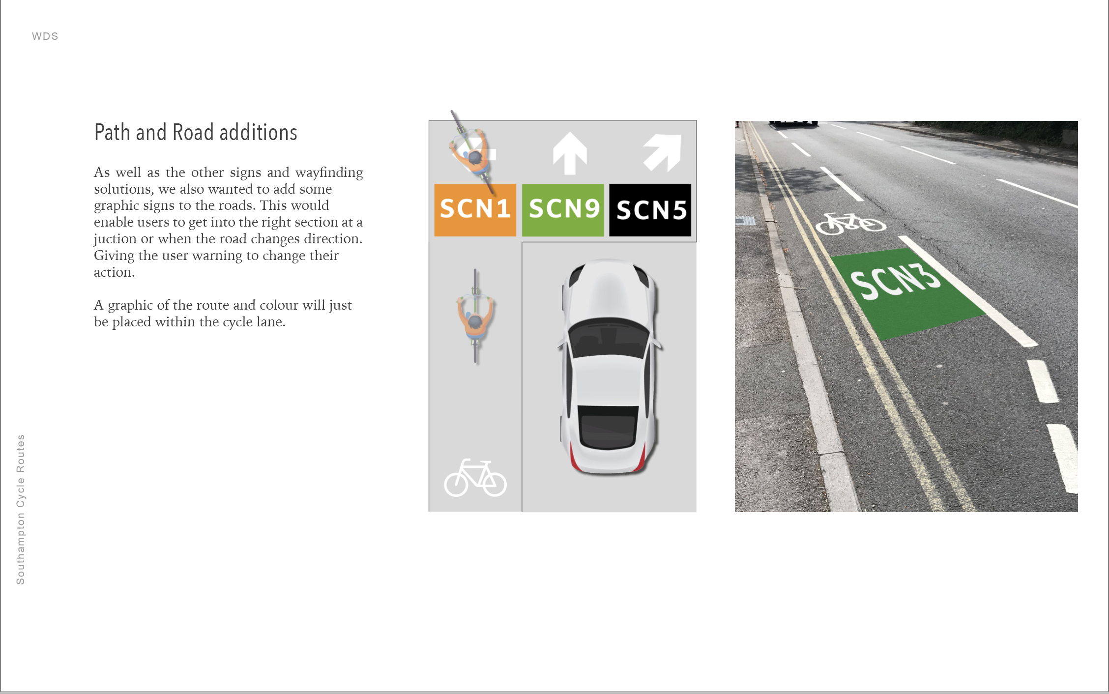
Think about the imagery on the posts
Think about possibly having colour on the road as a clear marker
think about the consistency
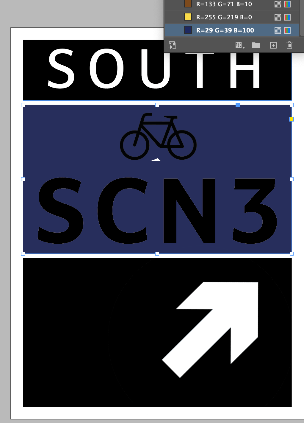
Taking all of this in account, I started to play around with the layout.
Then I had a crit which left me thinking about the following:
Colour theory
Challenge the colours on the map
Consistancy
What is my outcome
graphic devices
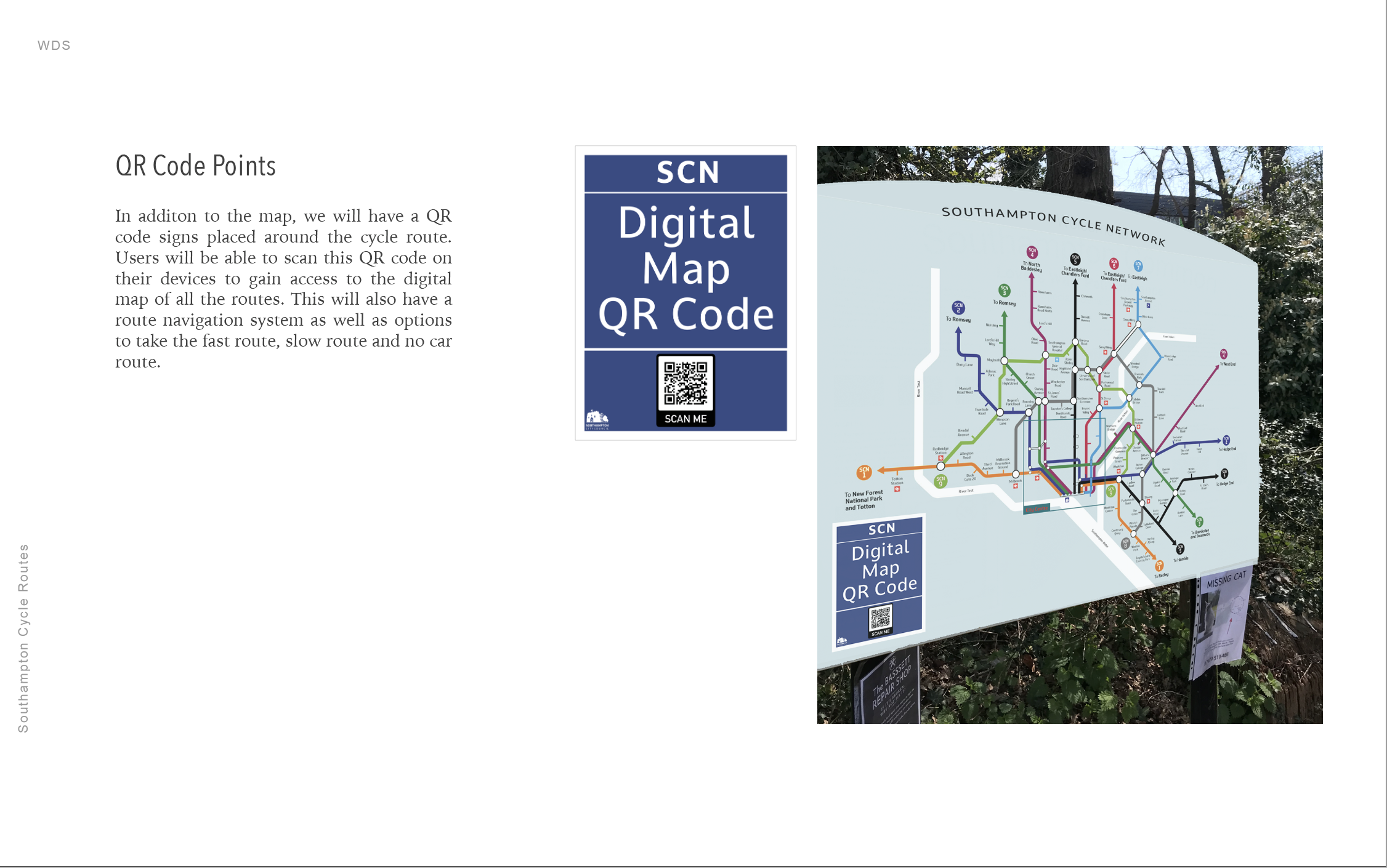
Qr codes?
Could be more generic
Microplastics
Boris Bikes
Simple the better
Micro Plastics Case study
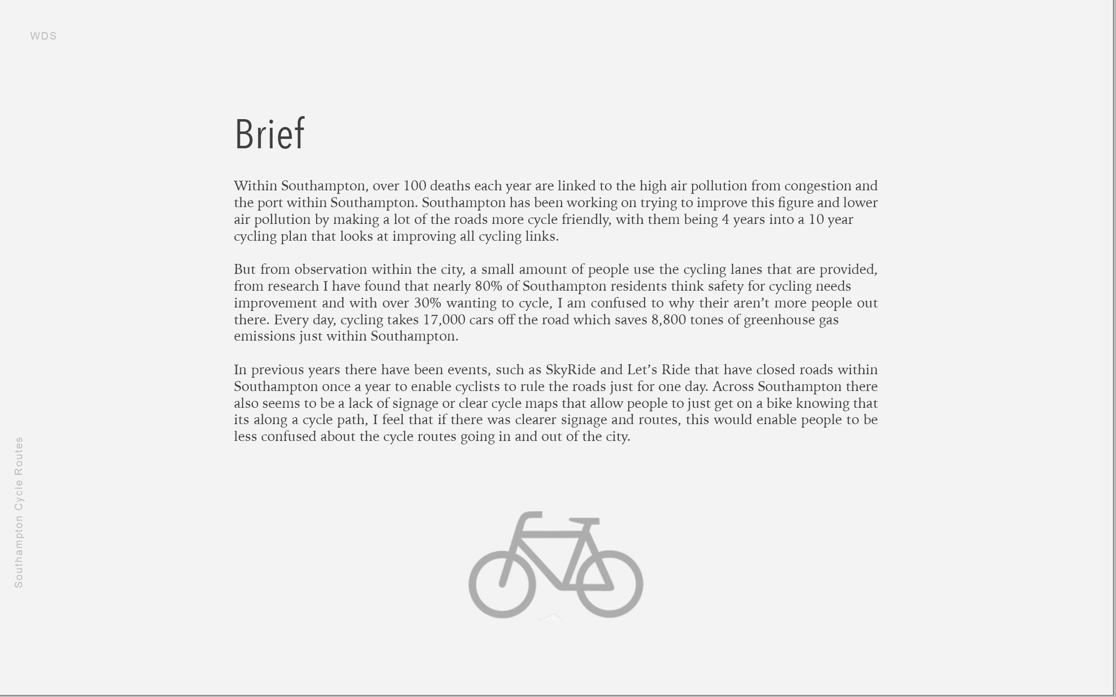
After reading this article, I though this would be a great alternative to laying roads with the amount of pollution that goes into it. I think that if this didn’t have so many negative effects then that would be good. It takes me back to the research that I did for the tyre and micrplastics in another weeks project.
“The 30-metre path, made of recycled plastic equivalent to more than 218,000 plastic cups, is expected to be three times as durable as an asphalt alternative. It also contains sensors to monitor the road’s performance, including its temperature, the number of bikes that pass over it and its ability to cope with the traffic.
The prefabricated sections of cycle path are light and hollow making them easy to transport and 70% quicker to install. Cables and utility pipes are able to be easily fitted inside, and the path is designed to drain off rainwater.”

After doing more research on this topic, I have come to the conclusion, I won’t be using this for inspiration as there have been studies that have found the more worn down that the path gets the more micro plastics go into our atmosphere.
Painting the Road Case Study
This is a really interesting case study that Paul shared on the ideas wall. I think its really nice how it was designed to rethink the everyday and its something that is bright and colourful that could add effect. There also this whole notion and questions about the design of a walk crossing or a cycle lane which could be interesting to play on within my design.
“London Design Festival 2016: artist Camille Walala has applied her signature graphic style to a pedestrian crossing in south London .Walala was commissioned by Better Bankside and Transport for London to create the Colourful Crossing for Southwark Street. They tasked her with reimagining the everyday experience of crossing the road.”

From this feedback, I went back to the signs and tried to make them more consistent. With the layout.
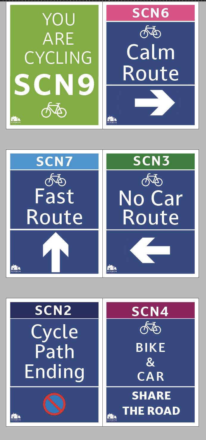
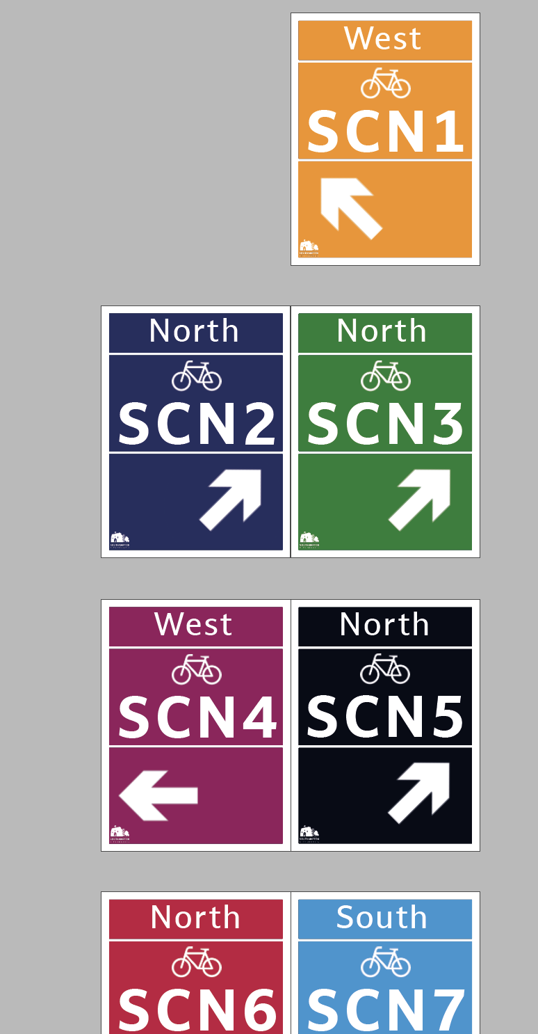
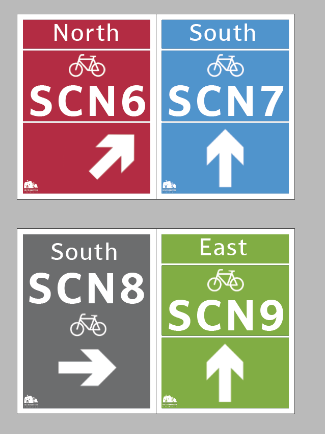
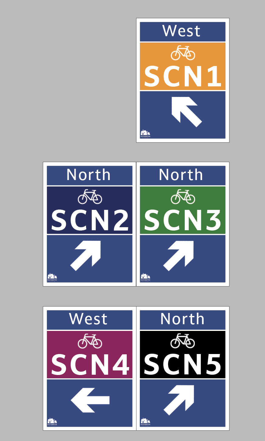
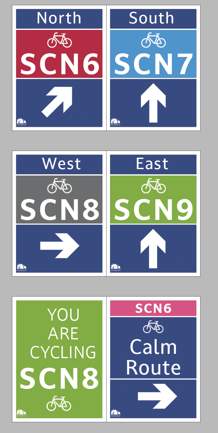
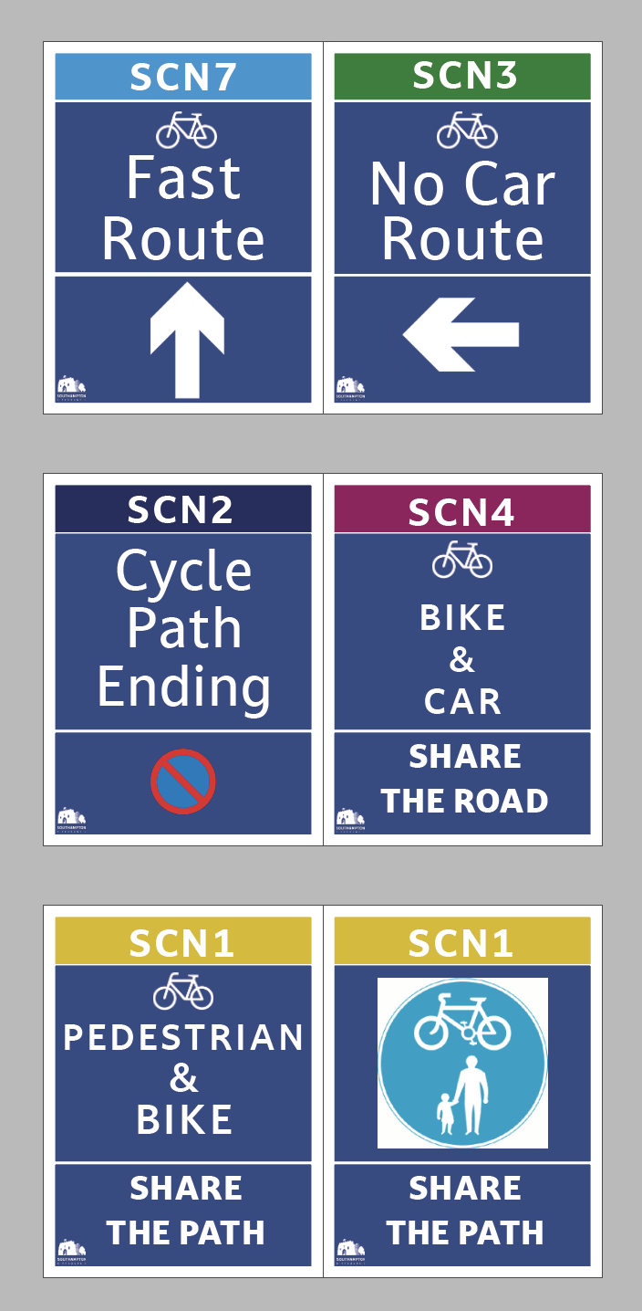
After this I decided that my outcomes would be the sign, the product, the QR code and the road signage - I would produce this in a pack with all the other way-finding information. I re coloured the images and then created a map that followed the image colour. I also then went onto create a QR code and added that to the map too.
I then put this all together in a PDF document.
Weekly Summary
I found this week really interesting and fun! This is the first week that we have been able to design.
Ideas Wall Contribution
Reference list
Behance and Oosthuizen, R. (n.d.). London Cycle Wayfinding. [online] Behance. Available at: https://www.behance.net/gallery/70896087/London-Cycle-Wayfinding [Accessed 13 May 2021].
Bourton, L. (2018). “Excitement, change and hope”: a poster workshop in a Camden basement from 1968 to 1971. [online] www.itsnicethat.com. Available at: https://www.itsnicethat.com/articles/poster-workshop-1968-1971-four-corners-books-publication-230518 [Accessed 13 May 2021].
Burson-Marsteller (2017). Air View | Burson-Marsteller | Blueair | D&AD Awards 2017 Pencil Winner | Service Innovations | D&AD. [online] www.dandad.org. Available at: https://www.dandad.org/awards/professional/2017/creativity-for-good/25715/air-view/ [Accessed 13 May 2021].
Cartlidge Levene (2006). WalkRide Newcastle Gateshead Map | Cartlidge Levene | Newcastle City Council | D&AD Awards 2006 Pencil Winner | Signage & Information Graphics | D&AD. [online] www.dandad.org. Available at: https://www.dandad.org/awards/professional/2006/graphic-design/15128/walkride-newcastle-gateshead-map/ [Accessed 13 May 2021].
Clemenger BBDO Wellington (2017). The Conscious Crossing | Clemenger BBDO Wellington | KiwiRail | D&AD Awards 2017 Pencil Winner | Design/Brands | D&AD. [online] www.dandad.org. Available at: https://www.dandad.org/awards/professional/2017/creativity-for-good/25788/the-conscious-crossing/ [Accessed 13 May 2021].
Cowan, K. (2020). Mate Act Now: Leading designers from all over the world join in a climate change “poster protest.” [online] Creative Boom. Available at: https://www.creativeboom.com/inspiration/mate-act-now-designers-from-all-over-the-world-join-in-a-climate-change-poster-protest/ [Accessed 13 May 2021].
Earth Week (2010). Earth Day 1970 Part 1: Intro (CBS News with Walter Cronkite). [online] www.youtube.com. Available at: https://www.youtube.com/watch?v=WbwC281uzUs&feature=emb_logo [Accessed 13 May 2021].
Grey London (2016). LifePaint | Grey London | Volvo | D&AD Awards 2016 Pencil Winner | Advertising & Marketing Communications - Brand | D&AD. [online] www.dandad.org. Available at: https://www.dandad.org/awards/professional/2016/creativity-for-good-white-pencil/25057/lifepaint/ [Accessed 13 May 2021].
Jamesup (2012). London Designer Has A New Take On Cycle Wayfinding. [online] Londonist. Available at: https://londonist.com/2012/01/london-designer-has-a-new-take-on-cycle-wayfinding [Accessed 13 May 2021].
Lord, S. (n.d.). Poster Workshop 1968-1971 | Irregulars. [online] Four Corners Books. Available at: https://www.fourcornersbooks.co.uk/books/poster-workshop-1968-1971/ [Accessed 13 May 2021].
Maynard (n.d.). Southampton Legible City. [online] Maynard. Available at: https://www.maynard-design.com/project/southampton-legible-city/.
Outrider Foundation (2020). When the Earth Moves Film. [online] www.youtube.com. Available at: https://www.youtube.com/watch?v=Cwnkw5pnG38 [Accessed 13 May 2021].
Steven, R. (2016). Design Museum Designs of the Year 2016: the nominees. [online] Creative Review. Available at: https://www.creativereview.co.uk/design-museum-designs-of-the-year-2016-nominees/ [Accessed 13 May 2021].
Studio Binocular (n.d.). Adelaide City: Cycle Wayfinding» Studio Binocular. [online] Studio Binocular. Available at: https://www.studiobinocular.com/projects/adelaide-city-cycle-wayfinding/ [Accessed 13 May 2021].
Tiger Beer (2017). Air-Ink | Marcel Sydney | HEINEKEN Asia Pacific Pte. Ltd. | D&AD Awards 2017 Pencil Winner | Product Design | D&AD. [online] www.dandad.org. Available at: https://www.dandad.org/awards/professional/2017/creativity-for-good/25712/air-ink/ [Accessed 13 May 2021].
Williams, M. (2020). Wayfinding is more than just functional in Moscow’s Gorky Park. [online] Creative Review. Available at: https://www.creativereview.co.uk/wayfinding-moscow-gorky-park/ [Accessed 13 May 2021].
Yalcinkaya, G. (2018). DixonBaxi creates branding for Tour de France television coverage. [online] Dezeen. Available at: https://www.dezeen.com/2018/07/20/eurosports-cycling-tour-de-france-dixonbaxi-branding-graphics-design/ [Accessed 13 May 2021].