Week Nine
Lecture Notes:
Lecture Reflection:

This lecture was really interesting to note the information about service design which I didn’t know previously.·
Service design is what makes you walk into one shop and not the other
Service design thinking
Customers eyes
Co-creative
Sequencing
Evidencing
Holistic
It was also interesting to note about some of the art activist movements that are happening around the world that you don’t know about especially CSPG and Peter Kennard. I think these are areas that I will want to research more this week.
Resource Notes:
Resource One:
Resource Two:
Resource Three:
Resource Five:

Resource Summary:
Resource One:

A really insightful document looking at the different areas of services design and case studies but also the processes that you can go through within service design. I always think the studies like this are really useful especially when they relate back to how it affects graphic designers and what graphic design really means within the service design area. I also thought that the process was really interesting and how you go through each technique. This process is very similar to my previous degree in interior design and how you go through working out a solution.
Resource Two:
Resource Three:
A really helpful presentation on the brief history about some of the political posters that have been around for a while. I think some of them are really interesting that they haven’t actually been designed by graphic designers but just people that are passionate about the topic so they make a poster about it. Some of them don’t directly correlate to the war themselves but they imply something that is going on. I really heard her when she was speaking about the poster which changed the classic war poster and turned it into the topics that you could find within a newspaper today, I think that is shocking but very true that a lot of the political events can be found in the newspaper with the same topics which don’t change.
Resource Four:

https://servicedesigntools.org/tools
Resource 4 is the service design tools website that allows you to look at all the meanings within each of the processes but also allows you to gain an understanding about why you might or mightn’t do that. I think this Is really helpful for me in particular as I often struggle to find the meanings or to understand what’s going on.
Research
Service Design and Saving the World
Why is art activism so important?
“The 20th century philosopher Theodor Adorno famously wrote that “all art is an uncommitted crime”. What he meant was simply that by its very nature art challenges the status quo. Throughout history, artists have reacted against oppression, violence, injustice and inequalities. They have stood up for the voiceless and marginalised. Protest art challenges traditional boundaries, hierarchies and rules imposed by those in power. It’s an act of defiance. And it is hugely important as it can influence the thinking of the general public, as well as leaders and politicians. Often images speak louder than words. Art can make a message accessible and universal.”
https://ruthmillington.co.uk/11-famous-protest-art-examples/
Designing for social good
When looking at an article that looks at how work for social good is designed which has always happened throughout history https://eyeondesign.aiga.org/isometric-studio-is-rethinking-what-it-means-to-design-for-social-good/ . Design studios like Ideo have developed processes pull from service design and design thinking to codify social design into particular deliverables that can be used in any context. It also means looking for universal solutions, can we be more like policymakers and how do we design for these social issues in a way that doesn’t just reflect back our own stylistic preference but instead creates truly empowering tools for the very people that design is supposed to benefit. This company worked on an exhibition called rising together unjust policing through the black American experience. “We faced a dilemma because despite the great research they’d done, they had no Black team members and wanted to present this information in a formulaic way,” Jawaid says. “And the elephant in the room was that there were all these names that we knew — Michael Brown, Sandra Bland, Trayvon Martin — where were those names? Why weren’t they being talked about?” “They proposed traveling to three American cities to interview and photograph participants to better understand their negative experiences with policing. These images and quotes became the foundation of the exhibition that was then layered with historical narratives, current data, and a community table in the center of the exhibition space that encouraged visitors to talk to one another.”
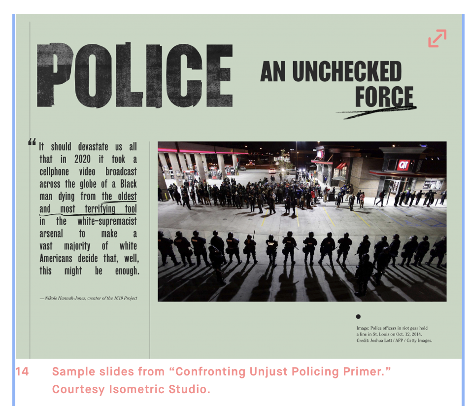
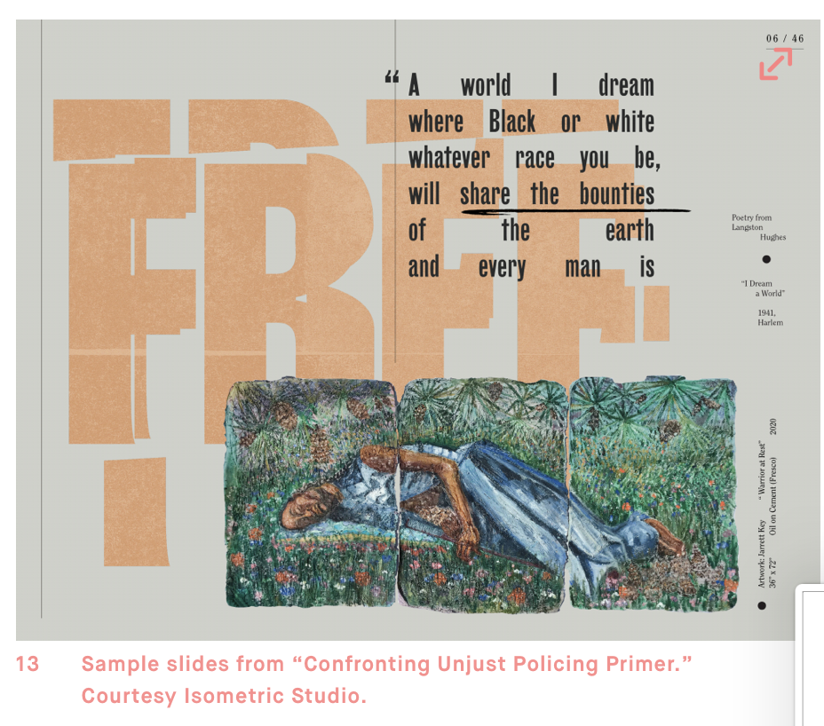
It doesn’t matter the client or the project, Isometric embraces these challenges seeking to move beyond the stylistic and predefined types of work. They want to have equal sides “It means we can give equal measure to each other as business partners and the clients we serve,” Chen said. “We can represent everybody who has informed the context of this work.” And in architecture, an isometric drawing is a floor plan drawn at a thirty degree angle where the same scale is used for every axis, creating a non-distorted image. “It’s an ideal that isn’t really possible,” Jawaid continues. “But we’re interested in that ideal. We’re designing for that ideal. We are looking for the people who have been excluded and trying to make this space more inclusive.”” https://eyeondesign.aiga.org/isometric-studio-is-rethinking-what-it-means-to-design-for-social-good/
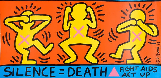
Keith Haring & AIDS activism
https://ruthmillington.co.uk/11-famous-protest-art-examples/
“Although he died in 1990, Keith Haring’s art activism lives on. His pop art-style makes his messages accessible. Today, there are Haring T-shirts, Haring hats, Haring shoes, Haring baseball hats and badges. During the 1980s, he made art which addressed socially important issues. His specially designed posters were given out at anti-nuclear and anti-apartheid rallies. He also campaigned for AIDS awareness, through his famous slogan Silence = Death. Haring’s art forced people to talk about AIDS”.
“Art is nothing if you don’t reach every segment of the people” – Keith Haring.”

CSPG
“Every purchase helps support CSPG's mission to preserve the graphics of the past and teach the generations of the future.”


Iconic Designs apart of activist movements

The Smiling Sun is a globally recognised symbol of the Anti-Nuclear movement. English speakers know the slogan as “Nuclear Power? No Thanks” but it was actually originally Danish: “Atomkraft? Nej Tak”.
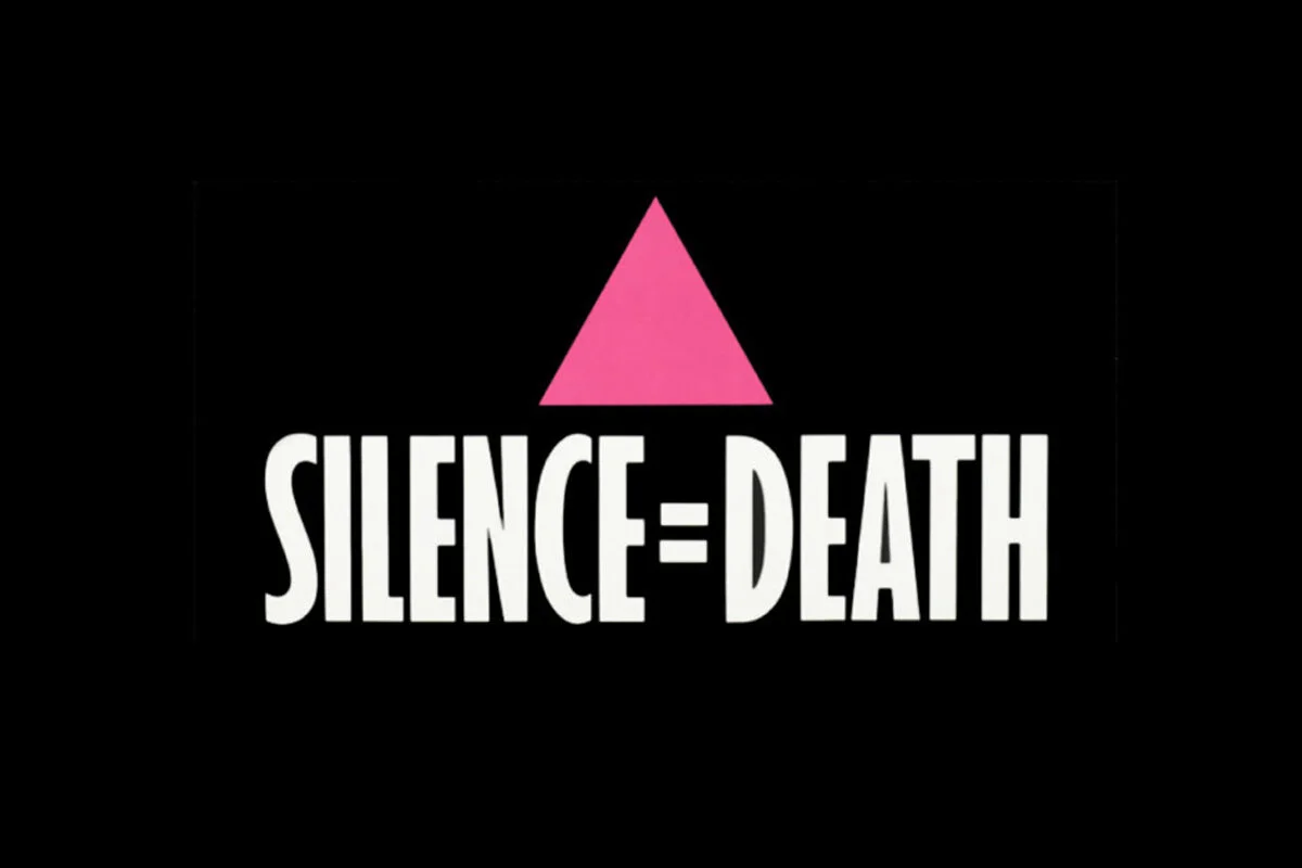
“Silence = Death refers to two things. Firstly, the iconic poster and central image of ACT UP (AIDS Coalition to Unleash Power). And, secondly, the poster’s designers, known as the Silence = Death Project. The latter was a New York-based collective made up of six gay activists, Avram Finkelstein, Brian Howard, Oliver Johnston, Charles Kreloff, Chris Lione and Jorge Soccarás.”

“The Peace symbol has become so commonplace that it’s easy to overlook both its history and the fact that it is a piece of design. The logo, which was then known as the Nuclear Disarmament logo, was designed by British designer Gerald Holtom. Soon after its release in 1958 it became the official logo for the British Campaign for Nuclear Disarmament (CND).”

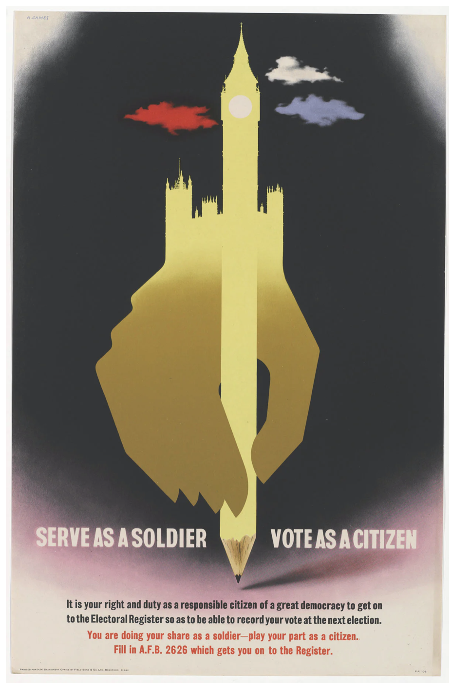
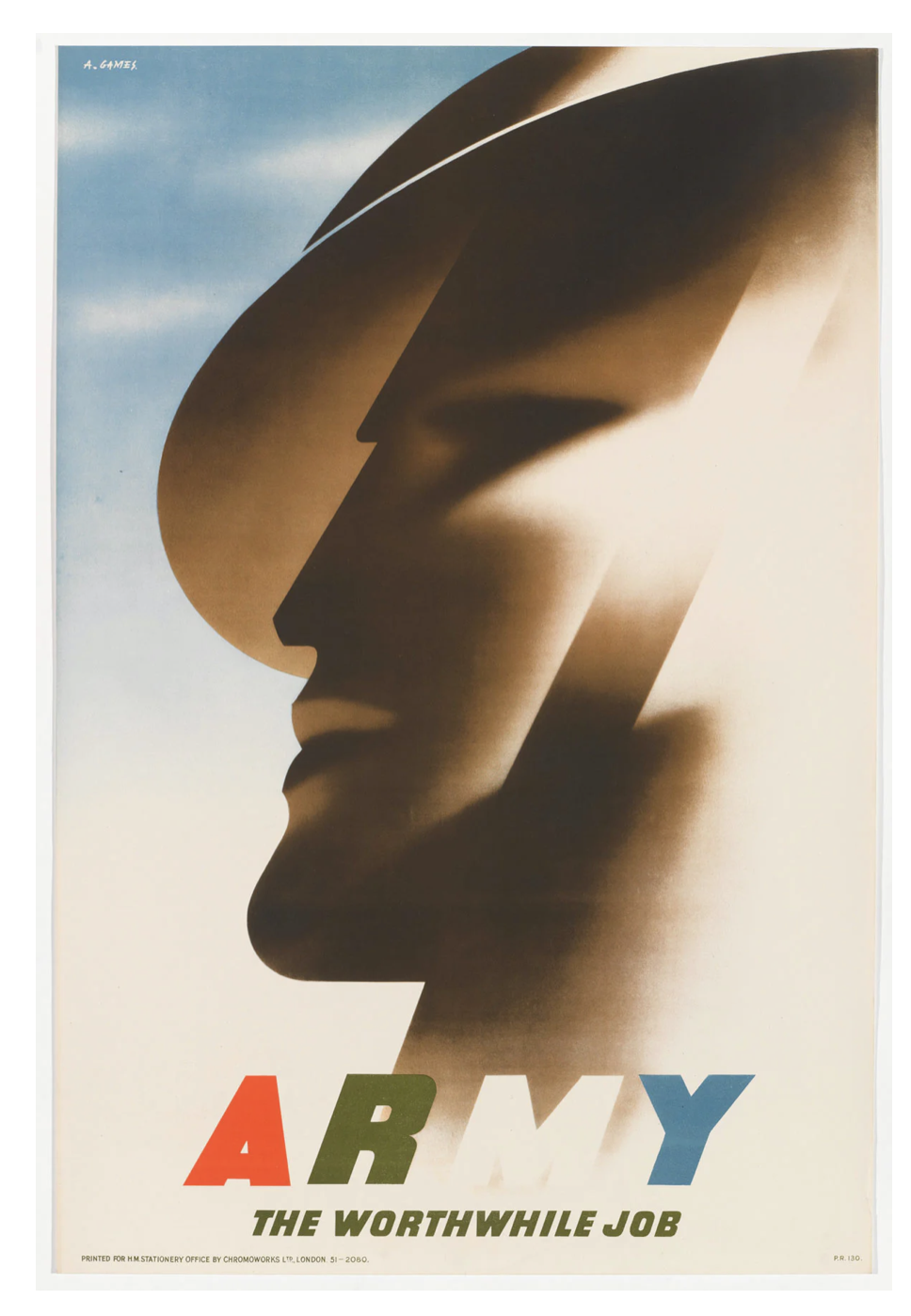
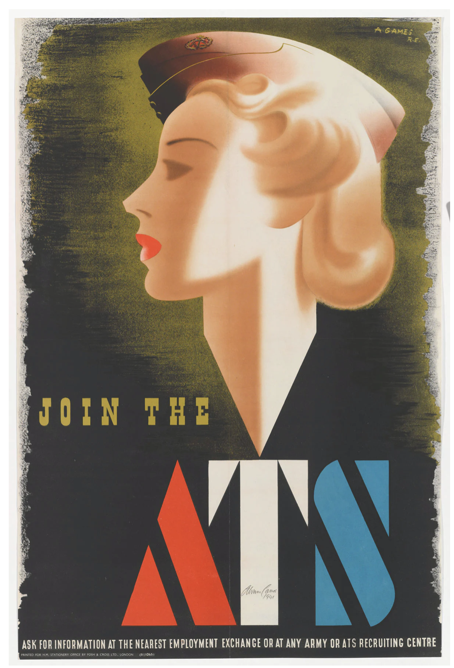
“During the Second World War, British graphic designer Abram Games was recruited as an Official War Artist. Between his appointment in 1941 and the end of the war, Games created over 100 propaganda posters for the British government. He had to create posters that would encourage both soldiers and civilians and to increase war efforts. Given a certain amount of artistic freedom, the posters Games created were striking and beautiful with some surrealist elements. They took official war posters in an entirely new direction. Though, at the time, not everyone loved Games’ work. Winston Churchill even ordered that one of his posters be removed from a 1943 exhibition. His propaganda posters were ahead of their time design-wise.”
After seeing the work of Abram Games, I wanted to dig a little deeper into his work. https://www.creativereview.co.uk/remembering-abram-games-wartime-work/
Peter Kennard
“Peter Kennard (born 17 February 1949) is a London-born and based photomontage artist and Professor of Political Art at the Royal College of Art. Seeking to reflect his involvement in the anti-Vietnam War movement, he turned from painting to photomontage to better address his political views. He is best known for the images he created for the Campaign for Nuclear Disarmament (CND) in the 1970s–80s including a détournement of John Constable's The Hay Wain called "Haywain with Cruise Missiles".
Because many of the left-wing organisations and publications he used to work with have disappeared, Kennard has turned to using exhibitions, books and the internet for his work.
Kennard has work in the public collections of several major London museums and the Arts Council of England. He has his work displayed as part of Tate Britain's permanent collection and is on public view as part of 2013's rehang A Walk Through British Art.” https://www.tate.org.uk/art/artists/peter-kennard-10184
After listening to the video about Peter Kennard, I think that some of his work is really iconic. I particularly find it interesting how he has montaged a lot of art work together. I also like how he has taken iconic sayings and montaged them to create a more meaningful and effective effect.


Art Activist:
Milan Fashion Week

https://www.theguardian.com/fashion/2019/sep/22/gucci-model-mental-health-protest-milan-fashion-week
This was an interesting protest recently, although not a poster campaign I think that mental health has become a vital thing in the past years and I think showing this statement at Milan fashion show is huge and a lot of respect for the model doing this.
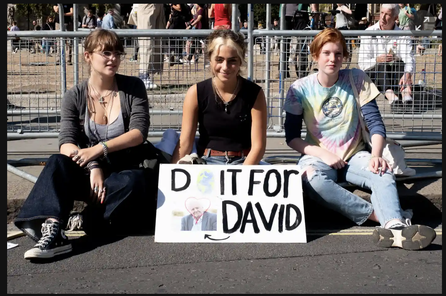
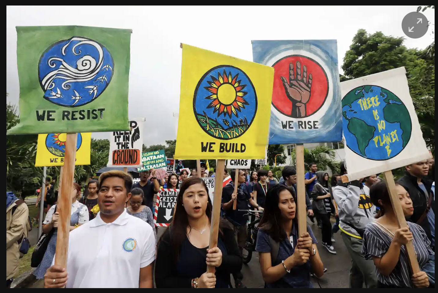
Climate Change:
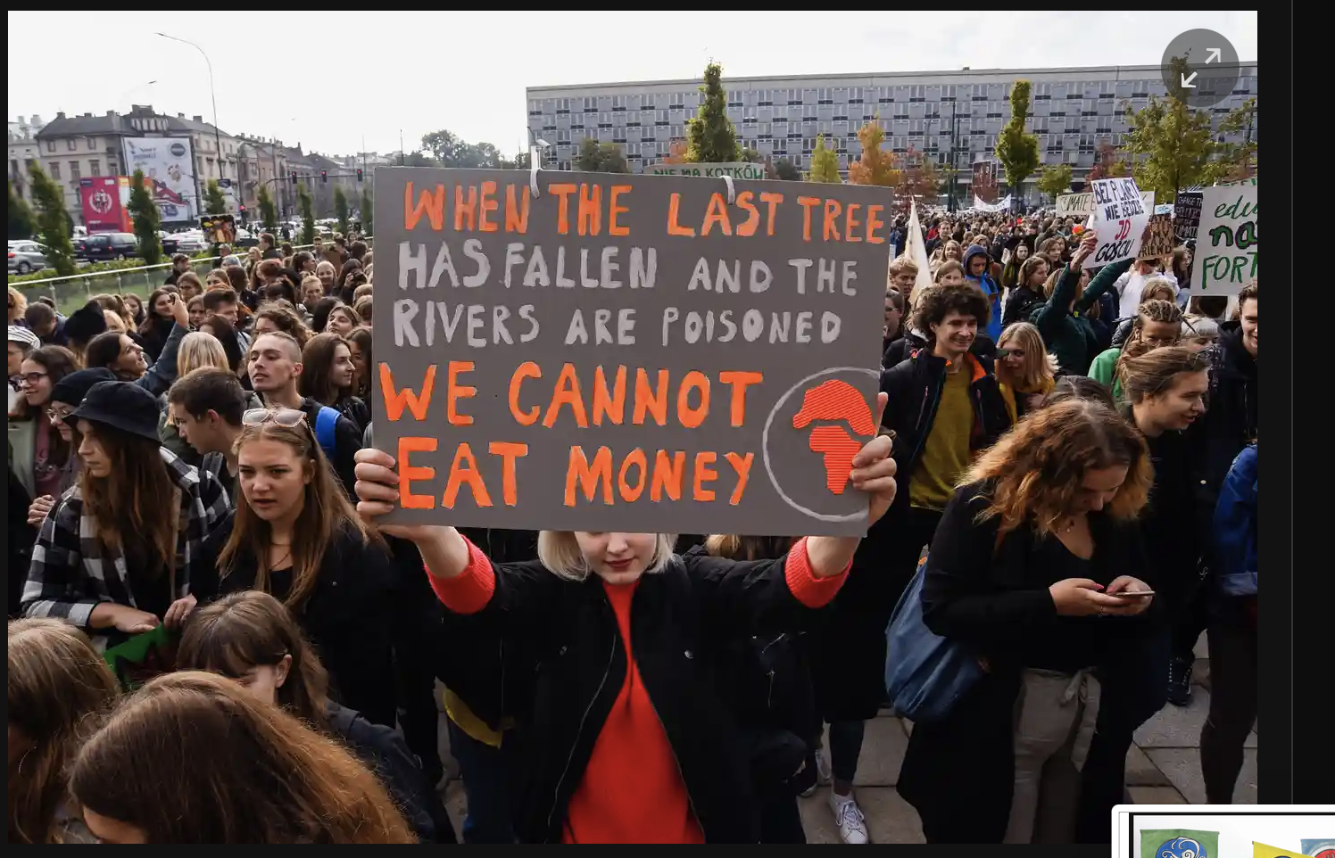
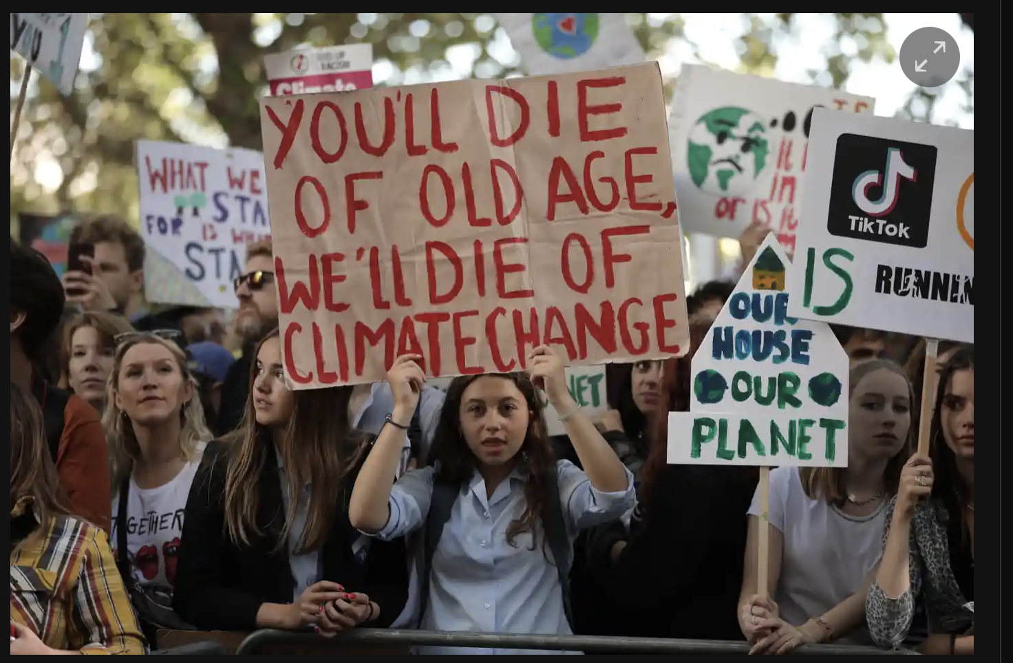
Some of the iconic posters of the past couple of years that are looking at protesting climate change, I think the messages really hit home for a lot of people that are looking at these messages. https://www.theguardian.com/us-news/gallery/2019/sep/20/the-best-climate-strike-signs-from-around-the-globe-in-pictures
You an see in the following images, but a lot of these slogans and sayings are then repeated through a lot of other protests that are happening.
The new era of Poster art:
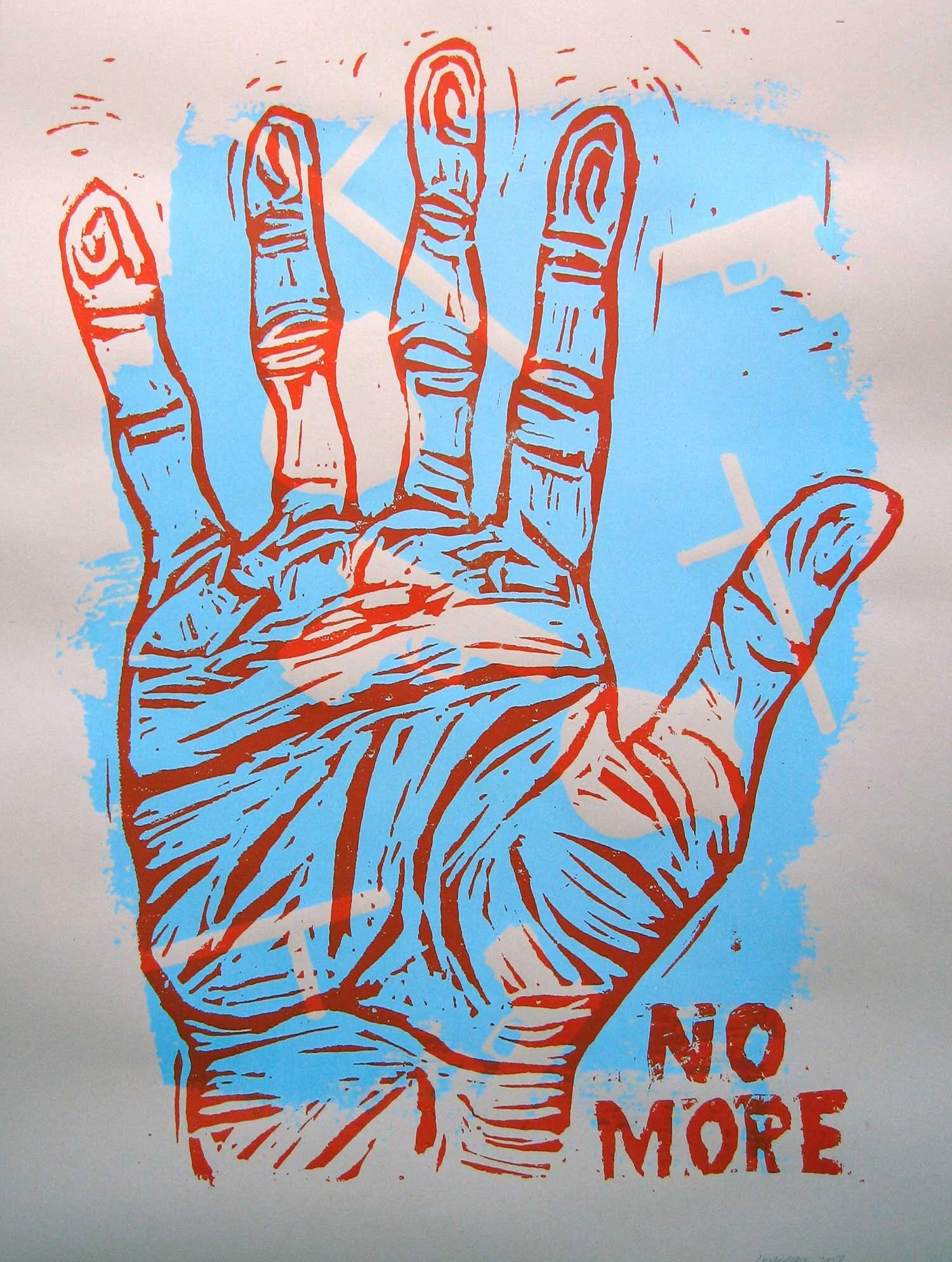
When the last president of the USA became president, he sparked a new wave of art activism so people are able to show what they are feeling, one of the famous images from this time was by climate artist, Josh MacPhee which can be seen in the image below. https://www.theguardian.com/artanddesign/2018/mar/03/50-protest-art-posters-detachable

I think this is such a powerful poster as it gives a glimpse as to what the future might be with a clever mix of using an old image and then adding illustration over the top of the image. It made me interested to see what the other images he has done that are equally iconic.
“Josh MacPhee is a designer, artist, and archivist. He is a founding member of both the Justseeds Artists’ Cooperative and Interference Archive, a public collection of cultural materials produced by social movements based in Brooklyn, NY (InterferenceArchive.org). MacPhee is the author and editor of numerous publications, including Signs of Change: Social Movement Cultures 1960s to Now and Signal: A Journal of International Political Graphics and Culture. He has organized the Celebrate People's History poster series since 1998 and has been designing book covers for many publishers for the past decade (AntumbraDesign.org). His most recent book is An Encyclopedia of Political Record Labels (Common Notions, 2019), a compendium of information about political music and radical cultural production”

https://justseeds.org/product/like-the-waters-we-rise/
“Artists have long been at the heart of this movement, finding bold, inspiring ways to help uplift struggles, reveal connections between climate and intersecting issues, build public support, and paint a picture of the world we are working to create. Like the Waters, We Rise tells the story of this expansive climate justice movement through a collection of print-based works developed as part of—or inspired by—occupations, direct actions, and mass mobilizations. Taken together, these works show the many terrains of struggle, points of intervention, and solutions of this continually expanding movement of movements.
Like the Waters, We Rise is developed in collaboration with Interference Archive, an all-volunteer “archive from below” located in Brooklyn. For the last eight years Interference has dedicated itself to carefully collecting, documenting, and preserving the cultural work of social struggles throughout the past several decades.
The exhibit takes place in two parts. The first opens here at the Nathan Cummings Foundation, and includes a selection of recent print based work (2005-present) beginning the year that Hurricane Katrina crashed onto the shores of the Gulf Coast. The second opens at Interference Archive in February 2020, and will include a collection of archival prints documenting the historical legacies of movements that gave birth to the current climate justice movement, including the Indigenous sovereignty movement, the farmworker movement, Black liberation struggles, and more.
The work shown within these exhibitions provides a partial look at a continually growing body of work, one that shows the growing strength and reach of the climate justice movement, a movement through which so many of our issues, struggles, and communities are connected.
This project was organized by Raquel de Anda (lead curator) and Nora Almeida, Ryan Buckley, Sophie Glidden Lyon, Josh MacPhee, and Siyona Ravi.”

Also creating images or posters that allow people to customers I guess or write what they want to write on the poster?
“A police badge is not a license to beat and kill. There is evidence that increases of police violence and weaponry precede increases of violent crime in communities. Based on designs made for Art Against Police Brutality exhibitions in Chicago in 1999 and 2000, printed in 2006. Unfortunately still relevant.”

“I was scribbling in my notebook and this phrase just came to me, and what better to illustrate then an infinite loop of darkness constructed out of all the colors in our lives. This was also another experiment pushing my knowledge and capacity on the risograph. The poster seems simple, but is actually constructed of six different colors, so the paper was run through the machine six times.
For those not familiar with risograph printing, the paper is pulled into the machine by a grooved rubber wheel, which collects ink and leaves track marks on the prints. When you have a lot of dense ink coverage, it is very difficult to avoid this. So if you order a print, don’t be surprised by a set of thin horizontal lines running through the print. See detail image below on the far right.
Because of the heavy ink build-up on these prints, you may receive a print that is still just a little bit sticky to the touch in the darkest areas!”
ZARIA FORMAN
Although not your normal protester, this artist looks at how she can protest the climate change through her artwork.
“Zaria Forman documents climate change with pastel drawings. She travels to remote regions of the world to collect images and inspiration for her work, which is exhibited worldwide.”
Video Notes //
Life mission to convey urgency of climate change through work
Viewers to emotionally connect to places that you might not get to visit.
Inspired to protect and preserve them.
process - travelling to the places at the forefront of climate change
Create large scale compositions
Using soft pastel
The image is stripped down to its basic form of colour and shape
See the composition as a whole
Fortunate to join and travel with her mother on these places
Passion for the artic and felt the power of the landscape
same sense of awe that she experienced
The ice is also Vulnerable
The Maldives is the lowest country in the planet which is drowning.
Focus on the positives rather than the negatives.


The way that Zaria talks about her work honestly really strikes and surprises me as to what is happening to our planet which I think we all forget which I say a lot of times, this is a really interesting way of showing people and trying to create impact in peoples lives to allow for change.
PAUL NICKLEN
“Paul Nicklen is a Canadian photographer, filmmaker, and marine biologist who has documented the beauty and the plight of our planet for over twenty years. As an assignment photographer for National Geographic magazine, Nicklen captures the imagination of a global audience.
Nicklen is uniquely qualified to create his brand of documentary photography which informs and creates an emotional connection with wild subjects in extreme conditions.”


Workshop
Research three user-centred design processes or tools that can be used to discover a core need or problem e.g. customer journey maps, service safaris, a day in the life, cultural probe, double diamond.
Select one process and write a short 100-word description to illustrate how it can be used to discover an insight or challenge.
The three user centred design processes that I have decided to research are; Emotional journey, Concept walk through and User stories.
Emotional journey
“An emotional journey allows us to look at how the users perception or experience changes throughout the service experience. This is an extension of a customer journey map that associates an indication of the emotional status of each stage of the experience.”
“The emotion can be represented by a curve floating from moments of frustration to delight, or by adding emojis and pictograms to the specific steps of the journey.” https://servicedesigntools.org/tools/emotional-journey
Concept walk through
“The concept walkthrough allows to gain feedback on a service idea at very early stages, by walking some users or experts through the new desired experience and ask to comment. The concept walkthrough only needs some low-fidelity mock-ups, sketches or images to support the explanation.”
https://servicedesigntools.org/tools/concept-walkthrough
User stories
“User stories are a technique coming from the Agile methodology, used to describe the requirements of a digital service from a user perspective (in contrast with product-based requirement documents). The user stories detail all the elements and interactions that enable the envisioned user experience with a mobile app or website, and connect the work of the design team (developing interaction flows and UI components) with the process of back-end and front-end development, enabling a better integrated workflow in sprints (rather than a water-fall development process).” https://servicedesigntools.org/tools/user-stories
I decided to choose concept walk through to illustrate how it can be used to identify a new insight.
By taking part in the concept walkthrough the user of the experience is able to be guided round the service or the action that is necessary to complete the task in question, so if this is for a website, if the walkthrough is taking place we are able to see how the user would interact with the website or how they guide themselves around the website then asking them how they would comment or if they found the experience easy or hard would then allow the developers to use that insight to change anything they need too, to improve the app or website or service in question. I think that this is a really useful process as often when you are in the service or making the service you cant see what others are seeing or how things are working, this just enables someone with fresh eyes to point out any bumps or things that don’t make sense.
Research and select one existing campaign or service design project that tackles a social problem and analyse its effectiveness. Please remember to include information about any user-centred design processes that may have been used and the impact it brought about.
Write a 300 – 400 word description with screen grabs to illustrate your research findings.
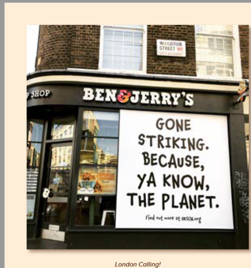
Whilst researching brands, one of the ones that stuck out to me was ben and jerry’s the ice cream company. I’ve heard about the way the brand looks at social problems before but never looked too much into it before seeing this article.
“Taking a stand in a way that inspires customers requires businesses to get behind causes they truly care about. “Consumers know when a brand is just paying lip service,” said Apczynski.
Activism is a part of Ben & Jerry’s history. As early as 1987, it developed social justice-themed ice cream flavors to lobby for change and raise money for global warming, LGBTQ+ rights, and criminal injustice—to name just a few causes.
This is likely one of the reasons why Ben & Jerry’s recent statement against racial inequality, which pointed to racial discrimination throughout history and addressed President Trump directly, resonated with its community. This also isn’t the first time Ben & Jerry’s publicly supported the Black Lives Matter movement.
“You can only launch authentic efforts if you believe in them,” said Apczynski. “If you’re getting behind an issue the business doesn’t authentically connect with, consumer loyalty won’t play out because that effort will be perceived as half-assed. That strategy isn’t going to help your business survive in a society that does authentically care.”"
https://www.zendesk.co.uk/blog/6-companies-tackling-social-justice-inspiring-customers/

From the screenshot above from the ben and Jerrys Website, I found it interesting that these were all the social issues that they looked at refugees and other things like in-equality. Then I clicked on the refugee social problem and it came up with loads of interesting information and the campaigns that they are currently working for. They have also worked with another company to set up something called ice academy that works with people to develop their business ideas with entrepreneur training, mentoring and part time employment that allows them to get their creative ideas into action. Obviously working with partners to help enable that to happen but this is one of the social problems with ben and Jerrys that I just didn’t know that they worked closely with, I assumed that they would work closely with fair trade but everything else.
Alongside this idea, they also come out with a new flavour of ice cream called spice and all things n’ice, as another way to support entrepreneurial people that arrived here and graduated from the ice academy. “Proceeds contributed to a small cooperative grant fund owned and managed by the graduates themselves, meaning they decide themselves how to use the money for their businesses, working together to take back control of their futures.”

This is just one of the many ice cream flavours they they release for their different social causes, when looking through their instagram account - there is a lot about climate justice and posts about the social problems that are happening within todays world. One of their latest campaigns that stands out from the instagram page is one called close the barracks. Which is a lot of people within the uk are waiting for their asylum claim to be processed and whilst they are doing this they are staying in unsafe old army barracks. They are protesting to close the barracks and for the government to make safe housing available to them. This is a problem that id not heard of before, so it’s clear that ben and Jerrys aren’t scared about voicing their opinion about social matters that are not only happening in the uk but abroad.
I have also looked through their social and environmental report that they do each year and I’ve highlighted the thing they are doing in the company that I think are important.

When comparing all of this to the 5 channels of service design - I have tried to outline and compare how ben and Jerrys tick all the Boxes.
User-centered – Use qualitative research to design focusing on all users.
I feel that with the social impacts that are happening around the world, ben and Jerrys are always trying to improve their design for all the users that are using their product, for example creating eco friendly packaging as well as making vegan options, this is all around the user for them as they want their product to sell.
Co-creative – Include all relevant stakeholders in the design process.
No one is working alone at ben and Jerrys, they have obviously have another company that they run all of their work with, so no one is working alone is any of these processes.
Sequencing – Break a complex service into separate processes and user journey sections.
Not sure about this one?
Evidencing – Envision service experiences to make them tangible for users to understand and trust brands.
I think that what makes this brand a trustable brand is the fact that It is all trying to be eco friendly and they are working with the farmers to make sure that its all fair trade, so even the people that provide the chocolate and the sugar, the whole process is fair trade which is why I think the ice cream can be a little bit more expensive.
Holistic – Design for all touchpoints throughout experiences, across networks of users and interactions.
Not sure about this one either?
After doing all this research I came to a conclusion that this wasn’t a strong enough example of service design for me to analyse properly, so I decided to continue researching which is when I came across another case study looking at a youth mental health centre by IDEO. https://www.ideo.org/project/allcove
The youth mental health centre of the future looks at redesigning the help-seeking experience that a lot of young people experience today. Regardless of where young people are on their journey of mental health, this project really focusses on a welcoming and non-judgemental environment. Santa Clara County Behavioural health services in collaboration with a centre for youth mental health opened two mental health clinics, they wanted the clinic and support to be easy accessible and open to all. They want to redefine the threshold for seeking care and making it easy for people to just walk into their clinic and tackle anything that the young people are facing. They came to the company IDEO to help design a brand and a space but they didn’t do this alone with them co-designing with 16-25 year olds. They had a youth group of 27 teenagers that contributed to every step of the process from talking through their stories to designing the colour schemes.


In the end they came up with the concept called alcove space to speak to whatever someone’s me time might look like. The rich colours and the gradients allow the youth to be reminded about the emotions that exists on different spectrums and the different situations that they might be going through. The whole brand ‘ allcove’ resonates with being alone but never being alone. Here IDEO talk about how the logo co-insides with the principes of allcove, “its logo, a curved shape with small inlets, represents just that—a place to retreat with openness to leave when you want to. The first syllable of the name (all) communicates inclusivity and togetherness. While the second syllable, cove, is by definition a space surrounded by protection that can take many forms.”

Throughout the designing journey, there was also an experience playbook that outlibes tge special cues that allows for the young people that visit the youth centre to way find at key moments in their journey, I assume this was done by a concept walk through, that allowed the team to learn about the youth wanted to choose when they interacted with staff and when they wanted to do things on their own. The digital orientation allows them to walk through the physical environment and general offers before they arrive at the space.
After researching the above on the IDEO website, I found the allcove website as I wanted to see what the user would be seeing. Its a really simple space to access information about the centre but also been designed in a way that you Can always see the gradients of the colours throughout the website which can be see in my screen grabs below. I also think that they colours on the illustrations and really simple but bring the drawings to life. It feels like a calming environment just through the website. https://www.allcove.org/#about01


I also fond this really interesting core components of the space on the Stanford website, https://med.stanford.edu/psychiatry/special-initiatives/allcove.html, just outlining the things that they stand for.
There was also a really clear video that allowed an explanation as to why they are doing what they are doing. They also interviewed young people that are interested in going to the programme, within they call it headspace but this became alcove.
Overall I think the way that they went about the user analysis for this project was really effective, they worked hand in hand with people that were using the space, to make sure that they felt comfortable within, they wanted to understand what the space would be used for and what people with mental health problems would find comforting vs not comforting.
Weekly Summary
This week has been a hard week for me to get my head around as its such a broad topic and can very easily be confusing. I think I have done some research on the user service before but not this in-depth. I found it really interesting to research some of the famous art activists of the past couple of decades and to learn about the CSPG which I hadn’t heard of before now, I think what they are doing arching a lot of the artwork from various protests around the world is really interesting. I tried to research some of the different methods of this art activism but also bring it to the present day and some of the protest art that I would’ve known.
For the workshop challenge this week, I found it really hard to get a company or a campaign that had enough information that spoke about service design. Ben and jerry’s are really in depth with the amount of information they give out especially having this social activism team at their disposal. I couldn’t find enough information about any of their processes so I decided to move onto another campaign called alcove in which IDEO was a partnership of. I found the whole design process and the research really interesting and I love that they have all come together to form this wellbeing centre but it was designed by the young adults that would be using it. It was also nice to see the techniques that they had used being put to use within the service design of the space.
Reference list
Archive, I. and Foundation, the N.C. (2019). Like the Waters, We Rise. [online] justseeds.org. Available at: https://justseeds.org/product/like-the-waters-we-rise/ [Accessed 13 May 2021].
Bromwich, K. (2018). You can stick it: 50 protest art posters. [online] the Guardian. Available at: https://www.theguardian.com/artanddesign/2018/mar/03/50-protest-art-posters-detachable [Accessed 13 May 2021].
CSPG (n.d.). “War is Not Healthy” by Lorraine Schneider. [online] political-graphics. Available at: https://www.politicalgraphics.org/product-page/war-is-not-healthy-by-lorraine-schneider [Accessed 13 May 2021].
Isometric Studio is Rethinking What it Means to Design for Social Good and Fuller, J. (2021). Isometric Studio is Rethinking What it Means to Design for Social Good. [online] Eye on Design. Available at: https://eyeondesign.aiga.org/isometric-studio-is-rethinking-what-it-means-to-design-for-social-good/ [Accessed 13 May 2021].
MacPhee, J. (n.d.). Prisons are a Black Hole. [online] justseeds.org. Available at: https://justseeds.org/product/prisons-are-a-black-hole/ [Accessed 13 May 2021].
Marriott, H. (2019). Gucci model stages mental health protest at Milan fashion week. [online] the Guardian. Available at: https://www.theguardian.com/fashion/2019/sep/22/gucci-model-mental-health-protest-milan-fashion-week.
McLaughlin, A. (2019). Remembering Abram Games’ wartime work. [online] Creative Review. Available at: https://www.creativereview.co.uk/remembering-abram-games-wartime-work/ [Accessed 13 May 2021].
Millington, R. (2020). Activist Artist. [online] Ruth Millington. Available at: https://ruthmillington.co.uk/11-famous-protest-art-examples/.
Nicklen, P. (2018). About The Wildlife Photographer Paul Nicklen. [online] Paul Nicklen. Available at: https://paulnicklen.com/about/.
Stevenson, O. (2020). 11 Amazing Designs for Activism, Protest and Cultural Change. [online] Shillington Design Blog. Available at: https://www.shillingtoneducation.com/blog/activism-design/.
Tate (2013). Peter Kennard born 1949 | Tate. [online] Tate. Available at: https://www.tate.org.uk/art/artists/peter-kennard-10184.
TED (2016). Drawings that show the beauty and fragility of Earth | Zaria Forman. [online] www.youtube.com. Available at: https://www.youtube.com/watch?v=9VF7kffCgJU [Accessed 13 May 2021].
The Guardian (2019). The best climate strike signs from around the globe – in pictures. The Guardian. [online] 21 Sep. Available at: https://www.theguardian.com/us-news/gallery/2019/sep/20/the-best-climate-strike-signs-from-around-the-globe-in-pictures.