Week Seven
Lecture Notes:
Lecture Summary:
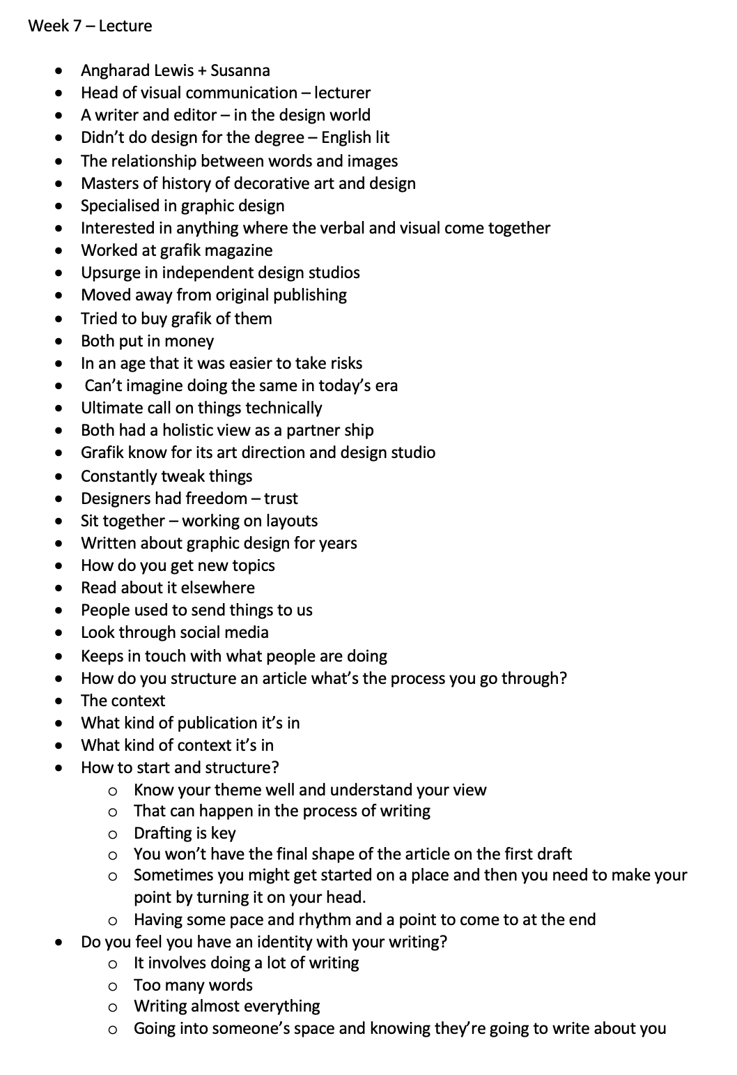
Super interesting lecture with Angharad about her history in design and how she got into the industry which is really helpful for people like us that are doing degrees to help us get into the industry. Loved hearing about the history of Grafik as I love their magazine style and editorial work so I think this could be a researching point of this week. But also loads of interesting and useful tips about the editing and writing process for this week which i’m going to highlight below. Its been really useful to hear about the way that she has done it so that we can learn about her process.
“· How to start and structure?
o Know your theme well and understand your view
o That can happen in the process of writing
o Drafting is key
o You won’t have the final shape of the article on the first draft
o Sometimes you might get started on a place and then you need to make your point by turning it on your head.
o Having some pace and rhythm and a point to come to at the end
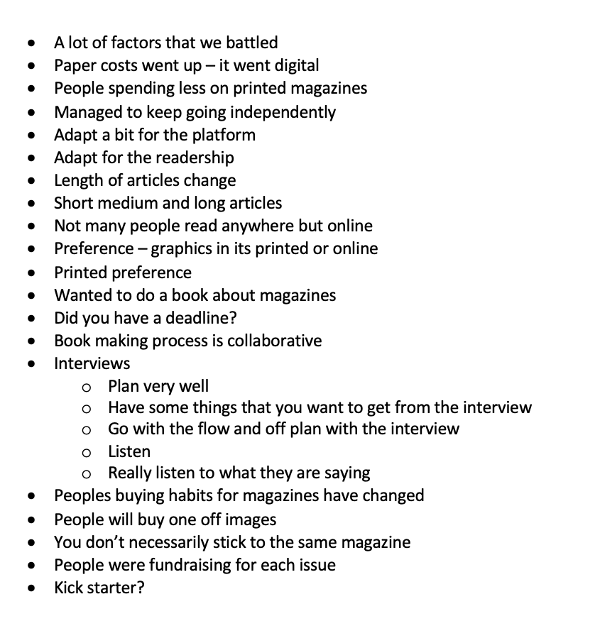
Interviews
o Plan very well
o Have some things that you want to get from the interview
o Go with the flow and off plan with the interview
o Listen
o Really listen to what they are saying
How do you structure an article what’s the process you go through?
· The context
· What kind of publication it’s in
· What kind of context it’s in
How do you get new topics
· Read about it elsewhere
· People used to send things to us
· Look through social media
· Keeps in touch with what people are doing “
Resource Notes:
Resource One:
Resource Two:
Resource Summary:
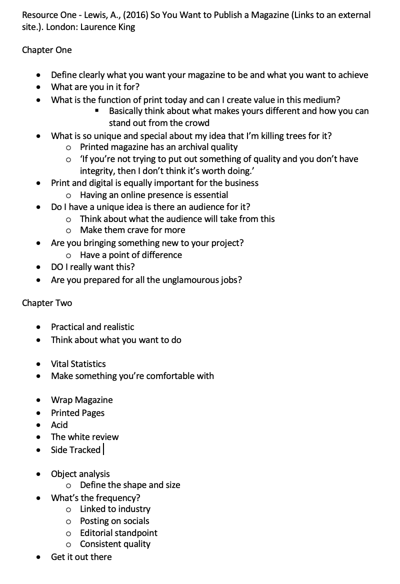
Resource One:
Really nice to see Angharad’s work in publication and loads of useful tips that have allowed me to start thinking about the publication and magazine world. Although there seems to be a lot of anxiety around the subject of starting to public online. I think the overall message is to just try and stand out from the crowd and to make sure that the magazine is quality. I also found some key magazine which I think ill add to my research for this week:
· Wrap Magazine
· Printed Pages
· Acid
· The white review
· Side Tracked
‘If you’re not trying to put out something of quality and you don’t have integrity, then I don’t think it’s worth doing.’
Resource Two:

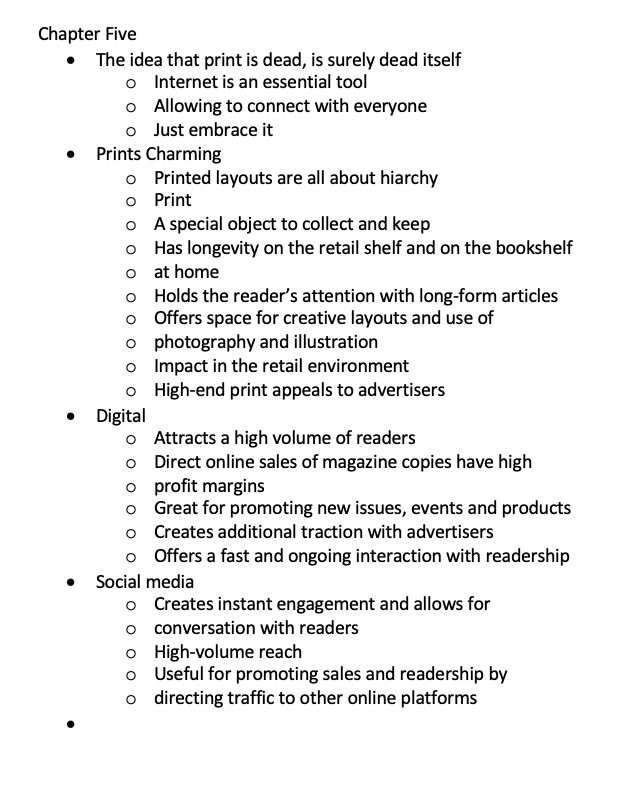
Another really helpful resource just about how you should lay out the document and how it should read. One of the areas that really interested me was the above about how we navigate around a page and how we are told to do this from a young age - but is this a British navigation or does this go onto be a world navigation as alot of people read from different lines. One of the areas that I wanted to do more research into was Frutiger’s Grid, I haven’t heard about this before now and I wonder if it’ll give me more of an insight into typography.
Research
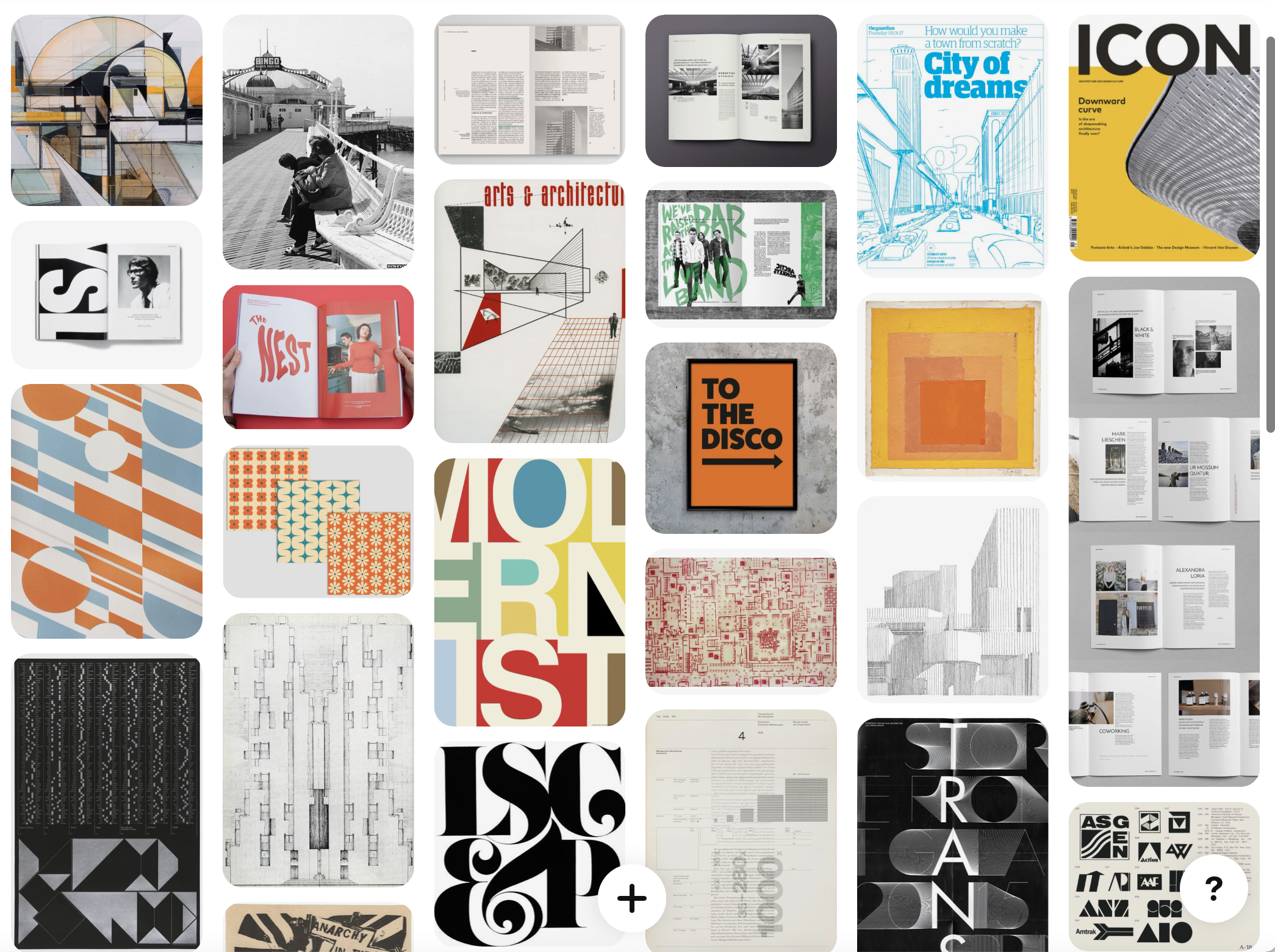
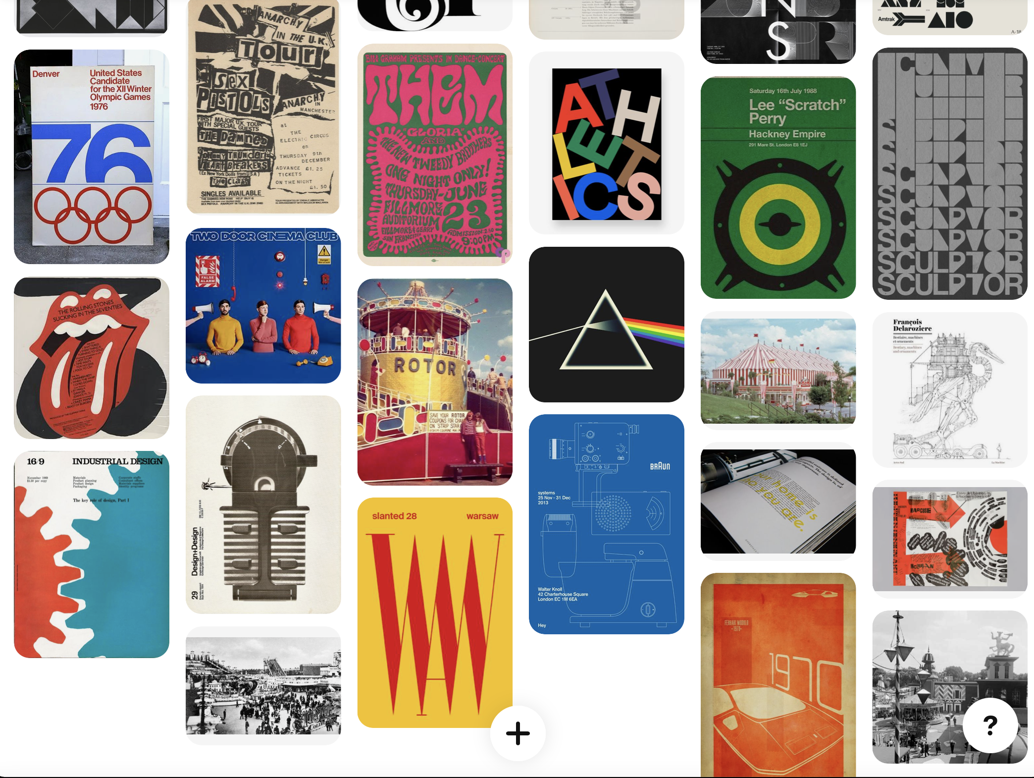
Within the research this week, previous week I have looked at books but this week seems to be pointing more at other publications such as magazines, I wanted to explore the layouts for inspiration.
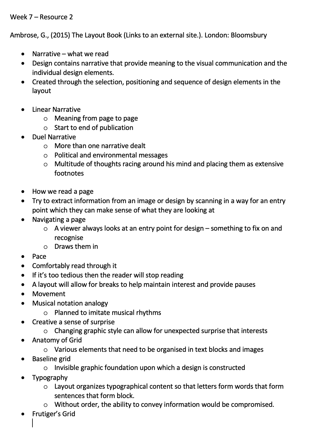
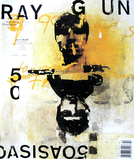
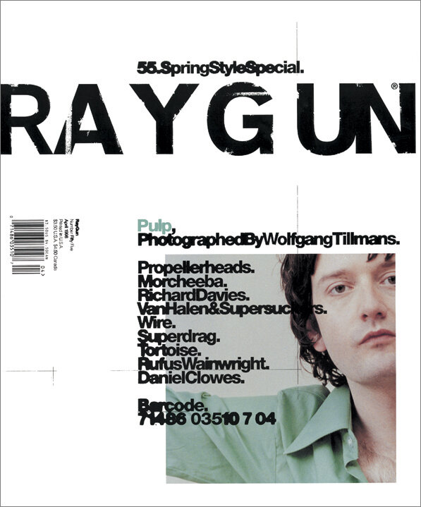
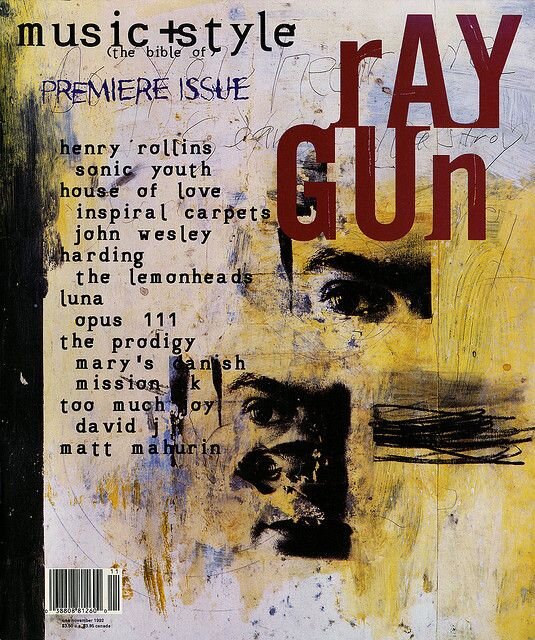
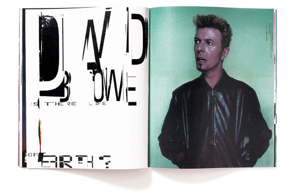
Ray Gun
“While the contents of its pages were not related to graphic design, Ray Gun magazine proved to be an exploration of typography, layout and visual storytelling that would shift the approach of many graphic designers. The magazine was founded in 1992 and led by the work of David Carson, who served as its art director for the first three years of its career, which lasted 7 years and over 70 issues.
Carson's style of typographic experimentation influenced the development of the deconstruction style of design and a whole new generation of designers. The experiments by Carson and other Ray Gun designers were chaotic, abstract and distinctive, but sometimes illegible. The magazine's radical subject matter often related to music and pop culture icons and the magazine became a reliable source for the prediction of up-and-coming stars.”
http://www.designishistory.com/1980/ray-gun/
The main thing that I love about Ray gun is that abstraction of the magazines, they play around with illustration, print and photography to allow it to all merge together which is a huge inspiration point for this weeks workshop challenge for me.
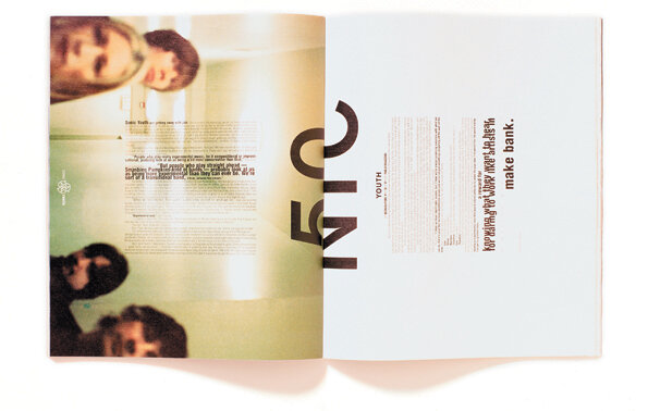
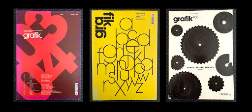
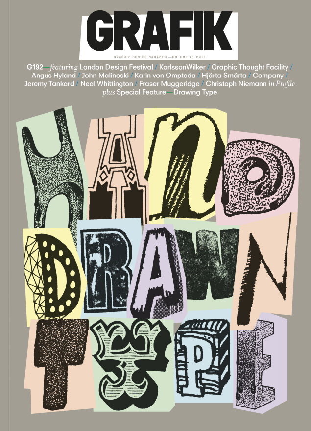
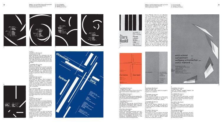
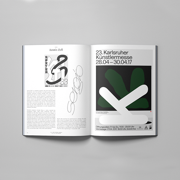
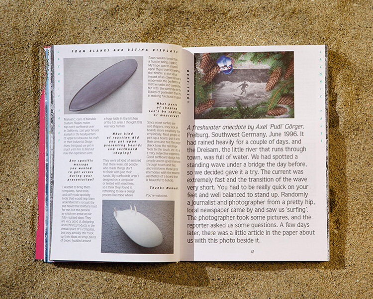
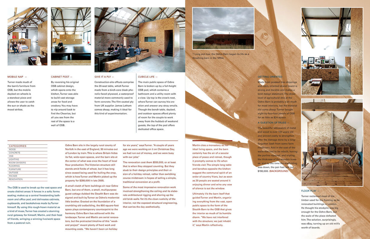
Grafik
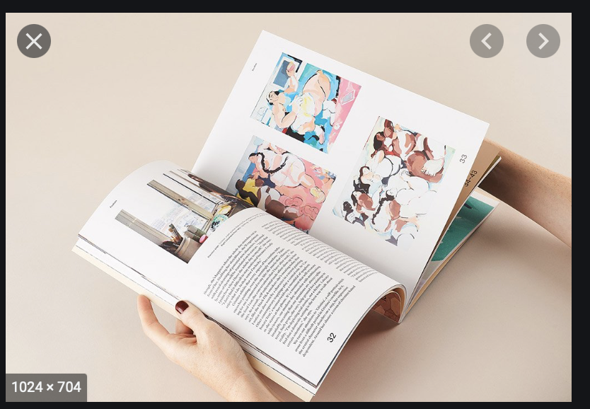
Furthering on my research from the lecture this week, I wanted to research more about Grafik Design magazines.
I particularly love the below layout of typography and then the covers that are so visual and really aimed at the type of person that would read this magazine. The spread thats at the bottom of this section seems like the perfect amount of process with the accompanying words.
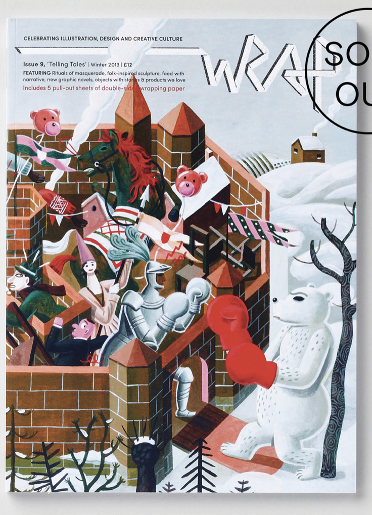
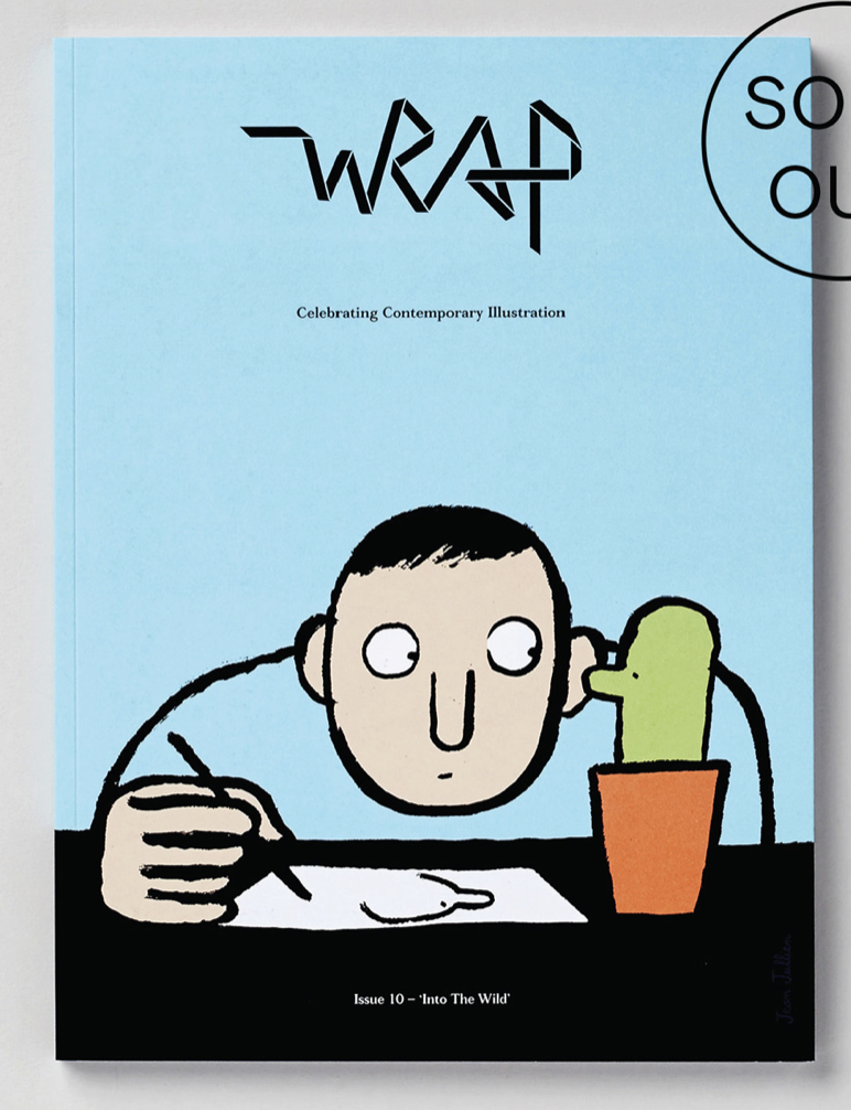
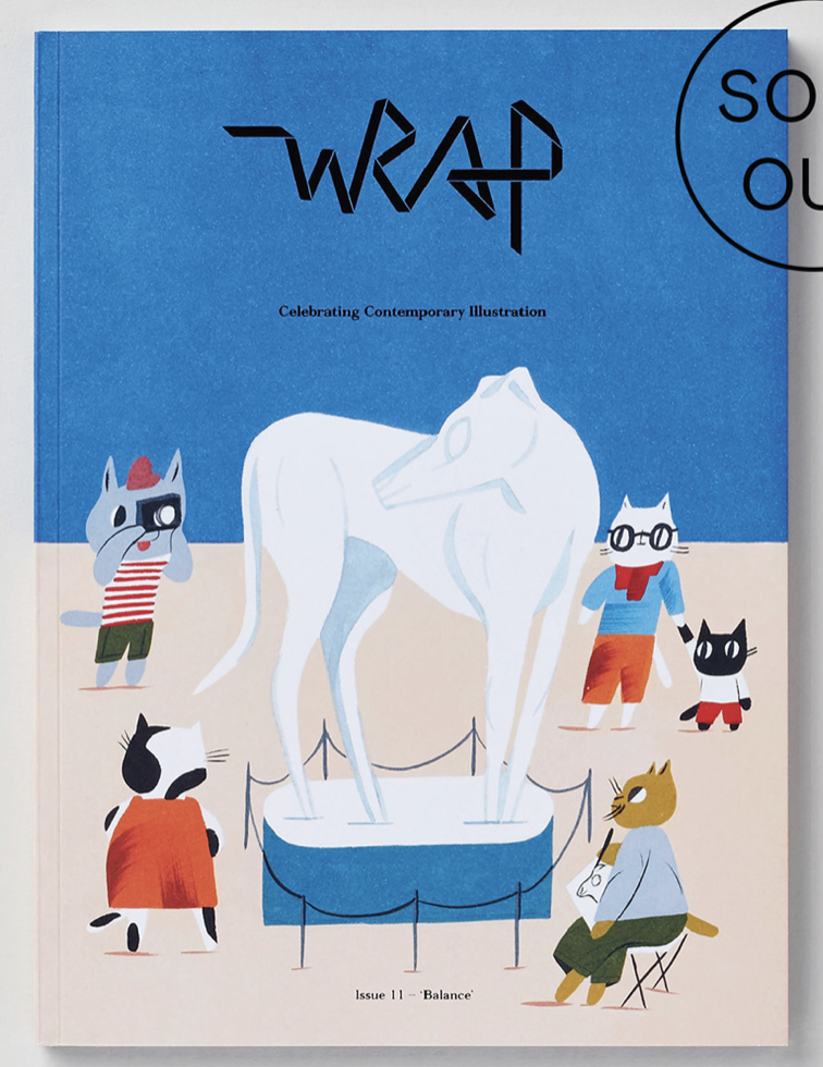
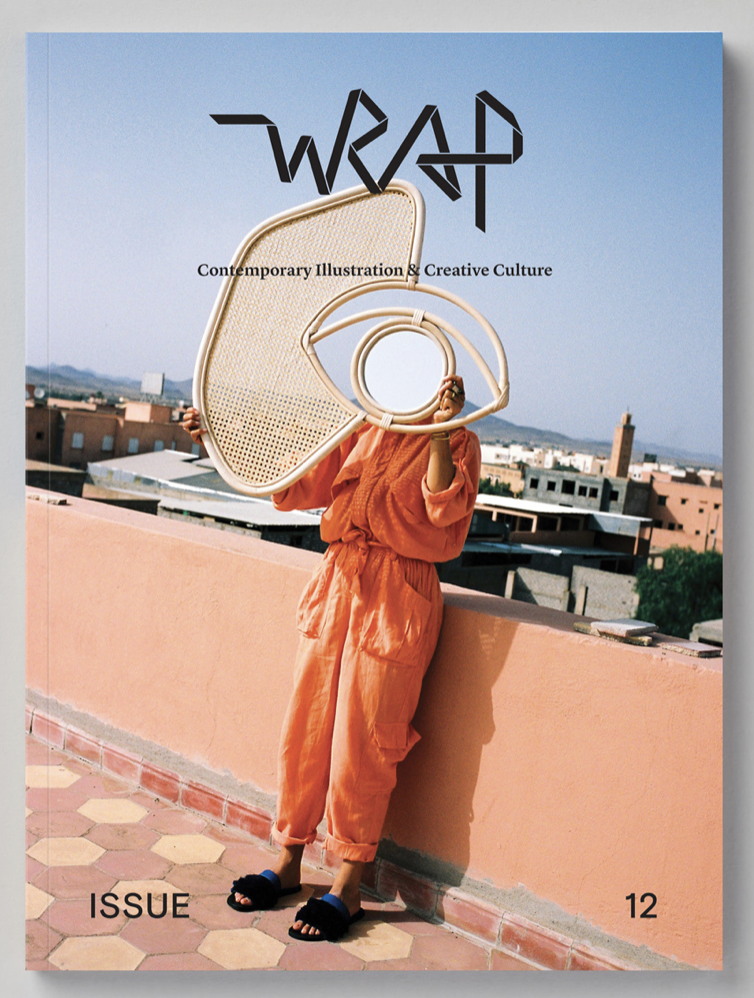
Wrap Magazine
“Built from creative collaborations with designers, illustrators and artists; Wrap started life in 2010 as a magazine and now includes a stationery and product range, online shop, and editorial content in print and digital. All of Wrap’s output is united by a palpable excitement in showcasing and providing a platform for those making original work which pushes boundaries in both aesthetic and process”
https://www.wrapmagazine.com/about
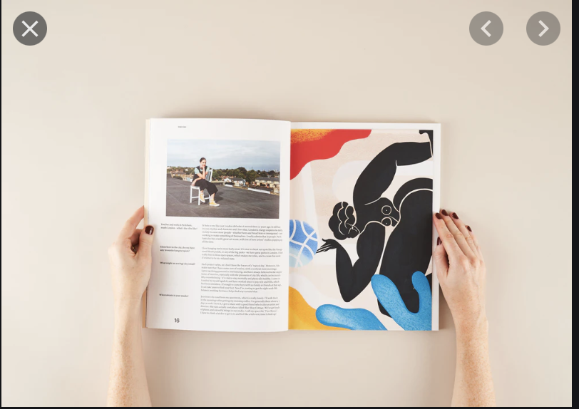
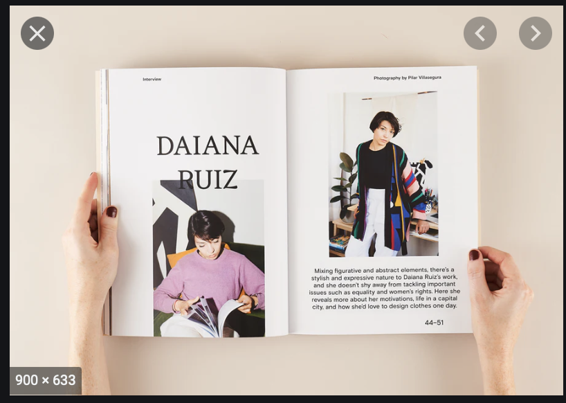
I love the illustrative playful approach that wrap has on their front covers, with instantly drew me into wanting more with what the inside holds. They’re so colourful and playful. Each week or each release seems to have a different style that accompanies the topic that is being researched.
For the inside spread there seems to be more imagery than words and also making sure there is a border around all the pages which seems nice.
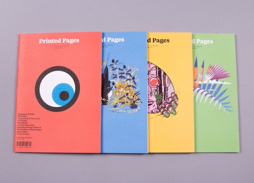
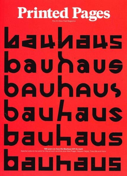
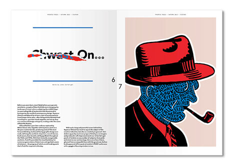
Printed Pages
This is a magazine that is run by its nice that website. It only comes out a couple times a year so its really rare. I love the pastel colours that are used within the prints that are below for the front covers, also that the illustrations seems to sit central on the page. Within the magazine, its very visual again with more imagery than words and the words being put into columns in a format way. There are also double pages of visual diagrams or images which is a lovely break from having to read the wording.
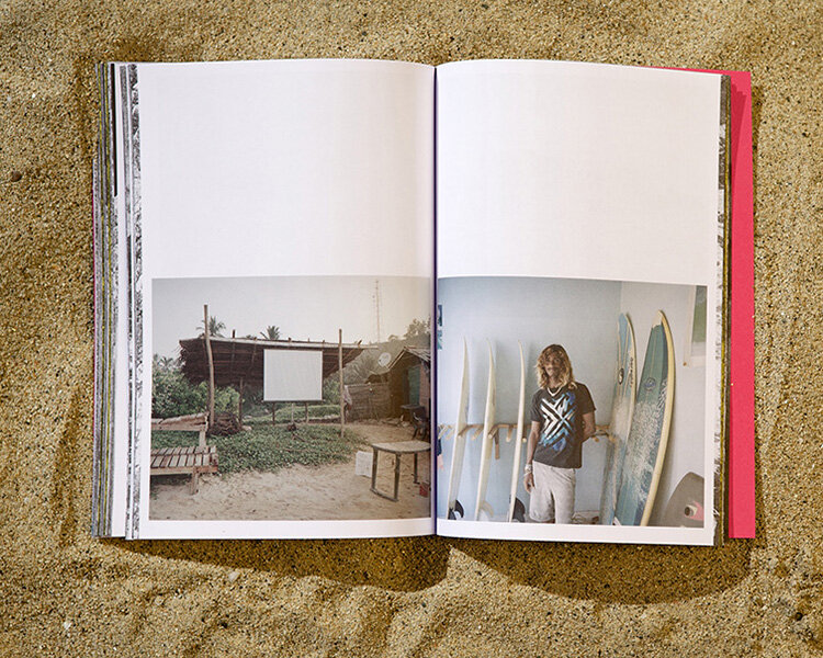
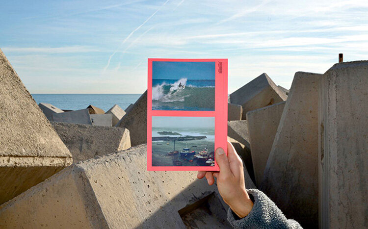
Acid
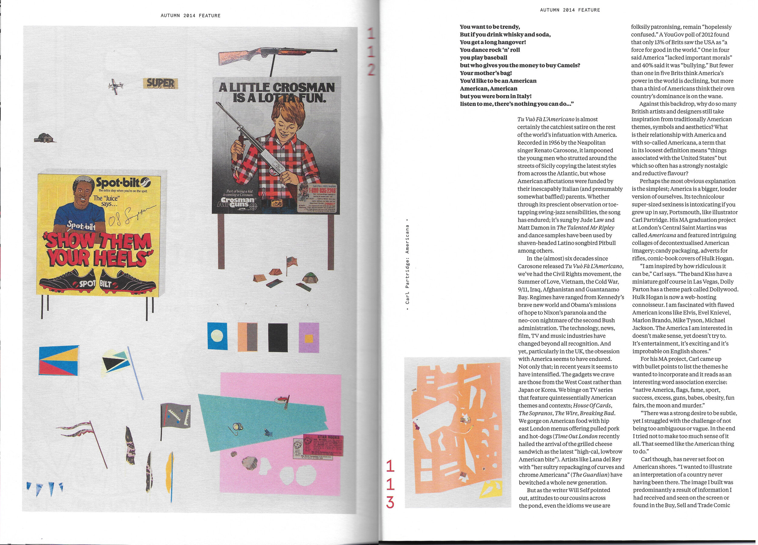
I wanted to focus on this different type of magazine that is away from the graphic design side. “Acid is a publishing project looking at surfing through the prisms of exploration and everyday life. Shortly after surfing had become important for us, we felt the need to portray surfing in a broad context and explore its fringes with art, science, philosophy and poetry. So we’ll do just that, trying hard not to sound too serious.”https://acidsurfing.com/about It seems to be a very visual and bright coloured magazine with a lot of different type sizes and different layouts which is a nice change, I love how in the image below they have a bright coloured background and then with black and white / dull coloured images on the top.
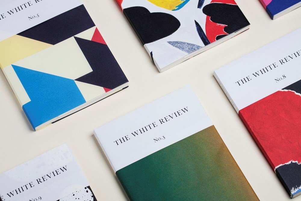
The white review
“THE WHITE REVIEW is currently on sale at the following bookshops. We are distributed by Central Books (UK & Europe) and Consortium (US). If you are interested in stocking us, please email editors [at] thewhitereview.org.
The journal was conceived as an arts and literary journal specialising in artistically or educationally meritorious works of new or emerging artists and writers. Its aim is the promotion of the arts and literature and of advancing education in arts and literature. It takes its name and a degree of inspiration from LA REVUE BLANCHE, a Parisian magazine which ran from 1889 to 1903. “ https://www.thewhitereview.org/about/
The main thing that drew me in with this magazine was the really interesting cover, it wasn’t like a magazine it was almost layed out like a series of books which its said to be sold in book shops. Its a really elegant style of layout inside and outside with the images being small and the text staying with a border around the images. I wonder if there is any other colour within the book though.
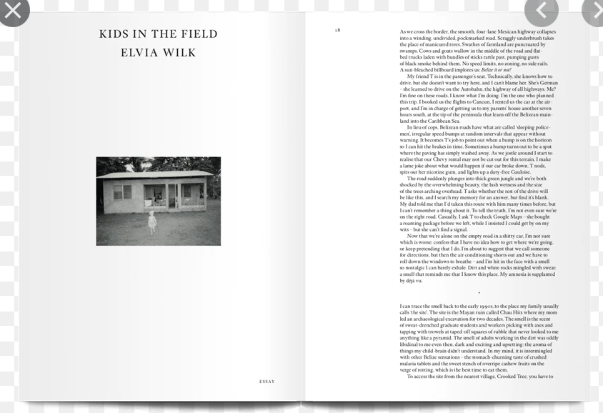

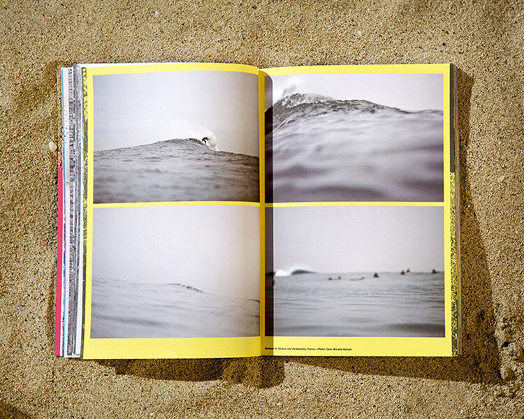
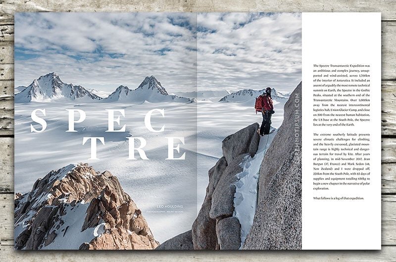
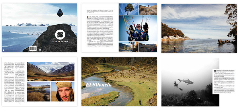
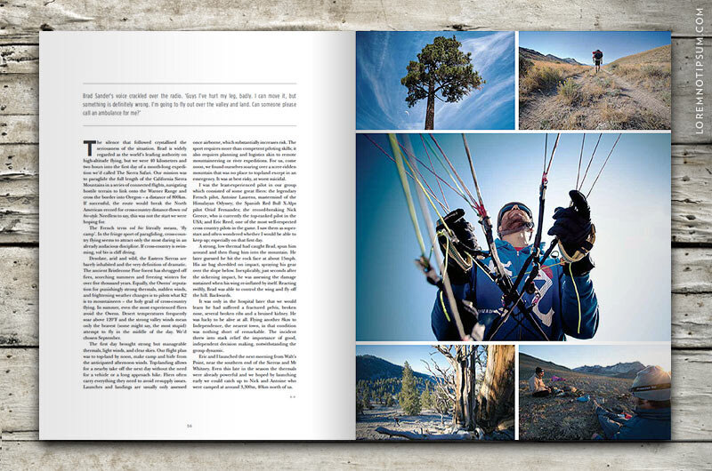
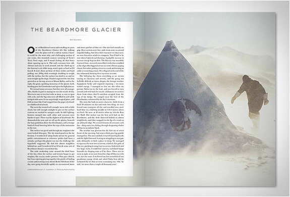
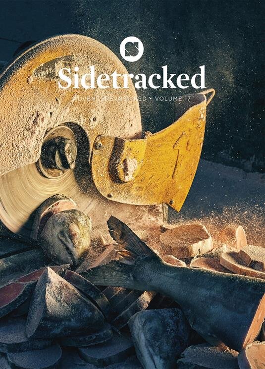
Sidetracked
“Sidetracked captures the emotion and experience of adventure throughout the world. We seek out the undiscovered, challenge ourselves, and push back limits. But above all, we create connections – with humanity, history, landscape and culture. We share meaningful stories that represent all life on this planet. Because, by creating an inspired community, together we can forge a trail for positive change.
We’ve always been rooted in inspirational journeys – telling stories online and via our print journals (three times per year of those who put themselves out there, setting aside fear and doubt in order to experience the breathtaking, the awe-inspiring, and the magical.’ https://www.sidetracked.com/about-sidetracked/
Due to my love of photography, I was instantly drawn to the covers of these magazines. You can tell instantly the story that is going to be told within the magazine. The layout inside is very much like a standard newspaper but also amazing quality of images that transforms you and takes you to that space which i’m assuming is what they wanted to achieve.
Also looking back at these images, I was drawn to the last cover thinking it was cutting wood but i’ve only just realised that it is actually cutting fish.. not sure ill be using that within the moodboard anymore.
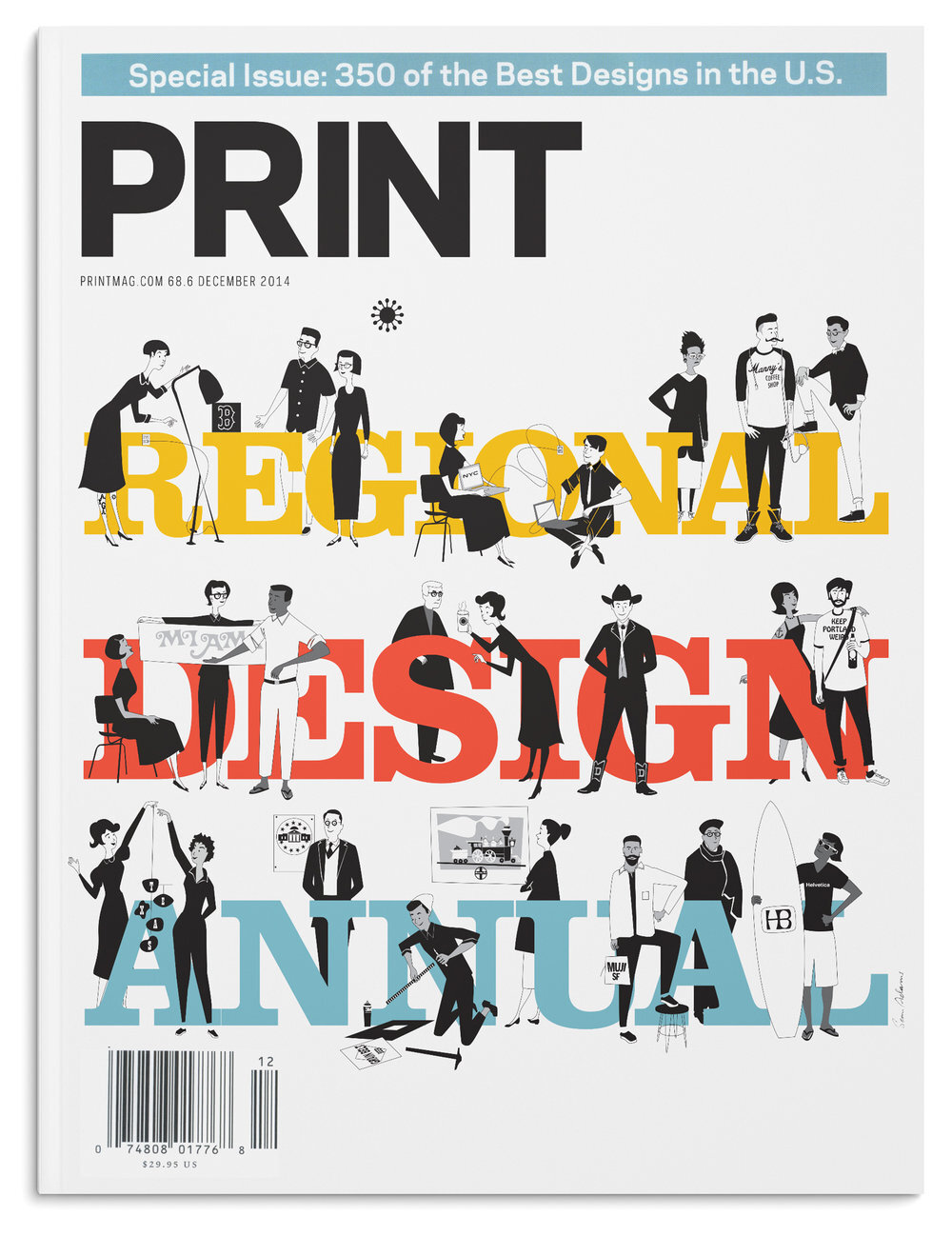
Print Magazine
“PRINT (founded 1940) is where creative people gather to inspire and build design dialogue. Perpetually curious about everything design, we report on, curate and celebrate visual culture, the makers of that culture and the expression of graphic design in all its forms and mediums.”https://www.printmag.com/about
I was drawn to this magazine due to the large graphics that can be seen within the magazine below. It is nicely laid out in terms of the contents page and the chapters pages but also the breaks between the story. It makes it come to life and feel real.
Architectural Magazines
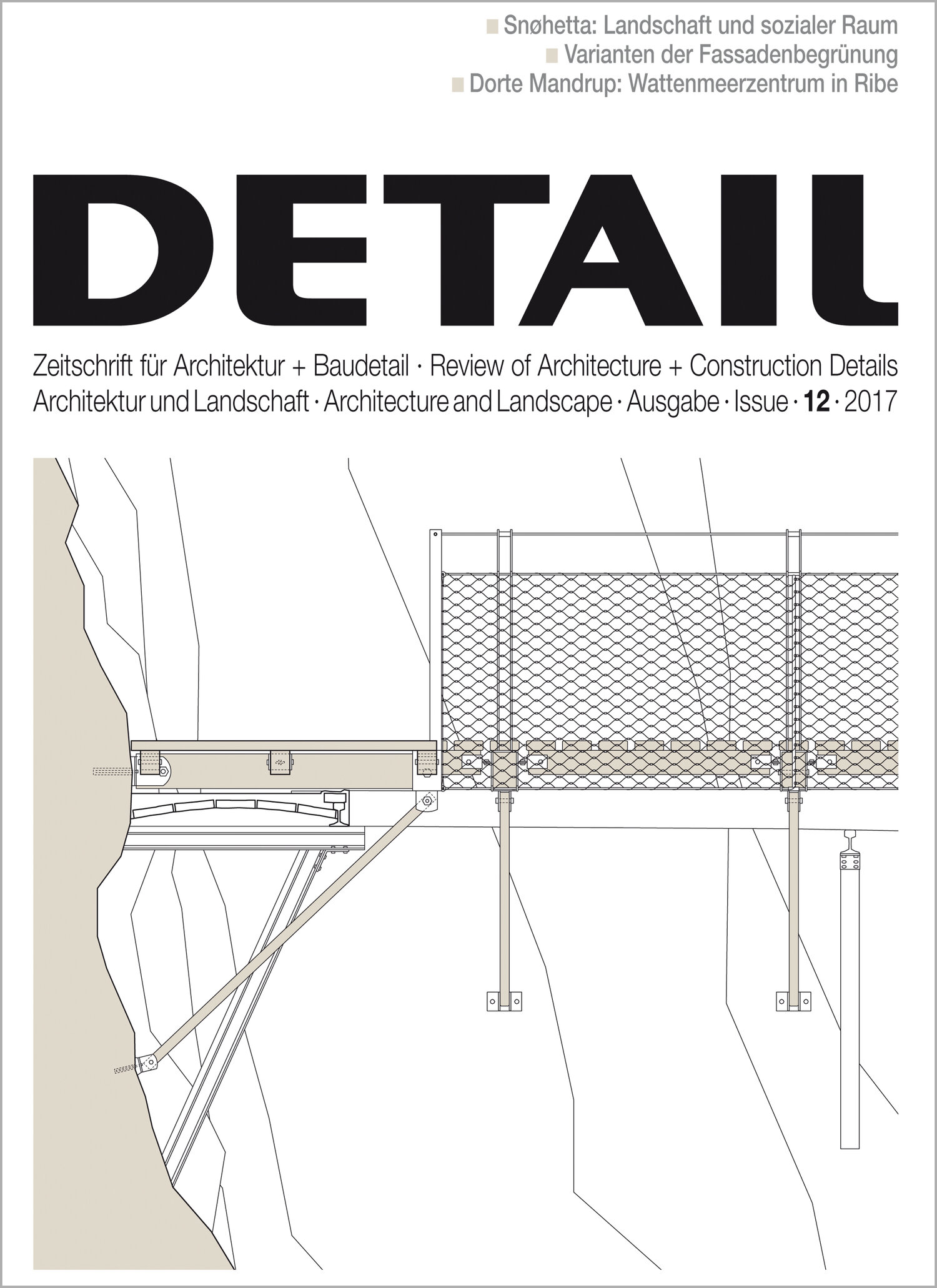
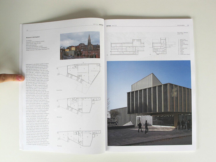
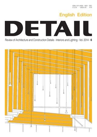
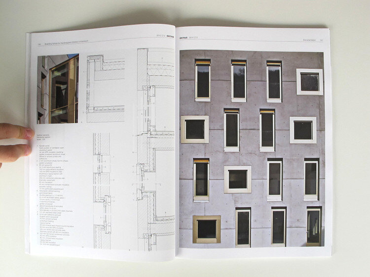
Detail Magazine
“The magazine DETAIL, which appears in German and English, devotes every issue to specific topics in construction and building details in architecture. Current international architecture projects are documented with beautiful photographs and comparable drawings at a scale of 1:20. Twice a year, the magazine features the special supplement GREEN and two issues of DETAIL interior.”https://www.detail-online.com/service/about-detail/
I had actually previously heard about this magazine from my previous degree and I knew that they did such lovely detailed drawings of the things that they were talking about inside. I love the selective colours that they use on the front covers to bring the illustration to life but also how detailed and plan like the inside spreads are.
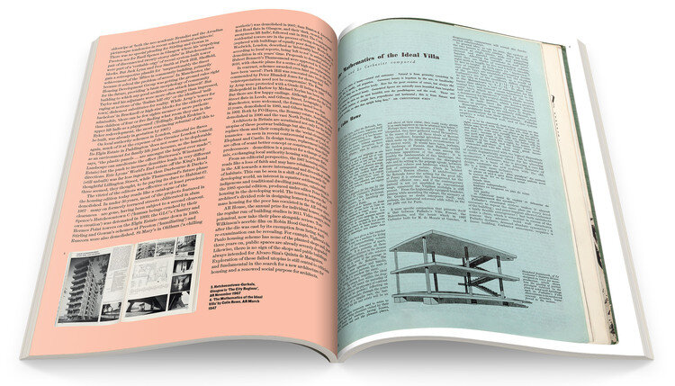
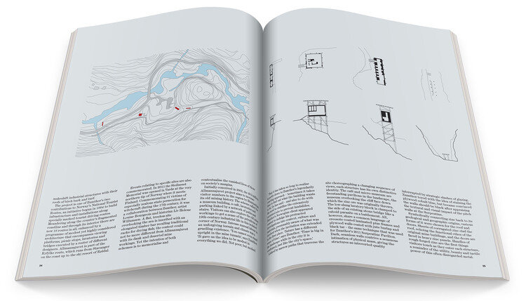
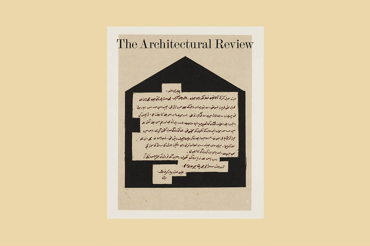
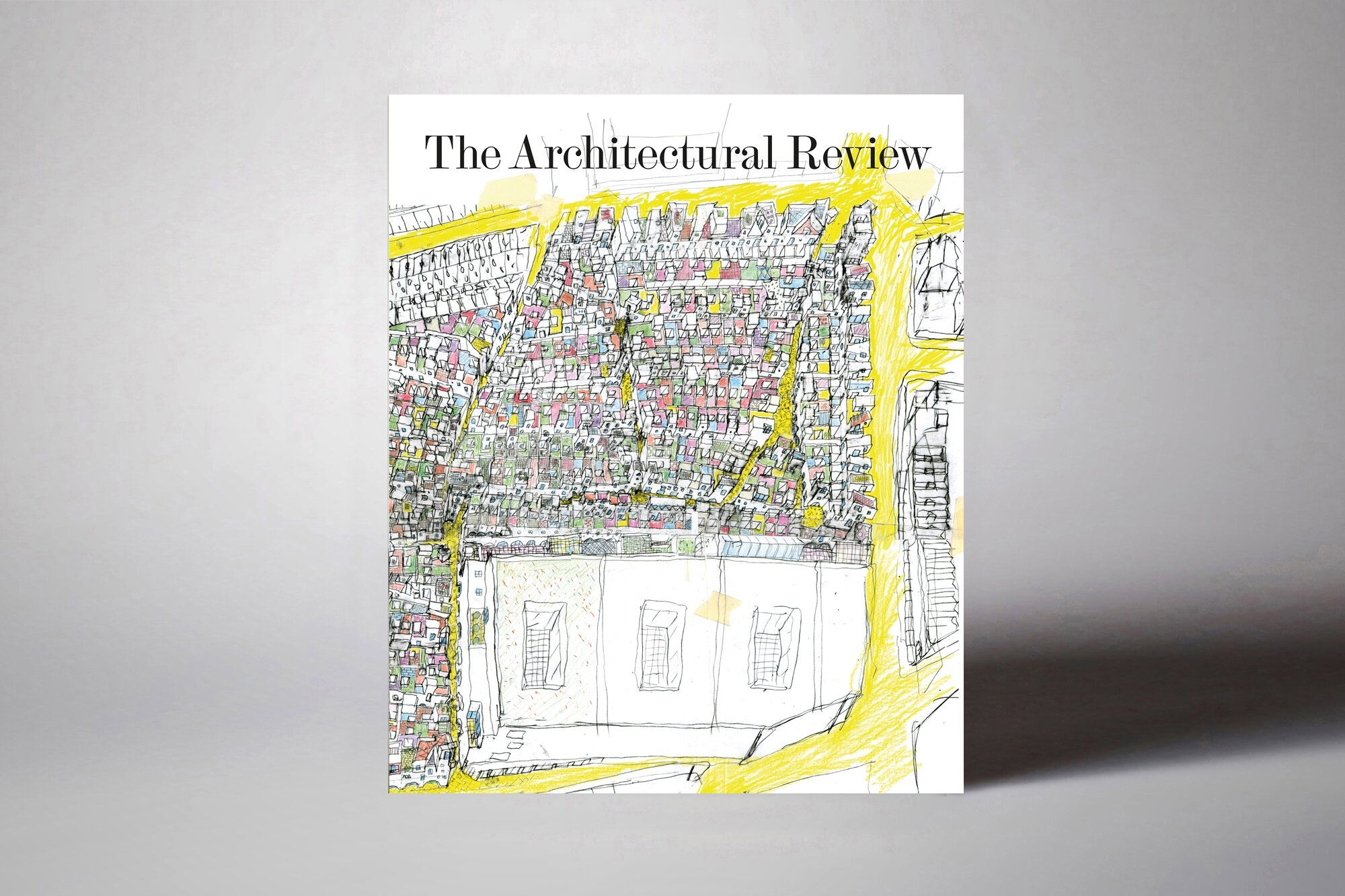
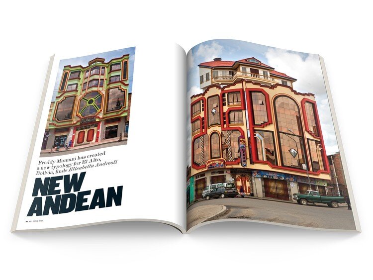
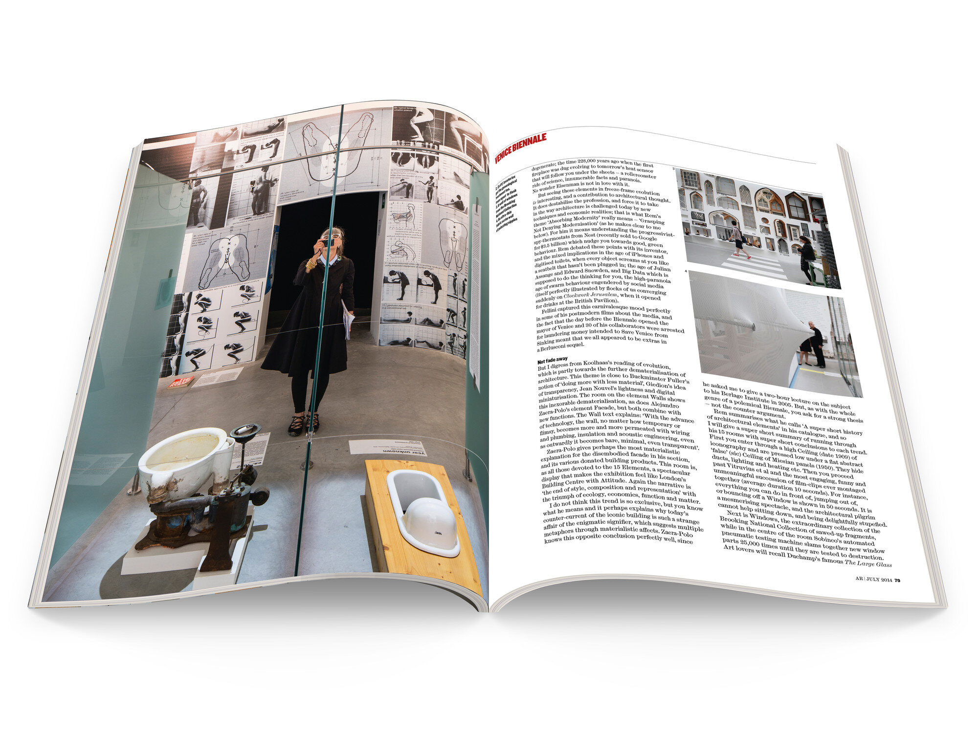
Architectural Review
“The Architectural Review has scoured the globe for architecture that challenges and inspires. Buildings old and new are chosen as prisms through which arguments and broader narratives are constructed. In their fearless storytelling, independent critical voices explore the forces that shape the homes, cities and places we inhabit.” https://www.architectural-review.com/contact-us
Another informative magazine by architectural review. I was really drawn to their crazy and colourful front covers of the magazine. and then on the inside I was also like the pictures and diagrammatic approach with the words below, the imagery is so beautiful and clear.
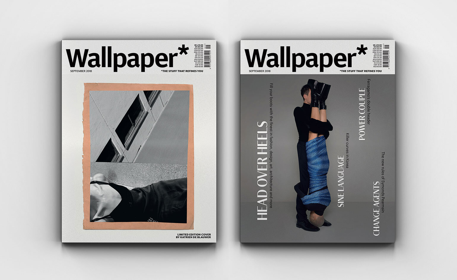
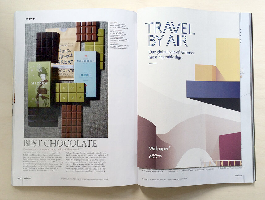
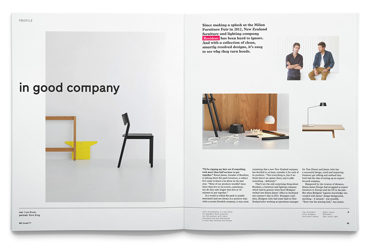
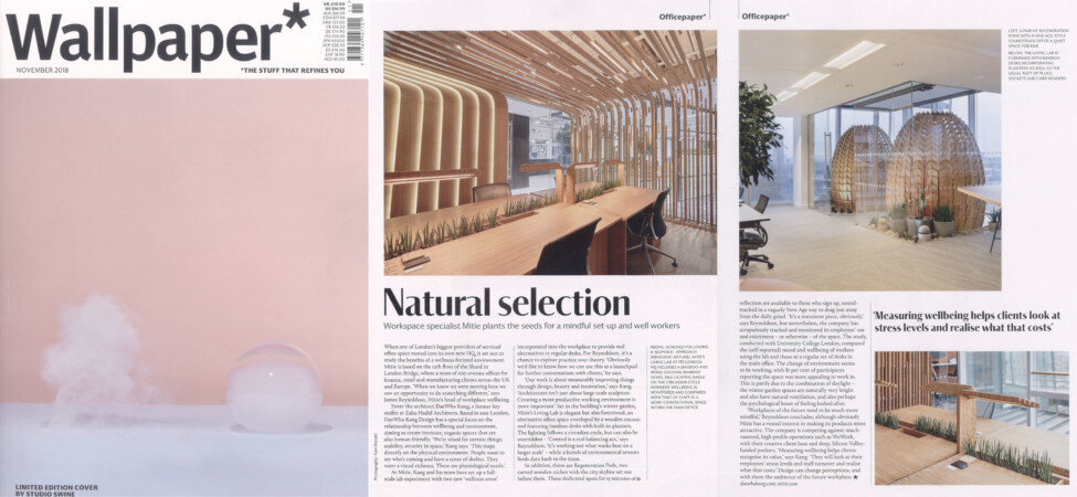
Wallpaper
Wallpaper magazine focuses on a range of different areas but I was mainly interested in their abstract layout that reminded be of Ikea a but its a very clean and neat looking commercial but I think I want to be a bit more exciting with the publishing that I present.
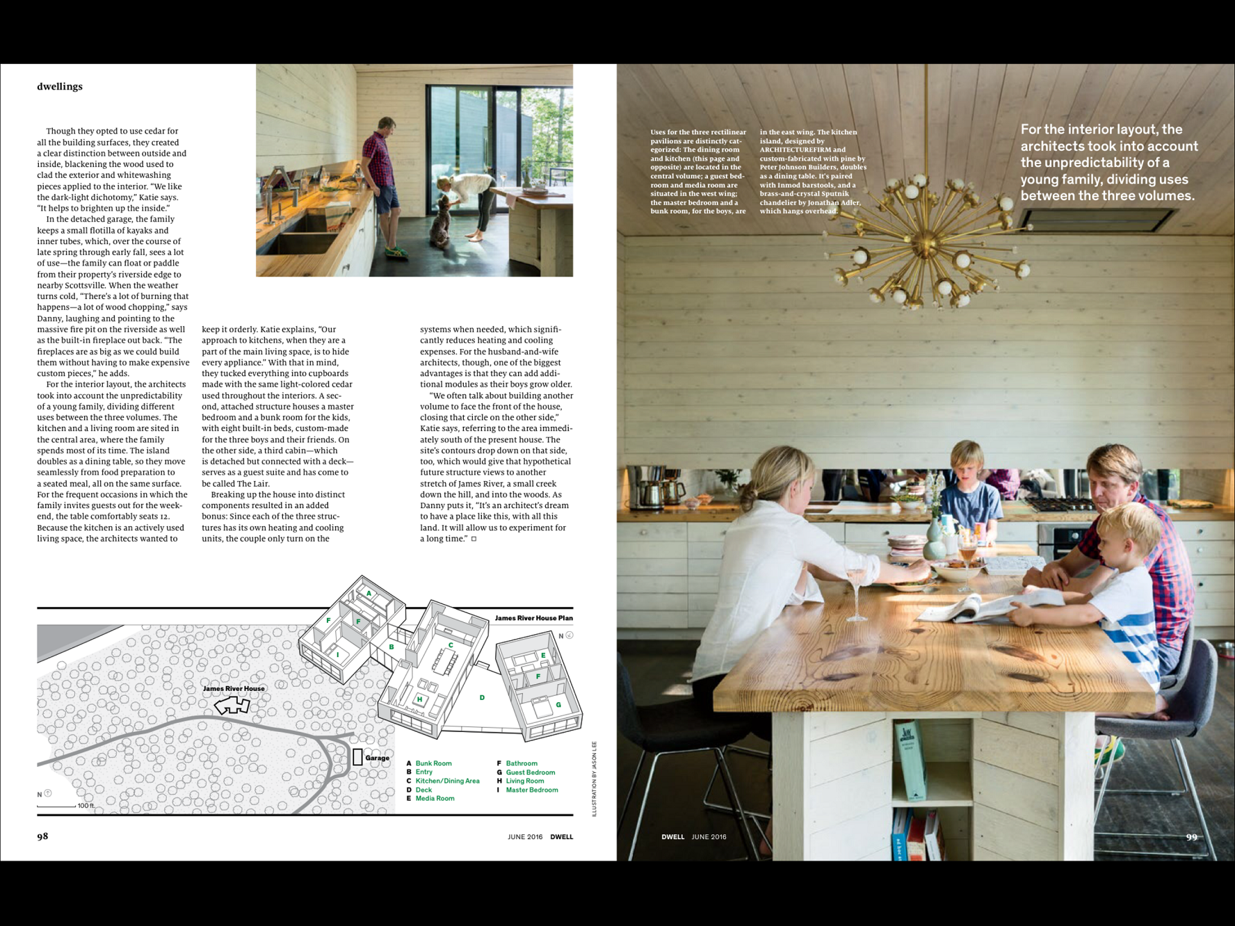
Dwell Magazine
“Dwell Media is an inspiration and collaborative platform for architects, designers, and enthusiasts to share and discover inspiring design.’https://www.dwell.com/about Again drawn to their fabulous imagery and the way that they focused not he materials that are being used throughout their design.
Photography Magazgines
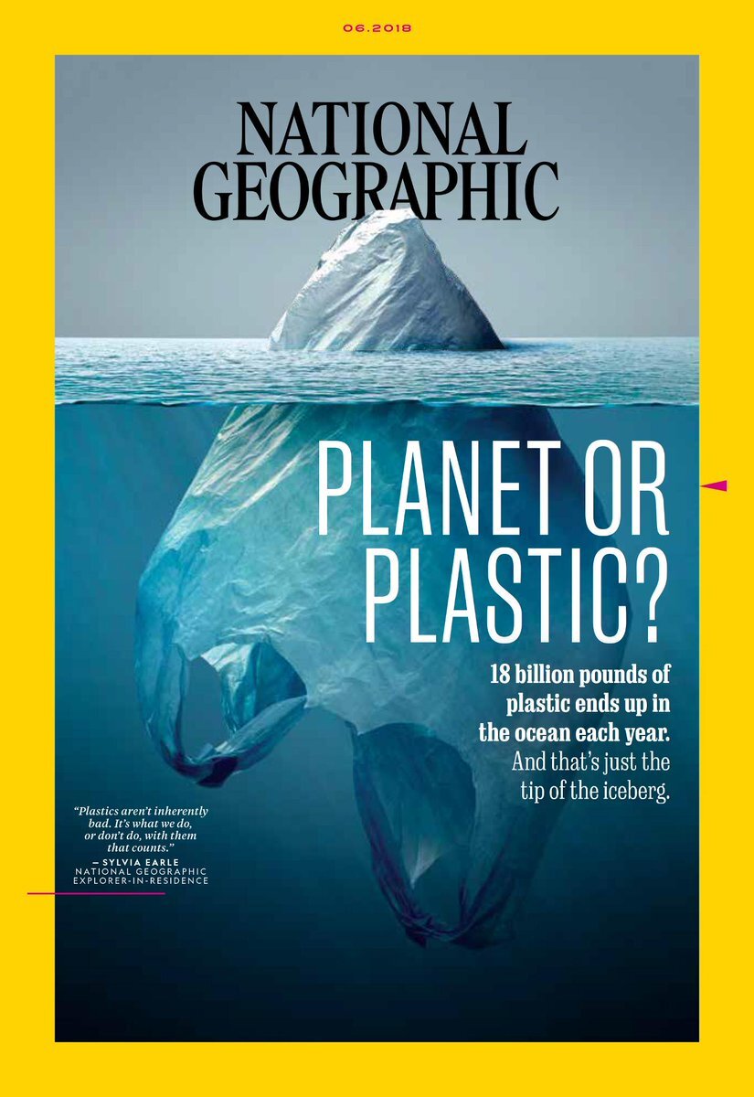
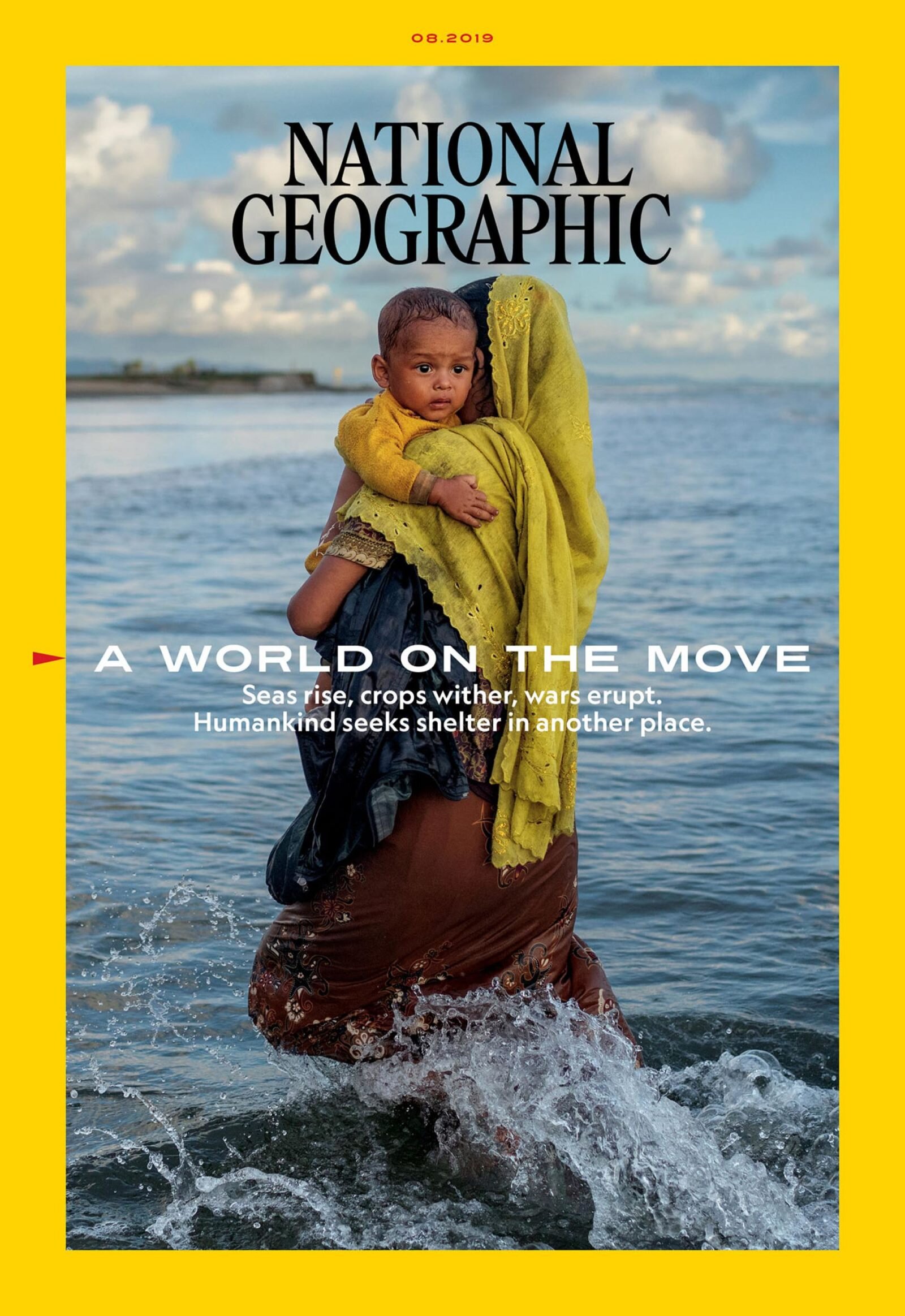
National Geographic
Of course we all know national geographic magazine, I was interested in the layout that they did for all of their magazines. Especially how simple they kept their front cover using the key photograph with a yellow border, red and black writing. Also inside its all focussed on the visual imagery once again with the text kind of taking a step back in order to tell the story.
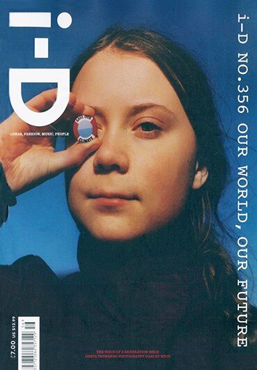
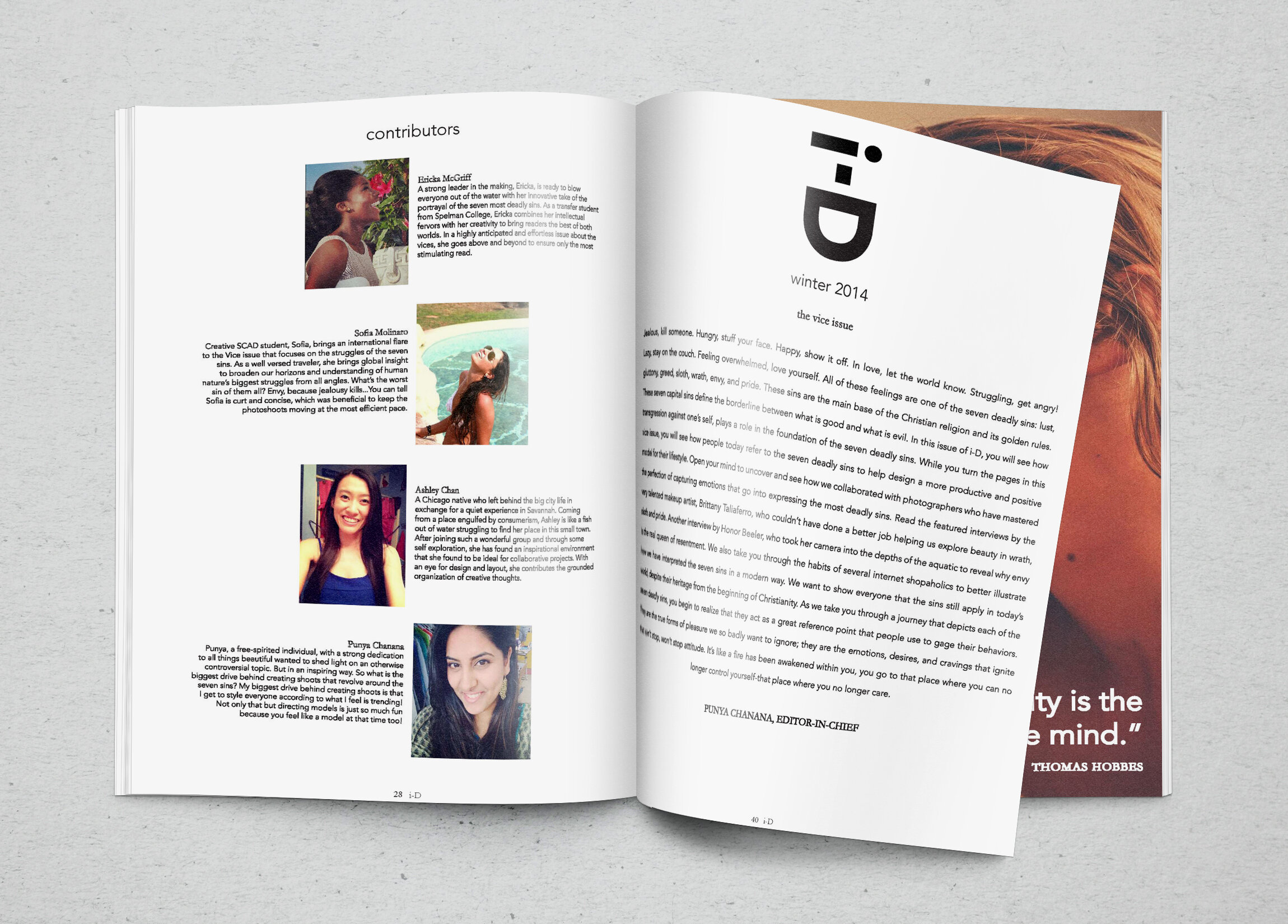
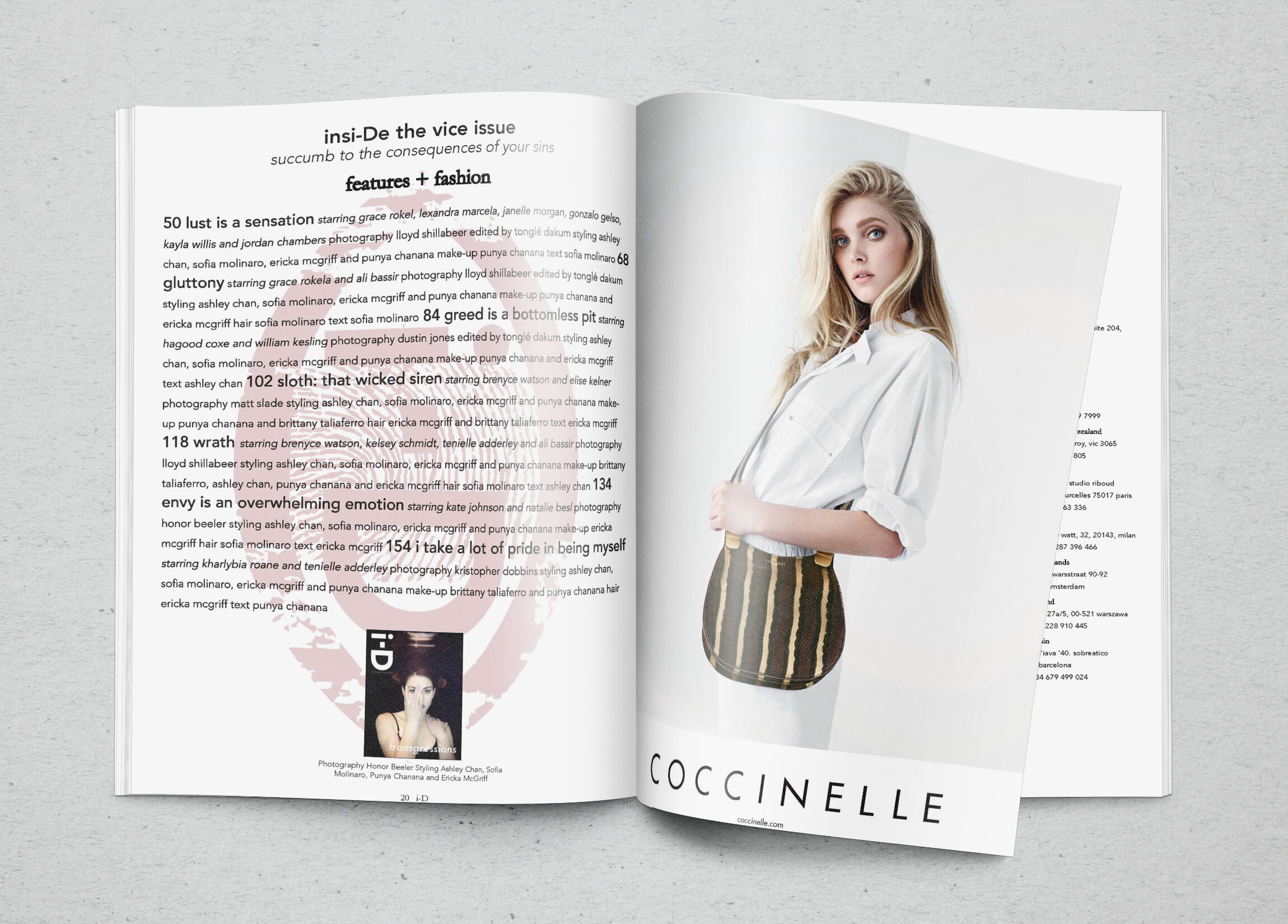
iD Magazine
I was mainly drawn to iD magazine because of the cover below, I think its so simple and I love the title of the magazine but then inside it lets it down for me and I think I would want to be more explorative with the approach.
1970s Magazine
Due to the essay im writing this week is based within the 1970s, I decided to do some research on the 1970s design.
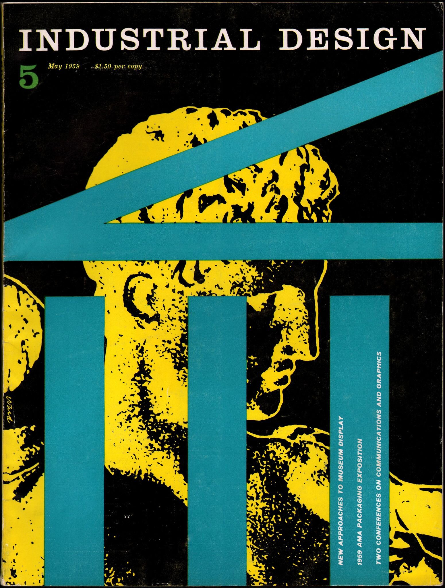
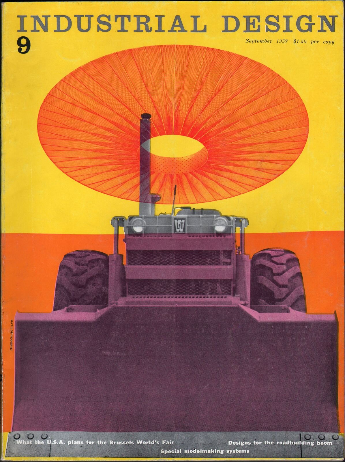
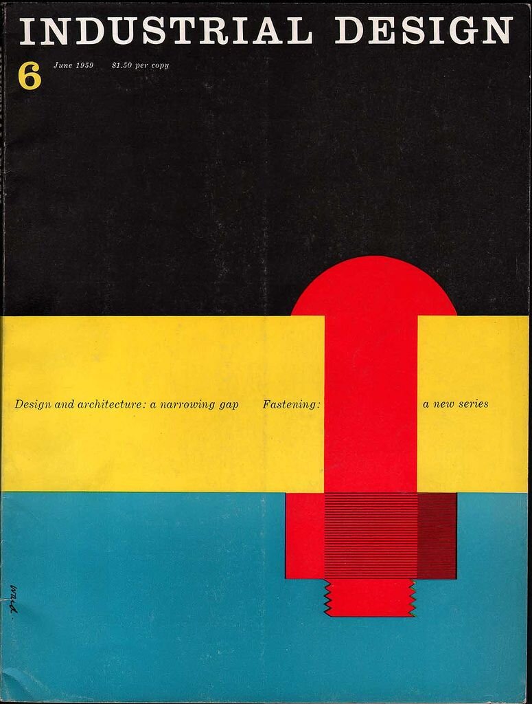
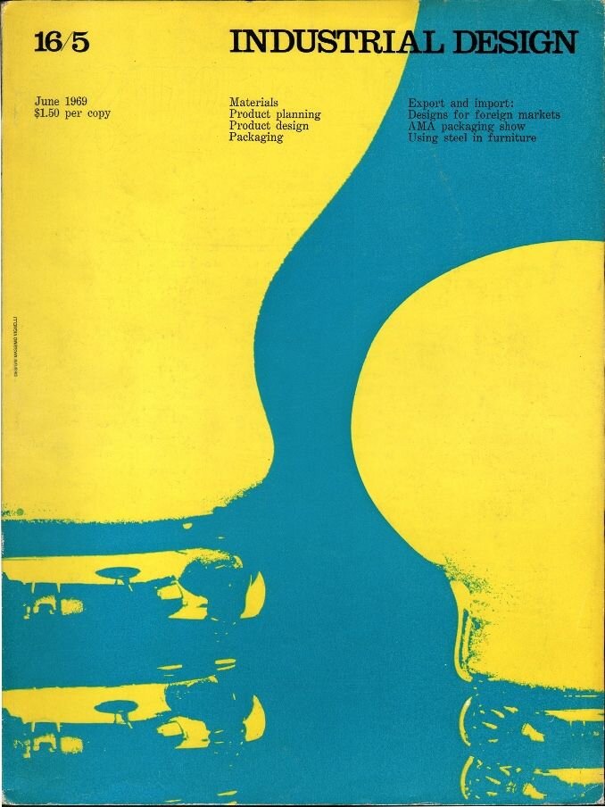
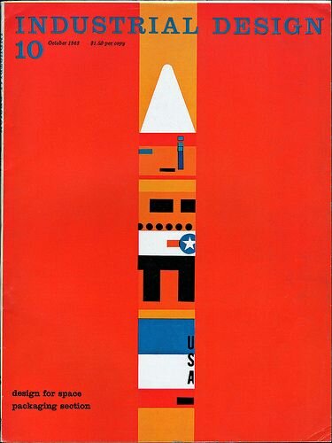
Industrial Design Magazine
I came across these magazines which I really like the colour and the shapes that they are using. I am unsure what they are about as I was unable to find any information about them but I just love the simplicity and how the design style didn’t really change of the time that they produced them.
Workshop
Please remember your text is aimed at a visually literate audience and we want you to consider form, structure, materials and how the medium might impact on the writing itself.
Write the first draft of your 3,000 word article, to be saved as a Word or TextEdit document.
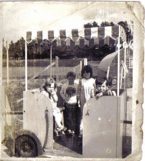
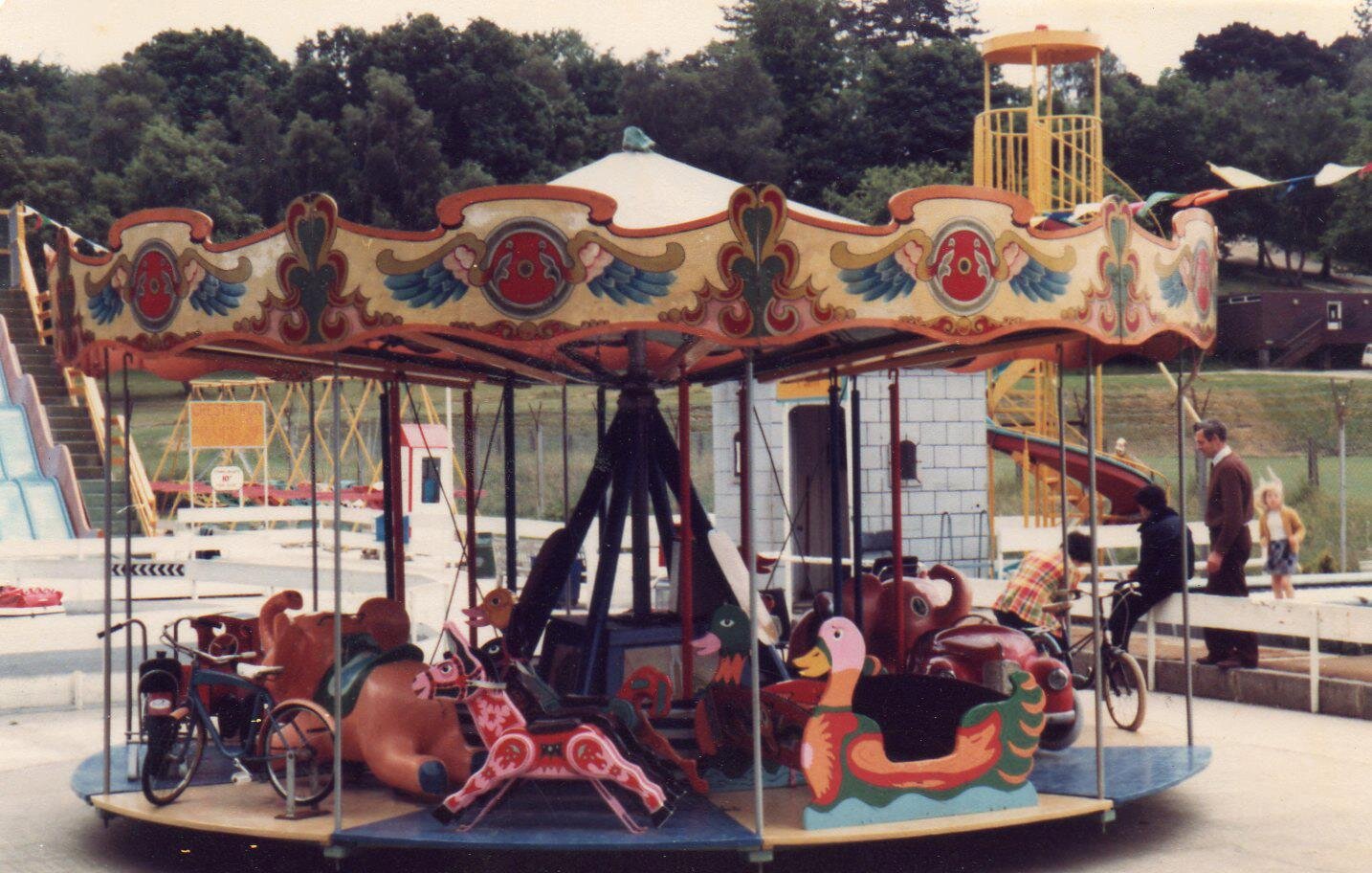
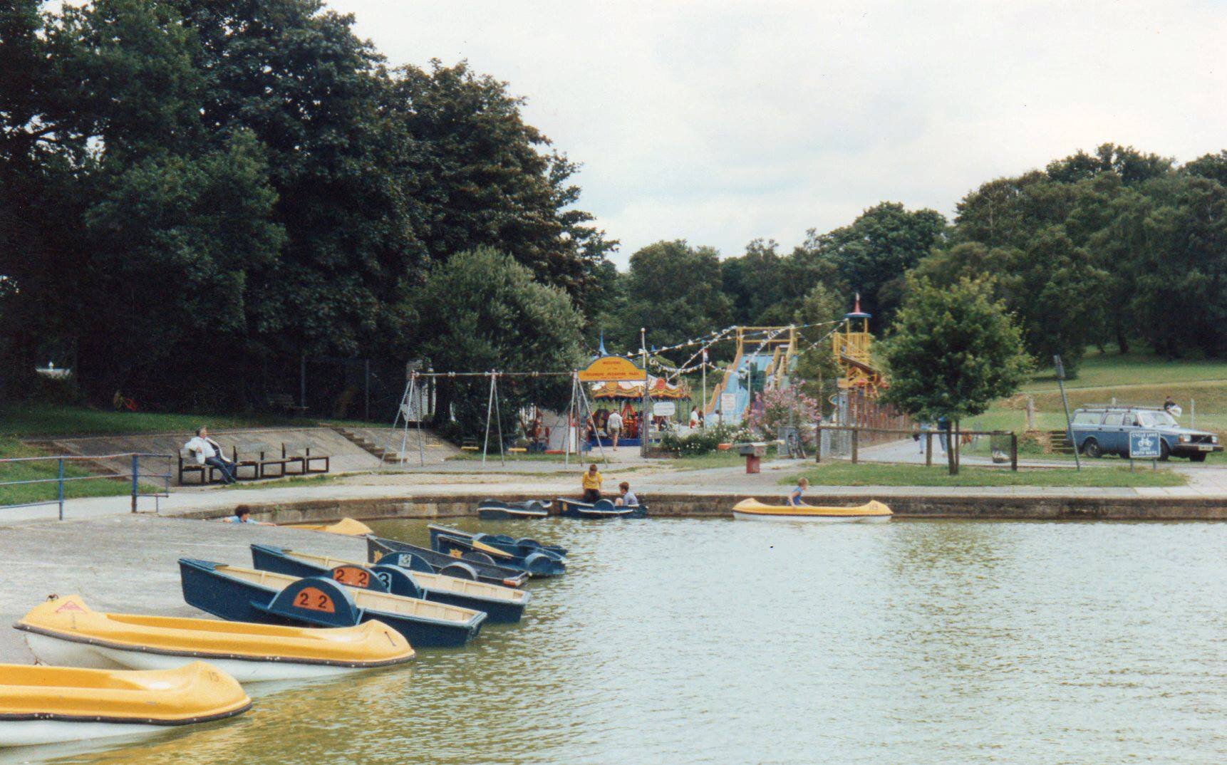
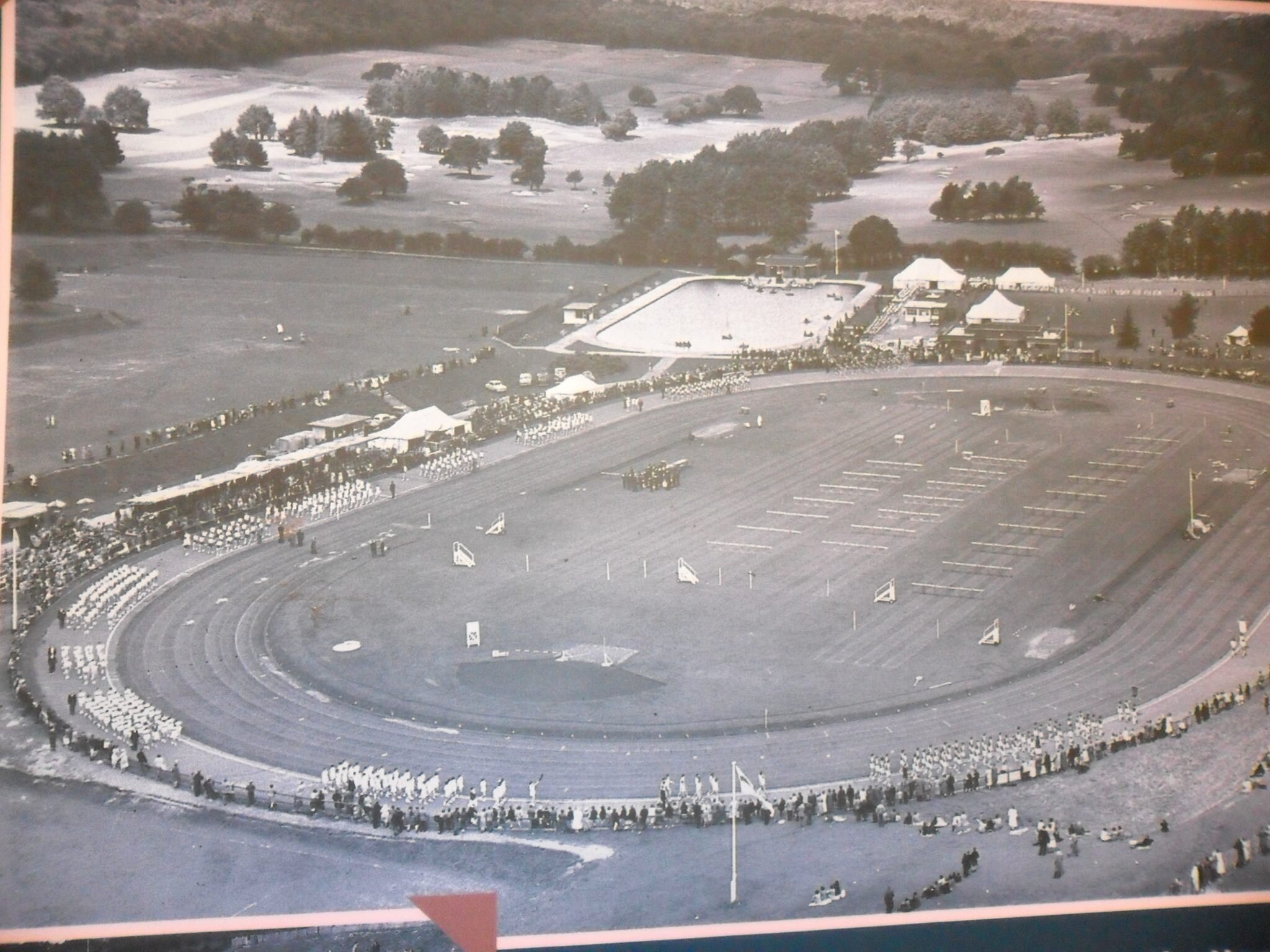
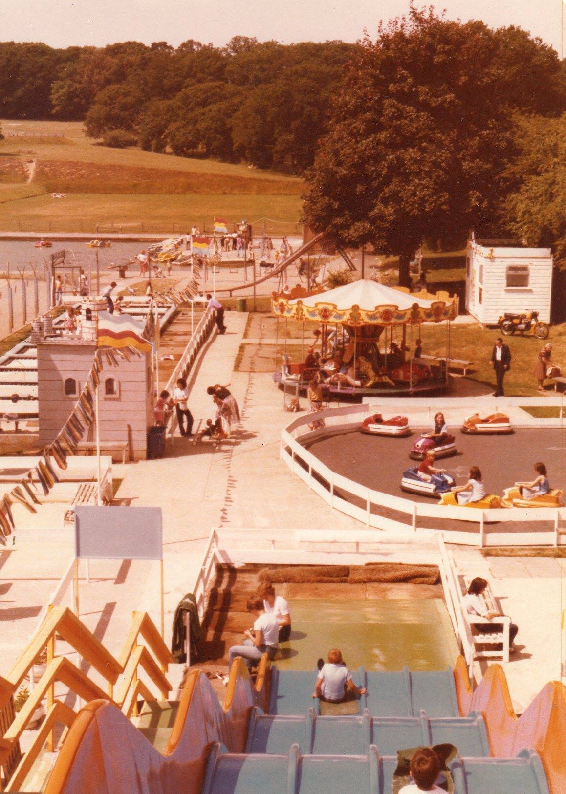
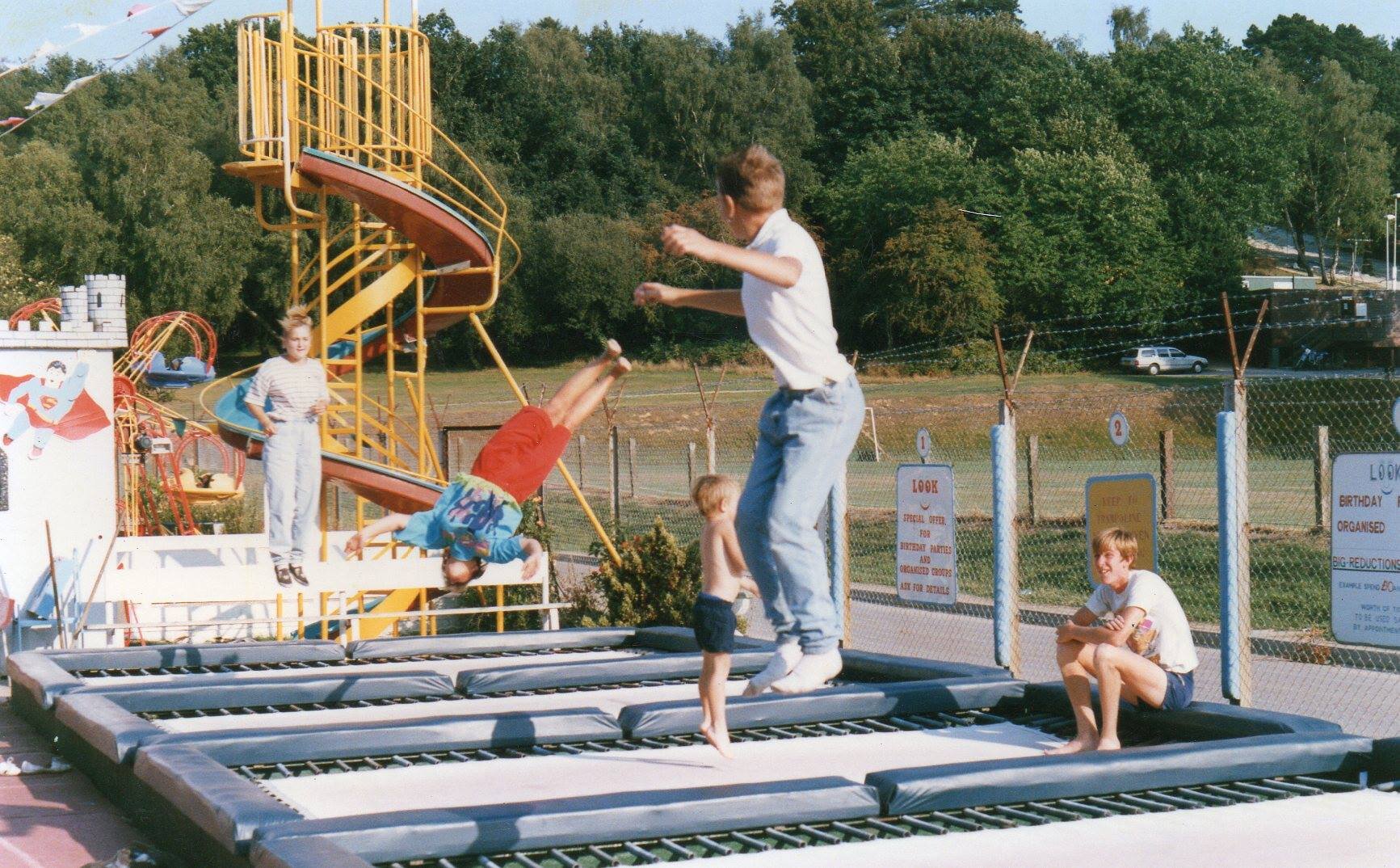
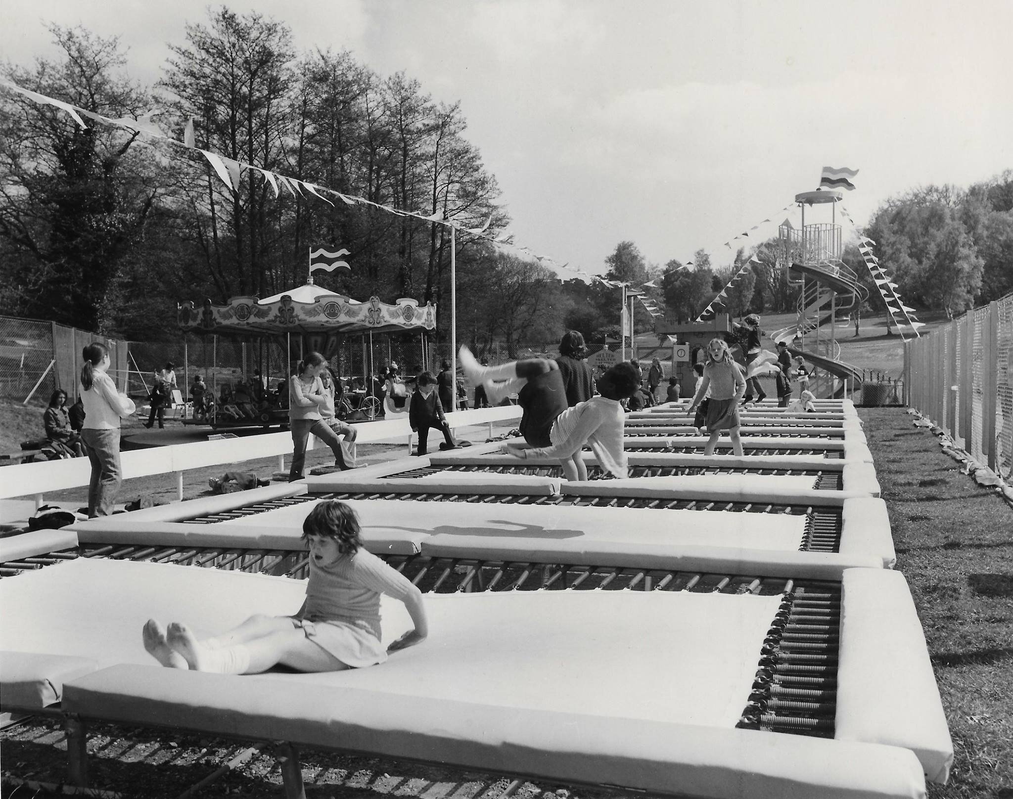
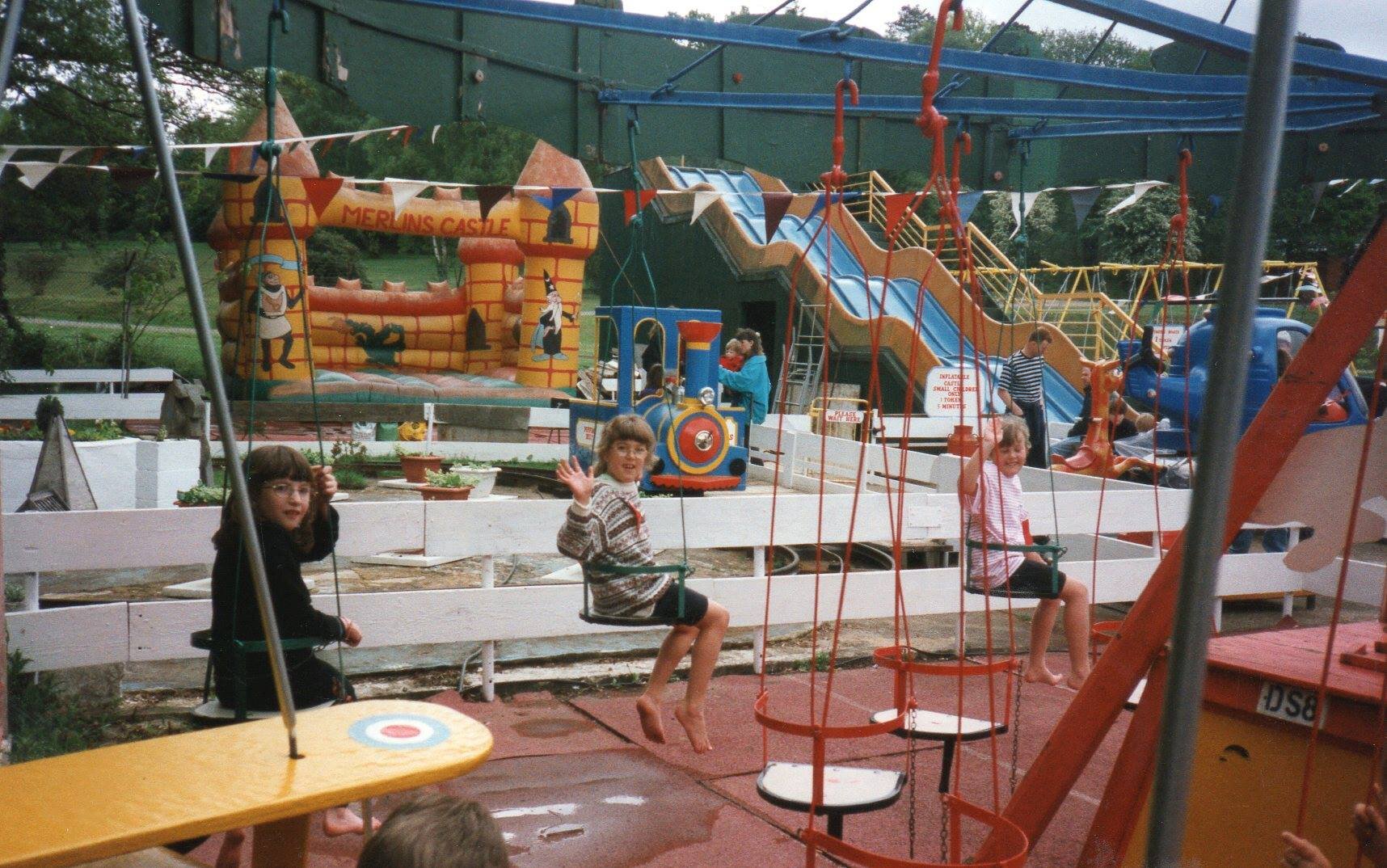
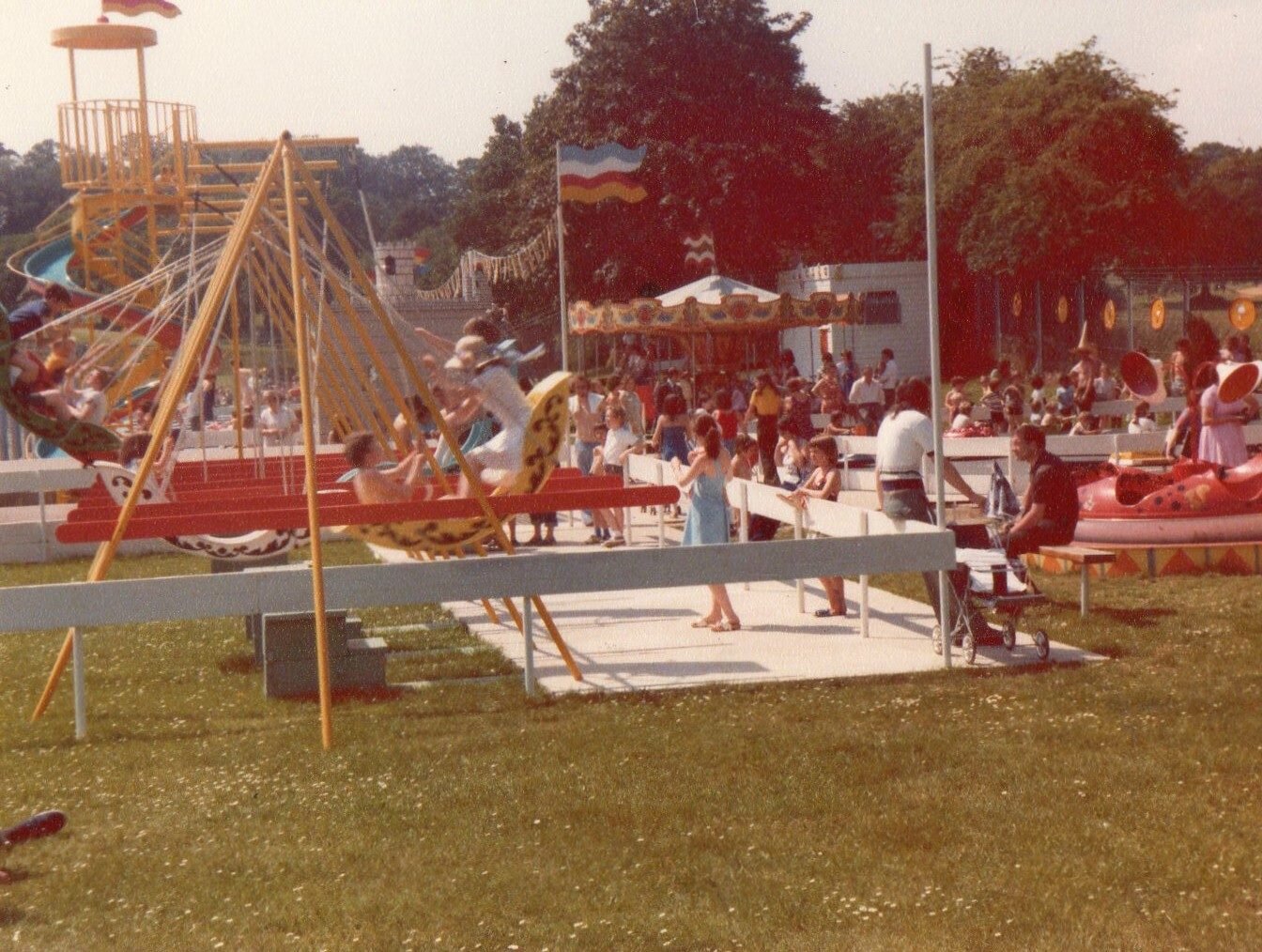
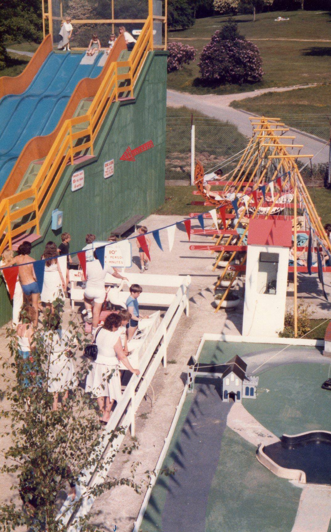
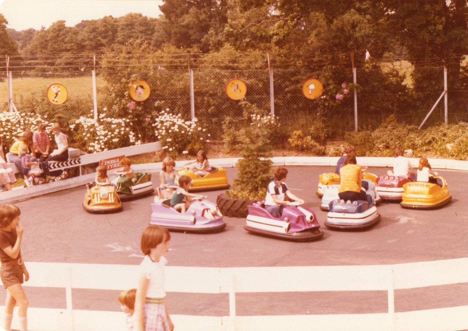
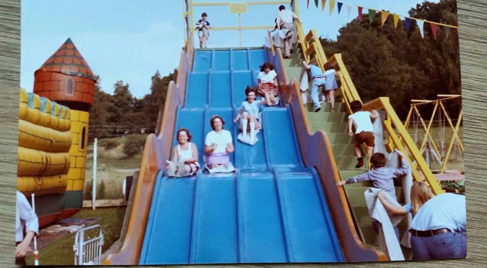
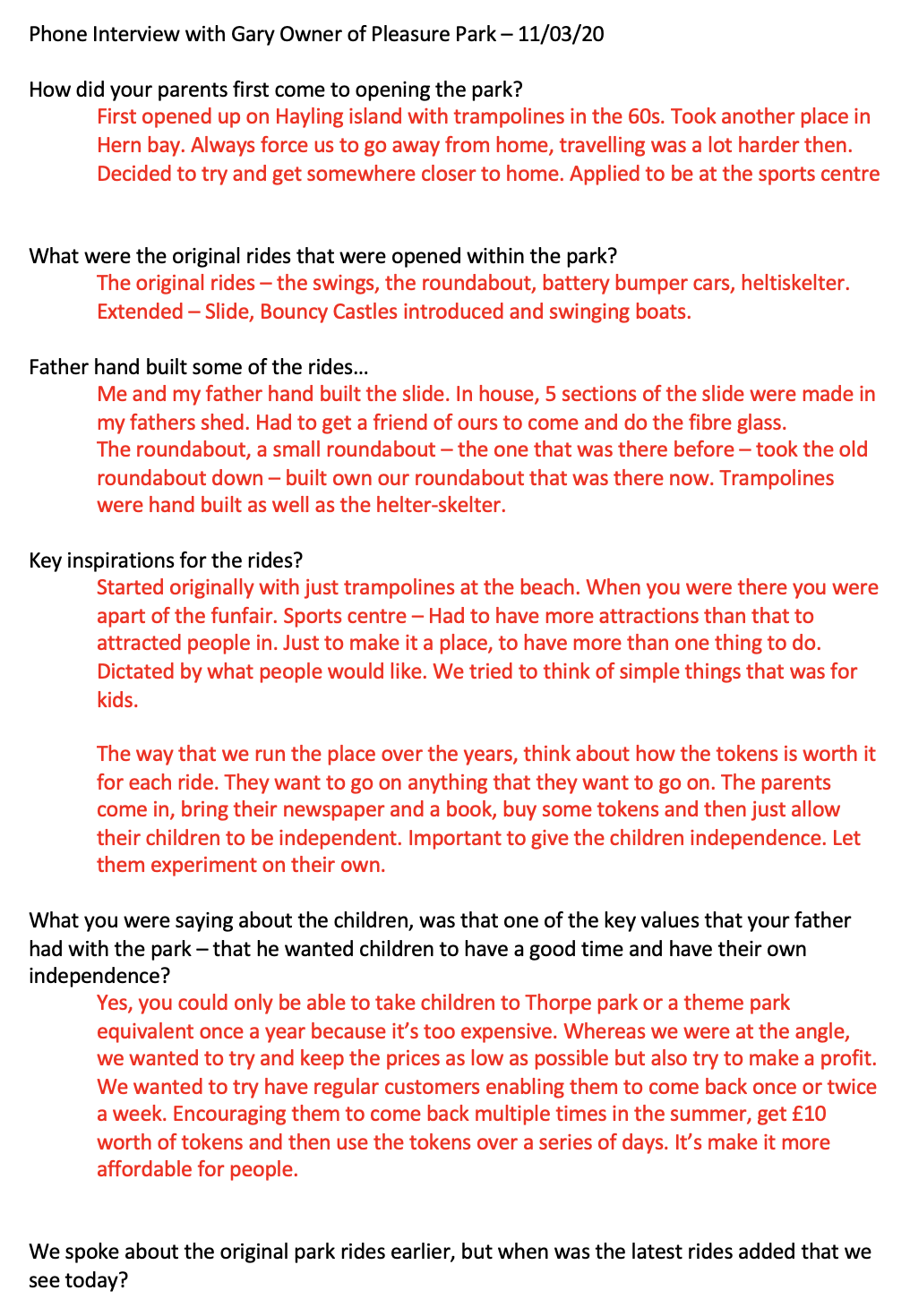
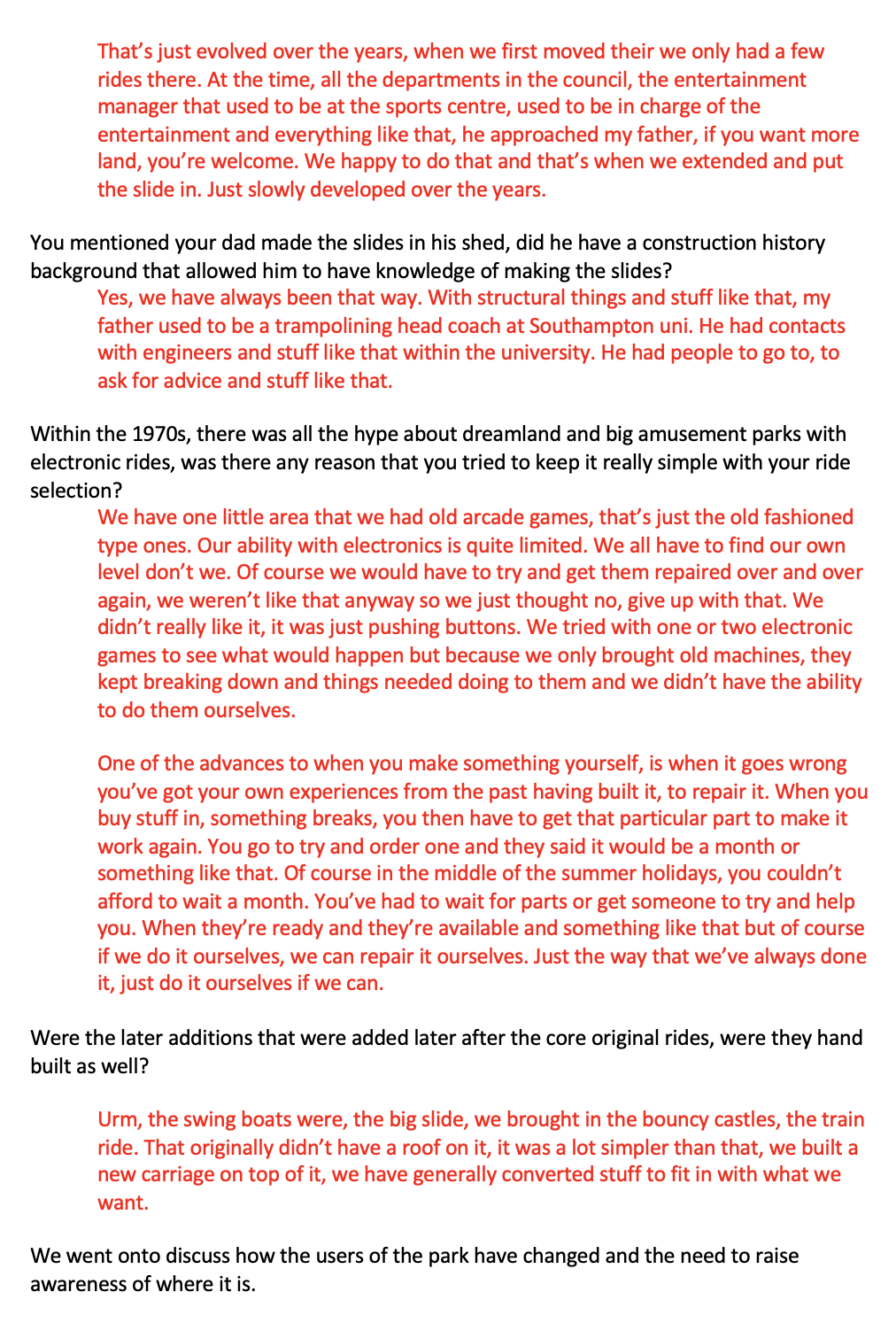
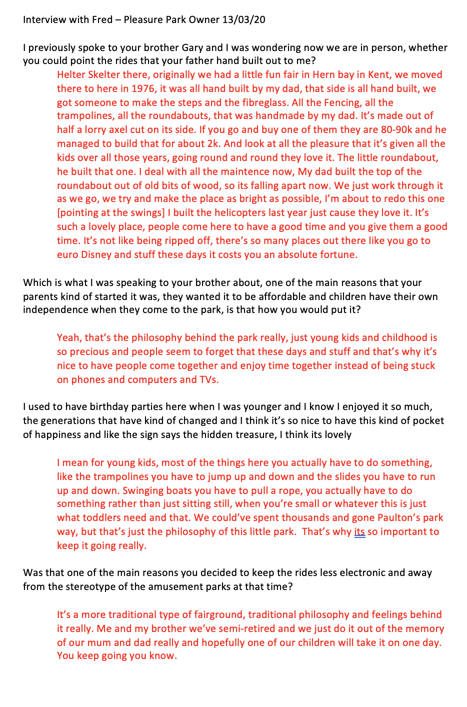
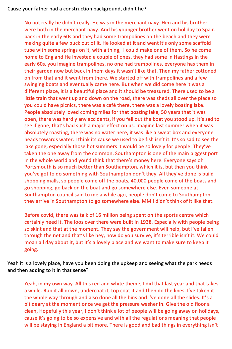
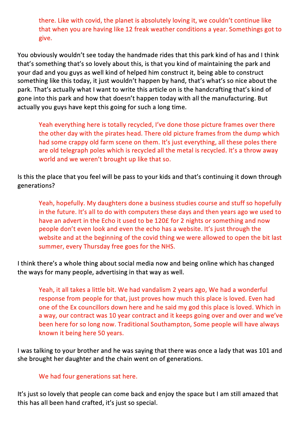
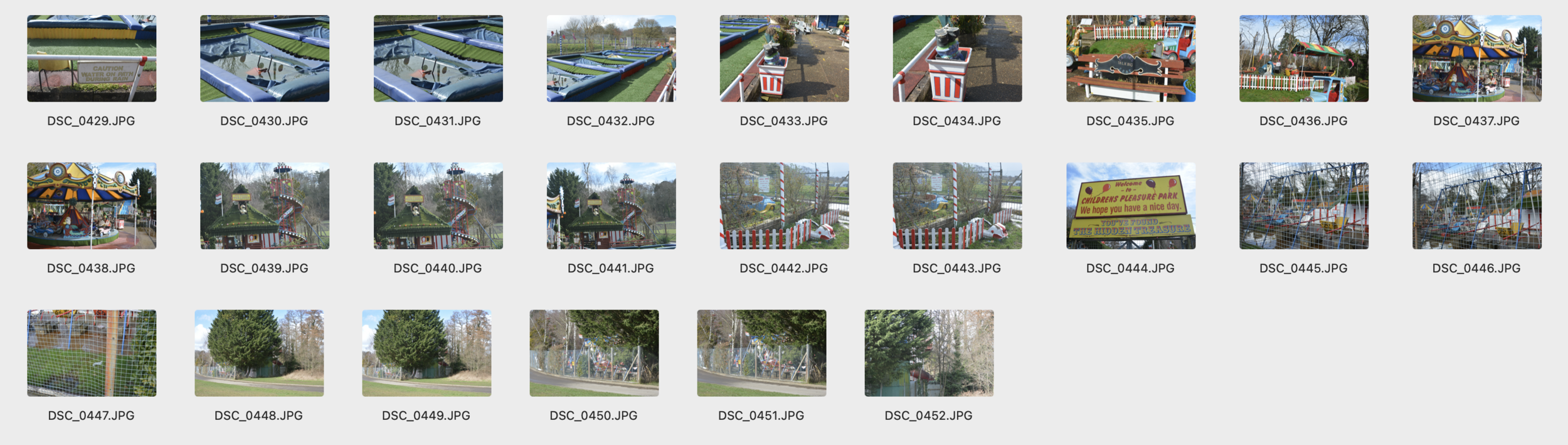
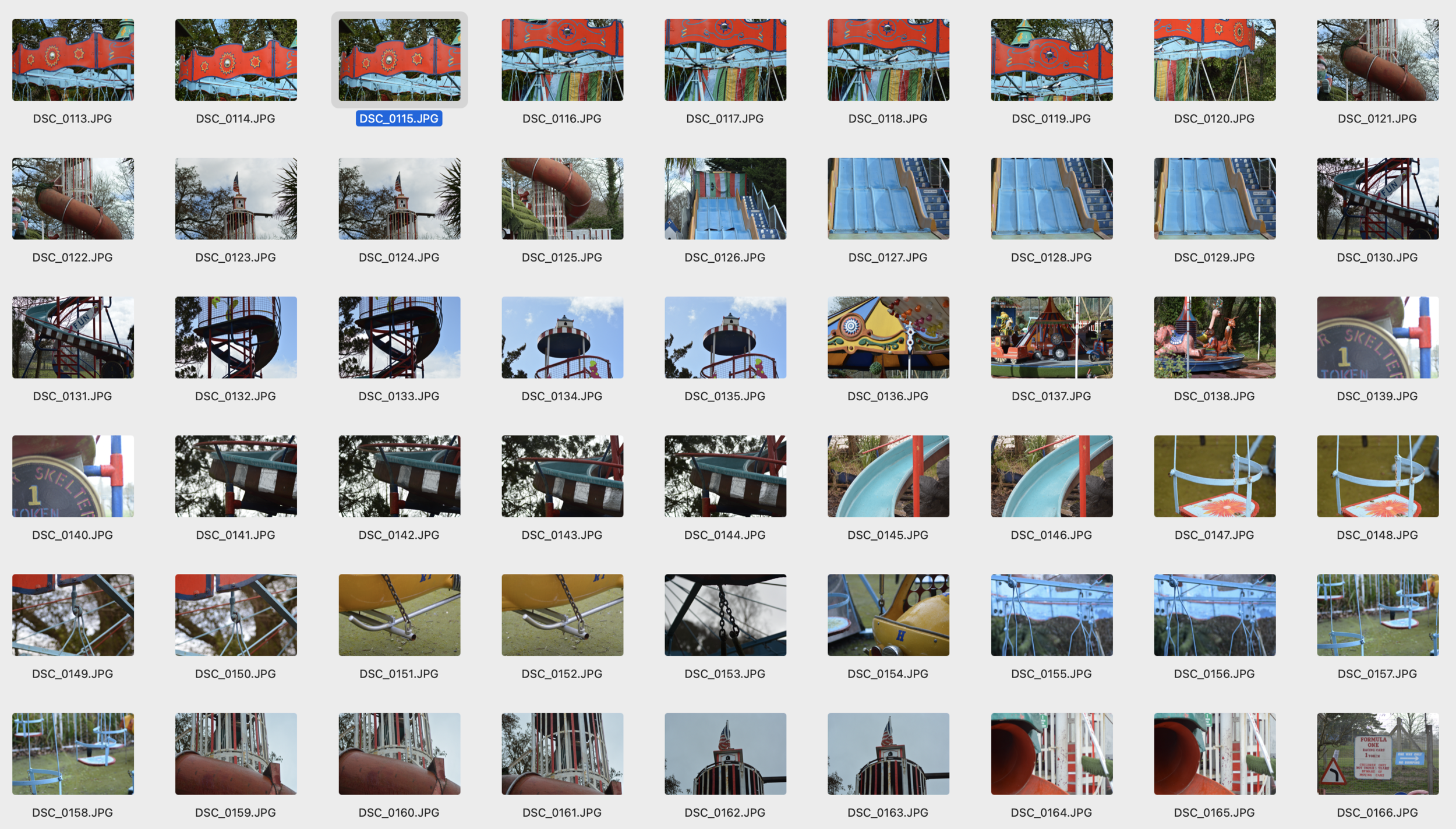
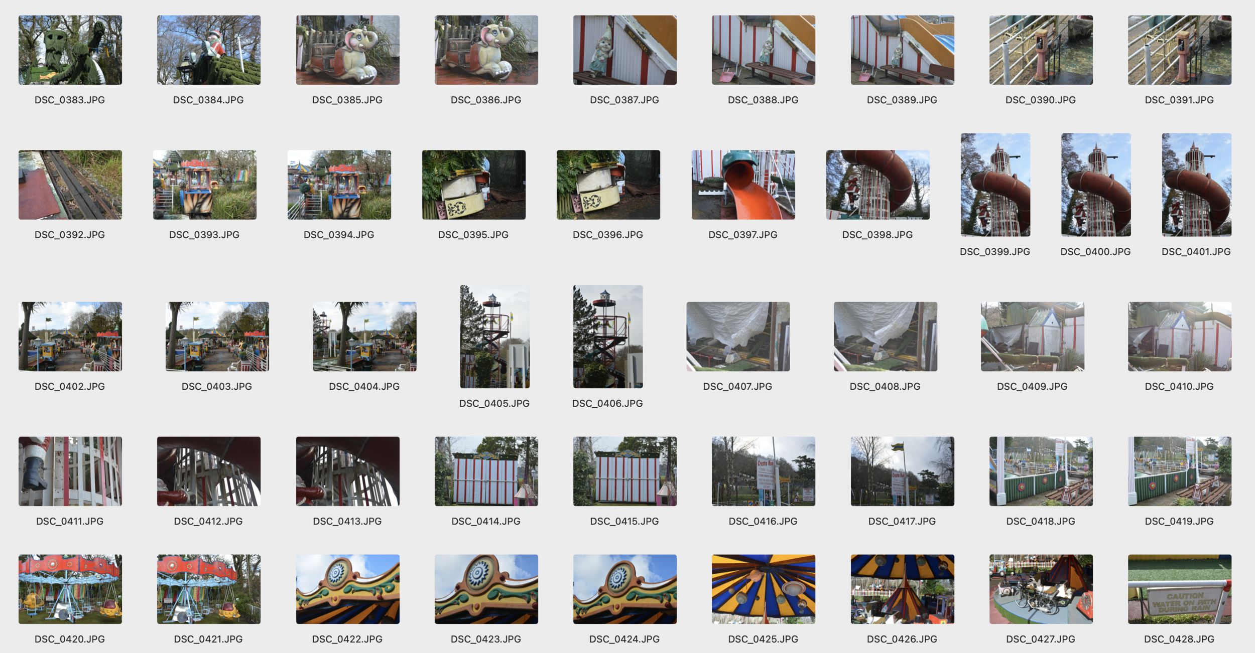
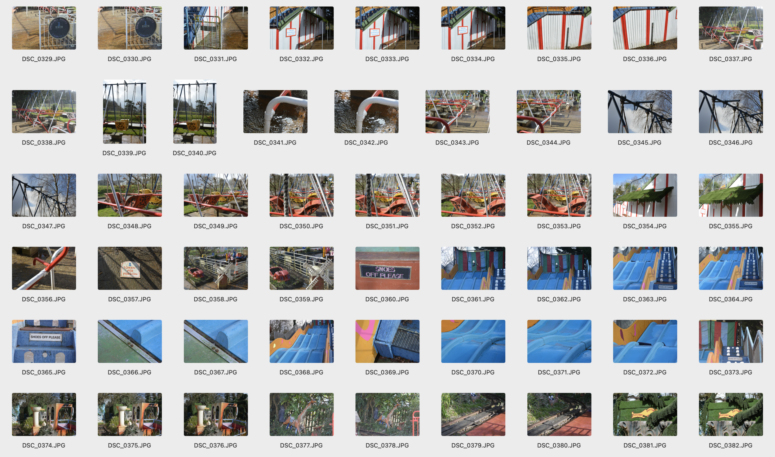
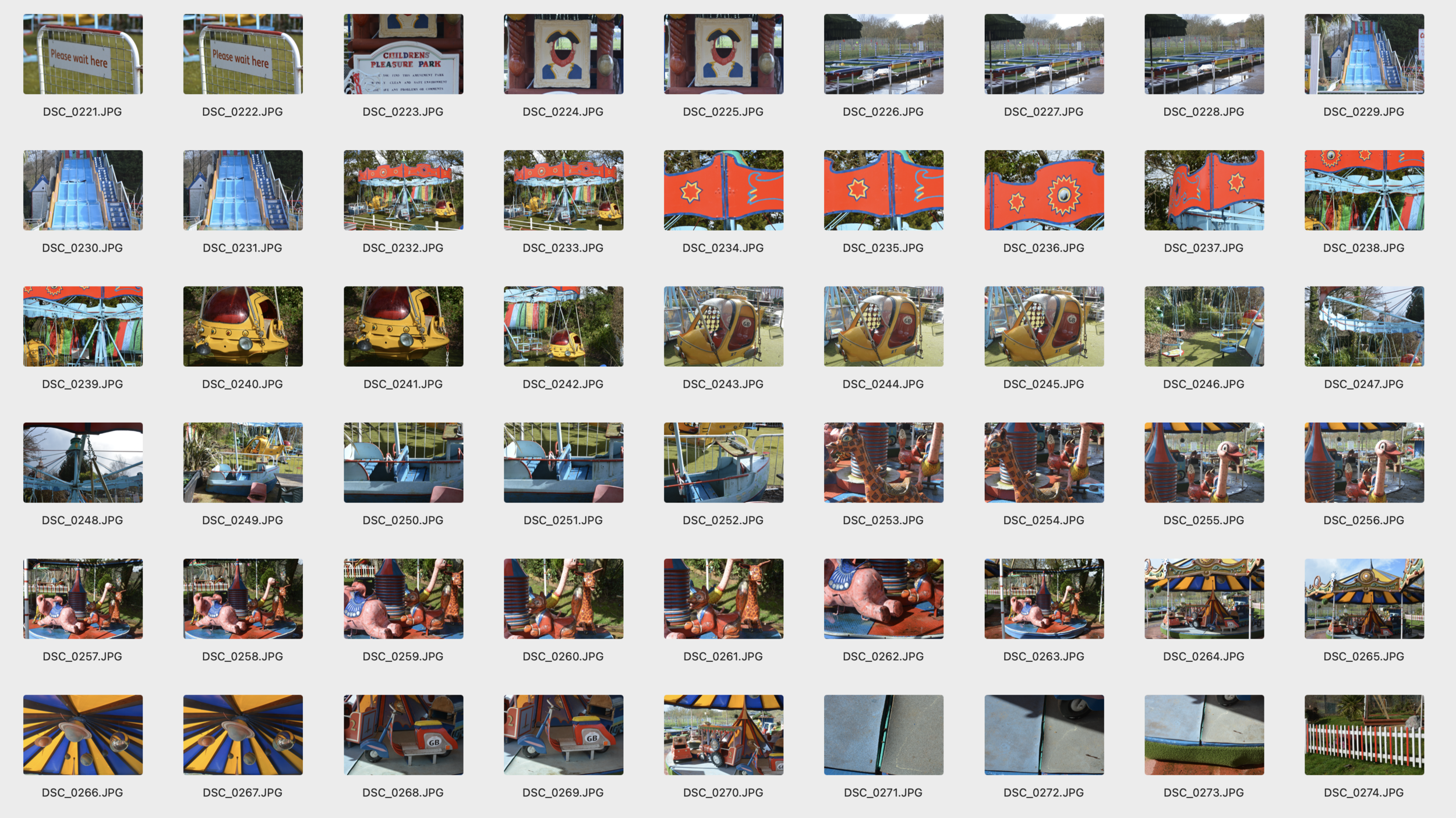
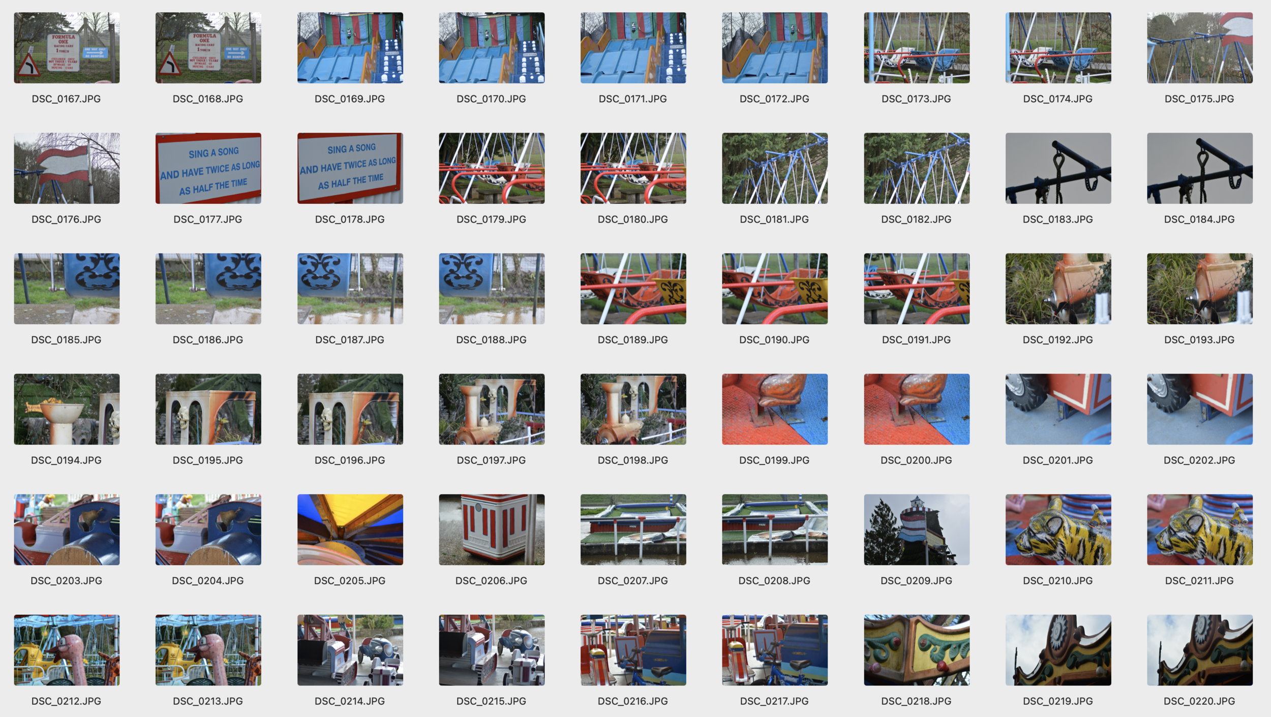
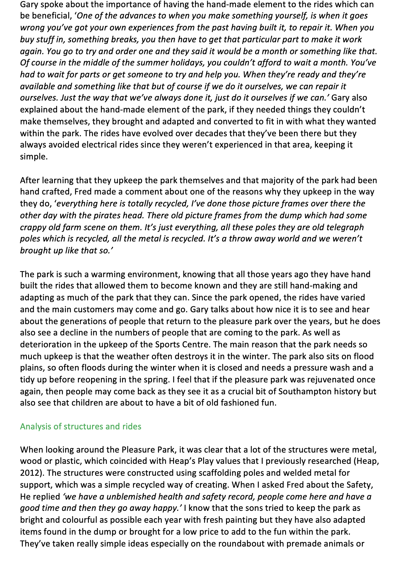
For this weeks Essay output I decided to go with the Pleasure park which is close to my house. I thought my original story would just be to write a story about it but after talking to ben about some ideas we decided to go down a craft route due to the original pleasure park rides being hand constructed by the original owners. Over time this has obviously changed and moved to adding more rides but I feel the magic has been lost to what the place once was so I thought about how I was redesign and recraft the space. I began to do some research but struck out of a lot of dead-ends due to the archives being closed, the original owners also passed away and left the place to their sons and I didn’t have a face to face interview and tour of the pleasure park till the end of the week.
I started at the planning website and found some of the original plans of the park.

I then decided to post some of my findings on the ideas wall:

Ben gave me a couple of points to begin researching.

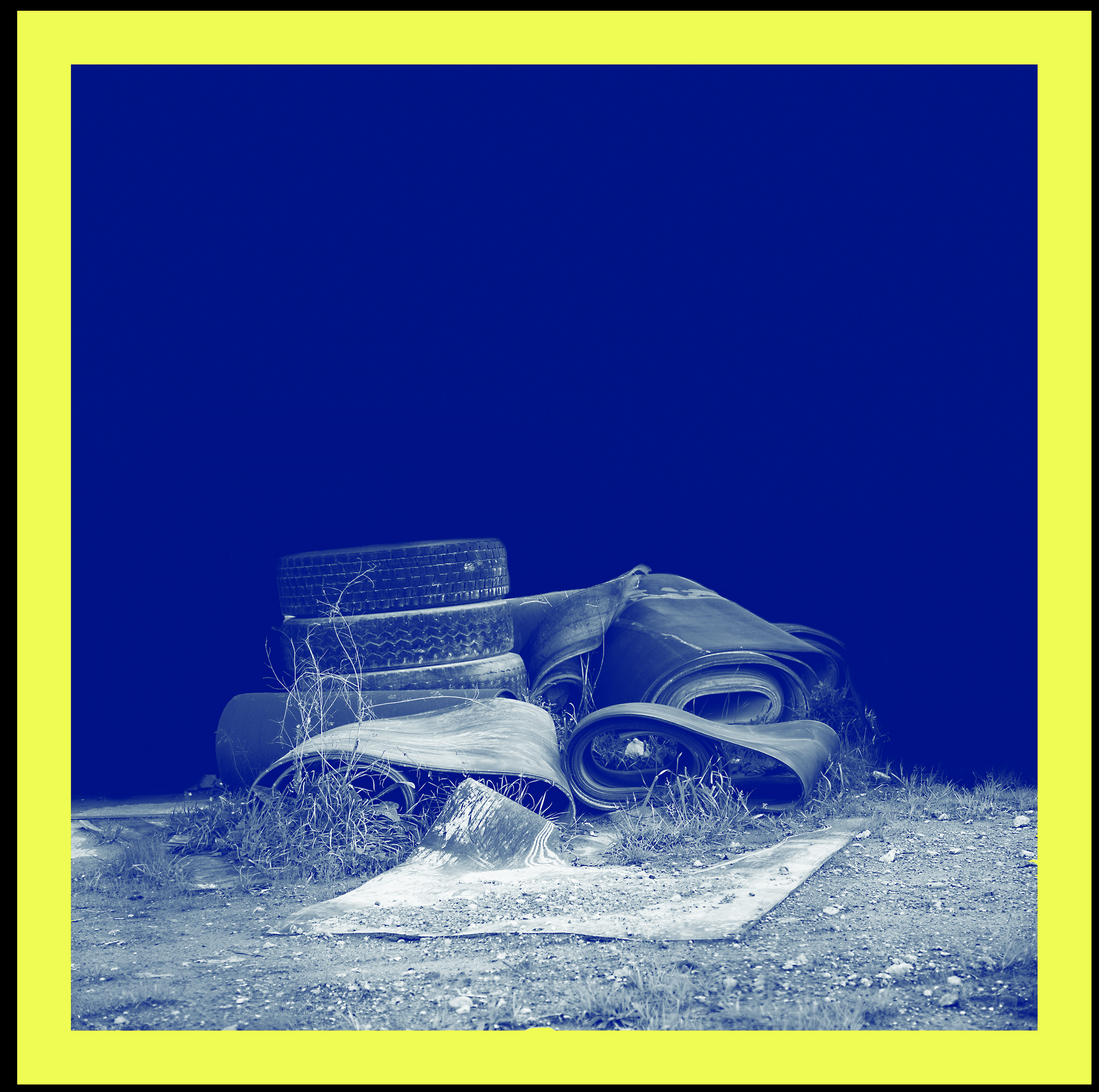
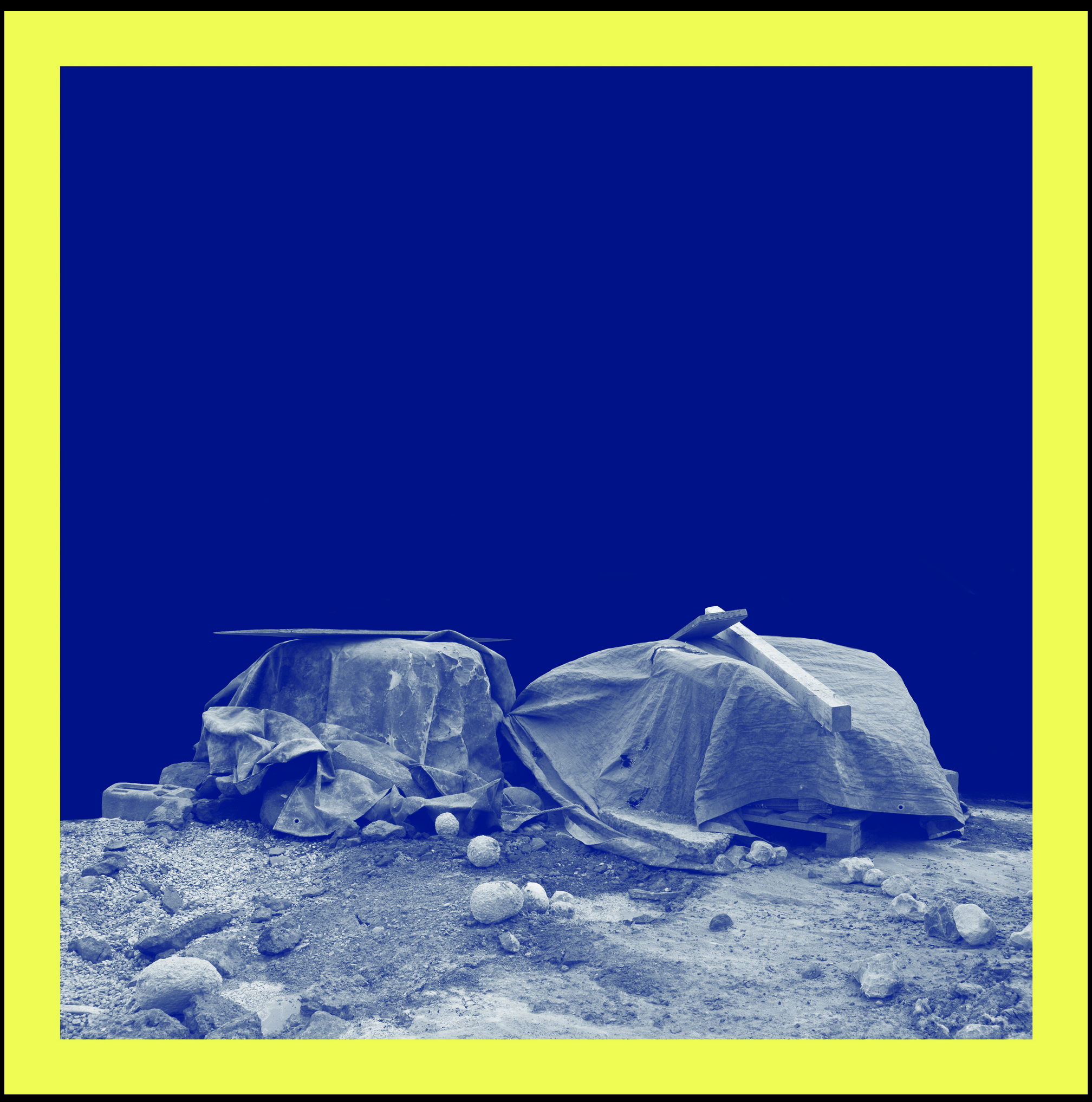
Felicity Hammond
Factory Settings
“Blue is the colour of the screen when it is unable to transmit information; it is a miscommunication, an error report, a simulation or substitution. It is the print of future planning yet it is also failure, already redundant.
Restore to Factory Settings mourns for a forgotten industry; industrial relics become urban follies, shrouded as they lie precariously between construction and deconstruction, archaic and futuristic. I have carefully adopted the blue-print in the methodology for making these images, referring to the blue of construction, the blue of a new beginning; the blue of the factory settings.
The project is deliberately allegorical, describing our modern condition in the West, navigating the convergence of built environments with less tangible but arguably no less real technological and ‘virtual’ spaces. It stems from years of watching and documenting the urban terrain transform around me, with a particular focus on the factory area of East London where my family once worked. These factories which were once producers of power, have now become a product of it. This work therefore stands for both progression and error, and its relationship with urban temporality.”
https://www.lensculture.com/projects/265445-restore-to-factory-settings

I love the depth and meaning behind this project, I also love how in the images below that she has edited out of the background to have this blue that allows you to feel like you’ve sunk to the bottom of the ocean. I would love to do an editorial like this for my images, maybe I could edit out the backgrounds to make them feel like a totally different sunken piece.
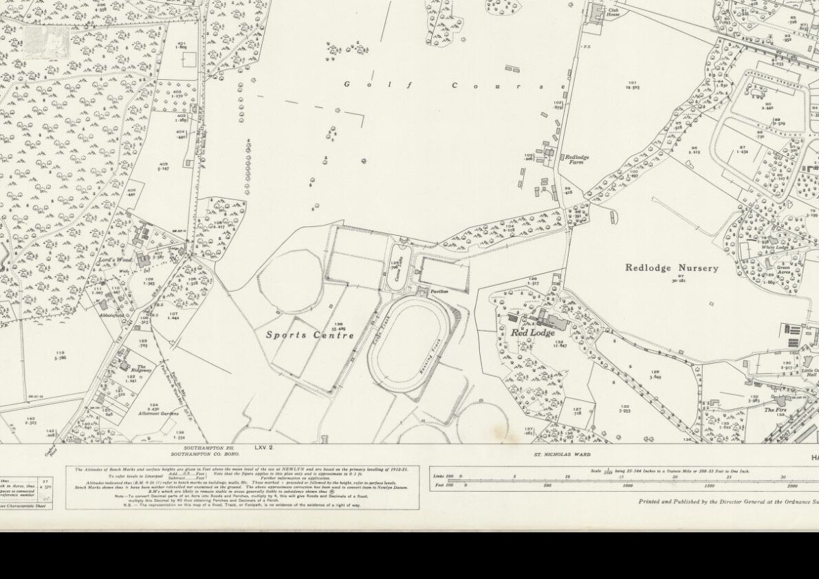
Whilst continuing with my research, found a map of the sports centre before the pleasure park was constructed which can be seen below.
I then went on the Facebook and instagram and found some of the images that were posted from around the 1976 when it first opened. I feel this really allowed you to feel what the place was like and how it was to be a child experiencing this.I also love how they all feel really vintage like we’ve travelled back in time.
After talking to ben, we both thought it would be good if I had a comparison which is then when I started looking up about dreamland and some of the history of the amusement parks below are all the links that I have researched so far.
https://thepleasurepark.co.uk/our-history
http://www.fossc.info/uploads/SOSC_History_and_Planning_History.pdf
https://www.dailyecho.co.uk/contact/
https://www.southampton.gov.uk/arts-heritage/southampton-archives/plimsoll.aspx
https://southampton.spydus.co.uk/cgi-bin/spydus.exe/MSGTRN/WPAC/HOME
https://maps.nls.uk/view/105986482
https://www.facebook.com/SouthamptonMemories/posts/872161189539805
https://www.facebook.com/photo/?fbid=475667052536234&set=o.342305639192032
https://www.facebook.com/groups/39990577882/search/?q=Southampton%20Sports%20centre
https://ebookcentral.proquest.com/lib/falmouth-ebooks/reader.action?docID=3441842
https://play.google.com/books/reader?id=BwrACwAAQBAJ&hl=en&pg=GBS.PA237
https://www.sheffield.ac.uk/nfca/researchandarticles/pleasuregardensamusementparks
https://www.theguardian.com/travel/2017/may/17/dreamland-margate-reopens-again-after-25m-revamp
http://www.felicityhammond.com/monument-to-the-curiosity-zone
https://pes-scanning.com/portfolio/historic-wooden-roller-coaster-restoration/
https://www.whatdotheyknow.com/request/procurement_supply_and_restorati
https://www.espplay.co.uk/the-history-of-playgrounds/
https://creativeplayuk.com/short-history-of-playgrounds/
https://www.bbc.co.uk/newsround/17747678
https://www.bbc.co.uk/news/av/world-europe-50689515
https://www.liverpoolecho.co.uk/whats-on/whats-on-news/abandoned-theme-parks-around-uk-17065527
https://www.youtube.com/watch?v=Dk0_OcbMAzM
https://www.hse.gov.uk/pUbns/priced/hsg175.pdf
https://www.snaptrip.com/c/activity/top-10-vintage-theme-parks-rides-uk/
https://www.walesonline.co.uk/news/uk-news/what-remains-abandoned-theme-parks-17071923
https://www.plymouthherald.co.uk/whats-on/family-kids/eerie-abandoned-theme-parks-once-4172348
https://flashbak.com/british-amusement-park-and-fun-fair-postcards-from-the-1960s-403295/
https://blooloop.com/theme-park/in-depth/family-owned-theme-parks/
https://blooloop.com/theme-park/in-depth/family-owned-theme-parks/
http://www.constructioncompany.com/historic-construction-projects/disneyland-walt-disney-world/
https://www.sheffield.ac.uk/nfca/researchandarticles/noveltyrides
Once I had some kind of research I started to write the essay with the structure of:
Introduction
History
History of Amusement Parks
History of Dreamland
History of Pleasure Park
Analysis of rides and Structure
Current Day
Current Day amusement Parks
Current day Dreamland
Current Day pleasure park
Restoration/ rebuild
Values of Modern Day
Throw away culture
Refreshed / modernisation of Park
Conclusion
Whilst writing this I felt that It didn’t work in this sense, so it changed too:
Introduction
History of the Parks in UK
History of Amusement
History of Rides
Children’s Playgrounds
Current Day Amusements
Southampton Pleasure Park
Dreamland
Dreamland History
Dreamland Present Day
Analysis of Rides and Structure
Restoration / rebuild
Refurbished / modernise.
Values of the Modern Day
Slow Maintenance
Conclusion
As im still waiting for the key interviews, I have started writing under all these headings but I feel that its going to take me a little bit longer as I find it so hard to structure essays. I’m not sure if this will be the final layout as it might change.
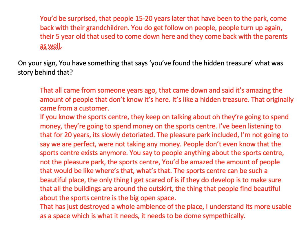
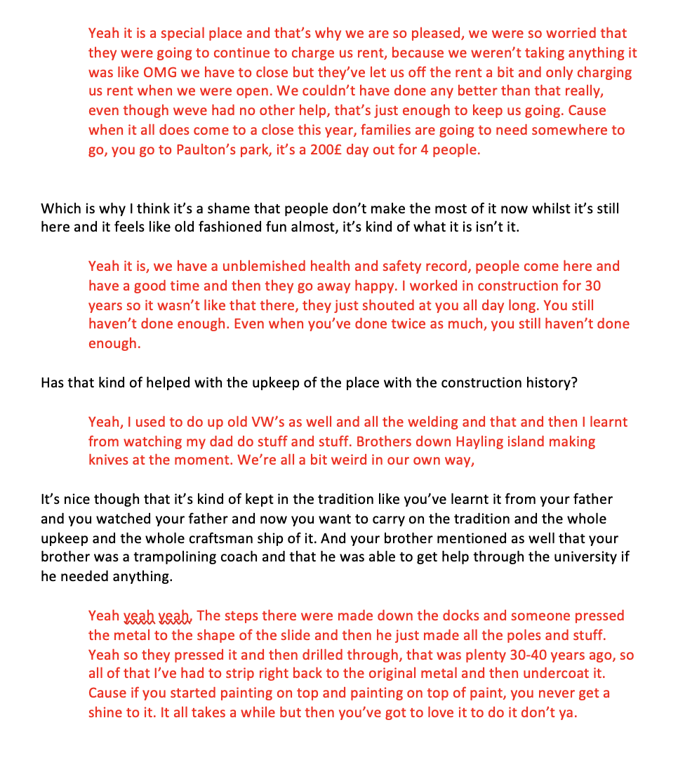
I then managed to get an interview with one of the brothers on the phone which can be seen below:
I’m still getting research and interviews, although I want to move onto next week, so ill come back and post my draft to this week when it’s finished.
2. Create an A3 landscape format inspiration board to present your initial ideas about the design approach, to include examples of materials, format, typography, print / digital production.
For the A3 Moodboard, I had the idea to make the design relate to the 1970s as this was when the park was first opened. This was my first attempt which I basely took some of the images that I found and already had of the site, some of the layouts that I liked aswell as some of the covers - I just wanted to some feedback initially to whether this was enough inspiration and then I was going to change it later on.
01.

02.This is my second attempt at the moodboard, hopefully this one will give me a more clear direction.

I also wanted to quickly create a Pinterest board incase I got any other ideas from other people.
I then tried to take some of those parts from above and added them to my mood-board.

3. Save your inspiration board in an interactive PDF format and upload to your blog and the Ideas Wall.
01.


Piotr made a good comment about possibly looking at album cover design but also tv commercials to see if there was anything graphic design inspirational from there which was a good idea.

Mina also made a comment about how I could possibly add in some of the imagery that i’ve already collected to add to the moodpboard which I hadn’t thought about.
02.

Weekly Summary
I feel this week has been such a crazy week with trying to firstly get feedback about the ideas that we had, as the feedback days are at the beginning of the week. Im glad that I did manage to talk through my ideas with ben and talk about ways that I could write the story as I really struggle with the narrative part of writing. But secondly, trying to write a whole essay in one week has been quite the task, especially since I spent last week really focussed on the ideas concepts. But this week I found the lecture really enjoyable and I found some really interesting magazines that sparked ideas for my own concept.
In terms of research and writing my essay, it’s going to take me more than a week to do this as I feel like the information that I need is acquired over time. I have done one interview with one of the owners but I need to do one more interview and actually go and take pictures around the space. I feel the research I have found has so far allowed me to gain a deeper understanding of hand craftsmanship but also about a family business and why they decided to hand build things.

Reference list
Acid (n.d.). Tumblr. [online] Tumblr. Available at: https://acidsurfing.com/about [Accessed 13 May 2021].
Detail (n.d.). DETAIL - Magazine of Architecture + Construction Details - About us. [online] https://www.detail-online.com/service/about-detail/. Available at: https://www.detail-online.com/service/about-detail/ [Accessed 13 May 2021].
Dwell (n.d.). About Dwell. [online] Dwell. Available at: https://www.dwell.com/about [Accessed 13 May 2021].
Flask, D. (2019). Ray Gun : Design Is History. [online] Designishistory.com. Available at: http://www.designishistory.com/1980/ray-gun/.
Print (n.d.). About | Print Magazine. [online] PRINT. Available at: https://www.printmag.com/about [Accessed 13 May 2021].
Sidetracked (n.d.). About Sidetracked. [online] Sidetracked. Available at: https://www.sidetracked.com/about-sidetracked/ [Accessed 13 May 2021].
The Architectural Review (n.d.). Contact us. [online] Architectural Review. Available at: https://www.architectural-review.com/contact-us [Accessed 13 May 2021].
The White Review (n.d.). About. [online] The White Review. Available at: https://www.thewhitereview.org/about/ [Accessed 10 Mar. 2021].
Wrap (n.d.). Our Story. [online] Wrap. Available at: https://www.wrapmagazine.com/about [Accessed 13 May 2021].