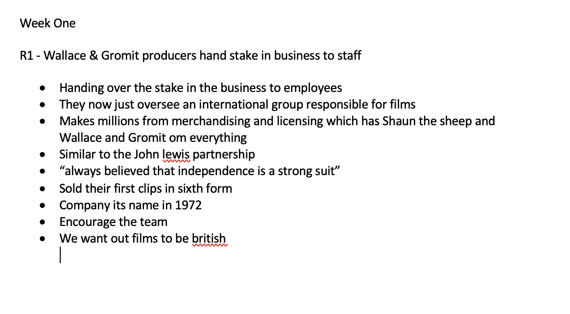
Week One
Lecture Notes:
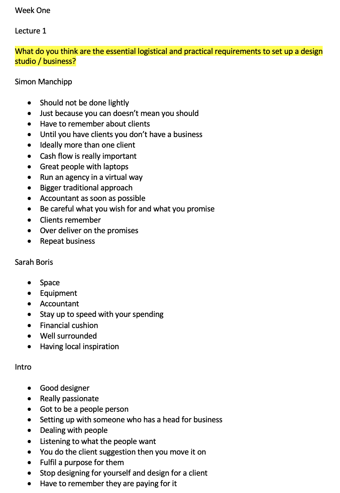
Lecture 1
Lecture 2
Lecture Reflection:
Lecture 1
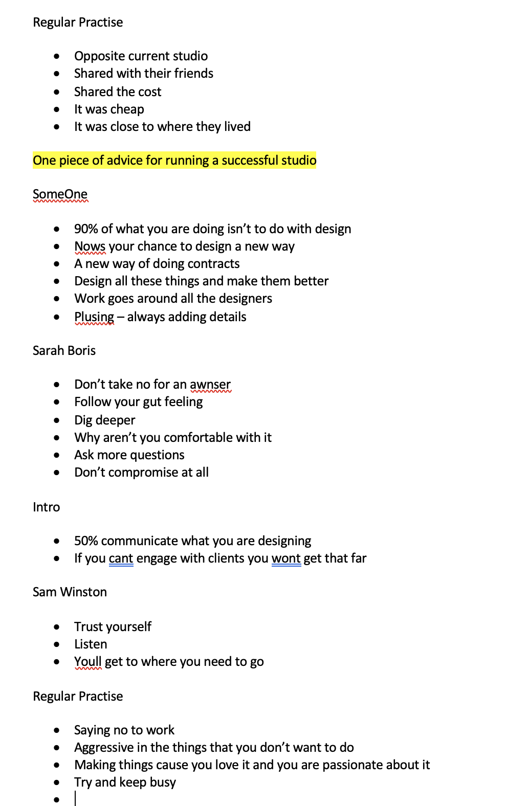
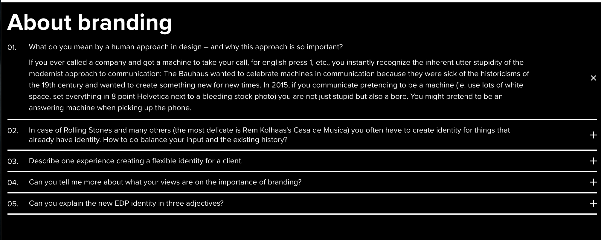
Really interesting and insightful information from this weeks lecture. It was nice to hear from people within the industry about how and the dos and donts about setting up your own practise. One of the main people that I always think their insightful is the regular practise, as they are only really a couple years out of university themselves. There is alot of talk about trusting yourself and this notion of believing in the work that you are doing.
Lecture 2
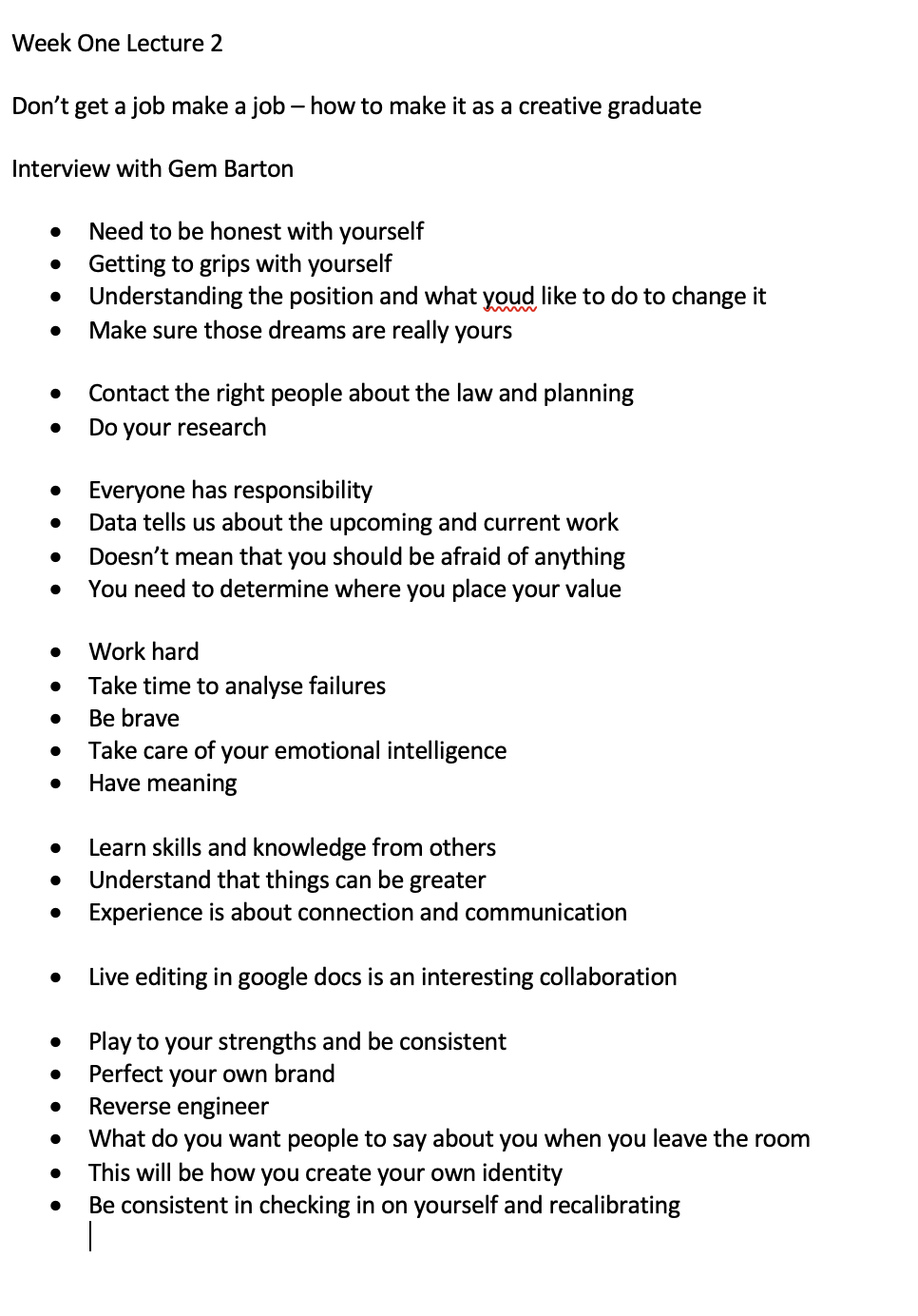
A really interesting interview with Gem Barton about her book. I think the words that she says about reverse engineering yourself is a really interesting approach especially when thinking about how you want the brand to be viewed but also how she talks about how do you want the brand to be not just how you want other brands to be but how you want your own brand to be. Some things to think about within this weeks task.
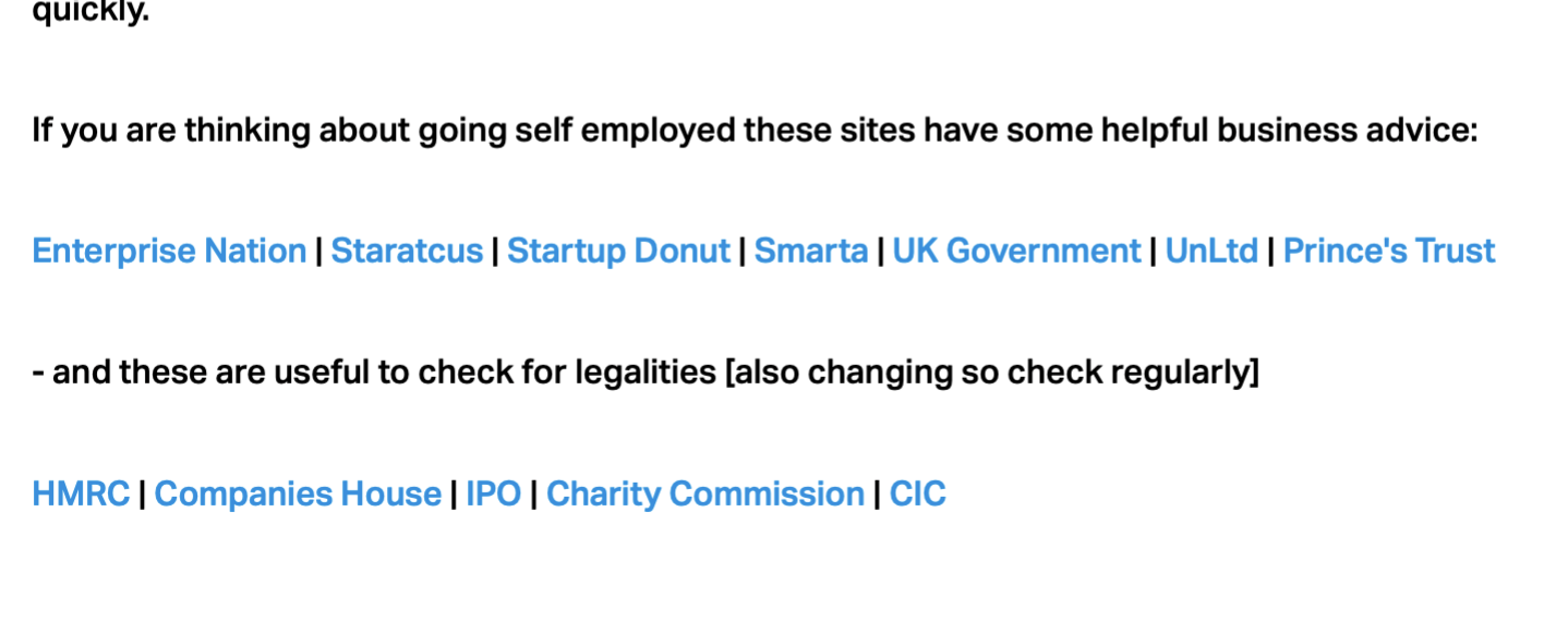
Resource Notes:
Resource Reflection:
So for this module for the resource reflection, I am going to approach it differently and more focus on the things that I can take away from each of the resources:
R1 Take aways:
One of the take aways from this resource was how they realised that they valued the workers of the company so much that they wanted them to be apart of it which is why they decided to share the shares to the employees. They hoped that this would allow them to work harder but also work more creatively. Encouraging the team to be better than ever which is a huge value that I think is important. I admire that they have such strong believe in their staff.
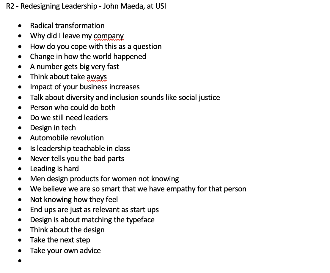
R2 Take aways:
John Maeda has clearly alot of experience in leader ship but the main take away from this was looking at how the world is changing so quickly. We are constantly moving forward and changing the way that we adapt and think about design so how can be take the next step to become this better person.
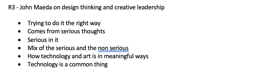
R3 Take aways:
Another lecture from John Maeda about why design thinking is so important. Why there is so much seriousness in design but how you need to mix seriousness with the fun and joking within the project. Another take away is that technology has come so so far in recent years but how can we get in-front and use technology to our advantage.
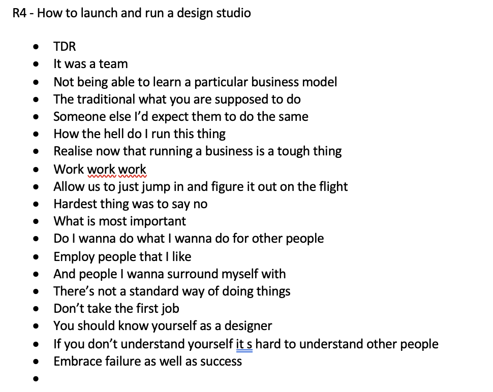
R4 Take aways:
This was a team of people that were running businesses. The main take away from this lecture for me was learning and understanding about how a business is made up and the people that make up that core business. One person spoke about how at the beginning he only hired people he didn’t want but then another went on to say the oppsoite. I feel that I would only want to employ people that I felt had the same worth ethic as me. Another take away was understanding yourself as a designer. If you don’t understand yourself as a designer, how do you expect other people to understand what you want? I felt this really important message.
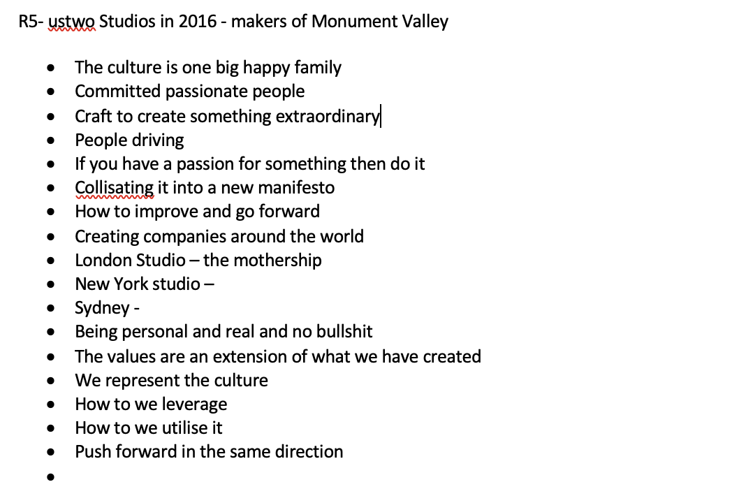
R5 Take aways:
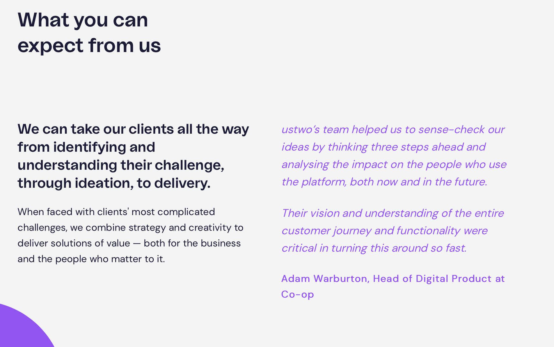
This was the most interesting resource from this week. UsTwo studios, they have a really interesting work environment and their beliefs are interesting too. They believe that their culture is this one big happy family and the invest in people who have the passion in front of them. They want to push with people to represent a culture and have a no bullshit approach.
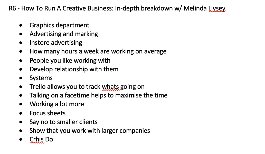
R6 Take aways:
Another interesting interview with Chris Do and Melina Livsey talking through how she can expand and build on the foundations of starting a new business in the graphics world. One of the main points that I was shocked about was how Chris Do thought 40 hours wasn’t enough and the conversation around what is enough work and what isn’t enough work and how you bring in someone to your team from the outside. It was also interesting to learn about the spread sheet of trello.
The next lot seem to be more website based:
R8 Take aways:
· Creative agency in branding and advertising in nyc
· Range of projects
· Social events
· Super creative employee page
· A range of interesting typography and branding projects
· Feels a bit different to your average brand
I think i’ll do more research into this for this weeks research.
R9 Take aways:
This website is possible one of the best websites by Stefan Sagmeister. I love that his about page is all just questions and he’s answered to do with particular topics. I think i’ll explore more of his business and his projects this week.
R10 Take aways:
Maeda Studio is an interesting website which is all the books and information which he uses. It was mentioned that he is a designer so I will be interested to more research this week about his design methods.
Research:
Planning, Strategy and Management – Philosophies, Roles and Approach
&walsh
After doing some more research not the &walsh brand - they are an all female independently run business which I didn’t realise before. I feel this makes their work powerful, especially in sometimes a very male dominant field. They apparently also used to be partnered with Sagmeister but their partnership split which was when &walsh was created.
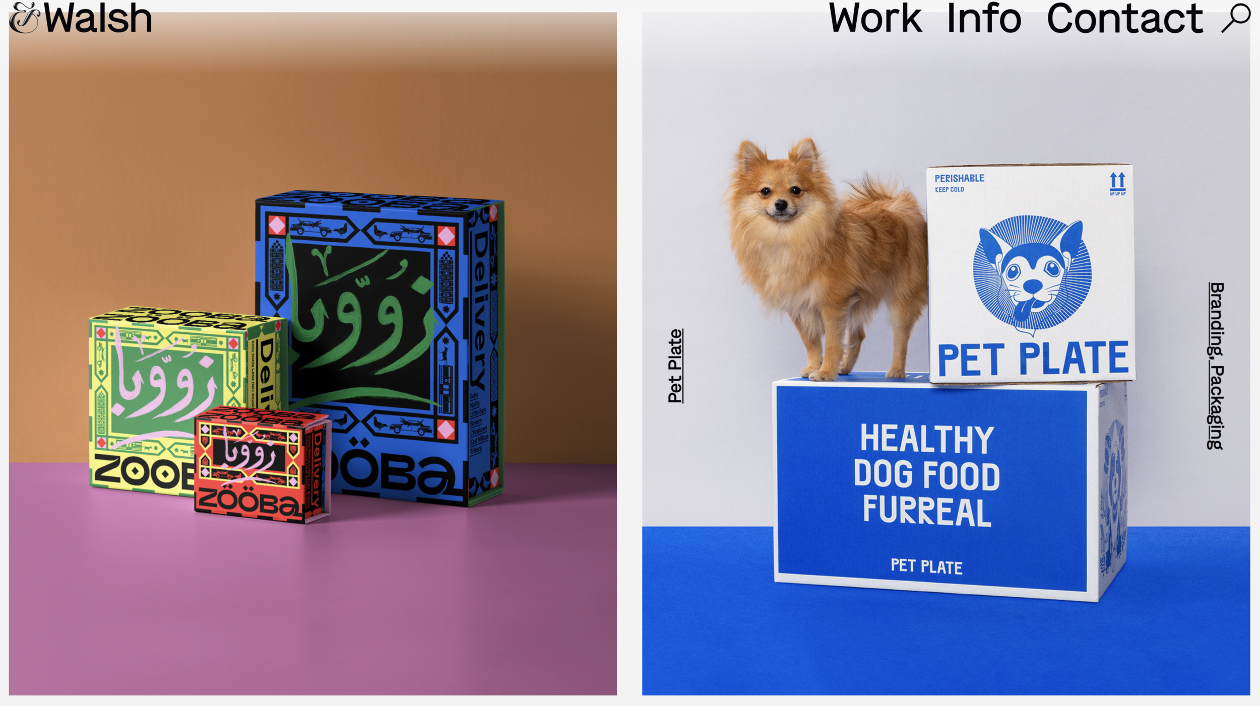
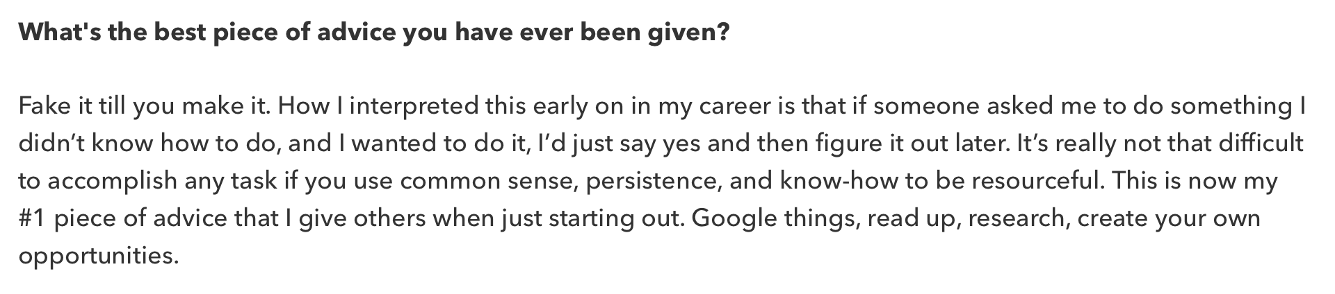
I also found an interview as I wanted to hear from her what her motivations were for starting an all female business. I think what she has to say is really inspirational and makes me want to work harder almost! Fake it til you make it was also mentioned in one of the resources this week too!
https://www.thedrum.com/news/2019/07/27/10-questions-with-jessica-walsh-founder-walsh
I went onto watch an adobe live session by Nick Longo about his business:

This really lighthearted interview was mainly aimed at branding and students that were still on a course, it went through the basics but also what you should and shouldn’t do when starting your own business. Nick Longo went from being apart of a business to creating his own so he has first hand experience.
About Me
I began to research some about me pages on the interest to see which really stood out to me and related with my personal values which I could take as inspiration for writing my own.
I also thought this was the best approach for this weeks project.
Split

I think the way that this is written especially at the beginning they really try to connect with the client or the reader of their website. I like that they just layout what they want to achieve but also then go on to say what they do.
The layout of the about page is really nice too having the bold text on the left and then the more finer text on the right with the black and white helping for reading purposes.
Mother
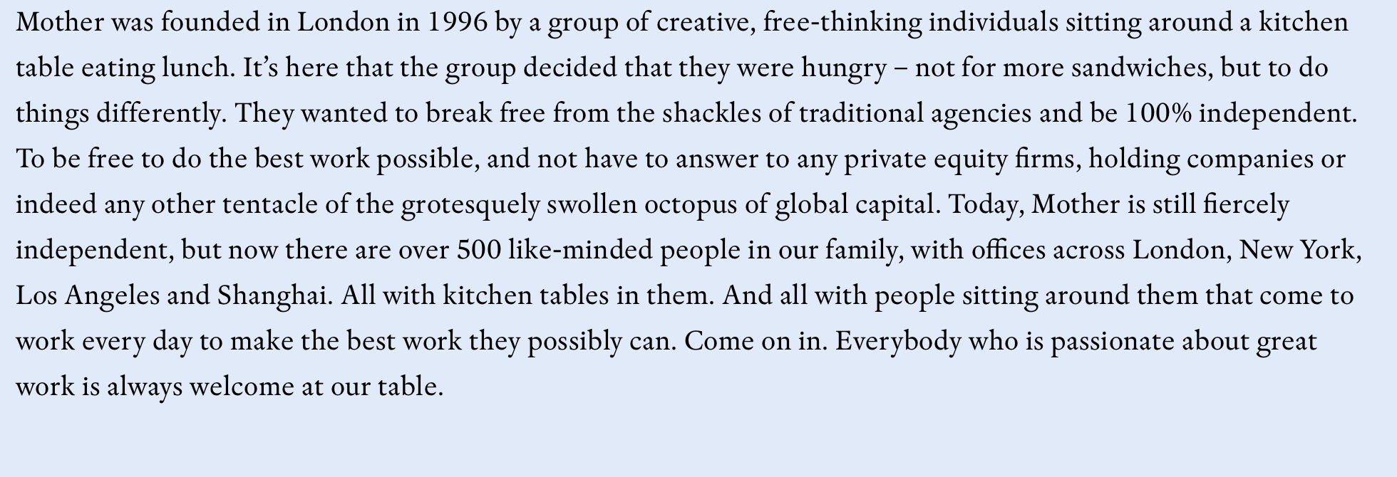
Again another pretty funny down to earth about us, I like how they said that they were hungry to do something more and they wanted to try and do the best work possible. They then go on to refer back to that kitchen table and how they’ve now made a community around it which is really nice.
The colours and font sit with the rest of the website.
UsTwo
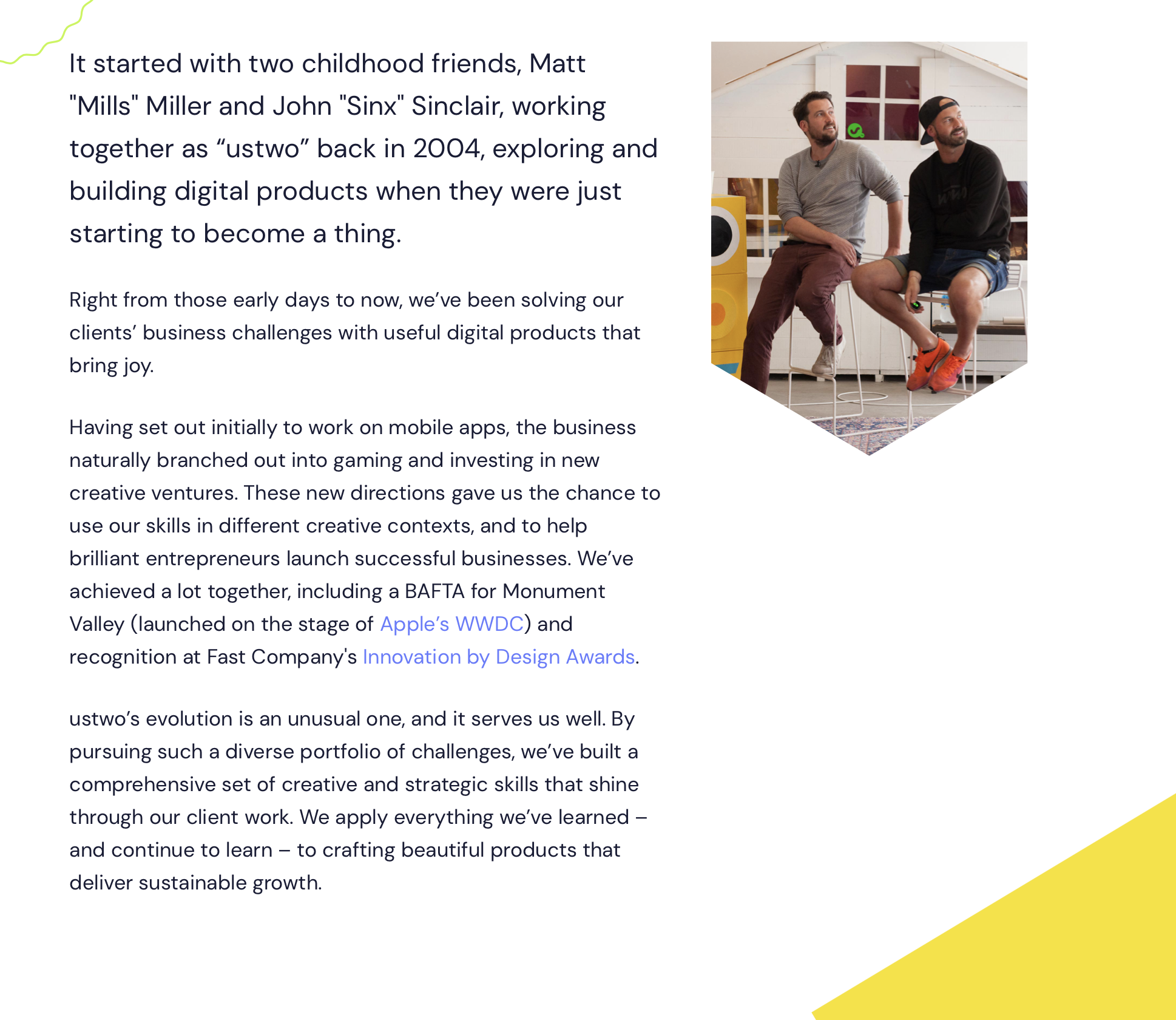
https://www.ustwo.com/about-us/
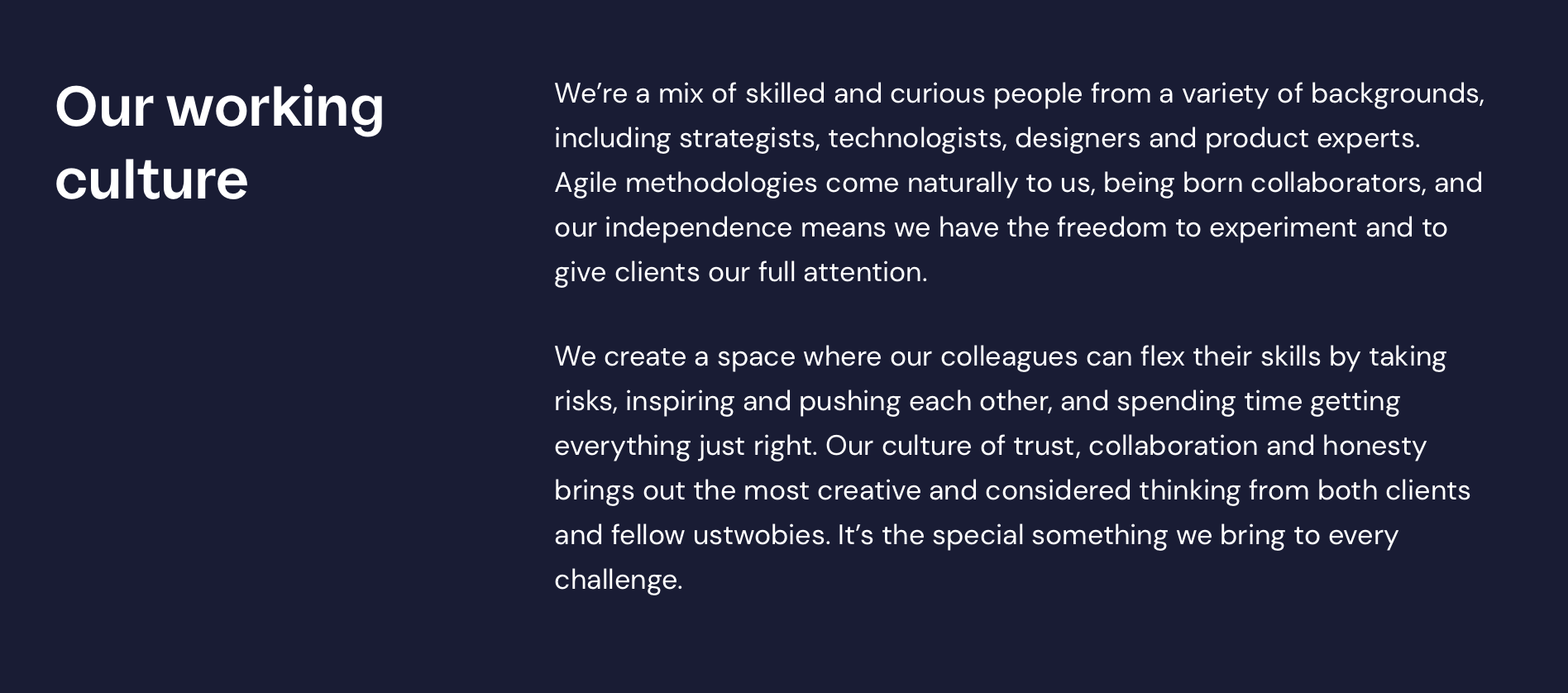
More of a direct approach from USTwo, they tell you how they met and what’s going on. I feel the most interest bit of their about us page is the our working culture section here they talk about what they actually do which I feel I connected with more.
Wolfoldins
https://www.wolffolins.com/about/
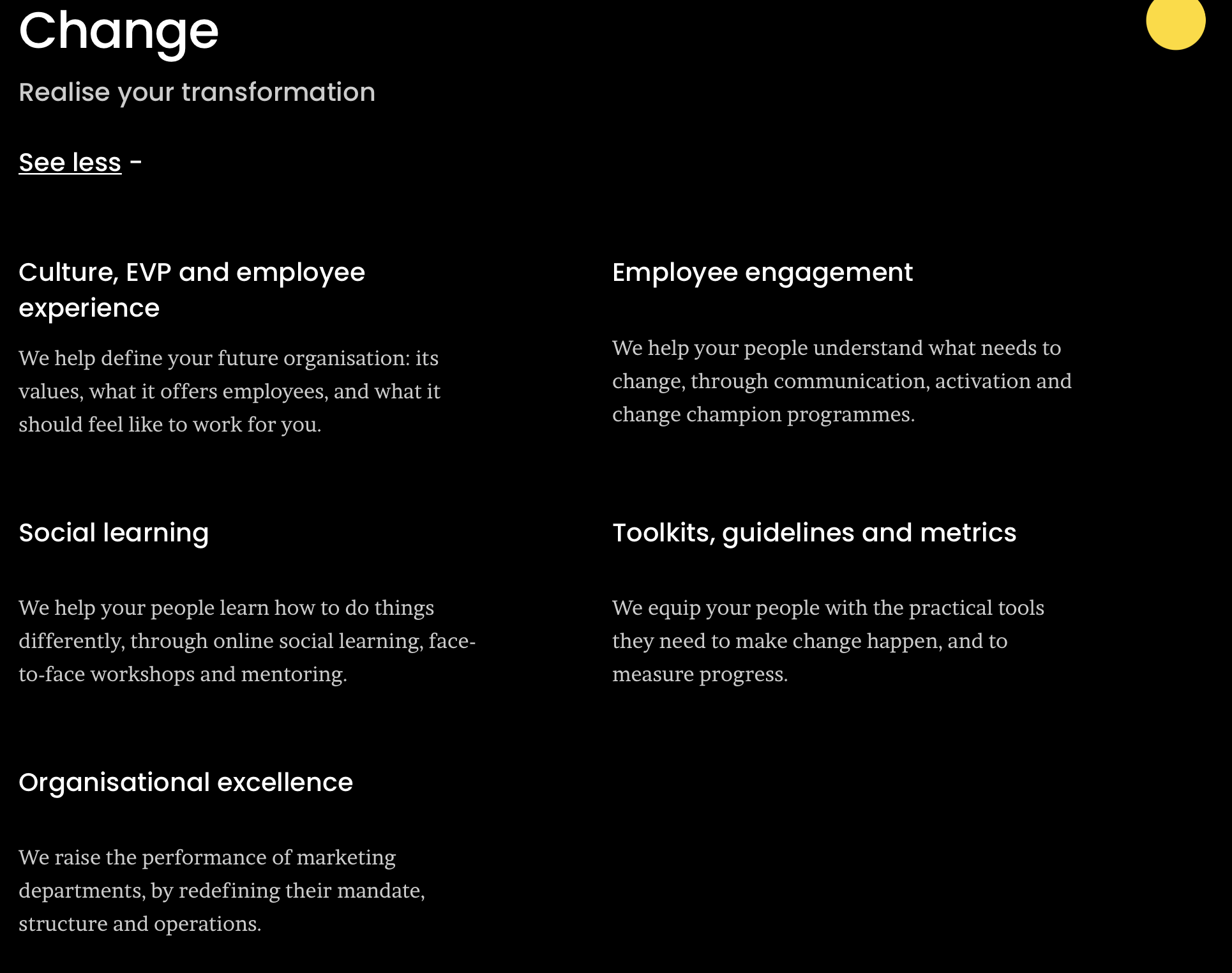
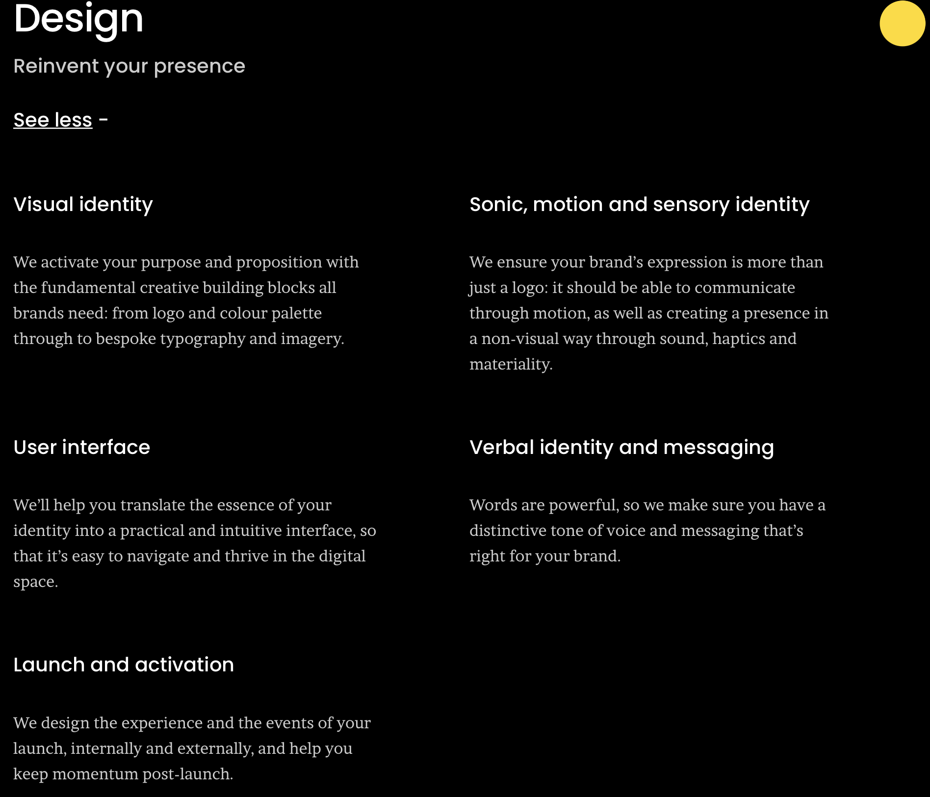
With this website, they haven’t told us about themselves but told us about the 3 important points within their work, Strategy design and change. I feel this gives us an overall idea of how they work as a company so there is no need for the about us paragraph. Its a different approach but makes it more interesting to explore each section.
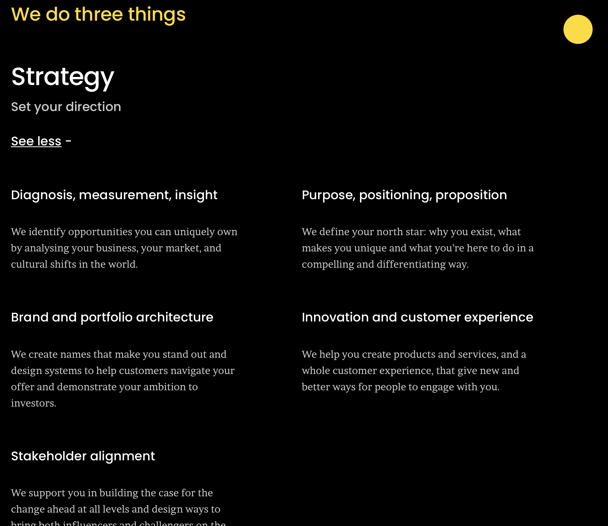
Made Thought
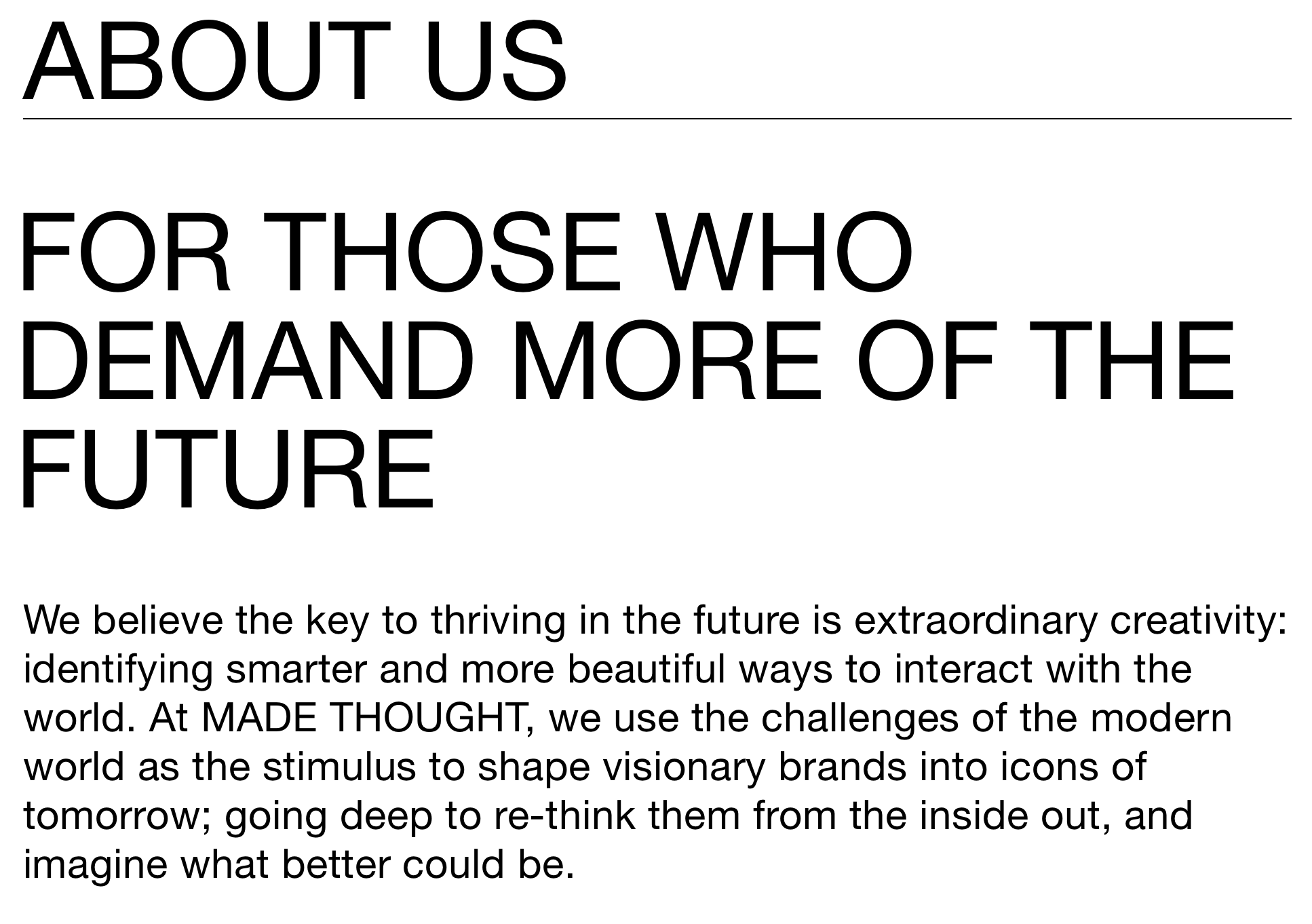
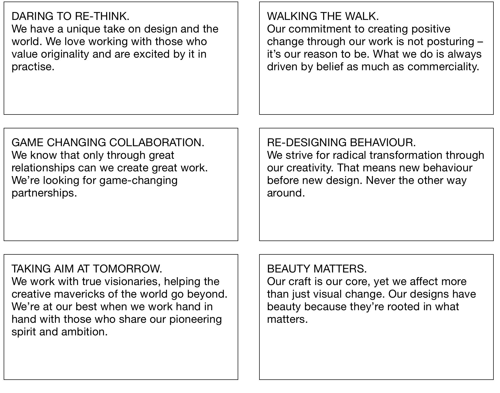
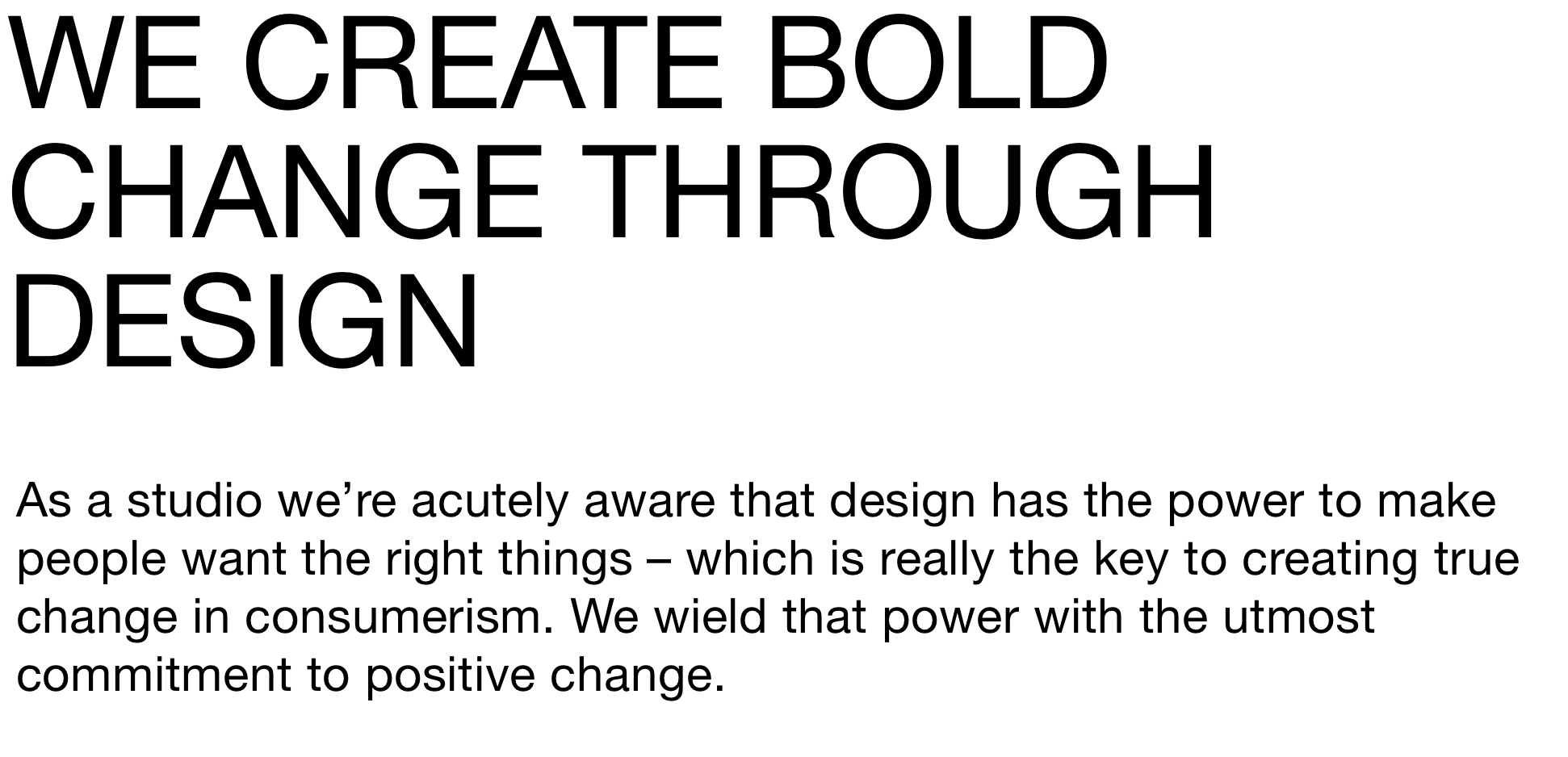
https://www.madethought.com/about
I really like this about us page, I feel like its shouting in my face all the positive things about the company. I like how they’ve included power words and alot about change and what they can do for you. It feels really strong. It was also an interesting layout with the boxes talking about the values of the company and what feels right for them.
GBH

Again a different approach for this one. They talk about themselves in third person instead of saying I or we which is an interesting way of putting it. I like the closing line of if your mind was open, we moved mountains to work with you - which makes you double think about the message they are trying to send to their future clients.
Practise for everyday life

I really liked this approach mainly because of the simplicity of the layout but also the information thats within.
Accept and Proceed

Another jokey kind of about us is accept and proceed. They lay things out simply and to the point. They want to create change which is what I think makes it work so well. The spacing between the wording is also interesting as it adds impact to certain wording.
Feild

This is such a short and sweet explanation of their company. Just really to the point, which again adds to how they run their company.
Hawkins Brown

They have a funny opening about the brand and how they view themselves and then they go onto talk about how they work and what they are going to bring to you. I feel Hawkins Brown make themselves feel more human and not like a robot just listing.
Perkins Will

The reason I chose this company was that I really liked the opening and I think the stories behind every company and every design are the most crucial part to understanding and communicating. How can we tell this story the right way?
Heatherwick Studios
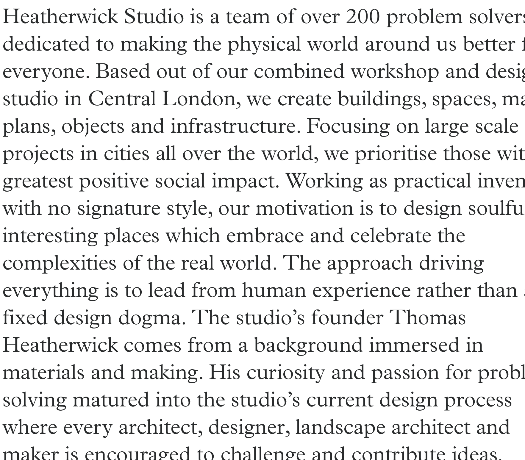
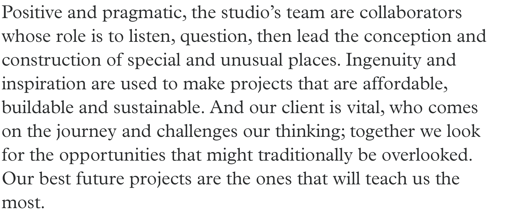
http://www.heatherwick.com/studio/about/
This is a very to the point about us page again, I feel that this is pretty big font which is shown as a similar size on their website which I would find hard to read it all as a viewer - or maybe thats the point??
BDP
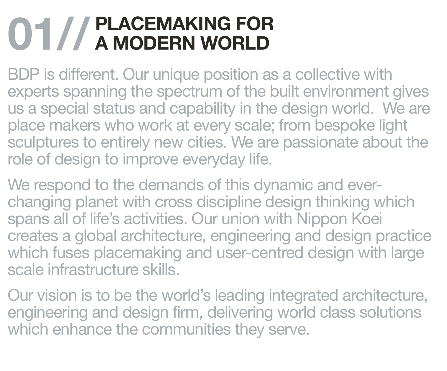
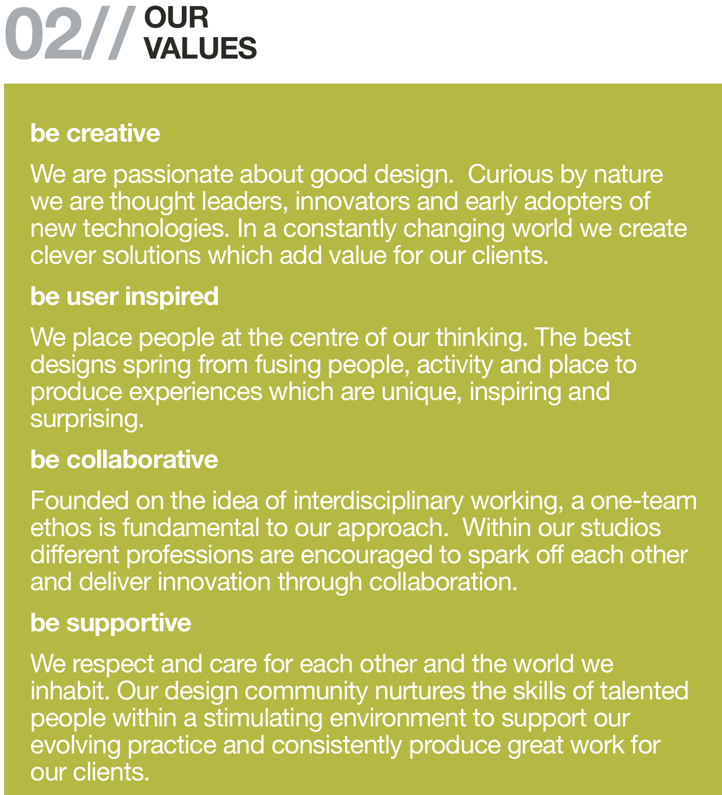
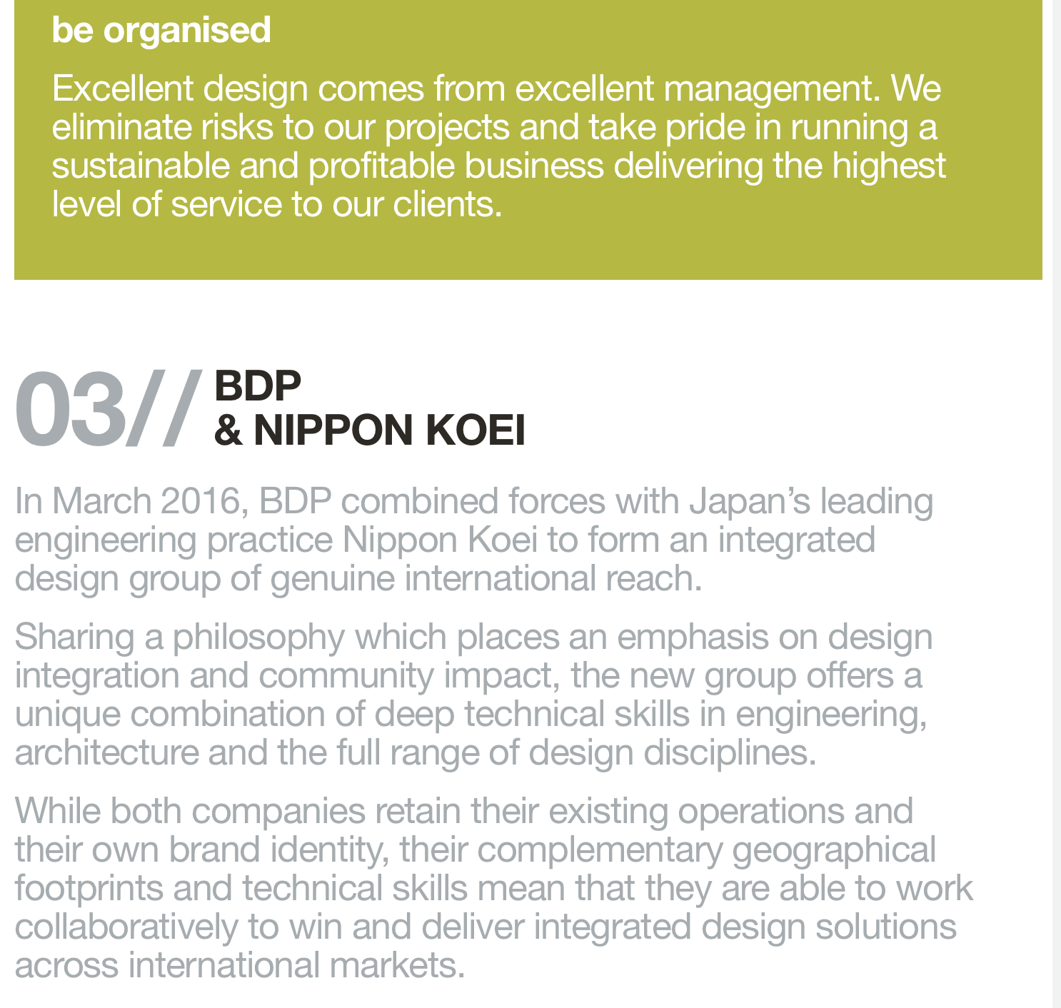
https://www.bdp.com/en/policies/policies/
One of the reasons I wanted to include BDP was purely for their opening paragraphs about their company. I love the explanation that they go to, to explain the why and the how about the little things but also that they go on to talk about their values - which is a really important part to connecting with the client.
From all of the above case studies, I think I have found out that I want to be direct and to the point but also try and be human to connect with the client. I want to add my values and understand that this is meant to summaries. I want to also list the things that we cover but in a non list way.
Supergraphics
I decided to research two of the super graphics companies that were recommended to me via the ideas wall. Still focussing on the about me sections of the website.
Morag Myerscough
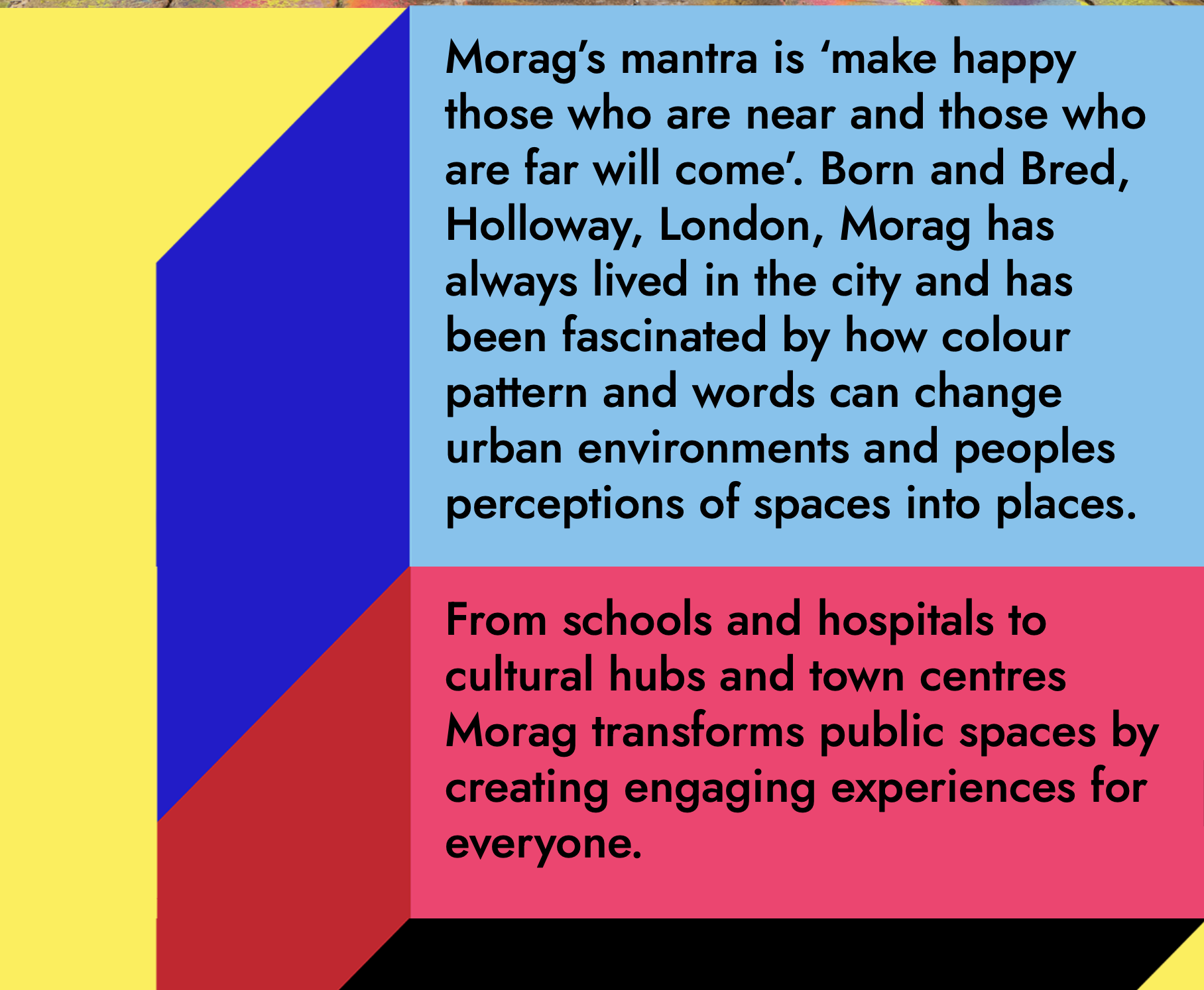
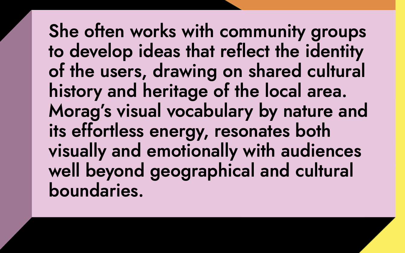
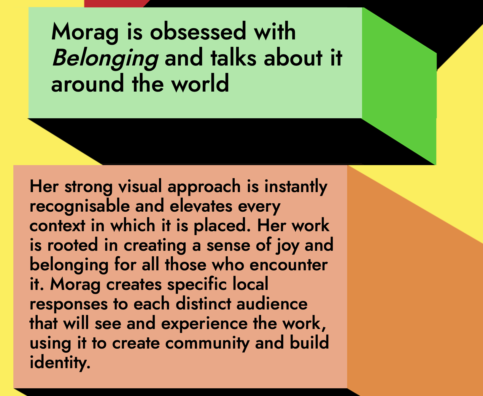
https://www.moragmyerscough.com/about
I’ve seen some of Myserscough work before but I thought this was really nice and vibrant to see that her work translates into the design of her website and the about us. She talks about herself in a third person which I’ve seen a couple times. I like the short snippets of text but also the bright colours that are in the background. I feel I really connect with how she want to change and create local community.
PaintshopStudio

Another interesting approach is this one of the Paintshop studio that was recommended to me in the Ideas Wall Posts. I admire to the collaboration that this studio has and how they aren’t afraid of saying what they want. I hope to have some collaboration within my own company.
Workshop Challenge:
How do you translate your perceived design ethos and positioning to your defined audience?
Revisit the geotagging workshop challenge from Week 2 of the Contemporary Practice module, and explore different studio philosophies through their about button and company statement.
Write an ‘about’ paragraph – an elevator pitch on either your current positioning or one you would like to establish. You may choose to take a speculative approach and envision your global dominance as a design studio superpower. Or as a more humble sole trader who works in a freelance capacity. Have your values changed since beginning the course? Is there a strategic approach your company would communicate to potential commissioners or clients?
Please consider the following in your approach:
What is the idea?
How does it work?
Why does it work?
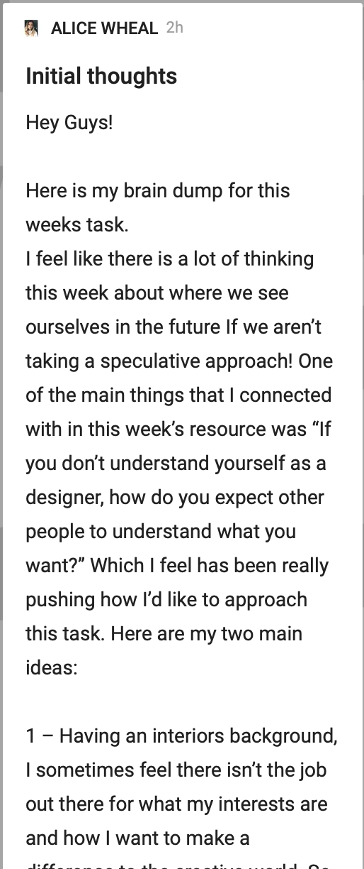
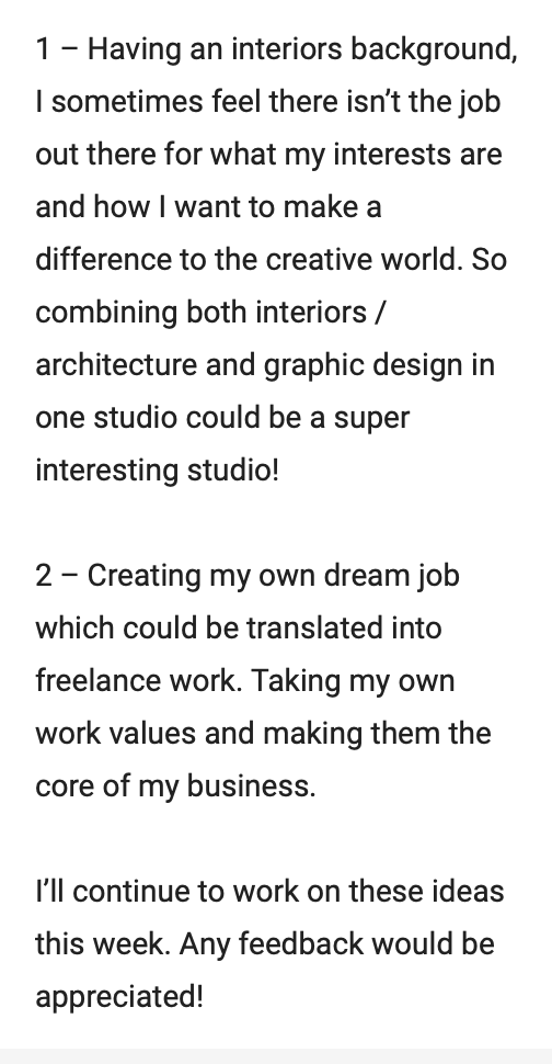
Before starting the project, I wanted to do a brain dump of ideas on the ideas wall to get any feedback.


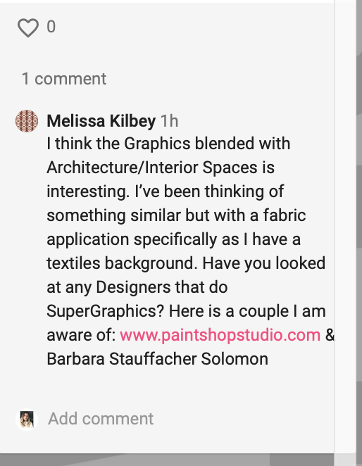
The feedback that I was initially given was by Melissa - I hadn’t thought about super graphics so I though this was a super interesting research point which I will add to the research section above.
From here, I went onto do a mind map of the values:


I also did a mind map of key things that I want the company to include:

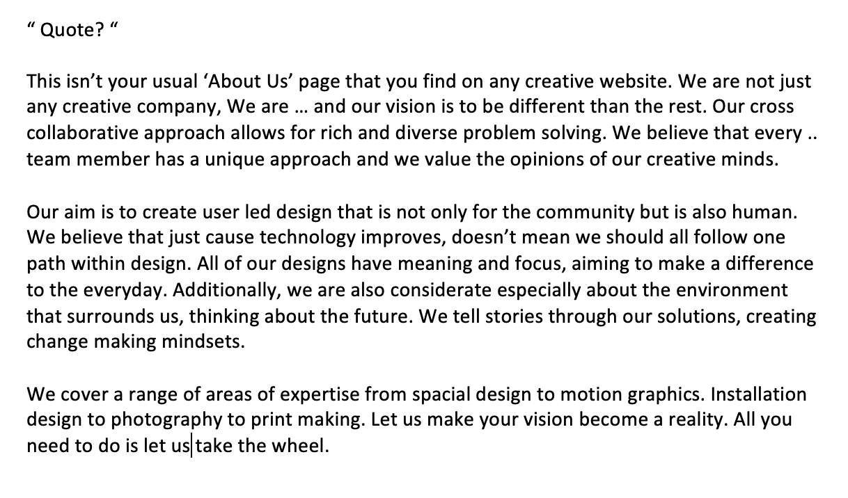
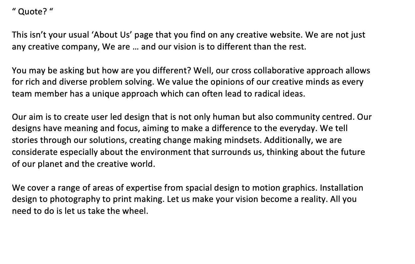
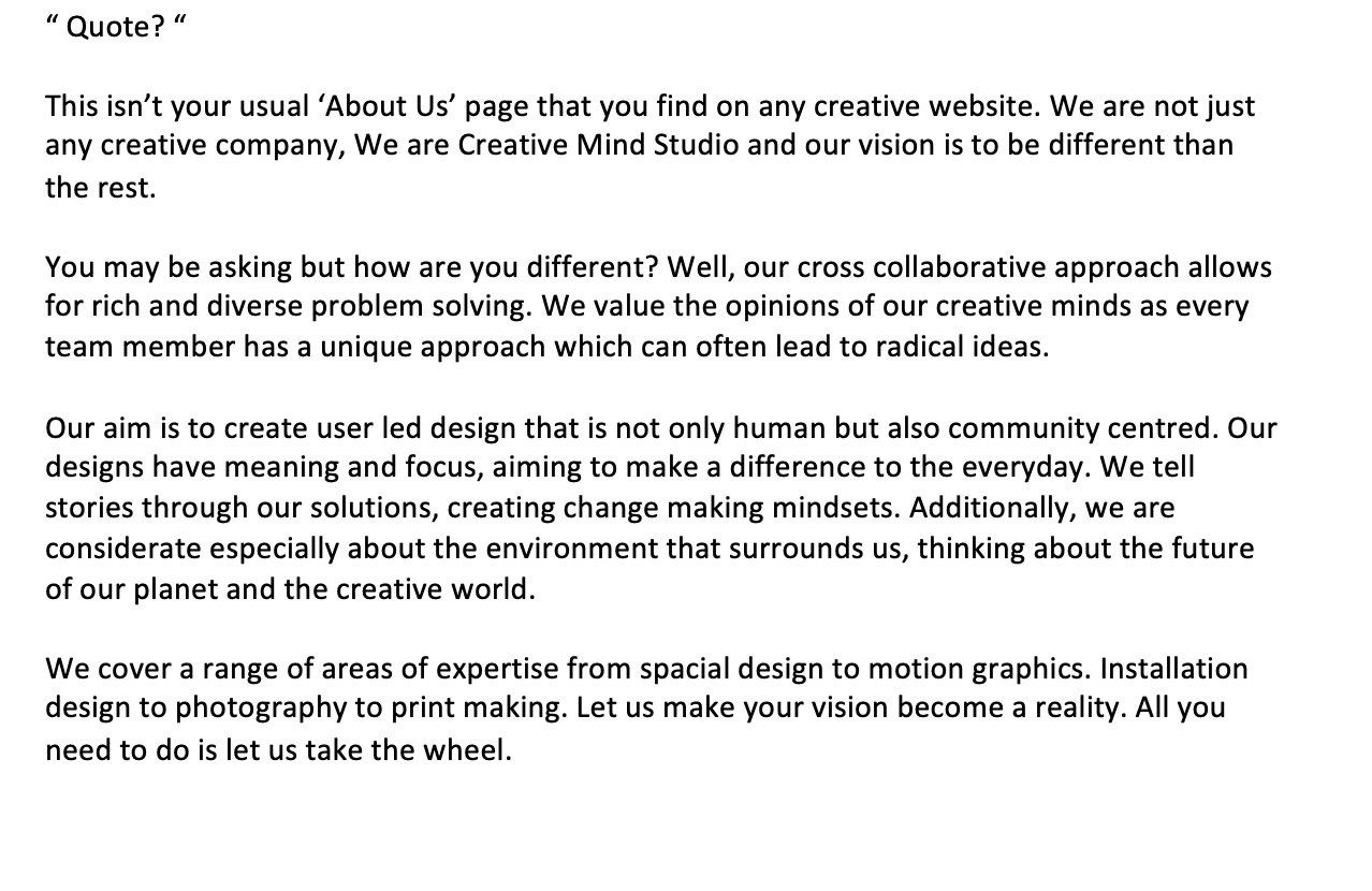
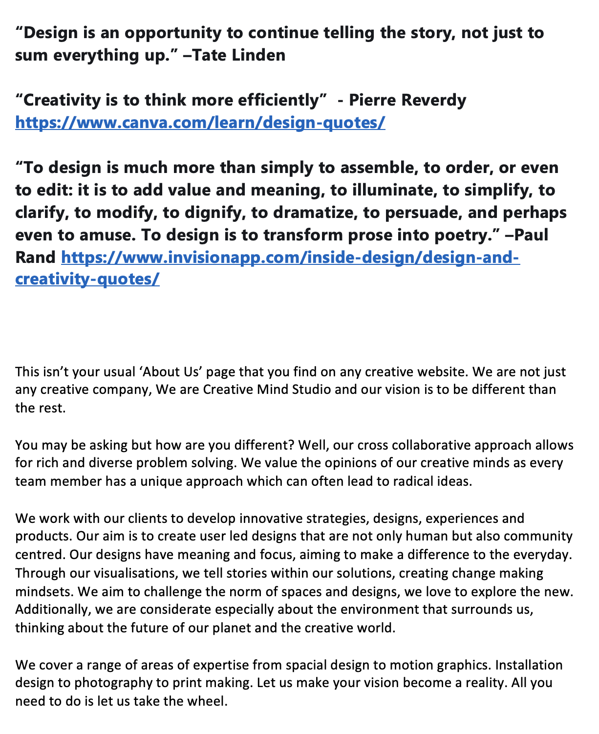
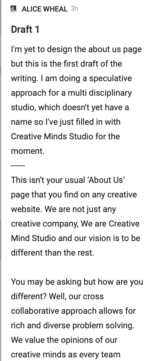
Taking inspiration from the about us pages, I felt more comfortable laying out the paragraph on a PDF document:

I went on to try and wander the HOW WHAT WHY
HOW DOES IT WORK?
You come to us with your ideas about the project you want to create, then we will help you tell the story.
WHAT IS CREATIVE MIND STUDIO?
Creative mind studio is a cross collaborative studio that specialises in a range of areas across all creative paths. We combine disciplines to help you create
WHY SHOULD I CHOOSE YOU?
We are different to other companies and want to make your dreams become a reality.
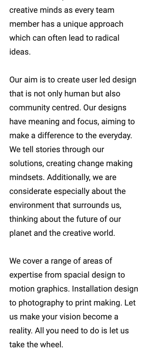
I then tried writing out the paragraph in various ways:
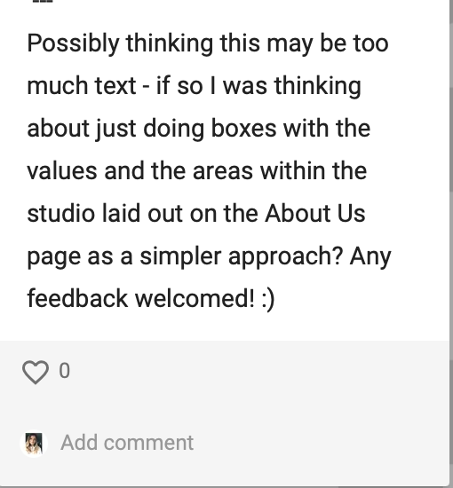
I posted on the ideas wall about the drafts that I’d done:
After doing multiple drafts - No feedback was unfortuently posted to me on the ideas wall but from the webinar I really felt this wasn’t what I wanted to be associated with. I had a change of heart and decided to really do interiors, architecture, photography, videography and graphic designs. I was also told to not use creative, innovative and passion within my wording.
To make up my mind exactly how I wanted the studio I am going to list all the things I don’t want the studio to be:
unsustainably competitive
Super long hours for employees
negative
uncreative
not friendly
not passionate
The norm
What I do want from within the company:
Collaboration
Community
Creativity
Friendly
Enthusiastic
Successful
Different
Studio
Passion
Drive
After doing this I wanted to look at more studios but within photography, videography and interiors.
Photography examples:
Rankin Studios

I think the way that Rankin studio approaches this - its super powerful and I love the underlining of certain wording. It feels powerful and life changing which is what I feel a photography studio should be in terms of changing perspective.
Videography examples:
MHF
Again I really like the friendly energy that is within this about us especially for videography. I understand the environment that they are trying to create.
VermillionFilms

I like the short and sweet outline but also listing the values that they really believe In and then explaining them. Taking this as inspiration for my final piece.
TopLine Film

This was all the about us that there was on the website. just three simple points with explanation beneath. This was a super simple approach to the about us page but again straight to the point. I also like the little symbols.
Animation Explainers
Animation - this is a super simple approach. But really clear layout - I would say that this is alot of a longer description than is needed.
Interiors Examples:
MKV Design
A really lengthy about us for an interior design company. Maybe it seems like a lot because the font size is really big. The values really stand out and this is a scroll down list of all the things. With the mission statement., they have really laid everything out.
Celine Interior Design:
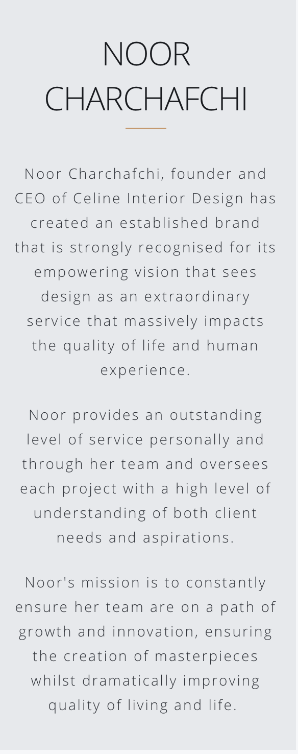
Another super simple yet informative about us For an interior design company. Talking about themselves in a third person.
It’s been interesting to learn about the differences in about us pages from different creative industries. I now understand why they are so different and the differences between each of creative industries.
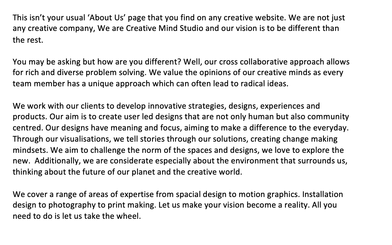
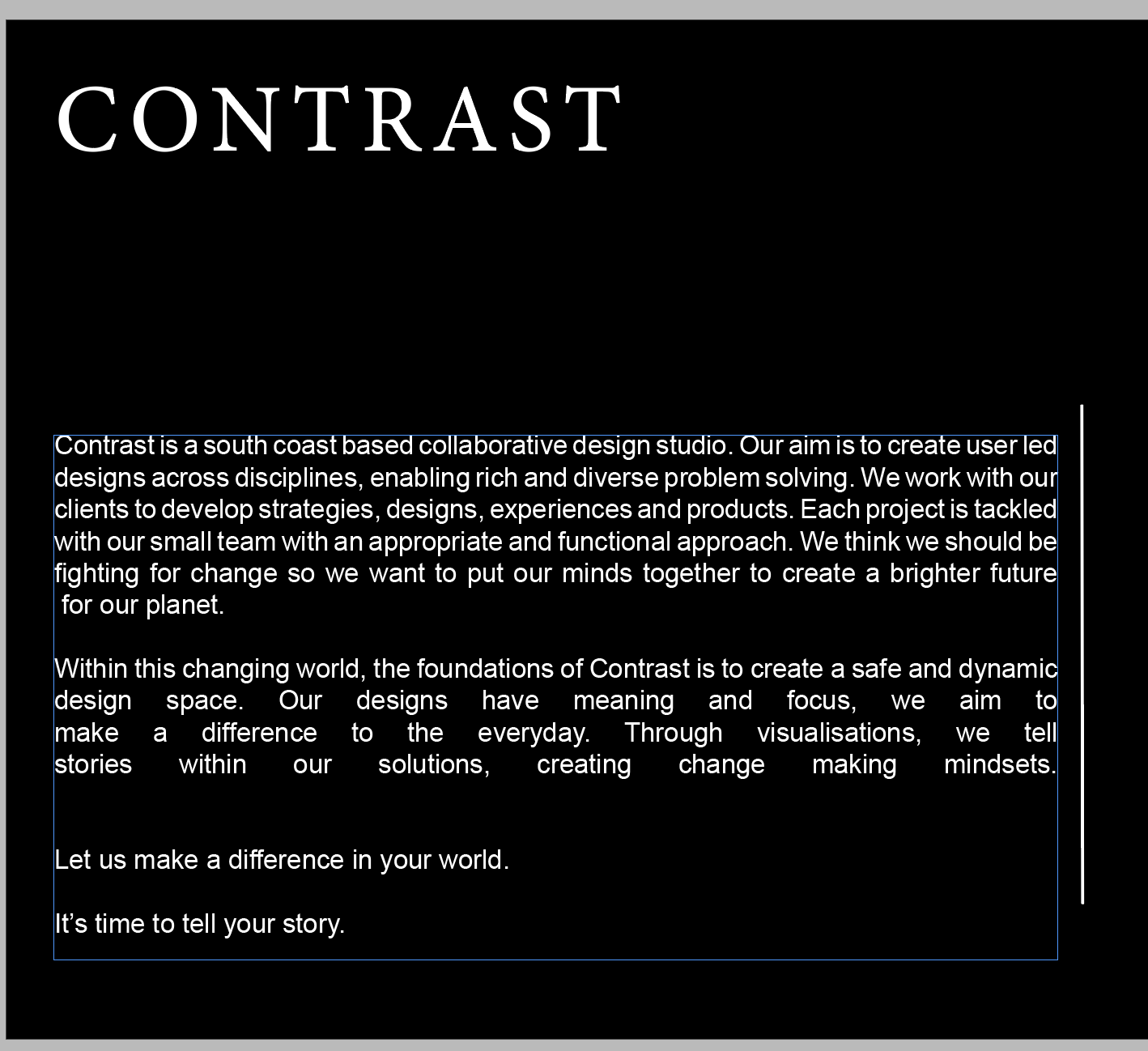
From this I went on to again write USING REAL WORDS about the company I wanted to create
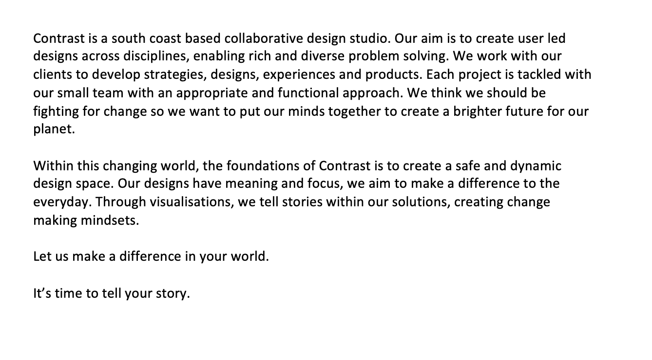
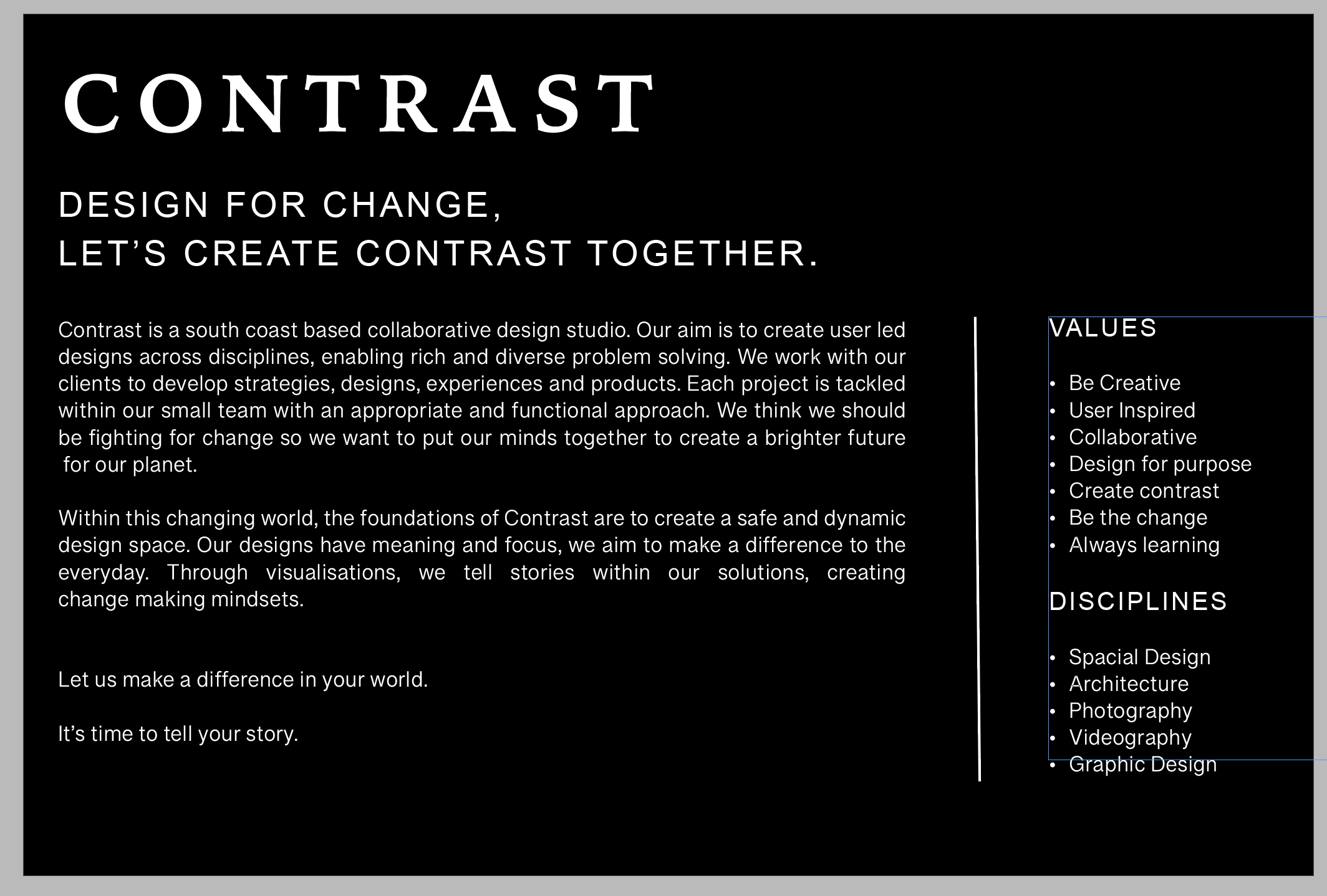
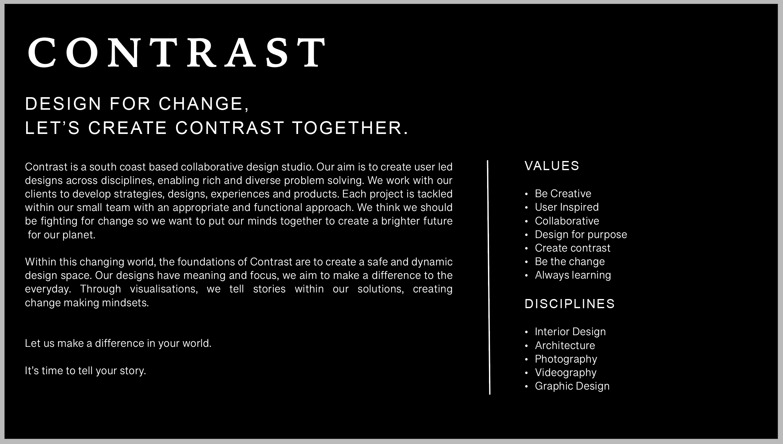
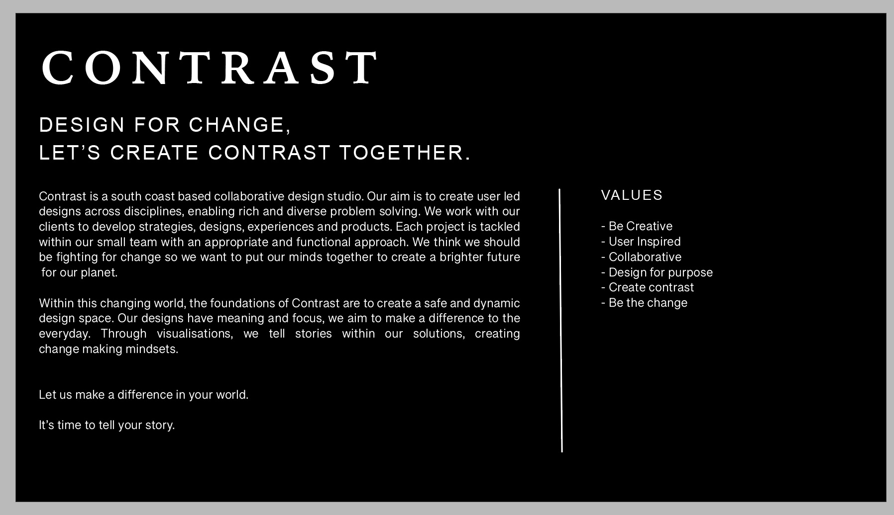
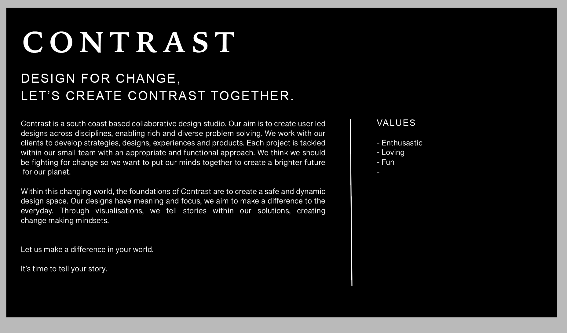
Contrast is a south coast based collaborative design studio. Our aim is to create user led designs across disciplines, enabling rich and diverse problem solving. We work with our clients to develop strategies, designs, experiences and products. Each project is tackled with our small team with an appropriate and functional approach. We think we should be fighting for change so we want to put our minds together to create a brighter future for our planet.
Within this changing world, the foundations of Contrast is to create a safe and dynamic design space. Our designs have meaning and focus, we aim to make a difference to the everyday. Through visualisations, we tell stories within our solutions, creating change making mindsets.
Let us make a difference in your world.
It’s time to tell your story.
Which I then placed on the PDF:
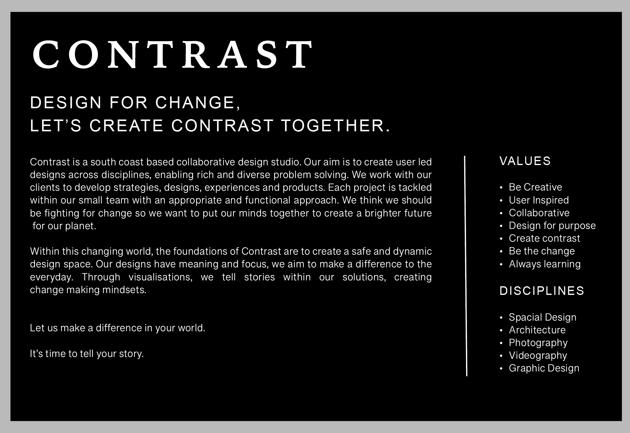
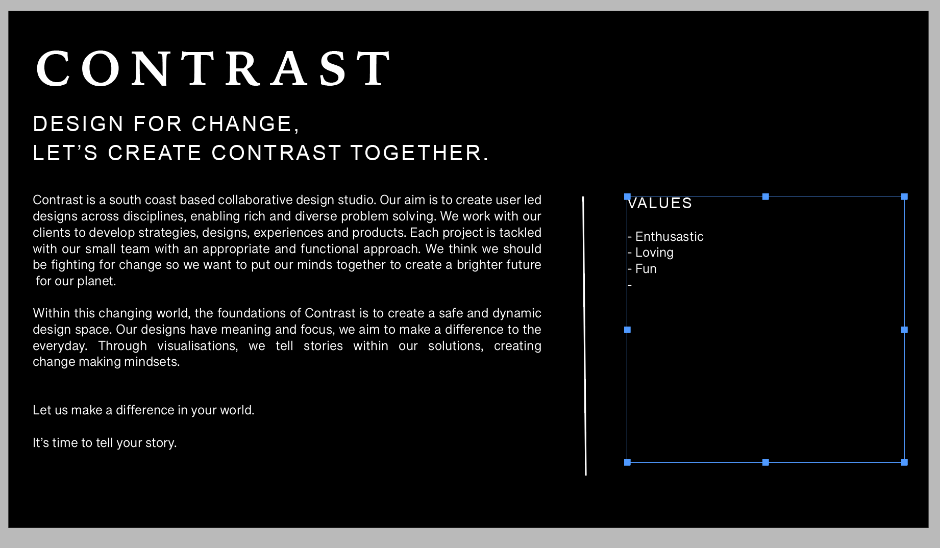
My Final piece:

If I have time I might redesign the pages for this as this is still pretty basic.
Weekly Reflection:
I found this week really challenging, mainly because it was about learning who I wanted to be as a designer and how I wanted to take the business that I create forwards. Over the week and slowly thinking about the future of my design, I feel the end result was really represented how I see the future self of the business.
I felt that all the resources this week had that little bit of insight of how to run a business in a slightly different way which was really useful. I think this has now made me start to think about honing in my skills but also how to employ other people.
Ideas Wall Posts:
Edit through the most valuable comments to include (copy-paste) in your entry, and analyse how they have helped (even if you agree or disagree).