Week Three
Lecture Notes:
Lecture Summary
Really interesting learning about the ups and downs of IP laws, especially through big company’s that have had their logos and designs questioned and challenged. But also the example of how they have had a mulberry employee challenged in relation to how mulberry owns designs when you work for them, I think this is really interesting and a topic that I still don’t know a lot about. I look forward to doing further research on the topics that they discussed within the lecture below.
Tokoyo 2020 Battle
https://www.theguardian.com/artanddesign/2015/jul/30/tokyo-olympics-logo-plagiarism-row

The logos for the olympic and para olympic games were to harmonise and symbolise the olympic spirit. It was interesting to note as they designed this logo for the olympic games that it was very similar to another theatre in belgium. But it was found by another graphic designer and posted in social media. Using simple shapes, there is always going to be similarities to other designs.
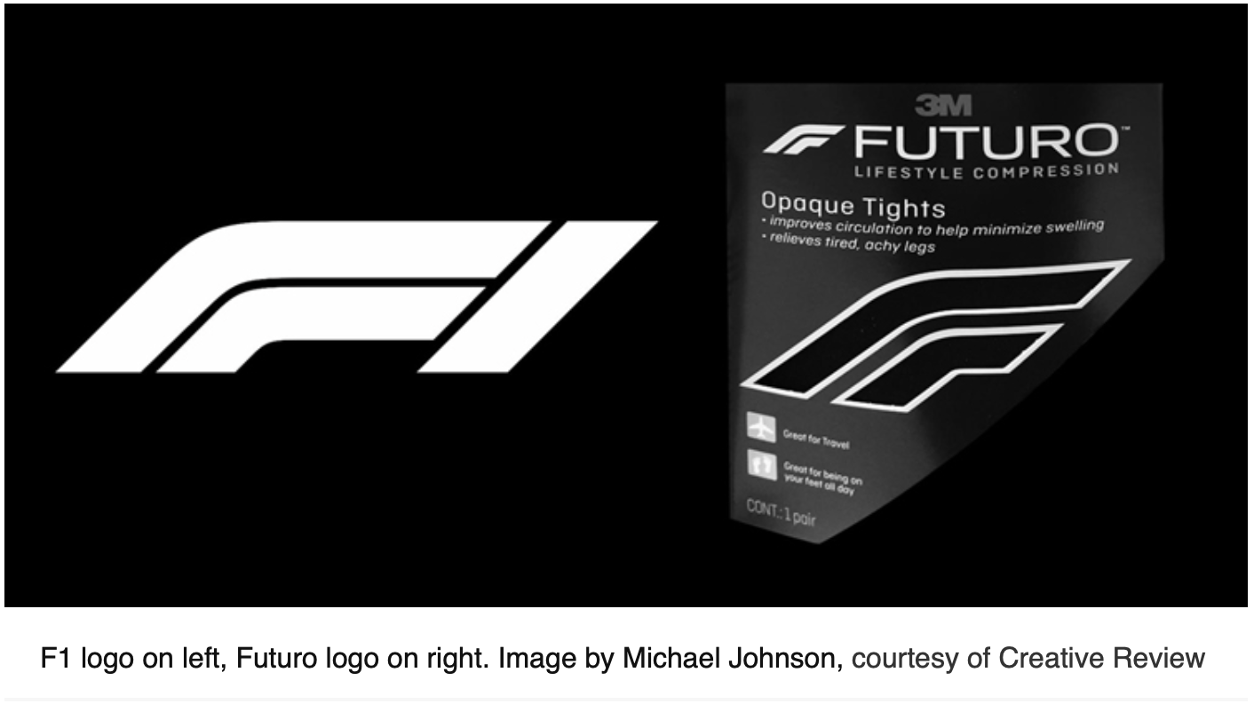
Formula 1 Battle
https://www.designweek.co.uk/issues/15-21-january-2018/formula-1-face-legal-battle-new-logo/
Another similar logo incident happened with F1 which was mentioned within the lecture this week. I hadn’t realised whilst they were discussing how similar the logo designs are for the F1 and for another company. Within the lecture it was mentioned that because they were being used for different purposes that there may not be a fight but you would also think that a company as big as formula 1 would cover their backs with this. I have included the imagery for contrast of both of the logos.
Zara Battle
https://www.thecut.com/2016/07/tuesday-bassen-on-her-work-being-copied-by-zara.html
Another copying case with zara and an artist Tuesday Bassen with the pendants that were seen being put within zaras clothing line. I find it very interesting to note that zara hadnt even changed the pins for the clothing but literally just copy and pasted. Went to to say that this artist wasnt famous enough to have her work stole, which i was completely shocked by. I think this gave me a real insight to the constant legal battles that were happening today.
Resource Notes:
R1
R2
R3
Resource Summary:
Key Themes:
R1
Outlining the basics of Patents, Designs and Copyright within certain extents. Just explains the basics but also what was important the think about within these areas. Also goes onto talk about the limitations of copying and what should be thought about but also how long copyright and other rights last.
R2
Introduction to copyright, looks and what it is and how long it lasts for. Also goes into details about the history of copyright and how copyright has changed over a period of time.
R3
How the ownership of copyright is different for every single person and how its changed over time. Outlines the exceptions and why they are different now to when they were first created. Also looks at different works and how they are protected and how long the protection lasts.
Although all of the above information seemed very complex as a lot of the time it was just an overview. I feel i would need to do more research into these areas to full understand what would happen each time i created something and how this would work in terms of patents, designs and copyrights. How does this work for a design process?
R4 (Previously covered within the lecture)
Research:
Legal and IP Frameworks, Comparing Different Case Studies, Media Use and Equity Ownership within the design industry
Research and analyse naming and copyright issues, the basic pitfalls of illegal practice and the common areas of the copyright process, and the ethical and legal factors most frequently affecting graphic designers.
After this weeks lecture and resources, i still wasn’t completely clear about what the Legal and IP frameworks were. So i decided to do some more research especially around graphic designers.
This helpful video by the Intellectual property office , outlines what Intellectual property actually is. It talks about that its all around. There are 4 different types of Property rights. Patents, Trademarks, designs and copyrights. Within the video it also expalined what patents were; which are protecting how products work, What they do, how they do it and what they are made of. A trademark protects the brand name of your phone for example. It can be words and logos. A registered design protects the overall visual appearance of the product. Copyright protects the written instructions. Legal form of protection which stop them from selling your designs.
This really helpful video just outlined the key basics which allows me to go on to understand more about what i was learning about this week.
Copyright and trademark protect different types
There are some things as a designer you cant copyright
Not always automatic about what you can or can’t copyright
someone has used your work without consent
Infringement
substance
Remember to keep records
Make sure the design is obvious that its your design and style
Try to be original as possible for every step
Sue someone for using your work
Be able to sue for damages
People who want to share their work can do
This video was a really simple layout and I actually realised what Infringment was within the video. It made me realise that you have to keep tabs on all of your work, be super organised as well as making sure that your work has your own mark or flair. It also became clear to me that not all of the design work is actually copyrighted.
I wanted to find out more about the registered designs that was also mentioned before which is where i came across this helpful video below.
Often overlook by businesses
£100 that a business spends on designs
Looks and appearance of a product
Shape and configuration
No protection when there is no design freedom
If it has to look this way to work
Example is a key
The is no design freedom for the end of the key
The fob end can have design freedom and it can be protected
You need to send images and line drawings of a product.
Protection for up to 25 years
Don’t register than you can have unregistered design rights
Stop others can copying
IS on you to prove that it is your design
Length and protection of unregistered designs is on you.
Within the above video by Andrew Rieth, it discusses about what you need to do when you have a design product but also how you can product your designs and that you should’t leave it to the unregistered design rights because you then have to prove that the designs are yours all the time.
Within this video about the business Billy and Margot which is a doggy ice cream company that was started a dogs love for ice cream. Within the video it also goes onto explain about how she came about registering the name. It was interesting to learn about the fact she couldn’t apply for a patent because the business was in-fact nothing unique about it. Instead registered for a trademark.
I thought this was interesting that just as they registered the trademark for the company that someone came to challenge her on this. I never realised that you had to register the trademark or even what hassle it must be especially if you become a big brand to cover your name. I thought the advice at the end of the video, thinking about how big you want to be is great.
This video with Nicole Phillips, Phillips has a business with watercolours on fabrics. She felt that she had to register the design because she didn’t want the designs to be stolen, which no one wants. She talks about her previous experiences about working with a large retailer at the end of university. She makes sure that all of the intellectual are protected, she goes onto explain how things are protected and even talking about a trademark. I’ve also never heard anyone talk about the price before so this was really interesting.
I think this is eye opening as i never thought about this from an artist perspective. SO this enabled me to get a clearer insight into why it is so important.
Within the final video that i found within this helpful IP series, i wanted to briefly just explore the Copyright and what was included within this. Within the video it talks about how not to copy the image too closely especially from a photographer and artist angle. There are also useful tips within the video about how to put your name on the image aswell as a stamp to make sure that no one can copy the image. Everyone deserve the right to be acknowledged. It was interesting to learn from this video about the ups downs of protecting the images and the paintings.
Now that i had an understanding o the main things that were discussed on the resources and the Lecture this week. I wanted to just try and research some similar designs.
https://www.creativebloq.com/features/8-famous-logos-that-look-unbelievably-similar
Within this website the Creative Bloq, there were alot more similarities of companies and brands which were really interesting to see. Two that really stood out for me was how similar one was to the Air BnB logo aswell as another one with the starbucks logo which can be seen below.
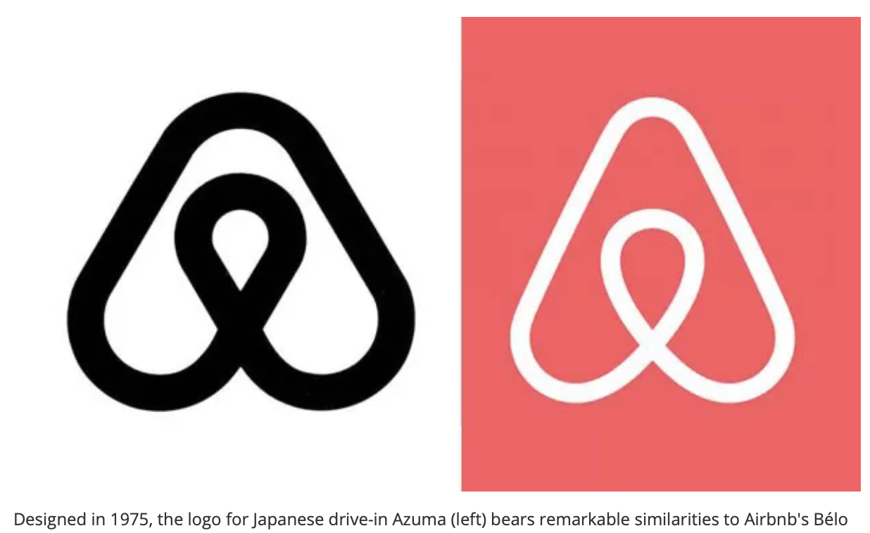
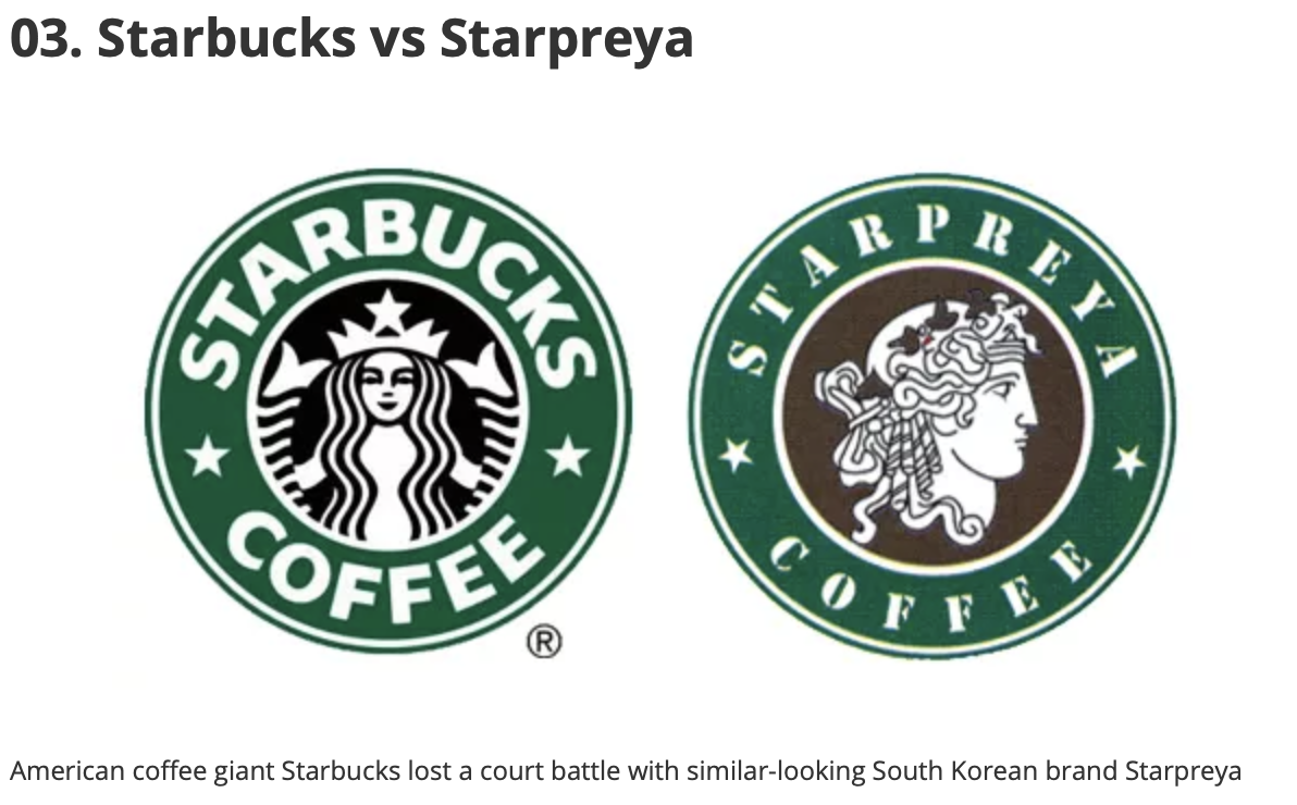
Within both of the above case study’s, it was argued that within that region that the logos look nothing alike but i think that can be argued as they are clearly very similar in a lot of ways.
Workshops Challenge
Select a designed object and highlight the key areas that may infringe copyright or require IP protection.
Present as a designed piece, incorporating an image of the chosen design and a typographically designed list of key areas.
When I initially read the question of the task, i wasn’t sure how to go about this. So i went back to the IP videos to find out what it means to copy IP crime and Infringement. Within this animation, it explains the acts that are also a criminal offenses. When thinking about the Infringement, this can range from anything that is a copy of that item.
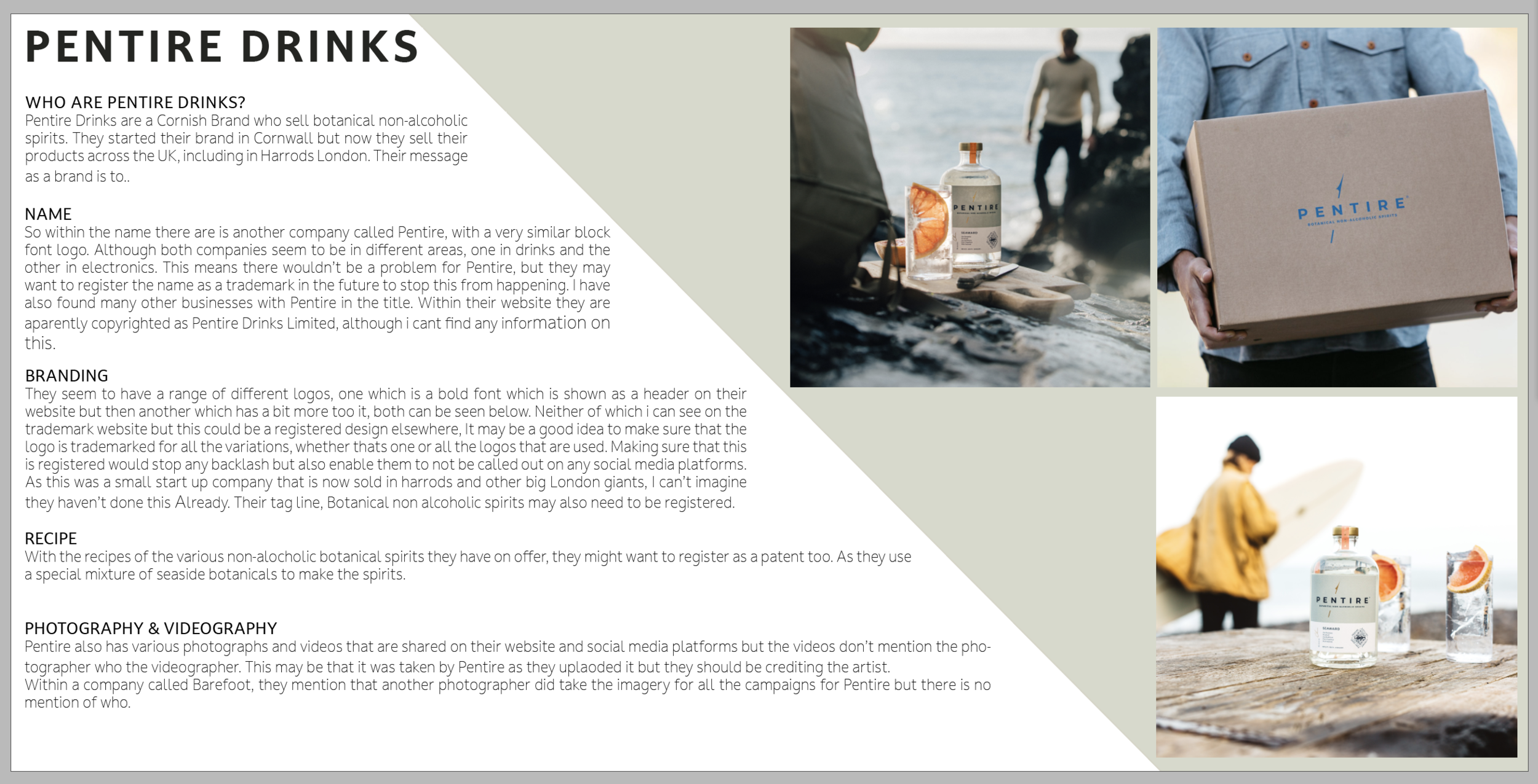
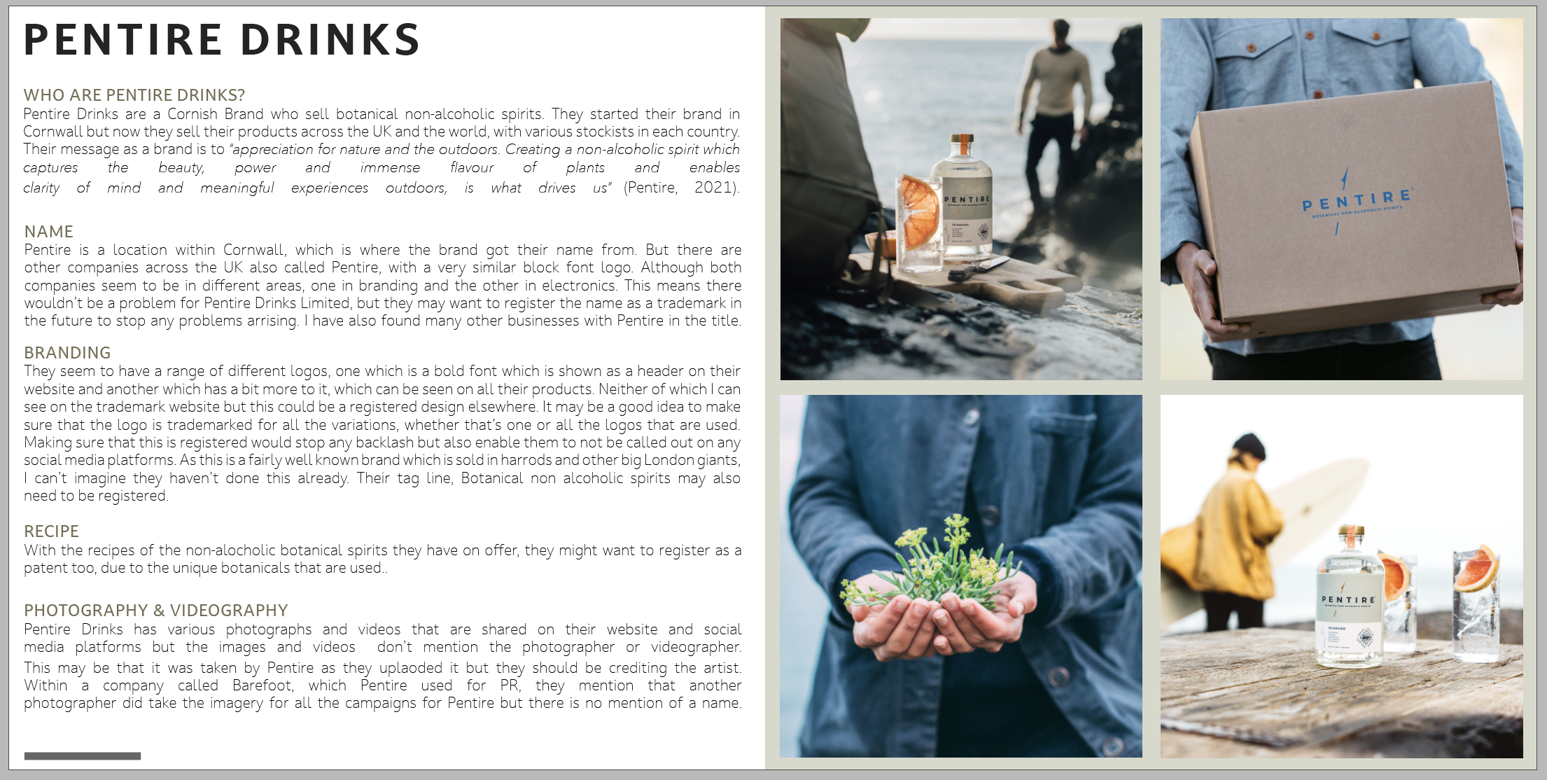
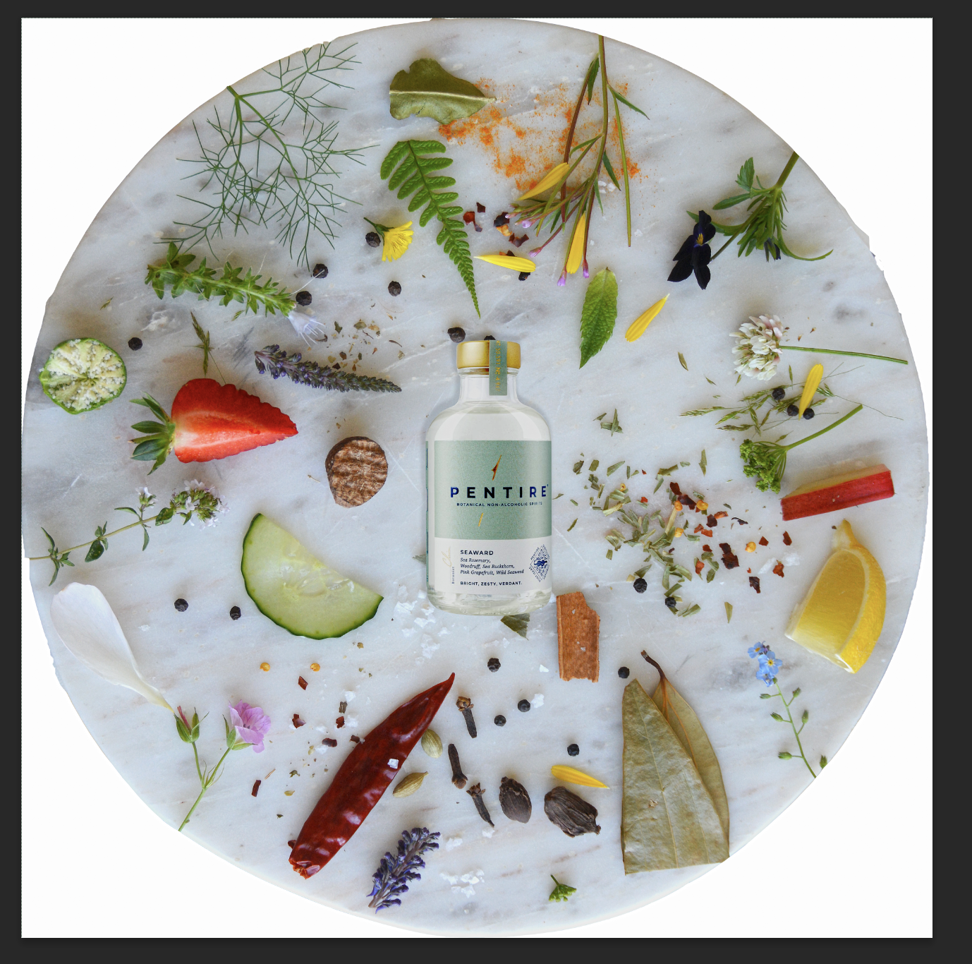
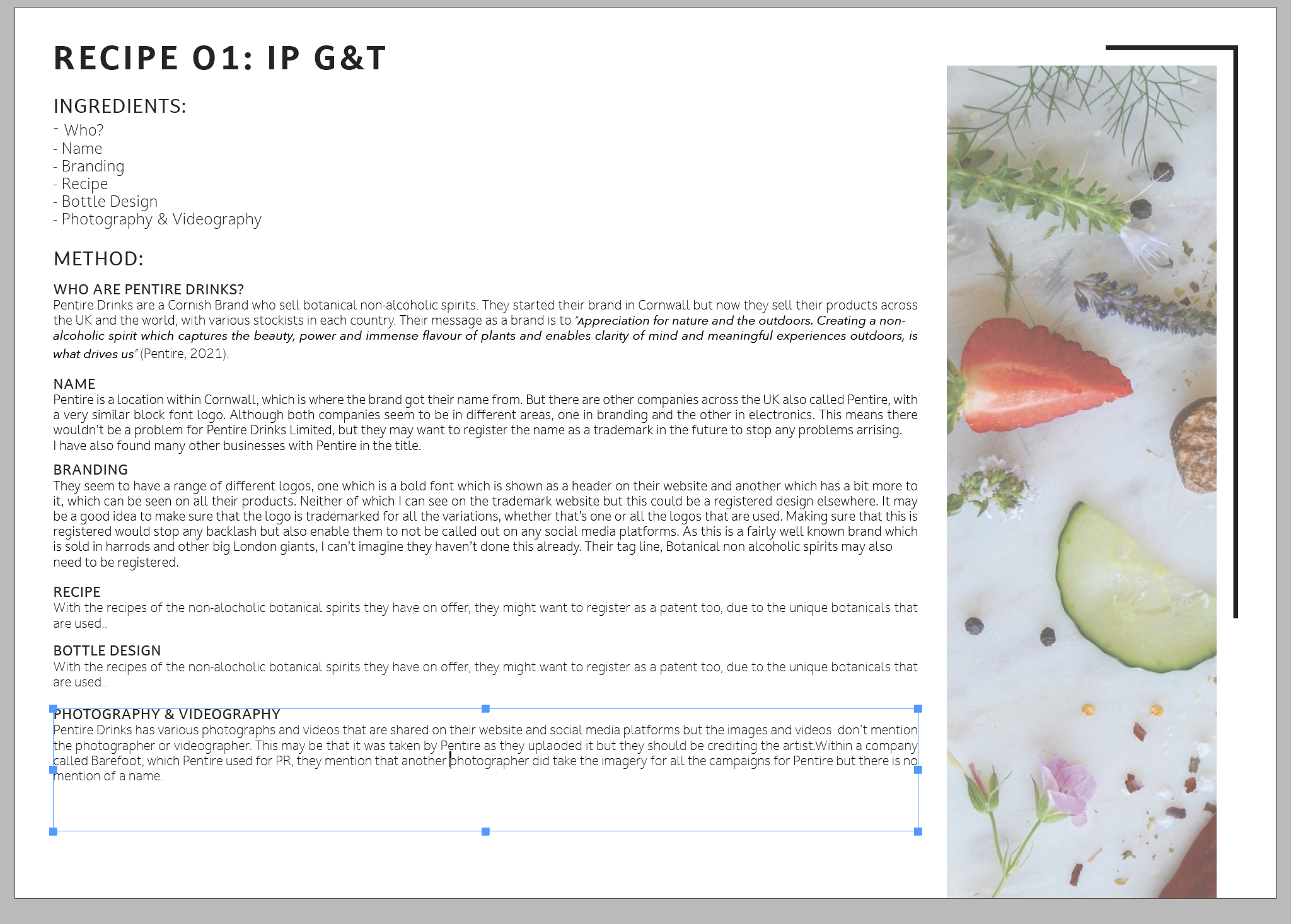
I was really interested in making sure that my business created branding products in the future and also making sure that my business is sustainable as possible. I wanted to look at product that were within the South West that possibly havent been highlighted. I researched 2 different beer and drink brands - Jubel Beer and Pentire. After doing some more research I decided to go with Pentire. From my understanding of the task, I have to look at the areas that infringe copyright or require IP protection. https://trademarks.ipo.gov.uk/ipo-tmcase/page/Results/1/UK00003317647
From my understanding, the name is registered but there are other businesses that are also called pentire.

But then from this I have also found another company that is also registered with the same name as Pentire. https://trademarks.ipo.gov.uk/ipo-tmcase/page/Results/1/UK00003541640

So within the name there are is another company called Pentire, with a very similar block font logo. Although both companies seem to be in different areas, one in drinks and the other in electronics. This means there wouldn’t be a problem for Pentire, but they may want to register the name as a trademark in the future to stop this from happening. I have also found many other businesses with Pentire in the title. Within their website they are aparently copyrighted as Pentire Drinks Limited, although i cant find any information on this.
They seem to have a range of different logos, one which is a bold font which is shown as a header on their website but then another which has a bit more too it, both can be seen below. Neither of which i can see on the trademark website but this could be a registered design elsewhere, It may be a good idea to make sure that the logo is trademarked for all the variations, whether thats one or all the logos that are used. Making sure that this is registered would stop any backlash but also enable them to not be called out on any social media platforms. As this was a small start up company that is now sold in harrods and other big London giants, I can’t imagine they haven’t done this already. Their tag line, Botanical non alcoholic spirits may also need to be registered.
The variations of different companies can be seen below, to me they all look very similar in terms of sizing and spacing but just that little bit different. Due to Pentire being a place i am unsure on the registered / copyright values.

As well as the drinks that they have on offer, they also have a range of novelty items which also display the logo for Pentire.
With the recipes of the various non-alocholic botanical spirits they have on offer, they might want to register as a patent too. As they use a special mixture of seaside botanicals to make the spirits.
Pentire also has various photographs and videos that are shared on their website and social media platforms but the videos don’t mention the photographer who the videographer. This may be that it was taken by Pentire as they uplaoded it but they should be crediting the artist.
Within a company called Barefoot, they mention that another photographer did take the imagery for all the campaigns for Pentire but there is no mention of who.
https://barefootmedia.co.uk/work/launch-pr-campaign-pentire-drinks/
From the information above I went on to make a super simple deign layout with the key head titles and some of the imagery that can be seen.
I posted on the ideas Wall

I wanted the final design to be super simple to mirror how simple the brand was, with their authentic basic colour scheme. I also included some of the key imagery that I thought stood with what the brand was about. I hope this was the right way of doing an output for this week.
After gaining some feedback from a one to one session, i decided to rethink the design of the PDF with the information on. I also found some really interesting information for how you have to trademark the design of the bottles these days due to the competition with the bottle design.
“Designs Mainly to protect the bottle design. With the increase in popularity of gin, so has the competition to stand out on a shelf. Traditionally, the standard colour for a gin bottle was green. The growth of ‘premium’ gins has sparked a plethora of different bottle designs (examples below). Even if the traditional green is kept, bottle design has become more and more creative.
If the bottle design is unusual, consideration should be given to registering the design as either a UK or EU registered design.”
“Trade secrets Recipes for new gin products are unlikely to obtain patent protection as there is no significant new or inventive step being used, especially with the strict regulations on the distilling of spirits, including gin.
Trade secrets would therefore seem the most appropriate method by which to protect a recipe, much in the same way as Coca-Cola and KFC protect their recipes. Under a trade secret, specific information on the recipe should remain confidential and only be given to those recipients who are aware of the specific obligations of confidentiality.”
https://www.lexology.com/library/detail.aspx?g=7521ad9c-e96b-438b-8255-00820b01e59b
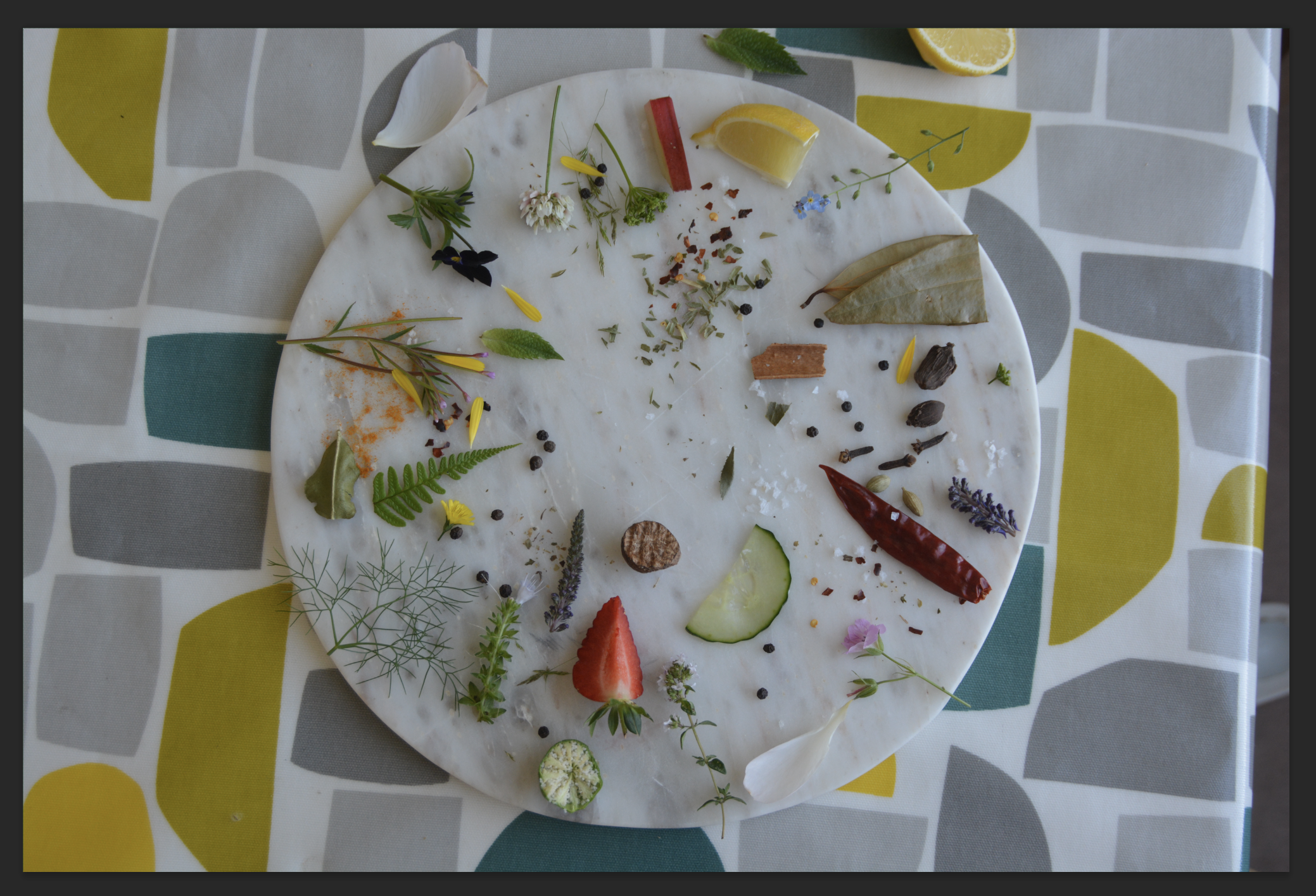
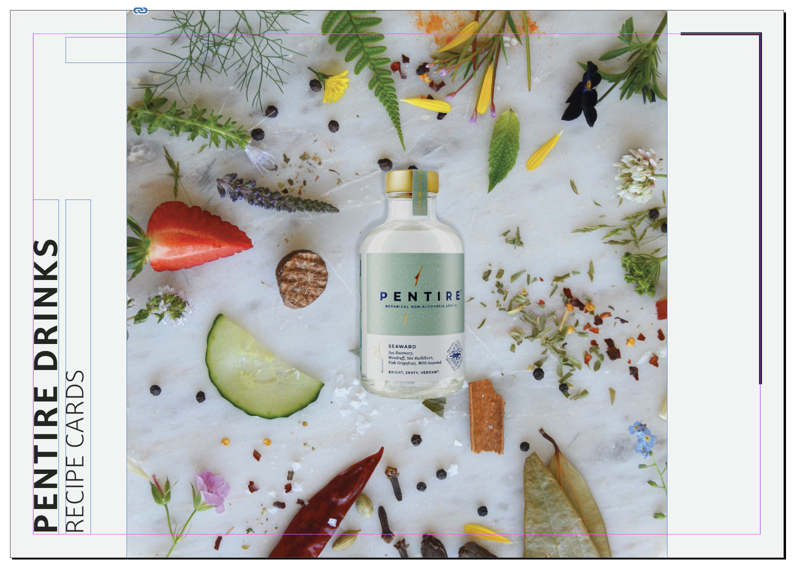
From this information and a little more research, i decided to do an Ingredients card layout with the information on. I started to really think about the ingredients within the gin and that they are a secret to each company, so no one else can copy - but really they are possibly the same ingredients just different amounts. So for this week I wanted to harness my photography skills and think about the ingrdients.
My plan was to find ingredients that were available in the garden (in cornwall) and in the fridge that i could possible use to make gin.
The process can be seen below:
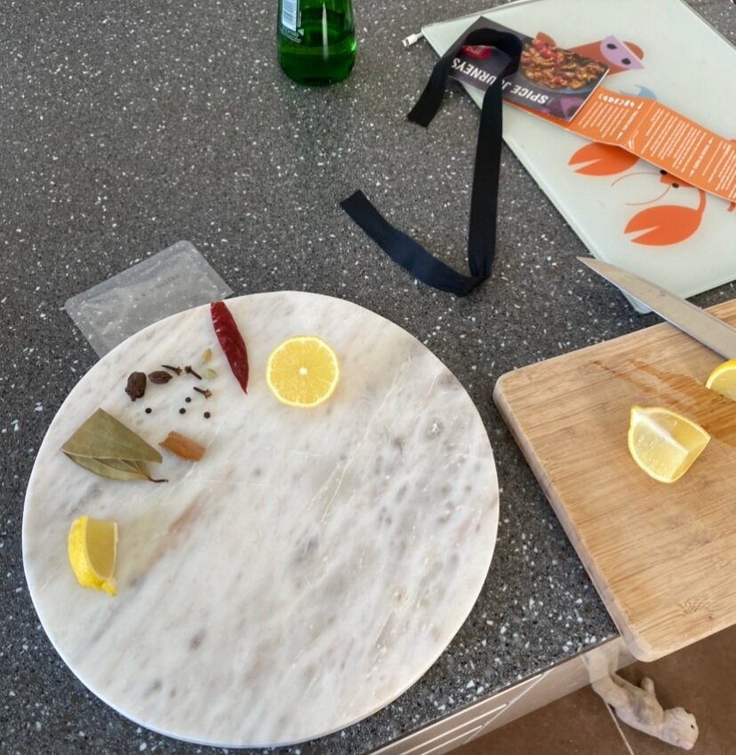
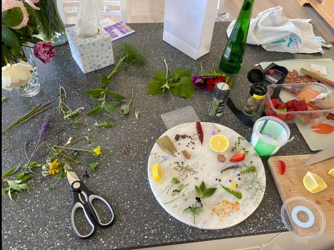
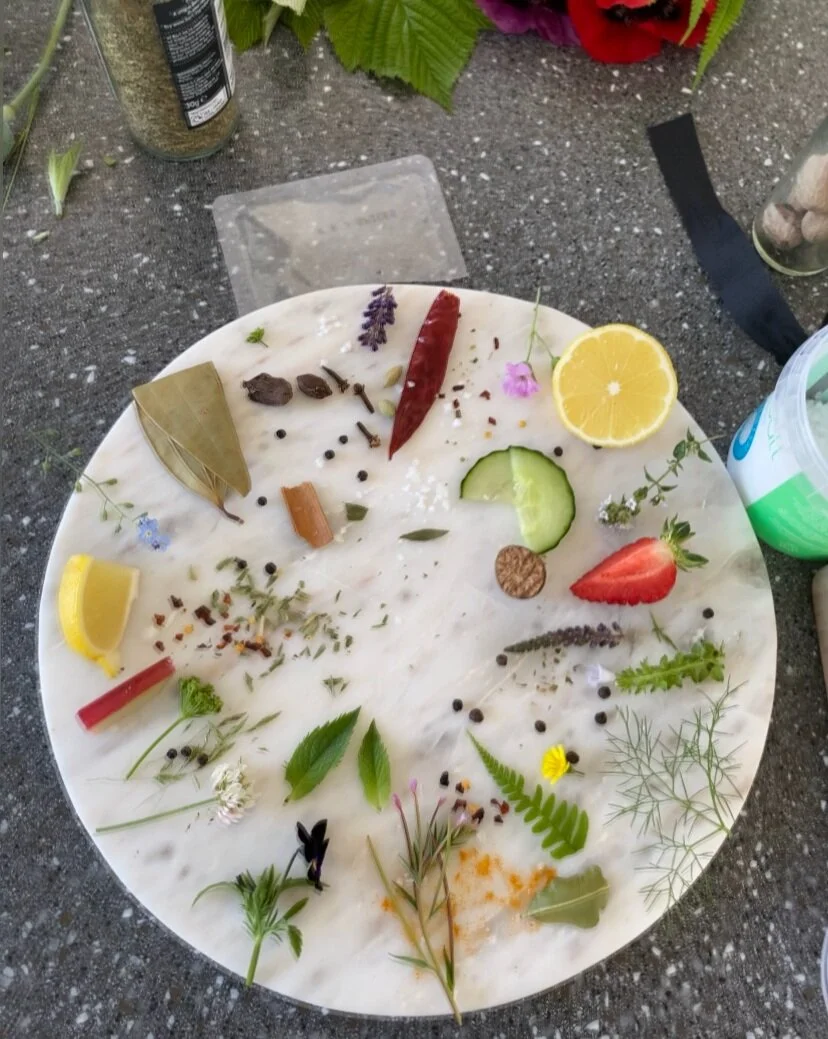
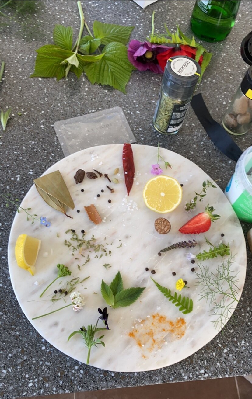
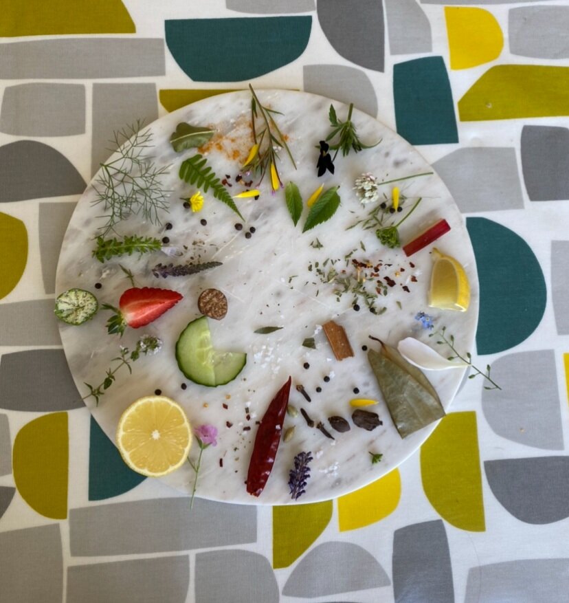
I went on to take some images with a wide perspective camera:
From this i took it onto photoshop to edit the one i wanted to use:
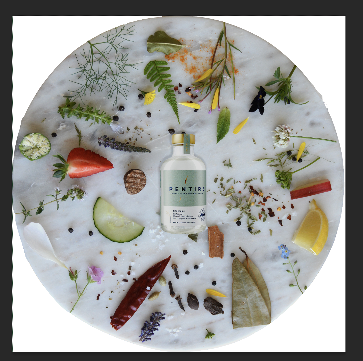
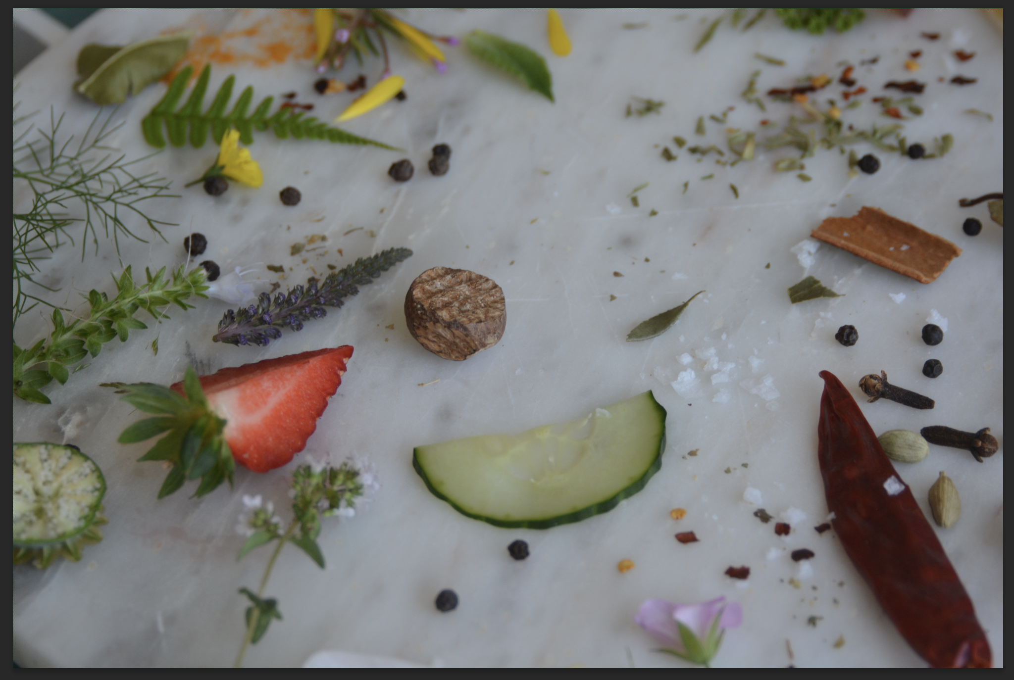
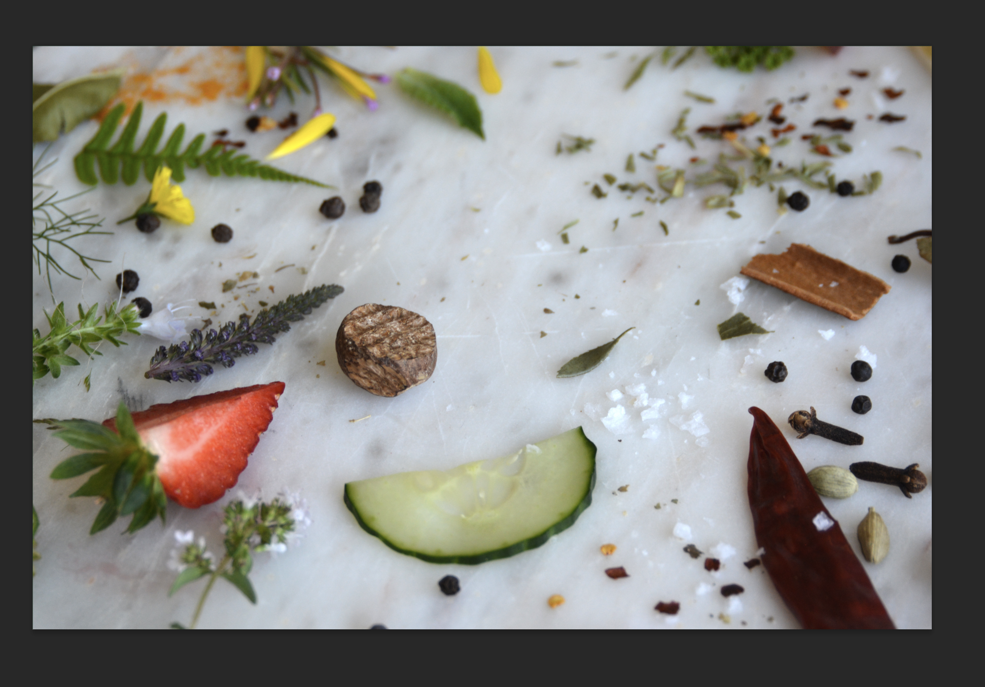
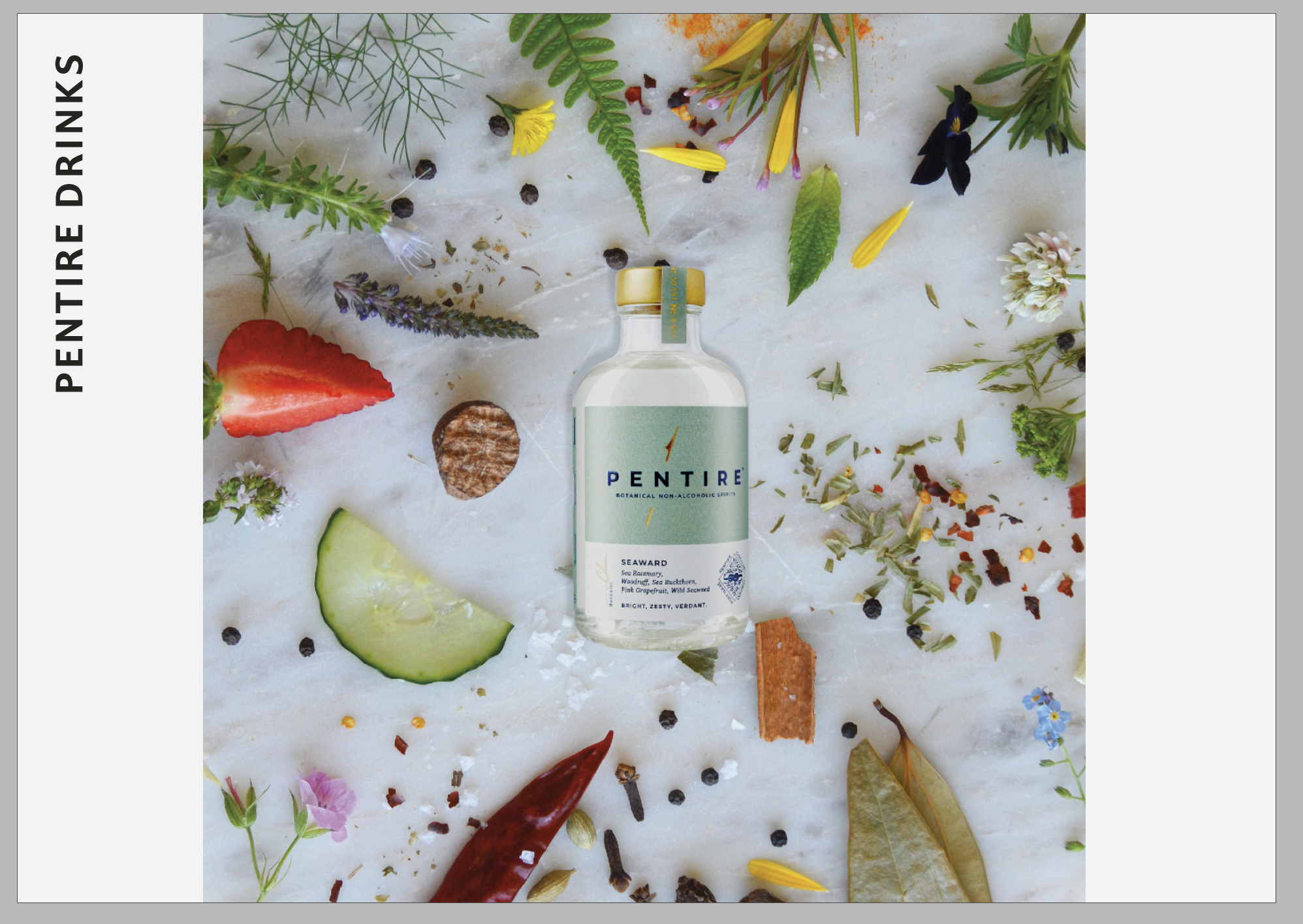
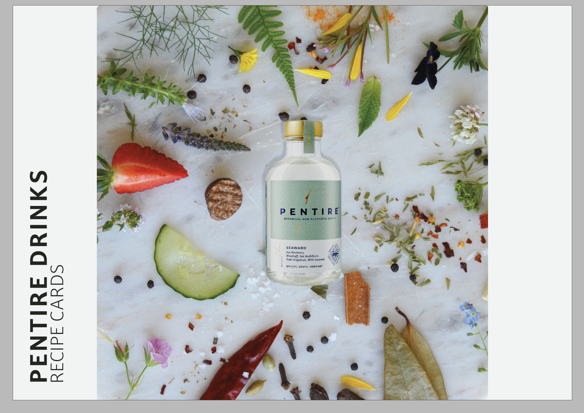
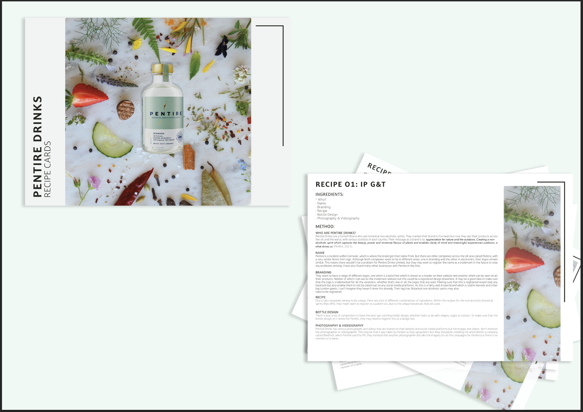

The above is my final product, I decided to go with G&T Cards called IP G&T due to the area we were studying. It was actually really interesting to look at an area of copyright that i’d never thought about before.
Weekly Summary
I thought this week was really interesting to find out about a side of design that I’d never thought about before. I found it especially useful looking at the case studies that were mentioned within this weeks lecture, as this enabled me to understand about what can happen when you copy a design or a design is similar to another company. Throughout this week I have also learnt about how to put your own stamp on things but also how to check if things are different / registered online.
Doing research about a brand / product at the end was also really interesting as there are a lot of things that you have to think about in terms copyright, making sure that you credit the photographers and other artists that you use as well as the design of the logo and making sure that its registered. I also found it interesting to learn about how you have to trademark the name / copyright the name but for the business I researched I think that would be a hard thing to do. I look forward to applying my knowledge to my business in the future.

