Week Eleven
Lecture Notes
Lecture Reflection:
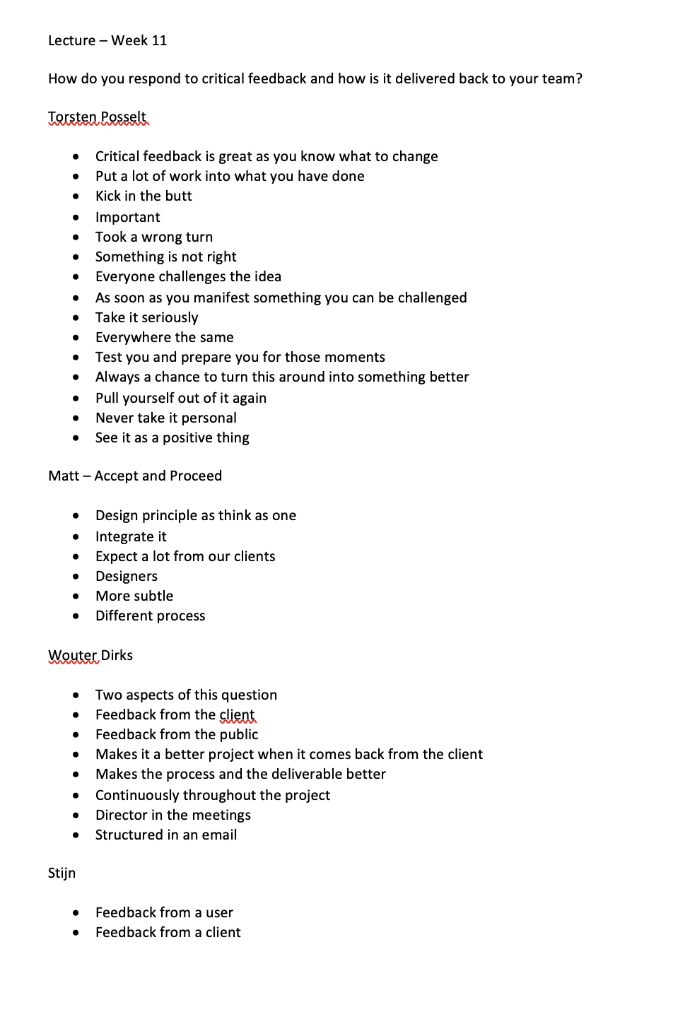
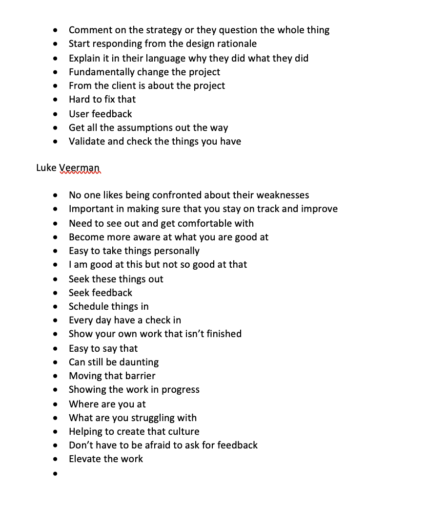
Within the lecture this week, there was a focus on responding to critical feedback, majority of the answer to this was taking it in as critical feedback is more important than people agreeing to your current concept. Critical feedback can allow the idea to grow but also makes the project stronger and more structured. Taking the feedback to turn it into something good. There was also a good point from Luke Veerman of making sure that you take something from the everyday.
Resource Notes:
Resource Reflection:
R3
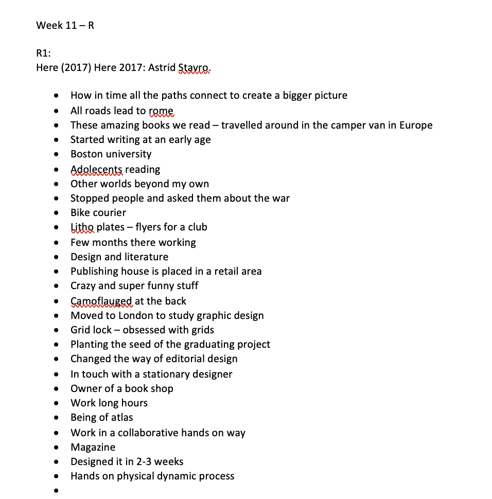
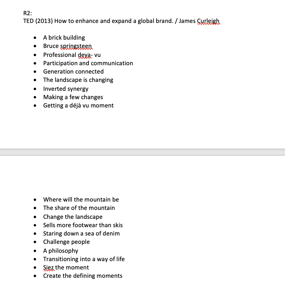
I was particularly taken with this talk by made thought and the process that they went through to connect and develop for a brand. Initially starting of with something that so small like choosing your favourite colour and then going on to create a whole identity and installation on the research that they found out. The most interesting part for me was the descriptives of each of the colour ways. I love this project, its very simple yet really effective.
R4
I like the structure of this talk and the steps that they went through. I thought it was interesting how they used to work for a larger company and then they had decided to decrease and let go of clients that didn’t have the same go like the rest of them. I thought the following statements were also really good advice; making sure to try and do something new, tell the story, build experiences out, connect people better and elevate yourself.
Research:
How has critical feedback shaped the direction of my project? How useful was this feedback and how well did I respond to it?
User interface & User Experience designs
Since my design will be an interactive digital interaction, I wanted to look up what was important for the User experience and interface designs and what was crucial to make sure that they had in.
https://www.created.academy/resources/the-5-principles-of-user-interface-design/
Within this first article it talks about 5 key principles;
Visibility
Optimising the elements of design
Helping the user achieve the goal
Need to see clearly
Consistency
How easy it is for the users to see the interface
applied through elements
visual design
interaction
Learnability
Understand the products and the system easily
Achieve goals with no help
Predictability
Forecast whats going to happen next
Feedback
Users need to know whether they are moving closer to their goal
visual signals designers can guide users through the experience
Where am i?
What is the current status of the system?
What will happen next?
What just happened?
This article was really helpful to actually start to think about the design and layout of the pages for the user.
https://xd.adobe.com/ideas/process/ui-design/4-golden-rules-ui-design/
The next article has been done by adobe, so the principles that they have said are important are the following:
Place users in control of the interface
Make actions reversible
Create an easy to navigate interface
Visual queues
predictability
Accomodate users with different skill levels
Make it comfortable for a user to interact with a product
Eliminate all elements that don’t help the user.
Don’t ask users for data they’ve already entered
Reduce Cognitive load
Amount of mental processing power required to use a product
visual clarity
Consistency
Functional Consistency
A lot of the answers to these were very similar to the previous, but they back up and make some interesting points.
https://www.interaction-design.org/literature/topics/ux-design
I wanted to find out a little more about what User experience design was and a little about what to think about when designing for something like my product.
Why, What and how the user of the product
Users motivations for adopting a product
Functionality and aesthetics
Making sure to think about the entire user journey
Creating a prototype and map can allow for the product to be tested
Within this article, it really breaks down each of the elements of user experience design.
Usability, is it easy to complete the tasks?
Value - does the product provide value to the users?
Adoptability - Will people start using the product?
Desirability - is the experience fun and engaging?
I feel all of these are important points that I need to focus on with the design of my product. When asking people for feedback - I will make sure that I have a check point that will then allow the user to give me good feedback.
Interactive Screens
I then went onto look at different interactive screens for the installation itself, so looking at how i wanted it to look at how people would interact with the design.
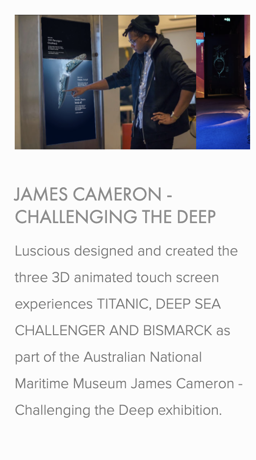
https://www.luscious.com.au/new-page-3
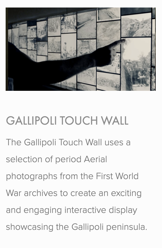
I came across this company that specialise in interactive screens and immersive experiences. I thought it would be interesting to see some of the different screens that they have used and projects that they have done. The projects that they have done are some of them are really big compared to the smaller screens. Comparing the two, I think that the smaller screens have a more personal touch to them compared to the bigger screens where a lot of people are able to see.
I think from this article, I have decided that I want smaller screens that are more personal to the user answering those questions.
https://medium.com/mouth-watering-media/the-top-10-digital-interactive-display-walls-40b96066477c
I went onto the explore other interactive display walls, just incase anything changed my mind on the personal approach from the previous article. Since these are all display walls, they seem like a lot of browsing instead of the personal experience which I wanted within my installation.
https://www.intuiface.com/blog/museums-and-interactive-displays
I also found this article, that is directly related to the interface and the museums, I wanted to look at how beneficial they actually were to the museums since my previous research showed that people were more likely to interact with them. The article speaks about how interactive screens can improve the users experience by up to 60 %. The article also talks about how they are relevant and are able to adapt them. They are environmentally and budget friendly for the museum, they can last a really long time and they can change the information that is placed on them. It also becomes an attraction that allows them to engage with the content of the museum. Overall I feel like it would be a positive addition.
Workshop Challenge:
Finalise the design of your ‘Industry Set’ project. + Prototype
Gather target audience and key stakeholder feedback; evaluate this feedback to ensure your project is in line with the original brief, strategy and target audience
Respond to this feedback and refine the design of your final outcome.
Post developments onto your blog and the Ideas Wall, to gain peer feedback
Confirming the process
Category
Colour (Black and white or coloured, multi coloured)
Form (Picture or Object)
Materiality (What’s it made out of?)
Size (How big or small)
Age (How old or new)
Detail?? - Don’t know if this one would work.
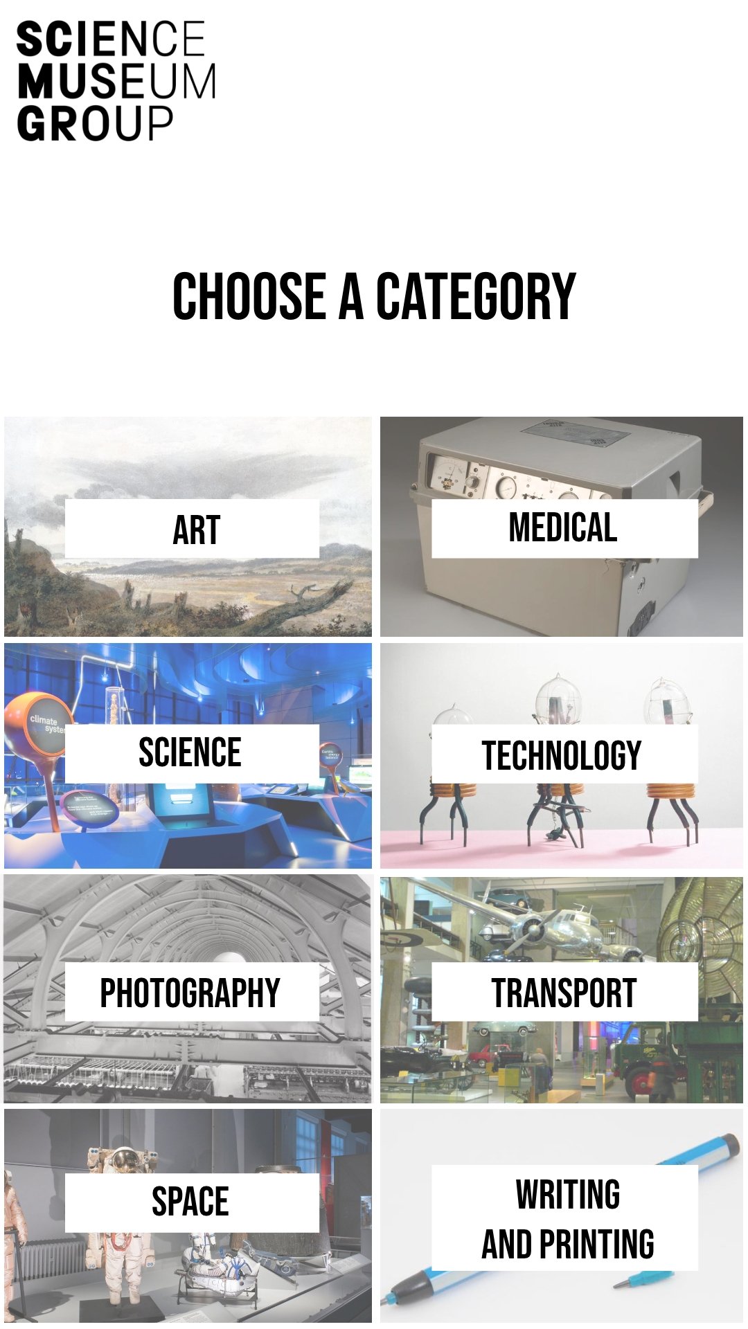
Categories;
Art
Medical
Science
Photography
Transport
Space
Technology
Writing and Printing
Example of overlaying process to each category
I started by writing out what i thought each category should have next to the process:
I thought this was a good starting point, but i wanted the user to interact (draw or choose or create) more with the installation instead of just having them choose image answers. I tried again looking at more touch questions: The only one that i thought had the most interaction was the detail category which I didn’t know whether i really needed:
In the previous, I didn’t really have any like drawing or tracing ones but now I feel these are a little bit more consistant. I am happy with this layout for now and then I will see if I need to keep the detail or whether it makes it too long.
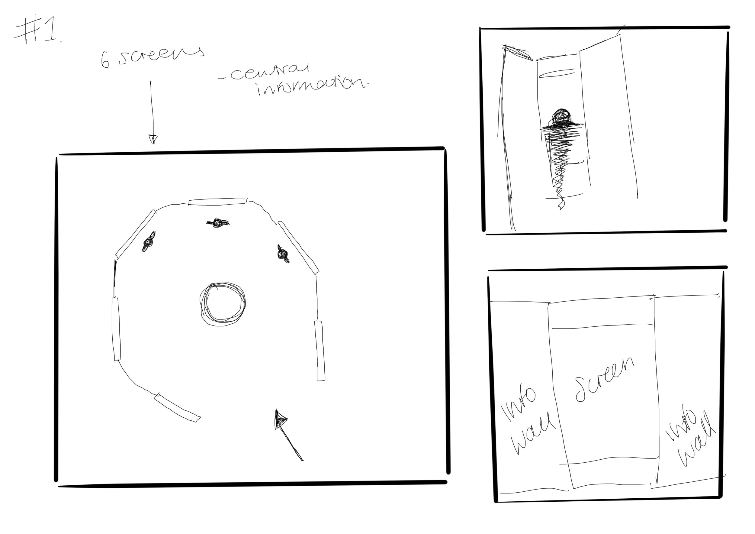
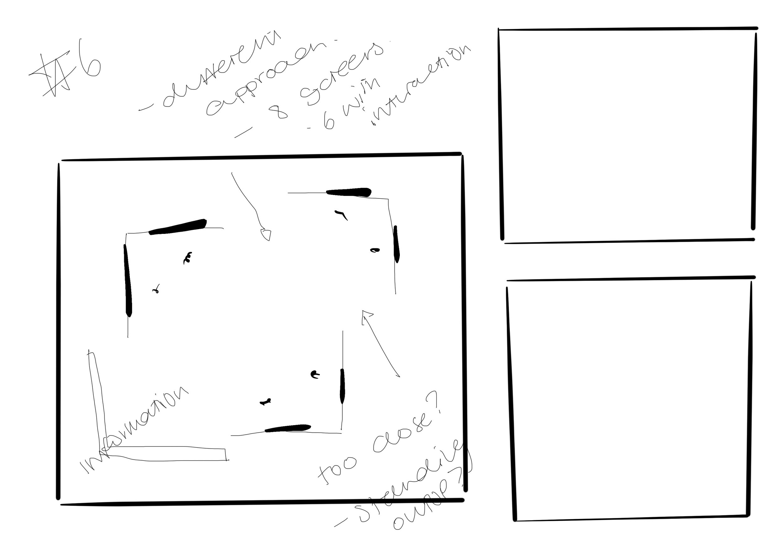
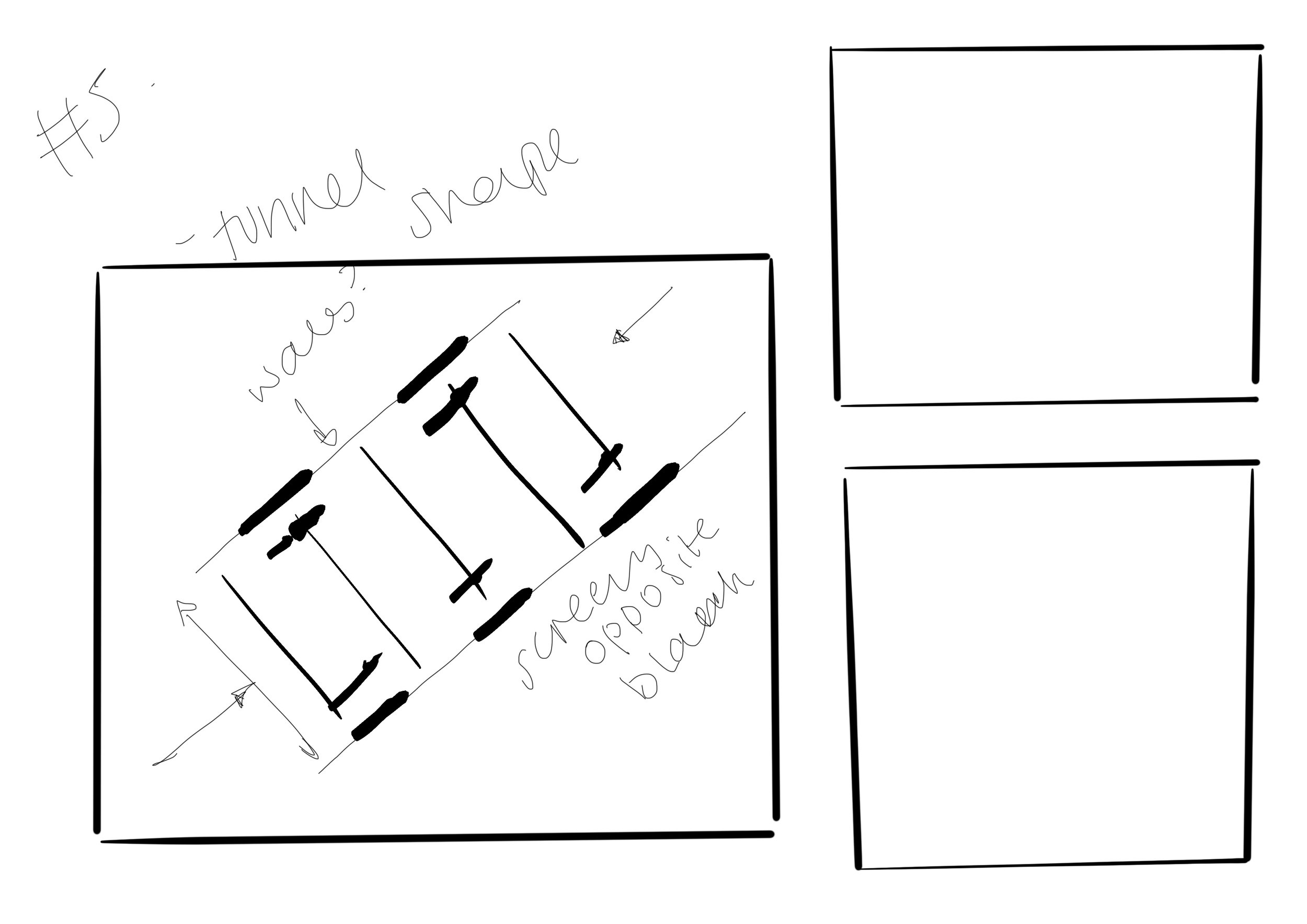
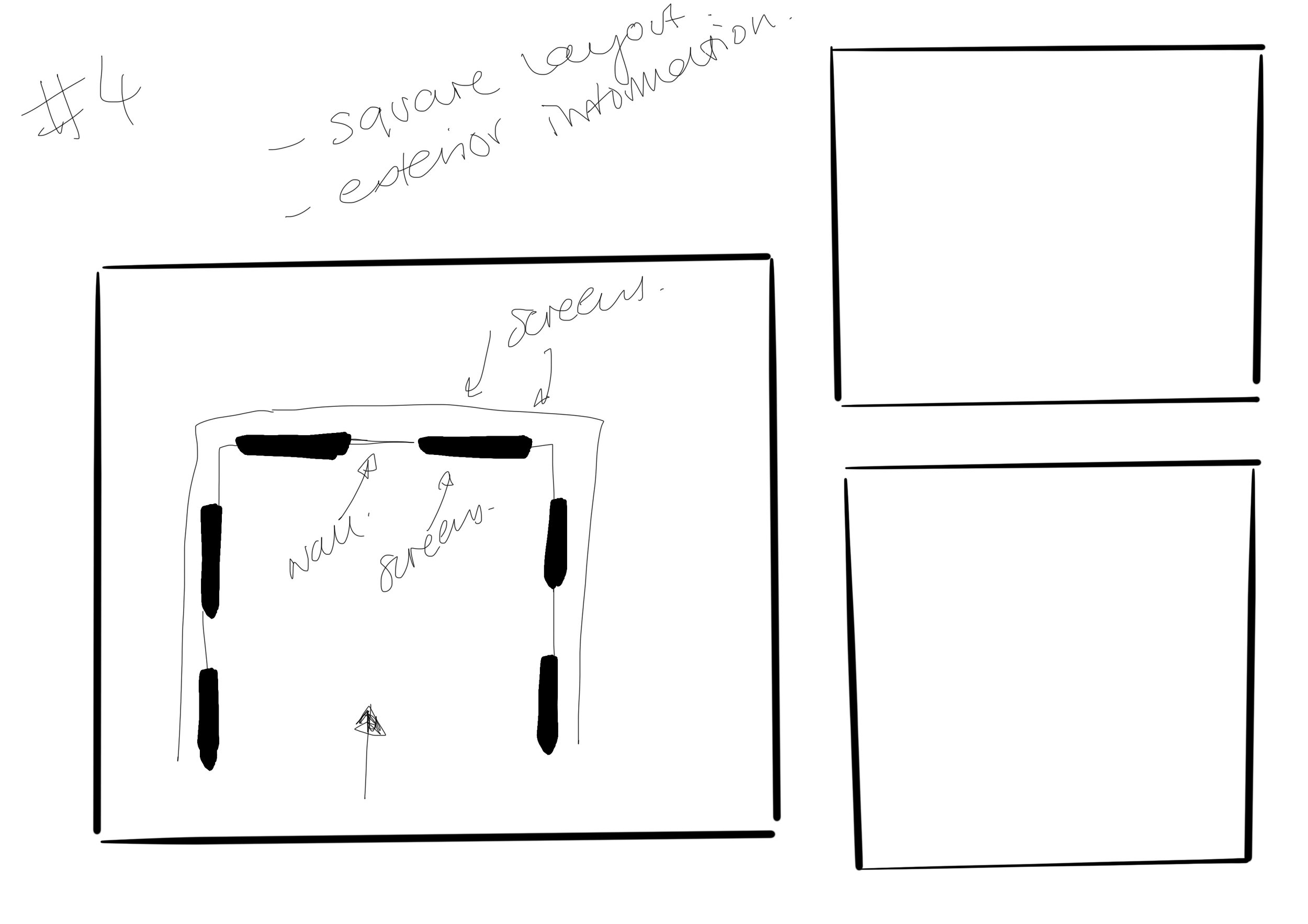
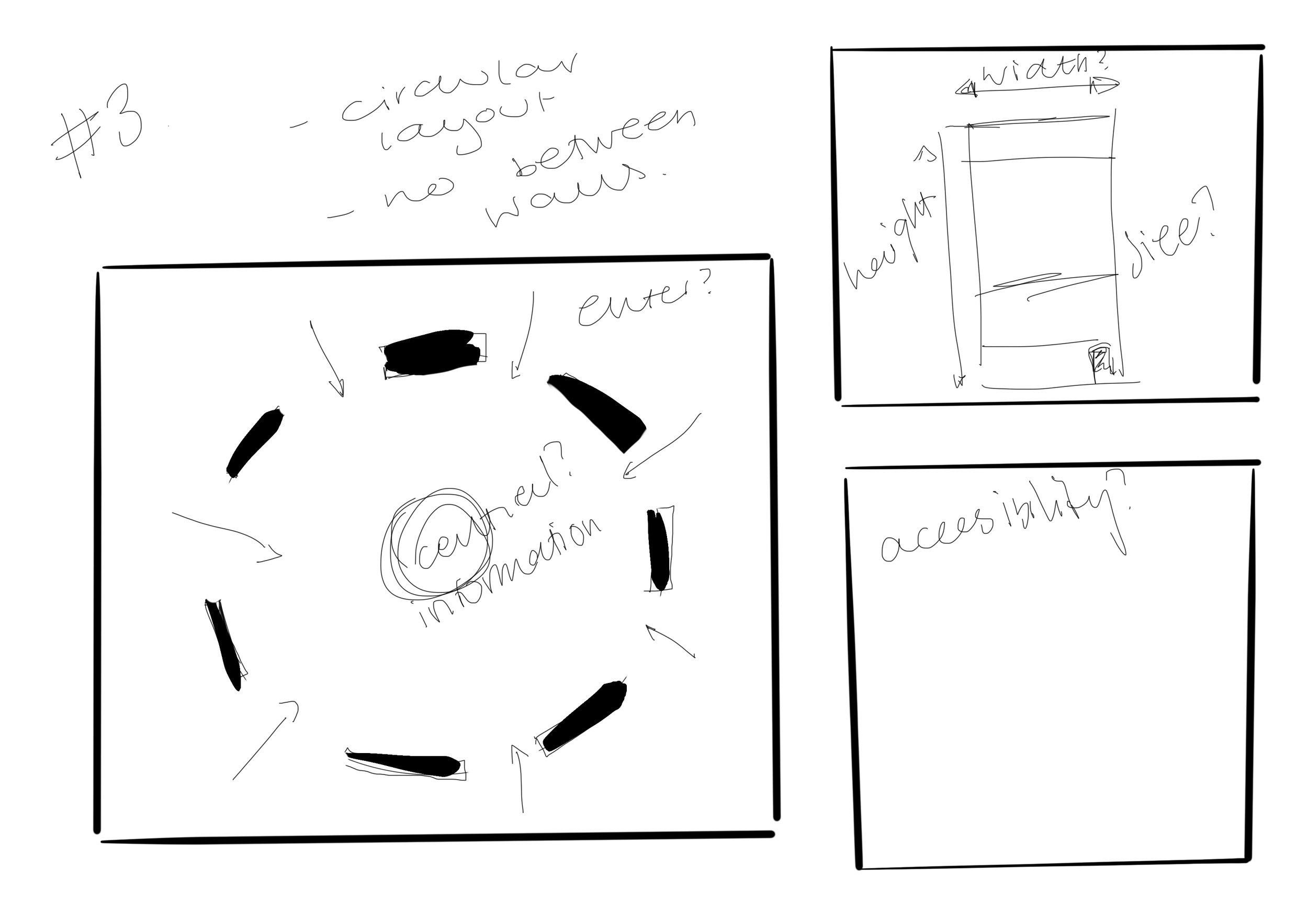
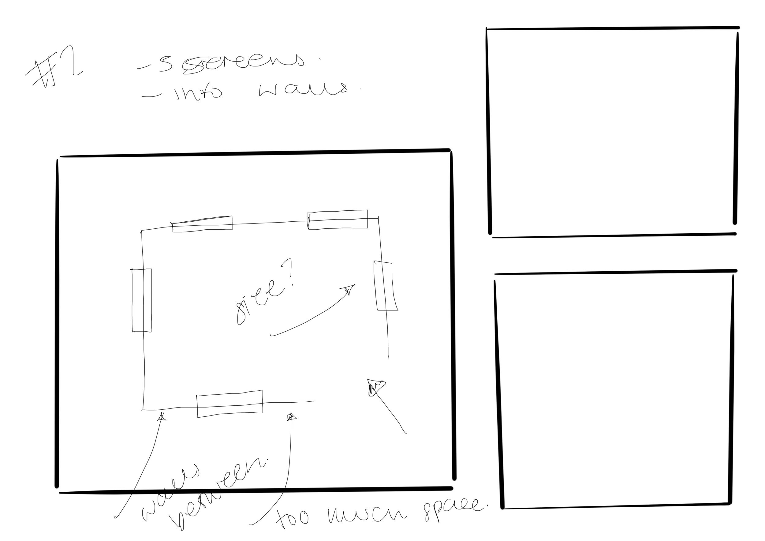
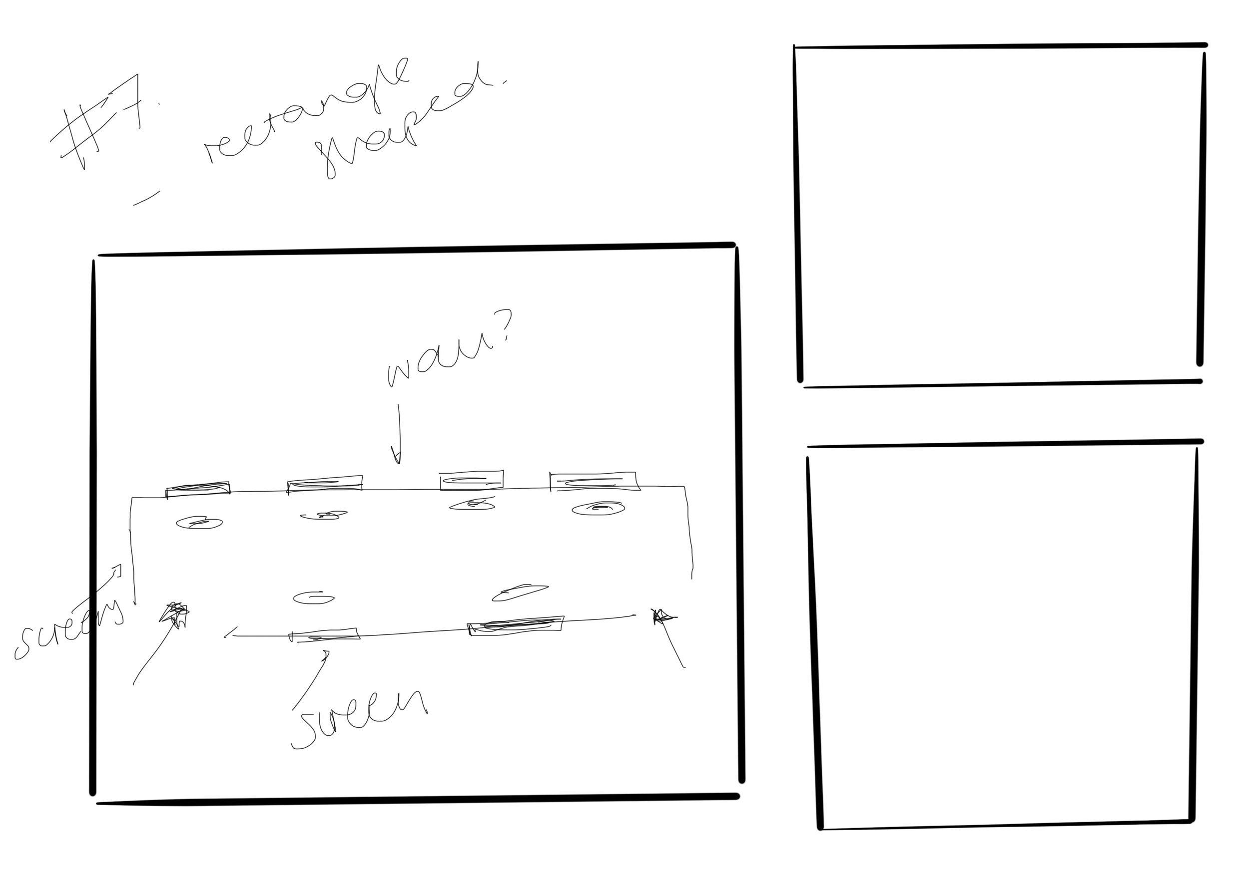
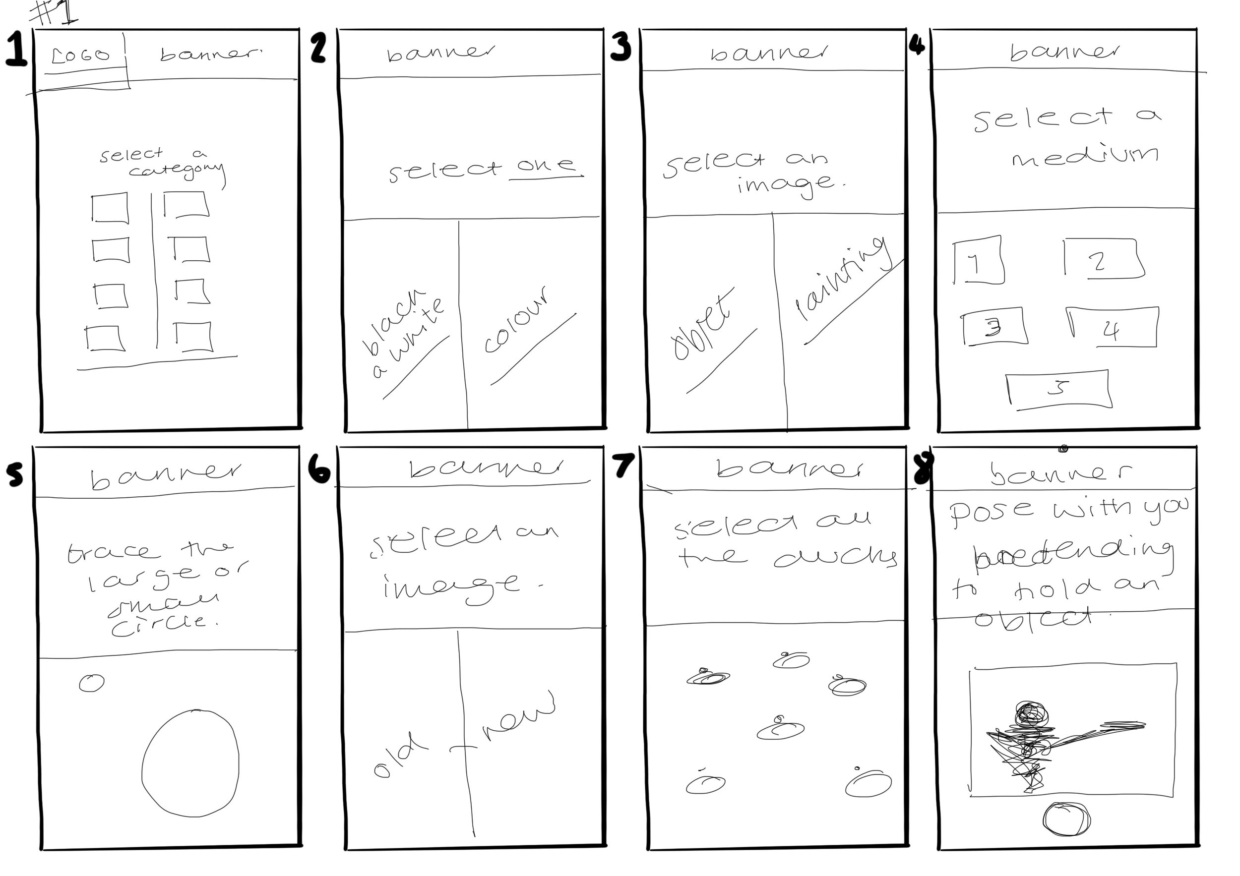
Sketches of how the installation will look
From these layouts, Initially i was thinking that Id like the layout to be circular, but Now i am thinking that I want it to be a half square so that it allows people to enter and exit the space easily but also have the room to learn and explore.
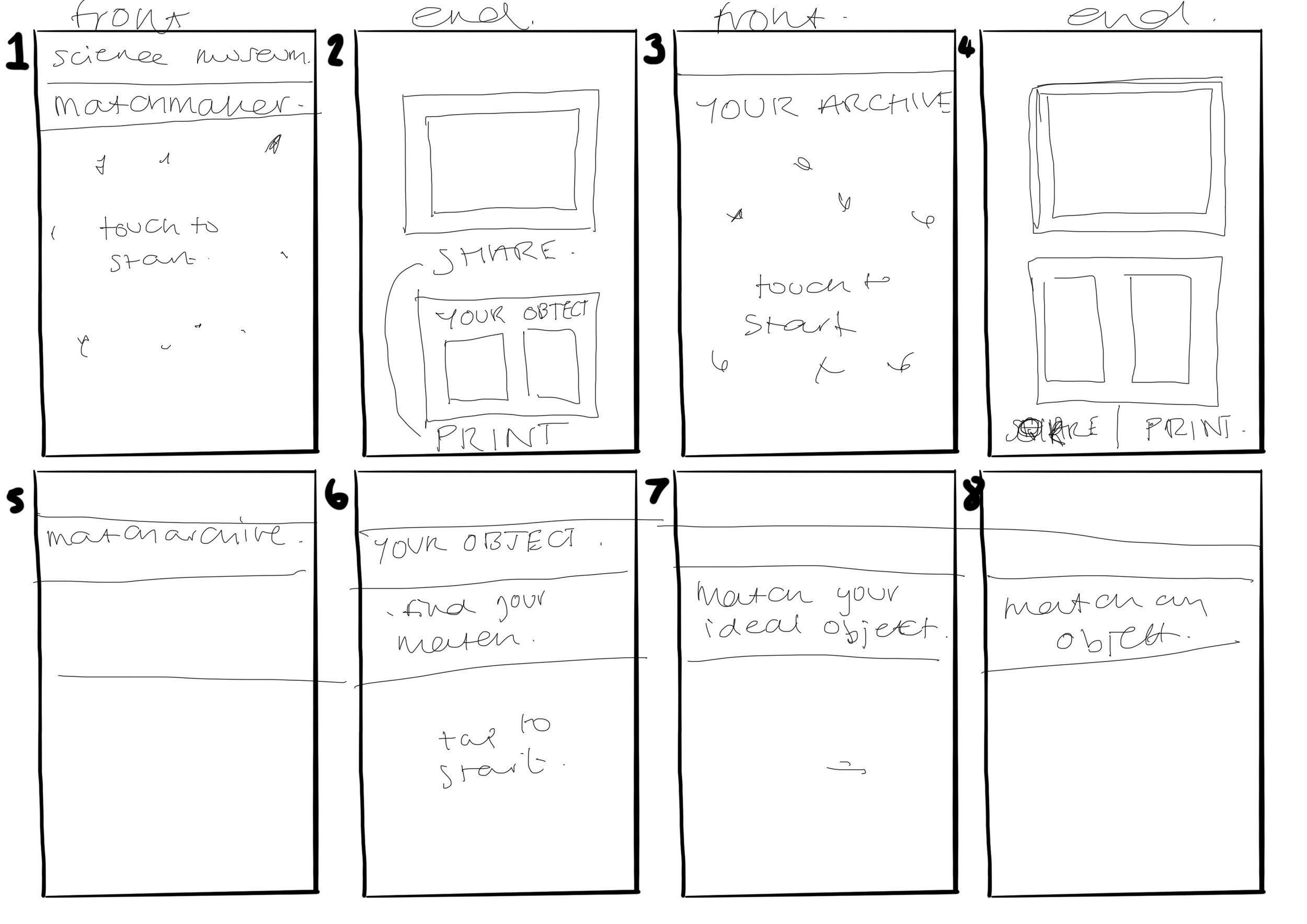
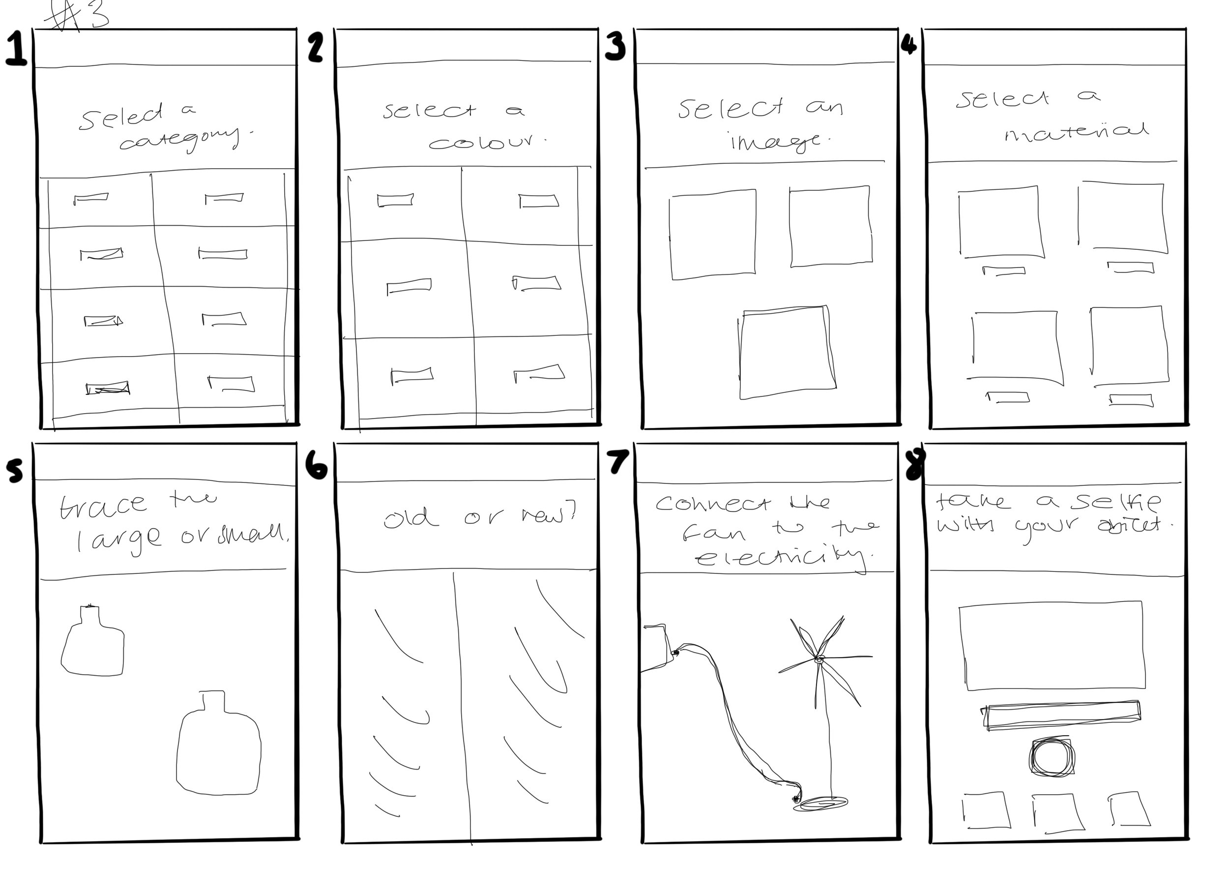
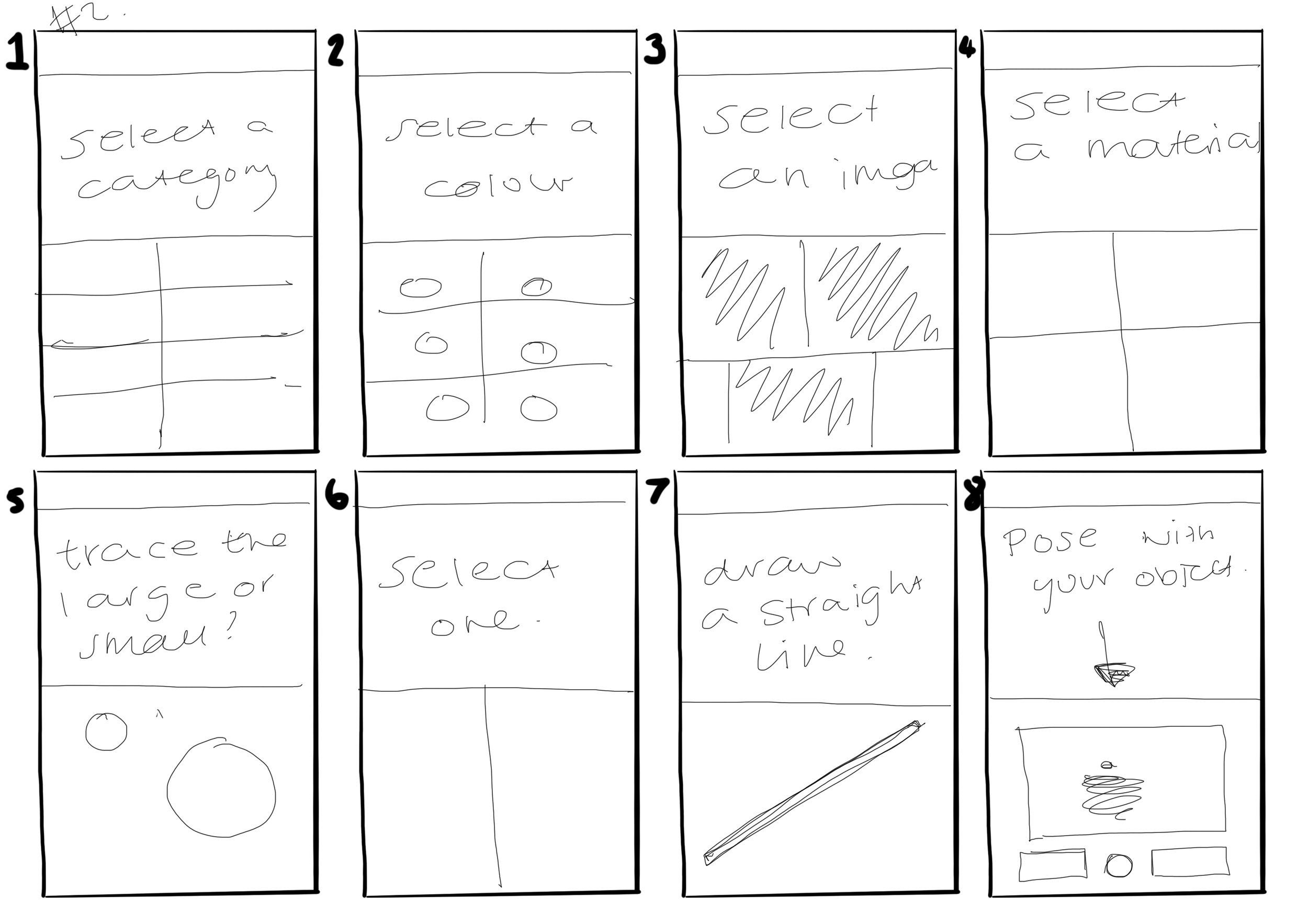
Sketches of the screen design
I went through how I wanted each page to look, taking on from the research that I did about the UX and UI design, I wanted it to be simple and clean and easy to understand. I need to make sure that the language I am using is also clear and easy to use. I feel like I have enough here to be able to look at the design, I want to use a grid design to make sure the layout is consistent.
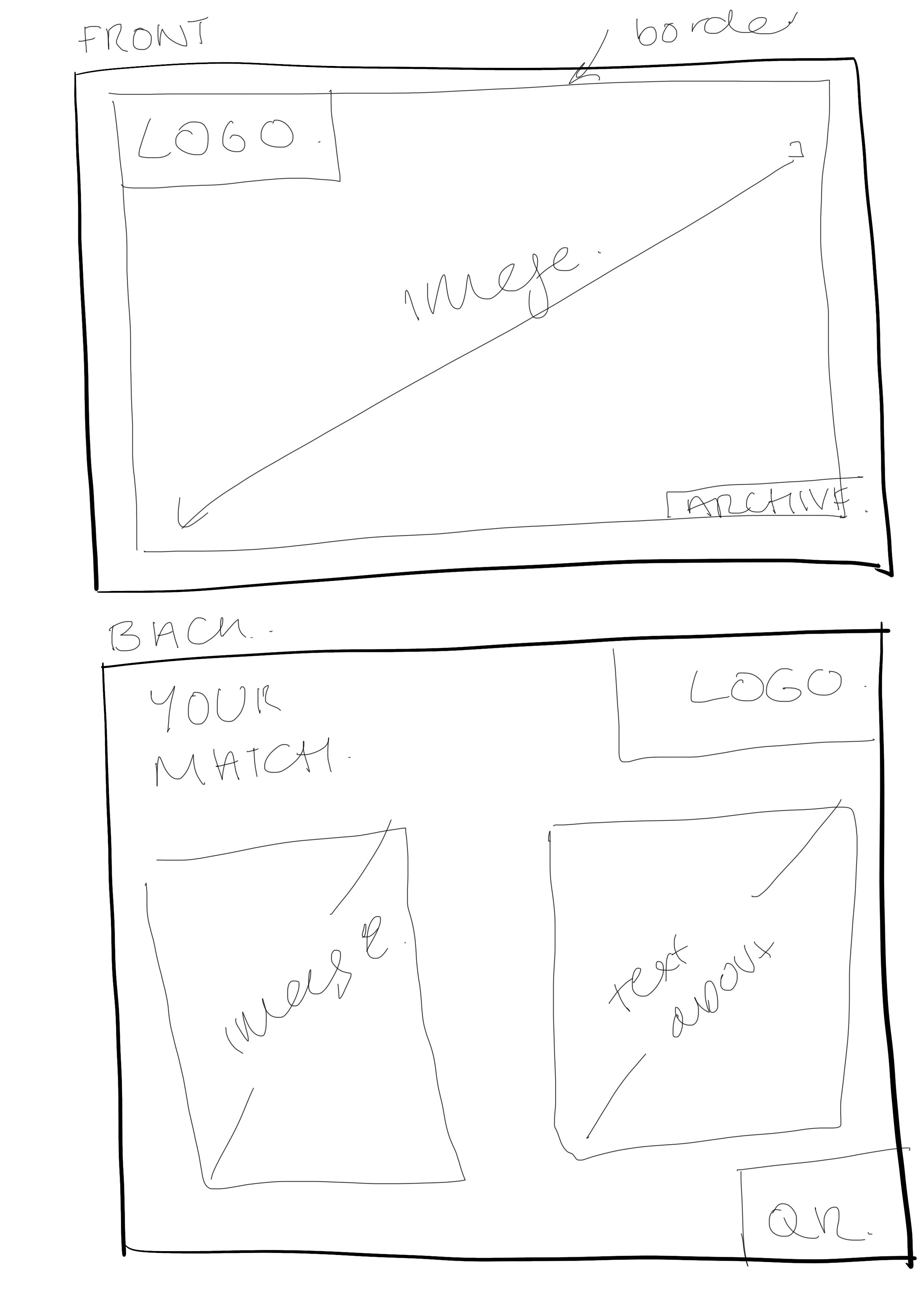
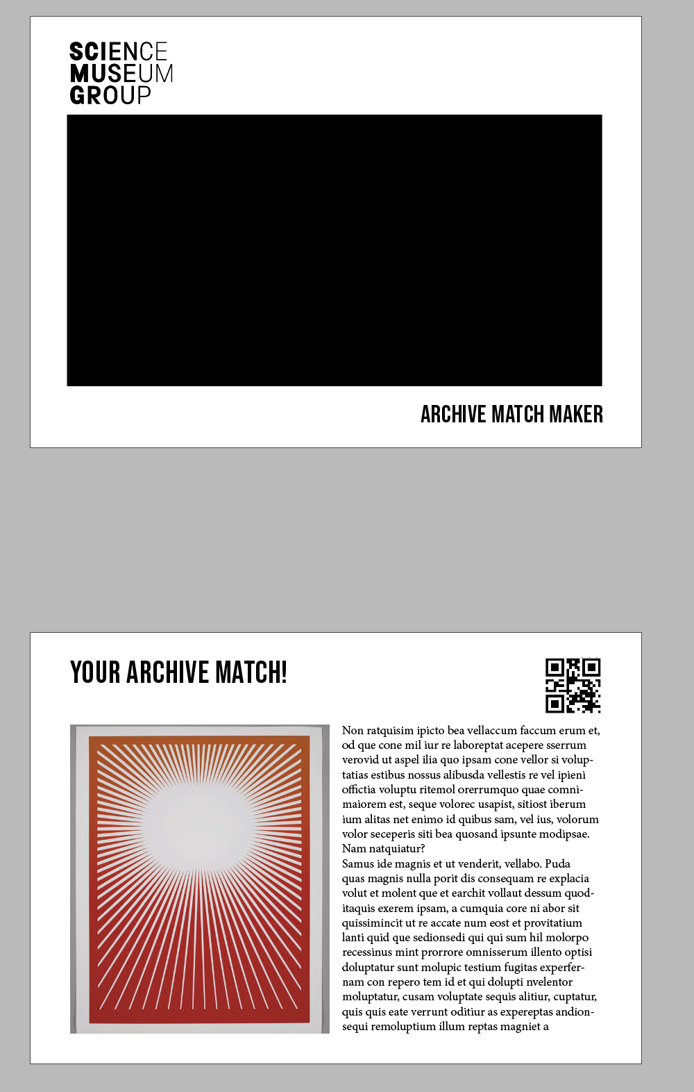
The printing process design
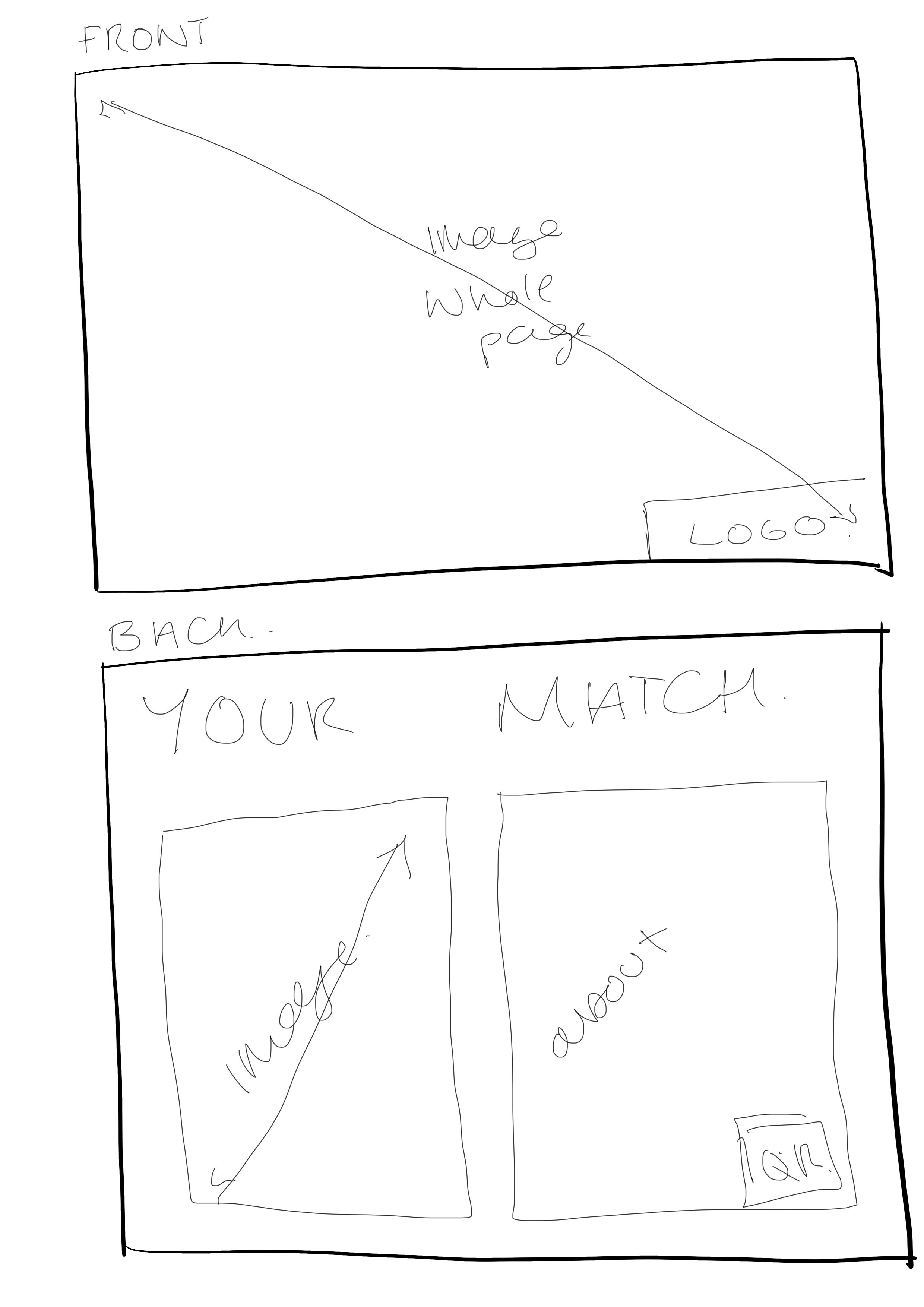
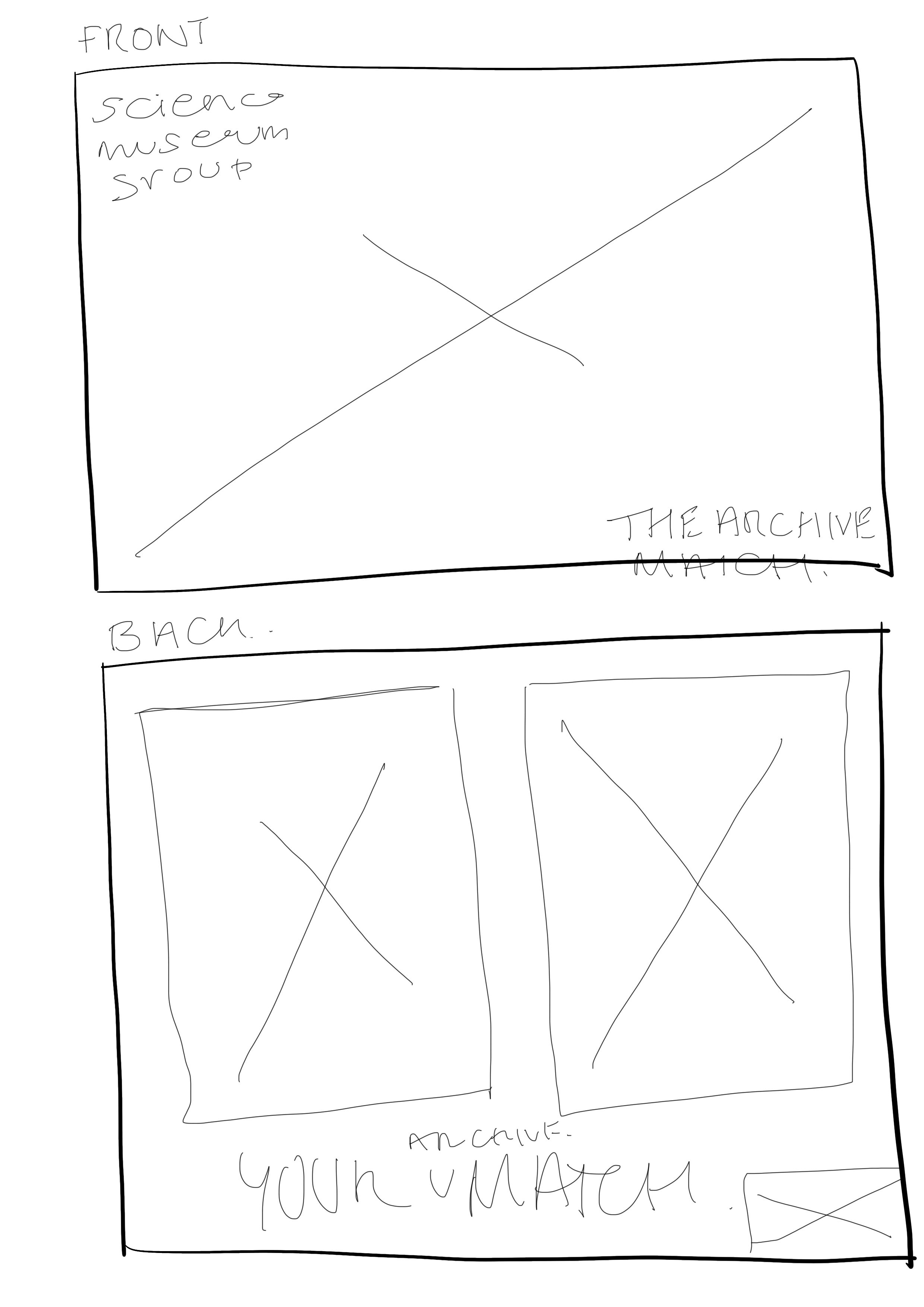
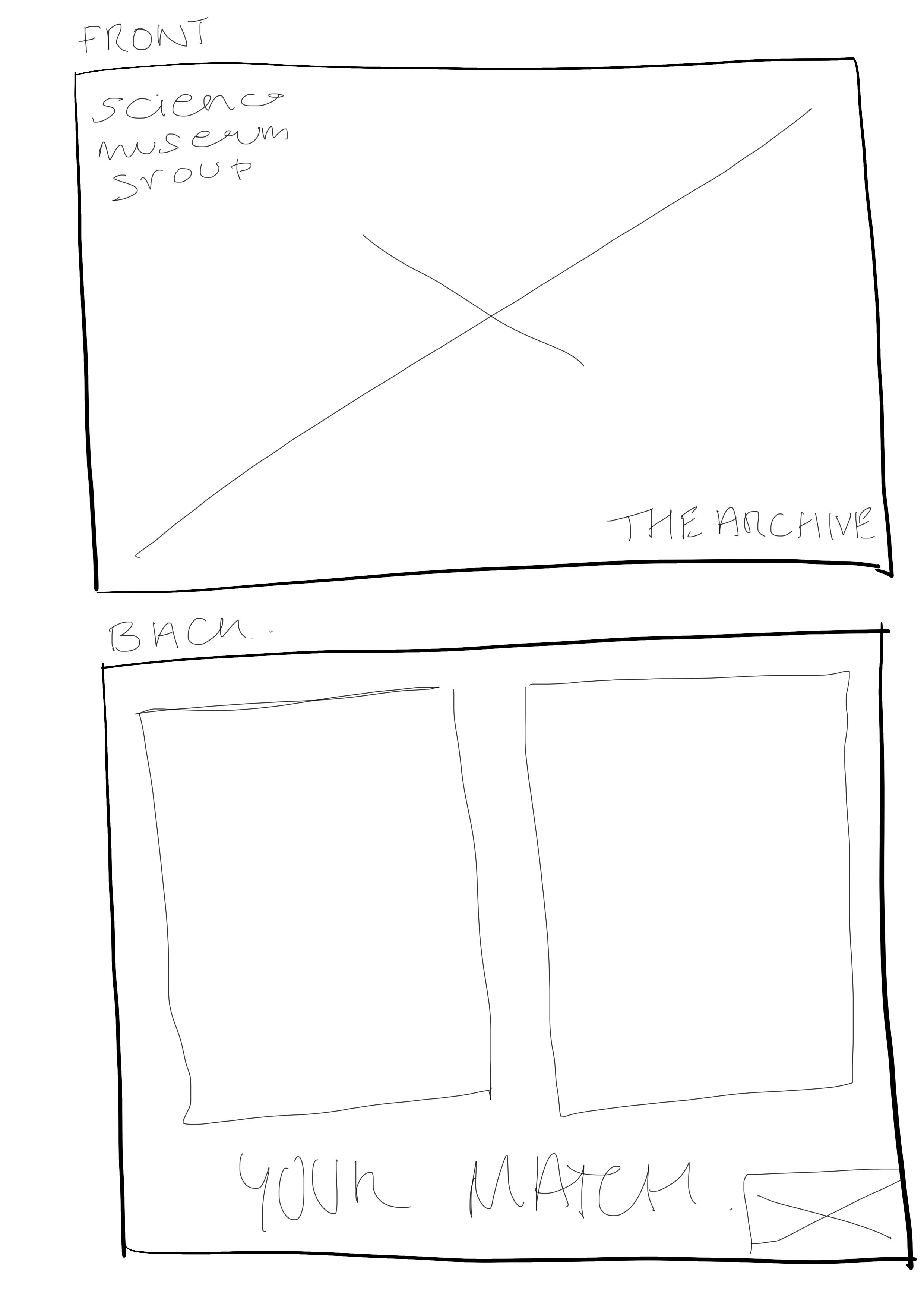
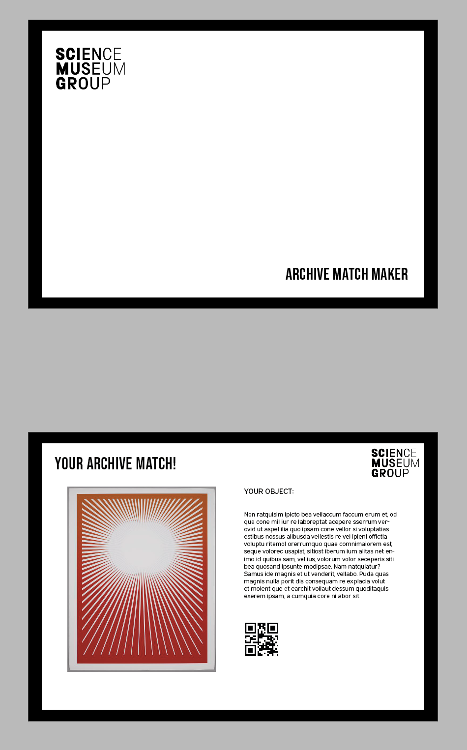
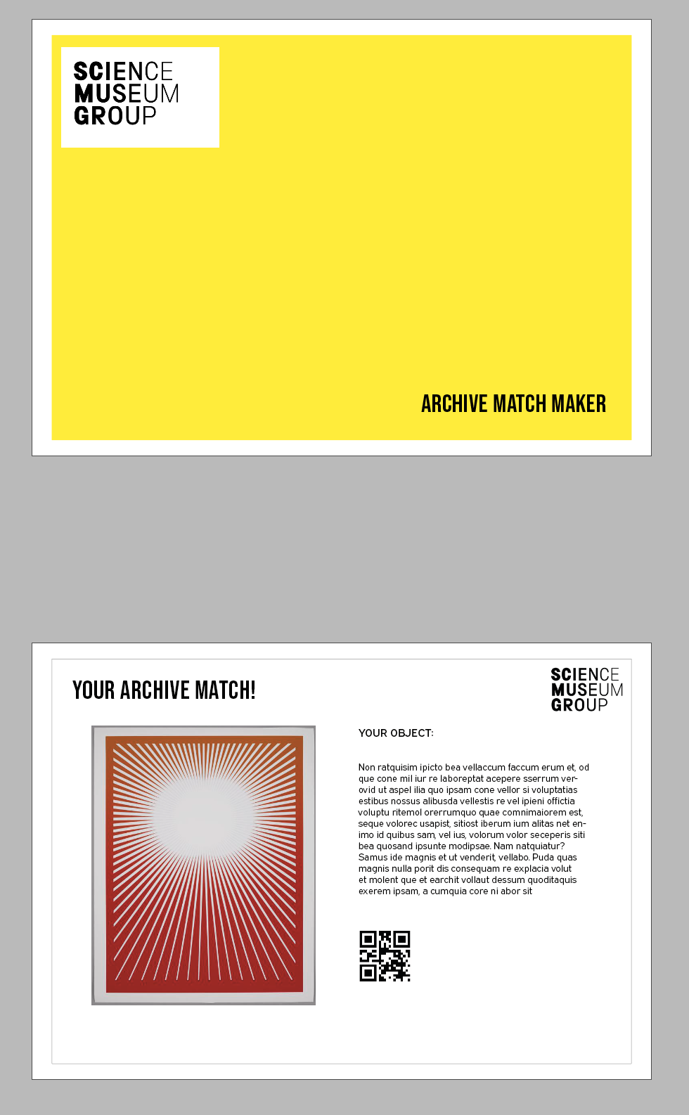
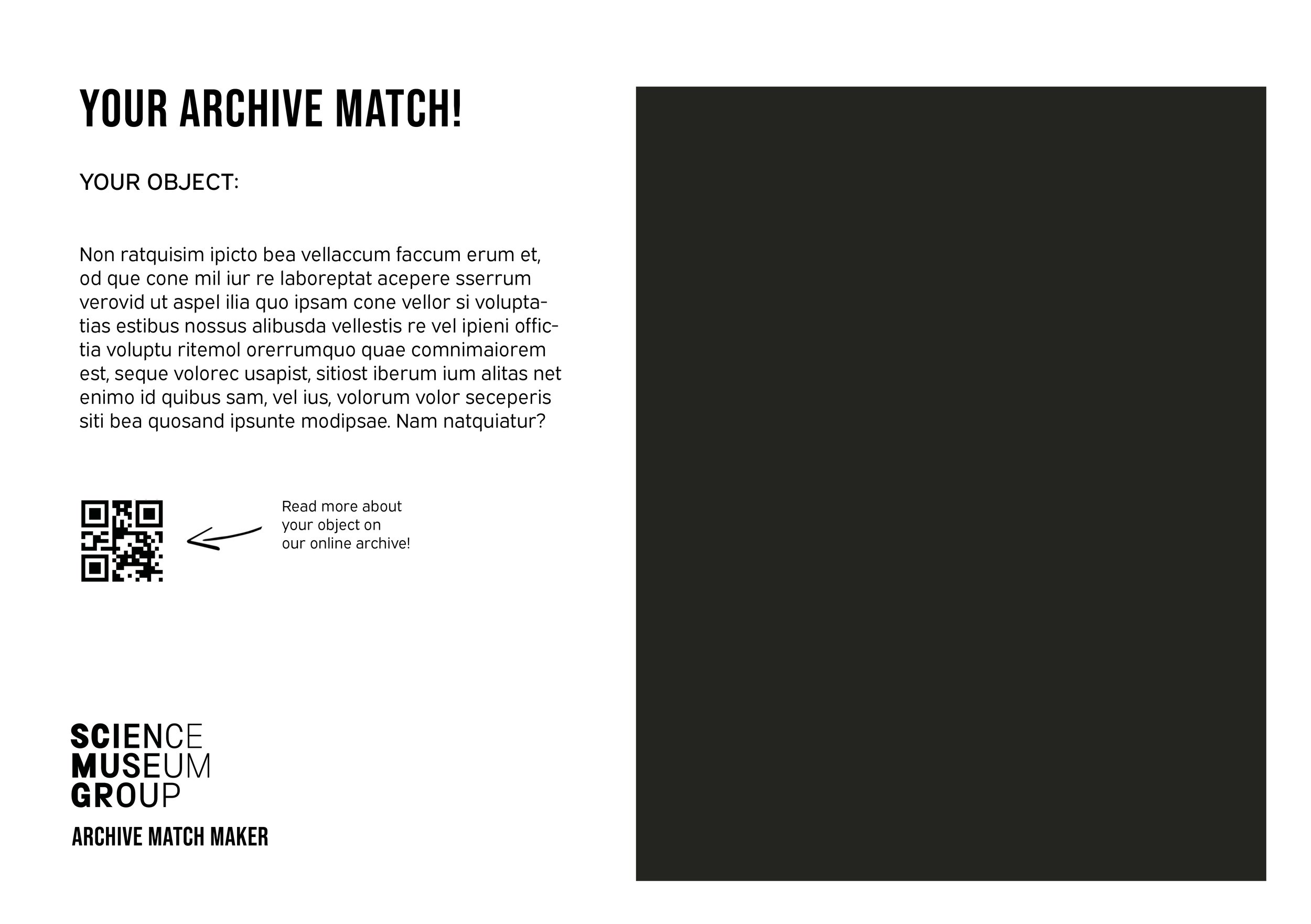
I also went on to sketch out how the output of the postcard could look. Again making it really simple and easy to understand.
Creating a prototype
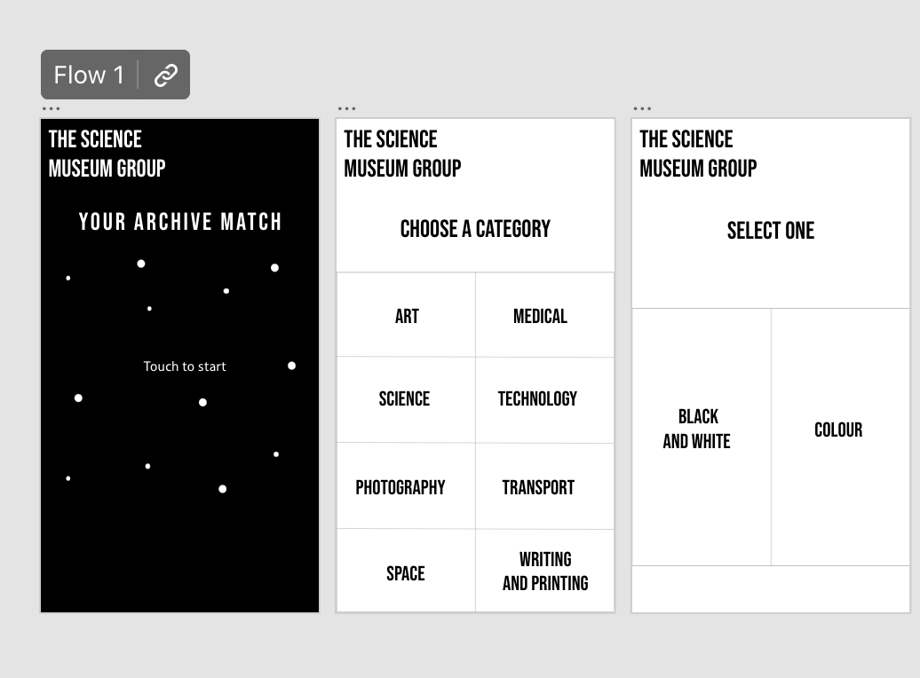
From all of the sketches and looking at the design, I starting to create the design for the interactive screen as well as the output and the installation. Due to the interactive installation being similar, I am only going to demonstrate how one of the category’s work since the process is applied to them all. If i have time i will apply the category to all of them.
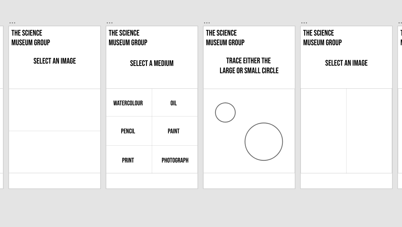
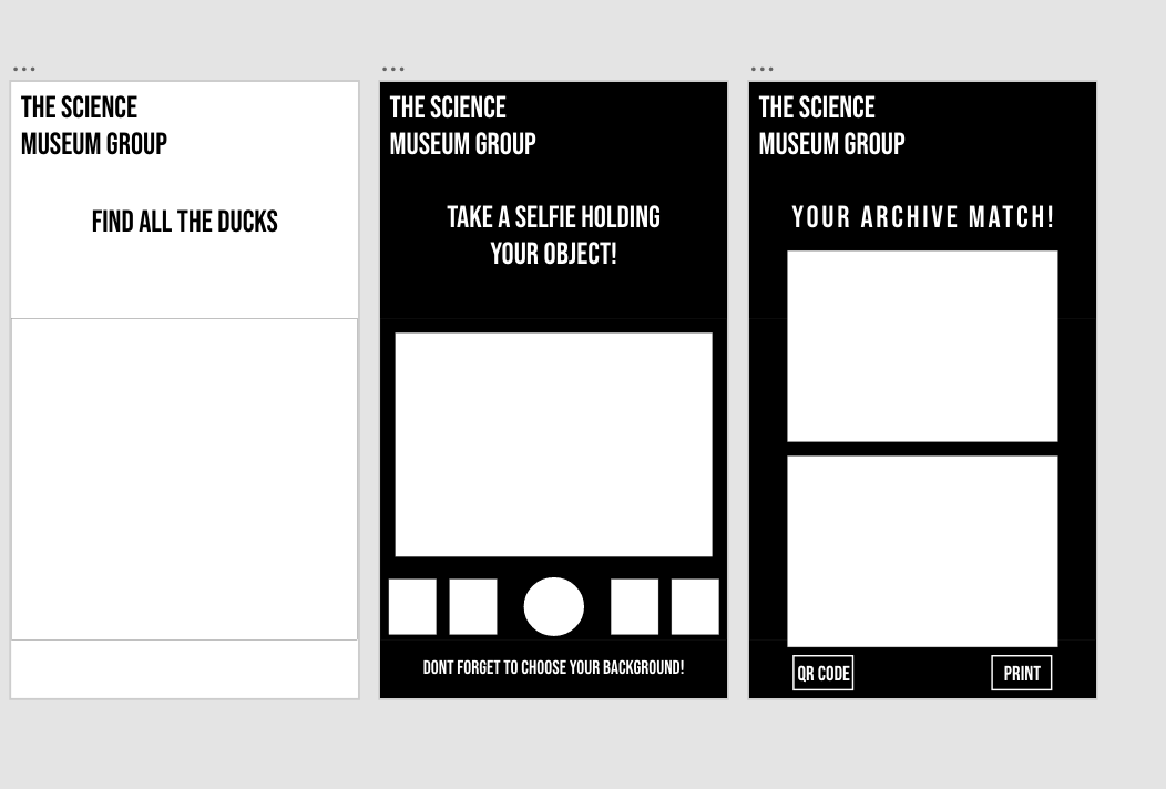
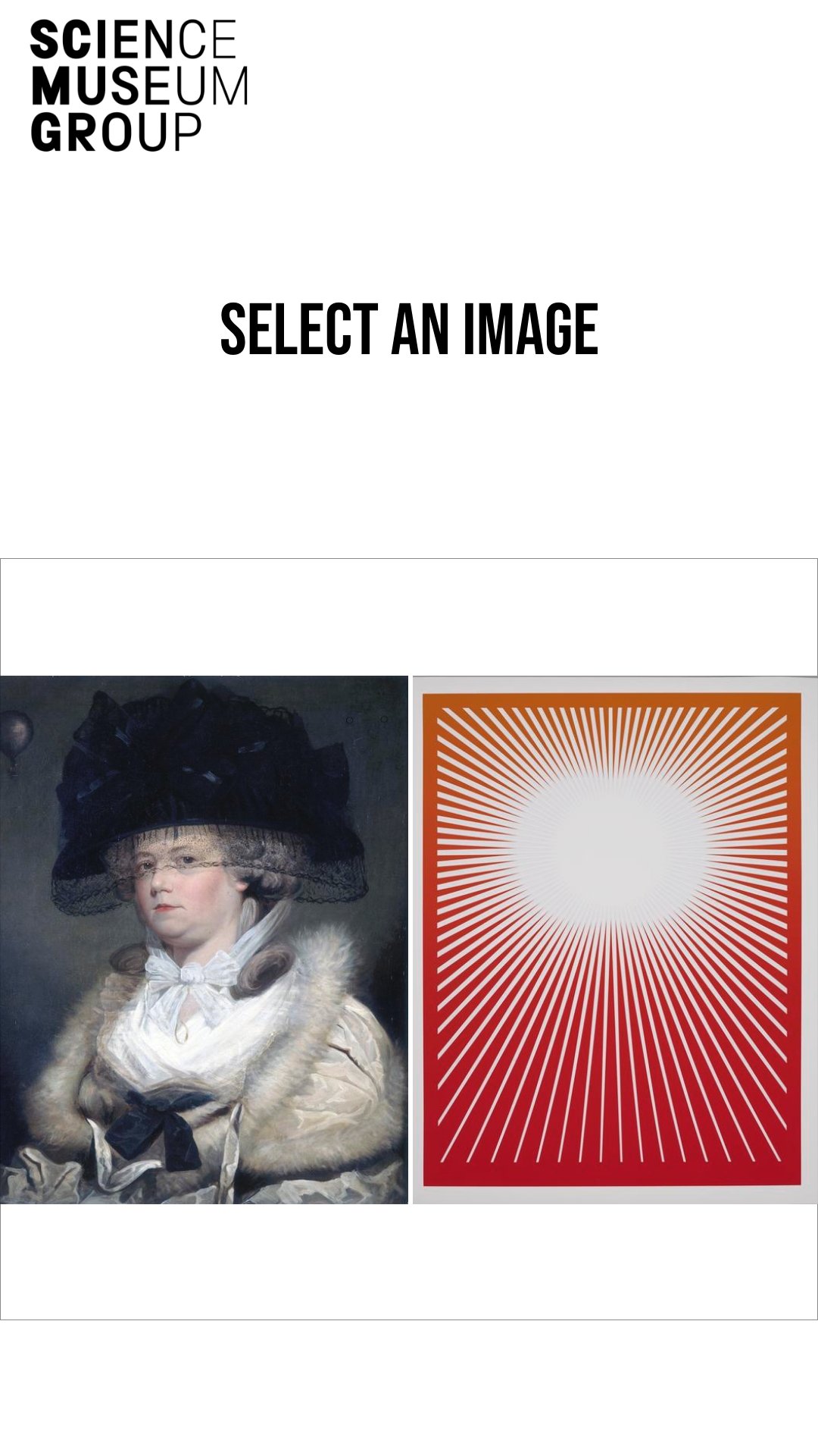
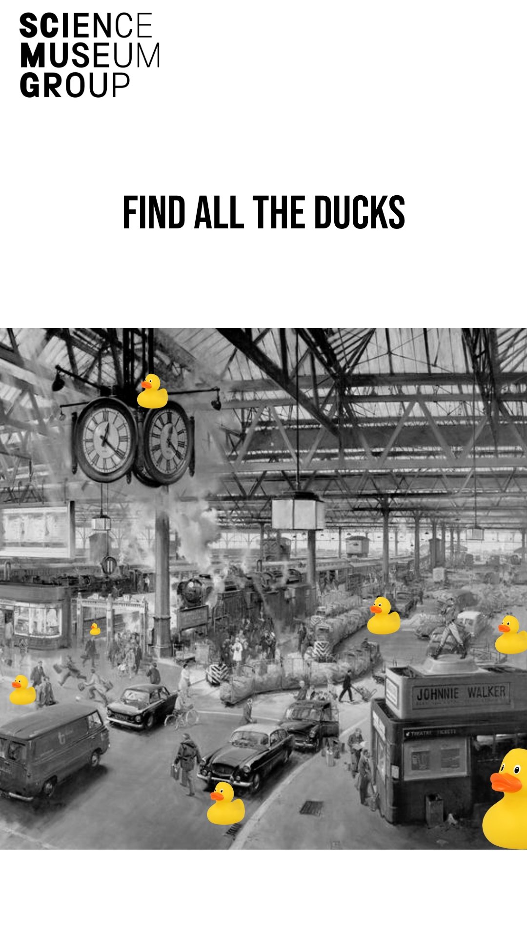
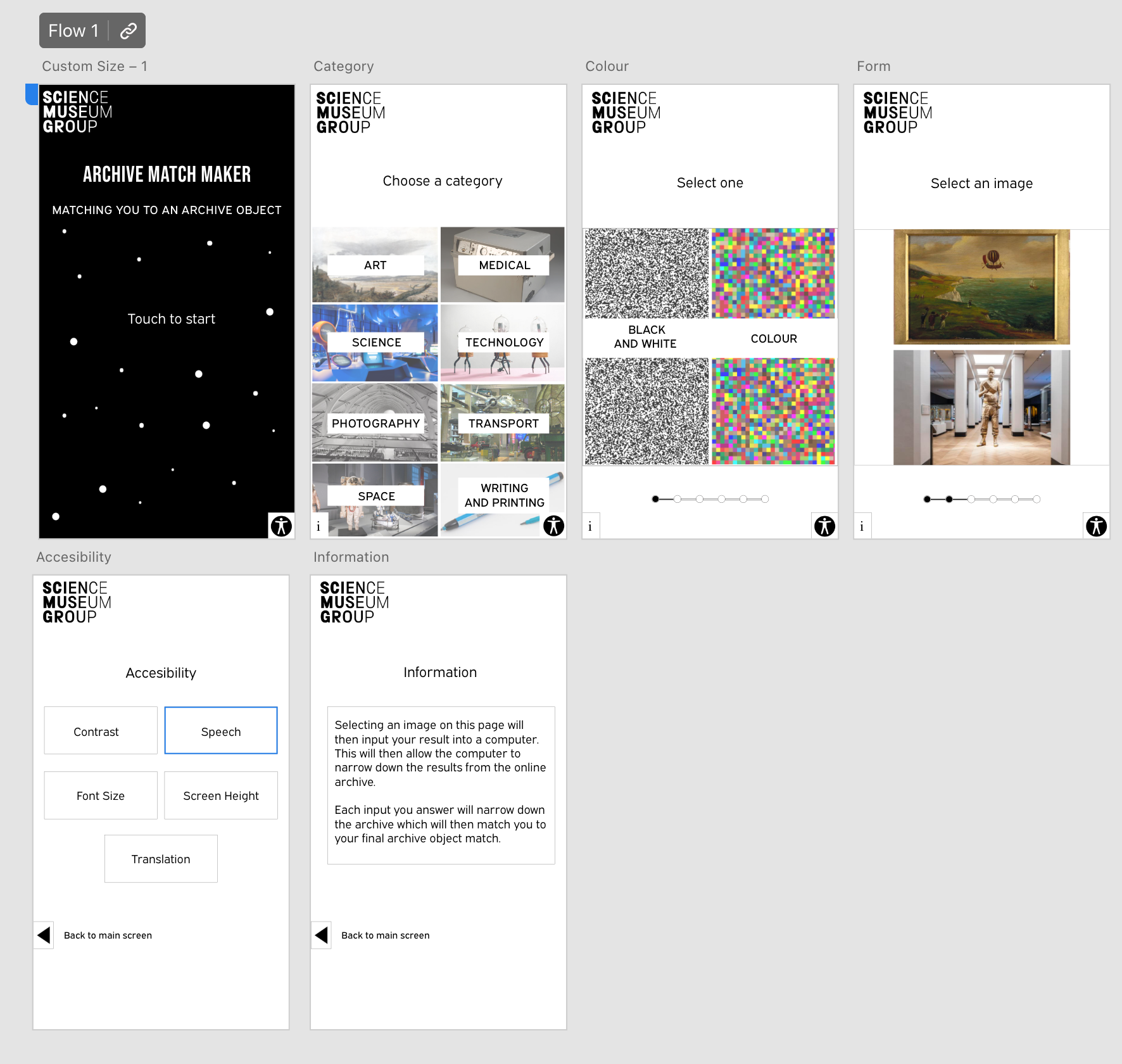
I used Adobe XD to start to create each of the screens and how they might look:
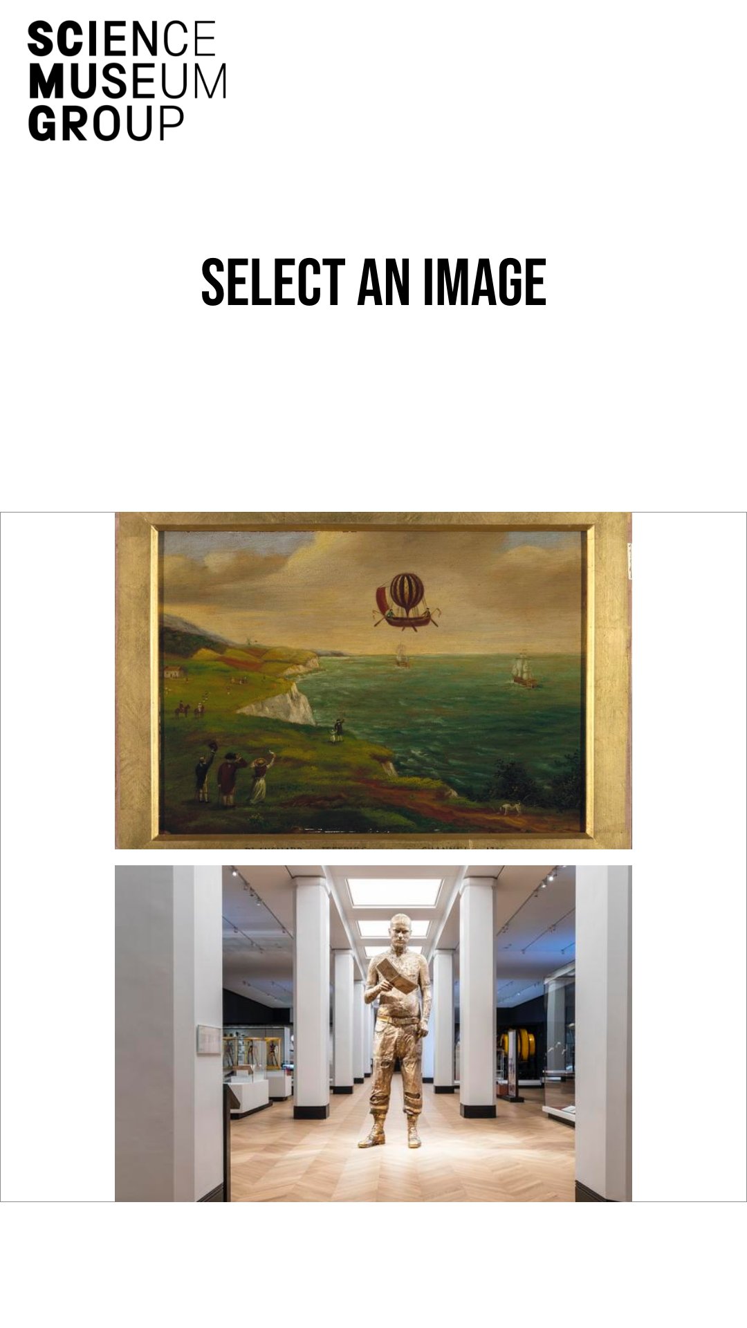
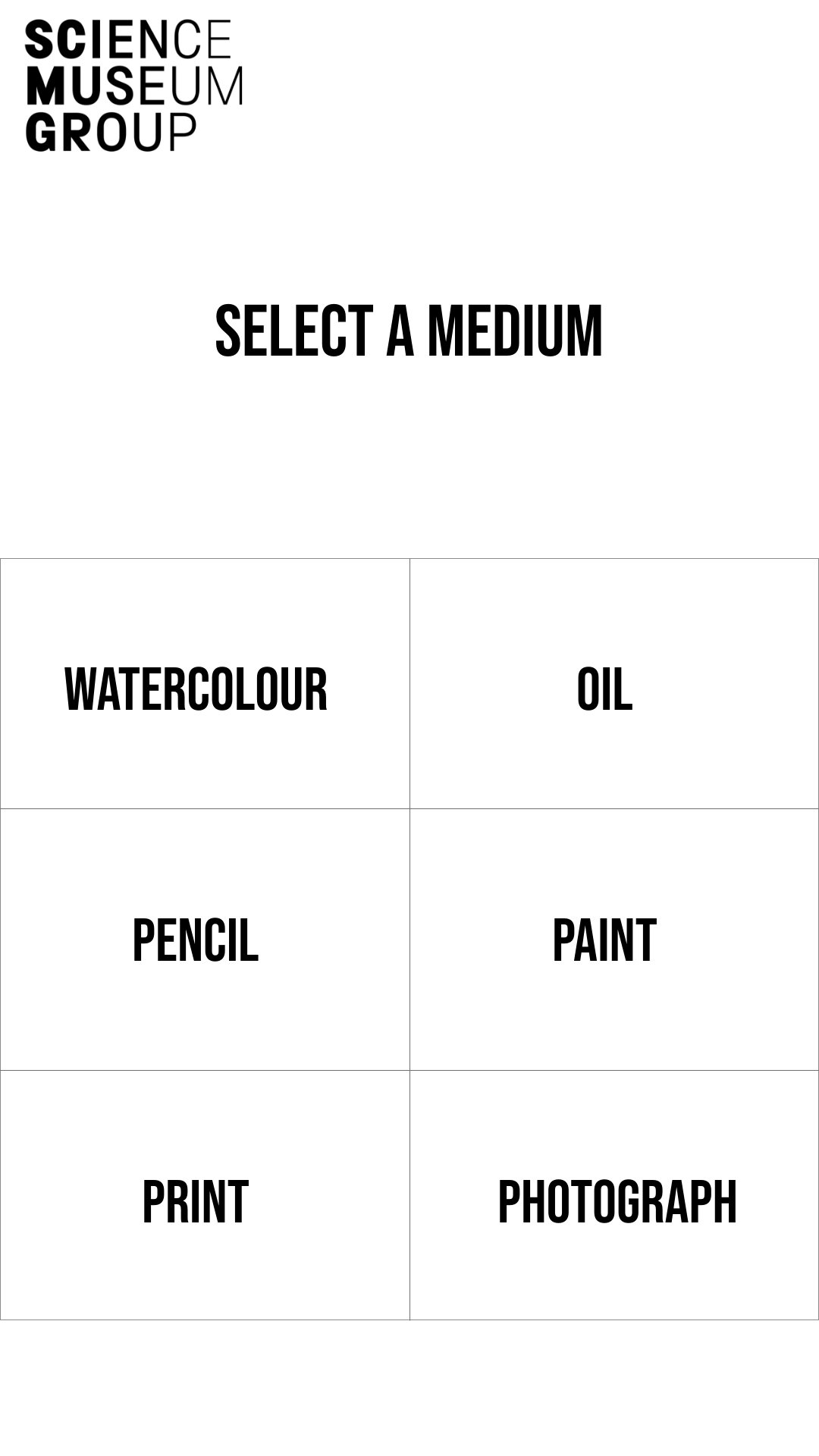
I was pretty happy with my first attempt of the layout, now i just needed to fill in the images that were missing and really research the font that I was using.
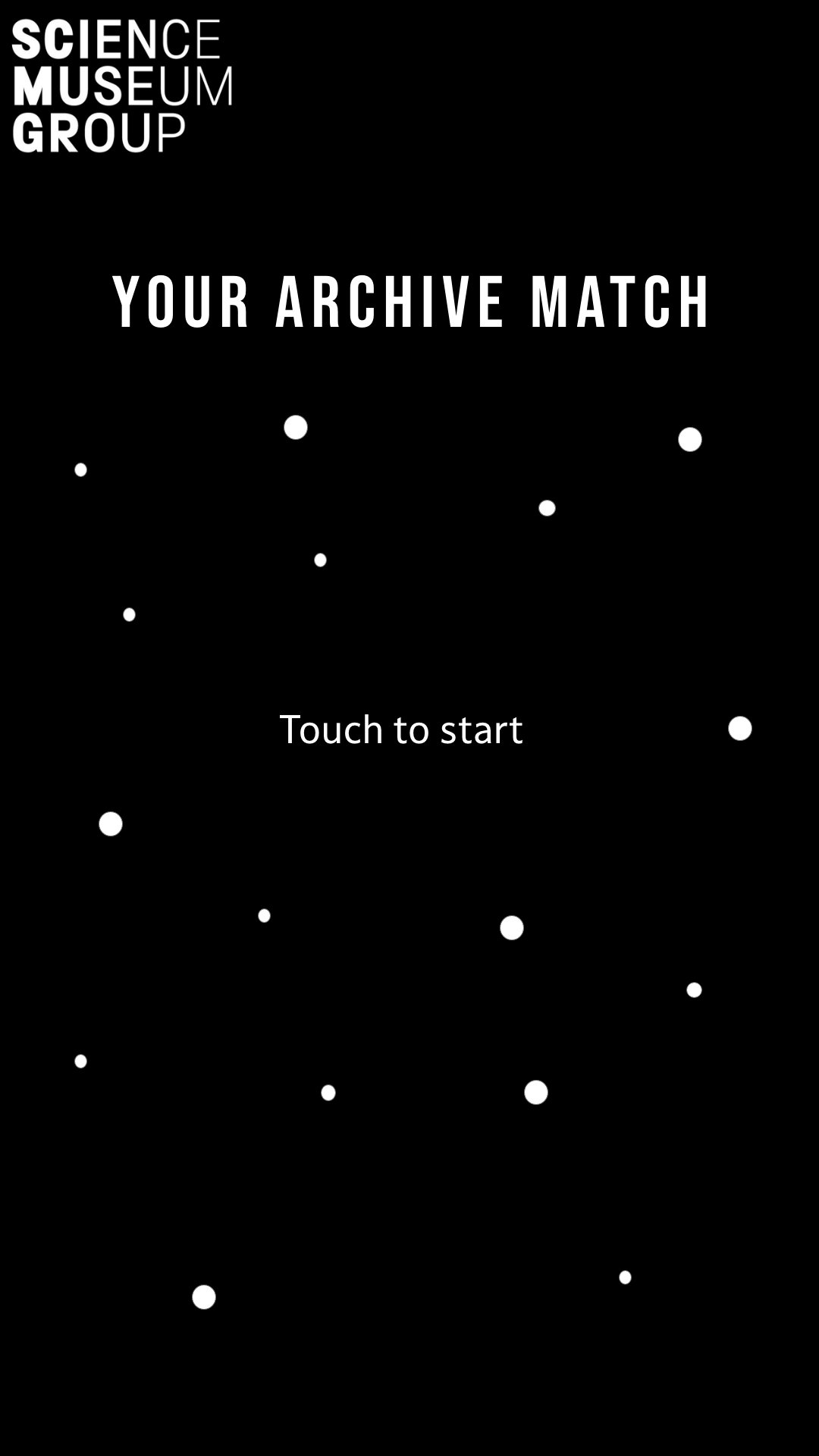
I was still happy with the content and the layout for the images but felt I needed a cleaner tex and to make sure that the text was in the same place.
Feedback from prototype
24 - Engineering Consult
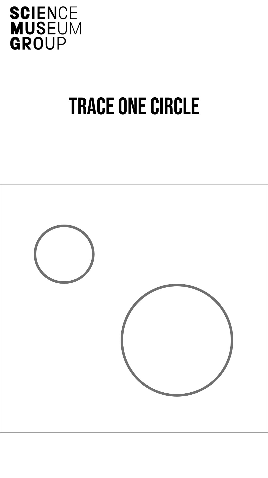
“The circles don’t make sense - to select the large or small object - it would be easier as a user to just tap like the rest of the project.
The ducks for the detail also don’t make a lot of sense as this would take the user a lot of time to complete - unless you had a time limit that would then automatically move on to the next step.
Missing a progress bar - visually telling the user where they are
Rest of the layout clear and easy to use.
Like the final outcome, and the personalisation touch.
Make sure that theres an accesible button - High contrast, audio, Bigger font. Height adjustable.
Also would be interesting to have an Info button so people can learn about why you are doing it.
Feedback from the installation - floating from the floor, hexagon shape “
Refining outcome
From the feedback of the pro-type, I am able to now take away some of the drawing features knowing that it would just be easier for them to touch. I also thinking about adding a progress bar, that would then allow the user to look at where they are within the installation.
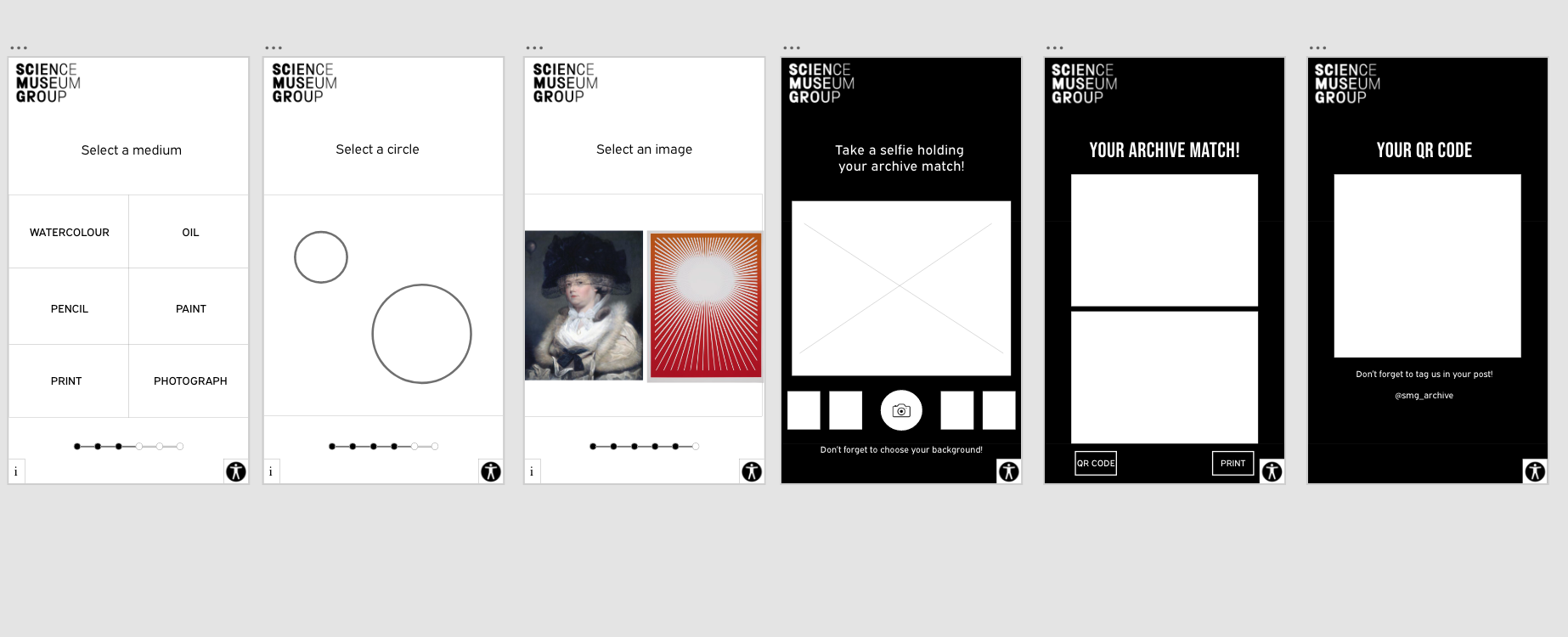
After adding and sorting the changes to the prototype, I began to add 1 more example which was medical and tried to link all the pages together so it could be a fully functioning prototype.
When this was complete, I asked for 6 audience feedbacks:
I asked the users the following questions:
- Usability - Is it easy to understand and complete each tasks?
- Do you think this installation is interesting and engaging?
- Is there any part that could be improved?
User 1 / Age 22 Female
Very easy to understand with simple tasks
Interesting concept and fun memento for the user to remember
Introductory pages ie one with less images could be a bit bolder and potentially have more colour in their graphical appearance like the one where you choose the circle.
User 2 / Age 23 Female
Very easy to complete
The tasks are easily explained but it may benefit to understand why the user is doing the task
may be easier to have the information near the start of the installation
Its engaging and interactive and personalised element is a nice part
User needs to understand why and end of the installation needs to be clearer
User 3 / Age 26 Female
I think it's easy to use and all makes sense, also quite fun and engaging. But I do think a page explaining what it is would be helpful?
User 4 / Age 22 Male
Layout is good and easy to click through
but need information to start with
Images are interesting
They are going off what they are/ looking at so make sure to add like more imagery
Could complete task too quickly
User 5 / Age 23 Male
Easy to complete each task
Interesting and engaging
Didn’t know what was doing or what to choose most of the time
an insight into each task would help
User 6 / Age 24 Male / Illustrator
So, Usability- The installation is incredibly streamlined and efficient in its pathway to designating a user with an object from the unseen archive. The simple questions and limited options make this something I could definitely see people using as it does not consume a great deal of time and is super easy to understand how to participate.So, Usability- The installation is incredibly streamlined and efficient in its pathway to designating a user with an object from the unseen archive. The simple questions and limited options make this something I could definitely see people using as it does not consume a great deal of time and is super easy to understand how to participate.
The installation has a very clean and well structured layout, I would say that in making it as accessible to all users as you have - it perhaps will not engage them for very long. With that said I think that the assignment of an object from the archive to an individual person is something that will connect them in a special way to things they would have otherwise not seen - and i think this enriches their long term engagement (more than the short term) as they look back on the item and the selfie to reflect on the experience they had in the museum.
As a prototype it works so well, I understand the concept with very little guidance and it genuinely feels nice and very satisfying to click through such a spacious UI. The only criticism I can think of is as I was going through the installation I perhaps didn't fully understand why or how the things I was choosing would lead me to an object that would be unique to me? But that could also be apart of the magic sort of like (Sorry if this is a little off track) That Genie game where he guesses who you're thinking of?
Summarising the feedback I have the following points that I need to improve;
Information about the installation at the beginning about why you are making the choices
More colour throughout making the imagery bolder
More imagery throughout
To make the changes about the explanation of the installation, I felt that I really needed to narrow down what the installation was about in the simplest way possible:
I previously had:
“This installation will allow you to select options for different categories. Selecting an option on each page will then input each of your choices into a computer.
Each input you give to the computer will narrow down the archive which will then match you to your final archive object match.”
This installation is working as a filter for the online archive. Each screen will ask you to choose a different option, the options you choose are all based on your personal preference.
By inputing your personal choices for each task, the archive can narrow down the objects within the archive. At the end of this installation, you will then be matched with your archive object!
I created a process diagram which was the same process that could be applied to every single category:
I also tried 3 different approaches to making this clear for the user
An information at the start of the installation
A diagram to show each of the page topics and an explaination.
The output
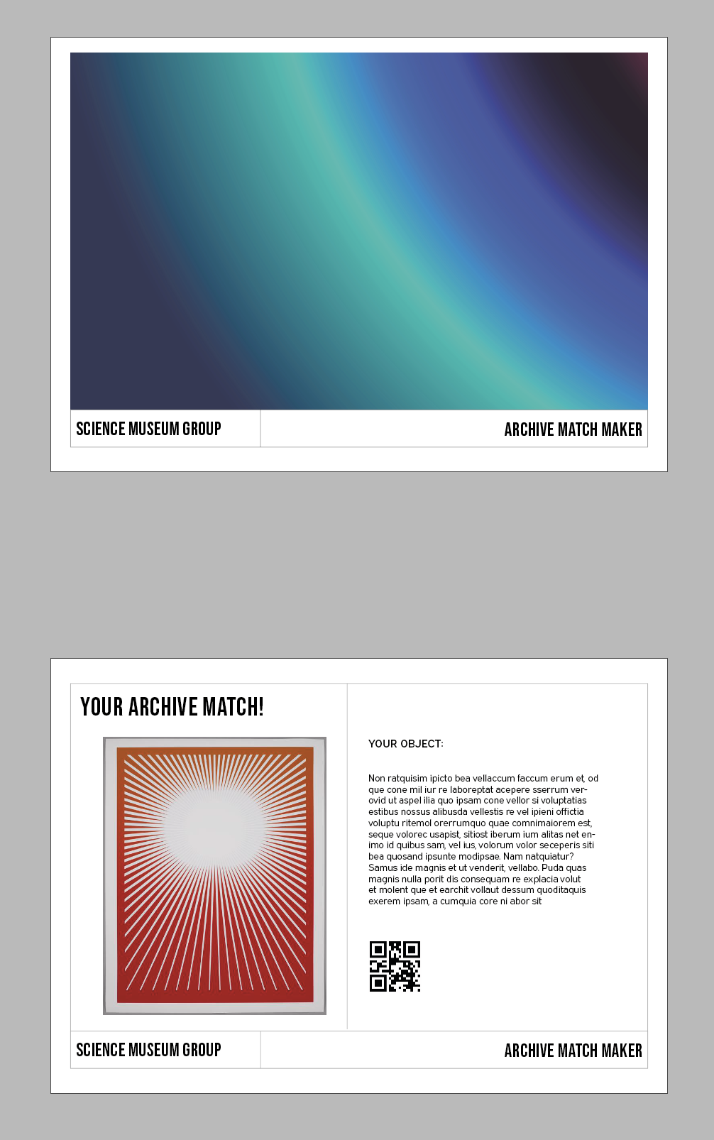
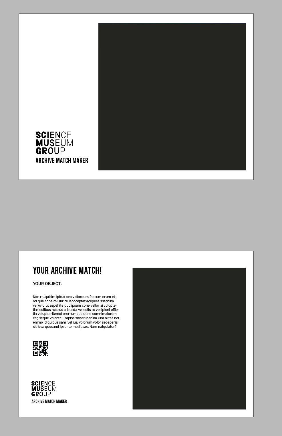
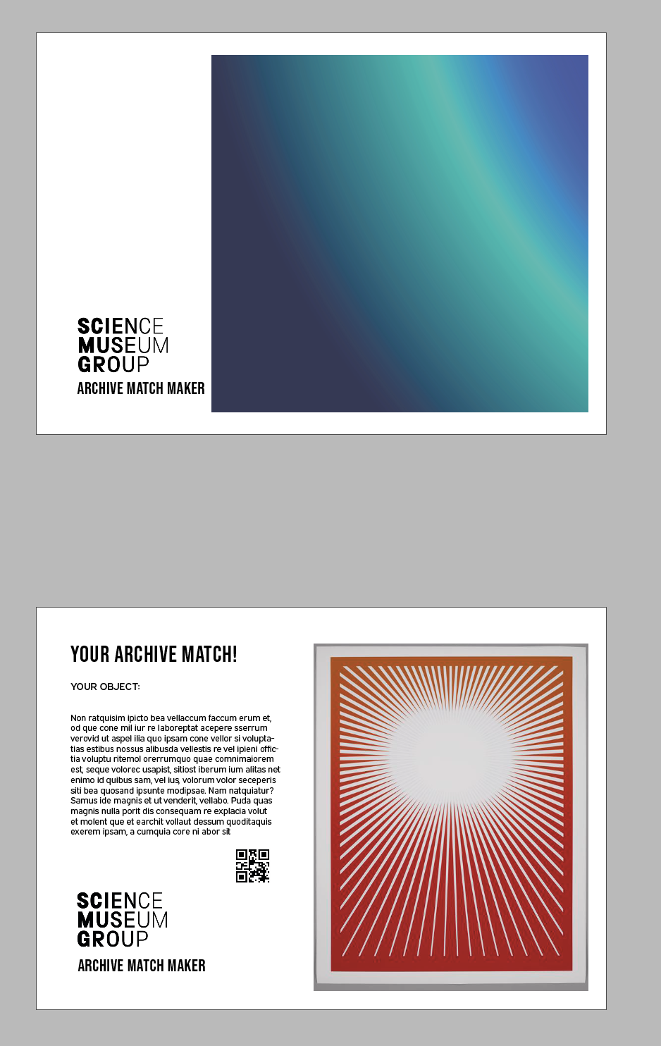
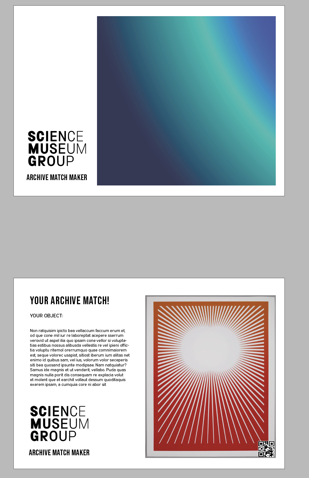
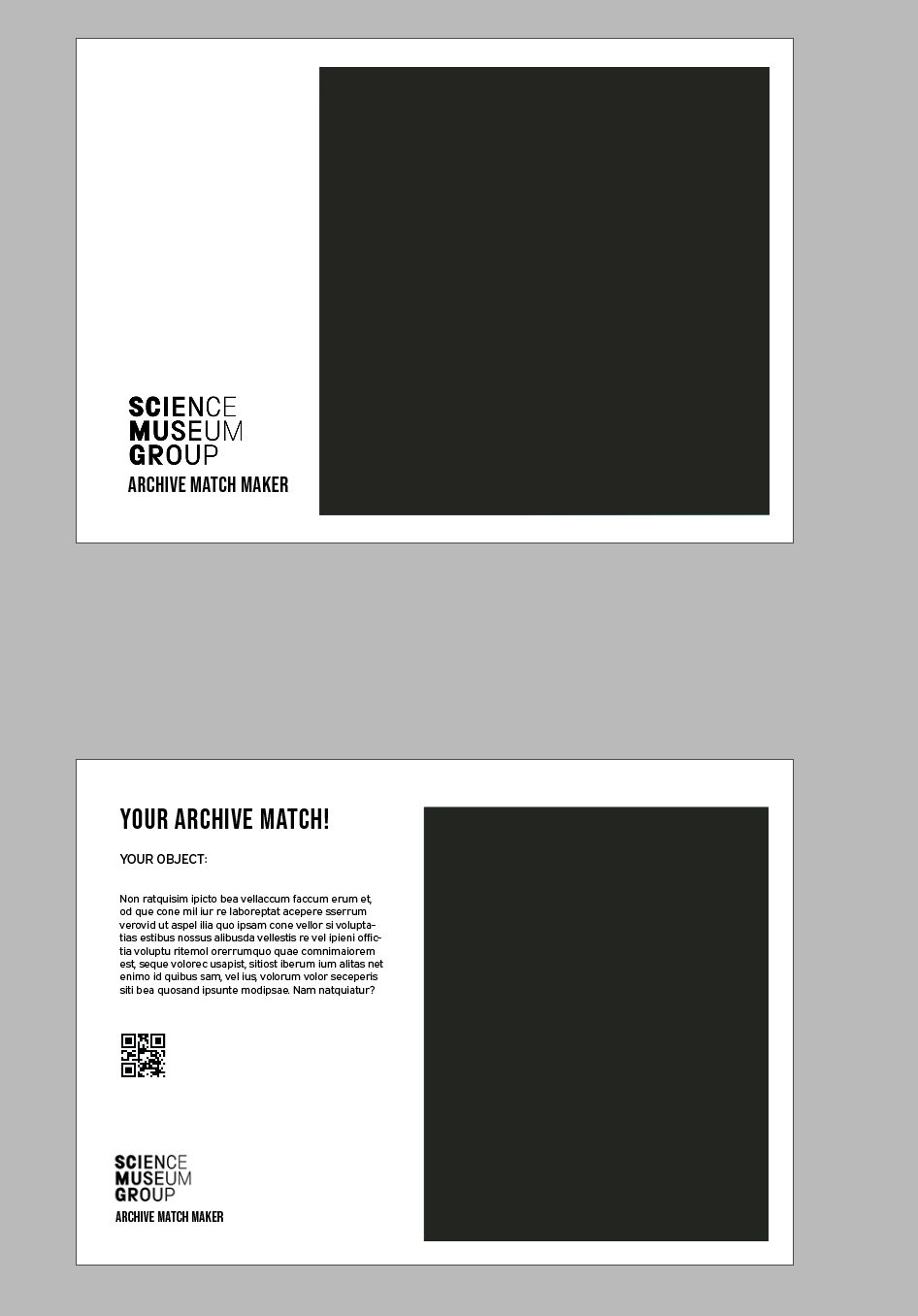
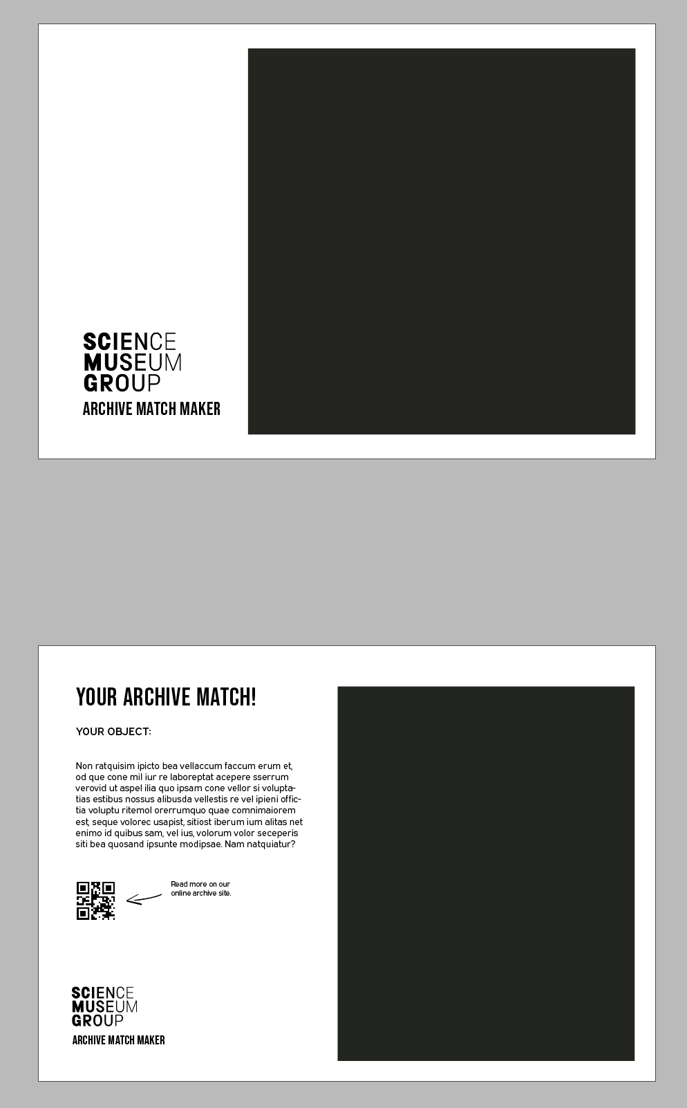
I started creating the layout for how the print out would look. After doing 3 examples, I wanted to start to create the different backgrounds for the selifes which would allow me to then see how the overall output would look.
I tried a couple different layouts before deciding on the final one - its simple but can easily be adapted depending on the objects.
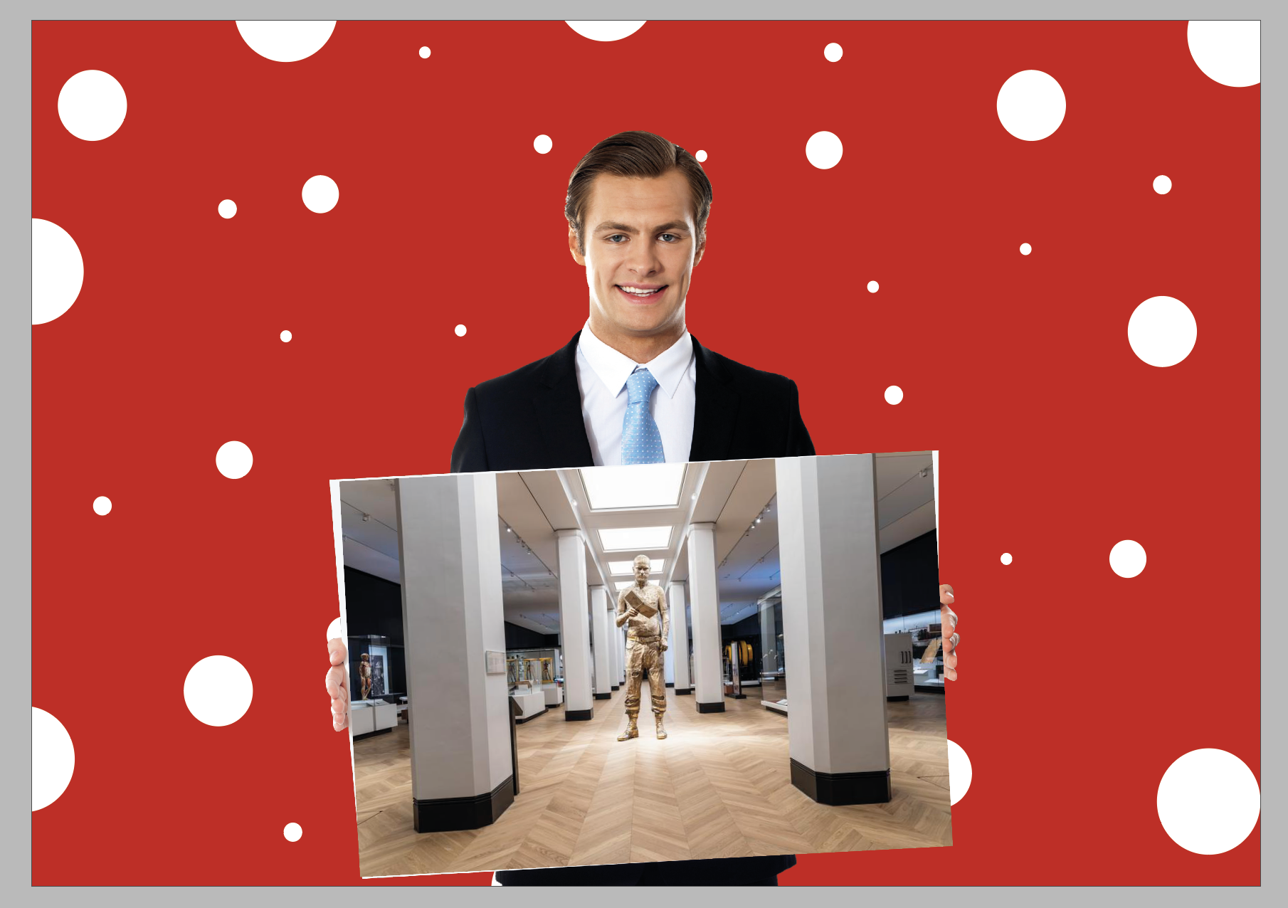
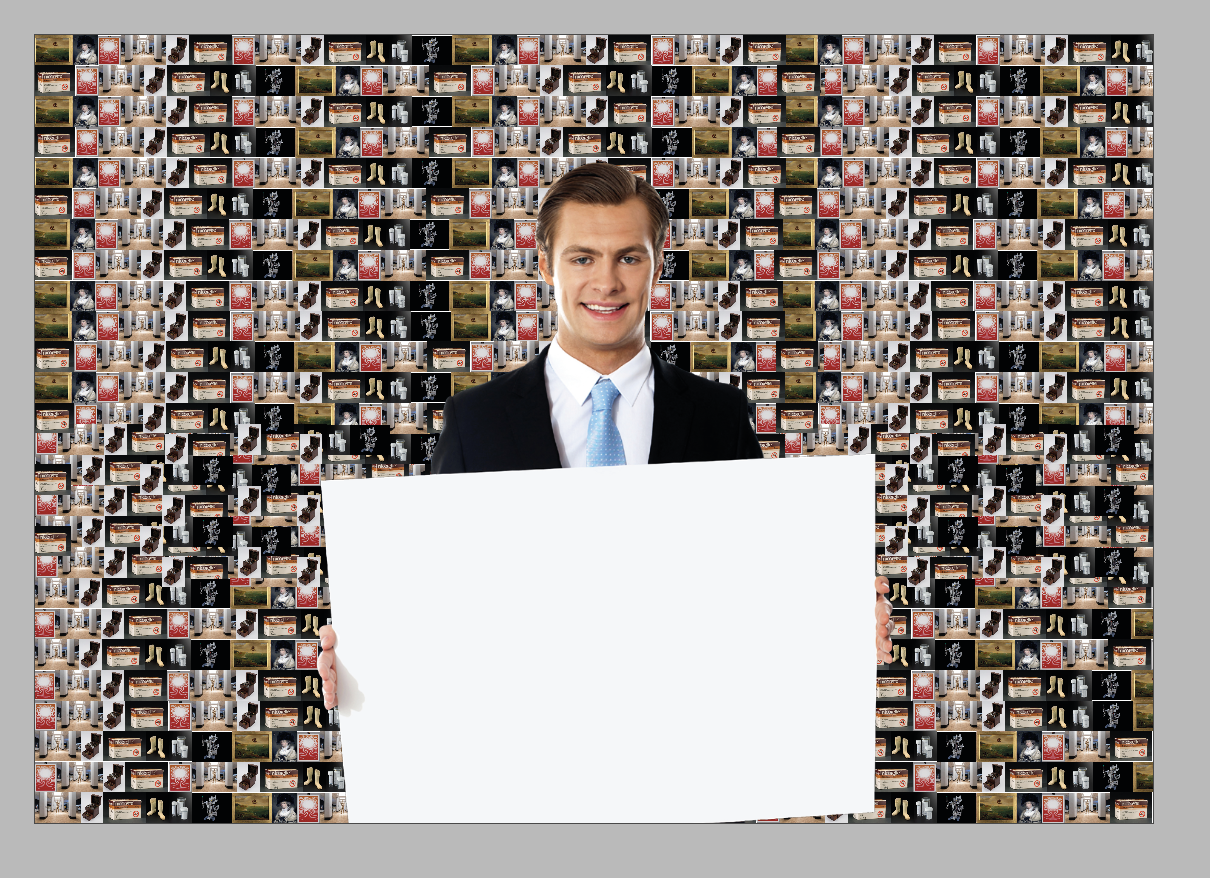
Designing the background for selfies
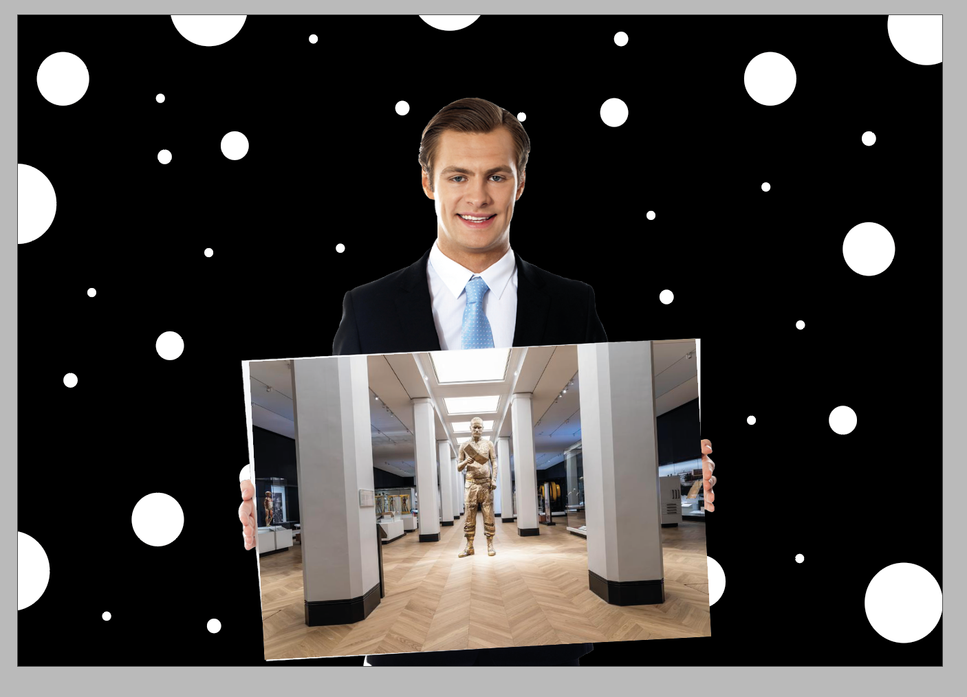
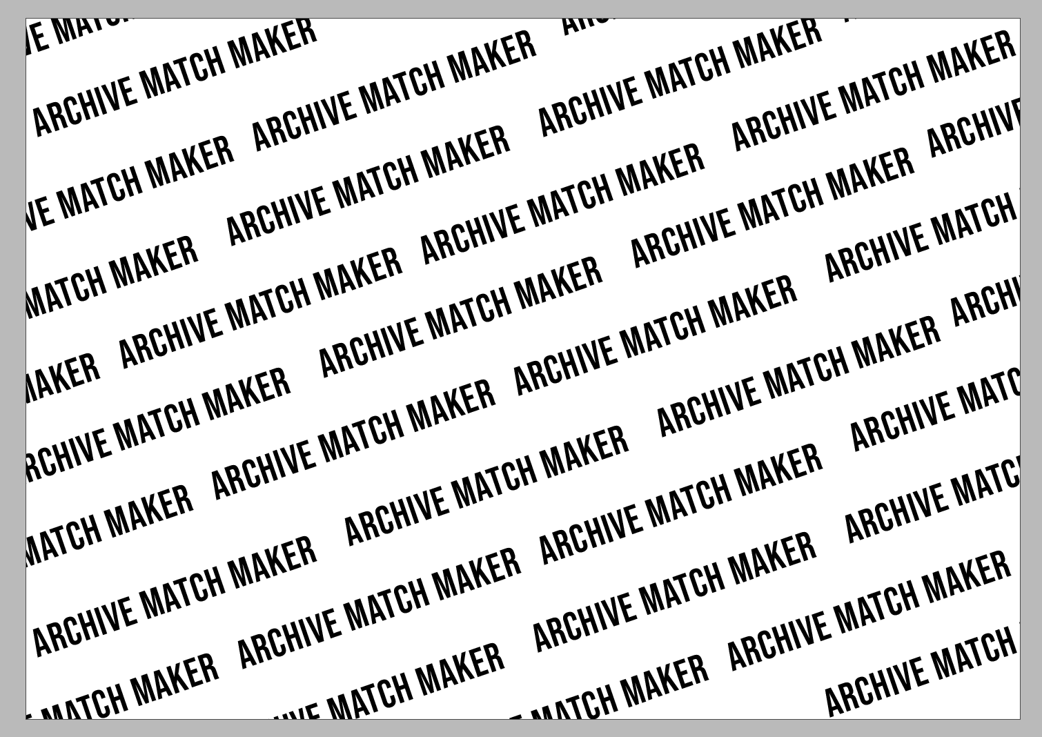
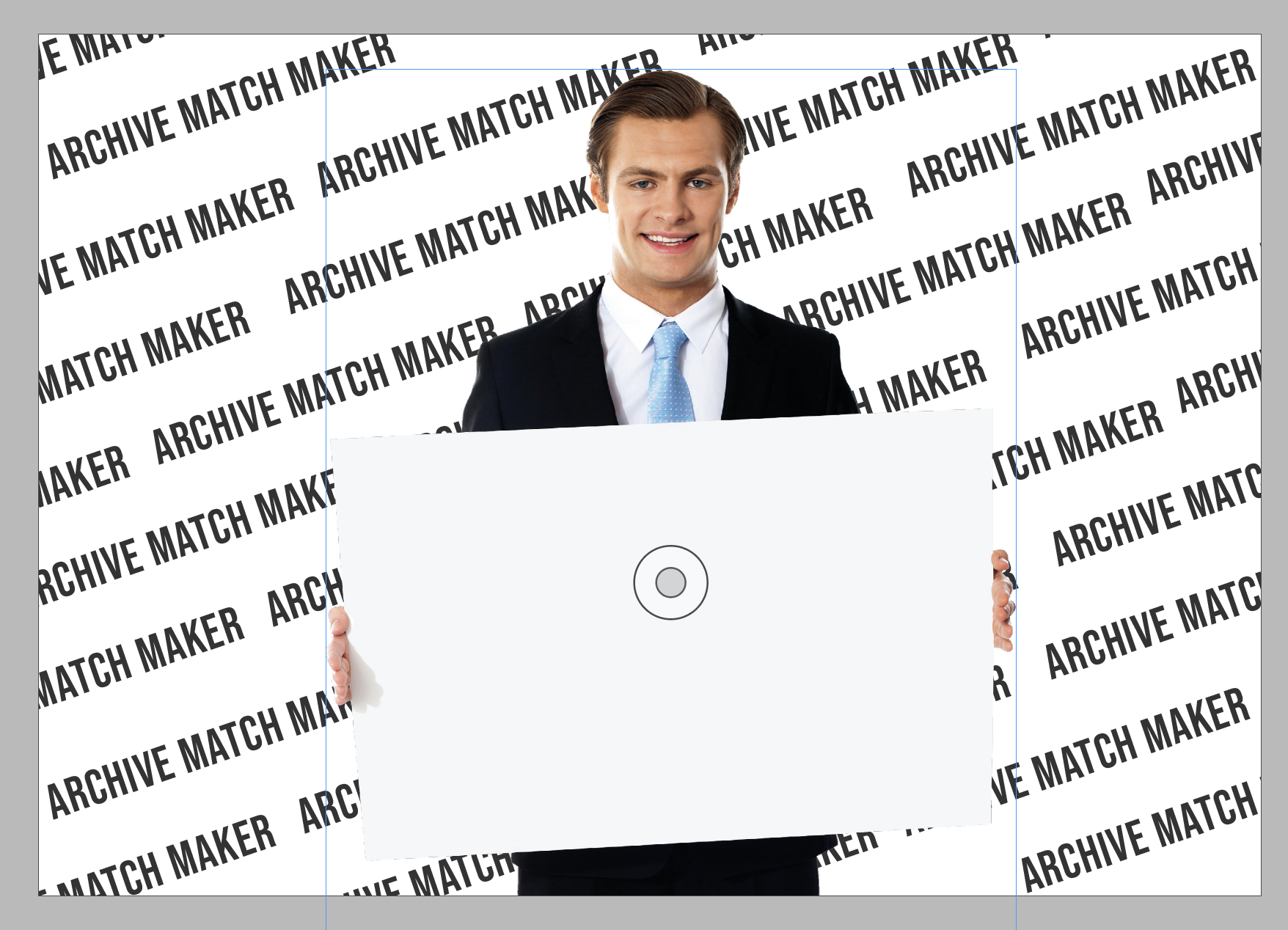
I began creating some super simple outputs for the background of the selfies that the user would be able to customise within the installation.
I tried some simple layouts from colour / space theme to others but I feel they need to be based on their category more than anything else. Potentially having one with just the black with dots and then the other background will be based on the categories:
Art -
Science -
After doing two, I decided that I’d prefer something a bit more plain and so more of the focus was on the person and the object that had been chosen.
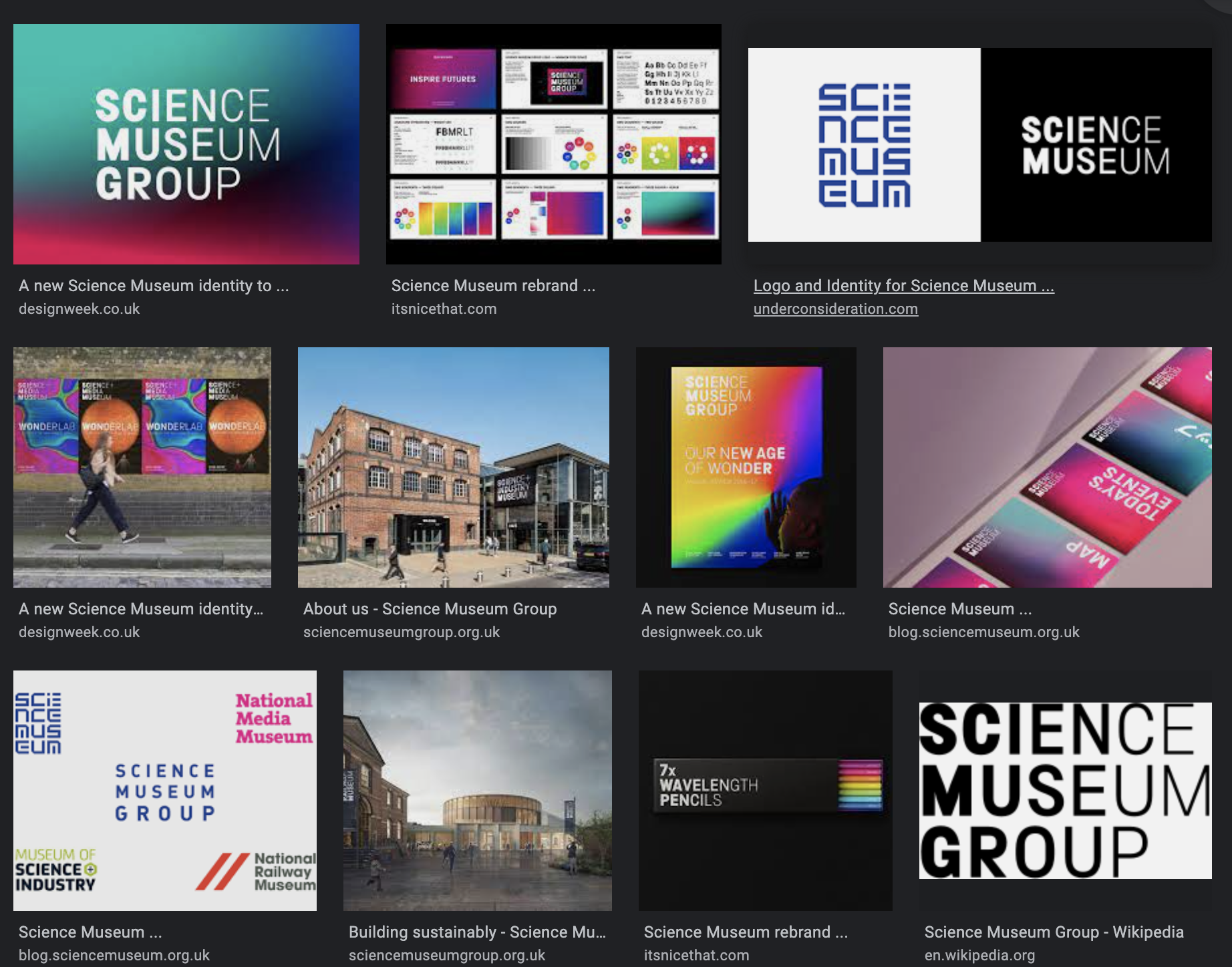
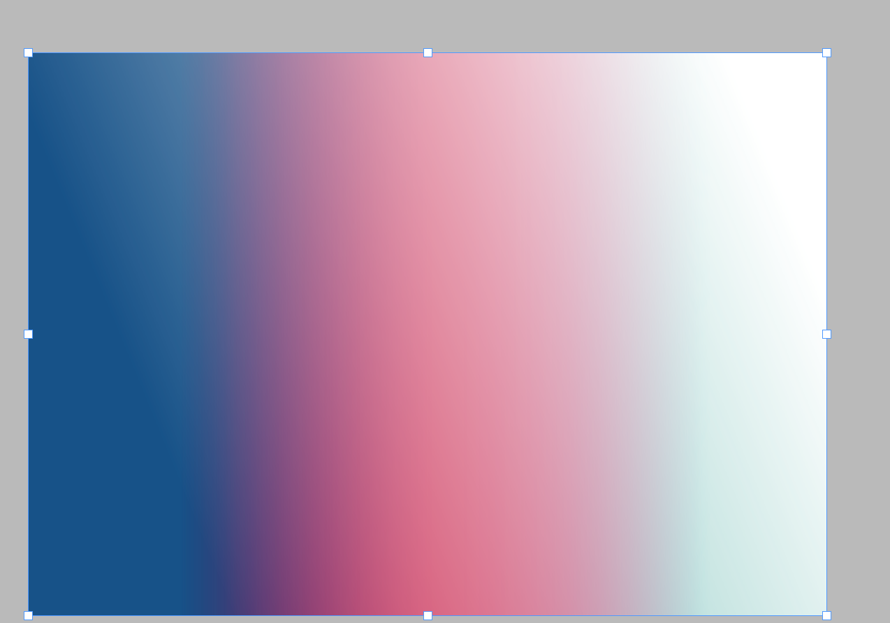
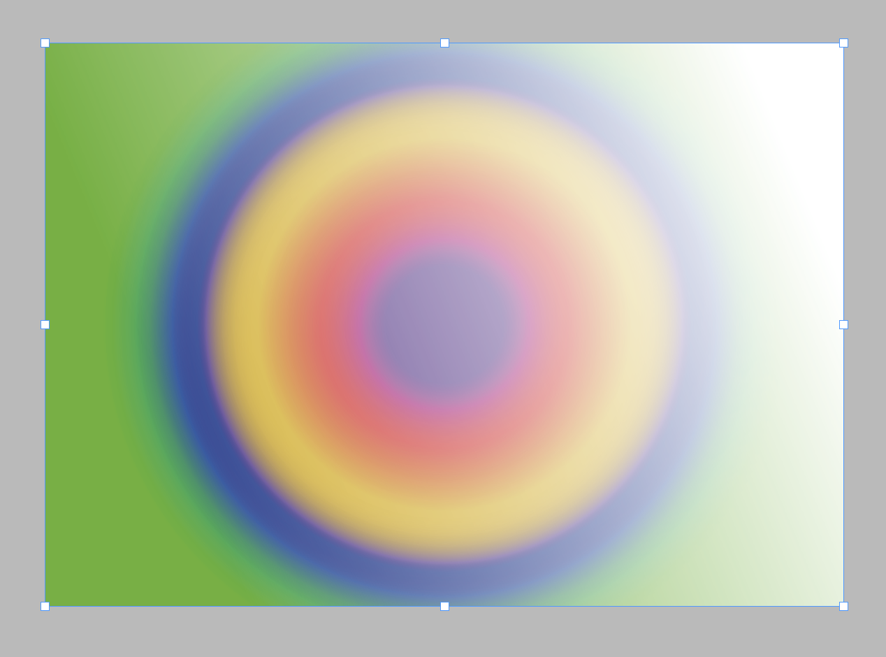
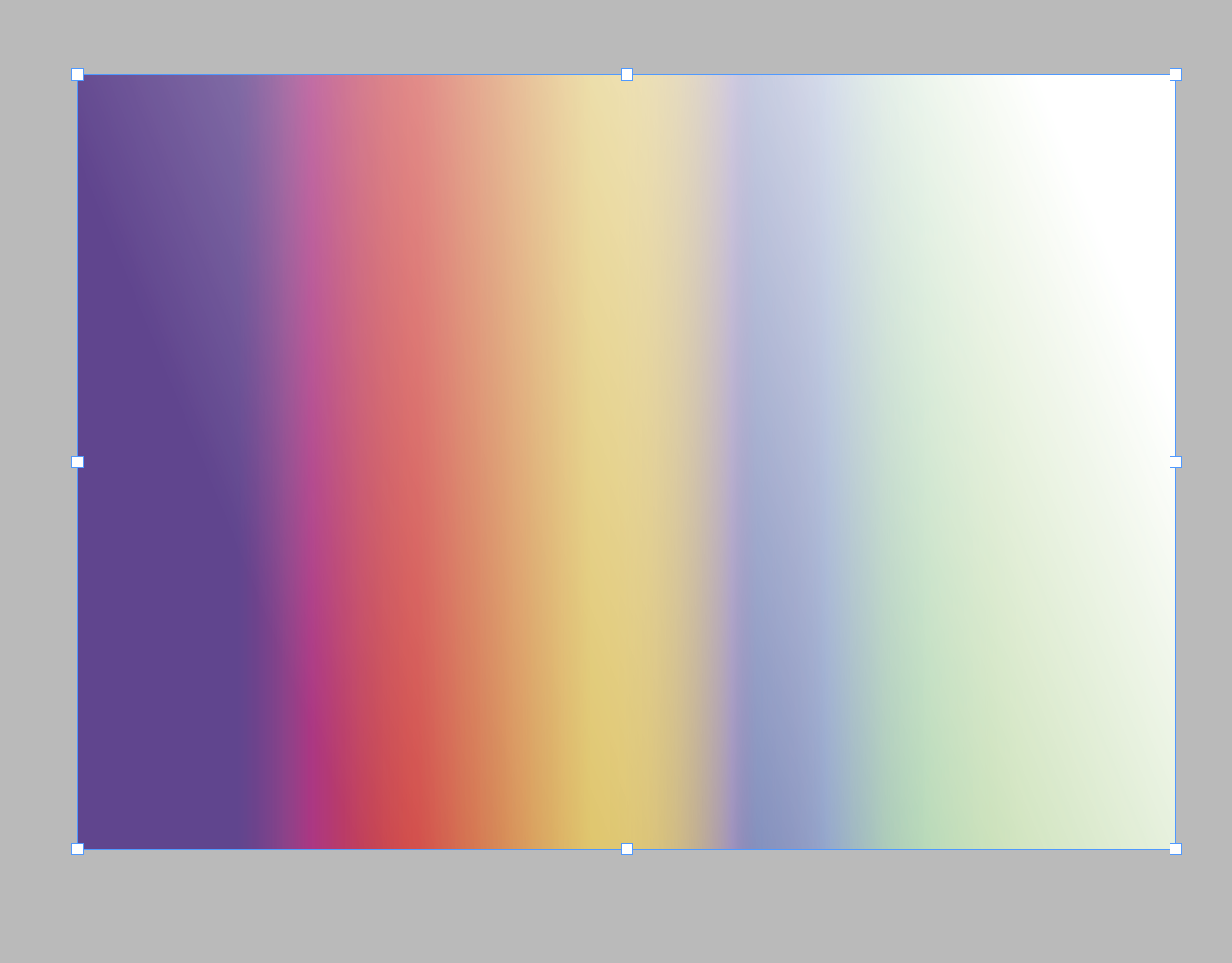
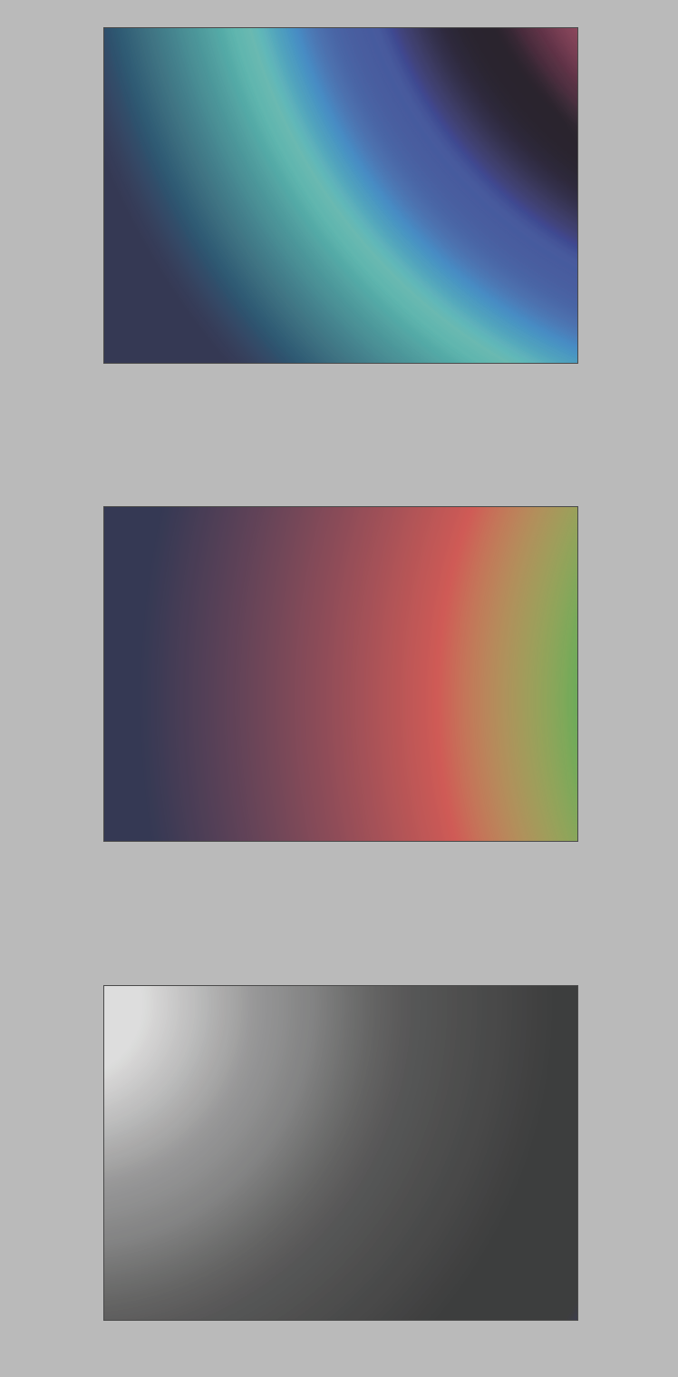
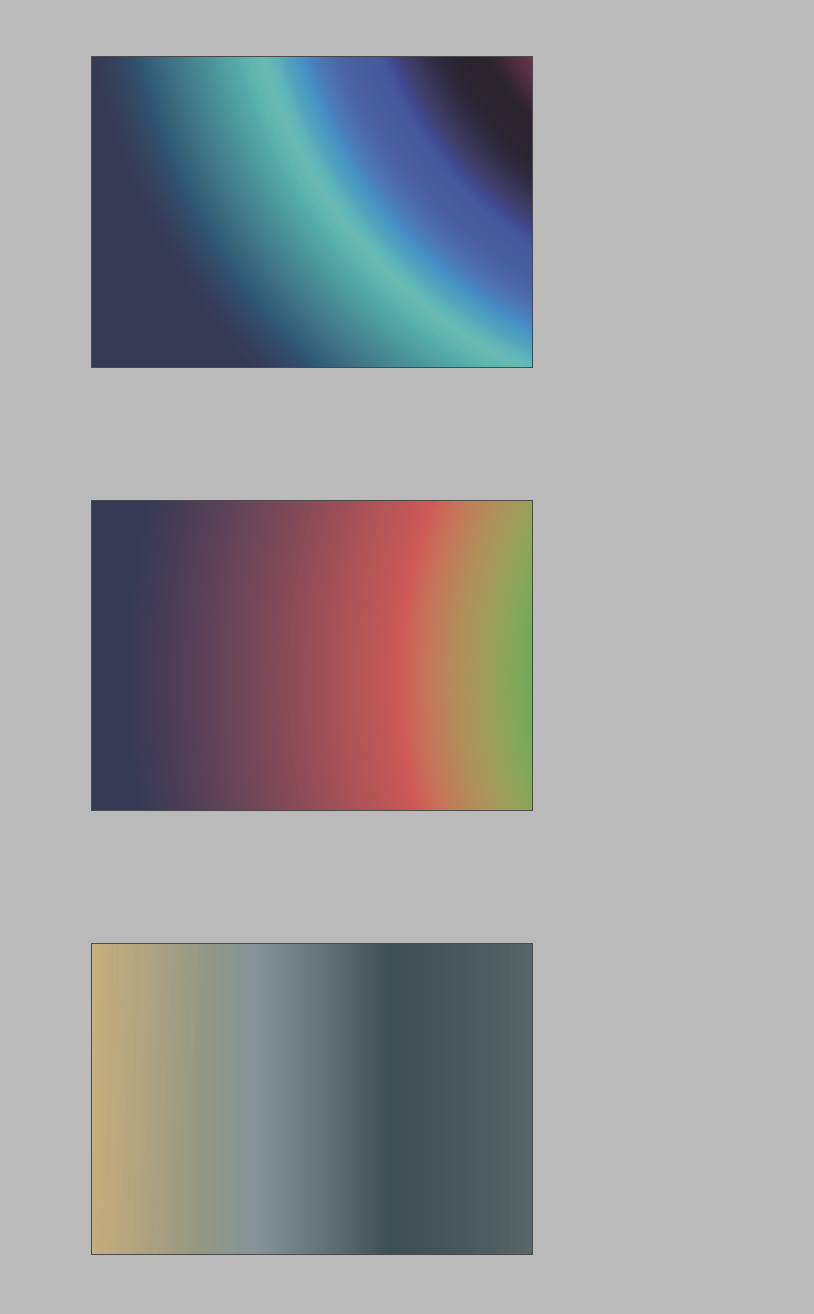
I was having trouble looking at colour pallets and layouts. I remember I had previously seen, brightly coloured used for the science museum group. I used these colour palletes to then experiment with creating different gradients.
These tests led me to final 3 colour ways which I thought would represent the brand nicely.
Refining Installation
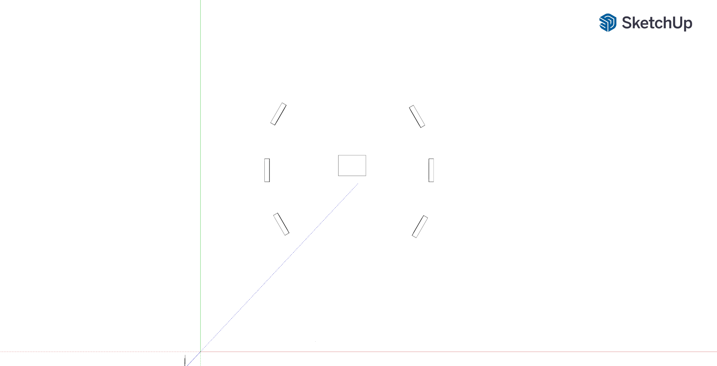
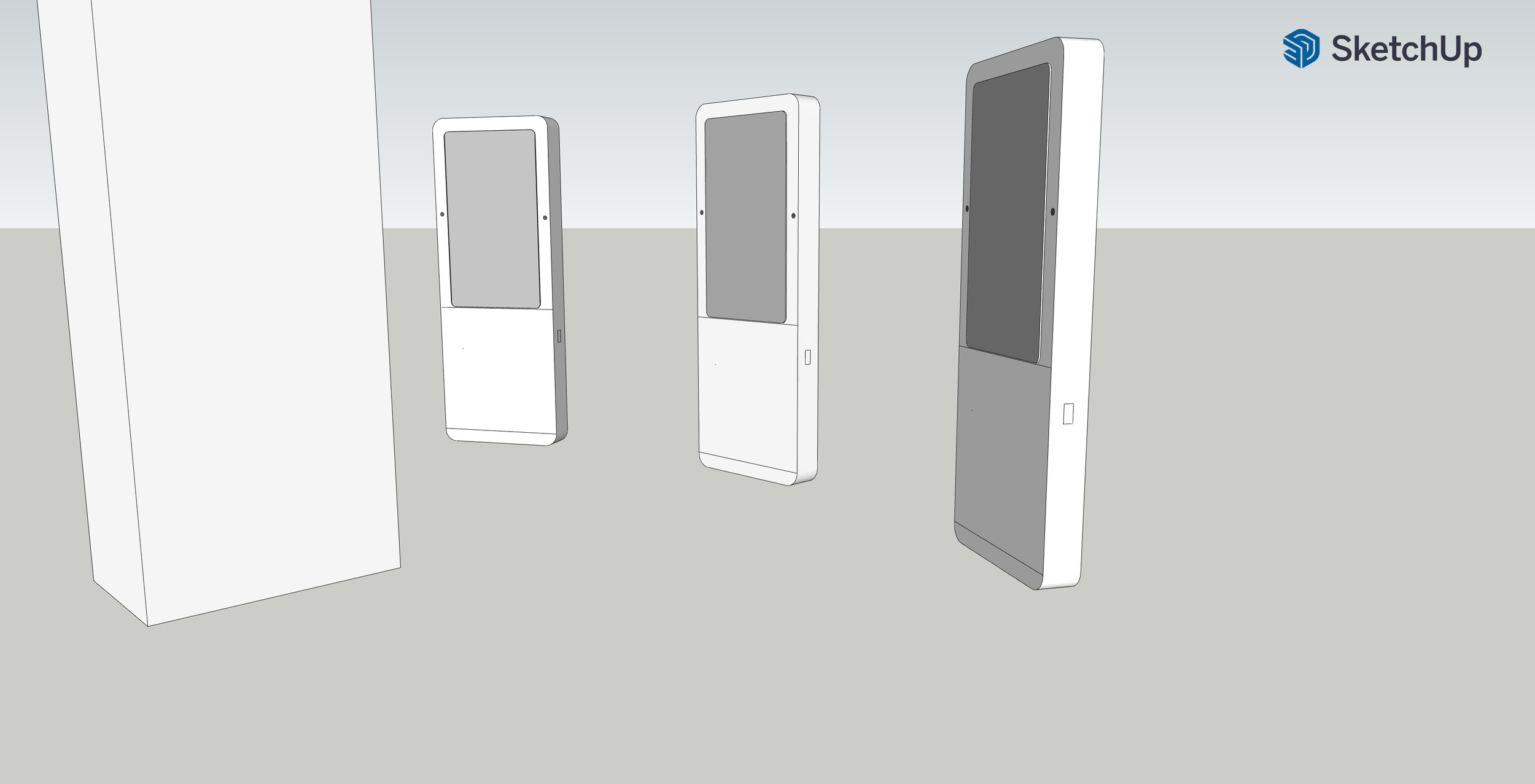
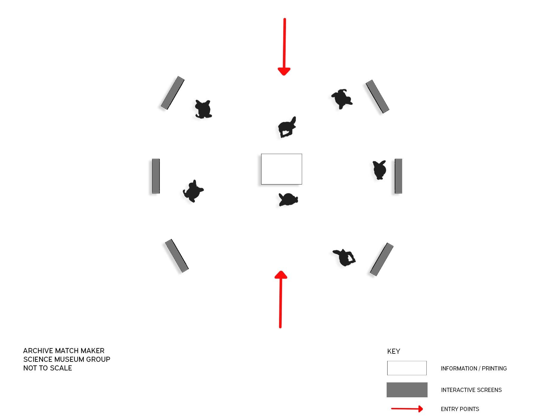
With the installation, I decided that I wanted something that would allow people to see other peoples results. But keeping it simple. 6 screens in a circle with information hub in the centre.
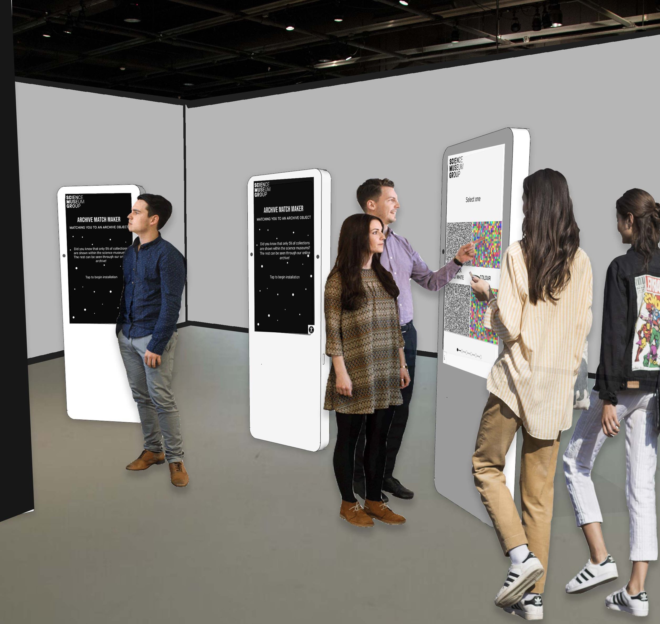
This is a sketch plan of the floor layout showing that people can access the installation from either side. I have also created 2 different visuals of the installation.
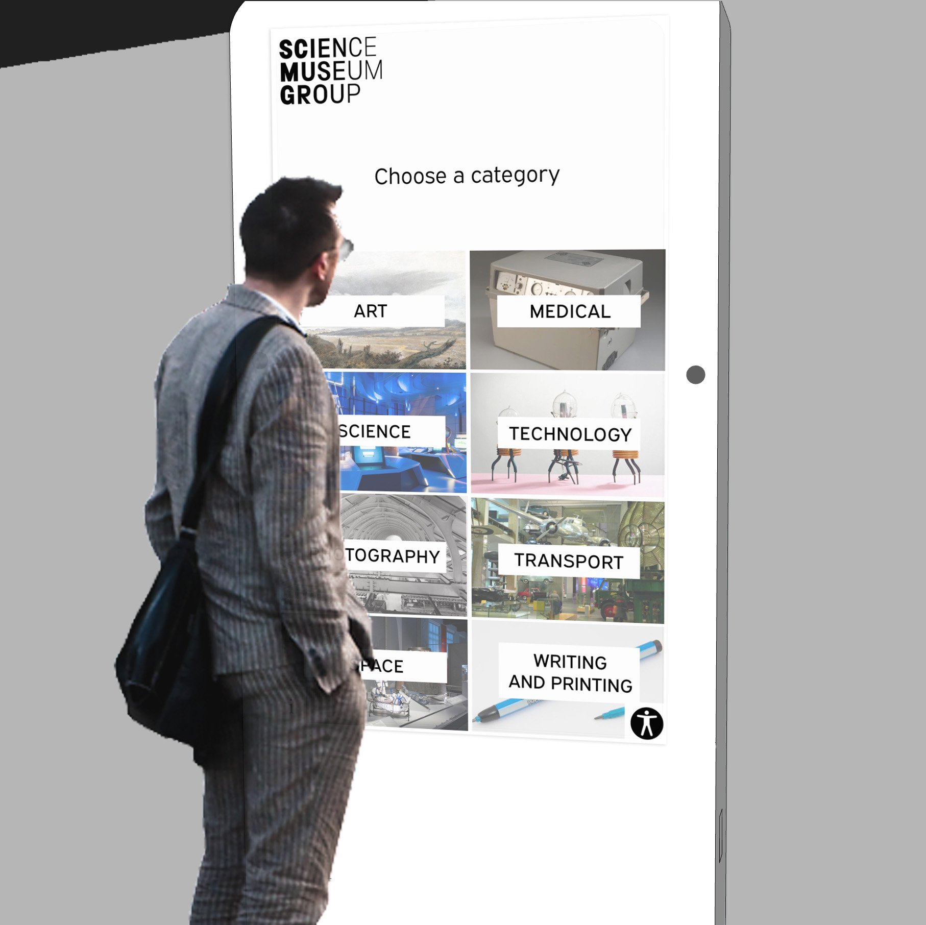
Visual one - Close up of the user
Visual Two. - all the screens together
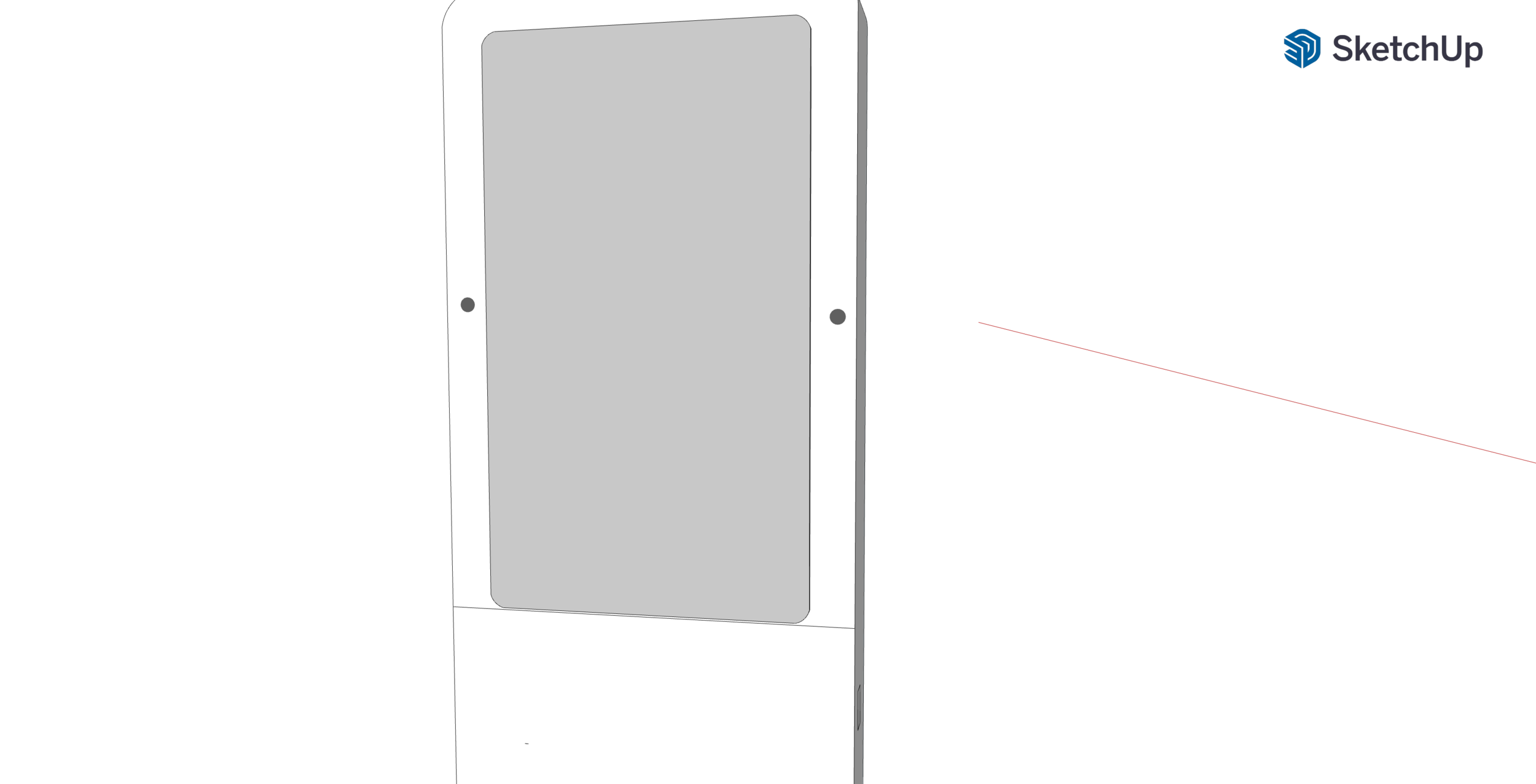
I did these visuals and something just wasn’t working for me with them. I created a sketch up model a quick one that I could then edit in photoshop so that all the proportions were correct. It also gave me a more accurate floor plan as I spaced out the screens.
I then went onto edit these in a similar way to the other images. Montaging on photoshop, I also added people to the floor plan and edited the colours and a key.
Weekly Reflection:
This week has really helped me to identify the final tweeks and touches to the final product of the installation. Feedback from my target audience who were a range of different ages and from different backgrounds, really helped me to understand how they are using the product and what they thought of it. Taking what they said into consideration, I feel that I have made a product that people will interact with and hopefully its right for the science museum group.
