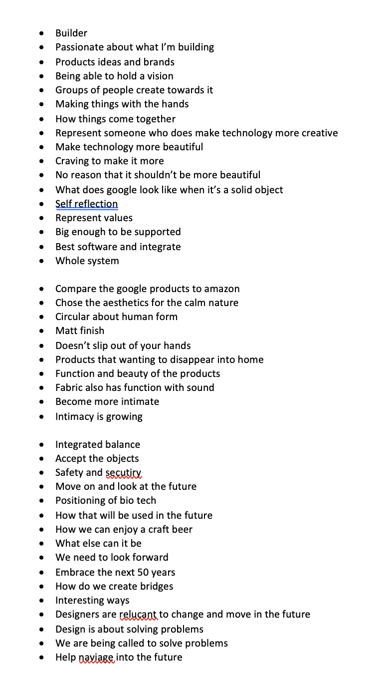
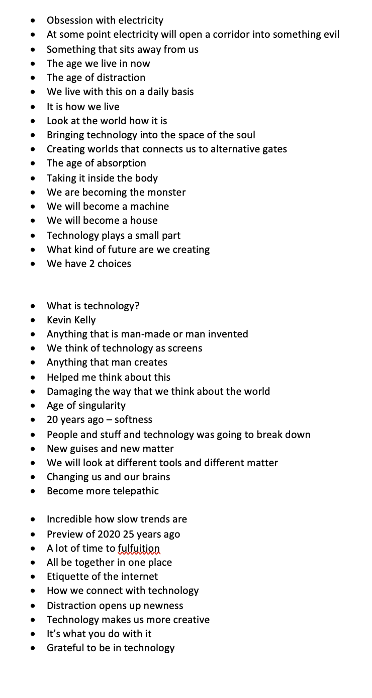
Week Seven
Lecture Notes
Lecture Reflection:
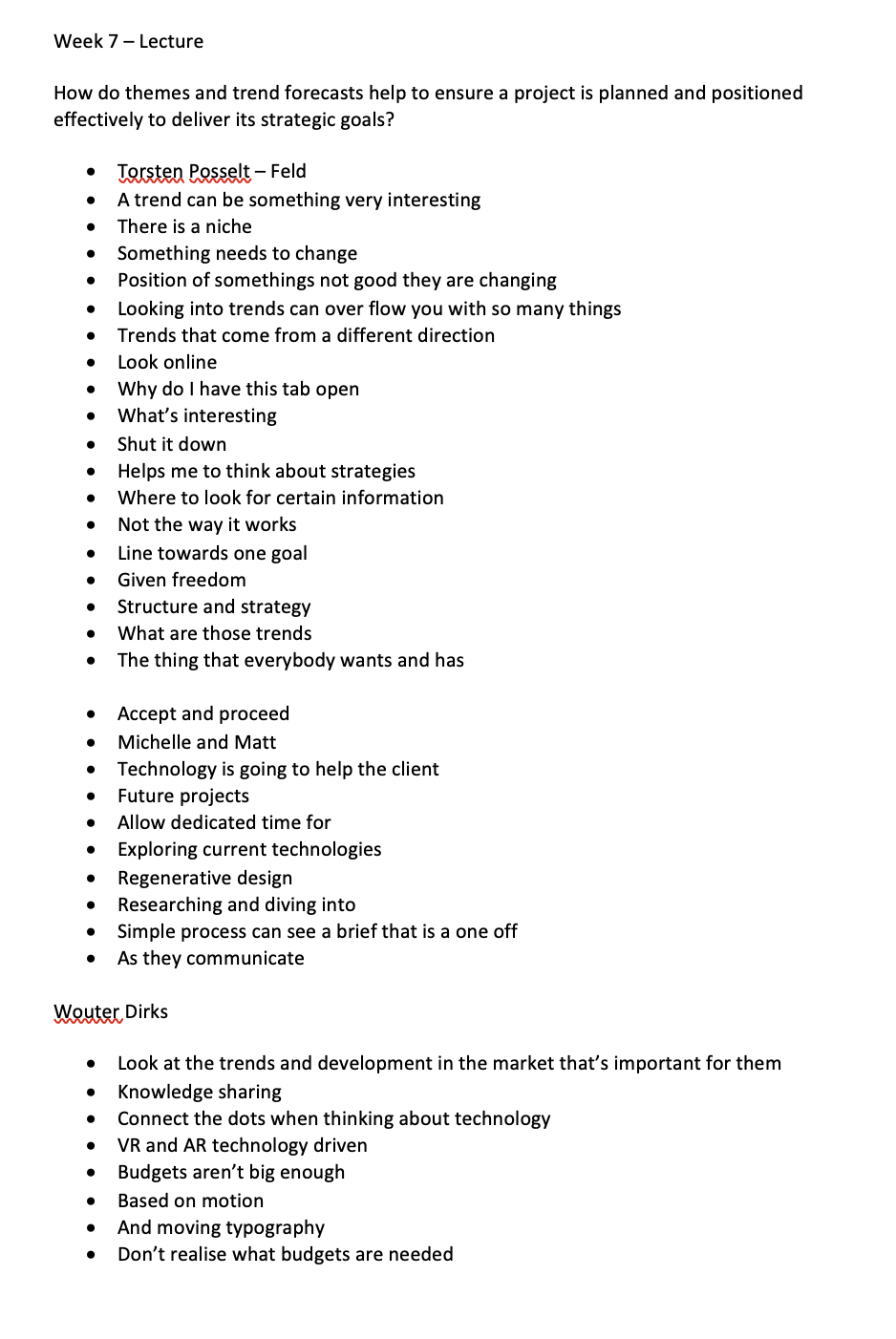
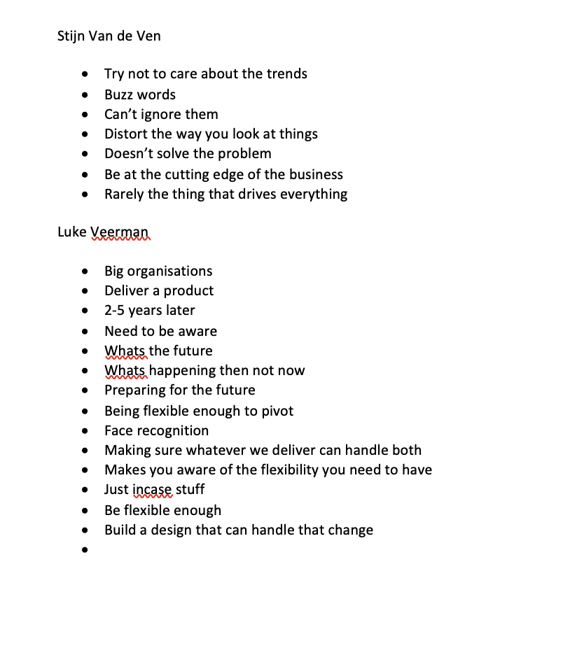
This week within the lecture there were really different approaches to looking at a plan for a project as well as the goals. Posselt spoke about how trends are from every direction, not just the area that you are in. Thinking about trends that are something that everyone wants and has. But Luke Veerman also had an interesting approach as. she mentioned that projects take time so we need to be thinking about the future projects and how long they will take but also what the trends will be in the future. We need to be flexible in design so we are able to pivot and build design that can handle change which i thought was a really insightful approach.
Resource Notes:
Resource Reflection:
R1
https://www.thefuturelaboratory.com/services/strategic-services
The future laboratory is a future consultancy. They have an intelligence programme, services, and strategic services which help their clients harness market trends and understand the consumer needs. I was particularly interested in their strategic services, which allows for growth and long term prosperity. They talk about how they look at human and data driven research to provide future solutions which allows them to stay ahead of the curve.
I then went onto look at a case study for the future of the workplace with an example of Nespresso. It looked at how the future of the workplace is changing and how the research that they have developed has allowed for them to understand what the workplace needs but also what they desire. They also have a lot of reports that you are able to get for free. I looked at the 2021 forecaster, where researchers have looked at the foresight of 5 key trends for 10 different sectors. Those sectors are the following; Beauty, Health and Wellness, Drink, Food, Travel, Luxury, Fashion and retail .
R2
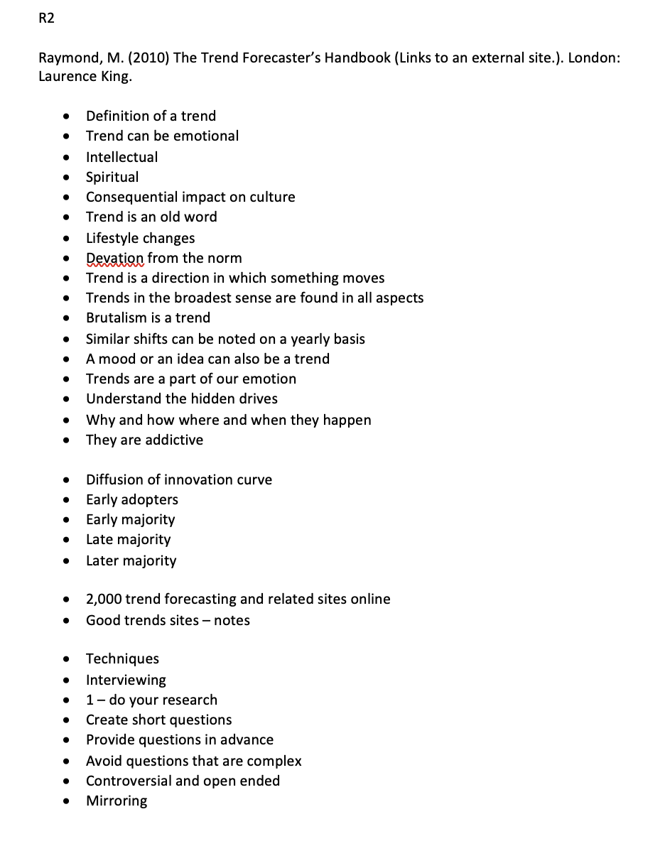
Within Raymonds book, the trends forecaster handbook there was a lot of interesting and useful information which focused around trends but also how to research towards them and how to ask the right questions. I was especially interested in the case studies that were within the main body of the text looking at chris sanderson and carston beck. Both of which are looking at future design and trends.
Within Chris sanderson, his business are broken down into visual and data researchers that explore different challenging events. He also speaks about how within presentations he makes sure that people are able to see things visually but also within a written form. Carston beck looks at more public sector organisations and how to map out situations before they happen, which is called criss cross scenarios. Looking at one very good, one very bad and 2 that aren’t so black and white which I thought was an interesting approach. They then look to see at what the impact is of these trends, which allows you to look at the facts.
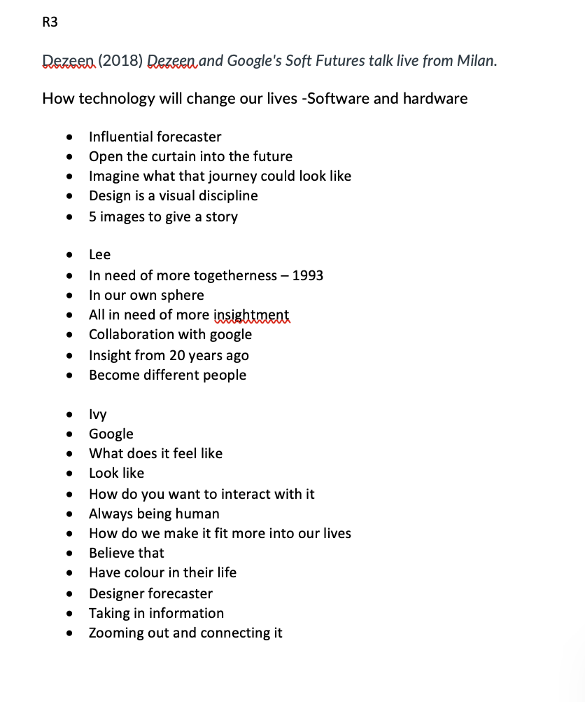
R3
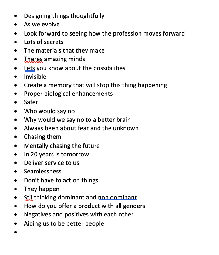
Within the Dezeen and google soft futures talk, the google designer talks through the new interactive google hub. When looking at out obsession with electricity, we once upon a time thought it was going to be something that was completely awful and horrible but now as we live on we are continuously bringing more and more electricity and technology into the world that we don’t find scary anymore. The reason that google went for a textured material for their product is that they look at the home and what people have in their home and saw they a lot of it was function and materiality. Which is why they went for rounded things which was more human and fabric. They discuss a lot of different things and how the future may change but what I was really amazed by was how there is an exhibiton that someone predicted what was going to happen 20 years ago and it has happened in 2020.
https://www.itsnicethat.com/news/yorgo-and-co-google-atap-jacquard-publication-digital-090721
Research:
positioning and trends: How can emergent themes, trends and moods elevate your project goals? How can trend forecasting help you speak to your target audience?
I went on to research some different articles that were available on future laboratory:
Youth and Media Futures: https://www.thefuturelaboratory.com/reports/2020/youth-media-futures
Although i wasn’t able to download the report exactly, I was able to get a grasp of what it was about within the overview and outline. It talks about how social media is getting smaller but also that the content that is being produced is going to user produced. Generation Z are uprising with their tech futures wanting to help the future without the limiations of the screen. There is analysis across 6 different trends, Hindsight, Insight, Foresight and Strategic Implications.
I went on to do some more research and found this article on the future forecast of youth and curator kids. Both these blog posts outlined how young people are navigating the information overload. A lot more people are creating digital content especially for tik tok.
From the google talk, I also found this really interesting article about the use of fabric.
https://www.itsnicethat.com/news/yorgo-and-co-google-atap-jacquard-publication-digital-090721
Google’s Advanced Technology and Projects (ATAP) is a team of engineers, scientists, artists and designers, working to turn new ideas into refined products which explore the way we relate to technology. The latest project looks at new digital experiences into everyday objects. They have created a book with the enhanced digital system as the cover, which contains “The interactive cover contains a complex digital system including a PCB, a USB connector, a piezoelectric disc, a battery, a white 3D spacer to let the LED lights shine through, and a layer of Jacquard touch- and movement-sensitive thread, which altogether creates the interactive effect.” I felt like this case study really followed on from the talk with google and dezeen, with the whole interactive technology aspect.
Workshop Challenge:
Research emerging trends and innovations that are relevant to your selected project and target audience. Add your research to the Ideas Wall and elaborate on your blog.
Create one clear positioning (mission) statement to outline your project goal and how you will address the strategy already outlined in your project plan. Your positioning (mission) statement should show evidence of how trends (and other emergent fields of practice) can be evaluated, to ensure the direction of your strategy is effectively aligned to your project requirements. Please ensure your approach is innovative, original and brings new insights to the given subject area. Upload your positioning (mission) statement to your blog.
Develop three different mood boards (with written captions) to contextualise your research into emerging trends and how they are appropriate to your positioning (mission) statement and target audience. Upload your mood boards to your blog.
Select one mood board and upload it to the Ideas Wall to gain feedback and record the feedback on your blog.
After last week of not really having a focus for my project, I wanted to do more research about different directions that I would be able to take the project in. I thought this would then help me later to research different trends and write the mission statement. for this week.
So last week, I wrote my focus as looking at the combination of physical and digital coming together, due to my target audience I didn’t want anything that would be too educational for the ages 18-30 but also not too focussed on stem but more the enjoyment.
https://www.mobiquity.com/insights/the-future-is-phygital
The above article looks at the customer experience of phygital, which was created during the pandemic when there was a shift with the way that everyone was working. To improve the customer experience with phygital, to create this immersive experience. The future of phygital, is to continue to combine the digital and phsyical to continue enhancing user experience.
Over the following, I have linked some pages which I thought would be interesting to see how other projects have focussed but I have also left some links to touch on next week if needed.
Wayfinding
I looked at the physical storage space which was designed last week to keep things in order within the archive facility. The larger items are housed on the large open space with the colourful grid which was designed by Sam Jacob studio. The floor system looks at housing the items effectively. Helping people find their way around the space. This is an example of how the physical and digital spaces work together to create an overall wayfinding technique.
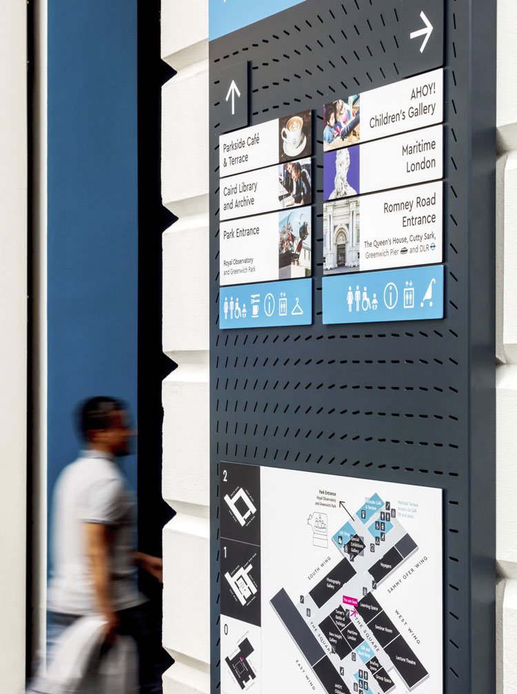
Within the case study with the maritime museum, CDD Design wanted to make sure that “We wanted the wayfinding system to promote access to all the galleries and to be engaging and accessible.” They used grey colours which was influenced by the the boat aspect of the space. They wanted to encourage exploration of the space by not having a prescribed route. This was an interesting wayfinding side to the overall design of the space.
Interactive Design
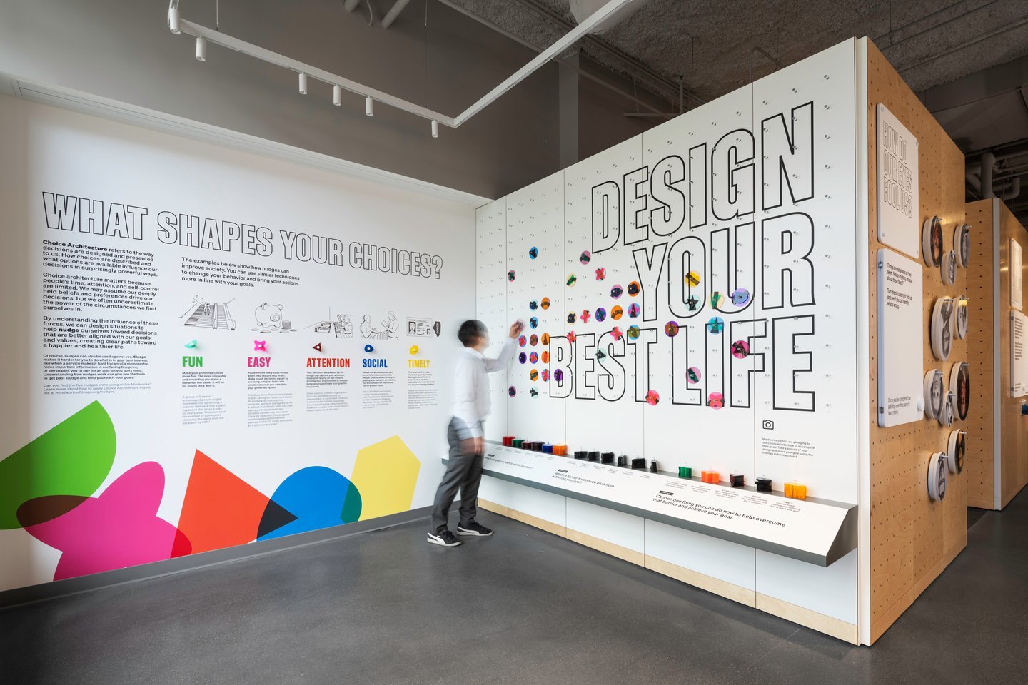
Interactive design, I initially thought of this when thinking about the physical and digital, having a space that would allow people to interact which often can make the experience more memorable. This example of an interactive design by Giorgia Lupi, Abbott Miller and Luke Hyman looks at the first interactive museum and working lab dedicated to behavioural science. Lupi has designed a series of interactive experiments that allow visitors to playout the behavioural science. Many of them are based on nudges. I love how interactive this space is, all of it is based around the user and their own preference and its a perfect example of how interactive design can work.
https://www.itsnicethat.com/news/pentagram-mindworks-the-science-of-thinking-graphic-design-090821
https://www.designweek.co.uk/issues/11-17-january-2021/design-in-2021-interactive/
Installation Design
Installations I have always thought are an interesting way of looking at how the physical and digital can come together to be combined. This could be in a way that looks at physical pieces but then uses technology to look at it in a different light which would also link slightly to interactive design.
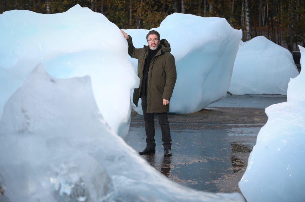
This example of an installation design was done by Olafur Eliasson, where he brought icebergs to london to show the devastating effect of climate change. This allowed the public to visually see what they are doing and the effect that it is having on our planet. This gave more of an impact then someone just reading about it or visually seeing it, they need to experience it.
https://news.artnet.com/art-world/olafur-eliasson-ice-watch-london-1416811
https://www.tate.org.uk/art/art-terms/i/installation-art
https://www.designweek.co.uk/issues/13-19-september-2021/va-ldf-installations-2021/
Storytelling
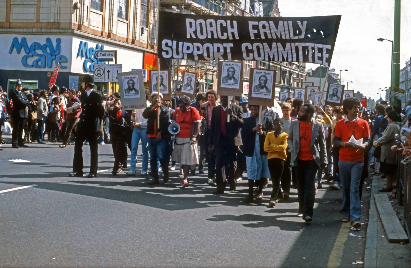
I was also really interested in the black music archive that was created within this video for the Tate, they spoke about how they wanted everyone to be able to access the archive, so they took over a tube station which allowed people to come down and tell their own stories. This shows how easy it is to have something that is so accessible for everyone.
Within the Tate video, it spoke a lot about how important story telling is and how important the stories are within the archives. I then found this article which was helpful on how you are able to tell those stories.
Within the below article with the national archive, it talks about how the national archive has launched on social media to help the outreach. “Archives bring meaning to and enrich the lives of so many people in so many different ways; to engage with, provide meaning to and connect with these audiences requires us to go beyond the gallery of digitised content. We need to tease the stories out, present the material in new and creative ways and re-imagine collections, showing off the potential they have. As archivists, one of the ways we can do this is to create digital stories.” I really like how they explained how archives can bring so much interest to other people aswell as the following ‘However, archives services tend to be short of time and resources, and often have bigger plans for collections engagement than they have the capacity to fulfill. However, with outreach, no effort is too small. A simple tweet is enough to start a conversation. Or to go viral.” Which really shows there are many different ways to tell a story online.
https://blog.nationalarchives.gov.uk/digital-storytelling-outreach-archives/
https://www.creativelivesinprogress.com/article/natalie-kane
AR
Another way of looking at the combination of the physical and digital but also the notion of story telling is looking at using something like AR, this would then allow people to view and see the museum online without having to be there. This would then allow people to walk around the museum, explore different archives but also you are able to add a lot more information that you would be able to fit within the museum itself.
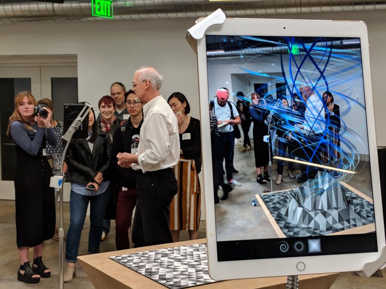
The following case study looks at how designers are now able to use AR as a tool to aid them in their working process. Adobe has launched a software called Aero, which allows virtual objects to be placed into the real world. I think this shows the endless opportunities that there are.
Offline
Taking it offline completely, I did have the thought of what if the archive wasn’t online at all and there could be this physical outcome that people could look through or have a copy off.
An example of how this is possible through archives can be seen within this project. Rio Cinema Archive is releasing a book which looked at a project in which young people were taught how to document daily life. The photos that were taken feel very rare and special to the area, they have been placed on an instagram account but a book is being funded. This just shows how something so special can be physical and digital.
https://www.itsnicethat.com/articles/rio-cinema-archive-photography-publication-110620
Narrative
There is also another way of looking at it all and that would be making sure to design something with a narrative. This can be seen within this article which I have looked at before in a previous module:
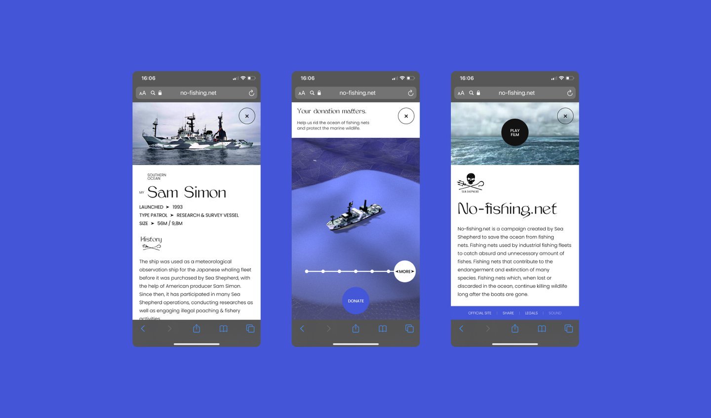
The article talks about how to design a website with a narrative. You want the story to come across and to come through which will enable the user to follow the story for the experience. Nicolas Rajabaly from makemepulse, talks about how “strongly that interfaces convey not only information but also emotions – similarly to imagery, animation, copy, or music. At the same level of importance as the other creative streams, we spend a lot of time polishing our interactive experience interfaces with consistency and personality.” I love the way that make me pulse approach all their projects with trying to get the best experiences for the audience as well as making them interesting.
https://www.itsnicethat.com/articles/double-click-march-makemepulse-digital-300321
Mindmap
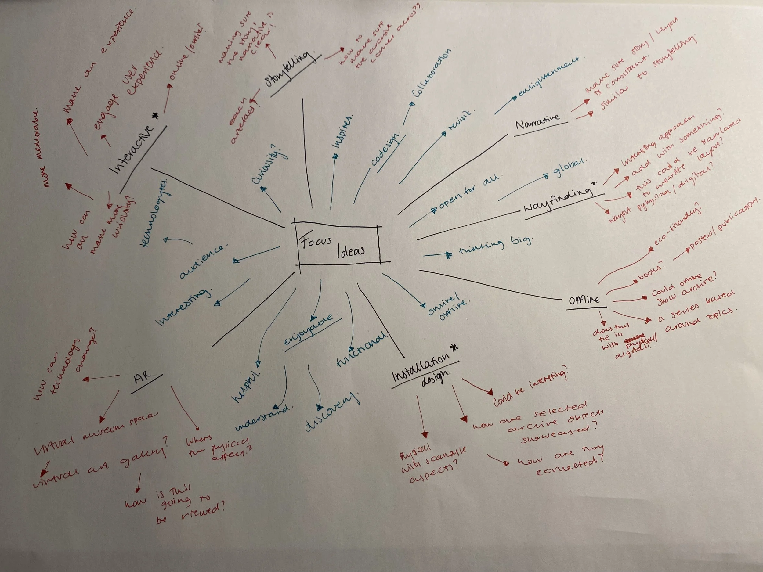
After this I was worried that a lot of them weren’t necessarily a focus but a concept. I went along with it anyway and decided to a mindmap of ideas:
Narrowed down:
I then narrowed this down to the concepts that I was most interested in:
The concepts were:
Interactive:
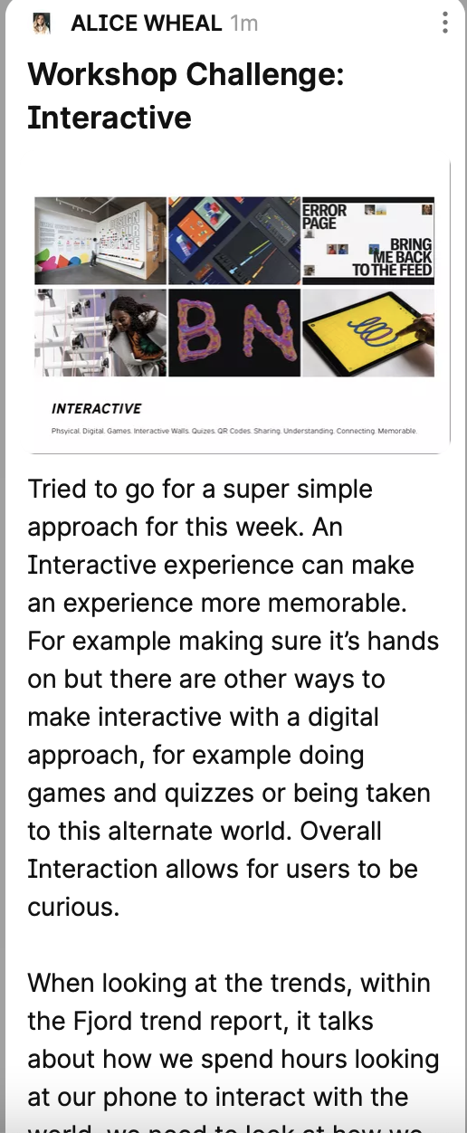
As outlined above with the example with Giorgia Lupi and the behaviour science museum, I think that an interactive experience can make an experience more memorable. For example making sure it’s hands on but there are also other ways to make it interactive with digital and physical. Allowing users to explore their curiosity.
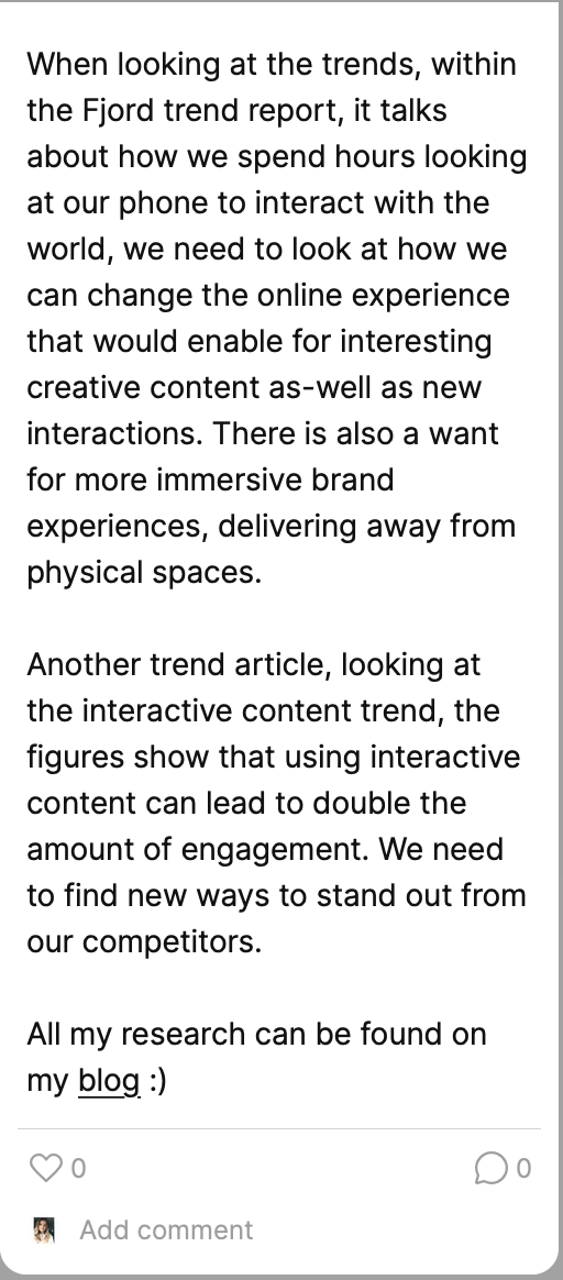
When looking at the trends, within the Fjord trend report, we spend hours looking at our phone to interact with the world, we need to look at how we can change the online experience that would enable for interesting creative content as-well as new interactions. There is also a want for more immersive brand experiences, delivering away from physical spaces.
Within the following article, it looks at the interactive content trend, the figures show that using interactive content can lead to double the amount of engagement. We need to find new ways to stand out from our competitors.
https://www.weareframework.co.uk/pinboard/digital-trends-interactive-content-use-is-growing-in-2021/
Installation:
With the installation, It is clear that this can also showcase parts of the archive which users would be able to learn about and interact with. I feel with installations there is a lot that you are able to do, as i said with the interactive part, I feel with installations this can be ever changing and memorable.
When looking at the trends, within the Fjord trend report there says that there is a move away from physical experiences such as installations, but i wonder how this would work for physical installations. There is a need for new experiences online and looking at how to connect to other people once more.
There are a couple examples in the following that looks at examples of installations spaces, but it might also be worth looking at some online installations too.
https://designwanted.com/tag/installations/
Way-finding:
As seen within the science museum group, they have organised their archive space with colour thanks to a graphic design studio, within this it is a way finding technique. I also looked at how this could be implemented digitally and physically to make sure the space is easy to navigate around.
When looking at the trends. within the Fjord trend report, way finding could also be looked at reconnecting people together and how many people have reformed new behaviours. There is also this need to redesign interfaces that allow for ease of access for customers and users of different platforms that keep them interested and active.
Within the article below, it looks at some of the signage trends for 2021, this includes the need for way finding signs that will allow for ease of navigation through a space. There is also a need for personalisation and innovation, where people are becoming over stimulated with the same advertising and signage techniques. The final trend is minimalism and simplicity, people are wanting more and more simple modern signage.
https://www.gregorysigns.com/top-3-signage-trends-to-look-for-in-2021/
Trends
I then did some research on trends which will allow me to speak to my target audience more:
https://www.ghd.com/en/perspectives/ten-emerging-trends-shaping-our-new-future.aspx
Within this Trend Article with Kumar Parakala with GHD, it looks at more of the business trends and how this is going to change the future. Within 2021, the business scene has changed with alot of people staying at home with the pandemic, this has had positives and negatives but I wanted to look at more about how people were thinking.
The first trend is globalisation, which is being redefined. this talks about how people are changing their business models. The second trend talks about acceleration of digital transformation which we all saw coming anyway. The third looks at an on-demand workforce, forth looking at how the healthcare is changing for all of us. Seven looks at ups-killing and reskilling some of the priority with this comes change of work habits which could change the area surrounding. There is also talk of rapid innovation to keep up with the changing world.
This article was helpful to get the key information about the trends that were happening, but i didn’t feel that this directly related to the topic that I was looking at.
https://www.accenture.com/us-en/insights/interactive/fjord-trends
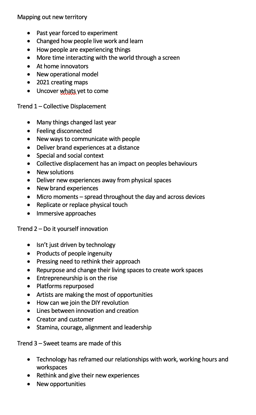
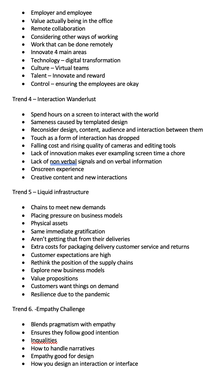
Within this other article looking at Fjord Trends by Accenture, I thought this article was more directly useful than the previous. Within the article, the notes can be viewed below but there were a couple areas that really stood out for me, obviously times have changed over the last year with the pandemic, this has meant that a lot more people are online and connecting digitally and using technology to do so.
This has meant that brands are needing to look at how to deliver experiences away from physical spaces, this could include immersive experiences that would replace the physical touch. There is also an aspect of DIY innovation, which looks at how we are doing alot more ourselves and repurposing, brands need to make sure that they understand the lines between innovation and creation, customer and creator.
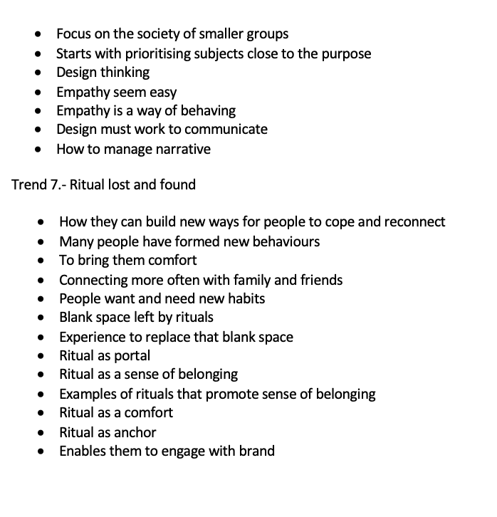
There is also this thing about interaction and how we need to think about the design, content audience and the interaction that is happening, meaning we require more and different on screen experiences that allow us to interact. I also thought it was interesting to look at the empathy side, and how you need to design more for interaction and interface when including empathy. We must communicate and also manage a narrative. All this information has given me a huge insight into the focus areas for the design.
Mission Statement:
To create the mission statement, I went through and look at some of the Science groups focus areas as well as including my own:
Curiosity
Open to all
Engaging
Inspiring
Accessible
Interesting
Thinking Big
Learning
Functional
Discovery
I ended up using the diagram that Harriet used within the lecture for this week, which hopefully would allow me to come up with the final mission statement:
From this I came up with the following statement:
Encouraging users through a memorable story telling experience, to interact and engage with an interface of inspiring objects collected over time.
Moodboards
Moodboard 1 - Interactive
Moodboard 2 - Installation
Moodboard 3 - Wayfinding
Interactive:
https://hato.co/projects/bloomberg-new-contemporaries-2020
https://hato.co/projects/d-and-ad-2018
https://www.itsnicethat.com/news/pentagram-mindworks-the-science-of-thinking-graphic-design-090821
https://www.designweek.co.uk/issues/11-17-january-2021/design-in-2021-interactive/
Installation:
https://www.itsnicethat.com/articles/jieun-gu-art-digital-240821
https://news.artnet.com/art-world/olafur-eliasson-ice-watch-london-1416811
https://www.designweek.co.uk/issues/13-19-september-2021/va-ldf-installations-2021/
https://hato.co/projects/must-should-could
https://www.dezeen.com/2021/11/10/aurora-arthur-mamou-mani-dassault-systemes-design-museum-video/
https://www.dezeen.com/2021/11/02/cop26-virtual-pavilion-build-better-now-make/
Wayfinding:
https://www.itsnicethat.com/news/cossette-playing-in-public-the-bentway-graphic-design-020921
https://hato.co/projects/printed-water
https://www.dezeen.com/2019/10/16/re-public-hafnia-hallen-sports-centre-design/
The mood board that I chose was Interactive, I thought this fitted what I wanted to do to best with the project in the future.
Weekly Reflection:
This week I found the overall week fairly difficult, I think this was due to having many ideas but not really having a focus area for the next couple of weeks. Deciding a focus area, then allowed me to look at the research for it and understand the trends that were involved. I found the Fjord Trend report really useful to understanding more of the audience but also what the audience is looking at in general. I feel that I could improve upon my audience research even more by directly researching how the 18-30 year olds would engage.- I need to do more research and look into how I would do this.
I feel happy that I now have a focus area of a physical and digital approach looking at interactive design practise that will hopefully allow me to explore different concepts in the upcoming weeks. I feel that some of my concepts this week are around technicality instead of an area like space or a different type of archive, but I want my design to be across any archive selection.
