Week Nine
Lecture Notes:
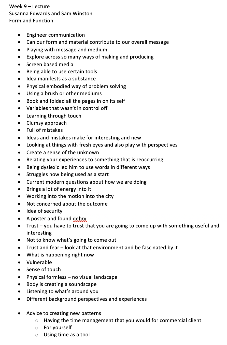
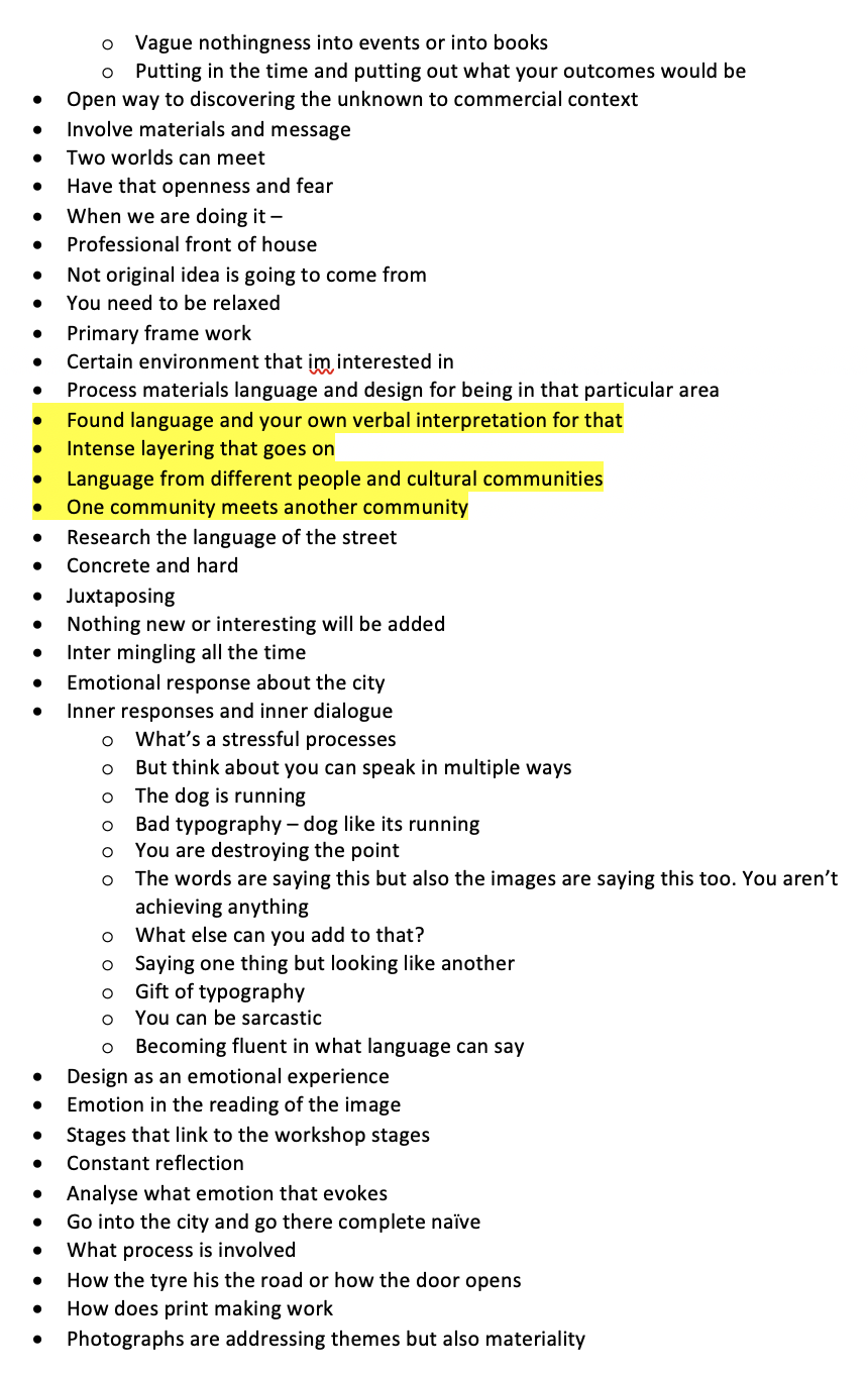
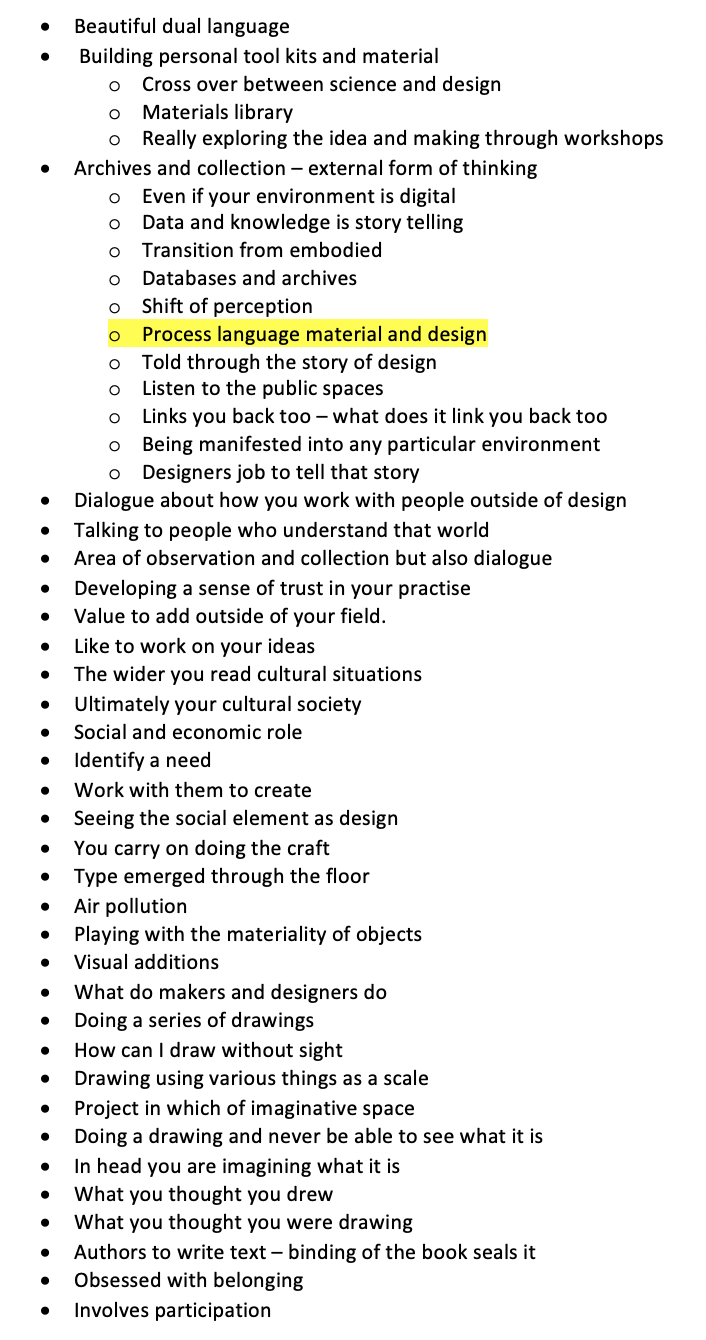
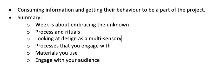
Lecture Reflection:
This was such a great lecture from Sam Winston and Susanna Edwards. I thought Sams point of views were really insightful and he really opens up as a designer by giving useful tips when you are at a location. By listening, looking, questioning what you are seeing and how this links back to issues and problems within the area you are within. He also makes a point that you shouldn’t be repeating yourself more than one- what you write should be different to what you design or the image that its matched with.
He also talks about this process of language material and design. How this then goes on to tell a story about where you are and what has influenced you. Thinking about language in a sense of what language are people speaking around you, what sign posts are there, what typography is there. Thinking of material about what is what you're standing on made off, what are people wearing or looking at or congregating, what are people doing. Design is there anything that is significant around you or how can you tell this story.
Resource Notes:
Resource One

Resource Two
Resource Reflection:
Resource One
The things that I took note of within this little video clip - was how the design made the jury feel. He said it made the hairs on the back of his neck stand up which is a really interesting term and approach meaning that the design really shocked him. I think the design is really clever how you take something so simple and boring as a report but about solar panels and turn it into a cool project or learning experience but putting it into the sun.
Resource Two
This resource was really eye opening. One of the main things that was mentioned constantly Is that ideas comes when you are least expecting it but if you don’t work on ideas they won’t come to you. There were also a number of the artists work that was really eye opening:
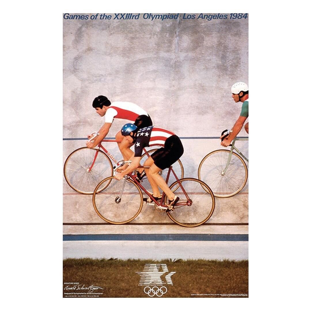
Arnold Schwartzman
I think this is so clever - the way that it shows the Olympic Rings as a symbol but you can only really see it when you look at it - really authentic.

Alan Fletcher
Although this wasn’t the work that was in the resource I found this online when searching for his work. I think he has a child play-fullness about the work which is what I love - so simple yet effective.

Sarah Illenberger
I love the way that she can create an object out of items and that she uses a lot of product in order to create her work. She also play around with photography by merging items together.

Christoph Niemann
I also think this is so cool interpreting a menu in a completely different way by using certain colours and shapes to reiterate.
Research
Within this weeks research, I decided to research more about Sam Winston from the lecture but also research about how to cities emotion and ink paint work.
Sam Winston
One of the main things I love about Winston’s work is the fact he is so broad with what he is capable of. I have researched him earlier in this project, but I wanted to get to grips with what he really produces having only seen 1 piece of his work.
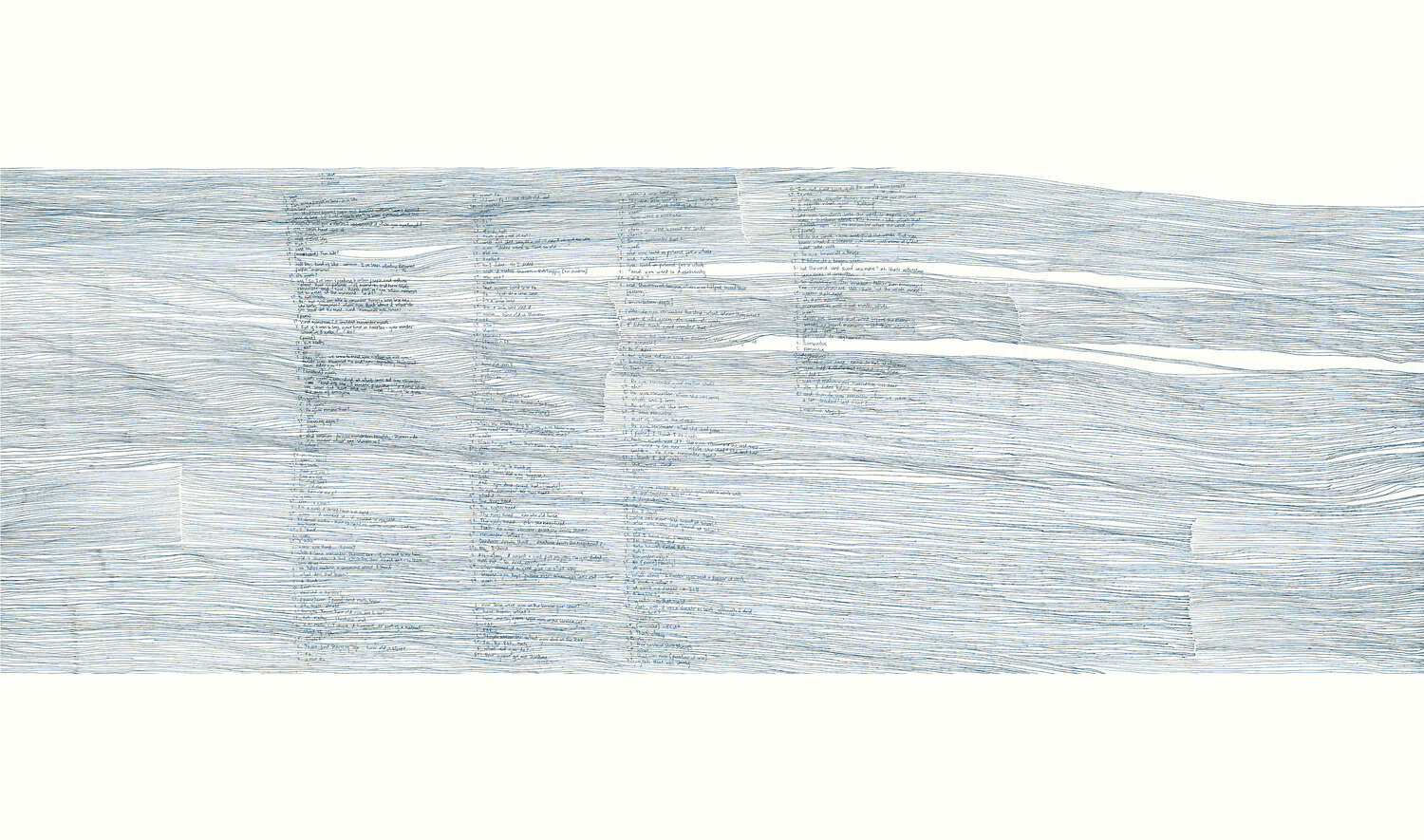
The piece above I especially love called: drawing on memory. Taking conversation that he’s had with other artists. Transcribing onto carbon paper and adding his own touch. To me this feels like waves and the ripples of the conversation. From a distance it feels almost calm but i’m sure when you read the conversation and get up close its a complete different story.
Cities Emotion
From the lecture this week and in preparation for this weeks workshop task, I wanted to research how other people have portrayed and used the city to capture emotions.
“Good City Life: crowdsourcing satellite data and emotions to map our urban landscape”
This particular project looks at creating something called happy maps, helping us to manage our times better. It takes information from the surrounding using our senses and “Crowd sourced data, geo-tagged social media pictures and open street map were thus merged. Based on the collected data the team moved on to provide cities with three types of maps: “Happy”, “Smelly” and “Chatty”.”

One thing that is particularly chatty maps takes the emotion from the sound levels across the city and turns it into a map - so if cars were honking then you can imagine that this would be turned red and if it was quiet green.
The above video goes into the details of the happy maps from the founder; talking about how his journey began and taking different routes around the city. Trapped in the mobile phone that he hadn’t been able to enjoy his cycle to work, so what if you went a different way to work without using a mapping app? He has a point about just being able to wondering around the city and look people In the eye to find your own way. Which is an interesting point, I think when you’ve been in a city so long you have a mental map in your mind.
The maps that are talked about in the above - you are able to take a route that is happy or beautiful instead of the route that is quickest. The map also allows you to add the memories with smells and sound too.
“Mithru Vigneshwara’s Aleph of Emotions uses Twitter to visualize a place’s emotions.”
The next interesting project I found was this one, which takes the gauge of the mood of your location from twitter and creates a visual to how the city as a whole is feeling. In this case its been created by Mithru Vigneshwara where you can just point the device at the location you’d like to visualise the emotion for and it will show you.

From these interesting designs this led me to look at the pollution and global warming and how this has an impact on our cities, this also came to mind as not long ago Southampton (my city) was seen as one of the most polluted in the UK due to the cruise ships and dock yards. I was thinking about doing this word for my workshop challenge but thought I should focus on something else.
John Sabraw

“In the rivers of Ohio, polluted by the old coal-mining industry, artist and professor John Sabraw is collecting toxic sludge. He’s realised he can use this “big, orange, sludgy, sulphur-smelling pollution running through creeks killing everything” to make pigment for his paintings.
By washing the sludge with reverse osmosis water, he can pull out and dry a beautiful, powdered iron-oxide (which artists have been using since the earliest cave paintings). He mixes it with acrylics or watercolours and then uses his bespoke pigments to create a series of circular paintings, exploring the fragility of our relationship with nature.”
Kasia Molga's carbon capes

“Kasia is an artist working with design, technology and science. For her project “Human Sensor,” she has made futuristic-looking capes from recycled laser-cut acrylic, which change colour as the wearer inhales and exhales, and react to air pollution. “When there is more black carbon in the air, it becomes more and more red,” explains Kasia.”
Nut Brother

“Chinese performance artist Nut Brother has walked the streets of Beijing for 100 days, sucking filthy air into a vacuum cleaner, and has recently courted controversy by turning his attention to water pollution .
In the Shaanxi province, drilling for gas has polluted the water supplies in the local villages with iron and manganese. To highlight the issue, the artist bought 10,000 bottles of China’s best-known bottled water, and swapped the contents with the polluted water. Then he stuck the profile pictures of the people who supported the project on social media on the labels”
Coronavirus
Also some art that responds to cities currently staying at home - Some illustrators drew over the current empty cities. I think these were really fun approach to enjoying the city whilst its quiet.
“As artists yourselves, what do you miss most about your city these days?
What we miss the most are the events which were sprinkled around the city. Longing after our favourite places, we find ourselves suffering in isolation. We live for real life human interaction, we like to be there to capture all the moments and turn them into fond memories. However, we are staying indoors, channeling our creative energy to contribute as much as we can with positive messages through our projects.”

Illustrator: Anita Jambour

Alexandra Filliamon

Rue Atleir

Marius Maris
Ink Art
I also decided to research some intersting ink art as part of my response this week - I wanted to have a slightly different approach.

I thought this was really nice as it reminded me of a mirroring effect. Almost felt like a book smudged in half.

The work above and below was by “Umer Ahmed is a graphic designer based in Oslo, Norway” .
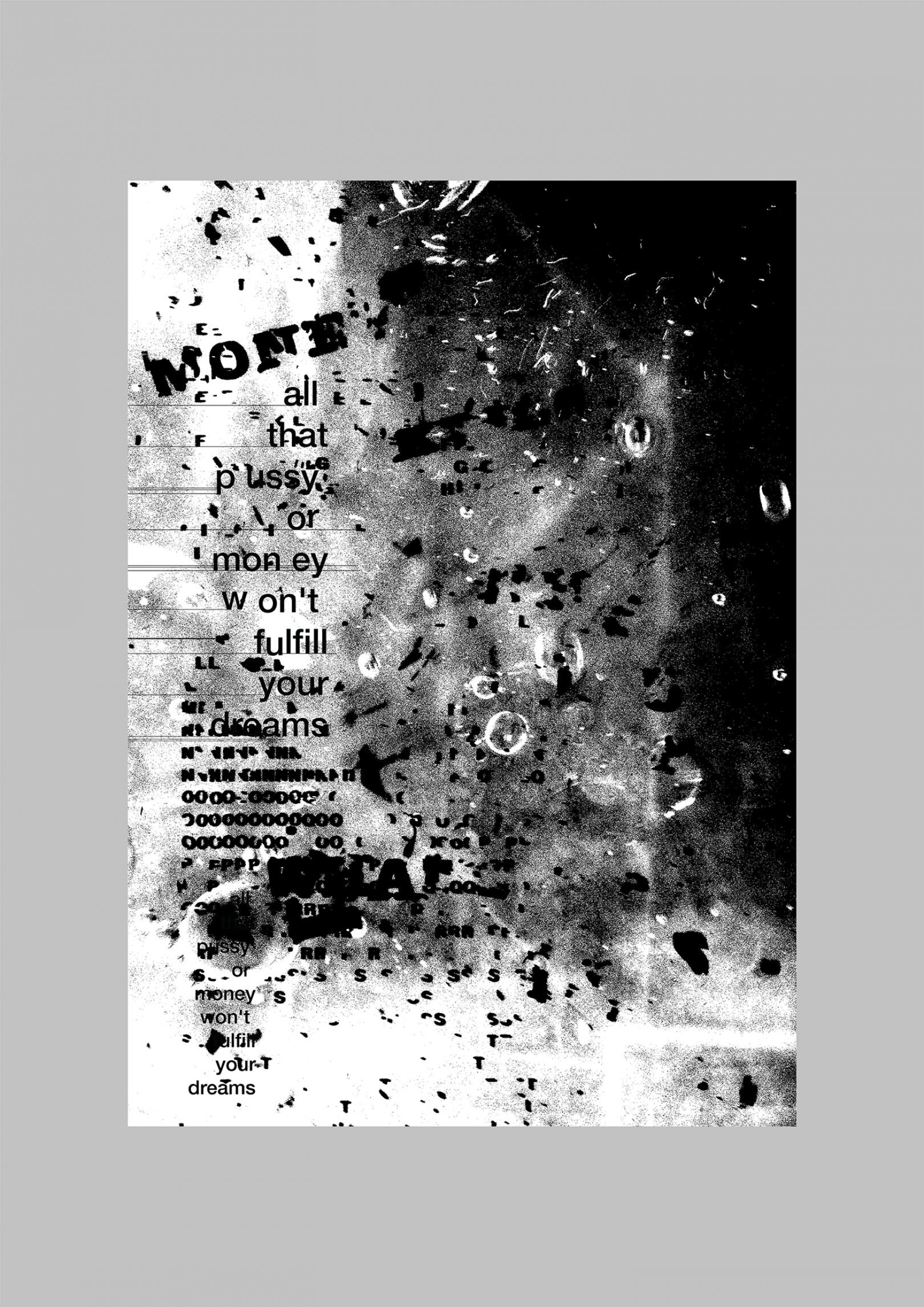
“Through these poster I express obscure feelings, and social oriented messages, may it be politics or music."
These images are really nice example of simple design, they also use a variety of texture and font to bring across the designs in different ways. I think they are really effective.
Workshop Challenge
To begin this weeks workshop task, I decided to start brain storming words that I associated with the city.

Next I then decided to brain storm all the emotions I felt like Southampton felt.

Next to establish the emotion I went wondering around the city in the middle of a sunny day. I expected the city to be raging with life like it normally is. People are normally out shopping or dining with their friends, having picnics in the park or seeing friends in the sunny winter day. I didn’t witness any of that, mainly due to the UK in current lockdown 2. I wanted to portray that the city which was normally busy felt so empty.
I took pictures of the city in its current state and one of the main buildings and structures that I followed around was the original walls within Southampton.
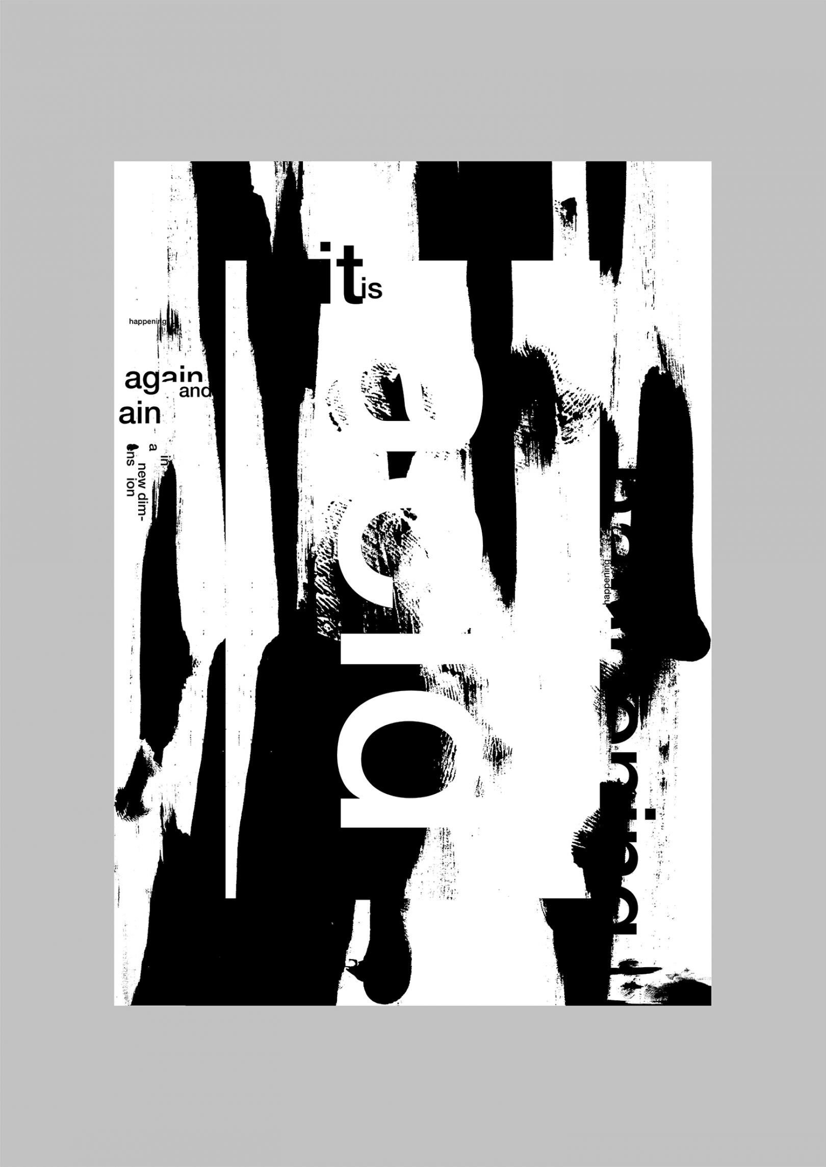
Using these images and the word of choice ‘empty’ I began to play around to see if I could create anything off the bat.

I decided to start by layering some fog over the image of the walls - this made the image become quite dark and spooky.

I then added the word empty in black but thought that this might be slightly too dark.

I changed the font to white and again I thought this looked alright but it wasn’t what I was wanting the overall look to be.

I played around with an editorial I saw about layering the picture over and over to make the image have depth. I really liked the effect it created but didn’t think this worked for the piece. I decided to focus on the walls that I thought made the city feel empty.

I began by inverting the wall and taking away the colour.

I changed the perspective and made it black and white.

I then made the text slightly smaller. I think this is really simple and I really like this outcome.

Focussing on the walls I then decided to layer some other images of the walls over the top and added the word empty.

I played around with the colour of the font and the opacity so that it felt slightly spooky.

Changed the layout of the walls which I thought seemed appropriate.

I also then increased the white of the images over the top of the background wall.
I just really wasn’t sure if this is how I wanted to portray this weeks task - I really liked the black and white and it really reminded me of printing. So I decided to take this idea of printing and try and print some of the materials that I had seen around Southampton.
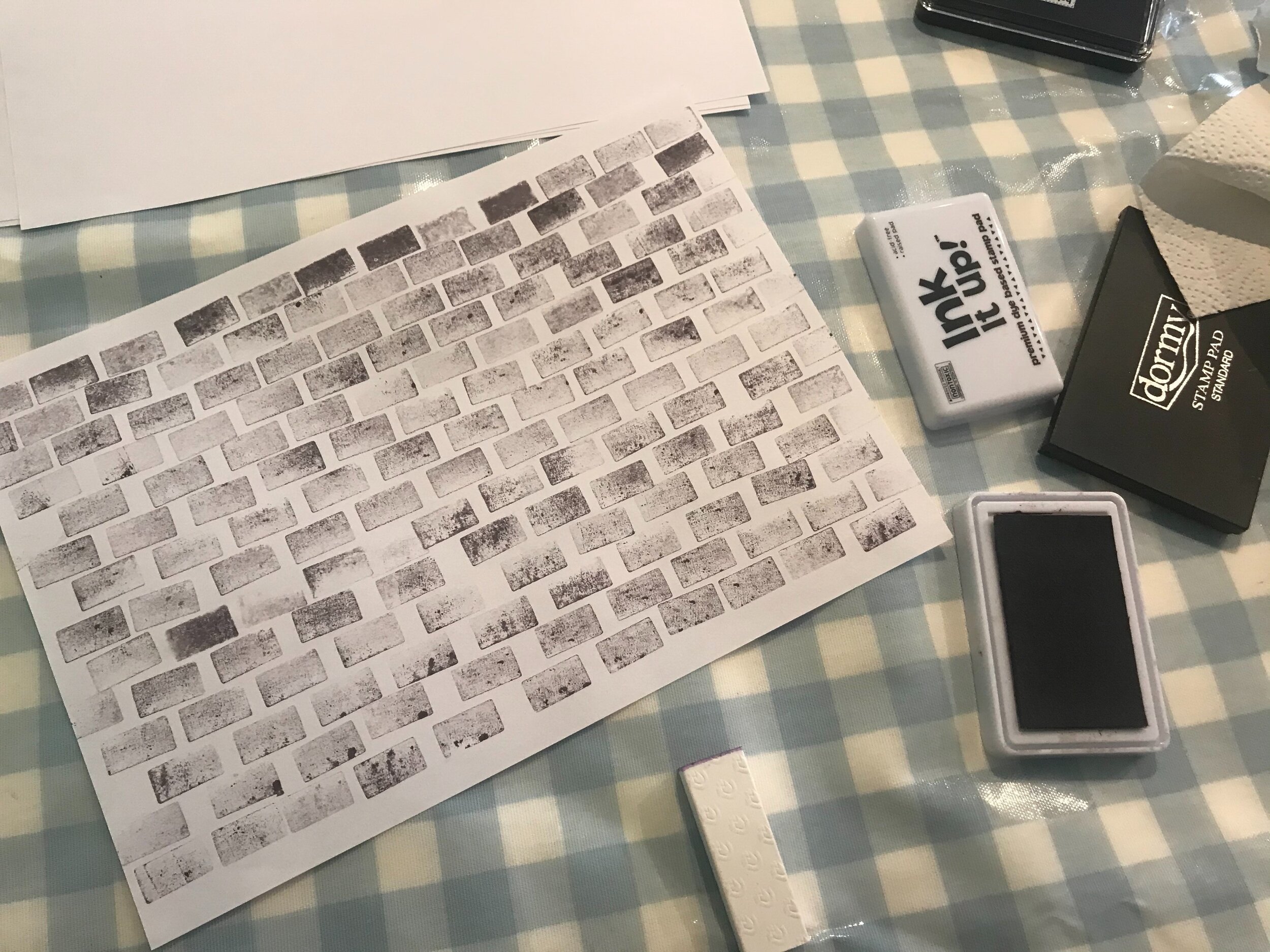
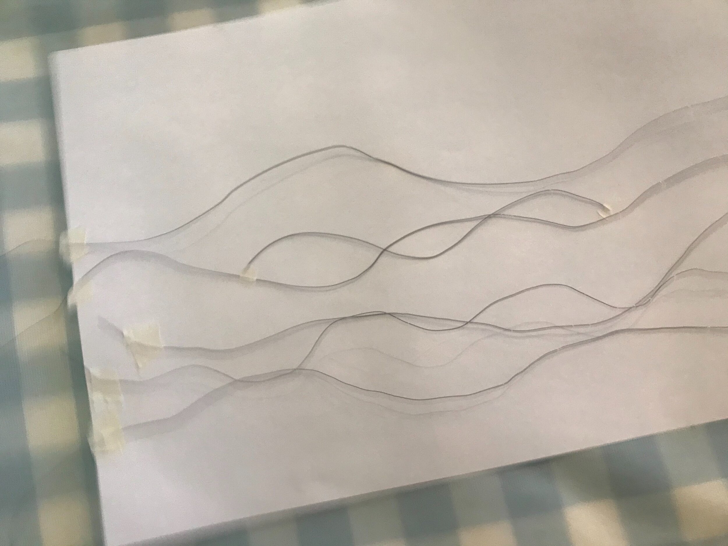
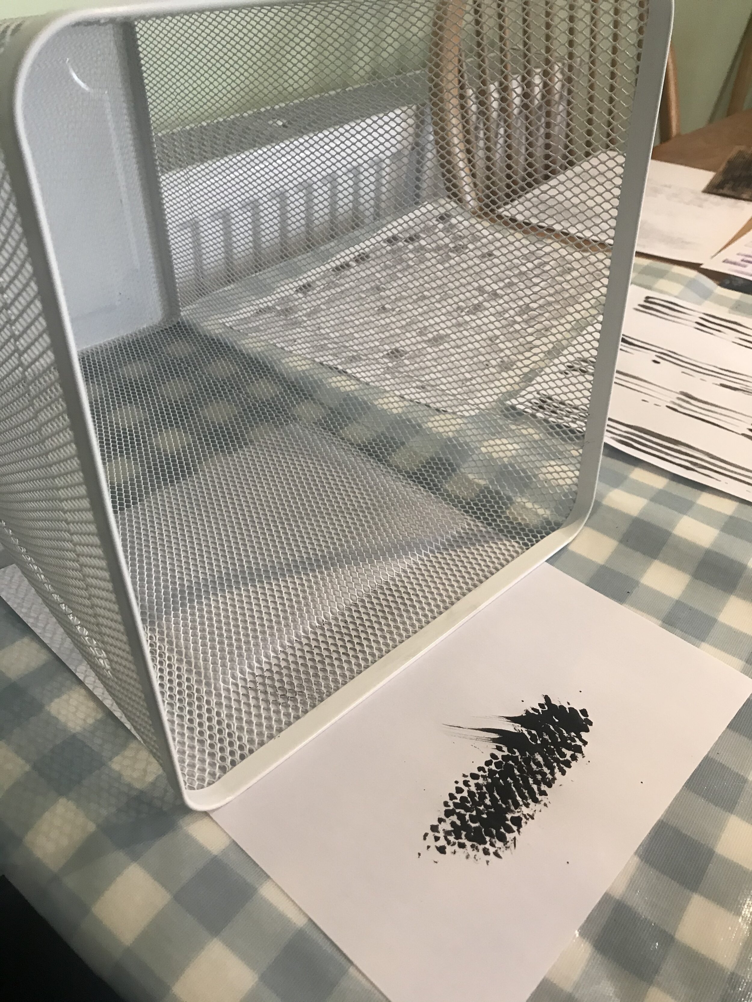
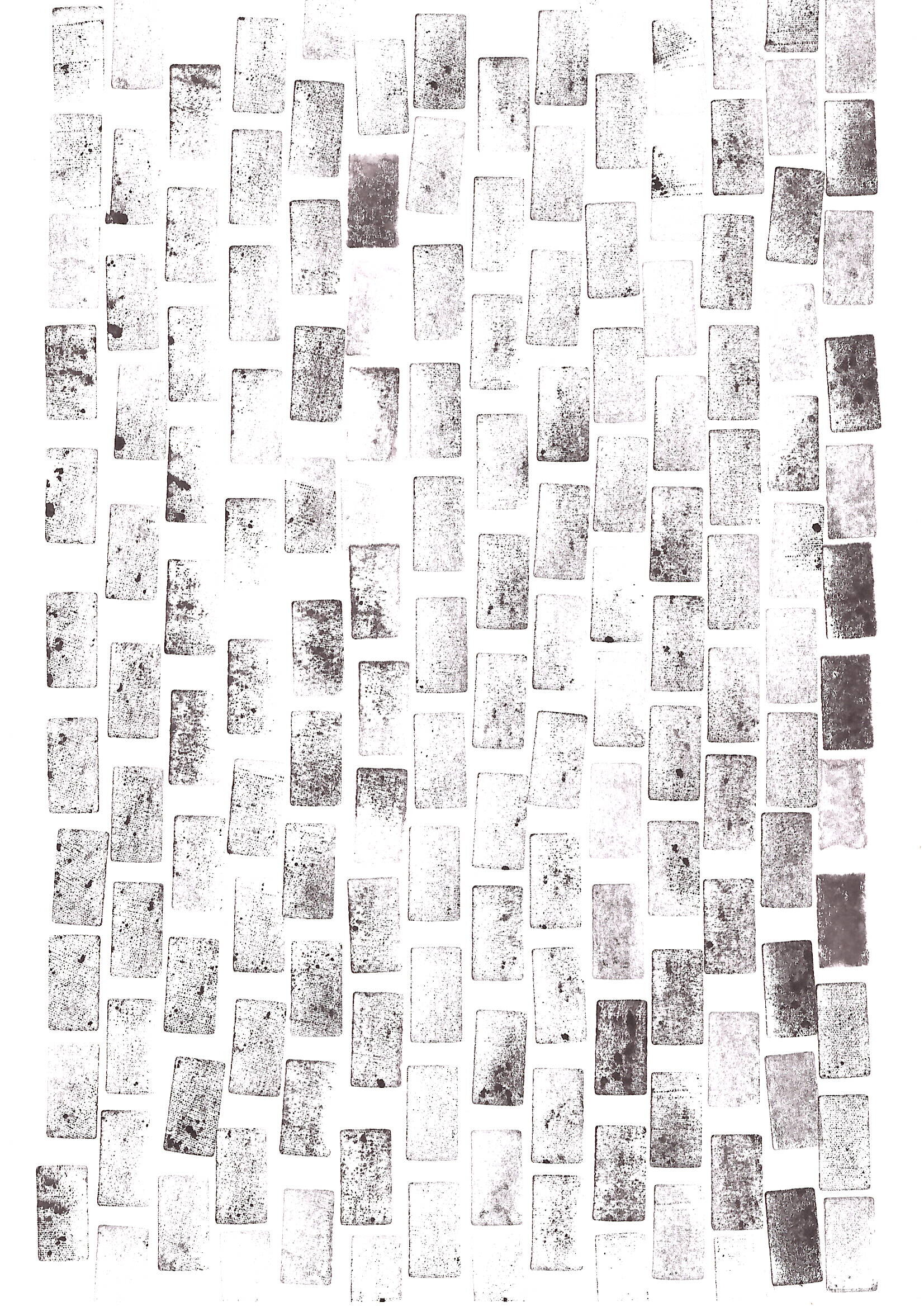
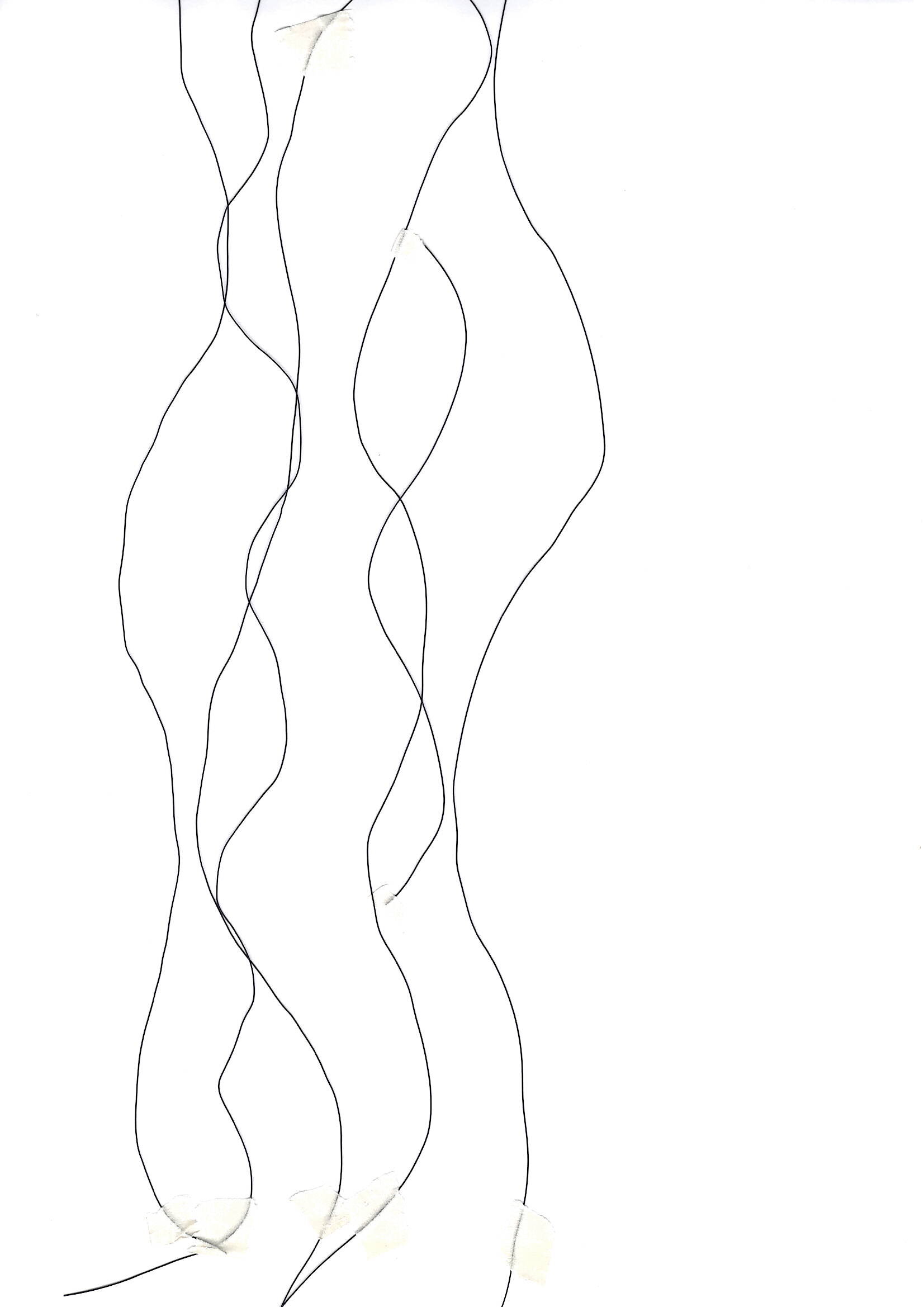
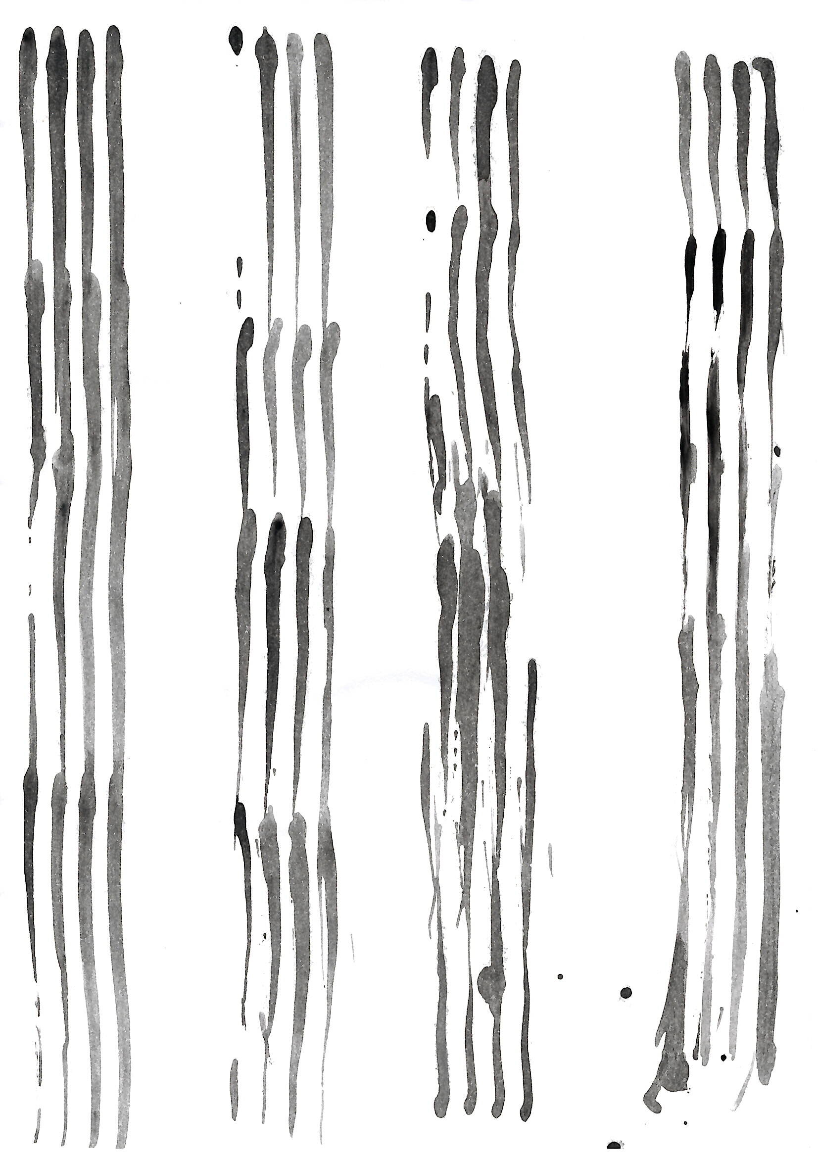
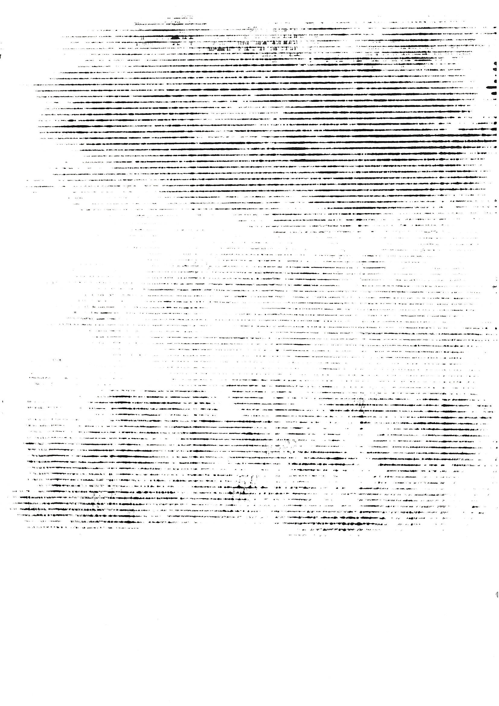
I created bricks I used a rubber and tested out using ink and acrylic. To create lines I found old packing material around the house which represented the building structures. To create the waves I used metal wire and tape and to create a grid texture I used a bin which represented a lot of gates. I also used a plastic fork to create different medium of lines which represented the congestion. There was also one black sponge blob which represented the pollution of the city. Which can be seen below.
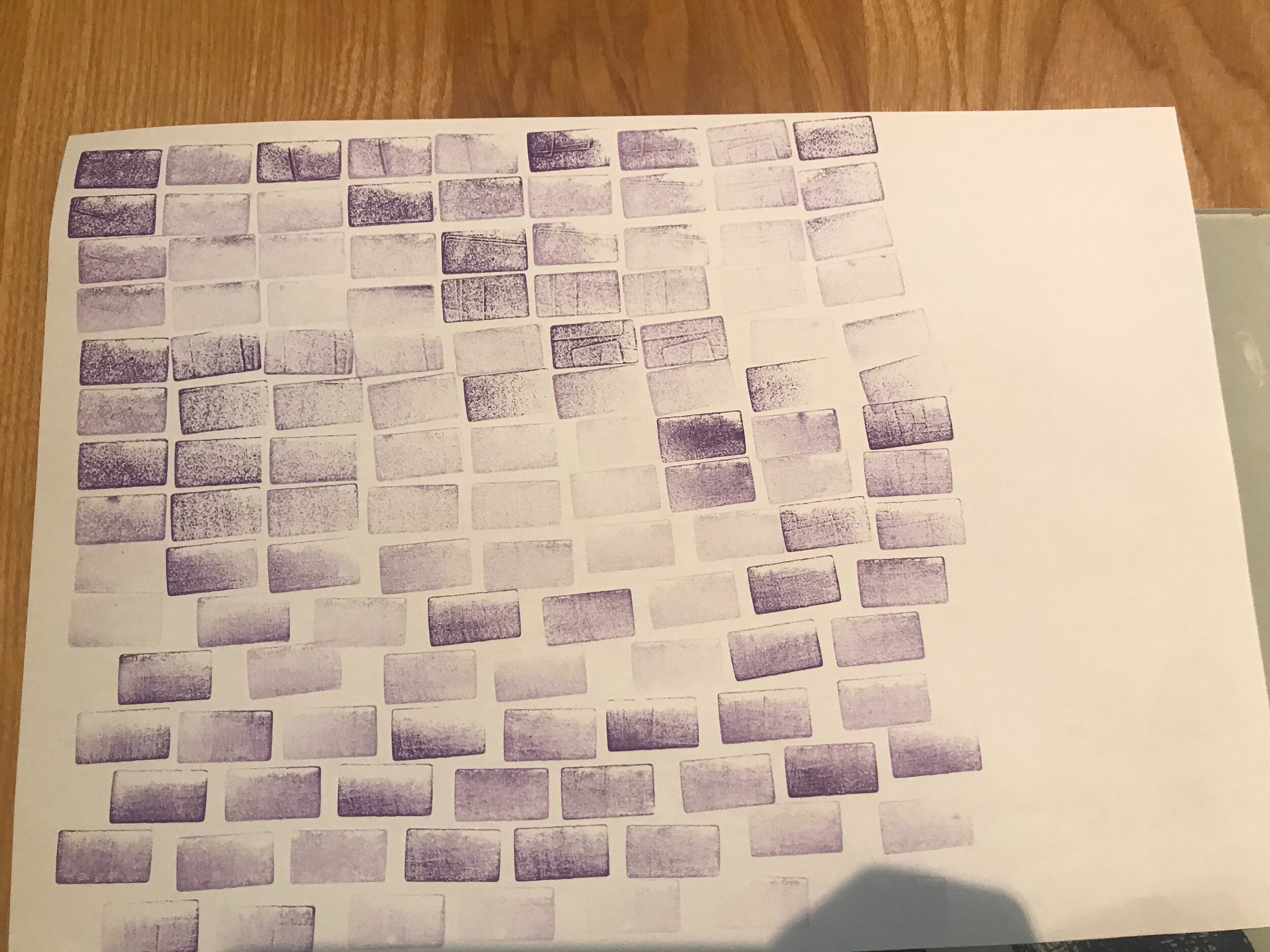
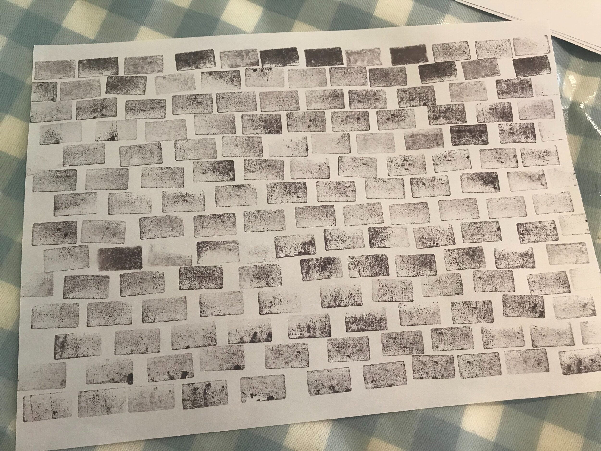
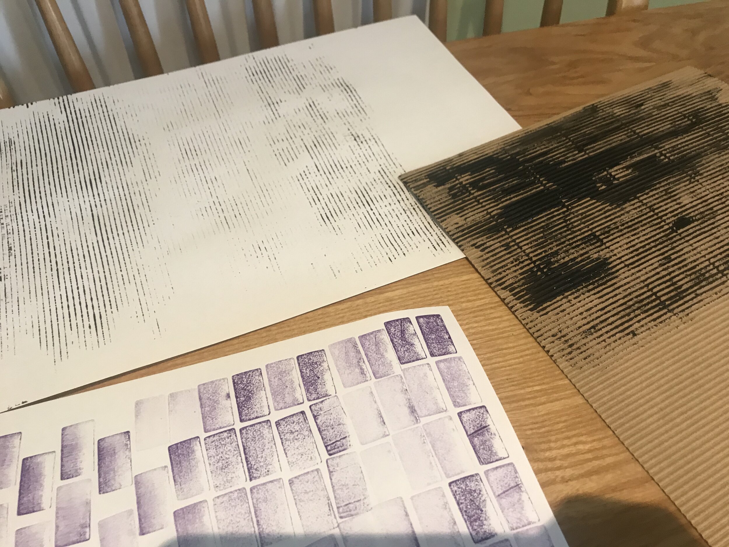
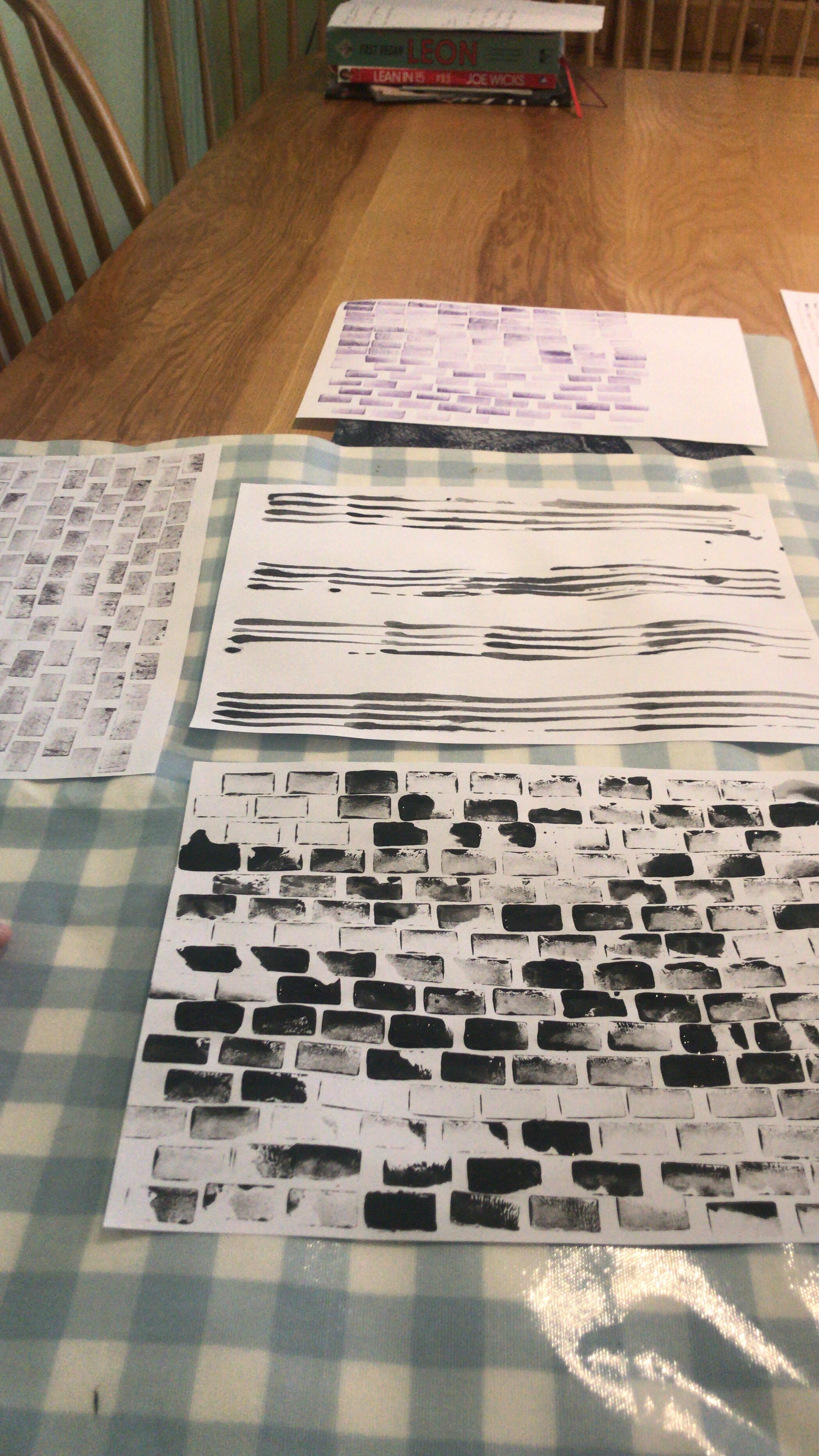
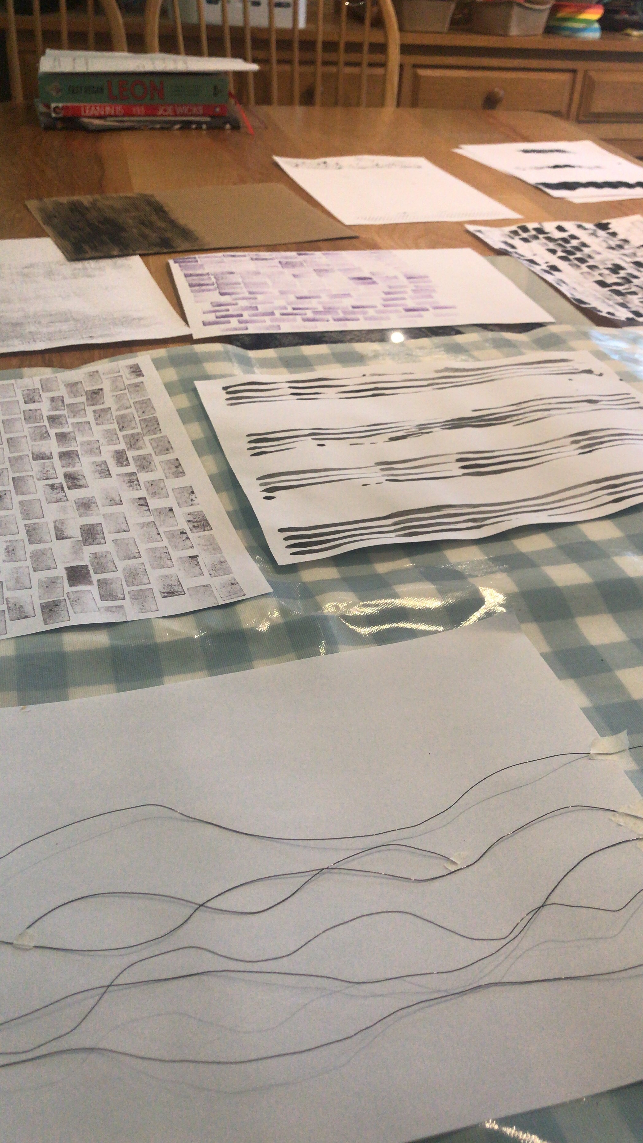
After creating these and leaving to dry, I scanned them in to then be able to physically manipulate them in photoshop.
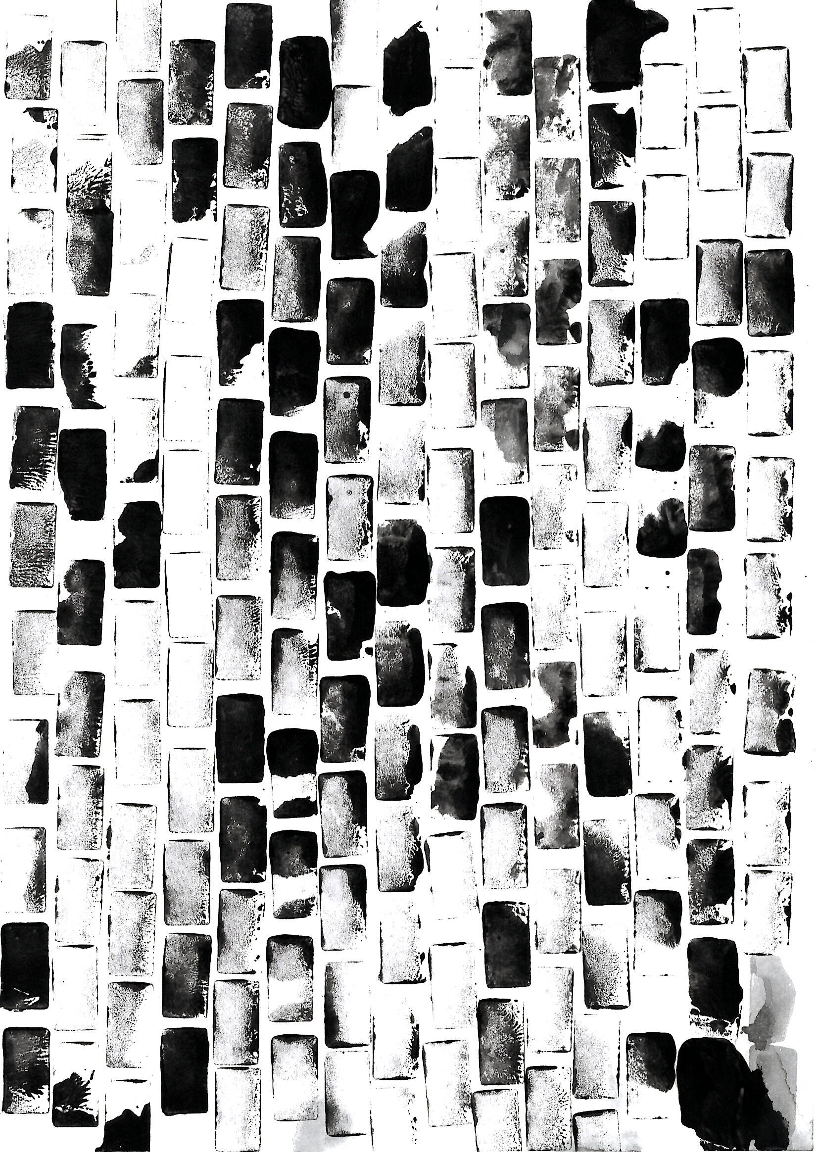
The first result of this physical manipulation can be seen below. I decided to use the colour blue to make the connection to the sea and it being a dock but also the representation of the university colours.

I really liked how this first attempt went of the image - I tried really hard to layer all the materials.

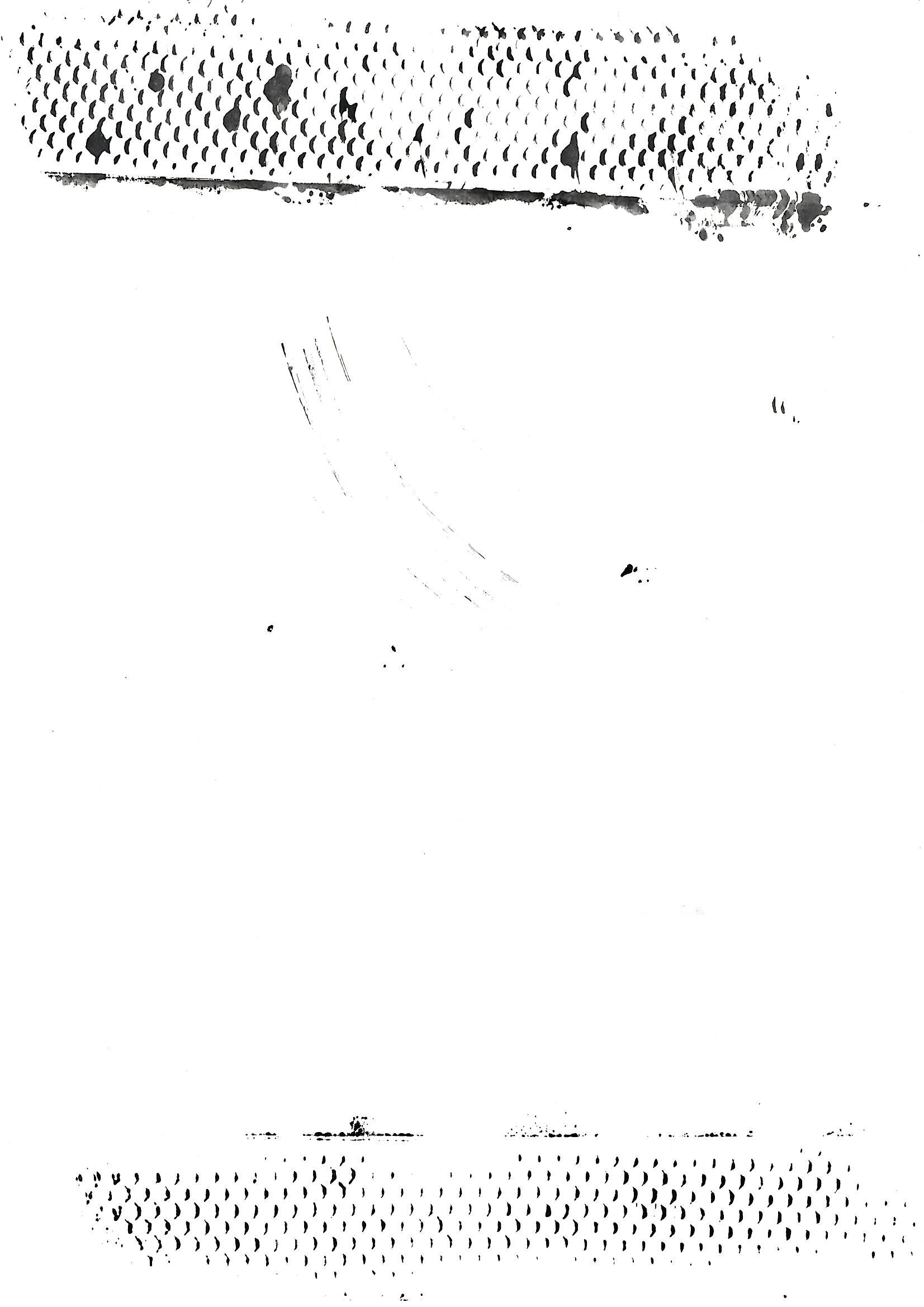
Next I decided to add some thin text which can be seen throughout the image. I think this just added a little bit more context to what was going on.

I played around with the opacity of the texts and also the thickness to see how this effected the outcome.

I then decided to make sure there was a bit more white space as my word was emptiness, so I wanted it to be slightly empty. I came to a point where I needed some feedback so posted my work to the wall.
This was the feedback that was given, I will try to take these on board to improve the image.
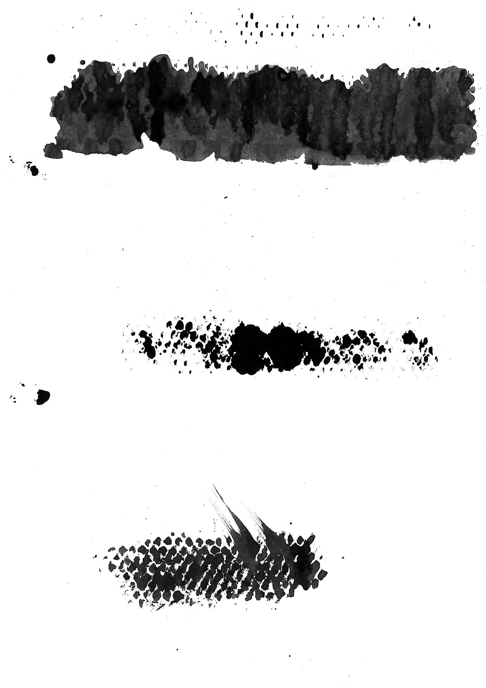
I think maybe I should change my word as I don’t think empty was the word I was meaning - more abandoned.

I tried pushing all the content to the side of the image on the current - but I felt that this made it very cluttered but I tried then adding the wording quite large on the left hand side.

I added it smaller in the corner to add distance and white space to the image but again too cluttered.

I decided to try selecting key elements and adding this to a fresh page and felt that this gave it even more effect than previously. I then added the word to the corner using a lighter colour to add the effect of emptiness.

I then also added words above but even paler to see if this added more effect - I really liked how this gave the effect of a distance and a poem.

I then made the abandoned slightly larger to improve the impact of the image. I also wanted to try adding white so that you could only see parts of the word in the document.

I didn’t feel like the white was visible and even when I tried to make it more grey you couldn’t see it properly. So i’m going back to the other image as my final piece.

Weekly Summary
I found this week so enjoyable especially getting out of my comfort zone with the workshop task. Normally using photographic montage to create something a bit different using materials from the city as inspiration.
Also using different paints and working out how to create print from things that I had laying around at home. The feedback from this weeks ideas wall was really helpful to help me refine my work. I also found the lecture thought provoking and taking Sam’s advice on how to take in an environment helped me to analyse my surroundings.
Thinking about what’s going on around you and taking a minute to smell ,listen and engage. Thinking about the materiality and the words that people are saying. This became a real inspiration for my outcome this week. Listening to how other designers gained inspiration allowed me to think and analyse my own process.
I learnt this week how to make sure that the graphic is creating an impact, whether that’s via the typeface, the illustration, image or the colours.