Week Ten
Lecture Notes:
Lecture Reflection:
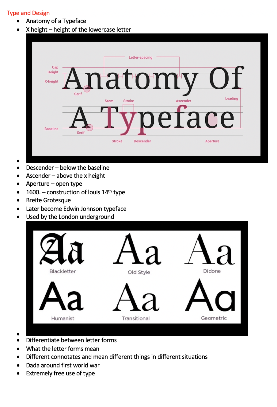
This has been a really interesting lecture learning and understanding where the type originated from and how hard it used to be in order to create a magazine and a book its been particularly eye opening especially since we have it at our finger tips today. The other point that I found so interesting is this whole motion of the anatomy of typeface and how graphic designers use grids in order to make sure that the lettering is correct. (Shown in the image below). I didn’t even realise that this was a practise but it takes me back to the days of learning to handwrite in primary school - so I suppose its similar in the sense.

Another point that I found really interesting and beautiful was the Dadaism and using the typography as illustration. I know understand where this originates from - these abstract pieces I personally think are never ageing.

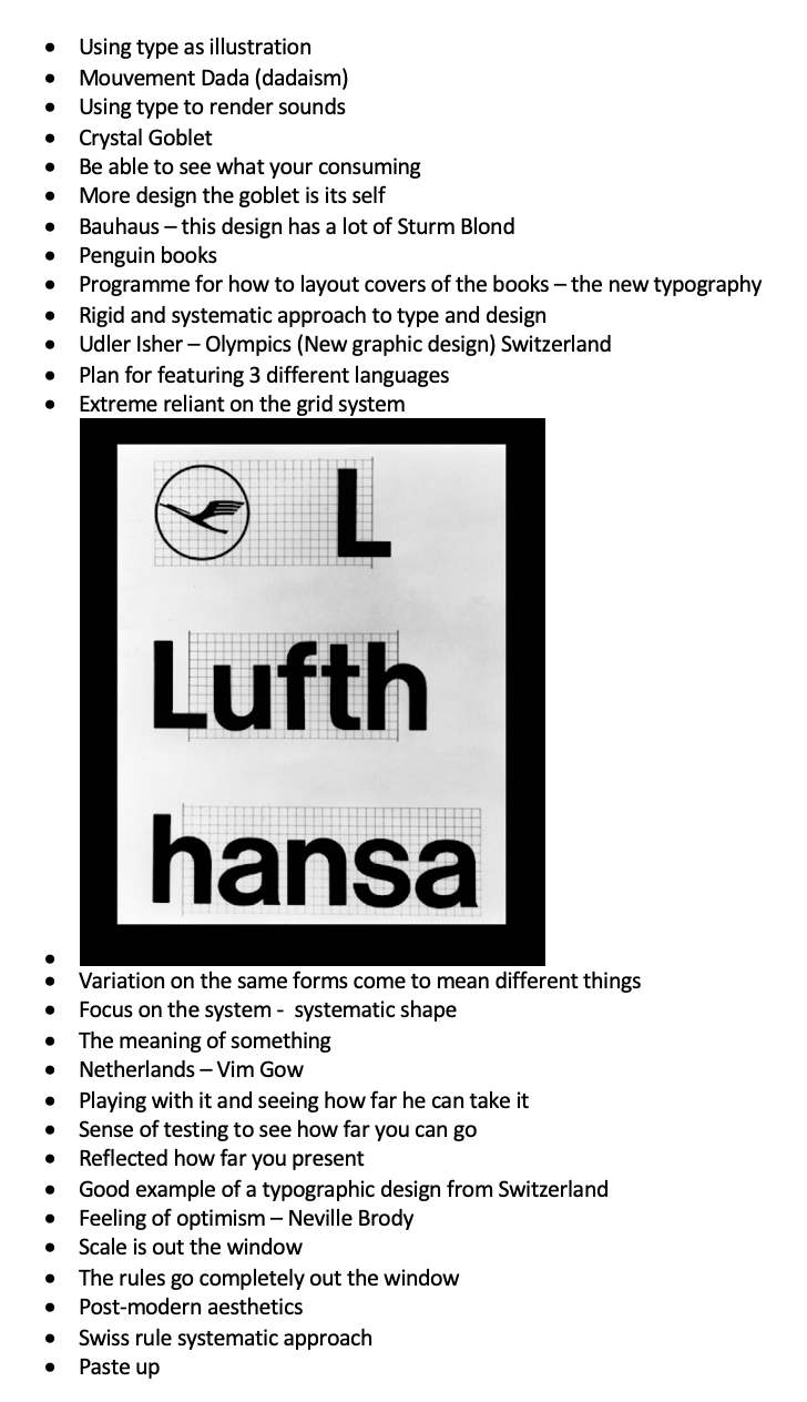
Also the work of Otl Aicher stood out for me. He worked for the Swiss Olympics creating images for each event was so interesting (Shown below) I feel like these have become iconic illustrations that can be recognised in any language.

Resource Notes:
Resource One
Resource Two
Resource Reflection:
Resource One
This resource helped me to gauge an understand about the reasons behind the aesthetics experience of typography and that typography can give a meaning and an understanding. Helped me to also understand how typography can be made out of anything but its the meaning behind that gives a whole story. For example the typeface you use could have an emotion like angry or sad or the typeface could be curly and that could symbolise happiness. There were also a few images that were shared which particularly took my interest:

Yara Khoury and Melle Hammer – 3D font
I thought this was so interesting - its not particularly legible but shows how 3D typography can be impactful to the medium that you use it for.

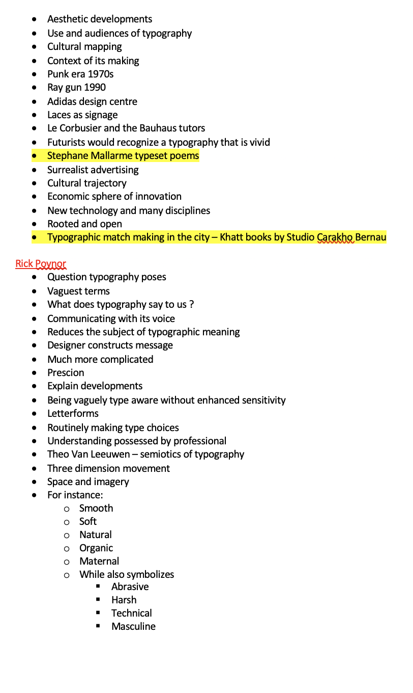
Stephane Mallarme typeset poems
This is a particularly abstract way of producing a poem and she has a different output especially making sure there are different spaces between each word and line. Making some of the words bold and some italic giving an overall effect to the poem.

Typographic match making in the city – Khatt books by Studio Carakho Bernau
The thing that stood out about this particular work for me was the contrast of the word image behind (with a 3D effect) and the blue translucent typography on the front.

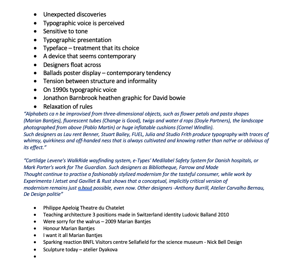
Philippe Apeloig Theatre du Chatelet
I particularly liked this image, although not understandable from a language point of view they all come of the a line frame with and you can understand its for the operate. I love the sizing and the fact that some are larger than others.

Teaching architecture 3 positions made in Switzerland identity Ludovic Balland 2010
This is also really interesting way of layering type on type with different colours but also using a technique to make the text stand out by having a coloured background. I think its super interesting.

Were sorry for the walrus – 2009 Marian Bantjes
A strong example about how text can be produced from anything. this looks like an animated dotted saying we are sorry. But again super effective and a different way of engaging with the reader.

Sculpture today – Atelier Dyakova
Another way of making 3D font to cut it out and create. This image probably looks different from different perspectives but remains legible. Also the different sizes of the lettering help to create an in-depth response.
Resource Two
This resource helped me to to understand everything I need to know about typeface and how it sits on a page. Also was interesting to note about the different colours and how that could make an impact to the reader but also the typeface size and how there is specified ones for each reader. It was almost like an information leaflet just explaining everything.
Research

First I am going to watch a documentary on Netflix, unfortunately they haven’t yet released the episode on YouTube otherwise I would link it above. Its on Jonathan Hoefler - Typeface Design.
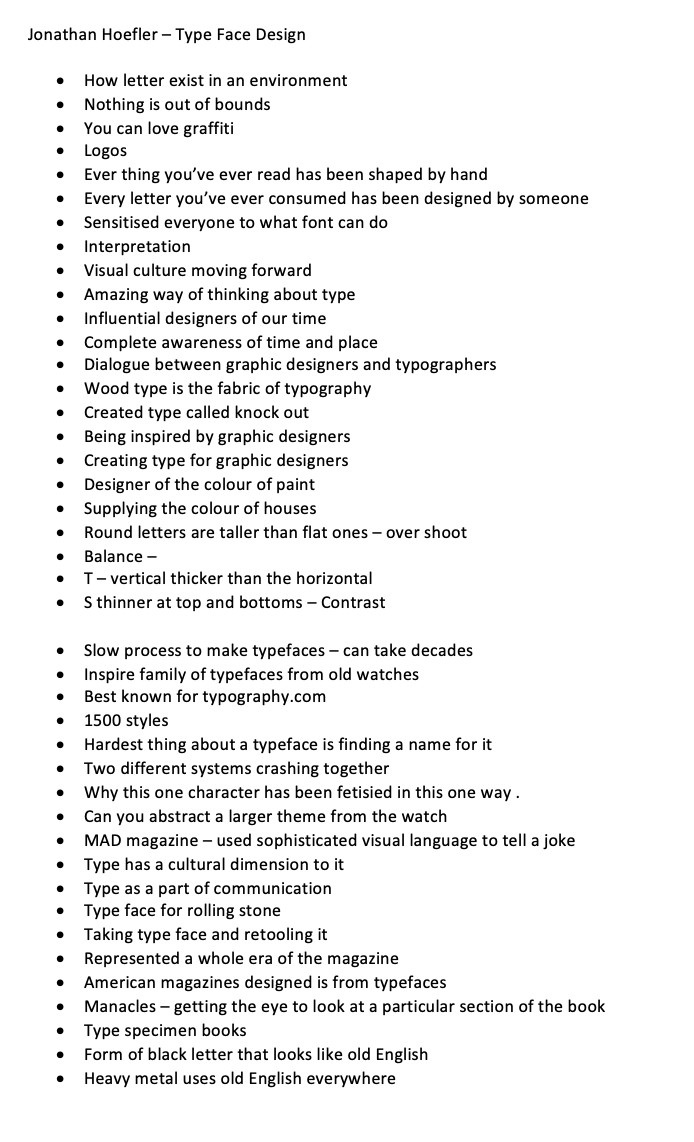
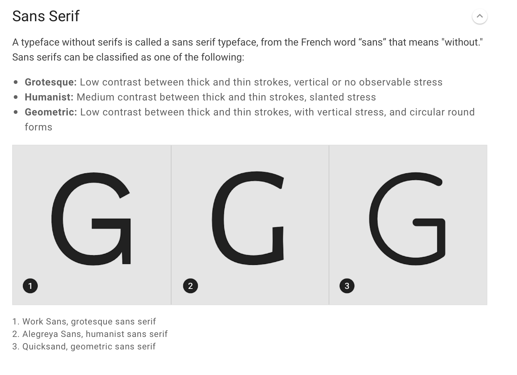
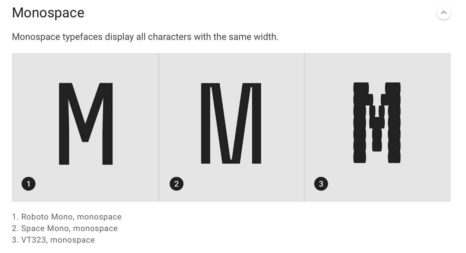
One of the most interesting things about this documentary was learning about different ways typeface have been created. Hoefler uses anything that he finds to create a typeface with, for example from watches and the signage from bus stop terminals. It’s also interesting to learn about why certain O are more curvy and some aren’t as curvy and how each letter form fits within a box. Hoefler also explains about the thickness and the optical illusion of some of the fonts, but how if you reverse them and put them on top of each other the proportions are different yet look the same. I have a vague understanding of typefaces but I want to dig deeper.
The video above just showed some handy tips on how to take charge of your font and they are as follows:
1. Justify – move the text from one side to the other
2. Use one font
3. Add a Weight – Mix the weights
4. Double Point size – create drama
5. Alight to one axis
6. Pick any font
7. Group by using rules – shapes
8. Avoid The corners – Negative space is a good thing
9. Mind the Gap = typography is about spacing
10. Its never just type
Also the super quick 2 minute video above that just runs through all the terminology to do with typographic. Which I also found a website that just explains some of the rules / key fonts really clearly. This also made me realise how different each typeface is and the differences between them. I can almost picture the typeface within a grid now.
David Carson

I also then decided to watch the a talk by David Carson, who is known in America for his graphic design and typography. I think what makes his design so great is that he previously worked in sociology and had no previous experience of design work. He takes the humour into every single piece of work he does and also give his personal interpretation. He is basically saying he deosn’t care if it makes sense or not it’s his interpretation.
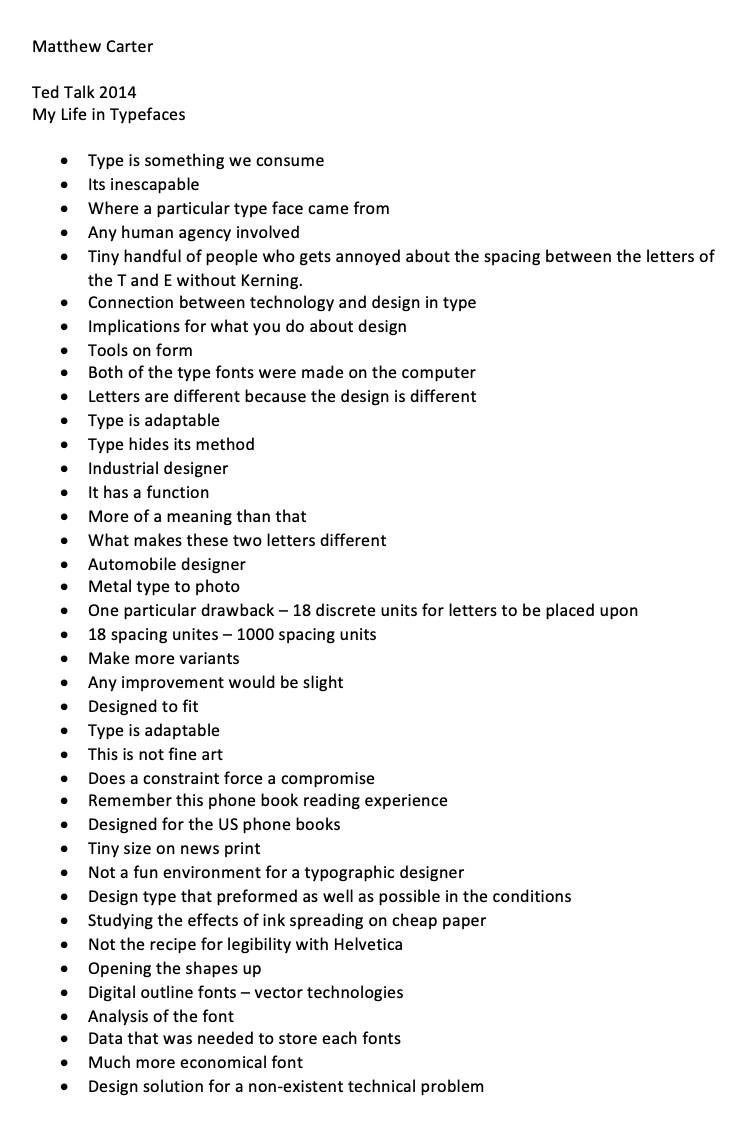
Matthew Carter
Another Talk my Matthew Carter and his experiences with typography and how he designed for computers long before they had improved performance. I thought this was so eye opening especially in terms of technology. Obviously typeface was designed before there was any technology around but how everyday tech is improving sometimes designers solve a tech solution but then by the time they come up with that solution its already been solved by someone else. He also talks a lot about how typeface is adaptable for different situations.
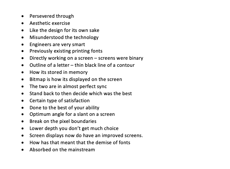
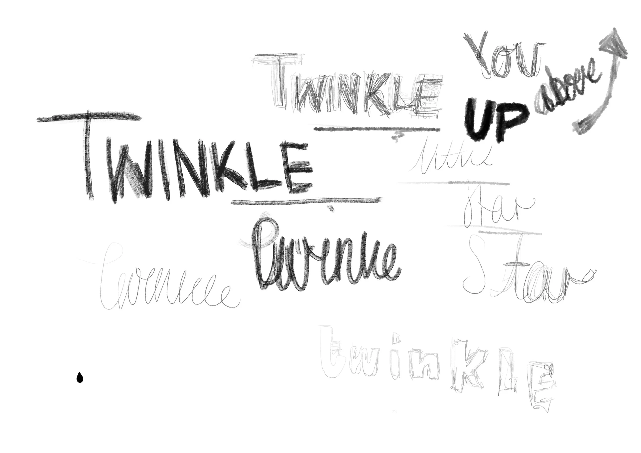
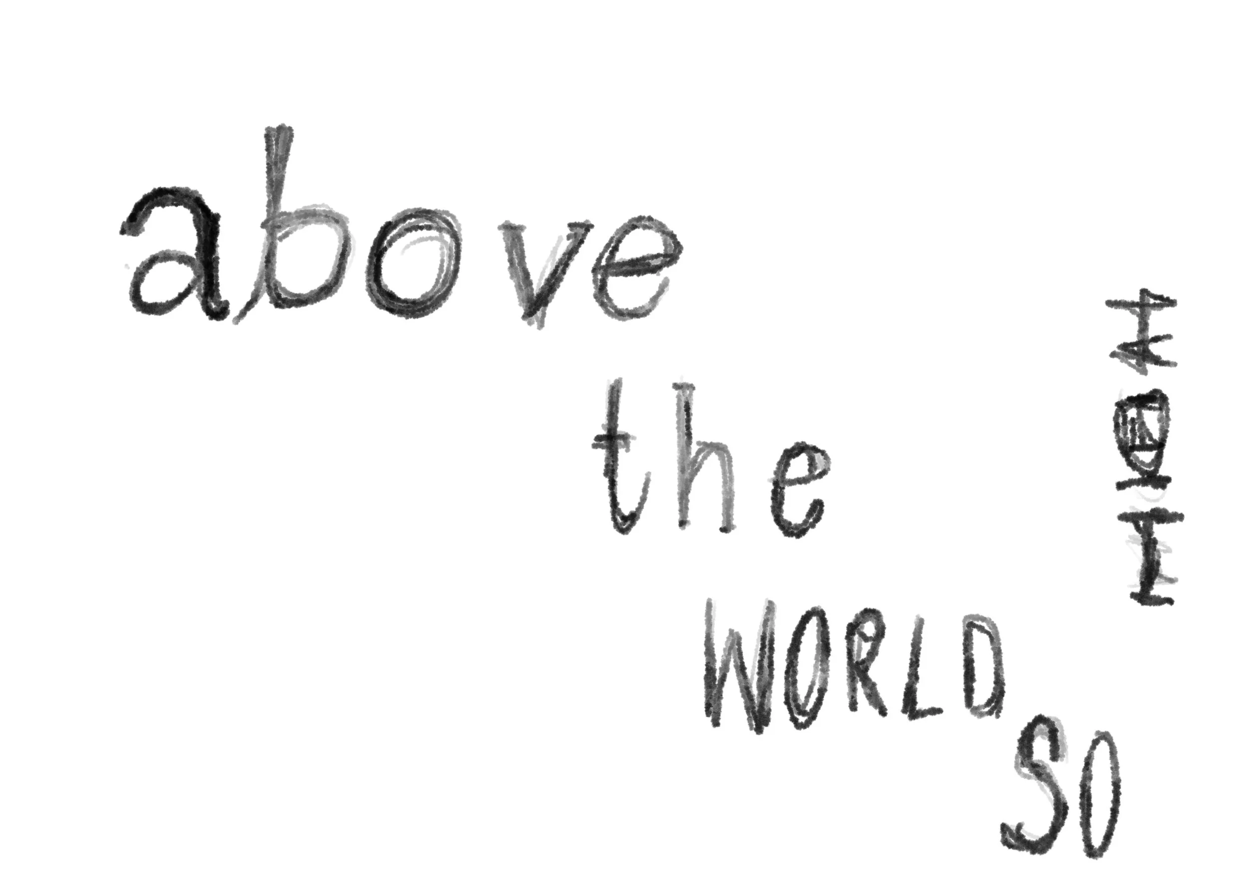
Workshop Challenge
For this weeks challenge I chose the following poem but only wanting to do the first sentance:
Twinkle, twinkle, little star,
How I wonder what you are!
Up above the world so high,
Like a diamond in the sky.
When the blazing sun is gone,
When he nothing shines upon,
Then you show your little light,
Twinkle, twinkle, all the night.
Then the traveler in the dark
Thanks you for your tiny spark,
How could he see where to go,
If you did not twinkle so?
In the dark blue sky you keep,
Often through my curtains peep
For you never shut your eye,
Till the sun is in the sky.
As your bright and tiny spark
Lights the traveler in the dark,
Though I know not what you are,
Twinkle, twinkle, little star.
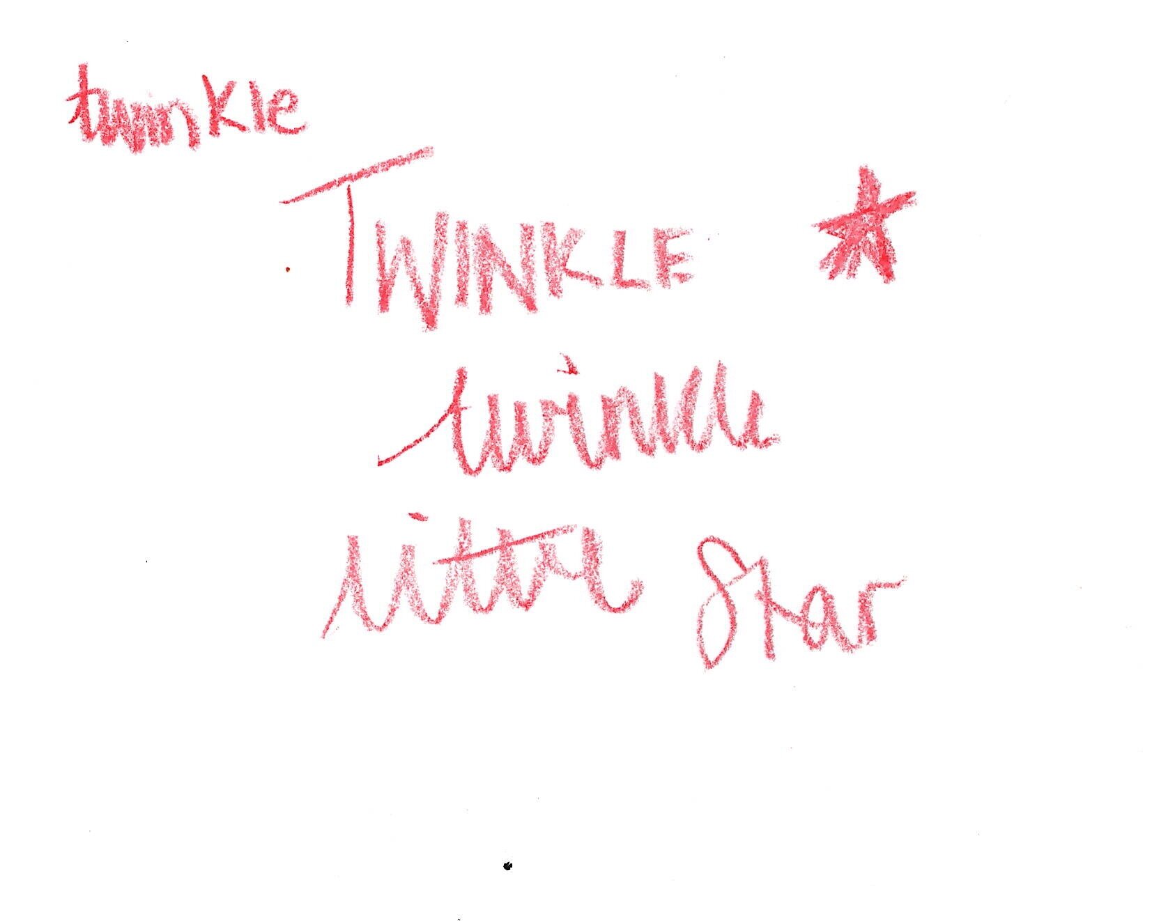
I began by doodling down any fonts about the twinkle and how I thought they could fit together. Below is a video of the brainstorming process:


I thought that maybe the text could go diagonal across the page, like layer by layer.


Then when it says high above - it then goes the opposite way.

I also tried to think about the shapes within the poem.

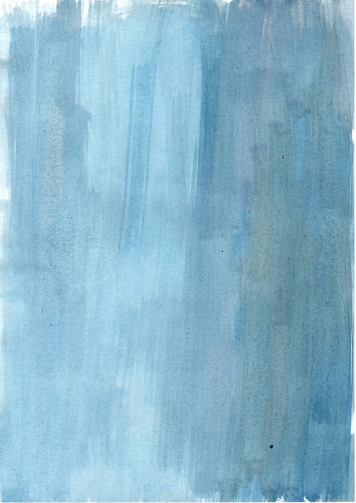
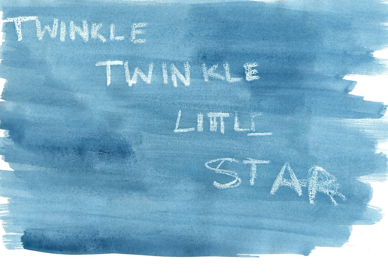
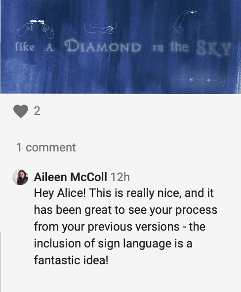
Then I started to think about the meaning of the poem and how it’s to do with the sky. I wanted to have a dark blue background with white font just like the above image.

I also tried handwriting on lines to see if this would improve the typography. I then began to make the background out of water paints and also realised that this is a children’s poem, so it was important to portray that - so I decided explore using wax crayons as this also withstands water paints.
After creating the background, I had the idea to create the words out of Disney films - so that they would appeal more to children. You can see the process of how I created that in the video below:


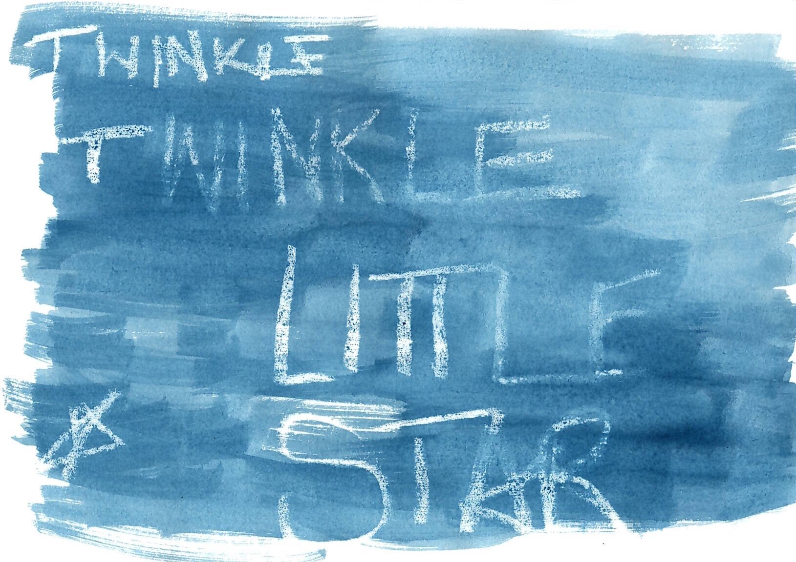
Feedback from the first draft:
From the really helpful feedback from my peers - I knew I needed the words to read better across the screen.

I tried different ways of changing the opacity.

I then decided that I needed the words to read across the screen - so it was easier to see.

I also added some glow to the words to make them stand out in the night sky!
Feedback from Draft 2:
I also had an idea to have the type in the front and then behind the font have the sign language version - I was taught this when I was in secondary school.
So I took the type that I previously made and then put the sign language above.

Feedback from Draft 3:
From this, I decided to take on the feedback from the previous and create a gif, using the sign language but also the words.
The process of the gif can be seen below. (Luckily my partner is fluent in sign language so I filmed him signing to make the gif)
That then led to the final video as shown below. Due to the capabilities of the website it doesn’t allow me to upload a gif but it can be seen in video format.
I really enjoyed this weeks workshop task, learning all things typeface and thinking of ways to rethink a poem. I really tried to think outside the box in order to appeal to children but also adults in this sense. This is also a well loved poem that I wanted to give a new lease of life.
Weekly Summary
This week I have learnt about famous typeface designers in America and how typefaces can be taken from anything that is around us including old watches. This is a long process of making sure the font kit is perfect with the right characters. I have also learnt how to create typefaces myself and why type is so crucial to us and the reader.
The examples that were shown within the resource this week were amazing. It helped me to gauge an understand about the reasons behind the aesthetic experience of typography and that typography can give a meaning and an understanding.
That’s what flared my interest in this weeks workshop task, recreating a poem. I decided to create the poem twinkle twinkle little star, I think my recreation of this poem comes across as magical and child friendly. I wanted the whole piece to come together and the Disney typeface within the piece is the power part. I tried to play on the sizing and opacity of the text to create emphasis on certain words. Adding the sign language to this graphic gif, enabled another way of communicating the poem.
Just showing that there are many ways of interpreting language. I enjoyed once again trying something new this week with creating an animation and learning about how to do this, adding another skill to my skillset.