Week Twelve
Lecture Notes
Lecture One

Lecture Two

Lecture Three
Lecture Reflection
Lecture One
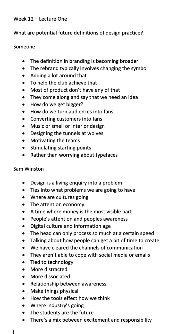
This lecture outline what the future definitions were for design practise. I agree with the general consensus that the world has changed its approach we have become more digital and technology has a huge impact. A point that I also really related to was within Sarah Boris, who said that people who are graduating today are more all rounders, they are able to do everything, rather than having one particular talent like print design. Sam Winston also mentioned that Students are the future, saying they are making the trends and the future definitions.
Lecture Two
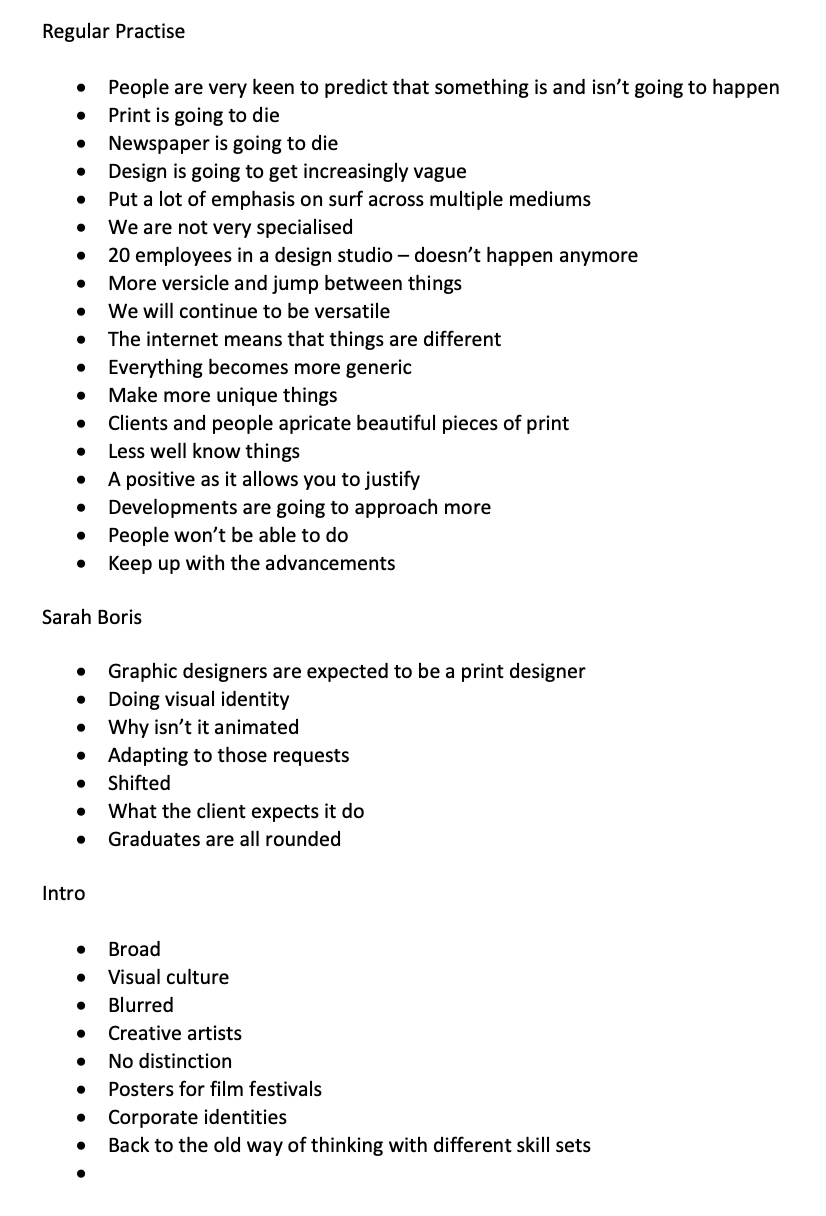
The lecture outlined what sectors that might change or need to change. I think the general points that were made is that the sector is constantly changing, but the constant that stays the same is the ‘ideas we are coming up with are connected to the people’ said by SomeOne. Everyones constantly looking for that niche that the viewer or the buyer would be interested in. Also another point which was also made previously is that there is a lot of sectors that have now been merged together, so there is a huge overlap which has its negatives as well as positives.
Lecture Three
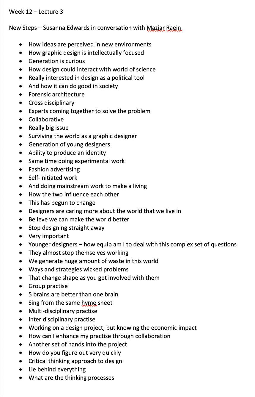
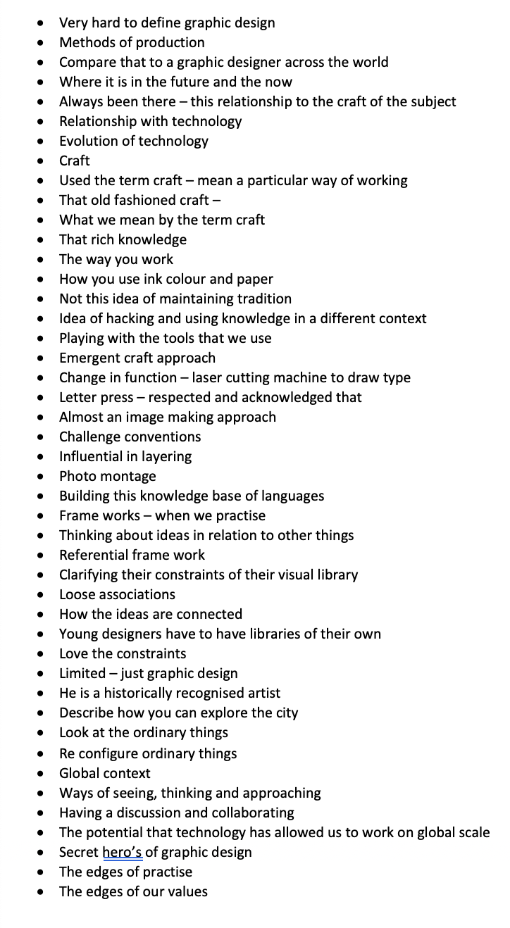
A chatty lecture, talking about global impacts and how we as student designers need to keep curious and keep a small record of physical aspects. Talking about how as designers, we are the change that is needed, we design the change and the trends. This was a really interesting to just hear a conversation about how design is constantly changing and the things we need to take into account as young designers.
Resource Notes
Resource One

Resource Two

Resource Three
Resource Reflection
Resource One
This resource “Dunne & Raby use design as a medium to stimulate discussion and debate amongst designers, industry and the public about the social, cultural and ethical implications of existing and emerging technologies.” Having a look at the projects, a lot of the look at the photography based or are staged photographs. They are actually really weirdly interesting, the shapes that were used within the project looking at awkward personality traits, took inspiration from paintings for the shapes that were created. Creating hide aways so people could hide within furniture. Its alot of out the box thinking to possible how the future could and will react.
Resource Two
Interesting resource that looks at investigating human rights violations including violence committed by states, police forces, militaries, and corporations. The information that’s given is interesting but also the visual context of little animations makes you feel like you are in a game when we are talking about real life. Looks at various locations across the world, the ones I have highlighted above are United Kingdom.
Resource Three
Imagining a different future for ourselves, this was a really interesting, eye opening lecture about how and what will happen if the world changes in years to come. I think a lot of people are very stuck in their ways about climate change and wanting to use cars, but in reality we need to think about what we are putting and using in this world. The images that were shown and the techniques that were used to show people that the world isn’t going to be a nice place if we continue, I think the visual aspect really makes people pay attention to whats happening.
Research
This week following the lectures and the resources, I decided to look at more shocking ways to grab the attention of the public.

A simple way of looking at climate change are these stamps that were created by berry creative that change colour / image when they are heated or cooled. This highlights how global warming is warming the earth. This is a small but simple way of signalling climate change.

Another case study, this time by Julia Lohmann, who has created a seaweed pavilion to outline the climate change. The colour of the seaweed changes throughout the day, it also has the smell of sea due to it being from the sea. I think this also outlines that within the sea we aren’t only killing the animals but also the seaweed like this one.

Leandro Erlich, created these sand coloured traffic to appear like the cars are submerged under water. Saying that he also has a responsibility to raise awareness about the rising sea levels that’s happening to our planet. I think this is a really visual way of bringing across the idea of climate change.

Another artist that is amazing at these installations is Olafur Eliasson. This is an installation, called Din Blinde Passenger, that invites visitors to walk through the fog, stating that this is the effect of climate change and air pollution on our planet. Is this the future?
The above interview with Olafur looks at the behind the scenes of his installations and why he has designed what he has. He explains about Din Blinde Passenger - Full of fog - you are capable of navigating, take your defence down which otherwise might be challenging - shows us they trust it to be a safe space. A project about Sustainability is constantly going on.

This is Sto Lens work, who looks at how our water is polluted by creating these prints of what will remain in the water for decades to come. “Using pieces of Styrofoam that he found in bodies of water and a self-invented printing process that he calls “Gomitaku” (trash impressions), he created ink prints on “scrolls” of unstretched canvas, linen, and paper. “Gomitaku” is based on the 19th century Japanese printing method, “Gyotaku,” that was used by fishermen to both record and honor their catches. The printed scrolls in the exhibition were hung vertically from monofilament attached to the ceiling of the gallery and directly on the wall suggesting the downward movement and eventual crashing of waterfalls. Walking among the scrolls, one can feel the enormity of the plastic pollution in our waters.” I love this approach because you can see the physical items that he has created with these cut outs. I think I may try and interpret this to something similar.

This has been created by the Dutch designer Xandra Van Der Eijk who 3D scanned the surface of a glacier in the swiss alps, this is her response to the climate change implying that the glaciers that were once there are now gone.

This documentary was interesting - from the point of view of a German. One of the points and protests that stood out for me was Extinction Rebellion - Putting blood on the steps to symbolise the children. We need a dramatic response. I think that is one of the problems is that people don’t realise that it’s effecting them.
I also looked at this story from Extinction rebellion - looking at why we need to save our seas and how pollution is effecting it. There is huge extinctions going on, that needs to be stopped - if we clean up the plastic - we will have a better change of survival. This was a protest that they did dressing up in blue. We are made up from a certain percentage of water and we need water to survive - so I think I may make this a focal point for my workshop challenge this week.

Super eye opening documentary about our Day Zero with water and how our water sources are running out. I think this might also be something to highlight - We have created a world that cannot keep up with the water supply that we just don’t have.

The above extract is taken from the extinction rebellion website. The key things that really stick out for me are the chemicals that are in the water but also human activities into water. In addition to the heavy metals and micropastics. To explore the Extinction Rebellion more, I also explored their graphic design aspect.

The designs take inspiration from the Situationist International Movement in 1960. Overall they use a range of 10 colours with their own typography made from old wood type within the posters.

“"We wanted to use a breadth of colour to highlight the intersectionality of the movement. Obviously, we had to use green. You can’t be an eco movement and not use Green," said Russell.”
I think their designs are so clear and the message they are trying to tell people are also clear. Their logo stands for a hourglass showing that time is running out which is also crucial to their design. Less words and simplicity really work.
Workshop
I found this week really hard to decide on one idea, below shows a little mind map behind my thinking. I wanted to pick up on this idea of visualising pollution which was done in the TED talk for resource 3 this week. Taking pollution from the air and recreating it to present to the government in order to visualise the pollution that’s happening around us and what will happen if that doesn’t change.


I think the two Ideas that I want to take forward are the ones to do with ‘buying your pollution’ and ‘buying air’ due to lack of water. I am going to create a design a range of posters and physical vending machines in response. I looked around the internet to see if anyone else had done this:

UNICEF sold 8 different types of dirty dangerous water on the street of New Yorkers. Shocking people caused action, $1 would be able to provide one child with clean water for 40 days.

One Water for Clean Water
By 2020 4.8 billion litres of bottle water are sold each year, one water wanted to do this campaign to show the poor water conditions for 663 million people worldwide.
I also went onto look at Evian - which is one of the most popular bottle water and what they were doing to tackle and change their packaging.
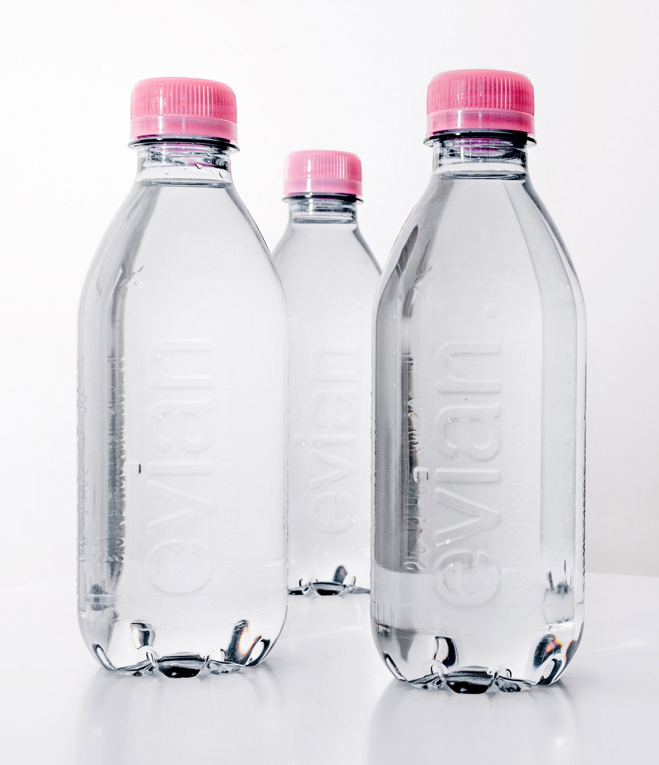
“The recyclable 400ml bottle is made of recycled polyethylene terephthalate (rPET) and features an embossed logo instead of a label.
However, the pink cap is made from virgin high-density polyethylene (HDPE) and oriented polypropylene (OPP), which Evian says can be recycled.”
But are these lids just ending up in the ocean with the rest of the micro plastics cause that’s where the recycled plastic goes?
Taking on these case studies and research, I wanted mine to be slightly different - inspired by the lack of water, extinction rebellion colour and typeface, Sto Lens Work and The Heat changing stamps. I began by taking quotes from the resources that I had found above:
“Day Zero”
“3 in 10 people on earth cannot count on water directly to their homes”
“Water is a BASIC human right”
“Everyone Gone forever”
“Die of thirst In 3 days”
“4.8 billion litres of bottled water per year”
“poor water conditions for 663 million”
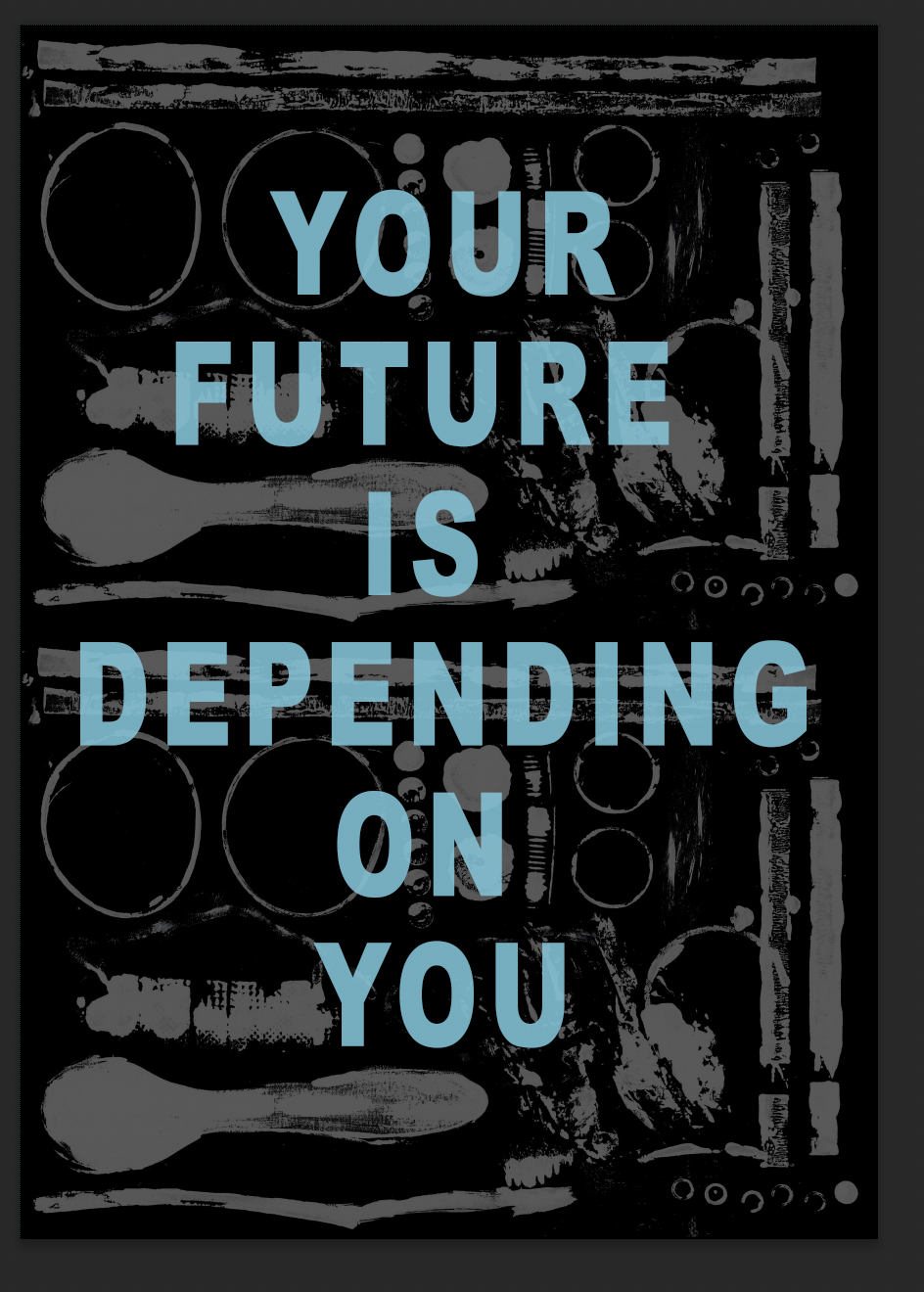
“You are the Future”
“We let the future happen to us”
I then went onto create print work by using various plastics that I could find around the house.
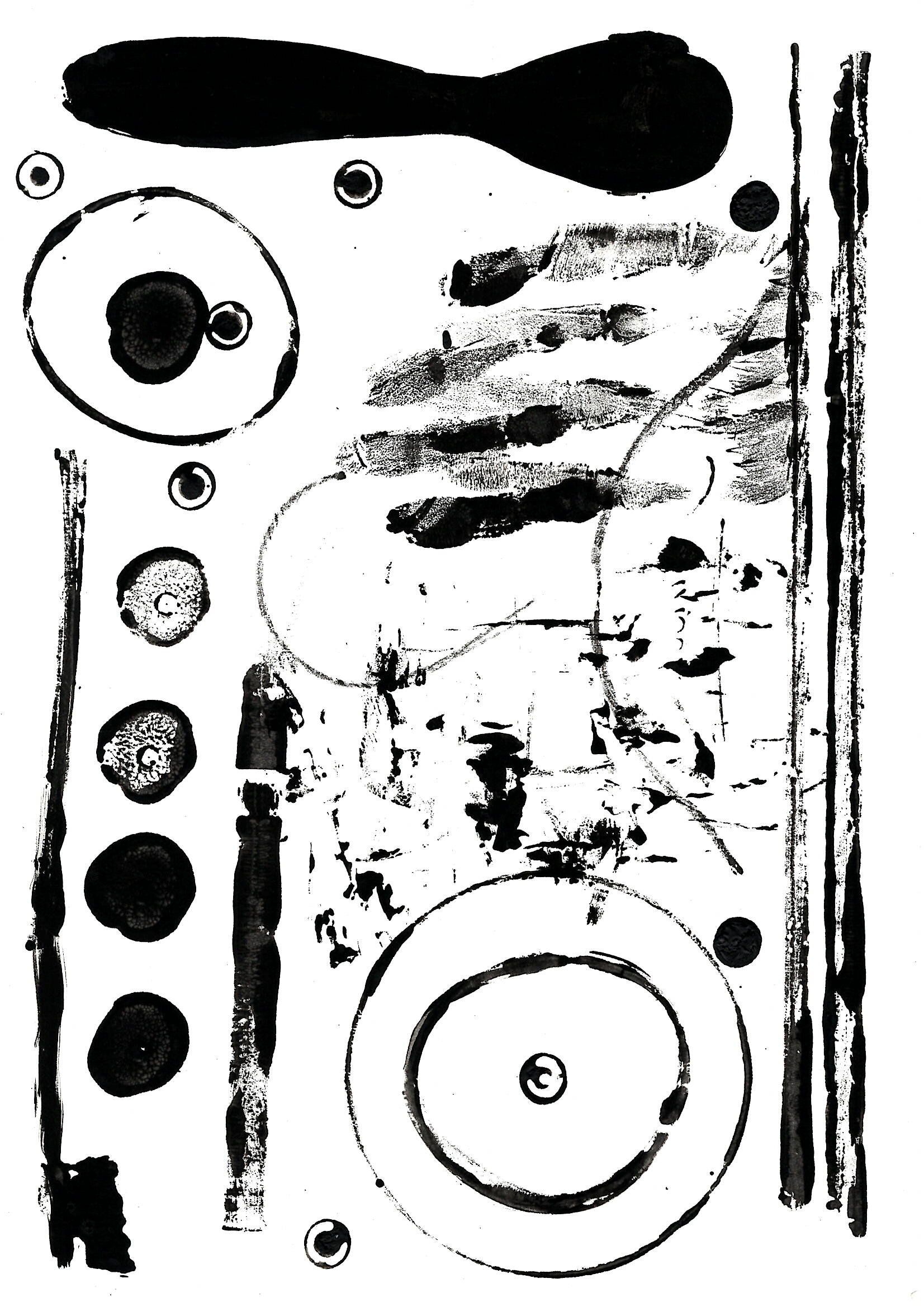
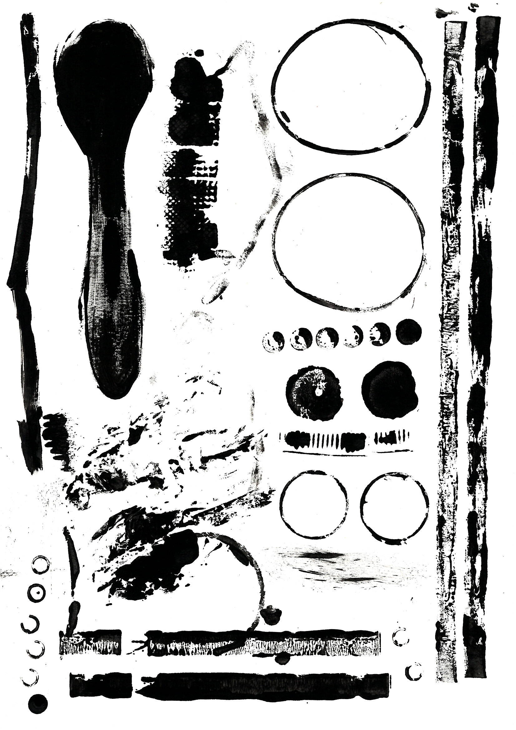
I then wanted to see how if these were duplicated on a page how they would look overall as a poster -
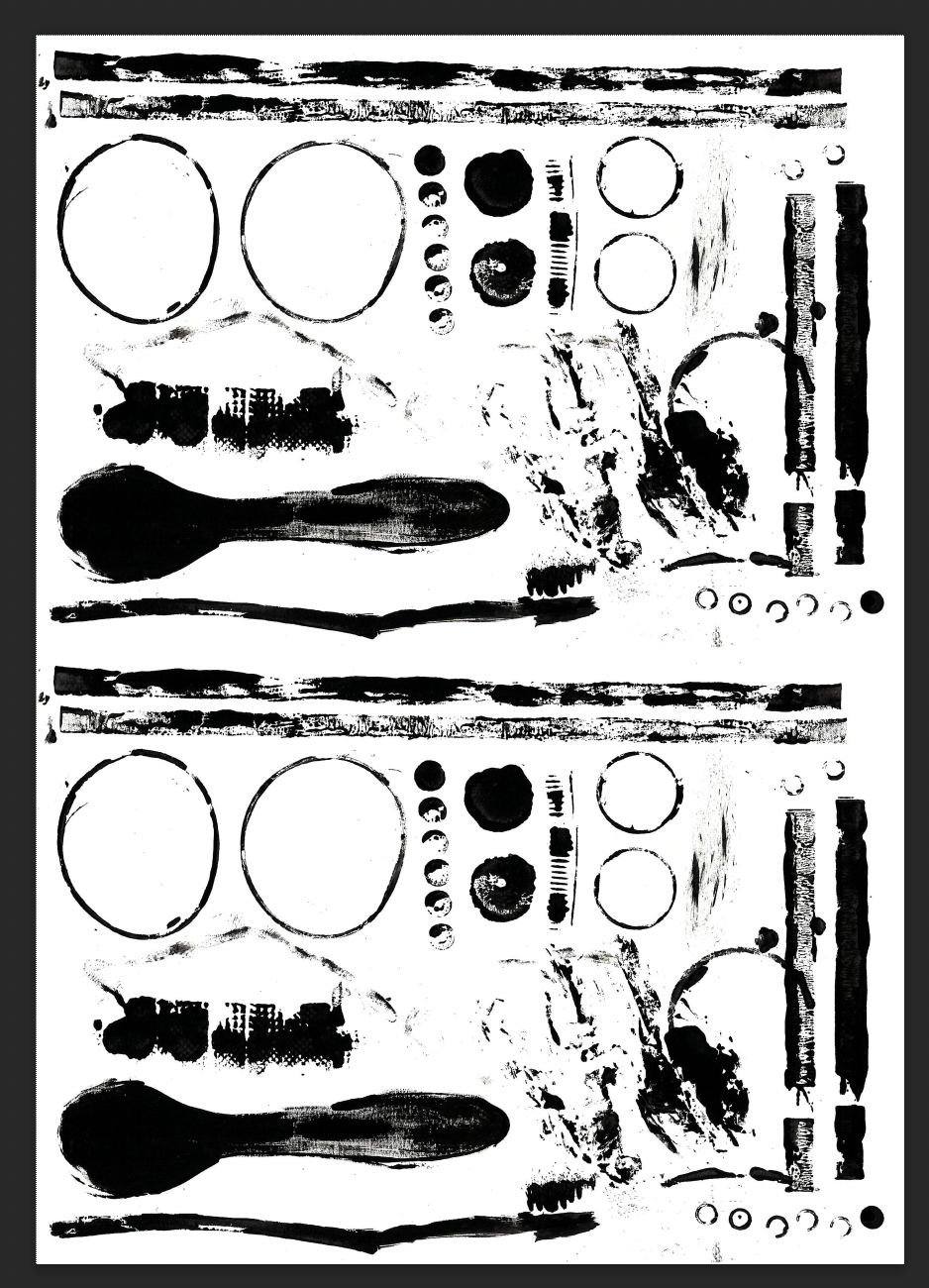
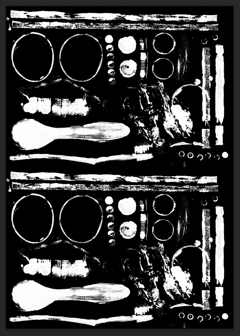
I also tried printing / drawing over the top of vector images - again plastics from the ocean.


It just wasn’t working for me - so I tried some other routes to see if I could figure it out.

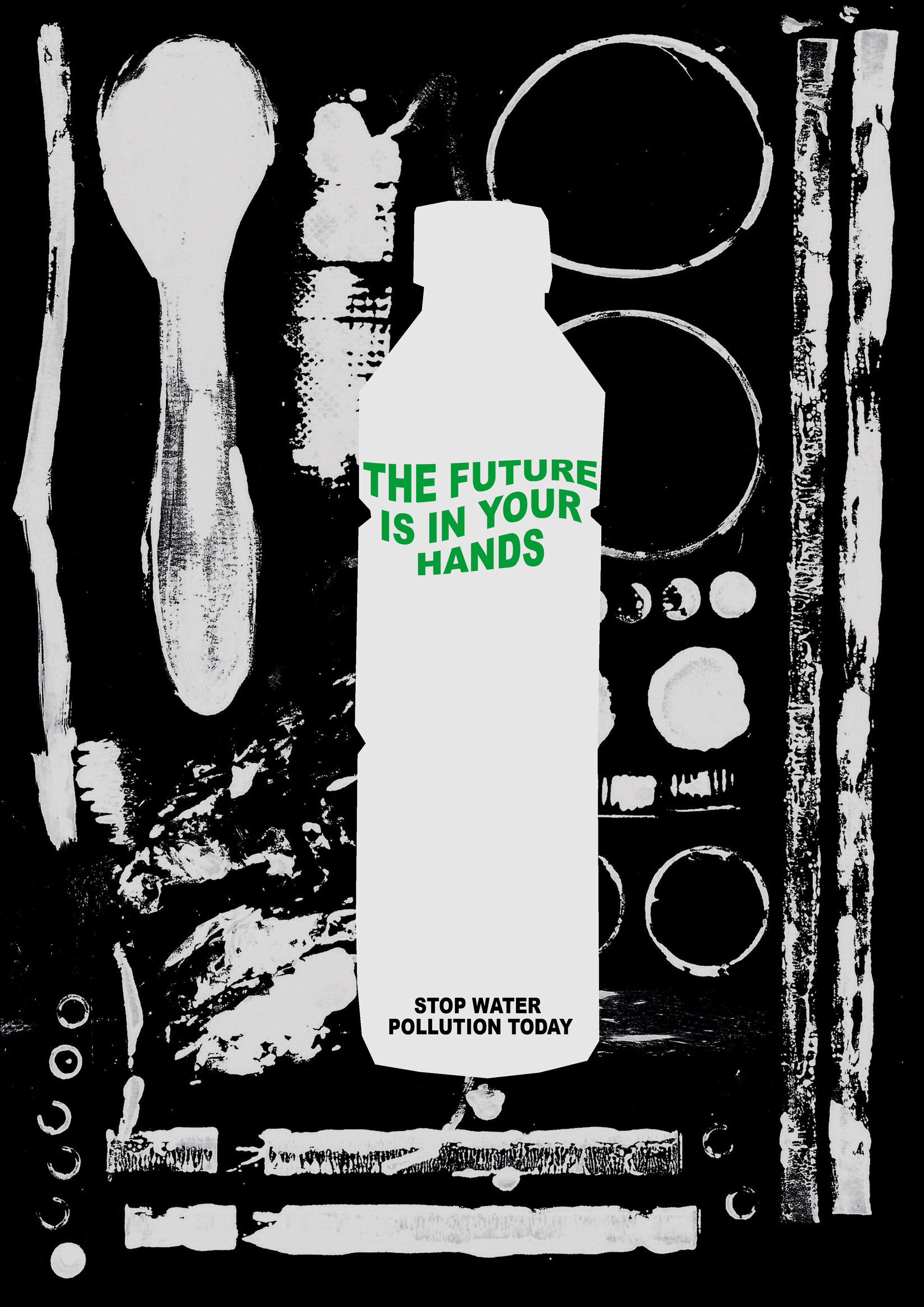
I tried putting a bottle in the middle of this poster to begin with - but I still wasn’t completely sure on whether I liked this image.

I then went on to another approach taking into account extinction rebellion, they said that you have blood on your hands.

I then went onto look at a can design -that could be used in association for the vending machine.

I felt like the words didn’t work - so I looked at incorporating previous images.

I then decided to cut the image in the centre to make a drop - to symbolise that the water is full of plastics.

I then thought that this drop of water could be used within other images, so tried it in this one and wasn’t sure about it.

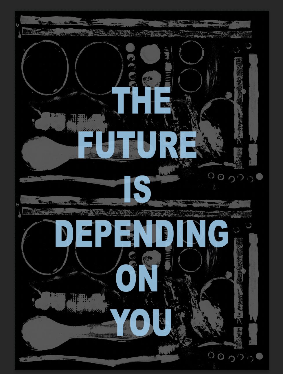
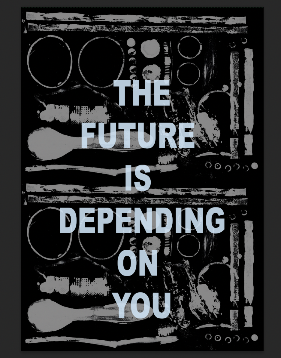
I then went for a completely different approach, using none of the images at all but typography in blue to symbolise the water. I still didn’t think this was effective.

Eventually I went back to the previous one and tried to make the key wording a little bit more interesting. I then thought what If I made this into a series of posters.

I went on to create the fish coming out of the plastic water. Using different colour wording taking inspiration from extinction rebellion.

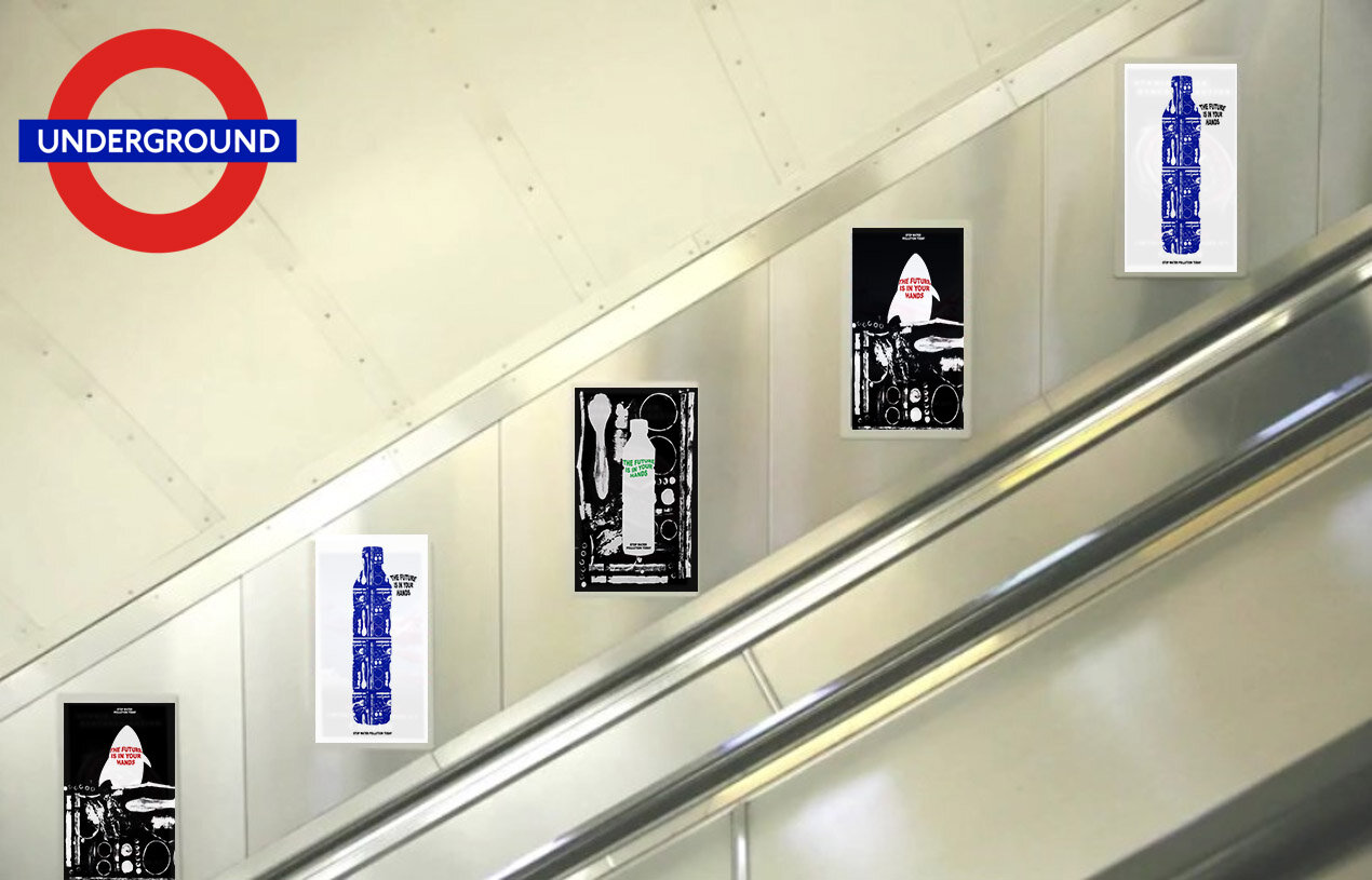
Due to it being a triple poster - I wanted one to be slightly different coloured than the rest of them. This one was a white background with blue on top. It can be seen below in a three.
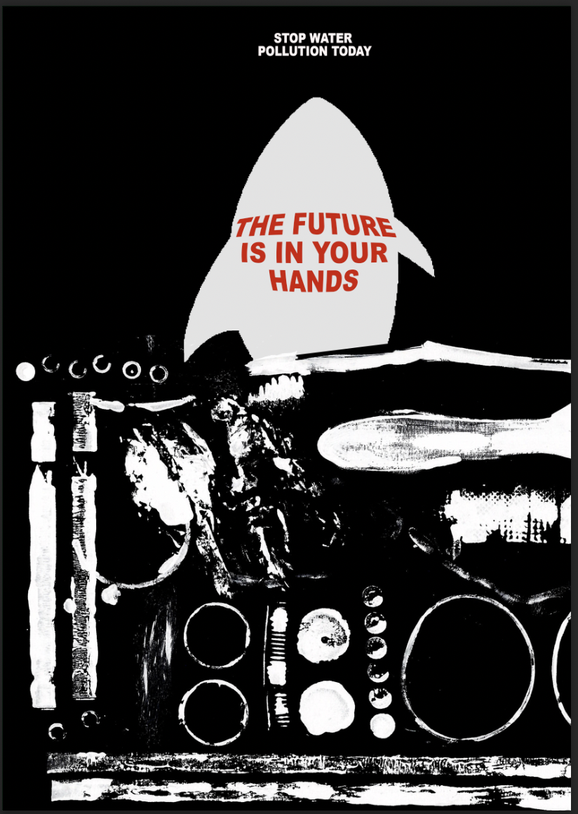
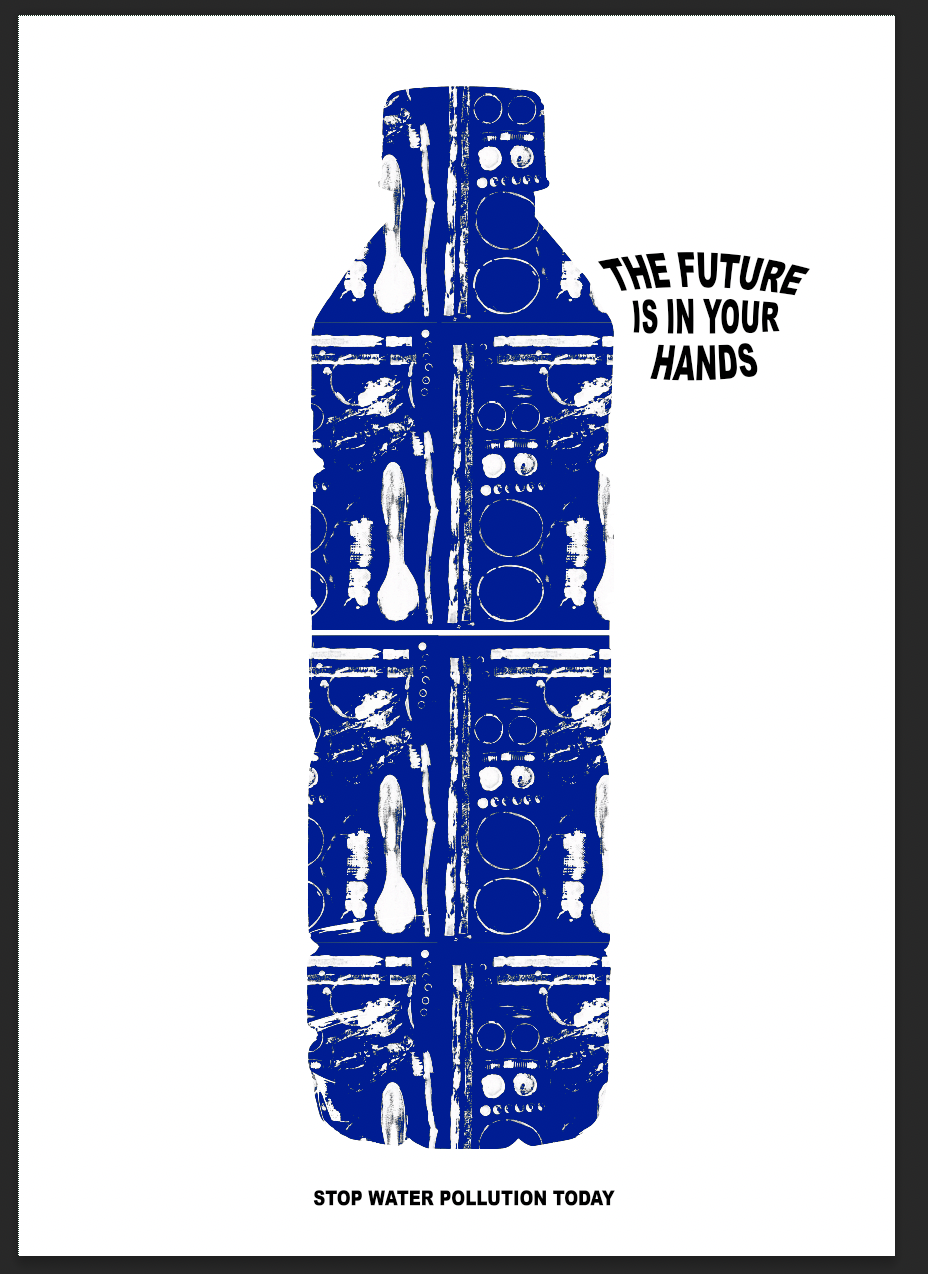
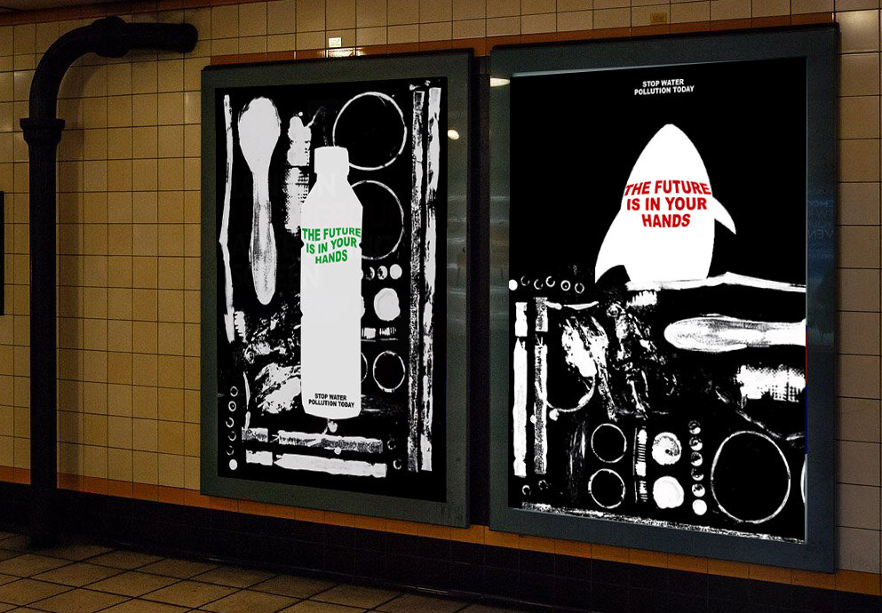
From this, I still wanted to create an advert / protest that shows just how bad the pollution is and how it is eye opening to others. I used the can from the above testing and also changed how one of the posters look to contain the contents on the front.

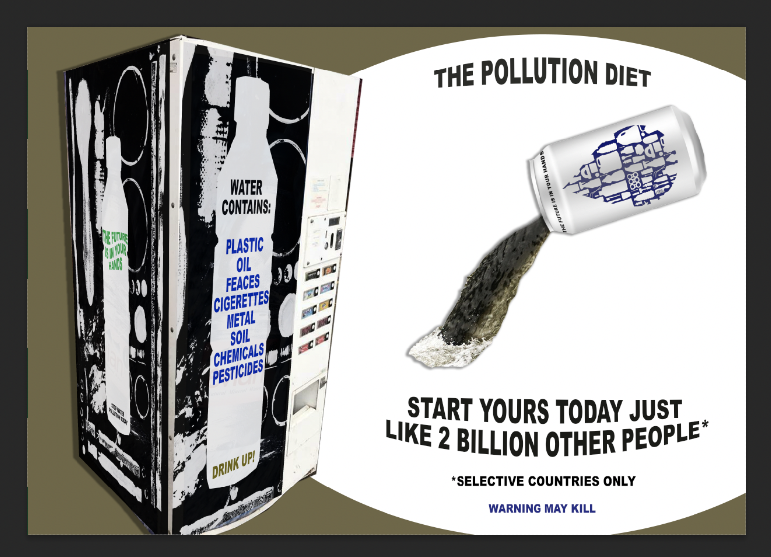
To make it a little bit more grundy and pollution like I added a border that was the same colour as the pollution that was pouring out. I hope that this is eye opening enough for people to understand just how bad the water pollution is.
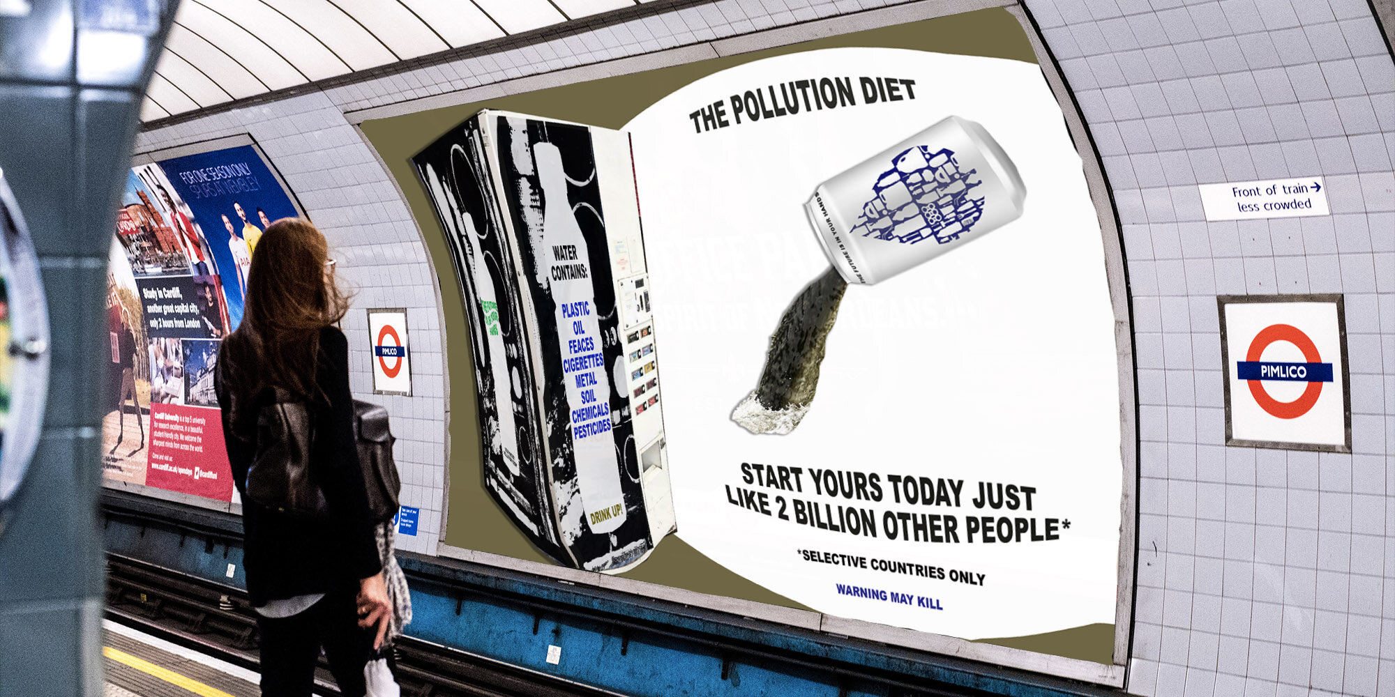
I have done mock ups of how this advertising could be displayed:
Weekly Reflection
Overall, this week has been really interesting to learn about the changing environment that is happening around us but also how we are using those joint skills to advertise within the world. Changing an application or the way that we do advertisement can change our perception on what is really happening.
I decided to take inspiration this week from the scientist within resource 3, Anab Jain. I think until we visualise what is really happening to the world we are quite oblivious to the climate change that is happening around us.
The consumer behaviour needs to change and having more protesting posters should help with that. I researched various artists and protesters that were trying to make a difference with their art, visual protesting. This led me to this weeks outcome of looking how we can make the pollution diet a trend for the better. Everyone tries allsorts of diets so it catches the attention of the viewer.
It is not meant to be appealing, but it’s meant to show that people across the world are suffering with this each day and that change needs to happen.