Week Eleven
Lecture Notes:
Lecture One:
Lecture Two:
Lecture Three:
Lecture Summary:
Lecture One:
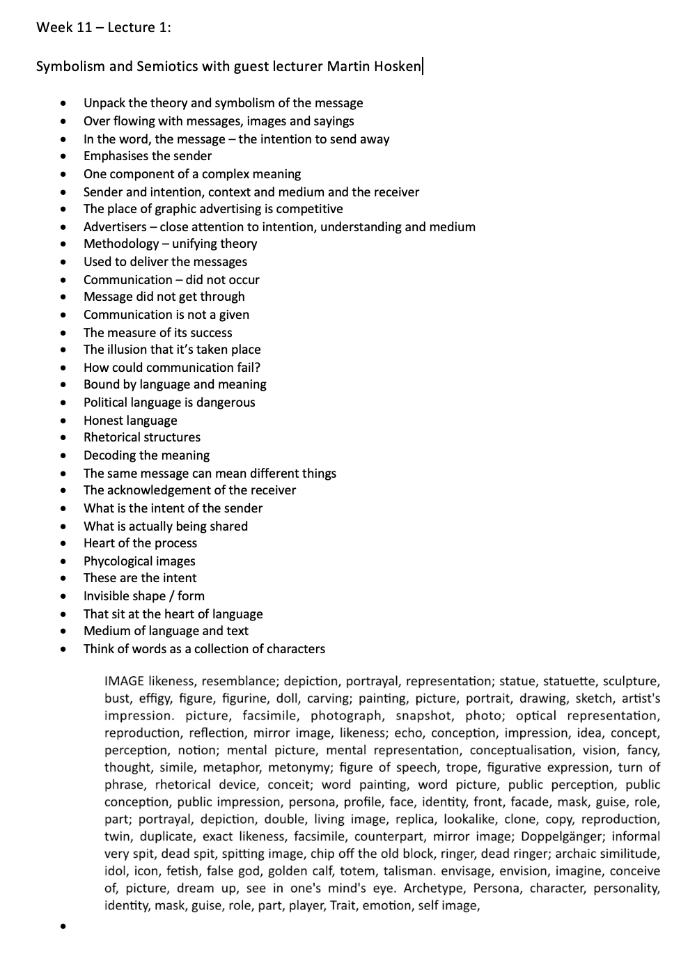
The main take away from this lecture with Martin Hosken, is this whole sense of the signifier and the signified = sign. I think this is a very interesting concept that all comes down to your knowledge and interpretation of things / subjects. What if we didn’t know anything and we saw a sign but we didn’t understand it? I think this would lead to some very interesting imprecations and meanings taken from signs. Also this whole notion of a symbol that’s culturally implied, this is very clear when you go to a different country and its not the same as where you live so you take things in differently.
Lecture Two:
The interesting point that Tom from Regular practise makes is that we are unpacking the meaning behind global symbols. Looking at the olympic logos over time was fascinating as I’ve never really taken a closer look and gone what does that mean but each logo related culturally to the location that the olympics is set for that year. The main year and country that stood out for me was Beijing 2008, where they have used the stamps from Chinese postage and the logo is seemly torn its a distillation of the country but not directly referenced. I would never have read deeper into the meaning behind it.
Lecture Three:
Patrick Thomas has made a particularly interesting installation in terms of the breaking events that are taken from RSS and then projected onto the screens that around. Making It interactive visitors can scan a barcode and interact. This mix of the typography that’s presented but also the graphic that’s randomly placed over the top in different colours leads to the output that becomes really interesting. I think what adds that extra level on top is the fact that it’s taken from global news headlines, so the text isn’t just English but any language. The whole how we receive our news and can we trust it - is questioning the rights and wrong of another social media platform.
Resources Notes:
Resource One:
Resource Two:
Resource Three:
Resources Summary:
Resource One:
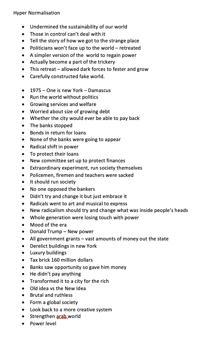
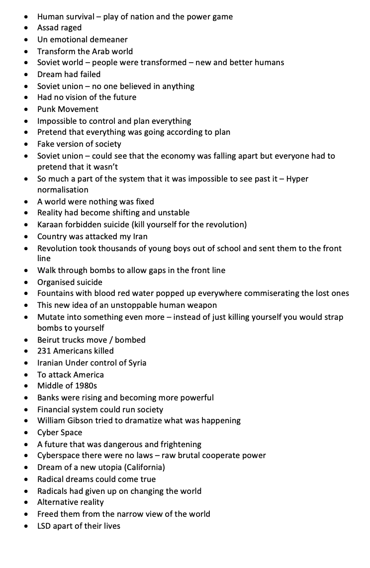
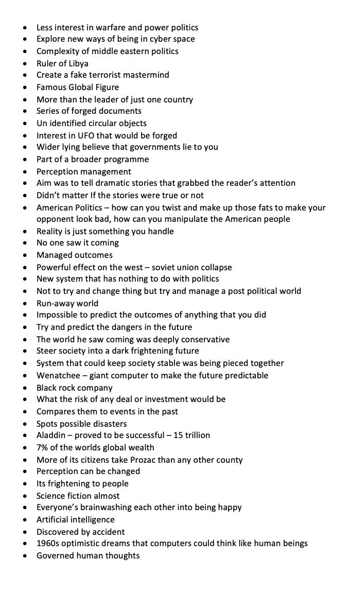
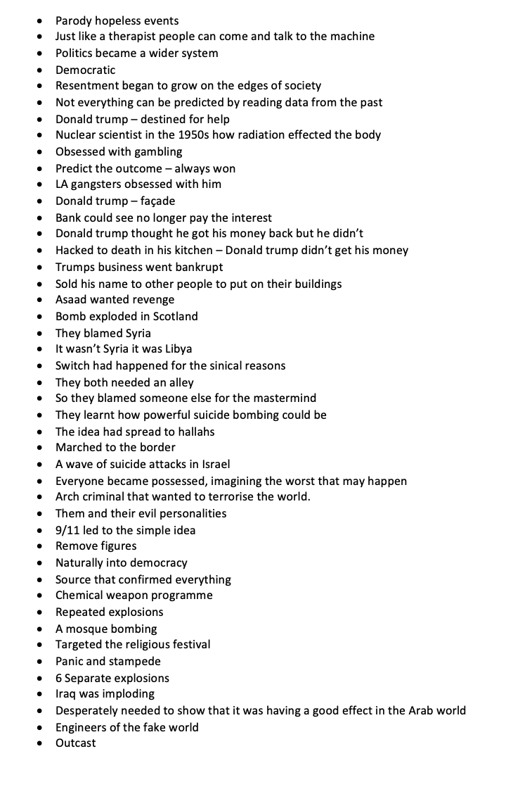
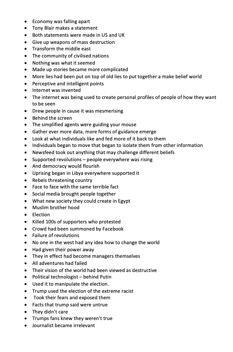
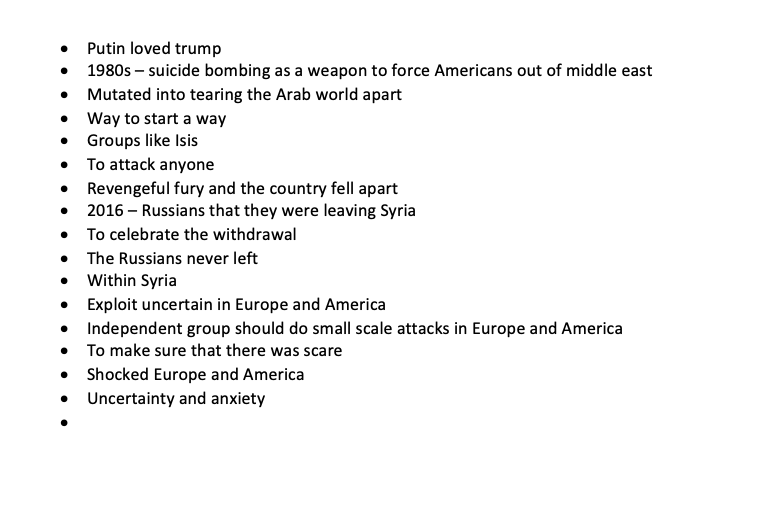
BBC (2016) Adam Curtis: Hypernormalisation [online video] Available at https://vimeo.com/191817381 (Links to an external site.)
This documentary was just eye opening to all the events that have happened over the past decades. Uncovering the lies and the key historic moments that have clearly changed how our countries are run. I think it does go to show that leaders of our countries do lie and you can’t really trust anything that is happening anywhere in the world. Another example of this is happening right now with Coronavirus, I mean it would be silly to think its a hoax but at the same time it wouldn’t be hard to be persuaded to believe that this is a situation that is just something so that our leaders can control us and be in charge once more? What is going to happen once this whole coronavirus is over? This is also shown in the protests that are happening across the globe right now, anti lockdown, brought together by the internet. Every positive within this world there is a negative.
Resource Two:
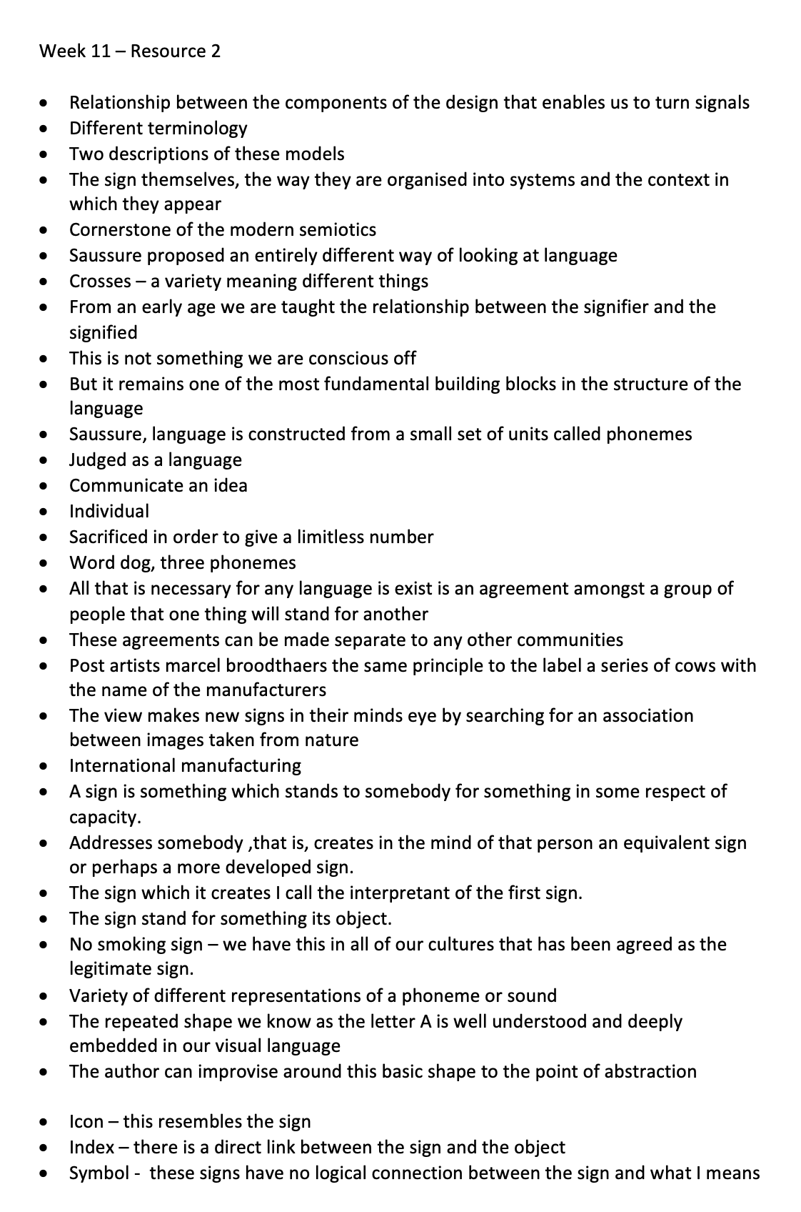
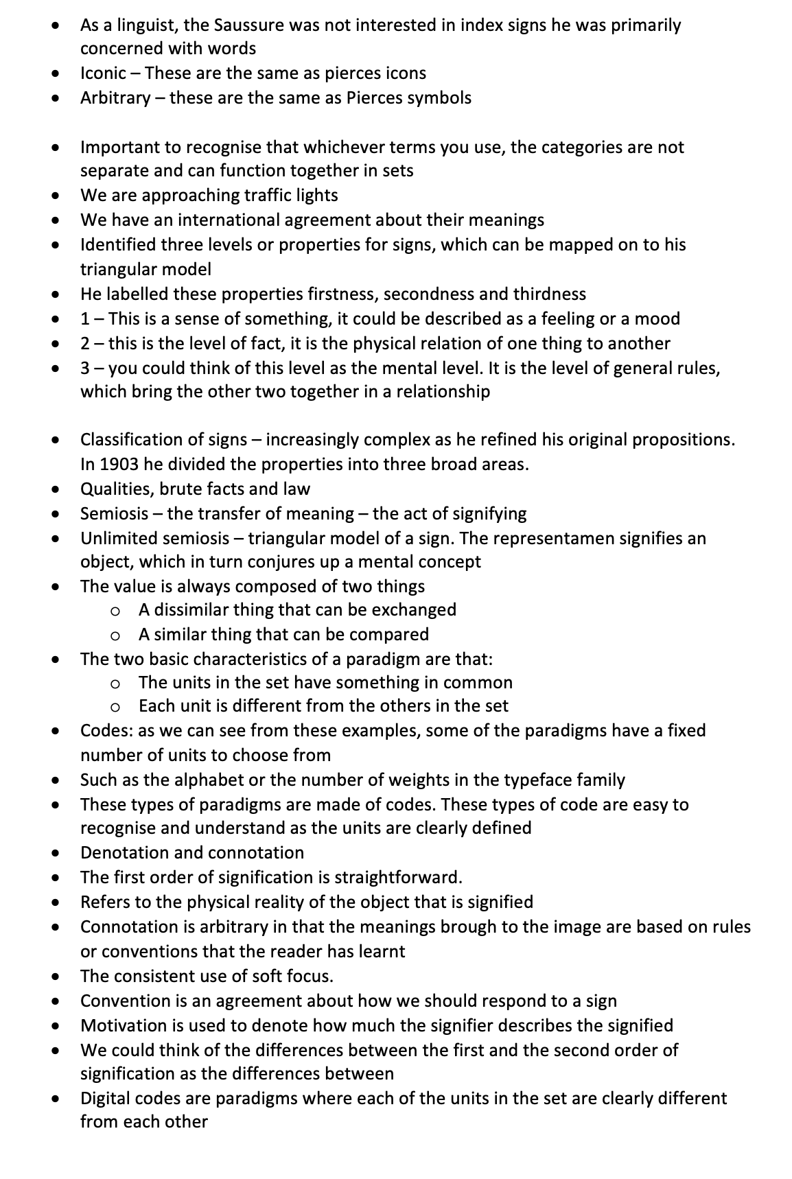
Crow, D., (2003) Visible signs: An Introduction to Semiotics (Links to an external site.). AVA, London.
This resource was mainly just repeating a lot of the lecture but it was nice to see how it related to graphic design. I really like this who idea of symbolic creativity that is mentioned within the resource. Willis says that there is 'vibrant symbolic life and an active symbolic creativity in everyday life, everyday activities and expressions’ also mention that those who don’t understand are simply uncultured. This has really opened my eyes to the meaning behind art and “· From an early age we are taught the relationship between the signifier and the signified “ Which I just think is so interesting how we’ve been brought up in this world where we know the meaning, but what if we wernt’t? is this where creativity comes from?
Resource Three:
Heller S., (1999) Design literacy (Continued) Understanding Graphic Design (Links to an external site.). Allworth Press, New York.
This resource was just eyeopening to how reporters can report stories that they know nothing about. I think it also shows the importance of how graphic designers always have a story to tell and we are about looking at solutions, whether that’s to do with advertising or looking at creating bitmap typefaces. I think there’s also something within this about perspective and how we approach things. How we approach graphic design and illustration in general, we should be doing it for a cause or a reason to make change within the area. I like the term ‘ Visual essay’ showing how something can be so visual when its not made out of words.
Research

“Reality Dependant on Images”
The above documentary that was on BBC, really opened my eyes to the filming capabilities that are possible and how easy it is to deceive the eye. We have become so obsessed about filming our everyday life and what’s going on around us, are we looking at the real truth? One of the artists that really stood out for me within this was Alison Jackson, I wanted to see some of the images for myself.

Jacksons imagery has a humour to it by either using clay or look alike models for her shoots. I think it makes us look at celebrities and key figures across the world in a different way, she often tries to portray them as normal, which can be seen in the photograph above. This does play on the mind as a lot of the images look identical to the famous celebrities and it’s funny that you see that image on the news for them. This is a key moment in society, it is fake news.
Workshop Challenge:
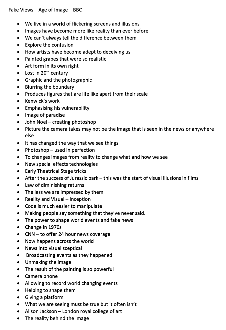
Coca-Cola
I have chosen the brand coca-cola as I feel this is a brand that can be interpreted and seen anywhere in the world!
Background on Coca-Cola
“The Coca-Cola Company, was first founded in the year of 1892 and still to this day engages primarily in the manufacture and sale of syrup and concentrate for Coca-Cola, a sweetened carbonated beverage that is loved by people around the world. The company also produces and sells other soft drinks and citrus beverages. With more than 2,800 other products available in more than 200 countries around the globe. Coca-Cola is in fact the largest beverage manufacturer and distributor in the world today with is headquarters based in Atlanta Georgia it’s also one of the largest corporations in the United States of America.,
The Coca-Cola drink was originated in the year of 1886 by the Atlanta Pharmacist Dr John Pemberton. One afternoon, the pharmacist stirred up a fragrant, caramel-coloured liquid and, once completed he carried it a few doors down to Jacobs’ Pharmacy. Here, the mixture was combined together with carbonated water and sampled by customers visiting the Pharmacy who agreed this new drink had something special about it. With such a positive reaction from the public Jacobs’ Pharmacy put it on sale for five cents (about 3p) a glass.”
Coca Cola Brand Values
To refresh the world...
To inspire moments of optimism and happiness...
To create value and make a difference.
Inspire creativity, passion, optimism and fun
How was the logo made?
“Coca-Cola is one of the most famous logos in the world today, and its curvey flowing script was designed by Dr John Pemberton’s bookkeeper Frank Mason Robinson who realised that the two curly ‘C’s would look great in advertising, he came up with the name previously and later flowing logotype in Spencerian script the exact date is not clear but during May of 1886, and officially registered as a trademark in 1887.
The Spencerian script was developed in the mid-19th century and was the dominant form of formal handwriting in the US during that period. Prior to the scripted logo at least one ad is known to have used the 86 logo including the hyphen to improve readability.”

Trademark logo Changes
The logo timeline

1887

1891-1892

1893-1904

1903-1941 Trademark Registered

1941-1962

1950s

1950s Diner Style Decor

1958 - Fishtail logo

1969-1985 Catch the Wave

1985-1987 New Coke

1987 Back to Classic
Modernised with added silver

1993-2002 Always Coca Cola

2002-2007 The Dynamic Ribbon

2007
Present
I think this logo process just goes to show that the logo has been envolving for a very long time. They’ve made slight changes here and there where they needed to but it was consistent with the colour and the font.
What does the Logo stand for?
“The name Coca-Cola was coined together to tell customers that the coca leaf and the kola nut are important ingredients in the drink.”
RED: Passion, strength, power, love, energy.
WHITE: Innocence, youth, peace, purity, humility.
“Studies have also shown the color red can trigger impulse buys. The white swirling letters also simulate passion. White is viewed as a brilliant color, making it perfect for signage due to its eye-catching qualities.”
“A report suggested that a staggering 94% of the entire world’s population recognised the red and white logo rather than the brand name itself to distinguish the brand and its product.”
“Due to Coca-Cola’s red and white mixture of brand colours there is a myth that they themselves invented Santa Claus as we are familiar with today wearing the red suite with white trim outline”
The Bottle
“The Coca-Cola Company signed its first agreement in 1899 with an independent bottling company, this bottling company as part of the agreement was allowed to buy the syrup and produce, bottle, and distribute the Coca-Cola drink.”
“The Coca-Cola bottle with its iconic contour fluted lines is properly one of the most famous shapes in the world today. It was even renowned as a design classic, and also described by industrial designer and designer of the 1971 shell logo symbol, Raymond Loewy as the “perfect liquid wrapper,” this famous Coca-Cola bottle has been celebrated in art, music and advertising world-wide.
When Andy Warhol who was known as the father to the Pop Art movement began painting his famous series of Coca-Cola bottles in the early 1960s, he had a vision and drew a shape to represent mass culture, when the German automaker Volkswagen wanted to celebrate the shape of the Beatle, they compared the car to the bottle.”

Andy Warhol
Coke Bottle - 1960
Advertising through time
“During the post-World War II years this saw diverse change in the packaging of Coca-Cola and its development and acquisition of new products. The “Coke,” trademark was first used in advertising in the year 1941, and was registered in 1945.”

One of the first Tv Christmas adverts for coca-cola can be seen above - thought to be filed in 1995. This hasn’t changed at all though the years and a new interpretation was only used just last year!
How is it symbolised in different countries?

Due to how iconic and well know the coca-cola logo is - It has been translated across the globe. Coca-Cola sell in every country but 2. So their logo obviously has to translate well. They have taken the same font and width and translated the logo for different countries which can be seen above.
Shown below are different marketing campaigns that can be found in different countries:

Spanish Advertisment

Cyprus Advertisement

South Korea Advertisment

Japan Advertisement

Brasil - 2014 World Cup Advertisement

Ramadan Advertisement

Morocco Advertisement

Bangladesh Advertisment
So as you can see from the above advertisements, the shape and the colours of coca-cola are often seen within the advertisements that are across the world. Making sure that we continue to associate those particular colours to the brand. It can also be seen within the Cyprus and the Japan bottle, that the design of the bottle has been taken from the cultural aspect. The brasil bottle was influenced by an event that was happening at the time, which a lot of people would be travelling across the world for. Even ramadan can be seen, being advertised, making sure that all the religions are also being taken into account. Making sure that the brand caters for everyone.

Worldwide Machine - Just showing that the brand has no boundaries when it comes to being able to access the drink from anywhere. I feel like this just confirms how global the brand coca-cola is.
Does it work at a local level?
The video that is above, was made for the Icelandic football Fans and embracing their countries successes with the World Cup in 2018. This advert works really well on a local level to Iceland but also on a global level as it feels very humbling to include some beautiful shots of Iceland and even the worlds strongest man made an appearance.
This advertisement which has been shot in Switzerland - takes something that is really cultural as cheesemaking and makes it into a advertisement for coca-cola. Showing that any food can be enjoyed with coca-cola anywhere in the world.
The advertisement above for India -has been made in terms of advertising for Diwali Festival. It’s a festival where everyone gets together to celebrate. I think this particular ad shows that this is very much a family advertised drink as-well which is also shown in Global ads shown later on.
Does it work as a global level?
One way that coca-cola works on a global level is their Christmas Advertisement. Across the Globe their Christmas advertisement is understood due to the lack of language that is involved to understand the storyline concept. The language that is included is translated and changed in order for that particular country to understand. Their advertisement also includes a lot of colour placement of the colours red and white that allows the viewer to associate those colours with the brand. This particular advert this year is coming back to families and that is one of the brand values of the company.
A previous Christmas advert can be shown below. Aswell as the Christmas colours that coca-cola brings, they have also associated these big red trucks to Christmas. Due to covid this year they aren’t able to line the streets of Britain with the big red trucks that can be seen in the video below. This is now an association with the holidays and Christmas - which can be seen how excited the children get within the advert.
Another way in which the brand works globally, is all their sporting events. As sport is widely understood and appreciated in any language. Below is an advert for the Rio 2016 Olympics with clips from the olympics showing what a gold feeling is, implying that when you drink coca-cola you have that gold feeling. I think this works really well with the brand as they look at creating happiness moments and these athletes are beyond happy and it just makes you smile.
Finally this concept, the hug machine. I think this is such a great concept, where you hug the coke machine and it returns with a coke can. Implying that the happiness or kindness that you give you also receive. Within the video there are also a lot of people that are happy, which is warming to see.
How does the media interpret the Coca Cola Brand?

Health
One of the main factors which the news and media like the play with, Is the health behind the coca-cola brand and how the sugary drinks are bad for your health. This is something that is toy’d upon a lot in the media, especially for young people and children.
I think due to how big coca-cola brand is and how many drinks they own, their is a light that shines on them majority of the time, whether they are doing good things or bad things. But I know a lot of people associate the word cola-cola has having a lot of sugar within which can be seen in the below video that has over 4million views.
Another article that shapes how coca-cola is seen within the media is the fact it is still producing coke in plastic bottles, although it is bad for the environment and they have changed their product so that the bottle are 50% recycled but still it was all over the news that coca-cola would still be producing plastic bottled versions so I guess it effects my view of the companies sustainability.
Workshop Output
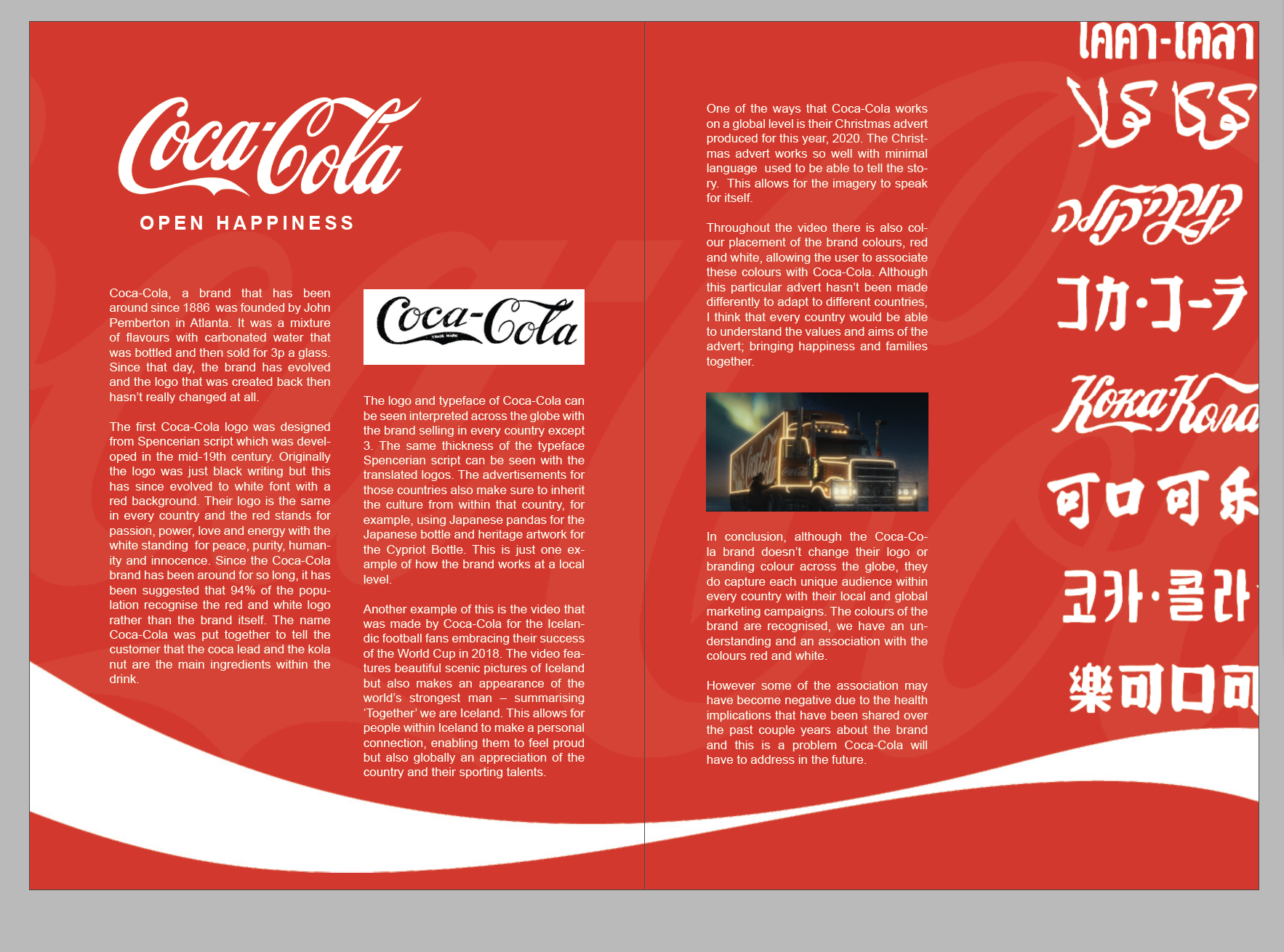
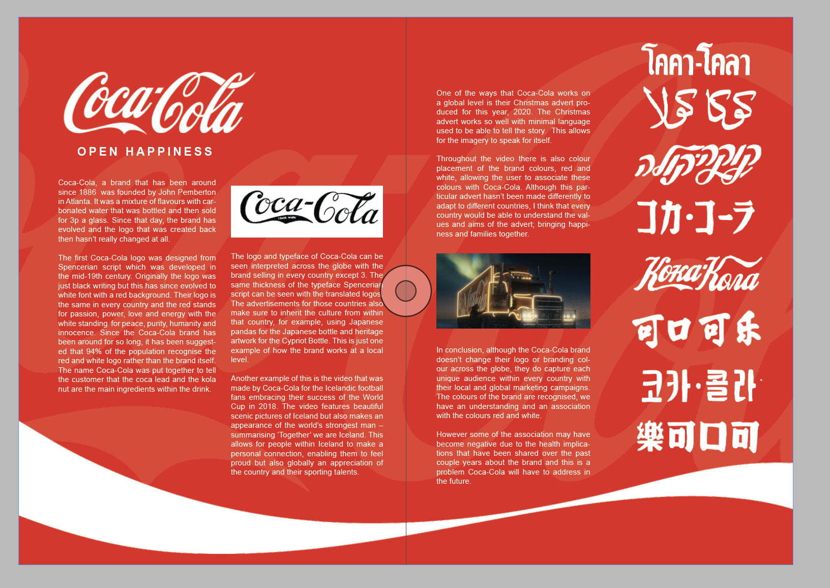
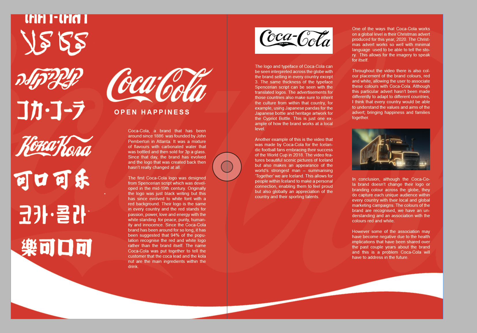
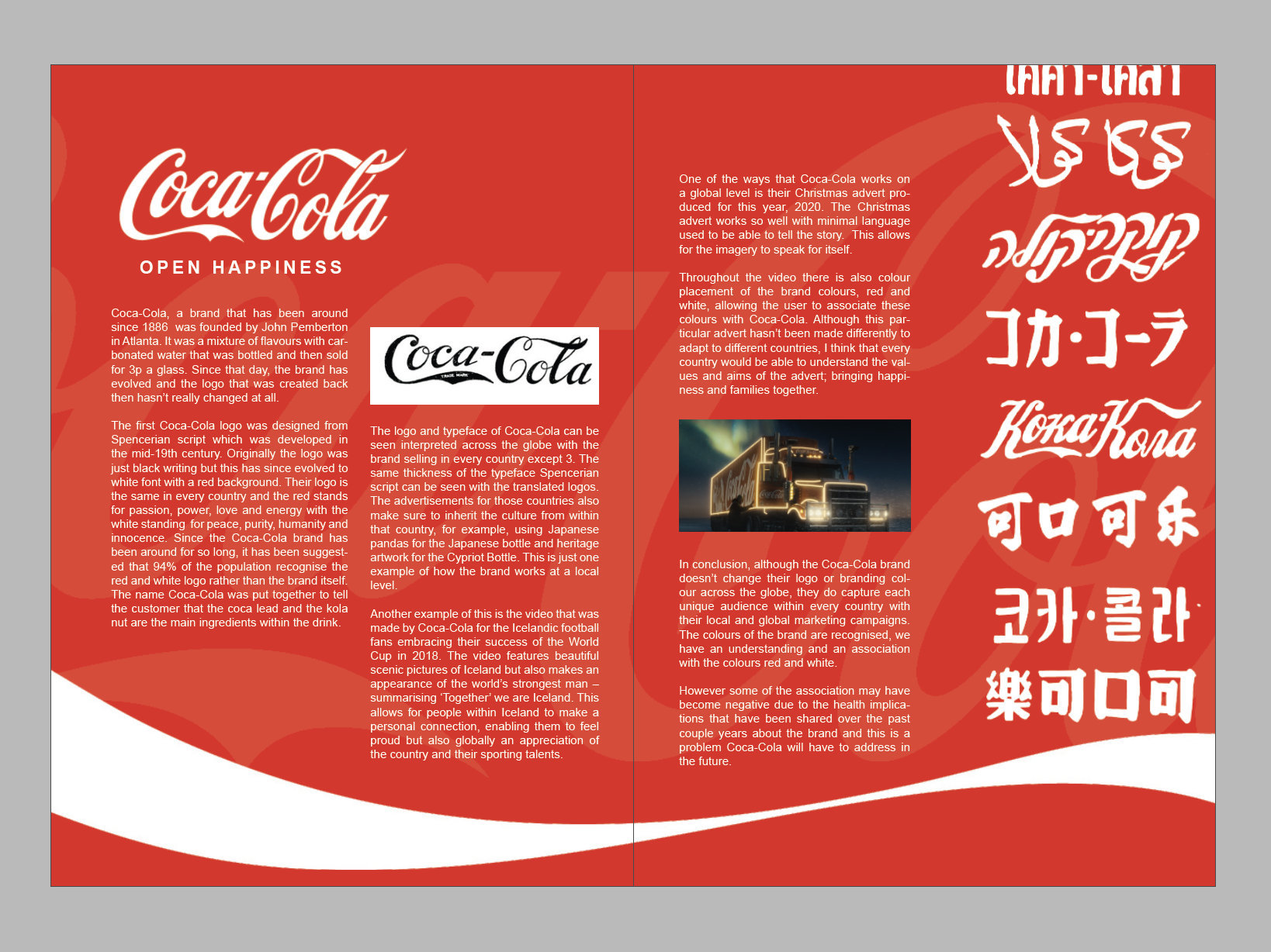
Coca-Cola, a brand that has been around since 1886 was founded by John Pemberton in Atlanta. It was a mixture of flavours with carbonated water that was bottled and then sold for 3p a glass. Since that day, the brand has evolved and the logo that was created back then hasn’t really changed at all.
The first Coca-Cola logo was designed from Spencerian script which was developed in the mid-19th century. Originally the logo was just black writing but this has since evolved to white font with a red background. Their logo is the same in every country and the red stands for passion, power, love and energy with the white standing for peace, purity, humanity and innocence. Since the Coca-Cola brand has been around for so long, it has been suggested that 94% of the population recognise the red and white logo rather than the brand itself. The name Coca-Cola was put together to tell the customer that the coca lead and the kola nut are the main ingredients within the drink.
The logo and typeface of Coca-Cola can be seen interpreted across the globe with the brand selling in every country except 3. The same thickness of the typeface Spencerian script can be seen with the translated logos. The advertisements for those countries also make sure to inherit the culture from within that country, for example, using Japanese pandas for the Japanese bottle and heritage artwork for the Cypriot Bottle. This is just one example of how the brand works at a local level. Another example of this is the video that was made by Coca-Cola for the Icelandic football fans embracing their success of the World Cup in 2018. The video features beautiful scenic pictures of Iceland but also makes an appearance of the world’s strongest man – summarising ‘Together’ we are Iceland. This allows for people within Iceland to make a personal connection, enabling them to feel proud but also globally an appreciation of the country and their sporting talents.
One of the ways that Coca-Cola works on a global level is their Christmas advert produced for this year, 2020. The Christmas advert works so well with minimal language used to be able to tell the story. This allows for the imagery to speak for itself. Throughout the video there is also colour placement of the brand colours, red and white, allowing the user to associate these colours with Coca-Cola. Although this particular advert hasn’t been made differently to adapt to different countries, I think that every country would be able to understand the values and aims of the advert; bringing happiness and families together.
In conclusion, although the Coca-Cola brand doesn’t change their logo or branding colour across the globe, they do capture each unique audience within every country with their local and global marketing campaigns. The colours of the brand are recognised, we have an understanding and an association with the colours red and white. However some of the association may have become negative due to the health implications that have been shared over the past couple years about the brand and this is a problem Coca-Cola will have to address in the future.
Below you can see the process of creating my editorial for this week:

This was my final result but after having some feedback from the crit - I decided to present it in different colours to make the point about that colour association doesn’t change.

Weekly Summary
This week has really opened my eyes to the amount of information that we take from the news and how the majority of it may be false. We are surrounded by influences from our everyday lives, that impact how we see and visualise brands. It was also interesting to learn about how we take colour and notions from signs and understand the meaning of this from a very young age which then led me to understand why 94% of the world associated Coca-Cola with the colour and not the font! The brand research was also really interesting to understand where the brand first started and how the typeface / branding of Coca-Cola first originated from.
I thought it was also nice to learn about how branding impact us culturally and globally, this has been shown through Coca-Cola’s impact on Christmas and how Santa was previously seen as green till Coca-Cola turned him red! There’s also something in this week about association of colour and branding, how branding and names are often changed across the world, which means we enable certain items as individual brands when they are actually apart of a wider net. This shows how manipulating certain brands can be.