Week Two
Lecture Reflection:
The main themes within the lecture this week were how design has changed throughout the decades, the history of graphic design and how technology and production has moved forward into the new generation.
Design is changing
Within the lecture, Edwards and Raein touch on points about how design has changed since the punk era of the 80s to the individuality of the now. Previously it seems that a lot of work was a statement to do with either political or social events that were happening at the time, reacting to the current climates. Where as now I feel that graphic design can sometimes react to the current climates, it doesn’t so much depend on whats happening within society. I would say the art industry is much more accepted now compared to the 80s and its become this huge industry where generation z love to get creative, the industry make just over 13 million every hour. Raein also talks about how production was a huge part back then as there would be separate people involved with the photography, a technician, a type setter and other designers on the project, I feel like thats moved on now to a man of all talents per se. I feel like designers now aren’t just bringing their graphic design skills but are also bringing their love for colour, photography, social media, wood work, textiles and every creative thing imaginable. Everyone has more than one talent or interest that they can bring to the table.
The History of Design
To really understand the history of the design that was mentioned in this week lecture, I researched some of the key names and found what they were known for, which can be found in my lecture notes above. I agree to what Edwards and Raein were saying about how valuable the history of design is and how in this generation we take for granted that we can find out things with a click of a button or a quick google search but in reality we have lost that personal touch with going and talking to people who have lived through the eras which became so famous. I think this is something Id like to find out more about within my research this week, possibly creating a time line and the key graphic design history that marks each era. I also find the motion of Micro Uptopias a particularly interesting topic to do with our generation today and I look forward to researching more about this topic.
Technology within Design
As I touched on before, technology has come along way within design since back in the day. Over 88% of the Uk now own a computer / laptop with over 79% of adults also owning a smartphone, these are crazy figures especially to think that the internet was only invented within the last 25 years. I think there were some interesting points made within the lecture about how production used to be done with rulers and colours for graphic design compared to the famous adobe suite that is used today. But is it for the better or for the worse? Obviously growing up in generation Z I think that the internet and social media has had it perks, especially connecting those who may live alone or all the way across the country/world. But I do feel like we have lost touch with the history and where our art/design path first came from. Raein also mentioned about knowing a little bit of everything within the culture but for generation z this has become a lazy habit for them, they have no need to retain information for the need that they can just ‘google it’. I find this whole topic particularly interesting as i’ve previously wrote my dissertation on the need for human connection and how that affects our public spaces.
Resources Notes
Reflection On Resources
I found this weeks recourses super interesting and I feel like I now have a greater understanding of the history of design, especially from the pre war graphic design compared to the post war modernisation. It was interesting to learn about all aspects, particularly the education part that we take for granted and which is so easily accessed today. I also found it interesting to learn about how one machine took over the jobs of people, so thats like one invention that can take away someones passion, which in that aspect is sad but also shows how fast new technology is being invented to make the ease of production faster and more economically sufficient. This resource has also made me aware that I am not familiar with any of the font names, so it was nice to have a brief understanding of where the names of the fonts came from but I feel I need to do more research within this.
Research
60s - 80s Modernism
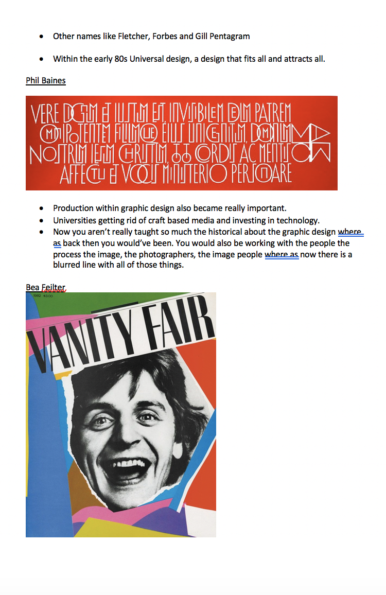
Corita Kent

Corita Kent (1918–1986) was an artist, educator, and advocate for social justice. At age 18 she entered the religious order Immaculate Heart of Mary, eventually teaching in and then heading up the art department at Immaculate Heart College. Her work evolved from figurative and religious to incorporating advertising images and slogans, popular song lyrics, biblical verses, and literature. Throughout the ‘60s, her work became increasingly political, urging viewers to consider poverty, racism, and injustice.”

Postage Stamp Designed by Corita Kent
I am really interested by this pieceby Corita. I love the use of colour and font in line with the rainbow.
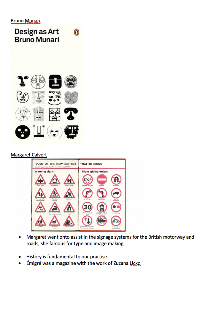
Derek Birdsall

“Derek Birdsall was born in Wakefield, Leeds in 1934. His design career began whilst barely a teenager, when a teacher of his recommended he join Art School, on the basis of his exceptional handwriting.
At just 15 he followed the advice and took an Intermediate Examination (the equivalent of today's Foundation qualification for an undergraduate degree) in Lettering at The Wakefield College of Art.
The Wakefield authorities, on finding out his age, insisted he continue in education for another 3 years, which is when he began to dabble in letterpress and found a job manufacturing cards for a local business.”

“In 1993 he designed this leaflet for IBM and the Design Council, as well as a poster”
I think what really stands out for me, within this work is the use of colour on the accents against the black and white. Its really classic fonts with almost child / playful accents over the top.
Richard Hollis

“Designer, teacher and author Richard Hollis was born in London in 1934. This was, he says “the only place in England where you could learn modern typography”. Near the school, in a tiny Holborn flat he began silkscreening wallpapers and posters while also working as a photo-engraver’s messenger.
Although mainly freelance, in the early 1960s Richard was employed in Paris as publicity designer for Galeries Lafayette and later went on to design the quarterly journal Modern Poetry In Translation, became the art editor of the weekly magazine New Society and later created John Berger’s Ways of Seeing. He also designed the visual identity and marketing materials for the Whitechapel Art Gallery in London (1970-72 and 1978-85) “

A summary of work by Richard Hollis. The work that particularly stood out of me was the screen printing side of his work. Also The large text and contrasting colours across all of his work.
Pentagram

“
Pentagram is a multi-disciplinary, independently-owned design studio.
Our work encompasses graphics and identity, products and packaging, exhibitions and installations, websites and digital experiences, advertising and communications, sound and motion. Our 25 partners are all practicing designers, and whether working collaboratively or independently, they do so in friendship.
Our structure is unique. We are the only major design studio where the owners of the business are the creators of the work and serve as the primary contact for every client. This reflects our conviction that great design cannot happen without passion, intelligence and — above all — personal commitment, and is demonstrated by a portfolio that spans five decades, many industries, and clients of every size.”

“The institution’s identity utilizes stencil typography for a season that is a work in progress due to the Covid-19 pandemic.”

“A public art installation to celebrate the first season of Hulu's ‘The Handmaid's Tale,’ based on the dystopian classic by Margaret Atwood.”
Margaret Calvert

“This was the mission entrusted to Margaret Calvert(1936 -) and Jock Kinneir (1917 - 1994) between 1957 and 1967. Their work subsequently became a model of modern road signage, replicated worldwide. Thousands of people see their work every day and take these signs for granted, without realizing the scale and revolutionary nature such a project had at the time!”

“Man at Work” – depicting a man digging, usually used to denote roadworks. The new artwork is a redesigned version of this ubiquitous image, reimagining it with a female, longer-haired, skirt-wearing worker.”
80s 90s Post Modernism
Branding logo and individualism, technology and society
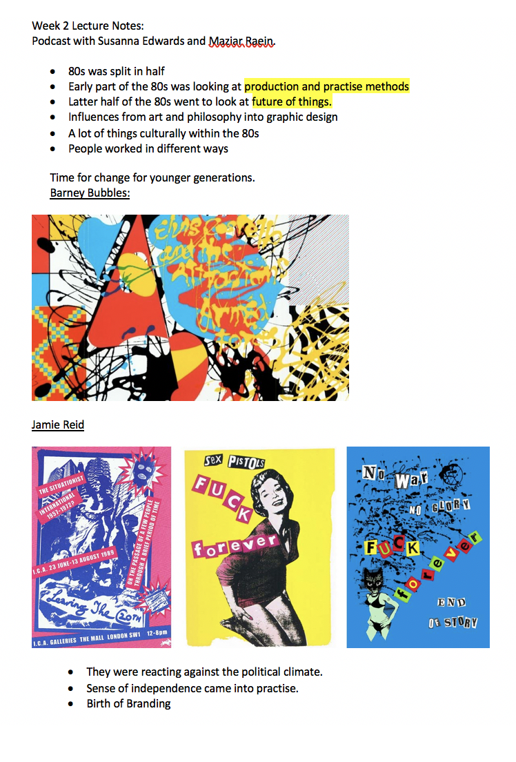
Barney Bubbles

“Barney Bubbles (born Colin Fulcher; 30 July 1942 – 14 November 1983) was an English graphic artist whose work encompassed graphic designand music video direction. Bubbles, who also sketched and painted privately, is best known for his distinctive contribution to the design practices associated with the British independent music scene of the 1970s and 1980s. His record sleeves, laden with symbols and riddles, were his most recognisable output.”
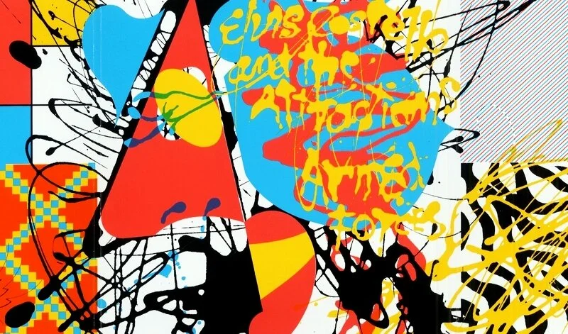
I love the overlays that are used within his work. They are like multiple images collaged together.
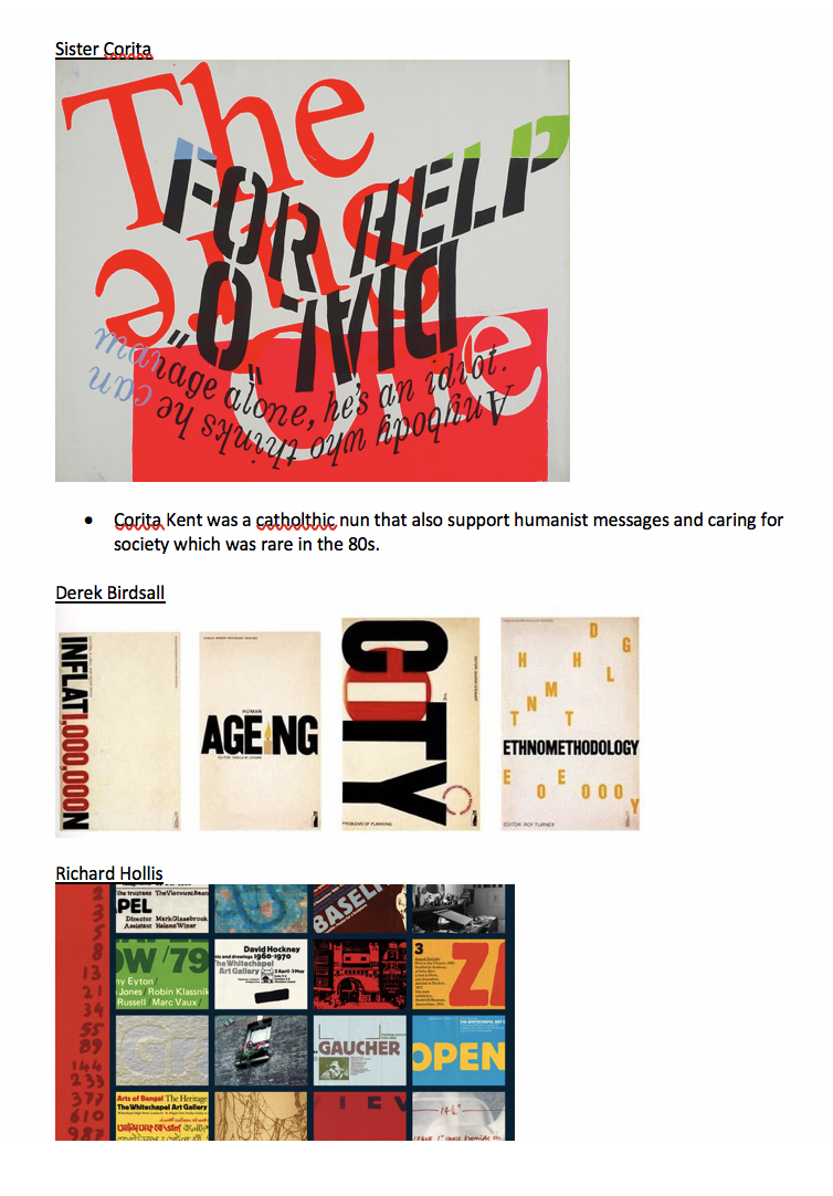
Jamie Reid

“Jamie Reid is a British artist best known for his décollage covers of the Sex Pistols’ albums Never Mind the Bollocks and Here’s the Sex Pistols, as well as their singles “Anarchy in the U.K.” and “God Save the Queen.” A self-described anarchist, Reid’s cover art helped define the aesthetic of the British punk movement with its faux-ransom-note letters and iconoclastic defacements of pop culture and nationalistic images.”

The use of the famous British collaged together really stands out for me. The queen in black and white and the British flag in full colour with newspaper collaged over the top.
Ray Gun

“Ray Gun was an American alternative rock-and-roll magazine, first published in 1992 in Santa Monica, California. Led by founding publisher Marvin Scott Jarrett, art director David Carson and executive editor Randy Bookasta, along with founding editor Neil Feineman, Ray Gun explored experimental magazine typographic design and unique angles on the pop cultural currents of the 1990s. The editorial content was framed in a chaotic, abstract "grunge typography" style, not always readable (it once published an interview with Bryan Ferry entirely in the symbol font Zapf Dingbats), but distinctive in appearance.”
Vaughan Oliver

“For much of his career, Oliver designed album sleeves for independent British music label 4AD, where his work routinely defied categorisation and themes. Watercolour-brushed barely-human forms, topless flamenco dancers and abstract monkeys, depicted in his signature gothic, surrealist and texture-heavy styles, graced the covers of work from the Pixies, Cocteau Twins, the Breeders and many others.”

Olivers work stands out for me, particularly the black and white images above that almost look like pictures that were taken.
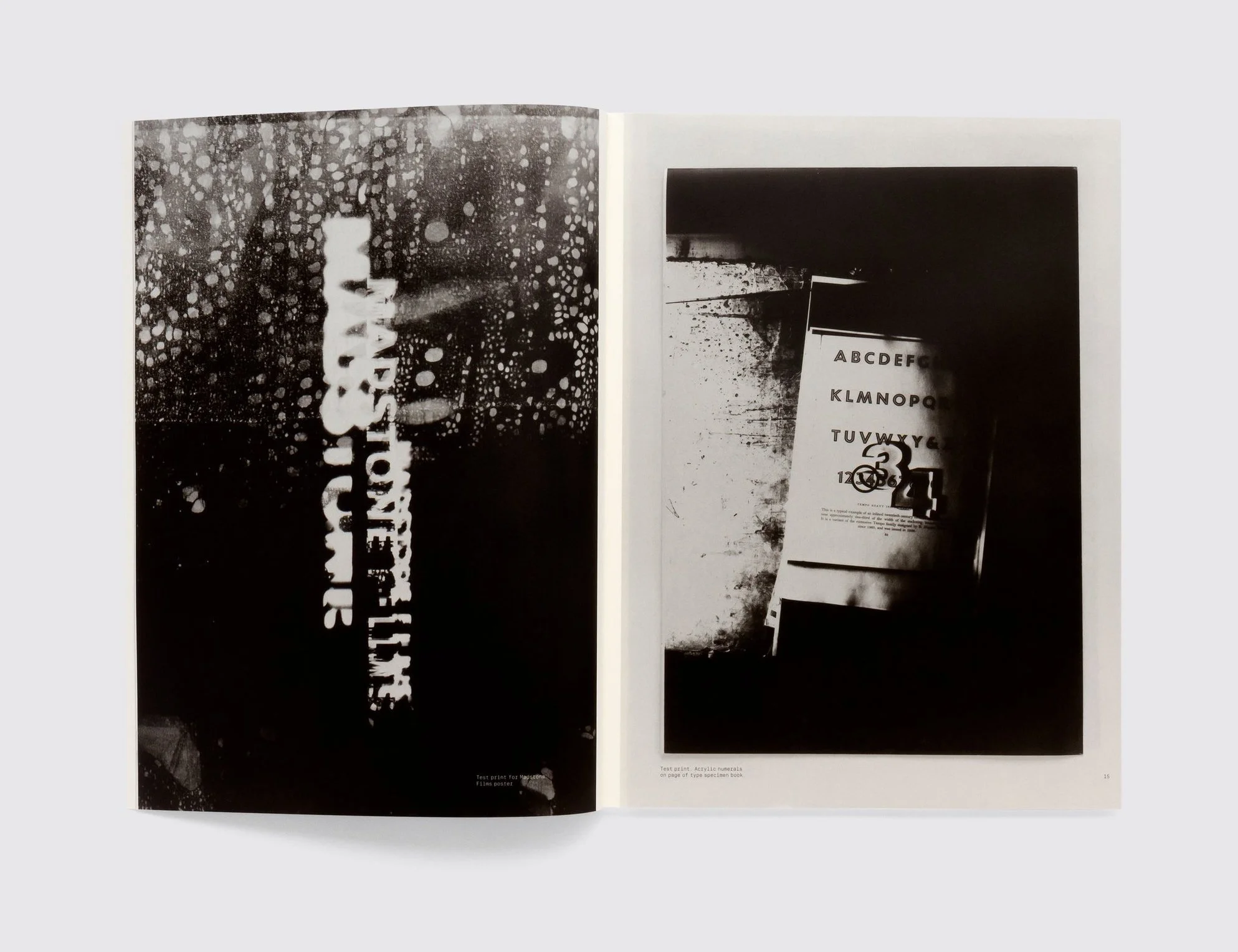
Phil Baines
“
Baines’s work of this period was heavily biased toward experimental typography that took inspiration from medieval manuscripts and the writings of Marshall McLuhan and George Steiner – he has often noted that his influences came from written rather than visual sources. Letterpress exerted a particular attraction due to its do-it-yourself aspect: the entire process could be handled from concept to production without outside involvement.”
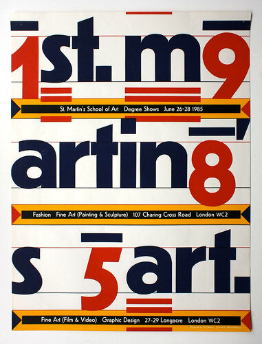
Degree show poster, St Martin’s School of Art, 1985. The four numerals are positioned according to a one-to-nine, left-to-right grid, the remaining letters being placed in the gaps between the numbers. The bars above the numbers refer to Roman inscriptional practice; the triple underline at the start of each word to type mark-up. The poster communicates irrespective of whether the viewer notices the underlying patterns. Printed silkscreen and using only Jakob Erbar’s eponymous 1922 face. The smaller copy was proofed from metal type and the larger characters were traced by hand.”
Sniffing Glue
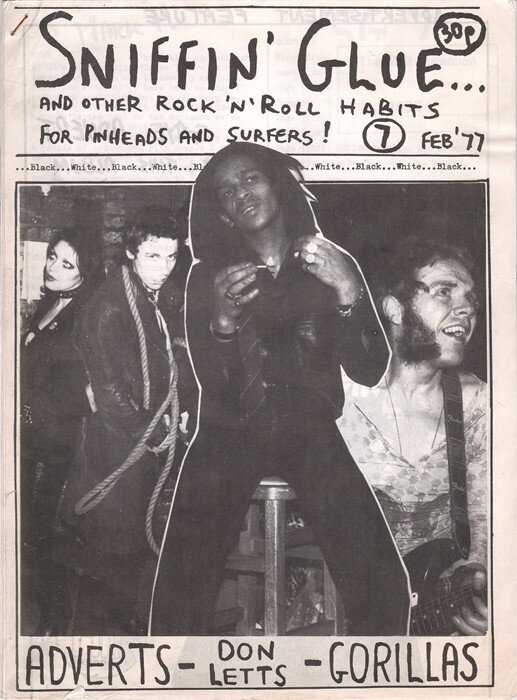
“At the time there were four established music magazines in Britain: you had the NME,Sounds, Melody Maker and Record Mirror, and basically, they wrote about the more established rock music. But when the punk scene started in 1976 in the UK, I just felt there was a need to have a magazine that was devoted to punk rock, so I had the idea to start my own fanzine. That’s why it was important at the time, because it was the first UK fanzine to write about punk rock. That’s why it was so significant.” - Mark Perry
Task One - Design Practices
‘The Brand Tailor’
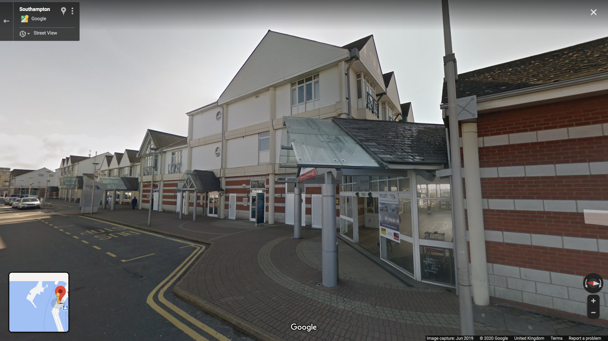
Exterior of The Brand Tailor
Company Statement from Website
‘Small by choice
No, we don’t have branches in San Francisco, Strasbourg or Santiago. We started in Hampshire in 2007 and we’re still in Hampshire today. We’re small, independent, highly successful and we like it that way.Quality not quantity
Because we keep overheads low and avoid flashy self-promotion, we’re not as expensive as other local design agencies. We only take on a handful of projects at any one time so you get a better return on your investment.Ideas with substance
Hard-won experience tells us how ideas will fare in the marketplace. They aren’t just designed to look good in our portfolio. They function well in the real world, where it matters.Cheap. Fast. Great. Pick any two.
All ideas are subject to time, money and quality restraints. We’re up front and honest: sometimes solutions need adequate time and money if they’re to be the best they can be.No account managers
At this design agency you talk direct to the creative director, the person who thinks up the ideas. Not some middleman with a fancy job title. When you brief the manufacturer direct, nothing gets lost in translation.No jargon
There’s a lot of unnecessary waffle that infects this industry. If you want new packaging or need a logo update, we’ll be saying exactly that. Not “delivering a multi-platform suite of innovative solutions” or “optimising your presentational value”.Less is m… Enough said.’
The Brand Tailor is a graphic design company known for the graphic design work, logo and branding but also website design. They create everything from brochures to logos and brand identities within the local area of Southampton but also globally. This small business was founded in 2010 with between two - ten creatives. The founders of the company are known for having a background in illustration and graphics and the other being creative director.

Graphic design Work Samples
Logo and Branding work Examples
The location of the company is at / near the ferry port in Southampton, there are a lot of smaller business that are close by but I wouldn’t call it a creative hub. The brand tailor have a good reputation, so I think this is where they get most of their clientele.
The brand themselves as a relatable company, especially from their brand statement. I think having such a professional website, they have caught some clients form the local area which have boosted their portfolio.
From geographical assumption, they are a small business and located close to the harbour. I don’t feel that they are someone that is relying on footfall for people to engage with the brand. The wording that they use within their statement on their website, tries to reach the client on a personal basis, trying to be relatable.
I am still waiting for an email response from this company in relation to other questions.
‘Bongo Creative’
Due to the Bongo Creative being such a small company, I believe the owner Ali works from her own home so I don’t have any exterior images of the business.
Company Statement from Website
‘Hi, I’m Ali, it’s good to meet you…
As a graphic designer I work in all areas that require design. Naturally you will question if I’m a good match for you and your project. I’ve been told that I adapt my style well to different types of projects. I will create a look and feel for your project to achieve the outcome you’re looking for. The best, most artistic, results happen when my client and I have good communication and build a great relationship. My clients have told me that I capture the essence of their brand and they appreciate my flexibility in the way I think and design for them.
Inevitably I hope for a continued working relationship on future projects so I aim to give more than what’s expected and try to be as helpful as possible in order to make your project succeed. From the outset, I ensure the clients thoughts and ideas go in to the melting pot, along with my creative input, this allows me to fully answer your brief. I believe this is why so many clients come back time and again.
I work for all types of businesses and teams of all sizes. Some projects are ideas based creating design concepts and visuals. Others are updating existing designs, creating print ready high resolution artwork and more simple artwork updates. It really depends on your requirements. I’m also happy to take on a more project management role where I get even more involved. I’m flexible and welcome a challenge.
In addition to the way I approach projects and turn my client’s vision, brand image and value proposition into a graphic piece, I will undertake many tasks as part of a graphic design project. These include collaborating on the concept with the marketing manager or team, attending meetings about the project, research their industry and target audience, explain the various potential designs, revise designs and prepare asset files for others on the team and for client use. ‘
The Bongo Creative is a self employed company that is run by a lady called Ali Fielder. She is the only one within the company and I believe it is run from Romsey which is a small town close to Southampton. Ali takes on clients of all sizes and different briefs within her brand statement she says that she is known for being able to change her approach quickly to adapt different clients. Within her brand statement page she also puts a lot of personal blogs and information, I believe this is so the clients know who they are talking too.

Work Examples from the Bongo Creative
This business is a self employed run business probably from Ali, the founders home. They are locked within a small town of Ramsey, again with no shop that allows for footfall. Due to the history of the business I can tell that she has been established for quite sometime but the company hasn’t expanded more than one person.
From geographical assumption, they are happy to be a smaller business that only attracts the local businesses around them. Ali mentions on the website that she is able to change and adapt to different businesses which means she is open to all types of clientele. She also uses her website like a blog, which means again the clients can relate to her.
I am still waiting for an email response from this company in relation to other questions.
‘Im Cre8ative Deisgn’

The External Images of the Business
Company Statement from Website
‘I’m Cre8tive Design are a small but busy design agency, based in Southampton, Hampshire. We can produce graphics for any media, whether it be print or digital based. We have worked on many interesting projects over the years, for both startup businesses and industry leaders and we continue to work on regular projects for many of our clients that we have developed great working relationships with.’
Im Cre8tive Design Ltd was launched in 2004 and have between 2-10 employees that work on a range of projects from Print Media, Website Design, Brand Identity, Digital Design, Illustration and Product Photography. They seem to only advertise a handful of their portfolio on their website, it is unsure how many projects they have completed.

Examples of Work found on their website.
From the google search, the business is located again within someones home. It is unsure if they have an office or whether they hire other people when and if they need them. They seem to be a well established company due to the portfolio of some known names in the area but they again do not collect their clients on footfall but from reputation.
From geographical assumption, they are a small business looking to attract business within the local area. They use professional wording to describe their business, although not a lot of information can be found about the business online.
I am still waiting for an email response from this company in relation to other questions.
Summary of Studios
The studios are all very different and based in different areas of Southampton. The Brand Tailor, Bongo Creative and I am Cre8tive, all their names of the studios are to do with creativity / branding. I feel like this was done for a reason to advertise and create a reputation within that area. The smaller business, Bongo Creative, tries to be more personal as she is the only one within the business. In contrast, I am Cre8tive and The Brand Tailor, come across as very professional but have a larger clientele and reputation within the Southampton Area. All of these businesses seem to have a small office, so this makes me assume that they aren’t looking at global clients. I think that all the businesses work is really inspirational and really clean.
I chose these companies within Southampton as they seemed to be the ones that were most searched on instagram (generation Z find out a lot of information from Instagram) But also because they had the best reputation within the area. They also all seem to be doing the same types of work but with different approaches and different portfolios.
I am waiting for emails from each company before analysing further.
Task Two - Production Practices
‘Chaptr’

‘We are Chaptr. We help brands engaged in culture and the creative arts to thrive in a digitally-connected world. We design and build impactful websites that inspire people to think, feel or do.’
Chaptr has a number of elements that makes up the brand - Brand, Creative, Code and Growth. They have various employees with different skill strengths to provide the best service. They have a studio that is within walking distance of the city centre of Southampton. This allows Chaptr to get noticed within the foot fall. I also love the brand that they have created for themselves and the work that they produce. I have emailed them to ask some questions but still waiting for a response.
‘Falcon Precision’
‘Our company’s philosophy of innovation and commitment to quality and service is supported by on-going investment in the latest CNC technology and 3D CAD/CAM software. Our integrated production control system ensures accurate planning with end-to-end visibility of all processes from quotation, through manufacture to invoice. The strict process controls assure full traceability, excellent quality control and improved on-time deliveries.’
Falcon Precision is a manufacturing expert within Southampton. They are located within the manufacturing part of chandlers ford(where a lot of other services are also located) This is a great area for them to be located as workmen can access them easily. They specialise in all things CNC and have a good reputation for laser cutting in particular. I really like that there are still companies that take pride in their production like this one does.
‘Wow Video Production’

As marketing professionals ourselves, we speak your language, and we’re also 100% focused on delivering the results you want and need.
All of the crew love what we do and when it comes to looking back on having worked with us, you will regard it as one of the most enjoyable and rewarding projects you’ve worked on.
Sometimes, events and situations during the course of a project arise that can set to cause major problems.
If and when that happens, that’s when the value of working with a team who are committed as you are to doing what ever it takes to make things happen really shines through.
Other more subtle elements such as an easy to use online project management system, telephone calls answered in person within the first five rings, and highly detailed project proposals all contribute to an all round, excellent customer experience.’
Wow Video Production are a marketing video production company based within Southampton. They have worked with a lot of companies within Southampton but are also known outside the city for their work. The reason I chose this company was because their professionalism stood out to me and i’ve also always loved video production, Ive find it really interesting how its put together - especially adverts. I love that they area able to provide different services and expertise for various projects - its always great to have guidance on hand.
Summary of Production
I think researching the various production around Southampton has really opened my eyes about whats available in terms of getting to that final product. I chose these companies out of a list of companies that were researched due to their professionalism. Unfortuently due to coronavirus I was unable to visit these places in person, but their website and selling aspects to customers really grabbed me. I really do hope that we don’t loose production places in the future.
Weekly Reflection
I have found this week super interesting to learn about the education of design but also the new advances of technology over the past few years and how this has affected design.
Overall this has shown that there are both positive and negative to the design moving on. With technology moving so fast we still need to hold onto our history and learn about what and how things happened before our time. This has also made me so grateful for the designers of history that I researched about this week. Learning about some of the key designers within the past decades and learning where they find but also get their inspiration from.
The influences have changed from then to now. Searching for design practises and production companies within my city, Southampton, has also made me aware about what is available within the area and where the key design hubs are. I think I need to make use of these services as its been shown that a lot of things are being put online. Within Southampton there is creativity happening everywhere, but it is often difficult to see as its tucked away in different areas.