Week Three
What is Globalization?

Lecture Notes:
Lecture Summary
I found this week lectures really interesting. I think hearing how globalisation is different for various companies has really explained the advantages but also disadvantages to me. I think one of the main advantages is being able to work anywhere in the world but again one of the disadvantages is that the creative world is mainly meant to be face to face but flying to different countries is obviously adding to our global warming (whoops). I think there were valid points made in connection to starting a business from a home / behind a screen and anything is possible with a network behind you.
Below I have outlined the key brand that really stuck out for me:
Airbnb
Airbnb have created a brand that can be known and understood anywhere across the whole world. It can be local but also global in the sense that you can find places to stay locally to you but also global. I also think their branding is particularly clever with the symbol that they call the Belo, which I think also looks like an a and a B from the sign with a & symbol. I think the video above which was shown within Harriets Lecture really just stood out for me with the authentic morals for humans, in the sense that we are all looking for a place, so they have targeted the consumer particularly well.
Pearlfisher Christmas Collaboration Video
I think this is such a lovely video that they have produced to show how although the companies are within the separate countries, there are different collaboration methods that enable them to come together especially throughout Christmas. I love the fact that all of this is shown in the different colours, making it very clear which country is which, showing the different traditions which all merge into one. Globalisation looks like its completed very easily through this advert / Christmas greetings video.
Apple
Another brand that was shocking for me was Apple, Ive always known them to be a consumer cult and always the brand that every teenager desires. They have also advertised themselves in ways that enable the consumer to find them unable to resist but I found this video really eye opening that theres no personalisation between the countries other than the language. I think there are a lot of negatives to being within the Apple cult, having had apple products thought out my education, i’ve found the price of them now to be ridiculous but also the life span to be so short that the cult isn’t worth it. But saying this, they have created a billion dollar brand from nothing, so something must be working.
Resource Notes
Resource Summary
The resource this week was great and a really good insight into how a design company started in the very beginning especially at a time when there wasn’t a lot of technology. I found there talk to be particularly eye opening when it came to the typography side purely because I don’t have a lot of knowledge on this subject. Some of the main points that I found interesting are highlighted below:
Text from anything
This weeks resource showed how Non-Format created typography and font from literally anything that surrounded them. I found this particularly fascinating how they basically used paint and straws or fabric and edited this to the font to create dramatic effects. I think this is an area that I would like to research more.
Technology
The technology that was discussed within the Non Format Video - said how at the beginning they didn’t really have any high tech computers or even the knowledge of adobe which was coming into trend. They just used a basic scanner and a work editing software programme. I think this just goes to show that you can create anything with the tools of creativity.
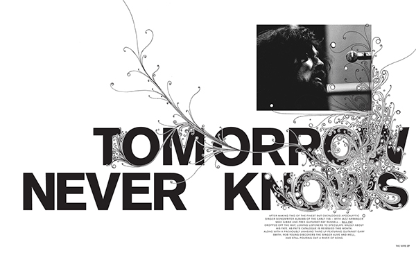
Image + Text
Another point that was discussed was how Text can be a stand alone product or when it is partnered with photography or an image it can be fairly powerful as shown above in the examples from non formats magazine. I think the combination of image and text can be really informative but also creative and make an effect on the reader.
Research

For this weeks research, I thought I would do some more research on the fact that typography really can be put into anything and taken from anywhere and also the history of typography.
Whilst researching the history of Typography I came across this youtube TED Talk video with Mia Cinelli who talks about her impact as a designer. She talks about finding a typeface that she wanted to turn into a font. I found this really interesting in understanding the different between the difference between font and typography. On her type creating journey, she explains how different letters are the way they are and how they spacing needs to be.
“because everything you ever read is in some kind of typeface and all typefaces are designed to say something specific and so when something is typed in a typeface then what is said is influenced by how it is set and I call this a kind of visual inflection so just like when we speak our tone of voice gives meaning to the words we're trying to say”
“type can be authoritative it can be honest it can be organic type can say I'm friendly or I'm childlike and if”
I thought this was really eyeopening, especially why she decided to take and create this font “Creating it for people who aren’t here anymore”. I have learnt that type isn’t just letters on a piece of paper but it is also how you feel about certain things and how you can connect with others to feel emotion or to be expressive which I think also connects to Non-Formats lecture.
The History of Typography
“1400’s: Guttenberg invented movable typefaces, giving the world a cheaper way to obtain the written word. Up until this point, all written materials were done by hand, and were very costly to purchase. Guttenburg also created the first typeface, blackletter – it was dark, fairly practical, and intense, but not very legible.
1470: Nicolas Jenson created Roman Type, inspired by the text on ancient roman buildings. It was far more readable than blackletter, and caught on quickly.
1501: Aldus Manutius created italics – a way to fit more words onto a page, saving the printer money. Today, we use italics as a design detail or for emphasis when writing.
1734: William Caslon created a typeface which features straighter serifs and much more obvious contrasts between thin and bold strokes. Today, we call this type style ‘old style’.
1757: John Baskerville created what we now call Transitional type, a Roman-style type, with very sharp serifs and lots of drastic contrast between thick and thin lines.
1780: Firmin Didot and Giambattista Bodoni created the first ‘modern’ Roman typefaces (Didot, and Bodoni). The contrasts were more extreme than ever before, and created a very cool, fresh look.
1815: Vincent Figgins created Egyptian, or Slab Serif – the first time a typeface had serifs that were squares or boxes.
1816 William Caslon IV created the first typeface without any serifs at all. It was widely rebuked at the time. This was the start of what we now consider Sans Serif typefaces. During this time, type exploded, and many, many variations were being created to accommodate advertising.
1920’s: Frederic Goudy became the world’s first full time type designer, developing numerous groundbreaking typefaces, such as Copperplate Gothic, Kennerly, and Goudy Old Style.
1957: Swiss designer Max Miedinger created Helvetica, the most loved typeface of our time. This was a return to minimalism, and many other simplistic typefaces such as Futura surfaced around this time period.
Present: With the internet, we have such a vast variety of old and new typefaces available for us to peruse and use. All these typefaces give us an abundance of options and looks for our designs today, and we’re not limited by just one or two typefaces like we would have been a few hundred years ago.”
This brief outline from where and why typography was created helped me to gauge a wider understanding of the topic.
Type from Anything

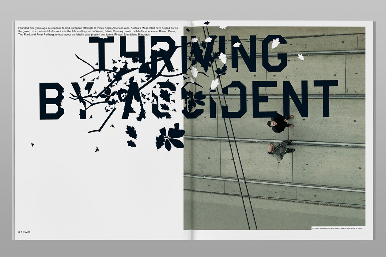
One of the eye opening topics from Non Format was the fact that Typography can be created from anything. I find this so interesting so I thought I would find some real life examples of how everyday objects can relate to typography. The first example is above showing buildings and how the photographer in different ways has looked up to see that different letters of the alphabet are formed. This is probably a standard response and no where near as creative as Non format but I still think this is so creative.

Another fairly obvious example is a chair and how a chair looks like a lowercase h from a side angle. Another example that I found which I posted on this weeks ideas wall.
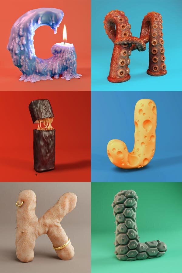
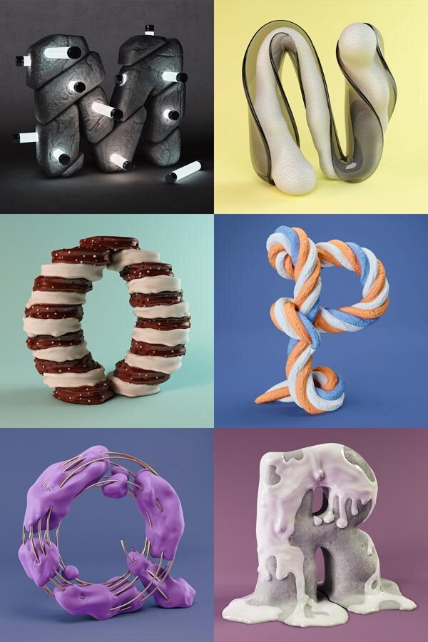
I think these were really fun and interesting ways - obviously not in real life but created on a 3D programming software. I think the main thing that stands out for me with these, is the fact there are so many different textures from every day items / food / body parts. For example the R thats melting / dripping with paint - its how you interpret the typography and how it effects your emotions. I would love to do an interpretation of this on how every letter represents a different taste or smell which would be really provoking.
So these are the obvious examples - but when does typography stop being typography? I wanted to reflect on a post that was posted this week to the ideas wall which I believe to be really interesting - typography photographed from human body parts.

The work had been created in response to 36 days of type challenge. He explored the different body areas and body types to create font which is a really interesting response. I think that its really clever but does this push the boundaries of typography too much? This makes me feel uncomfortable almost sexual due to the sweat / wet shininess to the skin but looking past the image to find the font. But again adding to the point that type can be made out of anything - or not so much made out of anything but seen in everything.
Workshop Challenge
Looking through the winners on D&AD, It was really nice to see such a wide variety of work that had been produced but also there was a lot of work that had been produced. The first thing that stood out for me on the categories list is that there seems to be the same but different of the same category. One of the things that stuck out for me was ‘Two in one design’ Something that has two uses.

The first design that stood out for me was this redesign of the Who gives a crap packaging. I think who gives a crap as a brand is such a good concept but also they have such bright and colourful packaging that brightens your day. So I think this redesign of the packaging that makes it fun for children to interact with but also I think different designs of this could be fun for adults too. This was under the illustration category but I would say this is more a product. It is a toy but also toilet paper.

Another interesting project that I found within the winners, was this one where you convert a cardboard box into furniture. I think this is also a two in one design as it can be used as a box but then reused into furniture which is a really clever product. Could you imagine if every cardboard box that was ever produced had a different use other than just storing things? Would our world be a greener place?

Another interesting design is this one, where they put the time that they ordered the pizza on the box as their graphic. They also included why its the perfect time to oder pizza at the time that the pizza is delivered. Apparently the sales increased by 30%. So this packaging doesn’t have a multi use other than telling the time upon delivery but I think its a feel good design. Sometimes it just needs to make you smile and think differently.
10 different types of design practice today
Brand Identity
Marketing and Advertising
User Interface
Publication
Packaging
Motion
Environmental
Art and Illustration
Typography / Font
Set Prop Design
The above list goes to show that there are many different practises that fall under graphic design. Graphic design is just a title with a broad knowledge of different practises.
Multi-Use Design
Multi Use design, is a design that can be used in more than one way. This is designs that could of previously been under product or packaging design or even illustration but have more than one way of being useful / helpful to everyday life. Are we really thinking about how many ways a product or an item can be used when thinking of up-cycling?

I think as designers we are always thinking about how we can improve someones life whether thats time of efficiency or even space. The earlier work that I found in D&AD got me thinking about how cardboard can be turned into anything and reused for a different purpose. The cardboard above could be put under the category of graphic design, product design, packaging design or even illustration. I think this is a really clever concept.
Views of Design Terminology
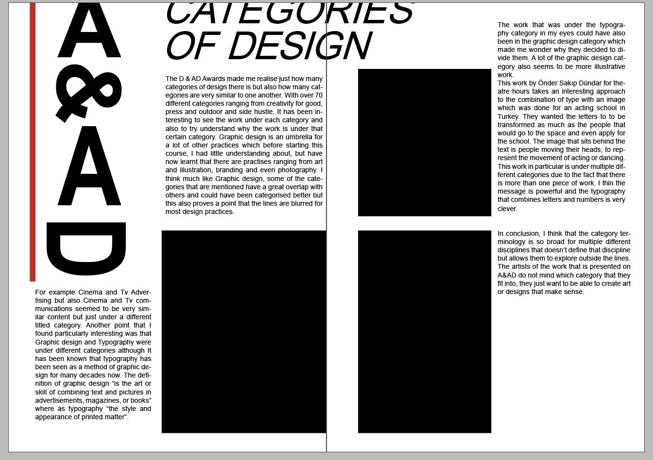
:The D & AD Awards made me realise just how many categories of design there are but also how many categories are very similar to each other. With over 70 different categories ranging from creativity for good, press and outdoor and side hustle, it has been interesting to see the work under each category and also to try to understand why the work is under that particular category. Graphic design is an umbrella for other practices that before starting this course, I had little understanding about, but have now learnt that there are practises ranging from art and illustration, branding and even photography. I think similar to Graphic design, some of the categories that are mentioned have a great overlap with others and could have been categorised better but this also proves a point that the lines are blurred for most design practices. For example Cinema and Tv Advertising but also Cinema and Tv communications seemed to be very similar content but just under a different titled category.
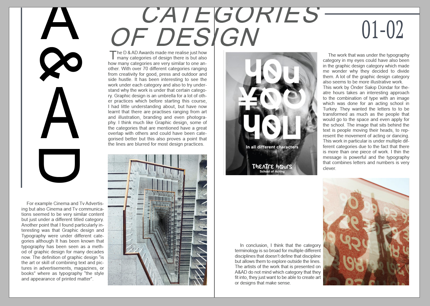
Another point that I found particularly interesting was that Graphic design and Typography were under different categories although It has been known that typography has been seen as a method of graphic design for many decades now. The definition of graphic design “is the art or skill of combining text and pictures in advertisements, magazines, or books” where as typography “the style and appearance of printed matter”. The work that was under the typography category in my eyes could have also been in the graphic design category which made me wonder why they decided to divide them. A lot of the graphic design category also seems to be more illustrative work.
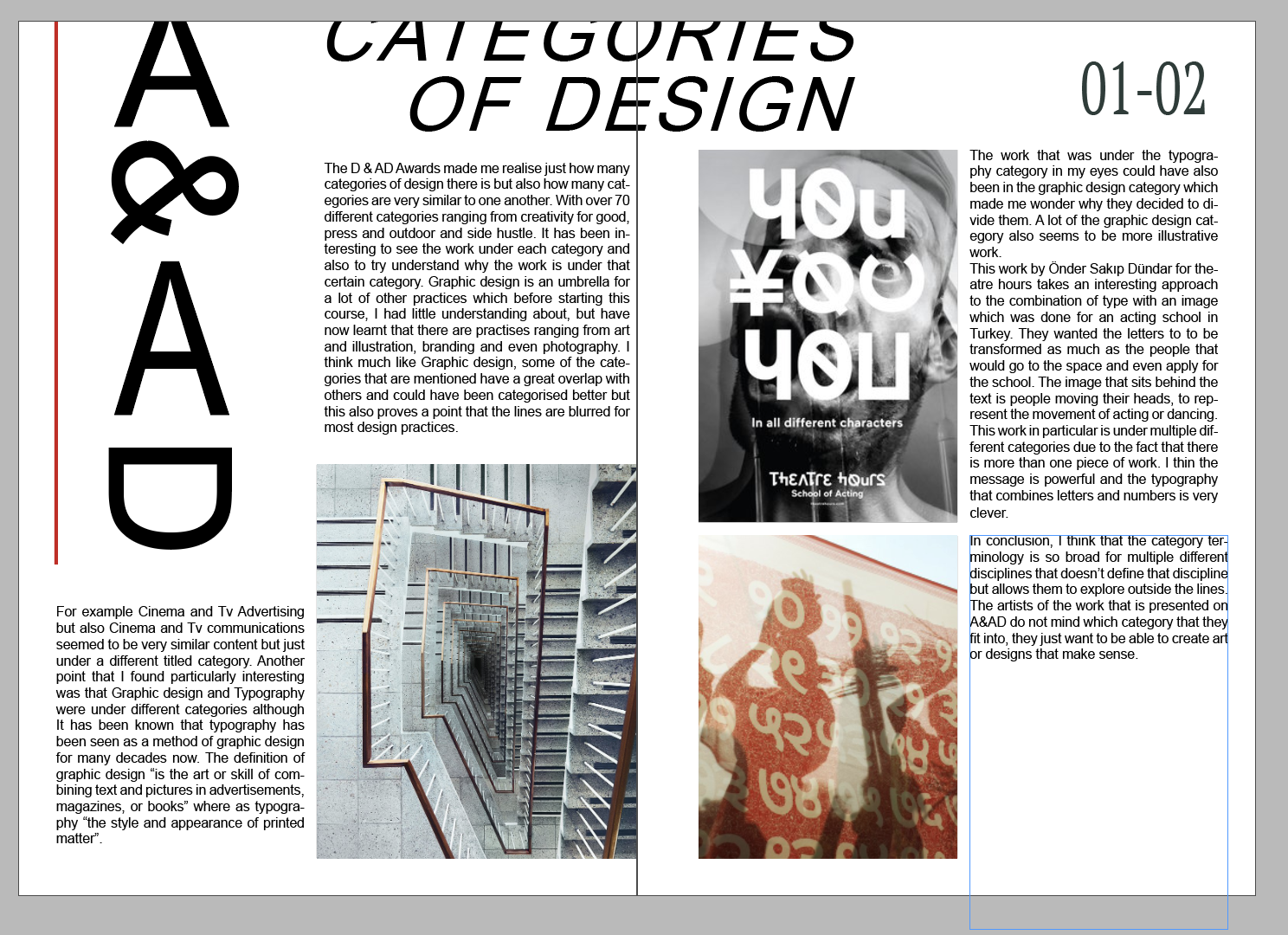
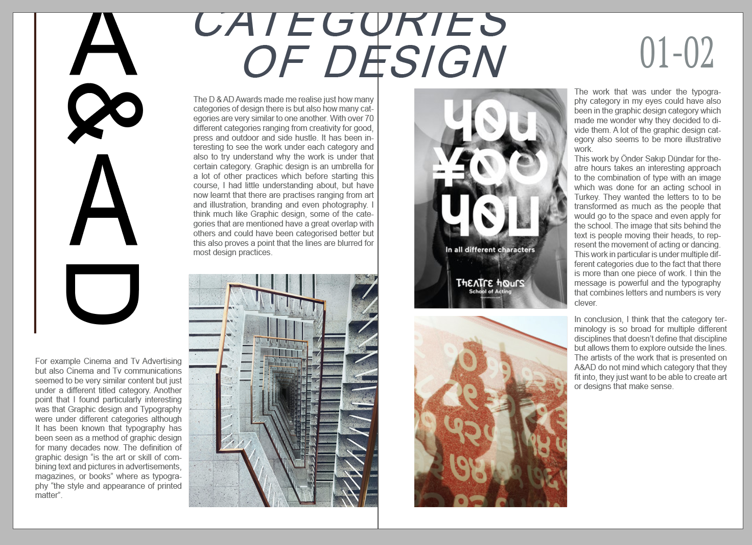
This work by Önder Sakıp Dündar for theatre hours takes an interesting approach to the combination of type with an image for an acting school in Turkey. They wanted the letters to be transformed as much as the people that would go to the space and even apply for the school. The image that sits behind the text is people moving their heads, to represent the movement of acting or dancing. This work in particular is under multiple different categories due to the fact that there is more than one piece of work. I think the message is powerful and the typography that combines letters and numbers is very clever.
Package design similarly is an area that can cleverly incorporate colour, design and graphics together. This is illustrated by the redesign of who gives a crap toilet paper packaging by Garbert design producing an innovative attractive reinvention of the product, he has used different colours and patterns to be appealing to all ages.
In conclusion, I think that the category terminology is so broad for multiple different disciplines that doesn’t define that discipline but allows them to explore outside the lines. The artists of the work that is presented on A&AD do not mind which category that they fit into, they just want to be able to create art or designs that make sense.
Inspiration

The Leica Bauhaus Workshops//
Photography and Graphic Design

Acting Identitiy//
Typography, branding, Graphic Design

Cities in Motion//
Typography

Planters – Gone But Never Forgotten //
Typography

Better Bankside //
Graphic Design

Lyric Illustration Series //
Illustration

West Coast Tasmania//
Graphic Design

Dream2Advance //
Graphic Design

Stairs // Photography

Music's Christmas Tapes //
Graphic Design
Process
Final Print

Summary
In reflection of this week, I have learnt more about typography but also the different disciplines that fall under this term of graphic design. I have loved learning about design terminology but also looking and exploring some design winners work, some of which I found particularly clever. The main categories that I found interesting were graphic design, illustration and package design. There were also some categories that I had not heard of before.
The category terminology for the winners is so broad for multiple different disciplines that doesn’t define that discipline but allows them to explore outside the lines. The artists of the work that is presented on A&AD do not mind which category that they fit into, they just want to be able to create art or designs that make sense. I think it was an interesting debate this week, sometimes our eyes can be too broad or even to narrow but its about finding the right balance.
The workshop challenge this week sparked from some of the typeface and layout that I viewed within the A&AD winners. I wanted something that was going to be clean but also intersting to look at. I took the inspiration of typography from TBWA, who talk about how their typeface can be created from letters and numbers. An eye-opening week to the discplines and varied work that falls under the broad category.