Week Five
Lecture Notes
Lecture Summary
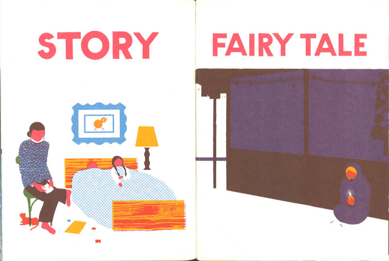
“Design Books, for Designers by designers”
A really interesting lecture this week, especially hearing about stuarts own personal journey about the importance with production and how he overcame that challenge. I think i’m starting to understand this week but there is a lot of information to take in. I was really taken by the example oh shit what now? as I feel graduating last summer from a design degree, you are against a lot of other people in the industry at the moment especially in these covid times, it will be interesting to take a closer look at the book.
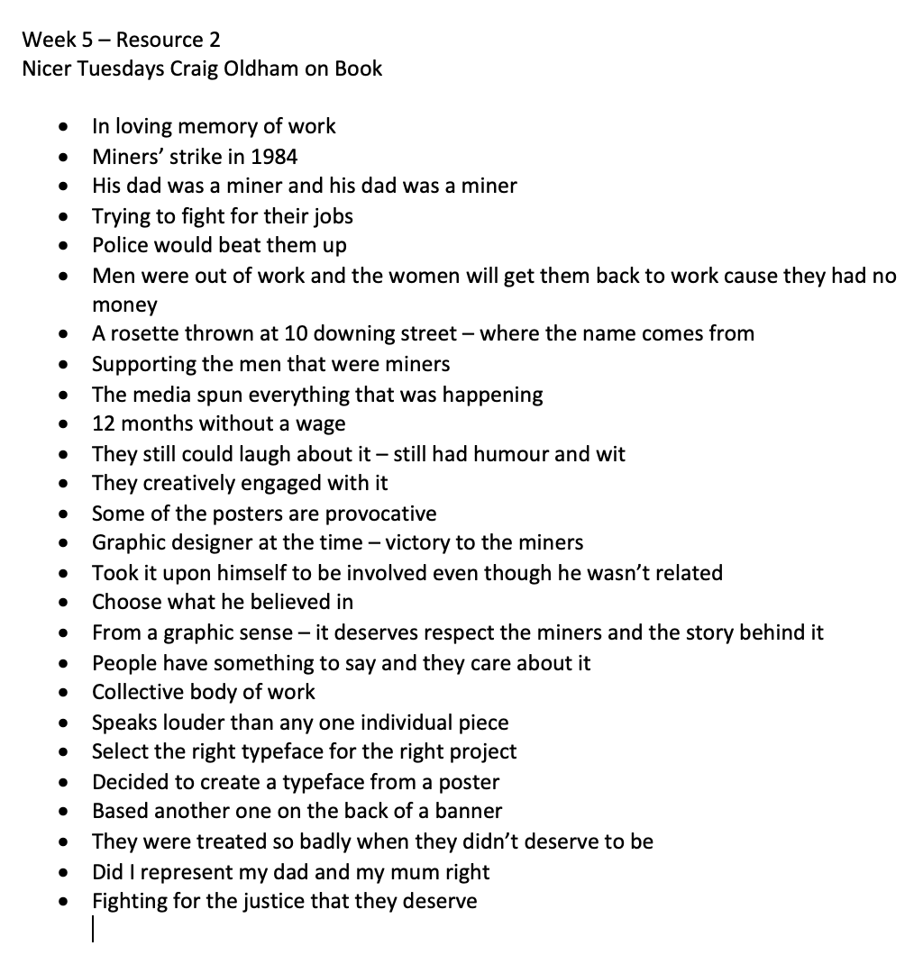
The other book which I also found myself being drawn too was the in loving memory work, I love how there was coal that was collected from the mine itself and then screen printed onto the front cover. This creates that personal connection with the place and the book.
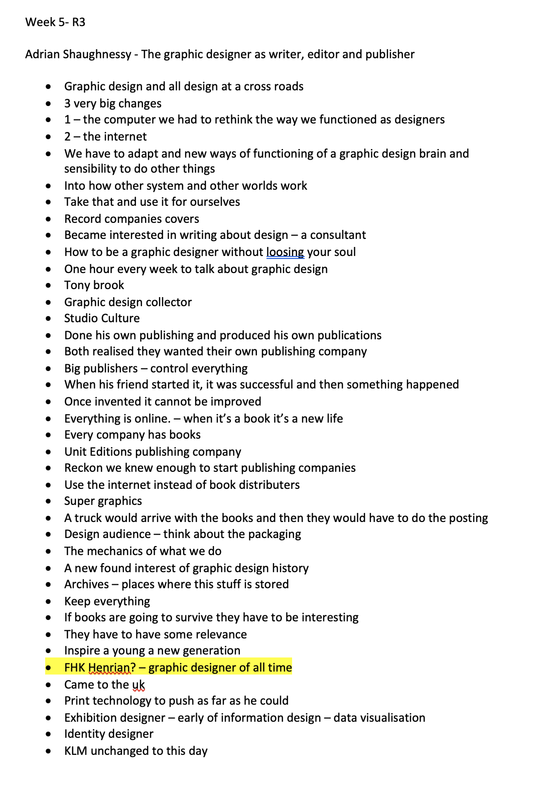
I think that I will have to do more research into Swiss design itself, but the other person Adrian Shaughnessy, which Ive researched last module, has a really interesting approach to the production companies. I think that his design manuals look so interesting, especially as we take for granted the use of using PDF and other technologies to help us with design today. I love the quality of the images within as they say a picture speaks a thousand words.
People that stood out to me (possibly investigate)
Paul Rand
Emil Ruder
Neue Grafik
De Stye
Adrian Shaughnessy
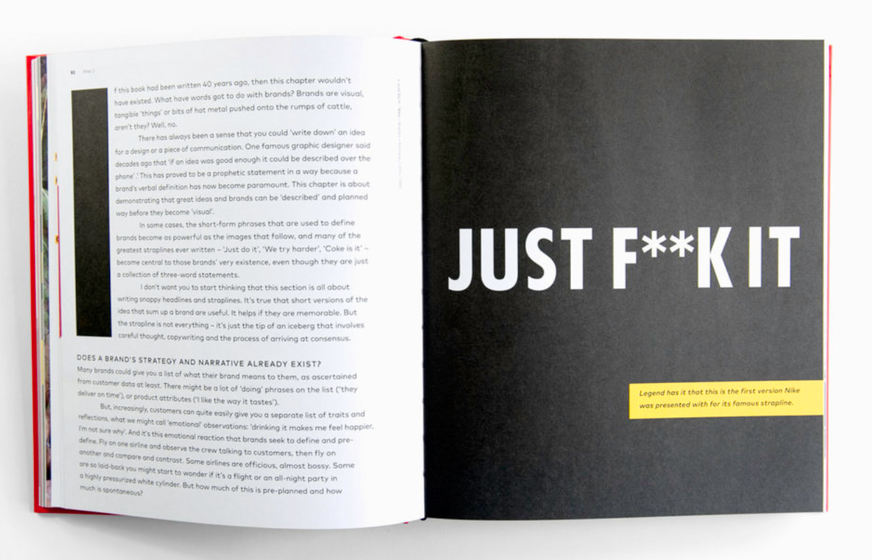
Oh shit what now
Octavo
Resource Notes
Resource One
Resource Two
Resource Three
Resource Summary
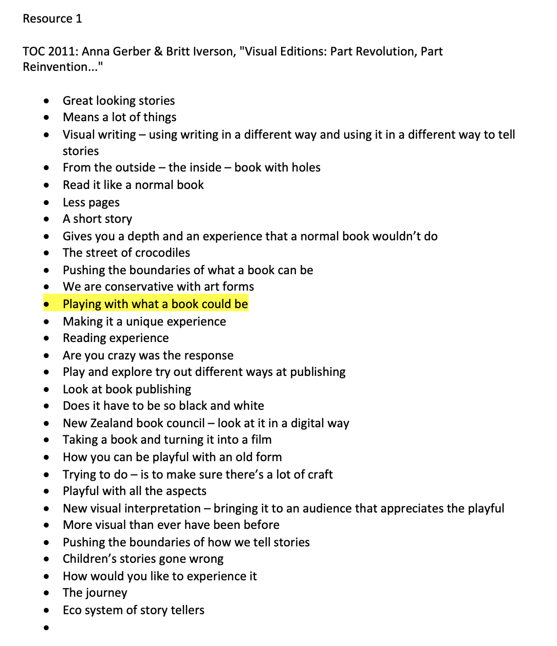
Resource One
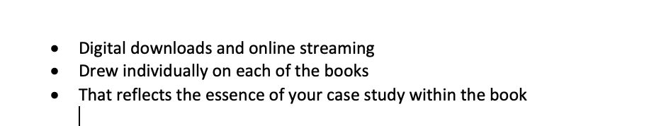
This was a really interesting resource, especially looking at playing with way ta book could be and the experiences that we have as a reader which I really related too. I think their ways of pushing how a book could look and how a book could read is really interesting in terms of design as you are reading not only that page but how that page plats on the previous. They do raise interesting points about why does design have to be so black and white.
“Pushing the boundaries of how we tell stories.”
Resource Two
Following on from the lecture where the video was shown about using the coal within the print method. I think the meaning behind the book itself is so interesting especially from the point of view of someone who had families working and striking for it. Ive also never heard of the mining strike or what went on at that time but some of the work that was shown from the book is so powerful, especially the font that was created from posters used within the strike.
“People have something to say and they care about it”
“Collective body of work Speaks louder than any one individual piece “
“Fighting for the justice that they deserve”
Resource Three
Really insightful lecture by Adrian Shaughnessy, I think his reasoning for starting his own publishing company Is really inspiring and the fact he thought oh well what can go wrong. I also think that by graphic designers starting their own companies it has their own personal touch to design and I feel designers are more likely to buy the books. An interesting designer that he did mention was Henri Kay Henrion or Henry? I couldn’t quite gauge which he said but I feel that this will be the start of the research for this week.
“Online we are locked into system – a printed page is still free and a landscape that you can create dynamic relationship between text and image”
The above quote which he says is so true, we are now in this computer and internet world that we just copy the guidelines and outlines that were already made for us but what happens when we just have a piece of paper> I think ill take this quote as inspiration for my workshop challenge this week and make sure that I have no set guidelines.
Research
Written Communication
Neue Grafik

http://www.eyemagazine.com/review/article/we-made-this-authentic-trilingual-landmark
“The original publication was printed in letterpress. To reproduce it accurately, the characteristics of this process, including the ‘halo’ effect around letter edges and the coarser halftone screen for pictures, had to be taken into account. Thanks to a combination of line, grey tone and colour reprography, and following several test runs, we came up with a version for offset printing that was true to the original.
The high quality of the reprint – combined with its veracity – is important to me because the original editors’ commitment to excellence was an expression of their conviction that constructive design reveals its aesthetic and communicative effect through objectivity and precision. This is an approach that increasing numbers of today’s designers are adopting.'“
Neue Grafik’s design may have served as both manifesto and manual for the New Typography, but its editorial scope went beyond type to embrace art, photography and science.
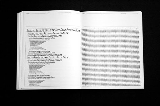
Hans Neuburg was the most prolific and versatile writer of Neue Grafik’s four editors, writing articles that encompassed industrial design (opposite, below) ‘Stile Olivetti’ and ‘Graphic and Jazz Records’.”
Emil Ruder
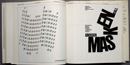
“Emil Ruder was a typographer and graphic designer who, born in Switzerland in 1914, helped Armin Hofmann form the Basel School of Design and establish the style of design known as Swiss Design. He taught that, above all, typography's purpose was to communicate ideas through writing. He placed a heavy importance on sans-serif typefaces and his work is both clear and concise, especially his typography.
Like most designers classified as part of the Swiss Design movement he favored asymmetrical compositions, placing a high importance on the counters of characters and the negative space of compositions. A friend and associate of Hofmann, Frutiger and Müller Brockmann, Ruder played a key role in the development of graphic design in the 1940s and 50s. His style has been emulated by many designers, and his use of grids in design has influenced the development of web design on many levels.” http://www.designishistory.com/1940/emil-ruder/
https://www.typeroom.eu/in-grid-we-trust-emil-ruder-aka-the-iconic-pioneer-of-swiss-style
http://www.designishistory.com/1940/emil-ruder/
https://www.pinterest.co.uk/pin/121386152429816314/
Oh shit what now
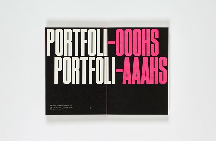
“I also mean that you have to find a way of talking about your work that reflects you. Your personality. A way you’re comfortable with, and that enables you to get across all the ideas and things you want to mention. Do it your way, in your voice.”” A bigger part of the process than the actual designing is communicating what you’re designing and why, and more importantly, why it’s the right thing to do””Design is storytelling (a word I cannot abide, but…) – having the idea, thinking of the story, and crafting and delivering it well is important, but unless you can tell that story it simply won’t be enough.”
This is a book written by Craig Oldham who shares his tips for graphic designers that are just starting out in the industry. I love the words that he has used within the book, the bold colourful letters that take up the whole page but also I love the no bullshit attitude that he is taking through. Just telling you the way it is.
Why do graphic designers write books?
Wanting to approach a niche market, where we are in an era of everyone sharing what they do online. Books are something that are niche. They want to talk about how the design world is and aim it at young designers that are entering the world.
https://eyeondesign.aiga.org/why-do-graphic-designers-write-books/
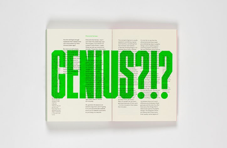
Micheal Johnson
“Branding is a specialized industry with its own unique language and methods, but it’s an industry split in two. On one side, there are strategists wielding impenetrable charts, proprietary methods, and PowerPoint decks, whose job it is to research, distil, and provide insight. On the other, the designers and communicators who interpret the strategic ideas and bring a brand or a campaign to life.
“The books available tend to be written for one side or the other… by opening up the process, especially the early stages, I could be doing everyone a big favour, from foundation students to clients and peers. It’s fair to say, however, that those who want to protect their smoke, mirrors, and proprietary processes aren’t so happy with me!” https://eyeondesign.aiga.org/why-do-graphic-designers-write-books/
I love the way that within his book, he combines the large letters and font with writing and contrasting colours, making his words seem bold and important.
What is tone of voice?
“Tone of voice isn’t what we say but how we say it. It’s the language we use, the way we construct sentences, the sound of our words and the personality we communicate. It is to writing what logo, color and typeface are to branding.
When we speak to others in person, our non-verbal communication says more than the words themselves. Non-verbal communication consists of facial expressions, tone, cues, gestures and pitch. Online, we lose of all of these except tone. We can imbue our Web copy with a tone that is distinct, clear, consistent and relevant to the target audience.”
“You need to have a lot in place before getting started, and the process needs to be embedded in the project. It’s more than about just cobbling together a few sentences. Tone of voice requires careful decisions based on the company’s values and personality.
You might need to adjust your process to find the right tone because each project has its own constraints and deliverables. But research is key, and it could include the following:
Interviews with stakeholders,
Content audits,
Brand reviews,
Audience research.“
https://www.smashingmagazine.com/2012/08/finding-tone-voice/
Avoiding generic Tone of voice

https://www.designweek.co.uk/an-environmental-cleaning-brand-that-avoids-a-generic-eco-tone/
Looking at a brand that doesn’t want to copy the eco generic tone of voice is ocean save which is a plant based cleaning solutions. They wanted their tone of voice to be ‘humorous activist’ being designed to be ‘positively provocative’. They wanted all their branding to be a bold and have a clear graphic identity that relates to the sea with blues and waves. I think this is a great way to avoid becoming the norm of saying the same things over and over again. It’s also clever how they have taken old bottles and just stuck their new design on the top.
Overall Examples
Theo Inglis
https://www.theoinglis.co.uk/MCMGD
“Curating a comprehensive overview of an aesthetic moment which tended – in a display of post-war positivity – toward the “playful, bold, and colourful.””” The kind of work I’m showing in the book is also complicated in terms of the modernism vs post-modernism overview of design history, most of the designers included would have called themselves modernists, but were producing work that is very different from the rigid, grid-based graphic design against which post-modernism rebelled.”
Such a clever idea for a book in terms of explaining what’s going on with graphic design by using sketches and photographs by graphic designers. Although I wouldn’t say it’s a story. I really like the approach that he has taken with the ‘playful, cold and colourful’ layout. Every page within the book feels colourful and he’s giving the word the credit it deserves.
Homeless Novel
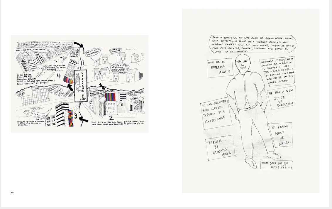
https://www.creativereview.co.uk/accumulate-book-of-homelessness/
“The book comes with an introduction written by Cumber who describes these accounts as “stories of pain, of abuse, of dysfunction, of families, of war and of rejection and of misplaced love, of overcoming difficulties and of fighting and succeeding”. Reflecting on the process of creating the book itself, she recalls the “visible, industrious energy” that emerged within the group of students during the project.”
The book was curated by asking people from shelters and accommodation to contribute to the book by attending a workshop for writing and illustration. Within this workshop they were able to share stories about their life experiences and then this would contribute to a chapter or a section of the book. I think this is such a great concept to ask the people themselves to contribute to the narrative and content of the book and being able to tell their story to others. I feel that homelessness is often a taboo subject which can often be ignored. So I think being able to create a graphic design book like this is so inspirational.
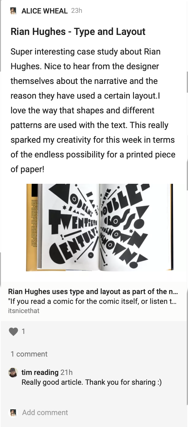
Rian Hughes
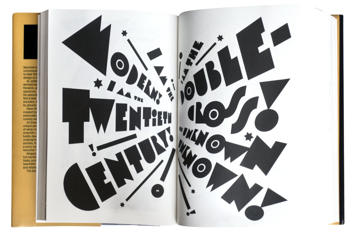
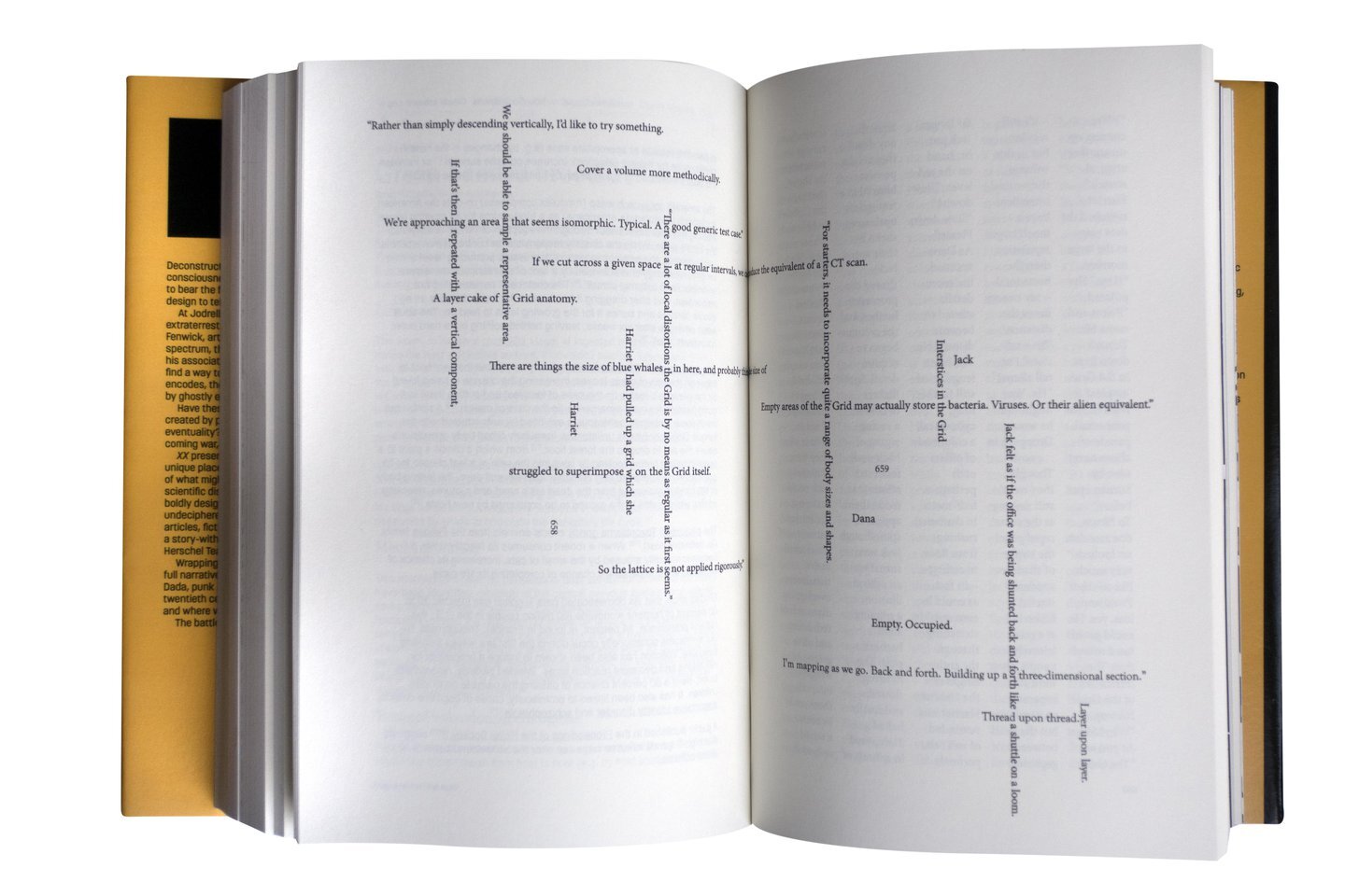
https://www.itsnicethat.com/news/rian-hughes-xx-a-novel-graphic-publication-200820
“The designer’s first novel tells a story not simply through words, but via the design devices used to display those words.”
The books aim is to tell a story not only through words but the design devices that are used to display those words from a storytelling graphic design angle. The story is about symbols and language encoding ideas and the novel also has its own language. I think this is such a great idea for a book that will not only get the attention of graphic designers but also the general public. I also love and admire that he has been able to design the book using shapes and different patterns within the writing themselves.
Children Book Examples
Ocean Plastic
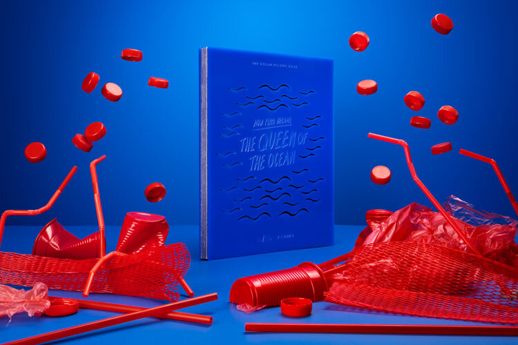
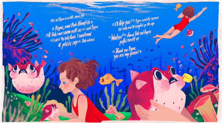
“Charity Waste Free Oceans has created the environmentally friendly book in collaboration with illustrator Chervelle Fryer and tech company Teijin.”
The book is aimed at children, with the story inside being about a girl who one day dreams about being able to swim with animals in the sea. The plastic cover is made from plastic waste which was collected from all over the world in order to create the book. I think this is a great concept for a book and the voice of two different areas are really heard, the need for children to be educated about plastic pollution but also raising general awareness for what plastic can be used and recycled.
The Book with no pictures
Really great concept for children using words instead of pictures. There are two voices within the story, the main person reading the book and then the words that create noises or visual imagination for the children. The emphasis on some of the words in different colours and shapes allows the story to come alive for the child instead of focussing on the pictures.
Press Here
A childrens book with interactive colours and shapes throughout the book that allow the book to come alive and real for the children. I think this is a great narrative as the child has to interact with the story line and each page that is turned the images or shapes change from the previous action on the previous page. Such simple primary colours and a nice caption along the bottom of each page to explain the action.
Seasons
“Seasons by French artist Blexbolex, which you might recall, is more meditative and abstract than the other books in this omnibus, but no less profound and stimulating for the young reader. With his signature retro-inspired minimalism, Blexbolex uses the metaphor of seasonality to reflect on a number of life's big themes and the subtle dualities of being human. Four spreads depict the same landscape during each season, with a single word or phrase in bold block-letters on each page. But don't breeze by the seeming simplicity of the concept -- many of the thoughtful pairings on the beautiful double-page spreads give you pause and make you wonder why and how the two words go together, gently nudging you towards a philosophical meditation on the seasons, change, and impermanence.”
A little bit of a different type of storybook, this storybook is focussed on the relationship between the words on the page and the pictures. But the pictures being used aren’t necessarily the pictures that automatically relate to the word. Its meant to be a childrens graphic design book, But I think that the overall narrative connection to living beings and the world around us is so beautiful, there is also a connection to the words above the images.
Diary Examples
Corona Diary
https://www.dezeen.com/2020/08/17/vic-lee-hand-drawn-corona-diary-lockdown-experience/
“London illustrator Vic Lee has documented his experience of the coronavirus pandemic in a graphic diary, which ended up selling thousands of copies after he shared it online.”
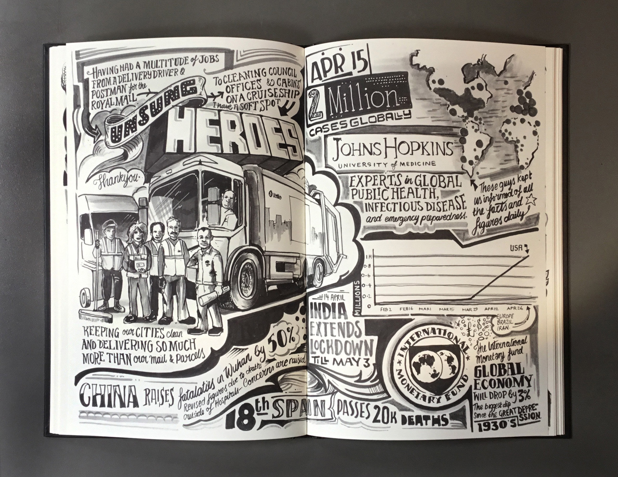
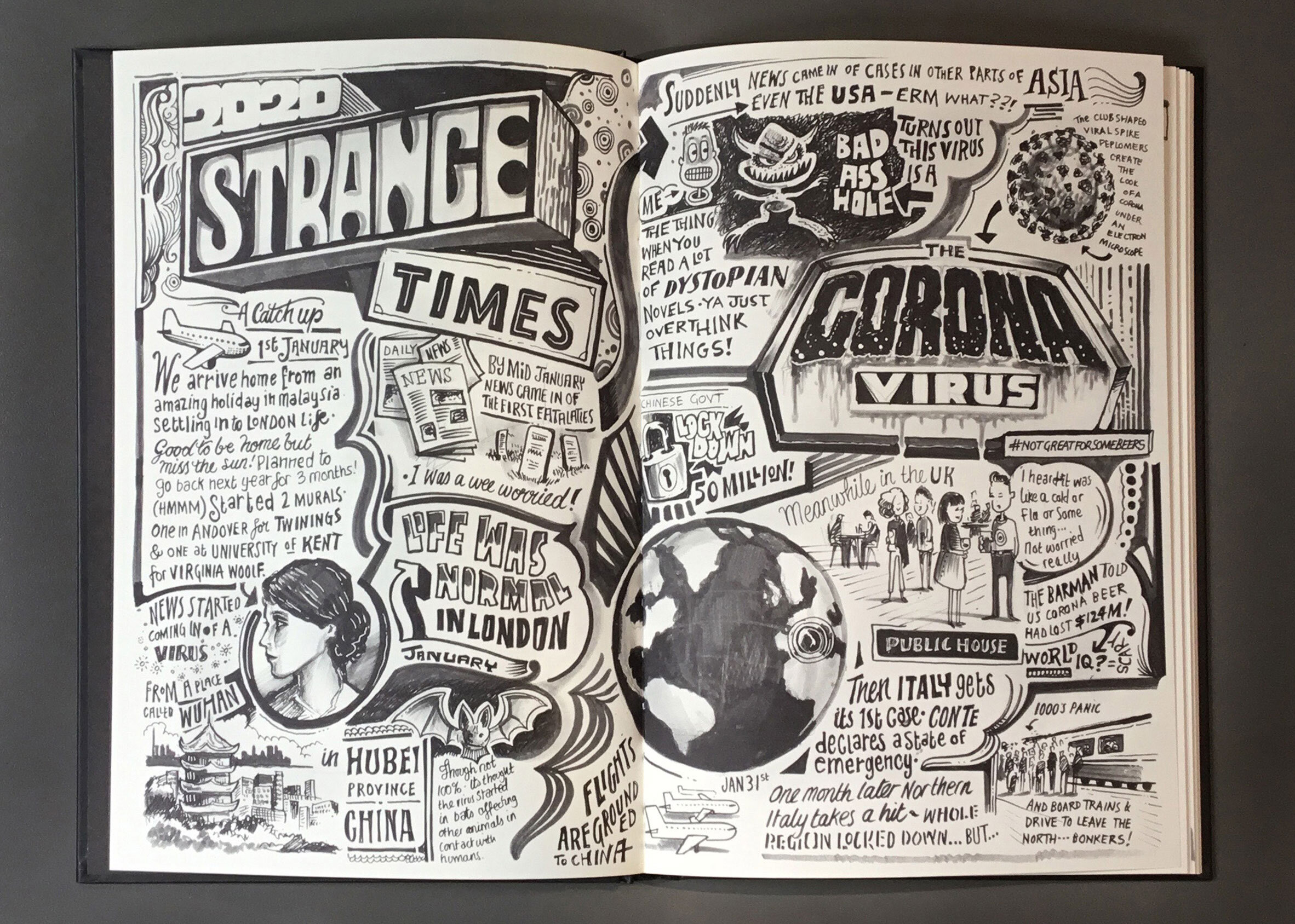
He decided as a coping mechanism through lock down that he would draw the events of his experience during the global pandemic. Doing this enabled him to try and understand the figures and stats which were hard to visualise. I think this is such a great creative way of portraying the lockdown and covid across the world. It feels like a comedy strip layout with a lot of the sketches being merged together into one. It has a black and white feel to it, which makes the format very clear and consistent.
Neighbourhood diary of shoreditch
https://www.designweek.co.uk/issues/march-2013/an-illustrated-diary-of-shoreditch/
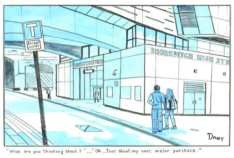
An illustrated diary of Shoreditch which was drawn by Adam Dant. He took inspiration that surrounded his shoreditch studio and made them into little sketches of the area and the captions are taken from peoples conversations. I think this is a lovely way of documenting what’s happening around the neighbourhood but also getting to know some of the local people and local personalities. There is a general narrative of an image paired with a caption and the content is always blue black and white.
Not the Norm Examples
In Case of Ubiquity
https://www.designweek.co.uk/jean-jullien-everythings-easier-when-you-make-people-smile/
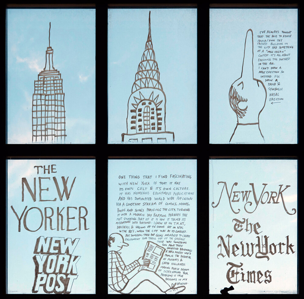
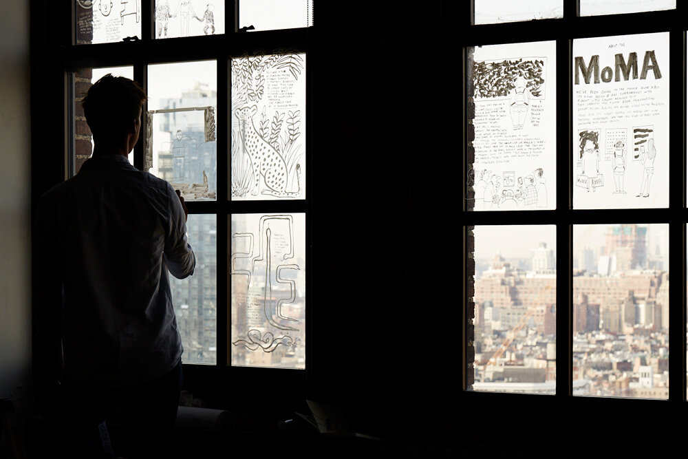
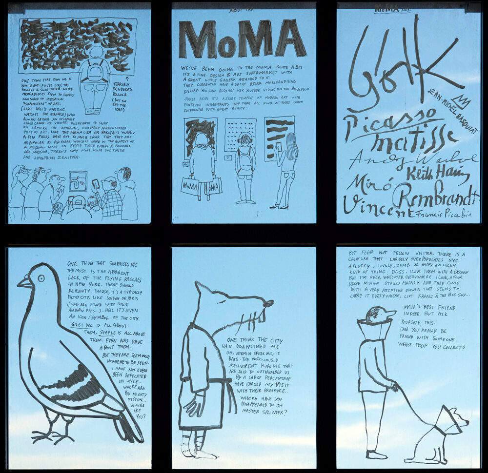
Jean has created these comedy takes on situations that happen when he is out in the city which he calls a visual gag and he spins and puts a funny twist on it. This is such an interesting way of documenting and address events or situations that are annoying to him. Each glass panel within the exhibition shows one event that’s happened, asking rhetorical questions to the reader about that particularly situation. I think this is so nice especially when looking at documenting the world around him, I wonder how this would overall read if it was in a book. I love the way that its on glass and photographed against the sky or a sunset which makes you think that the thoughts aren’t real they are just floating around like clouds.
Workshop
1 - Understanding Writing Styles
“. Create a tone of voice guideline template https://www.articulatemarketing.com/blog/tone-of-voice
A typical tone of voice handbook will include:
Some thoughts about the audience(s). Ideally with psychographic data and/or personas to help the reader understand their needs.
Relevant advice about different use cases, e.g. sales, marketing, website, letters, support etc. Not just who is reading it but when and where they’re reading it.
Who is speaking. What is the voice of the company? Do you want to write in a casual tone? Can you give some background information that helps the user understand how to speak with that voice?
What is the viewpoint? What does this ‘voice’ know about? What is its attitude to the reader, the product, the market, the competition? What vibe or emotion does it feel? What does it want?
Language. Is it formal? Relaxed? Jokey? What kinds of words are definitely required and which words are forbidden? One way to get at this is to ask what existing publications are you trying to emulate, the Financial Times, The Sun, a novel, a tax form?
Structure. Do you use the Pyramid Principle? The journalist’s inverted pyramid? Is it a colloquial conversation? Witty banter? Can you ask questions?
Good before and after examples that help the user learn how to do it themselves.
A controlled vocabulary. Words that you have to use (e.g. product names long and short). Words that you must always replace (e.g. ‘we don’t talk about our product as an ‘application’ but as a ‘service’).
Links to other relevant information such as a brand bible for graphic design elements, people who can give further guidance, style guides etc.”
• A news story
Tone of voice:
Detailed, informative, mutual tone.
“News articles are written in a structure known as the “inverted pyramid.” In the inverted pyramid format, the most newsworthy information goes at the beginning of the story and the least newsworthy information goes at the end.”
• A children’s story
Tone of voice:
Friendly, caring and younger audience
“Voice: The communicative and cumulative effect created by the author’s way of writing. The best books are always written with a voice that’s strong enough to make the protagonist — and the book as a whole — memorable.
Style: The panache with which the writer manipulates the conventions of modern language. In other words, style is the way the author adds his own particular twist to diction (word choice), dialogue, sentence structure, phrasing, and other aspects of the language. Like trends in fashion, style can be sparing and minimalist, outrageous and flowery, terse and evocative, or crisp and formal.
Tone: The attitude the story conveys toward its subject matter. For example, a story may convey an attitude of humor or sarcasm toward its characters and events, signaling to the reader that the material is to be taken with a grain of salt. Then again, it may convey an attitude of sincerity and earnestness through subtle content and language manipulation, thereby telling the reader to take the story seriously.”
• A launch document for a new brand & Business plan
“Your company's tone of voice represents your brand personality and values. This includes the words you choose and the order in which you put them and applies to all the content you deliver — website content, social media posts, emails, and any other formats.” https://www.semrush.com/blog/how-to-define-your-tone-of-voice/
• A love letter & Diary
“Informal: The goal of this content is to have an informal tone. It’s conversational, but still conveys a certain sense of expertise within the subject material.”https://www.americanrecruiters.com/2016/08/16/9-types-tone-writing/
“Soft tone of voice: Soft types of tone are used for intimate conversations. A soft helps form a bond and nurture a relationship. It also helps express empathy and gentleness during difficult conversations. Soft tones, as opposed to harsh or angry tones, make people feel safe. This is why people tend to use a soft tone while talking to a child.
Humorous tone of voice: Keeping your speech humorous with funny anecdotes or quotes keeps the audience in a positive mood. But you should be aware of keeping your tone cheerful and genuine, not mocking or sarcastic. “ https://harappa.education/harappa-diaries/tone-of-voice-types-and-examples-in-communication
“Diaries are usually quite personal – written in the first person from the writer’s point of view.
Many sound quite conversational and may contain informal words or phrases.
Tenses can vary – diaries tend to be past tense but can use present tense to bring an event to life for the reader.
The tone can be formal or informal depending on the intended purpose and audience, eg a travel diary might be chatty to encourage the reader to share fun experiences. However, it could also be serious if the writer describes places where there is extreme poverty.”
“As diaries are personal, they can have a variety of different structures:
Most are divided into the days of the week – but you do not have to write an entry every day.
They could start with ‘Dear Diary’ or with the date of that day’s entry.
Each day’s entry might end with a closing line such as: 'Got to go now' or 'time for me to go'.”https://www.bbc.co.uk/bitesize/articles/zn2djhv
• A manifesto & A speech
“ Formal: This tone in writing is often seen from an academic standpoint. It requires structured language, higher reading skills, and presents more facts that can be proven than the opinions of the writer.
Serious: This tone in writing creates a level of suspense within the reader. It increases their focus because the concepts being offered are important.” https://www.americanrecruiters.com/2016/08/16/9-types-tone-writing/
“Motivating tone of voice: Motivational speaker Chris Gardner, who inspired the film The Pursuit of Happyness, speaks with conviction and motivates people to tap into their potential and plan for success. A motivational tone keeps people engaged and inspires their personal as well as professional lives.Respectful tone of voice:One of the important examples of tones is the respectful tone of voice. A respectful tone enhances the quality of your communication. It conveys your kindness, humility, and truthfulness.”https://harappa.education/harappa-diaries/tone-of-voice-types-and-examples-in-communication
2 - Plan what you are going to write about and which section its under (400 words)


My first draft I wrote about some neighbour hood hoax and also another entry about a child in covid but it just didn’t really connect with me, So i’m going to try again but this time looking at covid from a graduate perspective.
So I then decided to do a series, writing from how graduates viewed covid and how they felt about going out into the adult world. I think this was something that was really forgotten for students last year and there was no ‘end’ to all their hard work.
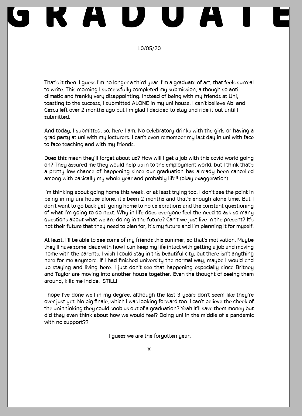
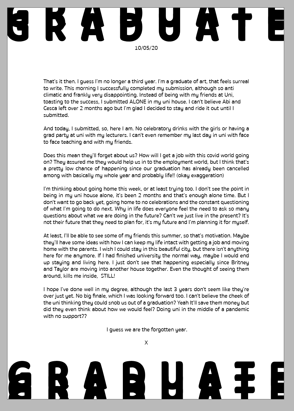
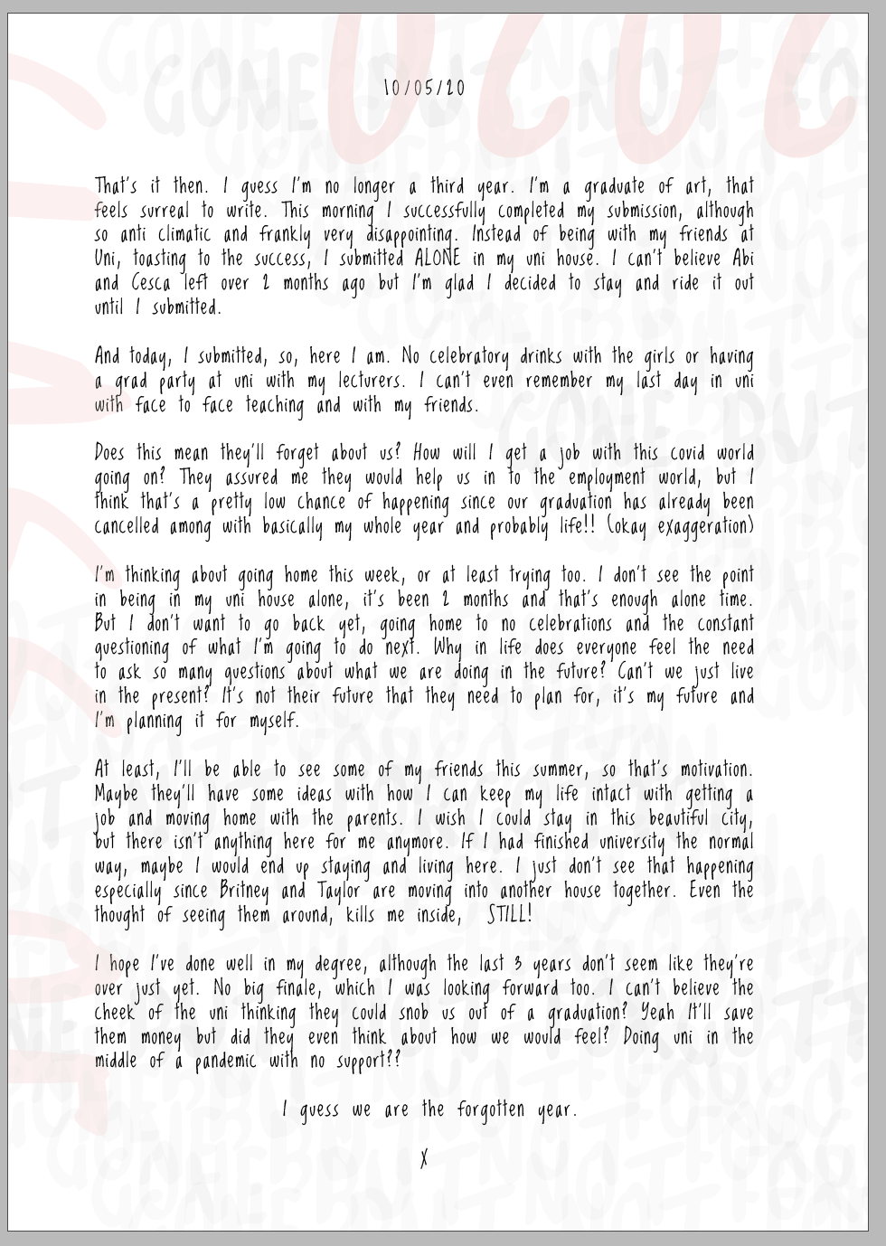
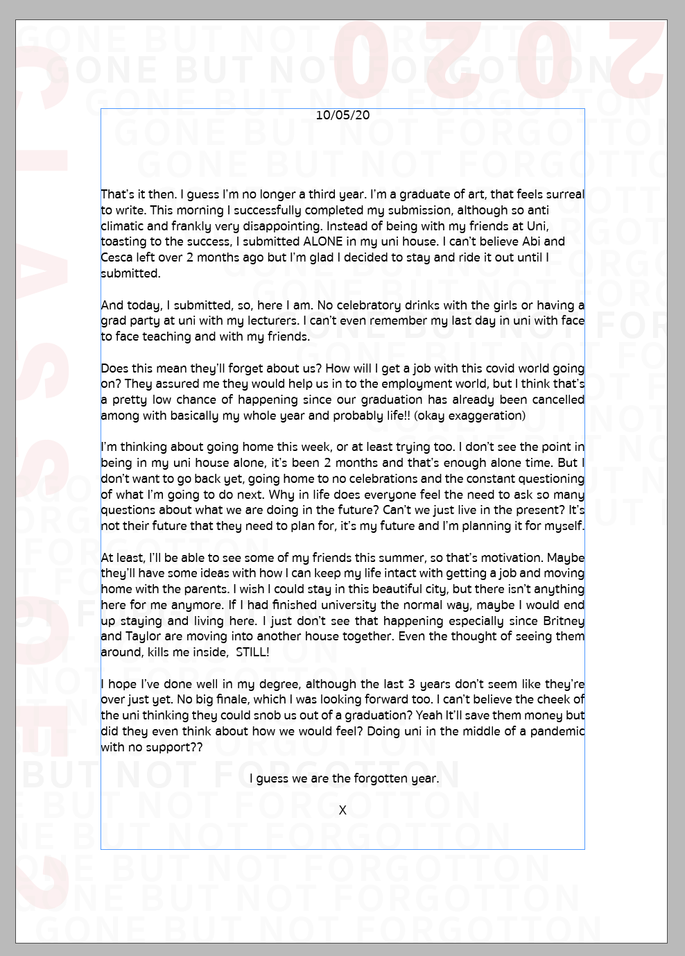
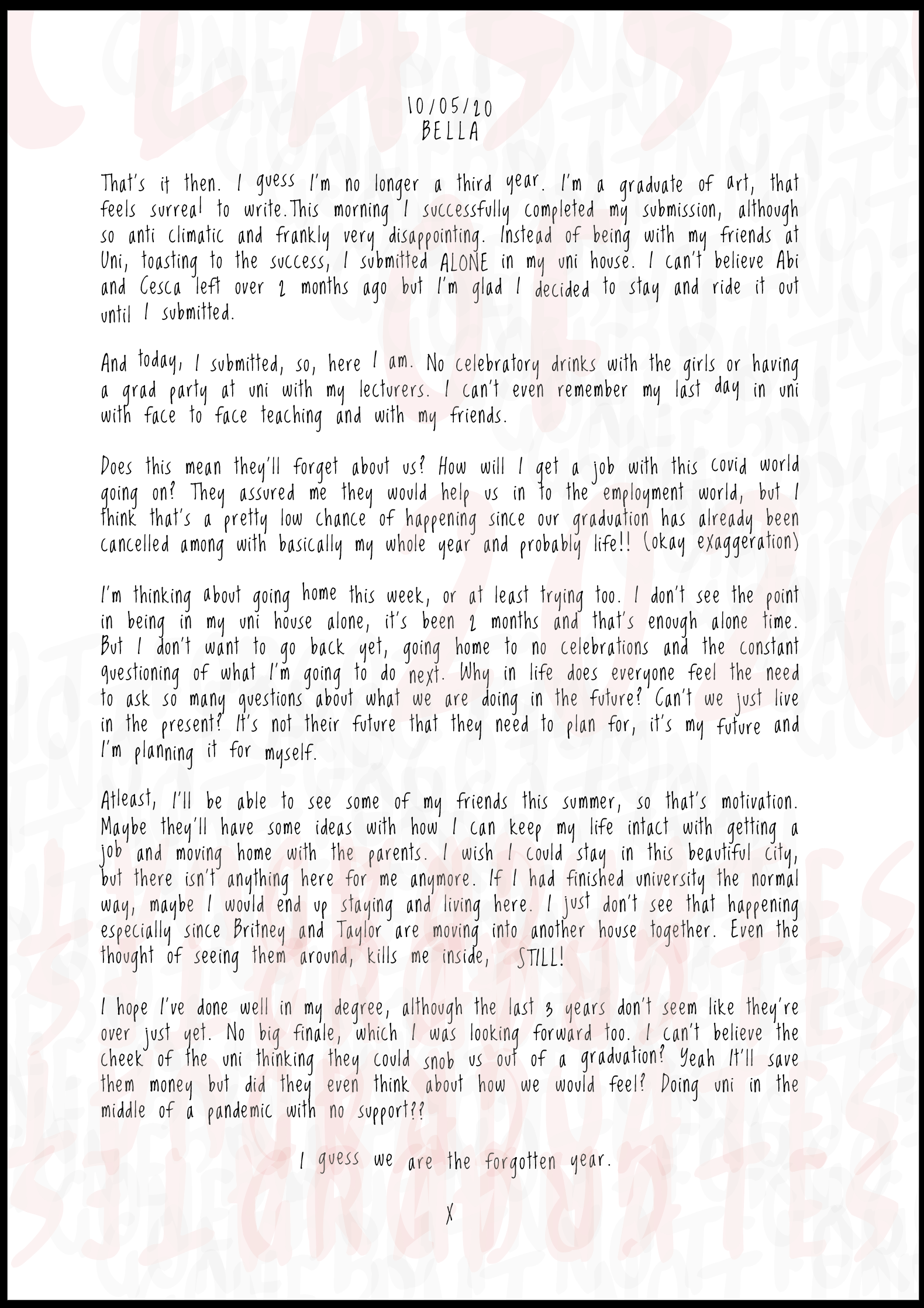
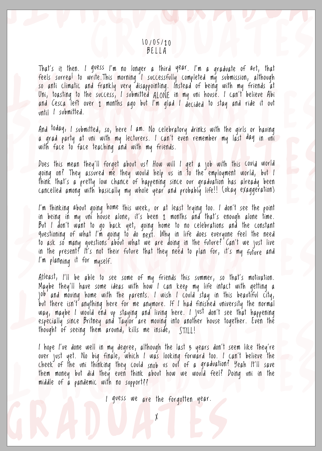
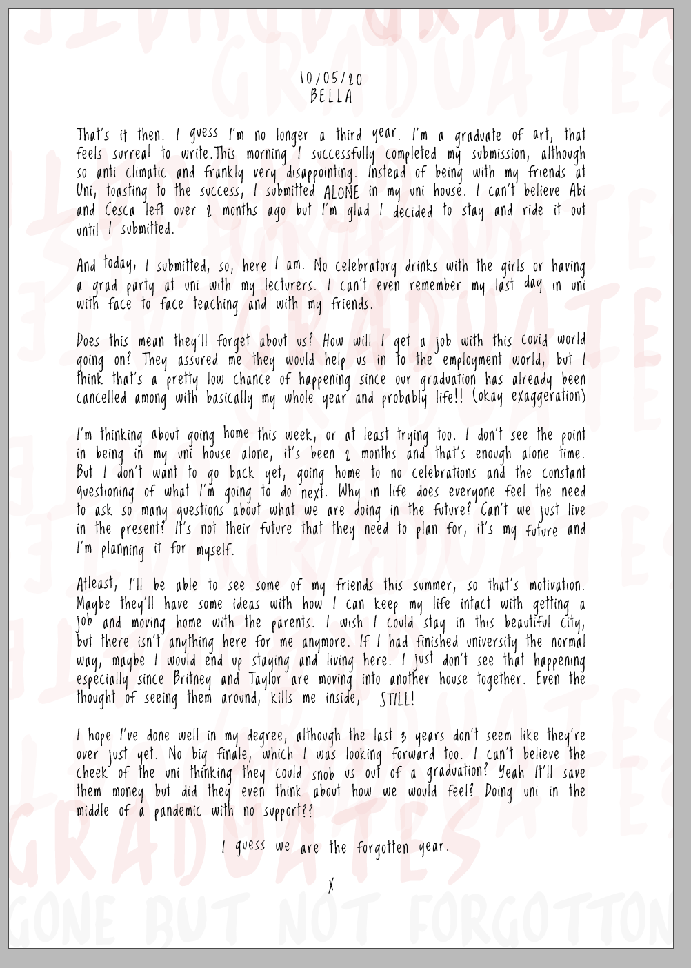
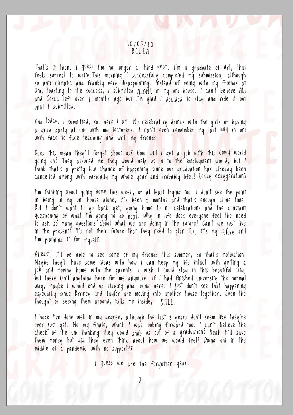
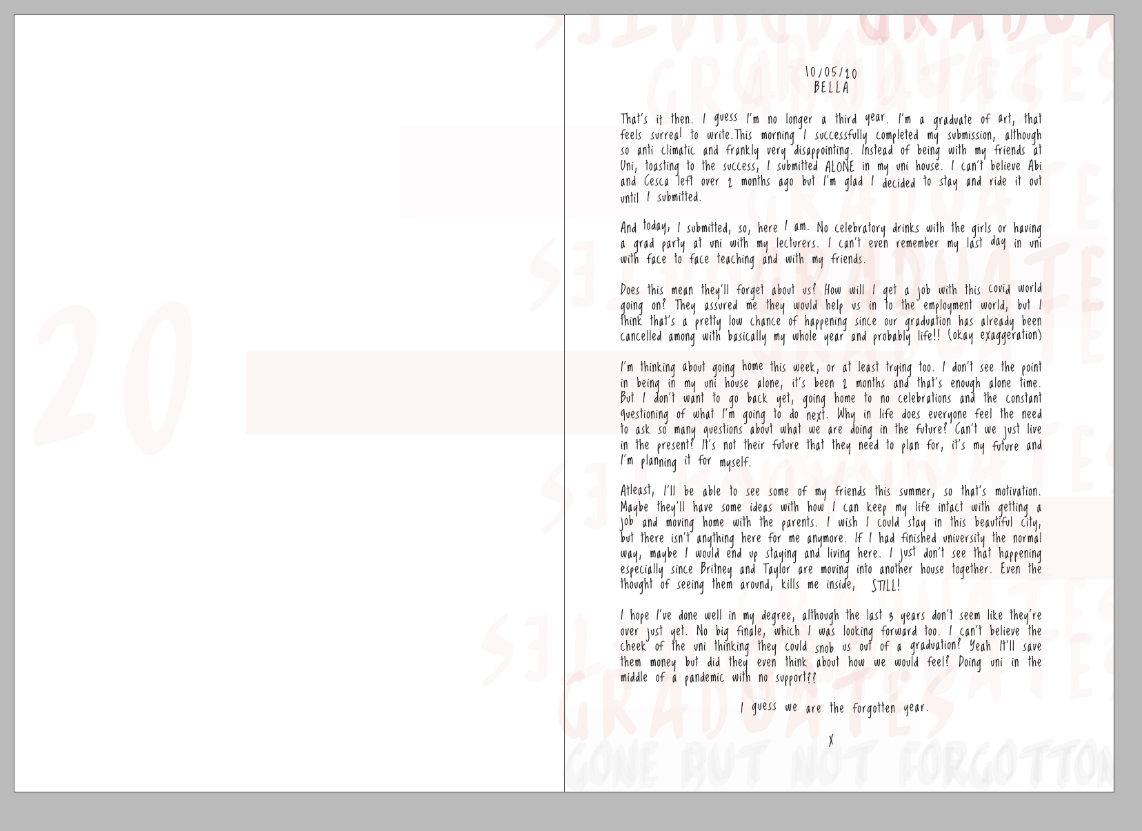
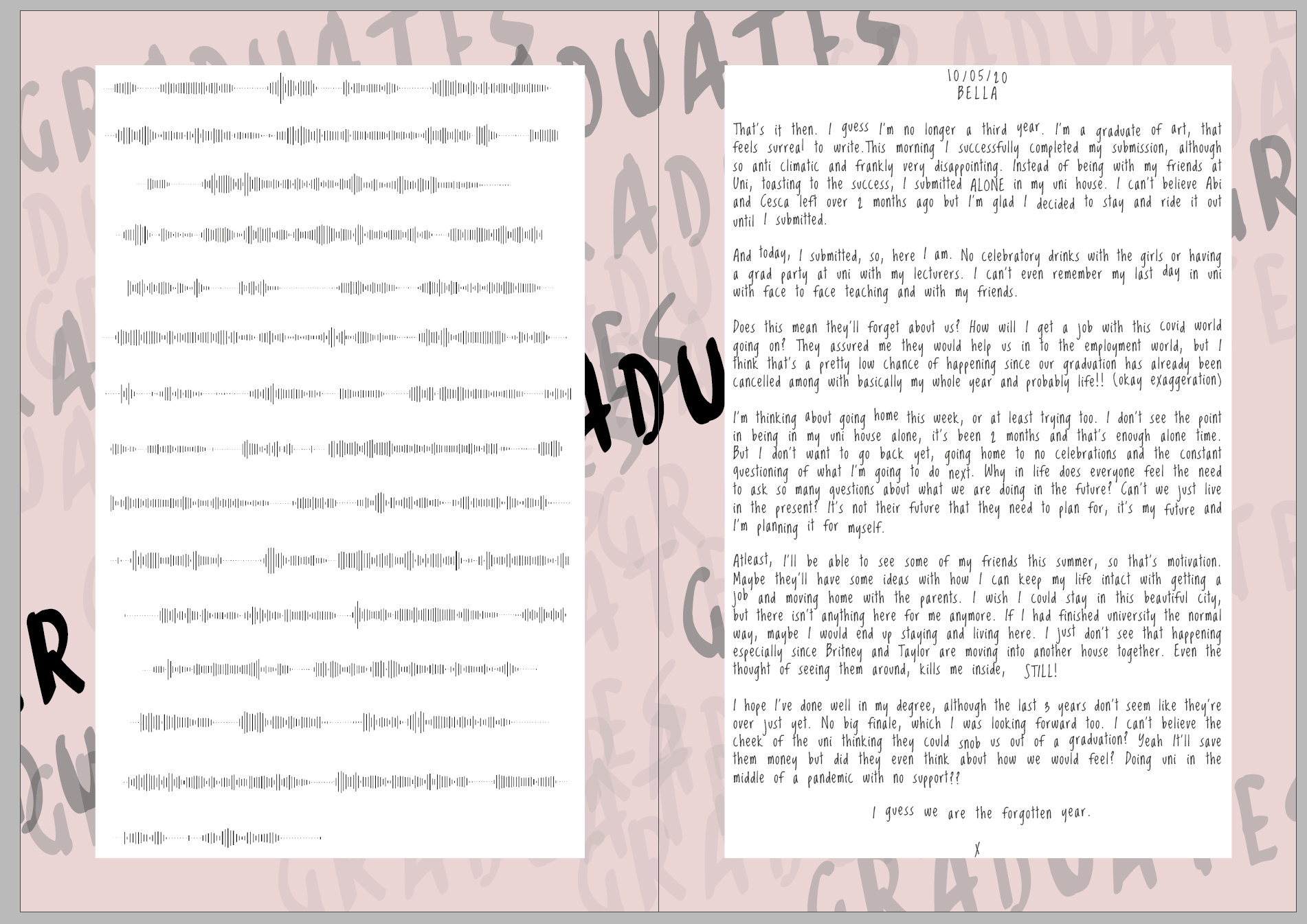
10/05/20
Bella
That’s it then. I guess I’m no longer a third year. I’m a graduate of art, that feels surreal to write. This morning I successfully completed my submission, although so anti climatic and frankly very disappointing. Instead of being with my friends at Uni, toasting to the success, I submitted ALONE in my uni house. I can’t believe Abi and Cesca left over 2 months ago but I’m glad I decided to stay and ride it out until I submitted.
And today, I submitted, so, here I am. No celebratory drinks with the girls or having a grad party at uni with my lecturers. I can’t even remember my last day in uni with face to face teaching and with my friends. Does this mean they’ll forget about us? How will I get a job with this covid world going on? They assured me they would help us in to the employment world, but I think that’s a pretty low chance of happening since our graduation has already been cancelled among with basically my whole year and probably life!! (okay exaggeration)
I’m thinking about going home this week, or at least trying too. I don’t see the point in being in my uni house alone, it’s been 2 months and that’s enough alone time. But I don’t want to go back yet, going home to no celebrations and the constant questioning of what I’m going to do next. Why in life does everyone feel the need to ask so many questions about what we are doing in the future? Can’t we just live in the present? It’s not their future that they need to plan for, it’s my future and I’m planning it for myself.
At least, I’ll be able to see some of my friends this summer, so that’s motivation. Maybe they’ll have some ideas with how I can keep my life intact with getting a job and moving home with the parents. I wish I could stay in this beautiful city, but there isn’t anything here for me anymore. If I had finished university the normal way, maybe I would end up staying and living here. I just don’t see that happening especially since Britney and Taylor are moving into another house together. Even the thought of seeing them around, kills me inside, STILL!
I hope I’ve done well in my degree, although the last 3 years don’t seem like they’re over just yet. No big finale, which I was looking forward too. I can’t believe the cheek of the uni thinking they could snob us out of a graduation? Yeah It’ll save them money but did they even think about how we would feel? Doing uni in the middle of a pandemic with no support?? I guess we are the forgotten year.
X
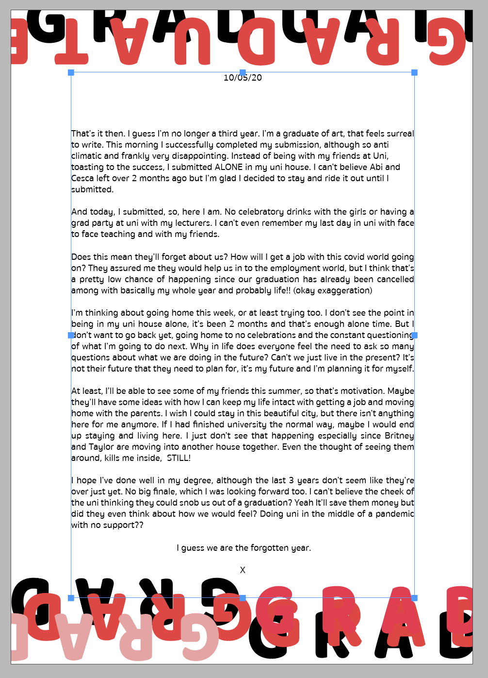
3 - Typeset your article
After playing around with the font which can be seen in the development in 4. I decided on a font called loved by the king which was really hand written. I also altered the height of some of the of wording to make it look more natural. Although this isn’t the classic hand written font, I didn’t want it to look to fake or too real. Everyones hand writing is so unique and thats what makes a diary entry so personal. I also wanted to try it backwards or a way that you couldn’t see it as it was really personal.


I actually really like this effect but I want to see if there’s another way of displaying it which will continue within my development below.
4 - Draw a sketch to illustrate how your article could be published as a book or magazine
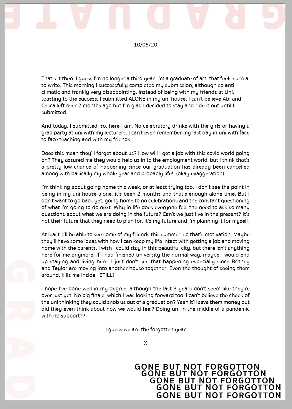

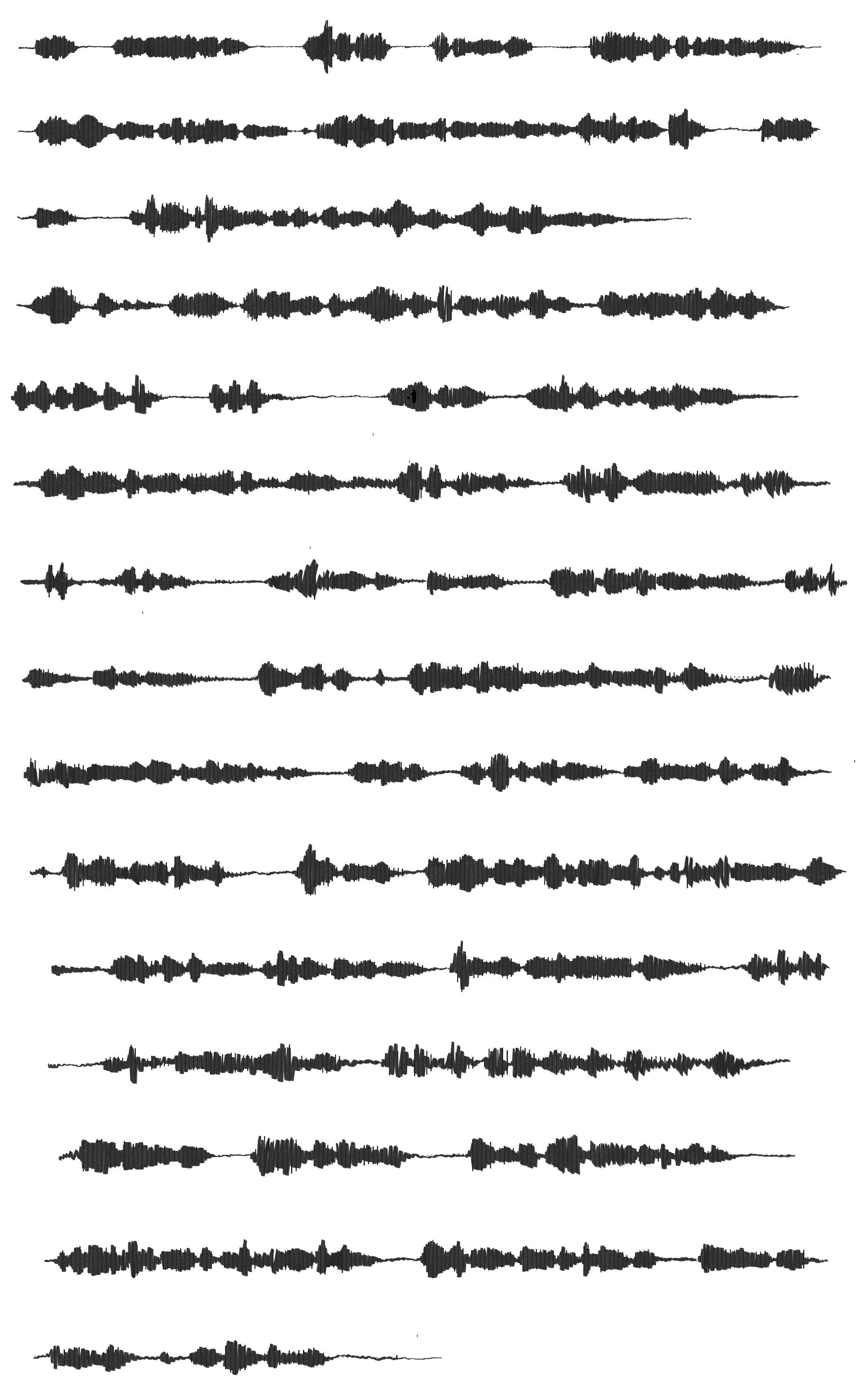
Got to this point and I started to think is this really how I want it to look and feel? I went back to the case studies which were really visual and decided to take a different approach. Instead of there being words - what about if it was voices? the voice notes of the graduates? I think that diaries and journals are really personal and I didn’t want them to be legible.

I recorded myself on the computer voice note maker and it came out like this:
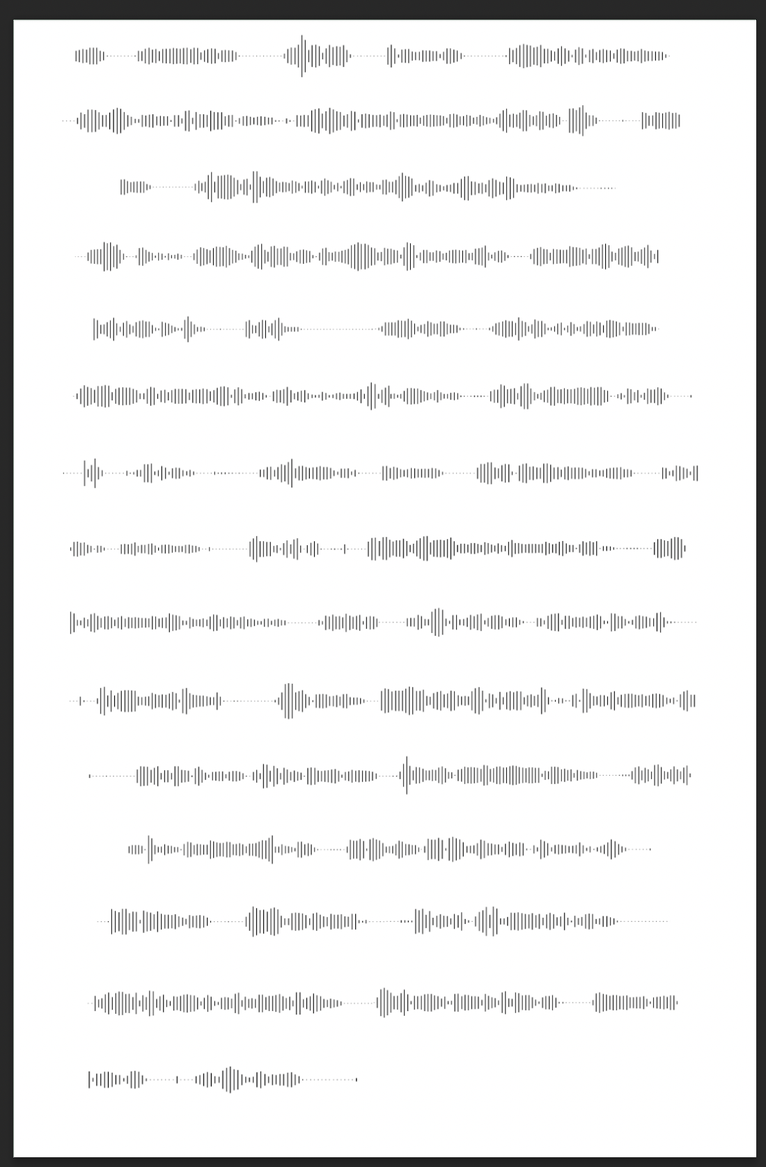
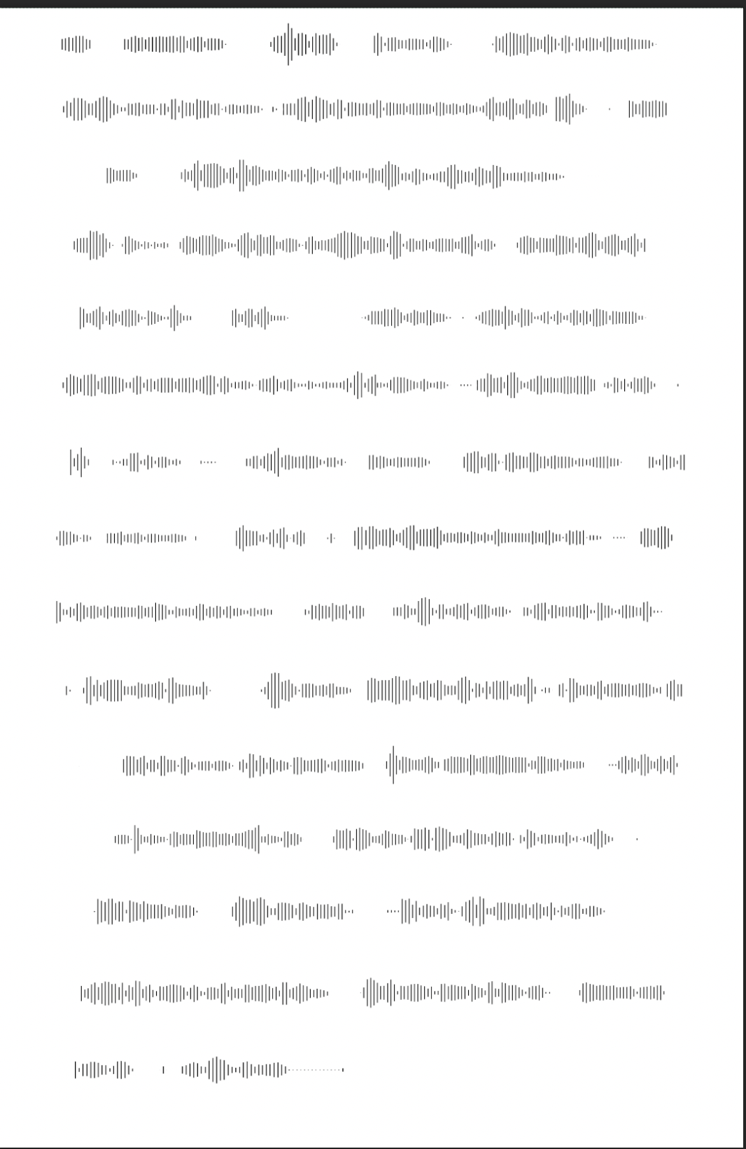
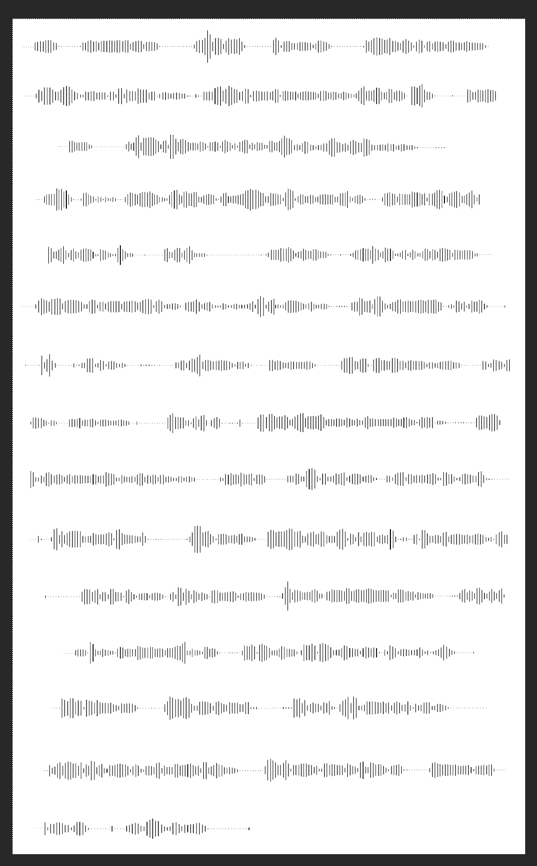
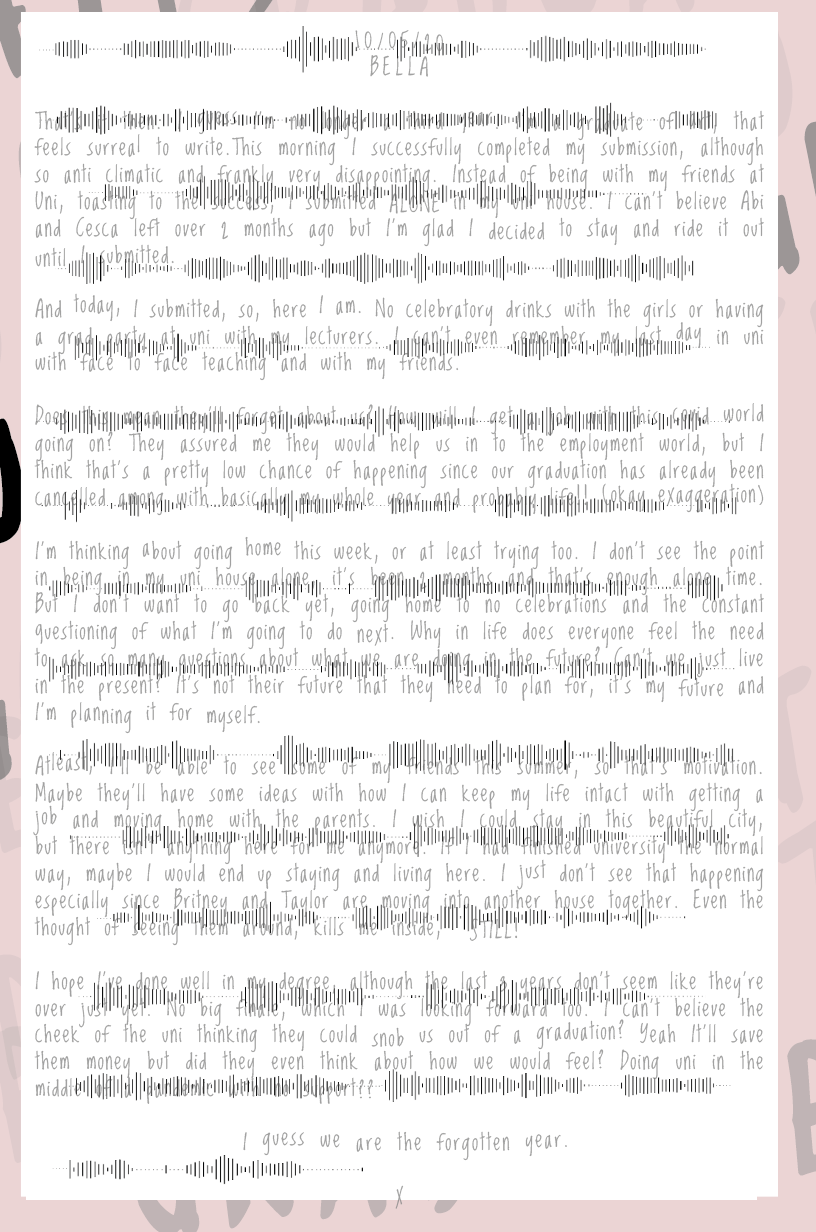
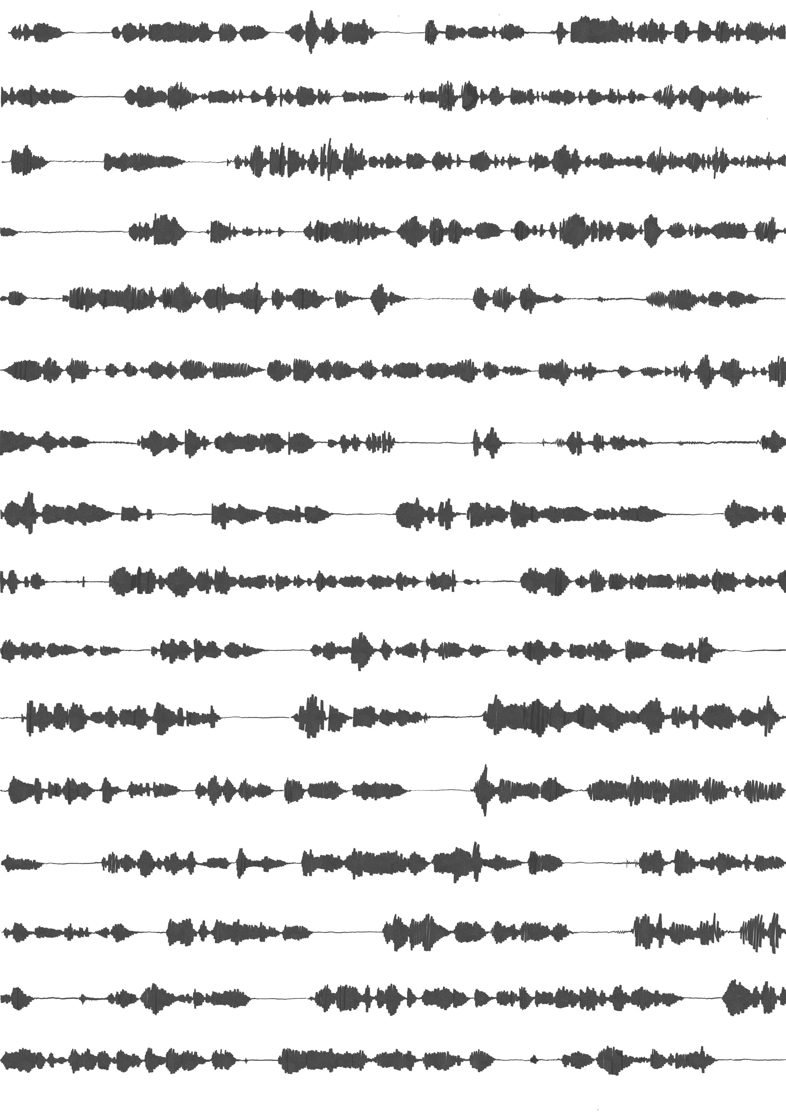
I then decided that I wasn’t a fan of the computer own effect, so I put it on my iPad and again started to draw over the top.
I then realised that I really liked this outfit - but I wasn’t a fan of how it was layed out and I wanted it to be more in depth - so I zoomed in on the voice note and arranged it on photoshop and went again.

I really liked this you can feel the person talking to you and how loud they are talking to you but not what they are actually saying. I then went to try and see what it would look like if I overlaid this.
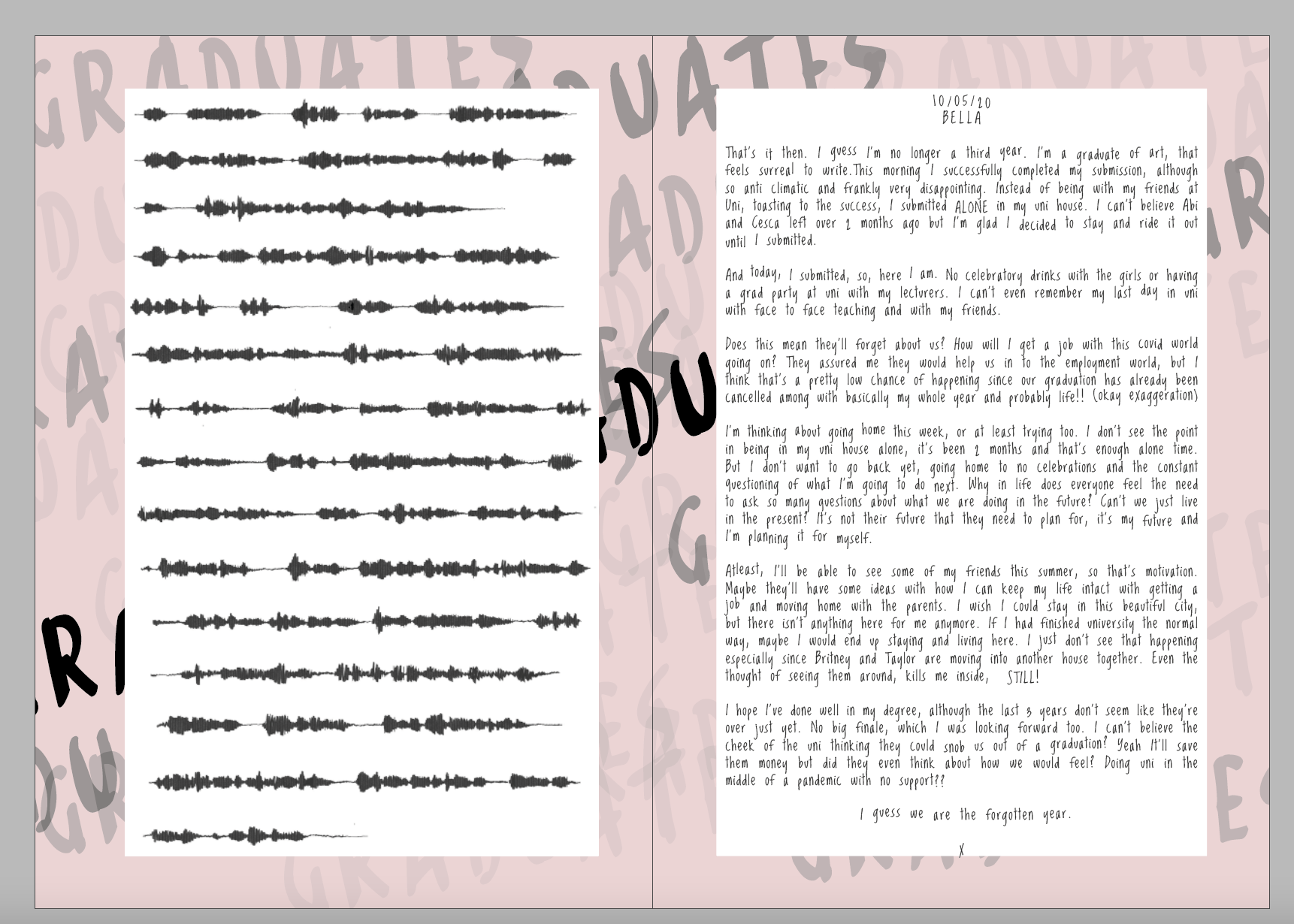
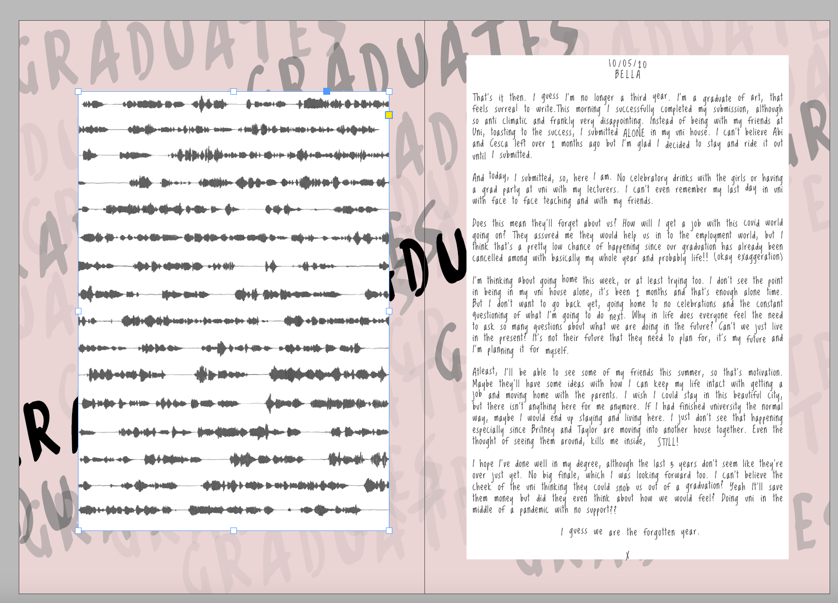
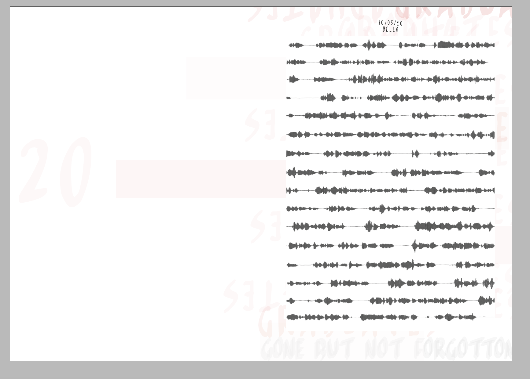
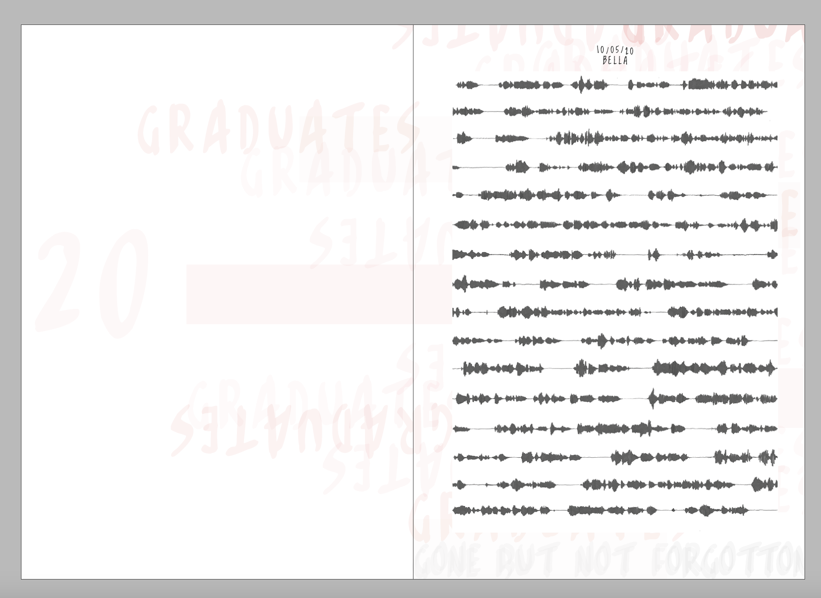
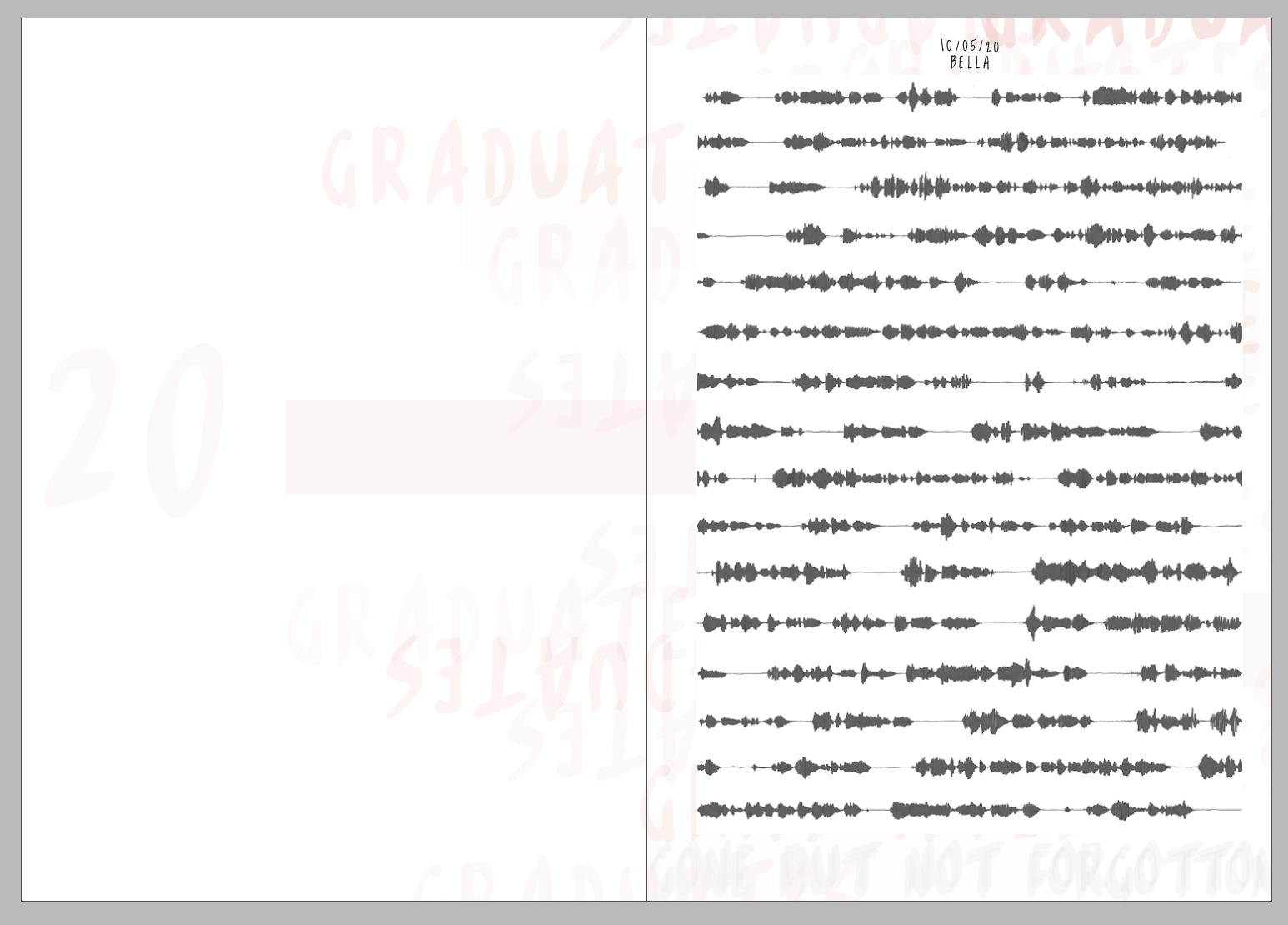
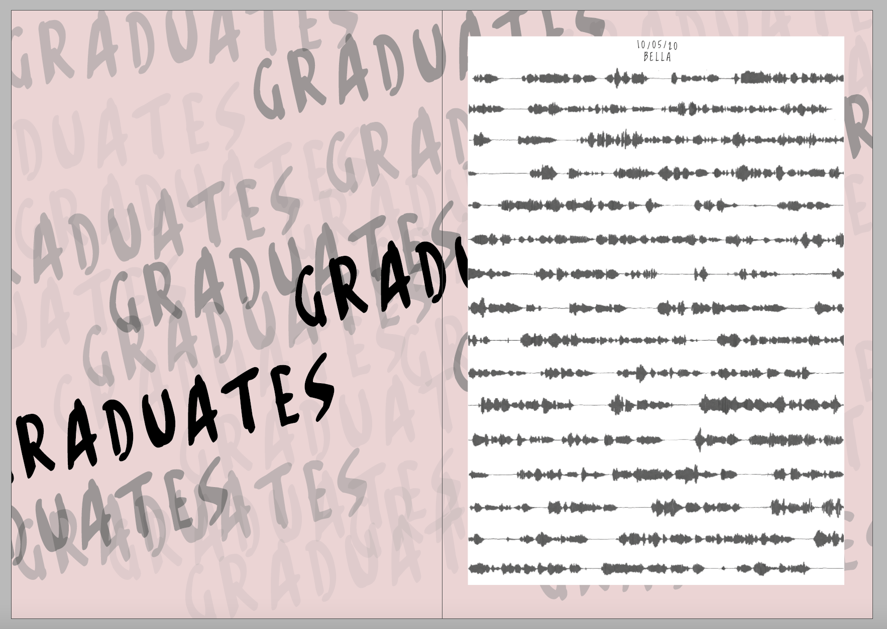
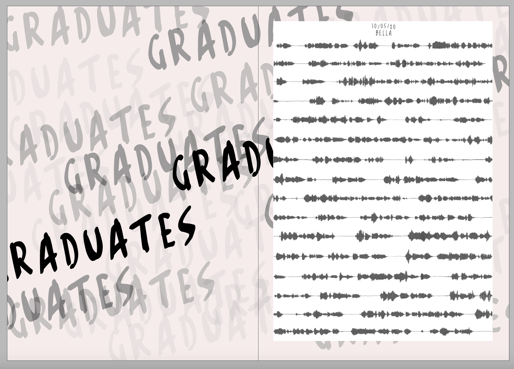
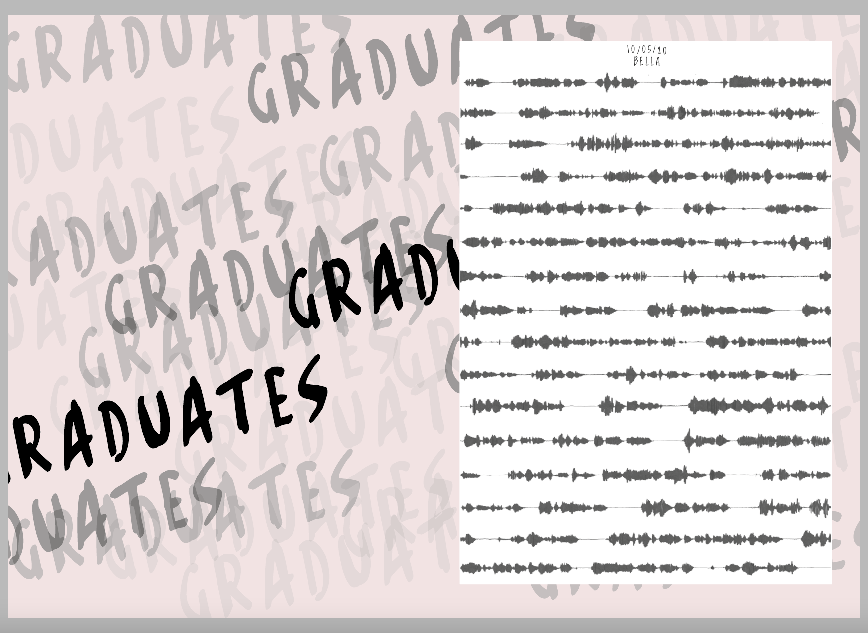

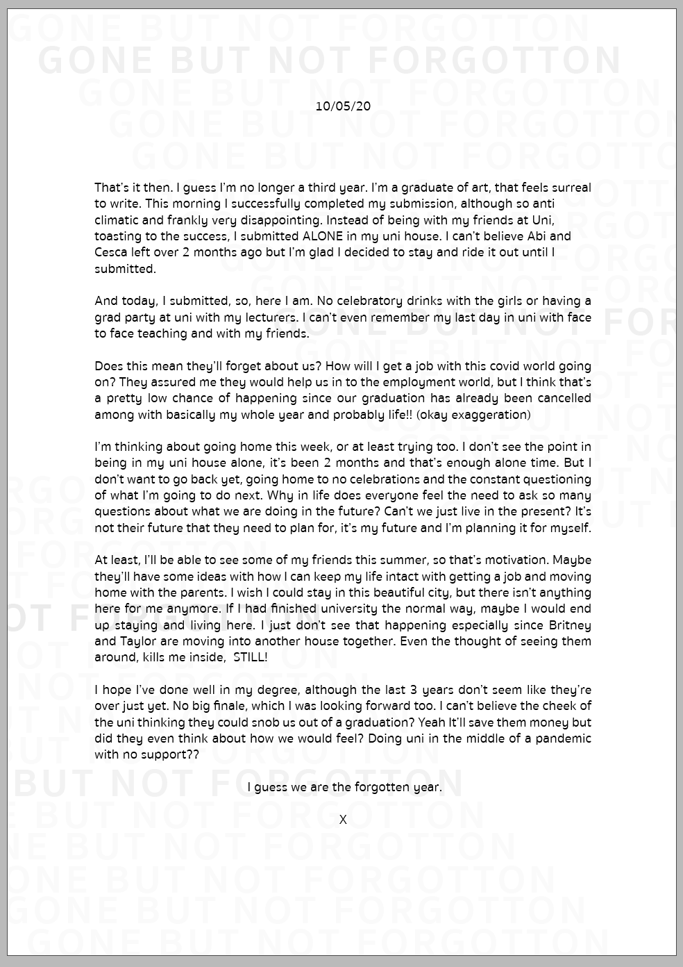
I decided on this one - I really like how the words behind were layered and how the black sat against the white. I then also decided to do a front cover.


I also tried and tested both of the covers on the background of books to see what they would look like.
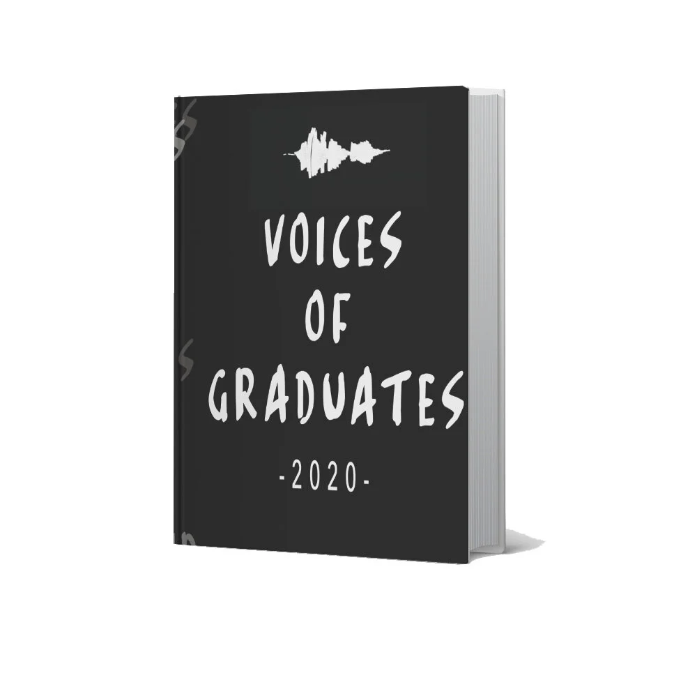

Im really happy with the final product. Its a little bit different but I feel thats what this week is about exploring the voice.
Weekly Summary
What a week! I really enjoyed the challenge this week and also the workshop task. I haven’t really thought about tone of voice since my English lessons at school, so this was really hard for me to get my head around. But I really enjoyed the research into areas that I would never really look at design or for case studies at least. Some really interesting and amazing design concepts especially loved oh shit what now and some of the journal inspiration ones but also Emil Ruder who I took inspiration from for my outcome for this week. I now understand how important it is to keep in mind who we are doing the work for and the reader of the work to make sure tone of voice is kept similar.
For the workshop challenge this week I decided to go with a journal / diary and ended up looking into a graduates voice. Being a graduate myself last year, I feel that their voice was lost and forgotten about during lockdown and this covid world that took over. The uni threw us to the side, when a lot of us felt abandoned by the university. So I wanted a way that the voices could be heard not just read, If I had more time I would of explored another way about a interactive book of listening to the voices but I like that my final outcome came to a book. I feel this is a visual way of seeing and understanding graduates at a time that they needed support.
Ideas Wall Posts
Reference list
Baines, J. (2019). Take a trip back to graphic design’s mid-century heyday with Theo Inglis’ latest book. [online] www.itsnicethat.com. Available at: https://www.itsnicethat.com/articles/theo-inglis-mid-century-modern-graphic-design-book-publication-030519.
Brewer, J. (2020). Rian Hughes uses type and layout as part of the narrative in XX: A Novel, Graphic. [online] www.itsnicethat.com. Available at: https://www.itsnicethat.com/news/rian-hughes-xx-a-novel-graphic-publication-200820.
Carlson, C. (2020). Illustrator Vic Lee publishes hand-drawn Corona Diary documenting his lockdown experience. [online] Dezeen. Available at: https://www.dezeen.com/2020/08/17/vic-lee-hand-drawn-corona-diary-lockdown-experience/ [Accessed 13 May 2021].
Designer Books (n.d.). Emil Ruder : Design Is History. [online] www.designishistory.com. Available at: http://www.designishistory.com/1940/emil-ruder/.
Eye Magazine (2014). Eye Magazine | Review | We made this. Authentic, trilingual landmark. [online] www.eyemagazine.com. Available at: http://www.eyemagazine.com/review/article/we-made-this-authentic-trilingual-landmark [Accessed 13 May 2021].
Gosling, E. (2013). An illustrated diary of Shoreditch. [online] Design Week. Available at: https://www.designweek.co.uk/issues/march-2013/an-illustrated-diary-of-shoreditch/ [Accessed 13 May 2021].
Gosling, E. (2016). Why Do Graphic Designers Write Books? [online] Eye on Design. Available at: https://eyeondesign.aiga.org/why-do-graphic-designers-write-books/.
Inglis, T. (n.d.). Theo Inglis. [online] www.theoinglis.co.uk. Available at: https://www.theoinglis.co.uk/MCMGD [Accessed 13 May 2021].
McLaughlin, A. (2018). Illustrating the world’s first children’s book made from recycled ocean plastic. [online] Design Week. Available at: https://www.designweek.co.uk/issues/30-april-6-may-2018/illustrating-childrens-book-made-recycled-ocean-plastic/ [Accessed 13 May 2021].
Montgomery, A. (2015). Jean Jullien – “everything’s easier when you make people smile.” [online] Design Week. Available at: https://www.designweek.co.uk/jean-jullien-everythings-easier-when-you-make-people-smile/ [Accessed 13 May 2021].
Oldham, C. (2018). Craig Oldham dishes out brutally honest advice to new graphic designers. [online] Itsnicethat.com. Available at: https://www.itsnicethat.com/news/oh-shit-what-now-craig-oldham-advice-for-graphic-designers-publication-170418.
Penguin Books (2014). The Book With No Pictures by B.J. Novak. [online] www.youtube.com. Available at: https://www.youtube.com/watch?v=cREyQJO9EPs&feature=emb_logo [Accessed 13 May 2021].
Popova, M. (2011). “Graphic Design for Kids” and 6 Other Artful Nonfiction Books. [online] The Atlantic. Available at: https://www.theatlantic.com/entertainment/archive/2011/09/graphic-design-for-kids-and-6-other-artful-nonfiction-books/245661/ [Accessed 13 May 2021].
The Storybook Lady (2016). Press Here by Hervé Tullet Read Aloud. [online] www.youtube.com. Available at: https://www.youtube.com/watch?v=H_EdcZgmFYY&feature=emb_logo [Accessed 13 May 2021].
TypeRoom (2020). In grid we trust: Emil Ruder aka the iconic pioneer of Swiss Style - TypeRoom. [online] www.typeroom.eu. Available at: https://www.typeroom.eu/in-grid-we-trust-emil-ruder-aka-the-iconic-pioneer-of-swiss-style.
Williams, M. (2020). Experiences with homelessness retold in graphic novel form. [online] Creative Review. Available at: https://www.creativereview.co.uk/accumulate-book-of-homelessness/ [Accessed 13 May 2021].
Wong, H. (2020). An environmental cleaning brand that avoids “generic” eco tropes. [online] Design Week. Available at: https://www.designweek.co.uk/an-environmental-cleaning-brand-that-avoids-a-generic-eco-tone/ [Accessed 13 May 2021].