Week Four
Lecture Notes:
Lecture Summary:
The lecture this week covered a variety of topics looking at surveying, analysis, forecasting and engaging. I think one of the points that really stood out for me is that “ 90% of error in thinking is due to the error in perception “ I think that’s what this week is all about really. Even if we jump back in time or fast forward to the present day events, if we aren’t at that event or we aren’t the present that is making that talk we are just making a perception of what happens and that perception is changed by the report of that coverage by the media.
I think there is this sense of covering up events that have happened or trying to forget that they did which can be seen clearly in terms of the immigration. But I think companies like forensic architecture are working on how we can change our perception to really bring out the truth. Going back to last week in terms of David McCandles, he made a website purely focusing on the positive but after listening to todays lecture where is the positive in any of these events?
Some of the key things that stuck out for me within this weeks lecture are which I could use for research:
Washington post
New York Times
Charles Booth
UK police release crime data
Forensic Architecture
Future Laboratory
Data Archives
Black Shoal
Resource Notes:
Resource One:
Resource Two:
Resource Three:
Resource Summary:
Resource One:
A small interesting interview with some of the people at forensic architecture about what they do as a company. I think they are very ambitious in terms of trying to change the perspective of other people around the world to agree with them and to bring out the truth of what’s really happened with when human rights have been ignored.
Resource Two:
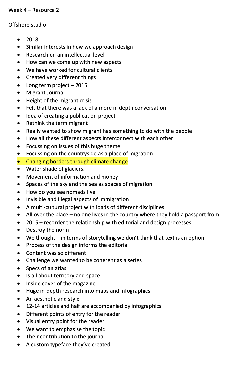
Offshore graphic design company based in Germany. I think what they have tried to do with this migrant journal is so interesting yet so inspirational. They have taken such a hush hush project and created it into something of beauty with all the facts about the immigrants with every aspect looked at like the photography story of each week and the texture that are used, the colour associations and even creating a typeface that can be used throughout to create unity. They don’t just look at the information on land they look at the sea and the stars and they are trying to CHANGE THE PERSPECTIVE. They want us to look at the word migrant differently than we have been. I think there designs are super clever and I want to research more about what they are doing.
Research:
Field
This company worked with accept and proceed in last week and I wanted to do a little bit more research into their work. Especially one called Chorus, “A data-driven art installation, commissioned by the British Library for its major 2013 exhibition Propaganda: Power and Persuasion. Chorus examines how ideas and opinions spread via social networks, and their potential to influence public opinion.”
I think this is a really interesting concept to watch the chaining trends that are happening across the world and being able to colour code them to being neutral, or aggressive or happy which allows you to stand back and watch the trends unfold.
Another one of their recent projects, I also found really interesting. In collaboration with IBM they have created Think 2020. “The artwork is rendered by a truly generative visual system, where an ensemble of graphical elements respond to groups of instruments: Melody, Vocals, Machines, Drum+Bass, Space+Details. Reacting with their shape, colour, surface detail and movement; with every wave, twitch, plop or bend.”
Using sound analysis, form finding and collaboration. “Both music and visuals are based on the idea that an engineered system generates the raw material for creative expression – the act of building your own tools as a catalyst for artistic freedom.”

I admire the way they have created these different type of posters and bits that slit together so that you are able to step by step understand how they have managed to make this piece. I think its a completely fresh way of looking at music and I feel that you can almost feel the piece by looking at it.

Georgia Lupi
She appeared in my research last week and after doing more research on her, I wanted to include her in this week too.
Data Fashion
I think this project drew me in as its something that’s really different to the norm of data visualisation. I look forward to seeing what’s behind this data visualisation fashion that she has created and the why.

“Her data creations are always very detailed and full of artistic value. Not surprisingly, her data art always makes it into our roundups. In this year’s collection, we have her fashion co-lab with Other Stories.
The main idea behind this fashionable visualization was to celebrate three women in science. Georgia’s sketches used the data from each woman’s notable projects to create reusable graphics that were then printed on handmade fabric.”
Video Notes //
Data doesn’t really exist
an abstraction of reality
focus on the number themselves
what does data represent
Data can create stories that we can all relate too.
This collection is about 3 women who are all pioneers in their area.
They want them to be interested in environmentalism and space and maths.
analysed the 17 chapters of the book
creating the words from the book into something that can be seen visually.
Dreams and aspirations
126 orbits that she preformed.
pattern represents the pattern and what she did in space.
It can be a very powerful narrative and design material that we can relate too.
I love that she has this idea within her that data doesn’t really exist and that its just this abstraction of numbers but the real data is how we can create stories that we all relate too. I really like that she has said all of those things as I think that’s the main reason for data visualisation is the story that’s being told behind it.
Giorgia Lupi, Information Designer, Author, and Co-Founder and Creative Director at Accurat
Notes //
Human Data - data can illuminate aspects of our human lives.
Innovate how they work with data
how to make sense of complex information of data
question and explore how we can connect data to what it represents
data as a medium to create human connections
what way would this data be meaningful
data portraits - images based on peoples answers
different colours with shapes
simple evoking questions
data as a tool to understand data in a simple kind of way
data that speaks our language
paints a complete journey of what’s happed by a story that was only told through data.
Data humanism
All use data to become more human.

I think within this lecture it was really interesting to learn about how we can bring the data back to human connection. One of the project that was mentioned about creating bespoke data portraits for people to start conversations after answering a couple of questions about themselves is so clever and interesting, I now wonder if this can be used in another way to portray other data?
Black Shoal
After hearing about the interactive stock market outcome within this installation, I was intrigued and wanted to find out more information regarding it.
Notes //
A visualisation of the stock markets - takes form of planetarium.
Live updates from the financial markets
Not try to make the data beautiful
the stars flicker and glow - glow means millions
Feeding from the light of the stars
the name - the formula development
Formula that was calculated from the risk in the stock market
the formula which allowed them to invest without risk
Something went wrong with their formula - company collapsed
Theories - formula didn’t account for its own impact on the market
Era of the .com boom - wired magazine
The stock market - something exciting
How they take on different meanings over time.
Project has taken on a whole lot of different meanings over time
Many disaplines
Expect more complex results
Seduced by this piece and you have to think about why?

The reason I think I am so drawn by this piece after listening to that little video is that its such a different interpretation from the stock market, when you think of the stock market itself its this crazy hectic place where everyone is running around making money loosing money, its very stressful. But watching the clip of the stars moving it’s taking away all the stress that is created from the stock markets.
““For these creatures, the heaves and surges of the world economy are like the Earth’s tectonic plates,” says Portway. “Just as we are only aware of the constantly shifting and unstable plates that make up the Earth’s crust when there’s an earthquake or volcanic eruption, the creatures have no way of knowing what lies ‘underneath’ their world – they only know that sometimes there are explosions of money, and sometimes there are famines.”
“They are living in an artificially constructed world we invented for them,” adds Autogena. “Living by rules that we have imposed on them, in the same way that we live in a market structure that we created ourselves.””
Symbolikon

“The Symbolikon data visualization, by Michela Graziani, is a large collection of artistically rendered symbols from different cultures and times in history. It has over 700 symbols in over 28 categories and it’s still growing.”
Climate Change Visualisations:
This week I also wanted to look into the climate change visualisations as I think this is possible what I want to base this weeks task on.
Climate Risks

“At the rate global warming is rising now and with no great actions being taken, the global changes will be drastic for humans and all living creatures. The WWF created this visual infographic to show the possible outcomes, and raise a clarion call to all big companies to step up their climate efforts.”
https://visme.co/blog/climate-change-facts/
It’s admirable how they have looked at everything that lives on the planet and what the risks are. I think its also clever that they have done a vs so you can see the before and after kinda thing. But I think that the infographic needs to me more shocking to make sure that the real impact is made.
Drowning in Plastic

“Past 10 years
4 trillion bottles
The plastic bottles sold worldwide since 2009 would tower above New York’s Manhattan Island. Data from Euromonitor International shows that more than 480 billion of these bottles were sold last year alone. The 2018 annual figure of almost 482 billion is up more than 50% since 2009. The pile visualised below is around 2.4 km high and dwarfs the glittering skyscrapers of the Financial District at the tip of Lower Manhatta”
I think this is such a great visualisation to show the amount of plastic when people are really ignoring the fact that its happening around them. I think a lot of people think they are the only ones either stopping or purchasing the bottles but they forget that we share the planet with others. They have done such a great job of creating an impact with this image.
CO2 Emissions vs. Vulnerability to Climate Change by Nation

“The Milken Institute School of Public Health created this graphic back in 2015 as a comparison between two data groups. In this visualization, the red circles represent countries which emit the most carbon dioxide.
The blue circles represent the countries which are the most vulnerable due to carbon dioxide emission. This data viz is not from this year, but it’s still very impactful, not to mention beautiful”
https://visme.co/blog/climate-change-facts/
This data visualisation has again been made so beautiful and clear with two key informations categories - the blue and the red and then being able to compare them on the same poster. I think they have also done a great job at symbolising the map and the world to point at the important things within the visualisation.
“Warming Stripes”

“This visualization was created by Ed Hawkins, the same data scientist behind the viral spiral visualization about global temperatures. The approach behind this data viz was to take a minimalistic stance which didn’t need to show any numbers or figures.”
https://visme.co/blog/climate-change-facts/
Another favourite is this one by Ed Hawkins - What stood out for me within this one is that its unlike any other data visualisation - there’s no actual numbers which I think its so clever to take a minimalistic approach. Sometimes the data can be so small but also so confusing when looking at it and I may just have to take this as inspiration for this week.
‘Summer in the City’
Another way of presenting physical visualisations is like this one to show climate change and what effects in within the surrounding area. Although a small model, I still the effect is there.

“The visualization explores the direct influence of weather and traffic volume on air pollution, comparing data of a 4-week period during summer 2015 in Lugano (Switzerland). Different colored laser cut plates fixed on wires represent daily data. As the wires are diagonally mounted on the structure, looking from different sides, they evidence either daily data or the evolution of the parameters.”
http://dataphys.org/list/summer-in-the-city/
Breathing Space
Notes//
air pollution isn’t static
we rarely think about how our cities and public spaces breathe.
What would mapping air quality data reveal?
monitored a few spaces over a couple of days
busy streets and road lower air quality
so variable on the day and the time..
Finding a little bit of breathing space in your day can make all the difference.
An interesting installation in London as you don’t often think about the air that you are breathing in throughout everyday, you often just think that the air is fine for you but in heavily congested areas within London the air isn’t as good as it may be within the country side where you have a lot for breathing space.
‘Migration Waves’

Following on from this weeks topic of the word migrate. I found this beautiful data visualisation done by the national geographic. I think I was mainly drawn to how one side is white and the other side is black and it seems like a contest. It is also so beautifully laid out.
”Less than 10 percent of these migrants are forced to flee; most are seeking a better life and move only when they can afford to. Global migrants totaled fewer than 100 million in the 1960s, and although the number has increased substantially since then, it remains a fraction of the world’s 7.6 billion people today.
The design of an infographic is functional, semantic, aesthetic, and even poetic.This infographic is entitled "Migration Waves", the data has been represented with shapes that evoke sea waves on the NatGeo yellow background; creating with all this a direct connection to the cover where a migrant mother is hit by a wave whose picture is framed by the famous yellow rectangle.Journalistic design = function, meaning, aesthetics and poetry.”
https://www.informationisbeautifulawards.com/showcase/4191-migration-waves
Deaths as Nails
Although not the happiest of finds, I think the message that it shows and the data that it is telling us can be interesting. This piece shows the amount of covid 19 deaths, hammered int cubes. More nails are added each time someone passes from the awful disease. I think this visually shows the impact that this is having on the community.

“The text down the steps says "Fürchtet euch nicht", meaning "do not be afraid".
Workshop Challenge:
For this weeks workshop task, I had two ideas - possibly looking at how covid 19 pandemic has improved our climate change and how fitness has taken a huge storming across the world.
Source a scientific, cultural or environmental story that matters to you.
Create a piece of information design to communicate its information and reveal a new insight.
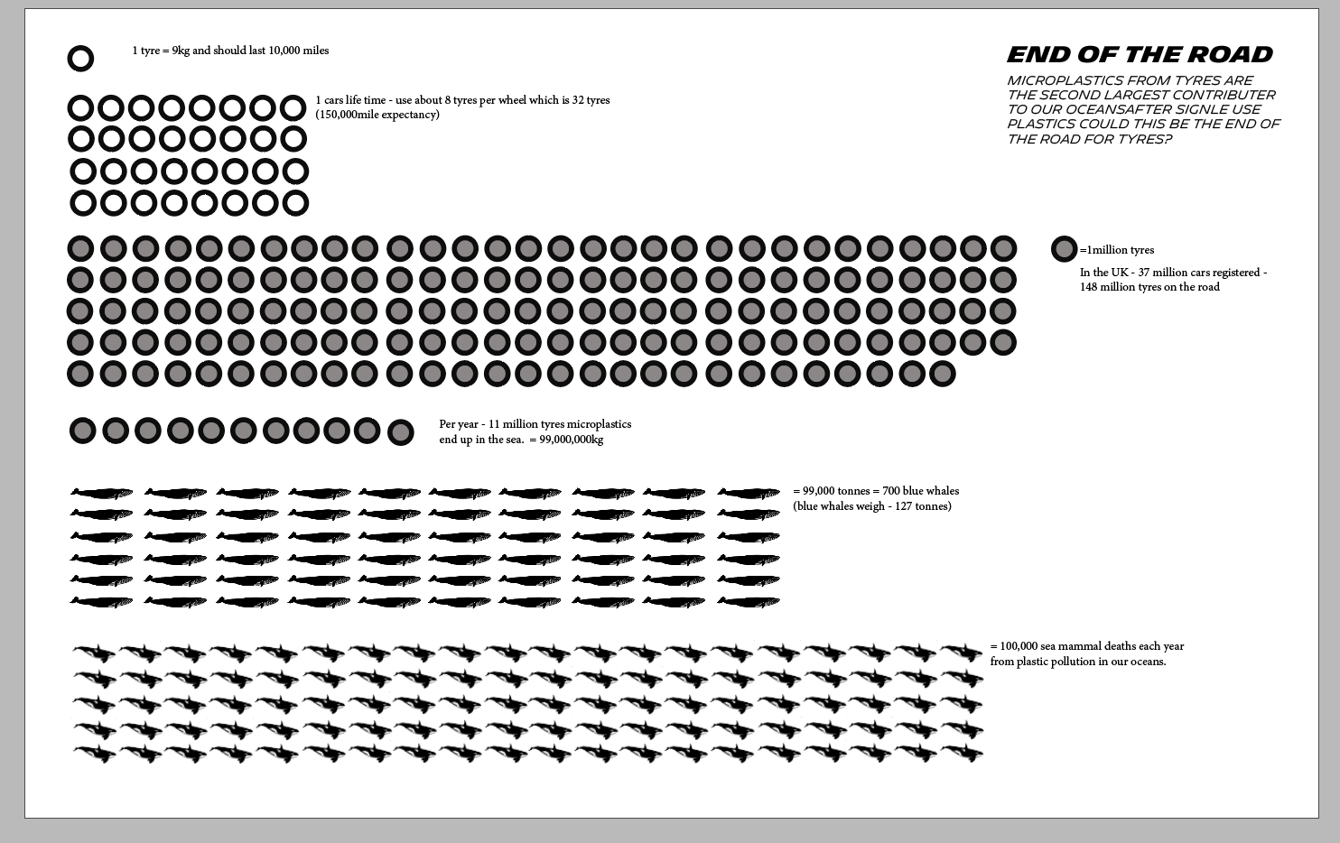
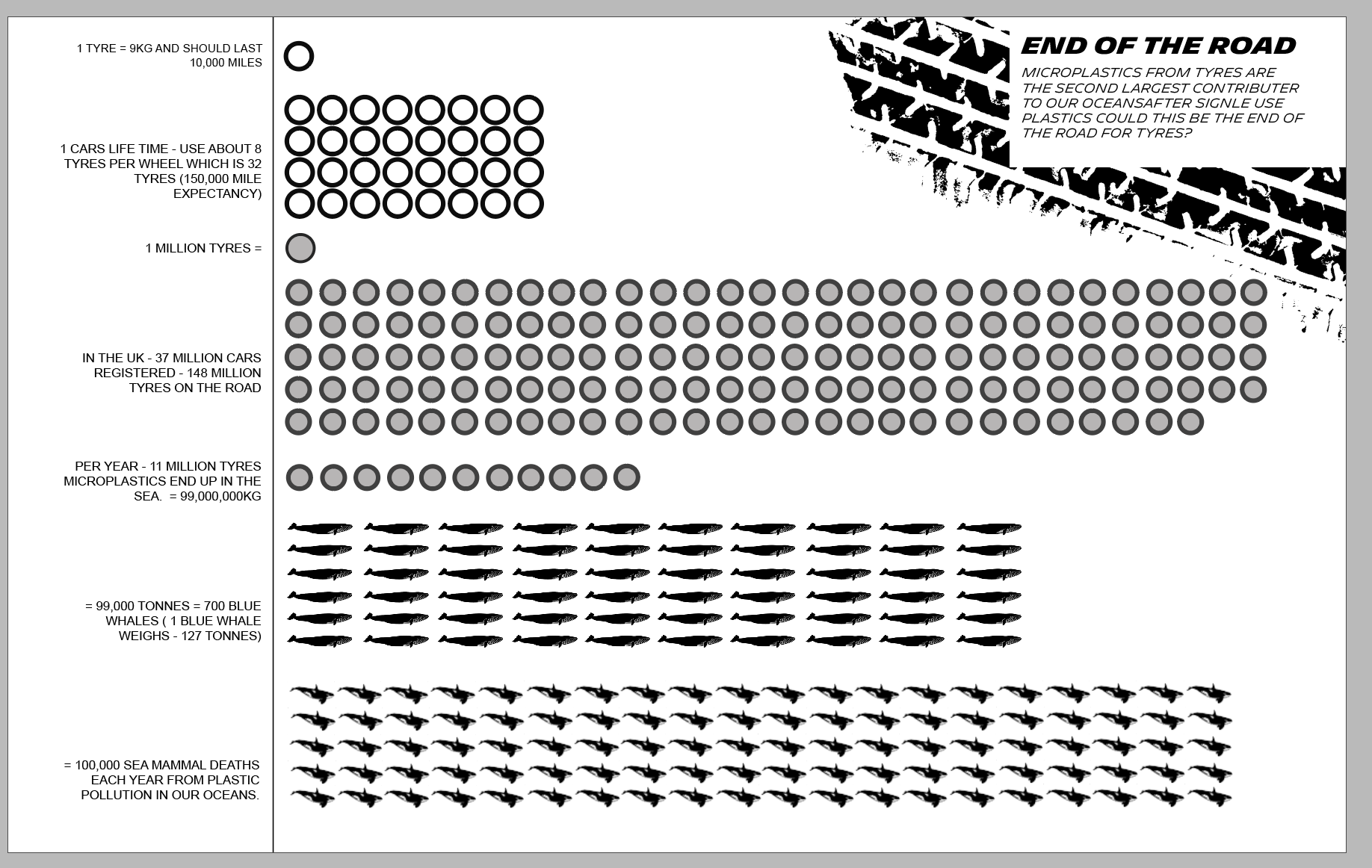
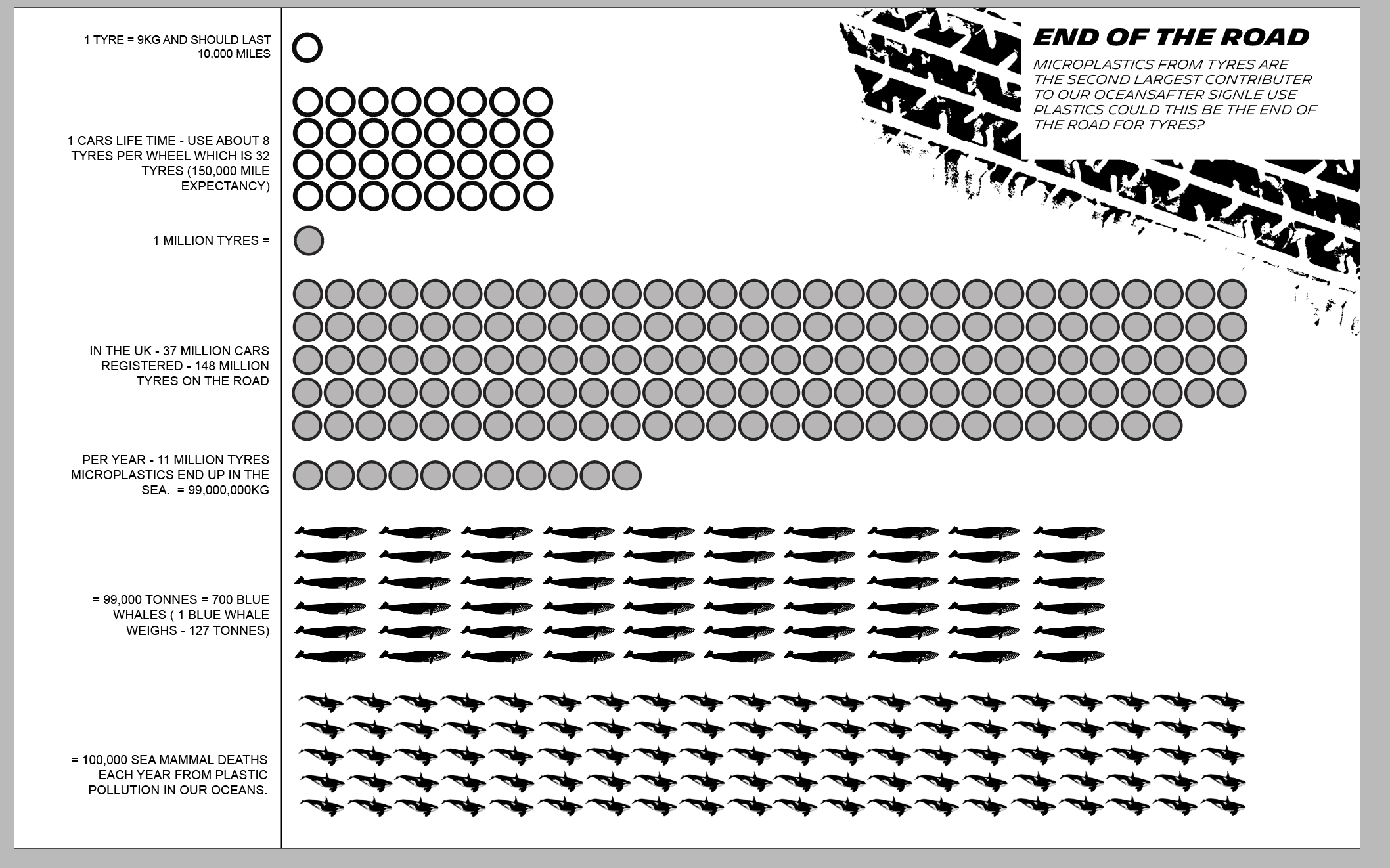
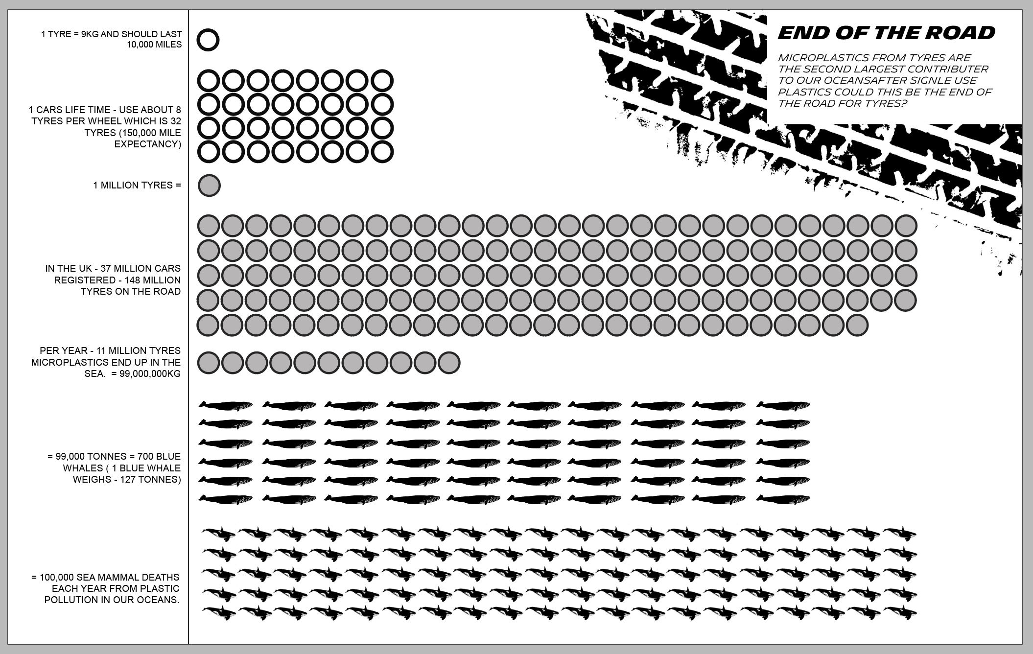
From this I then went onto look at plastics from the research I was doing this week at climate change and then It led me to looking and researching about Tyre Microplastics which a lot of people aren’t very familiar with.
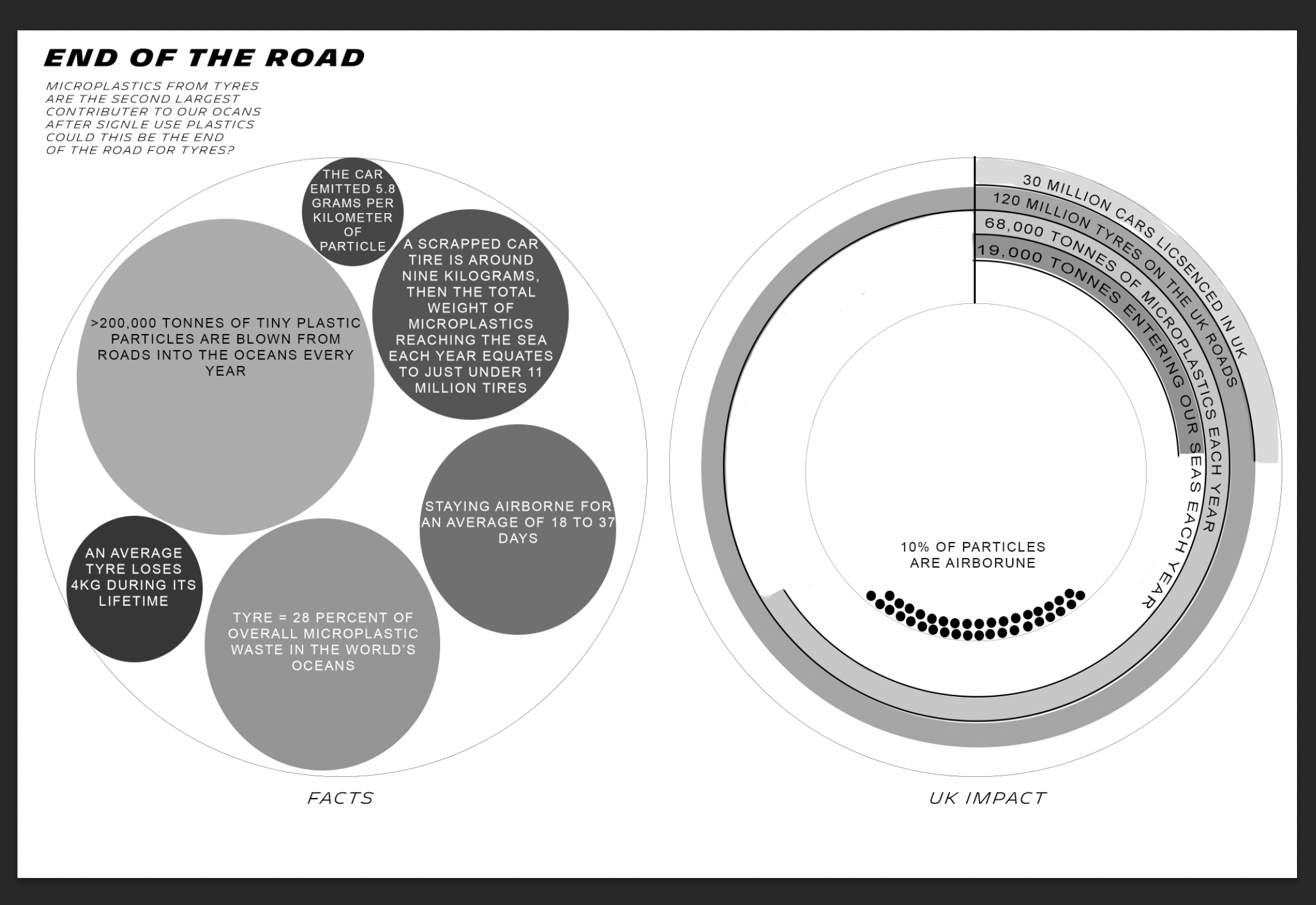
The facts:
• An average tyre loses 4kg during its lifetime
• More than 200,000 tonnes of tiny plastic particles are blown from roads into the oceans every year
• 550,000 tonnes of particles smaller than 0.01mm are deposited each year, with almost half ending up in the ocean
• 80,000 tonnes fall on remote ice- and snow-covered areas and may increase melting as the dark particles absorb the sun’s heat
• The study suggests the finest particles can remain airborne for a month
• There are over 40 million tyres going on to cars in the UK each year.
• Taking all vehicles into account there are over 100,000 tyres being fitted to vehicle each and every day in the UK.
• 68,000 tonnes of microplastics in the UK, with 7,000–19,000 tonnes entering surface waters annually
• It is understood that microplastic pollution is associated with numerous health impacts and contributes to the total annual deaths linked to air pollution in the UK, estimated between 28,000–36,000 deaths
• we found that the car emitted 5.8 grams per kilometer of particles
• It indicated up to 100million m² of the UK’s river network – and more than 50million m² of estuarine and coastal waters – at risk of contamination by tyre particles
• 28 percent of overall microplastic waste in the world’s oceans
• 13,000 tonnes of microplastics from tyres
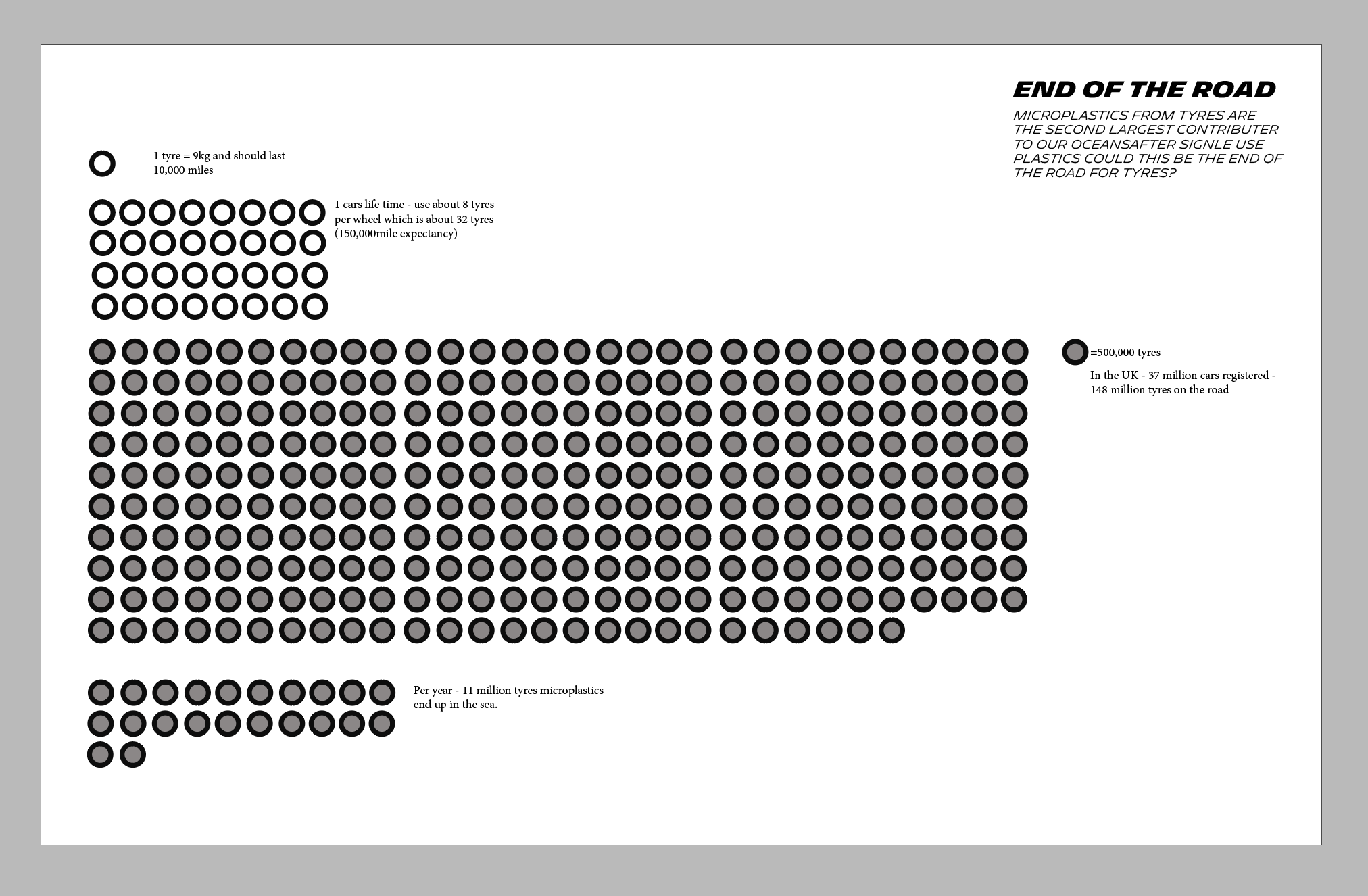
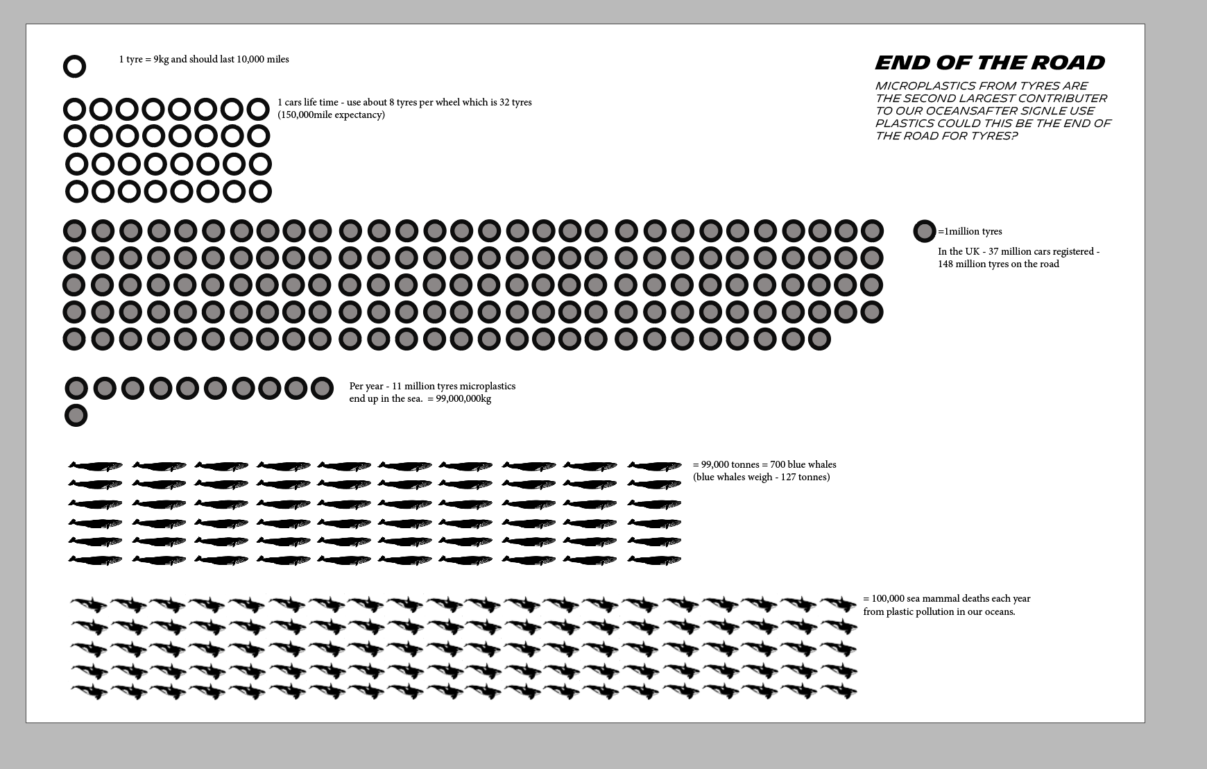
• According to government figures, there are around 30 million cars licensed for use in the UK. That means 120 million car tyres on our roads. And that’s not including all the lorries and massive multi-wheeled HGVs
• It is estimated that up to 10% of tyre wear is generated as airborne particles, which contribute to ongoing problems of air pollution and lung problems in UK cities.
• microplastics from tyres and vehicle brake pads made up 89% of the particles taken from the air above motorways
• Every year, 100,000 metric tonnes of microplastics are shed from tires, transported through the air and dumped in the ocean. Another 40,000 tonnes comes from brakes. To put that in perspective, if the average scrapped car tire is around nine kilograms, then the total weight of microplastics reaching the sea each year equates to just under 11 million tires
• They found that smaller particles from tires can spread further, with the smallest staying airborne for an average of 18 to 37 days
• Smaller particles travel far and are deposited worldwide, with about 43% of their total mass ending up on land, and 57% in the ocean.
• Globally, it is estimated that tyre-wear accounts for nearly half of road transport particulate emissions. It is also the second largest microplastic pollutant in our oceans after single-use plastic.¹
• Today, half a million tonnes of tyre particles are produced annually in Europe alone, from vehicles accelerating, braking and cornering.
Now I want to simplify these facts - having all this information on the data visualisation could be confusing.
General:
1. An average tyre loses 4kg during its lifetime
2. More than 200,000 tonnes of tiny plastic particles are blown from roads into the oceans every year
3. we found that the car emitted 5.8 grams per kilometer of particles
4. 28 percent of overall microplastic waste in the world’s oceans
5. 13,000 tonnes of microplastics from tyres
6. scrapped car tire is around nine kilograms, then the total weight of microplastics reaching the sea each year equates to just under 11 million tires
7. They found that smaller particles from tires can spread further, with the smallest staying airborne for an average of 18 to 37 days
UK:
• There are over 40 million tyres going on to cars in the UK each year.
• Taking all vehicles into account there are over 100,000 tyres being fitted to vehicle each and every day in the UK.
• 68,000 tonnes of microplastics in the UK, with 7,000–19,000 tonnes entering surface waters annually
• According to government figures, there are around 30 million cars licensed for use in the UK. That means 120 million car tyres on our roads. And that’s not including all the lorries and massive multi-wheeled HGVs
• It is estimated that up to 10% of tyre wear is generated as airborne particles, which contribute to ongoing problems of air pollution and lung problems in UK cities.
• It indicated up to 100million m² of the UK’s river network – and more than 50million m² of estuarine and coastal waters – at risk of contamination by tyre particles
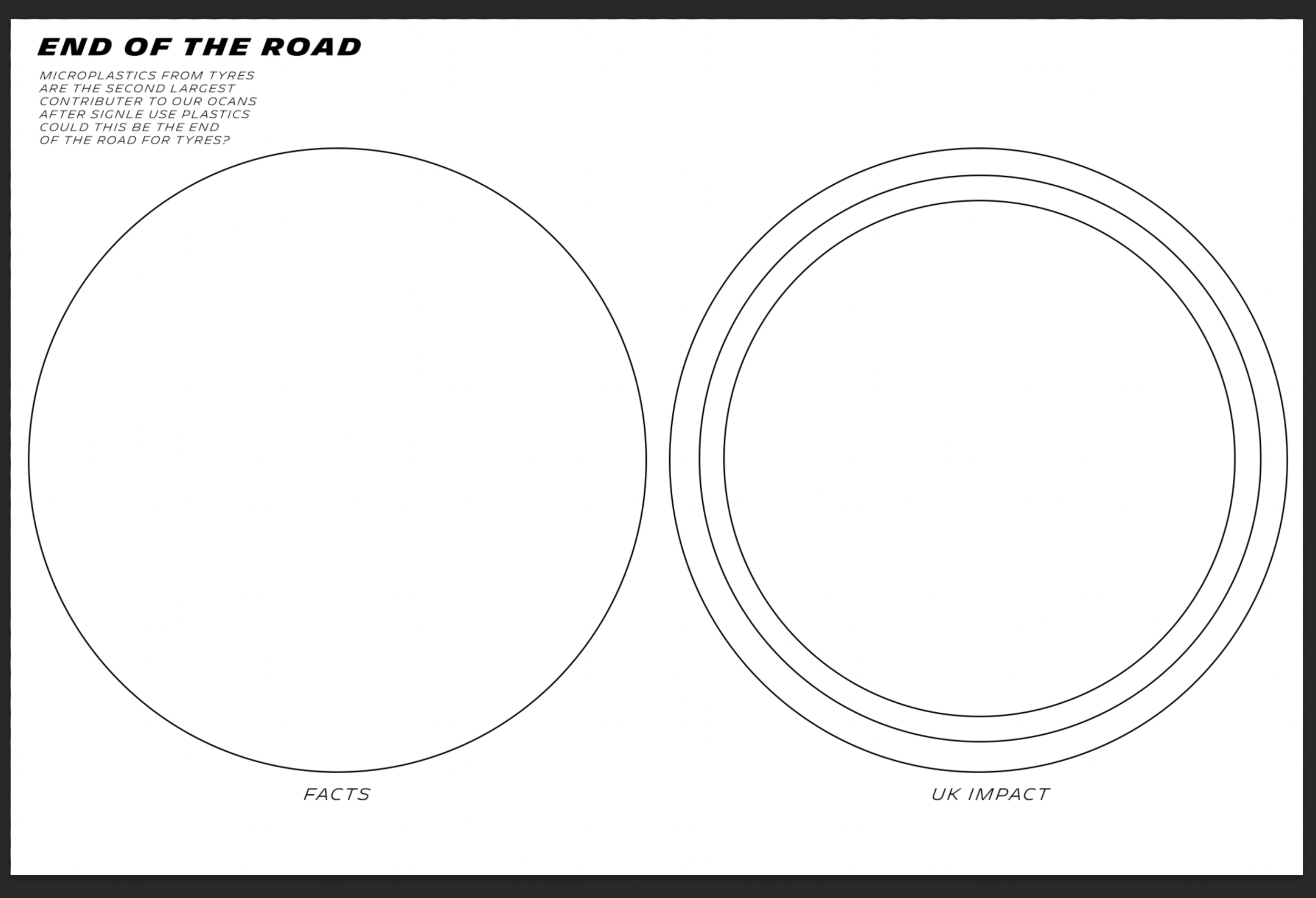
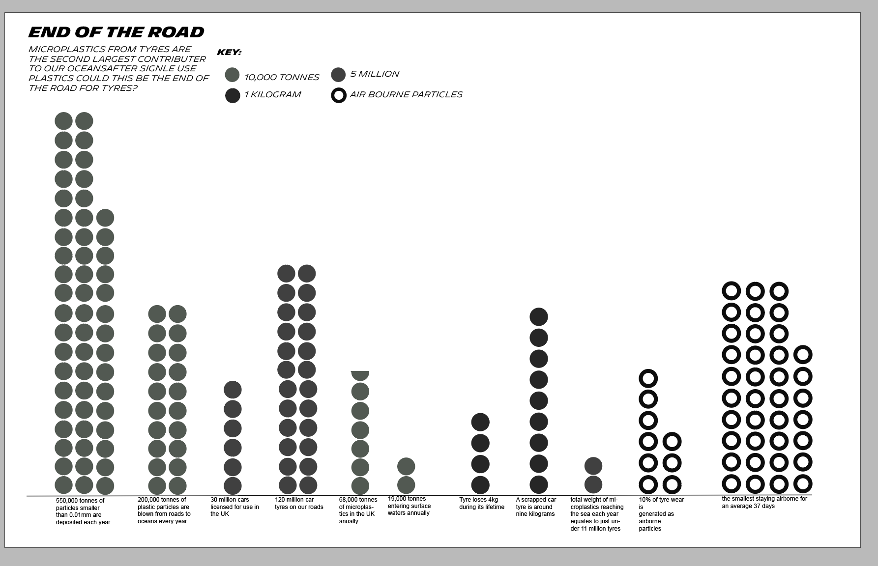
I then also felt that this was still too much information - so I cut it down too:·
-Taking all vehicles into account there are over 100,000 tyres being fitted to vehicle each and every day in the UK.
-68,000 tonnes of microplastics in the UK, with 7,000–19,000 tonnes entering surface waters annually
At this point I felt like I was at a creative block as I just couldn’t see any other way of present the information. I decided to go back and look at David McCandless Website for inspiration:
I was mainly struggling with how to visualise the quantities. After having a critical review and asking for feedback the main things that they said were:
Simplify
Key
Distinction of what the information is
two halves
thinking of symbols
could it be more interesting
how can it relate to data humanism?
What is the story i’m telling
I felt I was still over complicating it with too many different weights and facts so then I simplified it again:
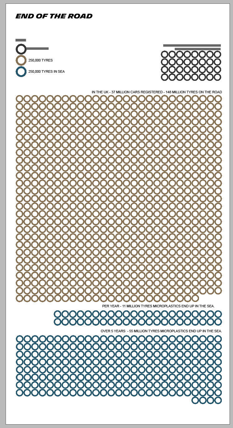
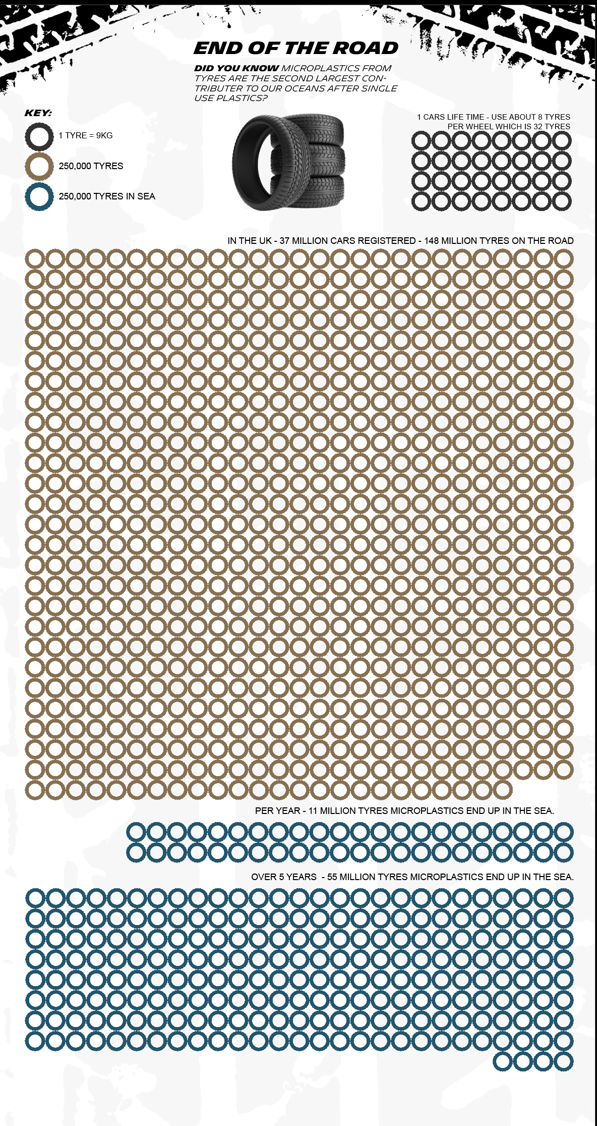
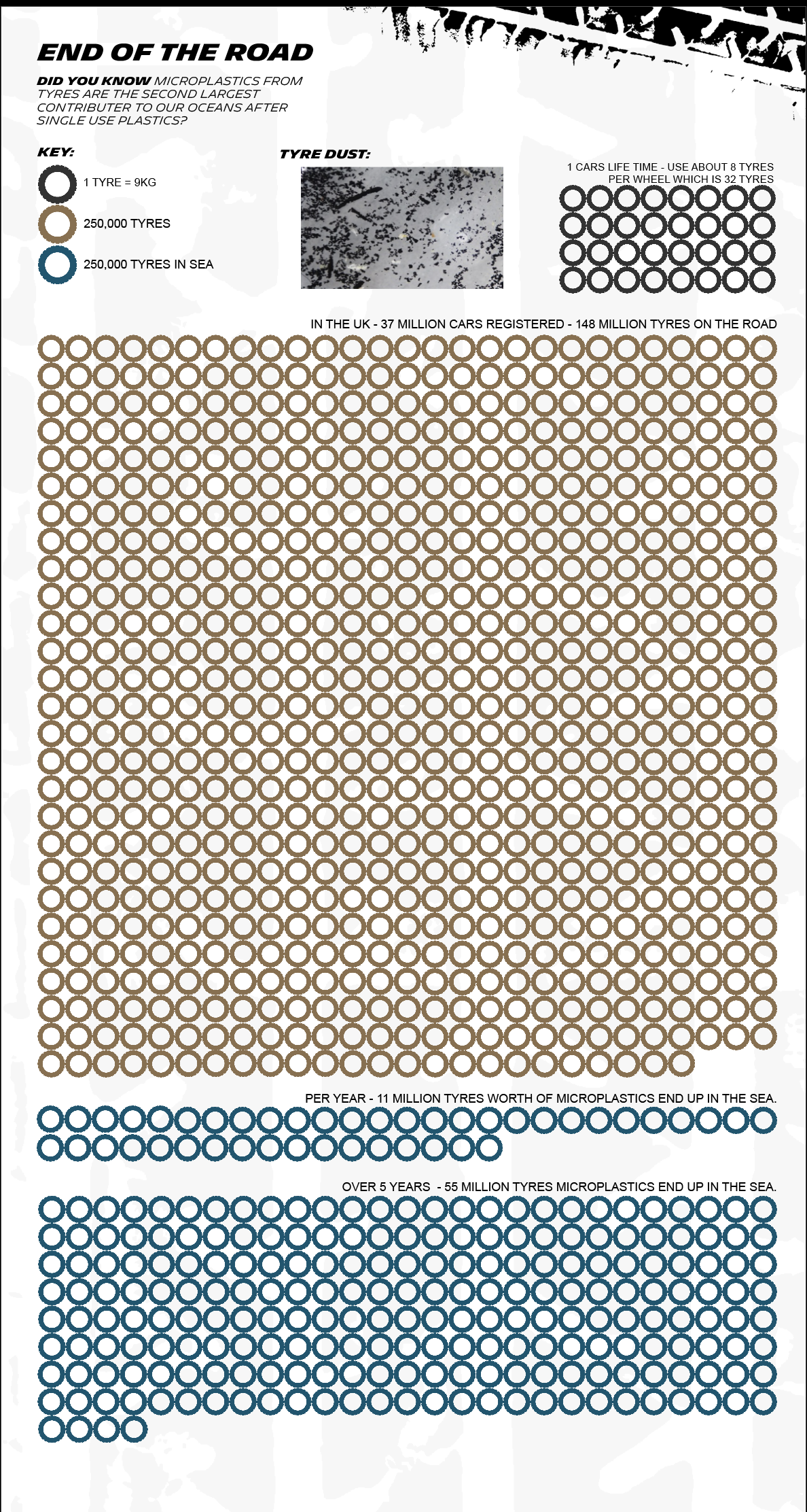
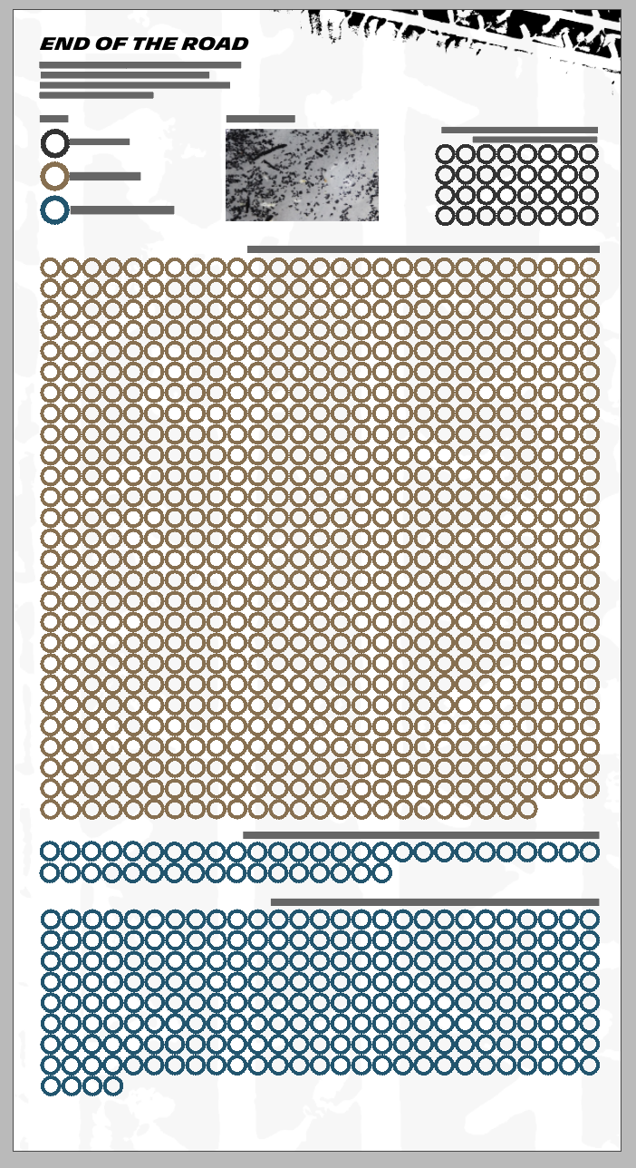
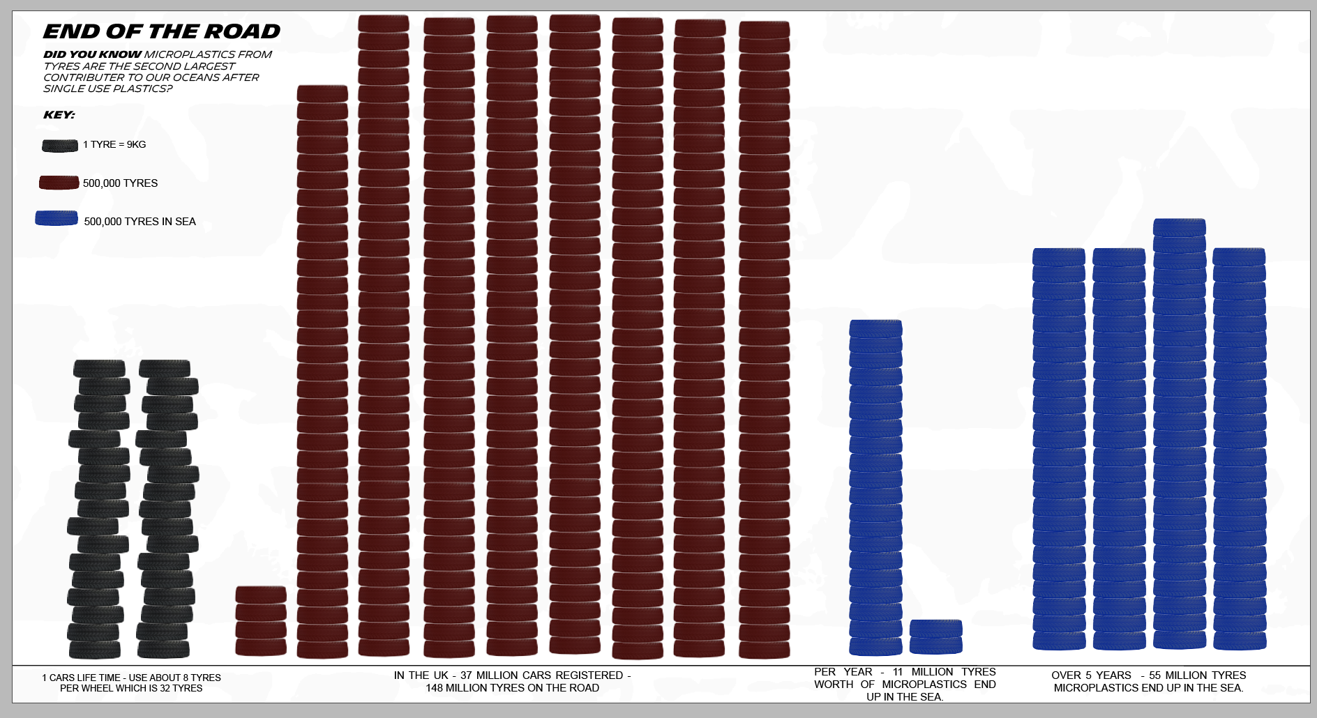
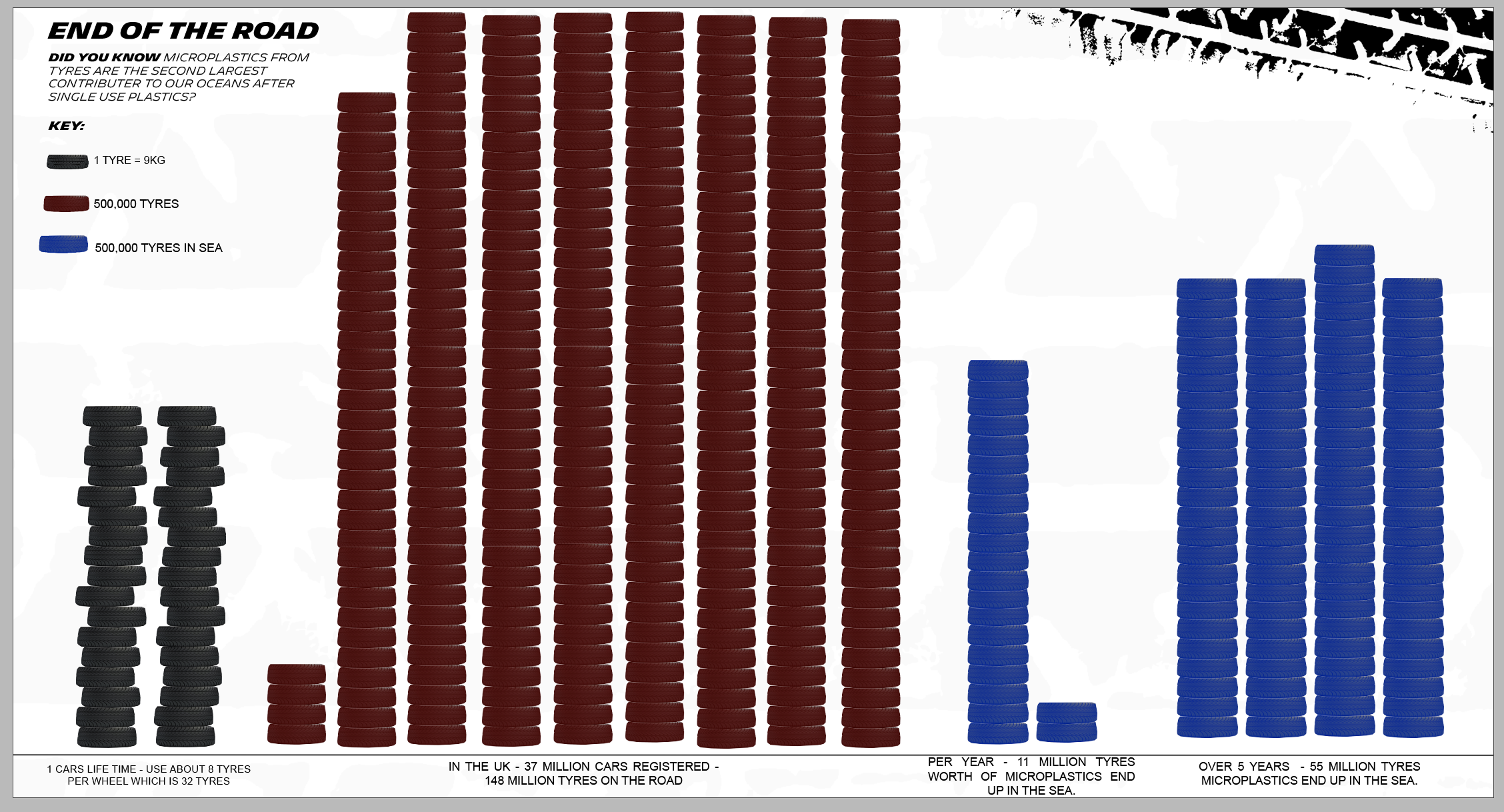
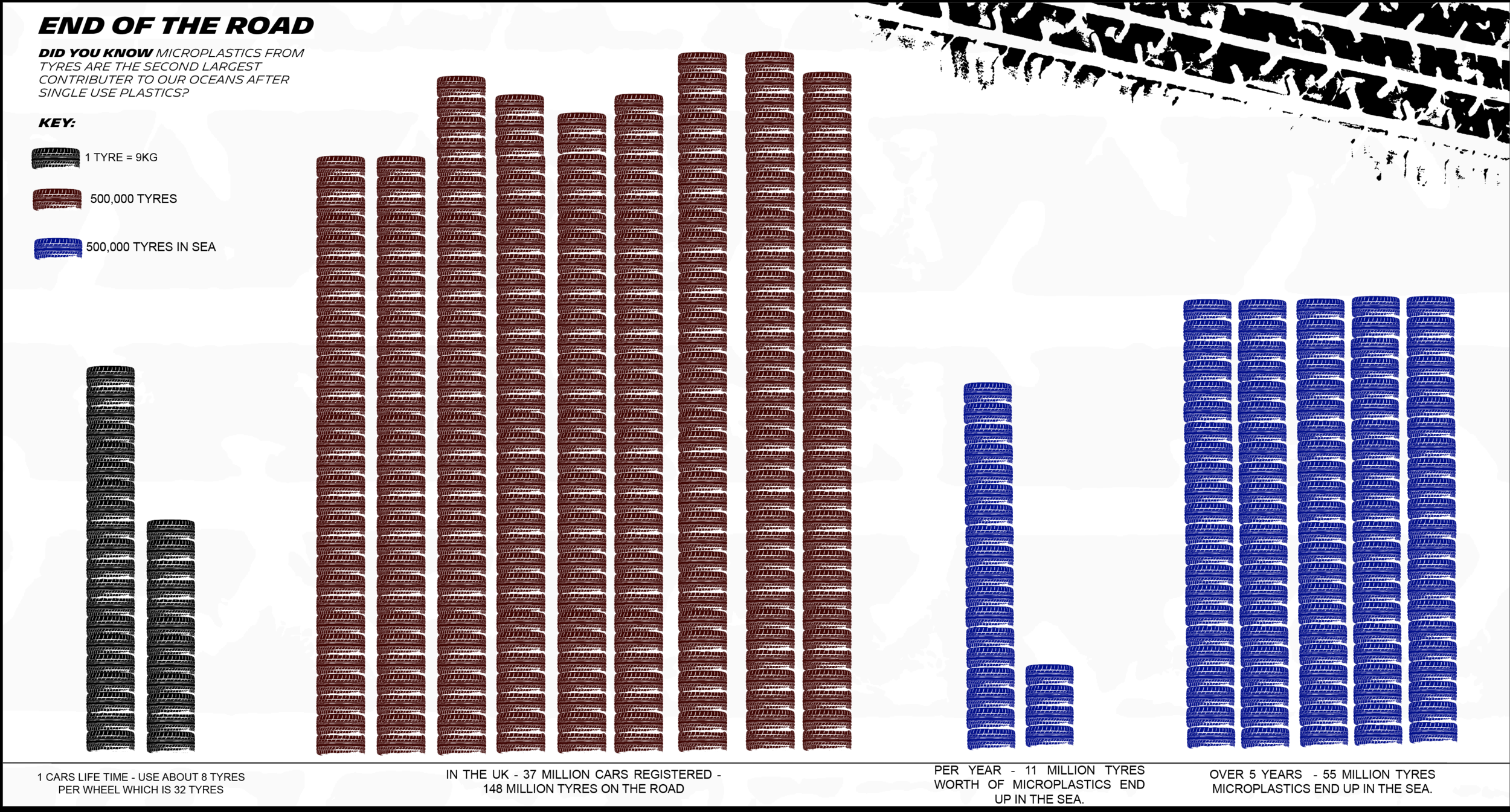

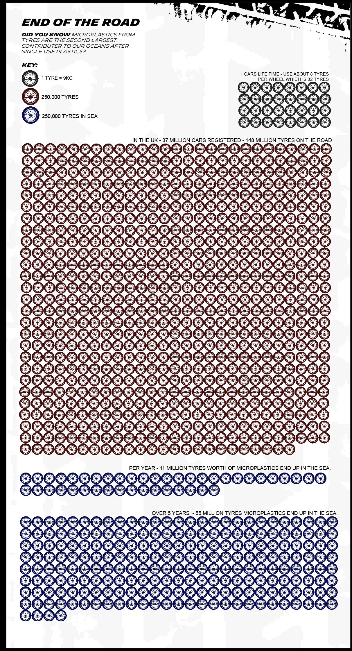
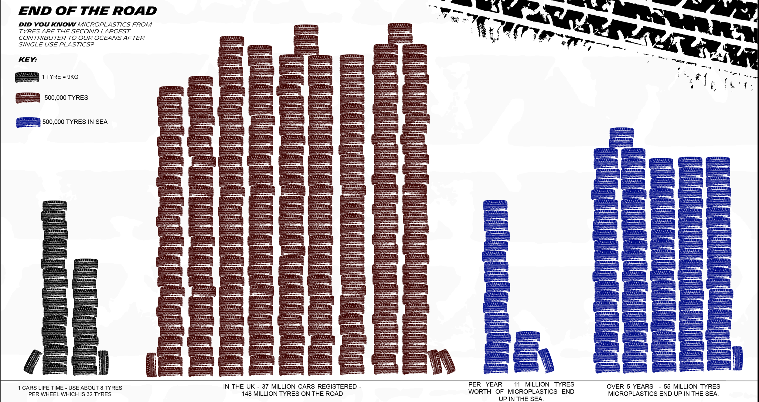
This ended up being my final piece - I think this really portrayed the amount that was going in the sea and was easy to read whilst looking like tyres. I tried loads of different methods but I think this one worked the best.
Weekly Summary
I found this week really interesting especially looking into data humanism and a lot of physical climate change data visualisation case studies, that allowed me to look at a different approach to data visualisation.
Although when it came to the workshop task this week, I felt this was possibly the hardest week so far! I really struggled to come up with a topic but then decided to go with micro plastics as its a topic that I have strongly researched before. I found a new area that I hadn’t heard so much about and that was tyre micro plastics that is the second largest pollutant to micro plastics in our seas. I found loads of interesting information on it but then it was converting this information to data visuals that I found really hard. I ended up making it really simple but now looking back I should have done an overview and taken inspiration from georgi lupi where she has done data humanism before. I think if I had more time I would’ve gone back and changed the topic that I was doing.
Ideas Wall Posts:

Reference list
Accept & Proceed (n.d.). Accept & Proceed. [online] Accept & Proceed. Available at: https://www.acceptandproceed.com [Accessed 12 May 2021].
Behance (n.d.). WHAT MADE ME Interactive Public Installation. [online] Behance. Available at: https://www.behance.net/gallery/4419469/WHAT-MADE-ME-Interactive-Public-Installation.
British Council (n.d.). Telling stories with numbers: five artists using big data | British Council. [online] www.britishcouncil.org. Available at: https://www.britishcouncil.org/anyone-anywhere/explore/digital-creativity/telling-stories-numbers.
Dezeen (2019). Digital artwork depicts effect of climate change on trees at Foundation Cartier. [online] www.youtube.com. Available at: https://www.youtube.com/watch?v=aq0u7F5NDvw [Accessed 12 May 2021].
Frearson, A. (2011). Receipt redesign by BERG. [online] Dezeen. Available at: https://www.dezeen.com/2011/06/23/receipt-redesign-by-berg/ [Accessed 12 May 2021].
Grabkowska, D. (n.d.). What Made me. Available at: https://www.behance.net/gallery/4419469/WHAT-MADE-ME-Interactive-Public-Installation.
Griffiths, A. (2019). Digital artwork called Symbiosia depicts effect of climate change on trees in Paris. [online] Dezeen. Available at: https://www.dezeen.com/2019/07/25/digital-artwork-depicts-affect-of-climate-change-on-trees-at-foundation-cartier/ [Accessed 12 May 2021].
Its Nice that (2019). Matthew Jones gives insight into Accept & Proceed’s work for Nasa. [online] www.itsnicethat.com. Available at: https://www.itsnicethat.com/articles/nicer-tuesdays-2019-accept-and-proceed-graphic-design-140619.
Koblin, A. (2009a). Amsterdam SMS messages on New Years Eve. [online] vimeo.com. Available at: https://vimeo.com/2312662 [Accessed 12 May 2021].
Koblin, A. (n.d.). Flight Patterns. Available at: http://www.aaronkoblin.com/project/flight-patterns/.
Koblin, A. (2009b). Flight Patterns Color - HD. [online] www.youtube.com. Available at: https://www.youtube.com/watch?v=ystkKXzt9Wk [Accessed 12 May 2021].
Lupi, G. and Posavec, S. (n.d.). Dear Data. Available at: http://www.dear-data.com/all.
McLaughlin, A. (2020). Pentagram’s new project shows the human side of stats during coronavirus. [online] Creative Review. Available at: https://www.creativereview.co.uk/pentagram-happy-data-coronavirus/ [Accessed 12 May 2021].
Miebach, N. (2011). Art made of storms. [online] www.ted.com. Available at: https://www.ted.com/talks/nathalie_miebach_art_made_of_storms/up-next [Accessed 12 May 2021].
Miebach, N. (n.d.). Storm Art. Available at: https://nathaliemiebach.com.
Nicer Tuesdays (n.d.). Nicer Tuesdays: Accept & Proceed. [online] www.youtube.com. Available at: https://www.youtube.com/watch?v=Pgjkj4FzPMA [Accessed 12 May 2021].
Penney, M. (2016). Iconic Icons: Aicher’s Pictograms. [online] Sessions. Available at: https://www.sessions.edu/notes-on-design/iconic-icons-aichers-pictograms/.
Posavec, S. (2015). Drawing the Dictionary. [online] Stefanie Posavec. Available at: http://www.stefanieposavec.com/drawing-the-dictionary-1 [Accessed 7 May 2021].
Pots for Tots (n.d.). Pots for Tots. [online] Pots for Tots. Available at: https://www.potsfortots.co.uk/our-pots [Accessed 12 May 2021].
Sluis, K. (2016). Before Tufte, there was Bertin. [online] Medium. Available at: https://karlsluis.medium.com/before-tufte-there-was-bertin-63af71ceaa62.
www.youtube.com. (n.d.). Big Bang Data: Dear Data. [online] Available at: https://www.youtube.com/watch?v=iqaVe1MCTlA&feature=emb_logo [Accessed 8 May 2021].
www.youtube.com. (n.d.). Ikea Cook this Page. [online] Available at: https://www.youtube.com/watch?v=KyOI7FI6DJ4&feature=emb_logo [Accessed 12 May 2021].