Week One
Lecture Notes:
Lecture Summary:
I think it was really interesting to hear from graphic designers what typography means to them and how they see it in the world that we are living in today. The key points that also stood out for me were Uni Mark and Harry Beck but also Monotype. All these companies are really interesting in terms of their connection to transport design systems that are used. Below I have taken examples to compare each of them.
MonoType - London Signage
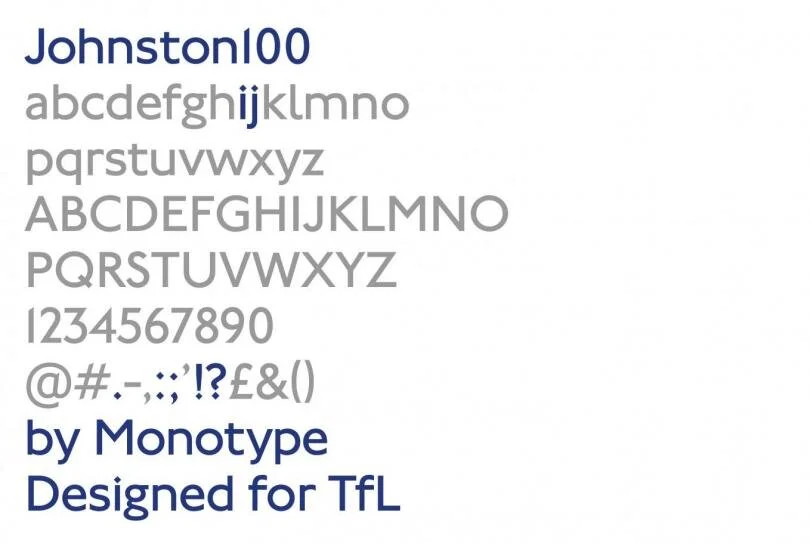
“https://www.monotype.com/resources/case-studies/introducing-johnston100-the-language-of-london”
They have created this font into something that can be so recognisable across the transport system within London. Something that is iconic.
Harry Beck - Underground Diagram

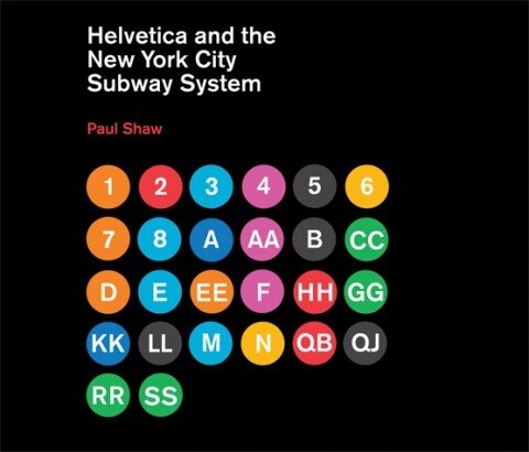
Uni Mark - New York System
Resource Notes:
Resource 1:
Resource 2:
Resource 4:
Resource Summary:
Resource 1:
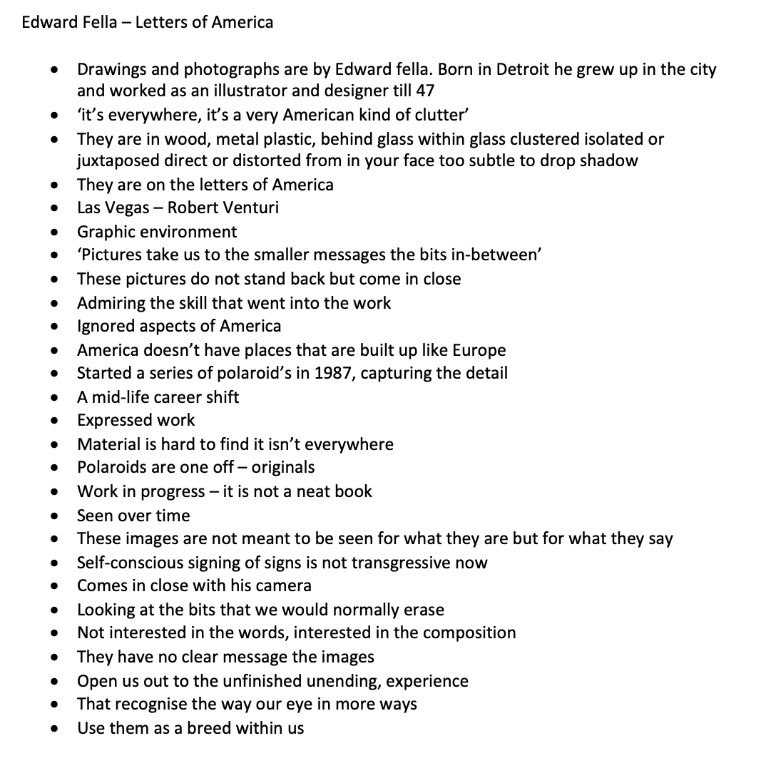
‘Pictures take us to the smaller messages the bits in-between’‘These images are not meant to be seen for what they are but for what they say’
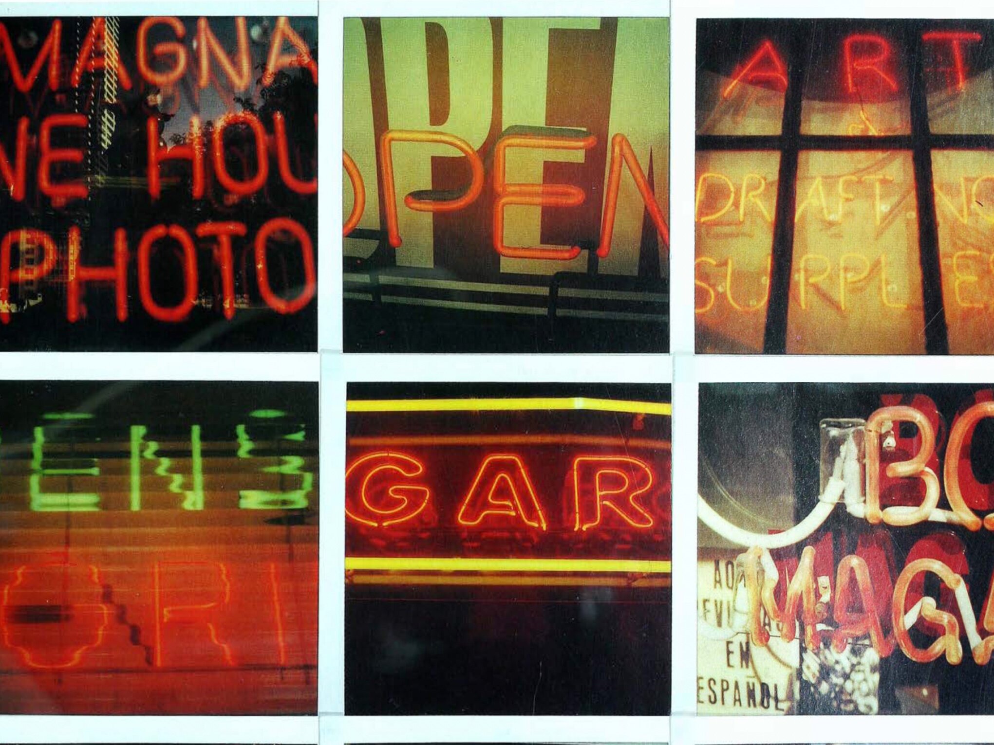
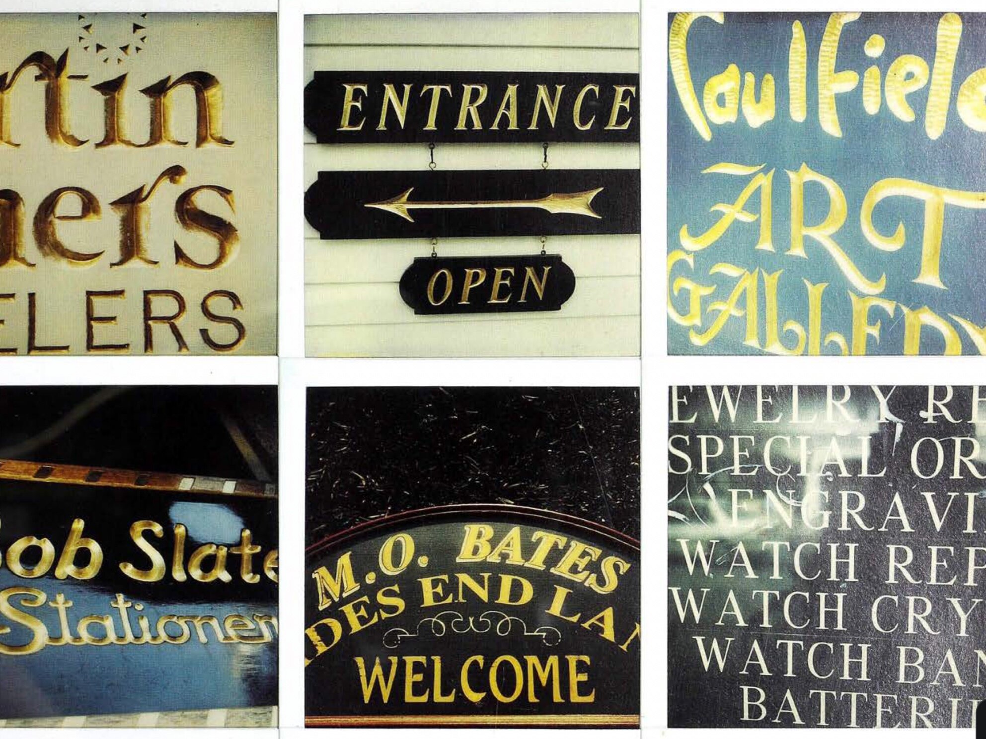
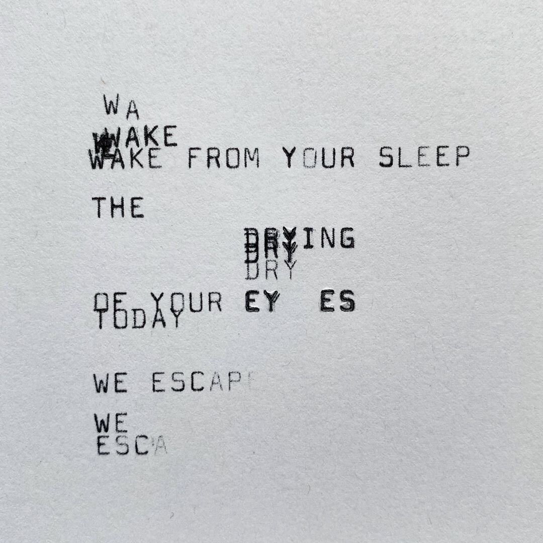
This was a really interesting resource, looking at the work of Edward Fella. Some of his work examples shown below. I think of the things I really like is that he’s really zoomed into the typography that he has found around him, its not of the word which he says he doesn’t care about its about the configuration of the letters. Looking at the bits that we would normally ignore and not really take consideration of. Looking at his work he’s also decided to take pictures of the type that could be a little bit different and a bit more interesting that just the basic work. He also talks about the fact that the images have no clear message and they are just up for interpretation. I really like that concept that every image just allowed to talk for themselves. Really clever how he’s also grouped the images by type of typography but also colour.
Resource 2:
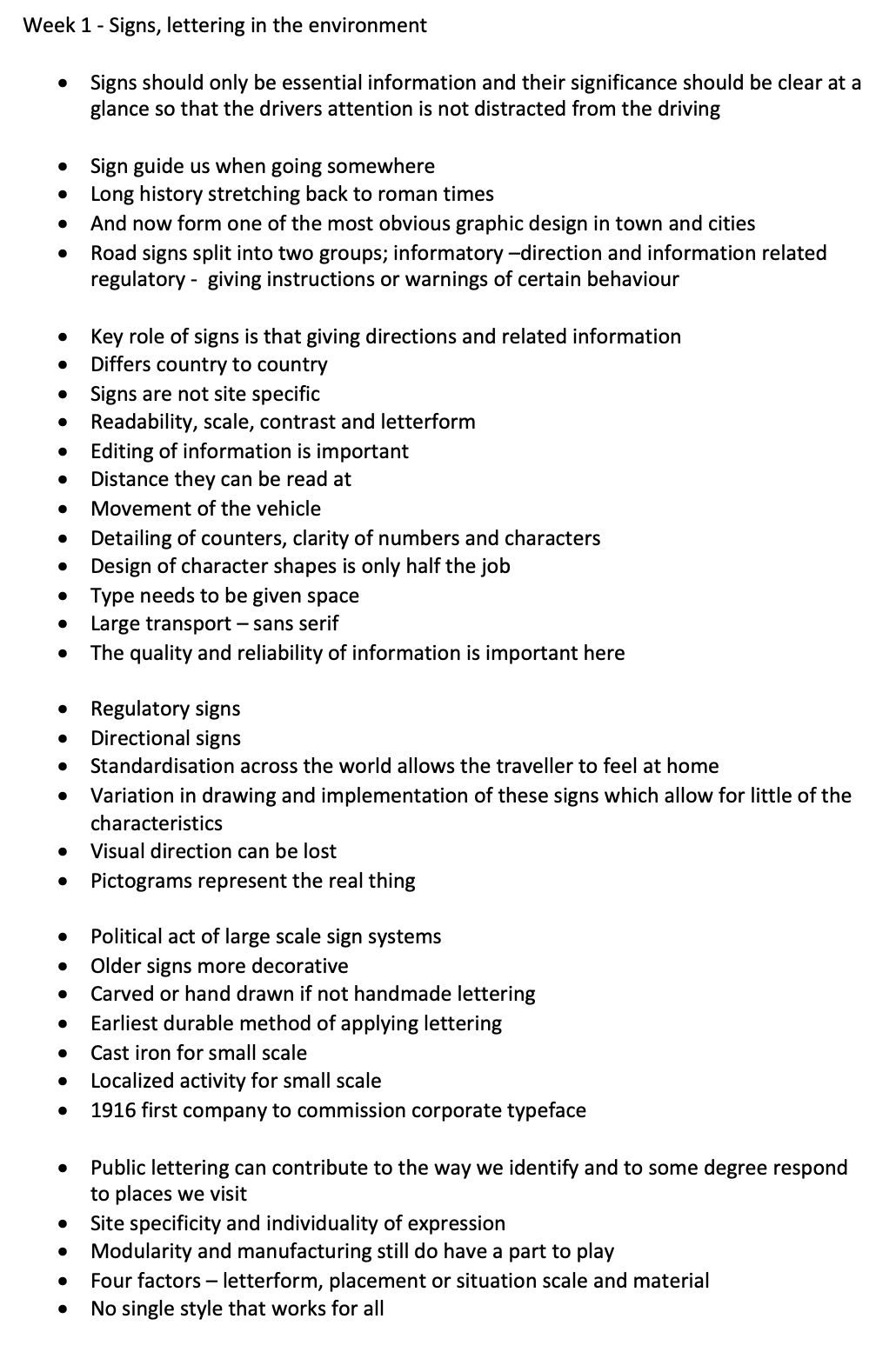
This resources was interesting to note the differences and points that were taken into account when looking at different signs - regulatory signs and directional signs. Also to learn about the history of architectural signs and their meanings when it comes to designing them. Letterform, placement, situation scale and material all come into play when designing a typeface. The function and execution needs to be perfect which I’ve never taken into consideration before. But also sad to see that the architectural design of lettering has changed so much in the last years due to the craft skill. I feel the world would be a totally different place if we didn’t have type on the computer and Digital design, maybe it would stay old fashioned. One name was mentioned, Joan Brossa. Ive looked into their work below.
Joan Brossa
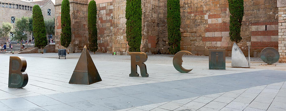
‘https://carnerbarcelona.com/journal/street-urban-art-barcelona/’
Joan Brossa created this image as a visual poem, which can be viewed from multiple angles. This work stood out for me due to the different sizes of lettering and the shapes that were used to create the words.
Resource 4:
'Typography is white – it’s the space between the letters.'
I thought this article was really interesting from another graphic designers perspective with clearly a lot of experience. I love how he talked about the arts as a visual disease that surrounds us and we try to cure it by designing something, its kind of the words that take it from a negative situation into a positive one. I’ve also never seen a designer talk about the negative space between letters before, really insightful to see how he perceives the public and their opinion of graphic design. Which a lot of the time is really negative due to their opinions but I think that the users of the transport every single day should have an opinion of what they are going to be looking at.
Research
From this weeks resources, I wanted to dive deeper to understand about the rules and the fonts behind typography but find some iconic typography along with their methods and artists.
Matt Cohen
Cohen was mentioned in this weeks references for the king of ghost signs. After doing some research for Matt Cohen, I came across a documentary, writing on the wall, which is focussed on using projectors they illuminate 150+ signs in one night which Matt Cohen is apart of.
Documentary Notes // Talks about ghost signs being an interesting thing, because if you don’t see them you don’t know they are there. This whole project, writing on the wall is about creating awareness and the stories that the projections have to tell. It also talks about the history of the ghost signs and how they used to be painted by someone so long ago, seeing them we take for granted. 150 ghost signs across Winnipeg. Matt has spent a lot of time trying to research and understand them.
Custom signage, letter art - which is really big. The industry has gone digital and the hand painting courses that were available aren’t available anymore. Used to hand paint everything. Craig Winslow that recreates the signs like they were new from projection, part of a creative residency with adobe. He recreates every single colour and type to put over the top he doesn’t use type that’s already made. Any ghost sign is able to be an incredible story. Advertising techniques have since moved forward. Learn to adapt to the new techniques of the 21st century. Need to continue with hand sign painting to keep the industry going. Qualities that you can’t get with a vinyl cutter.
The main eyeopening thing about this documentary is the identity that comes with the sense of history of ghost signs that a lot of the world just don’t see. Be able to keep these ghost signs alive show the world what used to be there and the identity of the world back in that time. Also showing the identity and the advertising that used to be highly fashionable back then which has become modernised and forgotten. I love the hand craft-man aspect of the ghost signs and the personal touch that the painters put on their work, I think that personality and identity has been lost in modern day graphic advertising.
History of BrickAds / Ghost signs:
“Some of the earliest painted signs in the UK can be found in 18th-century coaching towns, offering ales, a bed and stables. Stamford in Lincolnshire still offers “Good Stabling & Loose Boxes”; the destination spa town of Bath a “Circulating Library And Reading Room”. Both likely post-date a piece of legislation which Roberts explains as the start of the ghost sign era, when the industrial revolution began to mass-produce items for sale to an increasingly urban population: “The Westminster Paving Act of 1762 ordered the removal of dangerous traditional hanging signs,” he says. “They were heavy, cumbersome and could fall on passers-by.”
That law in effect consigned advertisements to walls, where painting was the cheapest way to get noticed. From the 1840s, railway terminals were hotspots, and so too the fascias of high streets. That ushered in a century of painted signage in cities. It may seem shocking now to paint over a Georgian or Victorian-era building, but there was no law on preservation at that time.
Many ghost signs on brick buildings aligned letters with the horizontal courses of brickwork. But not all demonstrate such care: outside London’s King’s Cross station was the unmissable opportunity to paint “Weighing Machines” across arches over windows lighting apartments for transient rental. One of London’s finest signs is in Battersea, at the junction of St John’s Hill and Sangora Road: a boy striding in ballooning yellow trousers to herald “Peterkin Custard”. It was named after a flour mill owned by J. Arthur Rank, who exchanged his failure in the custard industry for epic success in films.” This section has been taken from - Website.
Craig Winstow:
After watching the documentary, I wanted to find more of Craig Winstows work especially to see if he’s done any in the Uk. He’s actually created so many ghost signs that come to life in and across London, some familiar places to us during London design festival. I think its also interesting how different eras use black and white or even add colour to the Ghost signage. I think this is such a niche area and that Winslow has done such a good job of breathing life back into these signs that hopefully people will realise that they are symbolic and that they can stay.
Sign Writing:
After hearing about sign-writing within the documentary I wanted to learn more about the history of it within the UK.

“Sylvia Pankhurst after, and during, the painting of ‘Votes for Women’ on 198 Bow Road”
https://betterletters.co/celebrity-signwriters-past-present/”
Brief History from - Website
Originally painted pictures and symbols that few people could read
Ruins of Pompeii - work of Aemelius Celer
Painted notices
In England, did not come into common place till 18th Century
100 years painted signs everywhere
Known as Folk Art
Often decorative and beautiful with outlines, shading, ornamental flourishes and deliberate flair
Sign-writers were classed as building trade
‘Painters painted everything, from portraits to banners and barges and murals’ ‘decorated glided and coloured solid object such as wood metal and stone’
Sign writing is essentially advertising - with trade symbols
Considered architecture is always design concern.
300 years the sign writing tradition provided something which is impossible to recreate with man made machines.
After learning about some history, I wanted to learn from a songwriter how it actually works and wanted to watch a songwriter at work. The below video does just that.
Notes // 1800s - sign writing is making a come back. It’s the purest form of advertising. What and how to look at individual letters, there’s always something new and different to be done. People have stopped saying ‘vinyl is cheaper’. ‘quality is remembered long after price is forgotten’ The spacing is really important. Its also important to build up on the canvas.
Massimo Vignelli
Massimo Vignelli is known for his designs across the world but particularly in the New York underground system that he developed.
Documentary notes //
Originally trained as an architect and then fell in love with graphic design.
Likes to try different materials and different experiences.
Before computer - very manual - grew up with a pencil
Gives you a great sense of scale. - scale are mental
With a computer you can do things very quickly
Better than ever in history
get other people to try and help him with the work he was doing on the computer
Play yourself to get the most out of it
Design should be visually powerful
Intellectually elegant
Cultivated and redesigned for quite sometime.
Tell people how to get away from awful and ugly situations within design
People are fascinated with trends
Maps were created to a certain extent - they were trying to be geographic.
We took a diagrammatic approach to the subway system - like the London map
Very simple subway system
The map is in so many museums
its a good map - Paris copied diagrammatic map
But in New York is a hybrid between the two.
Too much information.
Vignelli’s insights into design are really interesting as he combines his knowledge for architecture, interiors and graphics into one. It was also interesting that he really trusts pen and paper but as-well as that he got into graphic design after his interest in architecture. I feel this is one of the reasons of his successes for the Iconic New York Under Ground, taking this on across the city swell and taking the architecture into consideration. He wanted something that would always be trending.
Chris Ashworth
Ashworth was mentioned within this weeks resources so I thought I would do some more research to see some for the work that he had produced.
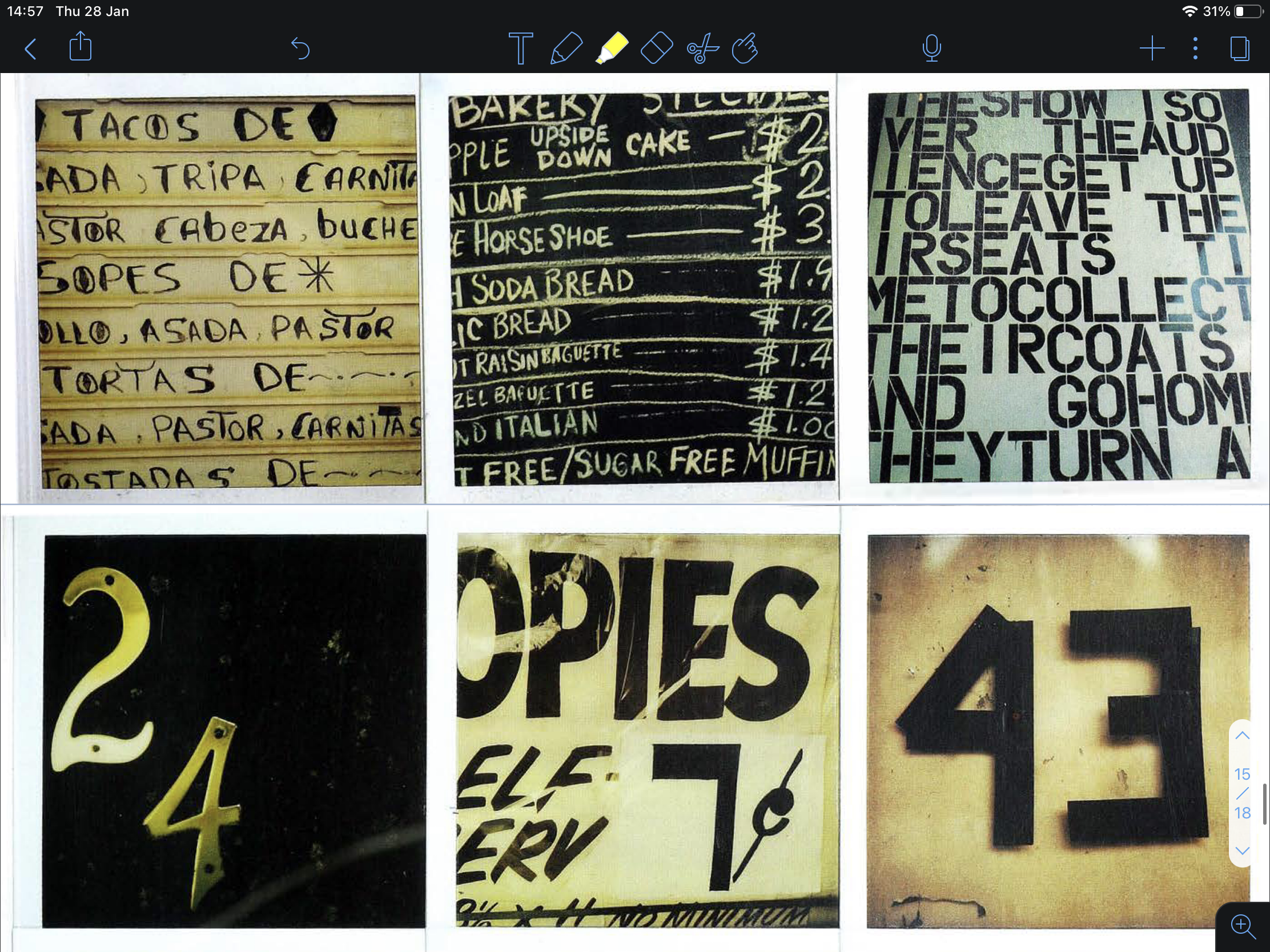
Ashworth is an English graphic designer known for executive global director of Getty images and Ray Gun Magazine in 1997. With some friends, he started a collaboration with night clubs. Creating easily photocopiable black and white flyers for local night clubs. His style is known for Swiss grit “This style is characterised by hyper detail, barcodes, horizontal lines, and the use of multiple transparent layers.” Which can be seen in the images below.
I love the layering that comes through in Ashworths work. Starting with black and white lines in the background, something that can be so simple yet its been used so carefully to add detail to the images. Things have been placed and torn away on the tom to create a grungy effect with the type being so simple. The repetition in the letters makes me think of when the music gets jarred on the record player or not being able to get your words out.
These have now become the identity for those clubs and that makes a statement to the rest of the area that these nightclubs are in.
The below images are taken from website
Anthony Burrill
Burrill has also recently been doing a modern Twist on Ghost signs with this one being placed on a seven story high mural that sits at the end of a historic canel-side building in Leeds.
‘the piece will be here for the people of Leeds for centuries’
I love that a piece this bold in the modern world has been able to seem like a positive pocket of hope. Also that the writing takes up the whole building makes a stand for the message itself. I wish there were more artists that are able to put up prints like this across other cities as I feel it has an impact.
The below image has been taken from website

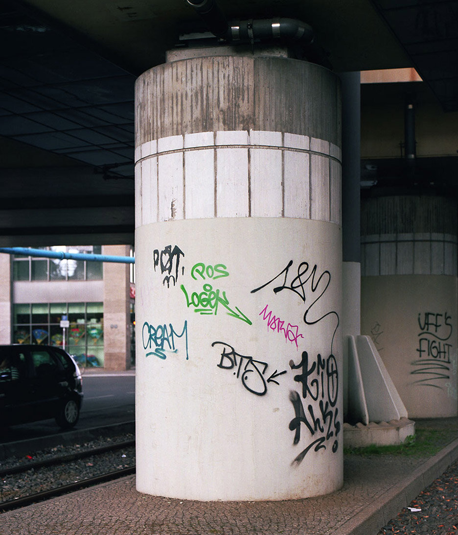
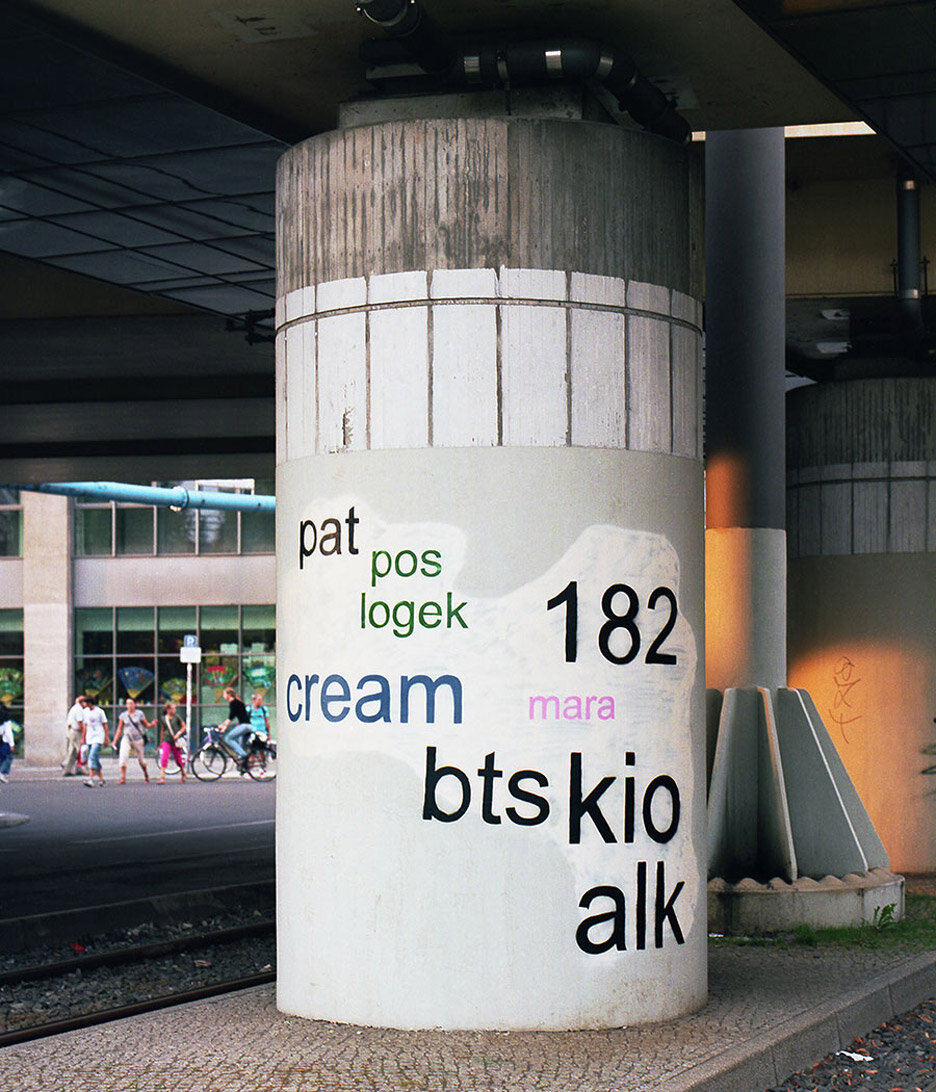
Mathieu Tremblin
Another artist that has been changing places with their graphic is Tremblin. He has been translating graffiti into graphics as part of his tag clouds project. Keywords are markers of urban drifting.
I think being able to make these more legible for other people within the community shows that graffiti is important and speaking a message. It says something about the place and the tags that are being used and often talks to you about the creative people that are living within that city.
The images below show the before and after and are taken from website.
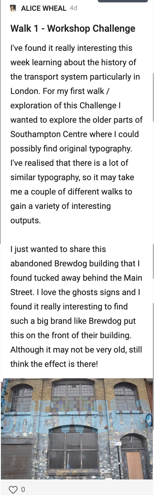
Workshop Challenge
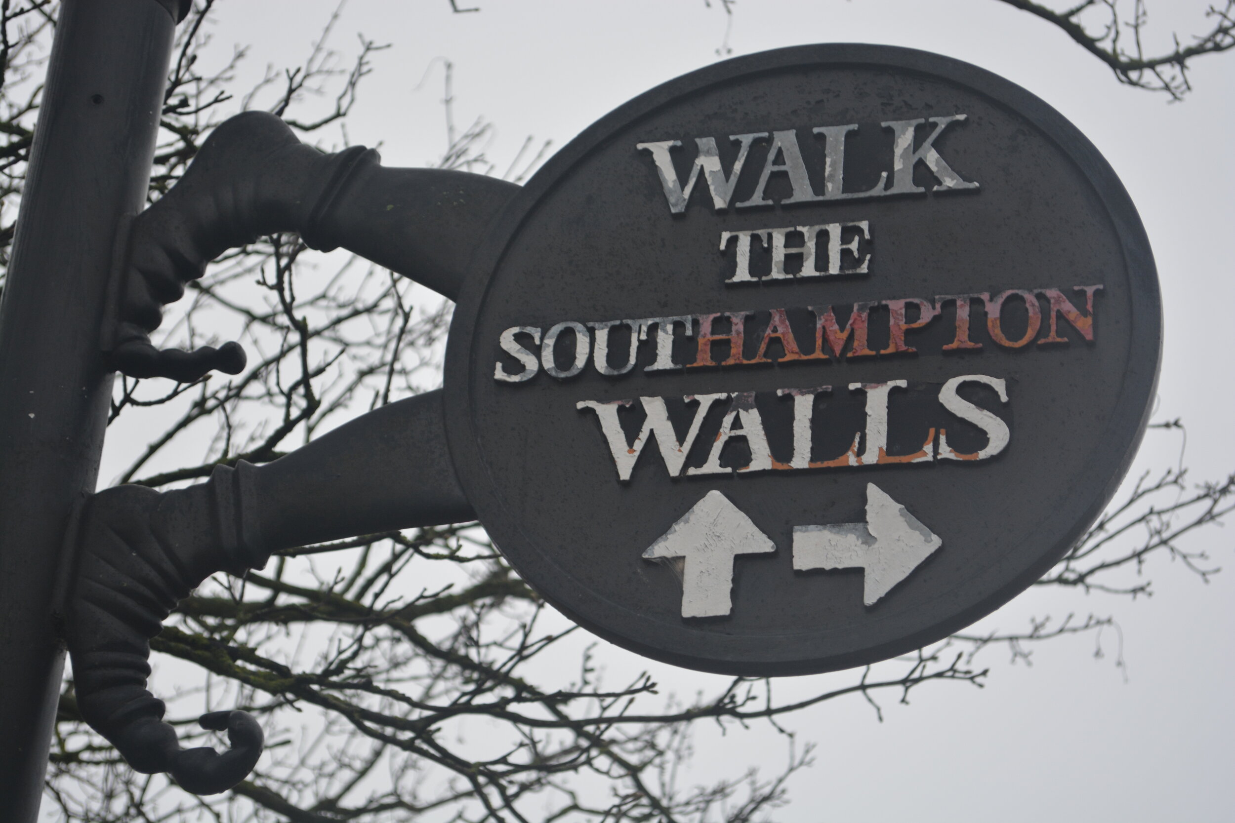
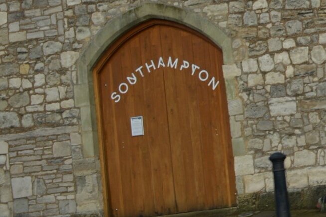
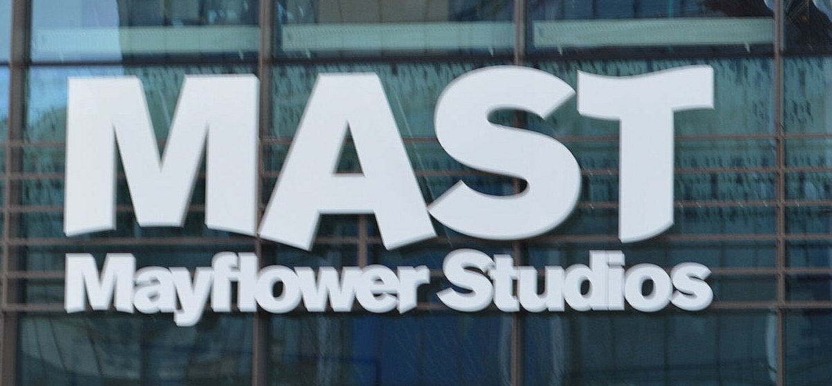
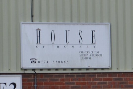
For this weeks workshop task, I began by walking around some of the areas in Southampton that I knew were historical.

Map of planned walks
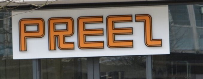
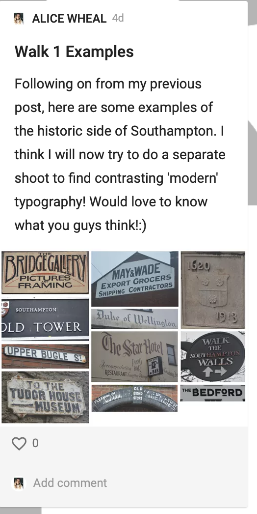
Walk 1 - History
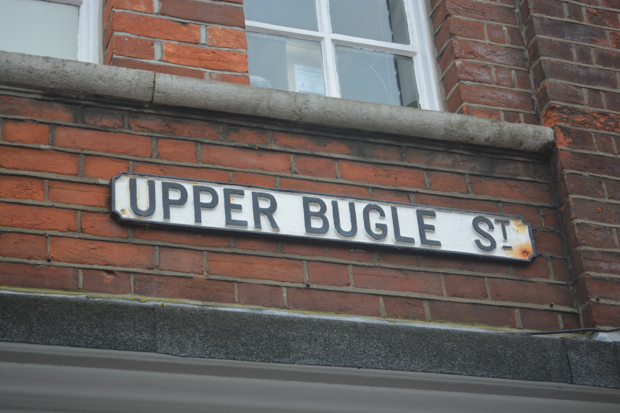
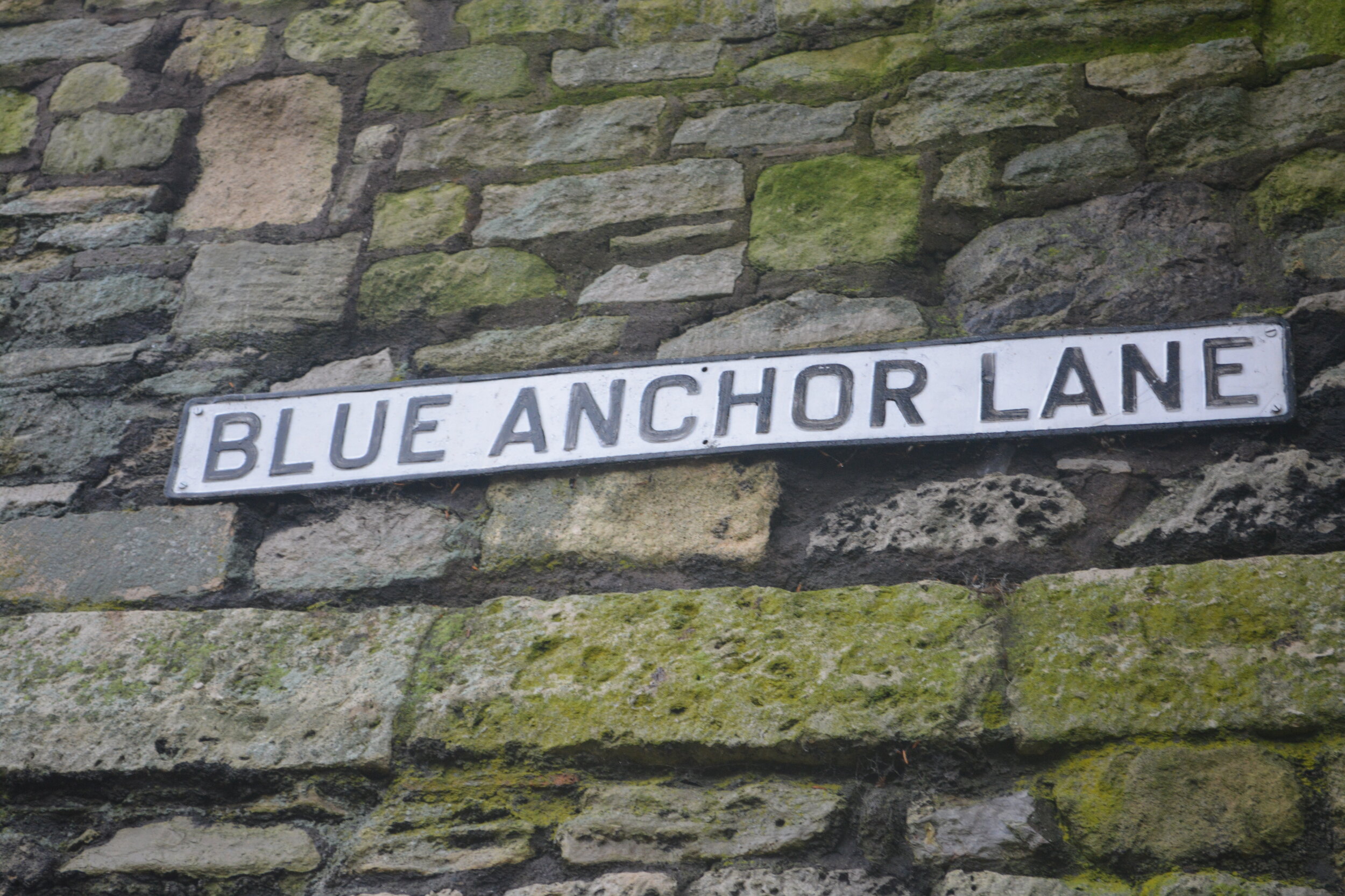
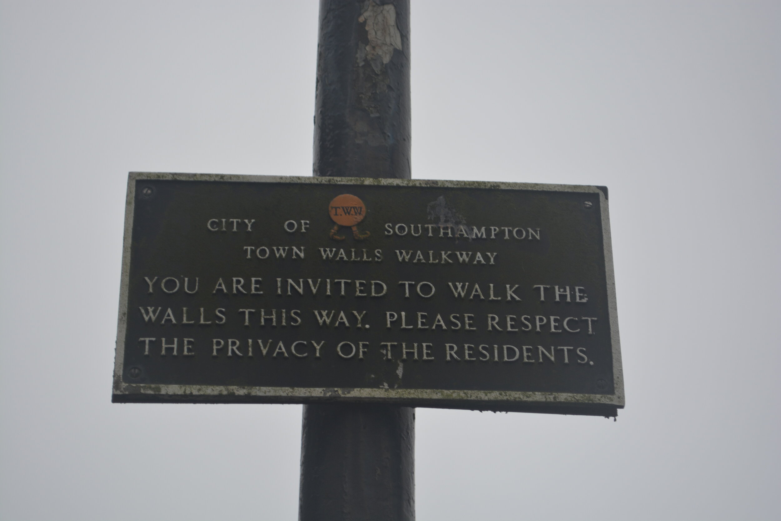
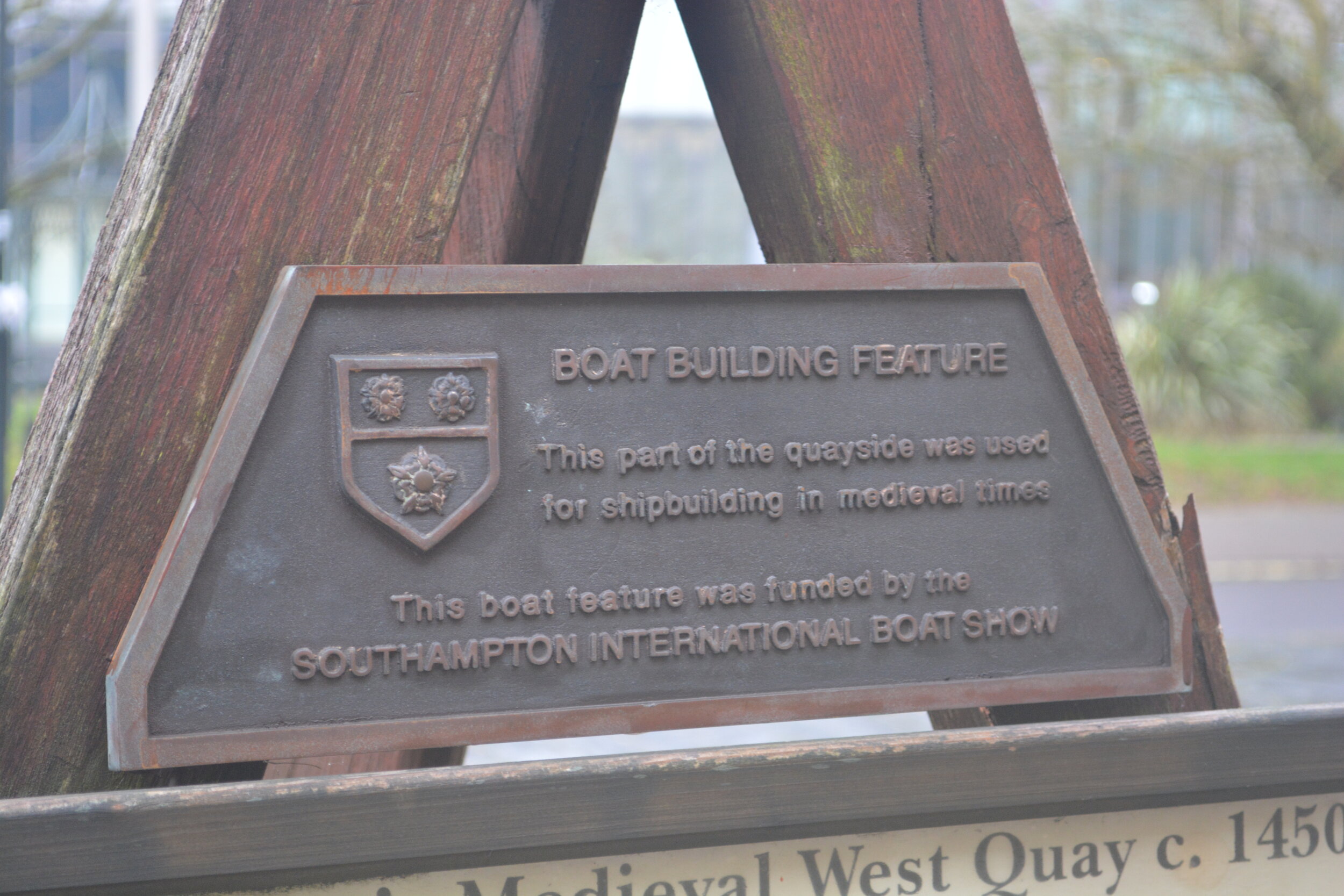
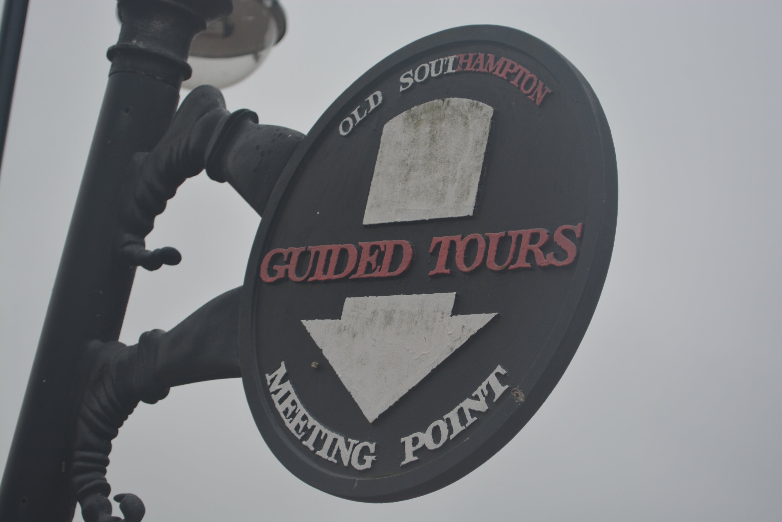
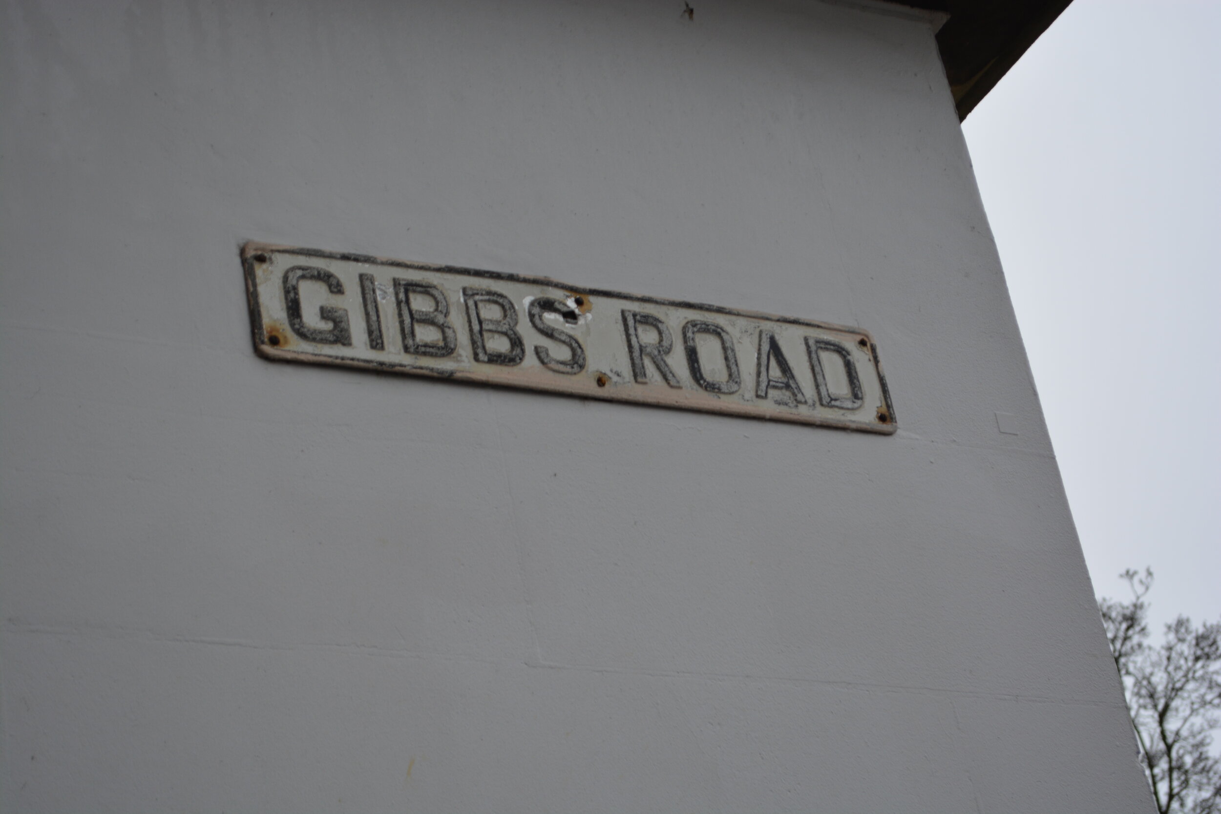
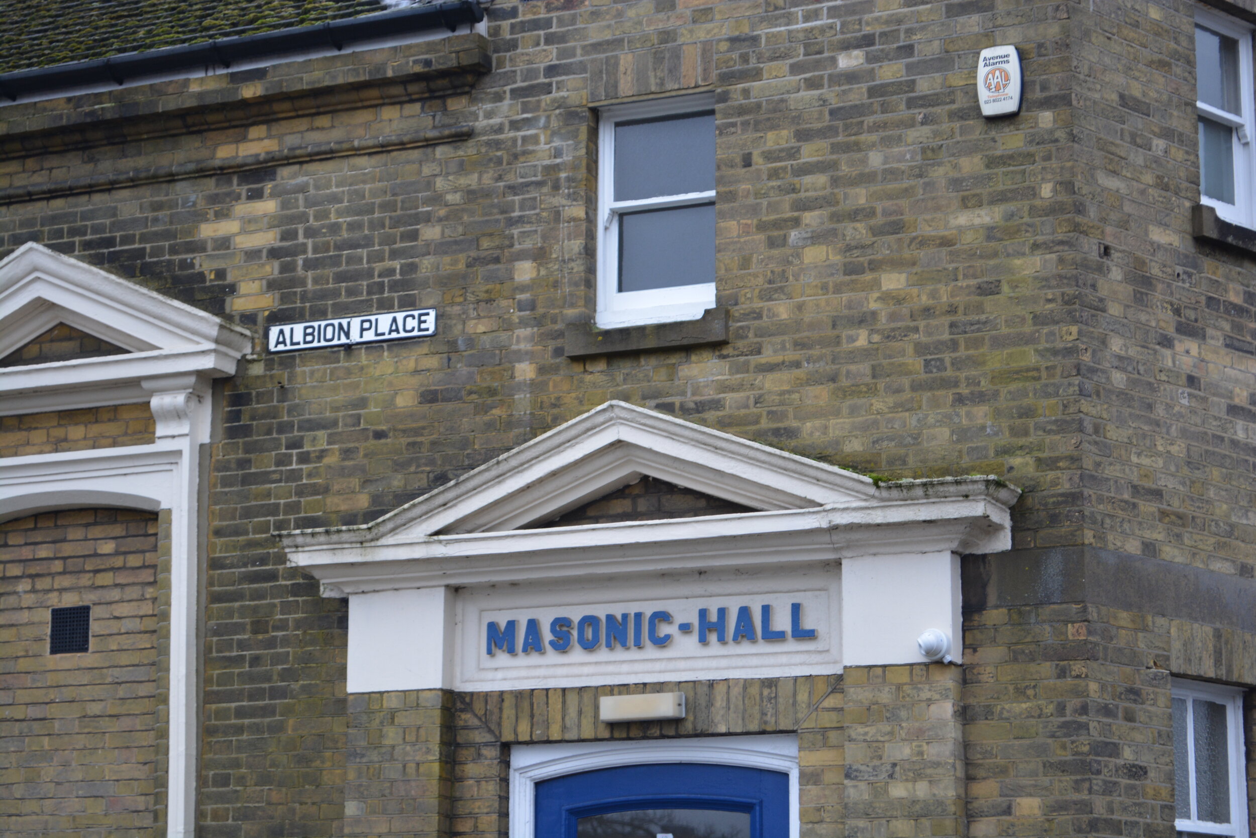
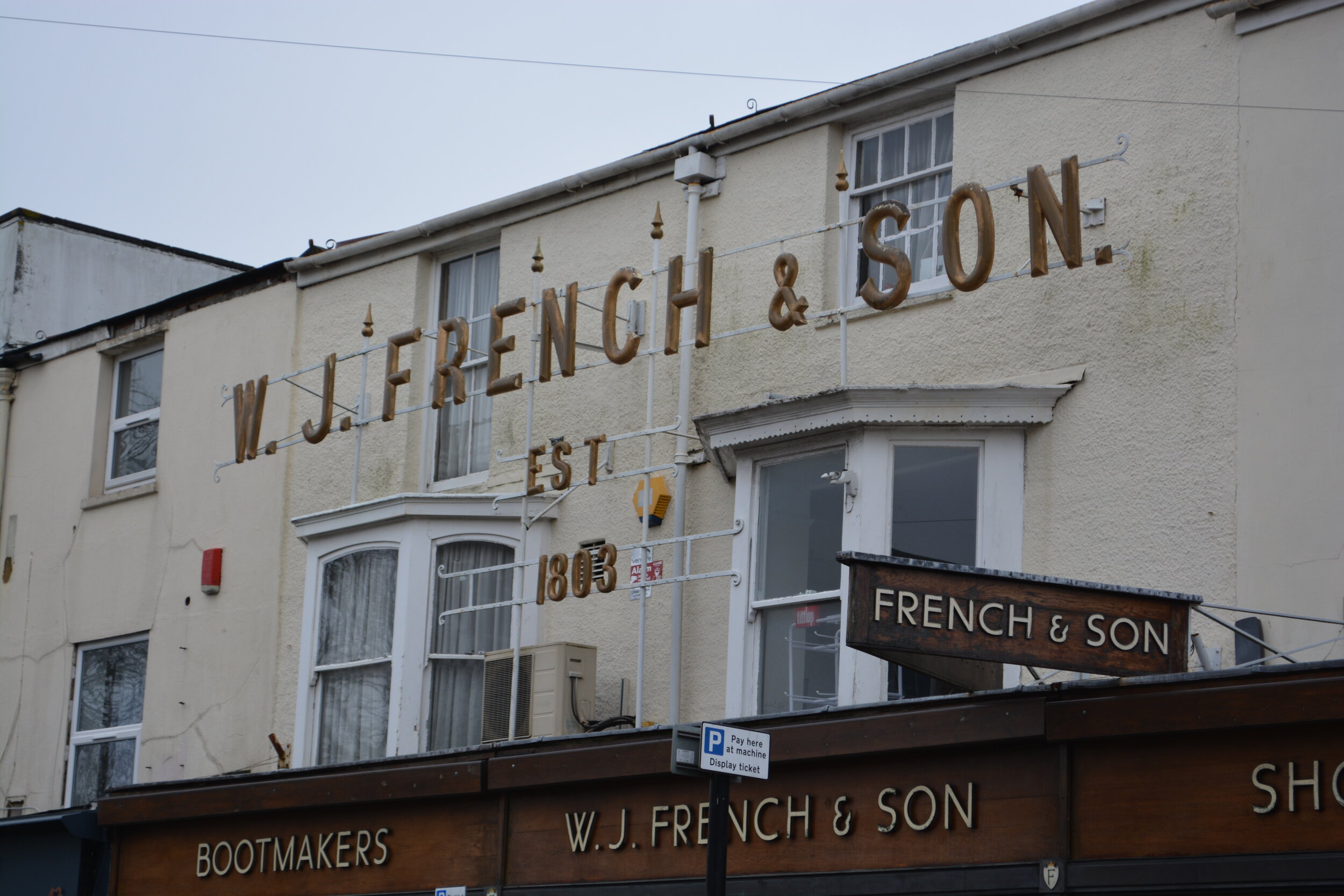
I then narrowed this down to 11 of the best historic ones of the day.

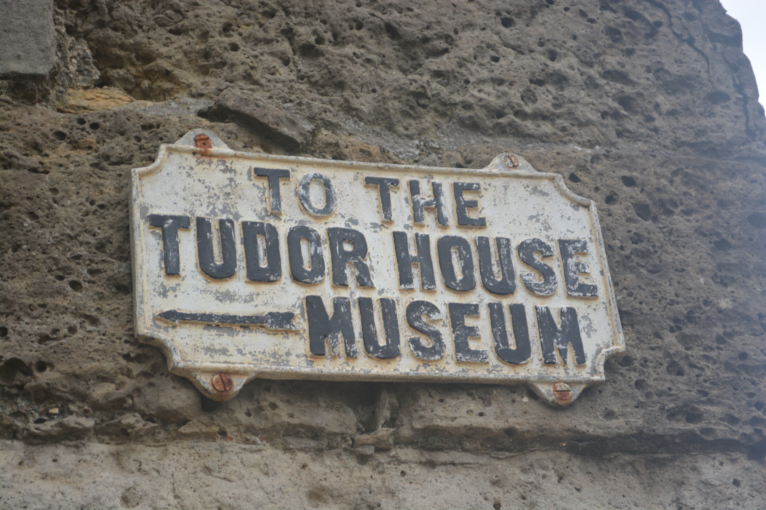
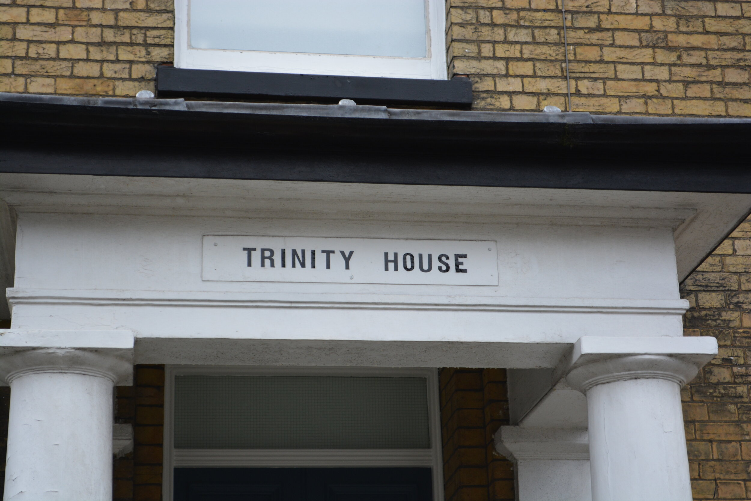
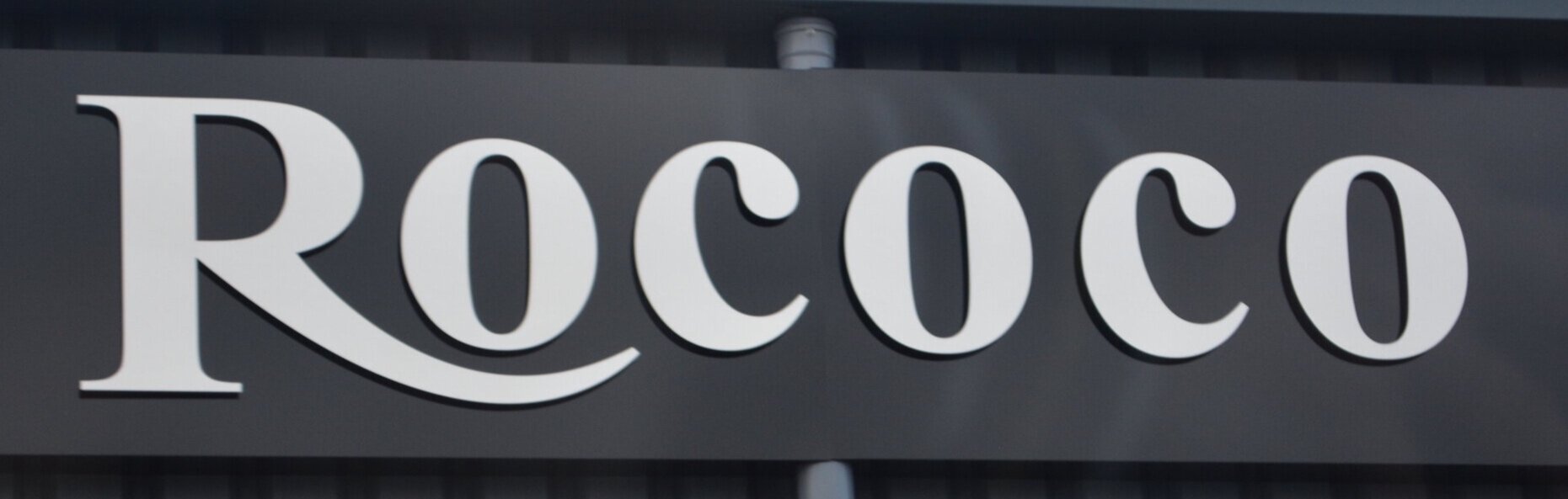
I found this really interesting that there was still so much history and old typography that was dotted around Southampton! Overall the above image feels really old fashioned, like we’ve travelled back in time. Southamptons iconic typography seems to be more curvy / handwriting compared to a more blocky type that was also around at this time!
Looking back I am also unsure if the bottom right image should be there, as this does seem a bit more ‘modern’.

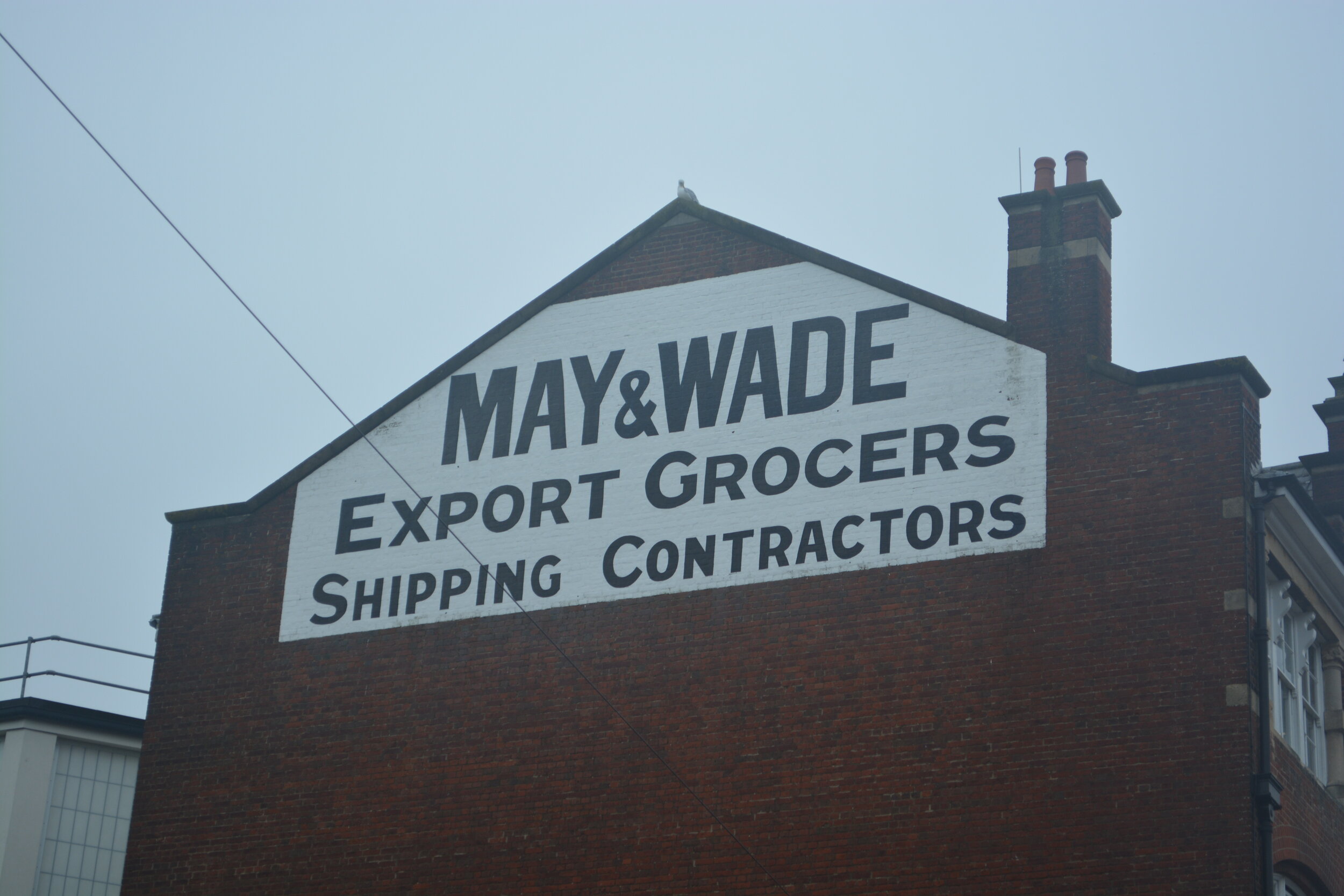
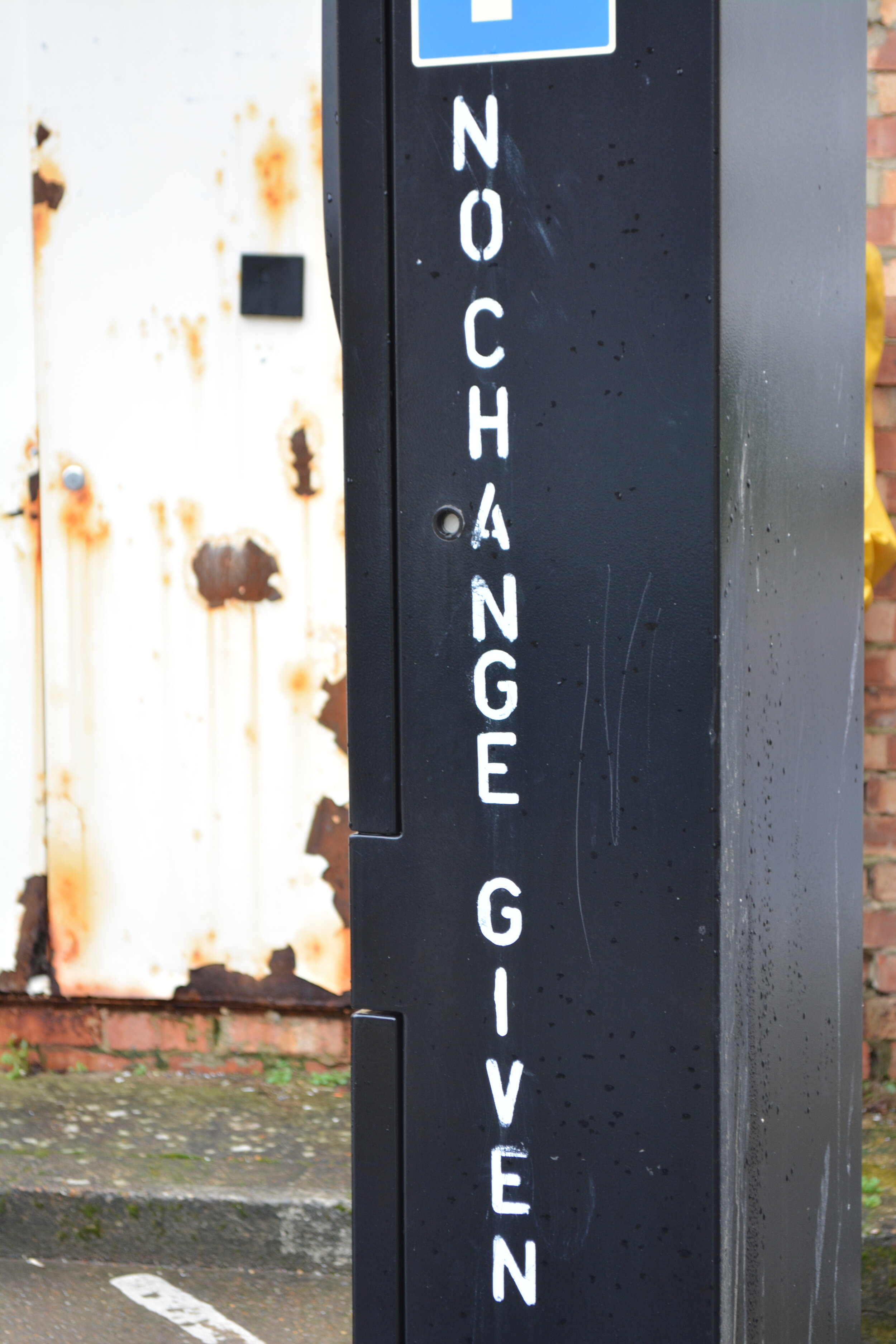
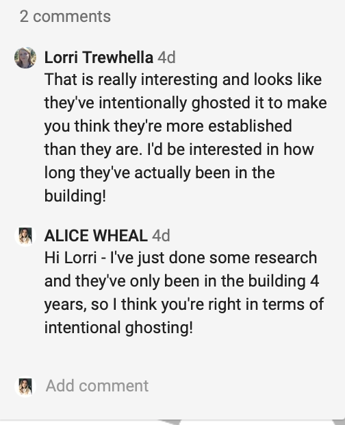
I also found a really interesting ghost image for brew dog. After doing some research I found out this was in fact intentionally ghosting as it was only opened in 2016. I think the effect is still there as it really stands out. I then also found another ghost sign that has clearly been painted over to be a lot clearer:

Walk 2 - Contemporary
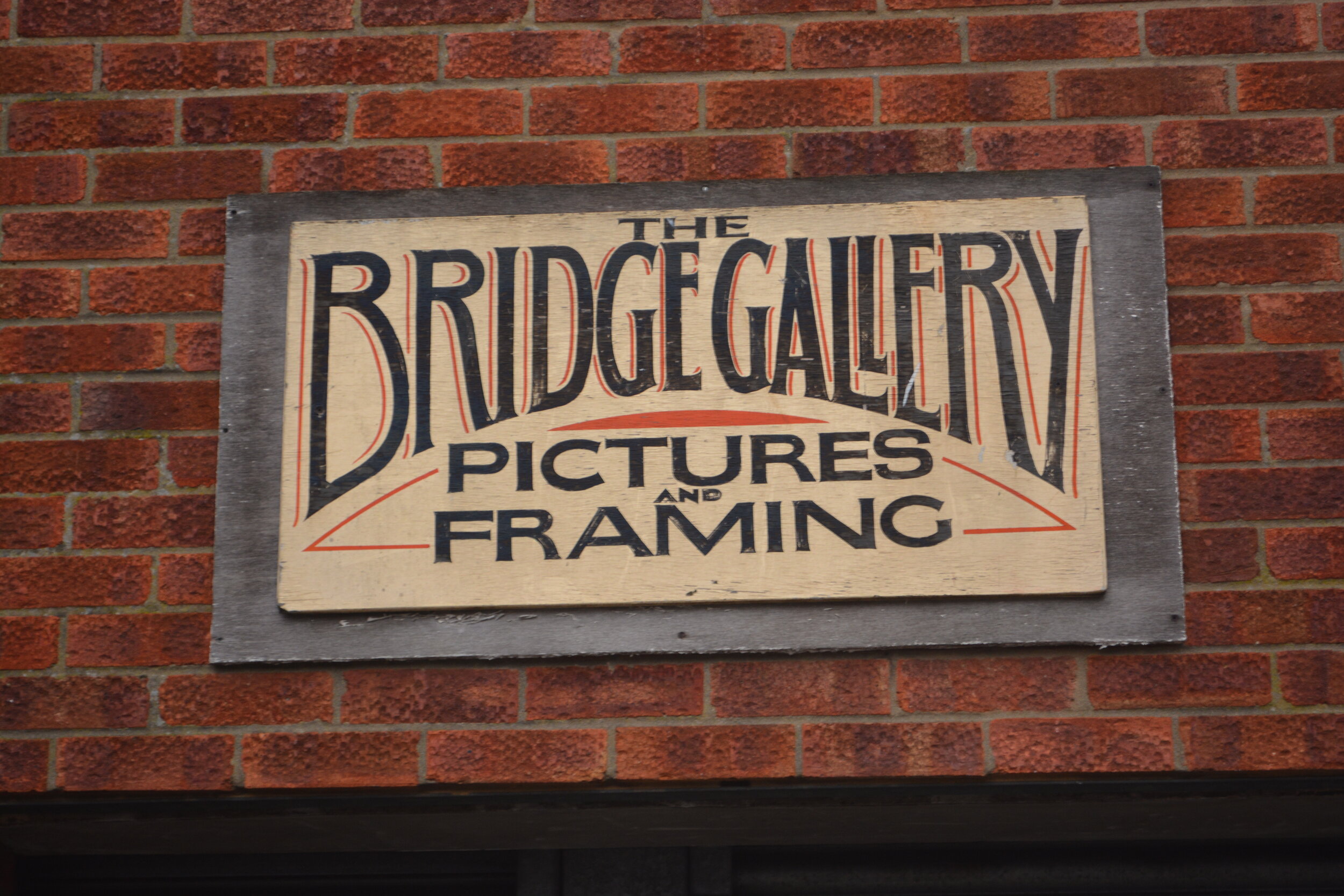
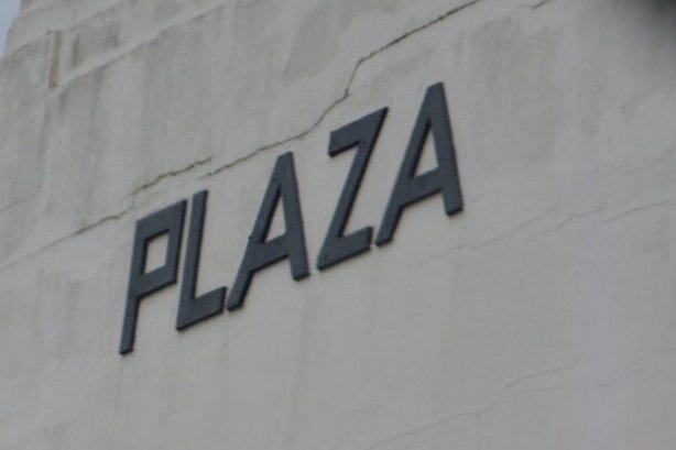
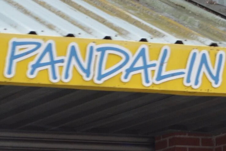
For this walk, I’m going to try and focus on the more contemporary typography that is around Southampton. Walking a similar sort of route but with a different view point. I ended up firstly going to a different area of Southampton which was also an old part, which can be seen at the beginning of these Images and then I headed to the main stretch of road.

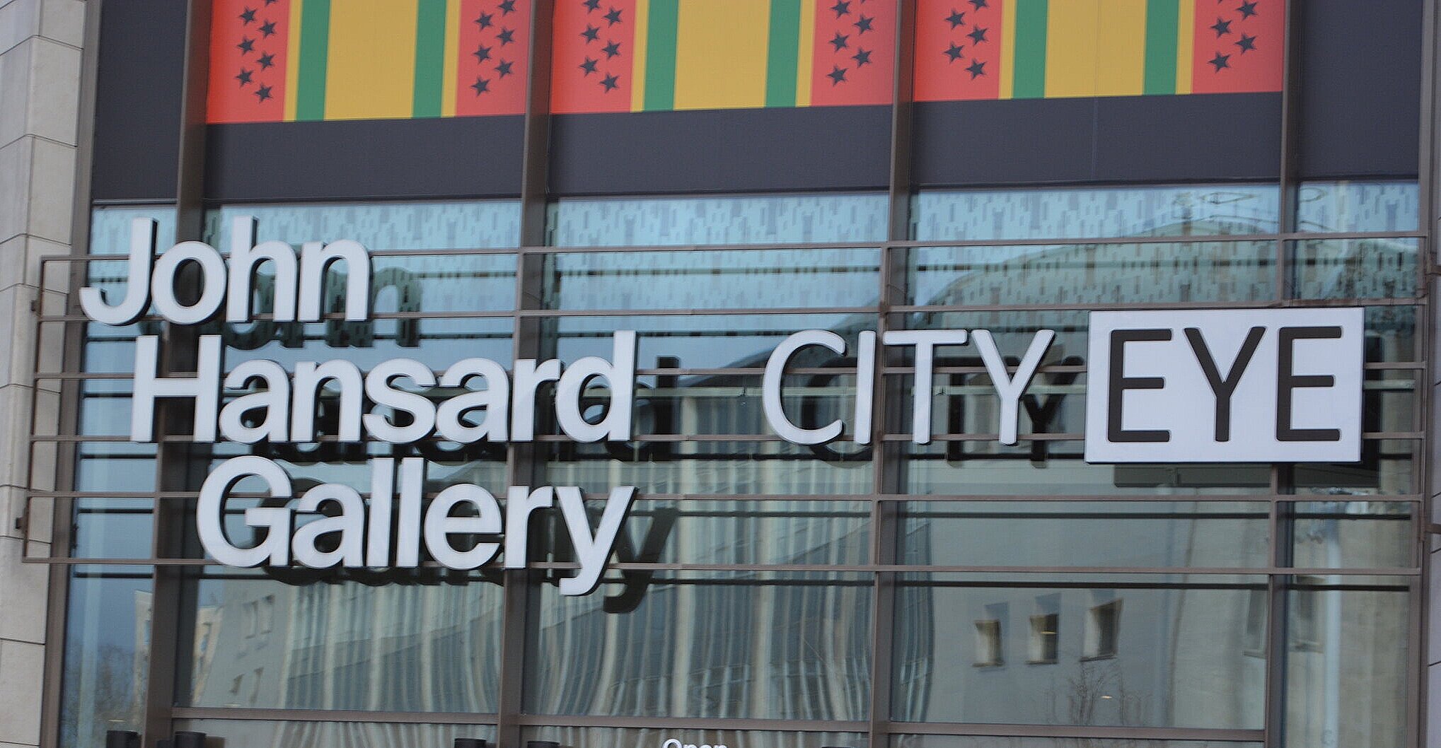
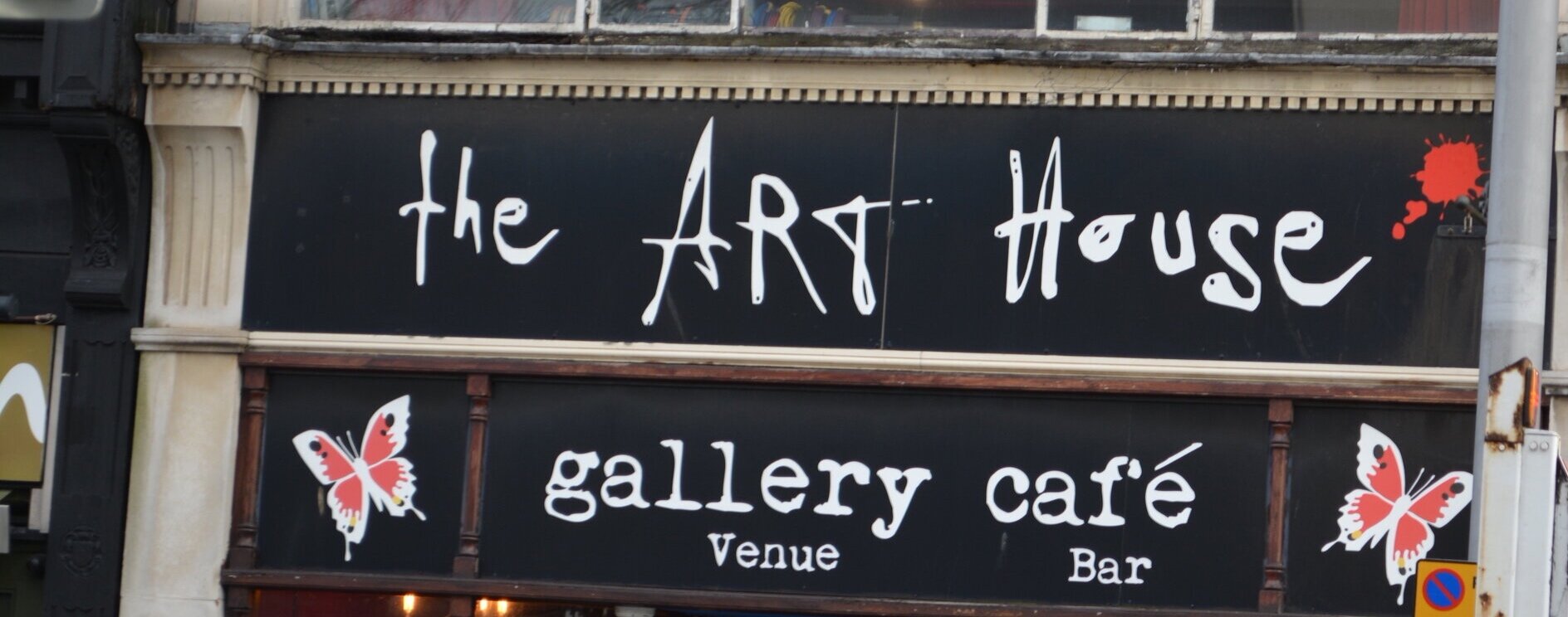
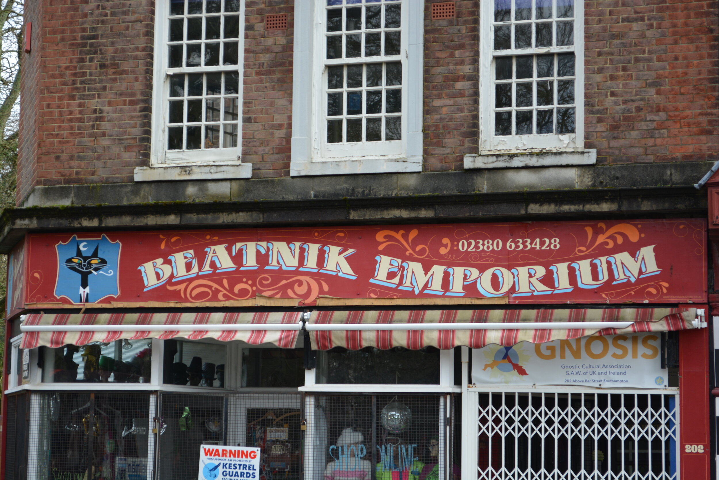
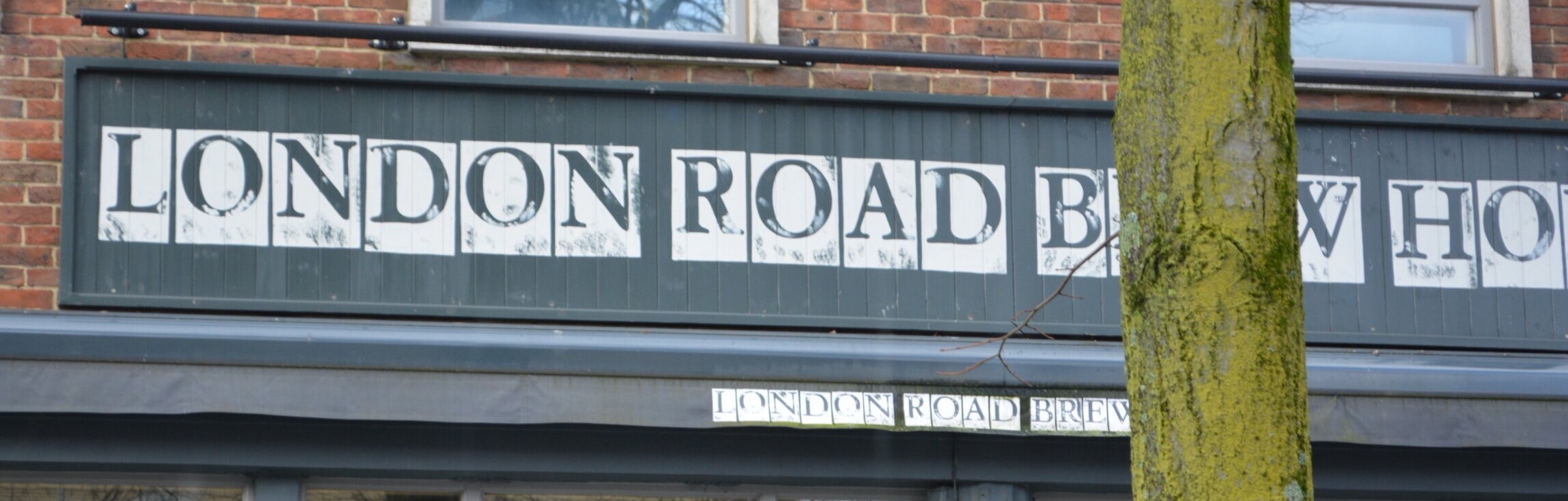
Aswell as finding some historic ones, the typography that I found today seemed to be modern and different to others that are more standard and boring.
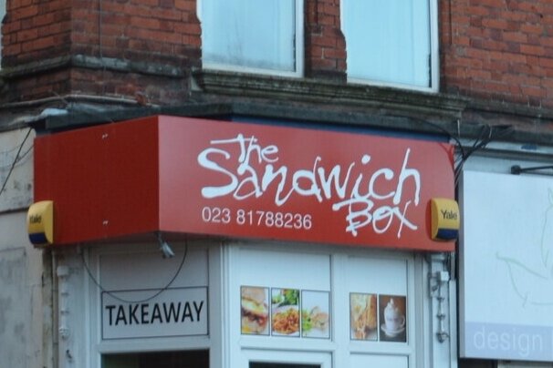
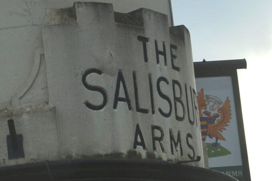
Drive - Outside the Lines
After the previous two, I decided to take a drive to places that were hard to reach by walking. On this one I wanted to try and find the un-usual. Being a passenger in a car, you are able to see so much more than when you are in the drivers seat.
The Final 5
From all of these I narrowed it down to, I have also talked about the history of the brand or the place next to it to give a slight insight to the location of Southampton.

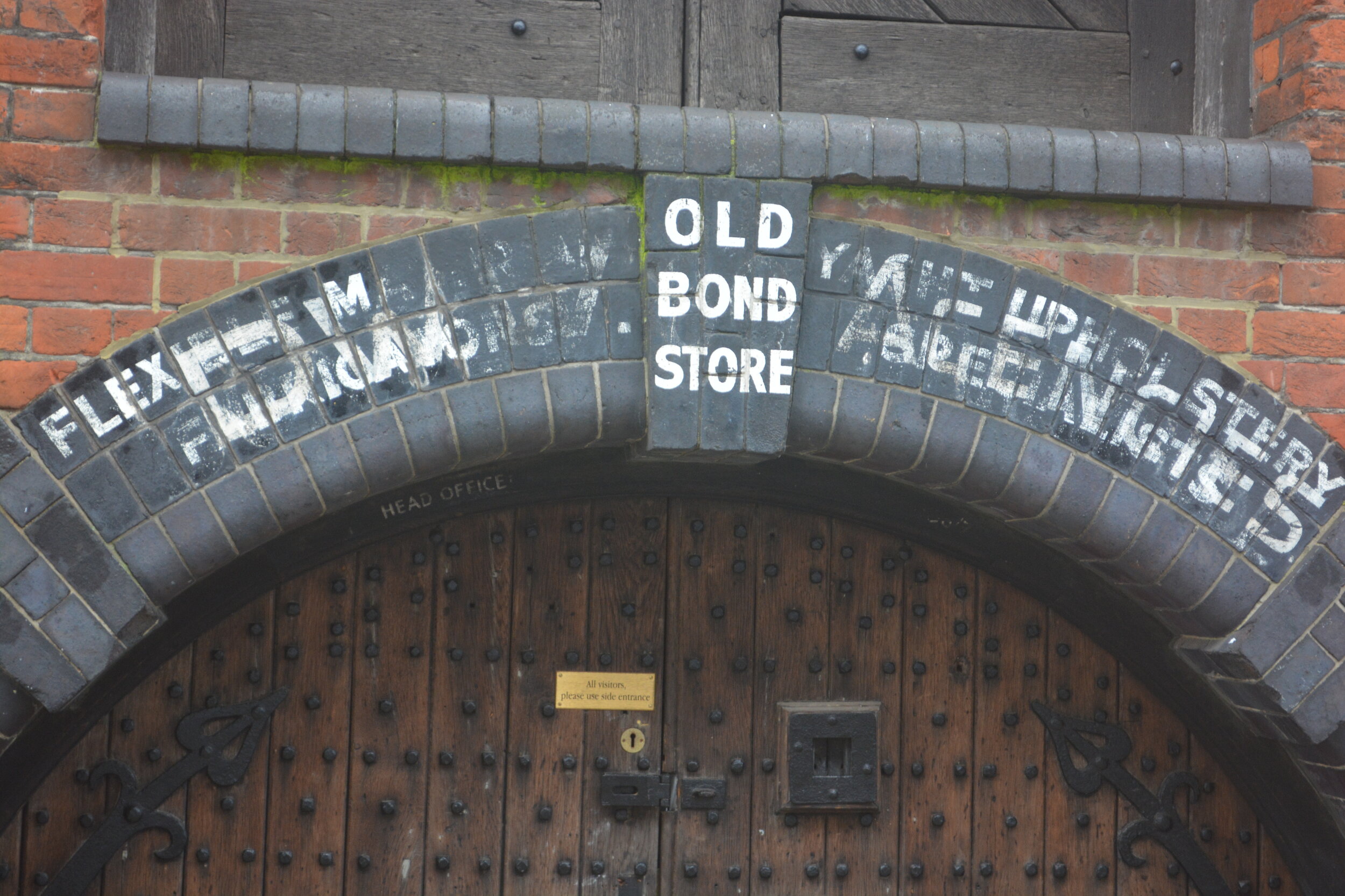
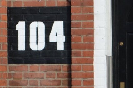
‘THE OLD BOND STORE’
Back of the Walls, Southampton SO14 3BHCalled the ‘Old Bonded Warehouse', this building was built before 1795. The structure of the building resembles a swiss chalet but is considered to have strong culture, illustrative and aesthetic values as it represents a lost building type for Southampton. Such stores of this structure were common around this time period. In 1820, it was used as a builders store and later was seen as a malt house but presently used as a co-working space. The typography on the structure looks to be stencilled or hand painted due to the close letters as the brick gets narrow. Around the arch there seems to be multiple layers of weathered paint, showing that this structure had multiple purposes throughout its life. A lot of the lettering seems to have worn away but the ‘old bond store’ wording seems strong. Being sat on an arch, makes me think that this was used as advertising / branding purposes.

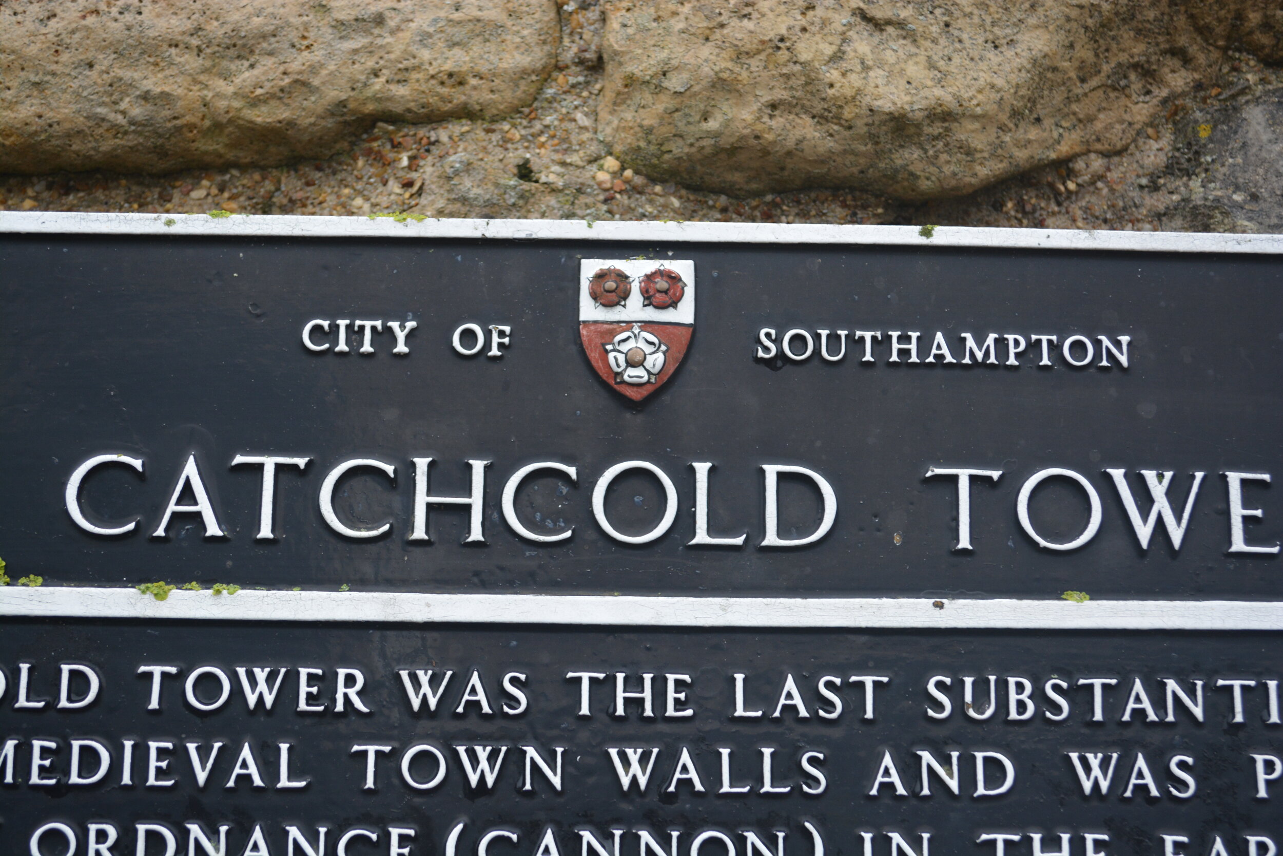
‘CATCHCOLD TOWER’
Southampton SO14 2DAThis is a signposting close to a landmark in Southampton, Catchcold Tower. It is a tower that was southward on the west wall of town being used in the early 15th century as a gun tower. This typography is a signpost to talk about the history of this time. It’s white writing on a black background, looks to be metal lettering that was painted over to withstand the weather over time. Also different sized type for the header and the body of the text also being in uppercase for ease of reading. This is a uniform sign design that is across Southampton at all historic points.

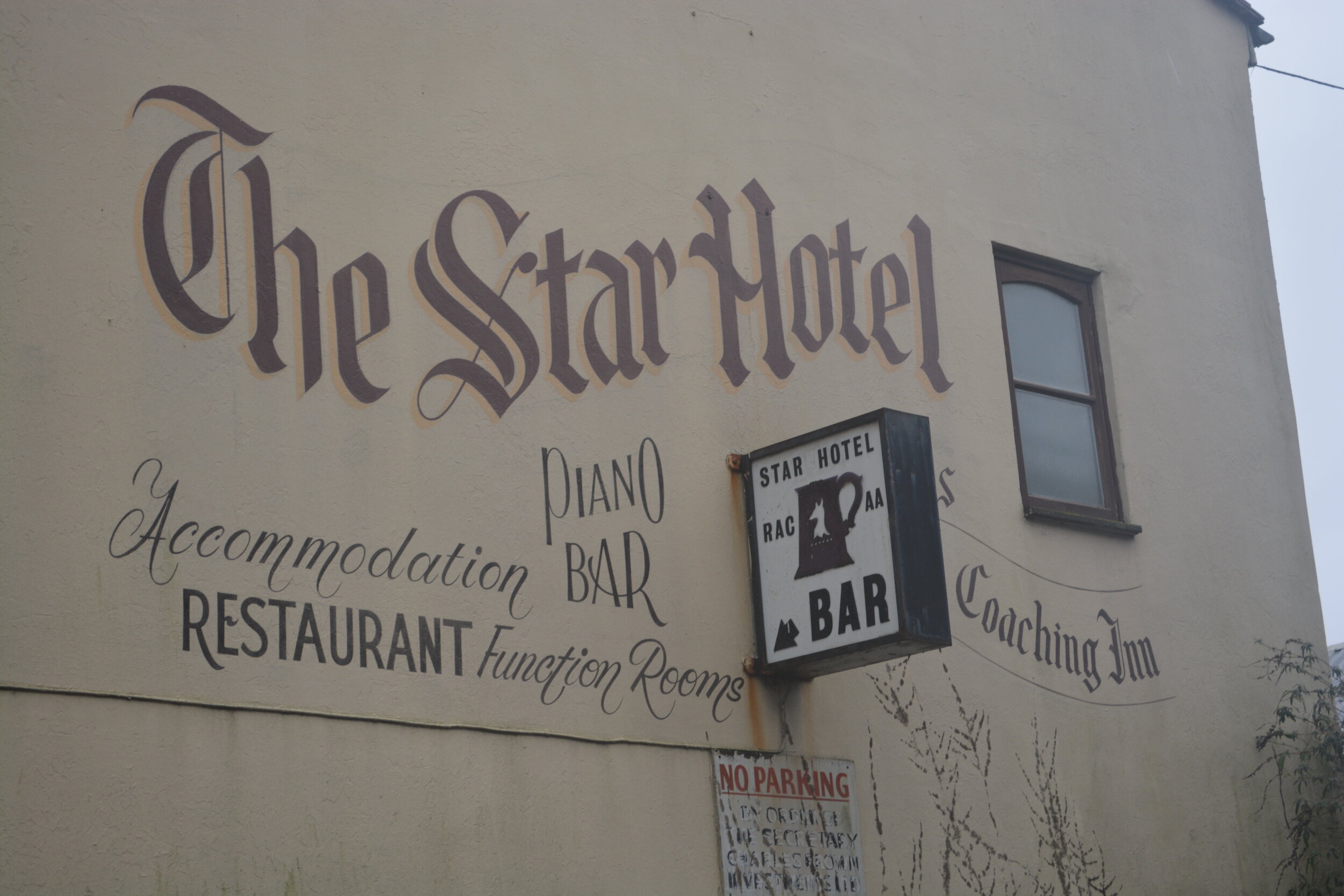
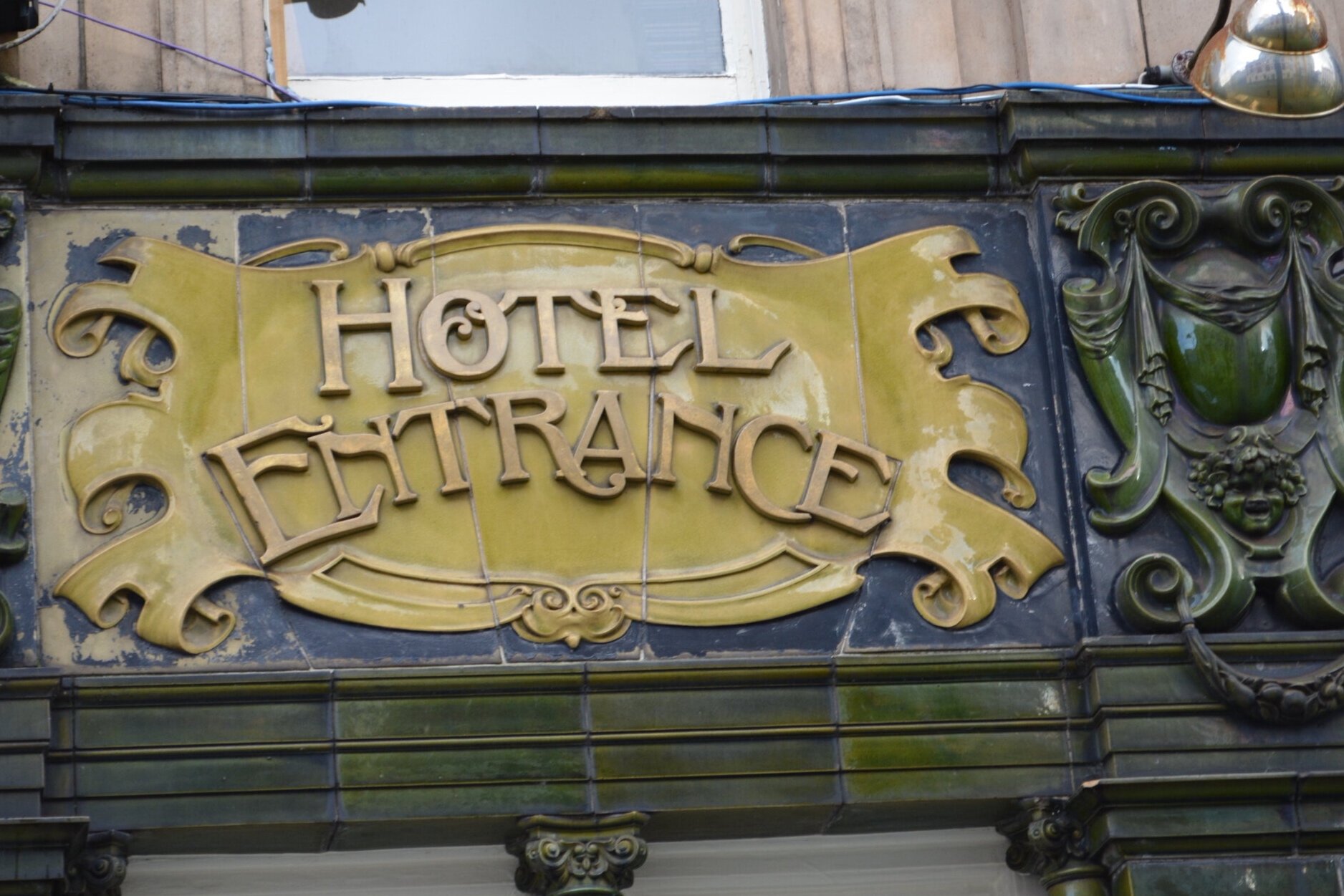
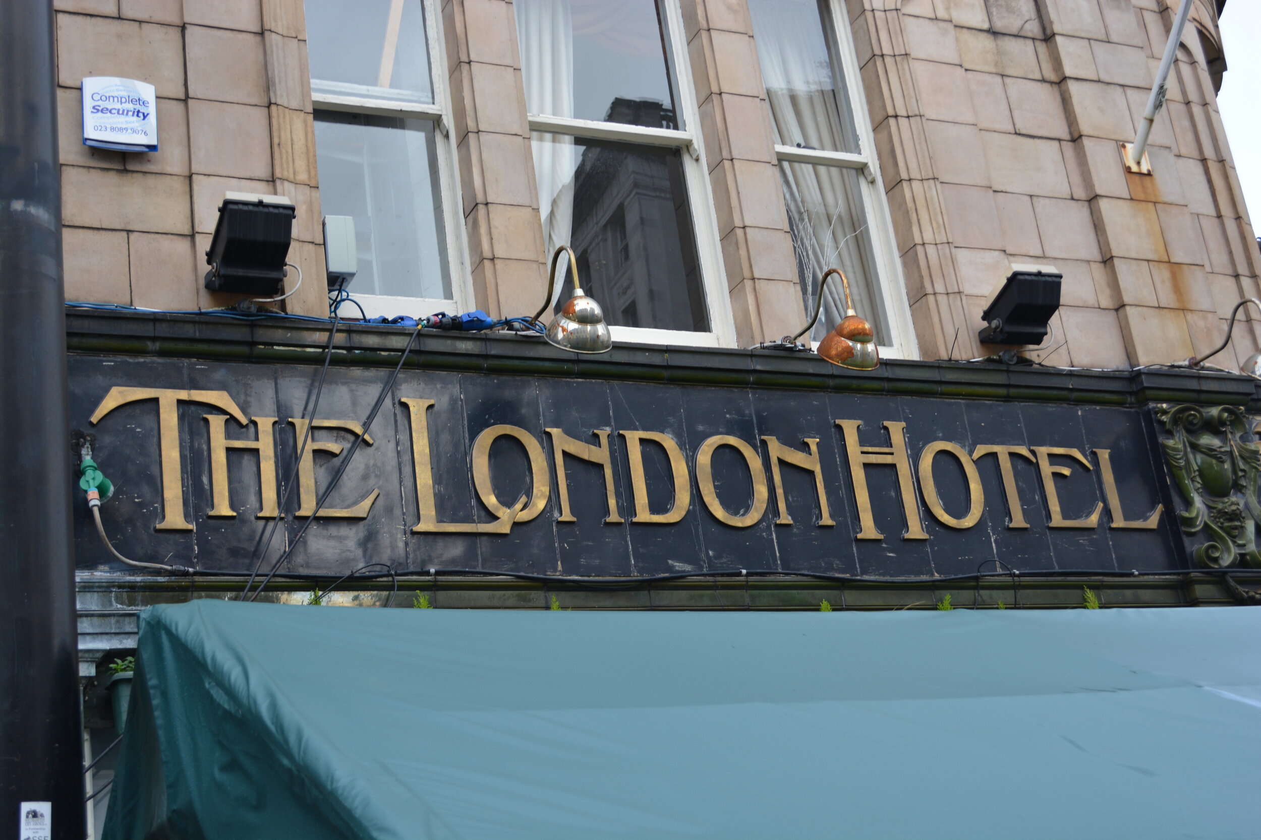
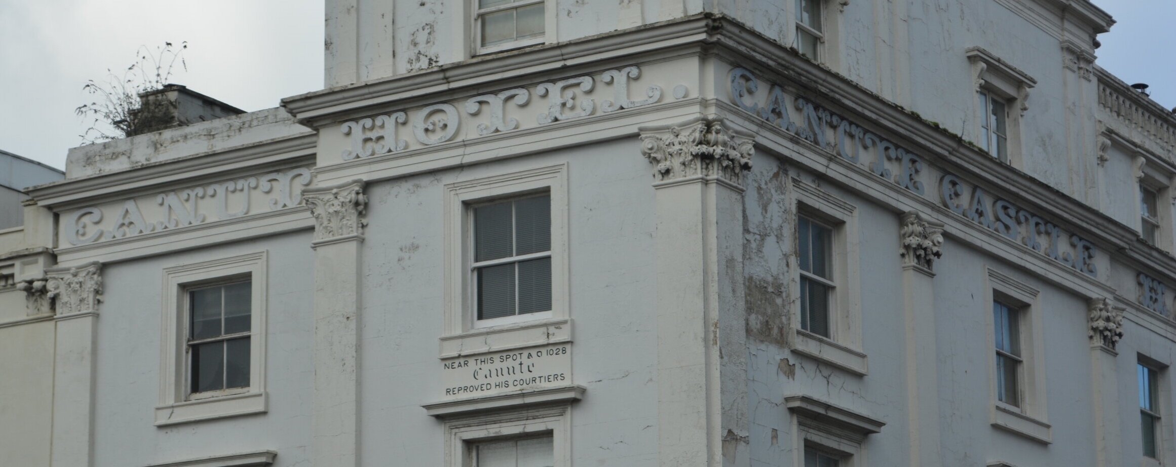
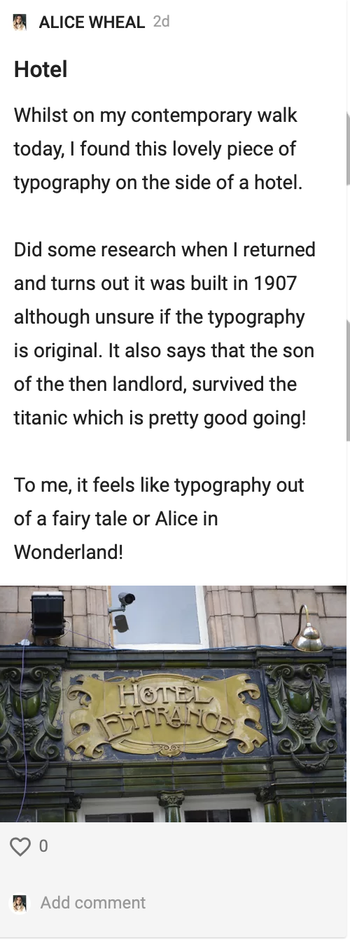
‘HOTEL ENTERANCE’
Oxford St, Southampton SO14 3DJThis is the typography on the side of the London Hotel in Southampton. The lettering looks to be made from metal with the gold colouring on a yellow tile. The top of the lettering ‘hotel’ seems to be straight and the bottom word ‘Entrance’ seems to be more curved. This could suggest that this made the entrance / opening into the building more clear. The difference in kerning across the words makes me feel this was hand created. There also decorative swirls and cross over into different letters that could’ve been a decorative effect at the time. There has always been a hotel at this site since 1846 but only the London Hotel since 1907. It is also interesting to note that a Titanic survivor was the son of the original landlord.

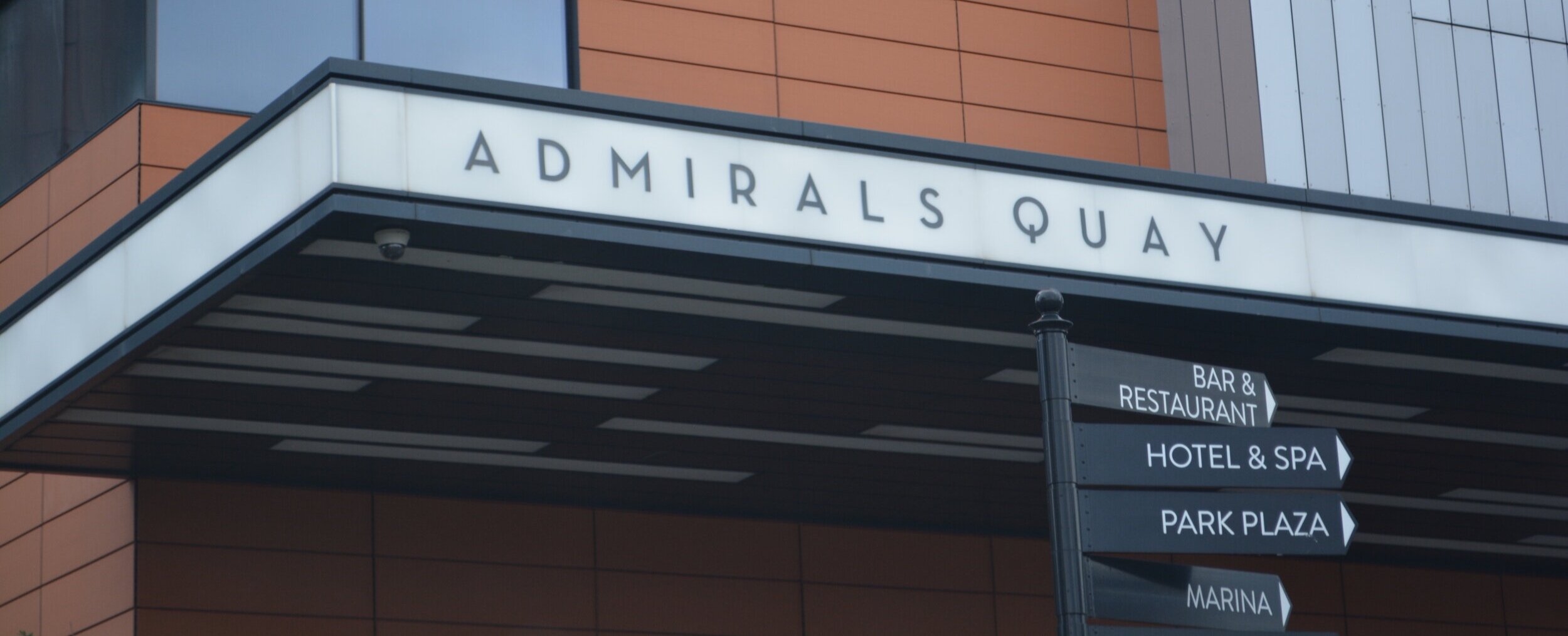
‘ADMIRALS QUAY’
Southampton SO14 3LGThis section of Southampton has been recently refurbished, with Admirals Quay only being built in 2014 for residential use. This area of Southampton also used to be part of the docks but was recently renovated to be more ‘upmarket’ with bars and restaurants. The Admiral Quay is the name of the structure, clear black writing on a white background allowing people to read clearly. It’s a very blocky square uppercase typeface with sharp points for As and W. The top of the Q seems to also be elevated with the descender being straight.

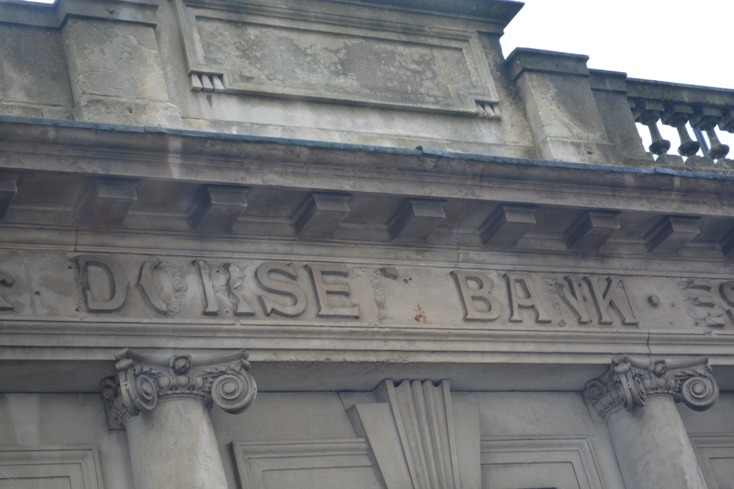
‘DORSET BANK’
WILTS AND DORSET BANK, CANUTE ROADThis is a grade II listed building which was built in 1835 as a one story structure. It has Roman columns at the front with a moulded architrave. The architectural type that is on the façade of this building shows that it was for sign posting or branding. It is made out of stone that makes me think it was built to last and function. There are also large gaps between each wording with a bullet point, which allows it to be read clearly from further away. The letters themselves are uppercase, also block type text which each letter being the full cap height. Canute road was once the main street in Southampton, a busy street, which can only make me think that this was a loved bank for all its time.
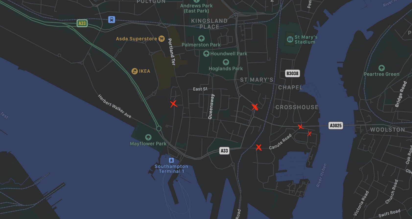
Where the 5 images were taken at each red cross.

Weekly Summary
This week has allowed me to learn and find out about different types of typography and sign making that have been around for generations. Also allowed me to research about the iconic maps and diagrams that make the London Underground the easy to navigate space that it is today with the Johnston typeface and the unity of all the stations. It was also interesting to learn about the architectural typography, allowing structure designs to create words directly into stone.
The biggest highlight of this week, I have thoroughly enjoyed learning about ghost signs especially from Matt Cohen. I think they have done such a great job of trying to raise awareness of these ghost signs that can be found in cities across the world. They are something that makes up the history of how our city became the way it was.
Another highlight for me, was wandering around the city to find all these different typefaces, I felt that I could’ve probably done this forever. It fascinates me how we don’t offend realise what is history even when it is right infant of us. I have walked past these buildings and signs but unless you are in the right headspace, you would’ve never really looked at it for more than 2 seconds. I feel privileged to live in a dock city that has been able to preserve as much as the history as physically possible and I look forward to taking my knowledge of the city to designing the typefaces next week.
Ideas Wall Posts:
Reference list
Abbey, R. (2017). ROBIN ABBEY - Traditional Signwriter. [online] www.youtube.com. Available at: https://www.youtube.com/watch?v=xaUJYxgFW7U [Accessed 12 May 2021].
Ashworth, C. (n.d.). Swiss Grit. Available at: https://designcollector.net/likes/swiss-grit-by-chris-ashworth.
Beck, H. (1931). Available at: https://londonist.com/london/transport/modern-tube-map-harry-beck-1931-1933.
Burill, A. (2021). You and Me Mural. Available at: https://fontsinuse.com/uses/38005/youand-meand-meand-you-mural.
Designcollector. (n.d.). Swiss grit by Chris Ashworth. [online] Available at: https://designcollector.net/likes/swiss-grit-by-chris-ashworth.
Gregory, R. (n.d.). Sign writer Introduction. [online] Available at: https://www.signpainting.co.uk/craft/.
Tremblin, M. (2016). Tag Clouds. Available at: https://www.dezeen.com/2016/08/08/mathieu-tremblin-graffiti-typography-graphic-design-tag-clouds-france/.
Tucker, E. (2016). Mathieu Tremblin replaces graffiti with typographic translations. [online] Dezeen. Available at: https://www.dezeen.com/2016/08/08/mathieu-tremblin-graffiti-typography-graphic-design-tag-clouds-france/ [Accessed 6 May 2021].
Tucker, E. (2021). Anthony Burrill has designed a seven-storey-high mural for Leeds. [online] Creative Review. Available at: https://www.creativereview.co.uk/anthony-burrill-leeds-mural/.
Winslow, C. (n.d.). 031 — Great Falls, MT Orange Crush — 226 2nd Ave S. Available at: https://craigwinslow.com/work/lightcapsules/.
Winslow, C. (n.d.). CRAIG WINSLOW › LIGHT CAPSULES. [online] CRAIG WINSLOW. Available at: https://craigwinslow.com/work/lightcapsules/ [Accessed 6 May 2021].
Winslow, C. (2016). Light Capsules — LDF16: Part 1. [online] Vimeo. Available at: https://vimeo.com/183522909 [Accessed 12 May 2021].
Winslow, C. (2017). Available at: https://www.bloomberg.com/news/articles/2017-08-17/-light-capsules-reveal-the-history-of-cities-faded-ads.
www.ft.com. (n.d.). Subscribe to read | Financial Times. [online] Available at: https://www.ft.com/content/1cf2205a-7e35-11e9-8b5c-33d0560f039c [Accessed 6 May 2021].
www.youtube.com. (n.d.). Big Think Interview With Massimo Vignelli | Big Think. [online] Available at: https://www.youtube.com/watch?v=schuTm9iuuA [Accessed 12 May 2021].