Week Two
Lecture Notes
Lecture Summary
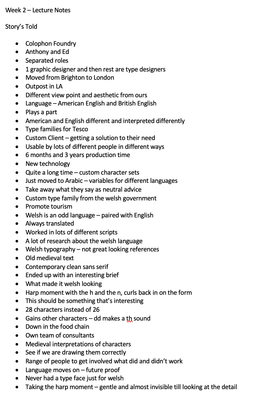
This lecture was eye opening to learn about the process that graphic designers have gone through to make 2 iconic typefaces that are used. The first one being created by Colophon Foundry, I found this particularly interesting that the welsh language is still being preserved and translated and how this was taken into account when they were designing the graphics. I look forward to looking out for that graphics on the transport systems soon. Another thing I loved about their graphics, the harp and the way they used the harp to describe the curved n but also the way that they put two letters together to create another meaning such as the double dd or the ch and how beautifully that flowed into the typeface!
The second iconic typeface is the one that was created for the 1968 Mexico olympics. Learning about how they managed to get their super simple concept that was then translated to a lot of other things for the olympics was so interesting! I loved that they were able to create signage where no language was needed. In module one we looked at the London olympic logos but these just seem more natural curves to go along with the curving around the Mexico Olympic logo.
Resource Notes
Resource 1
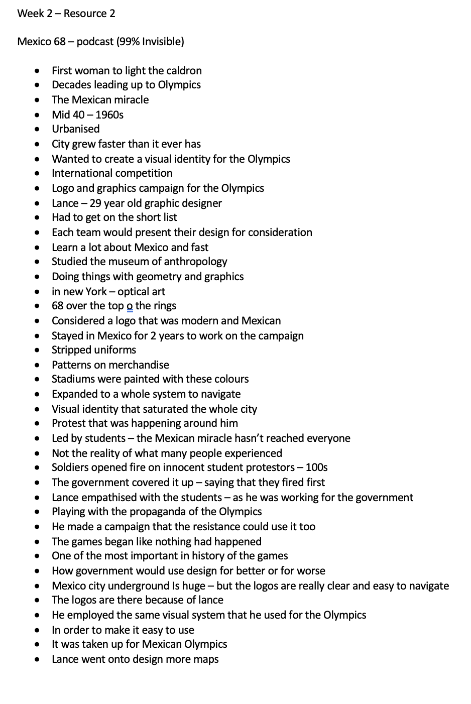
Resource 2
Resource 3
Resource 4
Resource Summary
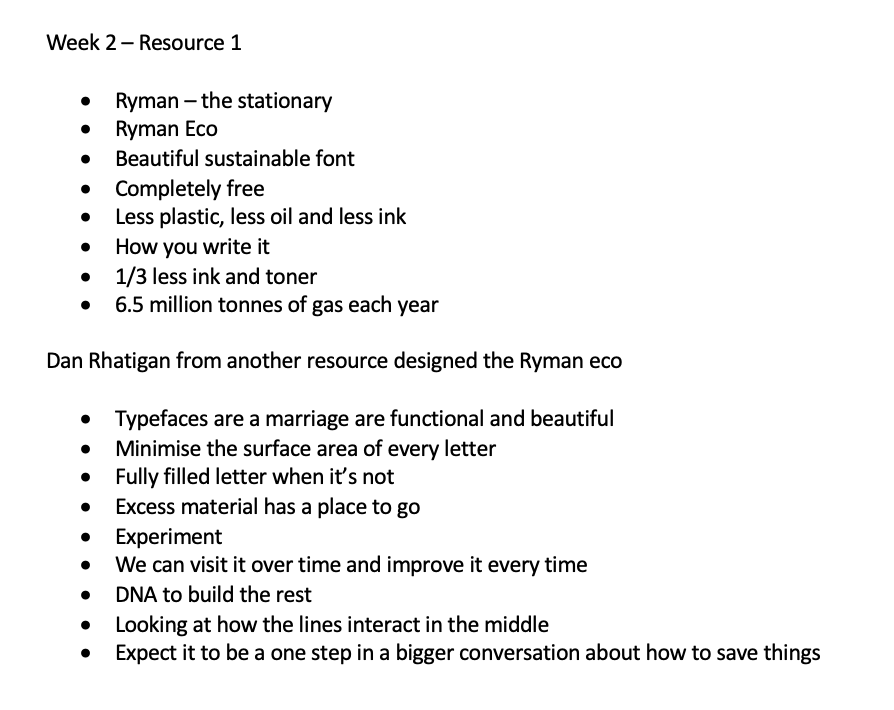
Resource 1
Ryman Eco Is an interesting concept - i’ve never thought about how changing the font could help make a difference on our planet and reduce the amount of ink that we use. My only problem Is that when that is really shrunk down will it be easier to read? Dan Rhatigan also talks within this resource as well as the other resource we’ve seen so he is clearly gained lot of knowledge about typography.
Resource 2
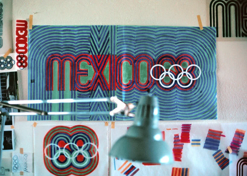
Image taken from : https://99percentinvisible.org/episode/mexico-68/
This podcast discussed the visual designer that designed the Mexico 68 logo and identity. This was discussed within our lecture this week as well but this podcast went into the details of the political events that were also happening the time. How people took the optical art design and used it within the protests. Doves that were also placed around the city, students went and painted a red dot on them. One of the most shocking things about the lecture is that a lot of students were killed for standing up for what they believe in. It makes me horrified to even think about if that were to happen in modern day society, the impact it could have on the nation and the world.
The way finding that was mentioned in the lecture was also mentioned and deployed within the subway system which is a super clever way of translating the language and making symbols of that translation. Something so simple but so easy to navigate around.
Resource 3
This resource looked at a type making website that can be used online by users to create their own spin on lettering. I think it looks to be an easy and useful concept to have it as it pushes users imagination in terms of how they want their typography to look. One thing that does come to mind is it feels like a team meeting - why are so many people coming to hear about the updates of this website? Possibly something to do more research about.
Resource 4
The creative review podcast discussed some of the ongoing issues in-terms of development of popular places and popular cities like London Paris and Manchester. I completely agree with their view point in terms of, often the design side is forgotten when it comes to concepts about cities and their ways. They are often just trying to think about how much economic gain can be made or how many people they can get into estate so it was refreshing to hear that at a new development they are including the other residents and neighbours to those residents.
I agree that Manchester is often forgotten as-well, we see London as being the big tourist hotspot as do other people that fly in from around the world, they often don’t know about other places - going back to seeing London on instagram. But Manchester has a lot of offer in terms of design and architectural value with all the old buildings that have been abandoned. There is a whole argument point of the north south divide but overall I think if people were to explore Manchester they might see it as the new London in terms of culture and to live.
Research
For this weeks research, I wanted to explore a range of typography that was available and also how people perceive it.
Colophon Foundry
Listening to Colophon Foundry in the lecture this week I was really impressed with their approach to designing something so important to Wales. I wanted to see the other typefaces they had designed and also see if there was any advice they would give people who are designing typefaces.
Notes //
Used in a serious way to warn you about a danger or a problem
A lot more than 16 characters in a typeface.
Type design - basic building blocks of shapes
Shapes rather than letters - a lot easier to design.
Great typography is invisible
Think about a danger sign - if you had to try understand what it said it would be hard to understand.
Pangram.
Context of words
So many ways now of getting into type design
trying out and drawing letters by hand
Try and replicate and try to make them better.
The above video just went through a couple of things, especially thinking about the letters as shapes rather than actually characters, I wonder how this will inform a design. Some examples of their work that I particularly liked are below:

LaFayette Anticipations
Graphic design identity for the new arts venue. I love this I like how it feels like the letters are on some conveyabelt and are always moving towards or away from something. I think its also interesting how they’ve used a mix of straight and flat and also curved lettering.

Twickenham
RFU design, that had energy and intensity. I think this is such a great typeface and definitely my style of uppercase with the painting home made feel to it. I love that it looks like a paint brush but also so neat and tidy!

Nasty Gal
A family of fonts. I actually really enjoy this typeface and it was on that stood out to me within the lecture too. I think I love that the curves kinda curve back on themselves and it feels really cut throat and bad ass.
Mexico 68 Logos

The merchendise
From listening to the information about the Mexico 68 Games, I wanted to just analyse the things that particularly stood out for me. One thing I love is how this graphic identity has been taken onto merchandise in particular these balloons are amazing. I love how they let light through.

The logo itself.
The lego itself is just so interesting how it feels like ripples of water. The kind of after effect of the Mexico olympics. I think this is such a great design and especially how it links to the rings.
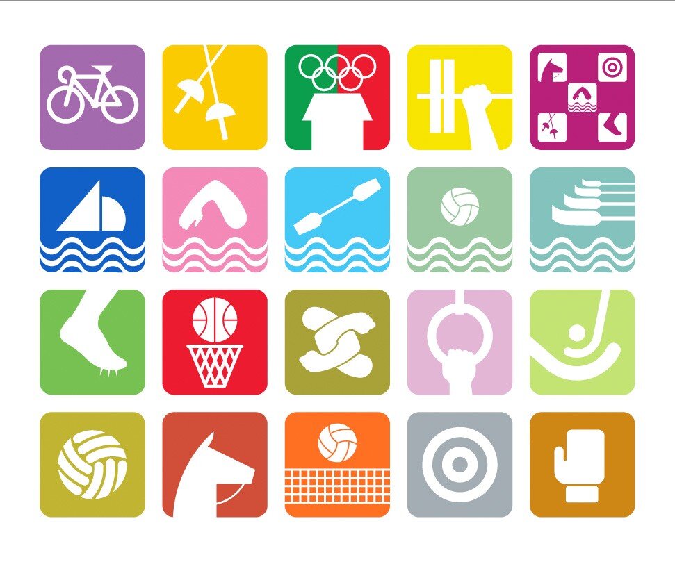
Sports Icons
Another thing that I loved about the identity was these way finding graphics for each of the event that were taking place. Focussing in on one aspect of that activity to make it the focal point is so clever and the colours feel really mellow yet vibrant.
Creating your own typography
Video Notes //
All type consumers
Navigate and make choices
Keep us safe
Understand the power of type
Fonts are like multi sensory grenades
Fonts turn words into stories
Thrown in at the deep end, graphic designer is about understanding what they mean not what they say
The font can change the meaning of a word
What to give a brand, typography is story telling.
Questioning how to make stories, maybe we should use fonts that tell the truth
How do fonts influence us?
Entertaining and theatrical
Times new Roman - times newspaper - 1931
when you want to come across as being serious and credible
Leave our conscious brain to read what they are saying
not paying attention to them consciously
We can play with this and alter experiences
Fonts altered how the sweets tasted
Reference the complex associations
Coca-cola logo tells a story about the American dream
going to taste sweet
A film and a book - condensed letters
Fonts turn words into stories
An eyeopening interesting video talking about how we do take in fonts and consider them especially when it comes to food and fonts which I have never thought about before. A font can tell a whole story without you even realising it. Like we associate the Star Wars far far away typography with star wars and if we saw this anywhere else that’s where it would be. I wonder how this would relate to place? especially within our cities?
Video Notes //
Respond to typography in an emotional way
Letters are everywhere, typography is everywhere
type again and again and again to live your life
Identity is Everything
Much unique-ness and understand in every typography
Typography is like carpet - texture
Sculptural
Type is universal
people are aware of typography that they have never been able to do before
typography should be enjoyed
Font vs Typeface
Anatomy of Type
Although the above video has been shown in a lecture previously, I felt it helpful just to recap what they said and the designers that were within. Eddie Opara’s work stood out for me so I did a little more research into him.
Eddie Opara
Thinking about Place
Although not directly connected to a cities typography. The above video was very useful in terms of how to make typography relate to a place and how it’s all in the story.
Interesting versions of typography
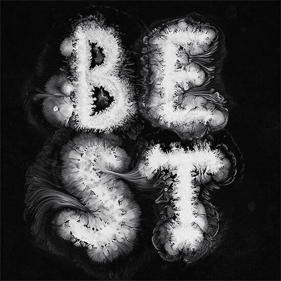
Dysfluent Mono is a really interesting typeface that I came across that embodies people with a stutter. Which can be seen in the image below. This particular designer, Connor Foran, wanted the sounds to be visible through the words.
“Visually representing my stammer by repeated or stretching the letters seemed defiant at the time, almost as if I had given the middle finger to these words and letters that cased me so much grief for so many years,”

I love the way that some of the wording or letters is repeated is repeated but then in some of his other work the S is prolonged so you automatically think about how this would sound. I love his use of colour and the shape of the font too.
Another really interesting typography going way back in history was this one by the Sumerians called cuneiform which means wedge shape. They used to write out messages on clay and then lay them to set in the sun to dry. It was first created to keep track of business accounts but over time blossomed into everything.
‘https://www.history.com/news/9-things-you-may-not-know-about-the-ancient-sumerians ’
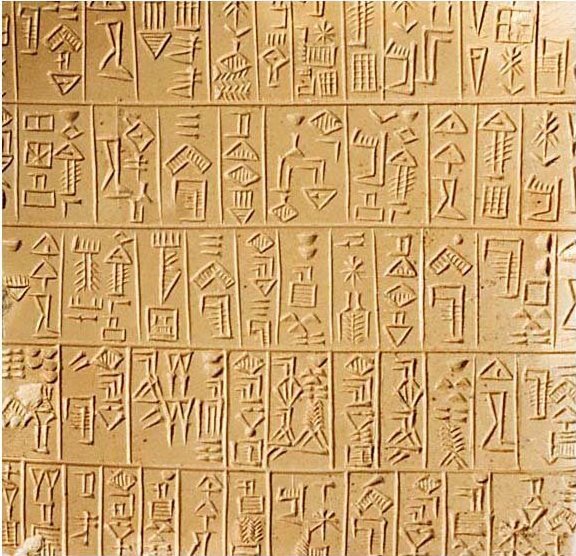
The main thing that I was drawn too with this type of typography is that its almost like little symbols that are put together to explain things. It’s so different to everything that we experience today. I guess pictograms are still around but this feel really authentic and beautiful. Something that could be used as an alternative.

Dyslexic Typography
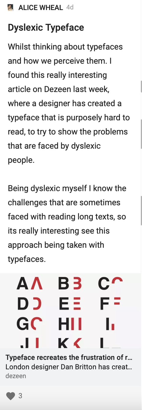
After thinking about how I Interpret typography and letters, I started researching how other people might be the same and found an article on dezeen.
This article looks at Dan Britton creating a dyslexic typeface to raise awareness of the challenges that dyslexics have on reading and understanding letters. He wanted to simulate how it can often be frustrating for people with dyslexia to read. He cut up the Helvetica typeface to delete 40% of each letter, to just about make them readable. It is meant to make the process a lot slower. I think this is amazing how you can take an issue that 10% of the population have and make it so that it is raising awareness and protesting for large long paragraphs of wording. I also love how it comes across as some kind of puzzle and diagram or pictogram.

Pams Writing
This is a story about a laundrette where nothing has changed in the last 30 years. It all comes down to the signs that have been put up around the laundrette on a4 piece of lined paper. I think this is so lovely, that someone that owns and runs a laundrette can have this kind of signage, so hand made and thoughtful, like it says in the article it feels old fashioned. I love the way that the bold colours are just been written in red and how the w has been written. Just shows how lovely and nostalgic hand writing can be.

Wall Message Font
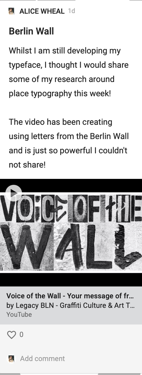
This typeface has been designed from the Berlin Wall. Using typography that people have destructed and used it as inspiration. The founder of the typeface talks about how type has an impact on culture and creating and celebrating the freedom.

Below is a really thought provoking word video about the impact of the freedom and the voice of the wall. It was made by all the typography. I think this is such a powerful message and feels like its powerful in evoking emotion. Something so simple of taking the typography of that place and placing them together.
Experimental Typography
I also just wanted to quickly touch on this whole other side of typography, the experimental side where we don’t look at the shapes and the layout of particular typefaces that we can be creative and typography can actually be anything. Below are just two examples of how you can make and do anything with typography it can be meanings or symbols.
Ruslan Khasanov
This designer just goes above and beyond using so many different materials to create letters. This one has been created in water it looks like playing with ink and then putting it in black and white. I love this, I love the way that the ink feels uneasy and not settled how it could just come out at any second.

Ben Hutchings
Another really interesting water kind of project is this book cover by Ben. It has a map in the background but the typography on the front feels like its moving or the ripples of the water, I think it’s really effective in a thought provoking way.
Workshop Challenge
For this weeks Workshop, I wanted to begin by analysing the images that Ive taken last week. I also wanted to outline them and draw them for myself.
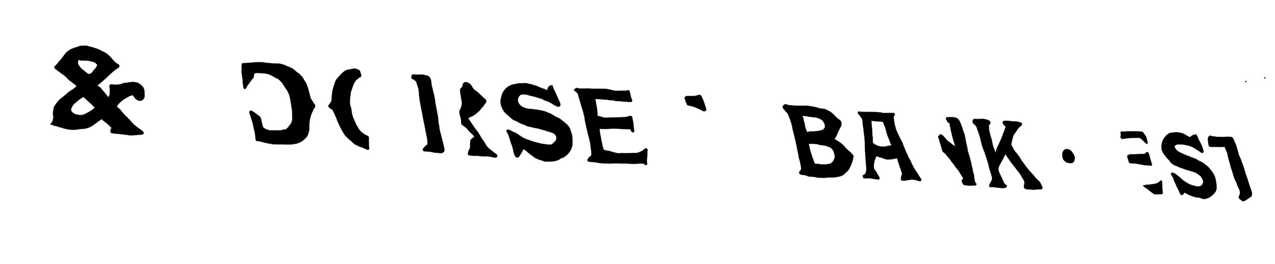

I really like this effect of just using the outline as the letters themselves although i’m not sure how clear they are.


Again tried outlining the letters and really liked the effect that this gave.


This is on of my favourite typography’s mainly because it is hand painted and unique.

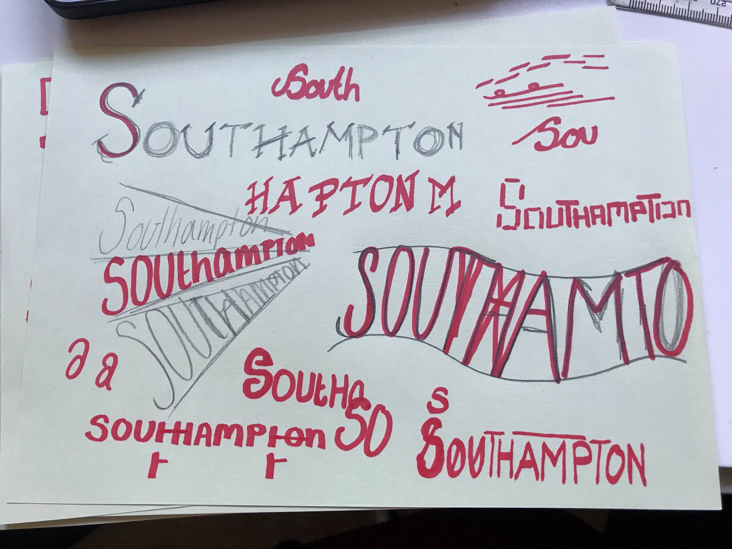
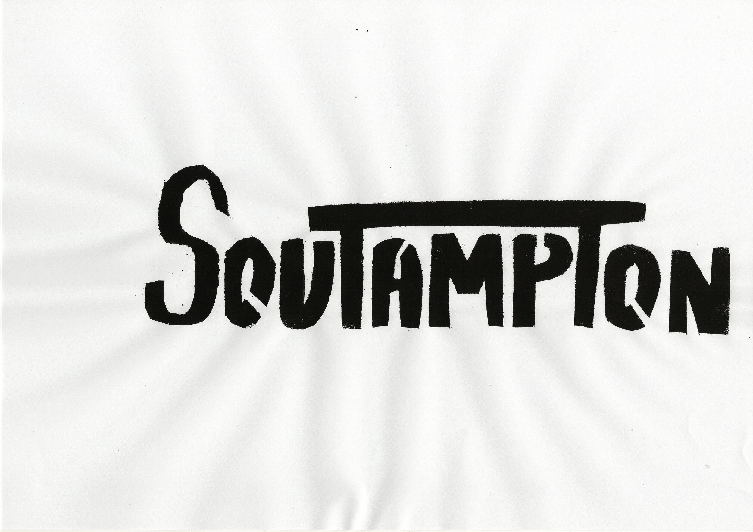
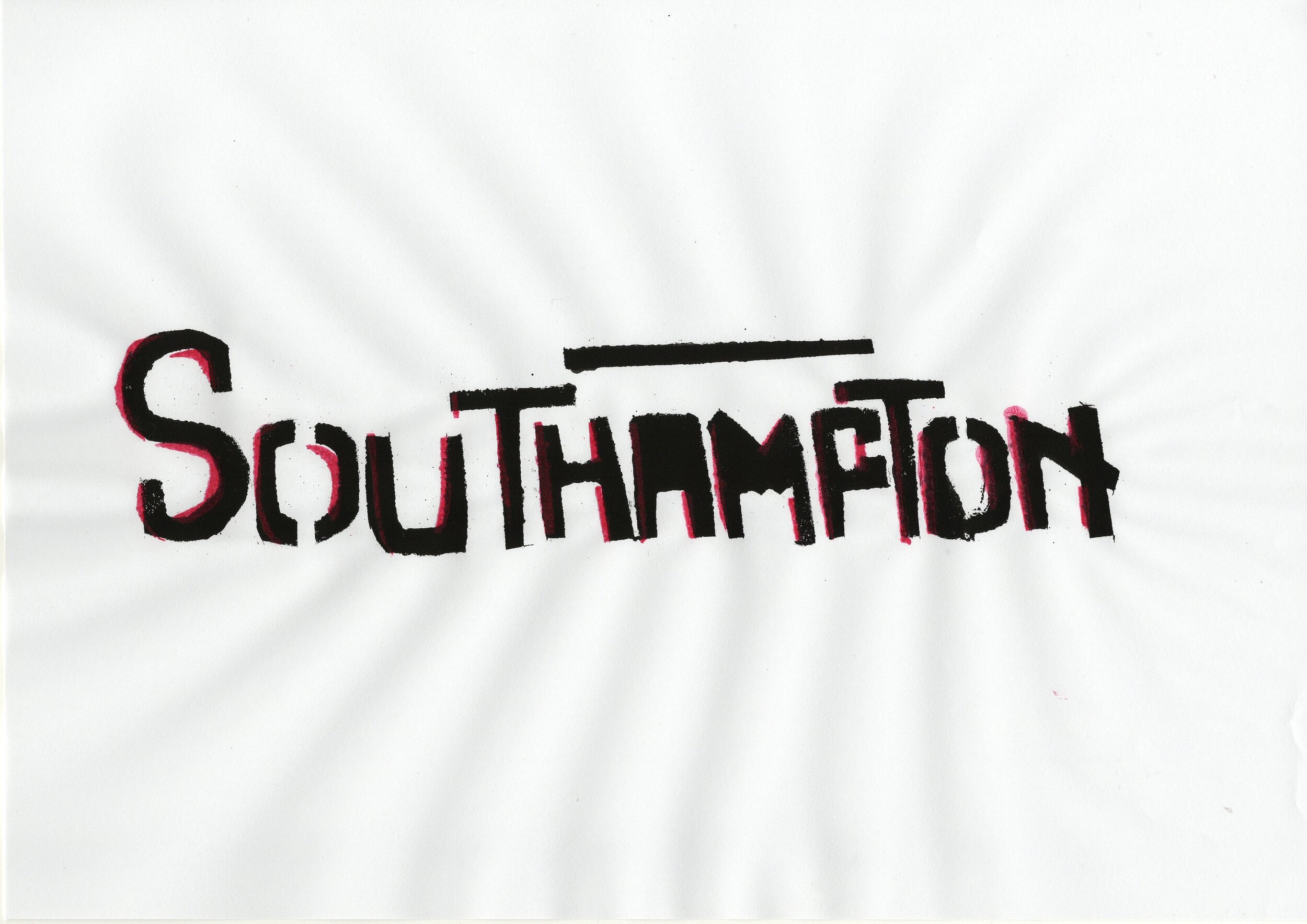
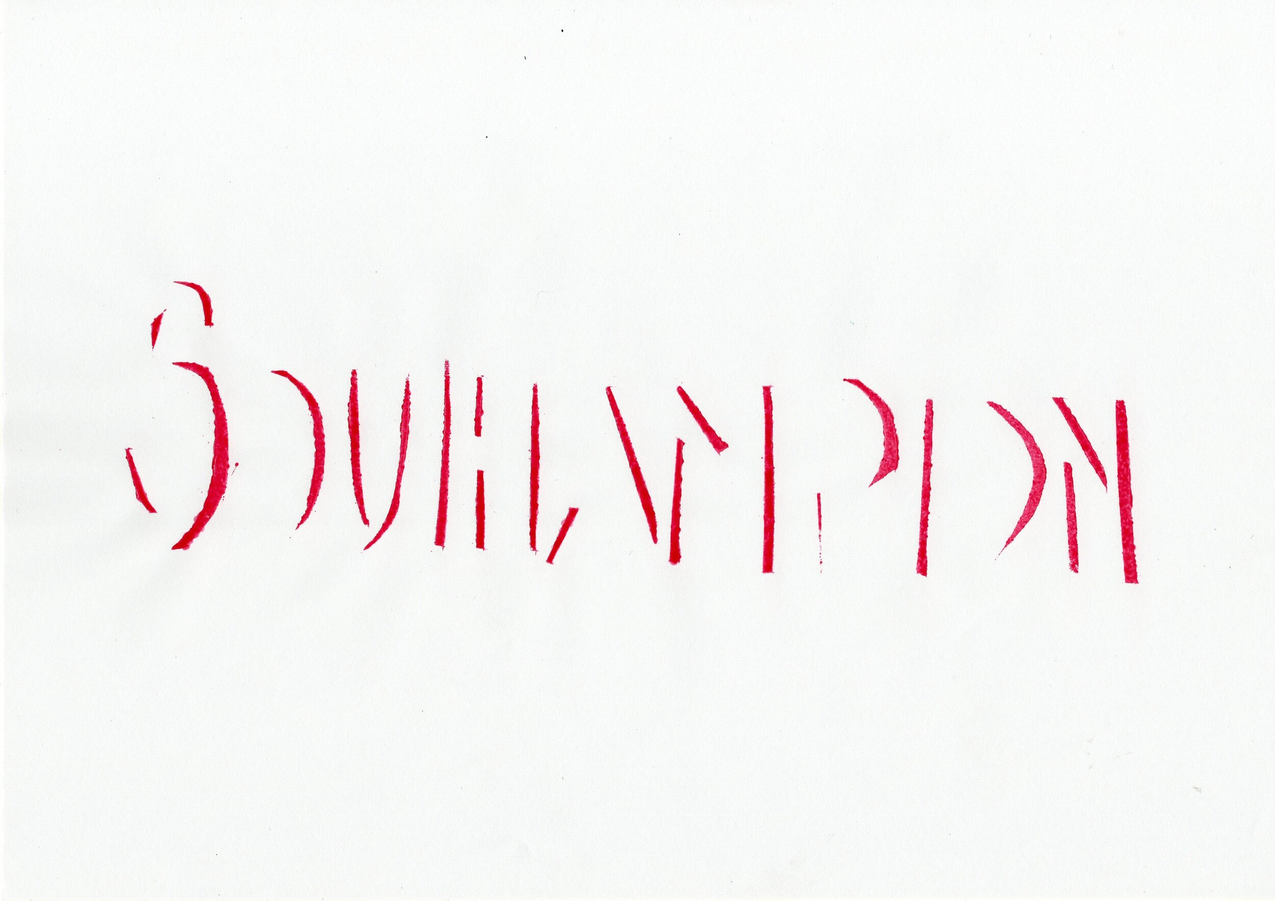
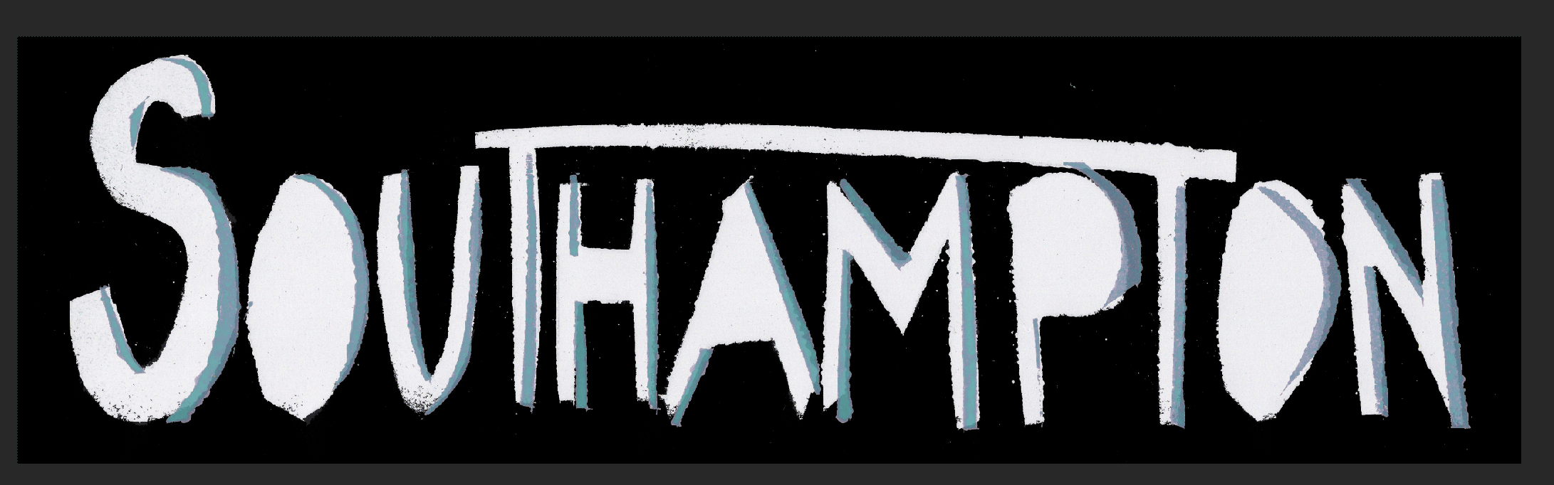
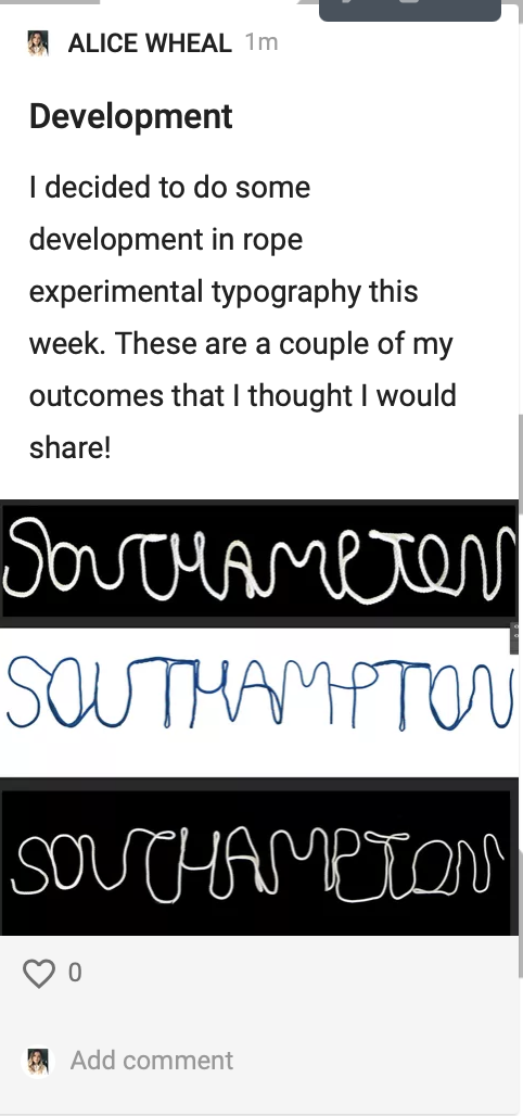
I then tried to use that typeface and write Southampton. Still really liking the half there half not there. I also tried taking away half the letters like in the dyslexia typeface to see if that worked for me.
I then began to research about Southampton and what it stood for:
Southampton the name originated in the middle ages.
First important port when normans arrived 1066
Medieval city walls
Biggest port in UK? / Next to the water
Home to university and arts university
A lot of history still remains
New part of Southampton up and coming
The titanic - the maritime - water history!
River Itchen as Hamwic or Hamtun, names said to have meant 'the home settlement' or 'the settlement on the bend in the river'.
From this I wanted to create something different, possible focusing on water or the port, taking history and modern day into account and hand painted / spray painted with shadow work.
Due to being interesting in the medieval walls, I tried to research some examples of medieval typography.


I ended up doing some doodling if how I might want the typography to be but I felt a bit creatively blocked.
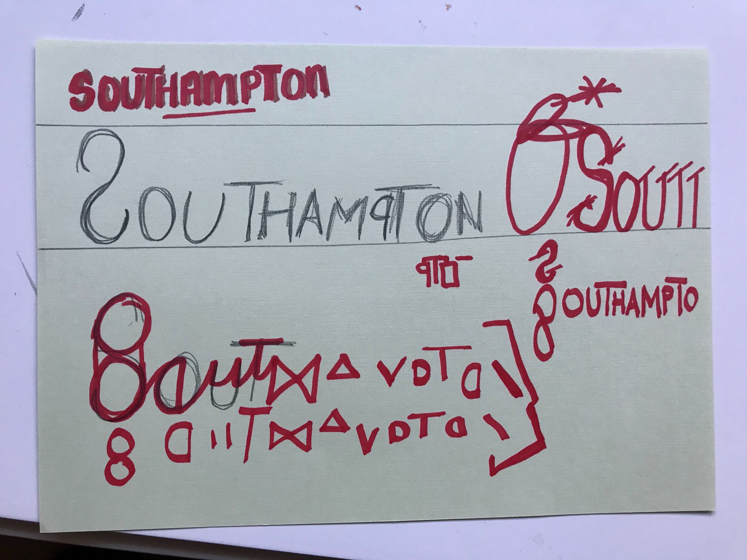
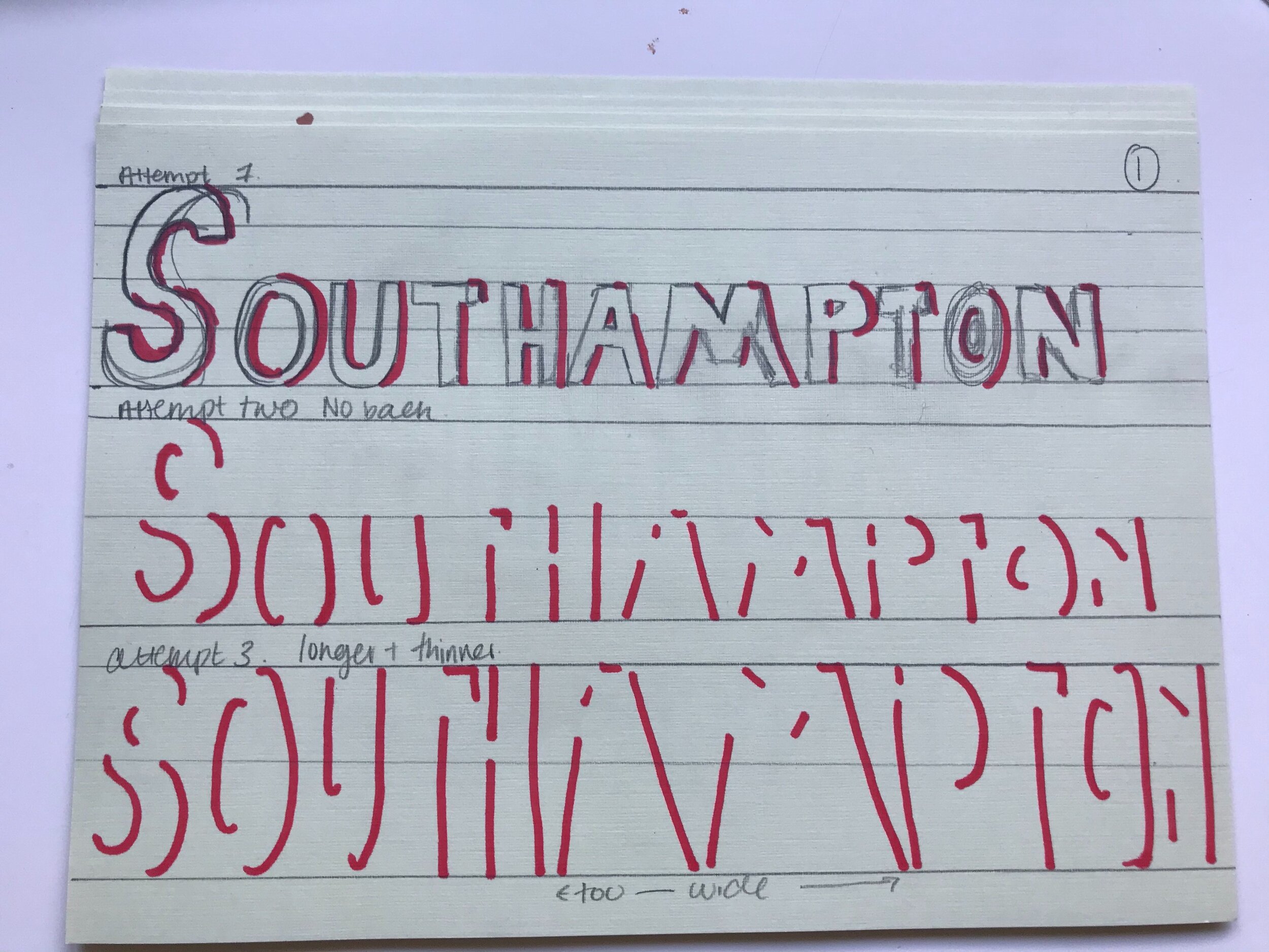
I kind of liked the whole TT joining over the top of Southampton but also still really liked the shadow effect. I tried taking these doodles that I had done and make them into stencils.

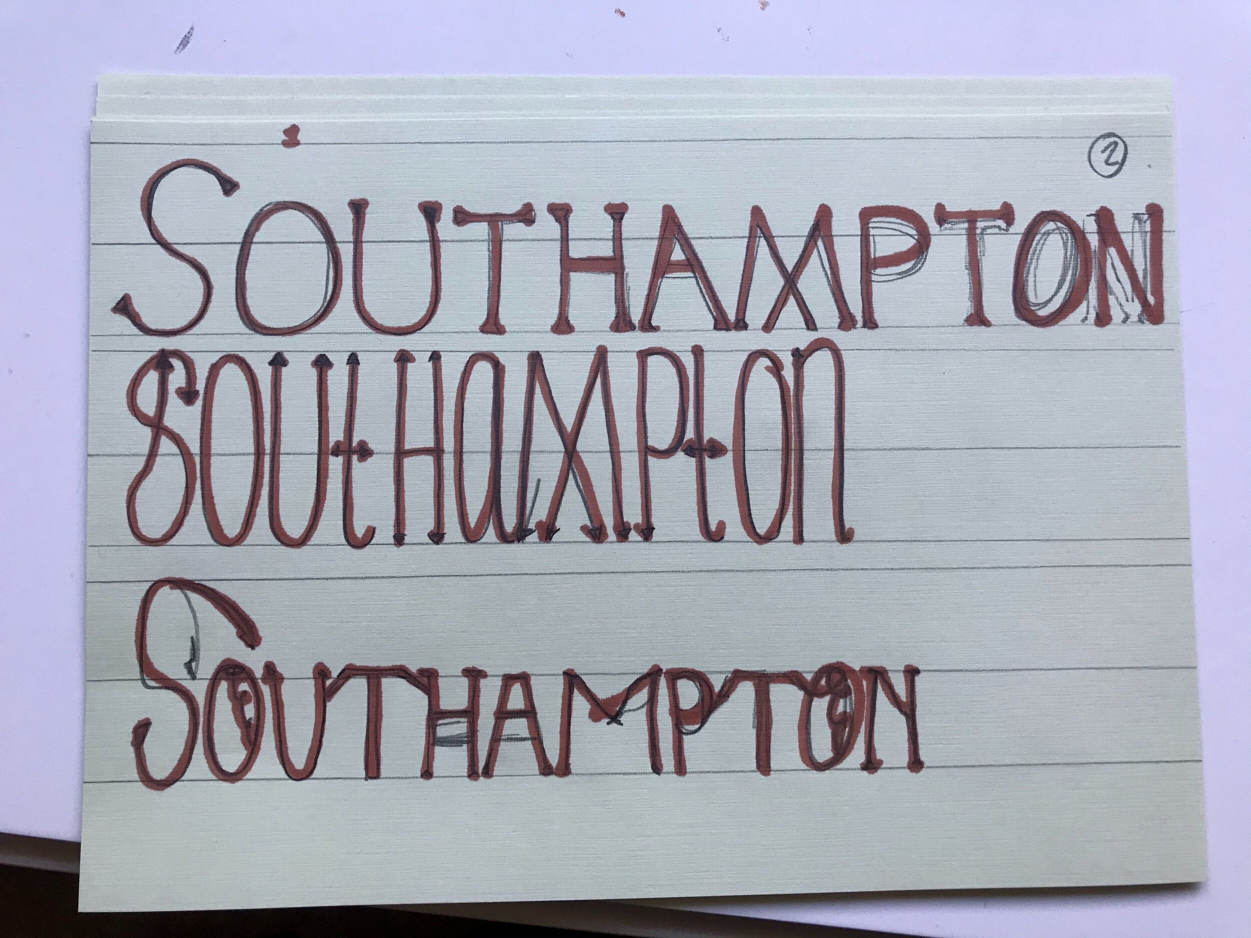
I began by printing of some of my favourite fonts from my doodles. (Yes I now realised I missed spelled one of them, sorry)
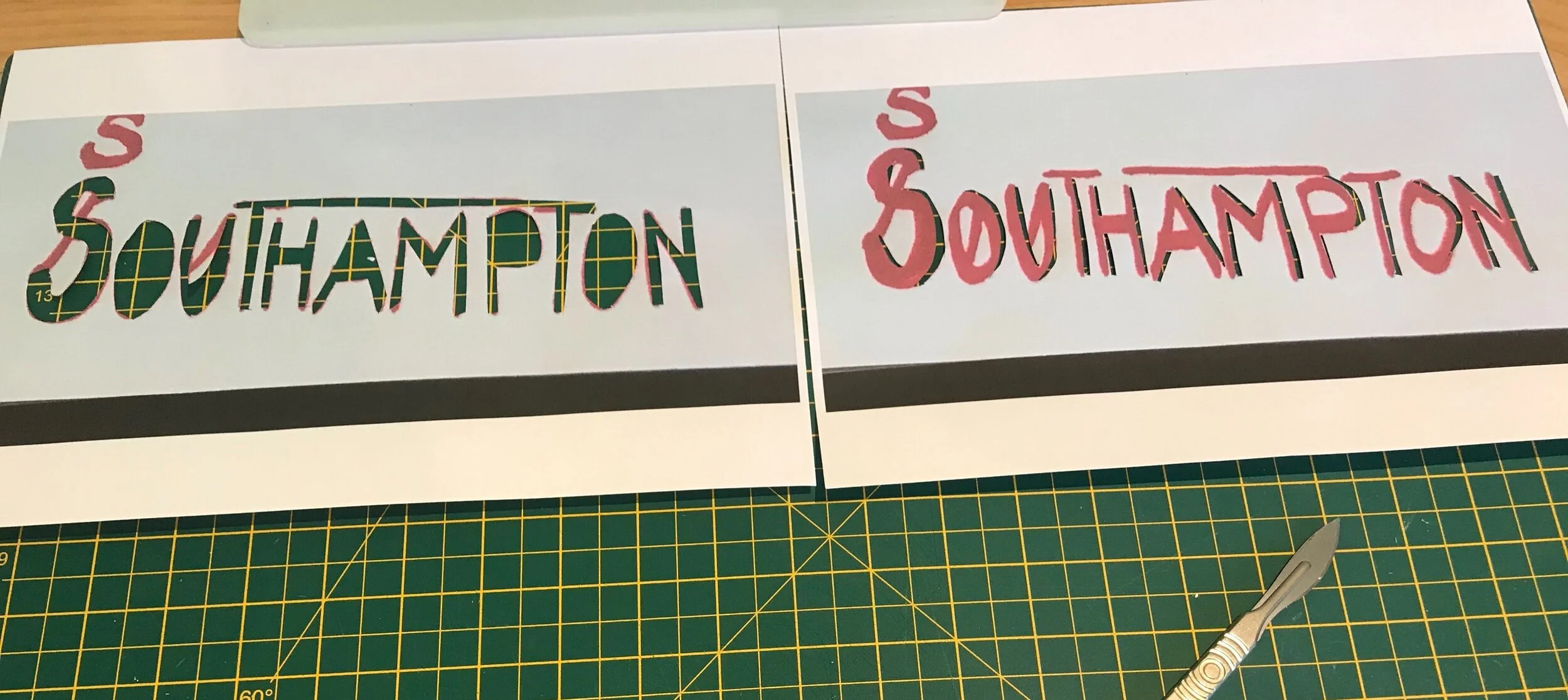
I then cut out on the images the words and also another copy with just like the shadow cut away.

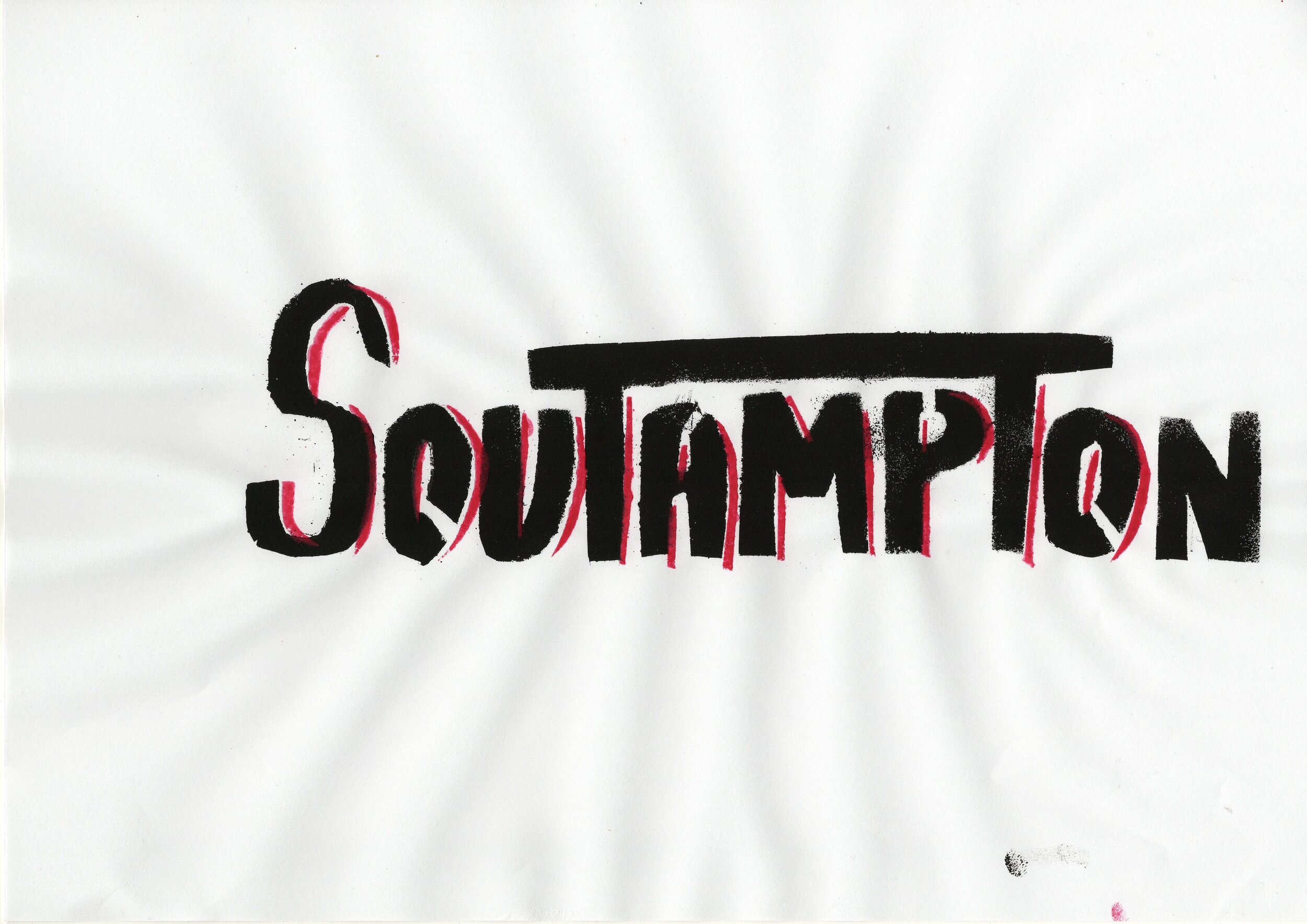
This then became my pencil - I used 2 colours I thought would work well on white paper.

I ended up doing 3 stencils - 2 black full lettering and one red of the outline. One of the black with full lettering I wanted to use to test layering them both together.

I will now scan these in and edit them and explain my favourites.
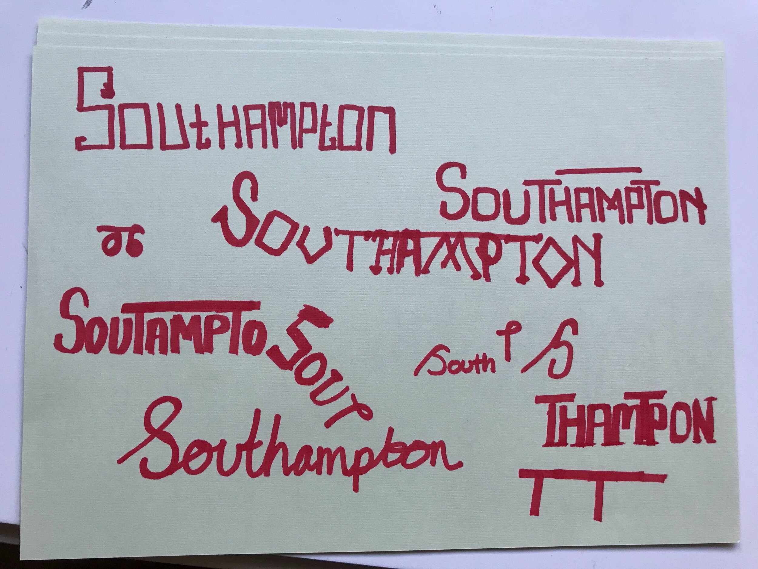
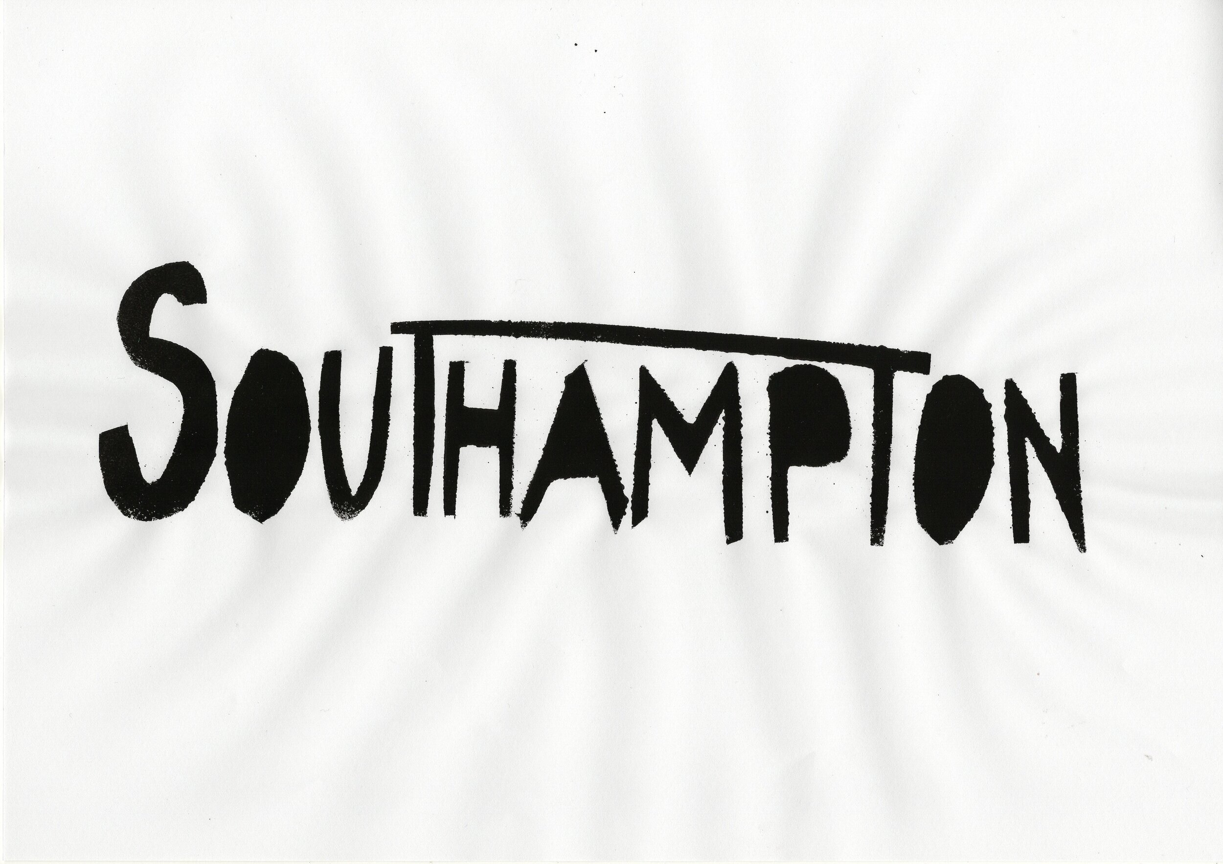
I really like this one especially as it reminds me of the stencilling that was used on the walls that I found last week. Although I want to try correct this on photoshop to make sure it spells correctly.
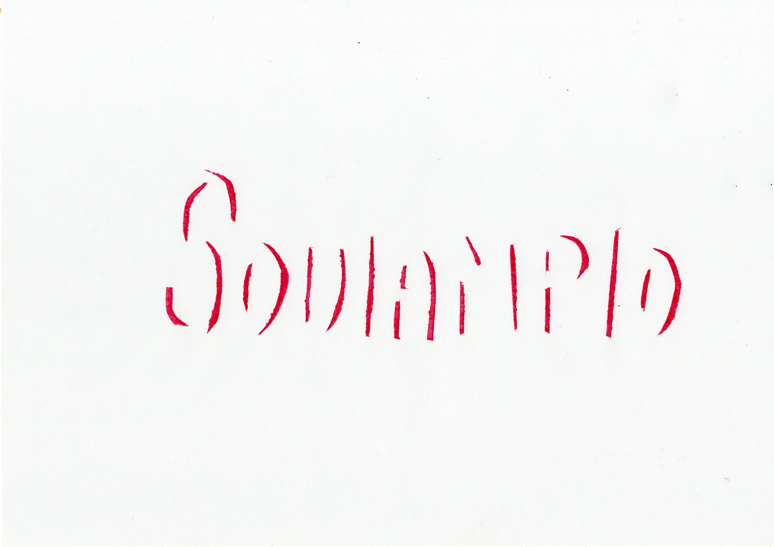
I don’t think this one worked as well for the clearness of the letters and also I didn’t end up liking the bar above the T.
Also wasn’t sure bout the lettering within this one - I did lower case t which then joined the next letter.
I really like this one especially as its not perfect but feels unique with the O blacked out. I like the feel - I think ‘ill try to develop this further.

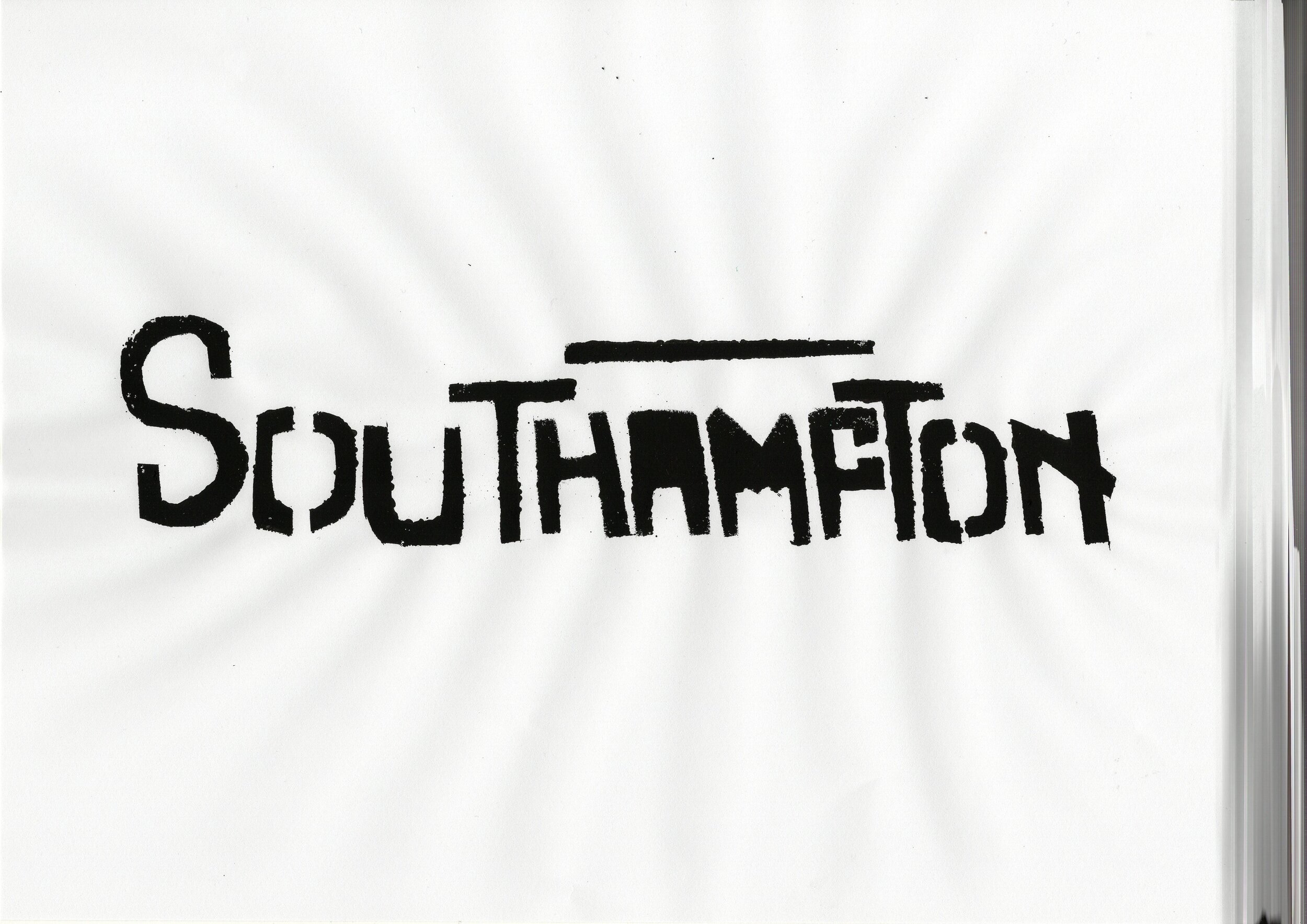
I decided to correct my spelling mistake and add a H in on photoshop.
Here shows the added H. I think that it matches height and with the rest of the lettering.

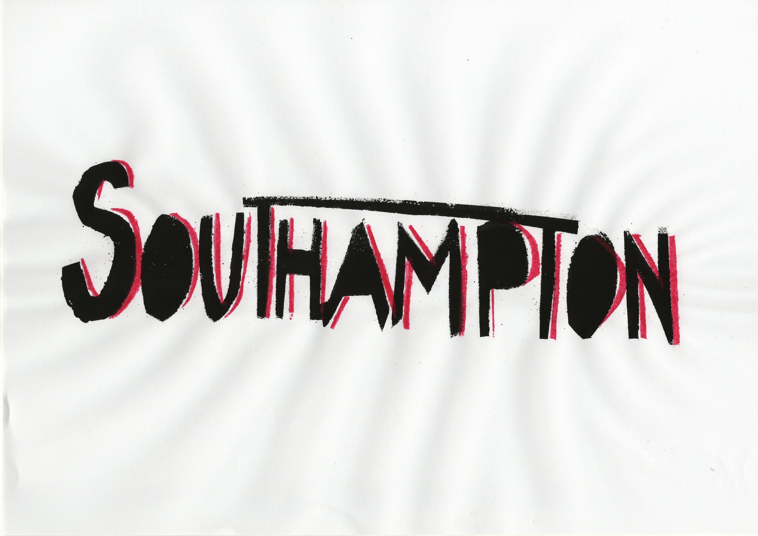
I then tried experimenting with having the colours inverted. I think I was drawn to this due to the original stencil painting no the wall that I found last week.

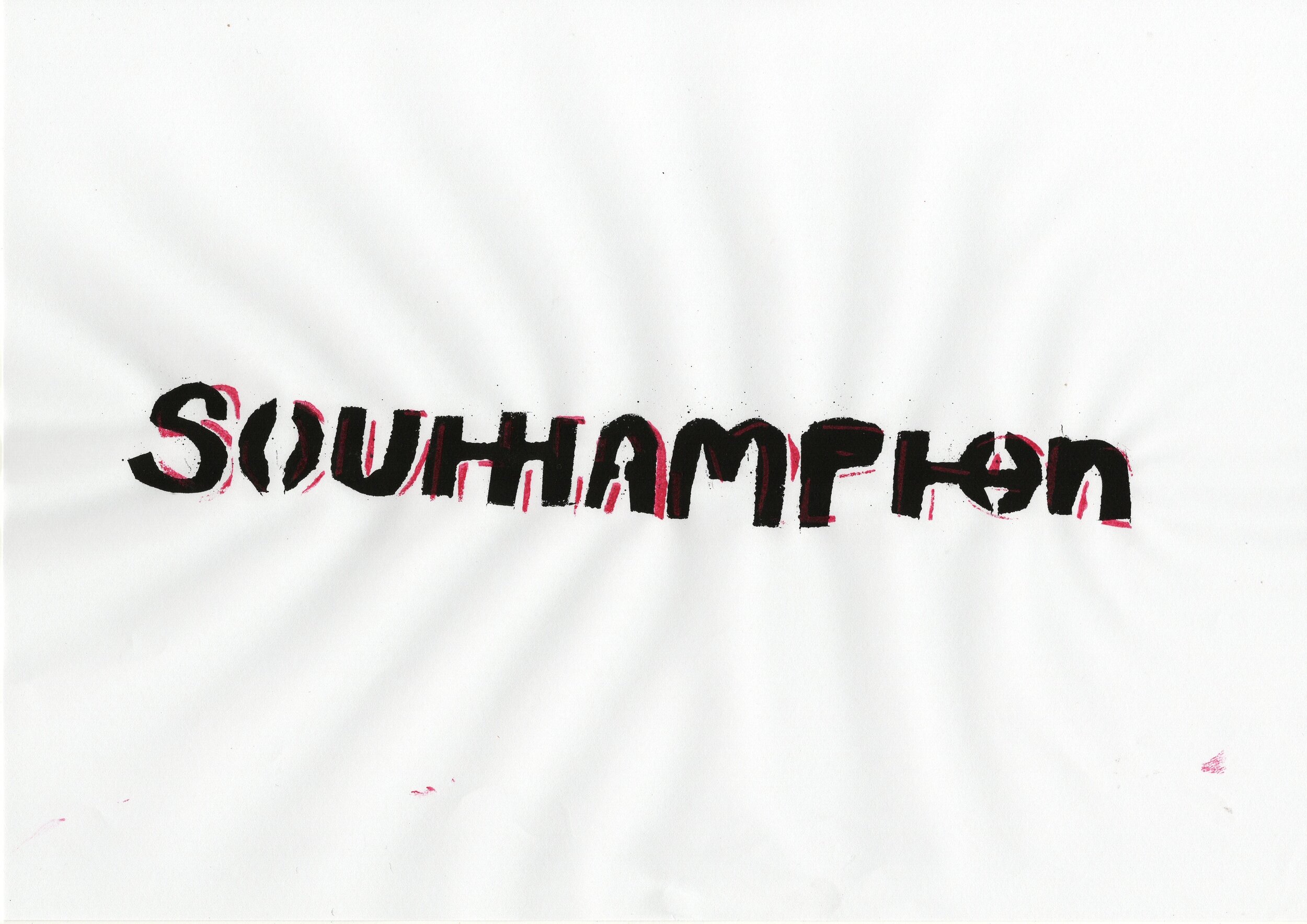
I also experimented on my other favourite - adding the outline and the bold together

I experimented with making the bold lighter


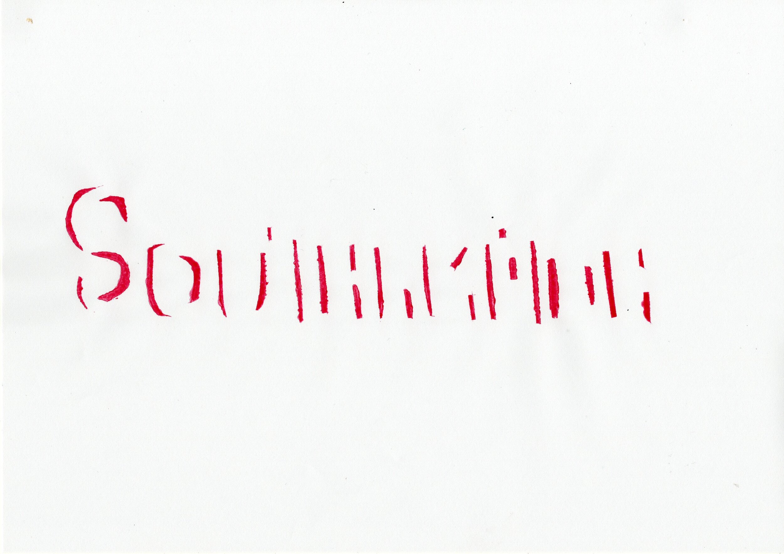
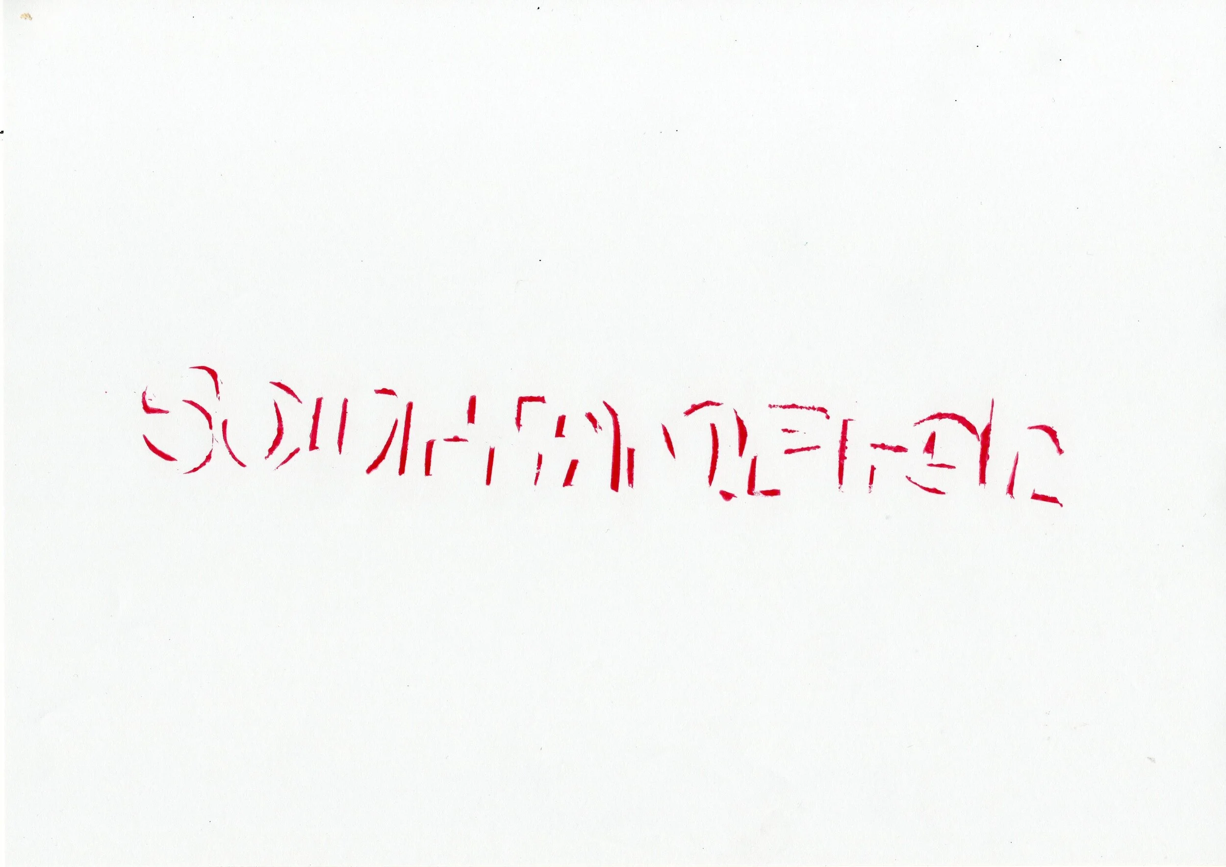
I also experimented with making the red outline to a different colour - blue to represent the sea and coast.
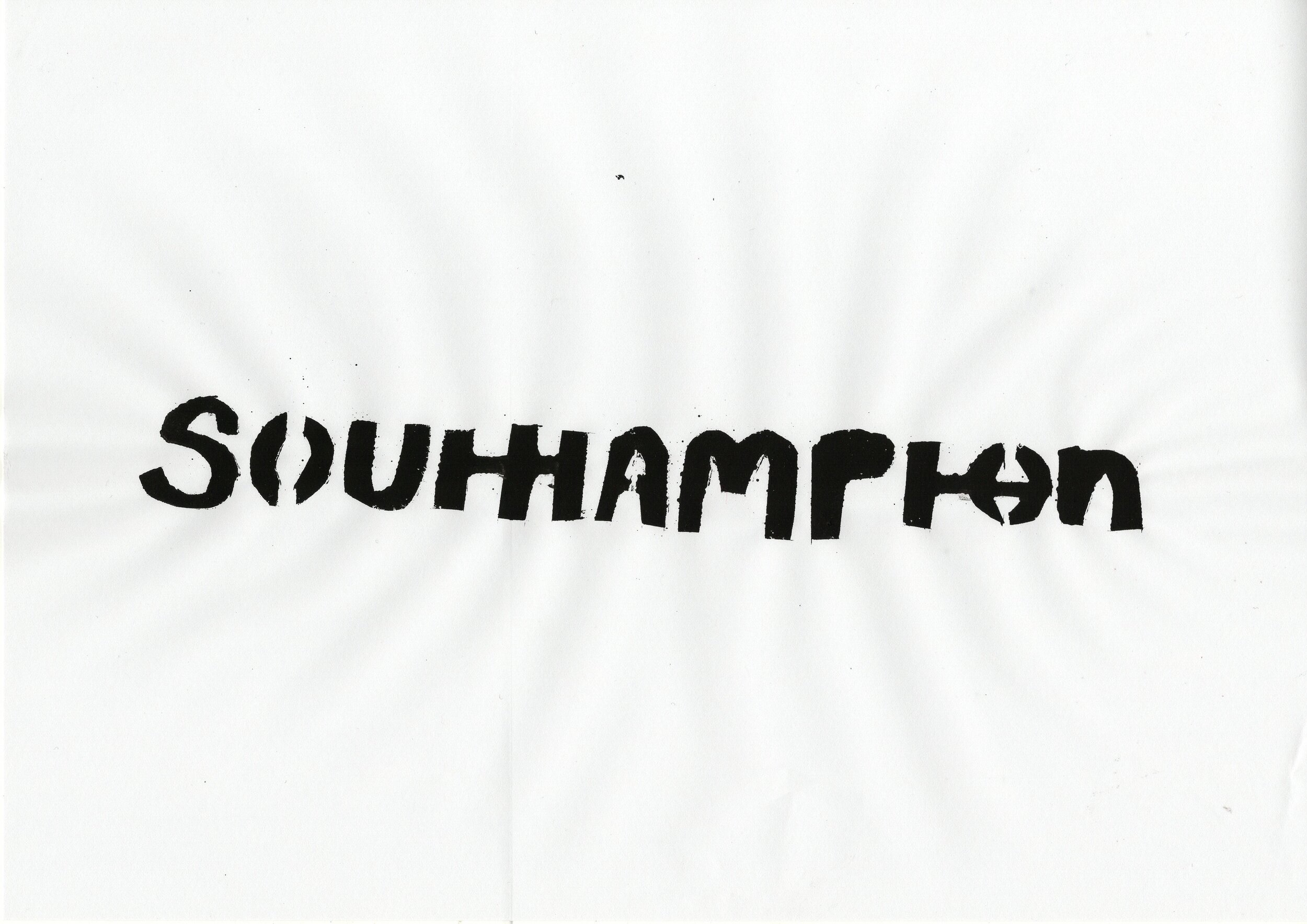
I also tried inverting to see if the white font looks better and I prefer with the white background.

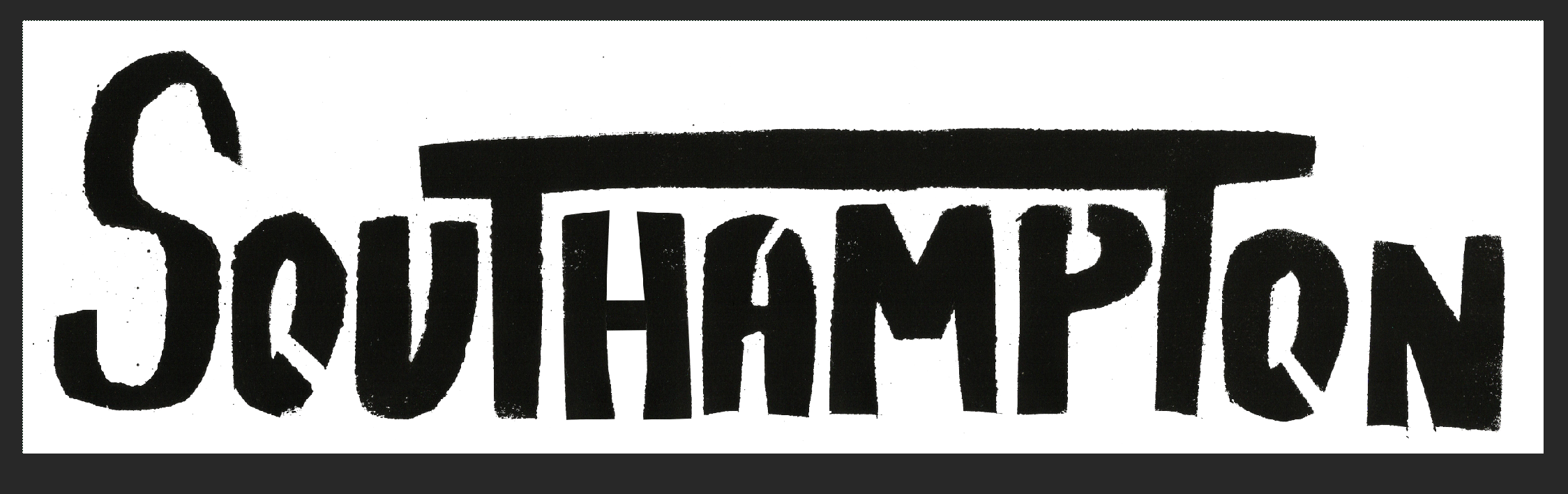
These are the two final outcomes for this week.

I think I Prefer this one purely because it feels hand crafted and really reminds me of a modern take on the stencil that I found.
To try and look at the whole project differently, I tried to think about what Southampton was and its a port and that kind of means sea and sailing - my mum had some old sailing alphabet flags around so I tried to use them.
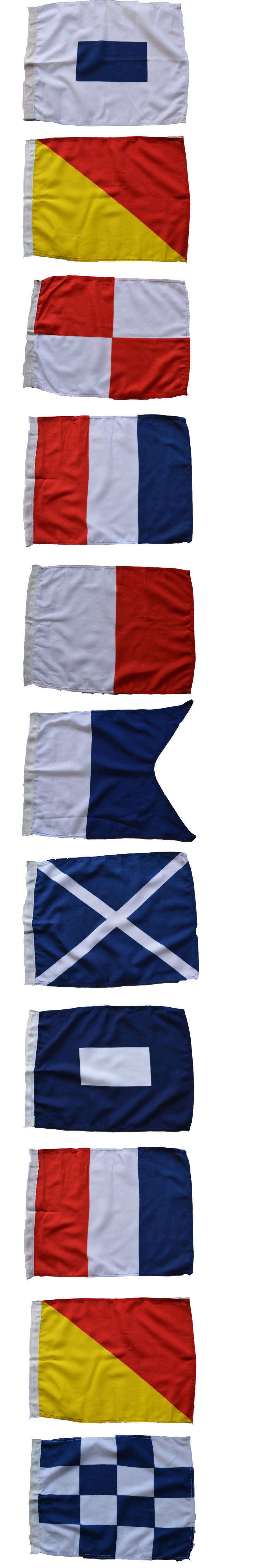
Lining them up on a line to represent how they would look on the mast. I don’t think this many would ever be used but I also think its just an interesting way of portraying typography. Im not sure on this outcome as I would like to have had them up or something so the natural light could shine through.
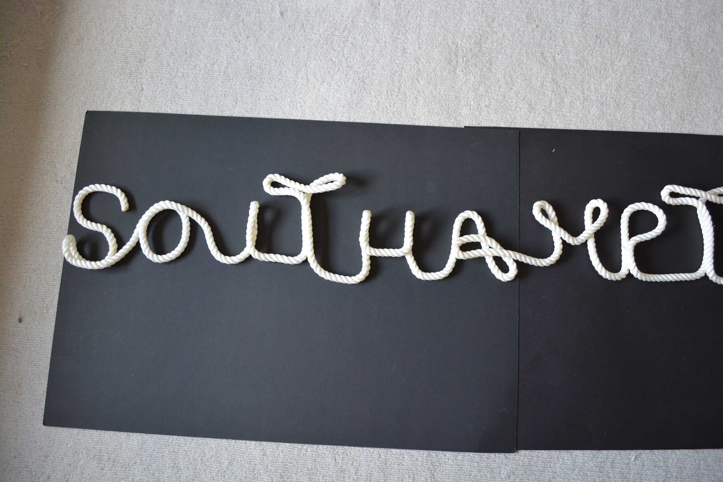
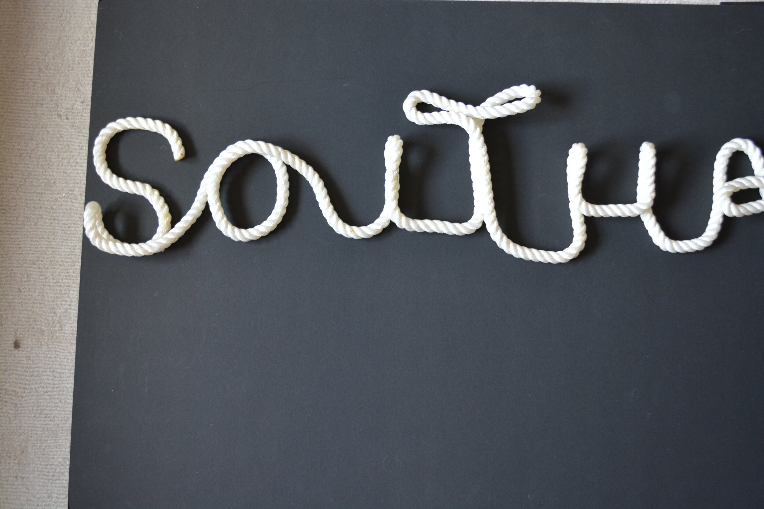
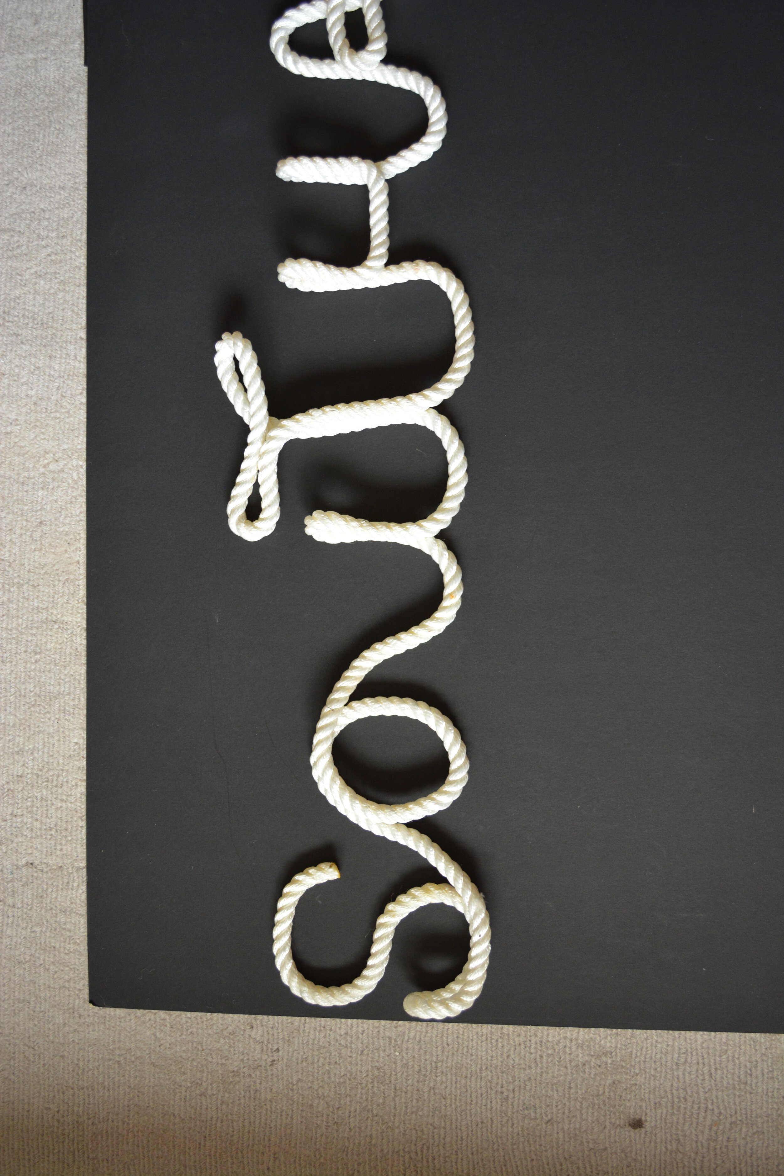
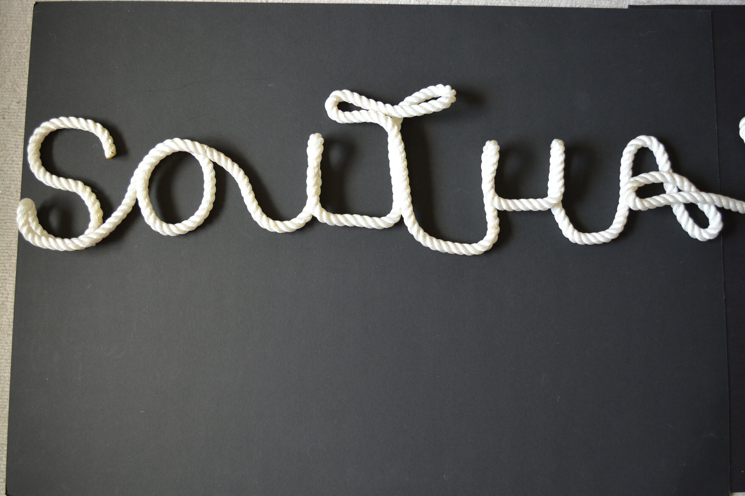
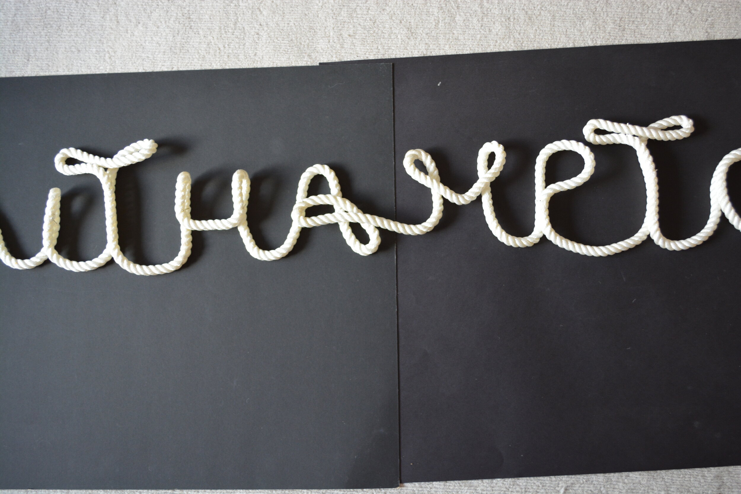
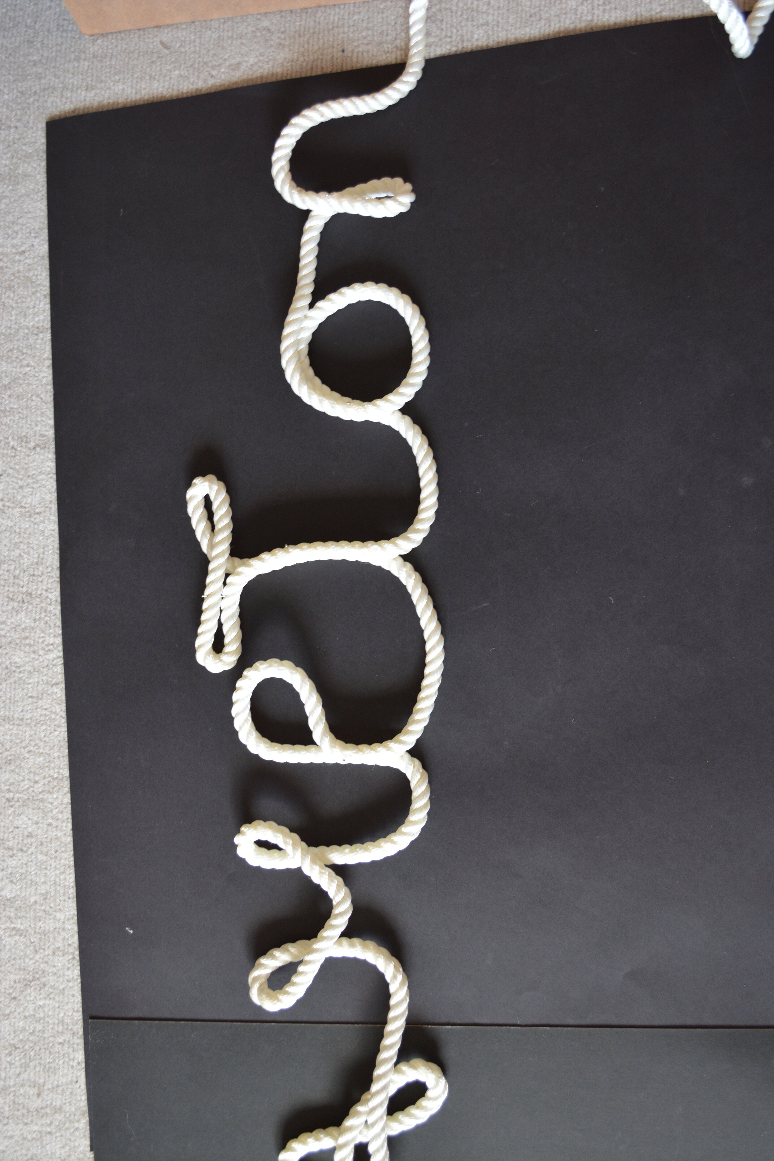
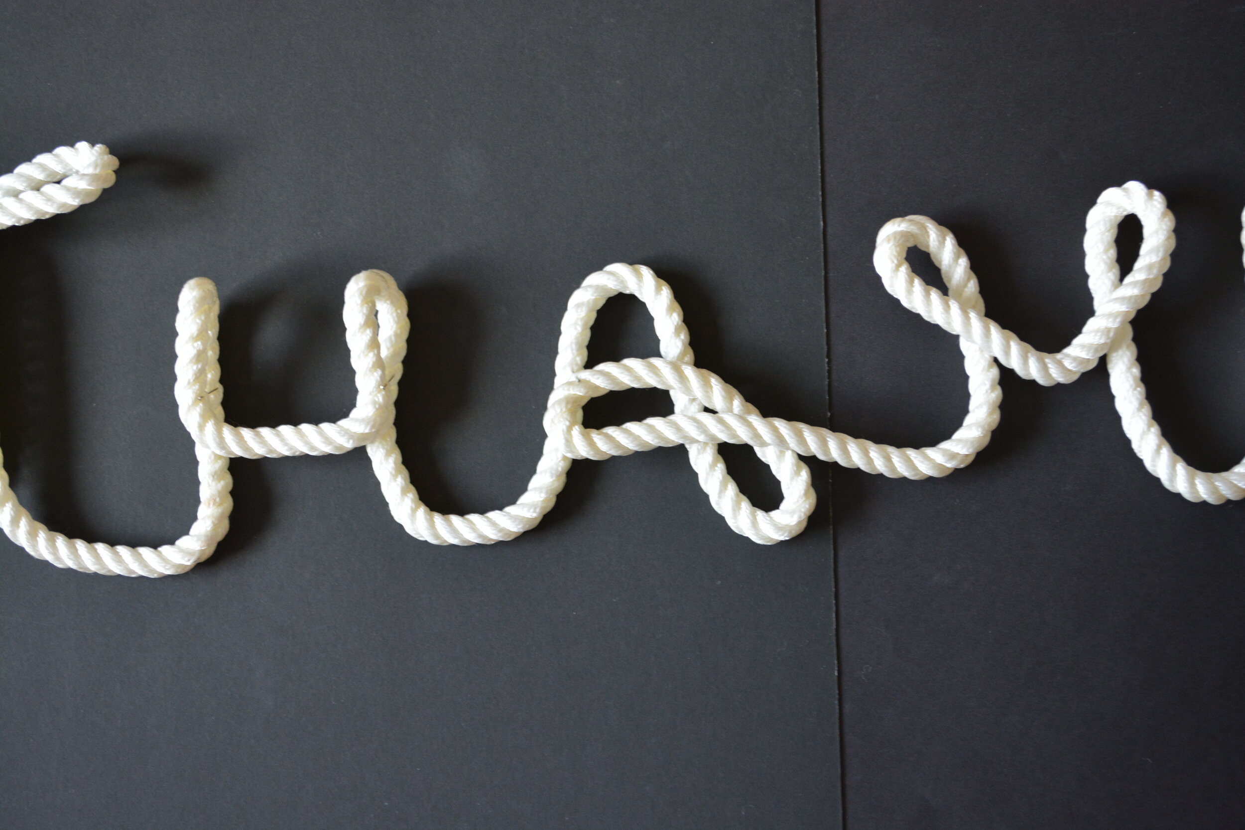
Another thing that relates to ports is ropes that can be used on the boat or at the port - so I tried to physically create Southampton out of rope.
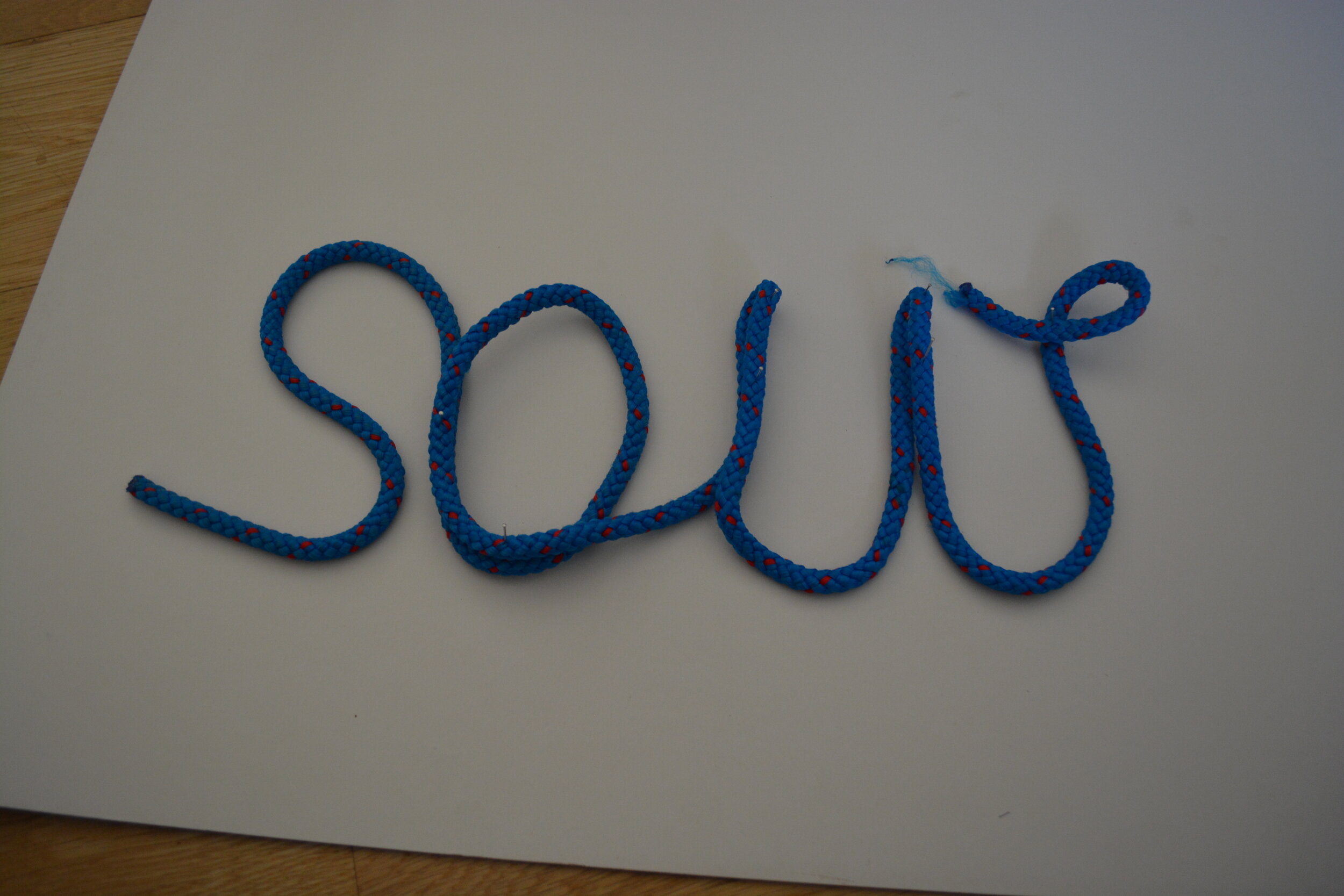
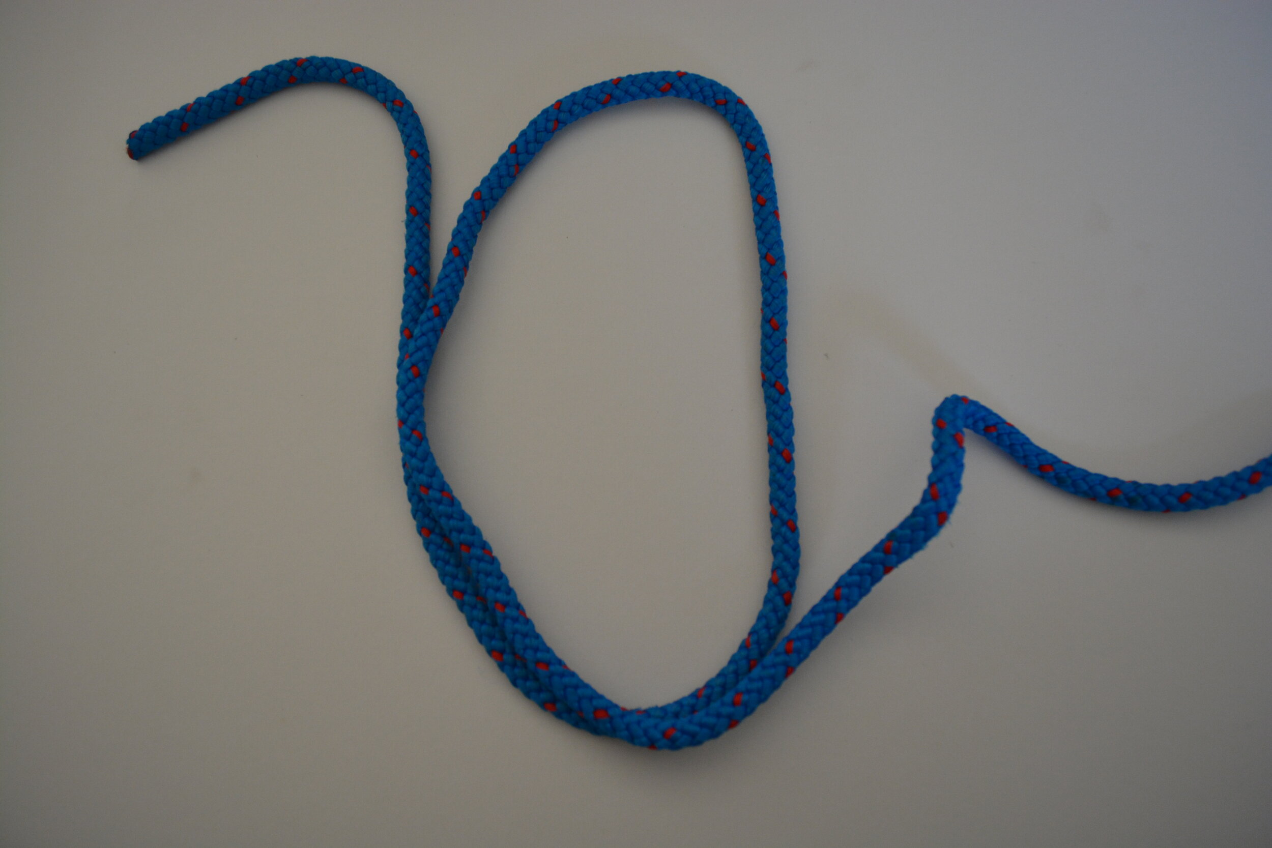
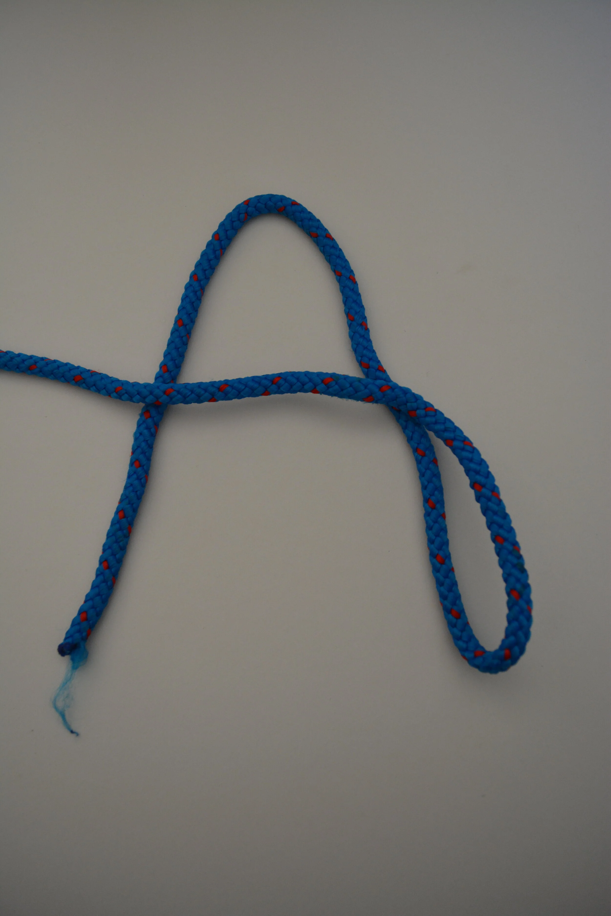
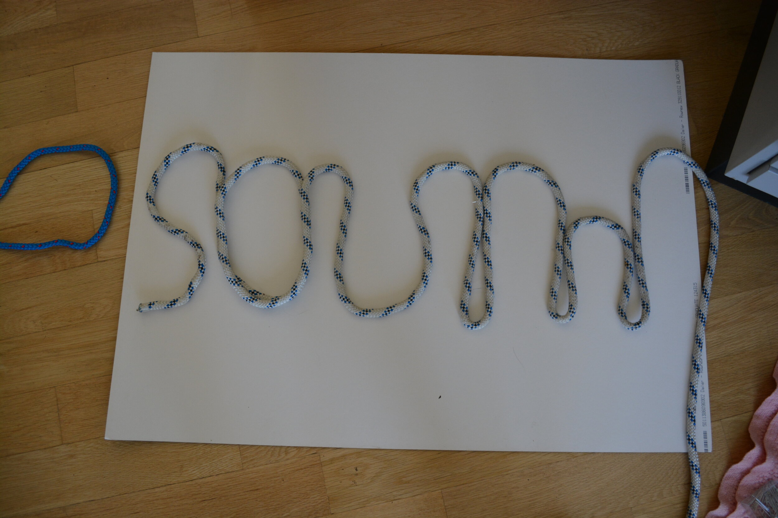
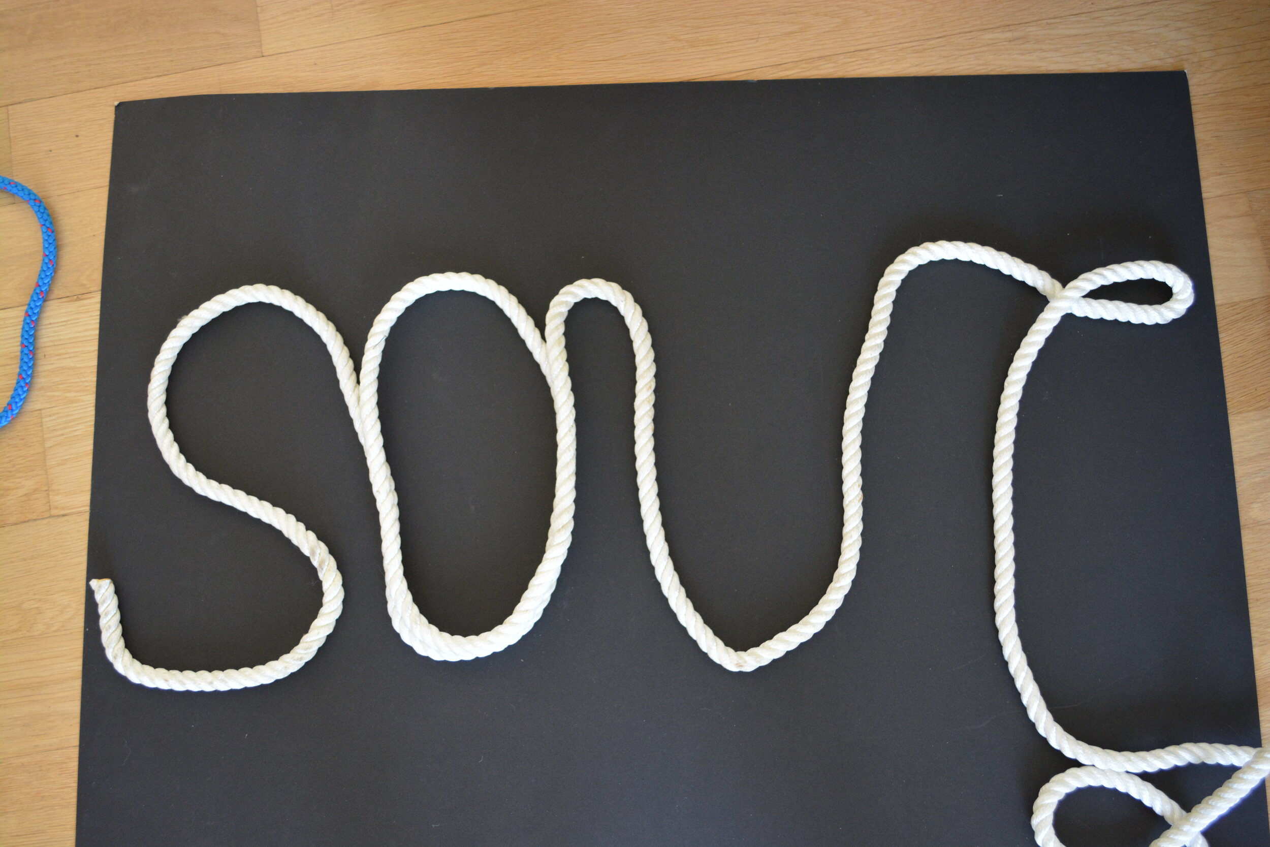
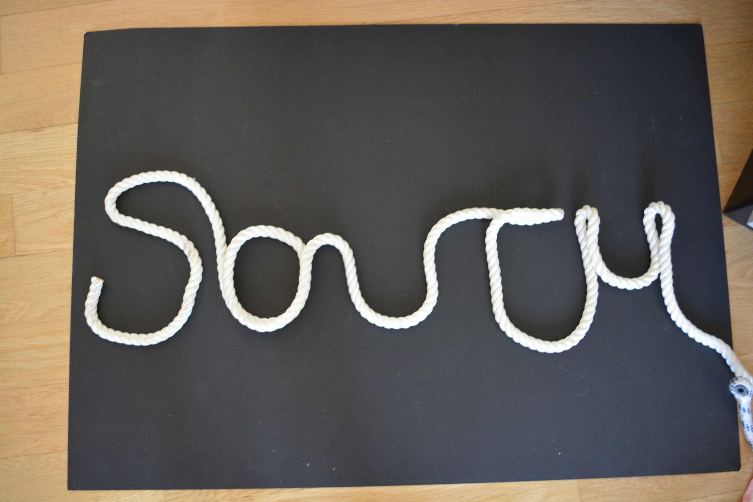

I went onto slot the words together and it created this organic shape wording. This was the first attempt and i’ill test with the other words too.

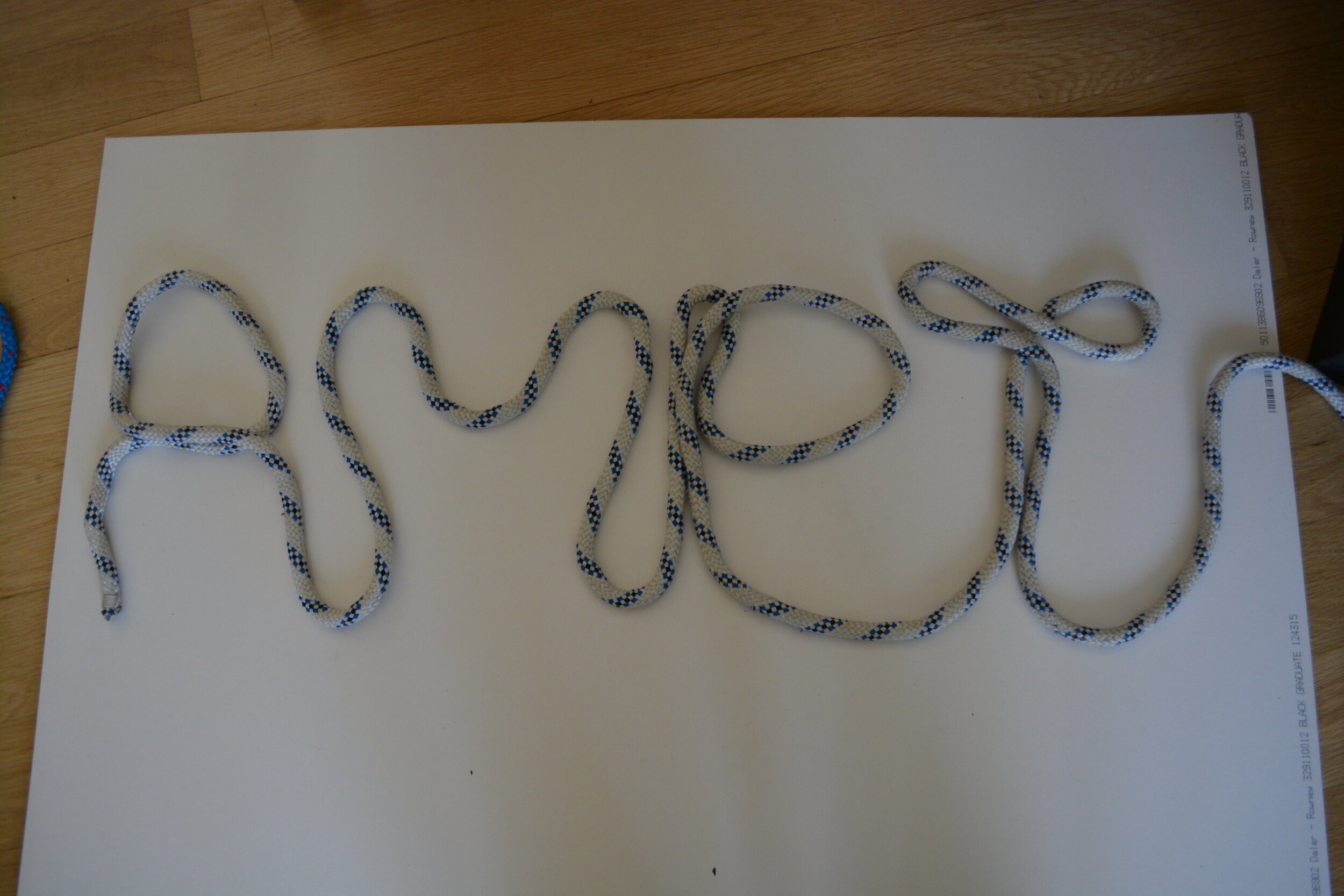
I tried manipulating the wording to see if it made it more clear or less clear. I really like the above version for this rope experiment.


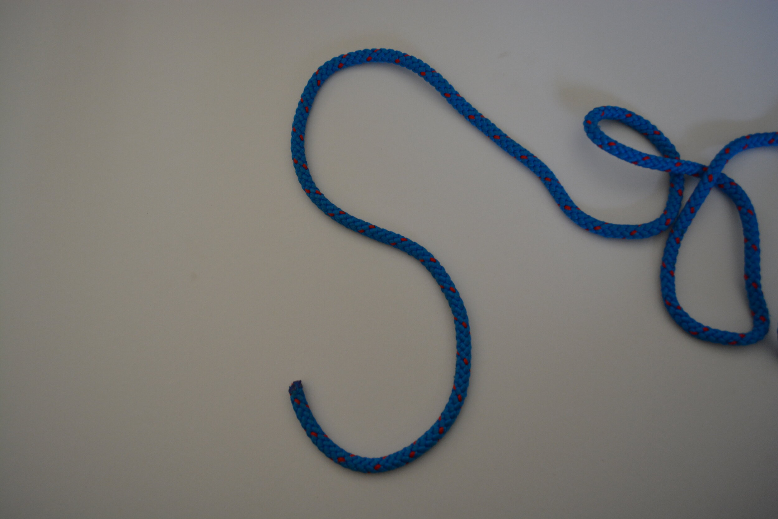
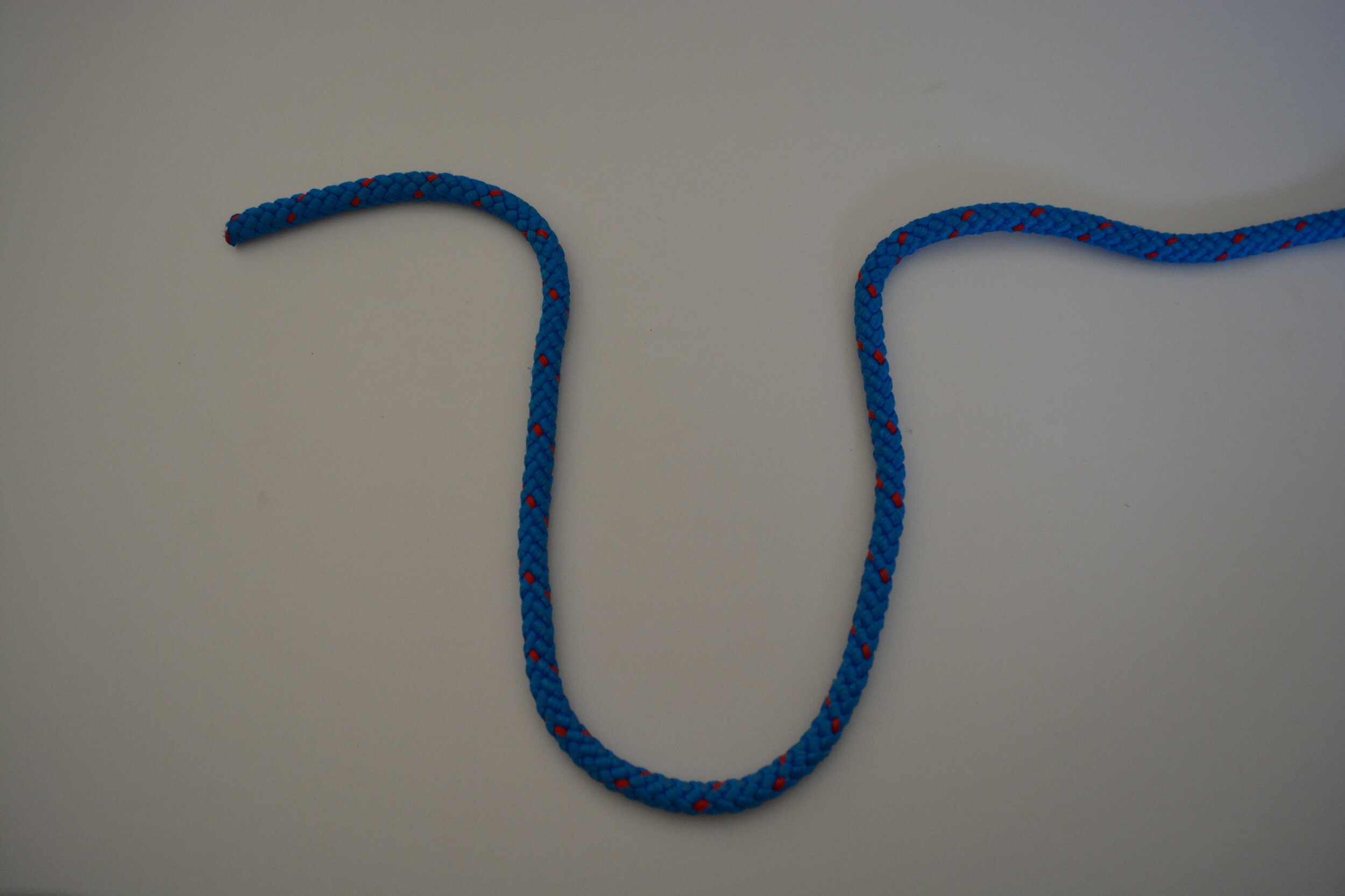
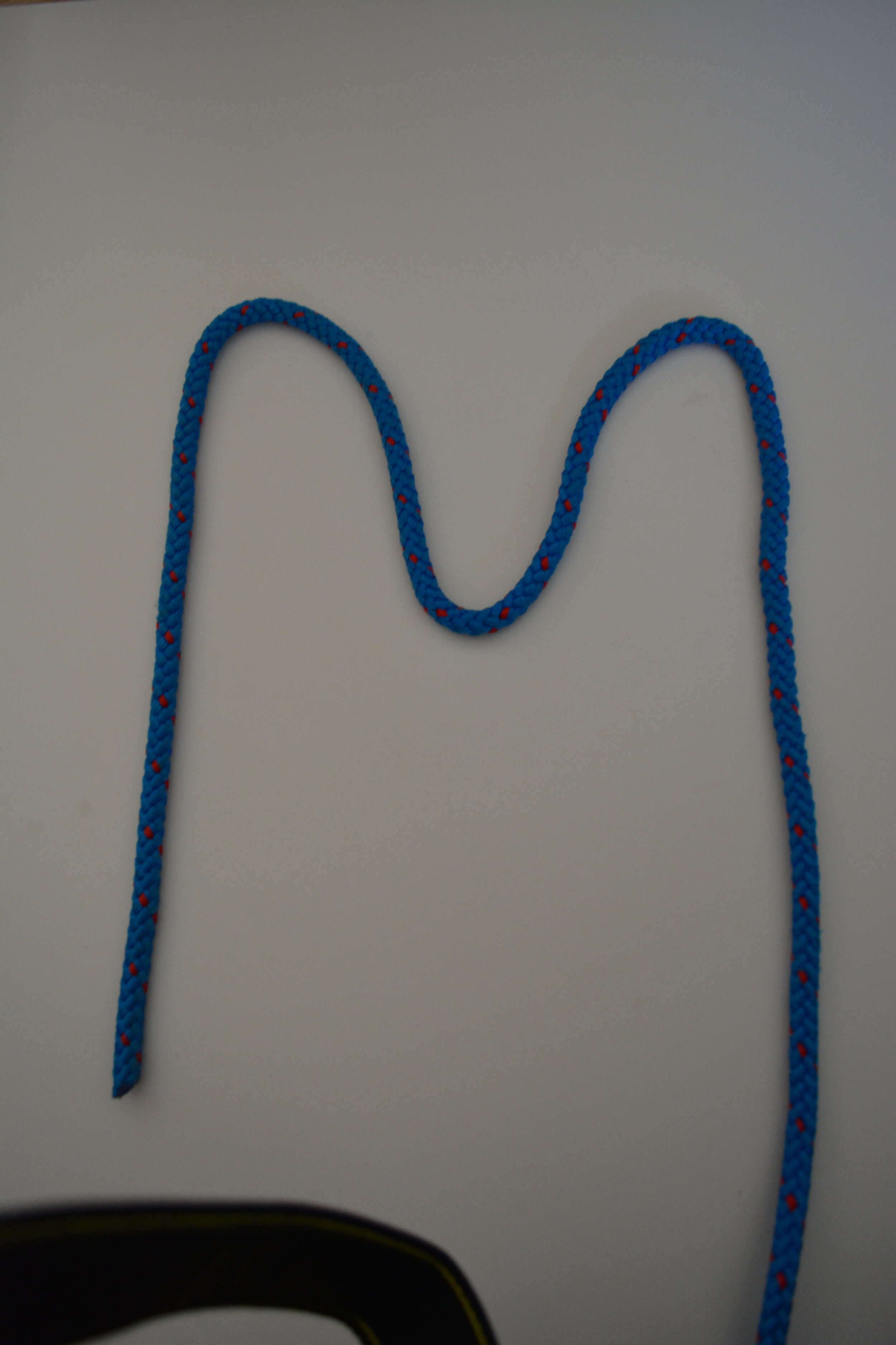
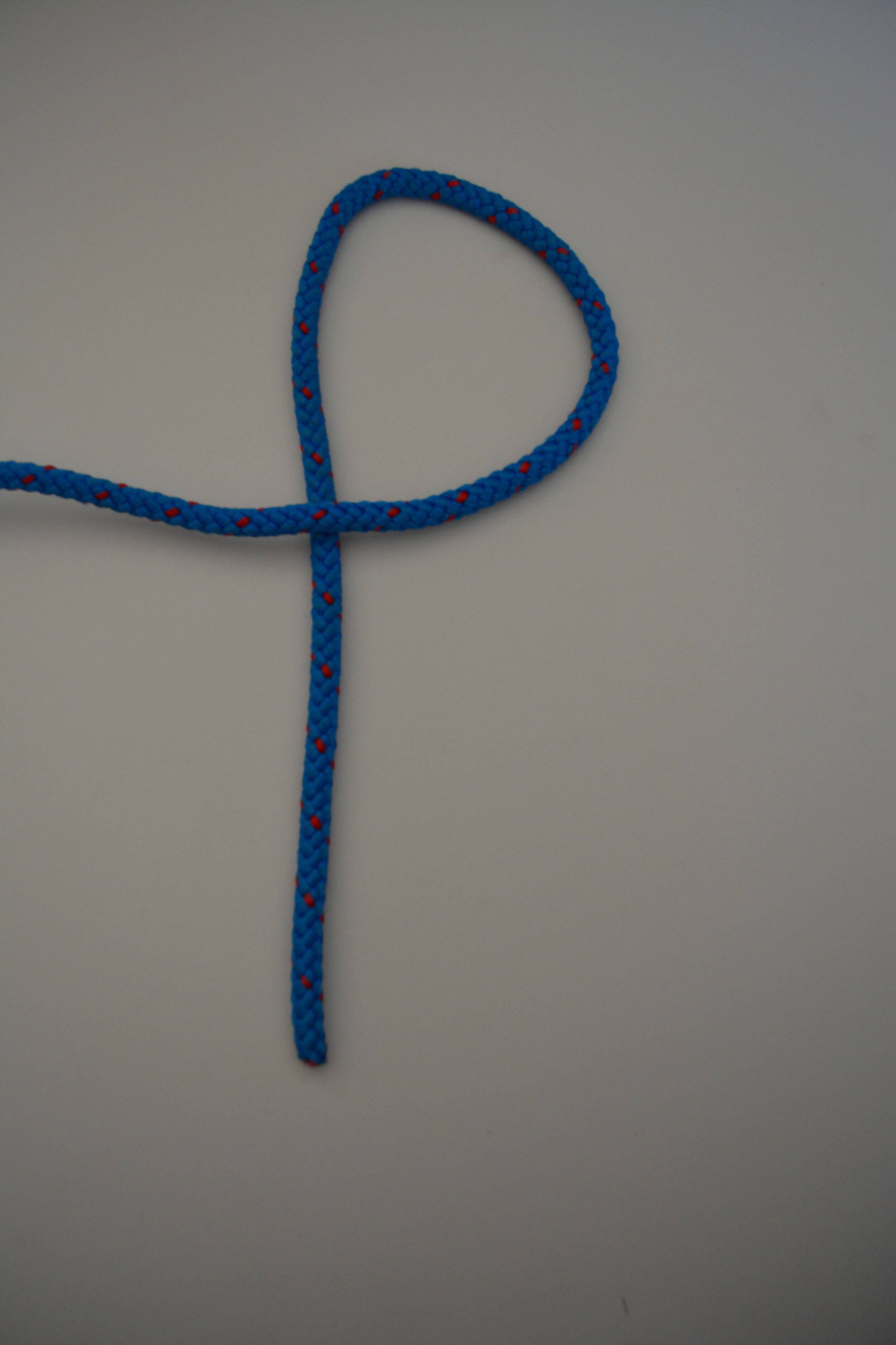
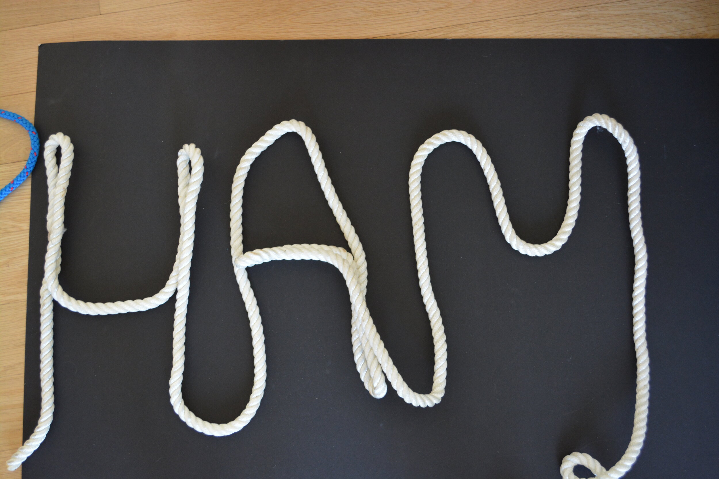
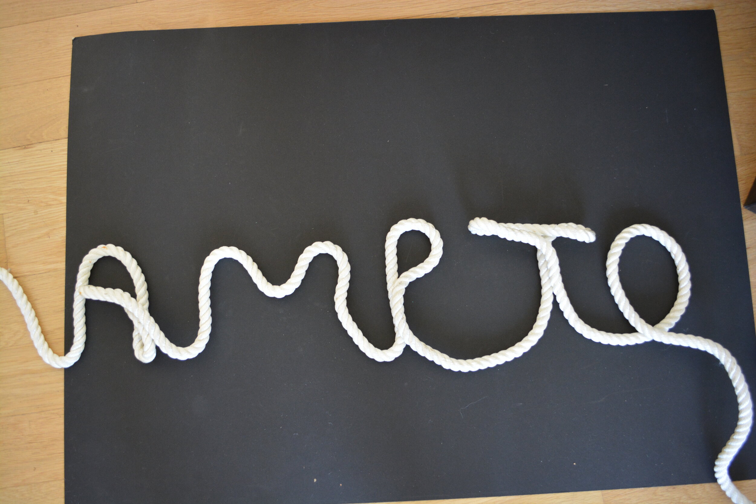
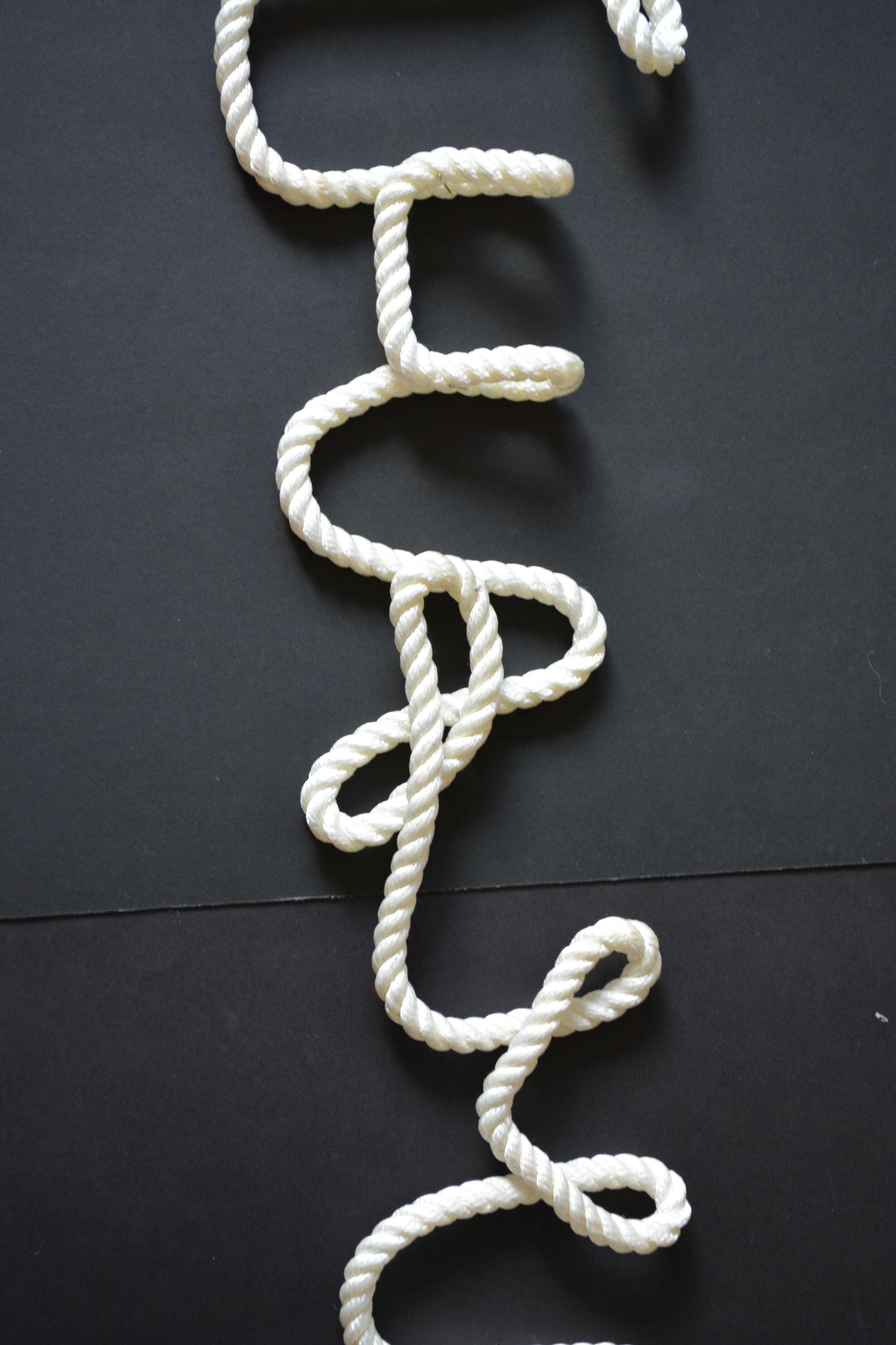
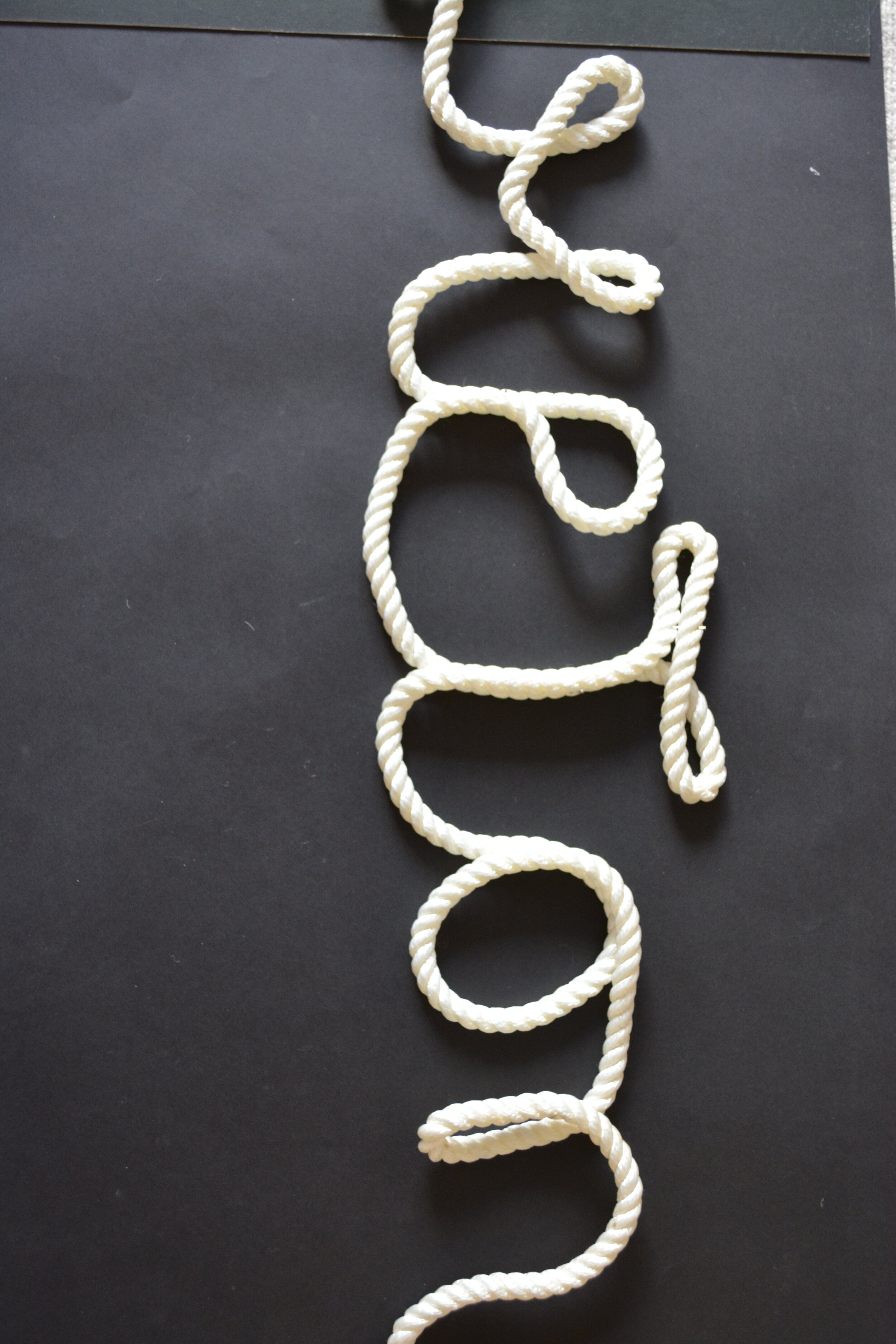
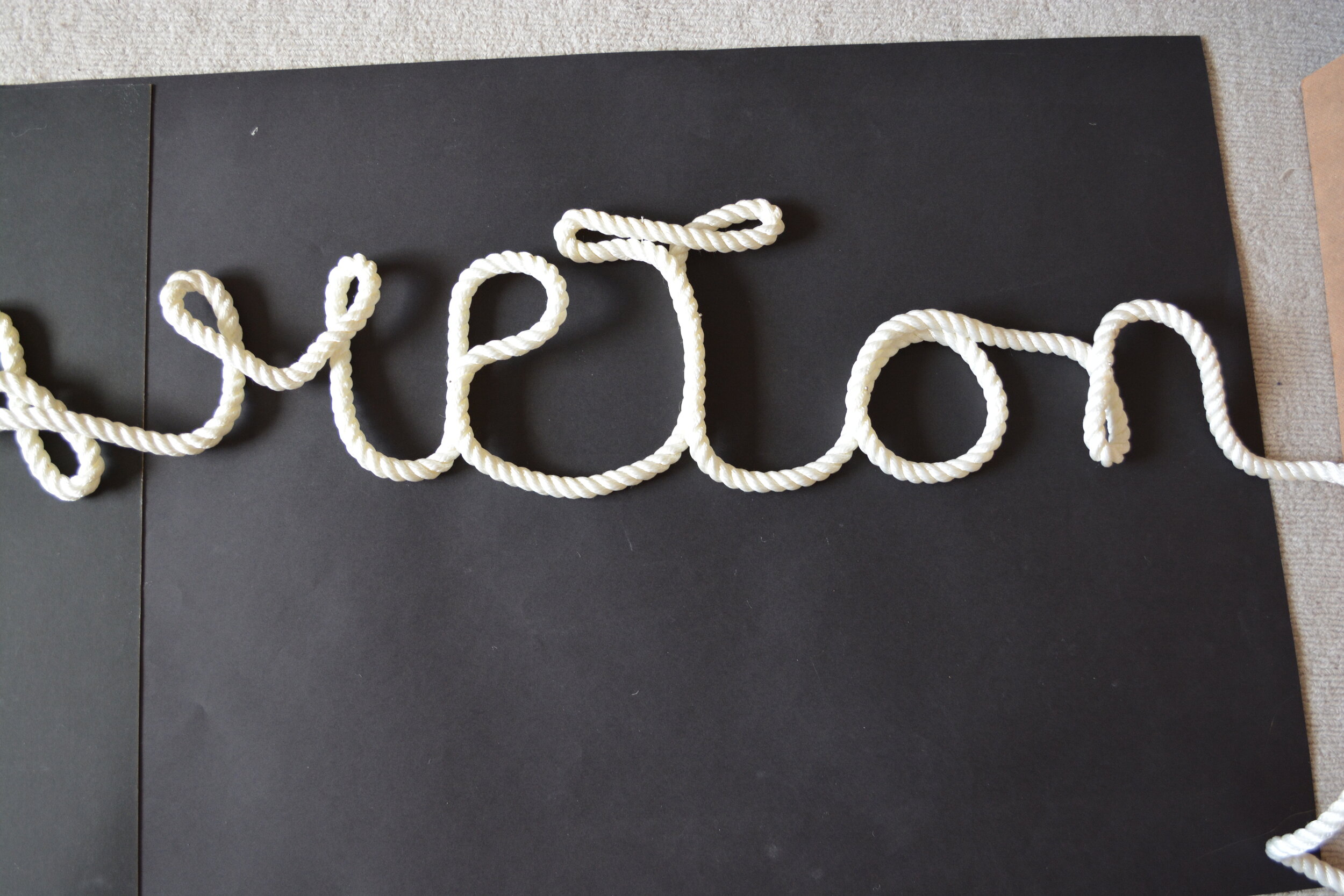
I Tried the rope with a slightly thinner - this was also individual letters that were put together. I prefer this normal version to the others.


I then wrote really big letters and then photoshopped them in chunks - im not sure on the first T within this word but I actually quite like this.


I’m not very happy with the T in any of them, so I will try to redo this and improve and then if that is unsuccessful or im still not sure on the outcome - I will try to do digital version.

I don’t think this is very clear but I also had this vision to kinda of have this up and down wave type thing to look like it was on waves but it can’t be seen within this.
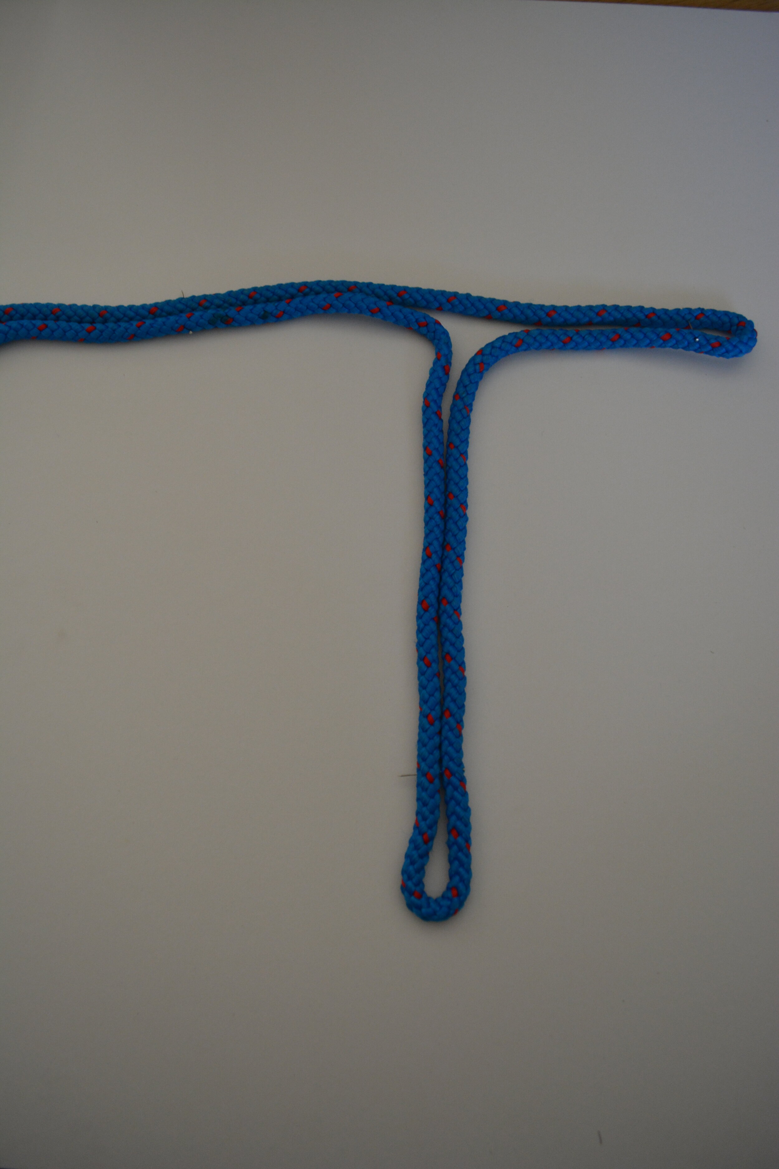
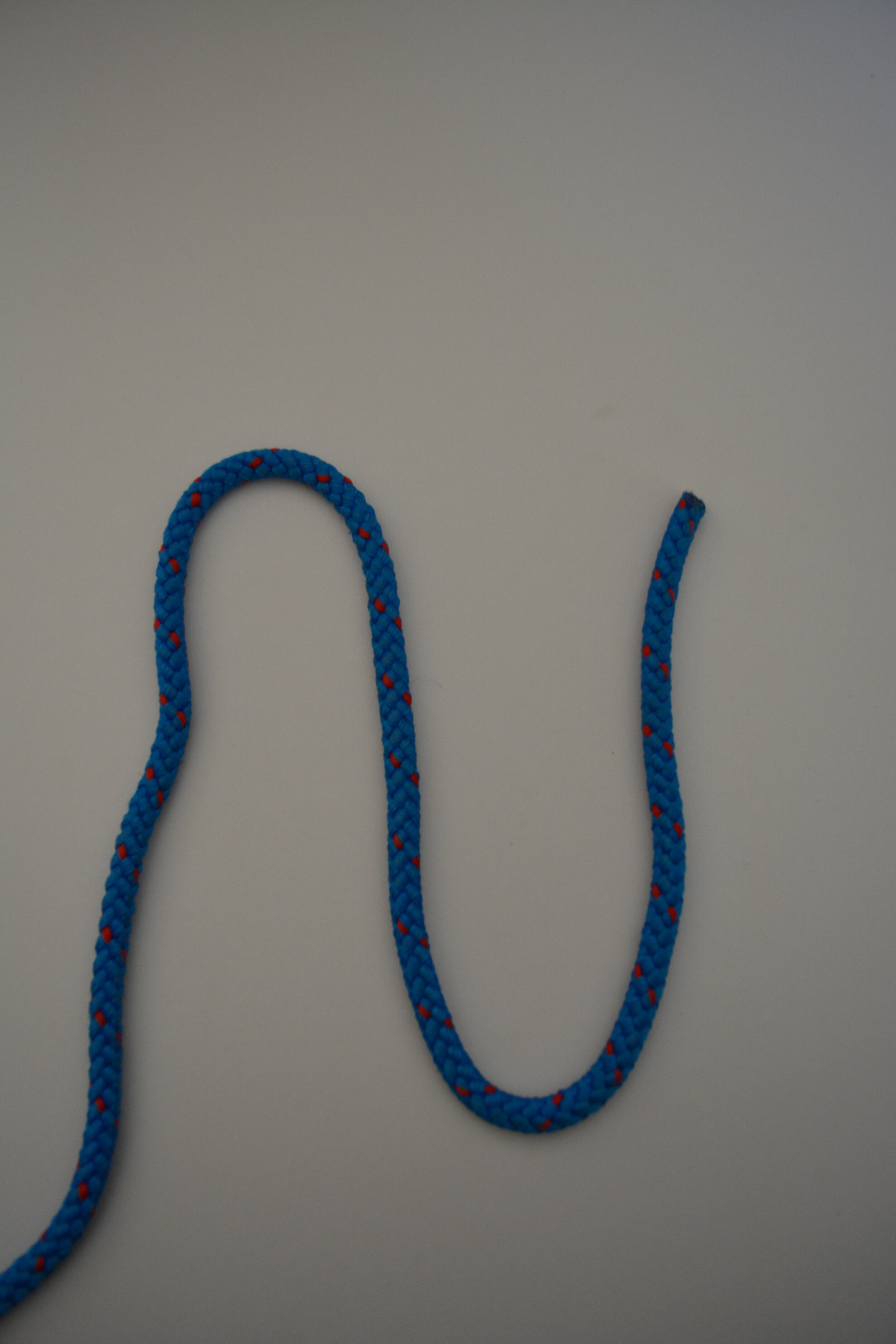
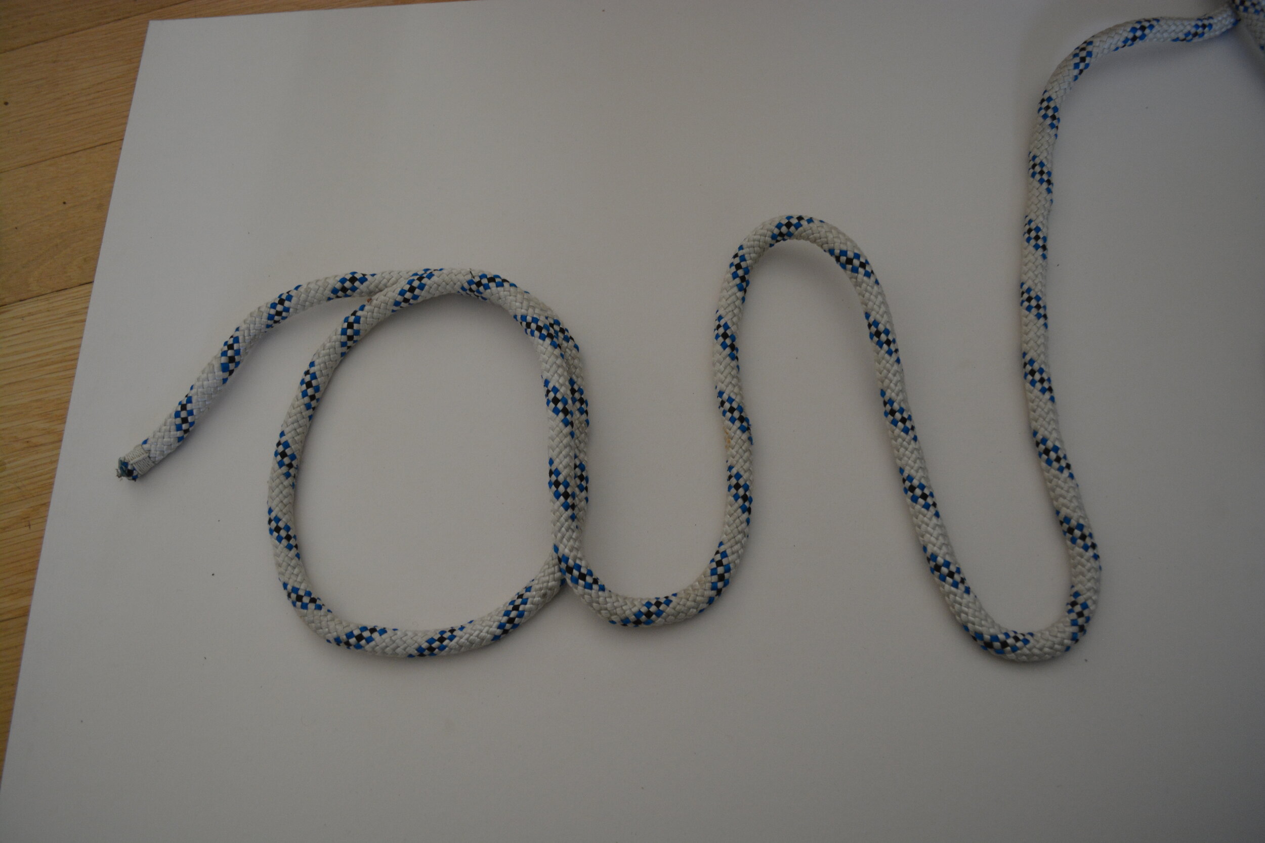
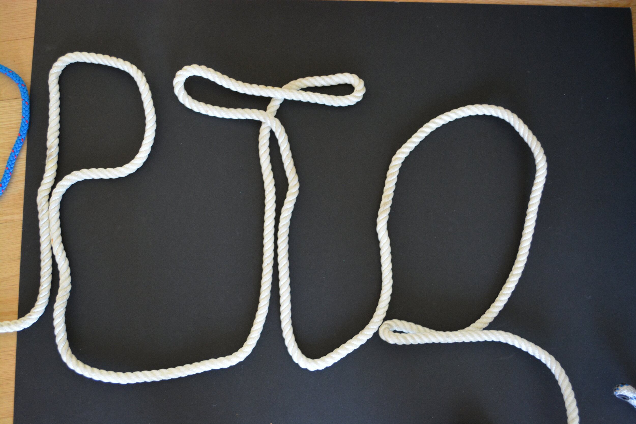
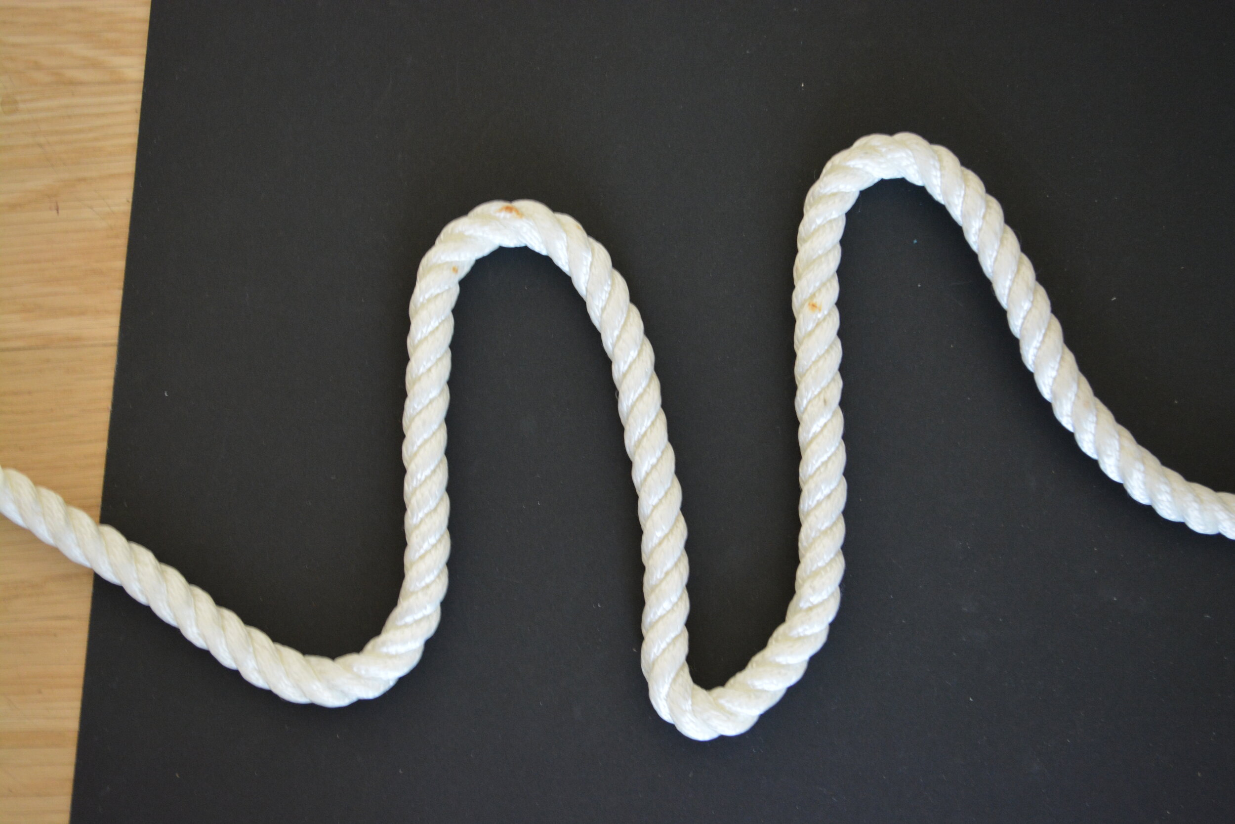
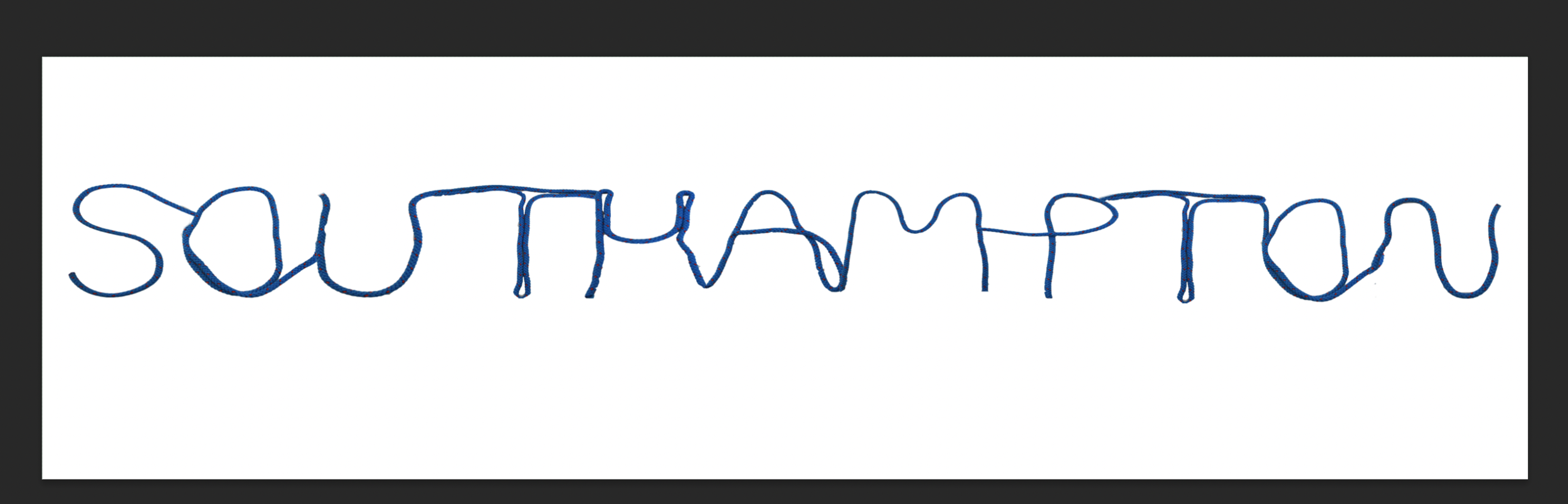
I tried different ways of writing out the rope and instead of doing it in sections I decided to write the whole word. At the beginning I couldn’t get the T or the O / A and M right but then towards the end I measured them all.
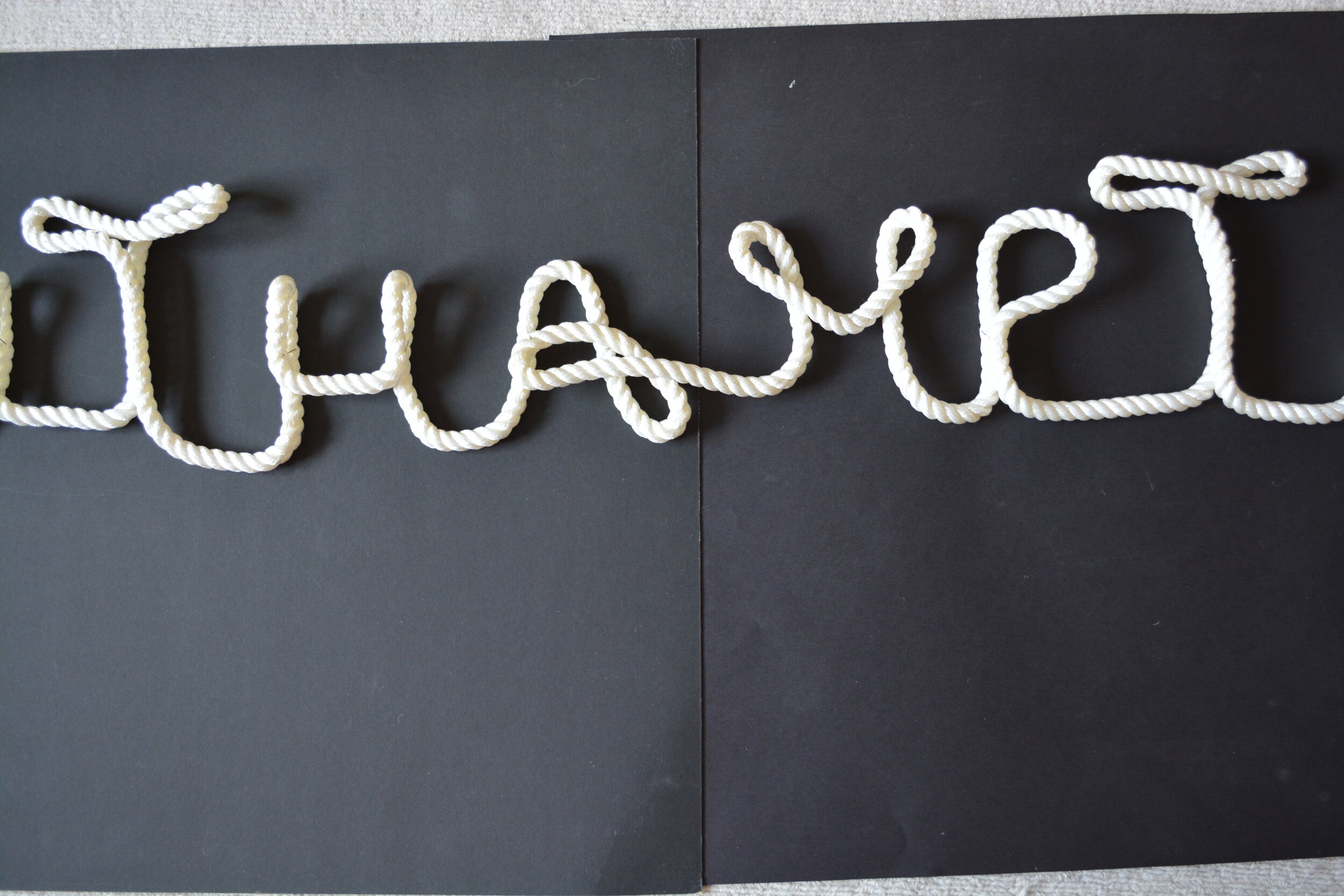
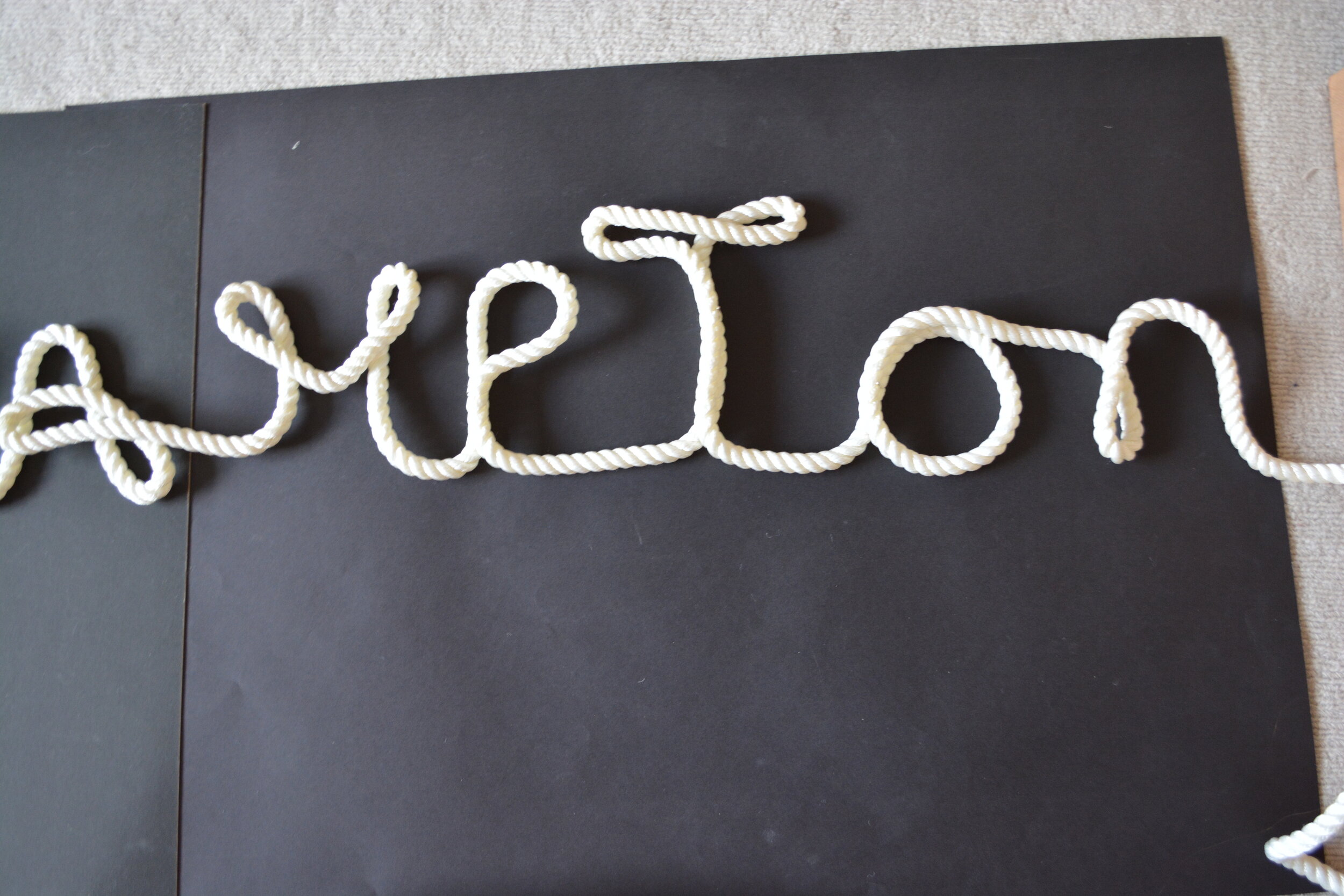

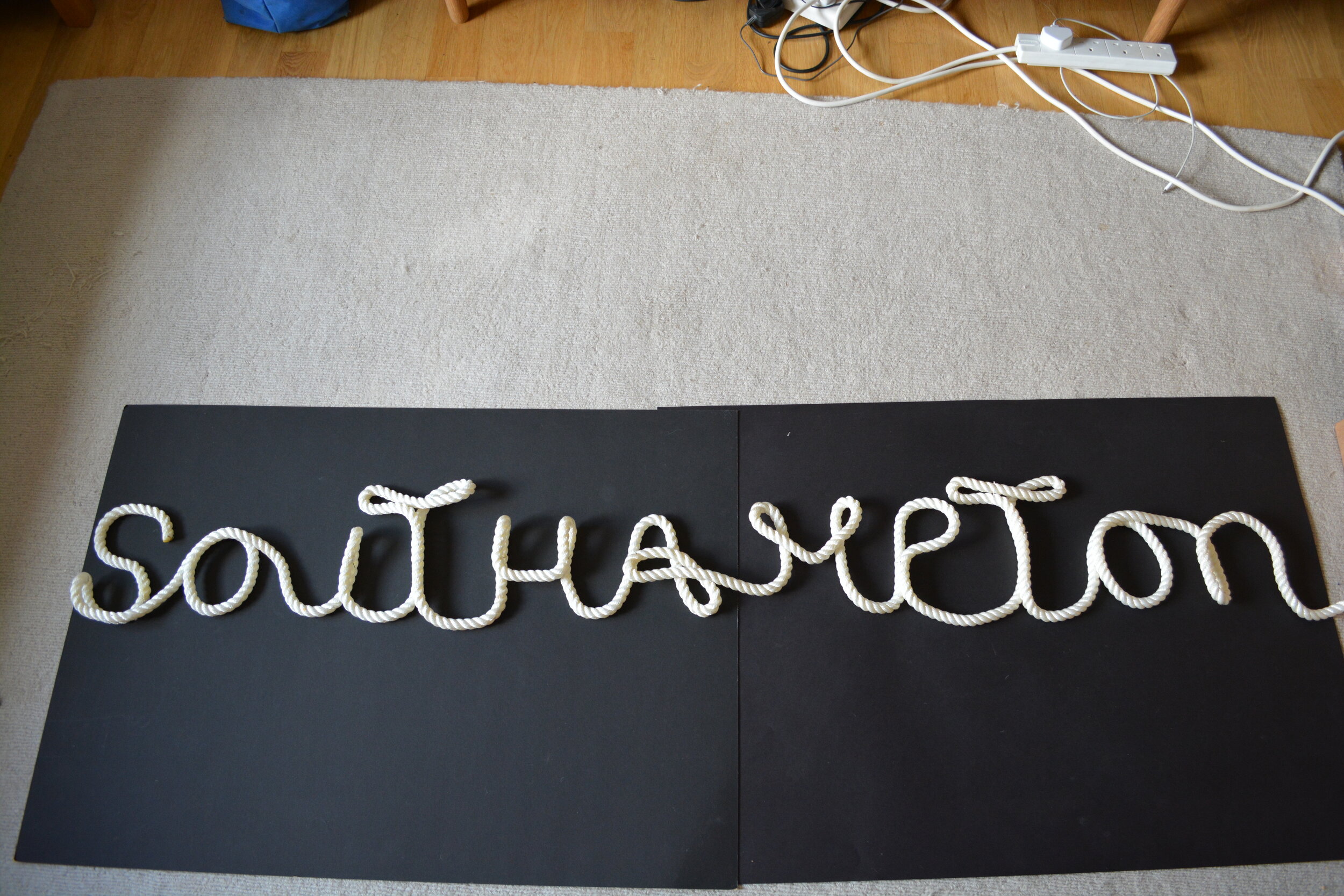
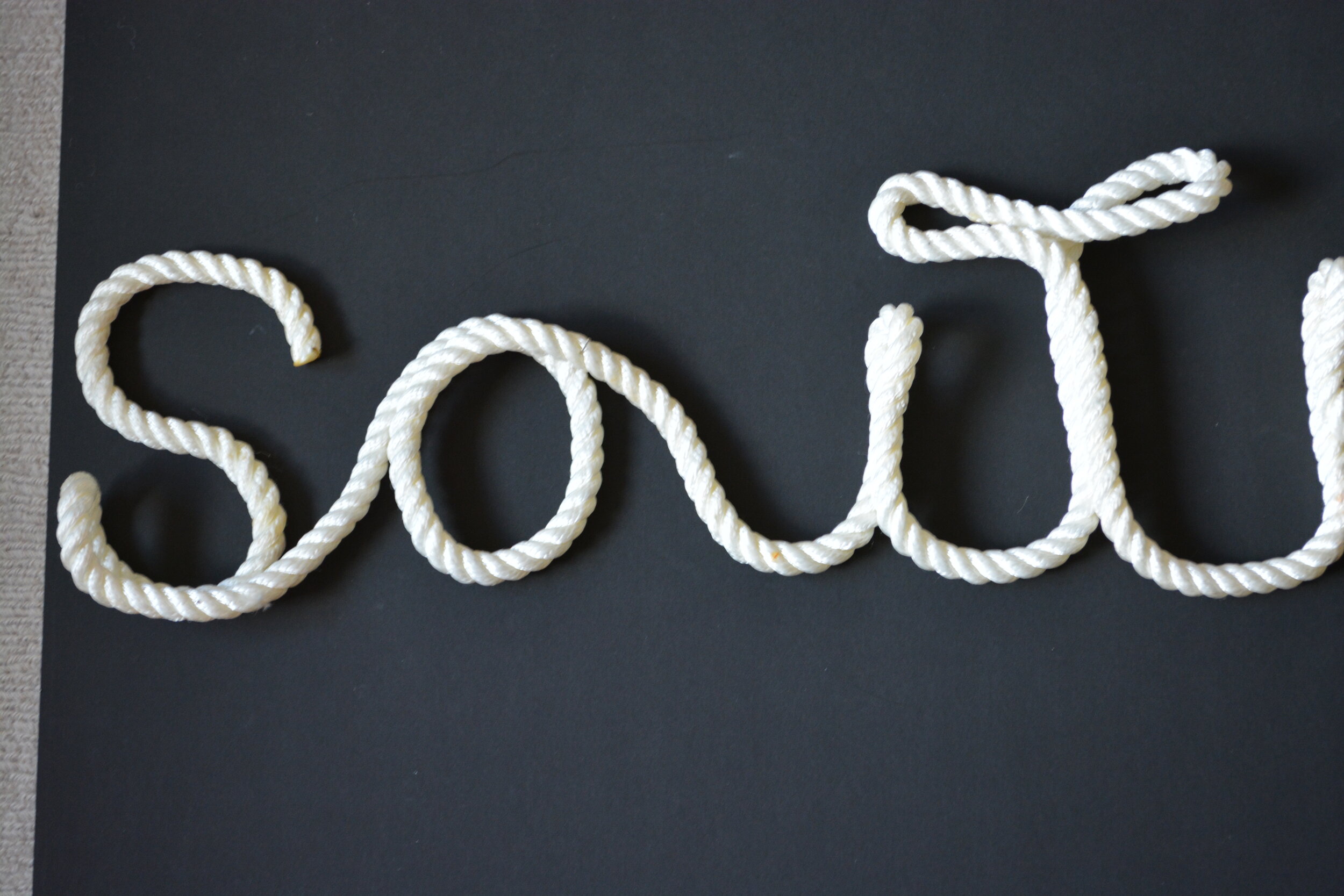

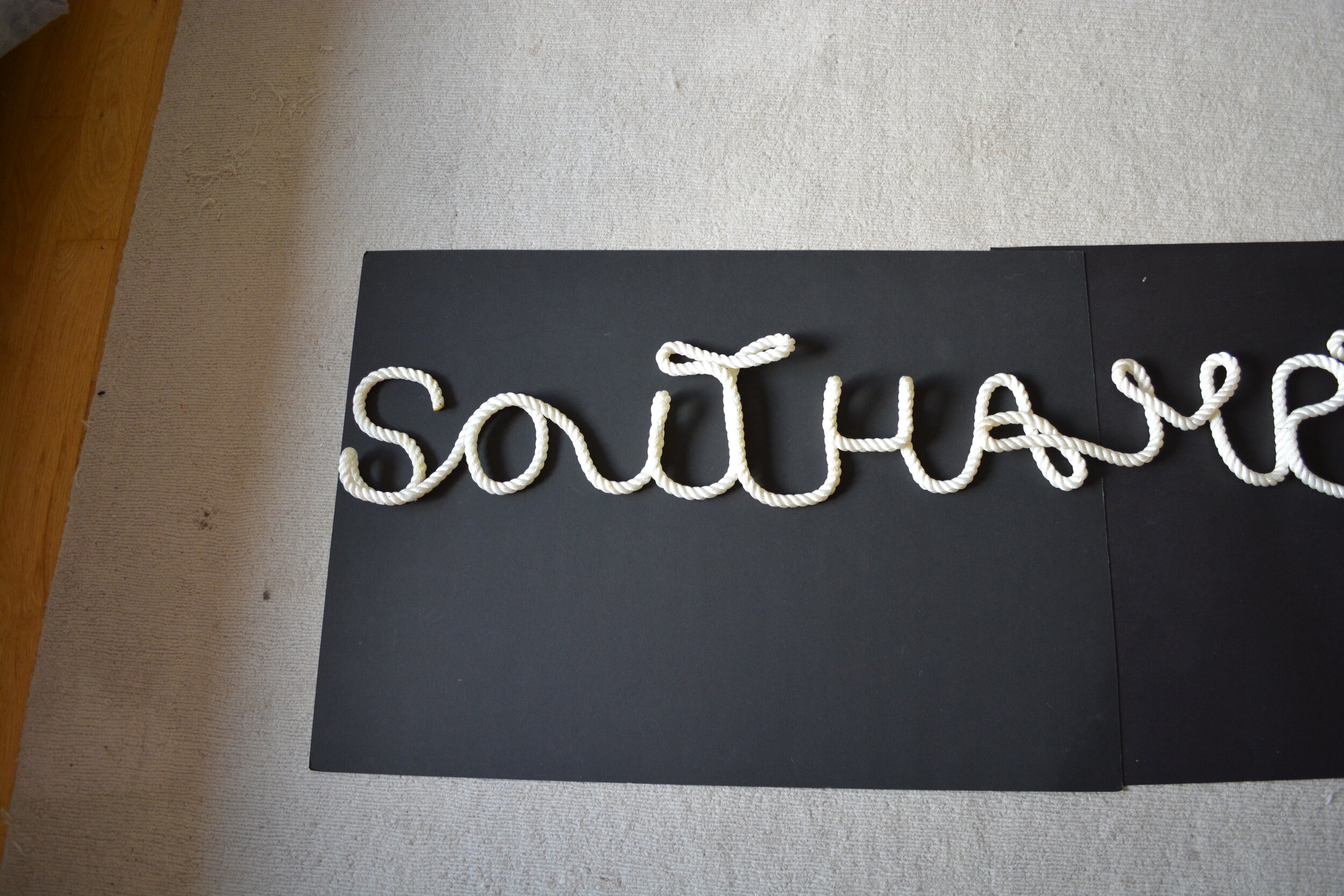


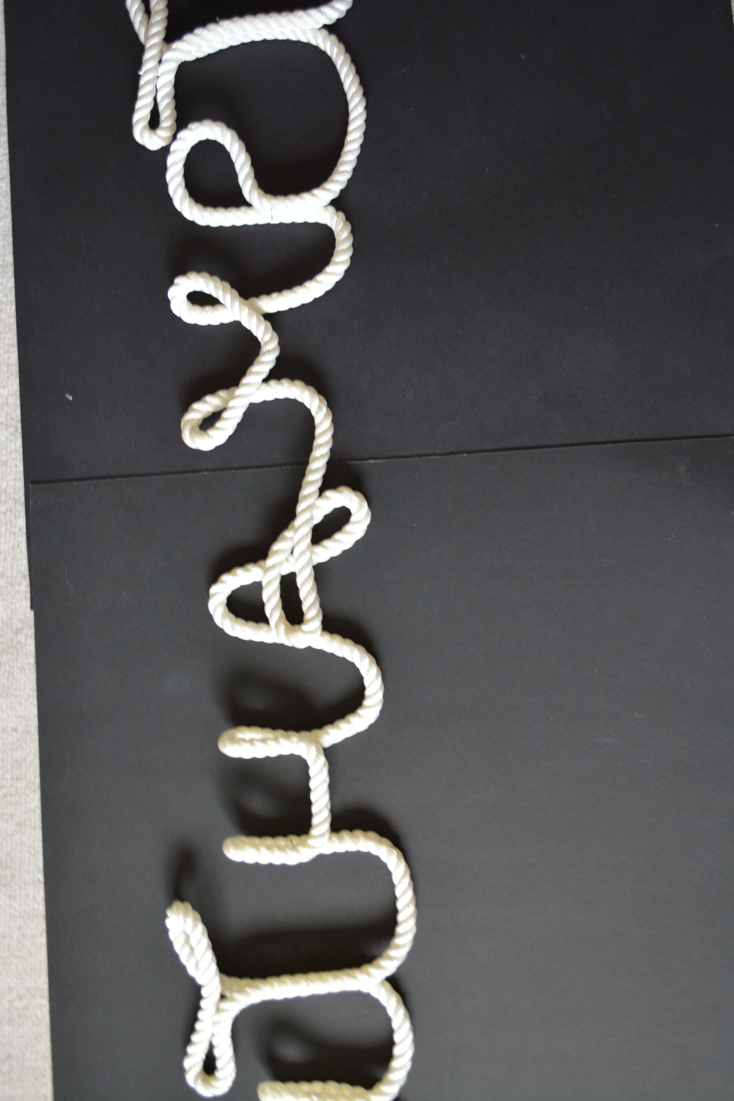


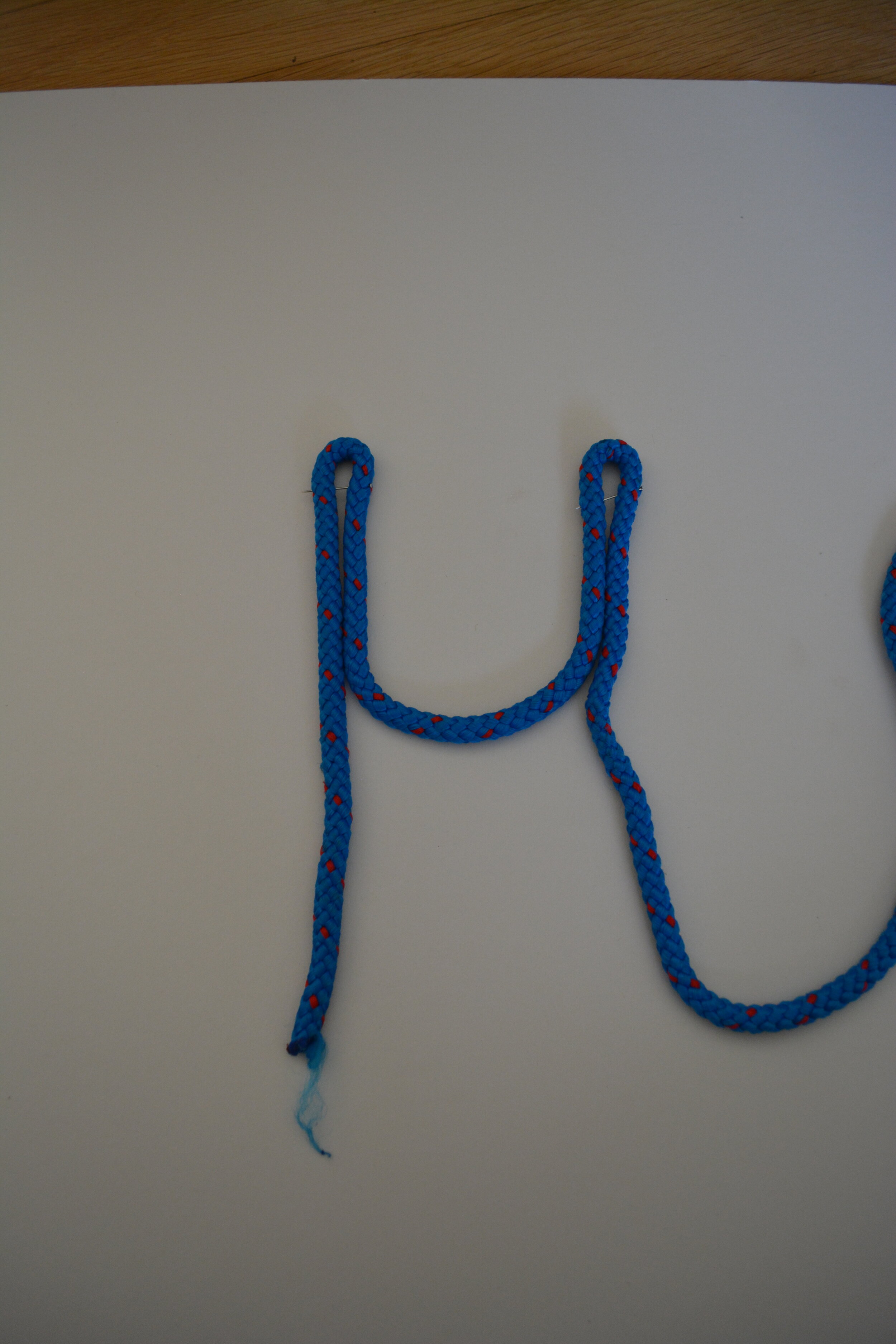
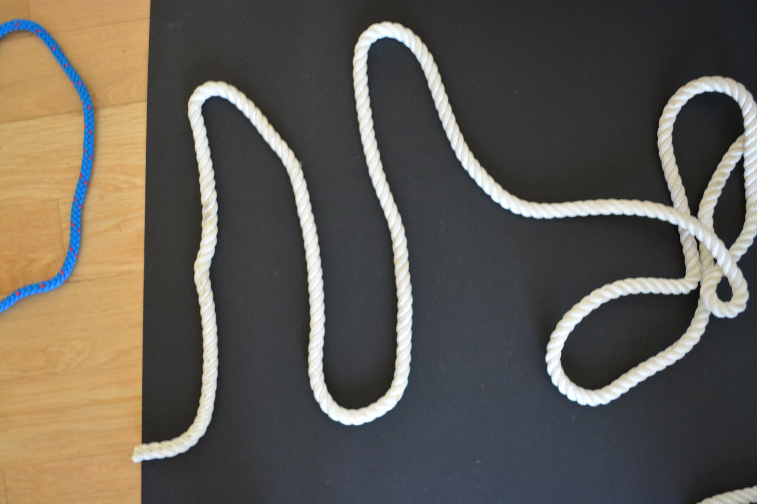
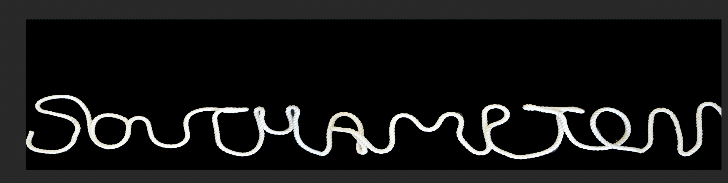
I played around with the writing and made sure that the letters were more legible. I also wanted the Ts to be taller and to stand out more than the rest. Im now going to photoshop them together but it should look like something above.

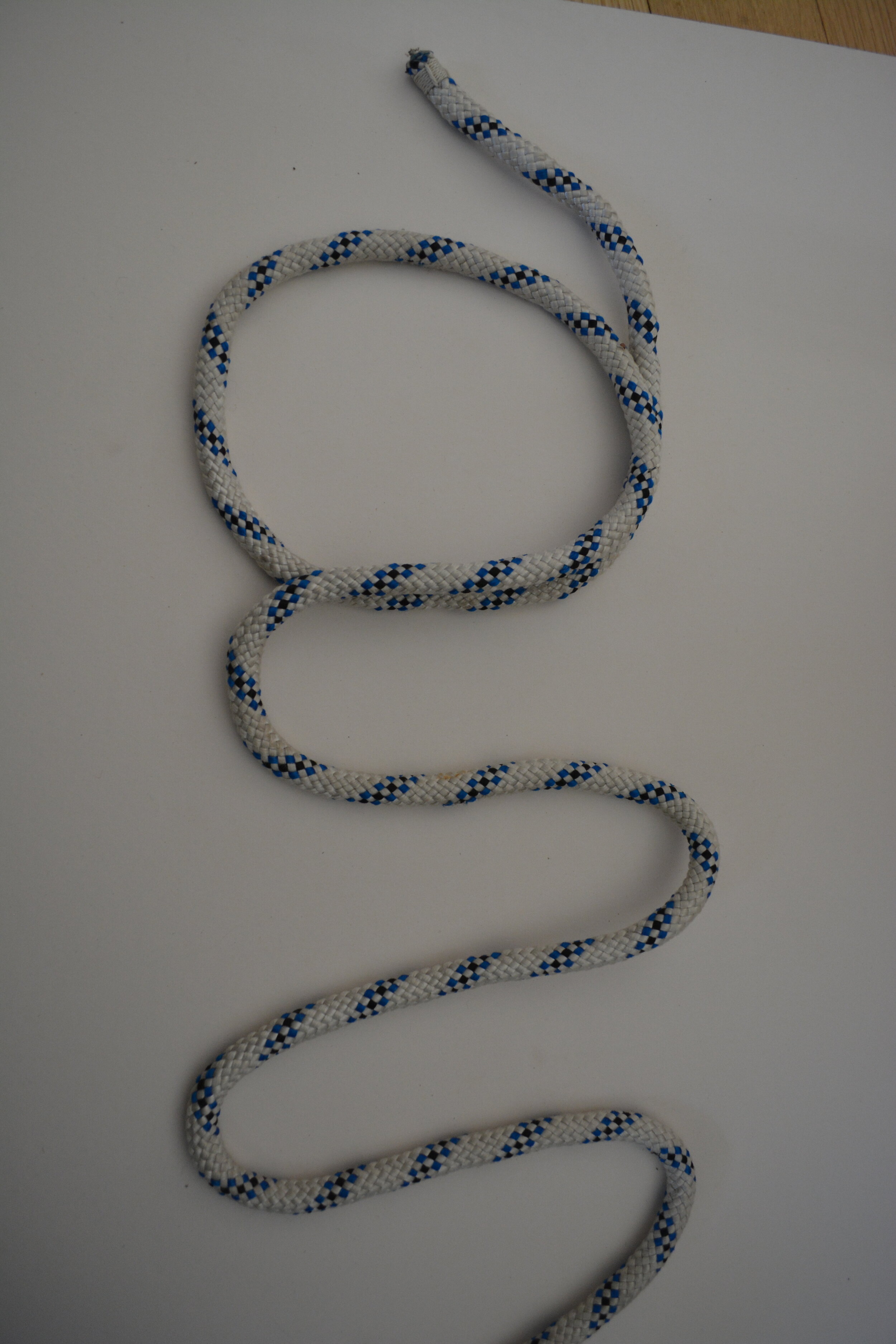
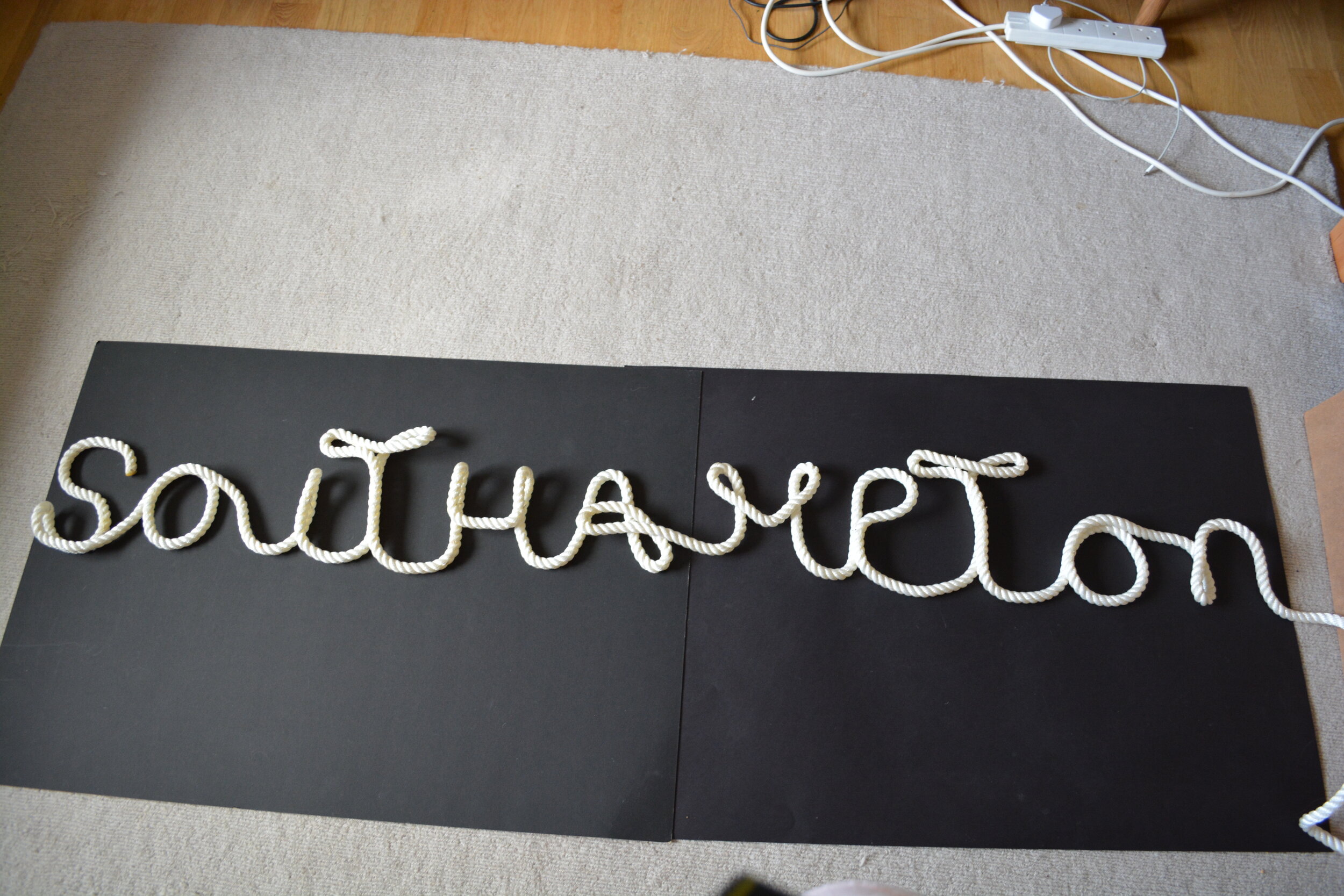
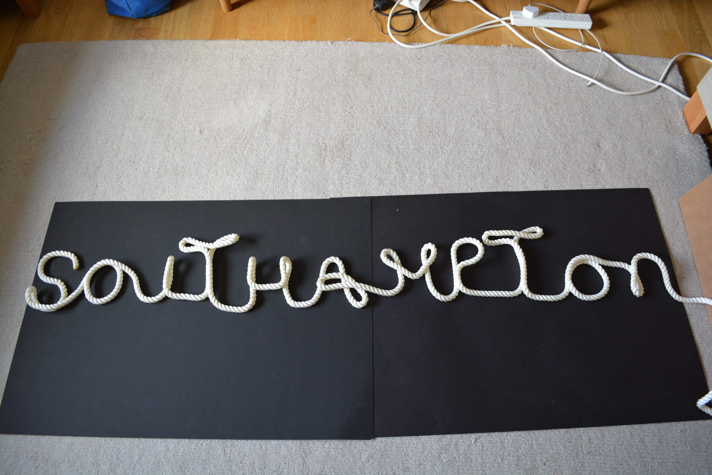
I actually really like how this came out, so i’m not going to try manipulate this image. I like how it feels a little bit more overall continuous with the letter layout.

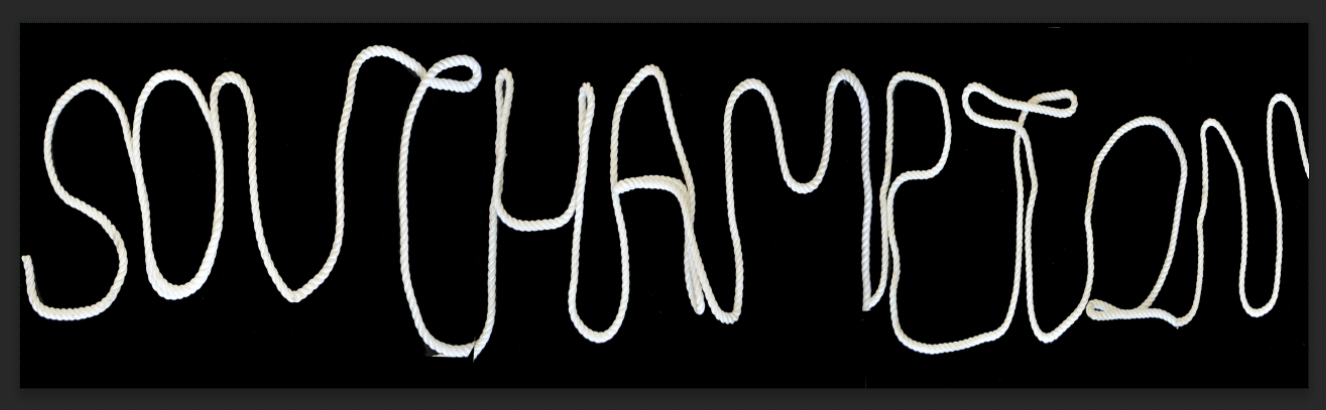
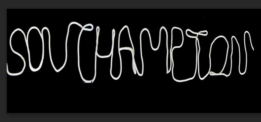
Although I did try just changing some of the black and white settings as it seemed a but yellow the later part of the word and I really like the results.

So this is the final outcome for the rope development and for the week. I feel this really symbolises everything behind Southampton especially with the Maritime history and its connection to the sea. The T also reminds of Anchors that are used.
Weekly Summary
This week I found really challenging, especially taking the research and investigations that were done last week, for inspiration for this week. It was really interesting learning from Colon Foundry about their experiences with designing the typography for the welsh government, I especially liked the design for the double d.
It was also interesting to learn about the Mexico 68 Olympics and the iconic identity that was created swell as the behind of some of the government problems that were going on at the time. I love the simplicity of this project something so small that has now gone on to make a impact across the area with their underground system.
I wanted to explore a variety of typography within my research and then falling across experimental typography which is what I felt my work fit into the best. Which led me into the workshop project for this week. I began by looking at the typography I had collected last week and making sure I understood it. I also made some stencils and then had a whole rethink about what Southampton stood for, thinking about the port and the water and being at the coast. I know that Southampton has cruise ships and the titanic left from here.
I experimented with alphabet flags from boats but also with rope which I ended up creating my final project from. I feel this was the one that related to Southampton the most. The twists and turns that the city has taken but also the consistency that rope has as a material. I researched different ways to tie the note and to create letters but also I wanted the T’s to stand out and be larger Than the rest to symbolise the shape of anchors. I look forward to taking my knowledge from this week forward to other weeks.
Ideas Wall Posts
Reference list
Alagiah, M. (2019). David McKendrick and his 20-year infatuation with Pam and her handwritten notes. [online] www.itsnicethat.com. Available at: https://www.itsnicethat.com/features/bam-and-pam-launderette-signs-typography-graphic-design-270919 [Accessed 12 May 2021].
Andrews, E. (2019). 9 Things You May Not Know About the Ancient Sumerians. [online] HISTORY. Available at: https://www.history.com/news/9-things-you-may-not-know-about-the-ancient-sumerians.
Angelos, A. (2021). Stretched and repeated, Dysfluent Mono is a typeface that embodies what it means to have a stammer. [online] www.itsnicethat.com. Available at: https://www.itsnicethat.com/articles/dysfluent-magazine-dysfluent-mono-typeface-graphic-design-130121 [Accessed 12 May 2021].
Britton, D. (2015). Dyslexia Typeface. Available at: https://www.dezeen.com/2015/06/05/dan-britton-typeface-recreates-frustration-reading-dyslexia/.
Foundry, C. (n.d.). Lafayette Anticipations. [online] Colophon Foundry. Available at: https://www.colophon-foundry.org/custom/lafayette-anticipations/ [Accessed 12 May 2021].
Foundry, C. (n.d.). Nasty Gal. [online] Colophon Foundry. Available at: https://www.colophon-foundry.org/custom/nastygal/ [Accessed 12 May 2021].
Foundry, C. (n.d.). Twickenham. [online] Colophon Foundry. Available at: https://www.colophon-foundry.org/custom/twickenham/ [Accessed 12 May 2021].
HEIMAT (2019). Berlin Wall Inspires New Font. Available at: https://www.digitalartsonline.co.uk/news/typography/berlin-wall-inspires-new-font-for-30th-anniversary-of-its-fall/.
Heimat (1989). Wall Font. Available at: https://www.digitalartsonline.co.uk/news/typography/berlin-wall-inspires-new-font-for-30th-anniversary-of-its-fall/.
Howarth, D. (2015). Typeface recreates the frustration of reading with dyslexia. [online] Dezeen. Available at: https://www.dezeen.com/2015/06/05/dan-britton-typeface-recreates-frustration-reading-dyslexia/.
Hutchings, B. (n.d.). Magazine Cover. Available at: https://www.designer-daily.com/10-awesome-examples-experimental-typography-46573.
Khasanov, R. (2014). Experimental Typography. Available at: https://theinspirationgrid.com/experimental-typography-by-ruslan-khasanov/.
PBS (2011). Typography | Off Book | PBS. YouTube. Available at: https://www.youtube.com/watch?v=eKKDL6lekmA [Accessed 9 May 2020].
Sumerian Reader ’ Urnammu 9 '. (n.d.). Available at: https://isaw.nyu.edu/library/blog/getting-started-with-sumerian.
TEDxTalks (2014). Wake up & smell the fonts | Sarah Hyndman | TEDxBedford. [online] www.youtube.com. Available at: https://www.youtube.com/watch?v=OXc-VZ4Vwbo&feature=emb_logo [Accessed 12 May 2021].
We Need to Talk About Film (2017). How to Make an Impact: Location Typography. [online] www.youtube.com. Available at: https://www.youtube.com/watch?v=0MV13C0RnVc&feature=emb_logo [Accessed 12 May 2021].
www.youtube.com. (n.d.). Voice of the Wall - Your message of freedom. [online] Available at: https://www.youtube.com/watch?v=Uczmt9qEcr4&feature=emb_logo [Accessed 12 May 2021].
Wyman, L. (1968). Mexico Olympics 1968. Available at: https://medium.com/fgd1-the-archive/mexico-olympics-1968-32fc8d7e0e45.