Week Five
Lecture Notes:

Lecture Reflection:
Within the lecture this week, It focused on researching and looking for opportunities within the fields. Like every creative studio, they all had different approaches but I was drawn to Accept and Proceed, Matt and Michelle, they talk about how accept and proceed have changed how they look at projects and working in a collaborative manor. They now look at what they want to do work in different fields and how they can make a difference to the world within their work. I feel this approach is really inspirational and made me want to work for them. They also spoke about how their self imitated projects allowed them to explore and research different methods that allows them to feedback to their clients in new ways. The other approach that I was interested in was Luke Veerman from Eden Spiekerman, he focusses on finding a problem and then a solution. Having a fresh perspective and also becoming more knowledgable through the clients problems. Both of these offer an interesting way to gain a different perspective to research and understanding.
Resource Notes:
Resource Reflection:
R1
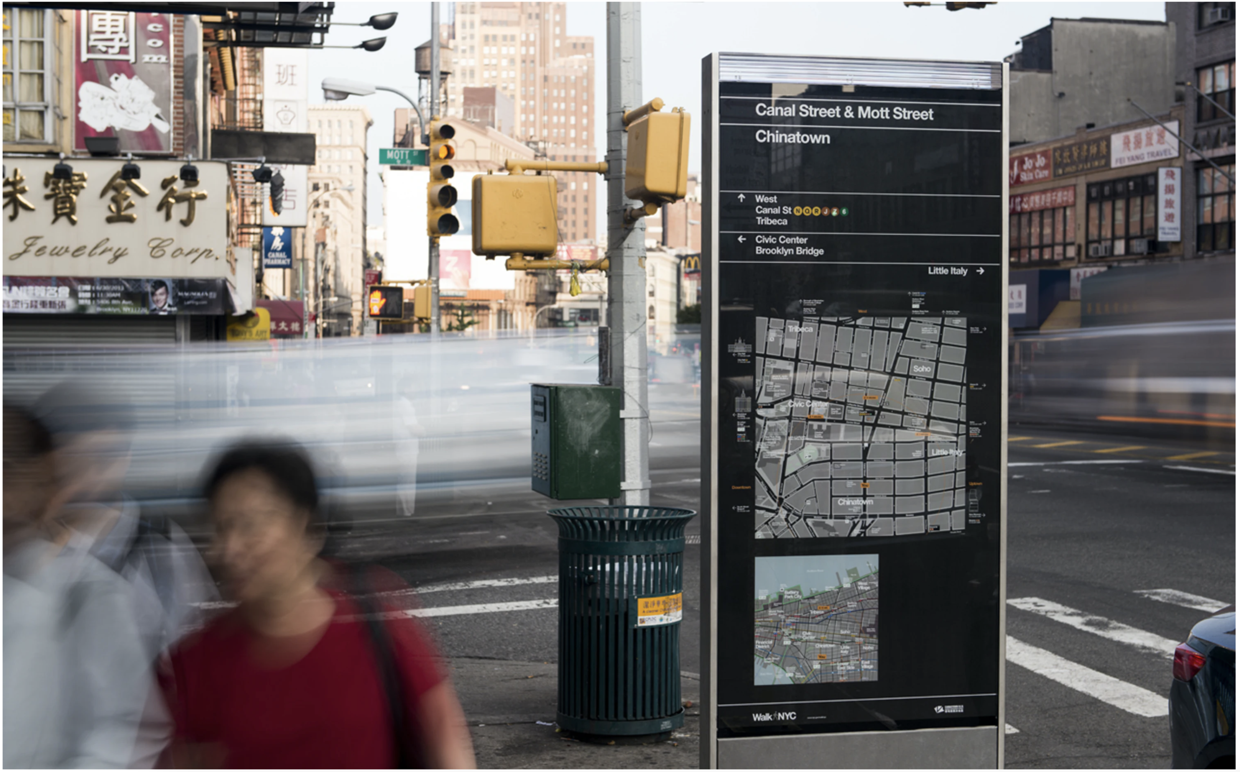
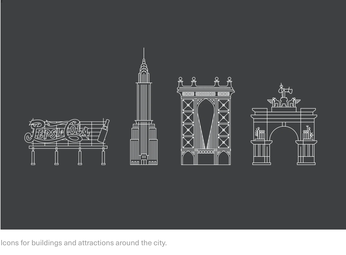
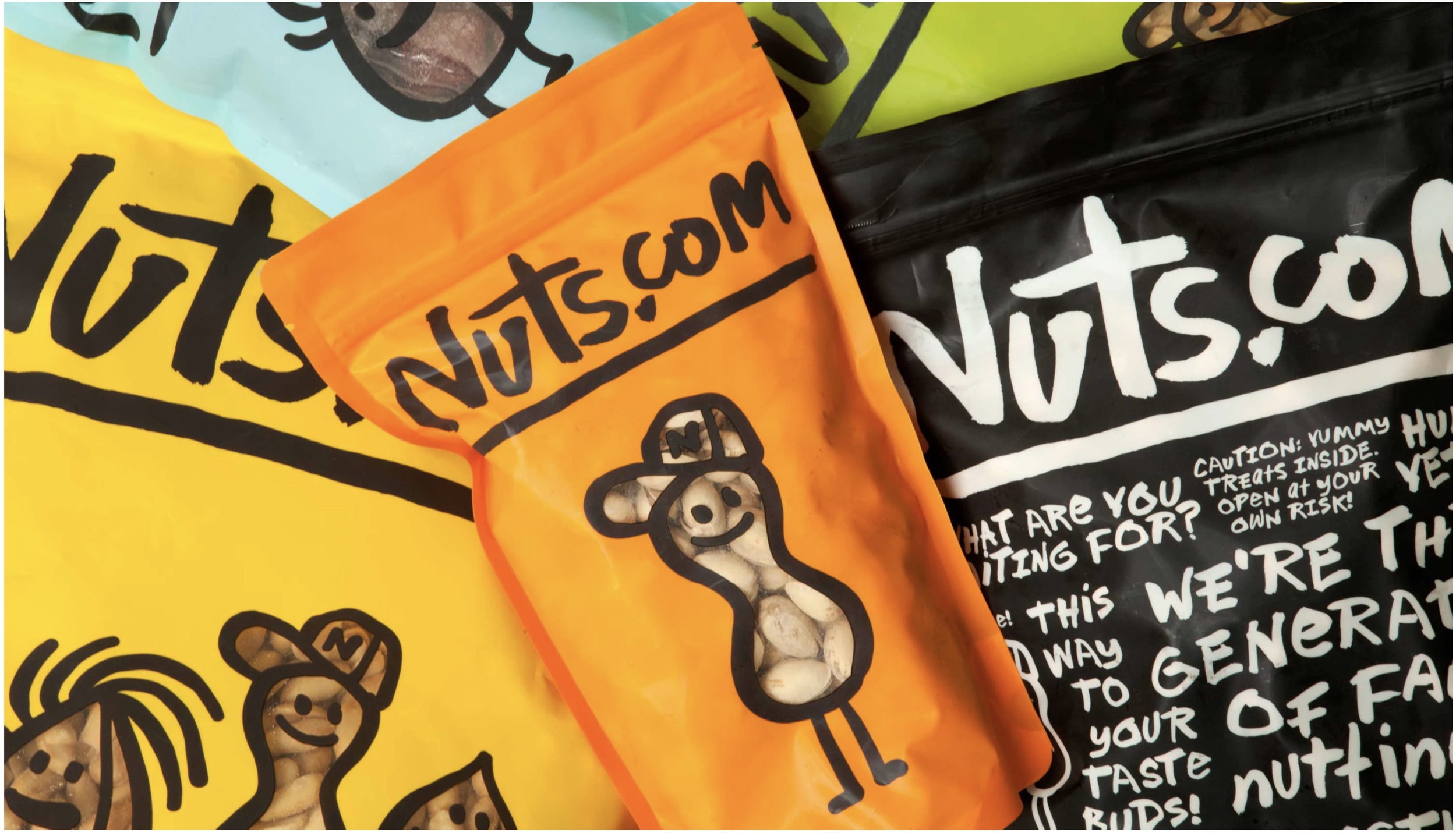
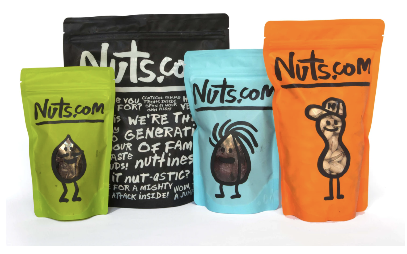
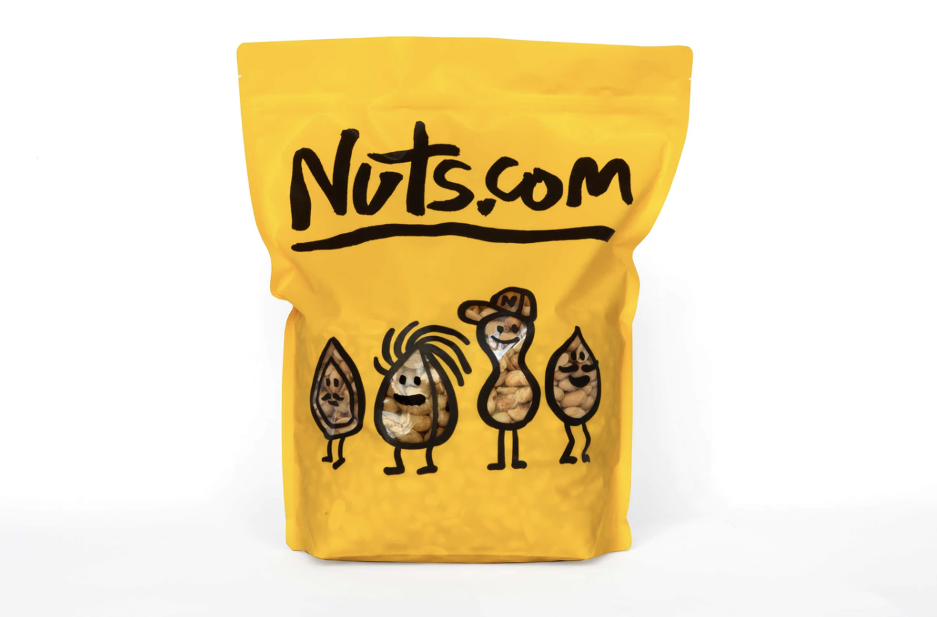
I really enjoyed this lecture with Micheal Bierut on how to think like a designer. In particular, the walking around NYC as well as redesigning such a simple packaging like nuts as well as putting together the libraries for the children. What particularly stood out for me was how he approached the lecture to talking about how he did it, instead of just talking about the outcome. This allowed me to see how simple the solutions were and where he gained his inspiration from.
R2
Marian Bantjes and Jessica Hische spoke about a lot on how to become successful. Their main points of the lecture was how inspiration is a moment of surprise and can come at anytime. They also spoke about what its like to be a women in graphic design, the similarities there are between not going to a arts school and going to an arts school.
Research
Who are the most established or innovative creative practitioners working in the field of your chosen project brief? What are their strengths and weaknesses? What do you admire about their work? What lessons can you learn from their final outcome and their ability to engage with (or failure to engage with) the target audience?
For this weeks research, following onto the workshop challenge, I thought i’d do a bit of research into some different creative practitioners before i research for the brief.
Micheal Bierut
I was really interested in Bieruts work from this week and wanted to find out some more information on his work and inspirations as well as the pentagram.

He has also brought out multiple publications, including his book on How to. which features case studies and explanations about his work. “In the introduction, Bierut tells the story of how he discovered graphic design as a child and ended up pursuing it as a career. The book begins with a chapter about the inexpensive composition notebooks Bierut uses to sketch and refine his ideas, with a portfolio of full-scale reproductions of selected spreads. Underneath its bookjacket, How to… is bound in a black-and-white marble pattern inspired by the notebooks.”
https://www.itsnicethat.com/news/michael-bierut-pentagram-the-skirball-center-graphic-design-070218

Bierut has also recently designed the new typographically identity for the Performing arts centre in New york. The rich graphic heritage of downtown new york. There are two different weights of fonts which were selected for their personality. It has also been taken across the campus to have a consistant identity throughout. The main thing i love about this is that they have combined the black and white photography with contrasting backgrounds and overlaying text ontop. It is really bold and different.
Other Competing Briefs
After deciding on the science group, these are the other briefs that I researched that didn’t make the cut of the final 3.
Met Museum Kids
This example for the met museum, they have created this animated map in the same format as wheres wally that will encourage children to engage with the dots around the screen. When they click on a dot information comes up about what they have clicked on. It is a virtual experience of the met. I think this is such a child friendly interesting idea to encourage children to engage with different artefacts.
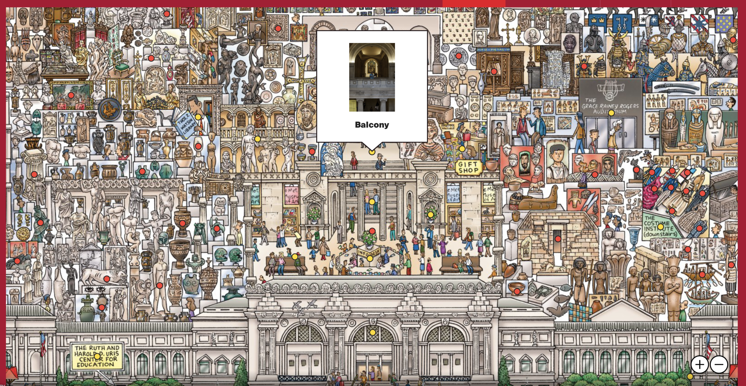
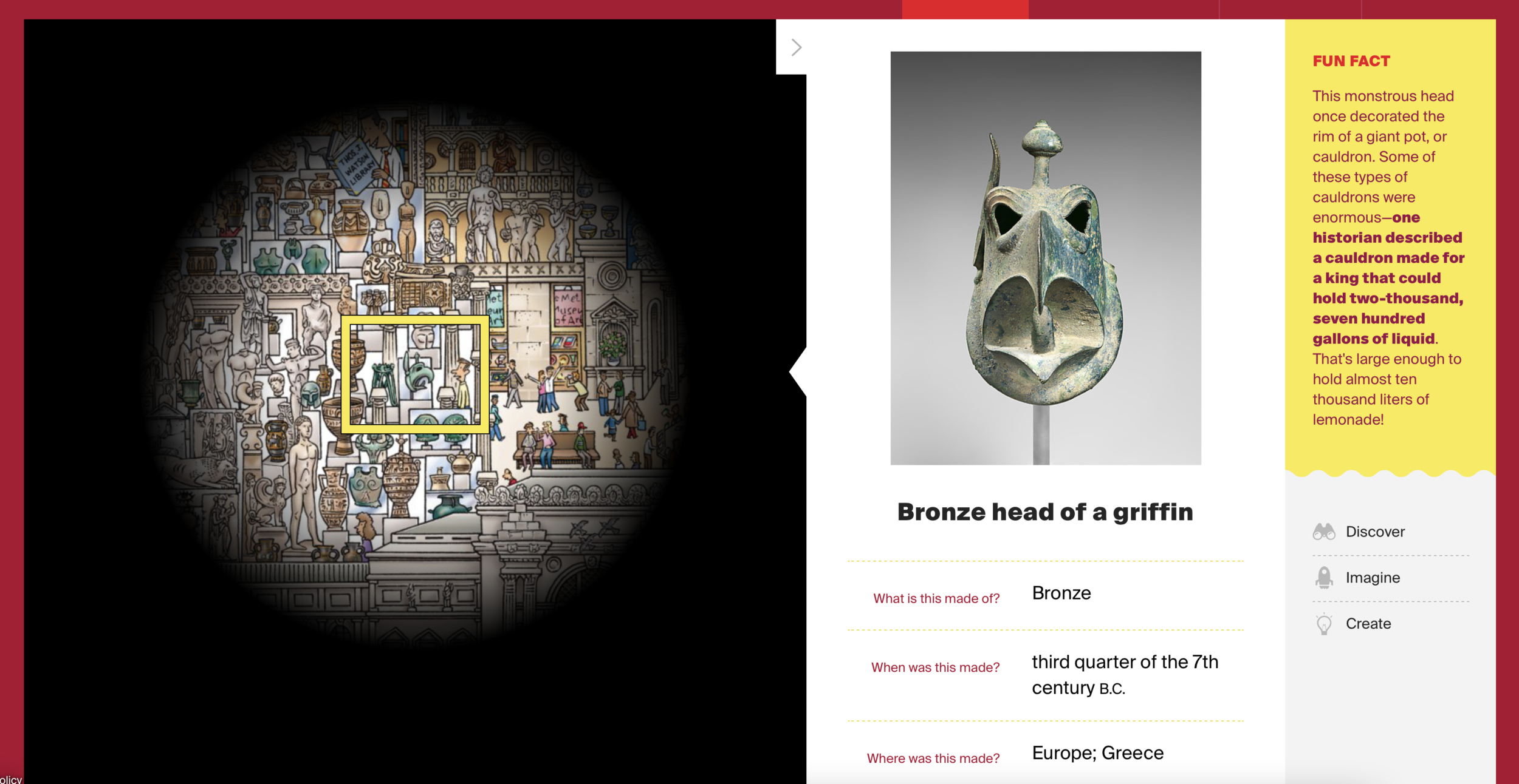
https://www.metmuseum.org/art/online-features/metkids/explore
Send me an Image
A dutch artist has forced viewers to walk through 350,000 photo prints. They are all images from social media and are meant to represent the about of images that are uploaded. Loosing the way that we get images printed and use films. The exhibition outlines what photography means to communication. I really like the physical aspect of this, although it has an apsect of waste for it, it gives the amount of images that we upload to social media a physical presence.

https://co-berlin.org/en/program/exhibitions/send-me-image
New York Novels
https://www.nypl.org/blog/2018/08/22/instanovels
I have looked at this case study within a previous module, where new york public library wanted to look at their younger audience but also looking at animating classic iconic stories in a new way. They invented Insta Novels, where anyone is able to access the stories.

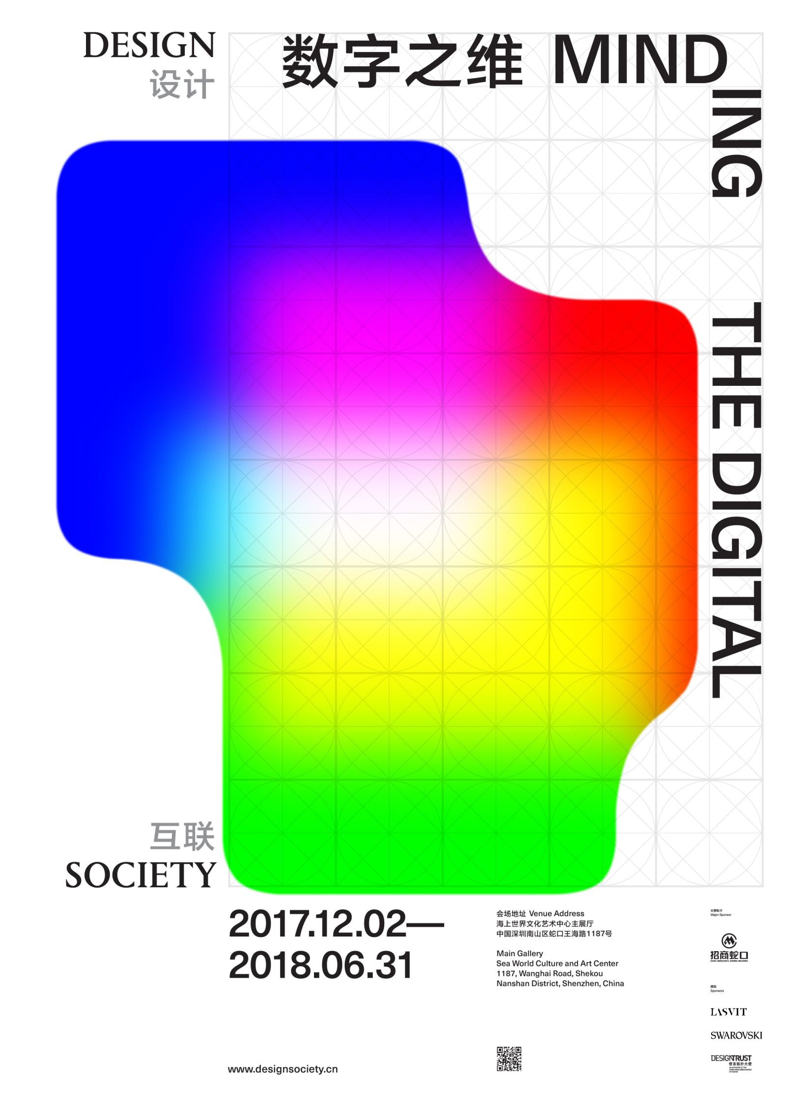
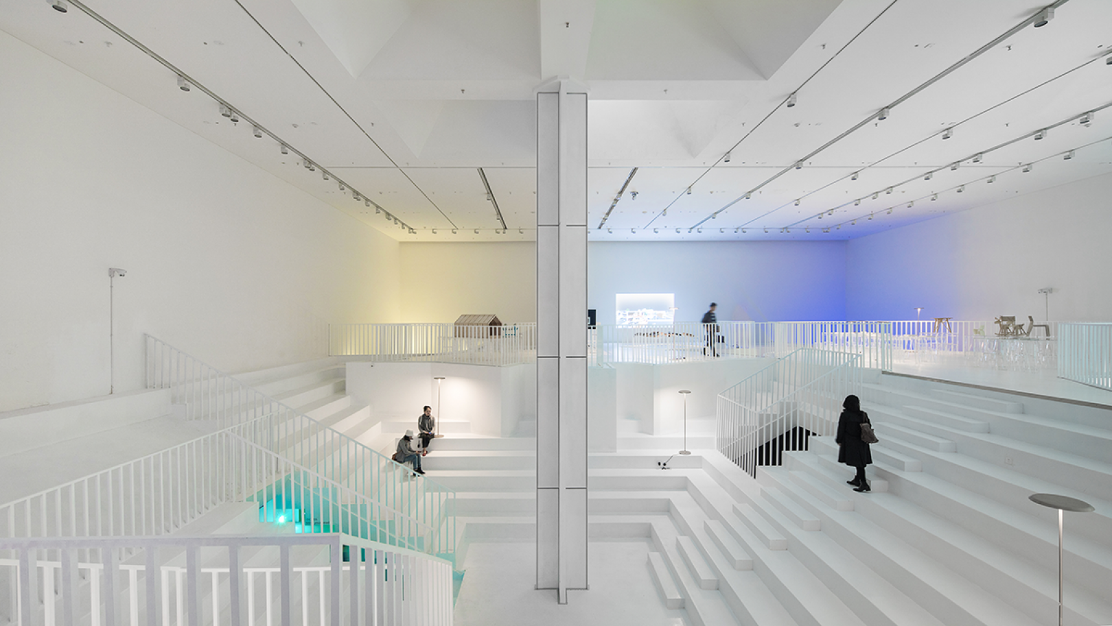
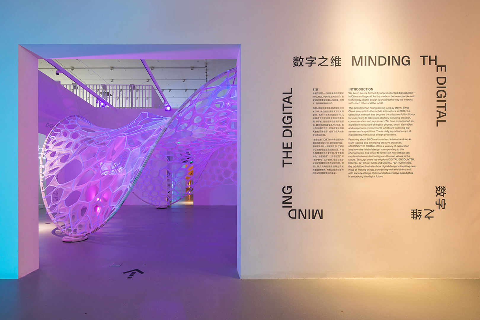
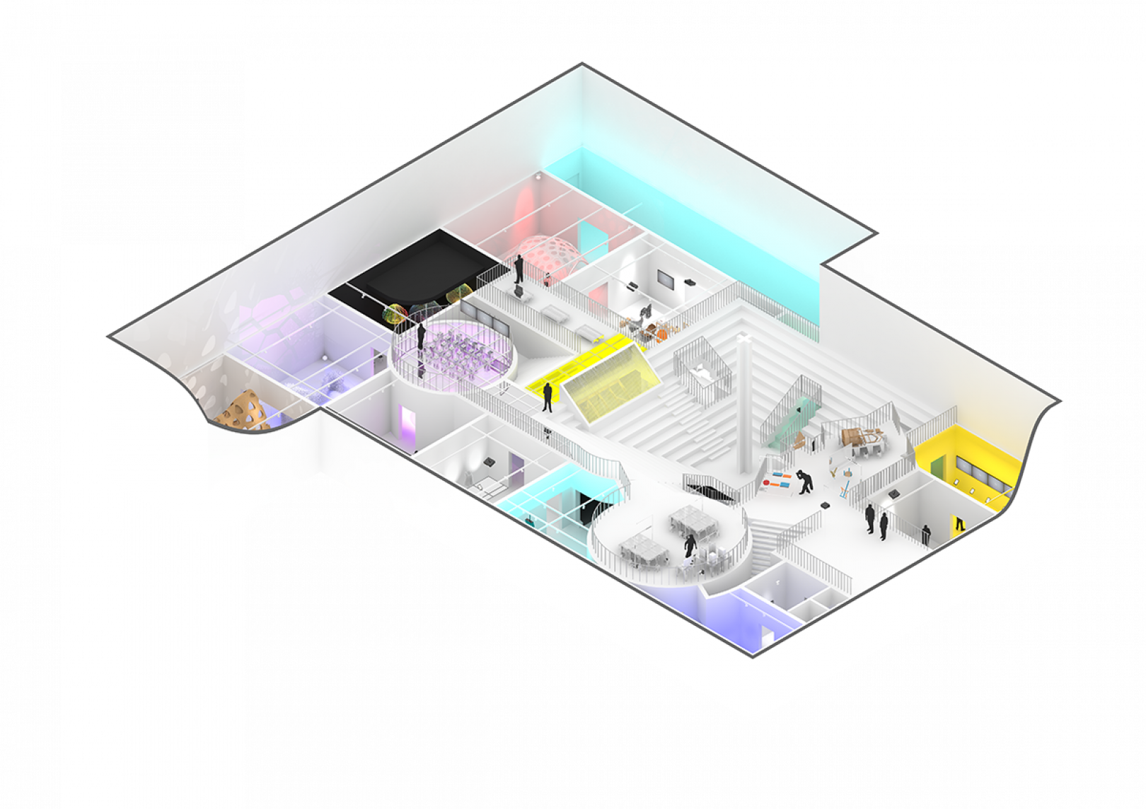
Design Society
https://www.creativeboom.com/inspiration/studio-thonik/
This case study is based on the design studio partnering with MVRDV, to create a visual identity for inaugural exhibition at Design Society. The show is said to have focussed on the digitalisation by many different practises. Their inspiration was RGB colour patches. I love the how they have combined how it looks online to then taken a physical aspect to the space.
Letter Archive
https://www.creativeboom.com/news/san-franciscos-letterform-archive-now-open-to-all-for-free/
Letterform Archive have created an online platform with 1,500 objects and 9,000 images of the history of typography, graphic design and written communication. It is a small portion of what will eventually be available for all to access. It has been designed with designers in mind.
This online archive has a different perspective looking at alot of the things for the design disciplinary. I love how you are able to search what you are looking for but they still make it hard to just browse the collection of things. Focussing on objects from a certain era.

https://oa.letterformarchive.org
Love Exhibition
This is an archive from the national archive, and to encourage more online engagement they have looked at letters within their archive collection. They have sorted them by topic within the letters that allows for different expressions. This then encourages people to explore the archives further with their sudden interest in the archive collection. I really like how this has been presented an layed out which is really easy for all users and ages.

Weekly Challenge
Read, research and analyse the four preselected ‘Industry Set’ project briefs and write short preliminary notes about each option. Post the preliminary notes onto your blog.
Select one of the ‘Industry Set’ project briefs that you would like to develop and deliver over the next eight weeks. Announce your selection on the Ideas Wall, for peer reflection.
Research and discover three creative studios, agencies or solo practitioners who have created competing projects that are in a similar field to your chosen brief. This could be an agency that regularly work in the same field or have created a one-off project, that is similar to your selected project brief.
Post a link to the three creative practitioner websites and/or competing projects onto the Ideas Wall, for peer discussion.
Write a 200 word synopsis (600 words in total) to evaluate the strengths and weaknesses of all three competing industry professional project examples.
Post your three written synopses onto your blog and remember to include a selection of images that illustrate and support your evaluation.
International Competition (Live)
Creative Conscious, improving the communities that we live in. Human centered designs aiming to change lives. Focussing on Mental Health issues. Need to tackle mental health illnesses. Identify something that isn’t working and look for a solution. Improving human health and wellness. Two different level; Stop negative things in the world or looking at it from a different perspective of positive things in the world.
Research:
https://www.creative-conscience.org.uk
The below was a video that was made for the creative conscience which shows a powerful call for creatives to come and change the world from a different perspective.
https://globalwellnessinstitute.org
Within this resource provided, it looks at a non profit with a mission to empower wellness worldwide by educating private and public sectors. It goes on to look at different research and the evidence that has presented to itself about the need to do things differently and educate.
https://sdgs.un.org/goals/goal3
This resource shows a beautiful infographic of facts and figures relating to health and wellness. It also then goes on to look at the targets and indicators and what will happen by certain years if we don’t change what we are doing. There is also a lot of research on how covid has made health and wellness worse for many people across the globe.
Summary:
This is a topic that I briefly looked at last module in terms of a mental health perspective. But I have never really looked into health and wellness project before. After watching the video and the resources, I feel there are many ways that I could approach this; looking at pollution again in more depth, looking at other social issues like obesity and lack of water in many countries. What I like about this brief is that there are so many areas that could be covered.
International Competition (Concluded)
D&AD new blood awards. Brief has concluded so isn’t classed as a live brief. Looking at the Adidas brand. Brand experience campaign for 17.- 25 year olds. Looking at how adidas can improve their lives or improve the city that surrounds them. Looking at relationships between sports and cities. How can the brand be inherited?
Research:

Within this resource, they talk about different areas of interest, sustainability and areas of interest moving forward. But mainly they look at own the game, which can be seen in the above diagram. This is focussed a lot on the people and the consumer being the focus of everything they do.
https://www.dandad.org/en/d-ad-new-blood-festival/
I wanted to do some research of previous projects that had been done with the topic of adidas, I came across this example. They may not be directly related to the international competition but I feel they give an over view of what can be achieved within this project. One looks at the girls side of adidas looking at a female platform. Looking at local sports near by.
https://www.dandad.org/awards/new-blood/2019/adidas/3533/adidas-show/

Summary:
I do have an interest in sport and after seeing some of the examples of adidas, I do like the sound of this project as an output. I would be more drawn towards looking at women and the female voice within sport which is shown within the case study above. I am unsure how i feel about the project not being live, as i feel if it was live then this would give me to the motivation and aspect of potentially winning.
Live Collaboration
This project would go out and find your own client or contact / industry partner and develop a collaborative project brief that you will deliver over the next weeks. The project allows to make connections with external companies. Thinking about a past within your previous industries that could help?
Summary:
I feel this project would not be suited to me at all due to the fact I don’t really have any industry connections and those I do have are working with adidas anyway, which means I may as well do the above brief. I could of course seek people to partner with but i feel this would take time away from the project due to replying etc.
Research and Development
Science museum group which includes; Science Museum, London; National Science and Media Museum, Bradford; Science and Industry Museum, Manchester; National Railway Museum, York; and Locomotion, Shildon. This group cares for a collection of different items from a range of eras. Small proportion of objects on display, enabled audience to connect in new ways online. information to the public access to digital archive. Targeting at young adults, don’t rely on audience reading anything closely.
Research:
https://www.sciencemuseumgroup.org.uk/about-us/collection/managing-the-collection/
Within this resource, it talks about how they maximise the collection that the public are able to see, working closely with the museums across the UK. They are constantly looking to add more to the collection and are currently reviewing the collections to see if they are more suited in other institutions.
https://www.sciencemuseum.org.uk/objects-and-stories
They currently have a search engine which allows people to come and search on the website but you really need to know what you are looking for to find the right thing. You can also explore the stories and some of the collection highlights as well as explore by topic.
https://www.pinterest.co.uk/stacking/museum-online-collection-generous-interfaces/
Their pinterest page was super helpful to look at different interfaces that the science group could potentially adopt for different collections and different types of objects and media.
https://www.are.na/lozana-rossenova/alternative-archival-interfaces
This was similar to the pinterest page of looking at experimental archive interfaces that could potentially be adopted by the science group. A lot of them were really contrasting of each other and theres obviously a lot of ways of doing something.


This resource is looking at how they are able to make more of the collection accessible to more people. A lot of people are researching the website rather than browsing and a lot of people have found things by object. There are also points to how they want to improve the experience of the website for users.
https://thesciencemuseum.github.io/never-been-seen/
This interface which is promoted by the science group which allows you to click on the image to learn more about the object.

Summary:
After reviewing some of the research and information that was provided with this brief. I feel this has a really broad output of the direction that you are able to take this project in. From a young persons perspective, there are a lot of things that could be changed in order to allow more people of a younger age to be interested in the archives online. This project would also allow me to gain live feedback about the project.
Selected Brief
After looking through all the briefs, it was a hard decision to choose between them due to them all being super broad. I first took out the live collaboration due to the lack of connections and then also took out the adidas brief. I have narrowed it down to two; I am between the Creative Conscious and Science museum. This is due to the Creative Conscious looking at human centered design which I have always had an interest in, I also like the approach that they have looking at what works and doesn’t work with the benefit of human wellness. The science group one is looking at education for young adults and seems to have a lot more room to have a physical and digital response.
I have decided to go with the science group one. After the webinar with the digital director from the science group looking at all the possibilites that the output could be and looking at some of the previous projects that stuart posted to the ideas wall. I feel this brief would allow me to explore different routes to the project of solutions that would help young adults explore and use the resource to their best advantage. I also feel I have previously done some experience in archives due to looking at this in a previous project.
https://lab.sciencemuseum.org.uk/science-museum-falmouth-university-ma-graphic-design-8000c758c335
Competing briefs
Glastonbury Digital
https://www.itsnicethat.com/news/v-and-a-database-glastonbury-festival-digital-180920
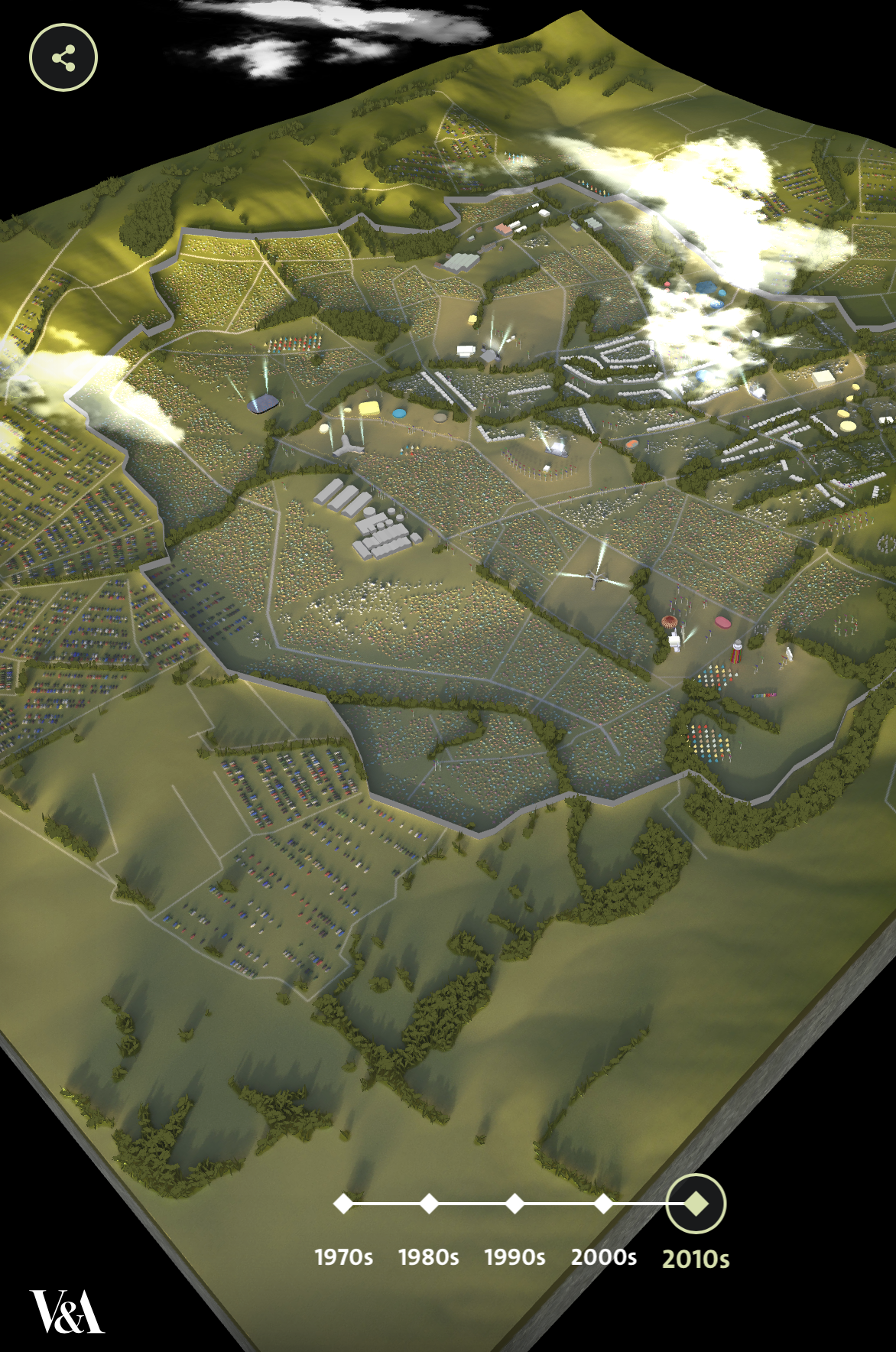
The V and A has launched a project online which will be a data base for Glastonbury as it celebrated its 50th birthday last year. They wanted to promote the importance of performing arts. The archive has a range of images of posters, the event as well as the festival gooers. This is avaliable for research and public.

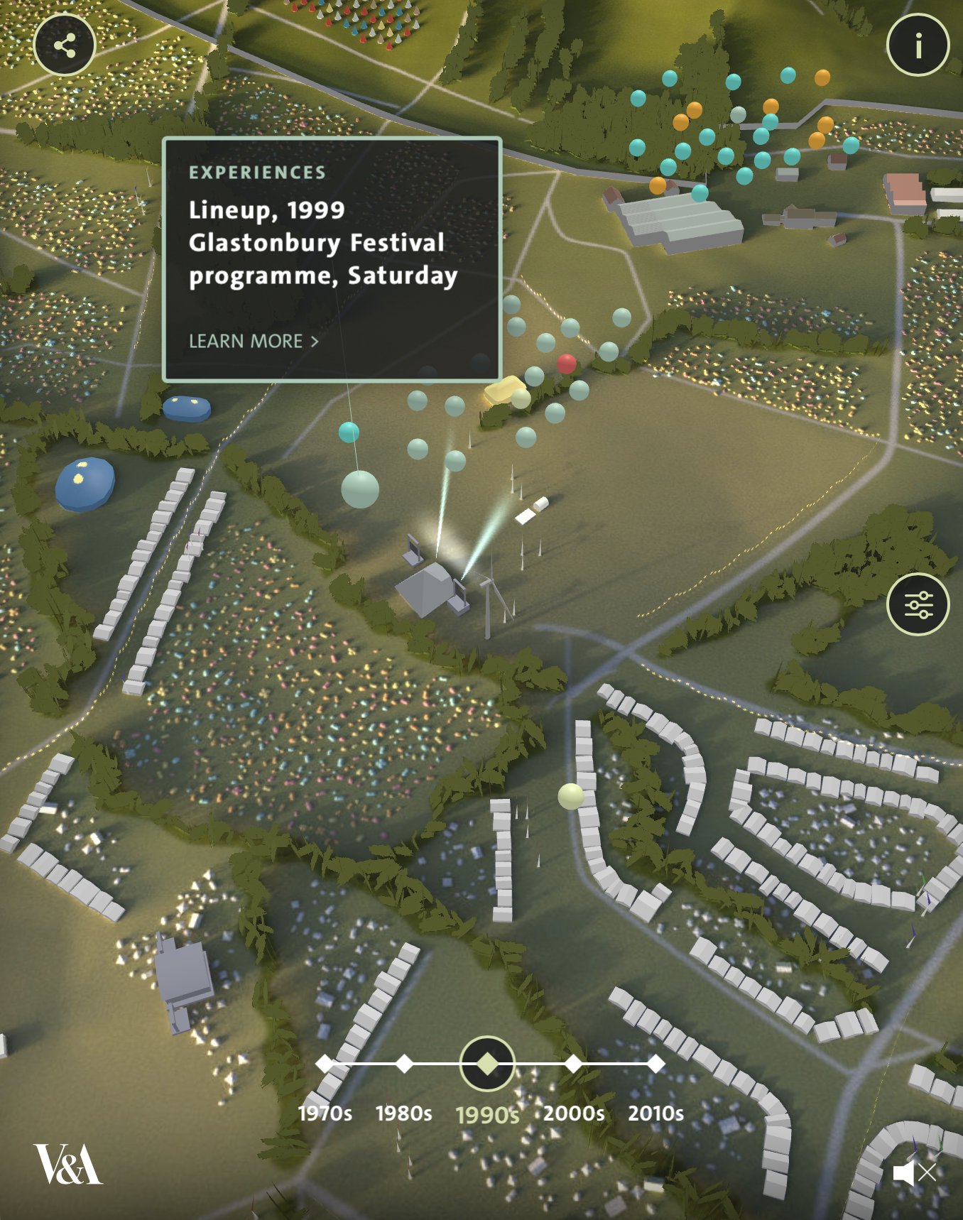
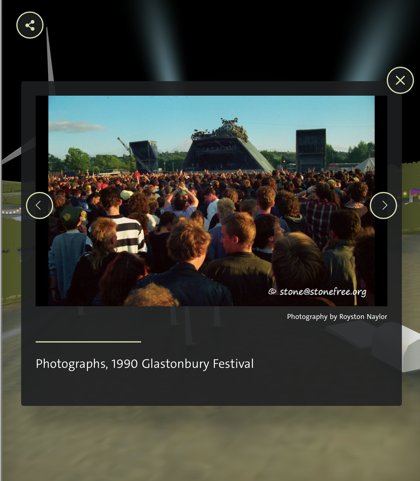
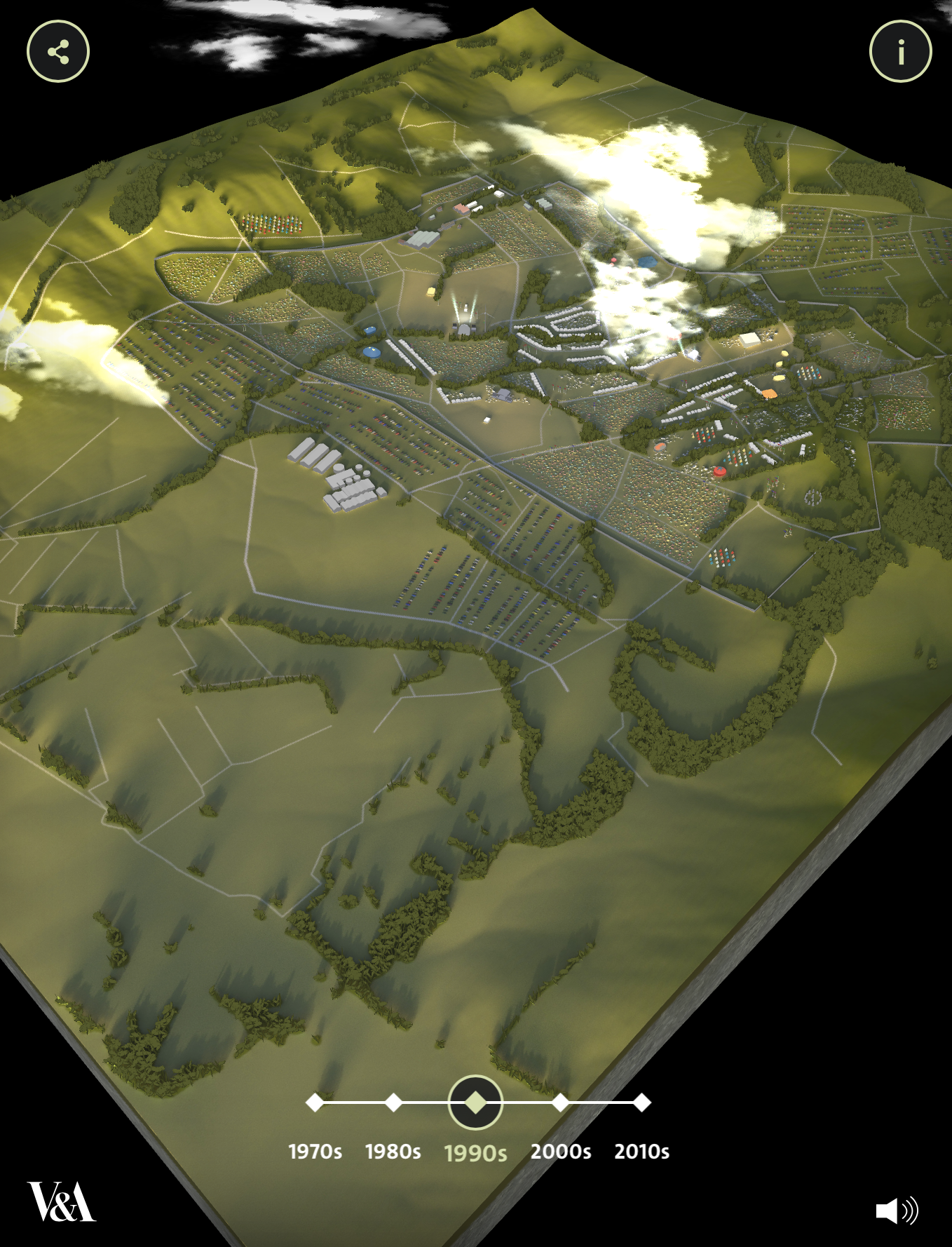
https://www.vam.ac.uk/mapping-glastonbury/
The actual interactive archive is as below. There are different years that allow you to click on and see the programme aswell as other documentation that was recorded. Fully interactive which is based around the layout of the site from each year. The different colours of dot mean it’s a different thing, like an experience of a sound.
Strengths and weaknesses Evaluation
The strengths for the Glastonbury project are that they have used the layout of the site for the navigation around to all the different sources and information that is available. I feel this works well as you are always working out where everything is when you are at the festival itself. I think they have also gathered some beautiful imagery that allows you to see how technology and the festival has evolved over the 50 years that it has been around. I love that it feels like an animated version of the festival as if you are within a video game. They have clearly put a lot of work into sorting the layout and making sure to upload all the right information.
I do feel that the information about the site and what the dots mean could be clearer as this took me some time and exploring the site to workout. I also think that the navigation bar at the bottom of the screen could be bigger and bolder that would allow the user to scroll through the eras. They have also rounded all the years together to 10s, when Glastonbury happens every year. I feel this could be improved by having it rounded and then sub years.
Machine Hallucination
https://www.dezeen.com/awards/2020/longlists/machine-hallucination/
Refik Anadol has used AI to turn millions of images of New york into a film. It’s a cinematic experience that looks at visual representation of urban memories of new york. The project is an immersive experience, which includes a 45 minute video explaining the process and the techniques behind the project. Although not a straight archive project, I feel this was an interesting way of producing a store of imagery from new york.
https://refikanadol.com/works/machine-hallucination/
“Refik Anadol’s most recent synesthetic reality experiments deeply engage with these centuries-old questions and attempt at revealing new connections between visual narrative, archival instinct and collective consciousness. The project focuses on latent cinematic experiences derived from representations of urban memories as they are re-imagined by machine intelligence. For Artechouse’s New York location, Anadol presents a data universe of New York City in 1025 latent dimensions that he creates by deploying machine learning algorithms on over 100 million photographic memories of New York City found publicly in social networks. Machine Hallucination thus generates a novel form of synesthetic storytelling through its multilayered manipulation of a vast visual archive beyond the conventional limits of the camera and the existing cinematographic techniques.”
Strengths and weaknesses Evaluation
For the Machine Hallucination, I feel that it worked as it was a completely immersive experience that was created from photographs and randomly generated by an AI. It’s a different artistic take on archived photographs. I love the story that it tells and the different shapes that it is able to created allowing the user to be fully immersed within the experience. I also think it’s interesting that these have been captured from social media account’s, as this is the first hand perspective of how new York is and what it’s like to be there.
Comparing this to the other archive projects that I have researched, I am unsure how this would work on a larger scale with different disciplines of objects. I also feel that this is an interpretation and may have had more impact if the images had remained in their original form. It also isn’t a full archive where you are able to see all the images in their glory and feels more for the installation.
National History Museum
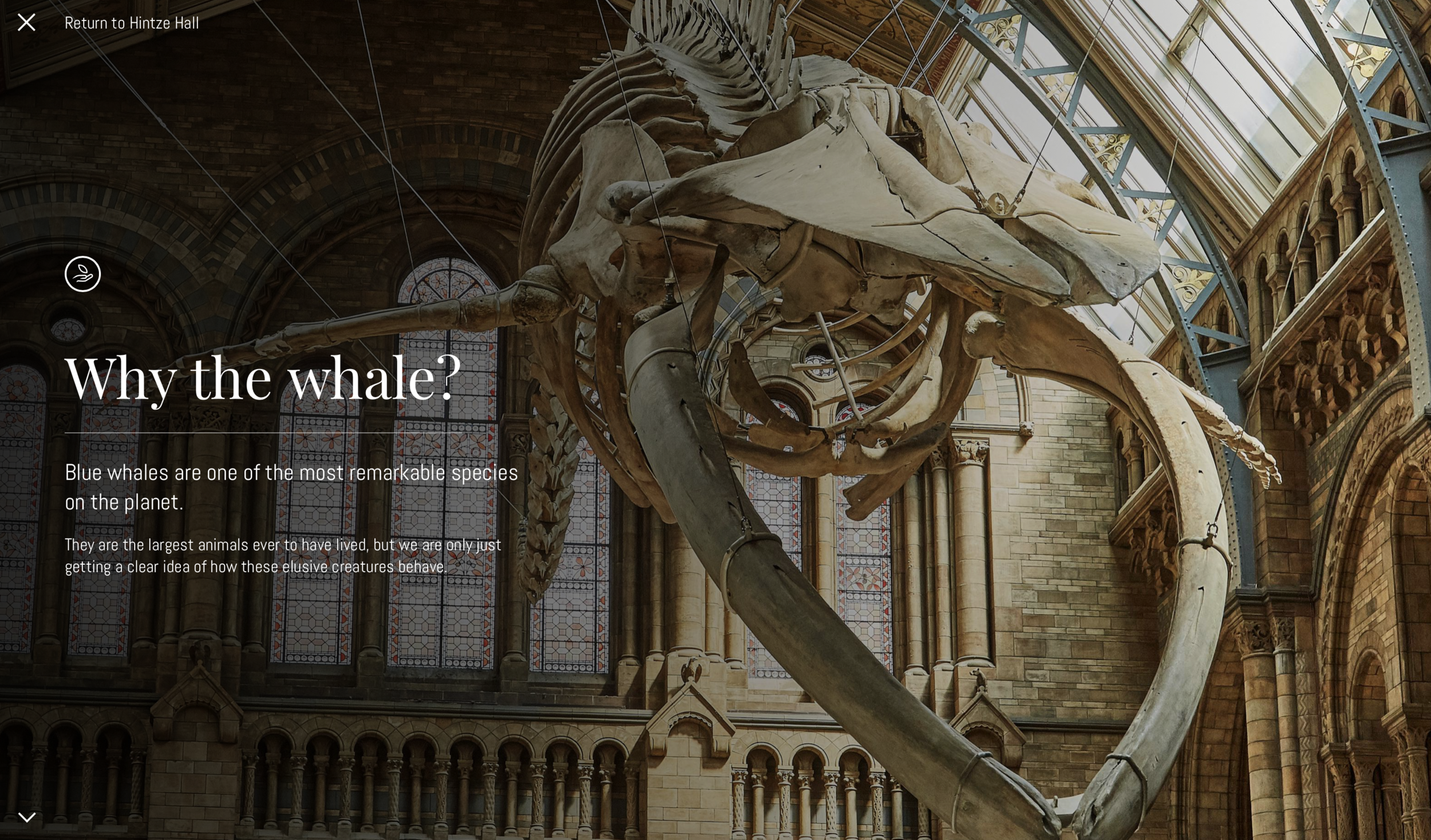
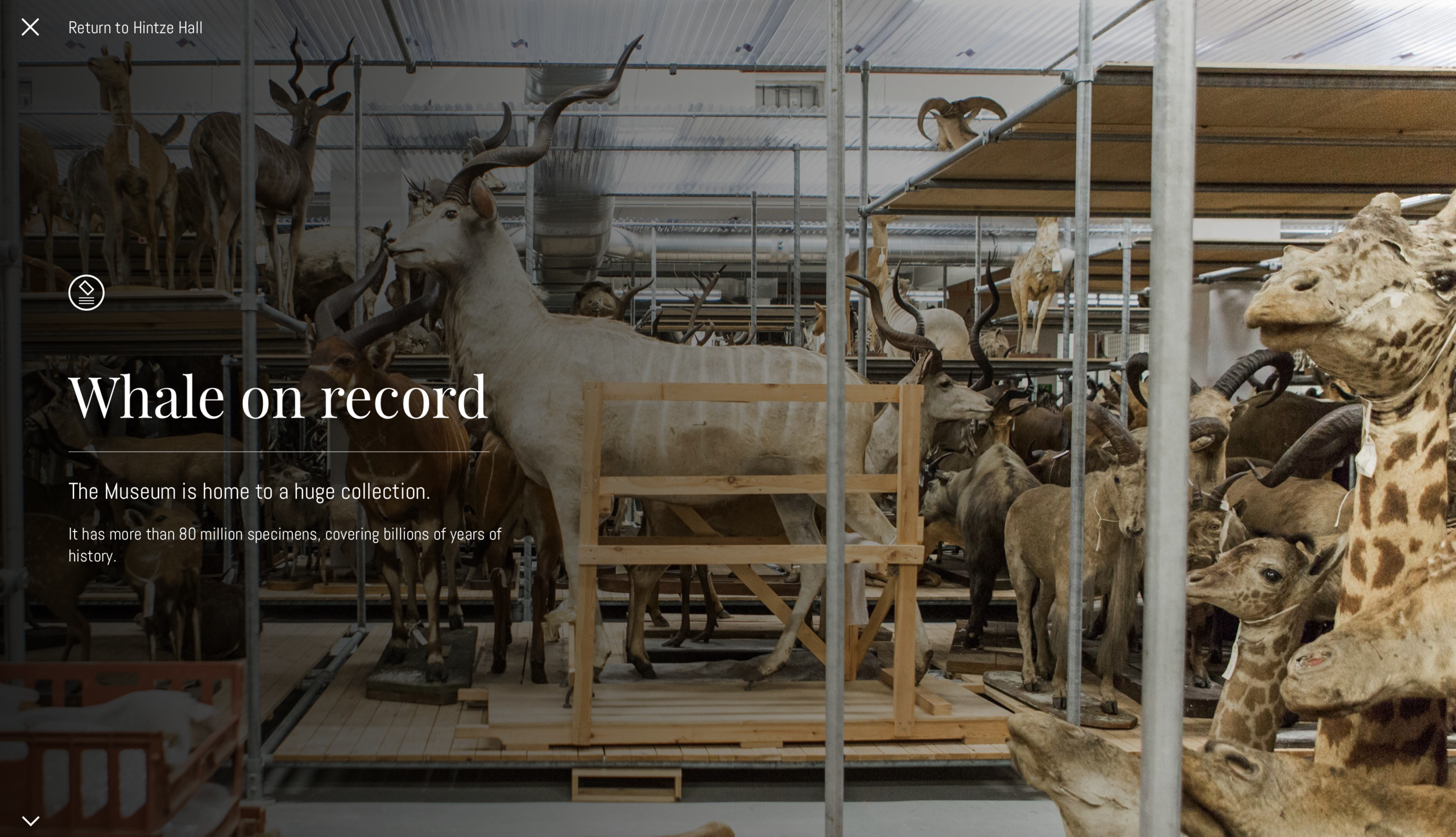
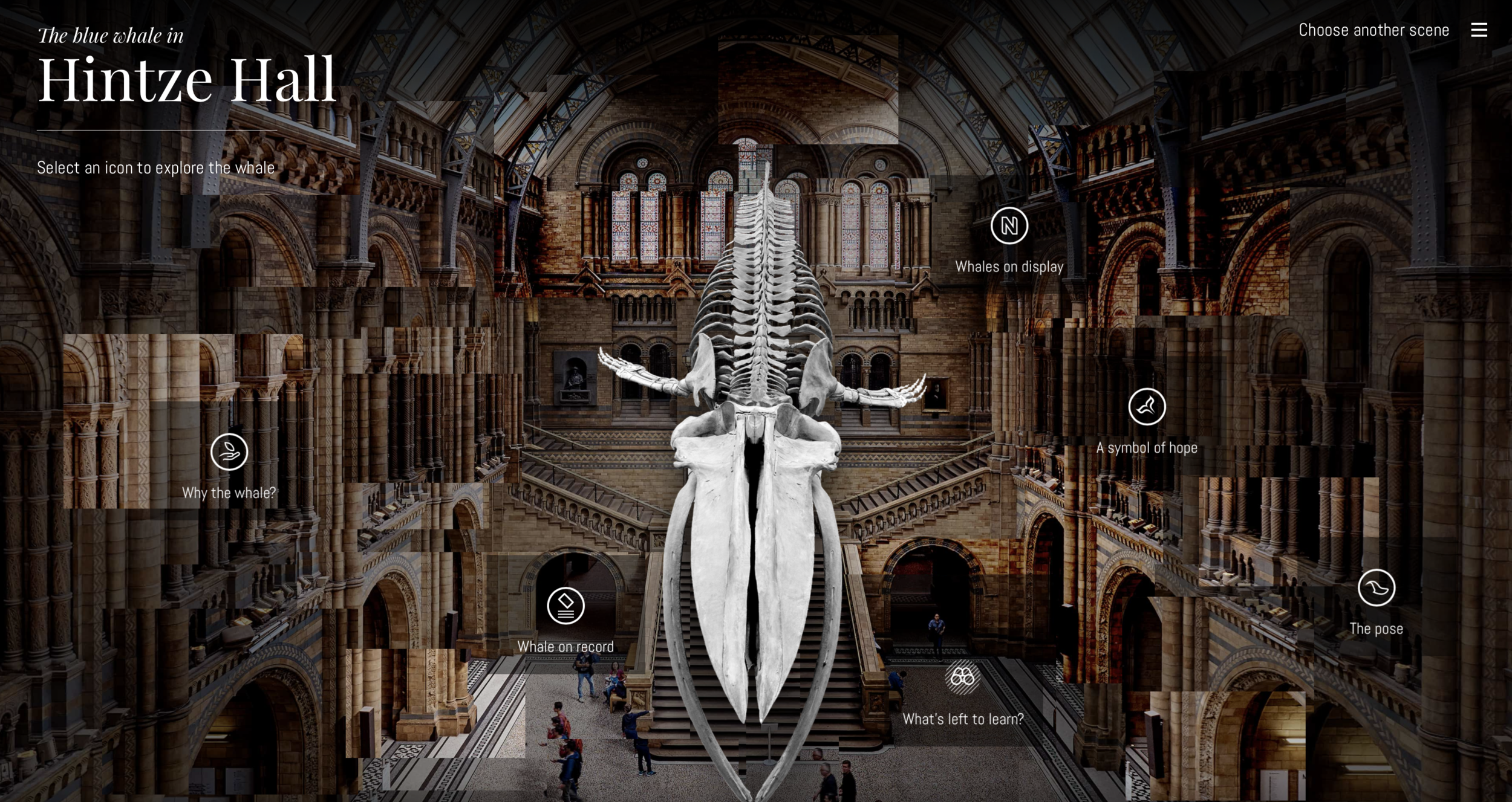
A white ago the national history museum outlined that they wanted to redesign their online platform. Casson Mann, a design consultancy, was first commissioned and they wanted to create tension between the museums architecture and the scientific aspect. The revamp mainly focusses on the authenticity of the collection and they wanted to mainly focus on the whale that is suspended from the ceiling. They want it to be a reminder of the fragility of life and the responsibility that they have towards our planet. In partnership with this they also reimagined their online platform and app which goes along with the story of the blue whale.

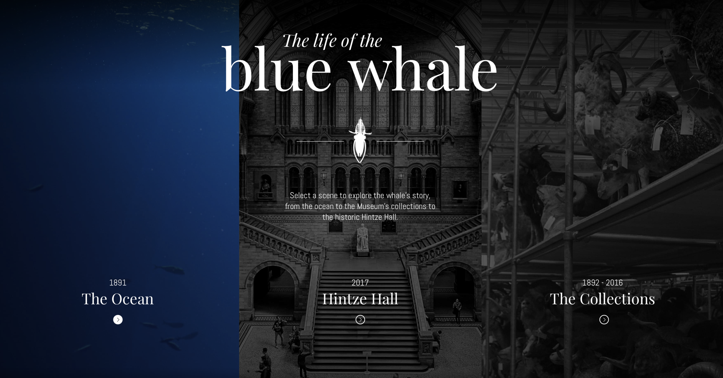
Strengths and weaknesses Evaluation
The national history museum have made hope the whale the focus of their remodel within the museum and on their online platforms. This has allowed them to gather information about the sea and the museum and other collections for the user to read about. I feel that they platform layout is very clear and it is easy to navigate and explore from every perspective. It clearly is meant for all ages as there is limited text. I also like how it tells a story which would then allow the user to visit the museum to learn about hope in person.
This is just for one artifact within the museum, it isn’t clear that there is more interactive information like this around. There is information but it is really lacked and I feel this could be improved with the amount of information that is accessible. The moving background to the site is slightly off-putting but can see that it adds an edgy effect to the overall interactive online experience.
Weekly Reflection
I thought this weeks resource from Micheal Bierut was really interesting especially how he talked about all of the projects that he had done in a How to kind of way. In the typical designer explanation, you are often just given the brief overlook of the project that they have designed but this felt more personal and almost getting in the head of bierut as the most important part is the creative process.
Looking through and researching all of the different briefs that were available for this weeks workshop task, gave me an insight into how the briefs might work in the working environment. After doing some of the research, I was drawn to two different briefs, even though all of them were appealing. The creative Conscience and the Science Group, but after looking at more of the research i felt that with my background in spacial design that there was more for me within the science group brief. After deciding this, I went on to research different competing archives that I thought were similar but contrasting to the science group. I wanted to research a range of areas and not just stick to classic museum archives. This led me to the national history museum, machine hallucination and the Glastonbury archive.
Ideas Wall