Week Nine
Lecture Notes
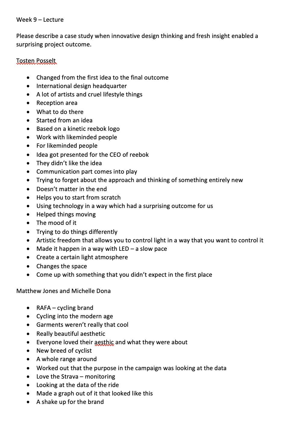
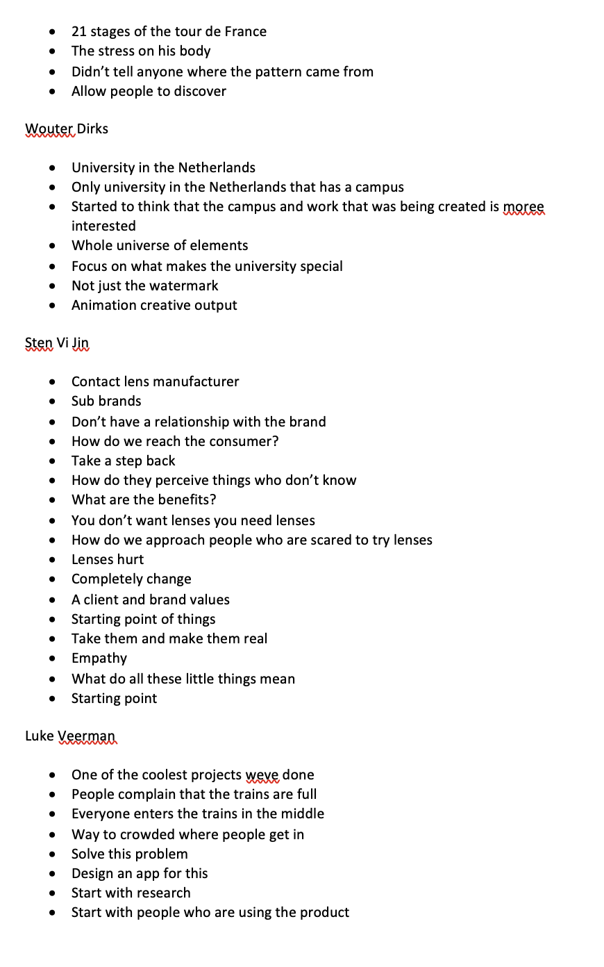
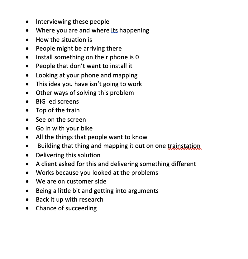
Lecture Reflection:
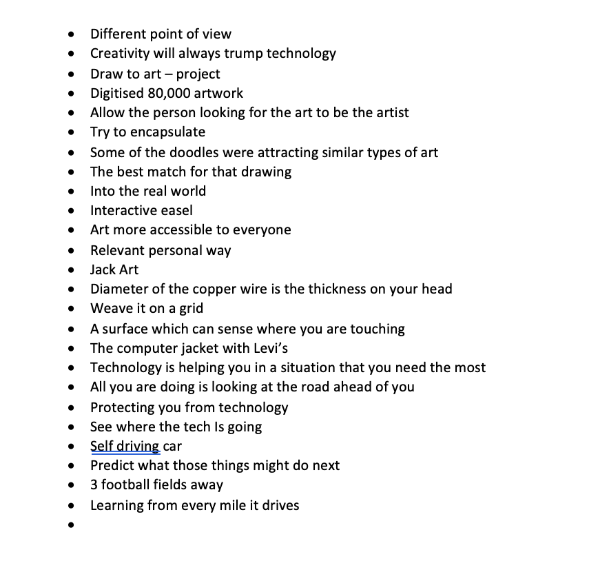
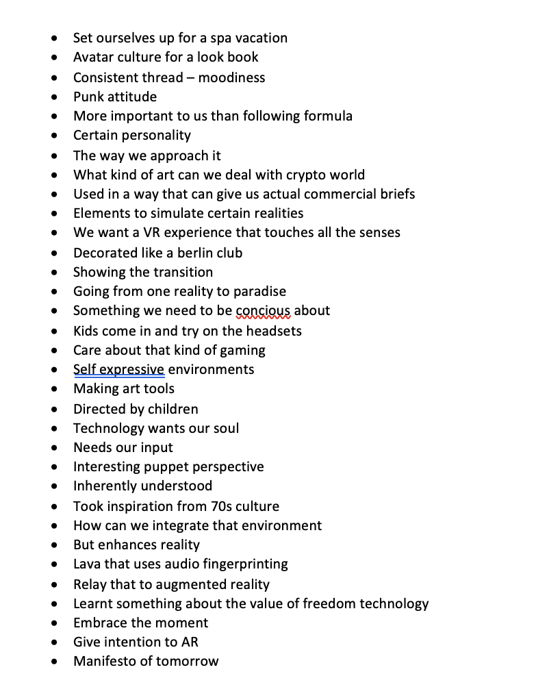
This weeks lecture showed loads of really interesting examples of work that has taken a different turn but the outcome was really successful. All of them look at the outcome in a really different way and take elements that aren’t nessecarily what the client has asked for. I like the project that Luke Veerman talks about and talking about when the train is full, he makes a good point about if you are using an app you are counting on people to engage with it and download it with the majority of people wont do. Looking at the screens and other ways to solve the problem. The solution was a really simple colour coded output that made a difference in peoples lives. Taking a step back from the concept can have a positive impact.
Resource Notes:
Resource Reflection:
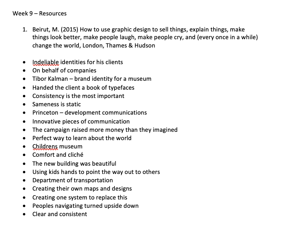
R1
Within this resource with Beirut, I thought one of the most interesting case studies was the one with the children’s museum. They talk about how instantly as designers we look at the comfort and cliche - stuff which everyone thinks about to do with it. But instead they involved the users that allowed them to create this whole new identity.
R2
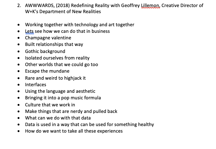
This was a really interesting talk as its something that is so far from the norm of what designers are doing. They have really pushed the boundaries of design. I was really taken with the VR experience that touches all the senses, because it allows the user to be there even more. I was also interested in this who notion of self expressive environments but also the value of freedom technology.
R3
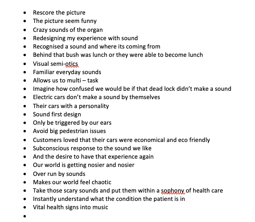
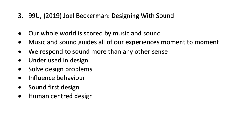
I have never thought about sound design before but beckerman showed just how important designing with sound can be. I was especially fascinated with the redesign for the hospitals that allow the staff to check the vital health signs. I have always loved human centred design and It’s great to see it in a new light.
R4
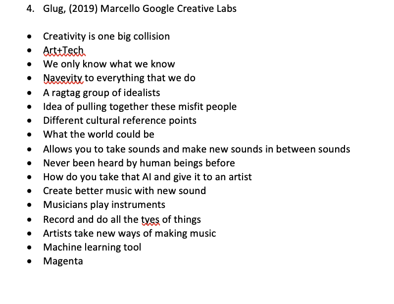
Google creative labs talk was the highlight of the resources for me this week. With the best part being the Draw to Art project, this allowed the user to draw an image which then allowed the to explore the range of art work that was on offer. I thought this was such a great idea especially for children learning and gave them a personalised experience but also became accessible to everyone.
Research:
In what areas can I improve my concept? How can I develop an innovative, experimental and brave approach to elevate my selected concept?
Reflecting from the resources and Lecture this week, there are a lot of areas of which I hadn’t even thought about including or thinking about within my ideas. Beruit spoke about how Consistency was important but also as designers we are always drawn to being comfort and cliched - is there another way that I can look at my ideas? How can I step back and look at them in a new way? Within the resource with Geoffrey Lillemon, he spoke about how we need to be different, we want to stand out and enhance the reality. Within the google creative labs talk, I saw loads of different ideas and projects that allowed me to think about my ideas, especially how am i going to get people to connect and interact with my concept?
Contrasting case studies
Last week I looked at some similar case studies to what I was interested in, this week I want to look at some that completely contrast my ideas and project which was suggested during this weeks lecture. To do this, I really tried to look at studies that I wouldn’t be drawn too or that were trending in an area that I wasn’t looking at. I focussed on the topics of product design, illustration, animation and fashion.
https://www.itsnicethat.com/news/national-gallery-of-canada-rebrand-graphic-design-250621
National Gallery of Canada does a rebrand towards decolonisation, although this case study isn’t directly relevant, I thought it was interesting to see the rebrand of a company that has been going for years. It took its inspiration from artists and employes. The logo has transformed from a square to a shape shifting circle that animates through various iterations. “Centeno Milton describes as “a permeable circle, inviting people in and radiating outward”. She goes on: “We had to show that we are constantly changing and that the connections that exist outside of the frame are limitless. Almost as if a kaleidoscope is letting light in as it turns, shapes connect, morph, recreate to become something bigger than the individual part.””
I love the way there there is this thing about the gallery and how they describe it, I want to take inspiration from the words of Centeno Milton. And look at the constant changing connections and limitless connections that there are available within the archives.
https://www.itsnicethat.com/articles/saad-moosajee-animation-030621
I wanted to look at an animators perspective of how they create immersive experiences. I looked at San Moosajee article with its nice that. He speaks about how he is “constantly exploring the balance between the graphic and the cinematic”. Alot of his work is mistaken for real life and real events that have happened. “I’m as focused in telling stories as I am in designing how they look,” he tells It’s Nice That. “This approach is not just about meticulous composition, but to me represents a complete consideration of the image and its influence on the story.”” He is driven my detail and process mixed with work ethic, which is what I will need to remember the details within the installation that I plan to design.
https://www.itsnicethat.com/articles/assemble-yinka-ilori-guest-edit-architecture-290621
Having looked at Assemble in previous modules and always being interested within their work, this is the founder talking about how storytelling is critical within their work. Which is a factor that I need to think about with this project. Maria Lisogorskaya talks about how telling the story is a way of understanding the idea which allows everyone to understand what is happening. “All that we make, say an experience is an accumulation of stories.” “Follow your intuition, what interests you and what would you like to commit time and energy to. Being into something is important. See where that takes you and then the story can evolve. Sometimes it’s fragments of an idea, a sketch, a feeling, a passion, a strong experience or intellectual pursuit. And patience and time, the story builds.”
I also found this article really interesting to what we actually consider historical significance. Plastic cutlery has obviously been banned but is also this huge global problem that causes a lot of upset. This collection by 2 designers has over 700 pieces, which allows us to see these objects in a new light. In the future looking back on this collection may humour us but this will be interesting for many to experience. Thinking about whats logical to showcase within the archive collection.
Workshop Challenge:
Review your initial ideas and reflect on the feedback and comments made by staff, peers and engagement with your target audience.
Select one initial design concept, which you think will successfully answer your chosen project brief. Announce your preferred concept on the Ideas Wall.
Research design thinking, potential formats (print, digital, environmental), traditional and new media, emerging technology and innovative production methods to gain a fresh insight into your project direction.
Add relevant company and project links to the Ideas Wall and upload a post onto your blog to evaluate how your research will help gain a fresh insight into your project plan and help reach your target audience.
Develop your design concept and post your innovative design thinking on your blog. Add a blog link onto the Ideas Wall, for peer discussion
So starting off with the ideas from the previous week, the main comment that was made was about the fact that the concepts I have come up especially with the AR with need to be so other people can socialise together and interact together and it not be so independent. I was also a bit stuck on the feedback, so I had a tutorial with ben about this and asked for some feedback from him:
Ben spoke about how passionate I seemed with two of the ideas and how these two ideas were very similar.
This is a reminder of the ideas from last week with the research questions with the ideas beneath:
How can Augmented Reality unlock a new space?
Visually being able to explore the physical archive anywhere, an online museum created with AR.
Being in a digital era and with the target audience being global, why couldn’t the physical archive space be accessed anywhere in the world? This would be like the new AR art galleries that were created during lockdown to showcase artwork in a new way. This would be an immersive experience that would be able to access via a phone or a computer app. This way the object could be viewed in a 3D form and explained how it is used.
AR Installation space combining the physical and the digital.
Being able to give the archive exposure to people, this would allow a physical space combined with an online platform that would show different objects within different settings - Think pokemon go but archive edition. This space could be small and permanent but also within your local town or city.
Can an immersive experience allow for the archives to be more memorable?
Having an interactive wall within the museum and online that would allow you to explore the archives.
Whilst visiting the museum itself, i noticed the ones with the interactive visual aspect were the ones that people were most interested in. If people were able to interact online with the objects then there may be more people visiting the site. There was also this aspect of having an interactive wall in the museum, that people would be able to approach and explore which could then also be translated to the website “Interactive wall today”.
Having a pop up or portable installation that would allow people to experience different pieces and collections within the archives.
Within this concept, I imagine a pop up food or drinks space or even just an space that has been constructed around the purpose of raising awareness of the archives. Potentially if the food was named after the archives or some of the collections and you were given information on the packaging or within the digital screens that surrounded. I feel there could also be a way to explore what if this could be combined with a personal element, if you visit all the pop ups and at the end the app then gives you a summary due to what you ordered what might interest you on the archive.
How can personalisation allow for the user to connect with the archives?
Personal questions that would then allow for personalised collection of the archives.
Within the museum, there was an interactive space called who am I, which asked you personal questions with a summary at the end - a change of this if personal questions were answered of your interests - could this change the way that people experience the archives? This could be combined with an installation or an the interface online?
Having an app or site that would allow you to have a profile of your favourite pieces.
Following on from the previous on the lines of personalisation, if personalisation was on an archive app that would be a similar layout to instagram where you could explore different collections which you could then favourite and add to your own profile. These would then be transfered to what would show up on your ‘explore line’. You could then share with friends and follow friends on the space.
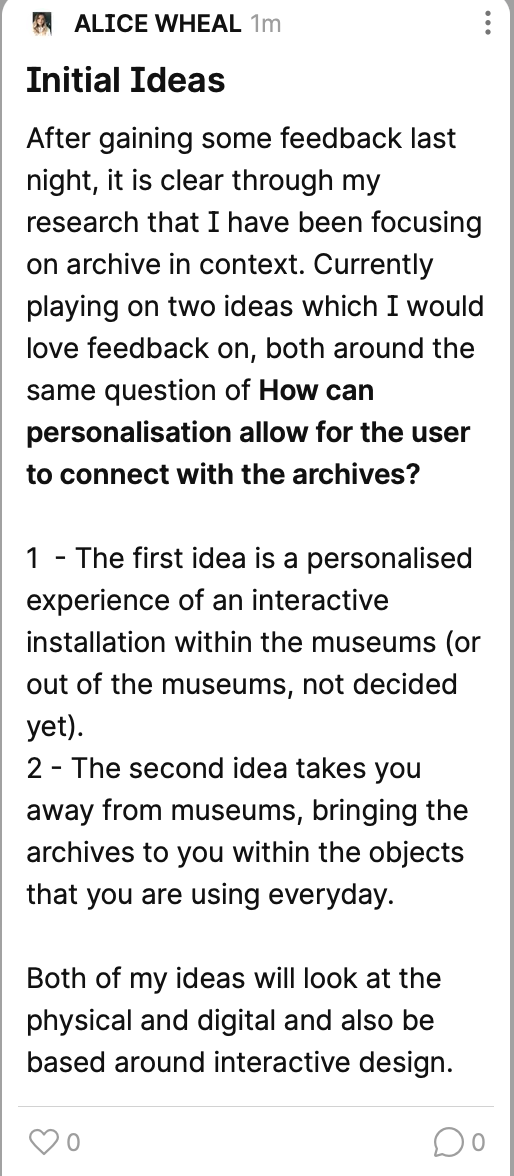
From this I have narrowed it down to two ideas but changing it so the questions are the same questions, both of which are based around the archive in context: One of them creates a space within the museum and the other you are bringing the archive to them. I still need to work on both these concepts this week before deciding which one to focus on:
How can personalisation allow for the user to connect with the archives?
Personal questions that would then allow for personalised collection of the archives.
Within the museum, there was an interactive space called who am I, which asked you personal questions with a summary at the end - a change of this if personal questions were answered of your interests - could this change the way that people experience the archives? This could be combined with an installation or an the interface online?
Having a pop up or portable installation that would allow people to experience different pieces and collections within the archives.
Within this concept, I imagine a pop up food or drinks space or even just an space that has been constructed around the purpose of raising awareness of the archives. Potentially if the food was named after the archives or some of the collections and you were given information on the packaging or within the digital screens that surrounded. I feel there could also be a way to explore what if this could be combined with a personal element, if you visit all the pop ups and at the end the app then gives you a summary due to what you ordered what might interest you on the archive.
(This idea was slightly different as I can now see the experience being within the everyday objects)
NEW CASE STUDIES: SIMILAR PROJECTS TARGETING SIMILAR AUDIENCES!
I decided to see if I could gain a new perspective from looking at some of the case studies on interactive installations.
http://jotta.com/project/serpentine-galleries
This goes along with the other case study i Looked up to do with Jakod Kidsk Steensen, pieces from the park can be seen and its a digital archive of the species that live within the park. This sculpter acted as the starting point and the bridge between the physical and the digital.
https://www.uva.co.uk/features/harmonics2020
This installation challenges our perception of light and sound unfolding at great speed, an illusion of time bending. “As the two kinetic sculptures speed up, rotating beams of light blend to form volumes of colour, while multiple discrete sounds become a major chord. Unable to process extremely fast information, our brain reads sequential sensory inputs as a single event in time. A disconnected reality perceived as a continuum, a harmonious whole”
https://www.jasonbruges.com/art#/pentagonal-portal-the-experience-tunnel/
This art installation is an algorithmic study, is apart of a computer algorithm. The wall of light has been designed to challenge the minds of the people who can understand it and visual captivate the minds of those who don’t. “As you move through the Pentagonal Portal, you arrive in the Experience Tunnel, which again looks like something you would expect to find on the set of a sci-fi movie. As you move through the tunnel, thousands of bespoke individual sensor and light units detect your movement and illuminate to capture your silhouette in lights, making the transition through the office space an engaging experience.”
Initially I was drawn to all of these installations because i love how they use simple cardboard boxes to create a space which such meaning. This one in particular with balls and a motor, they have created an atmospheric interesting installation. I also love how the cardboard boxes are stacked.
https://www.random-international.com/fifteen-points-ii-2019
This installation experiments the amount of information that is necessary fora. moving form to be recognised as a human. When steered and animated in a particular way, the lights form a person. “if it is possible to extend these instincts from the realm of the natural to that of the artificial, and what relevance this might have, if any, in the future.”
https://www.serpentinegalleries.org/whats-on/jakob-kudsk-steensen-the-deep-listener/
Within this design which is a augmented reality and spacial audio work. Jakob has created this form of slow media that uses technology to foster attention of the surrounding area rather than to be a distraction. I think this is a really interesting approach to something thats so simple to use and foster attention rather than distraction.
https://www.studioaboveandbelow.com/work/atmospheric-seeing-2
This is an interactive project piece that uses historical and live data that combines with NO2 Levels and live weather inputs. It also explores the navigation of the body through a large scale dataset cloud in the sky, which produces these small particles that we aren’t aware of travelling through cities everywhere today.
https://www.field.io/project/kapsarc-vision-wall/
This collaborate piece, is an infinite sequence of unique spark moments as colourful. highly, highly complex network visualisations. “Bringing to life the neural activity of open-source brain scan data from the Human Connectome Project, the piece represents both the intertwined network and the complexity of human interaction.” The piece also captures and observes sunsets and sunrises which are captured through a satellite. They used a high precision, low level multi screen syhronisation and render note management framework that allows them to keep them on.
http://troika.uk.com/project/arcades-buda-tower-kortrijk/
This project is called arcades, which is an installation that emphasises the structural details of the pillars with the light. They create this illusion amongst the haze. They describe the work as the following: “Each pillar is met by a fresnel lens, which refracts the rays, bending the beams of light hyperbolically to form the arches of gothic architecture. Through the experiential deconstruction of space and light, viewers necessarily become participants, their bodies intersecting the architectural form.” I love how light really focuses on the architectural nature within this project.
https://onformative.com/work/immaterials
This project is really interesting as it looks at the visualisation of data filled spaces. How can useful information be usefully integrated into a physical space, using a light painting technique, they placed their concept of this data in space to make it haptic. I love the layout of this and how real it feels, i also love the shapes but also the abstract, if you didn’t know the information you wouldn’t know what i meant!
I think after doing this research, I have decided to combine both the ideas together:
How can personalisation allow for the user to connect with the archives?
Personal questions that would then allow for a personalised collection of the archives within a immersive interactive installation within the museums.
I wanted to create an installation that would allow the user to answer some basic questions that would then showcase them some of the suggested archive pieces in a new fascinating way. Taking an extract from the trend, how can we create physical touch in a digital way? The objects could be stored in a certain way from a certain era to another so when the user explores their personal collection, it tells a story to them in a unique way.
What am I doing and Why?
18-30 year olds are some of the least likely to go onto the archives and just explore without there being a reason too. Unless there is an interest in stem, there is a lack of curiosity towards to the archive. I want to bring the curiosity alive once more by creating an interactive immersive installation, that will bring together the physical and the digital. Using technology to visualise a personal selection of pieces from the archive based on how the user answers the questions. I also want to make sure that the user is able to touch, see and hear some of the collection within the installation. Each time the user returns, they will be greeted with a new collection of objects.
I then went back through any of the research that I had done on installations and made a mind map of what really stuck out for me about all of them including the above case studies.
Summary:
Within the installations that I have explored, I have focused a lot on having a physical space but making sure that the installation its self is interactive and digital. There is also a very big part on the visual element within the installations, showing something and making it a focus. Movement, Interaction and story telling also play a big role. I also wonder if theres something in sound that could also be explored.
Mindmap:
I then looked at the process of the steps someone would take of engaging with the installation, these are initial ideas that I will work on more next week:
Also what the personalised questions would be, these are initial ideas that I will work on more next week:
What is your age?
Which of these interests you most (Please select two)
Photography
Transport
Medical
Arts
English
Science
Maths
Books
History
Which area interests you most (Please select two)
What is your profession?
Are you passionate about science?
Have you been abroad?
I need to think about what questions would allow the interface to generate different pieces that would genuinely interest the user.
Weekly Reflection:
This week has been really useful for me to be able to focus on one idea to gain a different perspective. I found the lecture and the resources really helpful for looking at a different case studies but also how people got to an idea. I was especially drawn to google culture and arts project of the draw to art, which I am completely amazed that is possible. This allowed me to really think outside the box when it came to my concept development.
Looking at contrasting case studies that I didn’t think would link to my project, really highlighted different ways of looking at story telling, historical pieces and creative immersive experiences whether that was animated or real. I then also went on to look at installation case studies that I thought would be interesting to refresh the mind with for this week, also remembering to remind myself what and why I am doing what I am doing. I also focussed on creating a research question and a key concept this week which would allow me to continue to look at my topic clearly.
