Phase 4 - Weeks Seventeen - Eighteen
Week Seventeen:
Weekly Focus
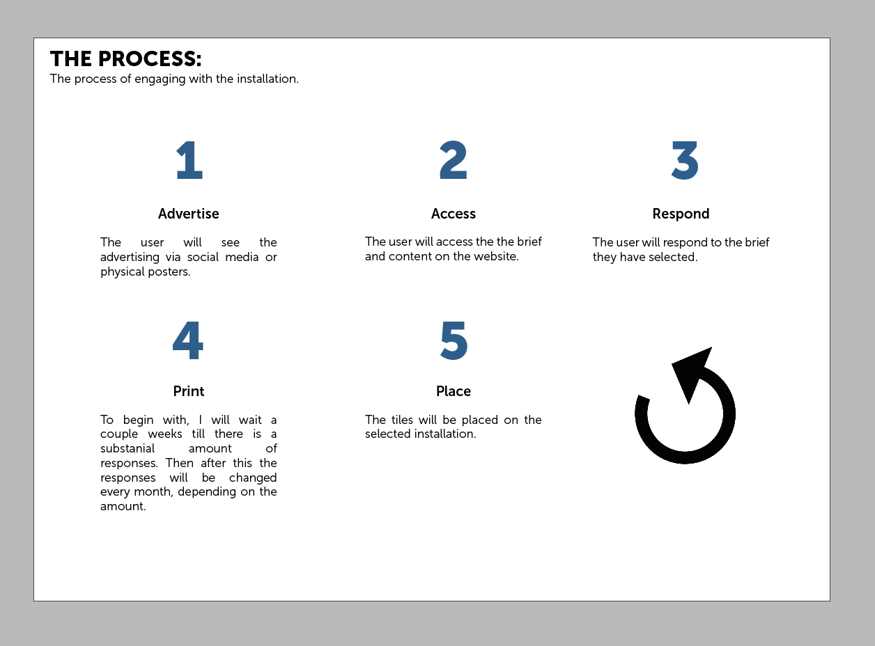
The weekly focus this week is to continue working on the essay but to also really start to design the concepts and the different elements to the project.
Continuing from the previous week, now I have laid out what I want to create, I feel i need to start designing all of these elements for the project:
Name creation:

I really wanted the name of the project to not only reflect what was happening but to also begin with an S. So I liked the Show Southampton but also Saturate as that means to like bring colour to the area. I will try both of these when i start to look at branding of the project.
Brand design
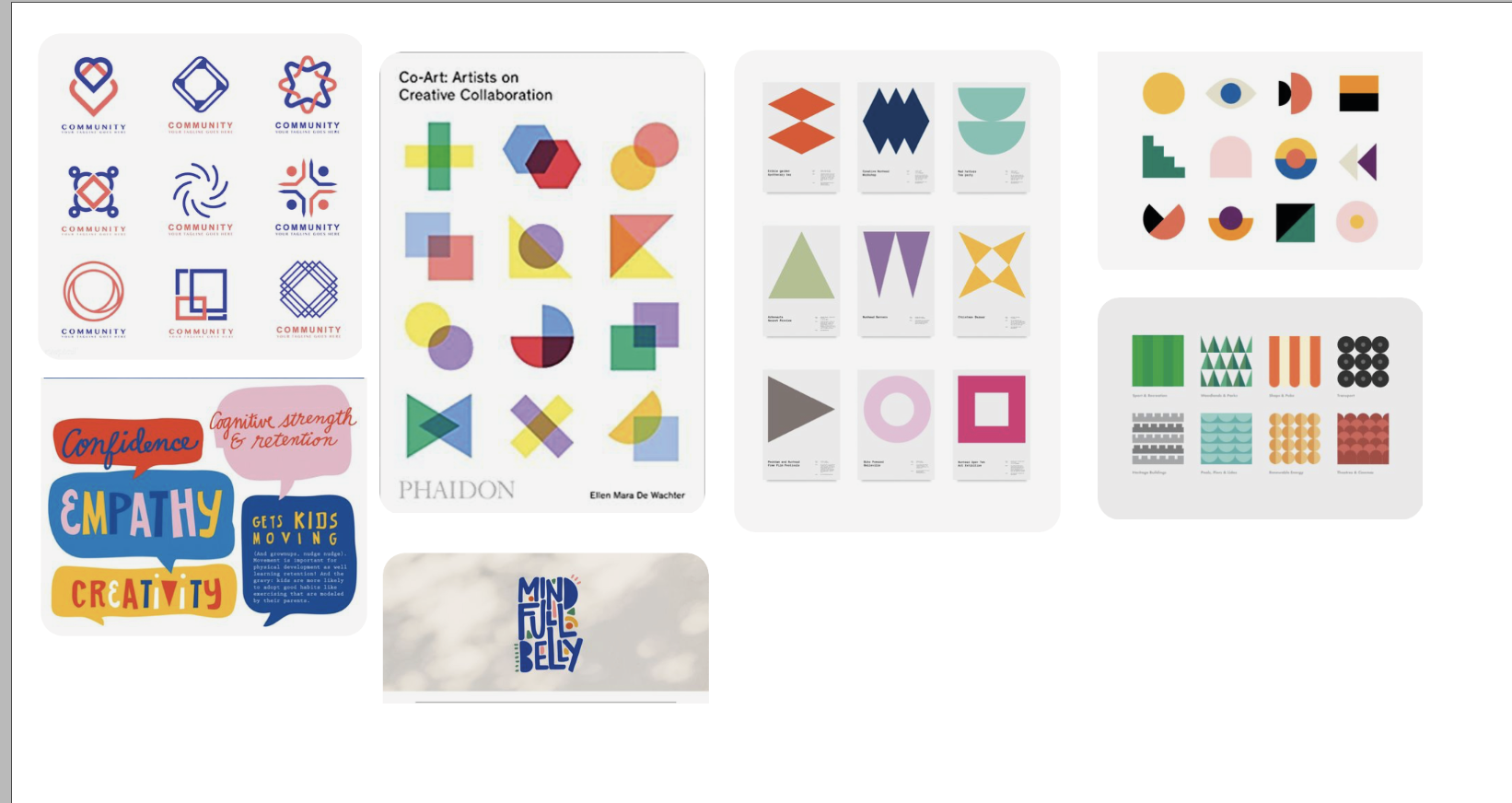
I did some research on different identity’s which i found on Behance which were created by other people. This allowed me to grasp how I want my identity to look:
I really like the different patterns and designs that were created as part of the background of this identity.

I also really liked the different icons within the below, creating characters that will allow people to be more engaged with the brand.

Another brand that I really related too was the one below. I love how basic the layout is using simple shapes and just the most simple colours which has enabled them to create advertising and social media.


Now I have a good idea what I want the name to be for the project, I went to put some mood-boards together of different brands and how I wanted the identity to come across:
Moodboards:
All the pictures for the moodboard can be found here:
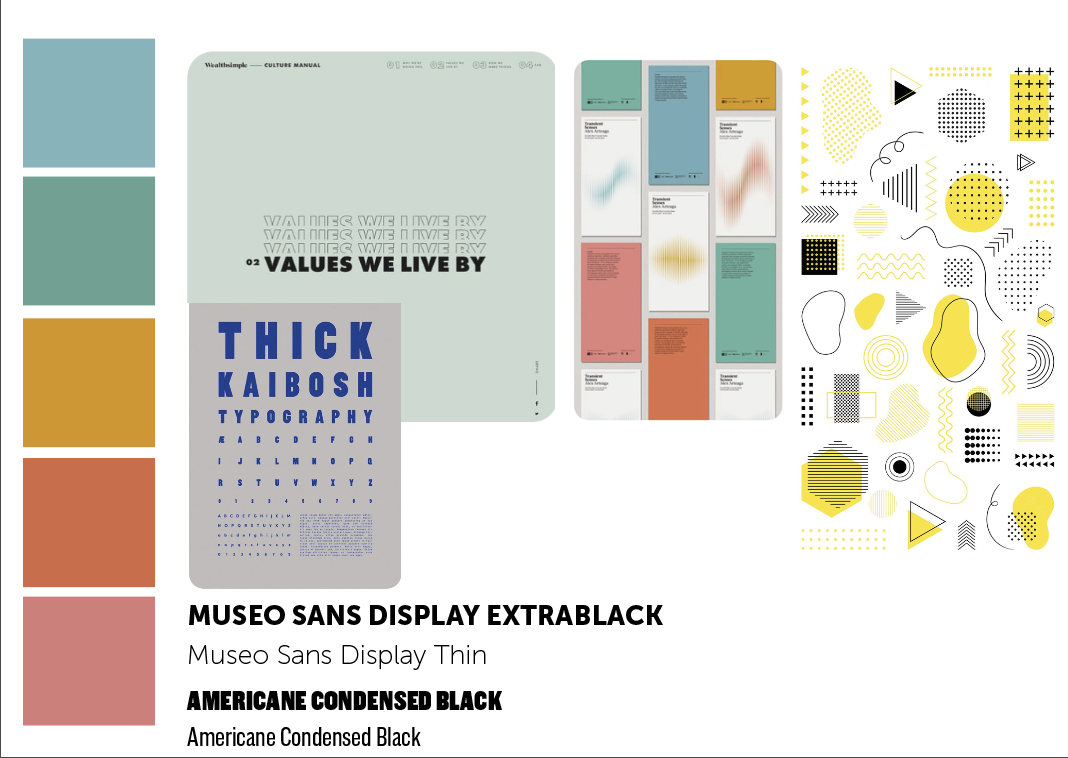
Mood board 1 - Colour Schemes
I wanted the colour scheme to be bright and colourful which can be seen in the mood board below:

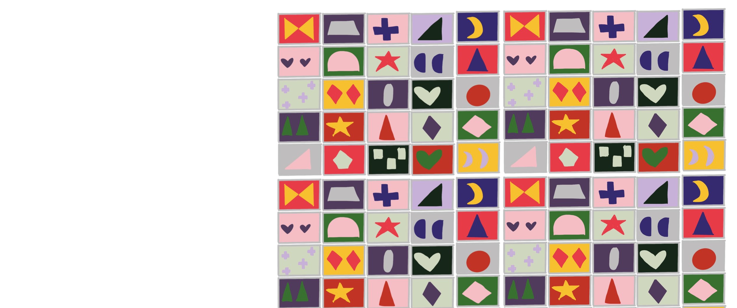
Mood board 2 - Illustrated Element
For the illustrated element - I wanted something that symbolised community and creatives but also the whole concept of the project which is tiles. I also thought of plants as this is a new lease of life for the city. I feel from this mood- board I will need to sketch out some different elements.

Mood board 3 - Typography
For the typography side of the brand, I wanted it to be super bold but to make sure that I had alternative fonts too:

Mood board 4 - icons
I think the icon is very similar to the illustrated element of the document but also I think that instead of this being something like below, I want this to use typography.
Chosen Moodboards of favourites together:
Moodboard 2:

https://www.etsy.com/uk/listing/808479752/minimalist-shapes-flashcards-printable?gpla=1&gao=1&&utm_source=google&utm_medium=cpc&utm_campaign=shopping_uk_en_gb_e-toys_and_games-toys-learning_and_school&utm_custom1=_k_Cj0KCQjwof6WBhD4ARIsAOi65air6QKZoDDto5NvsC8PDFb2wL1VLR9CLIhJ0zLv-WZtaCQzqW-bcr8aAkYeEALw_wcB_k_&utm_content=go_12603394295_125447605888_508814568695_aud-371913912633:pla-352859725646_c__808479752engb_475085961&utm_custom2=12603394295&gclid=Cj0KCQjwof6WBhD4ARIsAOi65air6QKZoDDto5NvsC8PDFb2wL1VLR9CLIhJ0zLv-WZtaCQzqW-bcr8aAkYeEALw_wcB
Moodboard 3:
https://www.etsy.com/uk/listing/1060419802/abstract-modern-geometric-shapes?gpla=1&gao=1&&utm_source=google&utm_medium=cpc&utm_campaign=shopping_uk_en_gb_c-craft_supplies_and_tools-canvas_and_surfaces-stencils_templates_and_transfers-clip_art&utm_custom1=_k_Cj0KCQjwof6WBhD4ARIsAOi65ajYtOnX1Q2ESiRp6BoJ9ga7GVZwBJedyg0WX8PcUJaE9525TQxnlccaAqlzEALw_wcB_k_&utm_content=go_12577611012_119603289037_507694396694_aud-371913912633:pla-295943621186_c__1060419802engb_528413146&utm_custom2=12577611012&gclid=Cj0KCQjwof6WBhD4ARIsAOi65ajYtOnX1Q2ESiRp6BoJ9ga7GVZwBJedyg0WX8PcUJaE9525TQxnlccaAqlzEALw_wcB

After this, I began sketching and playing with some different ways to layout the identity:

I tried to use the logo inspiration and the colours from each of the pages to make sure that I liked them before choosing the final one. I wasn’t sure of the above colours but also hhink I didn’t want to have a black outline on the boxes. The below colour palette worked well but I was still unsure on having grey boxes that surrounded them and also having a border.
I didn’t feel like the shapes were working even though I was trying to take inspiration from the case studies above, i went onto think about squares (due to the project being tiles but then taking inspiration for the graphics from places in Southampton which explains the project.
Below was the first attempt at hand drawing them but this might work better if I take the imagery into illustrator. I could then always take away the different backgrounds and just have the different logos that I have created.
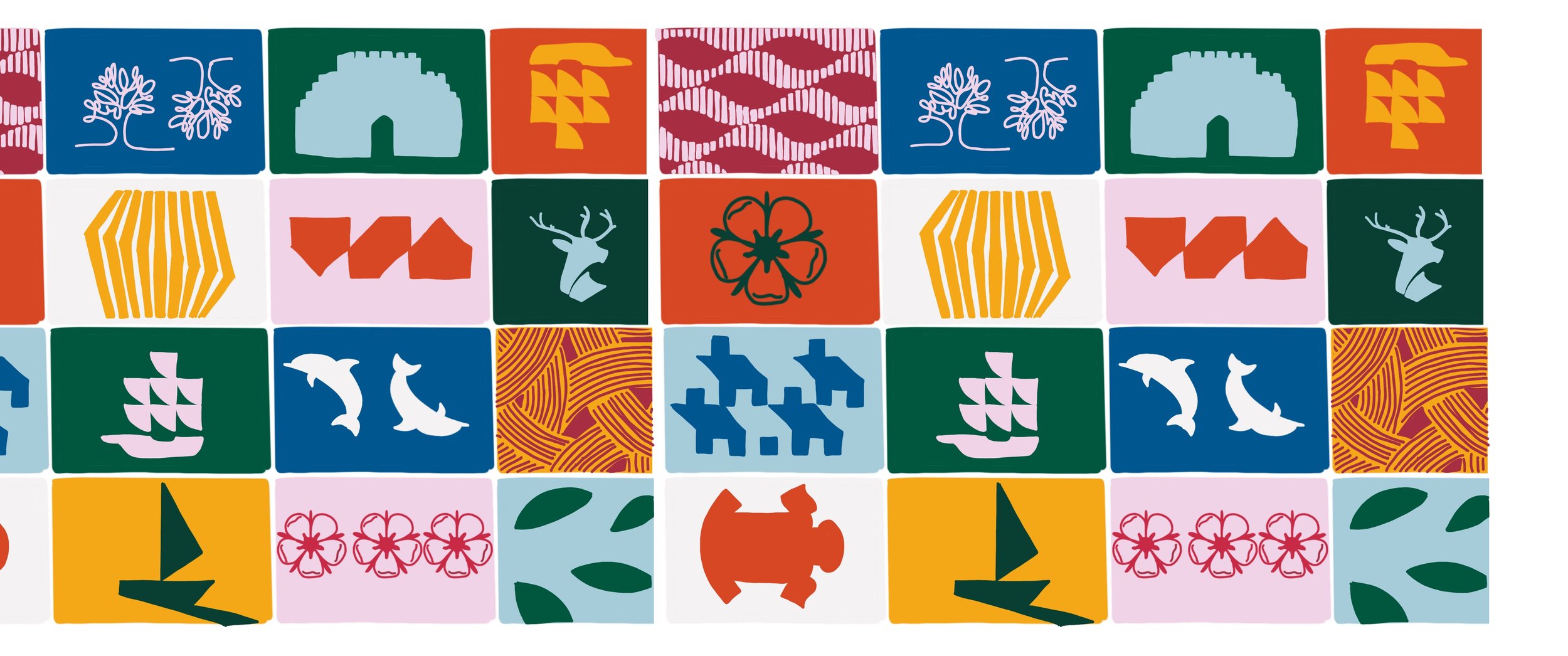
I then took the concept of this and tried to create a version that was a bit neater with sharper edges on the computer - I also thought about swapping out some of the images the and potentially playing with different backgrounds:
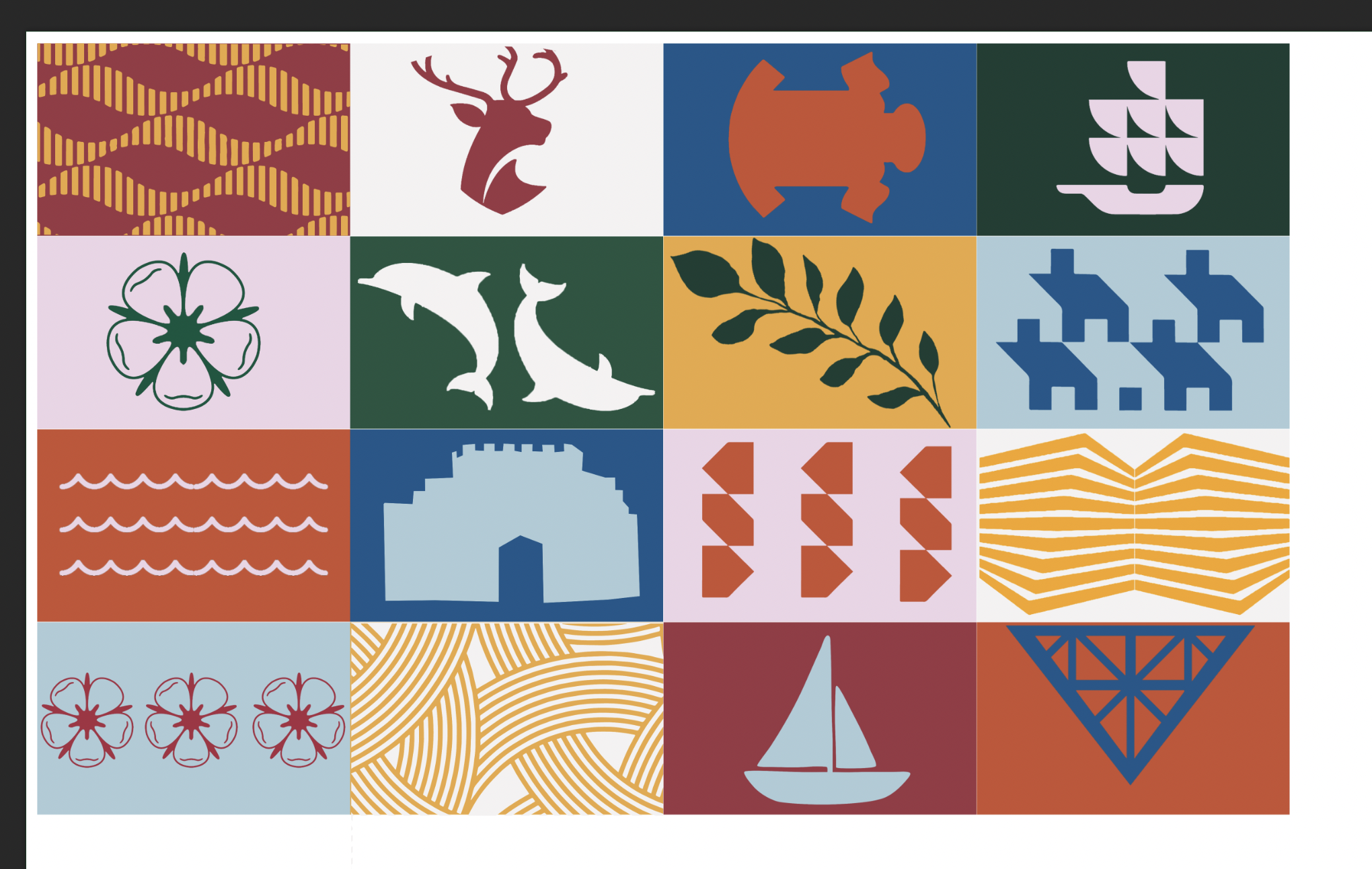
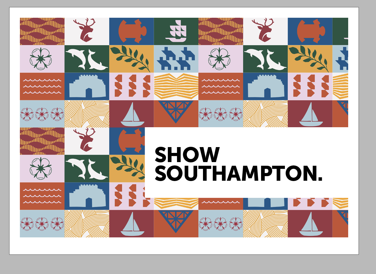
The above was the final version of the concept on the computer - each component from left to right is explained below:
Water
University Logo
Saints Logo
Docks
Southampton Rose
Dolphin (Old Southampton Uni Logo)
Water Pattern
Housing
Water
Bargate
Businesses
Old Walls
Southampton Rose
Leaves
Boat
Tudor House

This allowed me to create a Brand Identity Page:

This will be the foundation to when I come to do the advertising and the website in the future weeks.
Structures and relations:
After doing some research on different outside structures, I have decided that I want to be a half open half closed platform. I began to again sketch some different ideas but also layouts for how the tiles would sit on the building:
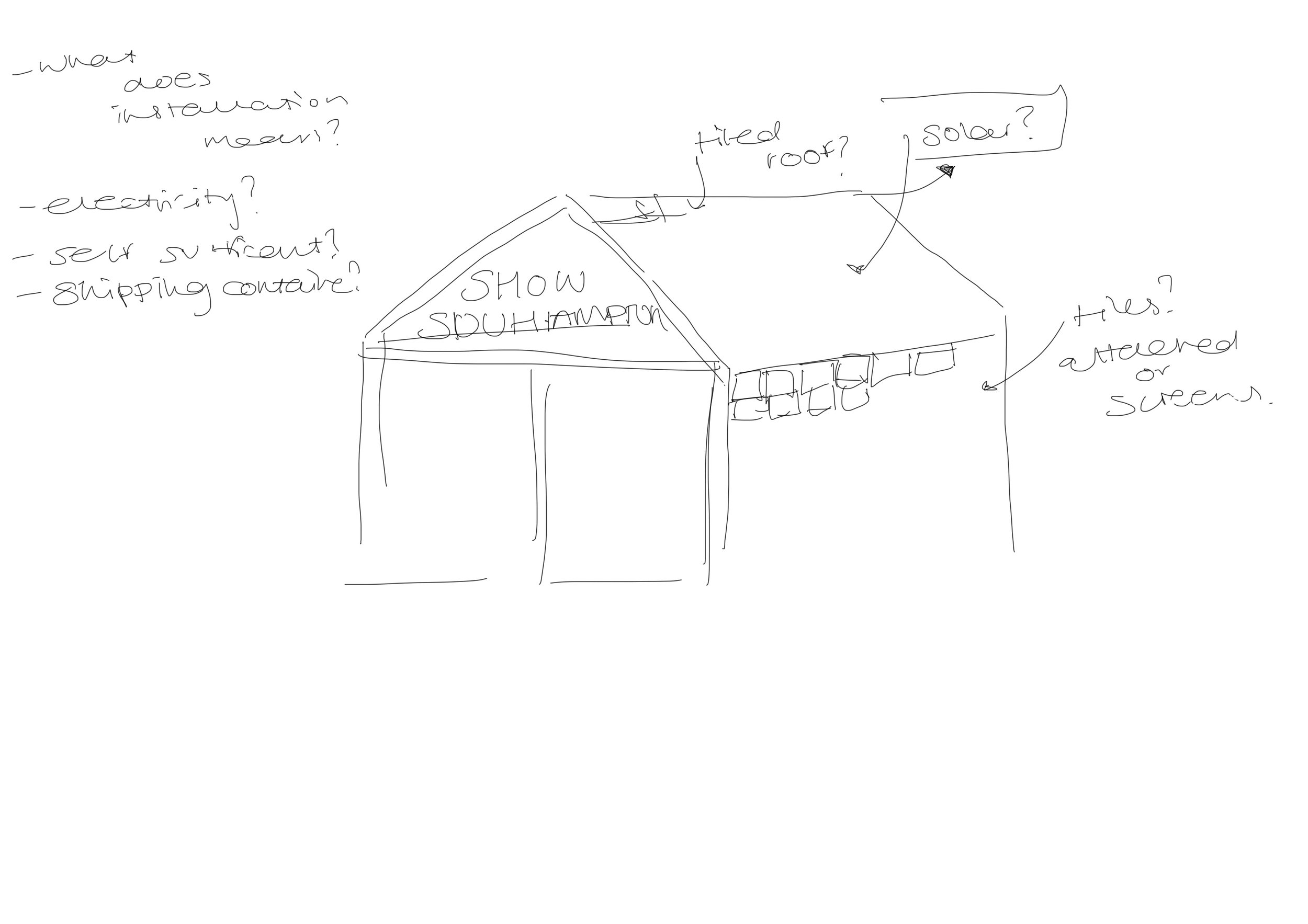
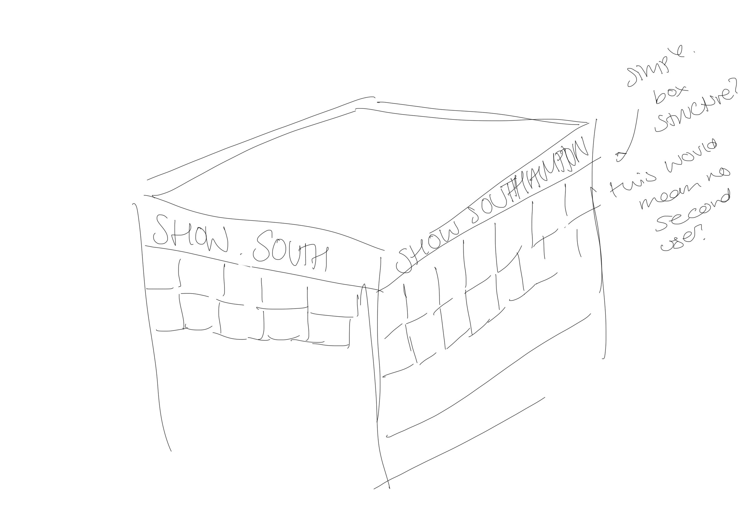
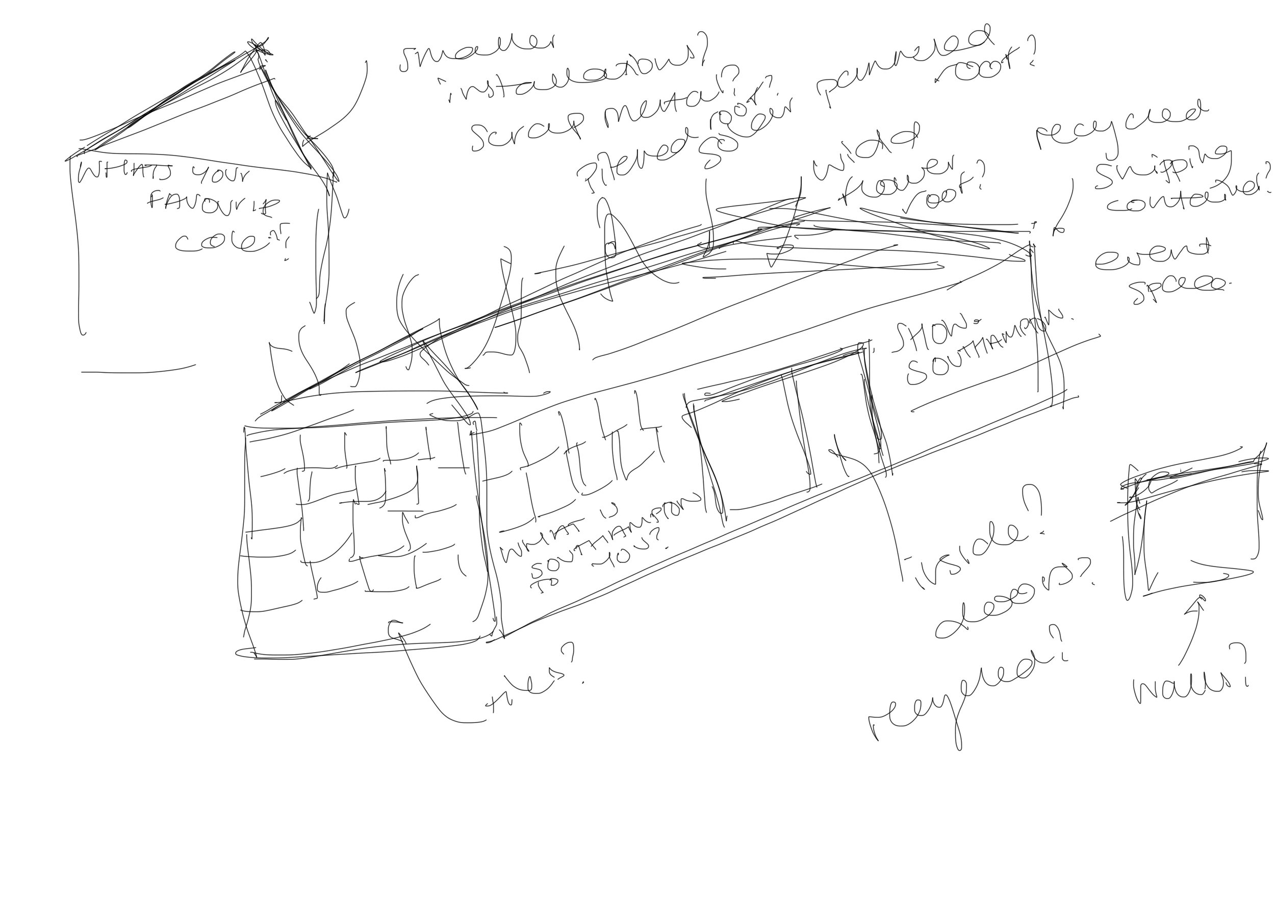

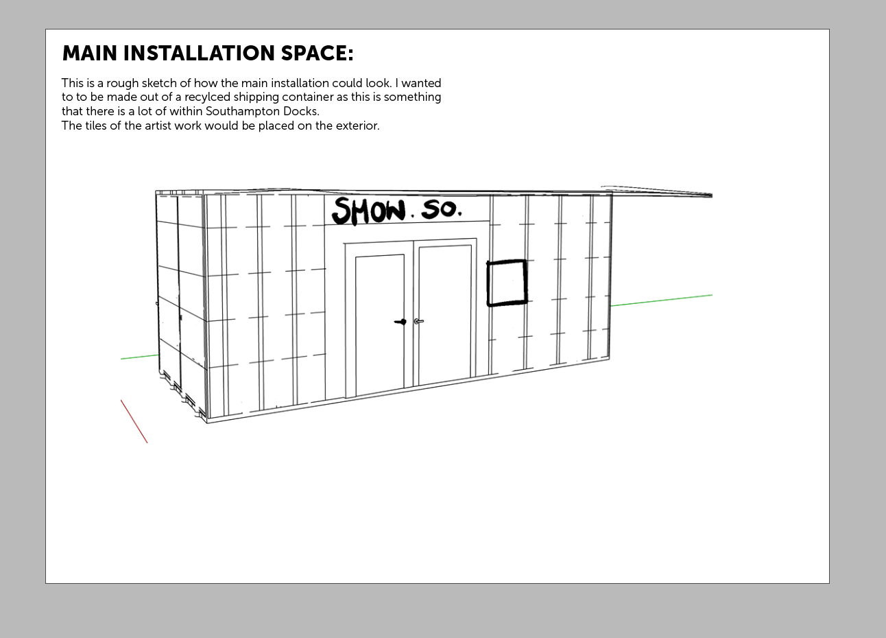
After sketching some ideas out but also thinking how the design could lead back to the city, I thought about up cycling one of the many abandoned shipping containers that are left at the docks in Southampton. I like this concept as it bring materials within a 5 mile radius and actually feel this could be a structure that was constructed off sight. I also think that shipping containers are fairly secure, which would hit the security aspect of the project. I don’t think that the small shipping container would need to hold a lot as things could be added to allow for workshops and exhibitions to go outside.
I also thought of cutting or using scrap metal to make the other smaller exhibitions that could be placed around the park. I feel I want to do two different versions of these which will be seasonal.

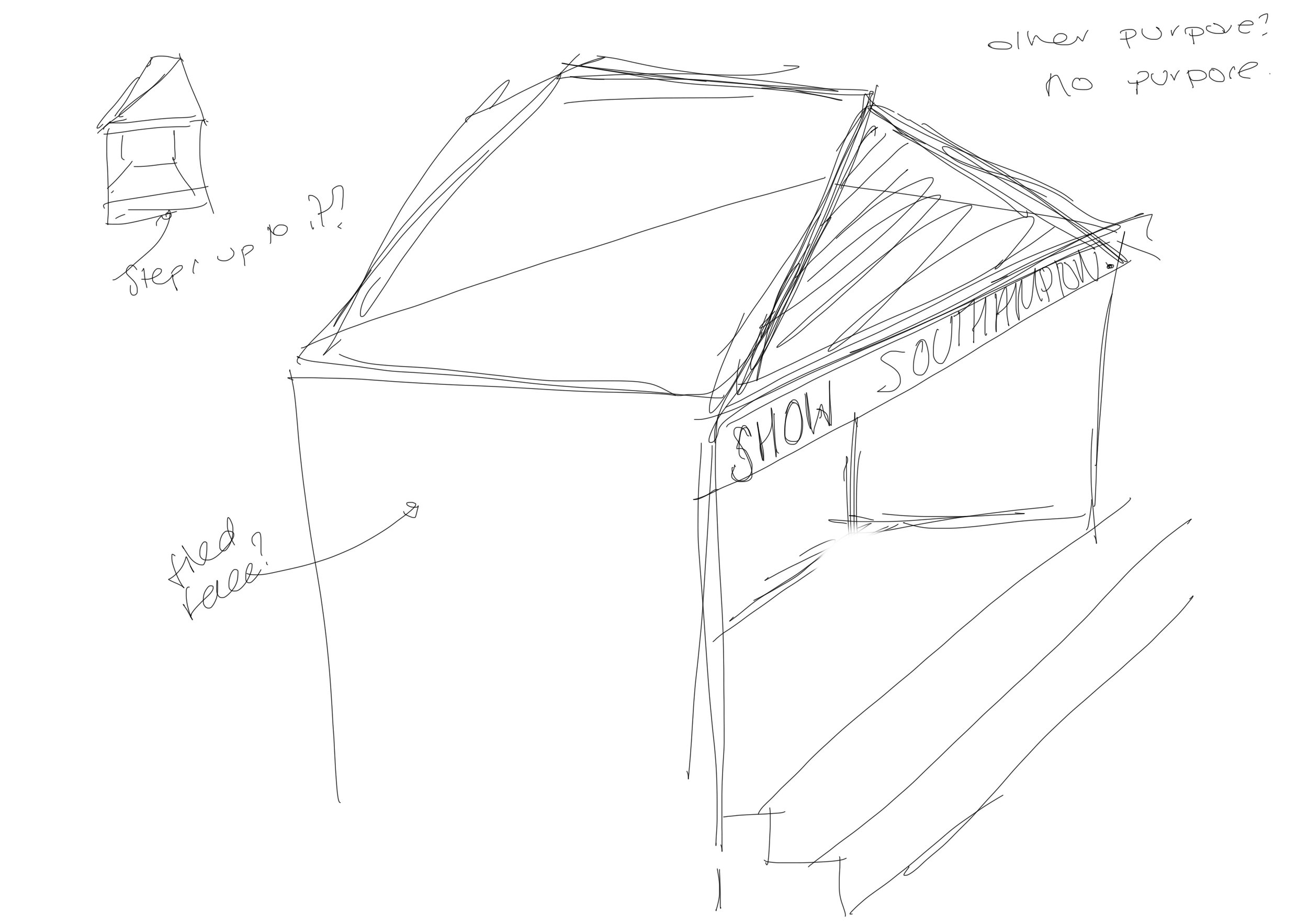
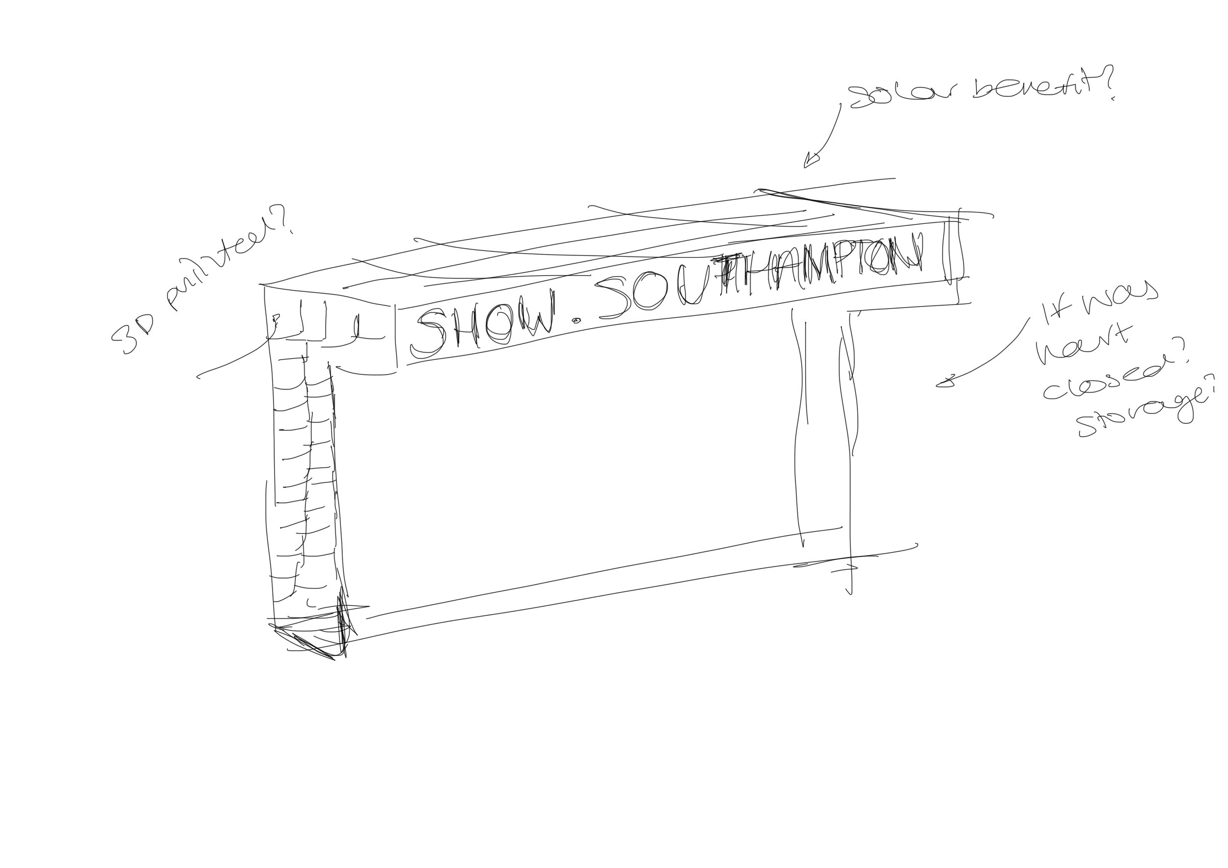
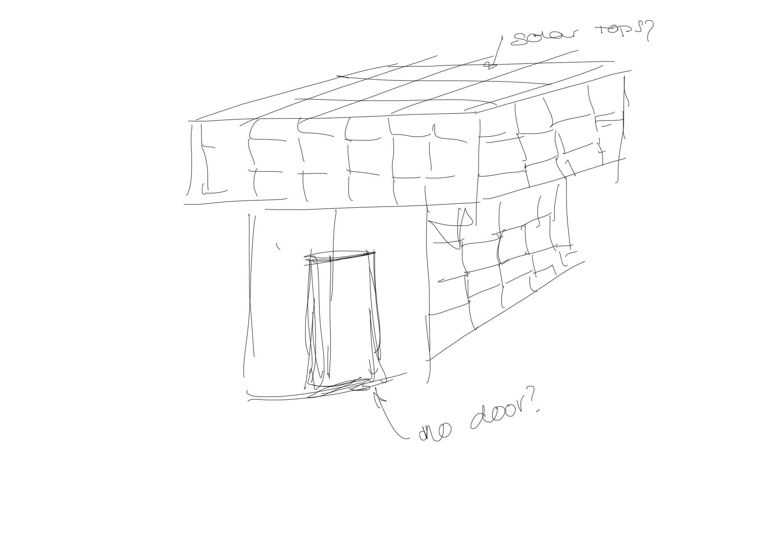
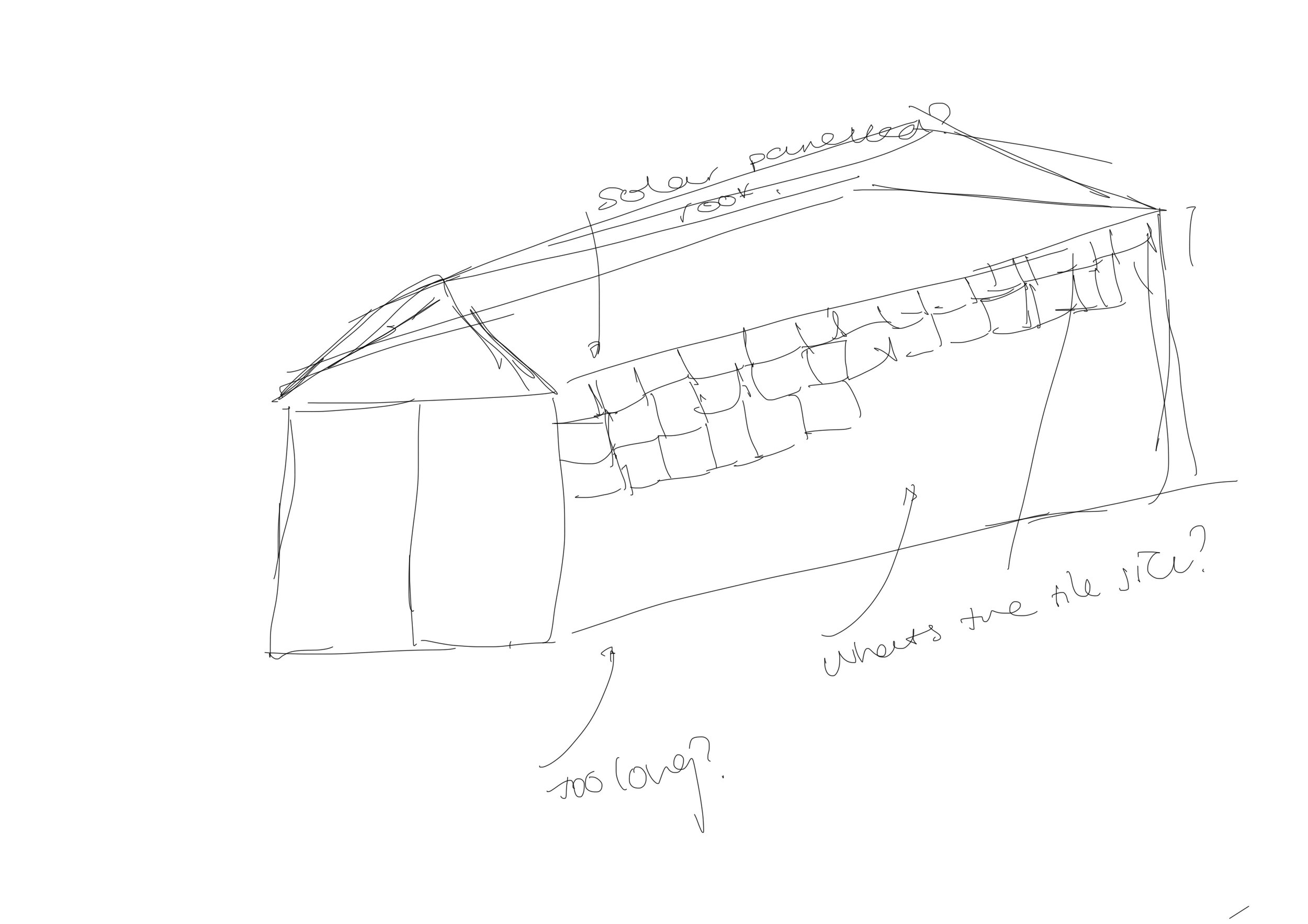
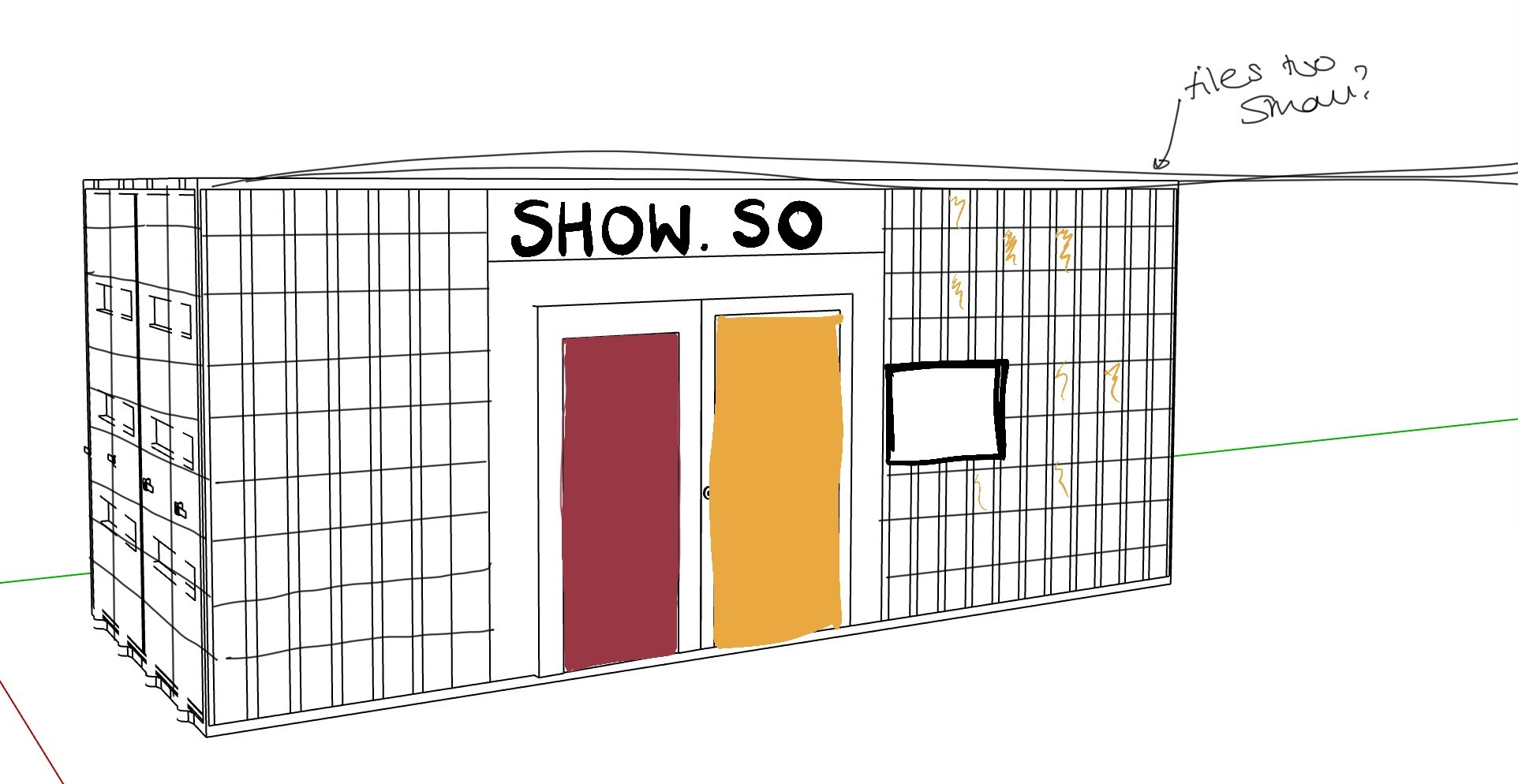
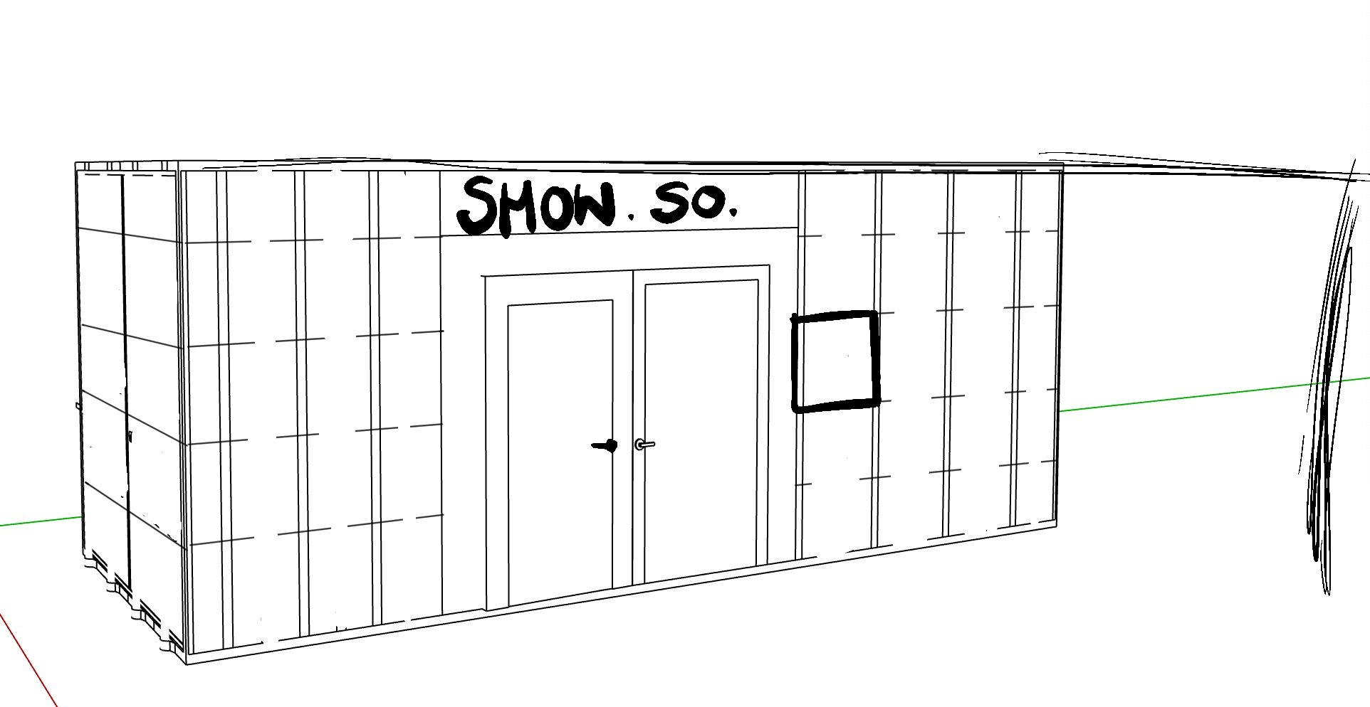
This led me to finally designing some floor plans and trying to take my sketches into Sketch-up:


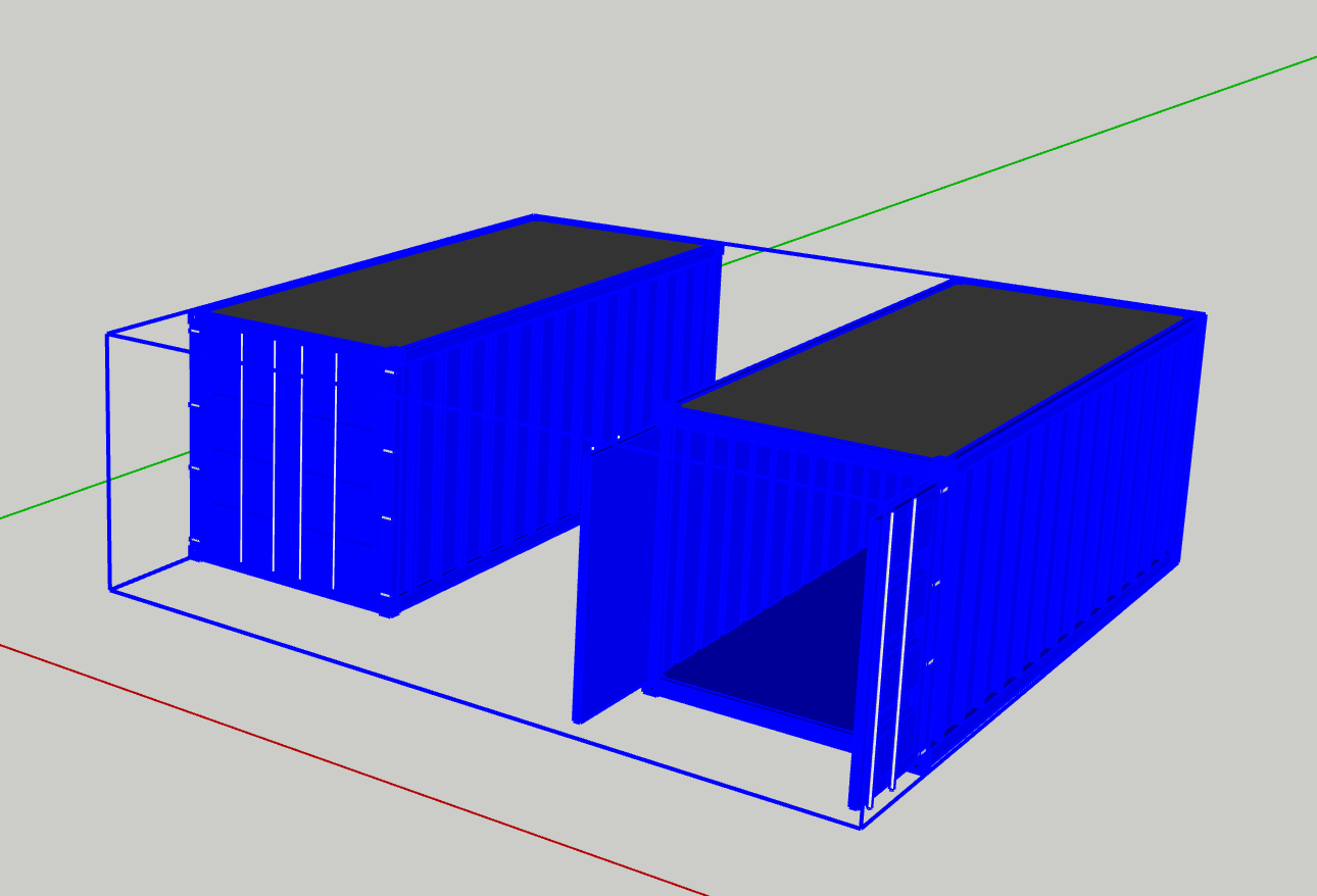
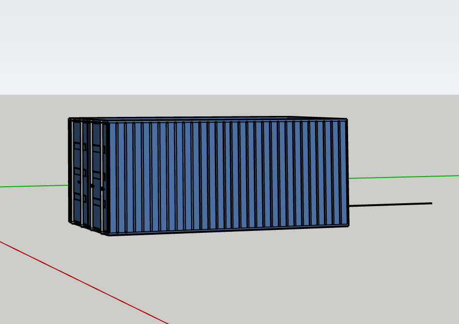
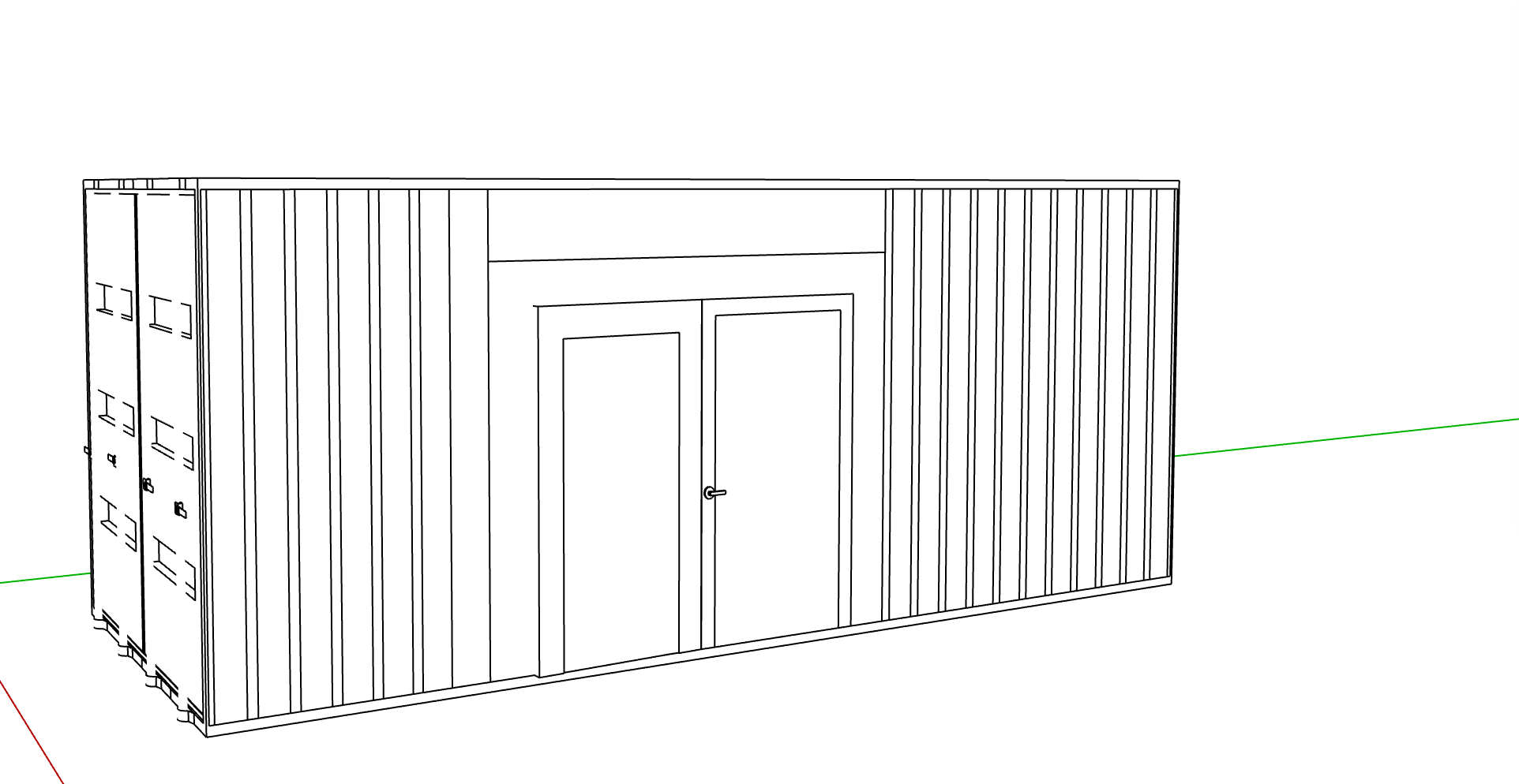
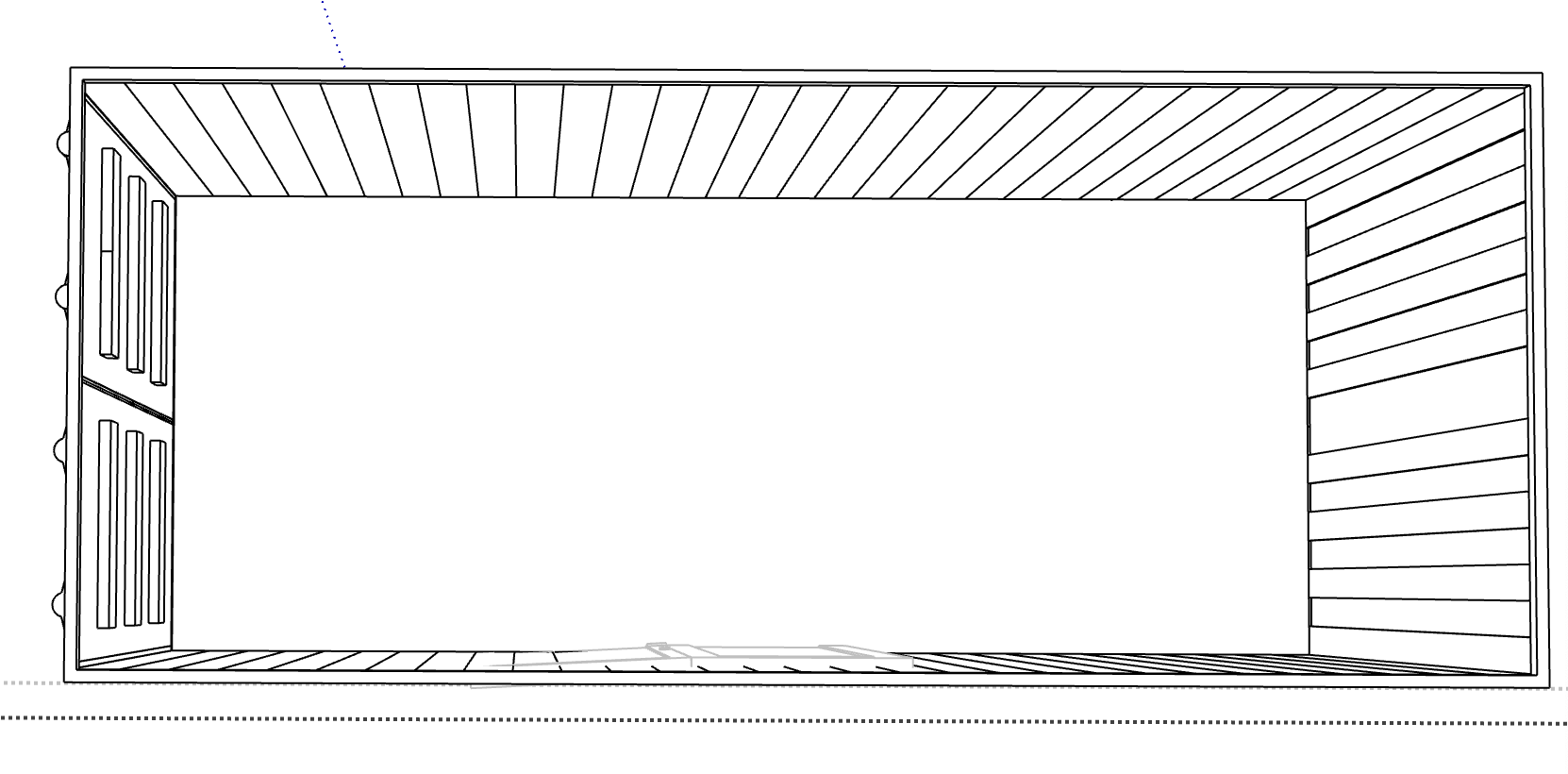
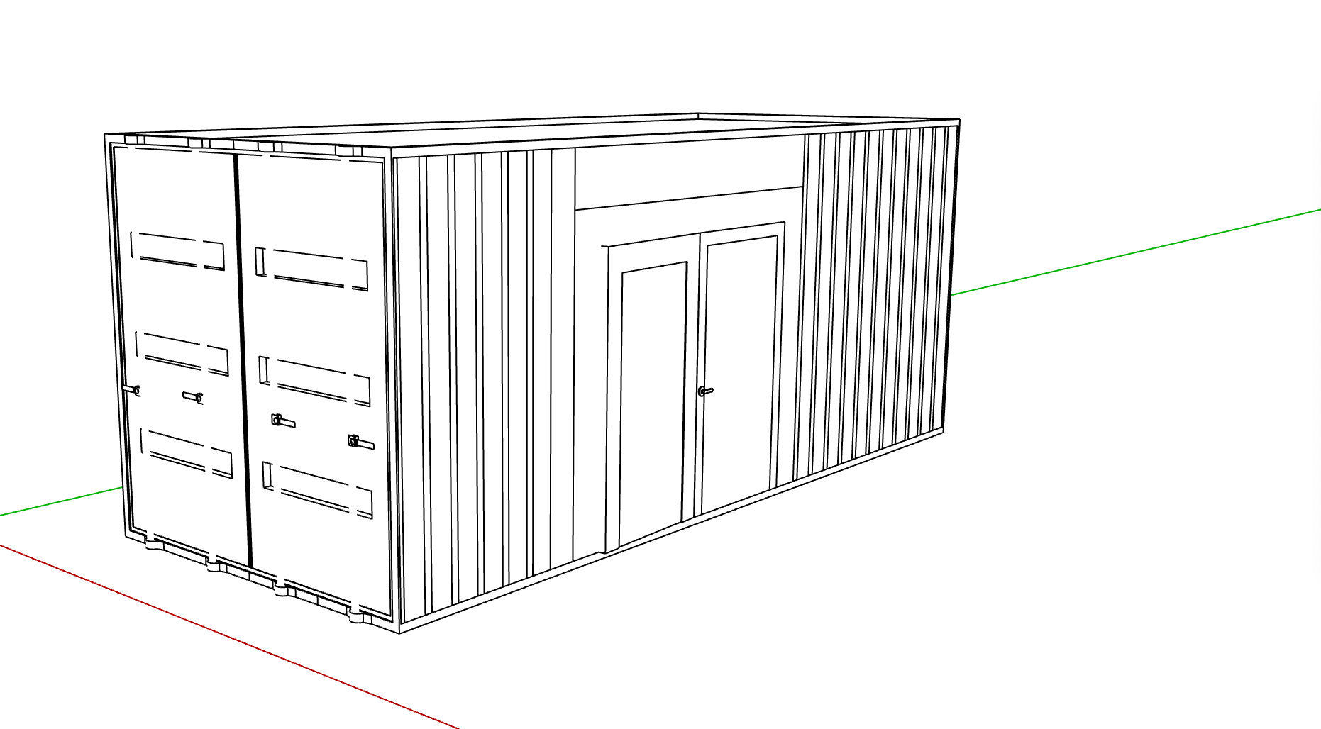
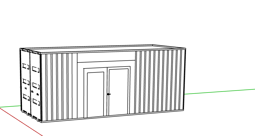
I took some screenshots of the pre-made different shipping containers that they had available to use on sketch- up and I feel this would allow me to think of sizing and scale and how much I would actually be able to fit into the space. I have decided to fit doors to the side of the space as I feel this would allow ease of entry to the space. I want to take these images into procreate to sketch-over the top of how the interior and the exterior might look.
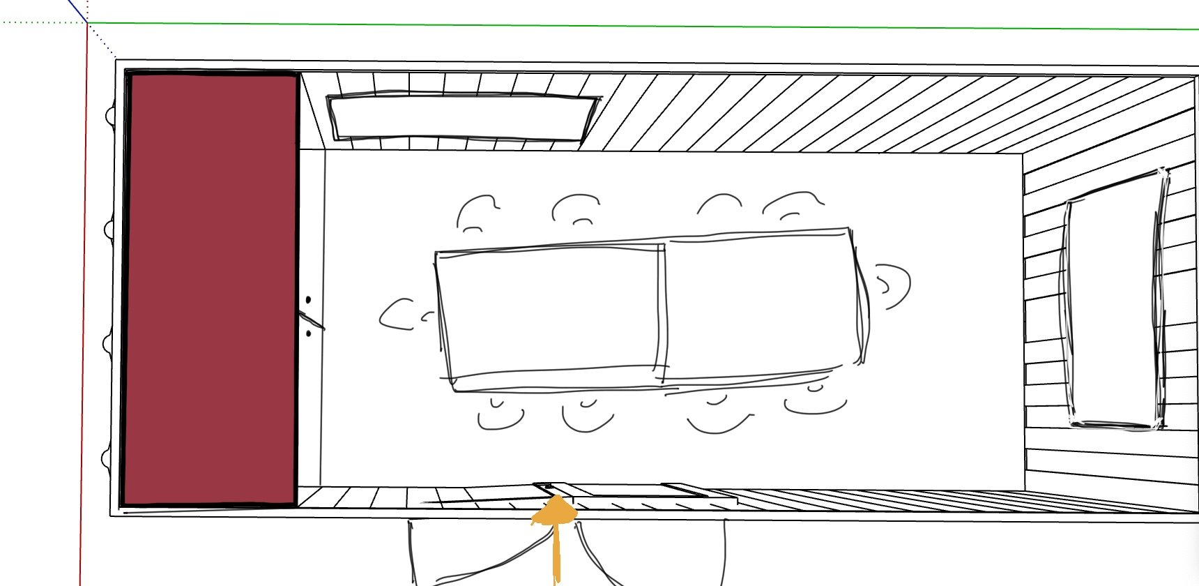
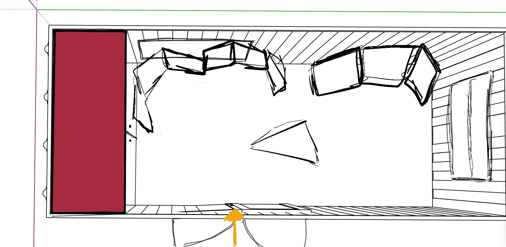
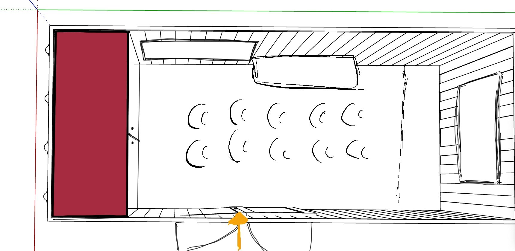
I still wasn’t sure on the whole shipping container concept and I wanted some feedback, so was going to wait till next week to gain feedback in a peer to peer.
My main questions were; A fixed tile or a digital tile? Thoughts on the shipping container? Tiles?
Location
With the structures in the planning phase; I wanted to begin to start planning the location of the site into an explanation:
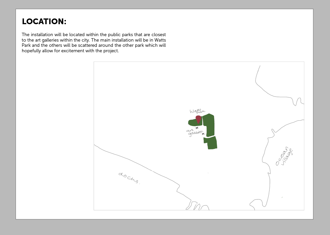
I pinpointed the two different parks that I wanted to use, with one of them being where the other smaller installations will be:
Both were really close to the art galleries and in places that people walk through to get from one place to another.


Due to there already being art work within Watts park, I decided that this would be the perfect location for the installation especially as it gains alot of footfall of people walking through the town.
Pack:
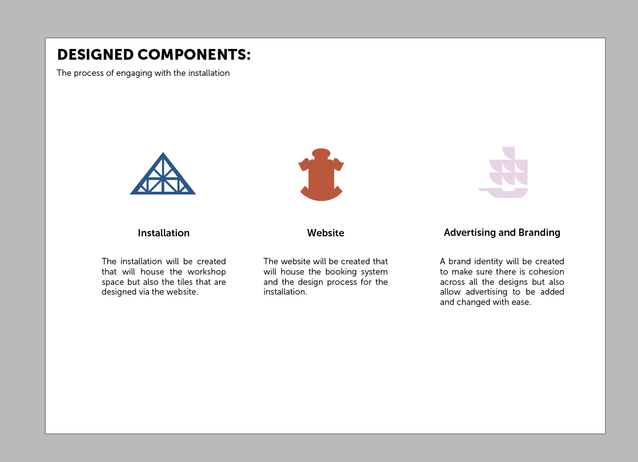
After starting to design somethings, I wanted to put together a pack of information that would allow a basic explanation of what was happening in my project and making sure that all the components fitted together:
Title Page
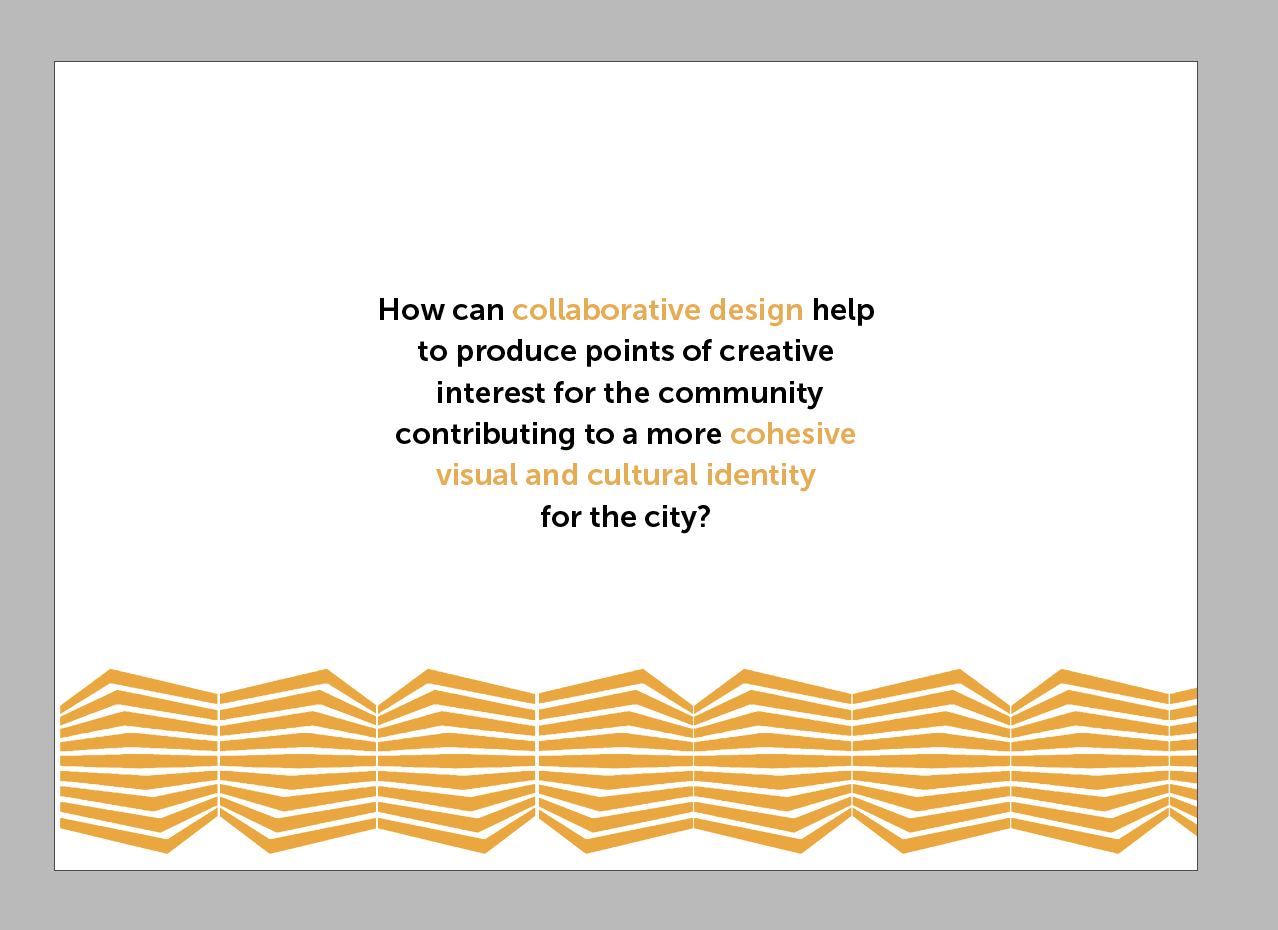
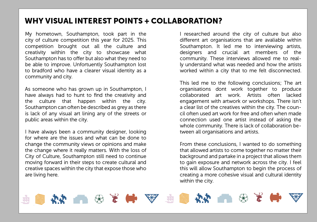
Explanation
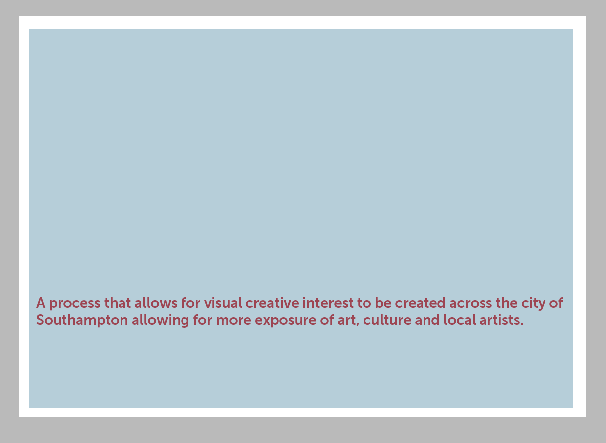
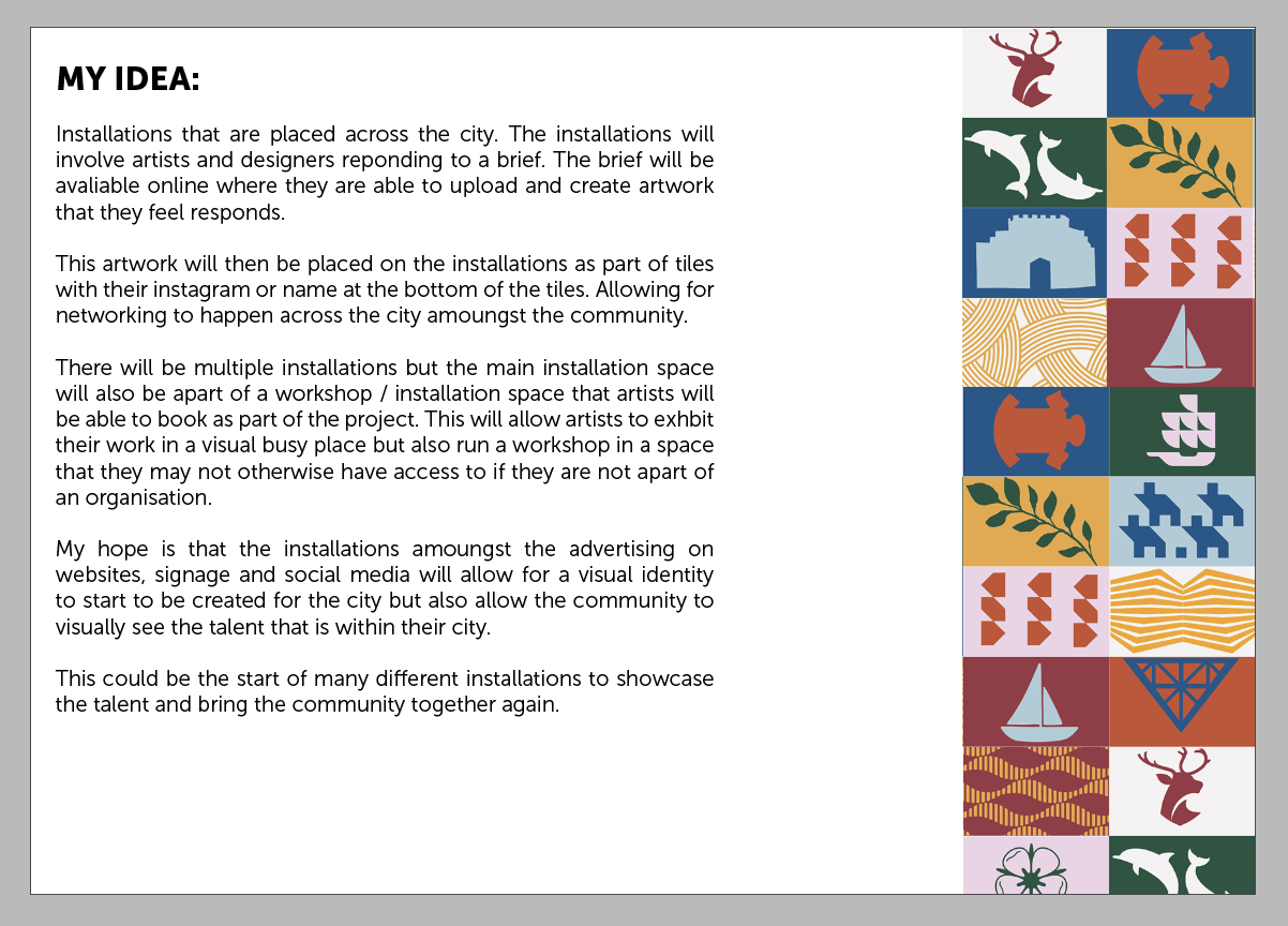
Proposed Idea
Process
Location
Explanation
Components
I feel this is a good foundation to then go on to be able to go on to create the PDF’s later in the module. I do feel that this is a first attempt and I need a shorter simpler way of explaining the project whilst keeping all the context and research in the document.
Weekly Summary:
I really began the basics of the design process within this week which allowed me to start to have a foundation that I can continue to tweak and change as and when is needed. I do still feel there are points within the project that I am not entirely sure what I am doing or what I need to do but trying to stay focussed on the design and the creative process that comes with that.
Resources:
Behance (n.d.). AWAKEN Kuwait — 2020. [online] Behance. Available at: https://www.behance.net/gallery/96832487/AWAKEN-Kuwait-2020?tracking_source=search_projects%7CAwaken%20Kuwait
Behance (n.d.). Join the Conversation. [online] Behance. Available at: https://www.behance.net/gallery/82966197/Join-the-Conversation?tracking_source=search_projects%7CJoin%20the%20Conversation
Behance (n.d.). North Dream Collection. [online] Behance. Available at: https://www.behance.net/gallery/71093765/North-Dream-Collection?tracking_source=search_projects%7Cnorth%20dream%20collection
Week Eighteen:
Weekly Focus
My focus for this week was to visit an exhibition that was put on for the city of culture and to also start to plan the PDF for the final output.
Peer to Peer:
After talking about my project in the peer to peer, I have decided to keep the shipping containers as a concept but also make the tiles printed and mounted to the shipping container instead of having something thats digital and needs a constant power source. This just brings the whole concept away from the digital era allowing for something physical to be created. I could also have workshop days where artists and designers could come along to create their own tiles.
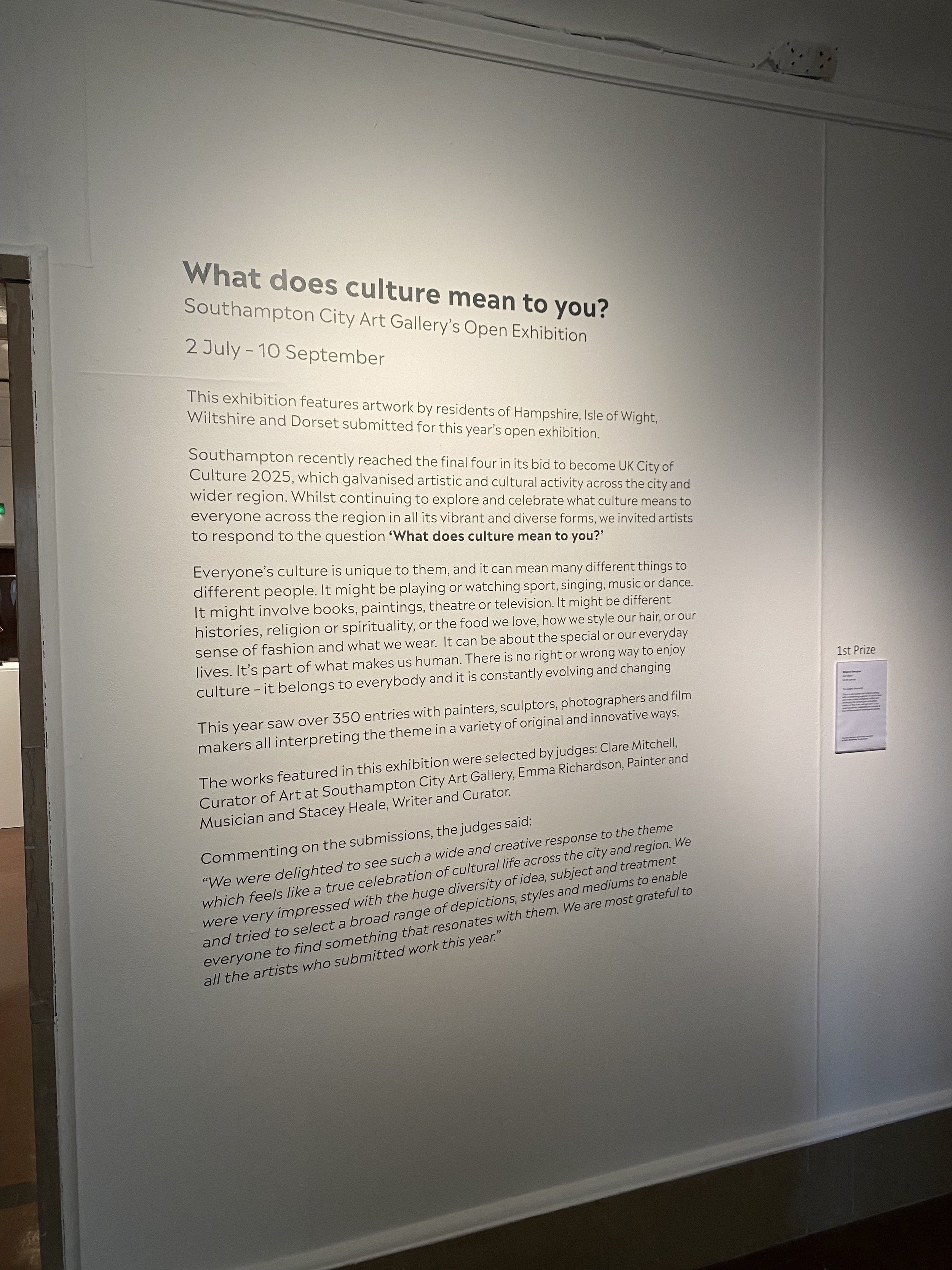
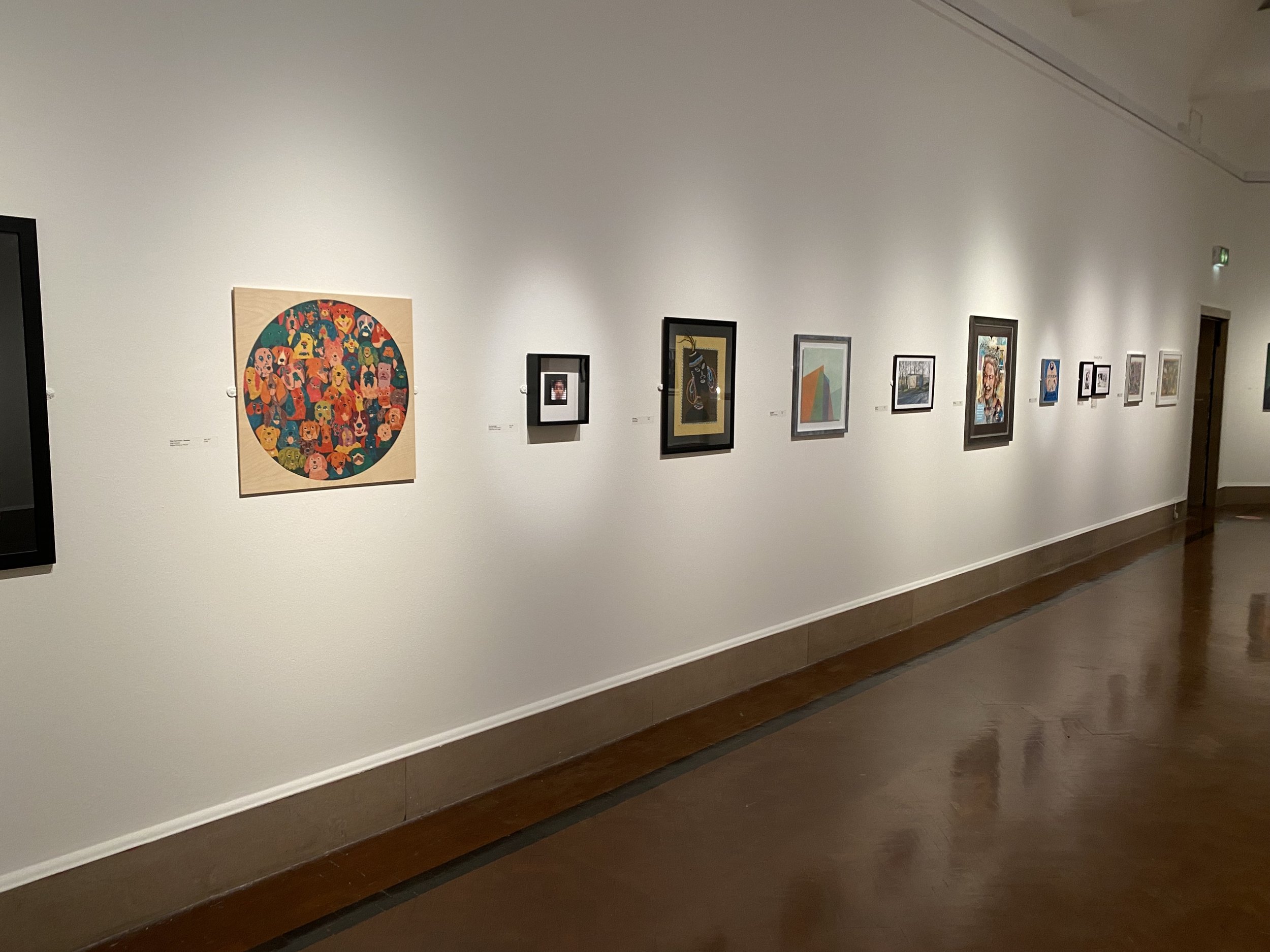
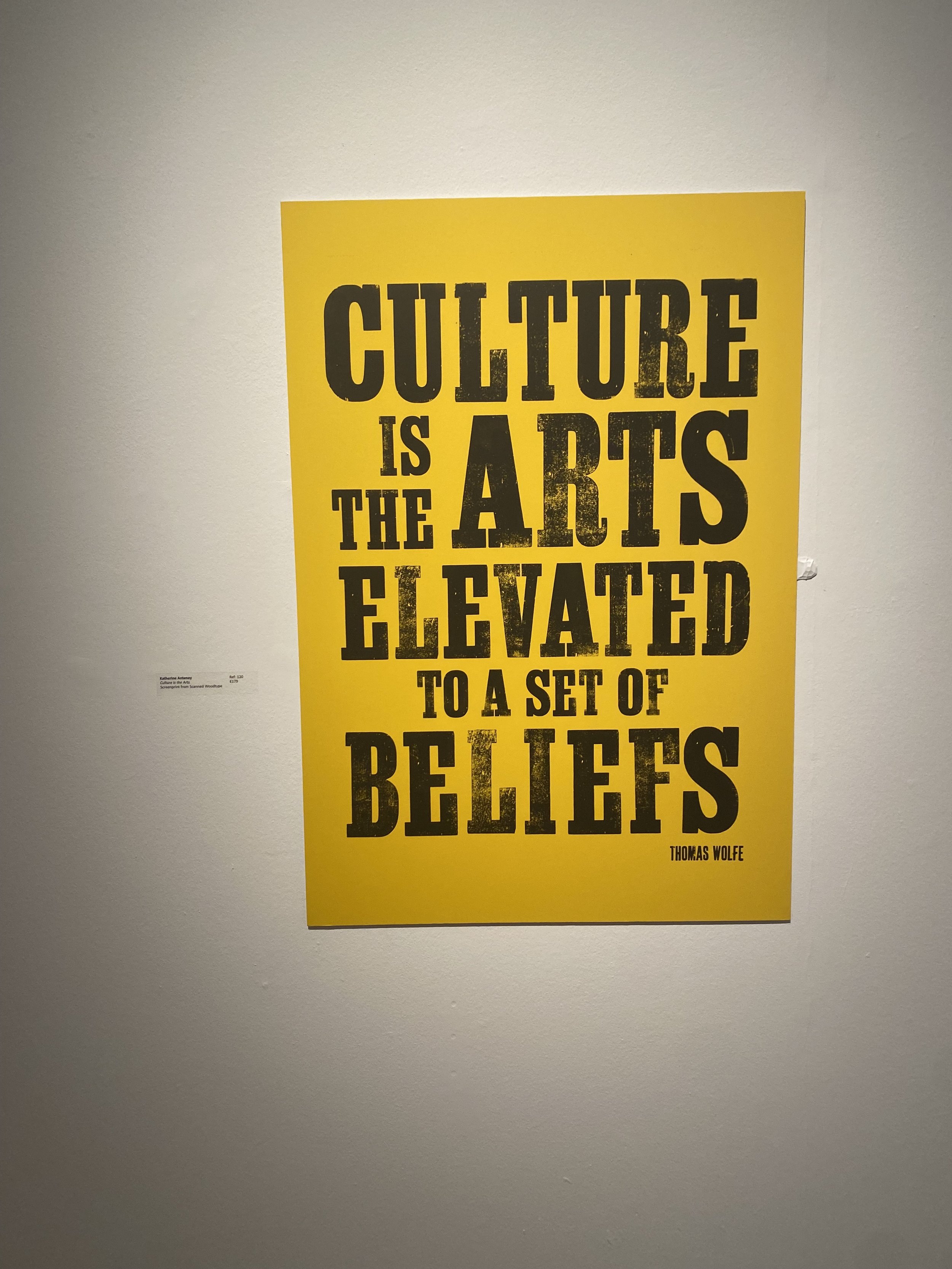
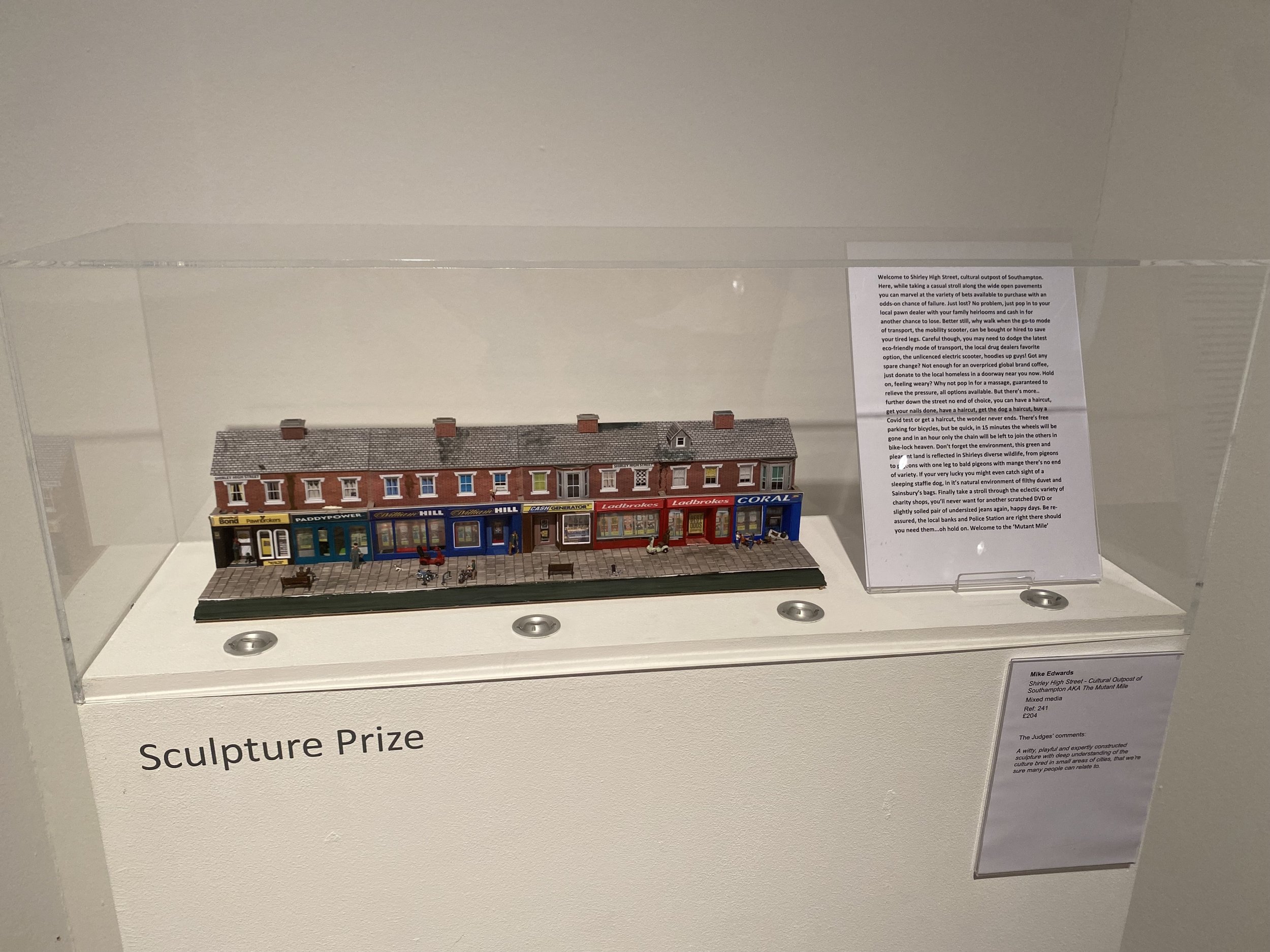
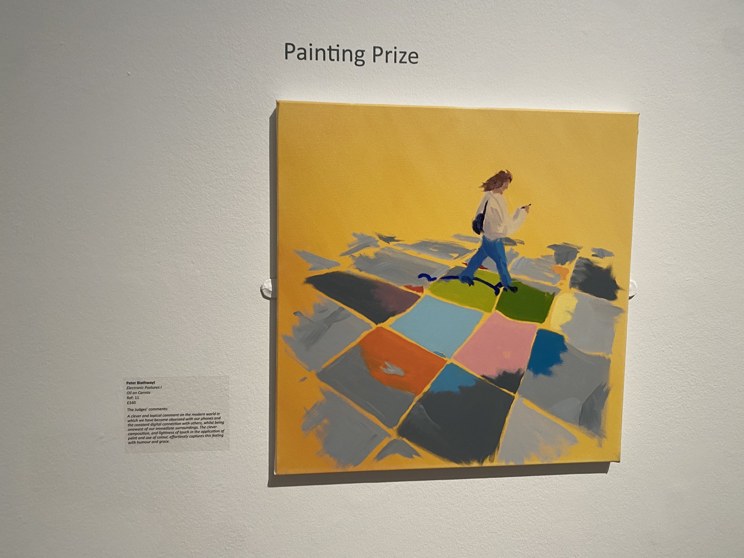
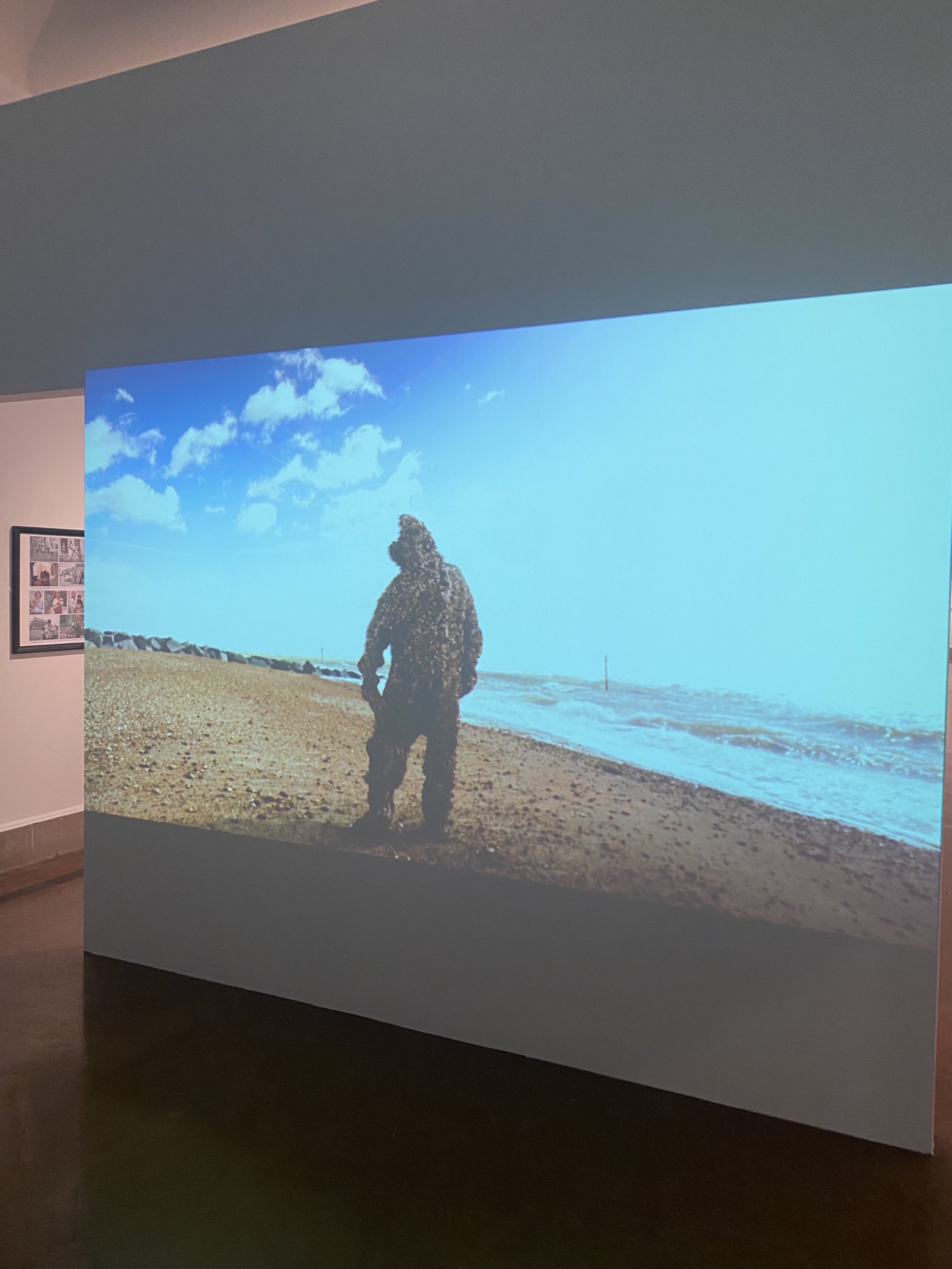
City of Culture Exhibition
This week I was told about an exhibition that was in the city art gallery that was at the back of city of culture. I thought it would be interesting to give it a visit.
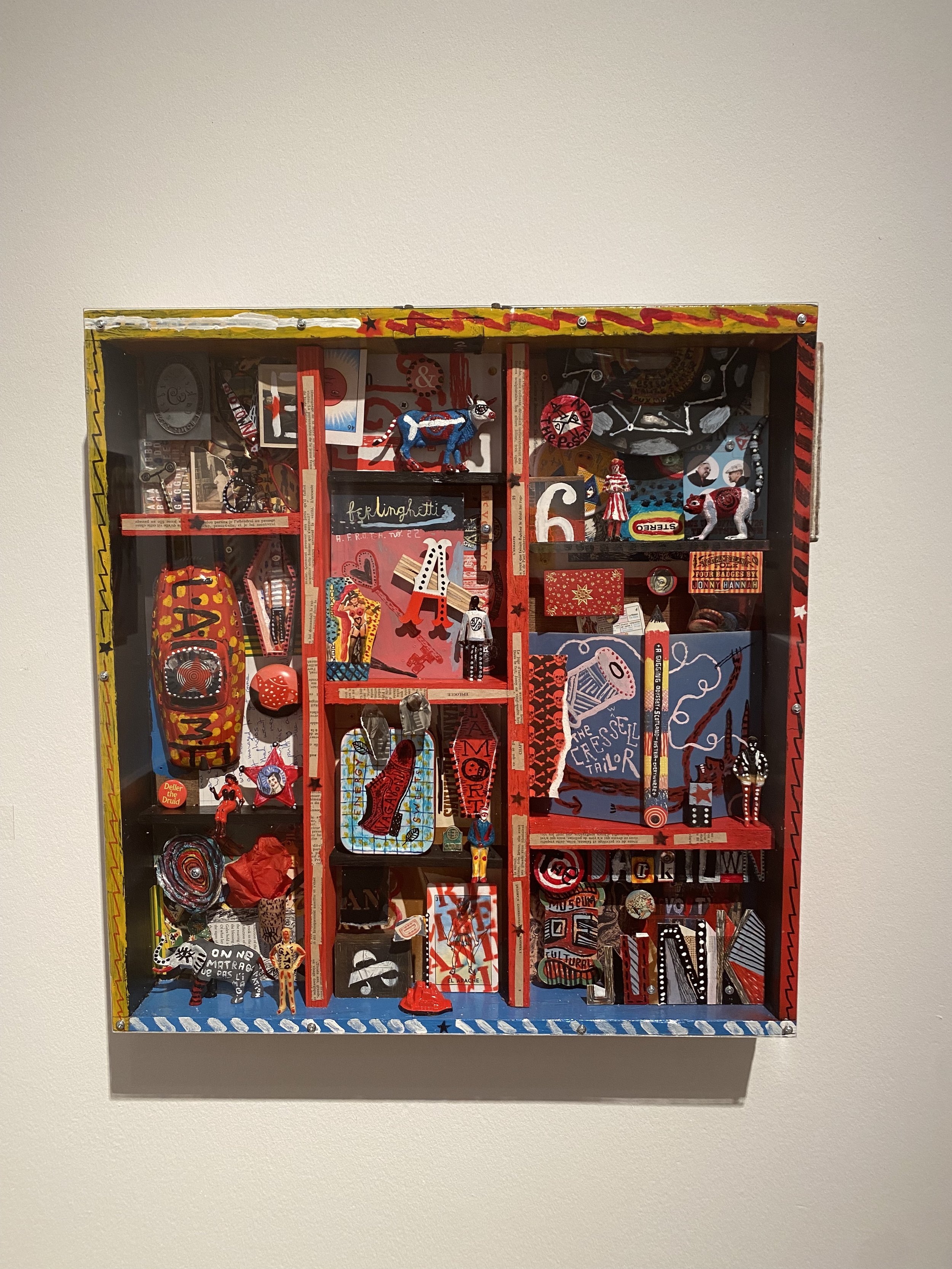
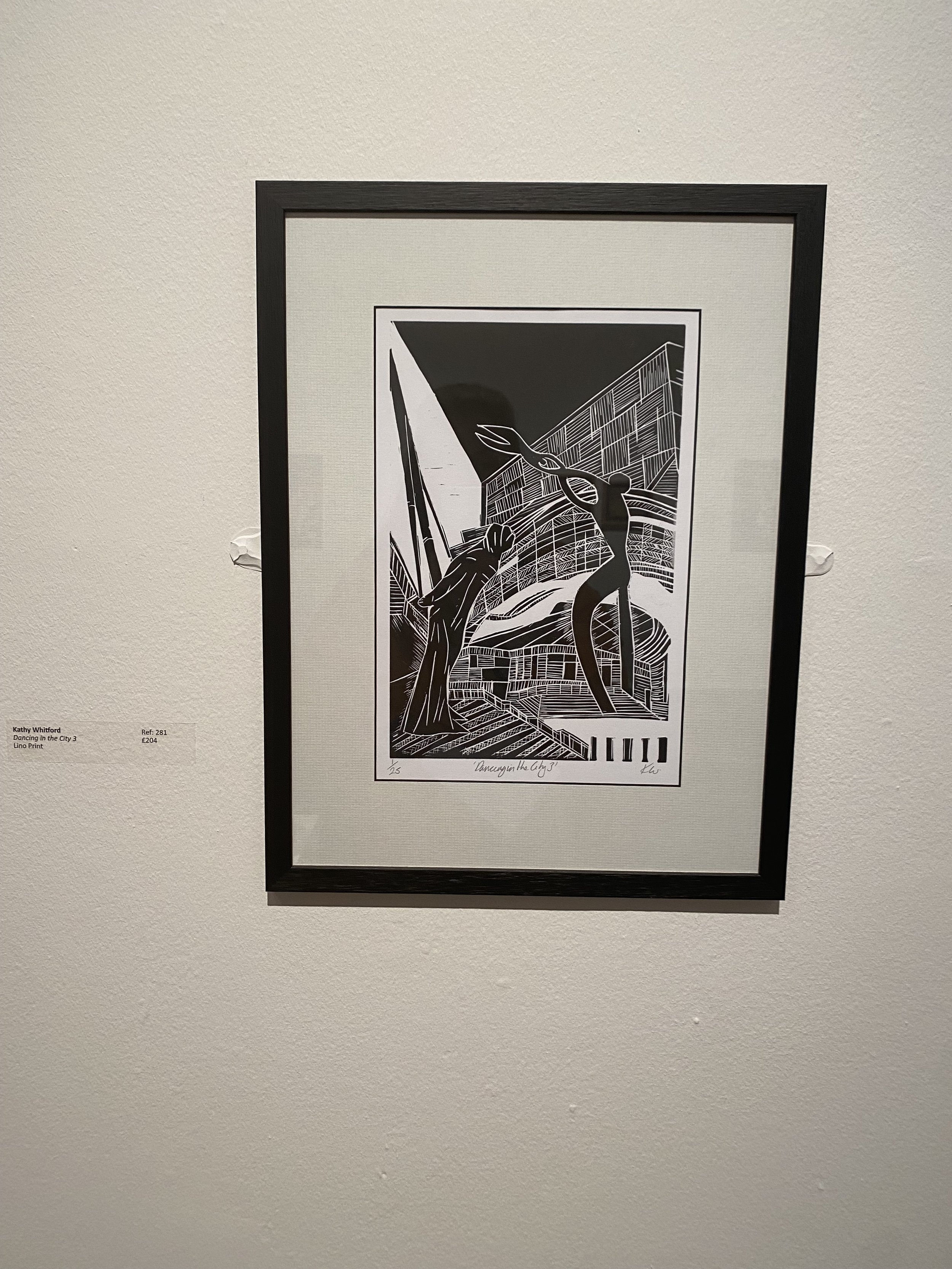
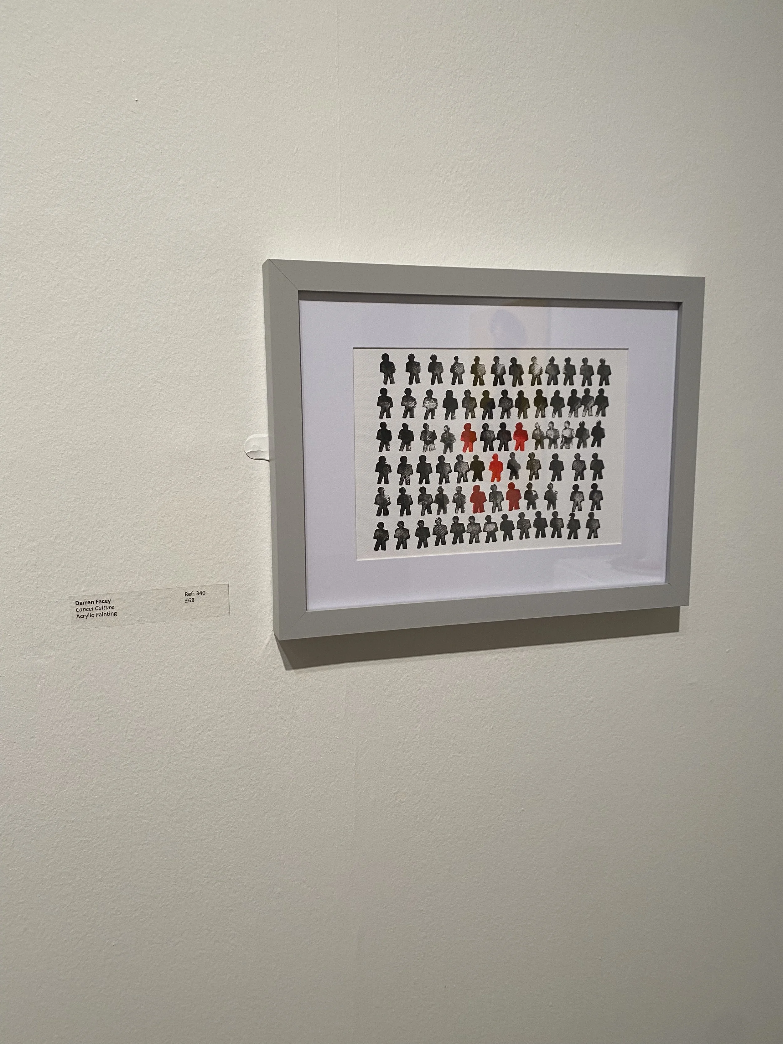
All the different outcomes were great to see how different interpretations of culture especially within Southampton. I especially liked the one that had a small red box with all the creative 3D sections within. It was nice to see another thing placed within the city that surrounds culture.

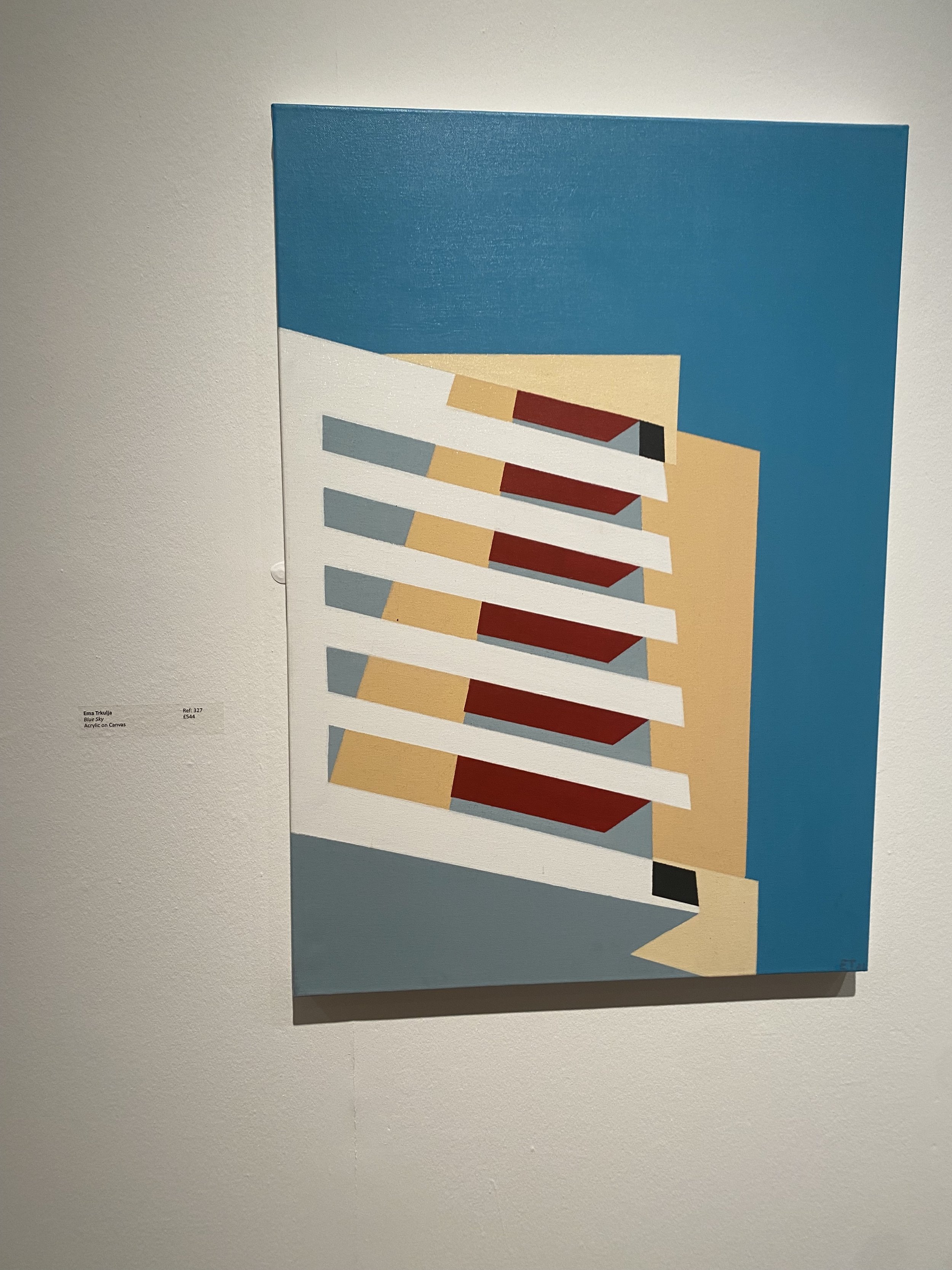


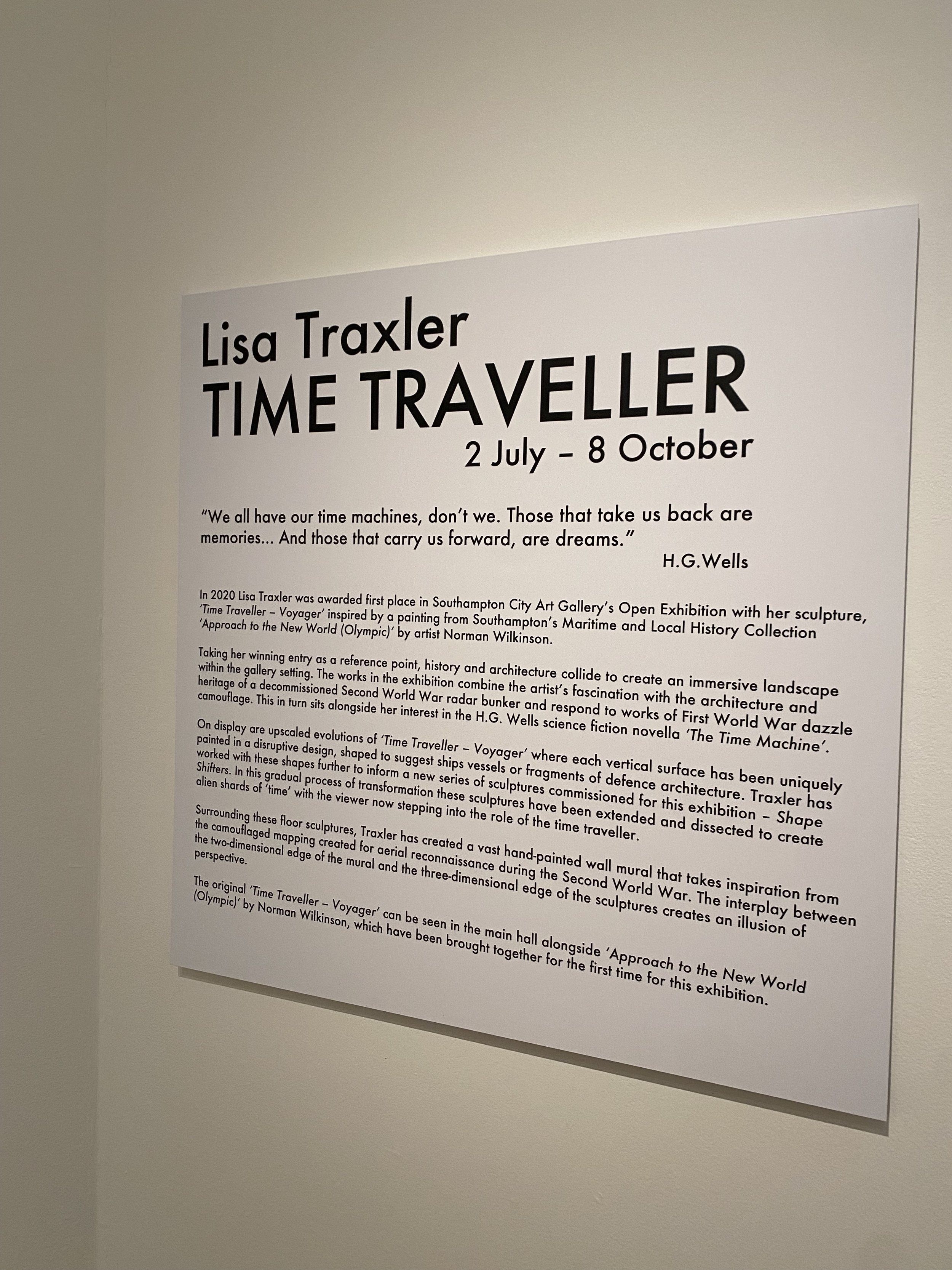


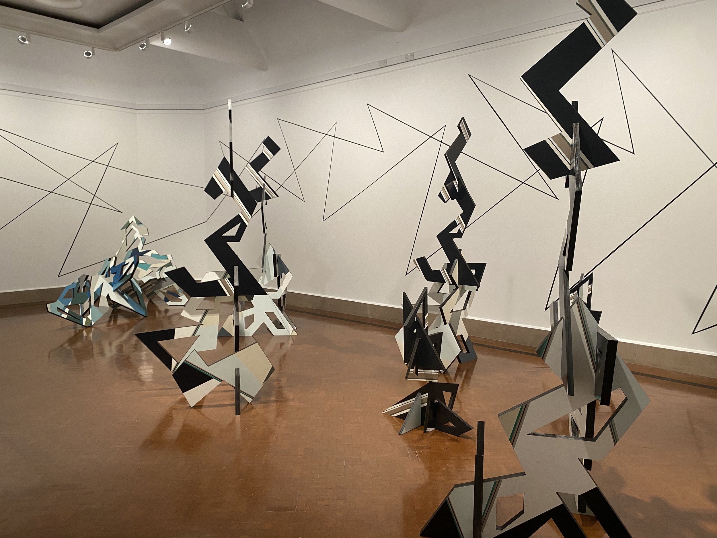

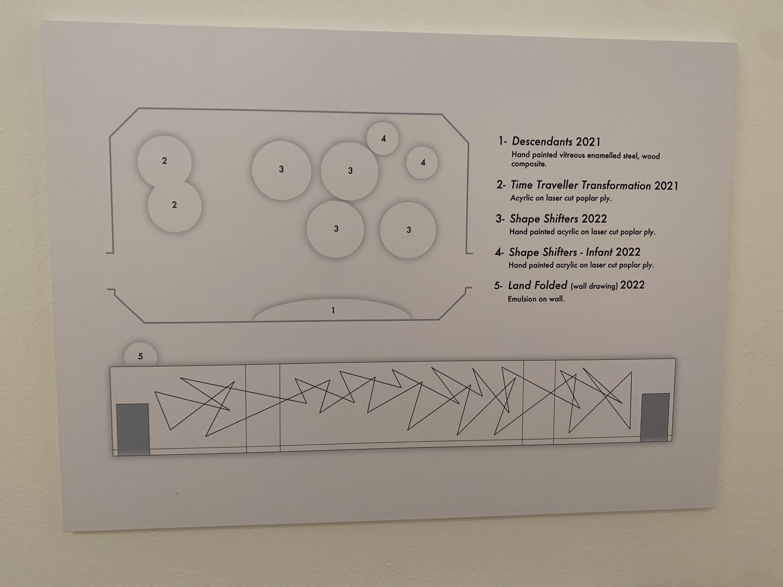
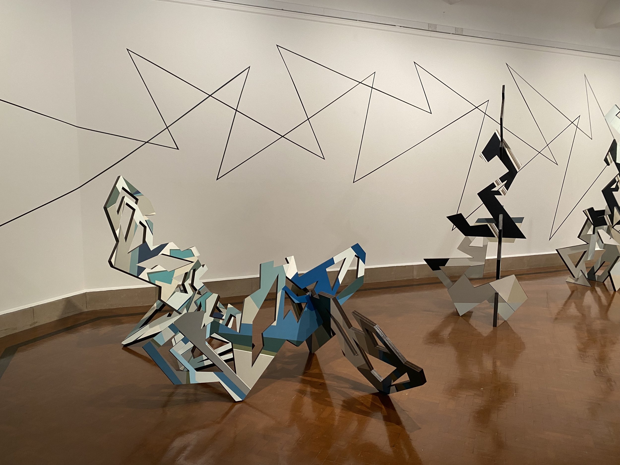
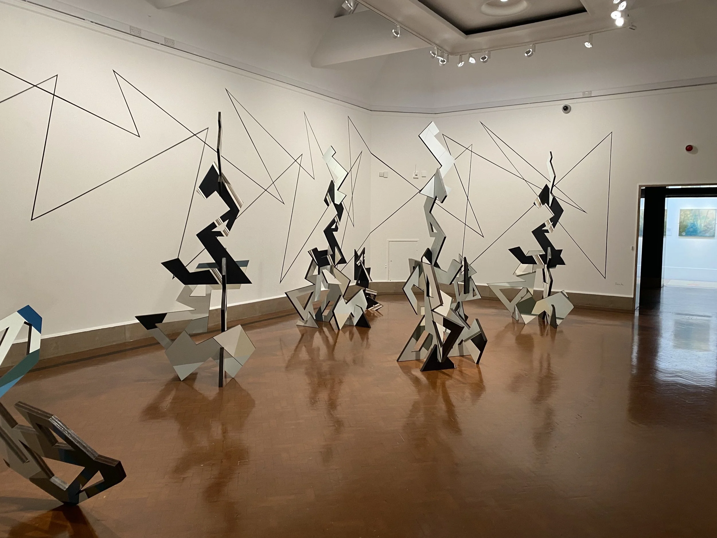
Whilst I was visiting the city of culture exhibition, I also came across another project that looked at the structures which I thought was interesting concept:
It was all to do with the immersive landscape and different shapes which were placed together within the gallery space. I love the layout and the design that was created but also that they all look like they could be changed and adapted.


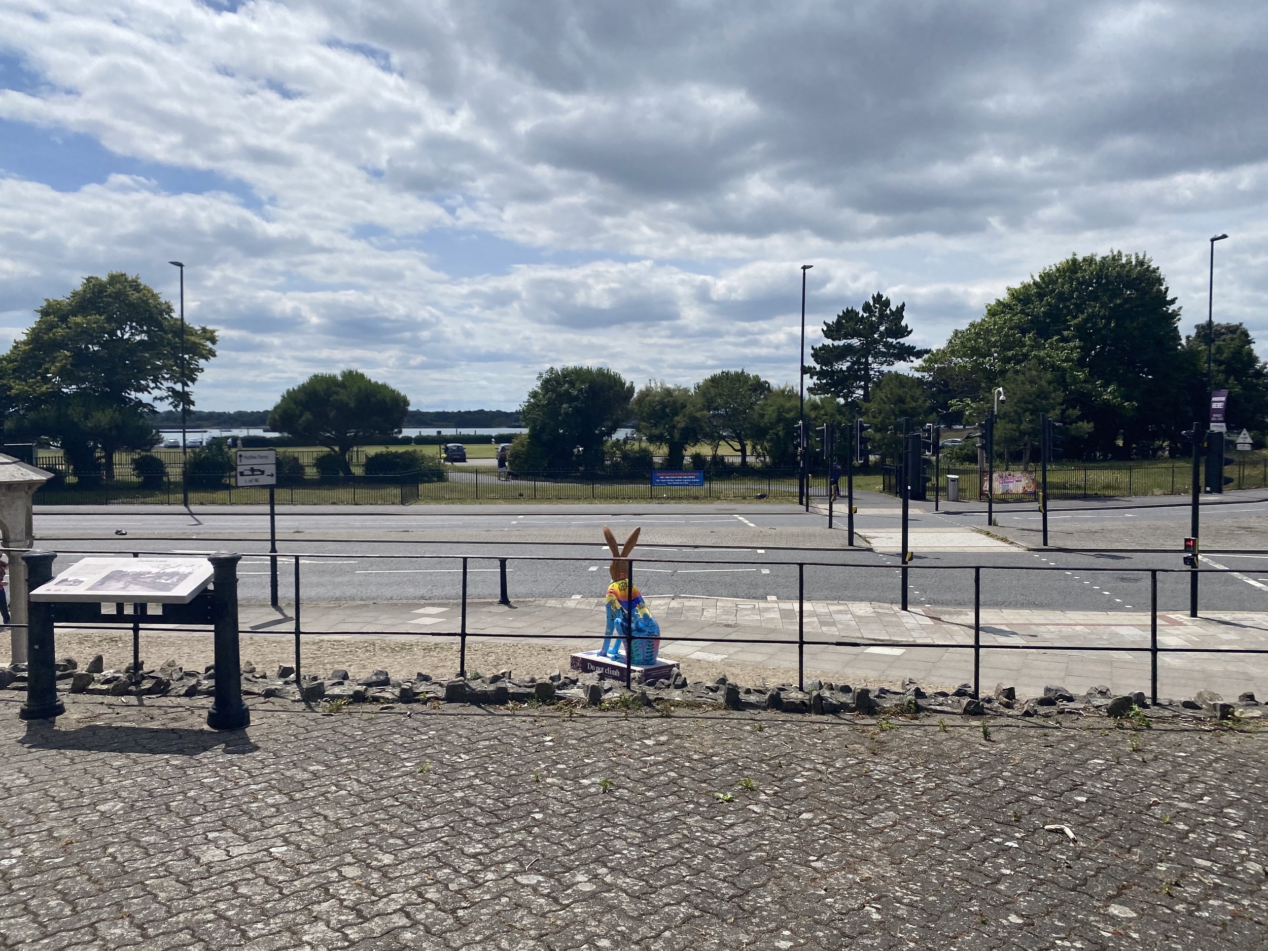
The Hares
Whilst visiting the city of culture, I was shocked to see all these hares has come into the city which I later found out is an art trail that was run by the same people who were mentioned in a previous weeks work. The hares stole my thunder with my project as this is a prime example of visually showing the creativity in the city but the artists working to the brief of an animal. Lizzie also mentioned them in a weekly peer to peer.
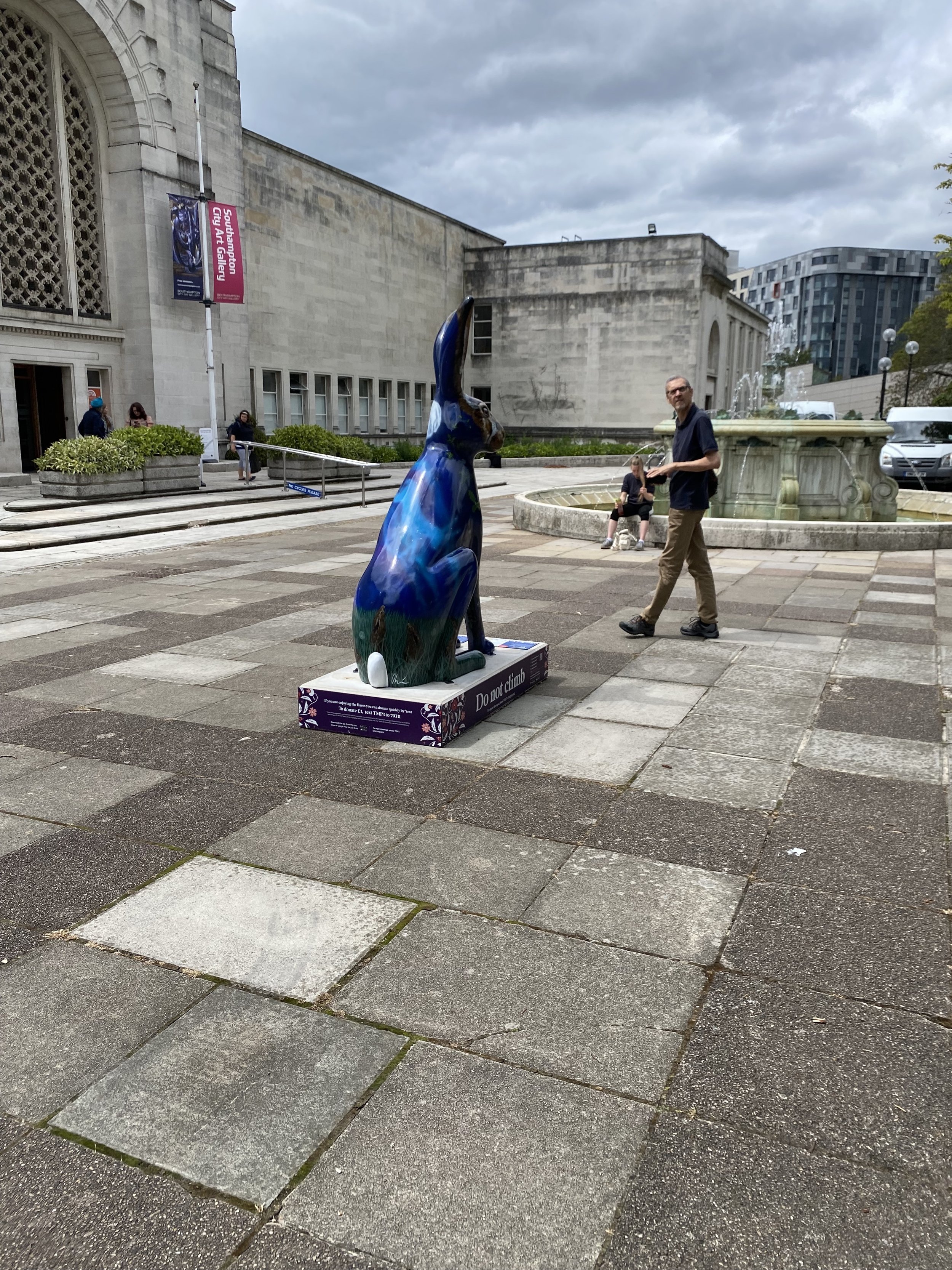
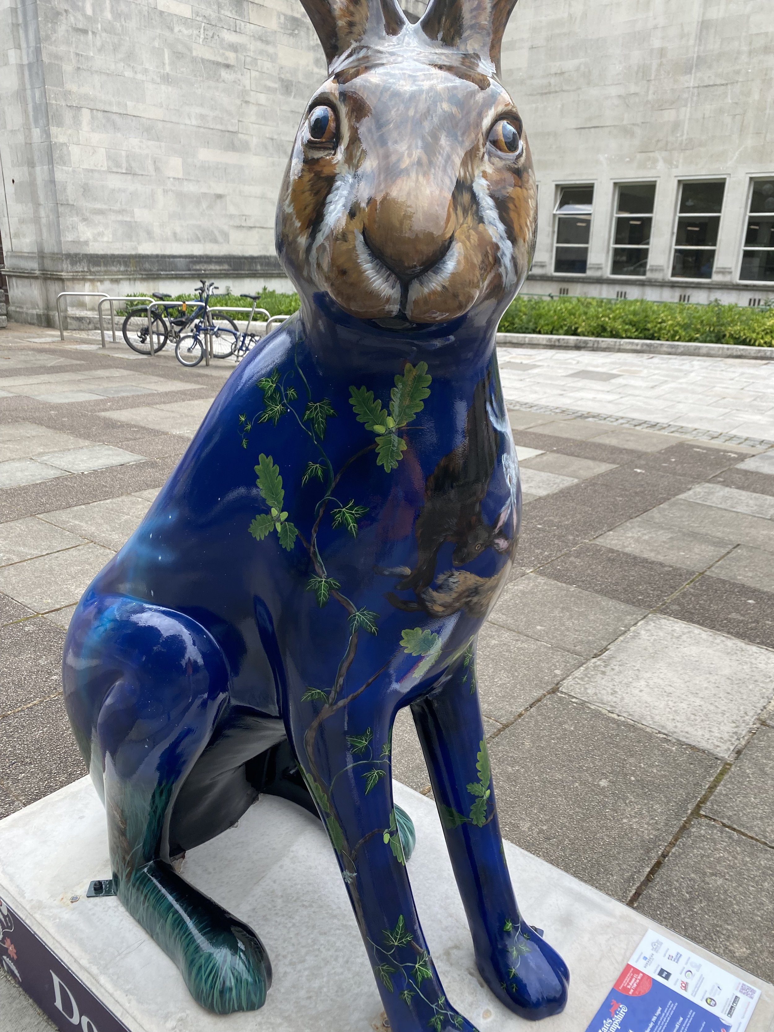

The hares were made by the company that makes the sculptures. It seems that Southampton does this every year but this year they have decided to decorate hares. I think the concept of involving the artist and designer is so nice but also having to donate and follow a trail could be exciting but I am unsure how many people are actually doing the trail. When seeing them around the city, some of the installations people were talking a lot more interest than others. I felt like this confirmed my decision that I didn’t want to do an art trail across the city but this could be something that changes later on in the project.


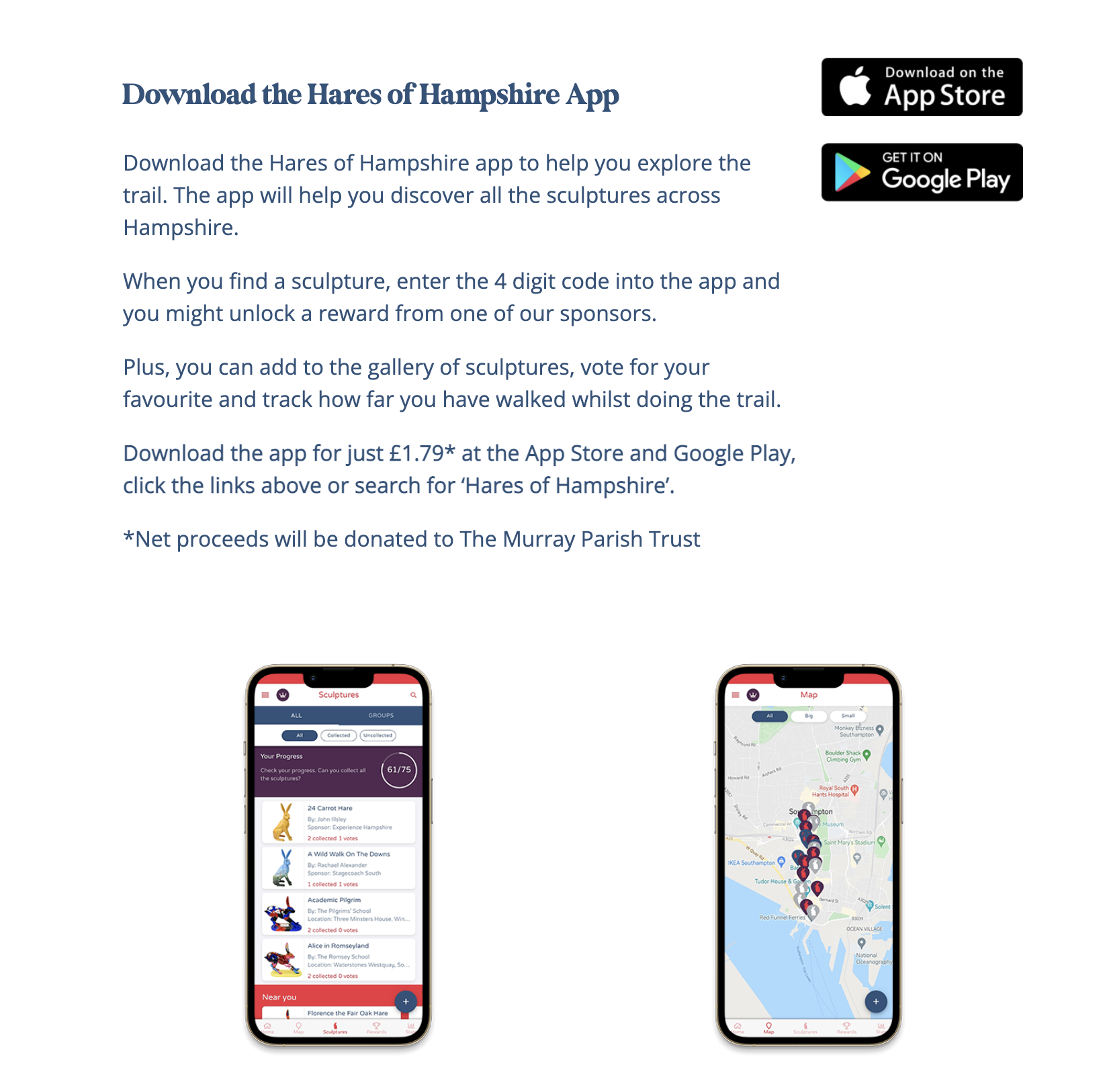
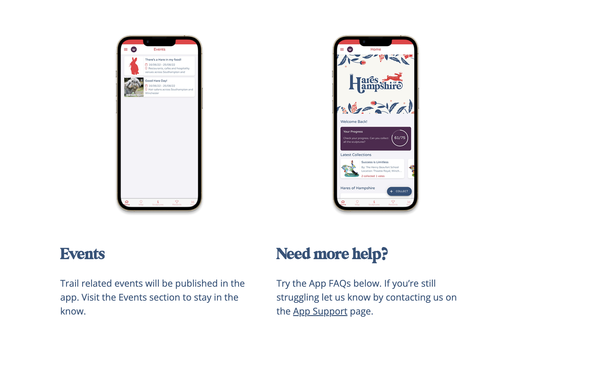
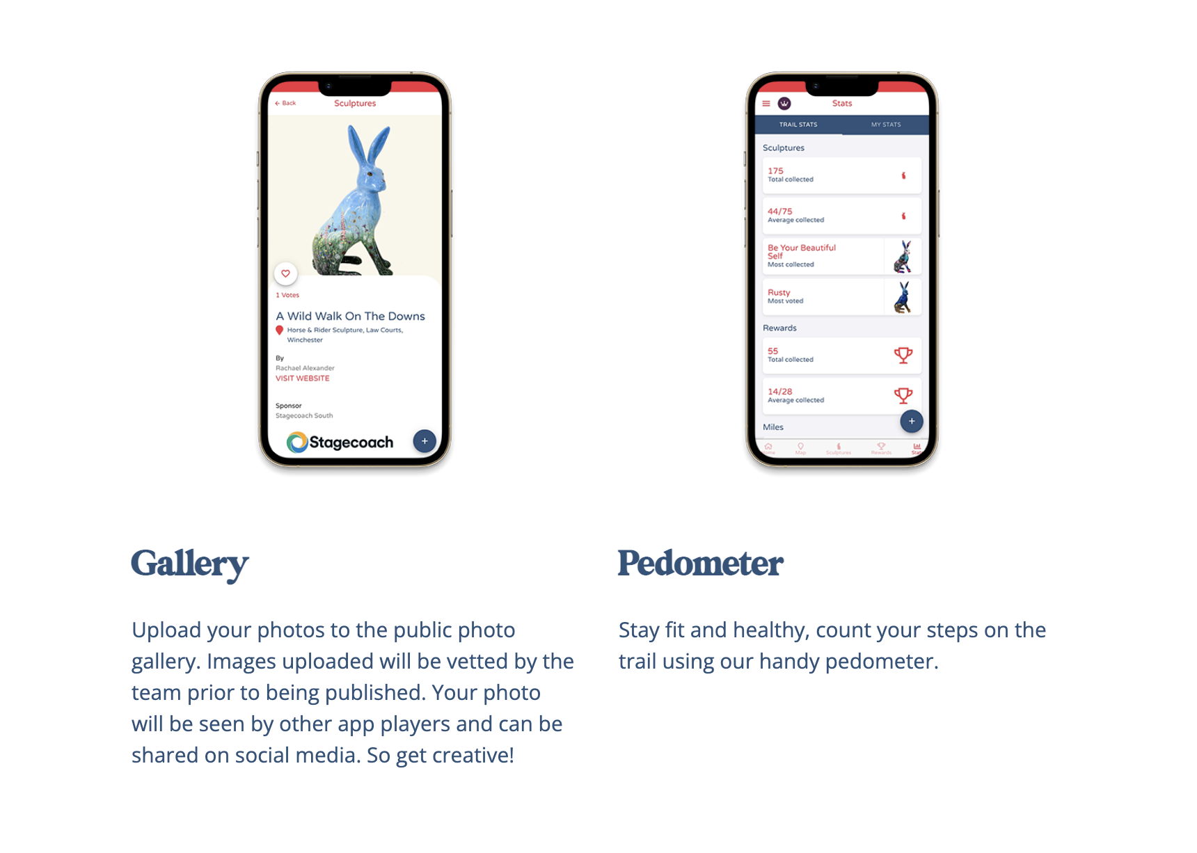
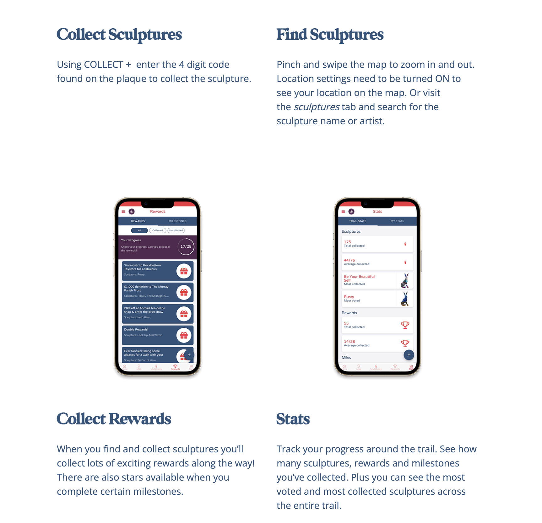
They also created an app which can be outlined in the screenshots below, I think this is a more interactive way to work with the installations that are placed across the city but also involving the children that would allow them to gain prizes and rewards and be able to interact with them in a different way.
After doing all this research into what was currently going on within the city, it gave me an insight that Southampton was infact trying to do good with the city and to try and place creative and culture together. The two installations are the first of many different steps that I hope they can take.
Planning the PDF
I decided to plan out how the final PDF would start to look and how I wanted to start to tell the story of the project so far.
The things I wanted to include in the PDF were the following;
Introduction
Research
Key Case Studies
Analysis
Key Research
The brief
The process
Installation x 3
Website
Adverting
Phase Deliverables
Reflection and references
Phase 1-4 +
Bibligraphy
Image References
After I planned out what I needed to put in, I started placing that on the pages and starting to plan the PDF and create for the rest of the week. I want to make sure that I have a clear layout.
Weekly Summary:
This week was really insightful, allowing me to see the different culture concepts that have been implemented already within the city. I felt like this week, I needed a week away from the design to work on the basics which should then allow me to go back to the design with a fresh set of eyes over the final week within phase 4. I feel that I am also starting to worry about the amount that i want to produce and what I want to produce for the whole project. But that will be continuing to focus on that in the upcoming weeks.
Resources:
Robson, S. (2022). Our Artists. [online] Hares of Hampshire. Available at: https://haresofhampshire.co.uk/our-artists/