Week Three
Lecture Notes:
Lecture Summary:
A very interesting and informative lecture given by Harriet for this week. As we are thinking about how effective visual information is, it was useful for her to give a really broad spectrum of examples. One point that I did find really interesting was how hieroglyphics were used to communicate picture ideas and then this has now informed the emojis that we use today. Translating to logo grams - I would have never seen that link myself so hearing it from her was really interesting. The ones that stood out for me were (I should research these later):
Otl Aicher - grid system - the design museum
Flat pack cookery book
Charles Joseph Minard
On-formative
Jacques Bertin
Resource Notes
Resource 2
Resource 3
Resource 5
Resource 6
Resource 7
Resource Summary
Resource 1
Resource 2
David McCandless Book - which I also said in another reference that I wanted to look into! Really clear diagramming again - especially clever how he’s put the names of the fish all in line so you know what’s edible and what’s not. Also showing the difference of what’s happening with deforestation in the amazon - no wording at all just the difference in the imagery. Tweak your day also super interesting - half of the information on there I literally didn’t have a clue about, also interesting how he’s done it in weight. Also an awful but interesting statistic about what’s killed most - with the larger being them most killed. Some of which I wasn’t even aware about. Then an super beautiful and interesting diagram about the personal threats that are shown in a spiral. Another interesting one is life times and how we will spend our average years. 28 out of 27 years sleeping thats a really cool statistic - overall a really clever and easy to read book with great stats within, some that you just don’t know on the daily.
Resource 3
Interesting example comparing graphs that show the battle of Napoleon 1812. I think I would gauge more information from the smaller graphs from this website rather than the large graph that has all the information put into it. We see things and learn things so much easier from having them visually shown to us which this resource has clearly shown.
Resource 4
David McCandless Visual data information website, which is where he stores a lot of the information has has gathered with some really interesting topics of research. One of the ones that I really enjoyed, obviously being in the middle of a pandemic is the ‘riskiest actives of covid’ which can be seen in the image below. I think this kind of adds some humour in some sense - I know some people might take this so seriously but I think its funny that there’s a visual diagram of this!

Another feature of this website which I am so interested in and seems like they have a good mix of positive news called beautiful news which is meant to uplift you some of the examples of topics are: Uk phasing out coal, slavery is illegal almost everywhere, a new global green deal. I think this is a great way of just exposing the positive facts of the news which are often missed due to negativity. Along with the positive its so easy to understand what is being said with the size of the documentary and maps and colours.

Resource 5
“Let the dataset change your mindset ”
David McCandless who is a data journalist. First I had no idea that there was even such thing as a data journalist which I actually think is a really interesting area of profession. Aswell as this the examples he shows as so interesting and he makes them so visual for anyone to be able to see and understand. The one I particularly enjoyed was the Facebook break ups but the way that he visualised this. I think he also makes good points about how we need relative figures to enhance or give connection to the data its about the overall perspective. I love the bubble diagram and I will be researching his book that he mentioned.
Resource 6
“Above all else show the data.”
I looked and researched the Sumerian’s last week as this is what I was really interested in their visual representation of typography. But it is really nice to see a clear time line of all the information relating to Visualisation of Information and how its developed over the centuries with each century getting more interested in the visual development.
Resource 7

“When you combine life with long exposure photography you get stories”
This has to be my favourite resource this week, especially as it all related to photography. I love how people combine long exposure to capture all things within life like a firework show or a back-garden over time. Data is captured within images like Nicholas explains within the lecture. One of the quotes that I particularly related too was ‘one photo that captures the essence of what we are seeing’. In modern society we are always capturing and taking pictures, we love the memories which is why instagram has become such a huge social media platform, but that quote I think its so important to take appreciation of one image one moment a day which you can save for life.


Research
Jacques Bertin
Jacques was also mentioned in the lecture this week, so I wanted to do some more research about what he was known for in terms of data visualisation. It turns out that he was the one that introduced us to the contours of the graphic sign system. He focused on flat information graphics - two components - visual mark or implantation itself and the position on its plane. Bertin has also highlighted some point when it comes to making a graphic:
Size
Size and Planar Positioning
Value from light to dark is more superior than one colour to another
Colour, orientation and shape function
White space with 5-10% ink
focus on fewer components.
https://karlsluis.medium.com/before-tufte-there-was-bertin-63af71ceaa62
All of which can be outlined in the example taken from his book below.


I think its really interesting that he created this output for creating data visualisation and how to kind of create that and how it would come across to the users in a positive way.
Otl Aicher - grid system - the design museum
Since it was mentioned within this weeks lecture, I wanted to dig deeper into the creation of the logos that we’re at the 1972 Olympics which were also used in Montreal in 1976.

The icons were designed on grids out of really simplistic forms and shapes without the need for any un-nessecary elements. Otl changed the game for how the Icons were designed and all the later logos for the next Olympic Games were off and from his design of these.

As well as these designs, Otl also designed the way finding system, at the Frankfurt airport. It was a set of Pictograms which needed to be easily understood. But also it was a way finding signage. At the time it was influenced by modern and futuristic design of the time.

From this Otl went onto create a typeface called train that was quite popular in general. The symbol that is still most known today from that set was the geometric man and women.
https://www.sessions.edu/notes-on-design/iconic-icons-aichers-pictograms/
I honestly never knew that Otl was behind all of these designs and he has become so iconic for the simplistic easy to read pictograms that are even still famous today. I also feel due to them being so geometric and black and white they will never age.
Everyday Visual Data

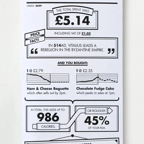
Receipt Redesign by Berg, trying to make the receipt more interesting instead of just a dull list of the things you purchased. Berg also gives the options to tick and fill out on part of the receipt, to feel more interactive. I love that this has kind of facts with little graphs that you would never see on a receipt. I feel if this was rolled out longterm it would have such a benefit on the general public and their output on what they are buying.
Flat pack cookery book
This flat pack cookery book is such a great and visual concept to come out of Ikea in Canada. The paper is made from parchment paper and you place all the ingredients on it and then place it in the oven for super easy cooking. I think this is amazing in terms of visualising food and how to cook - the recipes seem super simple to follow.
The video below shows outlines of how to measure and place your food items on the flatpack cookery paper.
Pots for Tots

Another example of the flat pack food Ikea inspired This food for tots company, where they layout all the ingredients that go into their recipes around the edges of this wooden board. I think this is visually such a great concept, like the Ikea cook book - you can see exactly what are going into the pots how fresh and organic it looks and that’s a great selling point when you are making these for children.
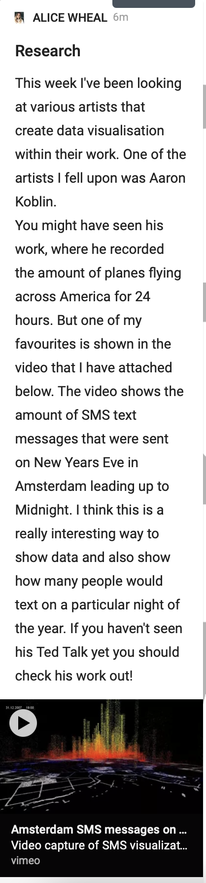
Aaron Koblin
“In a TED Talk about his work, Aaron Koblin explains his belief that 'data can make us more human' – his project Flight Patterns demonstrates this. To create the work, Koblin processed vast amounts of the US Federal Aviation Administration's flight data to illustrate the paths of air traffic over North America. In the video below, you can see how individual flight paths appear as a single coloured line, creating complex and colourful moving webs. The patterns that emerge visualise human behavior, suggesting that, in spite of the advanced technology used for air travel, we remain governed by the rules of nature.”
https://www.britishcouncil.org/anyone-anywhere/explore/digital-creativity/telling-stories-numbers
Video Notes //
Data can make us new human
Tell us to talk about some amazing stories
Being driven by data - amazing interface that create some amazing outcomes
Flight Patters - 24 hour period - people fall asleep
See that system
Colour coded it by type
Google maps and zoom into see air ports
Altitude and Manufacture.
different parameters
Visualising the flights
SMS messages being sent in amsterdam
Move around and see different in the city
different contributions for children
Daisy Bell - first singing computer.
Repeat a short sound project
Loads of strangers repeating the song
Bicycle Built for 2,000 super interesting!!
Radio head laser video
Build their own version of it
People working together to build something
make a collaborative music project
The Wilderness downtown
Interface is the Message
The above Video where Koblin talks through some of his projects is honestly some of them are so amazing and how many different ideas he has for collaboration but also taking simple data and making it into art. My favourites that he showed were the plane data and looking at how many plans were flying at a certain time but also the SMS messages that were sent in Amsterdam on New Years Eve. Both of which can be seen below.
This flight pattern video is colour coded for each different flight company and the type of plane.
Another one of my favourites, look at the changes that happen across the city in Amsterdam on New Years eve. I think the information is really clever but also the outcome is so beautiful aswell.
Nathalie Miebach
I went on to look at some designer that have creating visual data that has become into art. One of those is Nathalie, who creates these art pieces out of the found in storms.
Notes//
extract information from a specific enviroment
compare information to things that are found on the internet
compile all the numbers - two or three variables
a basket - horizontal and vertical elements
forms are completely made up of weather data
every elements are a different piece of data that is relating to the weather.
they reveal behavioural relationships
that may not come across to a 2D graph
all made up of numbers
assign temperature range.
weather data into musical scores
transferring information without compromising it
visual matrix of the musical score
challenges our assumptions of what belongs
different places that you can place the information
the viewer is challenged to what the visual data is
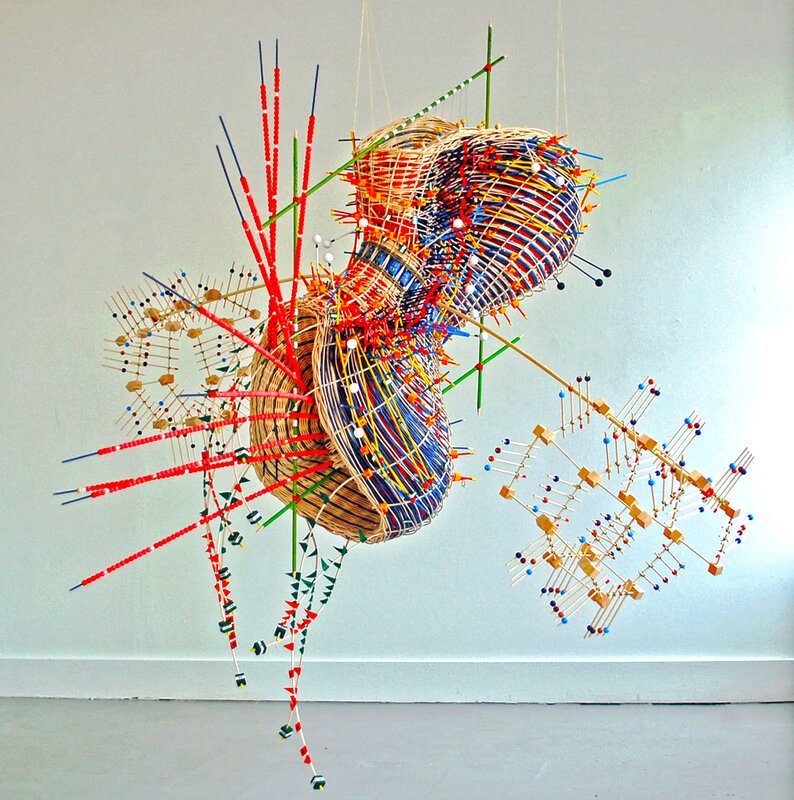
To try explain the above more - i’m going to try and find more information out about how she creates these art forms of data visualisation. Below you can see how she inputs the information into her art models and what each of the pieces stand for that can be seen in the image above.


Overall Nathalie’s work is amazing, the amount of data that goes into each piece that she creates is truly amazing - they also make it something so interesting and something i’m still trying to understand. Creating visual weather outcomes even though we are experiencing the weather all the time.
Climate change on Trees
Keeping on the topic of climate change, these tree shows in real time the impact of climate change on nature. An Installation by Dutch Artist, This Bierskeker collaborated with scientist Stefano Mancuso within Paris. This is a prime example of data visualisation, enabling people to see visually how climate change is effecting trees something that we can’t really see with the human eye.

‘The visualisation is based on data gathered from a series of sensors that measure solar radiation, CO2 levels, air quality and temperature, as well as humidity, soil temperature and moisture levels, rain and dew point.
These environmental factors cause fluctuations in the trees' photosynthesis, which affects the growth of the rings hidden behind their bark. The thickness and shape of the rings allow visitors to observe the short- and long-term impact of climate change.’
Real time Air Quality
Another interesting installation is this one that’s based around the air pollution and showing a visual outcome by the changing colours in response to the air quality in that area.
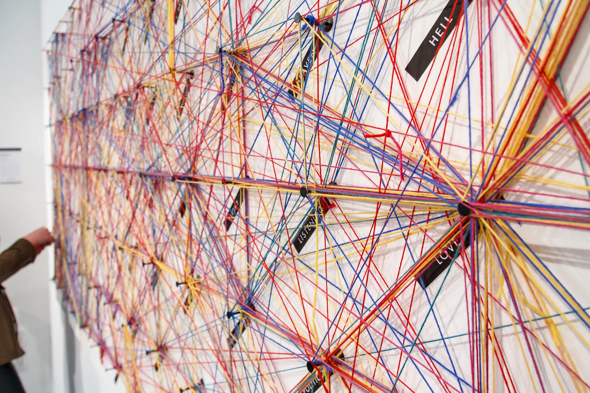
What Made me?
Another really interesting interactive installation that I came across this week on the ideas wall was designed by Dorota Grabkowska. The project was based around information visualisation which is perfect for this weeks topic. Asking the public of Birmingham 5 simple questions:
What made you Think?
What made you Create?
What made you Angry?
What made you Happy?
What made you Change?
Each question a different colour and could be connected together with a thread.
https://www.behance.net/gallery/4419469/WHAT-MADE-ME-Interactive-Public-Installation

This is such an interesting question as when we often do questionnaires we never are able to see the visual outcome like we are able to see here. I also love how there are so many possibilities and options for the user to choose from - enabling a cross pattern on the board. I love the colours and the patterns of random and is a great example of physical data visualisation.
Happy Data
Another different way of presenting information that was by Georgia Lupi from Pentagram who created Happy Data whilst working from home in the pandemic. All happy uplifting statistics whilst you’ve been sat at home.
I think this is such a lovely way that she has clearly visualised how you can add or see data through looking out your window and it makes a change to all the depressing information that is normally been provided within the pandemic. You can see some of my favourite examples below:


Giorgia Lupi’s work was mentioned in Harriets Lecture at the beginning of this week so I wanted to do some more research about what other data visualisation she had done.

This was one of my favourites of the work that she had on her website.
‘for Popular Science we analyzed over 12 million scholarly articles, visually investigating how rapidly various scientific disciplines and theories advanced over the years based on an extensive network mapping of citation patterns.’’
I love the shapes and how they change, they look to me like they are flowers blooming in the spring but the fact that they have all these graphs and interesting data all around them is so clever.
I also found this really interesting video clip on both Giorgia and another information designer Stefanie.
Video Notes //
hand drawn data postcards across the ocean to each other
investigate and share parts of ourselves to the other person
not so shameful resolutions to each-other
labour intensive
1st - cold and impersonal and then it got more personal
Each week of marking our awareness of what’s happening around us
drawing with data can be painful
a week of doors
an example of the days
the act of counting
29 - partners inspired love but also annoyance
to live in the present and to be in our surroundings
data is the beginning of the story not the end
understanding the world around us
instead of seeing it at the definitive answer to all our questions.
A really interesting project that was just making and taking time to live in the moment when they live across the world from each other. But I’ve also found out that this was made into a book called Dear Data. My favourite quote from this was
'“data is the beginning of the story not the end “
Stefanie Posavec
After touching on some of her work in the video above, I wanted to just touch on what Stefanies’s work was like compared to others.

Whilst looking at Stefanie’s work I found this one called drawing the dictionary, which sounds really interesting. The basis of the project is that there is a mural created out of index cards of 1,00 small drawings. “Each drawing visualises data (part-of-speech, number of syllables, first letter of word, etc.) from one of the 1,000 most frequently-used English words in order to create a multi-coloured mural highlighting the beautiful variation in the English language.”
http://www.stefanieposavec.com/drawing-the-dictionary-1
This is such a cool and interesting concept also so simple in terms of using index cards that are bright and colourful but also so plain. Putting drawings on them you can see the drawing stand out. I would never have thought that this was Data visualisation. You can see below the rules of the placement of lettering and the pen and pencil colour that was used.

Workshop
Moon Landings
For this weeks workshop task I decided to research and talk about the Moon Landings.
I began by first doing some research about the Moon Landings as I still don’t have any real ideas about what this is about. I watched the above video and made some notes.
Notes //
Matthew Jones created this for Nasa
They are a graphic design agency and are 13. years old
they are team that come from all over the world.
All contribute to the work
Network of collaborators too
See their clients as part of the team
been on the journey with them over the years
Design principles
Think as one
Find the Truth
Make it Resonate
Lens to view everything we do through
Think as one - collaboration
Find the Truth - find the one thing and amplify it
Explorations in Space
Poster - Moon Landings
Exploring data visualisation and print techniques
Poster for the Moon Landings
Only 12 people have walked on the moon
Neil and Buz from Apollo 11
On the Moon for 22 hours
2 and half hours they were walking on the moon
in space just in their tin can
extra layered meanings that come into effect
Apollo 12 - second mission
Stand on the moon for 8 hours
Apollo 13 didn’t make it
Apollo 14 Alan Shepherd - Smuggle golf balls onto the moon
First person to tea of in space
Apollo 15 - moon buggy
Apollo 16 - kept it short and then
Apollo 17
How do you take this data and make it into a poster
Plot the moon landings on the moon and where they landed
all on the facing side of the moon
Added the circular effect - the landing ripples of the moon dust
add in the data - how big the circle is - relates to how long they spent on the moon
Data of all the probes that have touched down on the surface
How the print came out - on the screen printers
Apollo 17 - 12 days and 72 hours on the moon
50th anniversary from the first moon landing
Spectra
Meteor strikes to the moon
Feild
Built a huge thing to replicate meteor strikes to the moon
the shoot would articulate
the programme that ran the piece
Why are we creating a moon blanket studio
Create stories in interesting ways
went to Nasa as a job
Curiosity Rover - one on mars
Holes in its tires
Graffitiing JPL
Just display the data
Climate emergency that is now happening on earth
Worked collaboratively with the office back in London
giving her, her voice
The coordinates
Grace-Fo
This information was really interesting to listen to not only the poster project but all the other collaborations that they have done with NASA.
https://www.itsnicethat.com/articles/nicer-tuesdays-2019-accept-and-proceed-graphic-design-140619
““Simply by exploring areas that we’re interested in,” Matthew said, “amazing things have happened and come our way.” The first of these was a poster based on the moon landings. Using data visualisation and experimental print techniques, the poster showed the locations of each landing and the time spent on the moon’s surface. The second project was titled Spectra and took the form of a kinetic sculpture in the studio. Working with Field, Accept & Proceed visualised meteor data released by Nasa as a reflective, motorised sheet.”
https://www.acceptandproceed.com/shop/MOON
“This print depicts every Moon Landing to date, and it’s position on the moon.
Including Nasa’s early surveyor probes, as well as the Russian Luna program and the most recent landings by the Chinese Chang’e programme, not to mention the most iconic 6 Apollo missions – that landed humans on the Moon. The large overlapping discs’ represent the amount of time spent on the Moon by each of the manned missions. Ranging from Apollo 11’s 21 hours and 36 minutes’ duration on the Moon’s surface to the final moon mission with Apollo 17’s incredible 74 hours and 59 minutes, which was three days of working, eating, sleeping and even playing golf.”
https://www.acceptandproceed.com/project/moonlandings
‘We drew inspiration from our long fascination with the universe and the great space race to create a limited edition artwork charting every recorded moon landing to date, from Nasa’s early surveyor probes to the most recent landings by the Chinese Chang’e programme.
Overlapping discs depict the exact landing location of each mission and the amount of time they spent on the lunar surface. The visual language is inspired by the iconic footage of the first human moon landing, with its incredible silver and white tones, dark black shadows and enigmatic moon-dust. This print is available in our shop.’
Effectiveness, the story revealed and the role both design theory and practice took in producing the work.
Analysis:
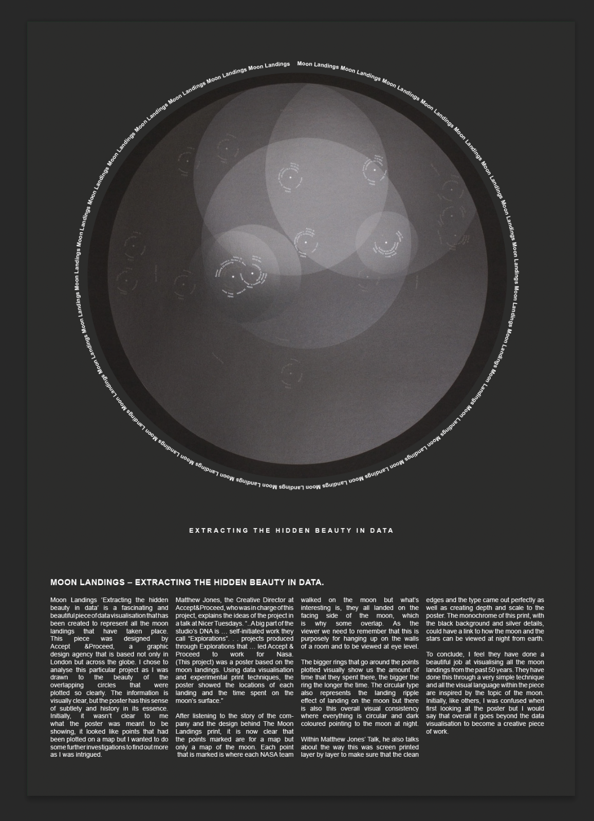
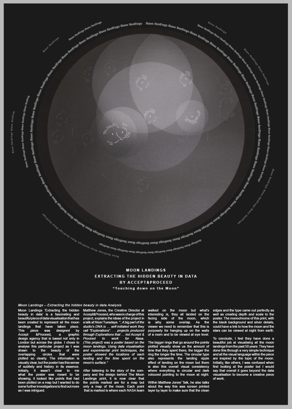
Moon Landings – Extracting the hidden beauty in data.
Moon Landings ‘Extracting the hidden beauty in data’ is a fascinating and beautiful piece of data visualisation that has been created to represent all the moon landings that have taken place. This piece was designed by Accept &Proceed, a graphic design agency that is based not only in London but across the globe. I chose to analyse this particular project as I was drawn to the beauty of the overlapping circles that were plotted so clearly. The information is visually clear, but the poster has this sense of subtlety and history in its essence. Initially, it wasn’t clear to me what the poster was meant to be showing, it looked like points that had been plotted on a map but I wanted to do some further investigations to find out more as I was intrigued.
Matthew Jones, the Creative Director at Accept&Proceed, who was in charge of this project, explains the ideas of the project in a talk at Nicer Tuesdays. “..A big part of the studio’s DNA is … self-initiated work they call “Explorations”. . . projects produced through Explorations that … led Accept & Proceed to work for Nasa. (This project) was a poster based on the moon landings. Using data visualisation and experimental print techniques, the poster showed the locations of each landing and the time spent on the moon’s surface.”
After listening to the story of the company and the design behind The Moon Landings print, it is now clear that the points marked are for a map but only a map of the moon. Each point that is marked is where each NASA team walked on the moon but what’s interesting is, they all landed on the facing side of the moon, which is why some overlap. As the viewer we need to remember that this is purposely for hanging up on the walls of a room and to be viewed at eye level.
The bigger rings that go around the points plotted visually show us the amount of time that they spent there, the bigger the ring the longer the time. The circular type also represents the landing ripple effect of landing on the moon but there is also this overall visual consistency where everything is circular and dark coloured pointing to the moon at night.
Within Matthew Jones’ Talk, he also talks about the way this was screen printed layer by layer to make sure that the clean edges and the type came out perfectly as well as creating depth and scale to the poster. The monochrome of this print, with the black background and silver details, could have a link to how the moon and the stars can be viewed at night from earth.
To conclude, I feel they have done a beautiful job at visualising all the moon landings from the past 50 years. They have done this through a very simple technique and all the visual language within the piece are inspired by the topic of the moon. Initially, like others, I was confused when first looking at the poster but I would say that overall it goes beyond the data visualisation to become a creative piece of work.
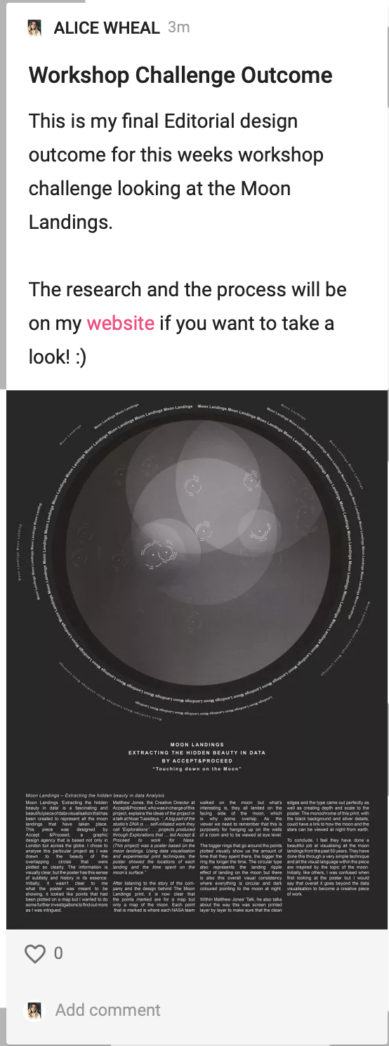
Editorial
For the editorial piece that goes with this weeks analysis, I wanted it to be really simplistic but also to mirror the form of the shapes that Accept&Proceed designed. I wanted there to be circles of text so I didn’t know whether I was going to design a package a real thing or just a poster.
MINDMAP OF IDEAS
After mind mapping all of my ideas I became settled on designing a poster or an facts page for a magazine article.
I began with the main pieces of the puzzle - the image of the poster - I then surrounded this with moon landings in text continuously - I added the text at the bottom and made sure it all linked along
I then tried adding more layers to the circle of more text to copy the ones in the poster and also changed the sized and opacity so the further out they went the more subtle they went.
I also wanted this title text so I added them at the top but this didn’t feel right so then I changed them to being placed in the middle. It felt the right so I didn’t over complicate it or change to another idea.
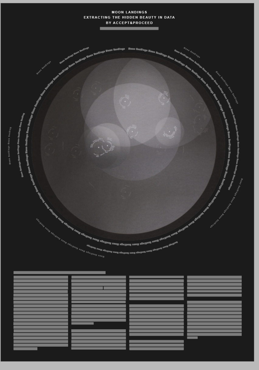

The final Editorial piece - I wanted the final outcome to be really simplistic and to mirror what was going on within the images of the poster. I also wanted the background to not be completely black and the test to also not be completely white. I thought keeping it simple will help all the attention to go onto the images.
Weekly Summary
This week has been probably the most interesting week so far, learning about data visualisations which is something I never knew even existed.
The workshop task was probably what I found most challenging due to the analysing and me and writing don’t get on very well. But I found it so much easier by writing everything in a list and then compiling the key information that I thought was needed for the story. I tried to keep the outcome of the editorial design simple this week as sometimes I can feel that I over complicate things or add to much detail. So im hoping by mirroring the work that was done within the poster, the focus can be the poster itself.
Ideas Wall Posts
Reference list
Accept & Proceed (n.d.). Accept & Proceed. [online] Accept & Proceed. Available at: https://www.acceptandproceed.com [Accessed 12 May 2021].
Behance (n.d.). WHAT MADE ME Interactive Public Installation. [online] Behance. Available at: https://www.behance.net/gallery/4419469/WHAT-MADE-ME-Interactive-Public-Installation.
British Council (n.d.). Telling stories with numbers: five artists using big data | British Council. [online] www.britishcouncil.org. Available at: https://www.britishcouncil.org/anyone-anywhere/explore/digital-creativity/telling-stories-numbers.
Dezeen (2019). Digital artwork depicts effect of climate change on trees at Foundation Cartier. [online] www.youtube.com. Available at: https://www.youtube.com/watch?v=aq0u7F5NDvw [Accessed 12 May 2021].
Frearson, A. (2011). Receipt redesign by BERG. [online] Dezeen. Available at: https://www.dezeen.com/2011/06/23/receipt-redesign-by-berg/ [Accessed 12 May 2021].
Grabkowska, D. (n.d.). What Made me. Available at: https://www.behance.net/gallery/4419469/WHAT-MADE-ME-Interactive-Public-Installation.
Griffiths, A. (2019). Digital artwork called Symbiosia depicts effect of climate change on trees in Paris. [online] Dezeen. Available at: https://www.dezeen.com/2019/07/25/digital-artwork-depicts-affect-of-climate-change-on-trees-at-foundation-cartier/ [Accessed 12 May 2021].
Its Nice that (2019). Matthew Jones gives insight into Accept & Proceed’s work for Nasa. [online] www.itsnicethat.com. Available at: https://www.itsnicethat.com/articles/nicer-tuesdays-2019-accept-and-proceed-graphic-design-140619.
Koblin, A. (2009a). Amsterdam SMS messages on New Years Eve. [online] vimeo.com. Available at: https://vimeo.com/2312662 [Accessed 12 May 2021].
Koblin, A. (n.d.). Flight Patterns. Available at: http://www.aaronkoblin.com/project/flight-patterns/.
Koblin, A. (2009b). Flight Patterns Color - HD. [online] www.youtube.com. Available at: https://www.youtube.com/watch?v=ystkKXzt9Wk [Accessed 12 May 2021].
Lupi, G. and Posavec, S. (n.d.). Dear Data. Available at: http://www.dear-data.com/all.
McLaughlin, A. (2020). Pentagram’s new project shows the human side of stats during coronavirus. [online] Creative Review. Available at: https://www.creativereview.co.uk/pentagram-happy-data-coronavirus/ [Accessed 12 May 2021].
Miebach, N. (2011). Art made of storms. [online] www.ted.com. Available at: https://www.ted.com/talks/nathalie_miebach_art_made_of_storms/up-next [Accessed 12 May 2021].
Miebach, N. (n.d.). Storm Art. Available at: https://nathaliemiebach.com.
Nicer Tuesdays (n.d.). Nicer Tuesdays: Accept & Proceed. [online] www.youtube.com. Available at: https://www.youtube.com/watch?v=Pgjkj4FzPMA [Accessed 12 May 2021].
Penney, M. (2016). Iconic Icons: Aicher’s Pictograms. [online] Sessions. Available at: https://www.sessions.edu/notes-on-design/iconic-icons-aichers-pictograms/.
Posavec, S. (2015). Drawing the Dictionary. [online] Stefanie Posavec. Available at: http://www.stefanieposavec.com/drawing-the-dictionary-1 [Accessed 7 May 2021].
Pots for Tots (n.d.). Pots for Tots. [online] Pots for Tots. Available at: https://www.potsfortots.co.uk/our-pots [Accessed 12 May 2021].
Sluis, K. (2016). Before Tufte, there was Bertin. [online] Medium. Available at: https://karlsluis.medium.com/before-tufte-there-was-bertin-63af71ceaa62.
www.youtube.com. (n.d.). Big Bang Data: Dear Data. [online] Available at: https://www.youtube.com/watch?v=iqaVe1MCTlA&feature=emb_logo [Accessed 8 May 2021].
www.youtube.com. (n.d.). Ikea Cook this Page. [online] Available at: https://www.youtube.com/watch?v=KyOI7FI6DJ4&feature=emb_logo [Accessed 12 May 2021].